A great banner ad is a masterclass in efficiency. It’s a carefully crafted blend of sharp strategy and knockout visuals designed to make a user do something. It all begins with a clear goal, a deep understanding of who you're talking to, and a design that hammers home a single, powerful message in a fraction of a second.
Success isn't about just making something that looks good; it’s about following a deliberate process built to grab attention and, most importantly, get results.
Building Your Banner Ad Strategy from the Ground Up
Before you even think about fonts or color palettes, you have to lay the groundwork. The most successful banner ads—the ones that actually convert—are born from a focused, well-defined strategy. This is the blueprint that separates ads that make an impact from the ones that just become digital noise.
This isn't the time to jump into a design tool. It's about asking the tough questions first. What, exactly, do we want this ad to achieve? And who are we trying to reach? Nailing down the answers here will guide every creative decision you make and save you from wasting time and money on designs that fall flat.
Set a Single, Razor-Sharp Objective
This is where so many campaigns go wrong. Trying to do too much at once is a recipe for failure. An ad that attempts to build brand awareness, announce a new feature, and drive sales will probably fail at all three. You have to pick one primary goal.
Think of your objective as your creative filter. For example, if your goal is just to boost brand recall, the design will be all about a big, prominent logo and a catchy tagline. But if you’re trying to generate leads, the focus shifts entirely to a juicy offer and a crystal-clear call-to-action (CTA) like "Download Your Free Guide."
Every campaign should have one clear job to do. Is it...
- To Increase Brand Awareness? This is all about exposure. The win is measured in impressions and getting your name in front of as many relevant eyeballs as possible.
- To Drive Website Traffic? Here, the click is everything. The entire ad is engineered to pique curiosity and convince someone to visit a specific landing page.
- To Generate Leads? This goal demands a clear value exchange. You need an irresistible offer—a webinar spot, a free trial—that makes giving up an email address feel like a no-brainer.
- To Boost Sales? These ads get straight to the point. They’re often direct, urgent, and feature specific products, discounts, or limited-time offers to trigger an immediate purchase.
By committing to a single objective, you bring clarity to the entire process for your team and your audience. A focused ad is an effective ad.
Craft a Detailed Audience Persona
Once you know what you want to do, you need to know who you're talking to. A generic message aimed at "everyone" is a message that will resonate with no one. This is why building out a detailed audience persona is so critical. You have to go way beyond basic demographics like age and location.
Dig into the psychographics of your ideal customer. What drives them? What problems are keeping them up at night? When you truly understand their pain points, you can frame your product or service as the perfect solution they've been looking for.
For instance, a banner ad for a project management tool targeting startup founders shouldn't just rattle off a list of features. It needs to speak directly to their pain point—that feeling of being completely overwhelmed by scattered tasks—and position the tool as the key to "finally regaining control." This empathetic approach makes your ad feel less like an interruption and more like a genuinely helpful suggestion.
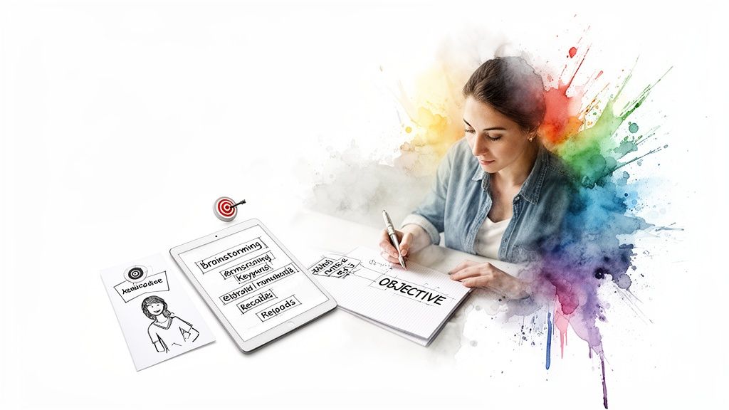
Brainstorm Concepts with an AI Co-Pilot
With a clear objective and a deep understanding of your audience, it’s time for the fun part: brainstorming creative concepts. This is where modern tools can give you a massive edge. Instead of staring at a blank canvas, you can lean on AI to kickstart the ideation process. Many forward-thinking marketers are now using platforms that provide AI tools for creative marketing teams to get the ball rolling.
By feeding your goal and audience persona into an AI image generator, you can explore dozens of visual styles, color palettes, and compositions in just a few minutes. This isn't about letting the AI do all the work; it's about rapidly visualizing different creative paths and identifying promising concepts before you sink a ton of design resources into them.
Choosing the Right Banner Sizes for Maximum Impact
Let's talk about something that seems technical but is actually one of the most strategic decisions you'll make: banner ad size. The dimensions you choose have a massive impact on your ad's visibility, where it gets placed, and ultimately, whether it succeeds or fails.
Think of it like digital real estate. A tiny, awkwardly shaped ad is like a kiosk shoved in a back alley—barely anyone will see it. A big, bold leaderboard at the top of a page? That’s prime storefront property. By sticking to the industry-standard sizes, you’re making sure your ad can actually show up on the vast majority of websites and ad networks. It’s the first step to maximizing your reach.
The Workhorses of Digital Advertising
While there are dozens of possible ad dimensions, a handful of them completely dominate the ad space, especially on major platforms like the Google Display Network. These are the sizes that publishers build their sites around and users are accustomed to seeing. They’re a safe—and smart—bet.
-
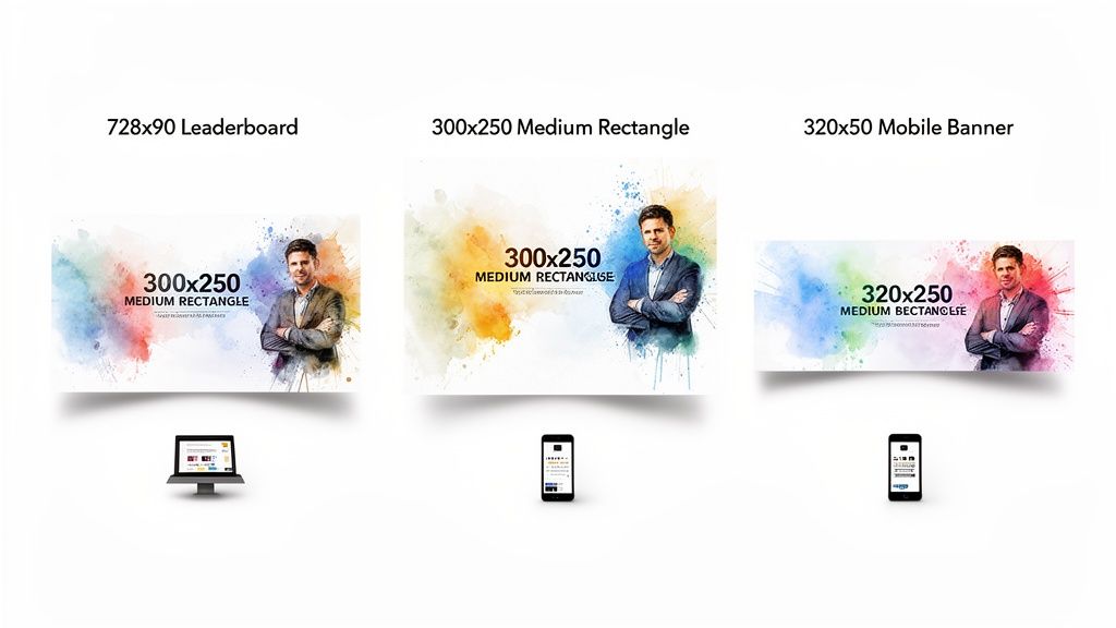
300x250 Medium Rectangle: This is the undisputed champion of banner ads. It’s incredibly versatile and performs exceptionally well when embedded right inside website content, like in the middle of a blog post. It's big enough to make an impact but doesn't feel overly intrusive.
-
728x90 Leaderboard: Just like the name suggests, this wide banner sits at the top of the page, usually right above the main navigation. Its prominent "above-the-fold" placement guarantees it gets seen, making it a fantastic choice for brand awareness campaigns.
-
320x50 Mobile Leaderboard: In a world where most browsing happens on a phone, this one is non-negotiable. It’s designed specifically for mobile screens, anchoring to the top or bottom of the view, and is absolutely essential for reaching people on the go.
Don't just take my word for it. Recent data from a 2023 analysis of over half a million creatives showed that standard IAB sizes like the 728×90 leaderboard and 300×250 medium rectangle consistently deliver better visibility and click-through rates. Interestingly, the same study found that 57.9% of ad designs were animated, signaling a clear shift towards motion. If you want to dig deeper into the numbers, you can find more insights on these banner ad performance trends at craftmypdf.com.
To make it even easier, here’s a quick-reference guide to the top-performing sizes and where they shine. These are the formats that consistently get the best inventory and deliver the most reliable results.
Top-Performing Banner Ad Sizes and Their Use Cases
| Banner Size (pixels) | Common Name | Primary Use Case | Best Placement |
|---|---|---|---|
| 300 x 250 | Medium Rectangle | High engagement, versatile | Embedded within content (e.g., articles) |
| 728 x 90 | Leaderboard | Brand awareness, high visibility | Top of the page, above the fold |
| 320 x 50 | Mobile Leaderboard | Mobile-specific reach | Top or bottom of mobile screens |
| 160 x 600 | Wide Skyscraper | Side-of-page visibility | Website sidebars |
| 300 x 600 | Half Page | High-impact storytelling | Website sidebars, replacing the skyscraper |
| 970 x 250 | Billboard | Premium, high-impact branding | Top of the page, especially on homepages |
Focusing your design efforts on these proven dimensions is the most efficient way to ensure your ads are seen across the widest possible audience.
Getting the Technical Specs Right
Beyond just the dimensions, you have to nail the technical specs. If you get these wrong, ad networks will reject your creative, or worse, it will deliver a clunky, slow experience for the user. The two big ones to watch are file format and file size.
File Formats
The right format really depends on whether your ad is static or animated.
- JPG: Your best bet for static photos. It gives you great image quality with small, compressed file sizes.
- PNG: Perfect for static graphics that need a transparent background, like a logo or an image with complex edges.
- GIF: A simple option for basic, looping animations. The downside is its limited color palette, which can make things look a bit dated.
- HTML5: This is the modern standard for anything complex, interactive, or animated. Think of it as a tiny, self-contained webpage that functions as your ad.
Key Takeaway: Always, always keep your file size as low as possible without destroying image quality. Ad networks are incredibly strict about this, usually capping files at around 150 KB. Why? Because bulky ads slow down page load times, which frustrates users and tanks your ad's performance. A fast-loading ad is the very first step toward a successful click.
Mastering Design Principles for Banner Ads That Convert
In the blink of an eye, your banner ad either grabs someone's attention or fades into the digital noise. That’s all the time you get. Effective banner ad design isn’t about cramming in as much information as possible; it’s a masterclass in strategic communication. The ads that truly work—the ones that get the clicks—are built on a solid foundation of design principles that guide the eye and demand action.
These principles all boil down to three core components. Think of them as the non-negotiables. Get these right, and you’re on your way to creating a powerful, persuasive message that actually converts.
The Anatomy of a High-Converting Banner Ad
Your banner ad is essentially a tiny, hyper-focused sales pitch. It needs to quickly establish who you are, what’s in it for the customer, and exactly what they should do next. If you miss one of these, the whole thing falls apart.
-
Your Company Logo: This is your signature. Your logo needs to be clear and present, but it shouldn't scream for attention. It’s the visual handshake that builds brand recognition and lets people know who they're hearing from.
-
The Value Proposition: This is the heart and soul of your ad. It’s the direct answer to the only question that matters to the viewer: "What's in it for me?" Forget listing features; focus on the benefit. How will this make their life better, easier, or more interesting?
-
The Call to Action (CTA): This is the engine. A strong CTA isn't a suggestion; it’s a clear, direct instruction. Simple, action-oriented phrases like "Shop Now," "Learn More," or "Get Your Free Trial" leave no room for confusion.
Your goal is to create an ad where these three elements work in perfect harmony. The logo establishes identity, the value proposition creates desire, and the CTA provides the path to fulfillment.
Establishing a Clear Visual Hierarchy
Visual hierarchy is the secret sauce that makes a banner ad work. It’s the art of arranging elements to telegraph their importance, guiding a person's gaze from the most critical piece of information to the least. With smart use of size, color, and contrast, you can practically force them to see your message in the right order.
So, what do you want them to see first? Almost always, it's the value proposition, with the CTA coming in a very close second.
-
Size and Scale: Make your main offer—the juicy benefit—the largest text element on the canvas. Your CTA button should also be prominent enough to pop. The logo can be more subtle, playing a supporting role.
-
Color and Contrast: This is your chance to really draw the eye. A bright, contrasting color for your CTA button is a classic move for a reason. If your ad has a cool blue background, a punchy orange or green button becomes a visual magnet. The fundamentals of graphic design for branding are crucial here, helping you create something that’s both on-brand and impossible to ignore.
-
White Space: Don't be afraid of empty space. Cramming every last pixel with content is a rookie mistake that creates a cluttered, unprofessional mess. White space (or negative space) gives your key elements room to breathe, making the entire ad easier to scan and digest in that split second you have.
Writing Copy That Clicks
The visuals might hook them, but it's the copy that reels them in. The challenge? You have to be incredibly persuasive with an absolute minimum of words. Every single word has to earn its spot.
Keep It Short and Snappy
Brevity is everything. Aim for a headline that’s no more than five to seven words, with any supporting text being just as lean. Ditch the jargon and focus on powerful, benefit-driven language. For example, instead of "Our software has many features to help you," hit them with "Save an Hour Every Day." See the difference?
Create Urgency and Scarcity
Nothing lights a fire under someone like the fear of missing out (FOMO). Introducing a little urgency can dramatically increase click-through rates by encouraging people to act now instead of "later."
- "Limited Time Offer"
- "Sale Ends Friday"
- "Only 3 Left in Stock"
This simple psychological trigger interrupts the user's passive scrolling and pushes them toward an immediate decision. You can see great examples of this in action by browsing different modern style banner designs, which have mastered the art of punchy, urgent copy.
Balance Imagery and Text
Finally, a truly great banner ad finds the perfect equilibrium between a powerful image and minimal text. The visual should be instantly relatable and emotionally resonant, supporting the copy without competing with it. A picture of a relaxed person on a beach is the perfect partner for a headline like "Your Dream Getaway Awaits." The image and text must work as a team to tell one clear, compelling story.
Speed Up Your Banner Ad Creation with an AI Workflow
Let’s be honest: the traditional way of designing banner ads is a grind. You create one size, then manually resize, crop, and recompose it for every other dimension. It’s slow, tedious work that creates a major bottleneck, especially when you need to constantly test new creative. This is where an AI-powered workflow completely changes the game, letting you generate and adapt your ads at a speed that just wasn’t possible before.
Instead of staring at a blank canvas in Photoshop, you can kickstart the entire process with a simple text prompt. Tools like an AI banner generator can turn your core idea into a dozen visual concepts in minutes. This shift is huge. It moves you from being a pixel-pusher to a creative director, letting you focus on the big-picture strategy instead of the technical grunt work.
Generate Your Core Visual with a Text Prompt
Every great banner ad starts with an eye-catching visual. With AI, you can create one from scratch just by describing what you want to see.
Imagine you're marketing a new line of sustainable, eco-friendly sneakers. A great starting prompt might be: "A vibrant, photorealistic shot of a stylish sneaker resting on a bed of lush green moss, with soft morning light filtering through forest leaves."
In seconds, you'll have a unique, high-quality image that nails the brand's vibe. But the real magic is in the iteration. You can instantly pivot to explore entirely different creative angles without setting up a single photoshoot.
- Want something more modern and edgy? Try: "Graphic illustration of a sneaker with bold outlines and flat color blocking, abstract leaf patterns in the background, pop art style."
- Aiming for a premium, luxury feel? Go with: "Minimalist studio photo of a single sneaker on a clean white background, with a soft shadow, elegant and simple."
This kind of rapid-fire experimentation lets you explore multiple creative directions in the time it used to take just to brief a designer. You can find out which visual style actually connects with your audience before sinking a ton of time and money into a single concept.
The big idea here is to stop creating one asset at a time and start generating a whole spectrum of creative options. Think of AI as your co-pilot, visualizing concepts instantly so you can focus on finding the perfect look for your campaign.
Intelligently Adapt Images for Any Banner Size
So you've landed on the perfect core visual. Now comes the part that used to be a headache: adapting it for all the different banner sizes, from a wide 728x90 leaderboard to a tall 160x600 skyscraper. This is where AI editing tools like outpainting are a lifesaver.
Instead of awkwardly cropping your beautiful square image and losing half the scene, outpainting intelligently expands the canvas for you. The AI analyzes the pixels, context, and style of your original image and then generates new, seamless extensions. That bed of moss from our sneaker ad can now stretch out horizontally to perfectly fill a leaderboard banner, with no weird stretching or quality loss. The AI literally "imagines" what the rest of the forest floor would look like, keeping everything perfectly consistent.
This simple diagram shows the three essential components every banner needs, whether you start with AI or a blank canvas.
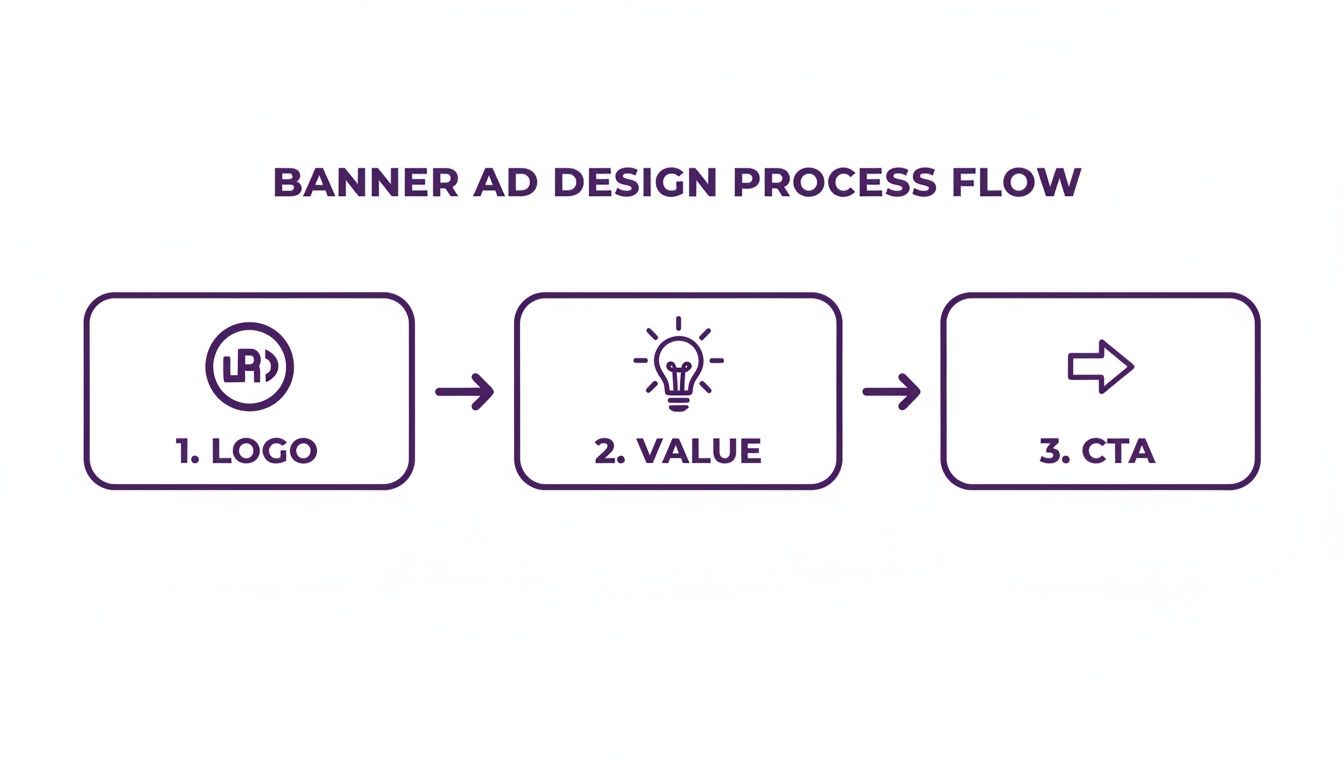
It’s a good reminder that no matter how you create the visuals, the core strategy—integrating your logo, showing your value, and driving action—never changes.
Refine Your Composition with Inpainting
Once your background image is perfectly sized, you need to clear space for the most important parts: your logo, value proposition, and call-to-action (CTA). This is where inpainting comes in handy.
Let's say a stray leaf or a distracting shadow in your generated image lands right where your "Shop Now" button needs to go. No problem. With inpainting, you just highlight the object you want to get rid of and give a simple command like "remove leaf." The AI intelligently fills that spot with more of the mossy background, making it look like the leaf was never there. This gives you pinpoint control over the composition, ensuring your visual hierarchy is clean and your message is front and center. You can even use it to add or move elements to strike a better visual balance.
This entire approach turns the rigid, step-by-step design process into a fast, flexible, and iterative loop. By using a platform built for this workflow, like AI Media Studio, you can churn out dozens of high-quality, perfectly sized banner variations in the time it used to take to create just one. That gives you far more creative ammo to test, optimize, and ultimately drive better campaign performance.
Testing and Optimizing Your Banner Ad Performance
Launching your banner ad isn't the finish line—it's the starting gun. A great initial design is just your best guess at what will actually work. The real magic happens next, through relentless testing, learning from real-world data, and making smart improvements. This is how you turn a simple banner ad into a powerful engine for growth.This cycle of continuous optimization has never been more critical. The digital ad space moves fast, and you have to be faster. With U.S. digital ad revenues hitting $225 billion in 2023 and display advertising alone accounting for $66.1 billion of that, the competition for eyeballs is intense. To get ahead, you need a solid framework for testing.
Start With a Clear Hypothesis
Great A/B testing isn't about throwing random ideas at the wall to see what sticks. It starts with a clear, testable hypothesis—an educated guess about what change will produce a better result. The best way to frame it is with a simple "If... then... because..." statement.
For instance, a weak hypothesis is just: "Let's test a red button."
A much stronger one sounds like this: "If we change the CTA button from blue to a high-contrast orange, then we will increase our click-through rate because the button will stand out more against our brand's background colors." This structure forces you to justify your reasoning, making the results much easier to analyze later.
Identify High-Impact Elements to A/B Test
You can test almost anything in your banner, but some changes will always deliver bigger wins than others. Focus your energy on the variables most likely to influence user behavior. Always start with big, bold changes before you start fiddling with minor tweaks.
Here are the most impactful elements to put to the test:
- The Call to Action (CTA): Pit different copy against each other ("Shop Now" vs. "Save 50% Today"). Test button colors (high-contrast vs. on-brand) or even button shapes.
- The Headline or Value Proposition: Does a question outperform a statement? Does highlighting a benefit ("Save Time") work better than highlighting a feature ("New Automation Tool")?
- The Core Visual: Test a product photo against a lifestyle image. See if an illustration gets more traction than a photograph, or if a design with a person's face generates more clicks.
- Color Schemes: Try out entirely different background colors or typographic color combinations to see what really grabs attention.
A critical rule of thumb: test only one variable at a time. If you change the headline, the button color, and the background image all at once, you’ll have no clue which change was actually responsible for the shift in performance.
Interpreting the Results
Once your test has run long enough to gather a statistically significant amount of data, it’s time to pick a winner. The two metrics that matter most here are your Click-Through Rate (CTR) and your Conversion Rate.
A high CTR is fantastic—it means your ad is compelling enough to earn a click. But the conversion rate is where the business impact is really measured.
Think about it: if a new ad variation gets a lower CTR but a higher conversion rate, it means it's attracting a more qualified audience. That's the ad that's actually making you money, making it the more successful design.
Take the winning variation and make it your new control creative. Then, it's time to form a new hypothesis and start the process all over again. This iterative cycle of testing and optimizing is how you systematically improve your banner ad performance over time. To make sure your ads are always top-notch, it's a good idea to get familiar with Key Ad QA Processes and Checklists to streamline your testing efforts.
A Few Common Questions About Banner Ad Design
Even with a solid game plan, you're bound to run into some specific questions when designing banner ads. Getting these right can be the difference between a campaign that sings and one that sinks. Let's tackle some of the most common questions we hear from marketers and designers on the front lines.
What Makes a Banner Ad Bad?
A "bad" banner ad almost always fails in one of three areas. The biggest culprit? A cluttered design. When you try to cram too much text, multiple images, and competing calls-to-action into a tiny space, you create visual noise. Users have become experts at ignoring that kind of chaos.
Another common pitfall is a weak or muddy value proposition. If someone can't glance at your ad and immediately understand "what's in it for me?" within a second or two, you've already lost. And finally, a passive, generic call-to-action like "Click Here" just doesn't cut it anymore. It fails to create any sense of urgency or give a clear, compelling reason to act.
The fastest way to kill a banner ad is to make it confusing. Your message, your offer, and the next step need to be instantly obvious to someone who is actively trying to ignore you.
Are Banner Ads Even Still Effective?
Absolutely, but their role in the marketing mix has definitely shifted. While "banner blindness" is a real thing, a well-targeted and thoughtfully designed banner is still a potent tool for both building a brand and getting a direct response. Today, effectiveness is all about relevance.
Think about it: an ad for a pair of shoes you just looked at on an e-commerce site is infinitely more powerful than some random, untargeted ad. Modern display networks allow for laser-focused targeting, which means your banner ad design can hit the right person at precisely the right moment. They're especially killer for retargeting campaigns, acting as a gentle nudge that keeps your brand top of mind.
How Much Should I Expect to Pay for Banner Ad Design?
The cost can swing wildly, from practically free to thousands of dollars. It all comes down to your approach and how complex the creative needs to be.
- DIY with AI Tools: Using a platform like AI Media Studio can slash costs. You're mostly paying for the tool's subscription and can generate dozens of variations on your own in minutes.
- Freelance Designers: Hiring a freelancer on a platform like Upwork or Fiverr can run you anywhere from $50 to $500 for a standard set of banners, depending on their experience and the project's scope.
- Creative Agencies: A full-service agency will handle everything—strategy, copy, design, testing—but it comes at a premium. Costs here often start in the low thousands for a complete campaign package.
Should My Banners Be Animated or Static?
The data is leaning more and more toward animation, but the right choice really hinges on your campaign goals and resources. Animated HTML5 banners consistently pull in higher engagement and click-through rates. Why? Because motion naturally grabs the human eye. They also let you tell a more complex story or showcase multiple product features.
However, static ads (like JPGs or PNGs) are much faster and cheaper to produce. They can be incredibly effective when they feature one powerful image and a crystal-clear message. A good rule of thumb is to start with high-quality static ads. If they perform well, then it's worth investing in animated versions to see if you can boost those results even further.
Ready to create stunning, high-converting banners in minutes, not hours? AI Media Studio gives you the power to generate endless creative variations with simple text prompts, intelligently adapt them to any size, and refine your designs with powerful editing tools.
Stop the endless resizing and start creating at the speed of inspiration. Explore what you can create at https://www.ai-media-studio.com.