To make a thumbnail that actually works, you have to blend a solid strategic idea with some smart design. It’s a two-part process: first, figure out who you're talking to and what your content's single biggest promise is. Then, you use design principles like contrast and visual hierarchy to make sure that promise jumps off the screen.
The Strategy Behind a High-Performing Thumbnail
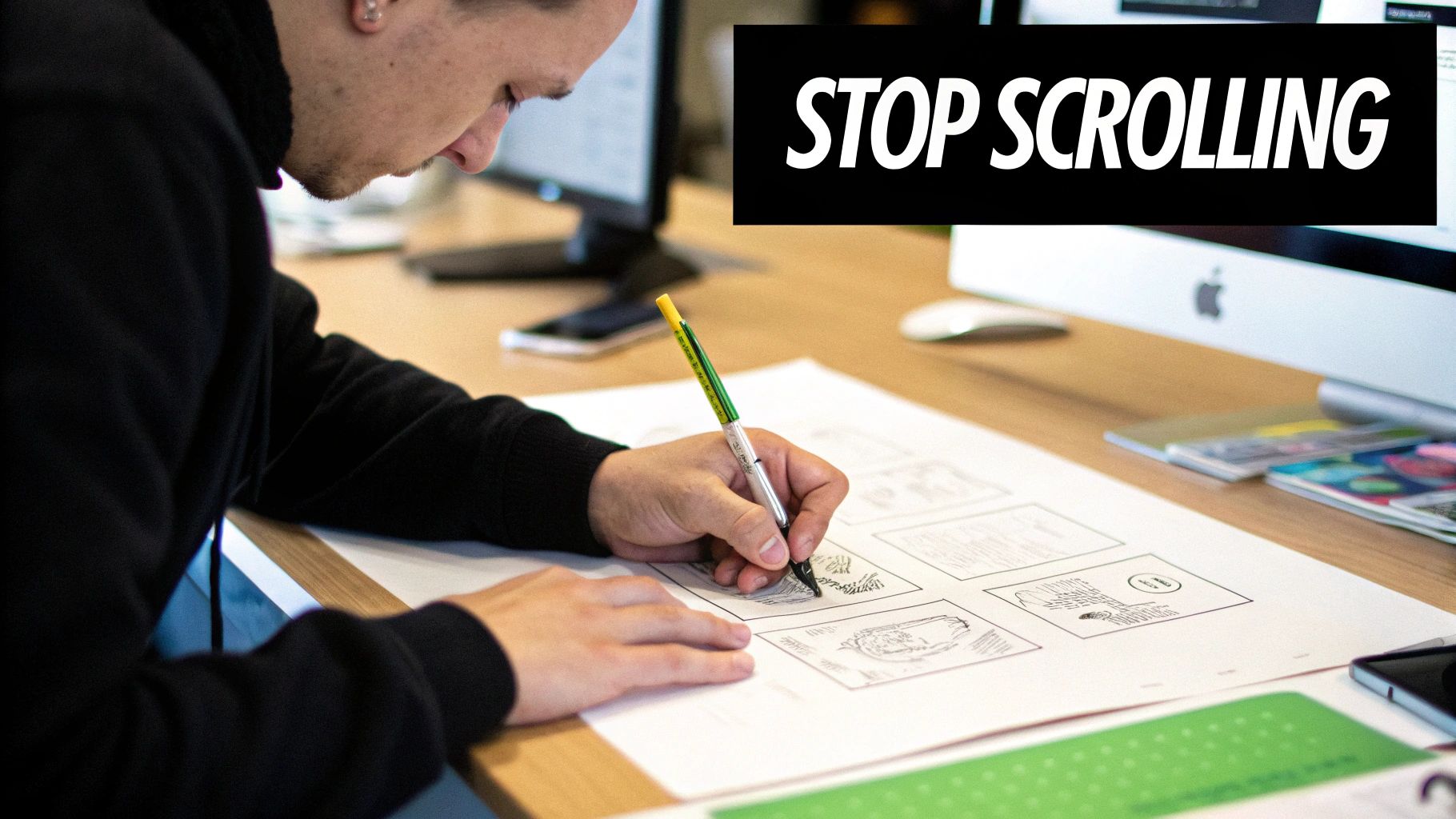
Long before you touch a design tool, the most important work happens in your head. A killer thumbnail isn't just a pretty picture—it's an advertisement for your content. Its only job is to make someone stop scrolling, get curious, and click.
It all starts with your audience. Who are you trying to reach? What are they searching for? What problems do they need solved? A thumbnail for a beginner's guide to baking bread should feel warm and simple. One for an advanced coding tutorial, on the other hand, might need to look complex and authoritative.
Think of your thumbnail as the visual answer to one simple question: "Why should I click this?"
Define Your Thumbnail's Core Promise
Your content provides a solution or an experience. The first step is to boil that down into a single, punchy idea. This is your thumbnail's core promise. Don't try to cram everything in; just focus on the most compelling takeaway.
Here are a few ways to nail down that core promise:
- Show the Transformation: Think "before and after." A fitness video could show a split screen of a weight loss journey.
- Pose a Question: Create a visual mystery that your content solves. A weird, unidentifiable gadget next to a giant question mark is pure click-bait (in a good way).
- Capture the Emotion: Focus on the primary feeling your content creates. A travel vlog about a chill beach vacation needs a shot of pure, blissful relaxation.
This shift from simple placeholders to strategic assets didn't happen overnight. In the early days of platforms like YouTube, thumbnails were often just random, blurry frames. But creators caught on fast, realizing that custom designs with expressive faces and bold text performed way better. It’s now estimated that by 2025, over 90% of top-performing videos will use custom-designed thumbnails. If you want to dive deeper, you can explore more about the future of YouTube thumbnails and how AI is changing the game.
Create a Simple Creative Brief
Once you’ve got your core promise, jot down a quick brief. This isn't some formal document—it's just a mental checklist to keep your design focused and prevent you from adding a bunch of clutter that drowns out your message.
Your brief just needs to answer three questions:
- What’s the one feeling I want the viewer to have? (Curiosity, excitement, trust?)
- What's the main visual element? (A person’s face, a product, a chart?)
- What's the absolute essential text? (Keep it to 3-5 words max.)
A thumbnail's job isn't to be a work of art; it's to be a work of communication. If it gets the point across in under three seconds, it's a success. This strategic foundation makes sure every design choice has a purpose, turning your thumbnail from decoration into a powerful click-driving machine.
Applying Core Design Principles That Work

A solid strategy is your foundation, but design principles are what truly build a thumbnail that demands attention. These aren't just abstract theories from art school; they're practical, time-tested rules for visual communication that work especially well on small, crowded screens.
Getting these principles right is what separates a professional, clickable image from one that just gets lost in the noise. The main goal? Create a clear visual hierarchy.
This just means you’re controlling what the viewer sees first, second, and third. In that split second you have to grab someone's attention, you need the most important element—whether it's a face, a product, or a key phrase—to pop immediately.
Guiding the Viewer's Eye with Composition
Composition is simply how you arrange everything in the frame. Instead of just plunking your subject in the middle, you can use simple compositional rules to make the image far more dynamic. The most famous one is the Rule of Thirds.
Imagine your thumbnail is split into a 3x3 grid, like a tic-tac-toe board. The rule suggests placing your main subject along one of the lines or at an intersection point, not dead center. It’s a subtle shift, but it creates a bit of visual tension that makes the whole thing feel more balanced and professional.
For example, if you have a person in your thumbnail, try lining up their eyes with the top horizontal line. This naturally draws the viewer's gaze right where you want it. Since our brains process visuals 60,000 times faster than text, a well-composed image sends its message almost instantly.
Your thumbnail isn’t just a static image; it's a visual journey you guide the viewer on. Composition provides the map, telling them exactly where to look to find the most value.
Learning how to direct attention is a game-changer. If you want to go deeper, our guide to visual hierarchy in design unpacks these concepts even further.
Making Your Subject Pop with Contrast and Color
Contrast is your secret weapon for creating a powerful focal point. It's all about making elements different enough that one stands out above the rest. You have a few types to play with:
- Color Contrast: Pairing complementary colors (like blue and orange) or slapping a bright color on a muted background forces the eye to look. A vibrant yellow button on a dark grey background is impossible to miss.
- Size Contrast: Make your most important element way bigger than everything else. If your video is about a "GIANT MISTAKE," the word "GIANT" should be physically massive in the thumbnail.
- Typographic Contrast: Mix a bold, heavy font with a lighter, simpler one. This creates an instant hierarchy in your text, helping people scan the key words in a fraction of a second.
Color psychology is also a massive part of this. Warm colors like red and orange can create excitement and urgency. Cooler colors like blue and green often feel more calm, trustworthy, and professional. Pick a palette that actually matches the vibe of your content.
Keeping Text Legible and Punchy
Typography is so often an afterthought, but it's absolutely critical. Your text has to be crystal clear on a tiny phone screen when someone is just scrolling by.
First, pick your font carefully. Ditch the thin, scripty, or overly decorative fonts. You want bold, clean sans-serifs that scream readability—think Montserrat, Bebas Neue, or Impact. And please, stick to just one or two fonts to keep things from looking messy.
Next, make sure your text is always legible against its background. This is where so many people go wrong, placing white text over a busy, light-colored image. Here’s how to fix it:
- Add an Outline: A simple black stroke (or "outline") around your letters makes them readable on top of literally anything.
- Use a Drop Shadow: A soft shadow behind the text creates depth and helps it lift off the background.
- Place Text on a Solid Shape: When in doubt, put your text inside a colored bar or box to guarantee it stands out.
And remember, less is more. Keep your text to a few powerful words that get right to the point. You're creating a quick, compelling hook, not writing a paragraph. When you combine strong composition, smart contrast, and clear typography, you create a thumbnail that doesn't just look good—it gets the click.
Mastering Platform-Specific Thumbnail Requirements
You can design the most brilliant, eye-catching thumbnail imaginable, but if it gets awkwardly cropped or looks blurry on upload, all your hard work goes down the drain. Every platform is its own little world with its own set of rules. Ignoring these technical specs is like trying to jam a square peg into a round hole—it just won’t end well.
This is about more than just pixel counts; it’s about context. A YouTube thumbnail is in a constant battle for attention on a crowded homepage. An Instagram Reel cover, on the other hand, has to look just as good in the fast-scrolling feed as it does on your meticulously curated profile grid.
Nailing the size and aspect ratio ensures your thumbnail looks professional and, more importantly, does its job wherever your audience finds it. Get it wrong, and you risk a pixelated mess from bad compression or, even worse, the platform chopping off your headline or the main subject of your image.
Thumbnail Specifications for Major Platforms
To sidestep these common pitfalls, you have to know what each platform wants. While the goalposts can occasionally move, sticking to the current recommended sizes is your best strategy. I always recommend exporting at the highest possible resolution; starting with a quality image ensures it stays sharp even after the platform works its compression magic.
Here's a quick cheat sheet for the most common platforms you'll likely be designing for.
| Platform | Recommended Dimensions (Pixels) | Aspect Ratio | Maximum File Size |
|---|---|---|---|
| YouTube | 1280 x 720 | 16:9 | 2 MB |
| Instagram Feed | 1080 x 1080 (Square) or 1080 x 1350 (Portrait) | 1:1 or 4:5 | 30 MB |
| Instagram Reels/Stories | 1080 x 1920 | 9:16 | 4 GB (video cover) |
| Facebook Feed | 1200 x 630 | 1.91:1 | 8 MB |
| Blog Post (Featured Image) | 1200 x 628 | 1.91:1 | ~300 KB |
Notice how small the file size is for blog posts? That's not a typo. It's absolutely critical for keeping your website's load speed fast, which is a huge deal for SEO. A heavy featured image can slow your page to a crawl and tank your search rankings.
It's Not Just About the Numbers—Context is Everything
Knowing the dimensions is just the start. The real secret is thinking about how and where people will see your thumbnail. Each platform's user experience should directly influence your design choices.
-
YouTube's Crowded Battlefield: Your thumbnail on YouTube is one of dozens screaming for a click. It has to be bold, simple, and instantly understandable. The official recommendation is 1280 x 720 pixels, but remember it's usually seen at a fraction of that size on a phone screen. If you're looking for inspiration, checking out battle-tested YouTube thumbnail templates is a great way to see what really works in the wild.
-
The Instagram Grid Aesthetic: An Instagram Reel thumbnail is a vertical 1080 x 1920 image, but don't forget that a cropped square version lands on your profile grid. You have to design for this "safe zone," keeping your most important visual elements centered so they don't get decapitated in the grid view.
-
The Vertical World of Shorts and Stories: Platforms like YouTube Shorts and Instagram Stories are built around the vertical 9:16 aspect ratio. This format completely changes the game for composition compared to the traditional 16:9 widescreen. To really get it right, a dedicated YouTube Shorts thumbnail guide can provide the nitty-gritty details you need to optimize for that specific environment.
A great thumbnail is one that respects its environment. By designing for the specific platform and its user interface, you ensure your message is delivered clearly and effectively, maximizing your chances of earning that click.
How to Use AI for Rapid Thumbnail Creation
The whole creative process, from the first spark of an idea to the final polished design, used to eat up hours. I've been there. Staring at a blank canvas, trying to will a compelling thumbnail into existence.
Now, with the right AI tools, you can spin up dozens of high-quality concepts in just a few minutes. This isn’t about killing creativity; it's about supercharging it. You get to move faster, test more ideas, and completely sidestep that dreaded blank-page paralysis.
Using a modern AI media studio turns the entire workflow into a conversation. Instead of fiddling with layers and tools, you just describe the image you want, and the AI builds it. It's a game-changer that makes pro-level design accessible to everyone, no matter your background in complex software.
This AI-driven approach has completely flipped thumbnail creation on its head. The global market for AI thumbnail generation hit around USD 482.6 million in 2024 and is ballooning, thanks to massive leaps in generative AI. These systems can look at your content and design thumbnails optimized for color, composition, and text placement. You can learn more about the growth of this market and see just how big this shift is.
Writing Effective Text Prompts for Great Visuals
The real skill in AI image generation is writing a great prompt. You have to think like an art director giving clear, specific instructions to a designer. The more vivid your description, the closer the AI will get to what's in your head.
My advice? Start simple, then layer on the details. Don't just ask for "a person cooking."
Instead, try something with more flavor, like: "a close-up, photorealistic shot of a smiling chef sprinkling flour on a rustic wooden table, warm kitchen lighting, shallow depth of field." See the difference?
Here’s a simple structure I use for my prompts:
- Subject: What’s the main focus? (e.g., "a futuristic robot")
- Action: What’s it doing? (e.g., "painting a vibrant mural")
- Environment: Where is it? (e.g., "on a brick wall in a bustling cyberpunk city street at night")
- Style & Details: What’s the vibe? (e.g., "glowing neon lights, cinematic lighting, highly detailed, 8K resolution")
Pro Tip: Don't hesitate to play with artistic styles. Tossing in phrases like "in the style of a watercolor painting," "3D render," or "anime key visual" can instantly transform the entire mood and look of your thumbnail. Experimentation is key.
Using Powerful AI Editing Tools
Generating the initial image is just step one. The real magic often happens in the edit. Modern AI platforms come packed with editing tools that give you incredible control without needing a degree in Photoshop. My two favorites are inpainting and outpainting.
Inpainting is your cleanup tool. Let's say the AI gave you a perfect image, but there’s a random, distracting object in the corner. You just highlight it, tell the AI to remove it, and it will intelligently fill in the space, matching the surroundings perfectly.
Outpainting, on the other hand, is for expansion. If your image feels a bit too tight or cropped, outpainting lets you extend the canvas. This is a lifesaver when you need to turn a square image into a 16:9 thumbnail. The AI generates new visual details that logically fit the existing scene.
The infographic below shows just how different your visual approach needs to be for various platforms—a process AI can make much, much easier.
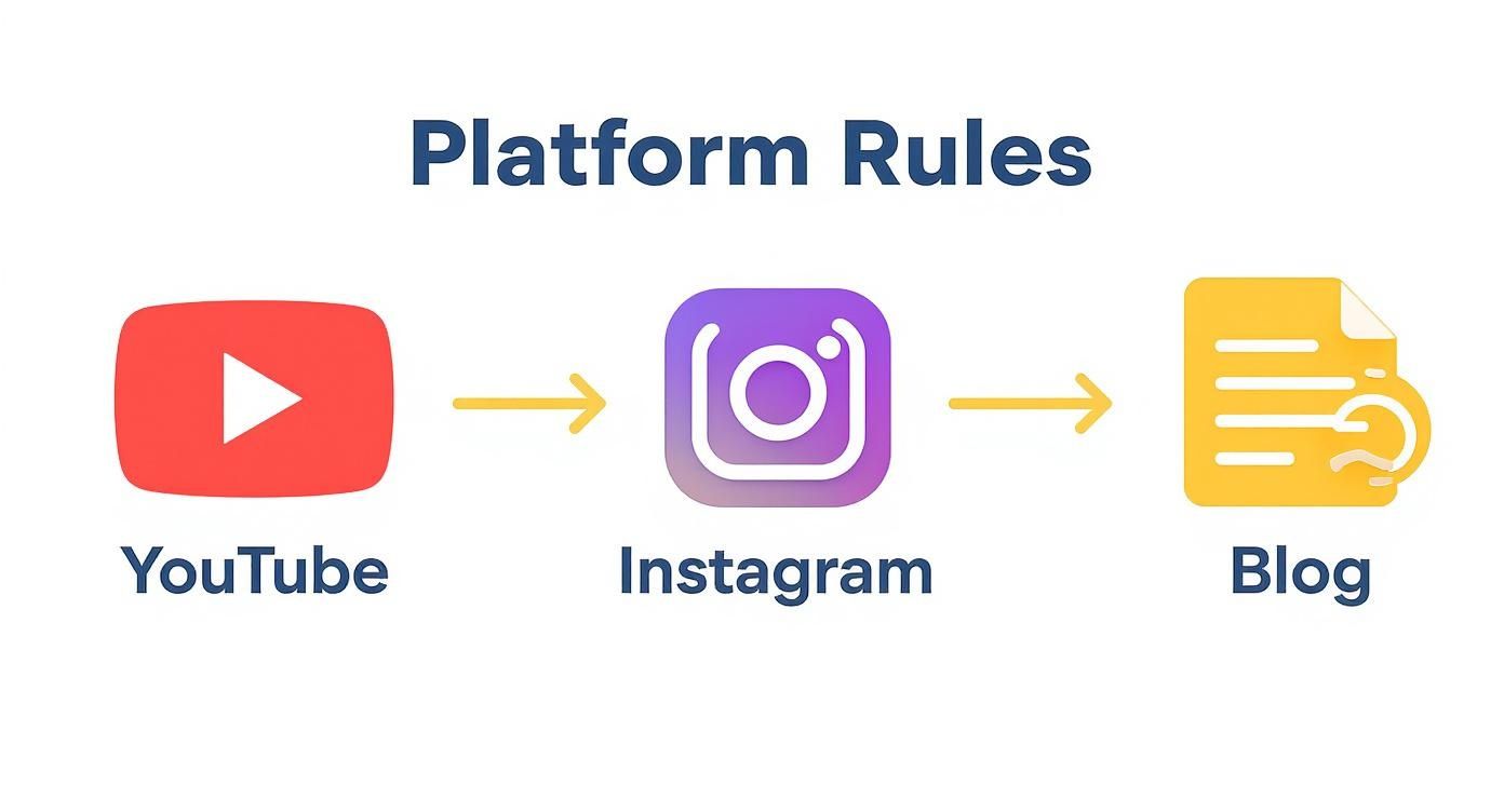
This visual flow really drives home the unique design needs for YouTube, Instagram, and blogs, showing why a one-size-fits-all thumbnail just doesn't work.
Leveraging Templates and Batch Creation
For anyone trying to maintain brand consistency, AI templates are a massive win. You can set up a master template with your brand’s fonts, colors, and logo placement. Then, for every new piece of content, you just ask the AI to generate a fresh background image that fits the topic and pop it into your template. Done.
Many of the 12 best AI image creation tools offer intuitive workflows to get this done quickly.
But where you really start saving time is with batch processing. This feature lets you generate a whole set of thumbnail variations at once. You can instantly test different:
- Color schemes: A version with warm tones vs. one with cool tones.
- Headlines: Trying out a few different text hooks to see what grabs attention.
- Backgrounds: A minimalist studio look vs. a busy, real-world scene.
This makes A/B testing almost effortless. You can create four or five totally distinct options in the time it used to take to design one. That gives you the data you need to figure out what your audience actually wants to click on. By combining smart prompts, AI editing, and batch creation, you build a workflow that's not just faster, but far more creative and effective.
You’ve put in the work and designed a thumbnail that looks fantastic. But hold on—the job isn't quite done yet.
How you save and export that image is a make-or-break final step. A file that’s too big will drag down your website’s speed and hurt your SEO. On the other hand, a file that’s squashed down too much will look blurry and amateurish, turning people away before they even click.
The sweet spot is a perfect balance: a sharp, clear thumbnail that loads in a blink. This final touch is what gets your design ready for the real world and makes sure your effort pays off.
Choosing the Right File Format
The file format you pick has the biggest say in both quality and size. There isn't one "best" choice for everything; it really depends on what's in your thumbnail. Getting to know the differences is the key to making the right call every time.
Here's a quick rundown of the usual suspects:
- JPG (JPEG): This is your best friend for photographs or any image with lots of colors and complex gradients. JPGs use what’s called “lossy” compression, which means they smartly toss out a little bit of data to create much smaller files. You can get a brilliant-looking image at a fraction of the size, which is a massive win for web performance.
- PNG: Go with PNG for graphics that have sharp lines, crisp text, or need a transparent background. PNGs use “lossless” compression, keeping every single pixel of original data. This gives you superior quality, especially for simple graphics, but the tradeoff is a larger file size.
- WebP: This is the newer kid on the block, created by Google, and it often gives you the best of both worlds. It handles both lossy and lossless compression incredibly well and supports transparency. The result? Files that are often 25-35% smaller than a JPG or PNG without any quality you can spot with the naked eye.
Honestly, for most thumbnails today, starting with WebP is your best bet. If you run into a platform that doesn't support it or have a very specific need, you can always fall back to JPG for photos and PNG for sharp graphics.
Compressing Your Image and Naming It Smartly
Once you’ve selected your format, it’s time to compress. Most design tools give you a "quality" slider (usually 0-100) when you export a JPG or WebP. Don't be scared to slide it down.
You'd be surprised how much you can lower it without seeing a difference. A setting between 70-85 is often the sweet spot, slashing the file size while keeping the image looking crisp. For a blog post thumbnail, I always try to keep the file size under 300 KB. It’s a great target for keeping your pages zippy.
Last but not least, name your file something descriptive before you upload it. Ditch thumbnail_final_v2.jpg and use something like how-to-make-thumbnail-images-guide.webp. It's a tiny thing that helps you stay organized and gives search engines a clue about what your image is, which is a nice little SEO boost.
The whole world is catching on to how important visuals are. The market for image generation tools was already valued at around USD 1.5 billion in 2023 and is on track to hit USD 4.8 billion by 2032. This explosion shows that every little detail—right down to how you export your file—is becoming a critical skill. Discover more insights about the image generation market to see how the pros are staying ahead.
Testing and Improving Thumbnail Performance
https://www.youtube.com/embed/XY3MFjPVvwc
Getting your thumbnail uploaded isn't the finish line—it's just the start. If you want real growth, you have to shift from just making cool images to building a data-driven strategy. It’s about moving past guesswork to figure out exactly what makes your audience want to click.
So, how do you do that? Testing.
Platforms like YouTube have built-in A/B testing features for a reason. They let you run two different thumbnail designs head-to-head for the same video. This is, without a doubt, the single best way to discover what your viewers actually respond to.
By running these tests, you're gathering hard data instead of just going with your gut. You might find out that thumbnails with a person's face crush ones with only text, or that a loud, yellow background consistently beats a more muted blue. Those are the kinds of insights that change the game.
What Metrics Actually Matter?
When you start testing, you need to know which numbers to watch. Zeroing in on the right metrics tells the true story of your thumbnail's performance and its impact on your content's reach.
Here are the big ones to keep an eye on:
- Click-Through Rate (CTR): This is your bread and butter. It’s the percentage of people who saw your thumbnail (an impression) and actually clicked. It's the most direct measurement of a thumbnail's hook.
- Impressions: This number tells you how many times your thumbnail was shown to potential viewers. A killer thumbnail can actually encourage the platform's algorithm to show your content to more people over time.
- Audience Retention: While not directly tied to the thumbnail itself, this one is critical. A super-high CTR followed by a massive drop-off in watch time is a red flag. It might mean your thumbnail was misleading, and that creates a bad experience for viewers.
Your goal is a high CTR that leads directly to strong audience retention. This combination sends a powerful signal to the algorithm: your content delivers on the promise your thumbnail makes.
Turning Data Into Smarter Designs
Once you start collecting this data, you can begin refining your whole approach. If you notice that thumbnails using bold, three-word headlines consistently pull a 2-3% higher CTR, that’s not an accident. That’s a pattern you can build into your design system for everything you create going forward.
Think of each test as a new piece of the puzzle. Over time, you build a unique blueprint for what your specific audience loves. This transforms thumbnail creation from a one-off chore into a continuous cycle of improvement.
If you really want to get granular with data-driven improvements, you should learn how to A/B test your video content in more detail. This iterative process is how you develop a style that doesn't just look good, but consistently performs.
A Few Lingering Questions About Thumbnails
Even when you've got a solid plan, a few questions always seem to pop up during the design process. Getting these small but crucial details right can make a huge difference in how your final thumbnail performs. Let's tackle some of the most common ones I hear.
Think of this as the final polish. Nailing these points will help you move forward with more confidence, knowing every choice you make is intentional and, most importantly, effective.
Should I Put My Face in My Thumbnail?
Nine times out of ten, yes. There's a reason you see so many faces on YouTube. Thumbnails with human faces, especially ones showing a clear, strong emotion, almost always get a higher click-through rate. Our brains are just wired to connect with other faces. A simple shot of you looking surprised, excited, or deeply curious creates an instant emotional hook that's hard to ignore.
That said, it's not a hard and fast rule. If your content is a highly technical tutorial, a slick product showcase, or maybe something more abstract like a visual art piece, a clean graphic or a great shot of the product might work better. The only way to know for sure is to test both and see what your audience actually responds to.
How Much Text Is Too Much Text?
Here's a simple rule I live by for thumbnail text: less is more. You should be aiming for three to five powerful words, max. The goal is to spark curiosity or scream the value of your content, not to tell the whole story. Remember, most people are scrolling on a tiny phone screen.
If someone has to stop and squint to read your thumbnail, you've already lost them. The text is a hook, not a summary. Treat it like a blockbuster movie headline.
For instance, instead of writing "A Complete Tutorial on How to Fix a Leaky Faucet," go with something punchier like "LEAKY FAUCET FIX!" It's short, direct, and far more effective at a glance.
What Are the Best Colors to Use?
There's no single magic color, but the best ones always do two things: create high contrast and match the emotion of the content. Bright, saturated colors like a vibrant yellow, a bold orange, or a strong blue tend to do really well because they physically pop out of a crowded feed.
A classic and highly effective trick is to use complementary colors—think opposites on the color wheel, like blue and orange or a deep purple and a bright yellow. This pairing creates a natural visual pull that our eyes are drawn to. Just make sure your color palette makes sense for your brand and the topic. A calming meditation guide probably shouldn't be using alarming red and black.
Ready to stop guessing and start creating visuals that actually work? AI Media Studio lets you generate professional-quality thumbnails with just a few words. Get started for free today and see how easy it is to make your content stand out.