When we talk about resizing images for the web, it's really a two-part process. First, you shrink the image's dimensions—its actual width and height in pixels (say, from a massive 4000px down to a more web-friendly 1200px). Then, you compress the file itself to make it as small as possible without turning it into a pixelated mess.
The goal is simple: pick your tool, nail the dimensions for your site, and export the image with the smallest file size you can get away with.
Why Resizing Web Images Is Non-Negotiable
We’ve all been there—staring at a blank screen, waiting for a website to load. More often than not, huge, unoptimized images are the culprit. But this isn't just about a few seconds of impatience. Slow-loading images actively sabotage your website's success and are one of the single biggest offenders when it comes to poor performance.
The Direct Link Between Image Size and Site Speed
Every extra kilobyte an image carries adds to the page's total weight. This weight directly translates into longer load times before a visitor can actually interact with your content. It's a particularly big problem for anyone browsing on a mobile device, where connections are often spottier and patience is always thinner.
Think about a typical e-commerce store. The product photos are stunning, crisp, and high-resolution, probably shot with a professional camera. If those images are uploaded straight to the site without being resized, a single product page could easily take five, ten, or even more seconds to fully load. A potential customer trying to shop on their phone is going to bail long before that first photo even materializes.
This is where Google's Core Web Vitals come into the picture. One of the most important metrics is Largest Contentful Paint (LCP), which measures how long it takes for the biggest visual element on the page—usually a hero banner or main product image—to appear. Chunky images kill your LCP score, and a bad score can directly hurt your rankings in search results.
How Image Size Impacts Website Performance
The connection between file size and performance isn't just theoretical. It shows up in real-world data that affects your bottom line.
| Metric | Impact of Large Images | Benefit of Resized Images |
|---|---|---|
| Page Load Time | Significantly increased, leading to higher bounce rates. | Drastically reduced, keeping users on the page. |
| User Experience | Frustrating and slow, especially on mobile devices. | Fast, smooth, and professional. |
| Conversion Rate | Decreases sharply with every second of delay. | Improves as the path to purchase becomes frictionless. |
| SEO Ranking | Negatively impacted by poor Core Web Vitals (LCP). | Positively influenced by fast-loading pages. |
| Bandwidth Costs | Higher costs for hosting due to more data transfer. | Lowered hosting and CDN expenses. |
Looking at the numbers makes it clear: optimizing images is a crucial business activity, not just a technical chore.
The Tangible Cost of Slow Images
The data on user behavior is pretty damning. Studies consistently show that as page load time increases from just one second to three, the probability of a user leaving jumps by 32%. For mobile users, a one-second delay can torpedo conversion rates by up to 20%. If you want to dig deeper, the latest technical SEO statistics really drive these points home.
For anyone running a website, the message is loud and clear: You have to master resizing images. It's a foundational skill for creating a great user experience, driving more conversions, and earning better visibility in search.
At the end of the day, properly sized images create a faster, more professional experience that keeps people engaged. It encourages them to buy your product, sign up for your newsletter, or actually read the content you worked so hard to create. Skipping this step is like putting a giant speed bump right in front of your own door—you're just making it harder for people to come inside.
Choosing Your Image Resizing Toolkit
Picking the right tool to resize your images can feel like a huge task, but it really just comes down to your needs and how you work. You absolutely don't need some complex, pricey software to get stunning results. In fact, some of the best options out there are totally free and run right in your browser.
The trick is to match the tool to the job at hand. Are you just resizing a single headshot for your "About Us" page, or are you prepping 50 new product photos for a big launch? Your answer points you straight to the right solution.
Let's break down the main types of tools so you can figure out what works for you.
Free Online Image Resizers
For those quick, one-off jobs, nothing beats the ease of an online tool. These are my go-to when I need to prep a blog post image or a new social media banner without installing a bunch of software. They're fast, simple, and get the job done.
A classic I always recommend is TinyPNG. You just drag and drop your image, and it smartly shrinks the file size with almost no hit to the quality. Another fantastic choice is Adobe's free online resizer, which gives you simple, clear controls for setting exact pixel dimensions.
You'll love online tools for things like:
- Resizing a few images for a new blog post.
- Quickly optimizing a new profile picture.
- Shrinking an image file to send over email.
These tools are incredibly easy to use, but they usually lack advanced features like batch processing. If you're dealing with more than a couple of images at once, you’ll probably want something a bit more powerful.
Desktop Software for Full Control
When you need absolute precision and power, nothing beats dedicated desktop software. I'm talking about the heavy hitters like Adobe Photoshop, Affinity Photo, or the excellent free option, GIMP. These programs give you granular control over every single detail—from exact dimensions and compression levels to color profiles and sharpening.
This is the kind of control pros need. A photographer preparing a client gallery, for instance, has to ensure every single image is perfectly optimized and consistent. Desktop software lets you build and save presets, which makes resizing dozens of images way faster. It's the clear choice for anyone whose job regularly involves wrangling images.
Pro Tip: Resizing for the web is always a balancing act between quality and file size. Your goal is the smallest possible file that still looks crisp and professional. As a starting point, try reducing an image’s quality setting to around 70-80%. You'll often be amazed at how much smaller the file gets with no visible drop in quality.
Automated Plugins for CMS Platforms
If your website is built on a platform like WordPress, automated plugins are an absolute game-changer. I'm a huge fan of this approach because it saves so much time.
Tools like ShortPixel, Smush, or Imagify handle all the resizing and optimization for you, right as you upload an image to your site. You just set the rules once—for example, "all my blog post images should have a max-width of 1200px"—and the plugin takes it from there.
This "set-it-and-forget-it" method is perfect for busy website owners, bloggers, and content teams who have better things to do than manually resize every photo. It's a great example of how you can find the right tool for any workflow, whether you need deep control or total automation. To get a better sense of what's out there, you can explore some of the best image optimization tools for faster, SEO-friendly websites and see just how powerful these solutions have become.
A Practical Walkthrough of The Resizing Process
Before we jump into the nitty-gritty, let's clear up two terms that often get mixed up: image dimensions and file size. They sound similar, but they’re two different beasts.
Dimensions are simply the width and height of your image, measured in pixels (like 1920px by 1080px). File size is how much space that image eats up on your server, measured in kilobytes (KB) or megabytes (MB).
The goal is to first get the dimensions right for where the image will live on your site. Then, you shrink the file size without making the image look like a blurry mess. Nail both, and you've got the recipe for a snappy, professional-looking website.
This whole workflow can be broken down into a few simple stages.
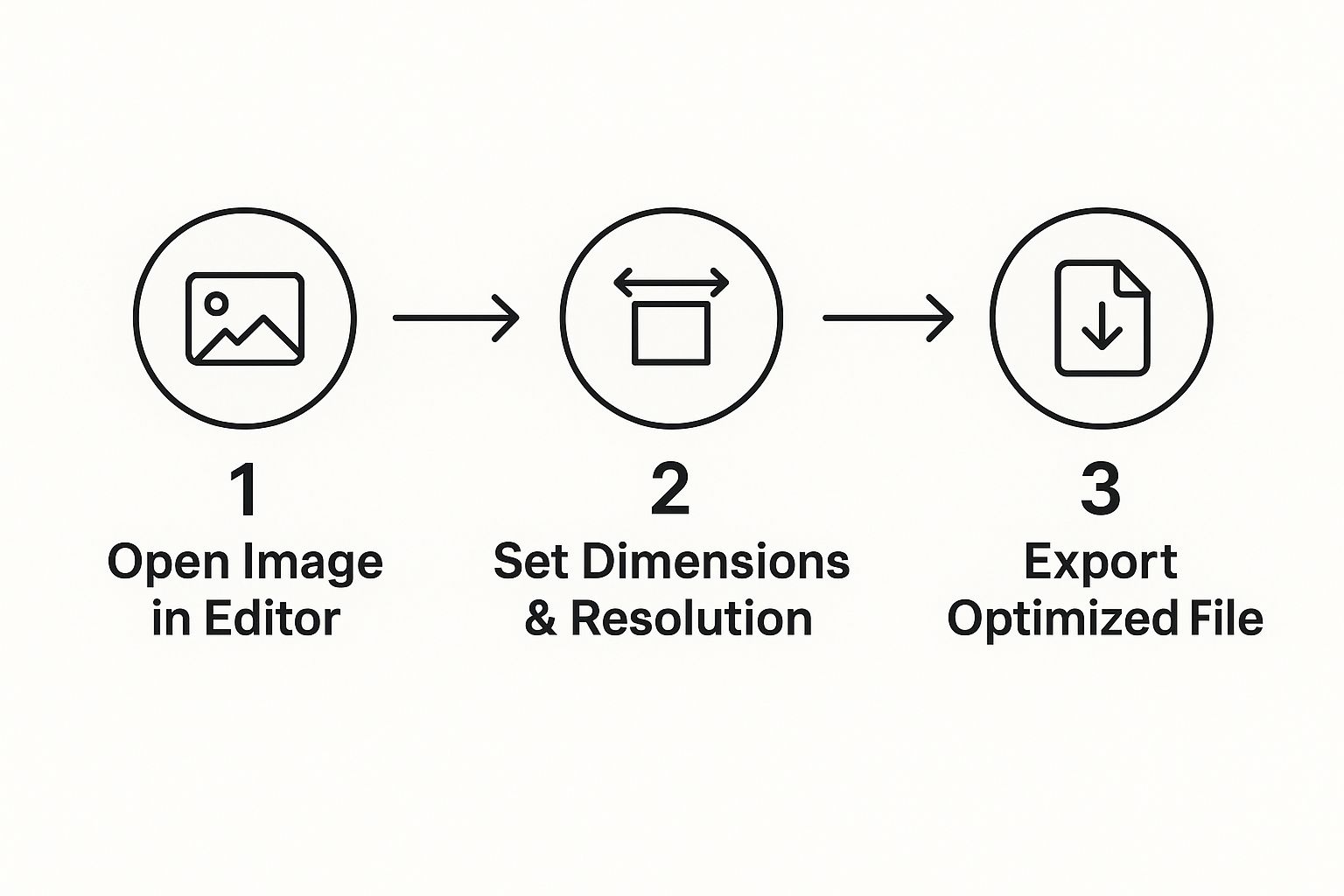
As you can see, it’s a pretty straightforward path from your original, high-quality photo to a lean, web-ready version. It’s a process you can—and should—repeat every time.
Let's Look at a Real-World Scenario
Okay, let's make this practical. You just shot a gorgeous photo for your new blog post. Straight out of the camera, it’s a monster: 6000px wide and a whopping 15MB. If you upload that directly, your page will load at a snail's pace. Not good.
So, let's prep it for a standard blog banner. Our targets are a width of 1200px and a final file size under 100KB.
A fantastic, free tool for this is Google's Squoosh. You’d upload your huge photo, and in the "Resize" options, just type 1200 into the width field. Squoosh is smart enough to calculate the height automatically to maintain the aspect ratio, so your photo doesn't get squashed or stretched.
And just like that, the dimensions are handled.
Here’s a golden rule: You can always make a big image smaller without losing much quality. But trying to make a small image bigger? That's a one-way ticket to a blurry, pixelated disaster. Always, always start with the largest, highest-resolution source file you have.
Finding That Sweet Spot: Quality vs. Compression
Once your dimensions are set, it’s time to tackle the file size through compression. Most tools have a "quality" slider, usually running from 0 to 100. This is where the magic happens.
Don't be afraid to play with this setting. You'll be amazed at how much you can reduce the file size by dropping the quality from 100 down to 75. For most images, the visual difference is so small that your visitors will never spot it. But your page load time will thank you.
Finally, you export the optimized image. In our example, by changing the width to 1200px and setting the quality to 75, our file size plummets from 15MB to a trim 95KB. Perfect. It’s now ready to go, looking sharp while loading fast.
If you find your resized images are still looking a bit flat after compression, you might need to explore other techniques. We cover some of those in our guide on how to improve image quality.
Common Image Dimensions at a Glance
To make things even easier, here's a quick cheat sheet for some of the most common image sizes you'll need for a website. Think of these as your starting targets.
| Image Use Case | Recommended Width (Pixels) | Target File Size (KB) |
|---|---|---|
| Full-Width Hero/Banner | 1920px | Under 250KB |
| Standard Blog Post Image | 1200px | Under 100KB |
| In-Content Image (Half-Width) | 800px | Under 80KB |
| Product Image (eCommerce) | 1000px | Under 100KB |
| Thumbnail/Preview Image | 400px | Under 40KB |
Keep in mind that these are general guidelines. Your specific website theme or layout might have slightly different requirements, but this table is a solid foundation for keeping your images optimized and your site performing at its best.
Optimizing Images Beyond Simple Resizing

Getting your image dimensions right is a huge first step, but it’s only half the battle. If you want a genuinely fast, professional website, you have to look beyond a simple resize and get into the other critical pieces of image optimization.
This is where you can gain a serious edge in site performance and SEO. We're talking about picking the right file type, using smart compression, and handling the little details that both search engines and users love. Think of it this way: resizing built the car's frame; now we’re tuning the engine for pure speed.
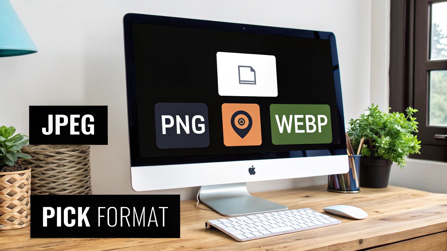
Choose the Right Image Format
The file format you choose has a massive impact on both file size and visual quality. They aren't all created equal, and using the right one for the job is a core skill for anyone working with web images. Luckily, you don't need to be a graphic designer to make the right call.
Here’s a quick rundown of the most common formats you’ll encounter:
- JPEG (or JPG): Your go-to for pretty much any photograph. It uses lossy compression, a clever method that removes some image data to shrink file sizes dramatically. This is perfect for complex images with tons of colors and gradients, like a landscape photo or a detailed product shot.
- PNG: This is your best bet for graphics with sharp lines, text, or—most importantly—transparent backgrounds. Think logos, icons, and diagrams. It uses lossless compression, so it keeps every single pixel perfect, but this often means larger files than JPEGs.
- WebP & AVIF: These are the modern, next-gen kids on the block, built from the ground up for the web. They offer far superior compression, often creating files 25-50% smaller than JPEGs or PNGs without losing quality. Most modern browsers fully support them, and many optimization plugins can automatically convert your images for you.
For a deeper dive, check out our guide on the best image format for the web, which breaks down the pros and cons of each.
Find the Sweet Spot with Compression
Compression is the art of shrinking a file's size while keeping as much visual quality as you can. Your goal is to find that "Goldilocks" zone where the file is tiny, but the image still looks crisp and clean to the human eye.
The most important takeaway is that you are almost always aiming for the highest possible quality at the lowest possible file size. Don't be afraid to experiment with a tool's "quality" slider; you can often drop it to 70-80% without anyone noticing the difference.
This simple adjustment can be the difference between a 500KB image and one that's just 80KB. That might not sound like a lot on its own, but multiply it by a dozen images on a single page, and the performance gains are absolutely enormous.
Don't Forget File Names and Alt Text
Finally, let's talk about two of the most overlooked—yet critical—optimization steps: naming your files descriptively and writing good alt text. These have zero impact on how an image looks, but they have a huge impact on your SEO and website accessibility.
Instead of uploading a photo named IMG_8432.jpg, give it a name that actually describes the picture, like blue-suede-running-shoes.jpg. This gives Google valuable context about what the image contains.
Likewise, alt text (or alternative text) is what shows up if an image can't load. More importantly, it's what screen readers announce to visually impaired users. Good alt text is descriptive but concise.
- Bad Alt Text: "shoes"
- Good Alt Text: "A pair of blue suede running shoes with white laces on a wooden floor."
Taking just a moment to handle these details makes your site more welcoming to all users and helps your images show up in Google Images, driving more organic traffic right to your door.
Automating Your Workflow with Batch Processing
Okay, resizing a handful of images for a quick blog post is one thing. But what happens when you’re staring down a folder of 50 high-res photos for a new property listing? Or 100 product shots for a big e-commerce launch?
Doing them one by one isn't just slow—it's a mind-numbing waste of time you could be spending on literally anything else. This is where you learn to work smarter, not harder.
The secret? Batch processing. It’s how you reclaim those lost hours. You set the rules once—size, quality, format—and then let the software apply them to an entire folder of images simultaneously. What used to be a multi-hour chore becomes a quick, hands-off task.
Leverage Desktop Software for Power Batches
When you need absolute control and precision, desktop software is your best friend. Powerhouses like Adobe Photoshop and Affinity Photo have incredibly robust batch processing features built right in. In Photoshop, the magic happens through a feature called Actions.
Let’s go back to that real estate agent with 50 photos. Instead of the soul-crushing process of opening, resizing, and saving each one, you’d do this:
- Record an Action: First, you open a single image and simply record your steps. For instance: resize to 1200px wide, apply a subtle sharpening filter, and save for web at 75% quality.
- Run the Batch: Next, you point Photoshop to your folder of 50 images, select the action you just recorded, and click "Play."
That’s it. Photoshop will meticulously repeat those exact steps for every single photo, dropping the newly optimized versions into a folder you designate. A job that could have eaten your whole afternoon is done before you finish your coffee.
The real power of batch processing lies in its consistency. You define your ideal optimization settings just once, and then you can flawlessly replicate them across dozens or even hundreds of images, ensuring every photo on your site is perfectly uniform and performs beautifully.
Set It and Forget It with Automated Tools
If you’d rather not even open an image editor, plenty of tools can automate the entire process for you. This is a game-changer, especially for anyone running a site on a platform like WordPress.
Plugins like ShortPixel or Imagify plug right into your media library. Once you set them up, they get to work automatically, resizing and compressing every single image you upload based on your rules.
For example, you can tell the plugin to cap all uploads at a max width of 1500px, convert them to the speedy WebP format, and strip out bulky, unnecessary metadata.
From that point forward, your image optimization is completely on autopilot. It’s the ultimate time-saver for busy bloggers, marketers, and business owners, guaranteeing every visual is perfectly sized from the moment it hits your site.
Common Questions About Resizing Web Images
Even after you get the hang of resizing images, a few tricky questions always seem to pop up. Think of this as your quick-reference guide for those common head-scratchers. We’ll cut through the confusion with clear, simple answers so you can get your images optimized and online with confidence.
What Is the Difference Between Resizing and Compressing an Image?
It's really easy to mix these two up, but they do completely different jobs.
Resizing an image means changing its physical dimensions—its actual width and height in pixels. For instance, you might take a huge 5000px photo straight from a camera and resize it down to 1200px wide to fit a blog post.
Compressing, on the other hand, shrinks the file size (the number of kilobytes or megabytes) by cleverly removing redundant data. It does this without changing the pixel dimensions. The best workflow is to always do both: first, resize the image to the correct dimensions, then compress it to make the file as lightweight as possible for fast loading.
What DPI Should I Use for Web Images?
This is probably one of the most common points of confusion out there, but the answer is surprisingly simple: DPI (Dots Per Inch) is completely irrelevant for web images.
DPI is a metric that only matters for printing. Digital screens on phones, tablets, and computers couldn't care less about it—they only pay attention to pixel dimensions.
While many design tools default to exporting web images at 72 DPI, the browser will always render your photo based on its pixel width and height. So, instead of wasting a second thinking about DPI, focus all your energy on getting the pixel dimensions right for where the image will be displayed on your site.
The bottom line: Stop worrying about DPI for anything you're putting on a website. Focus on pixel dimensions (e.g., 1200px wide) and file size (e.g., under 100KB), and you'll be on the right track.
Can I Make an Image Bigger Without Losing Quality?
In almost all cases, no. When you try to enlarge a standard image like a JPEG or PNG, the software has to guess and invent new pixels to fill the extra space.
This process, called interpolation, nearly always results in a blurry, pixelated, or soft-looking image. It’s essentially trying to create detail that just isn’t there in the first place. Your best bet is to always start with a large, high-resolution photo and resize it down.
While some modern AI-powered upscaling tools can help in a pinch, they can't perform miracles. This principle is just as crucial in other creative projects, like when you're adding text overlays and need a crisp, clear background. You can learn more about this by reading our guide on adding text to video, where starting with high-quality assets is equally important.
Ready to create stunning visuals for your website or marketing campaigns in seconds? With ai-media-studio, you can generate professional-quality images from simple text prompts, choosing from over 50 unique styles without needing any design skills. Get started for free and see how easy it is to elevate your content. Try ai-media-studio today!