Why Images Transform Online Learning Experiences
Imagine being handed a dense, text-only manual on how a four-stroke engine works. Your eyes would probably glaze over before the first page. Now, picture that same information paired with a clear, labeled diagram showing each stage: intake, compression, power, and exhaust. The concept instantly becomes more solid and easier to understand. This is the fundamental power of using images for online learning—they turn abstract ideas into concrete knowledge.
Our brains are built for visual information. In fact, we can process images an incredible 60,000 times faster than plain text. In a digital classroom, where an instructor can't use hand gestures or point to a physical whiteboard, visuals become the essential bridge connecting the educator and the learner. They do more than just decorate a page; they guide attention, make complex topics simple, and create memorable mental hooks.
Boosting Retention and Engagement
When learners can connect a piece of information with an image, they are far more likely to remember it. This phenomenon, known as the Picture Superiority Effect, shows that people remember pictures with much greater accuracy than they remember words. This isn't just a theory; it directly affects the success of digital education. For example, well-designed e-learning courses often reduce completion time by 40-60% compared to traditional classrooms, partly because strategic visuals help clarify difficult subjects and keep learners focused. You can explore more about how multimedia accelerates learning and find other insightful e-learning statistics on Wooclap.
Making Connections Beyond Words
Effective images for online learning also build vital emotional and contextual links. An authentic photograph of a diverse team collaborating on a project can make a business course feel more relatable and human. A powerful historical photo can trigger an emotional response, making a lesson on a specific era more impactful than just a date on a timeline. These visual elements add context, create a more immersive atmosphere, and help learners see the real-world application of what they are studying. They turn passive content consumption into an active, engaging educational journey, ensuring that knowledge isn't just seen—it's understood and remembered.
The Visual Learning Revolution Taking Over Education

Something remarkable has been happening in education over the last few decades, and visuals are taking center stage. We're seeing a major shift away from dense, text-only materials toward visually engaging, interactive experiences that lead to better results. This isn't just a fleeting trend; it’s a fundamental change in how people expect to learn in a connected world. The numbers behind this shift are truly impressive.
Since 2000, the online learning market has experienced an incredible 900% growth, establishing itself as the fastest-growing segment of the global education industry. This expansion means the market is projected to include over 73.8 million users by the end of 2024. As this area grows, so does the need for high-quality images for online learning that can hold attention and simplify complex ideas. You can dive deeper into these figures and find other online learning statistics on Coursmos.
Why Visuals Drive Modern Learning
This boom in online education is directly linked to the power of visual communication. Today's learners, whether they're corporate trainees or university students, are used to getting their information from videos, infographics, and dynamic graphics. A plain page of text just doesn't meet their expectations anymore. Because of this, instructional designers and educators are completely rethinking their approach.
Smart organizations now see that investing in strong visual content isn't an extra cost—it's a critical part of designing an effective program. They’ve witnessed how a single, well-chosen image can determine whether a learning module succeeds or fails. For instance, one global consumer goods company uses custom images to produce brand-ready visuals at scale, dramatically speeding up content creation across hundreds of its brands. This visual-first method helps them connect with different audiences far more effectively.
Case Study: Corporate Training at Scale
Imagine a large company with employees spread all over the world. The main challenge is delivering consistent and effective training across different languages and cultures. Text-heavy materials are often slow to translate and can be easily misinterpreted. Images, on the other hand, act as a universal language.
A clear diagram showing a new safety procedure is understood almost instantly, whether the employee is in North America or Southeast Asia. This visual approach has enabled companies to make huge gains in training efficiency, cutting down on time and costs while improving how well the information is understood and remembered. It highlights a simple truth: powerful images for online learning are no longer just nice to have; they are essential for success.
Essential Image Types That Actually Drive Learning
Just as a carpenter has different tools for different jobs, an educator needs a varied toolkit of visuals. Choosing the right **images for online learning** depends entirely on your goal. Are you trying to explain a process, evoke an emotion, or simplify data? Not all visuals are created equal, and matching the image type to the learning objective is what separates decorative fluff from a powerful educational aid.Think of it this way: using a stock photo of a smiling person to explain the water cycle is a missed opportunity. A step-by-step diagram, however, instantly clarifies the concept. The most effective visuals serve a specific instructional purpose, guiding the learner toward understanding. This means moving beyond generic placeholders and selecting images that actively participate in the teaching process.
To help you choose the right visual for your needs, here's a quick comparison of the most common image types used in learning.
| Image Type | Primary Use | Engagement Level | Production Difficulty | Best For |
|---|---|---|---|---|
| Authentic Photography | Building emotional connection and showing real-world context | Moderate | Low to High | Humanizing concepts, showing diversity, illustrating real-life scenarios |
| Process Visuals | Explaining sequences, workflows, or systems | High | Moderate | Breaking down complex procedures, illustrating cause-and-effect, training |
| Data Visualizations | Simplifying complex data and highlighting trends | Moderate to High | Low to Moderate | Presenting statistics, comparing figures, showing growth or decline |
| Interactive Images | Encouraging active exploration and discovery | Very High | High | Detailed anatomical diagrams, complex machinery, multi-layered maps |
This table shows a clear trade-off: highly engaging visuals like interactive images often require more effort to produce. However, even simple but well-chosen visuals like authentic photos can make a significant impact on how learners connect with the material.
From Abstract to Concrete: Process Visuals
When a concept involves a sequence or a system, text alone can be confusing. Process visuals, such as diagrams, flowcharts, and infographics, are designed to make the abstract concrete. They transform a wall of text describing a procedure into an intuitive, step-by-step map that learners can follow.
For example, a simple flowchart can explain a complex customer service protocol more effectively than three paragraphs of text. These visuals reduce cognitive load, allowing the brain to focus on understanding the system rather than just trying to organize the information.
Building Connections: Authentic Photography
While diagrams explain the "how," authentic photography often communicates the "why." Generic, overly polished stock photos can feel sterile and disconnected from reality. In contrast, authentic, high-quality photographs showing real people in genuine situations build an emotional bridge to the content.
A photo of a diverse team collaborating on a real project makes a lesson on teamwork feel relevant and human. This authenticity helps learners connect with the material on a personal level, a key factor in motivation and memory retention.
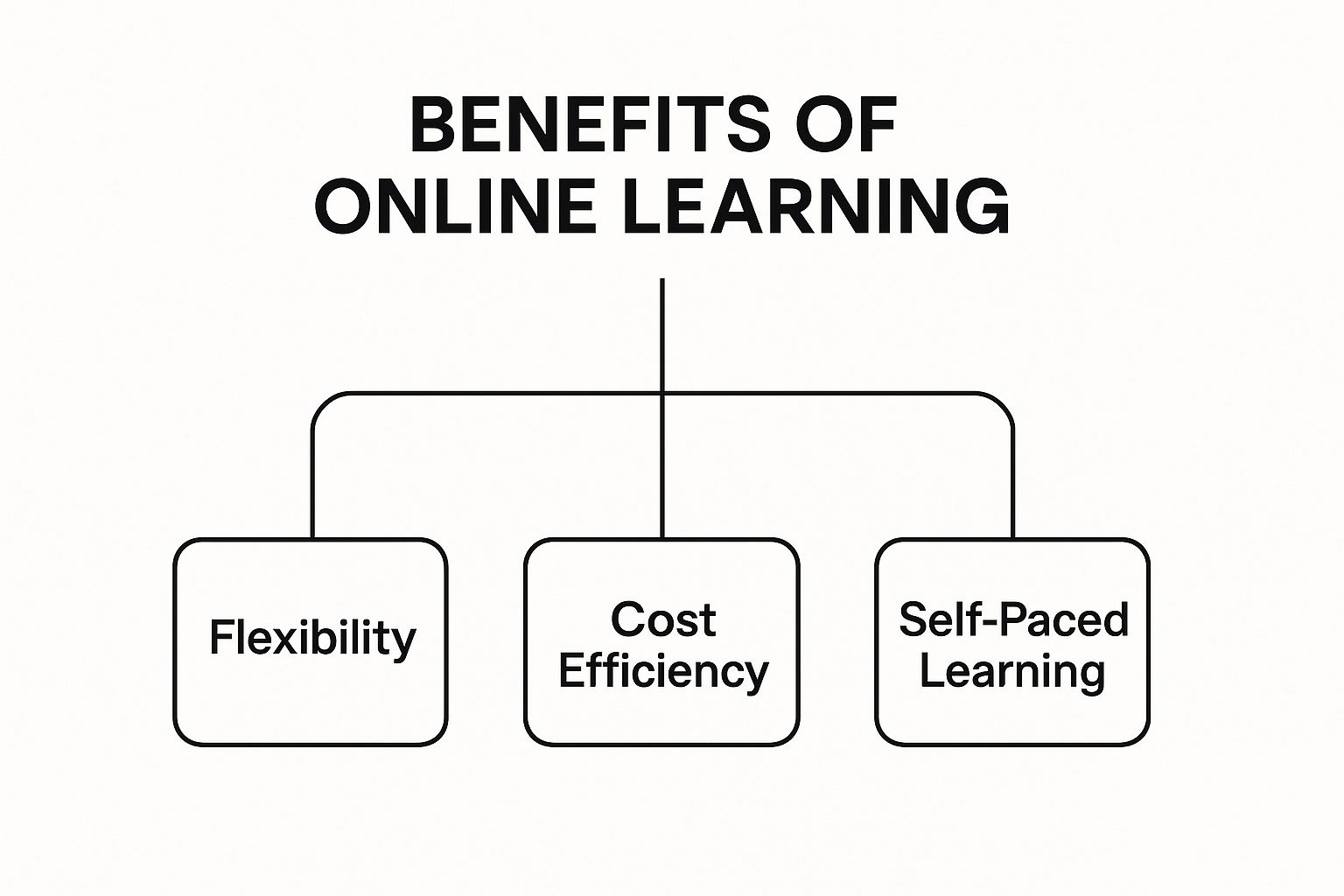
This infographic shows how core benefits like flexibility and self-paced learning are central to the online education experience.
Clarifying Complexity: Data Visualizations and Interactive Images
Numbers and statistics can be intimidating. Data visualizations, such as charts and graphs, translate complex datasets into easily digestible insights. A well-designed bar chart comparing market growth over five years is understood far more quickly than a dense table of figures.
Furthermore, interactive images take engagement a step further. Imagine a labeled anatomy diagram where learners can click on different parts to reveal more information. This active participation transforms passive viewing into an act of exploration, solidifying knowledge through direct interaction. By selecting the right type of images for online learning, you create a richer, more effective, and memorable educational journey.
Creating Visuals That Actually Enhance Learning

Turning a simple graphic into a powerful learning tool is where thoughtful design meets cognitive science. Creating effective images for online learning isn't about just finding something pretty; it's about making deliberate choices that direct attention and boost comprehension. A visual that truly works is built on principles that help the brain absorb information more easily.
This process starts with the psychology behind design. Color, for instance, has a huge impact. A calm, muted palette with high-contrast accent colors can help learners zero in on key information. On the other hand, a chaotic jumble of bright colors can be distracting and increase cognitive load. The aim is to use color with purpose, creating a visual hierarchy that guides the learner’s eye to what’s most important.
Balancing Design and Functionality
Beyond color, other design elements are just as critical for creating effective educational graphics. Great design strikes a careful balance between looking good and being functionally clear.
- Typography: The fonts you select must be easy to read on any device, from a large desktop monitor to a small smartphone screen. Sans-serif fonts like Arial or Open Sans are often recommended for digital text because their clean lines reduce eye strain during long reading sessions.
- Composition: Think of your image as a storyteller. Composition techniques like the rule of thirds or leading lines can draw the eye to the most vital part of the visual. A well-composed image feels natural and directs focus without the learner even noticing.
- Accessibility: Your visuals need to be usable by every student. This means adding descriptive alt text for screen readers, using high color contrast for visually impaired learners, and avoiding text embedded within images that assistive technologies can't read.
Technical Polish for a Seamless Experience
The technical side of your images for online learning is just as crucial as the design. A beautiful, high-resolution image that takes forever to load can frustrate learners and break the flow of a lesson. File size optimization is essential; images should be compressed to load quickly without a noticeable drop in quality.
Furthermore, responsive design makes sure your visuals look great on any device. An image should automatically resize to fit the screen it's on, keeping its clarity and impact. By mixing smart design with sound technical practices, you can create a smooth and effective visual learning journey. For those who want to produce unique visuals quickly, a free AI art generator can be a great way to create custom graphics for your specific needs.
Smart Strategies for Finding and Using Images Legally
The search for high-quality images for online learning can feel like tiptoeing through a minefield of copyright laws and puzzling licenses. A single misstep could lead to legal trouble or unexpected bills. The solution is to understand the world of image sourcing—from free collections to paid libraries—and know exactly what rights and duties come with each image you use.
Think of image licenses as different kinds of permission slips. Some give you total freedom, while others have specific rules you must follow. Breaking down these options will clarify your choices and help protect your work from legal issues.
Free vs. Paid: Navigating Your Options
Free image resources like Unsplash or Pexels offer a treasure trove of quality photos. The most obvious benefit is the cost: they are completely free. However, the selection can sometimes feel generic or limited, and you might see the same photos used across many different websites.
On the other hand, paid stock photo sites like Getty Images or Adobe Stock offer vast, professionally managed libraries with strong legal protections. When you buy an image, you're also buying a license that clearly spells out its permitted uses, giving you valuable peace of mind. The main drawback is the cost, which can become a significant expense.
To help you decide, this table outlines the main licensing types you'll encounter. It compares their costs, usage rights, and attribution rules so you can pick the best fit for your educational content.
| License Type | Cost Range | Commercial Use | Attribution Required | Modification Rights |
|---|---|---|---|---|
| Public Domain (CC0) | Free | Yes | No | Yes |
| Creative Commons (CC) | Free | Varies by license | Often, yes | Varies by license |
| Royalty-Free (RF) | One-time fee | Yes | No | Yes |
| Rights-Managed (RM) | Per-use fee | Specific, limited | No | Specific, limited |
The key takeaway from this table is the trade-off between freedom and cost. Public Domain offers the most freedom for no cost, while Rights-Managed provides exclusive use for a higher, recurring fee. Royalty-Free and Creative Commons licenses sit in the middle, offering a balance of flexibility and specific requirements.
Understanding Creative Commons
Creative Commons (CC) licenses are a favorite among educators. They allow creators to share their work generously while still retaining some control over how it's used. The most important rule here is to always check the specifics of the CC license. Some licenses only require you to credit the creator (attribution), while others may restrict commercial use or any modifications to the original work.
Ultimately, choosing the right source depends on your budget, your project's specific needs, and how much legal risk you're willing to accept. For anyone creating specialized educational or marketing materials, taking the time to understand these options is essential. A smart sourcing strategy ensures your images for online learning are not just compelling, but also fully compliant with the law.
Using AI to Create Custom Educational Images
The journey from consuming content to creating it has been dramatically shortened by artificial intelligence. For educators, this opens up a world of possibilities for producing custom images for online learning without needing a design degree or expensive software. AI image generators can become a powerful partner in crafting visual aids, but getting high-quality, relevant results means learning how to communicate with them effectively.
Think of an AI image generator as an incredibly fast and talented illustrator who needs a precise set of instructions. Your text prompt is your creative brief. A vague request like "a picture of a cell" will lead to a generic, unhelpful visual. However, a specific, detailed prompt that describes the subject, style, and composition will produce a graphic ready for the classroom.
This need for unique visuals comes at a time of explosive growth. The COVID-19 pandemic fueled an industry expansion of over 200% in online learning within just five years. In 2022, the U.S. online learning market was valued at $100 billion and is projected to climb to $686.9 billion by 2030. You can explore more of these powerful online learning industry statistics on DevlinPeck.com. This rapid expansion means educators need efficient ways to develop engaging materials.
Leading AI Platforms and Prompting Basics
Several platforms are at the forefront of AI image creation, each with its own strengths. Tools like Midjourney are known for producing artistic and highly stylized outputs, while DALL-E 3 excels at understanding complex, conversational prompts. Another key player is Stability AI, which offers powerful models for generating both realistic and creative images.
Here is an example of the interface for one of Stability AI's powerful tools.
The interface shows how you can enter a text prompt and choose from different styles to guide the AI, demonstrating the blend of user creativity and machine execution.
When crafting prompts for educational visuals, clarity is your best tool. Instead of asking for "a cell," a much better prompt would be: "A detailed cross-section diagram of an animal cell, infographic style, with clear labels for the nucleus, mitochondria, and cell membrane, on a clean white background." This level of detail ensures the output is both accurate and useful for teaching. You can apply similar principles to generate visuals for other purposes, as our guide on creating AI images for social media demonstrates.
Combining AI Efficiency with Human Insight
The most effective workflow marries the speed of AI with human expertise. Use an AI tool to generate a base image or several variations of a concept in seconds. Then, select the best option and use simple editing tools to add text, arrows, or other important highlights. This approach maintains educational accuracy while saving you countless hours. By mastering simple prompting techniques, you can produce a steady stream of custom images for online learning that perfectly align with your lessons and capture your students' attention.
Your Action Plan for Visual Learning Success
Knowing the theory is one thing, but putting it into practice is what creates real change. This final section is your roadmap to take everything you've learned about images for online learning and turn it into tangible results. The goal is to move from understanding the 'why' to mastering the 'how' with a solid process for elevating your course content.
Audit and Prioritize Your Visuals
Your first move is to take stock of what you already have. A simple visual audit can quickly highlight the biggest opportunities for improvement. Grab a notepad or open a spreadsheet and review your courses, asking these questions:
- Consistency: Do your images look like they belong together? Is there a shared style and quality level?
- Relevance: Does every single image serve a clear purpose in teaching, or is it just taking up space?
- Accessibility: Is every image equipped with descriptive alt text for screen readers?
- Performance: Are heavy, unoptimized image files making your course pages slow to load?
Once your review is done, you'll have a clear list of what needs fixing. Prioritize the changes that will make the biggest difference for your learners. For example, replacing a dense wall of text with an easy-to-follow diagram will almost always provide more value than a minor color correction.
Establish a Sustainable Workflow
To keep your visuals sharp and effective over the long haul, you need a repeatable process. This is especially important for creating images, where consistency is the foundation of a professional look and feel.
Creating a simple image style guide is a game-changer. This document doesn't need to be complicated; it just needs to define key elements like your brand's color palette, approved fonts, and whether you prefer illustrations over photos. This guide ensures that everyone on your team—even if it's just you—produces visuals that are cohesive and polished. Your workflow should also include a final quality check to make sure every new image lines up with your guide before it's published. This structured approach helps you efficiently build a learning experience that truly supports your students.
Ready to create stunning, professional visuals for your courses in seconds? AI Media Studio offers over 50 art styles to produce high-quality, custom images that bring your lessons to life. Start creating for free today.