Designing Presentations That Wow: A Guide to Engaging Slides
Creating compelling presentations is crucial for effectively communicating your message and leaving a lasting impact. This roundup of practical presentation design tips offers actionable advice to elevate your slide decks from mundane to mesmerizing. Whether you're a seasoned presenter or just starting out, these insights will help you design presentations that truly wow your audience. Learn how strategic design choices can transform your slides into powerful communication tools, ensuring your message resonates and achieves its intended goal. We'll explore key concepts like visual hierarchy, strategic white space, and the power of storytelling to create presentations that inform, engage, and inspire.
This listicle provides specific, actionable presentation design tips you can implement immediately. We'll cover these key areas:
- The 10-20-30 Rule for concise presentations
- Visual Hierarchy and Typography for clear communication
- The One Idea Per Slide Principle for impactful messaging
- High-Quality Visual Content Strategy for audience engagement
- Strategic White Space Usage for a clean, professional look
- Consistent Color Palette and Branding for a cohesive experience
- Storytelling Through Slide Structure for a memorable narrative
- Data Visualization Best Practices for presenting information effectively
By applying these presentation design tips, you can craft presentations that not only convey information clearly but also captivate your audience and reinforce your key takeaways. Let's dive in!
1. The 10-20-30 Rule
The 10-20-30 Rule, popularized by Guy Kawasaki, offers a powerful framework for impactful presentations, especially crucial for those seeking effective presentation design tips. It suggests that presentations should contain no more than 10 slides, last no more than 20 minutes, and use a font size no smaller than 30 points. This constraint-based approach forces presenters to distill their message to its core, maximizing audience engagement and information retention. This rule isn't about restriction, but rather about impactful communication. It's about respecting your audience's time and cognitive capacity.
Why it Works
The human attention span is notoriously short. The 10-20-30 Rule acknowledges this by promoting conciseness and clarity. Ten slides provide a digestible amount of visual information, preventing cognitive overload. The 20-minute timeframe respects busy schedules and maintains audience focus. Finally, the 30-point font size ensures readability, even from the back of the room, enhancing accessibility for everyone. This combination of factors leads to a more impactful and memorable presentation.
Implementation Examples
This rule has found success in diverse environments. Venture capital pitches benefit from the enforced brevity, compelling investors to focus on the core value proposition. Executive briefings become sharper and more decisive. Product launch announcements gain impact by highlighting key features succinctly. Even TED-style talks, known for their time constraints, align perfectly with this principle.
Actionable Tips
- One Idea Per Slide: Distill each slide down to a single core message. This ensures clarity and prevents information overload.
- Practice Timing: Rehearse your presentation to ensure it fits within the 20-minute timeframe. Time yourself rigorously.
- Font Readability Test: Check your slides from the back of the room to ensure the 30-point font is easily readable.
- Visual Hierarchy: Utilize the large font size to establish a clear visual hierarchy, guiding the audience's eye through the information.
- Backup Slides: Prepare additional slides with supporting data or details to address potential questions during the Q&A session.
When to Use It
The 10-20-30 Rule is particularly effective when presenting complex information to a time-constrained audience. Situations where clarity and conciseness are paramount benefit greatly from this framework. While not a universal solution for every presentation scenario, it serves as a valuable guideline for enhancing audience engagement and achieving presentation objectives, making it a standout among presentation design tips.
2. Visual Hierarchy and Typography
Visual hierarchy and typography are crucial presentation design tips for guiding your audience's attention and enhancing comprehension. It involves strategically arranging text elements using varying font sizes, weights, and styles to create a clear flow of information, emphasizing key points while supporting details naturally fall into place. Effective typography transforms a simple slide into a visually engaging and easily digestible piece of communication.

Why it Works
Our brains naturally prioritize larger and more visually distinct elements. By using larger fonts for titles and key takeaways, and smaller fonts for supporting details, you create a clear path for the audience's eye to follow. This structured approach prevents cognitive overload and ensures that the most important information is absorbed effectively. Learn more about Visual Hierarchy and Typography.
Implementation Examples
Apple's product presentations masterfully employ clean typography to highlight key features and benefits. Consulting firms like McKinsey use visual hierarchy in their slide decks to present complex data in a clear and concise manner. Even academic conference presentations and corporate annual reports benefit from effective typography to improve information retention.
Actionable Tips
- Limit Font Families: Stick to a maximum of 2-3 font families for a cohesive and professional look.
- Font Size Ratios: Use consistent font size ratios (e.g., 48pt for titles, 32pt for subtitles, 24pt for body text) to establish a clear visual hierarchy.
- Consistent Spacing: Maintain uniform spacing between elements for a balanced and polished appearance.
- Readability Test: Test your slides on different devices to ensure readability across various screens and projectors.
- Contrast for Emphasis: Use contrasting colors or font weights (e.g., bold) to draw attention to important information.
When to Use It
Visual hierarchy and typography are essential for every presentation. Whether you're pitching a new idea, presenting data, or delivering a training session, a well-structured visual hierarchy will always improve audience comprehension and engagement. It's a fundamental principle of effective presentation design, applicable to all contexts.
3. One Idea Per Slide Principle
The One Idea Per Slide Principle is a fundamental presentation design tip that significantly enhances audience comprehension and engagement. This principle advocates for presenting only one main concept, idea, or message per slide. This focused approach prevents cognitive overload and allows the audience to fully process and understand each point before moving to the next, leading to a more impactful presentation. This principle contributes to a clear and concise narrative, making it a crucial element of effective presentation design.
Why it Works
The human brain processes information more effectively when presented in digestible chunks. By limiting each slide to a single idea, you respect your audience's cognitive capacity and avoid overwhelming them with too much information at once. This targeted approach improves information retention and allows for a more natural flow of ideas throughout the presentation. This clarity contributes significantly to a more engaging and persuasive delivery.
Implementation Examples
This principle is evident in many successful presentations. Steve Jobs' iPhone launch presentations masterfully employed this technique, focusing each slide on a key feature or benefit. TED Talks, known for their impactful messaging, often adhere to this principle, allowing ideas to resonate deeply with the audience. Even complex medical case studies presented at conferences benefit from this approach, ensuring clarity and understanding amongst professionals. Sales pitch decks are another prime example, with each slide typically highlighting a single compelling reason to invest.
Actionable Tips
- Start with a Clear Slide Title: The title should immediately convey the main idea of the slide, setting the stage for the supporting information.
- Use Bullet Points Sparingly: Limit bullet points to 3-5 per slide to avoid cluttering the visual space and maintain focus on the core message.
- Support Ideas with Relevant Visuals: Images, charts, and graphs can enhance understanding and make the presentation more visually appealing, reinforcing the core message.
- Practice Smooth Transitions: Ensure seamless transitions between slides to maintain the flow of information and prevent jarring shifts in focus.
- Remove Extraneous Information: Ruthlessly eliminate any content that doesn't directly support the main idea of the slide.
When to Use It
The One Idea Per Slide Principle is applicable to virtually any presentation scenario. Whether you're delivering a high-stakes pitch, sharing research findings, or simply updating your team on project progress, this principle helps ensure clarity and impact. While some presentations might require more detailed slides, this principle serves as a valuable guideline for maximizing audience engagement and achieving presentation objectives, solidifying its position among essential presentation design tips.
4. High-Quality Visual Content Strategy
A high-quality visual content strategy is crucial for impactful presentations. It involves using professional, high-resolution images, graphics, and multimedia to enhance and support your message. Quality visuals significantly improve audience engagement, comprehension, and emotional connection with the content. Elevating your presentation beyond simple text-based slides makes your information more memorable and persuasive.

Why it Works
Visuals are processed significantly faster than text. High-quality images and graphics capture attention and make complex information more accessible. They create a more immersive and engaging experience, enhancing the audience's understanding and retention of your key takeaways. This approach elevates the overall professionalism and credibility of your presentation.
Implementation Examples
Consider the captivating imagery used in National Geographic presentations. Architecture firms showcase projects with stunning visuals. Fashion brands leverage high-quality photography to communicate style and elegance. Even travel and tourism presentations rely heavily on breathtaking visuals to transport audiences. These examples highlight the power of visuals in conveying complex information effectively.
Actionable Tips
- Full-Bleed Images: Utilize full-bleed images for maximum visual impact, creating a more immersive experience.
- Relevance is Key: Ensure all images are directly relevant to the accompanying content, reinforcing your message.
- Optimize File Sizes: Optimize image and video file sizes for smooth playback, avoiding technical glitches during your presentation.
- Visual Consistency: Maintain a consistent visual style throughout your presentation to create a cohesive and professional look. Learn more about high-quality visual content strategy and optimizing your images.
- Respect Copyright: Always respect copyright and licensing agreements when sourcing visual content.
When to Use It
A high-quality visual content strategy is beneficial for nearly every presentation scenario. Whether you're pitching a business idea, presenting research findings, or delivering a training session, compelling visuals will enhance your message and connect with your audience on a deeper level. It’s a core element of effective presentation design tips. This is especially crucial when dealing with complex information or when emotional connection is paramount.
5. Strategic White Space Usage
Strategic white space usage, a core principle of minimalist design, is among the most impactful presentation design tips. It involves the intentional use of empty space – not necessarily white – on slides to create visual breathing room, enhance readability, and guide the audience's attention. This technique transforms cluttered slides into elegant and impactful visuals by prioritizing clarity and focus. Mastering white space can significantly elevate the effectiveness of your presentations.
Why it Works
Our brains process information more efficiently when it's presented in digestible chunks. White space acts as visual pauses, preventing cognitive overload. It separates elements, improves readability, and creates a sense of sophistication and calm. This allows key information to stand out, ensuring your message resonates with the audience.
Implementation Examples
Apple's product presentations exemplify the power of white space. Their slides often feature a single image or a few words against a clean background, maximizing visual impact. Luxury brands leverage white space to convey elegance and exclusivity. Minimalist architecture presentations use it to highlight clean lines and spatial relationships. High-end consulting firms employ white space in their decks to project professionalism and authority.
Actionable Tips
- Rule of Thirds: Imagine your slide divided into nine equal parts by two horizontal and two vertical lines. Place key elements along these lines or at their intersections for optimal visual balance.
- Empty Space: Aim to leave at least 20% of your slide space empty. This provides ample breathing room and prevents a cluttered look.
- Consistent Margins: Maintain consistent margins throughout your presentation to create a unified and professional appearance.
- Element Grouping: Group related elements together, separating them from other content blocks with white space to improve visual organization.
- Resist the Urge to Fill: Fight the temptation to cram every bit of information onto a slide. Embrace the power of less.
When to Use It
Strategic white space usage is a versatile technique suitable for various presentations. It's particularly effective when presenting complex data, showcasing visuals, or aiming for a polished, professional look. By strategically incorporating white space, you can create presentations that are both visually appealing and highly effective, making it an invaluable addition to your presentation design tips repertoire.
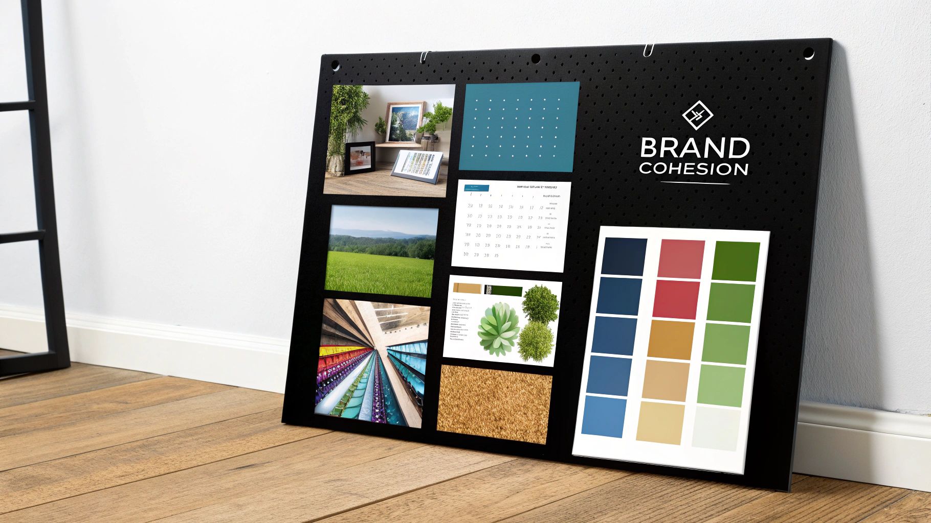
6. Consistent Color Palette and Branding
A consistent color palette is crucial for professional and impactful presentations. It involves using a limited set of harmonious colors throughout your slides, aligning with your brand guidelines or overall design objectives. This systematic approach creates visual unity, reinforces brand identity, and evokes specific emotions or associations, making it a key element among presentation design tips. A well-chosen color palette elevates your presentation from a collection of slides to a cohesive, branded experience.
Why it Works
Color plays a powerful role in communication. A consistent color palette enhances visual appeal, improves readability, and creates a sense of professionalism. It helps your audience quickly identify your brand and connect with your message on a deeper level. Just as consistent branding is vital across other platforms, maintaining color consistency in your presentations strengthens your overall brand image. You can learn more about consistent branding across different platforms with resources like this article on how to make social media graphics.
Implementation Examples
Many successful brands leverage consistent color palettes in their presentations. Think of IBM's blue-based presentations, Coca-Cola's red and white schemes, or Spotify's use of green and black. Even in fields like medicine, calming blues are often used to project trustworthiness and professionalism. These examples demonstrate how a consistent color palette contributes to a strong and recognizable brand identity within presentations.
Actionable Tips
- 60-30-10 Rule: Use a dominant color for 60% of your presentation, a secondary color for 30%, and an accent color for 10% to create visual balance.
- Cross-Platform Testing: Test your chosen colors on different screens and projectors to ensure they display correctly and maintain readability in various environments.
- Contrast Check: Ensure sufficient contrast between text and background colors for optimal readability, particularly for audience members with visual impairments.
- Color Palette Guide: Create a color palette guide for your team to ensure consistency across all presentations and marketing materials.
- Cultural Considerations: Be mindful of cultural color associations, especially for international audiences, as colors can have different meanings in various cultures.
When to Use It
A consistent color palette is essential for any professional presentation, especially those representing a brand or organization. It’s a core component of effective presentation design tips. While flexibility is important for creative presentations, maintaining a cohesive color scheme should always be a priority to ensure a polished and impactful delivery. This approach enhances brand recognition, improves audience engagement, and adds a touch of professionalism to your presentations.
7. Storytelling Through Slide Structure
Storytelling Through Slide Structure leverages narrative principles and logical flow to transform presentations from mere data delivery into compelling journeys. This approach elevates presentation design tips by weaving information into engaging narratives, fostering emotional connections, and dramatically improving audience retention. It's about crafting a story arc that resonates, not just presenting facts.
Why it Works
Humans are inherently drawn to stories. Narratives tap into our emotions, making information more relatable and memorable. By structuring your slides to follow a narrative arc, you create anticipation, build empathy, and ultimately leave a lasting impression on your audience. This method moves beyond simple information dissemination and fosters genuine connection.
Implementation Examples
Airbnb's early pitch decks, renowned for their compelling storytelling, exemplify this principle. Charity organizations frequently utilize narrative structures to connect donors with the human impact of their contributions. Product launches become captivating origin stories. Even presentations on change management gain traction by framing the transition as a journey of progress.
Actionable Tips
- Start with a Hook: Begin with a compelling question, a surprising statistic, or a captivating anecdote to instantly grab the audience's attention.
- Hero's Journey: Employ the classic "hero's journey" narrative structure, presenting a challenge, a journey of transformation, and ultimately, a resolution.
- Conflict and Resolution: Introduce an element of conflict or tension to create intrigue and then offer a resolution through your presented solution or idea.
- Smooth Transitions: Craft storytelling transitions between slides. Use phrases like "This led to..." or "However, we discovered..." to guide the narrative flow.
- Call to Action: Conclude with a clear and concise call to action, outlining the next steps or desired outcome.
When to Use It
Storytelling Through Slide Structure is highly effective when aiming to connect with your audience on an emotional level. When presenting persuasive arguments, introducing new ideas, or inspiring action, a narrative structure significantly amplifies your message. While not suited for every presentation type, this technique stands as a powerful tool for making your presentations more impactful and memorable, securing its place among essential presentation design tips.
8. Data Visualization Best Practices
Data visualization is the art and science of transforming quantitative information into accessible and actionable visual stories. Through charts, graphs, and infographics, complex datasets become readily understandable, supporting effective decision-making and enhancing presentations. Mastering this skill is essential for anyone seeking effective presentation design tips.
Why it Works
Visuals are processed significantly faster than text. Data visualization leverages this by presenting information in a format that is easily digestible and memorable. Effective visuals clarify complex trends and patterns, making data-driven arguments more compelling and persuasive. This approach promotes better understanding and facilitates informed decisions among audiences.
Implementation Examples
Leading consulting firms like McKinsey frequently utilize data visualization in their presentations to convey complex findings succinctly. Hans Rosling's dynamic TED talks showcased the power of animated data to illuminate global trends. Financial reports often rely on charts and graphs to present key performance indicators. Even scientific research presentations benefit from clear visuals to effectively communicate data insights.
Actionable Tips
- Choose the Right Chart: Select the chart type (bar, line, pie, etc.) that best represents your data and the message you want to convey.
- Declutter: Remove unnecessary gridlines, decorations, and excessive labels to ensure visual clarity.
- Strategic Color Use: Employ color to highlight key data points and create visual distinctions, improving readability.
- Insight First: Begin with the key takeaway you want your audience to understand, then support it with the visualized data.
- Cite Sources: Maintain credibility by always referencing the source of your data.
The infographic below displays the prevalence of various chart types in presentations. This data visualization emphasizes the importance of selecting the most effective chart for conveying specific insights.
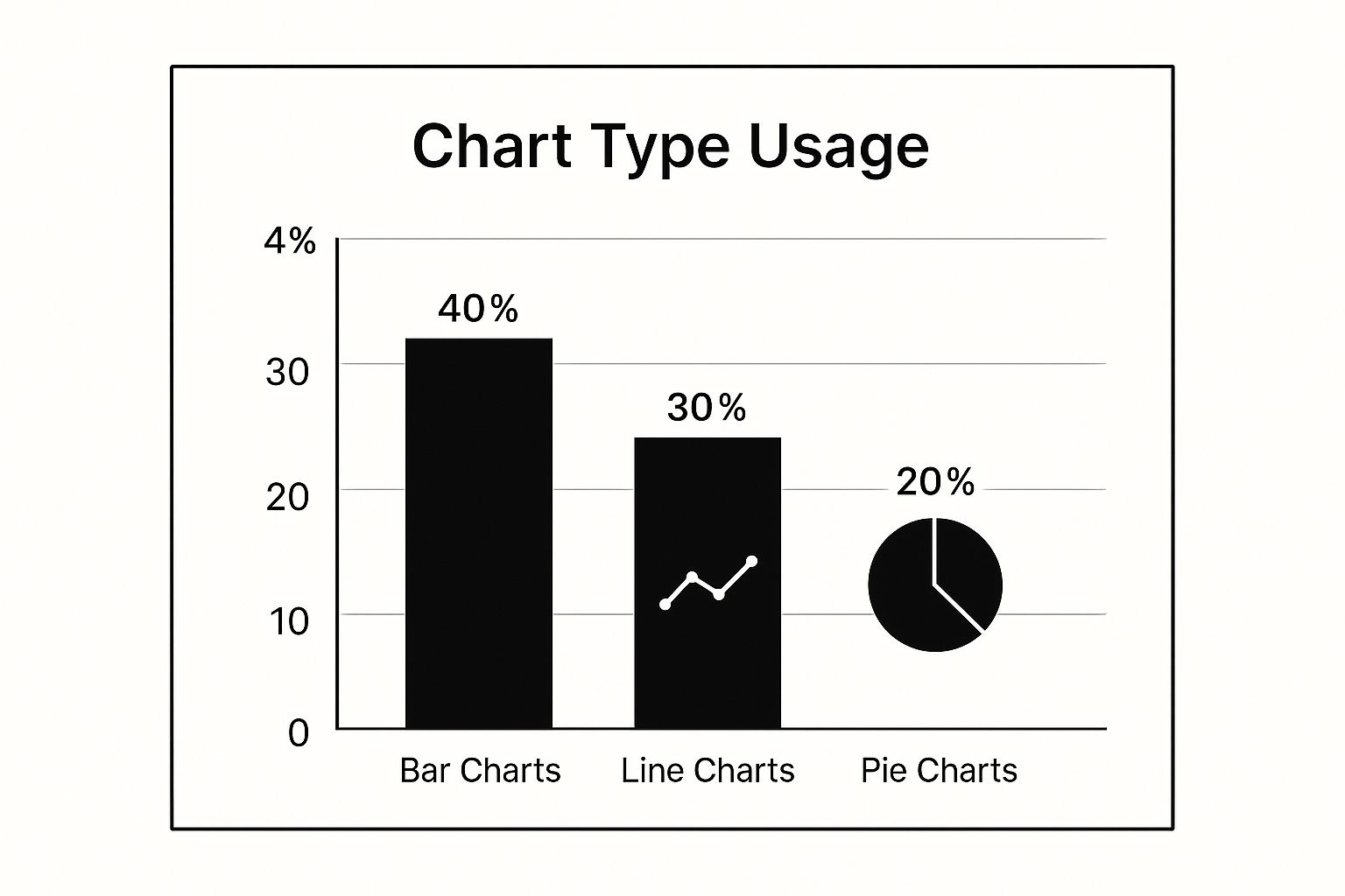
As the infographic reveals, bar charts are the most commonly used chart type, followed by line and pie charts. This reinforces the need to understand the strengths of each chart type to maximize impact.
When to Use It
Data visualization is invaluable whenever quantitative information needs to be presented. Whether in a business meeting, a conference presentation, or a research paper, well-designed visuals enhance communication and facilitate data-driven decision-making. Among presentation design tips, data visualization stands as a cornerstone for effectively conveying complex information, making it a crucial skill to master.
Presentation Design Tips: 8-Point Comparison
| Item | Implementation Complexity 🔄 | Resource Requirements ⚡ | Expected Outcomes 📊 | Ideal Use Cases 💡 | Key Advantages ⭐ |
|---|---|---|---|---|---|
| The 10-20-30 Rule | Low - Simple rules to follow | Low - Requires slide/time control | Focused, concise messaging with time limit | Pitches, executive briefings, TED-style talks | Prevents overload, easy to remember |
| Visual Hierarchy and Typography | Medium - Needs design knowledge | Medium - Requires font/style choices | Enhanced readability and audience guidance | Corporate, consulting, academic presentations | Improves comprehension and brand consistency |
| One Idea Per Slide Principle | Low to Medium - Focused slide creation | Low - More slides, careful planning | Clear message retention and reduced overload | Keynotes, TED Talks, sales and medical presentations | Clear narratives, easier timing management |
| High-Quality Visual Content | Medium to High - Sourcing and editing | High - Professional visuals required | Increased engagement, emotional connection | Marketing, product showcases, storytelling decks | Enhances professionalism and retention |
| Strategic White Space Usage | Medium - Requires design discipline | Low to Medium - Design effort | Improved readability and sophisticated look | Minimalist, luxury brands, tech presentations | Reduces clutter, draws attention effectively |
| Consistent Color Palette & Branding | Medium - Requires color theory knowledge | Low to Medium - Palette creation | Cohesive brand identity and visual unity | Corporate branding, marketing, global audiences | Strengthens brand recall and emotional impact |
| Storytelling Through Slide Structure | High - Requires planning and narrative skill | Low - Focus on content structuring | Strong engagement and memorable messaging | Fundraising, product launches, change mgmt | Creates emotional connection and clarity |
| Data Visualization Best Practices | High - Needs data skills and design | Medium to High - Tools and data prep | Clear, actionable data insights | Analytical, financial, scientific presentations | Makes complex data understandable and trusted |
Elevating Your Presentations: From Good to Unforgettable
This curated collection of presentation design tips offers a pathway to transforming your slides from mundane to memorable. We've explored key principles that underpin effective presentations, from foundational rules like the 10-20-30 Rule and the one idea per slide principle, to more nuanced concepts such as strategic white space usage and storytelling through slide structure. Mastering these elements will empower you to create presentations that truly resonate with your audience.
Key Takeaways for Impactful Presentations
Let's recap the most crucial takeaways for maximizing your presentation's impact:
- Visual Clarity: Employing visual hierarchy, typography best practices, and high-quality visuals ensures your message is easily digestible and visually appealing.
- Conciseness and Focus: Adhering to the one idea per slide principle keeps your audience engaged and prevents cognitive overload.
- Strategic Design: Utilizing white space effectively and maintaining a consistent color palette creates a professional and polished aesthetic, reinforcing your brand identity.
- Narrative Power: Structuring your presentation as a story, combined with compelling data visualization, transforms data into a captivating narrative.
Transforming Information into Inspiration
By implementing these presentation design tips, you empower yourself to shift from simply delivering information to inspiring action. Remember, a well-crafted presentation isn't solely about visuals. It's the synergy of a clear message, strong visuals, and confident delivery that truly captivates an audience. Whether you're pitching a revolutionary idea, presenting research findings, or simply sharing information, these tips will undoubtedly elevate your presentation game, leaving a lasting impression.
The Power of Visual Storytelling
These presentation design tips will help you craft visuals that amplify your message, enhance audience engagement, and ultimately drive your desired outcomes. Consider your specific audience and tailor your presentation to resonate with their needs and interests, further solidifying your message's impact.
Streamlining Your Design Workflow
Ready to create stunning presentations with ease? AI Media Studio empowers you to generate high-quality visuals quickly, freeing you to focus on refining your message and delivery. Visit ai-media-studio to explore how AI can revolutionize your presentation design process.