Imagine trying to follow a map where every single road is drawn with the same size and color. It's a confusing mess, right? That’s exactly what a design feels like without visual hierarchy—it’s the essential 'tour guide' for a user's eye.
At its core, visual hierarchy is the art of arranging elements to clearly show their order of importance.
Why Visual Hierarchy Is Your Most Powerful Design Tool
Let's be clear: visual hierarchy isn't just about making things look pretty. It's a powerful tool that transforms a cluttered, overwhelming page into an intuitive journey for the user. It silently guides their attention to the most critical information, whether that’s a headline, a key benefit, or that all-important “Buy Now” button.
By intentionally creating a clear path, you dramatically reduce the mental effort—what we call cognitive load—required for users to figure out what’s going on. This structured approach is the absolute bedrock of successful User Interface (UI) and User Experience (UX) design. It builds trust by making an interface feel predictable and, frankly, easy.
When people can find what they need without getting frustrated, they're far more likely to stick around, engage with your content, and ultimately convert.
The Foundation of Effective Communication
Think of visual hierarchy as the unspoken grammar of design. It dictates the order in which users take in information, which heavily influences their experience and the decisions they make. It all comes down to arranging elements—like size, color, and whitespace—so users can instantly understand the importance of each one.
For instance, larger elements naturally grab more attention. A strategic use of empty space, or whitespace, can isolate and emphasize a key item on the page. You can dive deeper into this core concept with the Interaction Design Foundation, which offers great resources.
Without a clear hierarchy, users are left scrambling to find a focal point, leading to confusion and, you guessed it, high bounce rates. This careful organization is really about telling a visual story. It tells the user where to look first, second, and third, making the entire experience feel logical and seamless.
A design without a strong visual hierarchy is like a conversation where everyone is shouting at once. The message gets lost in the noise, and the user quickly tunes out.
From Clutter to Clarity
For anyone creating digital experiences, mastering visual hierarchy is non-negotiable. It’s the key to building interfaces that are both beautiful and functional. It has a direct, measurable impact on user behavior by making specific actions more prominent and appealing. A brightly colored call-to-action button, for example, practically begs to be clicked because it stands out from everything else.
Ultimately, its impact shows up in the business metrics that matter:
- Reduced Bounce Rates: When users find what they need quickly, they have no reason to leave.
- Increased Engagement: A clear path encourages people to explore your content more deeply.
- Higher Conversion Rates: Guiding users toward desired actions naturally improves your outcomes.
By applying these principles, you turn chaos into clarity. You ensure your most important messages are always seen and understood. It’s the difference between a design that truly works and one that just exists.
The Building Blocks of Visual Hierarchy
So, how do you actually build a visual hierarchy? It starts with understanding the core components. Think of these not as rigid, unbreakable laws, but as a flexible set of tools in your designer toolkit. They’re the secret to bringing order to the page and guiding your user's eye exactly where you want it to go.
They're like the fundamental notes in a musical scale. On their own, they're just sounds. But when you combine them correctly, you create a harmonious and compelling song that just feels right to the listener.
By learning to control these elements, you call the shots. You decide where attention goes, what information gets the spotlight, and how you create a smooth, intuitive journey for anyone interacting with your work. Each principle works with the others, building a powerful and clear structure.
The image below breaks down how some of the most critical building blocks—like size, contrast, and spacing—all fit together under the umbrella of visual hierarchy.
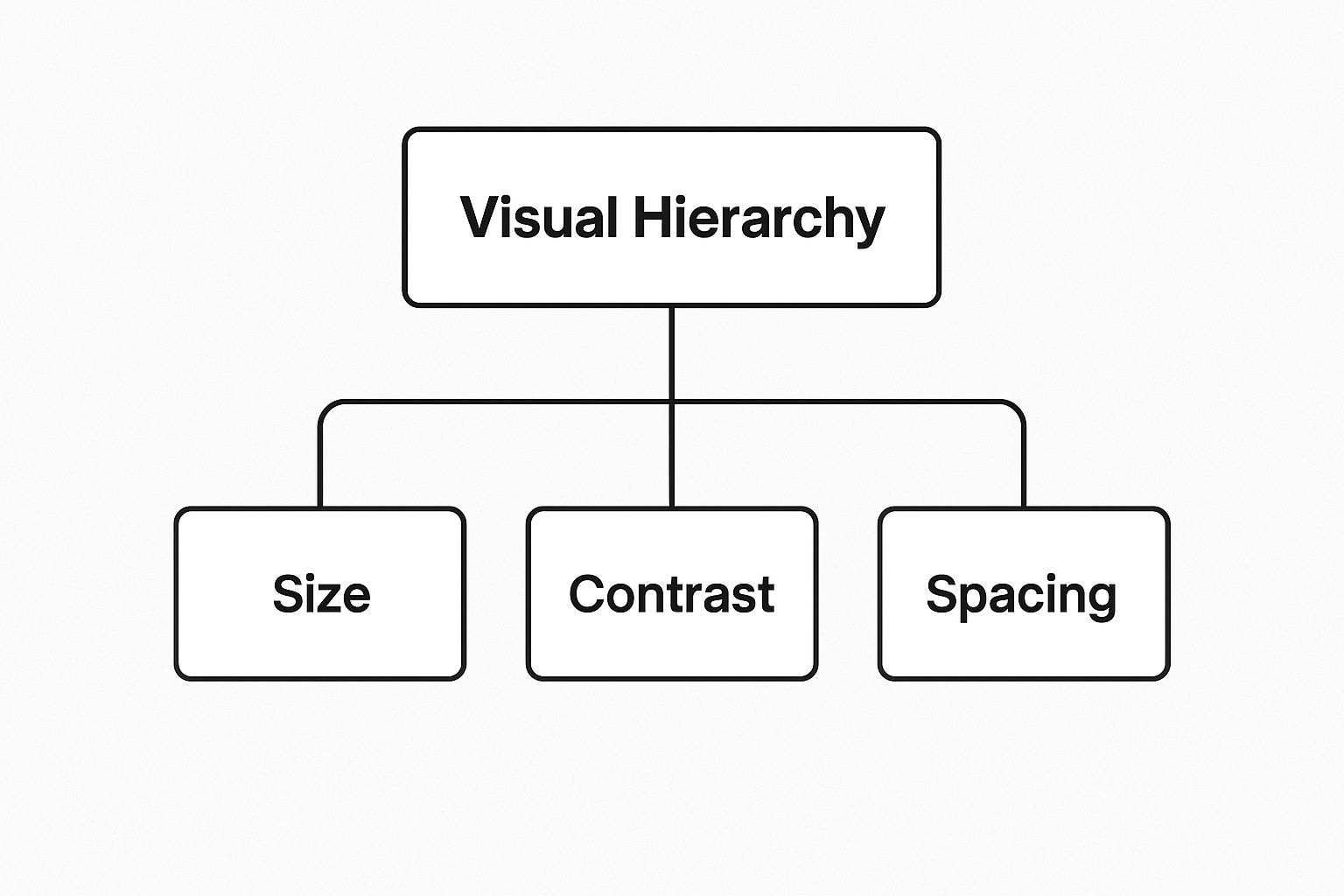
You can see how these foundational principles support the main goal. It shows that a great design is all about balancing these core elements to achieve total clarity.
Size and Scale
The easiest principle to grasp is scale. It’s pretty simple: larger elements attract more attention. Our brains are hardwired to notice bigger things first, which makes size an incredibly powerful tool for establishing what’s most important on the page.
Your most critical element—whether it's a headline, a key stat, or a "Buy Now" button—should almost always be the largest thing the user sees.
But this isn't just about making things massive. It’s all about relative size. A headline only pops if it's clearly larger than the sub-headline, which then needs to be larger than the body copy. This deliberate variation in scale creates a clear path for the eye to follow, from most to least important.
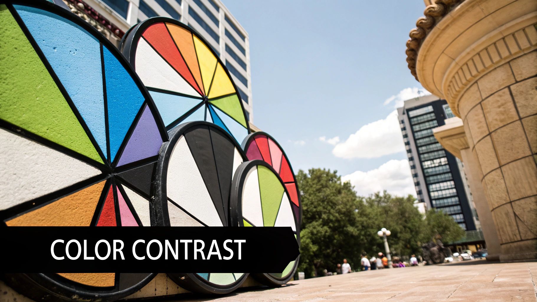
Color and Contrast
Color and contrast are a dynamic duo. They work together to make certain elements jump off the page while letting others fade into the background. Bright, bold colors naturally draw our gaze, but their real power is unlocked when you pair them with contrast.
A light element on a dark background (or vice-versa) creates high contrast, instantly signaling to the user: "Hey, look over here! This is important."
A classic rookie mistake is throwing too many colors at the design. This just creates visual noise and can seriously overwhelm the user. A much better strategy is to stick to a limited color palette and use a single, strong accent color to highlight the things you want people to click, like buttons and links.
And remember, contrast isn't just about color! You can create it with font weights (bold vs. regular), styles (italic vs. roman), and even different shapes.
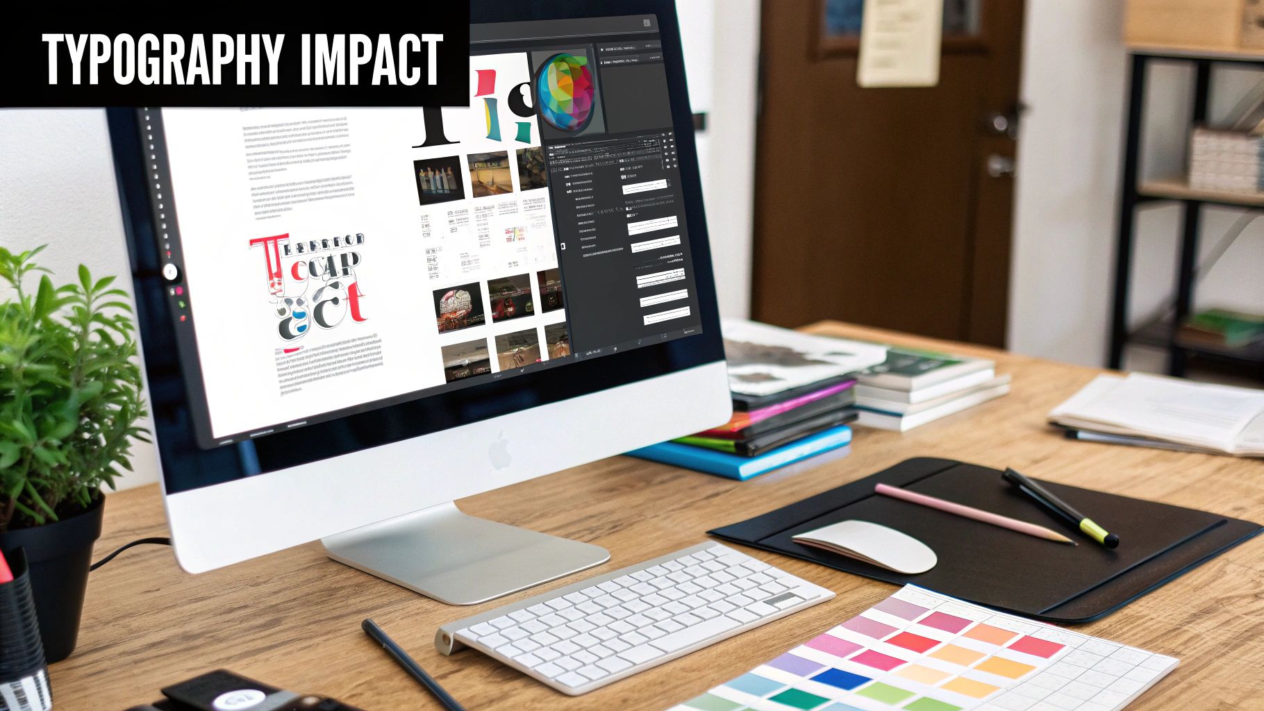
Typographic Hierarchy
Typography is so much more than just picking a pretty font. It’s about structuring your text so it's easy to scan and digest. A solid typographic hierarchy is like a great narrator, changing its volume and tone to guide the reader through the content.
Think of your text in these three levels:
- Primary Level (H1, H2): These are your main headlines. They should be the biggest and boldest, telling the user exactly what the page is about in a split second.
- Secondary Level (H3, H4, Bold Text): Subheadings are your signposts. They break up long walls of text, making your content way easier to scan and understand. They work to group related ideas together.
- Tertiary Level (Body Text): This is where the main story lives. The text needs to be perfectly legible and comfortable to read, but it should always take a backseat visually to the headings.
Whitespace and Grouping
Whitespace, often called negative space, is simply the empty area around your design elements. It is one of the most powerful—and most frequently ignored—tools for creating a clean, organized, and professional-looking layout.
Giving your content room to breathe with plenty of whitespace actually reduces cognitive load on the user. It makes everything feel less cluttered and easier to process.
A related concept here is proximity, which is just a fancy way of saying "put related things close together." By grouping a headline with its paragraph, or an image with its caption, you create logical little packages of information. This smart use of space tells the user that these items belong together, making the entire page easier to understand at a glance.
To tie this all together, here's a quick summary of these core principles and how they directly influence a user's experience.
Key Principles of Visual Hierarchy and Their Impact
| Principle | How It Works | Primary Impact |
|---|---|---|
| Size & Scale | Larger elements appear more important and draw the eye first. | Creates a clear focal point and establishes an order of importance. |
| Color & Contrast | Bright colors and high-contrast elements stand out against their background. | Highlights key information, CTAs, and interactive elements. |
| Typography | Using different font sizes, weights, and styles to organize text. | Improves scannability, readability, and guides the reader through content. |
| Whitespace | The empty space around elements. | Reduces clutter, improves focus, and creates a sense of organization. |
| Grouping (Proximity) | Placing related items close together to form a single visual unit. | Establishes relationships between elements and simplifies the interface. |
Mastering these five building blocks is the first major step toward designing interfaces that are not only beautiful but also incredibly effective and intuitive for your users.
How People See Your Designs
Great design is never an accident. It’s built on a deep understanding of how people see and process the world around them. When someone lands on your page, their eyes don’t just wander aimlessly. They follow predictable, almost universal scanning patterns that have been proven time and again by eye-tracking studies.
Tapping into these natural behaviors is a total game-changer for any designer. When you align your layout with how users already scan a screen, you can put your most important content right where their eyes will naturally fall. This makes the whole experience feel seamless and intuitive because you're working with human psychology, not fighting against it.
The Predictable F-Pattern
For pages packed with content, like blog posts or search results, people overwhelmingly fall into what's known as the F-Pattern. Their eyes move across the screen in a path that looks a lot like the letter "F."
Here’s a quick breakdown of how it works:
- First Horizontal Scan: The user’s eyes move across the very top of the page, taking in the main headline or the navigation bar.
- Second Horizontal Scan: They then move down the page a bit and scan across again. This second pass is usually shorter, catching subheadings or the first few words of a paragraph.
- Vertical Scan: Finally, their eyes track down the left side of the page, scanning for keywords or interesting tidbits in the first words of each sentence.
This behavior shows exactly why placing key information on the left and using clear, scannable headings is so critical. If you bury important details in the middle of a paragraph on the right side of the page, someone scanning in an F-Pattern will fly right past them.
The Simple Z-Pattern
On the other hand, for simpler, less text-heavy layouts—think landing pages or advertisements—the Z-Pattern is far more common. This scanning motion follows the simple shape of the letter "Z."
A user’s gaze starts at the top-left, zips horizontally to the top-right, cuts diagonally down to the bottom-left, and finally moves across to the bottom-right. It’s a simple path that effectively hits all four corners of the page.
This predictable eye movement from top-left to bottom-right is a cornerstone of visual hierarchy. Placing your logo in the top-left, a key visual in the center, and your primary call-to-action in the bottom-right aligns perfectly with this natural scanning behavior.
The science behind these patterns shows just how much psychological cues dictate how we consume information. For instance, a strong typographic hierarchy can boost message clarity by up to 50%, while high contrast can increase focus on key elements by 40%. You can learn more about the science of layout and how proximity improves information processing speed in this excellent creative chronicle.
Ultimately, these principles help you build a visual roadmap that guides users without them even noticing. They're also a fundamental part of effective visual content marketing strategies, ensuring your message lands with the biggest possible impact.
Visual Hierarchy in Action with Real Examples
Theory is great, but seeing visual hierarchy in design work its magic in the real world is where the real learning happens. When we break down top-performing websites and apps, we can see exactly how designers use these principles to guide our eyes and create experiences that just feel right. Let's move past the abstract and get into some concrete examples.
Big brands are absolute masters of this. They don't just sprinkle in some contrast or play with scale for the fun of it; they apply these rules with surgical precision to hit their business goals. One website might use hierarchy to funnel you toward a sale, while another is laser-focused on getting you to sign up for a newsletter. The goal dictates every single design decision.
By looking over their shoulder, you can start to recognize what makes a hierarchy effective and borrow those same tricks for your own projects. This is how you go from knowing the rules to actually applying them with purpose. A solid hierarchy is a non-negotiable part of any winning visual content strategy, making sure your most important messages land first. You can dive deeper by checking out our guide to building a powerful visual content strategy.
Deconstructing a Masterclass in Hierarchy
Let's take a look at a brand that pretty much wrote the book on clean, powerful design: Apple. Their product pages are the perfect case study for using visual hierarchy to command attention and scream "premium quality."
Just look at the screenshot from Apple's iPhone page below. Think about where your eyes go first. It's not an accident.
This page works because every single element has a job and knows its place. The huge, crystal-clear product shot completely dominates the screen, instantly telling you who the hero of this story is.
This is a textbook example of using scale to create an immediate focal point. The iPhone is the star of the show, and its size makes that impossible to miss.
After you take in the phone itself, your eyes naturally drift to the big, bold headline. The typographic hierarchy here is flawless. The main product name is the biggest, the catchy feature tagline is a little smaller, and the pricing info is smaller still—but still perfectly clear. And that high-contrast "Buy" button? It practically jumps off the page, serving as the main call to action.
Key Takeaways from Real-World Examples
When you analyze pages like Apple's, a clear formula for creating effective visual flow emerges. It’s not just about one principle; it’s about how they all team up to support one primary goal. The best designs use these elements in perfect harmony.
Here’s what we can learn from picking apart professional designs:
- Establish One Clear Hero: Every screen needs one undisputed focal point. Whether it’s a stunning image, a punchy headline, or a video, one element has to be the boss to keep users from getting confused.
- Guide with Typography: Use different font sizes and weights to create an obvious path through your information. Someone should be able to get the gist of your content just by scanning the text hierarchy.
- Leverage Whitespace: Look at all that empty space in professional layouts. It’s not wasted—it’s actively working to cut down on clutter, sharpen focus, and make the whole design feel more organized and less chaotic.
- Use Color for Action: Reserve a single, high-contrast accent color for the things you want people to click, like buttons and links. This trains users to instantly recognize what’s interactive.
By applying these observations, you can start building designs that don't just look pretty but also function with incredible clarity.
Common Hierarchy Mistakes and How to Fix Them
Even the most seasoned designers can fall into a few common traps that completely torpedo a design's visual hierarchy. These missteps can turn a clear, intuitive layout into a frustrating mess for the user. The good news? They're usually easy to spot and fix once you know what you're looking for.
Getting familiar with these pitfalls is your first step toward building designs that are consistently effective. When you can diagnose these issues in your own work, you ensure your message gets through loud and clear, without any confusing static getting in the way.
Mistake 1: Creating Too Many Focal Points
This is probably the most frequent mistake I see. It's the "everything is important" syndrome. When a design is crammed with bold headlines, bright colors, and huge elements all screaming for attention, it just creates visual chaos. The outcome is predictable: nothing actually stands out.
This is a classic sign that the design doesn't have a single, clear goal. If you try to make everything the hero, you end up with no hero at all. The user just hears a wall of noise and, more often than not, will simply leave.
The Fix: Before you even start designing, you need to decide on the one most important thing you want a user to do or see. Make that element the undeniable star of the show using powerful contrast or scale. Every other element on the page should play a supporting role, never competing for the spotlight.
Mistake 2: Ignoring the Power of Contrast
Another common problem is using elements with weak contrast, especially when it comes to text. Sure, that light gray text on a slightly darker gray background might look sleek and modern, but it forces people to squint and strain their eyes. That friction is a user experience killer and makes your content inaccessible to many.
Poor contrast makes a design feel flat and lifeless. It blurs the lines between what's clickable and what's just for show, causing users to miss crucial information or calls to action because they simply didn't pop.
When it comes to usability, clarity always wins over cleverness. Your design's first job is to be readable and easy to navigate.
Mistake 3: Forgetting About Whitespace
A cluttered design just feels overwhelming and unprofessional. Jamming elements together without any breathing room puts a huge cognitive load on your user. They can't process the information because there are no visual cues to help them sort and group related content. This is a massive pitfall in design, as elements with more visual weight—often created by the space around them—naturally draw the eye. You can find some great insights on this topic over at RMCAD's blog post on guiding the viewer's eye.
The Fix: Be generous with your whitespace. Think of it as an active tool, not just empty background.
- Group related items: Put things that belong together close to one another, then surround that group with negative space.
- Create focus: Want people to notice your main button? Isolate it with plenty of whitespace to make it a magnet for the user's attention.
- Boost readability: Add more space between lines of text and between paragraphs. It makes long blocks of content much less intimidating and far easier to scan.
Frequently Asked Questions About Visual Hierarchy
Diving into visual hierarchy can feel a bit like learning a new language. As you start putting these ideas into practice, you're bound to have questions. This FAQ section is here to give you clear, no-nonsense answers to some of the most common ones.
Think of it as your go-to guide for troubleshooting. The goal is to give you the confidence to stop guessing and start creating designs that guide your audience and get results.
How Does Visual Hierarchy Affect SEO?
This is a great question. While visual hierarchy isn't a direct ranking factor—Google doesn't "see" your design—its impact on SEO is huge. A smart hierarchy makes your content incredibly easy to scan and digest, which dramatically improves the user experience (UX).
When people find your site easy to use, they stick around longer. This leads to better engagement signals, like a lower bounce rate and longer time on page. These metrics tell Google that your content is valuable. Plus, a logical text hierarchy (using H1, H2, and H3 tags correctly) gives search engine crawlers a clear roadmap to your content, helping them understand what's most important.
A page that's easy for a human to read is almost always easy for a search engine to understand. Good design and good SEO go hand-in-hand.
Is It Possible to Have Too Much Hierarchy?
Absolutely. It's a classic mistake: when you try to make everything important, nothing stands out. A design cluttered with competing colors, clashing fonts, and too many "loud" elements just creates visual noise. The user doesn't know where to look, and the entire purpose of hierarchy is lost.
Effective design is all about making deliberate choices. Here’s how to avoid the chaos:
- Pick one primary focal point. This is the undisputed star of the show.
- Establish a clear secondary level. These elements support the main goal but don't fight for attention.
- Let everything else fade into the background. Supporting info should be there, but it shouldn't be distracting.
Simplicity and contrast are your best tools. Use them carefully to make your emphasis count.
What Is the First Step to Creating a Visual Hierarchy?
The most critical first step has nothing to do with colors or fonts. It happens before you even open a design tool. You have to define your goal. Ask yourself: “What is the #1 thing I want someone to do on this page?” Is it to click a button? Read a headline? Fill out a form?
That single objective is the top of your visual hierarchy. It’s your anchor.
Once you know your primary goal, everything else can be arranged to support it. For example, if you want newsletter sign-ups, the form and its headline are your top-tier elements. The list of benefits might be secondary, and the link to your privacy policy would be tertiary. Always start with strategy—then use design to bring it to life.
This strategic mindset is key to creating a unified brand experience. For a deeper look at keeping things consistent, our guide on creating visual brand guidelines is a great resource.
Ready to create stunning visuals for your blog, social media, or marketing campaigns without the complexity? At AI Media Studio, we provide an intuitive platform that lets you generate professional-quality images from simple text prompts in seconds. Explore over 50 art styles and elevate your content effortlessly. Get started for free today at ai-media-studio.com.