
Create a commercial-quality vertical 2:3 Pinterest composition explaining a three-part shop visual system t...
View this AI-generated image from the AI Media Studio community gallery. Prompt: Create a commercial-quality vertical 2:3 Pinterest composition explaining a three-part shop visual system through a modular train route diagram. Show three distinct miniature stations representing...
Prompt
Create a commercial-quality vertical 2:3 Pinterest composition explaining a three-part shop visual system through a modular train route diagram. Show three distinct miniature stations representing shop identity, product proof, and real-life use, connected by a clean illustrated track with abstract cards, icons, and image placeholders. Use sea blue, paprika red, lemon yellow, graphite, and soft white. Keep the hierarchy instructional and energetic. No real brands, no trademarked characters, no watermark, and no unintended readable text. AI-modified downstream. Corrective regeneration attempt 4. Produce a materially revised image, not a near-duplicate of an earlier variant. Preserve the successful subject, palette, lighting, focal hierarchy, and commercial polish from the original brief while correcting every issue below. Mandatory corrective instructions from the most recent visual QA: Preserve the vertical 2:3 layout, polished flat-vector style, sea-blue/paprika-red/lemon-yellow/graphite palette, illustrated train route, storefront station, product-display station, lifestyle station, people, and clear focal hierarchy. Remove every horizontal line, chart axis, dashboard detail, panel caption, card divider, and mark that could resemble writing or UI text. Replace them only with blank color fields, dots, circles, stars, simple geometric icons, or abstract non-linguistic shapes. Remove the lower-left cards and the lower-right dashboard panel entirely, or replace them with a small number of spacious blank geometric cards. Simplify the lower half and reduce peripheral decorations so the route and three stations are immediately legible and balanced. Ensure there are no letters, words, numbers, labels, logos, glyphs, pseudo-text, watermarks, or readable marks anywhere. Observed defects from prior variants that must not recur: 1) Dense lower section slightly reduces clarity of the three-part instructional hierarchy. 2) Attractive vertical composition with clear train route, palette, and three visual stations. 3) Numerous pseudo-readable text marks appear throughout cards, signs, product labels, speech bubbles, charts, and UI panels, violating the no-text requirement. 4) The lower half is overly dense, weakening the instructional hierarchy and station separation. 5) Strong vertical composition, polished flat-vector style, palette, train route, and three stations are successful. 6) Multiple unintended text-like horizontal lines appear in the lower-left cards and lower-right panel. 7) The composition remains overly dense with many peripheral cards and UI-like panels, weakening the three-station hierarchy. 8) Chart axes and dashboard-style details resemble interface graphics contrary to the no-glyph/no-writing requirement. Render no letters, words, numbers, prices, headings, labels, contact details, logos, glyphs, or pseudo-text anywhere. Use only blank surfaces, clean geometric marks, and non-linguistic placeholder shapes. Do not add explanatory captions, before/after labels, interface copy, or extra objects that the brief did not request. When a corrective instruction conflicts with a decorative detail, prioritize the corrective instruction.
Use this image as inspiration
Browse more public generations, compare prompts, and open the original share page to continue exploring this style.
More from the gallery
Recent public images on the same domain, all with their own crawlable detail pages.
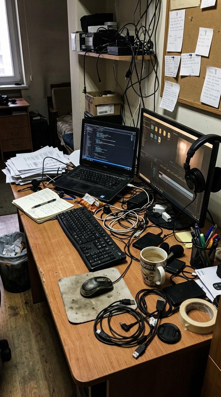
Amateur handheld phone photo of a creator's cluttered desk setup before branding and styling, imperfect pho...
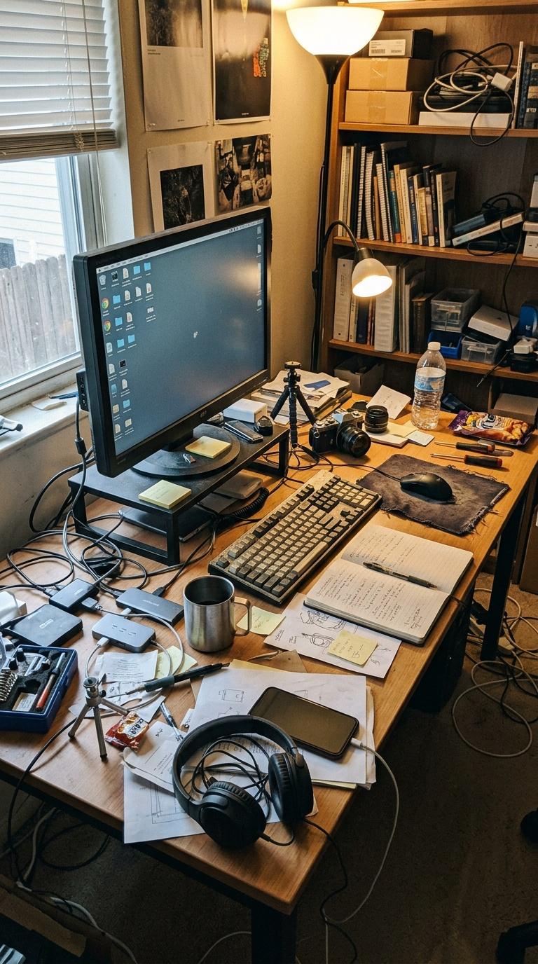
Amateur handheld phone photo of a creator's cluttered desk setup before branding and styling, imperfect pho...
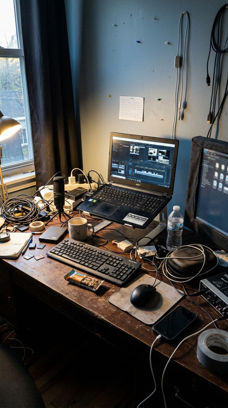
Amateur handheld phone photo of a creator's cluttered desk setup before branding and styling, imperfect pho...
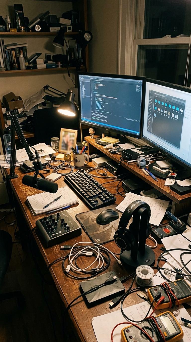
Amateur handheld phone photo of a creator's cluttered desk setup before branding and styling, imperfect pho...
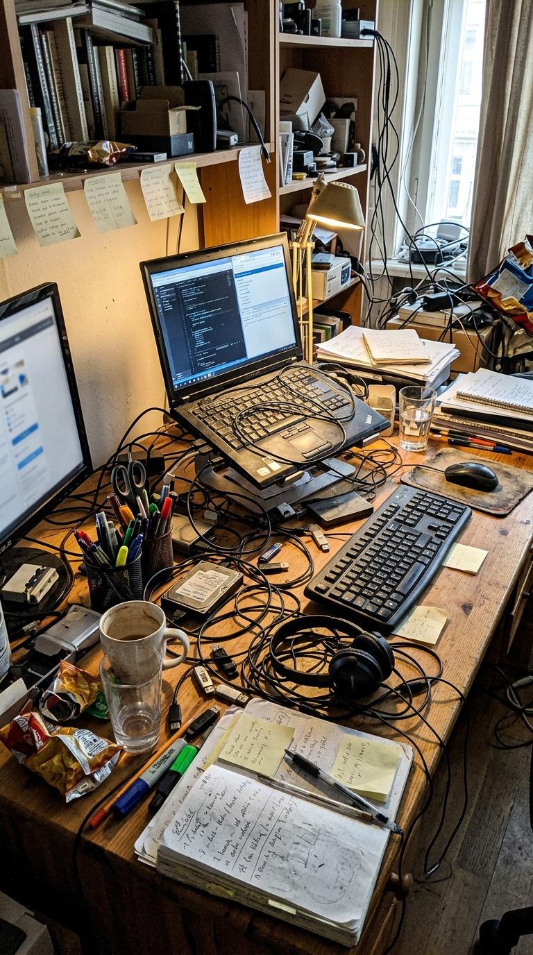
Amateur handheld phone photo of a creator's cluttered desk setup before branding and styling, imperfect pho...
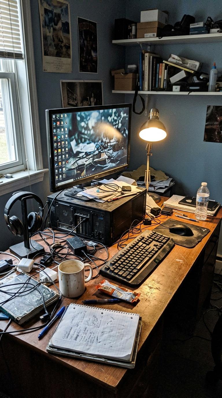
Amateur handheld phone photo of a creator's cluttered desk setup before branding and styling, imperfect pho...
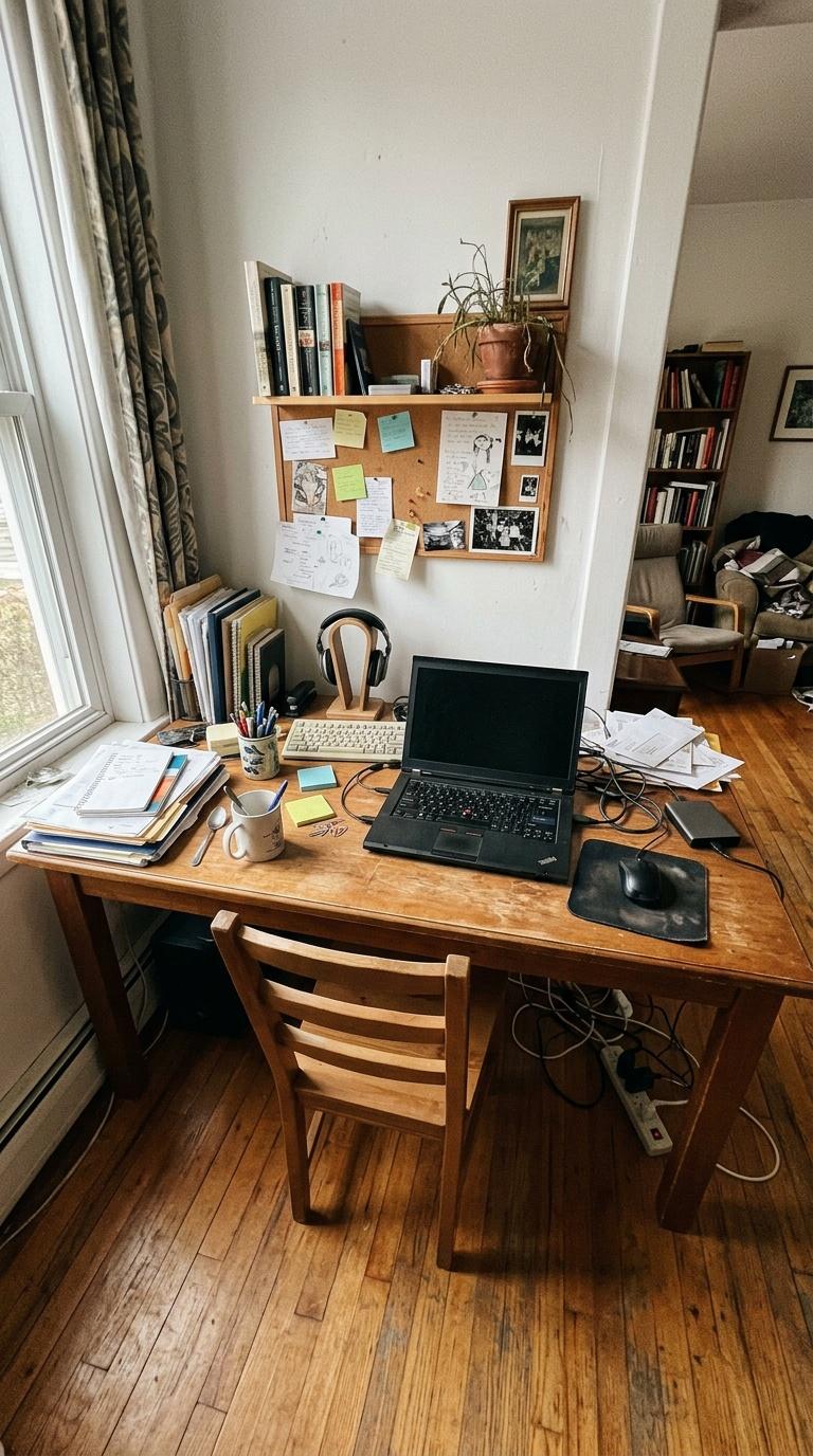
Amateur handheld phone photo of a slightly messy home desk area before redesign, imperfect wide-angle frami...
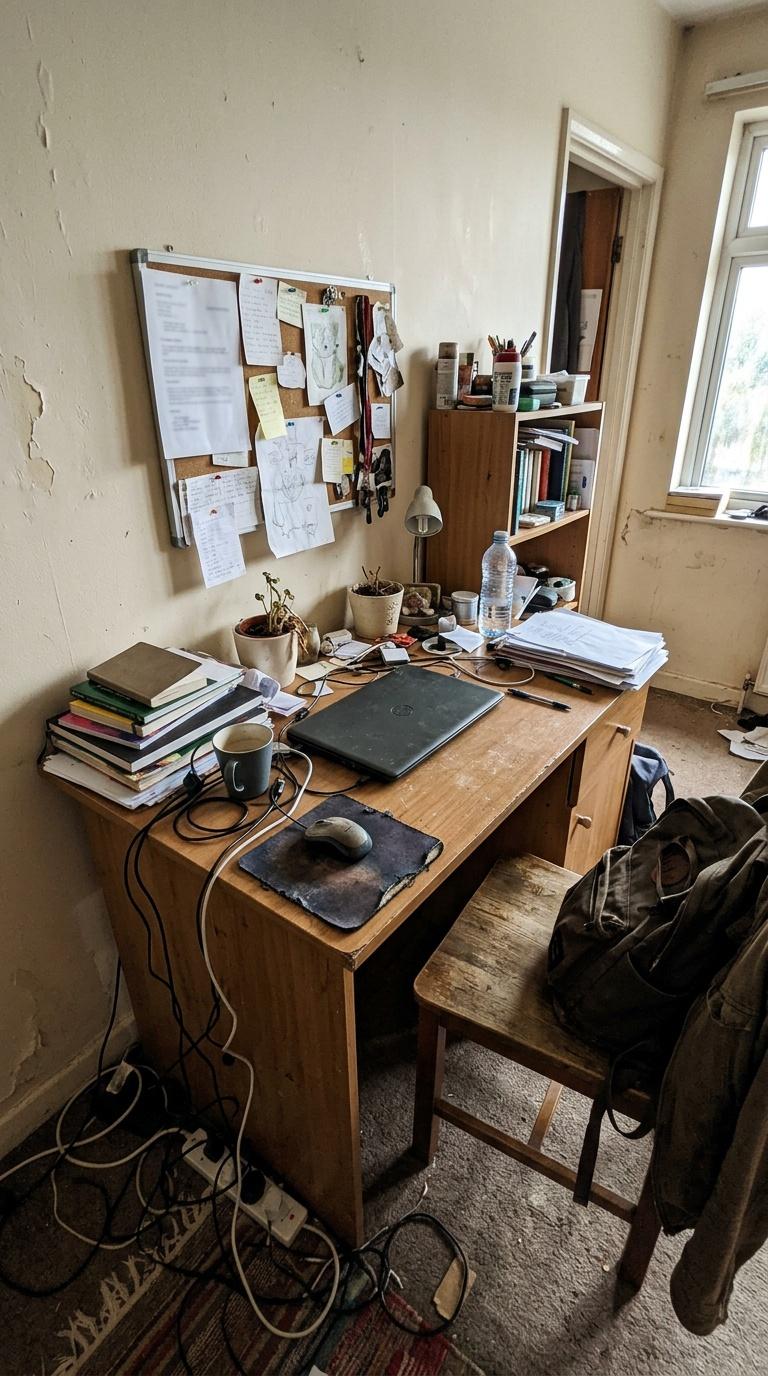
Amateur handheld phone photo of a slightly messy home desk area before redesign, imperfect wide-angle frami...