In a sea of digital noise, a generic banner ad is invisible. To capture attention and drive real results, your campaigns need visuals that are not only eye-catching but also strategically sound. The difference between a click and a scroll often comes down to the creativity and clarity of your banner, making strong design an essential component of any successful marketing effort. A well-executed banner communicates value instantly, builds brand recognition, and guides users toward a specific action, turning passive viewers into active customers.
This article moves beyond the basics to explore nine powerful and distinct banner design ideas that can transform your campaigns from mediocre to memorable. We'll break down the 'why' and 'how' behind each approach, offering practical tips and real-world examples to help you create banners that don't just get seen, they get clicked.
From the quiet confidence of a minimalist layout to the dynamic energy of an animated element, you will learn how to apply specific creative strategies. We will cover:
- Typography-centered and minimalist designs.
- Photo-realistic and storytelling visuals.
- Bold colors, gradients, and abstract patterns.
- Interactive, collage, and data-driven concepts.
Whether you're a seasoned marketer or a small business owner, it's time to rethink your visual strategy and create banners that truly perform.
1. Typography-Centered Design
A typography-centered approach is a powerful banner design idea that places text, not images, at the heart of the visual composition. This strategy uses creative font choices, compelling layouts, and a strong typographic hierarchy to communicate a message directly and effectively. Instead of relying on photos or illustrations, the letterforms themselves become the art, creating impact through style, size, and arrangement.
This method is exceptionally versatile. Think of Apple's minimalist product announcements, where a clean, elegant font against a simple background builds immense anticipation. Similarly, Nike’s iconic “Just Do It” campaign banners often use bold, commanding typography to convey a sense of action and motivation without needing an athlete in every shot. The focus is purely on the power of the words.
When to Use This Approach
This design is ideal when your message is the main event. It works perfectly for:
- Major announcements or bold statements where clarity is key.
- Luxury brands that want to project sophistication and elegance.
- Promotions with a strong call to action (CTA), like “50% Off Today Only.”
- Brand-building campaigns that aim to establish a distinct voice and personality.
Actionable Tips for Implementation
- Select Brand-Aligned Fonts: Choose a typeface that reflects your brand’s personality. A modern sans-serif like Helvetica suggests cleanliness and efficiency, while a classic serif like Garamond can evoke tradition and trust.
- Establish Clear Hierarchy: Guide the viewer's eye by varying font size, weight, and color. The most important information (e.g., the headline or offer) should be the most prominent.
- Limit Your Font Palette: Stick to two or, at most, three font families to avoid visual clutter and maintain a cohesive look.
- Prioritize Readability: Ensure your text is legible from its intended viewing distance. Test your design on different screen sizes to guarantee sufficient contrast and clarity.
2. Photo-Realistic Product Showcase
A photo-realistic product showcase is a banner design idea centered on high-quality, detailed photographs of your products. This strategy puts the physical item in the spotlight, using professional imagery to highlight its features, texture, and quality. Instead of abstract concepts, this approach gives potential customers a tangible, realistic view of what they are buying, building trust and desire.
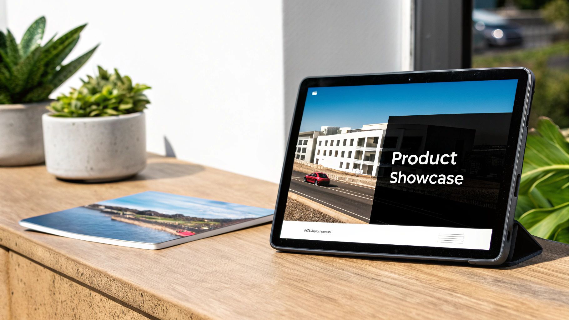
This method is a cornerstone of e-commerce and retail advertising. Think of Amazon's product banners, which often feature crystal-clear images of items against a clean white background, or Sephora showcasing a new lipstick with a vibrant, high-resolution shot that reveals its exact color and texture. Similarly, Tesla's banners use sleek, detailed photos of their vehicles to communicate innovation and premium quality, letting the product’s design speak for itself.
When to Use This Approach
This design is essential when the product's visual appeal is a primary selling point. It’s perfect for:
- E-commerce sites where customers can't physically touch the product.
- Retail and fashion brands showcasing new collections or specific items.
- Food and beverage companies aiming to make their offerings look irresistible.
- Technology and automotive brands that need to display intricate design and build quality.
Actionable Tips for Implementation
- Invest in Professional Photography: High-resolution, well-lit photos are non-negotiable. Poor image quality can cheapen your product and brand perception.
- Optimize Images for Web: Compress your images to ensure fast load times without sacrificing critical detail. A slow-loading banner is an ineffective one.
- Use Consistent Lighting and Styling: Create a cohesive look across your product line by using consistent lighting, angles, and background styles. This builds brand recognition.
- Show Products in Context: Use lifestyle shots to help customers visualize themselves using the product. A watch on a wrist or a sofa in a living room is more relatable than an isolated shot.
3. Animated and Interactive Elements
Incorporating animated and interactive elements is a banner design idea that transforms a static ad into a dynamic and engaging experience. This approach uses motion graphics, subtle animations, or clickable components to capture attention far more effectively than a traditional image. By adding movement, you can guide the viewer’s eye, tell a short story, and create a memorable interaction that encourages clicks.
This technique is widely used across the web to break through the noise. Think of Spotify's animated banners promoting new playlists, where album art subtly fades and shifts, or Netflix's use of hover-activated video previews that give a glimpse of the content. These banners don't just sit on a page; they invite the user to look closer and interact, making the ad feel less like a promotion and more like a piece of engaging content.
When to Use This Approach
This design is perfect for capturing attention in a crowded digital space. It is ideal for:
- High-impact product launches where you need to showcase features dynamically.
- Social media campaigns on platforms that support video or GIF formats.
- Interactive storytelling to explain a service or brand message in a compelling way.
- Improving click-through rates (CTR), as movement naturally draws the human eye.
Actionable Tips for Implementation
- Keep Animations Purposeful: Use motion to highlight the most critical element, such as your call to action (CTA) or key product feature. Avoid random, distracting animations.
- Optimize File Sizes: Animated banners, especially GIFs and HTML5 files, can be large. Compress them to ensure they load quickly without slowing down the webpage.
- Provide a Static Fallback: Some browsers or ad blockers may prevent animations from playing. Always have a static version of your banner ready to display as a fallback.
- Focus on a Single, Clear Action: If your banner is interactive, make the desired action obvious. Whether it’s a button click or a hover effect, guide the user clearly. To streamline this process, you can explore tools to generate animated banners that handle these technical details for you.
4. Geometric and Abstract Patterns
Using geometric and abstract patterns is a sophisticated banner design idea that leverages shapes, lines, and forms to create a visually engaging composition. This approach prioritizes rhythm, balance, and modern aesthetics over literal imagery. It communicates concepts like precision, innovation, and interconnectedness through carefully arranged visual elements, making it a powerful tool for brands that want to appear forward-thinking and dynamic.
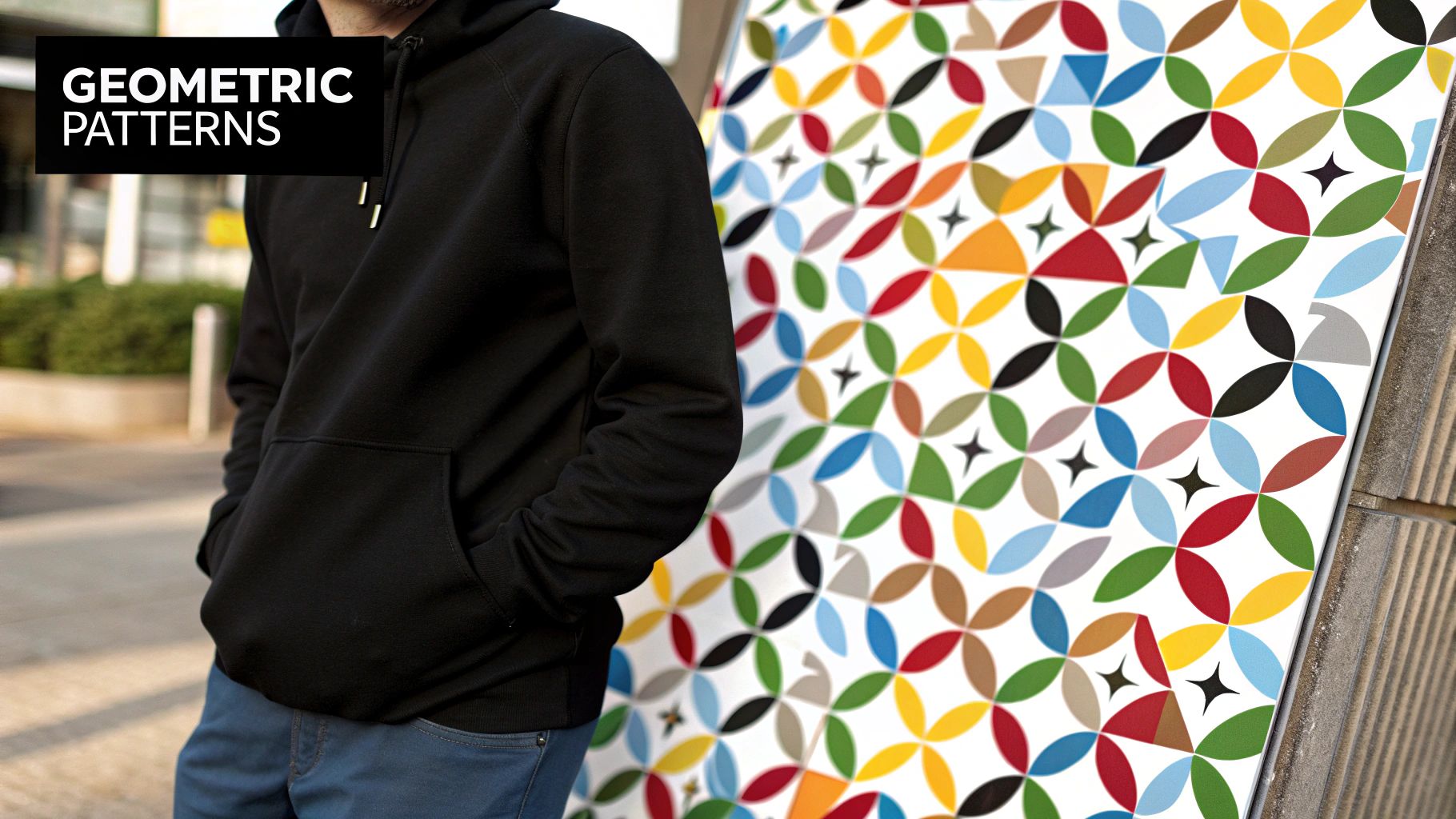
This style is prominent in the tech world, seen in Microsoft's clean, grid-based banners or the vibrant, shape-driven branding for tech conferences. Similarly, Spotify often uses abstract graphics to visually represent musical genres or moods. The success of this banner design idea lies in its ability to capture attention and convey a modern feel without needing a single photograph. To explore this style further, you can learn more about the flat vector style on ai-media-studio.com.
When to Use This Approach
This design shines when you need to convey complex ideas or a modern identity. It is perfect for:
- Tech companies and startups aiming to project innovation and structure.
- Financial or data services wanting to visualize concepts like growth and connectivity.
- Creative agencies and design firms showcasing artistic and contemporary flair.
- Event promotions for conferences, workshops, or festivals that need a high-energy, modern look.
Actionable Tips for Implementation
- Use Color Strategically: Assign specific colors to different shapes or sections of your pattern to create a clear visual hierarchy and guide the viewer’s attention toward your key message or CTA.
- Balance Complexity and Simplicity: A complex pattern can be eye-catching, but it needs to be balanced with ample negative space to avoid overwhelming the viewer or obscuring the text.
- Maintain a Consistent Logic: Ensure your shapes and patterns follow a clear rule, whether it's symmetry, a specific angle, or a repeating motif. This internal logic makes the design feel intentional and professional.
- Consider Shape Psychology: Different shapes evoke different emotions. Circles can feel friendly and communal, while sharp-angled triangles can suggest energy and movement. Choose shapes that align with your message.
5. Lifestyle and Emotional Storytelling
Lifestyle and emotional storytelling is a banner design idea that moves beyond product features to connect with an audience on a deeper, human level. This strategy focuses on evoking feelings and showcasing aspirational scenarios where the product or service enhances the customer's life. Instead of just selling an item, it sells an experience, a feeling, or membership in a desirable community. The visual narrative becomes the core of the banner, telling a story that resonates with the audience’s values and dreams.
This approach is masterfully used by brands that have become synonymous with a particular way of life. Coca-Cola’s banners rarely just show a bottle; they depict shared moments of happiness and togetherness. Similarly, Patagonia’s visuals aren't just about jackets; they are about the spirit of adventure and environmental stewardship. The goal is to make the viewer feel something and associate that positive emotion with the brand. For a deeper dive into crafting these narratives, you can explore more on visual storytelling tips.

When to Use This Approach
This design is powerful when building a strong, long-term brand identity. It's ideal for:
- Brands selling an experience, like travel, hospitality, or wellness.
- Aspirational products in fashion, automotive, or luxury goods.
- Community-focused businesses that want to foster a sense of belonging.
- Campaigns aimed at building brand loyalty and emotional connection rather than immediate sales.
Actionable Tips for Implementation
- Understand Your Audience's Aspirations: Research what your target customers value and dream of. Use imagery that reflects the lifestyle they aspire to live.
- Focus on the “After” State: Show the positive outcome or feeling a customer experiences after using your product, not just the product itself.
- Use Authentic and Relatable Imagery: Choose photos and videos that feature genuine-looking people in natural scenarios. Avoid overly staged or stock-photo-like visuals to build trust.
- Align Emotion with Brand Values: Ensure the emotions your banner evokes are consistent with your overall brand message. A brand built on trust should evoke security, while a brand built on excitement should evoke joy.
6. Minimalist and Clean Design
A minimalist and clean approach is one of the most sophisticated banner design ideas, centering on the philosophy that “less is more.” This strategy strips away all non-essential elements, using generous white space, a limited color palette, and pristine typography to deliver a message with quiet confidence and clarity. The goal isn't to be empty, but to make every single element, from a line of text to a single dot of color, profoundly impactful.
This design philosophy is famously embodied by brands like Apple, whose product banners often feature just the product against a clean background, conveying innovation and high value through simplicity. Similarly, Japanese brand Muji uses minimalist banners to showcase its products, allowing the design’s inherent quality and function to speak for itself. This approach transforms negative space into an active element that directs focus and creates a feeling of calm and order.
When to Use This Approach
This design is highly effective when you want to project sophistication, clarity, and focus. It is perfect for:
- Premium or luxury products where the design itself should feel high-end.
- Tech companies aiming to communicate efficiency, innovation, and user-friendliness.
- Health and wellness brands that want to evoke a sense of calm, purity, and trust.
- Calls to action that need to stand out without shouting, relying on space to draw the eye.
Actionable Tips for Implementation
- Master White Space: Treat empty space as a critical design element. Use it generously to frame your content, create breathing room, and guide the viewer’s eye directly to the focal point.
- Focus on Perfect Typography: With fewer elements, typography must be flawless. Choose a single, high-quality font family and perfect its alignment, kerning, and hierarchy.
- Use Color Strategically: Employ a restricted color palette, often monochromatic or with a single accent color. This accent color should be used deliberately to highlight the most important element, like a CTA button.
- Ensure Every Element Has a Purpose: Scrutinize every line, image, and word. If it doesn’t serve a clear purpose in communicating the message or strengthening the composition, remove it.
7. Bold Color and Gradient Schemes
A design approach centered on bold color and gradient schemes uses striking chromatic choices to create an immediate and powerful visual impact. This strategy moves beyond simple, flat colors, leveraging vibrant hues, smooth color transitions, and high-contrast palettes to capture attention instantly. The core idea is to use color not just as a background element but as the main driver of the banner's mood, energy, and message.
This technique is at the forefront of modern digital design, largely popularized by brands that need to stand out in a crowded visual landscape. Look at Spotify’s campaign banners and playlist art, which use duotones and vivid gradients to create an energetic, youthful feel. Similarly, Instagram’s iconic brand identity is built on a vibrant, multi-hued gradient that feels dynamic and creative. These examples prove that a well-executed color scheme can make a banner memorable and highly engaging.
When to Use This Approach
This is one of the most effective banner design ideas for grabbing attention quickly. It’s perfect for:
- Tech startups and modern brands aiming to appear innovative and fresh.
- Event promotions for concerts, festivals, or creative conferences where high energy is key.
- Product launches that need to generate excitement and buzz.
- Social media campaigns where standing out in a fast-scrolling feed is critical.
Actionable Tips for Implementation
- Understand Color Psychology: Use colors that evoke the desired emotion in your audience. For example, warm reds and oranges can create excitement, while cool blues and purples can project calmness or sophistication.
- Ensure High Contrast for Readability: Place text on your banner with care. If your background is a complex gradient, ensure your typography has enough contrast to remain perfectly legible. A simple white or black font often works best.
- Use Gradients with Purpose: A gradient should guide the eye or add depth, not just serve as decoration. Use it to draw attention toward a key message or call to action.
- Test Colors Across Devices: Colors can render differently on various screens and displays. Test your design to ensure your vibrant palette looks as intended for all users, avoiding unintended muted or overly saturated results.
8. Collage and Mixed Media Approach
A collage and mixed media approach is a dynamic banner design idea that layers multiple visual elements to create a rich, textured composition. This technique combines photographs, illustrations, typography, and graphic shapes, drawing inspiration from both traditional art forms and modern digital design. The result is a visually complex and engaging banner that tells a story through its layered and interconnected elements.
This style is often seen in campaigns that need to convey a sense of energy, creativity, or diversity. Think of the promotional materials for a music festival, which might blend photos of performers, abstract textures, and bold event details. Similarly, creative agencies like Pentagram often use mixed media to showcase their innovative spirit, combining different styles into a cohesive and impactful brand statement. The goal is to create a whole that is more compelling than the sum of its parts.
When to Use This Approach
This design is highly effective for campaigns aiming to stand out with artistic flair. It is ideal for:
- Creative and cultural events like concerts, festivals, or art exhibitions.
- Fashion and lifestyle brands that want to project an edgy, eclectic, or avant-garde image.
- Campaigns targeting younger audiences who respond to visually dense and dynamic content.
- Brands that want to communicate a multifaceted message or showcase a wide range of products or ideas.
Actionable Tips for Implementation
- Establish a Visual Anchor: Choose one dominant element, like a central photo or a bold headline, to ground your design and prevent it from looking chaotic.
- Unify with a Color Palette: Use a consistent color scheme or apply a color overlay to tie the disparate elements together. This creates harmony even with varied components.
- Focus on a Cohesive Message: Ensure every piece of your collage, from a small texture to a large photograph, contributes to the central theme or call to action.
- Play with Texture and Depth: Overlap elements and use shadows or transparency effects to create a sense of depth and tactile quality, making the design more immersive.
9. Data Visualization and Infographic Style
A data visualization and infographic style transforms complex information into a compelling visual narrative. This banner design idea uses charts, graphs, icons, and simplified data points to make information accessible and engaging at a glance. Instead of just stating facts or figures, this approach illustrates them, helping the audience understand and retain key insights more effectively.
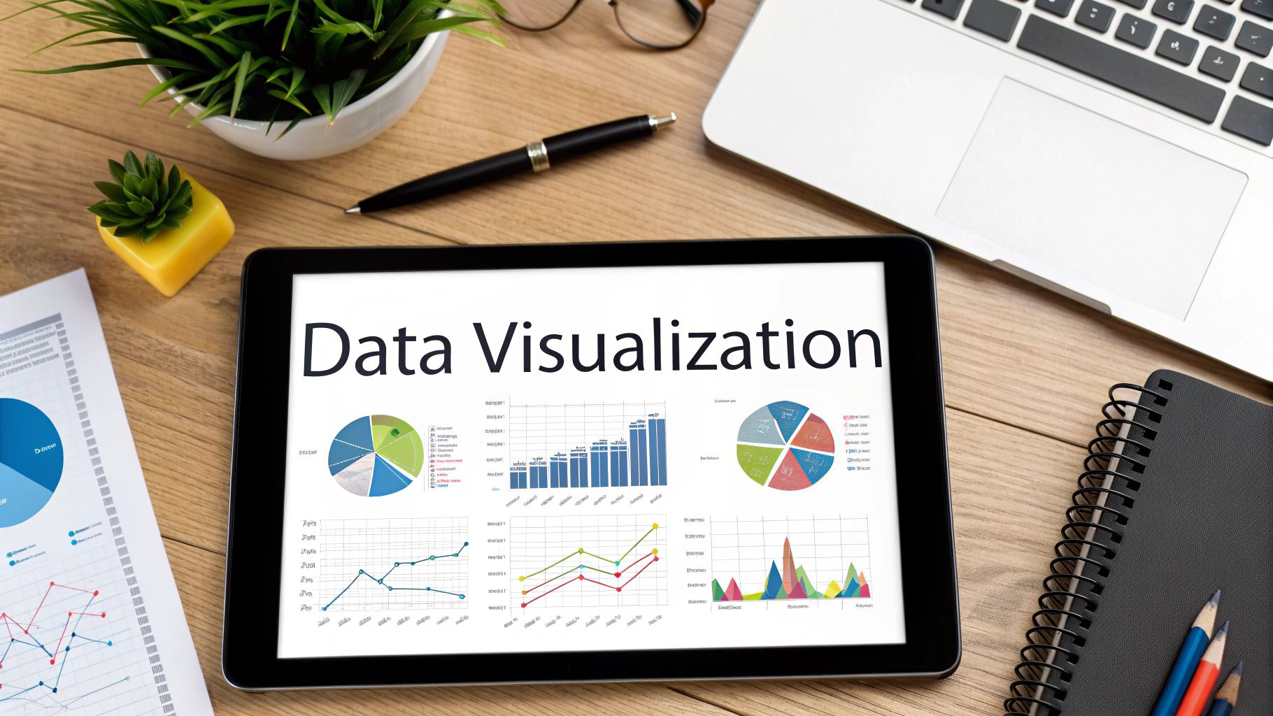
This method is highly effective for building authority and trust. For instance, a financial services company might use a clear bar chart in a banner to compare investment returns, making their advantage instantly obvious. Similarly, public health campaigns often use icon-based stats to communicate critical information, like vaccination rates or safety measures, in a way that is easy for everyone to comprehend. The goal is to educate and persuade through credible, visualized evidence.
When to Use This Approach
This design is perfect when you need to convey data-driven messages or simplify intricate topics. It excels for:
- Presenting research findings or market reports to establish thought leadership.
- Comparing products or services based on quantifiable features.
- Public awareness campaigns that rely on statistics to make a point.
- B2B marketing where demonstrating ROI or efficiency with data is crucial.
Actionable Tips for Implementation
- Prioritize the Key Data Point: Don't overwhelm the viewer. Focus the entire design on highlighting one or two crucial statistics that tell the most important part of your story.
- Keep Visualizations Simple: Use clean, universally understood chart types like bar graphs, pie charts, or line graphs. Avoid overly complex or cluttered visuals that are hard to interpret quickly.
- Use a Cohesive Visual System: Maintain consistency with your brand’s color palette and use a uniform set of icons. This creates a professional and organized look that reinforces brand identity.
- Ensure Data Accuracy and Cite Sources: Credibility is paramount. Always use accurate data and, if space permits, briefly mention the source to build trust with your audience.
9 Banner Design Concepts Comparison
| Design Approach | Implementation Complexity 🔄 | Resource Requirements ⚡ | Expected Outcomes 📊 | Ideal Use Cases 💡 | Key Advantages ⭐ |
|---|---|---|---|---|---|
| Typography-Centered Design | Low to moderate – relies on copy & font skills | Low – mainly fonts and layout tools | Clear, readable, timeless communication | Brand campaigns, minimalist messaging, international ads | Fast loading, cost-effective, highly readable, timeless |
| Photo-Realistic Product Showcase | Moderate to high – requires professional photography | High – photography, editing, storage | Builds trust, showcases product quality | E-commerce, retail product launches | Authentic product representation, reduces purchase hesitation |
| Animated and Interactive Elements | High – needs development & testing | High – coding, animation tools | Engaging, attention-grabbing, memorable experiences | Digital ads, interactive campaigns, rich media platforms | High engagement, conveys complex info progressively |
| Geometric and Abstract Patterns | Moderate – design skills needed | Moderate – graphic design tools | Modern, sophisticated visual appeal | Tech branding, events, modern product presentations | Scalable, strong brand recognition, visually striking |
| Lifestyle and Emotional Storytelling | Moderate to high – photography & narrative planning | High – production, diverse shoots | Emotional connection, brand affinity | Lifestyle brands, emotional campaigns | Builds strong emotional bonds, memorable, relatable stories |
| Minimalist and Clean Design | Low to moderate – demands design precision | Low – simple elements & fonts | Sophisticated, clear, timeless | Premium brands, product launches, versatile contexts | Fast loading, easy to read, projects premium quality |
| Bold Color and Gradient Schemes | Moderate – color theory and trend awareness | Moderate – design & testing tools | Eye-catching, emotional, trendy | Digital platforms, modern branding, creative industries | Captures attention quickly, evokes emotion, modern look |
| Collage and Mixed Media Approach | High – complex layering and artistic skill | High – various media and resources | Unique, creative, layered messaging | Artistic brands, cultural events, creative portfolios | Highly creative, distinctive, flexible in message delivery |
| Data Visualization and Infographic Style | Moderate to high – data accuracy & visualization expertise | Moderate to high – data + design | Easily understandable complex info | B2B, education, research, financial & health campaigns | Builds credibility, engaging, supports decision making |
Start Creating: Turning Ideas into High-Impact Banners
You now have a comprehensive playbook filled with powerful banner design ideas, moving you far beyond generic templates and into the realm of strategic, high-impact visuals. We have explored a diverse range of concepts, from the bold, communicative power of Typography-Centered Design to the immersive appeal of Animated and Interactive Elements. Each idea represents a unique tool in your creative arsenal, ready to be deployed for your next campaign.
The journey from a blank canvas to a compelling banner is about making intentional choices. It's about understanding when the clean, focused message of a Minimalist Design will resonate most, versus when a vibrant Bold Color and Gradient Scheme is needed to disrupt a crowded feed. The key takeaway is that there is no single "best" approach; success lies in strategic alignment. The most effective banners are born from a deep understanding of the campaign goal, the brand's personality, and the audience's expectations.
Synthesizing Your Strategy for Maximum Impact
Think of these concepts not as isolated options but as ingredients you can combine. A Photo-Realistic Product Showcase can be elevated with dynamic typography. A Collage and Mixed Media Approach can gain clarity and structure from an underlying Geometric Pattern. The true mastery of banner design comes from this creative synthesis, where you layer techniques to build something truly unique and effective.
Remember the core principles that unite all great banner design ideas:
- Clarity of Message: Your banner must communicate its purpose in a single glance. Whether using an Infographic Style to present data or a powerful image for Emotional Storytelling, the core message should be instantly understandable.
- Brand Consistency: Your chosen style must feel authentic to your brand. A startup known for its innovative tech might lean into abstract patterns, while a wellness brand would likely find more success with natural, lifestyle-focused imagery.
- A Compelling Call to Action: Every banner needs a clear next step. The design's entire purpose is to guide the viewer's eye and motivation toward that final, action-oriented element.
Your Actionable Next Steps
Don't let these ideas remain theoretical. Put them into practice immediately. Start by auditing your recent campaigns. Which of these approaches could have elevated your results? For your next project, challenge yourself to step outside your usual style. If you typically rely on minimalist layouts, experiment with a bold, typographic-led design. If your go-to is stock photography, try creating a custom collage.
This hands-on experimentation is the fastest way to develop your design intuition and discover which banner design ideas generate the best engagement for your specific audience. By consistently applying these strategic frameworks, you transition from merely creating ads to engineering powerful communication tools that capture attention, foster connection, and drive measurable business growth.
Ready to bring these banner design ideas to life in record time? ai-media-studio empowers you to generate stunning, high-quality visuals for any concept discussed in this article, from photo-realism to abstract art, in just a few clicks. Stop wrestling with complex software and start creating with the power of AI at ai-media-studio.