When you need to change an image's aspect ratio, you've got two main routes to take. You can either crop the image to fit a new shape or resize the canvas to add some padding around it—a technique often called letterboxing. Both methods are surprisingly quick with desktop software like Photoshop or even free online tools, making sure your visuals look just right on any platform.
Why Image Aspect Ratio Is So Important
Before we jump into the "how-to," it’s really important to get a handle on what aspect ratio actually is and why it's such a big deal for any kind of visual work. Put simply, it’s just the relationship between an image's width and its height.
Getting this right is what makes your images look intentional and professional, no matter what kind of screen they end up on.
Get it wrong, and you end up with some pretty frustrating results. Think about an e-commerce store where the product photos are stretched and distorted, making everything look cheap or broken. Or that stunning landscape photo you picked for a website header, only to have the best parts awkwardly chopped off. These are the exact kinds of problems that pop up when you ignore an image's intended shape.
The Shift to Widescreen and Its Impact
The need to really manage aspect ratios became critical as screen technology changed. For years, most of us were staring at squarish 4:3 computer monitors and TVs. But then, the entire industry made a decisive shift toward widescreen formats, creating a whole new standard.
The dominant consumer display aspect ratio shifted from 16:10 to 16:9 between 2008 and 2012, largely driven by the mass adoption of 1080p HDTVs and laptops. By the end of 2012, the market share of 16:10 displays had plummeted to under 23%, cementing 16:9 as the new norm.
This wasn't a choice made by creators; it was driven by manufacturers. And it meant designers and photographers had to adapt, fast. You could no longer just create one image and assume it would fit everywhere. Instead, you had to start thinking in multiple aspect ratios to keep your work from being horribly cropped or letterboxed on modern devices. You can read more about this technical evolution) and how it shaped modern media.
This chart does a great job of showing just how different these common ratios are, from the old-school 4:3 to the super-wide cinematic 2.39:1.
You can immediately see how a wider ratio like 16:9 is perfect for capturing more horizontal action, which is why it's the standard for video. Meanwhile, a squarer ratio like 4:3 gives you more vertical real estate. Understanding these basic shapes is the first real step to mastering how to change an image's aspect ratio without ruining it.
Choosing The Perfect Aspect Ratio For Any Platform
The perfect aspect ratio for an image? There's no single answer. The right choice is dictated entirely by where you plan to use it. Every social media platform, website layout, and digital ad format has its own unique real estate, and matching your image's shape to that space is what separates a professional look from an amateur one.
Get this wrong, and you end up with awkward crops that butcher your message or distracting black bars that scream "I didn't bother to optimize this." Think of it like tailoring an outfit. A widescreen 16:9 image looks fantastic as a website's hero banner or a YouTube thumbnail, giving you that broad, cinematic feel. But try to shoehorn that same image into an Instagram Story, and it's a disaster. For Stories, you need a vertical 9:16 view to fill the entire mobile screen and grab attention.
Matching Ratios To Social Media Platforms
Social media is all about capturing attention in a split second, and the right aspect ratio ensures your visuals use every single pixel available to them. Each platform has its own preferences, all designed to create the best user experience on their specific feed.
Here’s a quick rundown of what you need to know:
- Instagram: A square 1:1 ratio is the classic choice for the grid, but don't sleep on a 4:5 vertical portrait. It takes up significantly more screen space as users scroll, which can be a huge advantage. For Stories and Reels, a full-screen 9:16 is non-negotiable.
- Facebook: It's pretty flexible, but a 4:5 ratio for feed posts tends to perform best for the same reason it works on Instagram—more screen real estate. For link previews and many ad formats, a 1.91:1 landscape ratio is still the standard.
- X (formerly Twitter): In-stream images look sharpest with a 16:9 ratio, though you can also get away with a 1:1 or 2:1 format.
- Pinterest: This platform is built for vertical images. A 2:3 ratio is the sweet spot for Pins, making sure they stand out on the visual discovery engine.
When you're creating a lot of social content, it’s often much easier to generate https://www.ai-media-studio.com/tools/ai-images-for-social-media with these exact dimensions in mind right from the start.
Website And E-Commerce Best Practices
Beyond the fast-paced world of social media, your own website and online store have their own set of rules. Here, cohesion and clarity are everything. You want to guide visitors, not distract them.
A standard 16:9 ratio is the undisputed champion for most website hero banners and blog post featured images. This widescreen format is a perfect match for modern desktop displays. For years, Full HD 1920×1080 (a 16:9 ratio) has been one of the most common screen resolutions, making it a safe and effective bet for reaching the widest audience.
For e-commerce, consistency is king. Product photos are almost always best presented in a 1:1 square format. This creates a clean, uniform grid on your category pages, which allows customers to easily scan and compare products without any visual jarring.
The requirements get even stricter when you're running paid campaigns. To make sure every dollar counts, it's worth consulting a detailed Meta ad sizes guide. This will help you perfectly format every ad for its specific placement, whether it's in the main feed, stories, or messenger.
So, when should you even worry about changing the aspect ratio? This simple decision tree breaks it down. Is your image distorted or badly cropped? If yes, it's time to adjust.
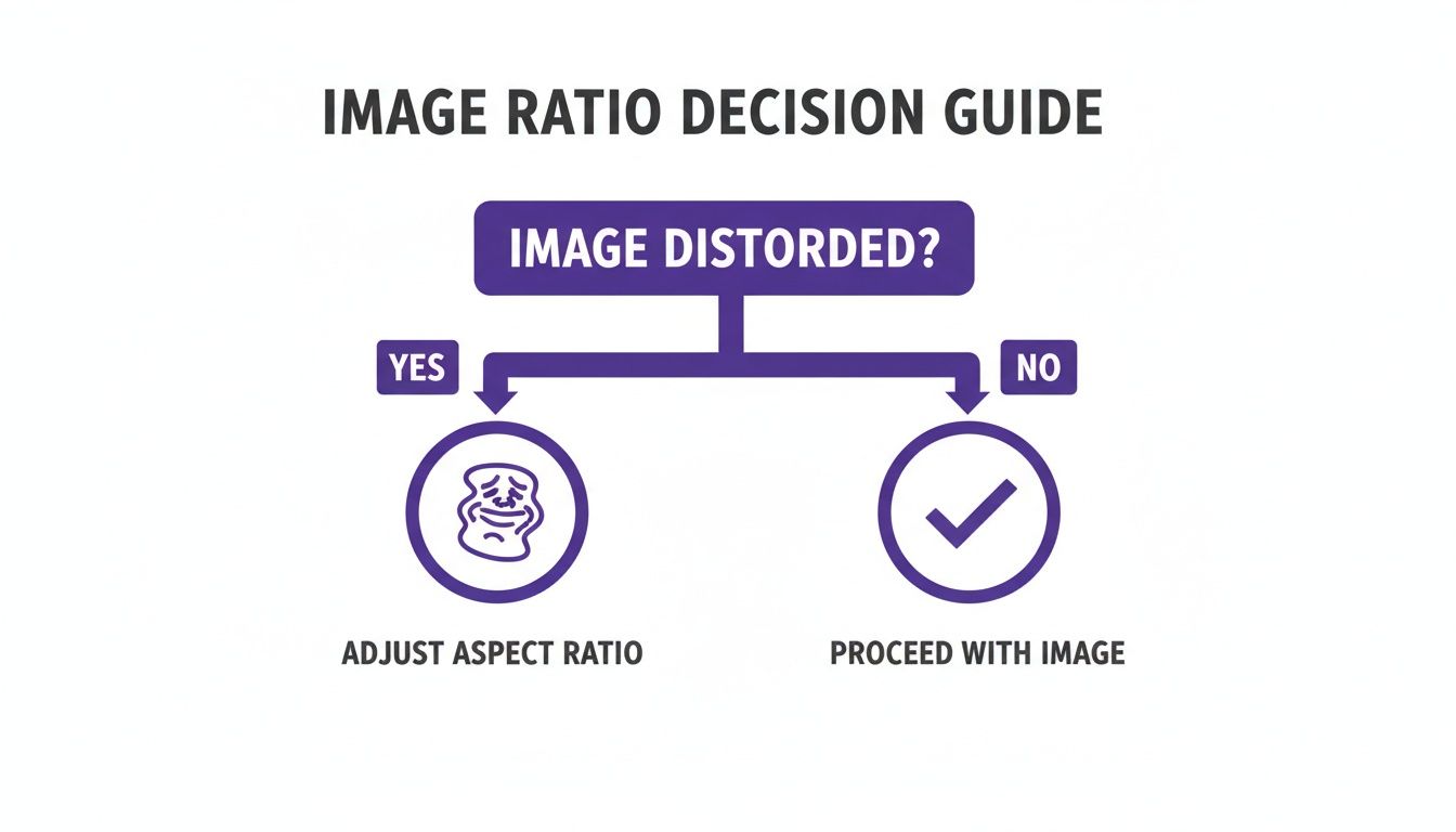
This graphic simplifies that first crucial step: identifying if there’s a problem to solve before you even open an editor.
To help you keep track of all this, I've put together a quick reference table with the most common aspect ratios and where you'll see them most often.
Common Aspect Ratios and Their Uses
This table is a handy cheat sheet for the most popular aspect ratios and where they work best. Keep it bookmarked to make sure your images always look their best, no matter the platform.
| Aspect Ratio | Common Dimensions (Pixels) | Primary Use Cases | Notes |
|---|---|---|---|
| 1:1 | 1080 x 1080 | Instagram Grid Posts, Facebook Carousel Ads, Product Photos | The universal square. Creates a clean, uniform look for galleries. |
| 4:5 | 1080 x 1350 | Instagram & Facebook Feed Posts | "Vertical Portrait" - maximizes screen space on mobile feeds. |
| 9:16 | 1080 x 1920 | Instagram Stories/Reels, TikTok, Mobile Wallpapers | Full-screen vertical video and imagery. Essential for mobile-first. |
| 16:9 | 1920 x 1080 | YouTube Thumbnails, Website Banners, TV Displays, Twitter | Standard widescreen format. Cinematic and ideal for desktop viewing. |
| 2:3 | 1000 x 1500 | Pinterest Pins, Photography Prints | A taller vertical format that stands out on Pinterest's grid. |
| 1.91:1 | 1200 x 628 | Facebook & LinkedIn Link Previews, some Ad Formats | A wide landscape format commonly used for shared links and ads. |
Remembering these key ratios will save you a ton of time and ensure your visuals are always presented in the most effective way possible. It’s a small detail that makes a huge difference in how professionally your brand is perceived.
Changing Aspect Ratios with Desktop Software
When you absolutely need pixel-perfect precision and total control, nothing beats dedicated desktop software. For serious projects, I always turn to powerhouses like Adobe Photoshop, Affinity Photo, or the fantastic open-source option, GIMP. These tools give you a level of control that quick online editors just can't match.
Unlike their web-based counterparts, desktop programs give you specialized tools to handle the two main ways of altering aspect ratios: cropping and canvas resizing. Knowing which one to use—and when—is the real secret to getting professional results without ruining your image.
The Power of Non-Destructive Cropping
Cropping is the most straightforward way to change the aspect ratio of an image. You’re essentially trimming away parts of the original picture to make it fit a new shape. The great thing about modern software is that this process is non-destructive, meaning you can always go back and adjust the crop later without permanently deleting any pixels.
Let's walk through a common scenario. You’ve got a stunning landscape photo shot in a standard 16:9 ratio, but you want to post it to your Instagram feed. To really make it pop while people are scrolling, a 4:5 vertical format is your best bet.
Here's how I'd handle that:
- Grab the Crop Tool: In pretty much any photo editor, find the crop tool. It usually looks like two intersecting right angles.
- Lock in a Fixed Ratio: This is the key step. In the tool's settings bar, look for an option to set a specific aspect ratio. Instead of dragging the box freely, you can type in "4:5".
- Recompose Your Shot: The crop box will now be locked to that 4:5 shape. Now you can drag it around the image and resize it to perfectly frame your subject, making sure no important details get cut off.
Using a fixed ratio is a game-changer. It stops you from accidentally stretching or squashing the image, guaranteeing the new version fits the platform's requirements perfectly.
Using Canvas Resizing for Letterboxing
But what if you absolutely cannot cut anything out of the photo? Maybe it's a product shot where every detail is crucial, or a group picture where cropping would mean cutting someone out. This is where you change the canvas around the image, not the image itself.
This technique is often called "letterboxing" (for horizontal bars) or "pillarboxing" (for vertical bars). It’s the perfect way to fit an entire image into a new aspect ratio without losing a single pixel of your original shot.
By resizing the canvas instead of the image, you maintain the integrity of the original photograph. You are essentially placing your image onto a new background that has the desired aspect ratio, filling the empty space with a color of your choice.
For example, let's say you have a 4:5 vertical photo that needs to fit into a 16:9 frame for a YouTube thumbnail.
Here’s the process:
- Open your image and find the "Canvas Size" option, which is usually under the "Image" menu.
- Change the units to pixels and plug in the new widescreen dimensions—for example, 1920 pixels wide by 1080 pixels high.
- Make sure the anchor point is centered. This tells the software to add the new space equally on all sides.
- Choose a color for the new canvas space. Black and white are classic choices, but you could also use a specific brand color.
The result? Your original vertical photo, perfectly centered in a widescreen frame. Nothing is cropped or distorted. This method gives you the best of both worlds—your image is untouched, and it fits perfectly in its new container. If you're curious about how different design applications handle these kinds of compositional challenges, looking at various book cover design tools can offer some really interesting insights.
Using Online Tools for Quick Aspect Ratio Changes
Sometimes you need to change an image's aspect ratio on the fly, and you just don't have the time—or the desire—to fire up heavy desktop software. This is where online tools really shine.
Browser-based editors are perfect for those quick, specific tasks, like prepping a photo for a social media post or creating a perfectly sized thumbnail for your latest blog entry. For social media managers, bloggers, and anyone juggling a dozen visual assets at once, the speed of these tools is a game-changer. You can take a full-resolution landscape photo and crop it to a perfect 1:1 Instagram post in under a minute, all without ever leaving your web browser.
Finding the Right Online Tool for the Job
A quick search will throw dozens of free online aspect ratio converters at you, but they're definitely not all created equal. Some offer a simple, no-frills cropping experience, while others pack in more advanced features. The trick is to find one that fits your needs without being overly complex or, worse, restrictive.
Here are a few things I always look for when choosing an online editor:
- Preset Ratios: A good tool should have built-in presets for common platforms. Think 16:9 for YouTube, 4:5 for an Instagram Feed post, or 9:16 for Stories. This saves you from having to memorize dimensions and just lets you work faster.
- Cropping vs. Padding: Does the tool only let you crop, or can you add padding (often called letterboxing)? Having the option to fit your entire image into a new frame by adding colored borders is a huge plus, especially when you can't afford to lose any part of the original shot.
- Ease of Use: The interface needs to be dead simple. Uploading your image, picking a ratio, and adjusting the frame should be a smooth, intuitive process that doesn't require a tutorial.
One critical thing to watch out for with free tools is their limitations. Many will cap your file size or resolution, and some might slap a watermark on your final image. Always check these details before you start editing to avoid any nasty surprises at the end.
A Typical Online Workflow
Let's walk through a common scenario: you need to create a 16:9 thumbnail for a YouTube video, but your source image is a vertical photo from your phone. With most online tools, the process is incredibly straightforward.
First, you'll upload your image directly to the website. Once it loads, you'll select the 16:9 aspect ratio from a dropdown menu or a list of presets. The tool will then overlay a cropping box over your image, locked into that specific shape.
All you have to do is drag and resize this box to perfectly frame the most important part of your photo. Make sure your subject is front and center. Once you're happy with the composition, you just hit download, and you're done.
This workflow is fast, efficient, and perfect for anyone producing content at a high volume. For those who want to integrate more advanced adjustments into this browser-based workflow, a powerful AI image editor can offer even more creative control. These modern tools combine the simplicity of online editors with features that were once exclusive to desktop software.
Using CSS to Change an Image’s Aspect Ratio on a Website
If you're a web designer or developer, you know the pain of trying to manually re-crop every single image for your site. It's a huge time sink. The smart move is to handle it directly in the code with CSS. This gives you a non-destructive and flexible way to change the aspect ratio of an image, ensuring your site looks sharp and consistent on every device.
Instead of permanently messing with your original image files, CSS lets you define a container and then tell the image how to fit inside that space. It's a much better approach for responsive design, where an image might need to be a perfect square on a desktop screen but a vertical rectangle on a phone.
Mastering the Object-Fit Property
The go-to tool for this job is the CSS object-fit property. It’s a lifesaver. It tells an image exactly how to fill its container's height and width, giving you total control over scaling and cropping without squashing or stretching anything.
Here are the values you'll actually use:
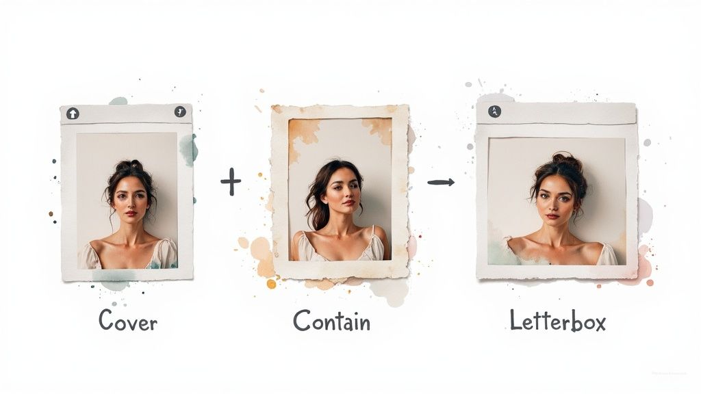
cover: This one scales the image to completely fill the container while keeping its aspect ratio. Anything that spills over the edges gets cropped off, which is perfect for hero banners or background images in cards.contain: Withcontain, the image shrinks or grows to fit inside the container, again without losing its aspect ratio. You're guaranteed to see the whole image, but you might get those black bars (letterboxing) if the container and image ratios don't match.fill: This is the default setting, and it’s usually what you want to avoid. It stretches the image to fill the container no matter what, which almost always results in a distorted, unprofessional look.
By simply combining
object-fit: cover;with a specific width and height on an image's container, you can force any image into a consistent shape. This is the secret sauce behind those perfectly uniform blog post grids or product galleries where all the source images are different sizes.
The Modern Aspect-Ratio Property
There's an even newer and cleaner way to do this with the aspect-ratio property. It's a game-changer because it lets you define the container's shape directly, making responsive layouts a breeze to manage.
For example, if you want to create a perfect 16:9 container for a featured image or a video, your CSS can be this simple: .image-container { width: 100%; aspect-ratio: 16 / 9; }
.image-container img { width: 100%; height: 100%; object-fit: cover; /* Makes sure the image fills the container */ } This method is incredibly slick. It replaces the old, clunky CSS hacks that relied on padding percentages. It’s a modern, elegant solution to a very common design challenge. Getting a handle on these CSS properties is a core skill for anyone building visually stunning websites, and it's something we dig into often in our guides.
Have Questions About Aspect Ratios? We’ve Got Answers.
Even with the best tools in hand, diving into aspect ratios can bring up a few questions. Trust me, I've been there. Getting these basics straight will save you a ton of headaches and help you make smarter edits down the road. Let's clear up some of the most common points of confusion.
The goal here is to cut through the jargon and give you the confidence to crop, pad, or just understand what you’re working with. These answers should clear things up and offer quick fixes for the hurdles you'll likely run into.
Will Changing the Aspect Ratio Ruin My Image Quality?
This is easily the number one concern, and the answer is: it depends entirely on how you do it.
If you change an image's aspect ratio by cropping it, you are not reducing its quality. Think of it as just trimming the edges off a photo. The part that's left over is still just as sharp and detailed as it was in the original.
The real trouble starts when you try to stretch a small, cropped image to make it bigger. That’s when you’ll see pixelation and blur. The pro-tip is to always start with the highest-resolution photo you can get your hands on. That way, even after you crop it down, you'll have more than enough pixels for a crisp, clean final image.
What's the Difference Between Aspect Ratio and Resolution Anyway?
It’s super common to mix these two up, but they describe completely different things. Here's a simple way to think about it: aspect ratio is the shape, while resolution is the detail.
- Aspect Ratio: This is just the proportional relationship between the width and height, like 16:9 or 4:5. It tells you if the image is a widescreen rectangle or a vertical box, no matter how big or small it is.
- Resolution: This is the nitty-gritty detail—the total number of pixels in the image, usually written as width x height (e.g., 1920x1080 pixels). More pixels mean more detail.
You can have two images that are both a 16:9 aspect ratio, but one could be a massive 4K file and the other a tiny thumbnail. They have the same shape, but wildly different levels of detail.
The aspect ratio is the shape of the container; the resolution is the quality of what’s inside it. Always aim for high resolution in the correct aspect ratio for the best results.
Can I Change an Image's Aspect Ratio Without Cropping It?
Yes, you absolutely can! The best way to do this is by adding "padding" or creating a "letterbox" effect around your image.
Instead of chopping off parts of your photo, you essentially expand the canvas to fit the new aspect ratio. Then you fill the extra space with a solid color, usually black or white. This method is a lifesaver when you can't afford to lose a single bit of your original shot.
Most good editing tools, both online and on your desktop, have a feature for this. Look for options like "Fit," "Pad," or "Resize Canvas." It’s the perfect workaround for framing your image in a new shape while keeping the original completely intact.
Ready to create stunning visuals in any aspect ratio without the hassle? AI Media Studio lets you generate professional-quality images from simple text prompts in seconds. Get started for free and see how easy it is to bring your ideas to life at https://www.ai-media-studio.com.