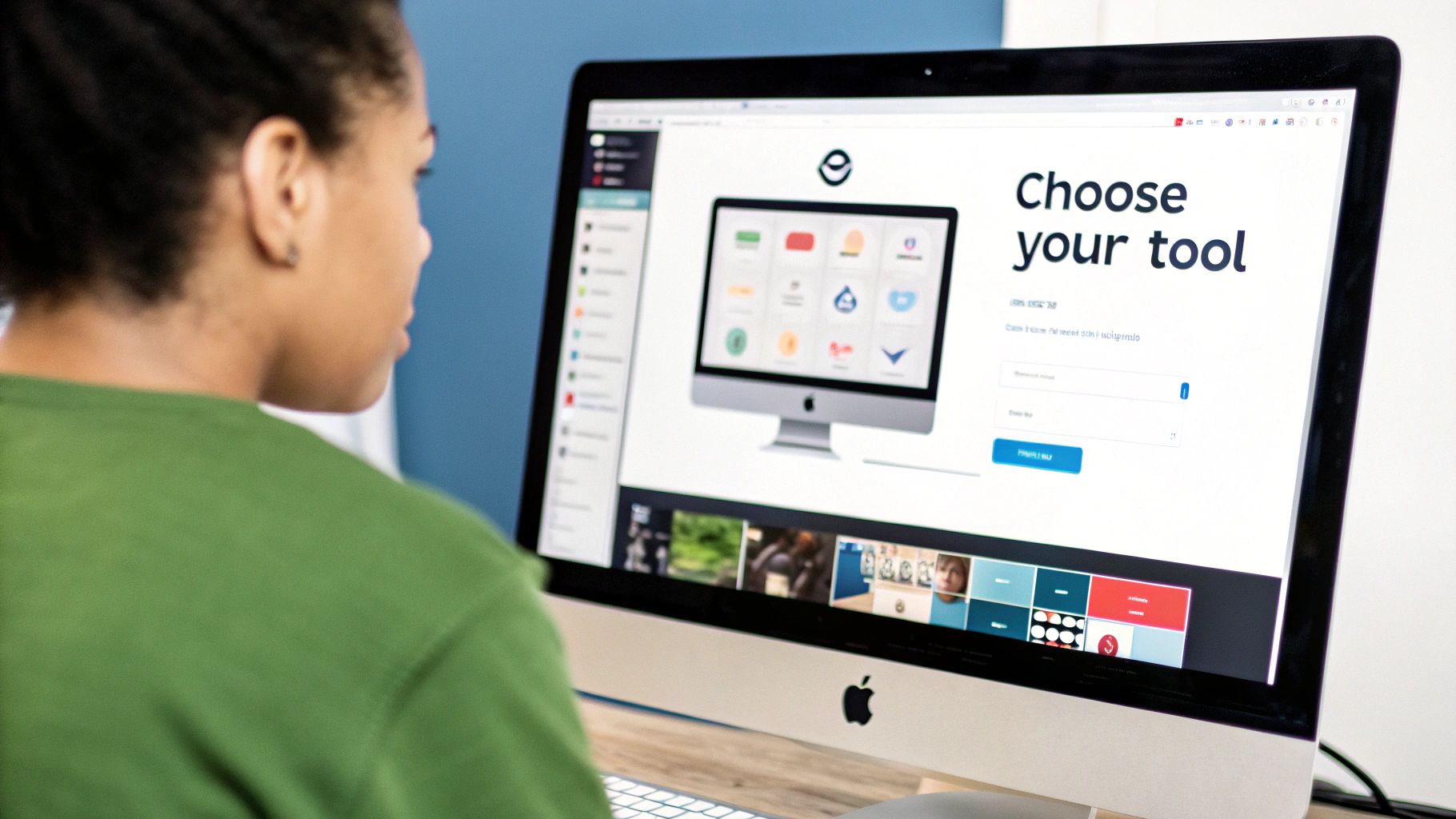
So, you’re thinking about creating a logo with AI. It’s a pretty straightforward process. You hop into a tool like AI Media Studio, give it some text prompts about your brand—think style, colors, and overall vibe—and let the AI do the heavy lifting. It’s a fantastic way to get a bunch of professional-looking concepts in your hands within minutes, without the hefty price tag.
Welcome to the New Age of AI-Powered Branding
We’re in a totally new era for logo design. Gone are the days when getting a professional brand identity meant shelling out a small fortune to a design agency or getting stuck in a months-long creative process. Today, artificial intelligence is making great branding accessible to everyone, from solo entrepreneurs to growing businesses.
This isn't just about cutting costs or saving time, although those are huge benefits. It's about putting the creative power back in your hands. AI acts as your creative sidekick, helping you turn your abstract ideas into a tangible, high-quality logo. You don’t need a design degree or a massive budget anymore; you just need a clear vision.
Why AI Is Changing the Logo Design Game
The buzz around these tools isn't just hype; it reflects a real shift in how businesses are built. The numbers back it up, too. The AI logo generator market is expected to jump from $0.48 billion in 2024 to $0.59 billion in 2025. This explosive growth shows just how much demand there is for smart, accessible design solutions.
What’s driving this change? A few key things:
- Unbelievable Speed: You can get dozens of unique logo ideas in the time it takes to write a single email to a designer.
- Budget-Friendly: It’s a game-changer for startups and small businesses, letting you sidestep the high costs of traditional design services.
- Endless Creativity: Feel free to experiment with countless styles, color palettes, and concepts without spending an extra dime until you find the one.
An AI logo generator doesn't replace your creativity; it amplifies it. Think of it as a brainstorming partner that can visualize your ideas instantly, allowing you to focus on strategy and refinement.
Your AI Logo Creation Journey at a Glance
To give you a clearer picture, here is a quick overview of the key phases for creating a logo with an AI tool.
| Phase | Objective | Key Action |
|---|---|---|
| Foundation | Define your brand's core identity. | Brainstorm keywords, colors, and style preferences. |
| Generation | Create initial logo concepts. | Enter descriptive prompts into the AI tool. |
| Refinement | Fine-tune the best designs. | Adjust colors, fonts, and layouts to perfect the logo. |
| Finalization | Export and implement your new logo. | Download high-resolution files for all your brand assets. |
Following this path helps ensure the final design is not only beautiful but perfectly aligned with your business goals.
Build Your Brand Foundation First
To really get the most out of an AI tool, you need to start with a solid brand foundation. Before you even think about generating designs, it's worth taking a moment to understand the basics of how to create a brand identity that truly connects with people.
Doing this groundwork first ensures the logos you generate aren't just pretty pictures—they're strategic assets that tell your story. For more hands-on advice, be sure to check out our guide on essential branding tips for small businesses.
Translating Your Brand Vision into AI Prompts
This is where the magic really begins. Forget any notion that creating a logo with AI is just a technical exercise. It’s an art form, one that hinges on your ability to translate a feeling into a clear, compelling instruction.
The secret to an exceptional AI-generated logo isn't a one-word command. It's about giving the AI a rich, detailed story to work with. You need to think of yourself as a creative director guiding a very talented, very literal artist.
So, before you type a single word into the prompt box, take a step back and define your brand’s personality. Is it playful and energetic, or is it buttoned-up and serious? Are you aiming for a modern, tech-forward vibe or something more organic and down-to-earth? Answering these questions gives you a whole library of descriptive keywords to pull from. This initial brainstorming is, without a doubt, the most critical part of the process.
For instance, a prompt for a high-end, artisan coffee shop will look completely different from one for a children's toy brand. The coffee shop needs words like "minimalist," "artisan," "warm tones," and "elegant script." The toy store, on the other hand, calls for terms like "vibrant colors," "playful character," "chunky font," and "whimsical." See the difference?
Crafting a Detailed and Effective Prompt
Once you've got your core concepts locked in, it's time to build the prompt itself. Don’t just list what you want to see; describe the feeling you want the final logo to evoke. I’ve found the best approach is to start with the most essential elements and then layer in the details.
Here’s a breakdown of how I structure my prompts:
- Core Subject: Start with the main icon or symbol you have in mind. Is it a mountain peak, a clever fox, a circuit board, or just an abstract shape? Be specific.
- Artistic Style: Next, tell the AI what aesthetic you're going for. Use terms like "flat design," "vector logo," "line art," or "watercolor style" to give it clear direction.
- Color Palette: This is huge. Instead of just saying "blue and green," get precise. Try "a palette of teal and mint green with subtle gold accents." This level of precision makes an enormous difference in the output.
- Mood and Vibe: Finally, add descriptive words that set the tone. "Calm," "energetic," "futuristic," or "retro" are all great examples that help guide the AI's creative choices.
To get the absolute best results, it's worth taking the time to truly understand the nuances of mastering AI image prompts.
Putting It All Together with Real Examples
Let's walk through a real-world scenario. Imagine you're building a logo for a new sustainable skincare brand.
A weak, ineffective prompt might be: "logo for skincare."
Now, let's try a strong, detailed prompt: "Minimalist vector logo of a single green leaf intertwined with a water droplet, clean lines, earthy color palette of sage green and soft terracotta, serene and natural."
This is the kind of detail AI Media Studio thrives on. The more specific your instructions, the closer the generated concepts will be to what you’re picturing in your head. And while this guide is focused on logos, these same principles apply to any visual content you create. If you want to go deeper, check out our guide on how to generate images with AI.
It's not just about aesthetics; it's about strategy. As of 2025, 85% of marketers see AI as a major force in design because it can connect color psychology and consumer data to create logos that resonate deeply.
Evaluating Your First AI Logo Concepts
Alright, the moment of truth. You've fed your prompts to the AI, and now you have a screen full of potential logos. It's an exciting milestone. The temptation is to just grab the one that looks the coolest and call it a day, but a great logo is so much more than a pretty graphic. It’s a workhorse for your brand.
This is where your job shifts from creator to curator. You're not just picking a picture; you're choosing the face of your business, a decision that will influence how customers see you for years to come.
This visual breaks down how we take those initial, broad ideas and sharpen them into a single, polished concept that's ready for the real world.
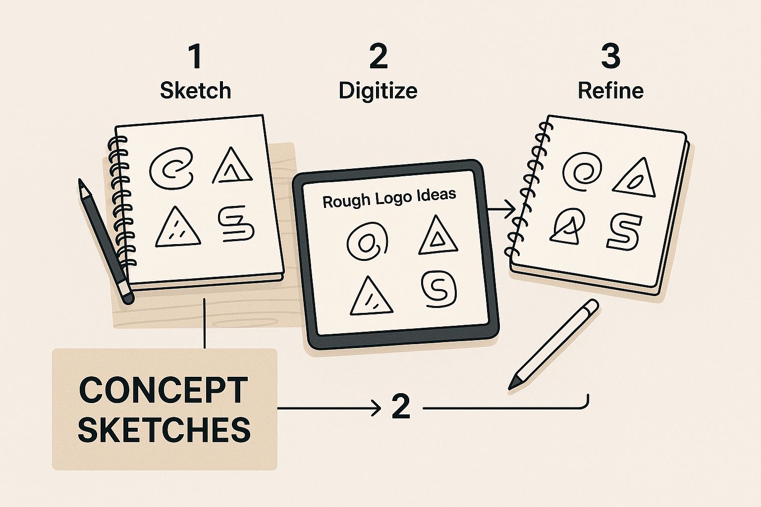
As you can see, great design isn't about getting it perfect on the first try. It's about starting with a wide net of ideas and then thoughtfully narrowing it down.
Looking Beyond First Impressions
Let's get past the initial "ooh, that's nice" reaction and start thinking like a brand strategist. A solid logo needs to tick a few very specific boxes. As you look through the AI's suggestions, run each one through this simple filter.
- Is it simple and memorable? Think about the most iconic logos out there. They're rarely complex. The best designs are the ones people can easily recall after just a quick glance.
- Is it timeless? Chasing trends is a recipe for a logo that will look dated in a year. You want a design that feels just as relevant and strong a decade from now.
- Is it appropriate? Does the logo's vibe actually match your business? A bouncy, cartoon-style logo might be perfect for a kids' toy store but would feel completely wrong for a law firm.
Asking these questions is a fast way to ditch the weaker designs and focus on the real contenders. This is a crucial part of the process when you're learning how to create a logo with AI that has genuine staying power.
Checking for Originality and Scalability
Two of the most critical—and often overlooked—checks are originality and scalability. While AI Media Studio works to generate unique assets, it's always a smart move to double-check that your favorite design isn't too close to an existing logo, especially a competitor's. A quick reverse image search is your best friend here.
Scalability is just as important. Your logo has to look good everywhere.
A truly effective logo is a visual chameleon. It needs to be instantly recognizable as a tiny favicon on a browser tab and equally impressive when blown up on a massive trade show banner.
Picture your logo in the wild. How does it hold up in simple black and white? When you shrink it down for an app icon, does it turn into an unreadable smudge? Designs that lean too heavily on intricate details or subtle color gradients often fail this real-world test. In my experience, simpler, bolder forms are almost always the winners because they perform well across every possible application. This practical step ensures your brand looks sharp and professional, no matter where people see it.
Refining Your Logo with AI Editing Tools
Getting that first batch of AI designs is exciting, but it's rarely the finish line. I like to think of it as the starting pistol for the final, most creative lap of the race. This is the refinement stage—where your human eye meets powerful editing tools to turn a good concept into something truly great.
This part of the process is a collaboration between you and the AI. You've already done the heavy lifting by defining your brand and prompting the initial ideas. Now you get to step in as the creative director, making those small, meaningful adjustments that will perfect the final logo. It’s less about huge overhauls and more about precise, impactful tweaks.
Fine-Tuning Your Chosen Concept
Once you've picked a winning concept from the initial batch, it's time to get granular. Modern AI platforms, including AI Media Studio, come equipped with a suite of editing tools made for exactly this purpose. You can kick things off by playing with the typography—see how different font styles can completely change the voice of your brand.
Next up, the color palette. You'd be surprised how much a subtle shift in a shade of blue or a slight warming of a neutral tone can alter a logo's entire mood. Don't hold back here. I always recommend generating several variations with minor color adjustments just so you can compare them side-by-side.
Finally, think about layout and composition. Small changes, like adjusting the space between an icon and the text or slightly rotating an element, can bring a new level of balance and professionalism to the design. This back-and-forth is key to landing on a final product that just feels right.
The goal of refinement isn't to start from scratch. It's to polish what's already there. Often, it's the small, deliberate edits—a font swap, a color tweak, a spacing adjustment—that transform a promising concept into a market-ready logo.
Generating Variations for Perfection
One of the most powerful features when you create a logo with AI is the ability to generate variations of a single concept. Instead of starting over, you can ask the AI to produce slightly different versions of the logo you already like. This is an incredible way to explore options without losing the core idea you fell in love with.
For example, you could ask the AI for:
- Different lockups: See how the logo looks with the icon above the text, next to it, or even integrated within it.
- Subtle style shifts: Request the same concept but in a "flatter" or "more illustrative" style.
- Contained versions: Ask for the logo to be placed inside a circle, shield, or square to see how it works as a self-contained mark.
This approach saves a massive amount of time and gives you the confidence that you're choosing the absolute best version of your design. For an even more seamless experience, our own AI Logo Generator includes intuitive tools for exactly this kind of iterative refinement.
Knowing When Your Logo Is Done
The last, and arguably toughest, step is knowing when to stop editing. It’s way too easy to get stuck in a loop of endless tweaks—a classic case of "analysis paralysis." My advice? Before you even start refining, set clear criteria for what "done" looks like.
A design is finished when it’s simple, memorable, and works everywhere you need it to. Once your logo hits those core requirements, it’s time to take your hands off the keyboard. Over-editing can quickly clutter a clean design and water down its impact. Trust your gut—when a logo feels strong, clear, and authentically you, it’s ready for the world.
Putting Your New AI Logo into Action
A brilliant logo is only as good as how you use it. Now that you’ve designed a logo you love, the real work begins: putting it into action correctly. This is less about design and more about understanding the technical side of things—like file formats—and building a consistent brand presence everywhere you show up.
Think of your logo as your brand's ambassador. For it to do its job, it needs the right outfit for every occasion, whether it’s a tiny profile picture on social media or a massive banner for a trade show. Using the right file type is non-negotiable for making sure it always looks sharp and professional.
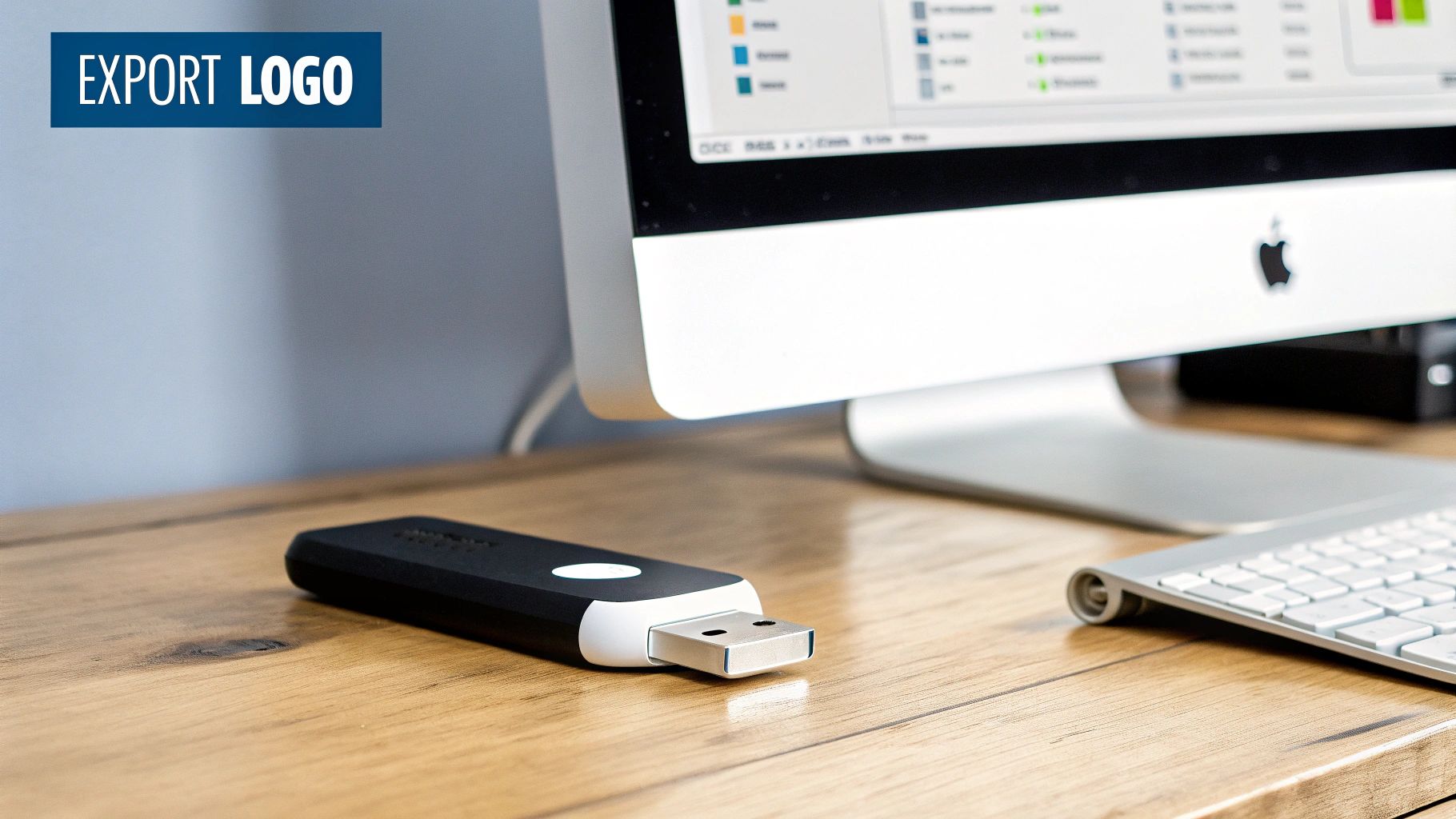
Understanding Your Logo File Formats
When you export your final design from a tool like AI Media Studio, you’ll likely get a bundle of different files. It’s easy to just grab the first one that opens, but trust me, each format has a very specific job.
-
SVG (Scalable Vector Graphic): This is your master file. Your golden ticket. Because it’s a vector, you can stretch it to the size of a billboard or shrink it to fit on a pen without it ever getting blurry. Always, always use this file for professional printing or for sending to other designers.
-
PNG (Portable Network Graphic): This will be your best friend for all things digital. PNG files support transparent backgrounds, which is absolutely essential for placing your logo over photos or colored sections on your website and social media graphics.
-
JPG (Joint Photographic Experts Group): Use JPGs with caution. They don't support transparency, and their compression can make your logo look fuzzy, especially around the edges. They’re really only good for web images where you have a solid background and file size is your absolute top priority.
The single biggest mistake I see people make is saving a low-quality JPG and using it for everything. Always start with your highest quality file—your SVG or a high-res PNG—and create other versions from that master file as needed.
Assembling a Simple Brand Kit
Consistency is the secret sauce that transforms a cool logo into a memorable brand. A simple brand kit acts as your personal cheat sheet to keep everything looking cohesive. It doesn’t need to be some hundred-page document; it just needs to be a central spot for your core visual assets.
Here’s a quick and dirty checklist to get you started:
- Final Logo Files: Make a folder with your main logo, a favicon version (for browser tabs), and any other variations you need (like all-white or icon-only). Make sure you have them in SVG, PNG, and JPG formats.
- Color Codes: Write down the exact hex codes for your primary and secondary brand colors. This is how you ensure the blue on your website's "Buy Now" button perfectly matches the blue in your Instagram post template.
- Brand Fonts: Note the names of the fonts you used in the logo itself, plus any complementary fonts you plan to use for headings and body text on your website or other materials.
Deploying Your Logo for Maximum Impact
With your brand kit in hand, it's go-time. Start applying your new logo consistently across every single place a customer might see it. It’s this repetition that builds familiarity and recognition.
Begin with your most valuable digital properties, like your website header and all your social media profiles. From there, roll it out to your email signature, invoices, presentations, and business cards. Every single application reinforces your brand identity, turning the design you created into a genuine business asset. This is the final step that makes learning how to create a logo with AI so incredibly powerful.
Got Questions About Making a Logo with AI?
As you dive into creating a logo with AI, you're bound to have some questions. That's completely normal. Things like ownership, quality, and how this all fits in with human designers are common thoughts. Let's get those sorted out so you can move forward with confidence.
Can I Actually Own an AI-Made Logo?
This is probably the biggest question on everyone's mind. When an AI like AI Media Studio designs a logo for you, who legally owns it? The short answer is, it's a bit nuanced, but generally, you're in the clear for commercial use.
The key is to always read the terms of service of the platform you're using. These terms will spell out exactly what rights you get—whether it's full copyright ownership or a license to use the design. Getting this right from the start is crucial for protecting your brand down the road.
Are AI Logos Just Generic Rip-Offs?
There’s a common myth floating around that AI logo generators just spit out generic, cookie-cutter designs. That's simply not true. The tool itself isn't what makes a logo generic; it's the input. A lazy, vague prompt will naturally give you a bland result.
But when you feed the AI a detailed, thoughtful prompt that truly captures your brand's personality and style, you get something unique. The magic happens when you combine specific instructions with a smart refinement process—iterating on colors, tweaking fonts, and adjusting layouts. This is how you steer the AI toward a brand mark that's genuinely yours and won't get lost in the crowd.
The quality of an AI-generated logo is a direct reflection of the quality of the prompt. Your unique vision, translated into specific instructions, is what makes the final design original and effective.
Think of it this way: asking a chef to just "make food" will get you something to eat, but it won't be memorable. Give that same chef a detailed recipe with specific ingredients, and you'll get a masterpiece. The same principle applies here.
Is AI Putting Human Designers Out of a Job?
Finally, people often wonder if AI tools are the end of the road for human designers. Not at all. AI is an incredible tool, especially for startups on a tight budget or anyone who needs to brainstorm a bunch of ideas fast. It makes professional-level design accessible to everyone.
But it doesn't replace the strategic mind of a human designer. An experienced designer brings a lot more to the table:
- Deep Brand Strategy: They can weave your logo into a broader brand narrative and position you perfectly in the market.
- Bespoke Creativity: They know when and how to break the design rules to create something truly new—a feat AI can't always replicate.
- Human Intuition: They just get the cultural nuances and emotional triggers that algorithms are still learning to understand.
So it's not about replacement; it's about partnership. AI is a seriously powerful assistant, but the strategic, storytelling soul of great branding often needs that human touch.
Ready to bring your brand vision to life? With AI Media Studio, you have the power to create a stunning, professional logo in minutes. Start for free and see what you can design. Try AI Media Studio today