Understanding Visual Brand Guidelines Beyond the Basics
Think of your visual brand guidelines as the architectural blueprint for your company's entire presence. It’s the foundational plan that ensures every single thing your audience sees—from a tiny icon in your app to a massive trade show banner—feels like it comes from the same place. This is much more than a simple document with your logo and colors; it's a core business tool that connects your big-picture vision to the real-world things you create.
From Static Rulebook to Dynamic Roadmap
Too often, brand guidelines are created, saved as a PDF, and then forgotten on a shared drive, gathering digital dust. These are nothing more than static rulebooks. The most memorable brands, however, treat their guidelines as a living document—a dynamic roadmap that evolves with them.
This approach changes the entire purpose of the guidelines. Instead of a list of "don'ts," they become a creative compass. This tool gives your teams a clear direction, empowering them to make smart, consistent decisions without feeling creatively boxed in. It’s the secret behind brands that look effortlessly coherent across thousands of different interactions.
A Framework for Cohesive Storytelling
Strong guidelines build a system where every visual element has a job to do. They answer the big questions upfront—like why a certain color evokes a specific feeling or how fonts should be used to guide the reader's eye. This frees up your creative teams to focus on telling great stories instead of reinventing the visual language every time.
This structure is what allows a brand’s story to feel consistent, whether someone encounters it on a billboard, in a social media feed, or on product packaging. The result is a unified experience that builds instant recognition and lasting trust with your audience.
The Strategic Value in a Crowded Market
This visual consistency has a direct impact on your bottom line. In a world where people interact with brands across dozens of channels, a unified appearance is critical for building credibility. While research shows that brand building typically receives only about 7% of a company's budget, a staggering 62% of consumers report that a brand's values strongly influence their decision to buy.
Your visual brand guidelines are the primary tool for making sure those values are communicated clearly at every turn. See how a strong brand identity influences what people buy. This framework allows a business to grow, enter new markets, and adopt new platforms while always sounding and looking like itself.
The Core Components That Actually Work
Logo and Color Palette: The Brand's Signature
Your logo is the most identifiable feature of your brand. Strong guidelines do more than just provide a logo file; they set the ground rules for how it should be treated. This includes defining clear space—think of it as a mandatory personal bubble—to ensure your logo is never crowded or lost on the page. Guidelines also specify minimum sizes for legibility and, crucially, what not to do, protecting your signature from being stretched, distorted, or recolored.
Alongside the logo, your color palette communicates your brand’s personality without saying a word. A defined primary and secondary palette with exact color codes (HEX, RGB, CMYK) is essential for consistency. This guarantees that your brand’s signature blue looks the same on a website as it does on a printed brochure, creating a seamless experience for your audience.
Typography and Imagery: Setting the Tone
Typography is how your brand’s voice sounds. Is it bold and confident, or is it quiet and thoughtful? Good guidelines establish a clear typographic hierarchy, which is essentially a system that tells readers what to focus on first. It assigns specific fonts, weights, and sizes for headlines, subheadings, and body copy to guide the eye.
This structure does more than just look organized; it creates a predictable rhythm that improves readability. By defining details like line height and letter spacing, you give designers the exact specifications needed to apply the brand voice correctly every single time, ensuring clarity and professionalism.
To see how all these pieces fit together, the table below breaks down the primary job of each component and the key specifications that make it effective.
| Component | Primary Function | Key Specifications | Usage Examples |
|---|---|---|---|
| Logo | Serves as the brand's primary identifier. | Clear space, minimum size, color variations, and misuse rules. | Website headers, business cards, social media profiles. |
| Color Palette | Evokes emotion and ensures visual consistency. | Primary, secondary, and accent colors with HEX, RGB, & CMYK codes. | Button colors, background shades, call-to-action text. |
| Typography | Establishes a distinct voice and improves readability. | Font families, weights, and sizes for H1/H2/body; line height rules. | Blog post headlines, paragraph text, image captions. |
| Imagery | Sets the mood and tells a visual story. | Style definitions (e.g., candid vs. staged), color grading, composition. | Hero images on a website, social media posts, ad campaigns. |
| Iconography | Acts as a visual shorthand for actions and features. | Consistent style, size, and stroke weight across all icons. | UI buttons, feature lists on a landing page, infographics. |
Each component has a distinct role, but they all work toward the same goal: creating a unified brand identity. When used together correctly, they build a sense of visual harmony that fosters trust and recognition.
The Full Toolkit for Visual Cohesion
Beyond the foundational trio of logo, color, and typography, a complete set of visual brand guidelines includes other tools that add depth and consistency.
- Imagery Style: This defines the entire mood of your visual content. It answers critical questions: Is our photography authentic and in-the-moment or polished and professional? Defining rules for lighting, composition, and color treatment ensures every image feels like it came from the same world.
- Iconography: A consistent family of icons serves as a simple, universal language for your users. Whether in an app or on a website, well-designed icons improve navigation and strengthen your brand’s visual character.
- Layout and Grid Systems: Think of these as the invisible skeleton holding your designs together. By defining margins, columns, and spacing, grid systems bring a sense of underlying order to every page, making content look intentional and easier to follow.
- Data Visualization: For any brand that presents data, having guidelines for charts and graphs is key. This ensures that even complex information is presented in a way that is clear, accessible, and visually aligned with your brand.
Why Visual Consistency Drives Real Business Results
This subconscious sense of reliability is the foundation for strong customer relationships. It's achieved through a clear and deliberate strategy, guided by a set of visual brand guidelines. These guidelines act as the official playbook, ensuring every piece of your brand—from your website to a social media post—presents a unified front.
The Hidden Costs of Inconsistency
When a brand lacks this unified presence, it pays a price that doesn't always show up on a spreadsheet. If a customer sees a different logo, color palette, or font on your website than on your social media, it can create a moment of confusion. This small crack in confidence can be enough to stop a potential sale.
The costs are internal, too. Inconsistent branding creates friction for your employees, leading to wasted hours debating minor design choices. This indecision slows down marketing work and results in a public image that feels fractured and unprofessional.
Building Trust and Accelerating Growth
On the other hand, a coherent visual identity creates a powerful sense of familiarity that can speed up business growth. When customers see your brand across different channels and it always looks and feels the same, it becomes a reliable presence in their lives. This familiarity directly builds brand trust, making it easier for them to choose you over a competitor.
This clarity also gives your internal teams a major boost. With a strong set of visual standards, they can work with speed and confidence. They have a clear rulebook that removes guesswork, freeing them to focus on execution. For example, knowing the exact visual rules makes it much easier to quickly create compelling social media graphics that are always on-brand.
This alignment has grown even more important as it now communicates core values, not just aesthetics. People are increasingly drawn to brands that reflect their own beliefs, and consistent design is the best way to communicate that purpose. Strong visual brand guidelines ensure this message is delivered with clarity, turning your visual identity into a tool for building genuine emotional connections. Discover more about how brand design is evolving to see where the industry is headed.
The Strategic Creation Process That Gets Results
Building effective visual brand guidelines is far more than a simple design exercise; it's a strategic project that demands a careful, structured approach. Think of it less like an artist painting a spontaneous masterpiece and more like an architect drafting the blueprints for a skyscraper. Without a solid foundation rooted in research and team alignment, the entire structure is at risk of failing. The end goal is to produce a tool that is genuinely helpful for everyone in the organization.
To give you a clearer picture of what this process involves, here’s a typical timeline. This table breaks down each phase, showing the key activities, expected deliverables, and the people who need to be involved.
Visual Brand Guidelines Creation Timeline
Step-by-step process with timeframes and key deliverables for each phase
| Phase | Duration | Key Activities | Deliverables | Stakeholders Involved |
|---|---|---|---|---|
| 1. Discovery & Strategy | 2–4 Weeks | Stakeholder interviews, workshops, competitive analysis, audience research. | Brand strategy document, core mission & vision statements, brand personality profile. | Executive Leadership, Marketing, Sales, Product Development, Customer Support. |
| 2. Design Exploration | 4–6 Weeks | Mood boarding, logo concepting, developing color palettes and typography systems, creating initial mockups. | 2-3 distinct visual concepts, refined logo, primary & secondary color palettes, typography scale. | Design Team, Marketing Lead, Project Manager, Key Decision-Makers. |
| 3. Validation & Refinement | 1–2 Weeks | Testing designs in real-world applications (mobile, web, print), accessibility checks, gathering internal feedback. | Finalized visual identity system, approved mockups of key assets. | Design Team, End-Users (for testing), Department Heads. |
| 4. Documentation & Rollout | 2–3 Weeks | Writing usage rules, creating templates, building a central asset library, and documenting all visual elements. | Comprehensive brand guidelines (digital portal or PDF), downloadable logo files, brand templates. | Brand Manager, Design Team, Marketing Department. |
This timeline shows that creating strong guidelines is a disciplined journey with clear milestones. Each phase builds on the last, ensuring the final result is both beautiful and built for business.
Discovery and Stakeholder Alignment
The entire process starts not with colors or fonts, but with conversations. The discovery phase is all about defining your brand’s fundamental essence: its mission, its personality, and the specific feelings you want customers to experience. This means bringing key people to the table from across the company—from marketing and sales to product and customer service.
The goal is to gather different perspectives to form a complete picture of the brand’s identity. This isn't about designing by committee, a common mistake that often weakens the final vision. Instead, the objective is to achieve strategic alignment on the brand's direction. This shared understanding becomes the project's North Star, guiding every decision that follows.
Design Exploration and Validation
With a clear strategic foundation in place, the creative work can begin. Designers start translating the abstract brand essence into tangible visual systems, including logos, color palettes, and typographic hierarchies. This isn't about picking what looks trendy; every choice must be intentional and directly support the brand's defined personality.
For instance, a fintech company trying to build trust might explore stable, deep blues and classic serif fonts. In contrast, a wellness app might experiment with soft, organic colors and clean, airy typography. Most importantly, these creative ideas must be validated. This means testing the visual elements in real-world mockups. Can you read the text on a small phone screen? Are the primary colors accessible for people with visual impairments? This validation step is what prevents expensive and embarrassing mistakes later on.
This systematic process applies to every element, including something as detailed as typography, as this visual guide illustrates.
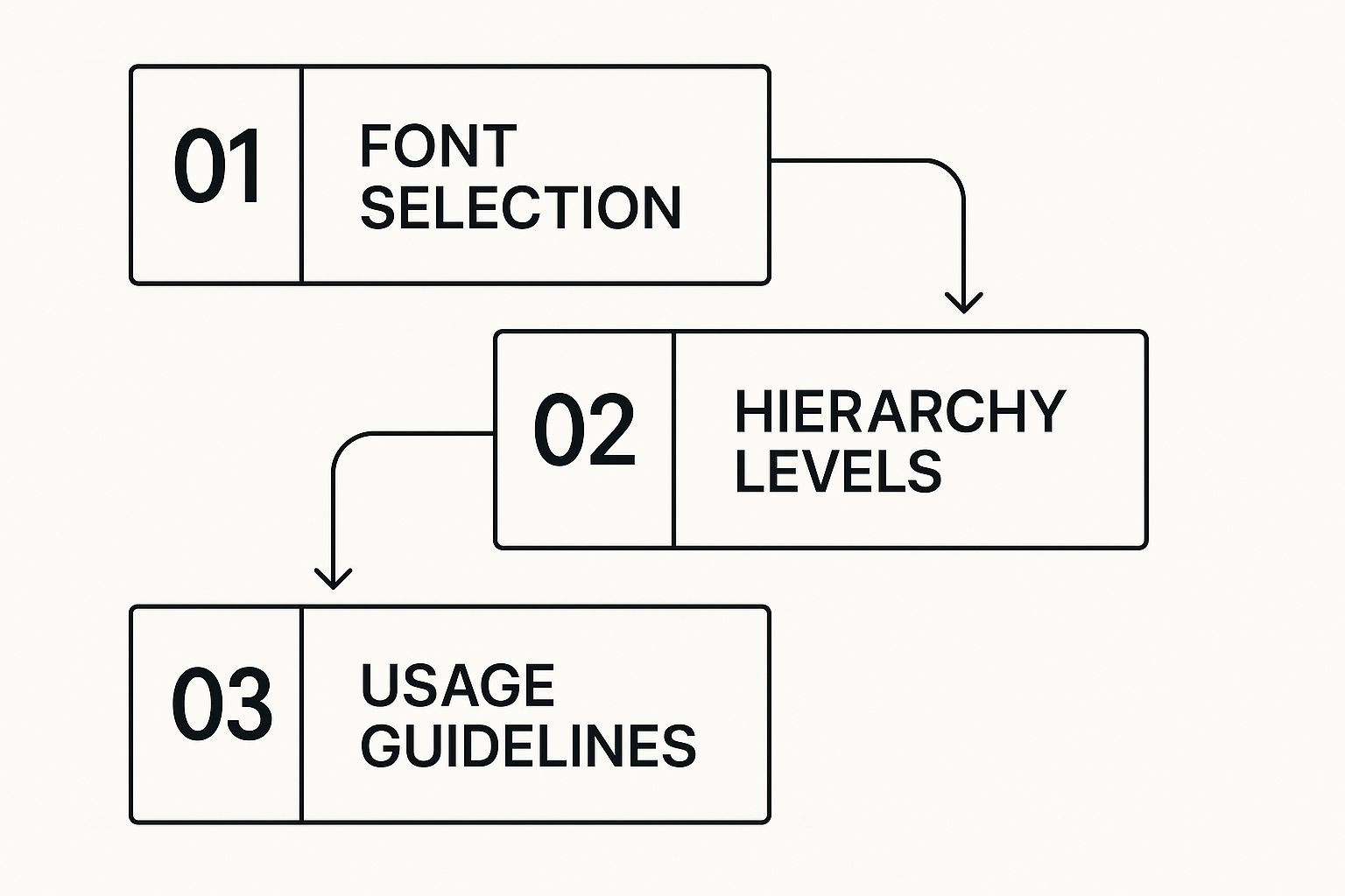
As the diagram shows, just choosing a font is the beginning. Defining a clear hierarchy and providing straightforward usage rules are what make typography a truly effective communication tool.
From Documentation to Daily Use
The final, and arguably most important, phase is documentation. A brilliant visual system is completely useless if it's buried inside a complex, 100-page PDF that no one can find or bother to read. The challenge here is to provide comprehensive detail in a way that is practical and easy to use.
The best visual brand guidelines are simple to access, quick to navigate, and designed for the people who will use them every day. Many modern brands now opt for searchable, interactive online portals. Instead of just listing rules, they provide downloadable assets, ready-to-use templates, and plenty of "do and don't" examples. This approach turns the guidelines from a static rulebook into a living, helpful resource. By making them an indispensable tool rather than a restrictive document, you ensure they become a core part of daily work, protecting the brand’s integrity as the company grows.
Real-World Examples of Guidelines That Work
Theory can only take you so far. The best way to understand what makes visual brand guidelines truly effective is to see them in action. Top companies don’t just fill out a standard template; they build a system that reflects their unique audience, company culture, and business goals. By looking at how they do it, we can learn how to create guidelines that people will actually use.
The Digital-First Approach: Uber
Global companies face a huge challenge: how do you keep your brand consistent when you have teams all over the world creating content for websites, apps, and social media? The answer is often a public, interactive brand hub. Uber's brand center is a perfect example of this modern method. Instead of a clunky PDF that gets lost in a folder, they created a living website that serves as the single source of truth for their brand, easily accessible to employees, partners, and the media.
This look inside their public brand hub shows how they present essential elements like the logo, color palette, and typography. Everything is organized for instant clarity.

The simple layout and clear navigation make it easy for anyone, anywhere, to quickly grasp the core rules of Uber's visual identity. It’s designed with the user in mind.
Balancing Consistency with Creative Freedom
The real magic in guidelines like Uber's is the balance they strike between strict rules and creative freedom. They set a firm foundation with non-negotiable elements—the core logo, primary colors, and main fonts. These are the things that protect brand recognition and build trust with customers. But they also create a system that encourages new ideas, so the brand never feels stale or repetitive.
For instance, a guide might offer a secondary color palette for special promotions or provide flexible layout templates for social media. This approach turns the guidelines from a rigid cage into a well-defined playground. It gives designers a safe space to experiment and create exciting work that still feels 100% on-brand.
This smart structure transforms a simple rulebook into a tool that supports both brand integrity and business growth.
The Strategic Investment in Visual Brand Systems
Forward-thinking companies now see their **visual brand guidelines** as a core business asset, not just a line item in the design budget. As businesses reach global audiences across countless digital touchpoints, the old-fashioned, static rulebook is no longer enough. This change comes from a clear need to tell a single, unified story that customers can trust.Market Growth and The Rise of Digital Identity
This strategic adjustment is fueling serious market growth. The global corporate identity design industry, which revolves around creating visual brand systems, is projected to grow from $8.62 billion in 2024 to $9.85 billion in 2025. This reflects a remarkable annual growth rate of 14.3%.
This rapid expansion highlights a simple truth: companies are actively investing in cohesive visual identities to build trust and cut through the noise. It’s a calculated decision to manage brand perception effectively at any scale. Discover more insights into this market growth.
Technology’s Role in Modern Brand Management
Fortunately, new technologies are making this level of brand control more achievable for everyone. Modern software and AI-driven platforms give organizations of all sizes the power to maintain a consistent visual presence without needing a huge budget.
Artificial intelligence is especially helpful, aiding in both the creation and enforcement of visual standards. For example, you can use an AI logo generator to quickly develop design assets that fit your brand’s core identity. This accelerates content production while guaranteeing everything stays on-brand.
Ultimately, investing in a well-built visual brand system is an act of future-proofing. It creates a resilient and flexible foundation that allows your brand to evolve and adopt new platforms without fracturing its identity. The return on investment (ROI) becomes clear through several key advantages:
- Greater operational efficiency as teams make faster, more confident design decisions.
- Stronger brand recognition that builds audience trust more effectively.
- Confident, scalable growth into new markets with a unified brand voice.
This transforms your brand guidelines from a static document into a dynamic asset that generates lasting value.
Your Action Plan for Visual Brand Guidelines Success
Knowing what visual brand guidelines are is one thing. Actually creating a set that your team will use is another challenge entirely. Instead of trying to build a perfect, encyclopedic document from the start, the goal is to make smart choices that build momentum and provide immediate clarity. This action plan turns a big project into a series of achievable steps.
Assess Your Current State and Prioritize Ruthlessly
Before building anything new, you need an honest look at where you stand. Begin with a brand audit. Go on a scavenger hunt and collect every piece of marketing material you can find—from social media graphics and email headers to sales decks and web pages. This visual inventory will quickly show you where consistency is breaking down.
Once you’ve identified the gaps, you can decide what to tackle first. Not every component of a brand guide is urgent. A phased approach works best:
- Phase 1 (Must-Haves): Start with the elements that cause the most confusion. This almost always includes logo usage, your primary color palette, and core typography. These are the foundational rules that stop brand chaos in its tracks.
- Phase 2 (Should-Haves): With a solid foundation in place, you can add guidelines for imagery style, iconography, and secondary color palettes.
- Phase 3 (Nice-to-Haves): More specific rules, like how to visualize data or use certain layout grids, can be developed later as the need arises.
Secure Buy-In and Allocate Resources
Even the most beautiful brand guide will just gather digital dust if your team doesn't get behind it. Gaining internal buy-in is just as crucial as the design work. Show your colleagues the real costs of inconsistency—the wasted time fixing off-brand presentations, the confusing customer experiences, and the weakened brand presence. Frame this project as a move toward efficiency, not just a design exercise.
Matching your resources to the task is also important. You don't always need a huge budget. For smaller teams, a clear and simple PDF document might be all you need to get started. Larger organizations might find a dedicated brand portal is a better investment. When it comes to daily work, smart software can also make a world of difference. You can check out some great options in our list of the top social media content creation tools for 2024 that help teams produce on-brand content efficiently.
Measure Compliance and Maintain for Long-Term Value
Your guidelines should be living documents, not dusty rulebooks. Set up a simple process to track how well they’re working. This could be a quarterly review of new marketing assets or just noticing a drop in questions about which logo or color to use. Success is when consistency becomes second nature.
Plan to review and refresh your guidelines once a year or whenever your brand makes a major change. This keeps them useful and relevant as your business grows. By treating your visual brand guidelines as an evolving system, you ensure they create real, lasting value.
Ready to create stunning, on-brand visuals without the steep learning curve? AI Media Studio gives you the power to generate professional-quality images in over 50 styles, ensuring every piece of content perfectly aligns with your new guidelines. Start creating for free today at https://www.ai-media-studio.com.