Galería de Imágenes IA
Descubre 1696+ imágenes compartidas generadas por IA de nuestra comunidad creativa
Todas las Imágenes Compartidas
Mostrando 48 de 1696 imágenes compartidas
 0
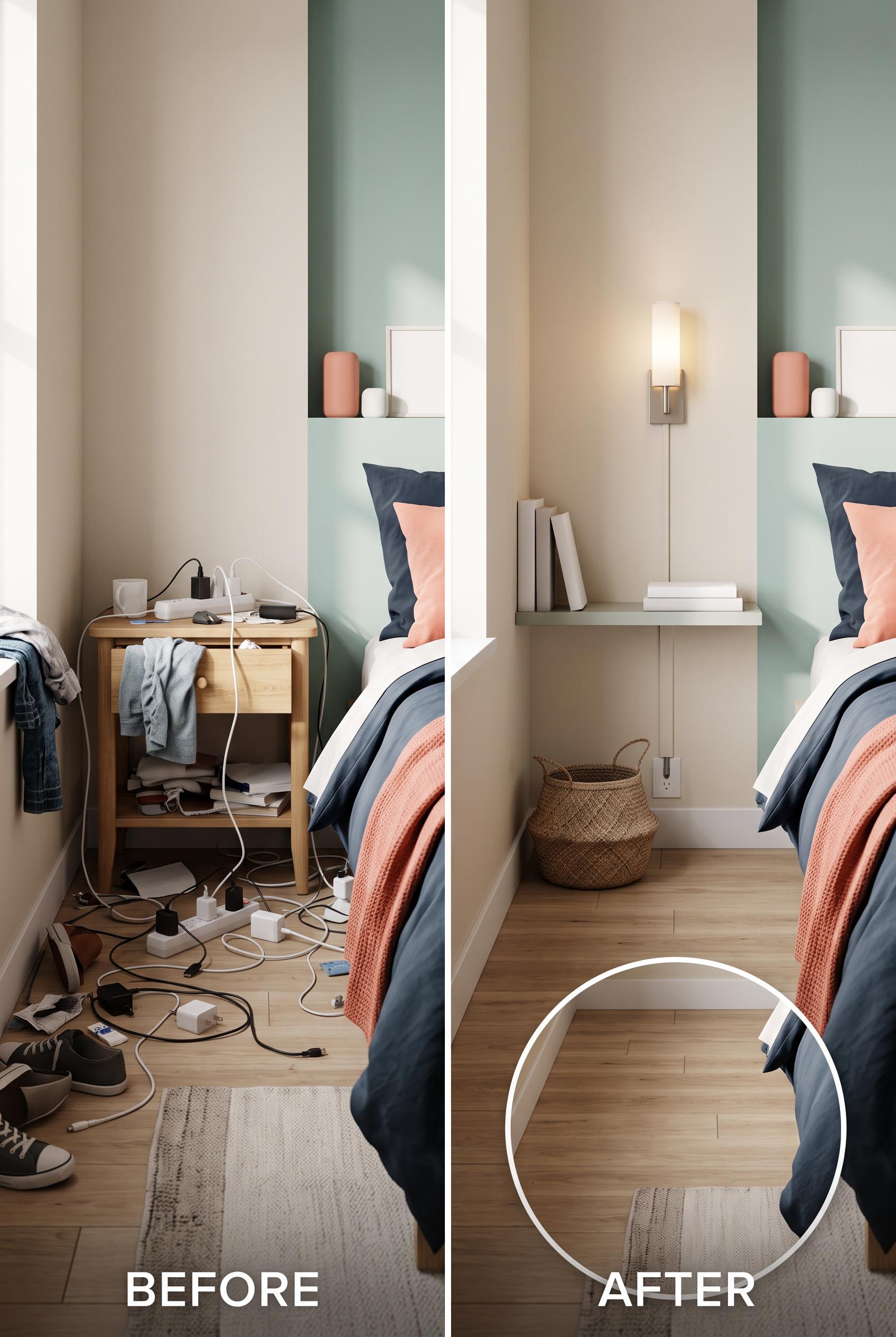
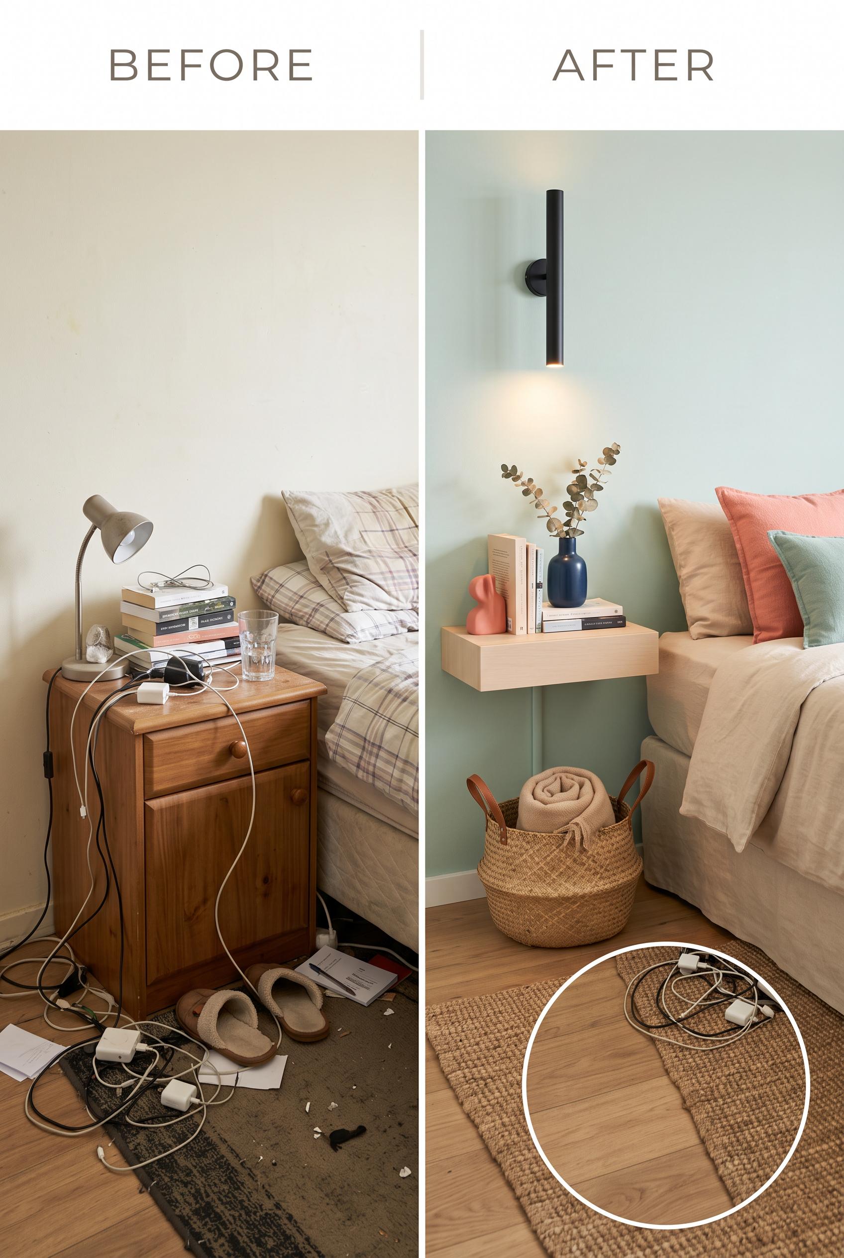
0Create a commercial-quality interior design before-and-after image in a vertical 2:3 Pinterest composition. Use a matched split view of the same small bedroom bedside corner, with a cluttered version on one side and a refined version on the other. Show seafoam, almond, ink, and coral accents, a slim floating ledge, concealed cable routing, a narrow wall light, and a woven basket. Add a subtle circular detail inset showing the cleared floor area. No real brands, no trademarked characters, no watermark, and no unintended readable text. AI-modified downstream. Corrective regeneration attempt 5. Produce a materially revised image, not a near-duplicate of an earlier variant. Preserve the successful subject, palette, lighting, focal hierarchy, and commercial polish from the original brief while correcting every issue below. Mandatory corrective instructions from the most recent visual QA: Preserve the attractive vertical split-bedroom composition, seafoam/almond/ink/coral palette, matched bedding, lighting, slim floating ledge, narrow sconce, single woven basket, and polished commercial styling. Replace the broad beige vertical support beneath the ledge with one thin, clearly defined concealed cable channel descending directly from the floating ledge to the outlet; make it visibly narrow, wall-mounted, and distinct from the sconce, with no other vertical support. Remove all exposed cables, plugs, adapters, and visible cable runs from the after scene, including along the baseboard. Make all books, magazines, boxes, and objects completely blank with no letters, words, numbers, logos, glyphs, or pseudo-text. Refine the circular inset into a clean top-down close-up of only the cleared bare wood floor footprint with a small portion of rug if needed, excluding the basket, cables, adapters, debris, bed, bed edge, and any distracting surrounding objects. Keep the inset subtle and unobtrusive. Observed defects from prior variants that must not recur: 1) The inset duplicates the basket and weakens the requirement for one woven basket. 2) Unintended readable text appears on books and magazines, beyond the intentional BEFORE/AFTER labels. 3) The after-view vertical element reads as a broad support rather than a clearly defined narrow concealed cable channel descending directly from the floating ledge. 4) The inset includes bed and rug edges, weakening the requested clean top-down cleared floor footprint. 5) The after scene’s vertical beige element reads as a broad structural support rather than a narrow concealed cable channel. 6) The after view still shows exposed cable routing near the outlet and baseboard. 7) Some book and magazine surfaces contain apparent pseudo-text/readable markings. 8) The circular inset is generally clean, but it includes rug edges rather than a tightly framed cleared floor footprint. Render no letters, words, numbers, prices, headings, labels, contact details, logos, glyphs, or pseudo-text anywhere. Use only blank surfaces, clean geometric marks, and non-linguistic placeholder shapes. Do not add explanatory captions, before/after labels, interface copy, or extra objects that the brief did not request. When a corrective instruction conflicts with a decorative detail, prioritize the corrective instruction.
 0
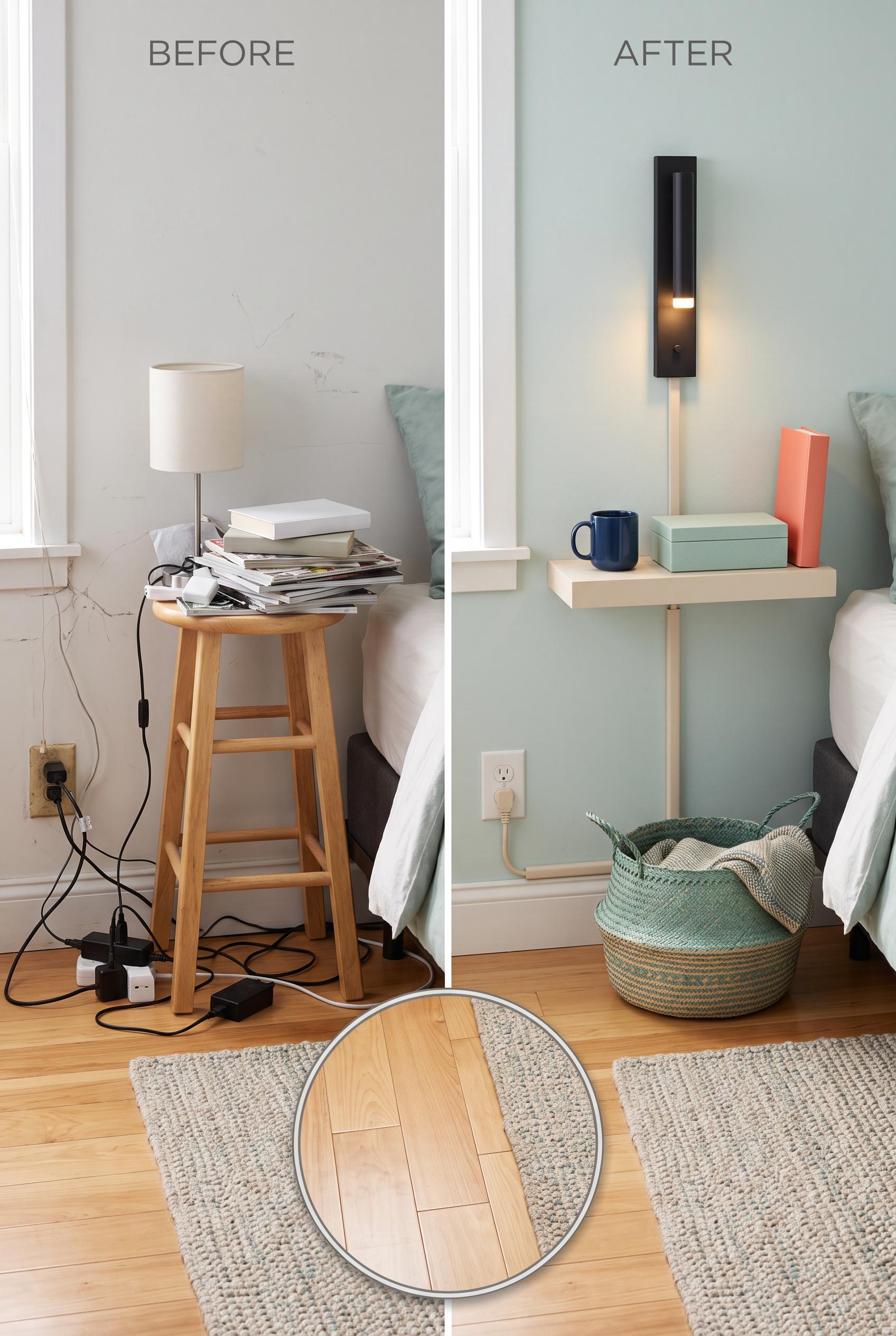
0Create a commercial-quality interior design before-and-after image in a vertical 2:3 Pinterest composition. Use a matched split view of the same small bedroom bedside corner, with a cluttered version on one side and a refined version on the other. Show seafoam, almond, ink, and coral accents, a slim floating ledge, concealed cable routing, a narrow wall light, and a woven basket. Add a subtle circular detail inset showing the cleared floor area. No real brands, no trademarked characters, no watermark, and no unintended readable text. AI-modified downstream. Corrective regeneration attempt 4. Produce a materially revised image, not a near-duplicate of an earlier variant. Preserve the successful subject, palette, lighting, focal hierarchy, and commercial polish from the original brief while correcting every issue below. Mandatory corrective instructions from the most recent visual QA: Preserve the attractive vertical split-bedroom composition, palette, bedding, lighting, ledge, sconce, single woven basket, and commercial polish. Remove all readable text from books, magazines, and every object except the intentional BEFORE and AFTER labels; use blank covers and surfaces with no pseudo-text, logos, or watermark. Replace the broad vertical support-like element in the after scene with one narrow, clearly visible, neat concealed cable channel running directly down the wall from the floating ledge, visibly distinct from the ledge and sconce, with no exposed wires. Refine the circular inset into a clean top-down view showing only bare wood floor and rug, with no basket, cables, adapters, debris, bed edge, or other objects. Observed defects from prior variants that must not recur: 1) The circular top-down detail shows a pile of loose cables and adapters, contradicting the required cleared floor footprint. 2) The concealed cable channel is not clearly visible in the after view. 3) The circular detail inset still contains a woven basket rather than a completely cleared floor footprint. 4) The after view does not clearly show a narrow concealed cable channel descending from the floating ledge; the visible vertical element reads as a support. 5) The inset duplicates the basket and weakens the requirement for one woven basket. 6) Unintended readable text appears on books and magazines, beyond the intentional BEFORE/AFTER labels. 7) The after-view vertical element reads as a broad support rather than a clearly defined narrow concealed cable channel descending directly from the floating ledge. 8) The inset includes bed and rug edges, weakening the requested clean top-down cleared floor footprint. Render no letters, words, numbers, prices, headings, labels, contact details, logos, glyphs, or pseudo-text anywhere. Use only blank surfaces, clean geometric marks, and non-linguistic placeholder shapes. Do not add explanatory captions, before/after labels, interface copy, or extra objects that the brief did not request. When a corrective instruction conflicts with a decorative detail, prioritize the corrective instruction.
 0
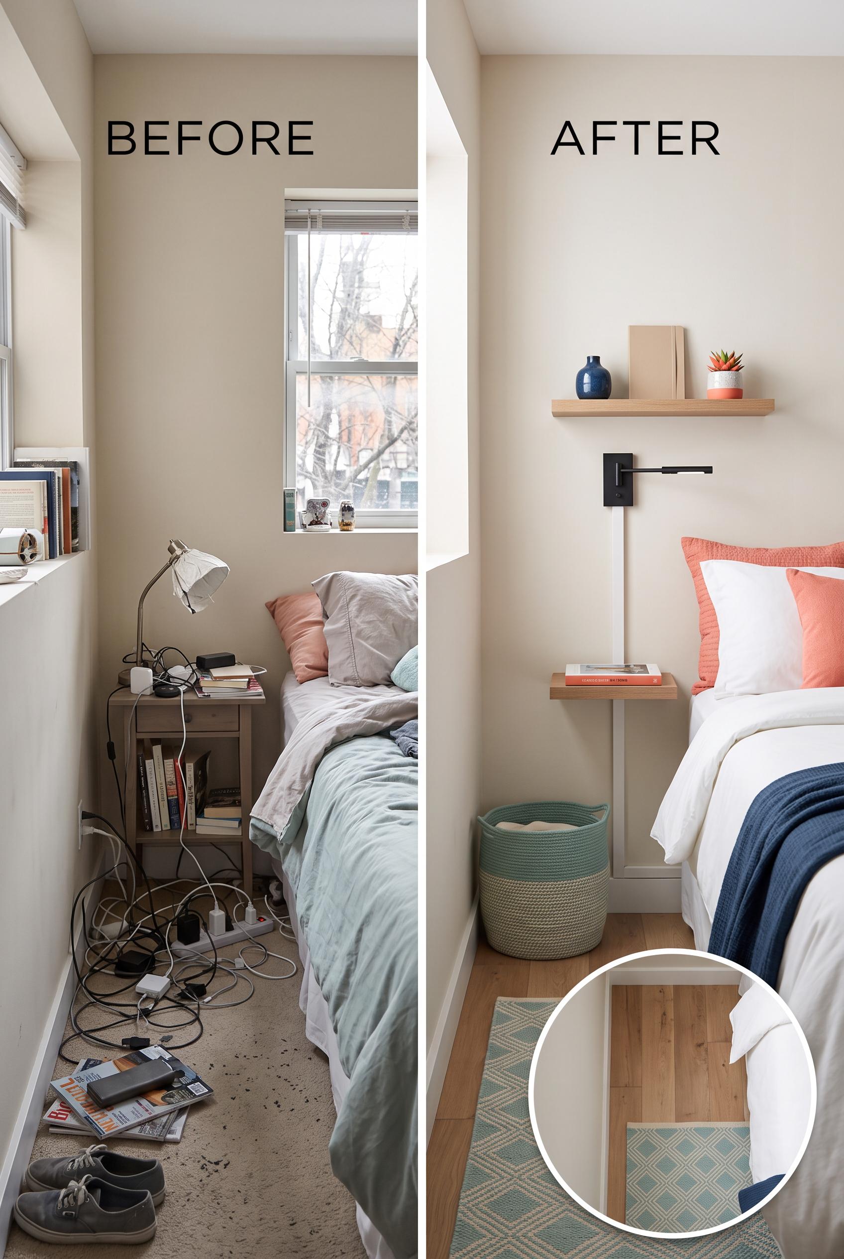
0Create a commercial-quality interior design before-and-after image in a vertical 2:3 Pinterest composition. Use a matched split view of the same small bedroom bedside corner, with a cluttered version on one side and a refined version on the other. Show seafoam, almond, ink, and coral accents, a slim floating ledge, concealed cable routing, a narrow wall light, and a woven basket. Add a subtle circular detail inset showing the cleared floor area. No real brands, no trademarked characters, no watermark, and no unintended readable text. AI-modified downstream. Corrective regeneration attempt 3. Produce a materially revised image, not a near-duplicate of an earlier variant. Preserve the successful subject, palette, lighting, focal hierarchy, and commercial polish from the original brief while correcting every issue below. Mandatory corrective instructions from the most recent visual QA: Preserve the attractive vertical matched split-bedroom composition, palette, bedding, ledge, sconce, lighting, and commercial polish. Replace the circular inset with a clean top-down view of only bare wood floor and rug, completely free of baskets, cables, adapters, debris, and other objects. Keep exactly one woven basket in the main after scene. Add a clearly defined, narrow, neat concealed cable channel running vertically down the wall directly from the floating ledge, visibly distinct from the ledge support and with no exposed wires. Retain only the intentional BEFORE and AFTER labels; include no other readable text, logos, watermark, or pseudo-text. Observed defects from prior variants that must not recur: 1) The circular top-down detail shows a pile of loose cables and adapters, contradicting the required cleared floor footprint. 2) The concealed cable channel is not clearly visible in the after view. 3) The circular detail inset still contains a woven basket rather than a completely cleared floor footprint. 4) The after view does not clearly show a narrow concealed cable channel descending from the floating ledge; the visible vertical element reads as a support. 5) The inset duplicates the basket and weakens the requirement for one woven basket. Render no letters, words, numbers, prices, headings, labels, contact details, logos, glyphs, or pseudo-text anywhere. Use only blank surfaces, clean geometric marks, and non-linguistic placeholder shapes. Do not add explanatory captions, before/after labels, interface copy, or extra objects that the brief did not request. When a corrective instruction conflicts with a decorative detail, prioritize the corrective instruction.
 0
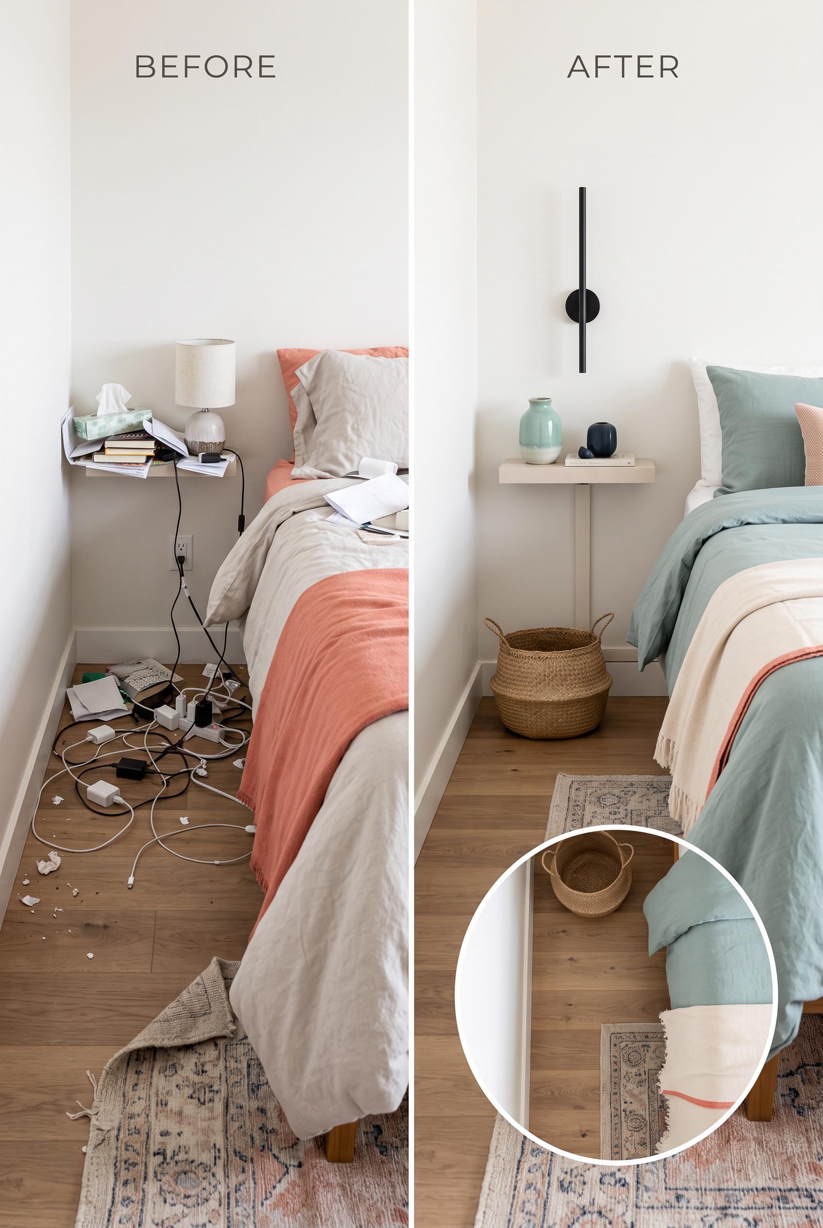
0Create a commercial-quality interior design before-and-after image in a vertical 2:3 Pinterest composition. Use a matched split view of the same small bedroom bedside corner, with a cluttered version on one side and a refined version on the other. Show seafoam, almond, ink, and coral accents, a slim floating ledge, concealed cable routing, a narrow wall light, and a woven basket. Add a subtle circular detail inset showing the cleared floor area. No real brands, no trademarked characters, no watermark, and no unintended readable text. AI-modified downstream. Corrective regeneration attempt 2. Produce a materially revised image, not a near-duplicate of an earlier variant. Preserve the successful subject, palette, lighting, focal hierarchy, and commercial polish from the original brief while correcting every issue below. Mandatory corrective instructions from the most recent visual QA: Preserve the attractive matched split-bedroom composition, color palette, ledge, sconce, bedding, and single woven basket. Replace the circular inset content with a clean, completely cleared section of wood floor and rug—no cables, adapters, debris, or clutter. Make the concealed cable channel clearly visible as a neat narrow vertical channel descending from the floating ledge, with no exposed wires. Keep only intentional BEFORE and AFTER labels; include no other readable text, brands, or watermark. Observed defects from prior variants that must not recur: 1) The circular top-down detail shows a pile of loose cables and adapters, contradicting the required cleared floor footprint. 2) The concealed cable channel is not clearly visible in the after view. Render no letters, words, numbers, prices, headings, labels, contact details, logos, glyphs, or pseudo-text anywhere. Use only blank surfaces, clean geometric marks, and non-linguistic placeholder shapes. Do not add explanatory captions, before/after labels, interface copy, or extra objects that the brief did not request. When a corrective instruction conflicts with a decorative detail, prioritize the corrective instruction.
 0
0Create a commercial-quality interior design before-and-after image in a vertical 2:3 Pinterest composition. Use a matched split view of the same small bedroom bedside corner, with a cluttered version on one side and a refined version on the other. Show seafoam, almond, ink, and coral accents, a slim floating ledge, concealed cable routing, a narrow wall light, and a woven basket. Add a subtle circular detail inset showing the cleared floor area. No real brands, no trademarked characters, no watermark, and no unintended readable text. AI-modified downstream.
 0
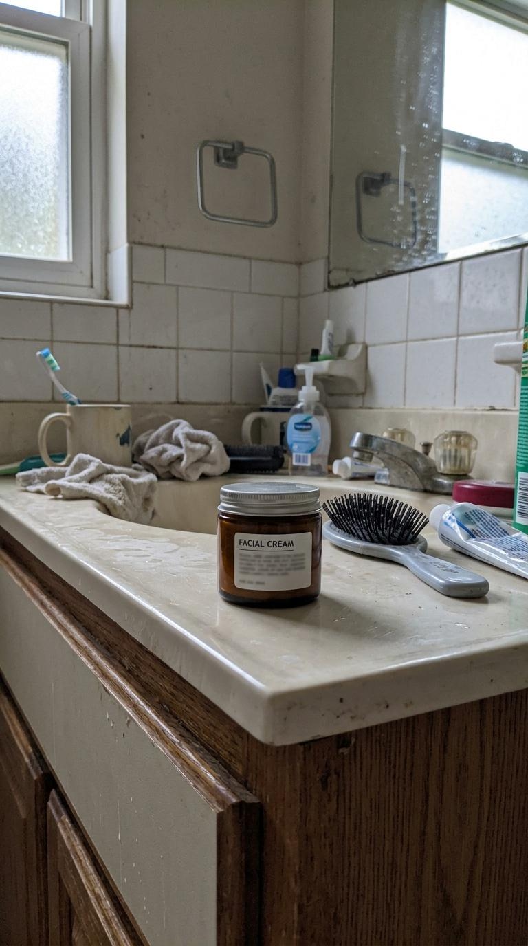
0Amateur handheld phone photo of a small beauty product on a slightly messy bathroom counter, imperfect natural lighting, casual unstyled seller-style demo snapshot, realistic clutter, ordinary home, no people, no readable text, no logos
 0
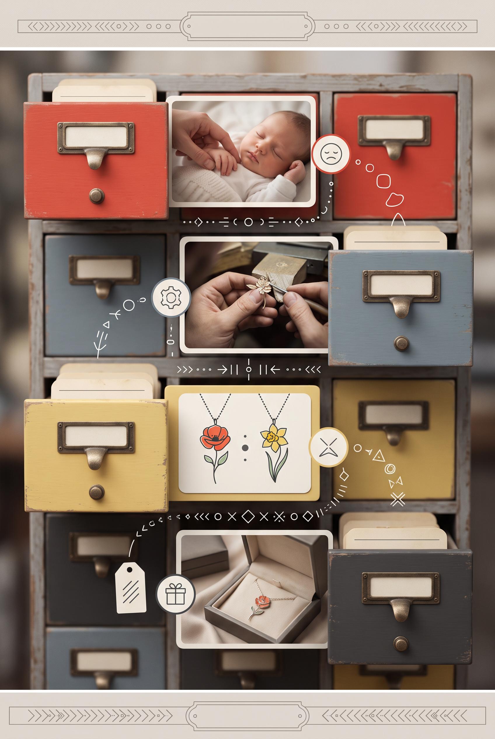
0Create a commercial-quality educational Pinterest graphic in a vertical 2:3 composition explaining a four-part campaign for a custom birth flower necklace. Use a vintage library card catalog with four open drawers, each containing an image vignette for emotional story, craftsmanship detail, customization, and gift presentation. Use poppy red, blue-gray, butter yellow, and charcoal. Clear visual flow, refined product photography, no real brands, no trademarked characters, no watermark, no unintended readable text. Corrective regeneration attempt 3. Produce a materially revised image, not a near-duplicate of an earlier variant. Preserve the successful subject, palette, lighting, focal hierarchy, and commercial polish from the original brief while correcting every issue below. Mandatory corrective instructions from the most recent visual QA: Preserve the polished vertical 2:3 vintage card-catalog composition, four colored drawers, necklace photography, baby/emotional vignette, craftsmanship scene, flower personalization scene, gift-box presentation, lighting, palette, and clear visual hierarchy. Remove all decorative glyphs, arrows, letters, numbers, punctuation, writing-like lines, and pseudo-text. Replace the icon system with only unmistakable simple non-linguistic pictograms made from solid geometric silhouettes: a heart, jewelry tool/gear, flower, and gift box, with no outlines that resemble characters. Make every drawer plate, card, gift tag, and top/bottom ornamental plaque completely blank and unmarked. Remove any marks that could be interpreted as labels or handwriting. Keep the four vignettes visually understandable without any text, logos, watermark, or trademark. Observed defects from prior variants that must not recur: 1) Attractive vertical composition with a clear vintage catalog focal point, but it substantially violates the brief's requirement to avoid readable copy. 2) Large headline, drawer labels, gift tags, footer CTA, and flower-name text dominate the design; the campaign should communicate through abstract vignettes and simple icons without- 3) Strong vertical composition, clear catalog focal point, coherent palette, and four distinct vignette areas. 4) The decorative icon/arrow system contains prominent glyph-like marks that resemble letters, numbers, punctuation, or pseudo-text, violating the no-glyph/no-readable-mark constraint 5) Blank drawer plates are acceptable, but the gift tag contains writing-like lines and the top/bottom ornamental bands are overly text-like. Render no letters, words, numbers, prices, headings, labels, contact details, logos, glyphs, or pseudo-text anywhere. Use only blank surfaces, clean geometric marks, and non-linguistic placeholder shapes. Do not add explanatory captions, before/after labels, interface copy, or extra objects that the brief did not request. When a corrective instruction conflicts with a decorative detail, prioritize the corrective instruction.
 0
0Create a commercial-quality educational Pinterest graphic in a vertical 2:3 composition explaining a four-part campaign for a custom birth flower necklace. Use a vintage library card catalog with four open drawers, each containing an image vignette for emotional story, craftsmanship detail, customization, and gift presentation. Use poppy red, blue-gray, butter yellow, and charcoal. Clear visual flow, refined product photography, no real brands, no trademarked characters, no watermark, no unintended readable text. Corrective regeneration attempt 2. Produce a materially revised image, not a near-duplicate of an earlier variant. Preserve the successful subject, palette, lighting, focal hierarchy, and commercial polish from the original brief while correcting every issue below. Mandatory corrective instructions from the most recent visual QA: Preserve the polished vertical 2:3 vintage card-catalog composition, four distinct colored drawers, necklace photography, craftsmanship scene, customization vignette, gift presentation, and decorative icon/arrow system. Remove every readable word, letter, number, label, headline, footer CTA, gift-tag message, card writing, and flower-name caption. Replace all text areas with blank vintage plates or abstract non-readable marks, while keeping each drawer visually distinct and understandable through its vignette and simple icons alone. Ensure no watermark, logo, trademark, or garbled pseudo-text. Observed defects from prior variants that must not recur: 1) Attractive vertical composition with a clear vintage catalog focal point, but it substantially violates the brief's requirement to avoid readable copy. 2) Large headline, drawer labels, gift tags, footer CTA, and flower-name text dominate the design; the campaign should communicate through abstract vignettes and simple icons without- Render no letters, words, numbers, prices, headings, labels, contact details, logos, glyphs, or pseudo-text anywhere. Use only blank surfaces, clean geometric marks, and non-linguistic placeholder shapes. Do not add explanatory captions, before/after labels, interface copy, or extra objects that the brief did not request. When a corrective instruction conflicts with a decorative detail, prioritize the corrective instruction.
 0
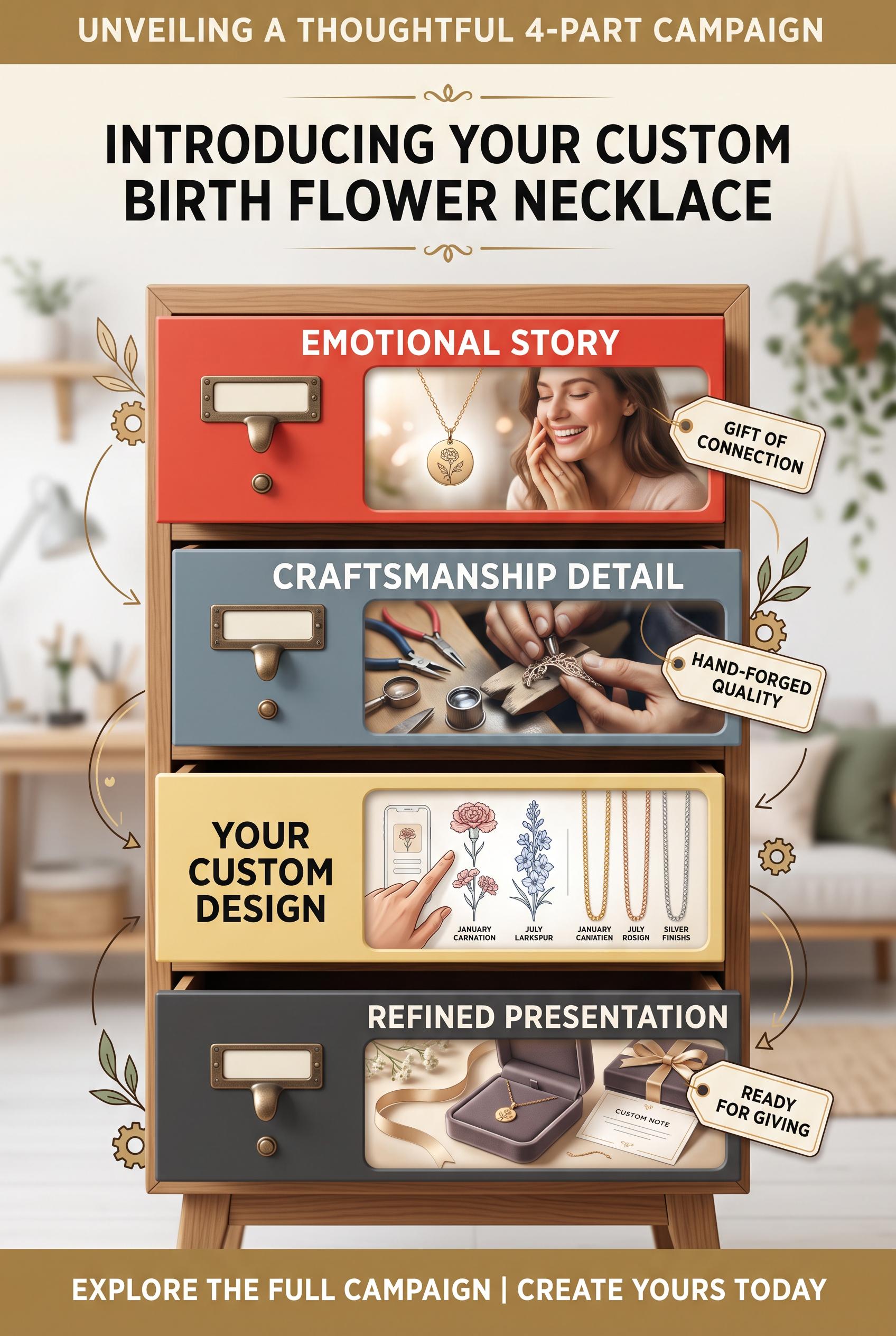
0Create a commercial-quality educational Pinterest graphic in a vertical 2:3 composition explaining a four-part campaign for a custom birth flower necklace. Use a vintage library card catalog with four open drawers, each containing an image vignette for emotional story, craftsmanship detail, customization, and gift presentation. Use poppy red, blue-gray, butter yellow, and charcoal. Clear visual flow, refined product photography, no real brands, no trademarked characters, no watermark, no unintended readable text.
 0
0Create a commercial-quality Pinterest product mockup in a vertical 2:3 composition for an editable real estate welcome guide. Show a tablet, printed booklet, folder, and insert cards arranged on an isometric studio desk with orbiting paper layers, dusty lilac, tomato, oat, and deep teal accents. Sophisticated editorial art direction, realistic paper texture, soft directional light, premium digital product presentation, no real brands, no trademarked characters, no watermark, no unintended readable text. Corrective regeneration attempt 3. Produce a materially revised image, not a near-duplicate of an earlier variant. Preserve the successful subject, palette, lighting, focal hierarchy, and commercial polish from the original brief while correcting every issue below. Mandatory corrective instructions from the most recent visual QA: Preserve the polished vertical 2:3 isometric desk composition, palette, lighting, realistic paper textures, tablet, booklet, folder, insert cards, pencil, ceramic tray, house-key ring, and orbiting paper layers. Remove every tiny text-like mark, dotted sequence, glyph, letterform, and pseudo-copy fragment from the tablet and all printed materials, including the tablet’s upper-right area and small cards. Replace them only with clean blank surfaces, large simple geometric color blocks, or clearly non-linguistic abstract shapes. Keep all materials identifiable through layout, imagery, and color alone. No readable or pseudo-readable text, numbers, logos, watermark, or extra objects. Observed defects from prior variants that must not recur: 1) The composition is polished and correctly vertical, but the required small key ring is absent; the gold objects appear to be binder clips. 2) Several cards contain dense, tiny pseudo-readable copy and contact details that risk unintended garbled text in a commercial mockup. 3) Strong vertical product mockup with the required objects and key ring, but several small marks on the tablet and printed cards resemble pseudo-text or glyphs, violating the no-text 4) strict commercial-quality requirement. Render no letters, words, numbers, prices, headings, labels, contact details, logos, glyphs, or pseudo-text anywhere. Use only blank surfaces, clean geometric marks, and non-linguistic placeholder shapes. Do not add explanatory captions, before/after labels, interface copy, or extra objects that the brief did not request. When a corrective instruction conflicts with a decorative detail, prioritize the corrective instruction.
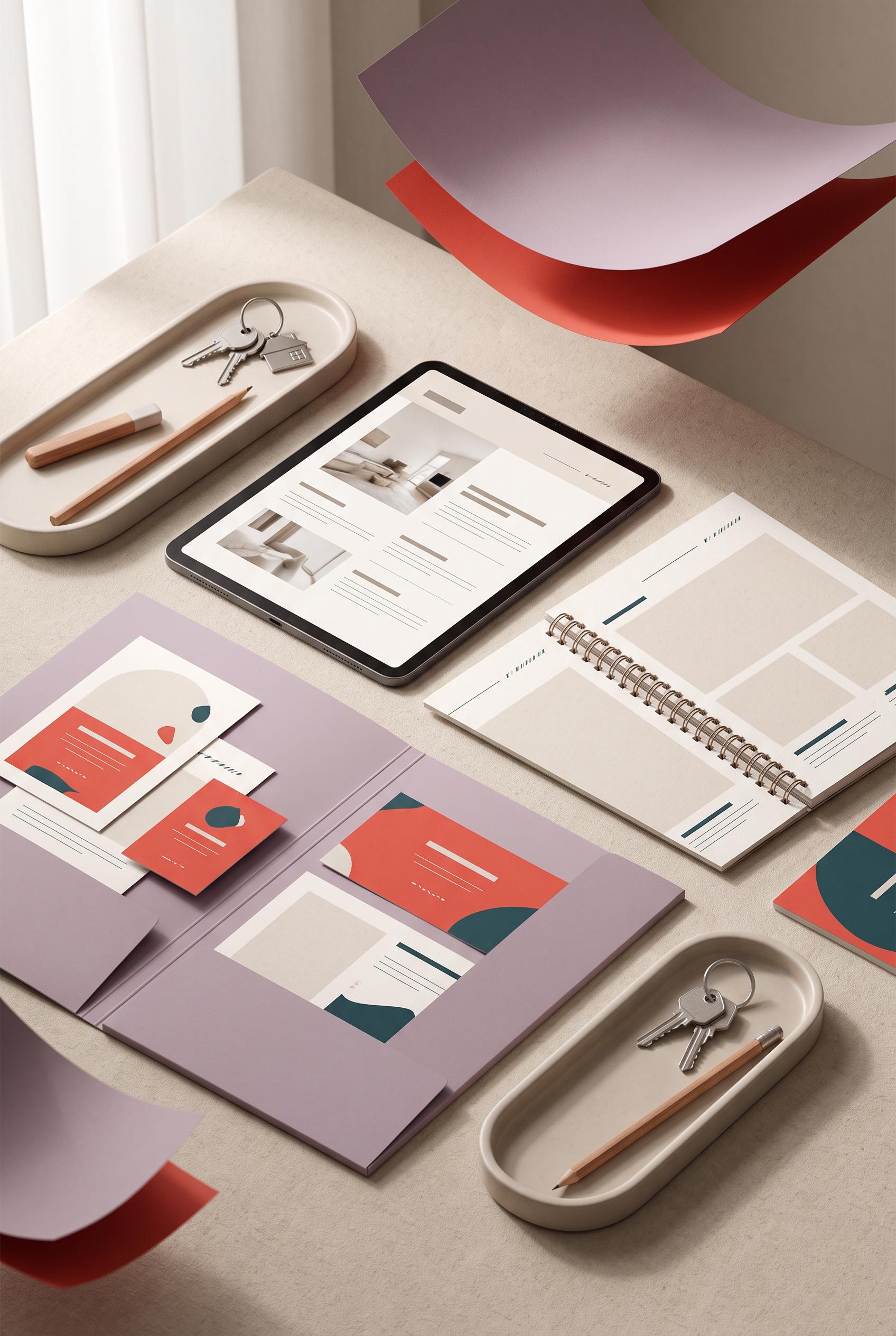 0
0Create a commercial-quality Pinterest product mockup in a vertical 2:3 composition for an editable real estate welcome guide. Show a tablet, printed booklet, folder, and insert cards arranged on an isometric studio desk with orbiting paper layers, dusty lilac, tomato, oat, and deep teal accents. Sophisticated editorial art direction, realistic paper texture, soft directional light, premium digital product presentation, no real brands, no trademarked characters, no watermark, no unintended readable text. Corrective regeneration attempt 2. Produce a materially revised image, not a near-duplicate of an earlier variant. Preserve the successful subject, palette, lighting, focal hierarchy, and commercial polish from the original brief while correcting every issue below. Mandatory corrective instructions from the most recent visual QA: Preserve the polished vertical 2:3 isometric desk composition, color palette, lighting, paper textures, tablet, booklet, folder, insert cards, pencil, ceramic tray, and orbiting paper layers. Replace the gold binder clips with one clearly recognizable small metal key ring with simple house keys. Remove all dense body copy, fake contact details, phone numbers, portraits, and tiny pseudo-text from every screen and printed piece; use clean blank layout blocks, abstract lines, or purely decorative marks instead, with no readable words, letters, logos, or watermark. Keep the guide materials clearly identifiable through layout and imagery alone. Observed defects from prior variants that must not recur: 1) The composition is polished and correctly vertical, but the required small key ring is absent; the gold objects appear to be binder clips. 2) Several cards contain dense, tiny pseudo-readable copy and contact details that risk unintended garbled text in a commercial mockup. Render no letters, words, numbers, prices, headings, labels, contact details, logos, glyphs, or pseudo-text anywhere. Use only blank surfaces, clean geometric marks, and non-linguistic placeholder shapes. Do not add explanatory captions, before/after labels, interface copy, or extra objects that the brief did not request. When a corrective instruction conflicts with a decorative detail, prioritize the corrective instruction.
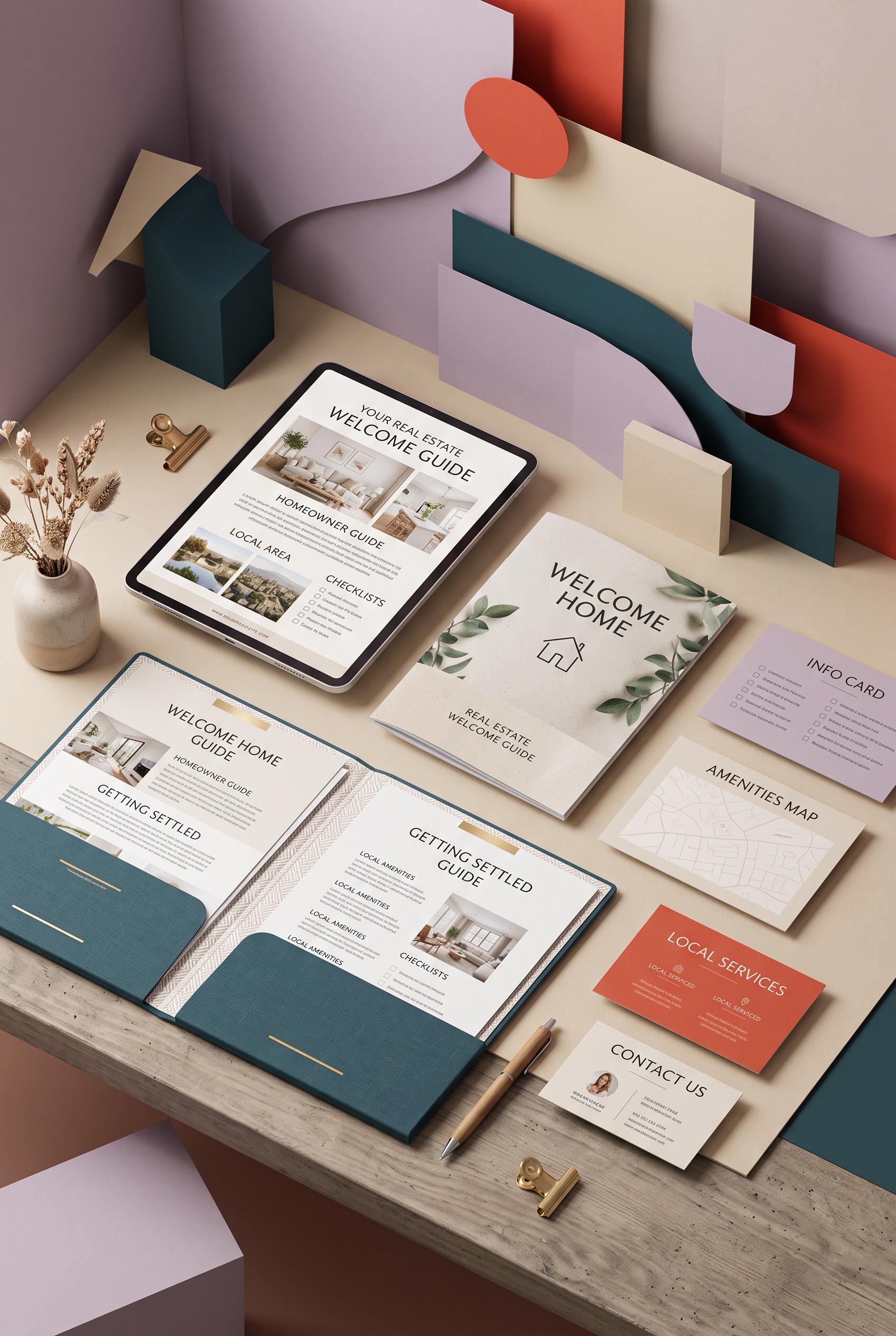 0
0Create a commercial-quality Pinterest product mockup in a vertical 2:3 composition for an editable real estate welcome guide. Show a tablet, printed booklet, folder, and insert cards arranged on an isometric studio desk with orbiting paper layers, dusty lilac, tomato, oat, and deep teal accents. Sophisticated editorial art direction, realistic paper texture, soft directional light, premium digital product presentation, no real brands, no trademarked characters, no watermark, no unintended readable text.
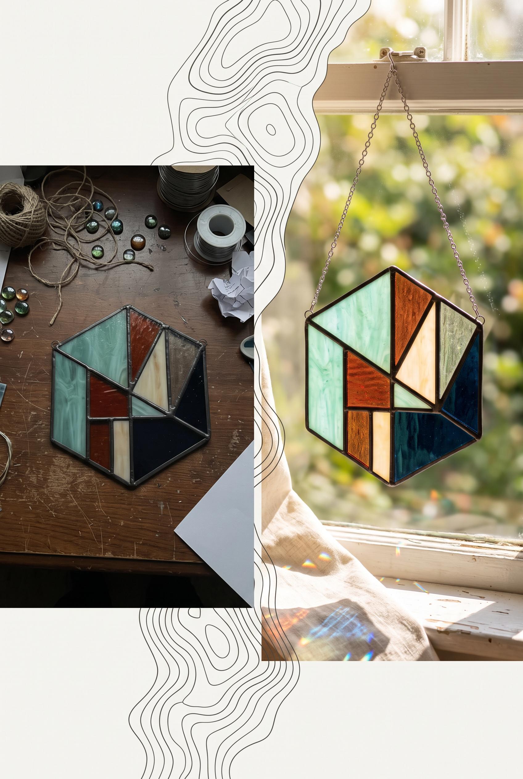 0
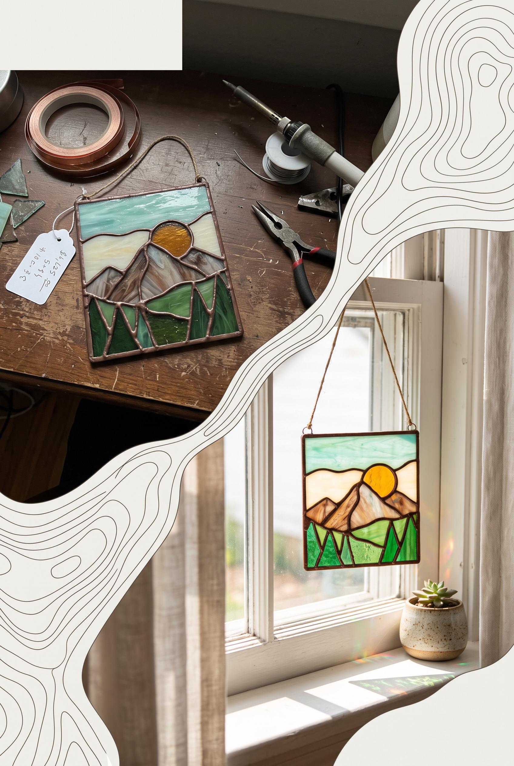
0Create a commercial-quality Pinterest image in a vertical 2:3 composition showing a before-and-after transformation of a handmade stained-glass suncatcher listing photo. Use a topographic contour transition from a dim cluttered phone snapshot to a luminous styled window scene, with seafoam, rust, cream, and ink accents. Editorial product photography, realistic glass reflections, tactile materials, strong visual hierarchy, clean negative space, no real brands, no trademarked characters, no watermark, no unintended readable text. Corrective regeneration attempt 5. Produce a materially revised image, not a near-duplicate of an earlier variant. Preserve the successful subject, palette, lighting, focal hierarchy, and commercial polish from the original brief while correcting every issue below. Mandatory corrective instructions from the most recent visual QA: Preserve the polished vertical 2:3 composition, matching stained-glass suncatcher, dim cluttered tabletop before scene, luminous window-lit after scene, soft shadow, realistic glass reflections, seafoam/rust/cream/ink palette, and contour-line transition. Remove the hanging tag completely, including its string, graphic, and blank writing lines; replace that area with clean tabletop. Remove the partially visible printed object at the bottom-right entirely and replace it with a blank clean surface and soft shadow. Render no letters, words, numbers, labels, logos, glyphs, handwriting, pseudo-text, or printed materials anywhere. Keep the top-left and bottom-right areas clean negative space. Observed defects from prior variants that must not recur: 1) logos, or pseudo-text anywhere. 2) Strong vertical before/after composition and clear focal product. 3) The left scene contains a hanging tag with visible handwritten characters and numbers, violating the requirement for no readable text or pseudo-text. 4) The tag is an unrequested distracting object in the commercial composition. 5) Strong vertical composition and clear before/after focal hierarchy. 6) The upper scene contains a hanging product tag with a recognizable graphic and multiple writing lines, violating the requirement for no labels, glyphs, or pseudo-text. 7) The lower-right foreground contains a partially visible printed-looking object with apparent text-like colored marks, creating unintended pseudo-text and visual distraction. 8) The contour transition is attractive, but the extra tag and printed object reduce clean commercial polish. Render no letters, words, numbers, prices, headings, labels, contact details, logos, glyphs, or pseudo-text anywhere. Use only blank surfaces, clean geometric marks, and non-linguistic placeholder shapes. Do not add explanatory captions, before/after labels, interface copy, or extra objects that the brief did not request. When a corrective instruction conflicts with a decorative detail, prioritize the corrective instruction.
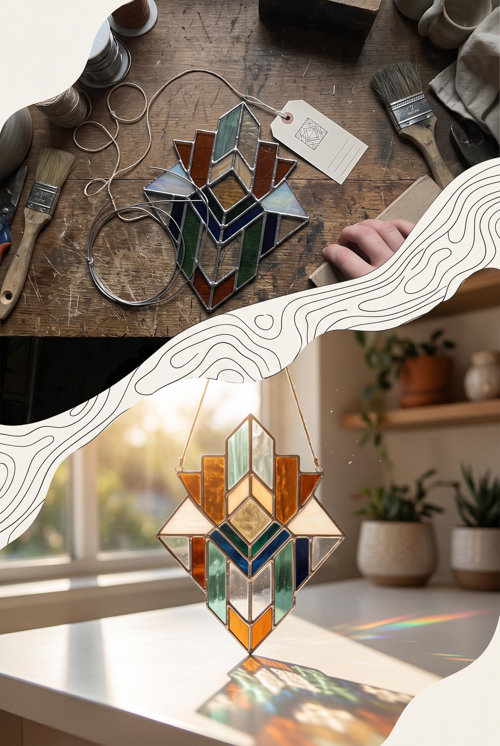 0
0Create a commercial-quality Pinterest image in a vertical 2:3 composition showing a before-and-after transformation of a handmade stained-glass suncatcher listing photo. Use a topographic contour transition from a dim cluttered phone snapshot to a luminous styled window scene, with seafoam, rust, cream, and ink accents. Editorial product photography, realistic glass reflections, tactile materials, strong visual hierarchy, clean negative space, no real brands, no trademarked characters, no watermark, no unintended readable text. Corrective regeneration attempt 4. Produce a materially revised image, not a near-duplicate of an earlier variant. Preserve the successful subject, palette, lighting, focal hierarchy, and commercial polish from the original brief while correcting every issue below. Mandatory corrective instructions from the most recent visual QA: Preserve the strong vertical 2:3 layout, matching stained-glass suncatcher, dim cluttered tabletop before scene, luminous window-lit after scene, contour-line transition, palette, reflections, and polished focal hierarchy. Remove the hanging tag completely, along with all handwriting, numbers, letters, logos, glyphs, labels, and pseudo-text. Replace that area with the clean tabletop or an entirely blank surface. Keep the top-left and bottom-right areas as empty clean negative space, with no added symbols or text. Observed defects from prior variants that must not recur: 1) Strong vertical composition, focal product, and clear before/after concept. 2) Contains prominent readable text despite the brief requiring only abstract, non-readable label marks. 3) Bottom-right typography overwhelms the product imagery and reduces clean commercial hierarchy. 4) The composition and before/after transformation are strong, but the top-left and bottom-right decorative marks read as glyph-like logos, violating the instruction to use no glyphs, 5) logos, or pseudo-text anywhere. 6) Strong vertical before/after composition and clear focal product. 7) The left scene contains a hanging tag with visible handwritten characters and numbers, violating the requirement for no readable text or pseudo-text. 8) The tag is an unrequested distracting object in the commercial composition. Render no letters, words, numbers, prices, headings, labels, contact details, logos, glyphs, or pseudo-text anywhere. Use only blank surfaces, clean geometric marks, and non-linguistic placeholder shapes. Do not add explanatory captions, before/after labels, interface copy, or extra objects that the brief did not request. When a corrective instruction conflicts with a decorative detail, prioritize the corrective instruction.
 0
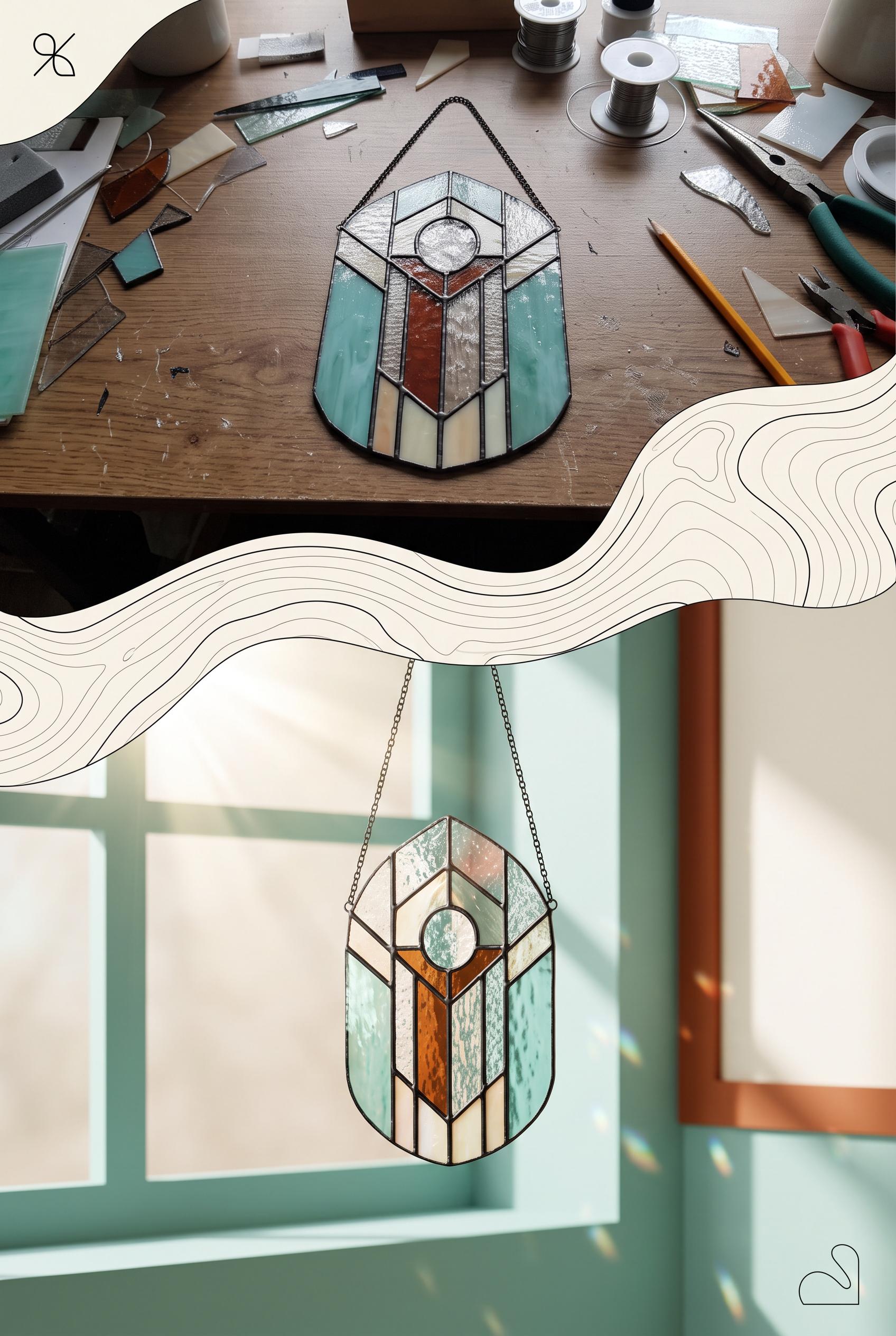
0Create a commercial-quality Pinterest image in a vertical 2:3 composition showing a before-and-after transformation of a handmade stained-glass suncatcher listing photo. Use a topographic contour transition from a dim cluttered phone snapshot to a luminous styled window scene, with seafoam, rust, cream, and ink accents. Editorial product photography, realistic glass reflections, tactile materials, strong visual hierarchy, clean negative space, no real brands, no trademarked characters, no watermark, no unintended readable text. Corrective regeneration attempt 3. Produce a materially revised image, not a near-duplicate of an earlier variant. Preserve the successful subject, palette, lighting, focal hierarchy, and commercial polish from the original brief while correcting every issue below. Mandatory corrective instructions from the most recent visual QA: Preserve the vertical 2:3 composition, realistic stained-glass suncatcher, matching product design in both scenes, dim cluttered tabletop before scene, luminous window-lit after scene, contour-line transition, palette, reflections, and polished focal hierarchy. Remove the top-left and bottom-right symbol marks completely. Replace them with empty clean negative space only; add no letters, words, numbers, labels, logos, glyphs, icons, or pseudo-text anywhere. Observed defects from prior variants that must not recur: 1) Strong vertical composition, focal product, and clear before/after concept. 2) Contains prominent readable text despite the brief requiring only abstract, non-readable label marks. 3) Bottom-right typography overwhelms the product imagery and reduces clean commercial hierarchy. 4) The composition and before/after transformation are strong, but the top-left and bottom-right decorative marks read as glyph-like logos, violating the instruction to use no glyphs, 5) logos, or pseudo-text anywhere. Render no letters, words, numbers, prices, headings, labels, contact details, logos, glyphs, or pseudo-text anywhere. Use only blank surfaces, clean geometric marks, and non-linguistic placeholder shapes. Do not add explanatory captions, before/after labels, interface copy, or extra objects that the brief did not request. When a corrective instruction conflicts with a decorative detail, prioritize the corrective instruction.
 0
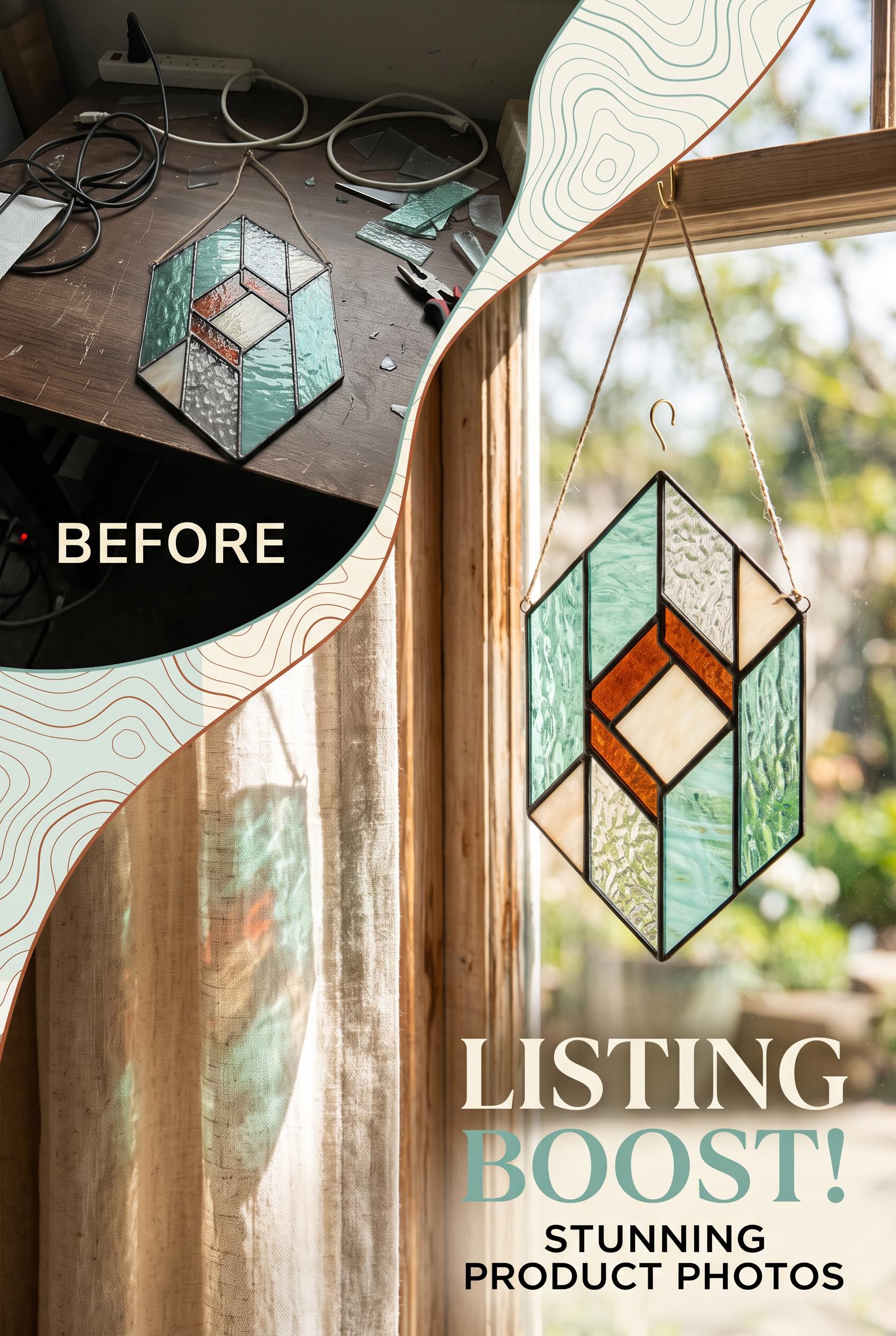
0Create a commercial-quality Pinterest image in a vertical 2:3 composition showing a before-and-after transformation of a handmade stained-glass suncatcher listing photo. Use a topographic contour transition from a dim cluttered phone snapshot to a luminous styled window scene, with seafoam, rust, cream, and ink accents. Editorial product photography, realistic glass reflections, tactile materials, strong visual hierarchy, clean negative space, no real brands, no trademarked characters, no watermark, no unintended readable text. Corrective regeneration attempt 2. Produce a materially revised image, not a near-duplicate of an earlier variant. Preserve the successful subject, palette, lighting, focal hierarchy, and commercial polish from the original brief while correcting every issue below. Mandatory corrective instructions from the most recent visual QA: Preserve the vertical 2:3 layout, stained-glass suncatcher, realistic reflections, dim cluttered tabletop before scene, luminous window-lit after scene, and seafoam/rust/cream/ink palette. Remove every readable word and all typography, including “BEFORE,” “LISTING BOOST!,” and “STUNNING PRODUCT PHOTOS.” Replace labels only with small restrained abstract graphic marks or non-readable shapes. Keep the contour-line transition, ensure the same suncatcher design is clearly shown in both scenes, and maintain clean negative space with the after product as the dominant focal point. Observed defects from prior variants that must not recur: 1) Strong vertical composition, focal product, and clear before/after concept. 2) Contains prominent readable text despite the brief requiring only abstract, non-readable label marks. 3) Bottom-right typography overwhelms the product imagery and reduces clean commercial hierarchy. Render no letters, words, numbers, prices, headings, labels, contact details, logos, glyphs, or pseudo-text anywhere. Use only blank surfaces, clean geometric marks, and non-linguistic placeholder shapes. Do not add explanatory captions, before/after labels, interface copy, or extra objects that the brief did not request. When a corrective instruction conflicts with a decorative detail, prioritize the corrective instruction.
 0
0Create a commercial-quality Pinterest image in a vertical 2:3 composition showing a before-and-after transformation of a handmade stained-glass suncatcher listing photo. Use a topographic contour transition from a dim cluttered phone snapshot to a luminous styled window scene, with seafoam, rust, cream, and ink accents. Editorial product photography, realistic glass reflections, tactile materials, strong visual hierarchy, clean negative space, no real brands, no trademarked characters, no watermark, no unintended readable text.
 0
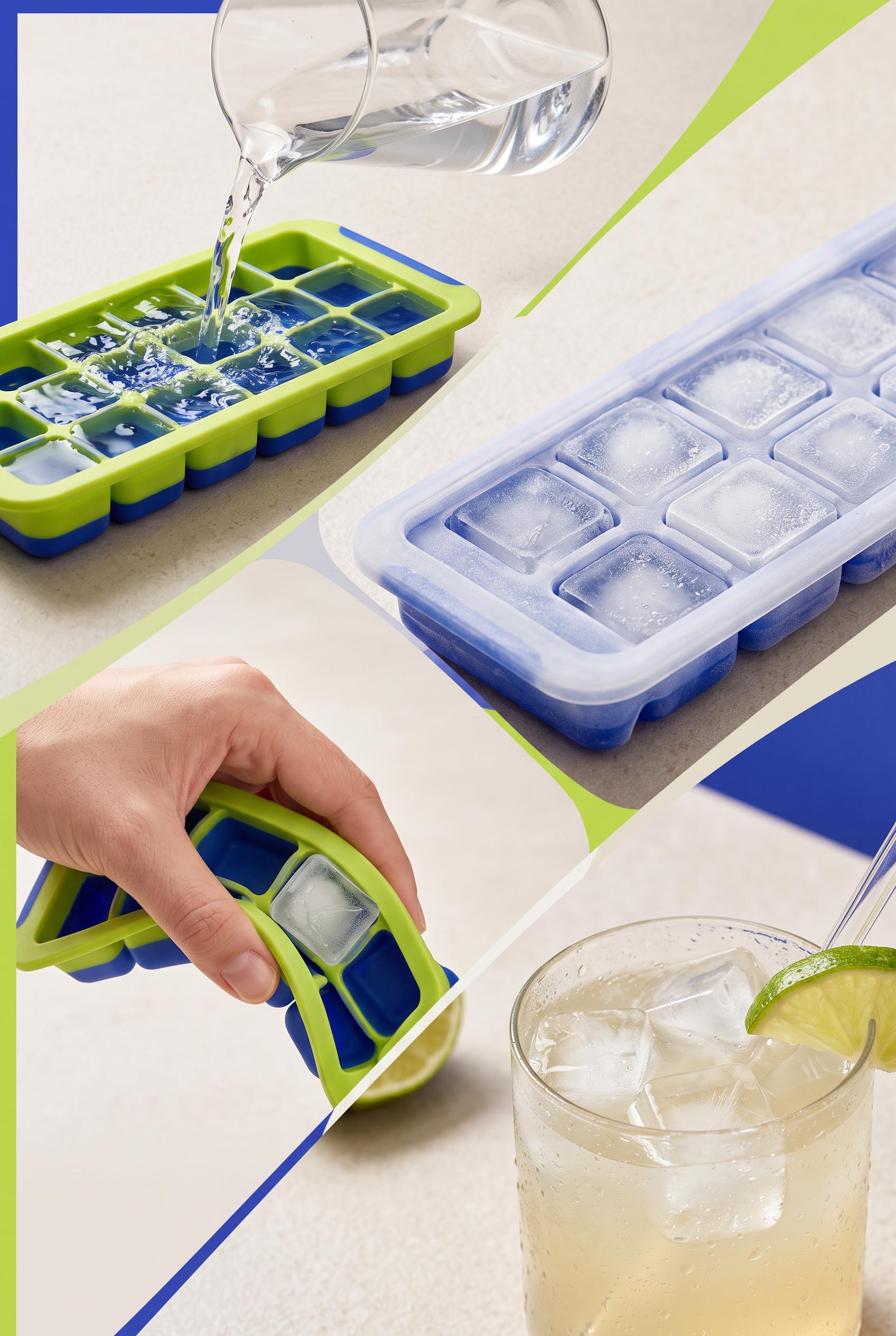
0Create a commercial-quality vertical 2:3 Pinterest composition for an educational launch campaign about a reusable silicone ice cube tray. Arrange a flowing diagonal ribbon of tactile macro moments: water being poured into the tray, frosted cubes after freezing, a hand flexing the silicone to release ice, and a finished cold drink with visible condensation. Use ultramarine, lime, frost white, and warm stone, high-speed liquid detail, polished studio lighting, clear visual hierarchy, generous negative space, no real brands, no trademarked characters, no watermark, no unintended readable text.
 0
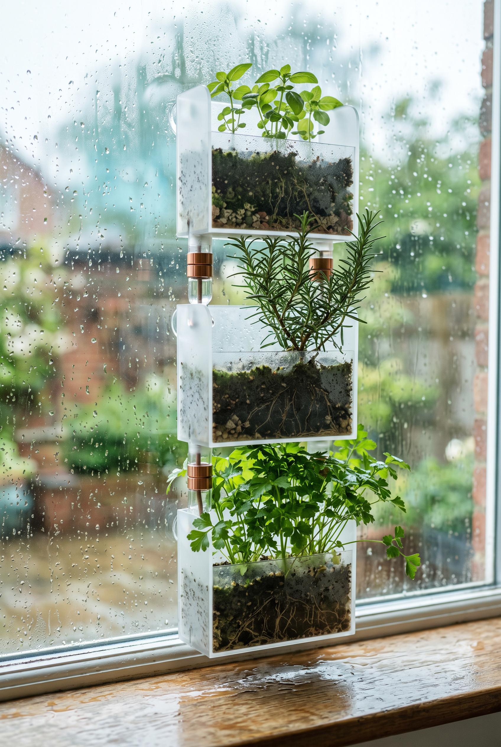
0Create a commercial-quality vertical 2:3 Pinterest composition featuring a modular window herb grower as an inspirational product showcase. Place three connected translucent planting modules on a rainwashed window sill, with delicate herbs at varied growth stages, visible water beads, subtle root silhouettes, and layered reflections. Use moss green, cyan, clay, and oyster tones, soft overcast daylight, refined editorial styling, realistic materials, premium product photography, no real brands, no trademarked characters, no watermark, no unintended readable text.
 0
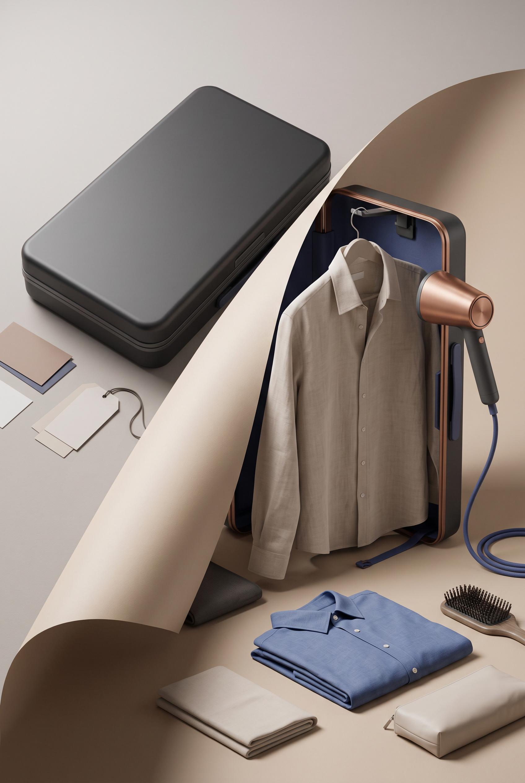
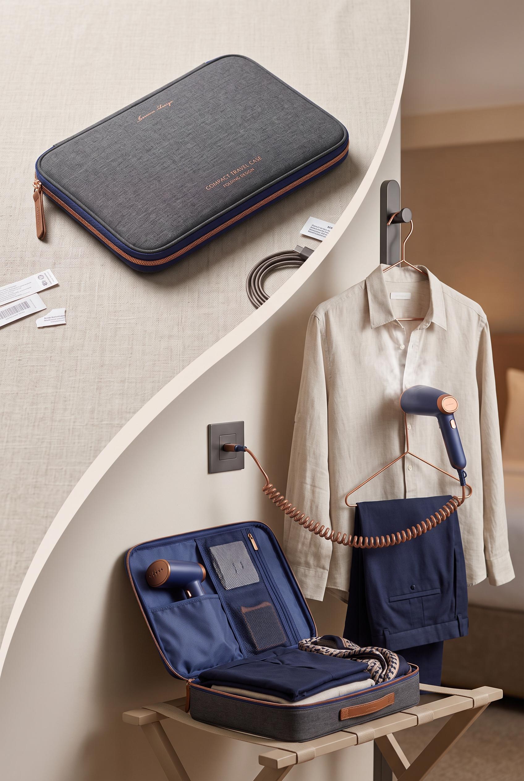
0Create a commercial-quality vertical 2:3 Pinterest composition showing a before-and-after transformation of a compact folding garment steamer travel case. Use a curved reveal from a flat closed package into a ready-to-use travel wardrobe scene with a hanging neutral shirt, steamer, cord, and neatly folded garment. Art direct with copper, blueberry, sand, and graphite, soft studio light, crisp product edges, tactile paper and fabric, elegant depth, premium packaging photography, no real brands, no trademarked characters, no watermark, no unintended readable text. Corrective regeneration attempt 2. Produce a materially revised image, not a near-duplicate of an earlier variant. Preserve the successful subject, palette, lighting, focal hierarchy, and commercial polish from the original brief while correcting every issue below. Mandatory corrective instructions from the most recent visual QA: Preserve the premium vertical 2:3 composition, curved paper-like reveal, tactile fabric, brushed metal, copper/blueberry/sand/graphite palette, shirt, steamer, cord, and organized travel accessories. Remove every logo, word, letter, number, barcode, label, tag marking, and readable inscription from the case, cards, shirt label, and all accessories. Replace those areas with clean unmarked material surfaces and realistic stitching only. Keep crisp product edges, natural proportions, controlled directional shadows, and eliminate any text-like artifacts. Observed defects from prior variants that must not recur: 1) Strong vertical composition and curved reveal, but the case contains clearly readable promotional text and a logo-like mark. 2) Additional small labels/cards include readable text and barcode-like markings, violating the no unintended readable text requirement. Render no letters, words, numbers, prices, headings, labels, contact details, logos, glyphs, or pseudo-text anywhere. Use only blank surfaces, clean geometric marks, and non-linguistic placeholder shapes. Do not add explanatory captions, before/after labels, interface copy, or extra objects that the brief did not request. When a corrective instruction conflicts with a decorative detail, prioritize the corrective instruction.
 0
0Create a commercial-quality vertical 2:3 Pinterest composition showing a before-and-after transformation of a compact folding garment steamer travel case. Use a curved reveal from a flat closed package into a ready-to-use travel wardrobe scene with a hanging neutral shirt, steamer, cord, and neatly folded garment. Art direct with copper, blueberry, sand, and graphite, soft studio light, crisp product edges, tactile paper and fabric, elegant depth, premium packaging photography, no real brands, no trademarked characters, no watermark, no unintended readable text.
 0
0Create a commercial-quality vertical 2:3 Pinterest composition showing an educational campaign for an independent home inspector. Use an overhead toolkit with three hinged inspection lenses arranged around a miniature house model, plus a flashlight, measuring tape, simple checklist shapes, and photo frames. Copper, ultramarine, moss green, and parchment palette, crisp instructional styling, tactile materials, generous blank areas for later copy, no real brands, no trademarked characters, no watermark, no unintended readable text, AI-modified downstream. Corrective regeneration attempt 3. Produce a materially revised image, not a near-duplicate of an earlier variant. Preserve the successful subject, palette, lighting, focal hierarchy, and commercial polish from the original brief while correcting every issue below. Mandatory corrective instructions from the most recent visual QA: Preserve the polished vertical overhead parchment toolkit, central miniature house, copper/ultramarine/moss palette, flashlight, blank checklist, and blank photo frames. Remove the standalone inspection lens on the right so exactly three distinct hinged inspection lenses remain, visibly open and arranged in a balanced triangle around the house. Remove every readable numeral from the measuring tape and replace its markings with short non-linguistic geometric ticks only. Keep all checklist surfaces blank except simple checkmarks and lines; include no letters, words, numbers, logos, labels, captions, or pseudo-text. Maintain crisp commercial-quality edges, realistic tactile materials, generous clean space, and no watermark. Observed defects from prior variants that must not recur: 1) Attractive vertical composition, but it does not clearly show three hinged inspection lenses arranged around the house. 2) Large readable headline, captions, checklist text, and a logo-like service lockup conflict with the no-unintended-text/no-brand direction. 3) Checklist contains visibly garbled pseudo-text. 4) The prepare, observe, and follow-up structure is not clearly represented. 5) Attractive vertical overhead composition with clear central house focal point and cohesive tactile palette. 6) Four inspection lenses are visible instead of exactly three hinged lenses in a balanced triangular arrangement. 7) Measuring tape contains clearly readable numerals, violating the no-readable-text requirement. 8) The composition otherwise has no obvious watermark, brand, or major generation artifact. Render no letters, words, numbers, prices, headings, labels, contact details, logos, glyphs, or pseudo-text anywhere. Use only blank surfaces, clean geometric marks, and non-linguistic placeholder shapes. Do not add explanatory captions, before/after labels, interface copy, or extra objects that the brief did not request. When a corrective instruction conflicts with a decorative detail, prioritize the corrective instruction.
 0
0Create a commercial-quality vertical 2:3 Pinterest composition showing an educational campaign for an independent home inspector. Use an overhead toolkit with three hinged inspection lenses arranged around a miniature house model, plus a flashlight, measuring tape, simple checklist shapes, and photo frames. Copper, ultramarine, moss green, and parchment palette, crisp instructional styling, tactile materials, generous blank areas for later copy, no real brands, no trademarked characters, no watermark, no unintended readable text, AI-modified downstream. Corrective regeneration attempt 2. Produce a materially revised image, not a near-duplicate of an earlier variant. Preserve the successful subject, palette, lighting, focal hierarchy, and commercial polish from the original brief while correcting every issue below. Mandatory corrective instructions from the most recent visual QA: Preserve the polished overhead parchment toolkit, copper/ultramarine/moss palette, central miniature house, flashlight, measuring tape, checklist silhouette, and photo-frame styling. Recompose the image so exactly three distinct hinged inspection lenses visibly open around the central house model, with a clear balanced triangular arrangement. Remove all logos, service names, headlines, captions, labels, and every readable character or pseudo-text; use only blank checklist lines and simple checkmark shapes. Make the three stages communicate through object arrangement only: preparation via checklist and flashlight, observation via lenses and photo frames, and follow-up via a blank report/photo frame. Keep generous clean blank areas, crisp commercial-quality edges, realistic tactile materials, and no watermark or brand-like insignia. Observed defects from prior variants that must not recur: 1) Attractive vertical composition, but it does not clearly show three hinged inspection lenses arranged around the house. 2) Large readable headline, captions, checklist text, and a logo-like service lockup conflict with the no-unintended-text/no-brand direction. 3) Checklist contains visibly garbled pseudo-text. 4) The prepare, observe, and follow-up structure is not clearly represented. Render no letters, words, numbers, prices, headings, labels, contact details, logos, glyphs, or pseudo-text anywhere. Use only blank surfaces, clean geometric marks, and non-linguistic placeholder shapes. Do not add explanatory captions, before/after labels, interface copy, or extra objects that the brief did not request. When a corrective instruction conflicts with a decorative detail, prioritize the corrective instruction.
 0
0Create a commercial-quality vertical 2:3 Pinterest composition showing an educational campaign for an independent home inspector. Use an overhead toolkit with three hinged inspection lenses arranged around a miniature house model, plus a flashlight, measuring tape, simple checklist shapes, and photo frames. Copper, ultramarine, moss green, and parchment palette, crisp instructional styling, tactile materials, generous blank areas for later copy, no real brands, no trademarked characters, no watermark, no unintended readable text, AI-modified downstream.
 0
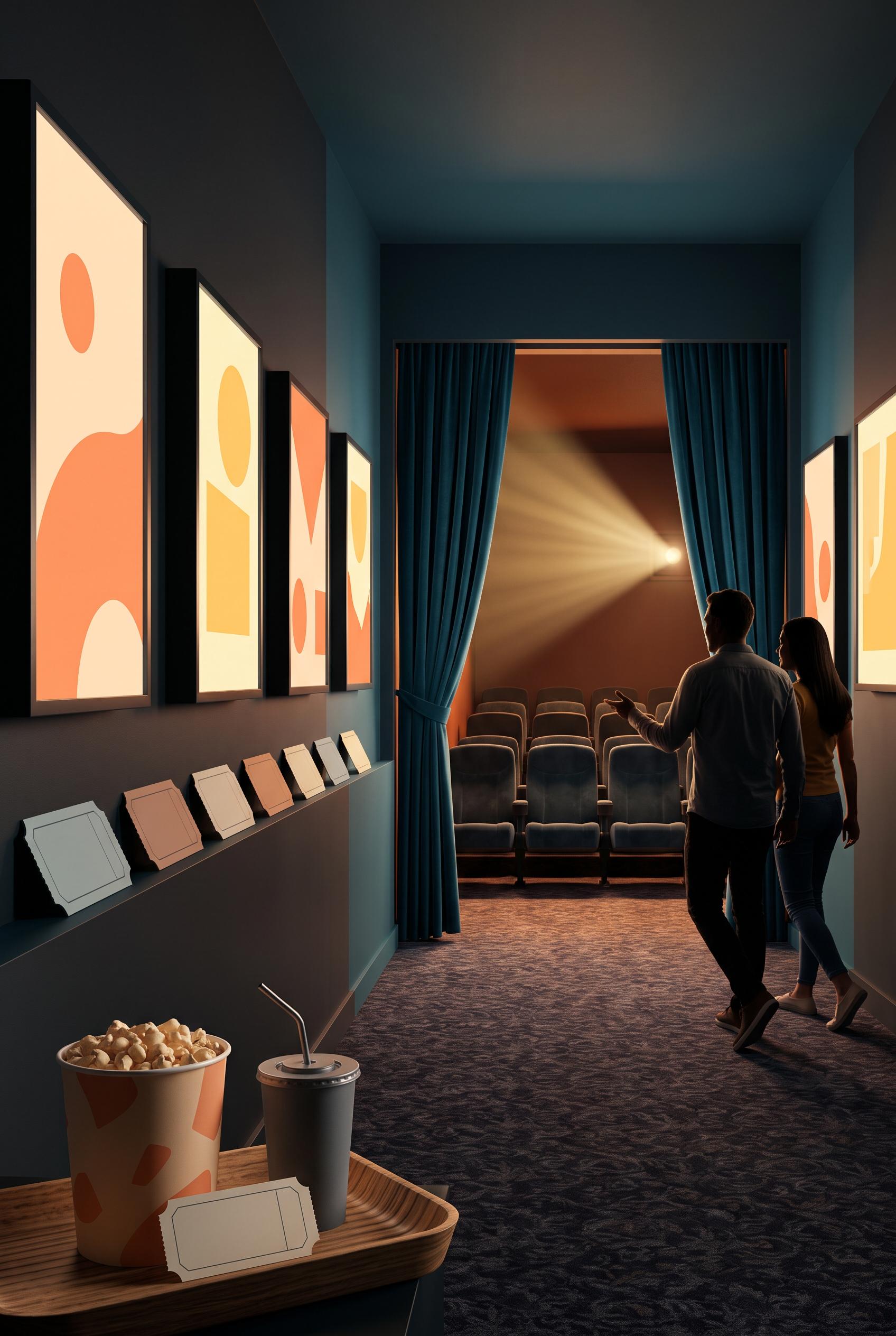
0Create a commercial-quality vertical 2:3 Pinterest composition for an inspirational local cinema campaign. Show a cinematic hallway perspective flowing toward a small screening room, with a warm projector beam, velvet seats, abstract ticket stubs, a snack tray, and welcoming guest silhouettes. Use cantaloupe, petrol blue, butter yellow, and charcoal, with atmospheric light, tactile details, sophisticated local advertising art direction, no real brands, no trademarked characters, no watermark, no unintended readable text, AI-modified downstream. Corrective regeneration attempt 2. Produce a materially revised image, not a near-duplicate of an earlier variant. Preserve the successful subject, palette, lighting, focal hierarchy, and commercial polish from the original brief while correcting every issue below. Mandatory corrective instructions from the most recent visual QA: Preserve the sophisticated vertical hallway perspective, warm projector beam, petrol-blue and charcoal architecture, cantaloupe and butter-yellow lighting, velvet cinema seating, and foreground snack tray. Remove all readable text and letter-like markings everywhere: replace poster designs with purely abstract graphic shapes, remove any popcorn wording or logo, and make every ticket completely blank with clean geometric edges. Add two or three subtle welcoming guest silhouettes arriving in the hallway near the screening-room entrance, distinct from posters. Keep the composition uncluttered and commercial-quality, with anatomically clean silhouettes and no generation artifacts, logos, trademarks, or watermark. Observed defects from prior variants that must not recur: 1) Strong vertical hallway composition, lighting, palette, and focal point. 2) No visible watermark or real brand identity. 3) The popcorn container and wall posters contain readable-looking text, violating the no unintended readable text requirement. 4) The scene lacks clear silhouettes of arriving guests; the dark figures are confined to poster artwork. 5) Some foreground ticket shapes have artifact-like markings and ambiguous distorted details. Render no letters, words, numbers, prices, headings, labels, contact details, logos, glyphs, or pseudo-text anywhere. Use only blank surfaces, clean geometric marks, and non-linguistic placeholder shapes. Do not add explanatory captions, before/after labels, interface copy, or extra objects that the brief did not request. When a corrective instruction conflicts with a decorative detail, prioritize the corrective instruction.
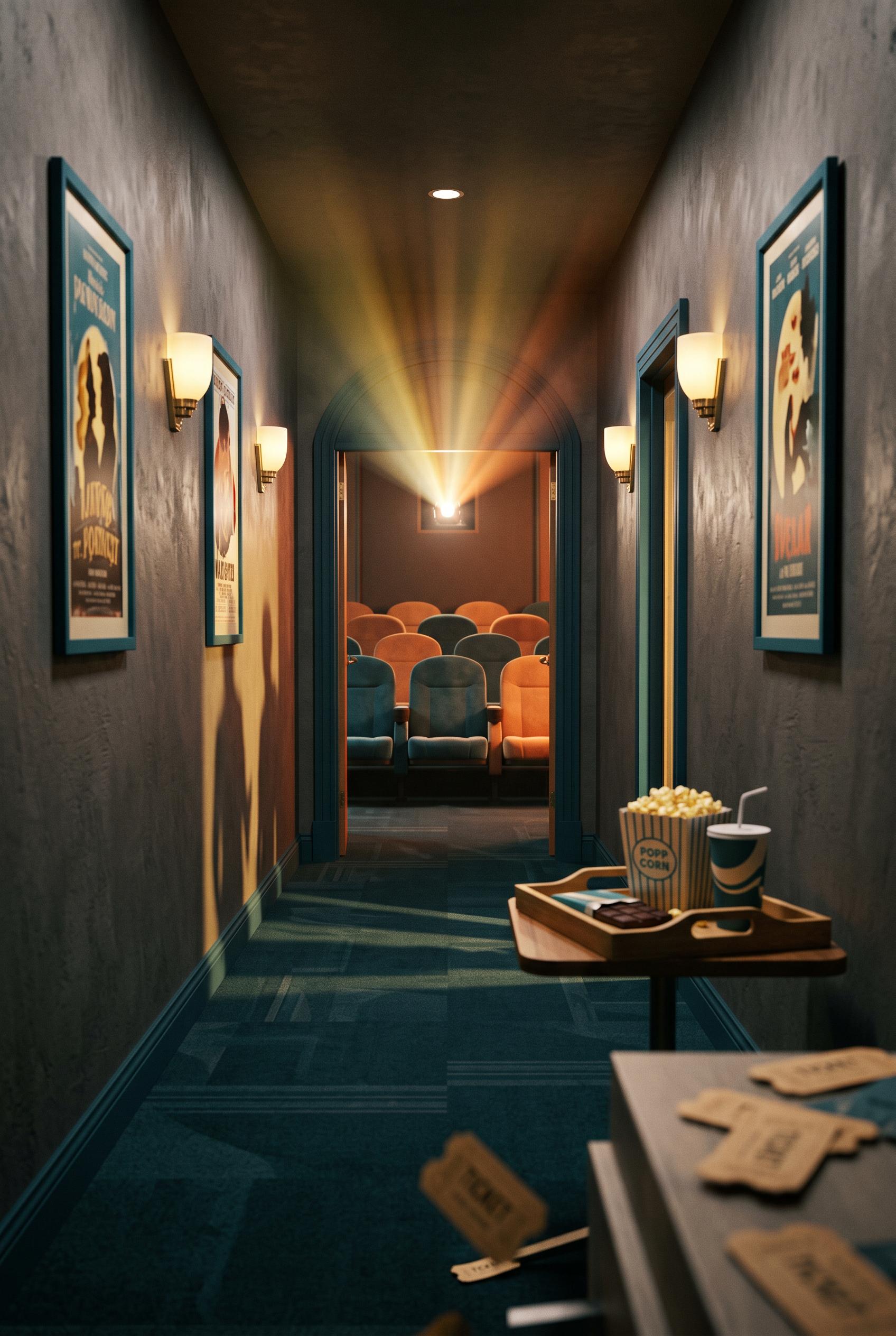 0
0Create a commercial-quality vertical 2:3 Pinterest composition for an inspirational local cinema campaign. Show a cinematic hallway perspective flowing toward a small screening room, with a warm projector beam, velvet seats, abstract ticket stubs, a snack tray, and welcoming guest silhouettes. Use cantaloupe, petrol blue, butter yellow, and charcoal, with atmospheric light, tactile details, sophisticated local advertising art direction, no real brands, no trademarked characters, no watermark, no unintended readable text, AI-modified downstream.
 0
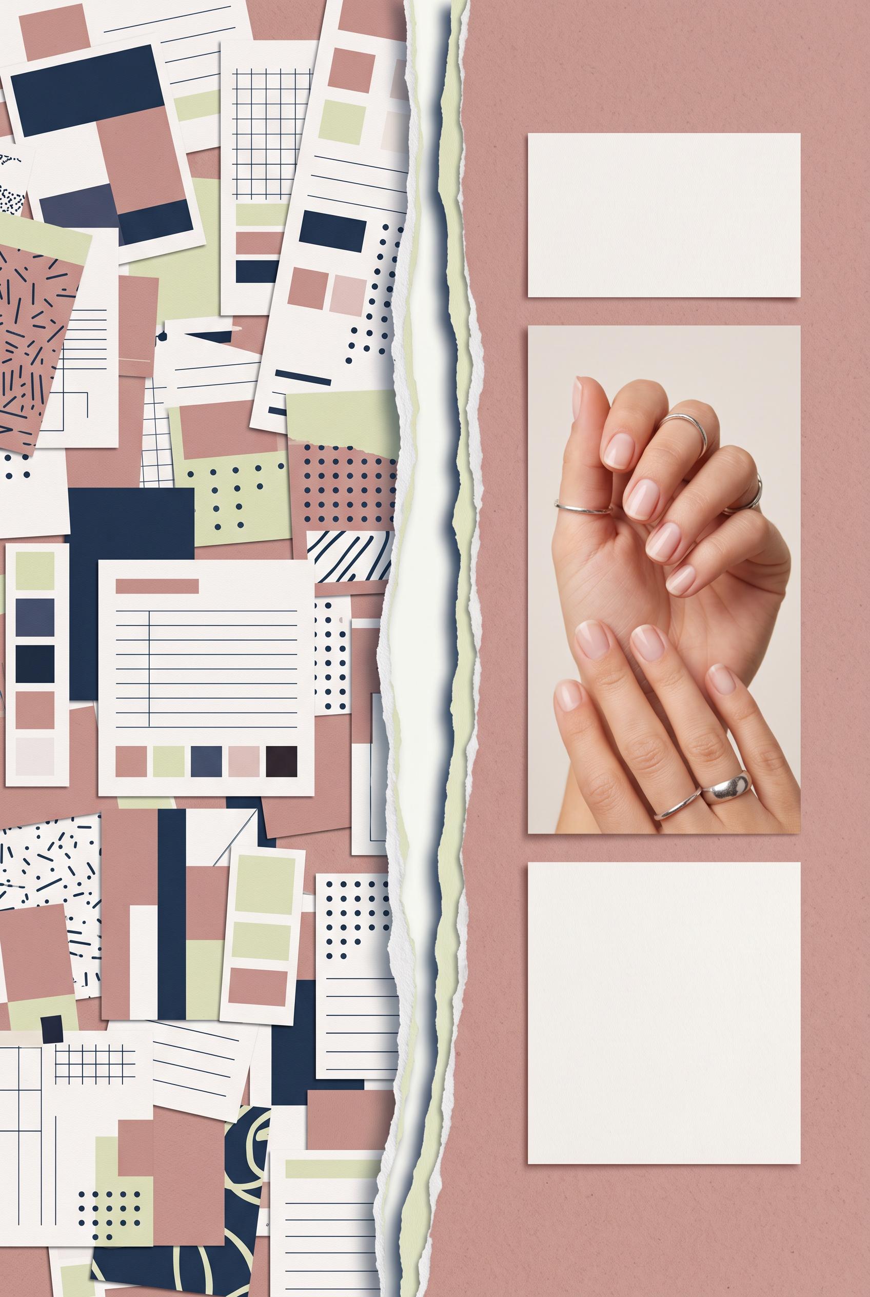
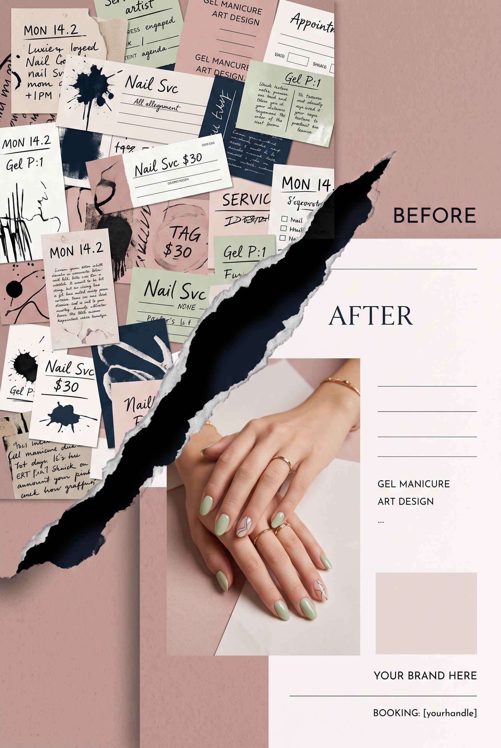
0Create a commercial-quality vertical 2:3 Pinterest composition showing a before-and-after marketing visual for an independent nail artist. Use a dramatic shadow-cast aperture opening from a cluttered collage of abstract service cards into one refined manicure promotion with a single hero hand image and clean blank text areas. Dusty rose, ink blue, celery, and alabaster palette, tactile paper surfaces, premium editorial art direction, no real brands, no trademarked characters, no watermark, no unintended readable text, AI-modified downstream. Corrective regeneration attempt 5. Produce a materially revised image, not a near-duplicate of an earlier variant. Preserve the successful subject, palette, lighting, focal hierarchy, and commercial polish from the original brief while correcting every issue below. Mandatory corrective instructions from the most recent visual QA: Preserve the vertical 2:3 composition, attractive natural manicure hand, dusty rose/ink blue/celery/alabaster palette, tactile paper texture, soft lighting, and busy left-to-refined right hierarchy. Reduce the central torn-paper aperture to a much narrower elegant opening, approximately 3–5% of the image width, with layered white and pale celery torn edges and only a subtle ink-blue cast shadow; eliminate the large continuous dark navy void. Keep the left collage busy using only abstract cards, grids, ruled lines, dots, and geometric blocks, with no writing-like marks. Keep the right side spacious and make two clearly distinct clean blank geometric blocks: one compact price-area block and one separate booking-path block, both visually aligned with the manicure image. Remove all text, pseudo-text, glyphs, numbers, logos, labels, captions, and watermarks. Observed defects from prior variants that must not recur: 1) The composition includes strong price and booking-style geometric areas, but the cluttered side needs non-linguistic marks only. 2) Attractive vertical composition with a clear manicure focal point and cohesive tactile palette. 3) The central aperture is a dominant solid-black void, contrary to the required narrow torn-paper shadow opening. 4) Multiple left-side cards contain handwritten and letter-like marks that read as pseudo-text or glyphs. 5) The transformation hierarchy is weakened by the oversized dark gap. 6) Right-side geometric areas are present but do not clearly resolve as distinct blank price and booking blocks. 7) The central aperture remains an oversized, dominant dark void, weakening the busy-to-refined transformation and violating the requested narrow elegant opening. 8) The right-side blank price and booking areas are present but somewhat generic and visually disconnected from the manicure promotion. Render no letters, words, numbers, prices, headings, labels, contact details, logos, glyphs, or pseudo-text anywhere. Use only blank surfaces, clean geometric marks, and non-linguistic placeholder shapes. Do not add explanatory captions, before/after labels, interface copy, or extra objects that the brief did not request. When a corrective instruction conflicts with a decorative detail, prioritize the corrective instruction.
 0
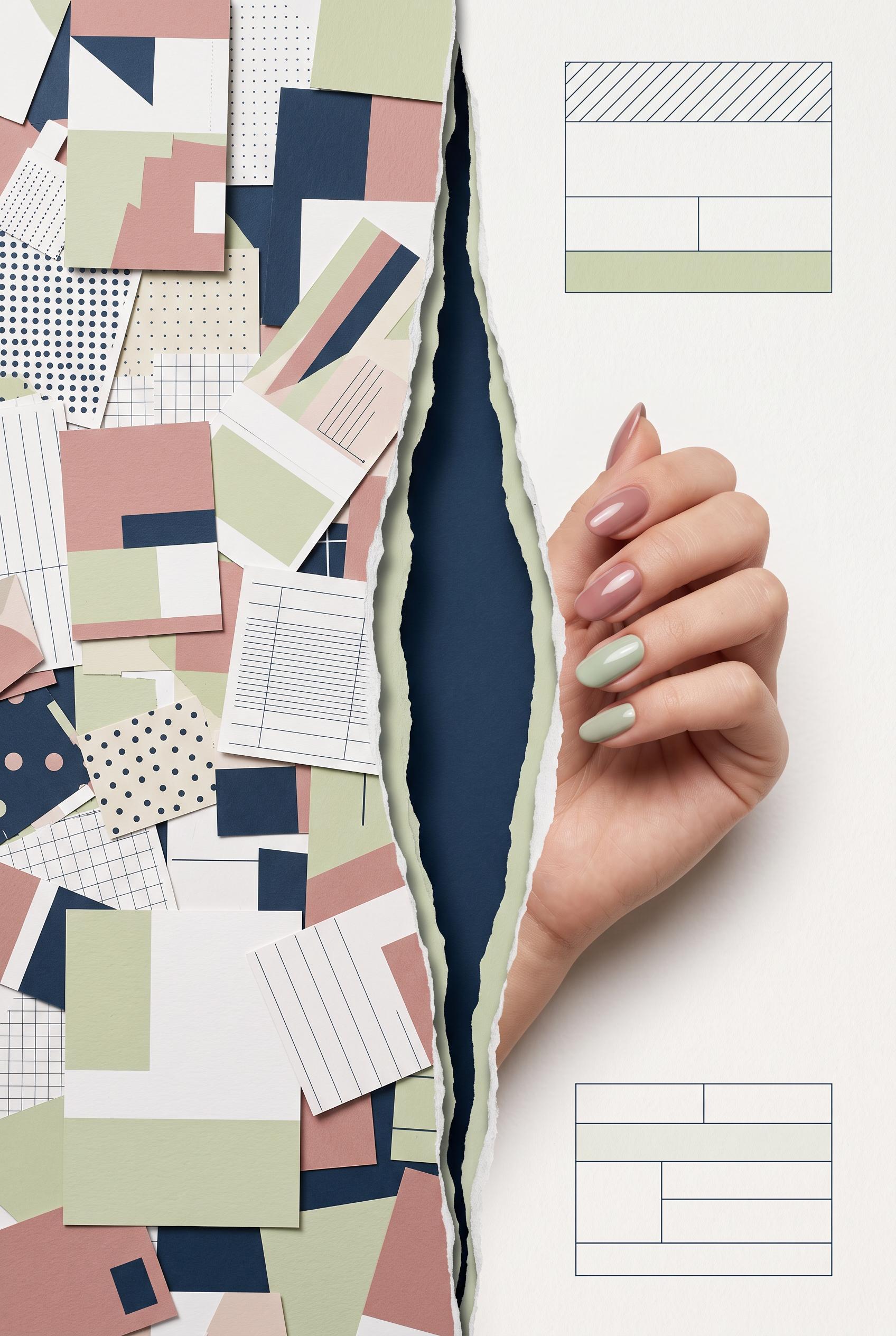
0Create a commercial-quality vertical 2:3 Pinterest composition showing a before-and-after marketing visual for an independent nail artist. Use a dramatic shadow-cast aperture opening from a cluttered collage of abstract service cards into one refined manicure promotion with a single hero hand image and clean blank text areas. Dusty rose, ink blue, celery, and alabaster palette, tactile paper surfaces, premium editorial art direction, no real brands, no trademarked characters, no watermark, no unintended readable text, AI-modified downstream. Corrective regeneration attempt 4. Produce a materially revised image, not a near-duplicate of an earlier variant. Preserve the successful subject, palette, lighting, focal hierarchy, and commercial polish from the original brief while correcting every issue below. Mandatory corrective instructions from the most recent visual QA: Preserve the vertical 2:3 format, dusty rose, ink blue, celery, alabaster palette, tactile paper texture, soft studio lighting, premium editorial styling, busy-to-refined transformation, and natural elegant manicure hand. Replace the central solid-black void with a narrow elegant torn-paper aperture or sharp shadow-cast opening using layered paper edges and a subtle ink-blue shadow; do not use solid black. Keep the left side tangled and busy, but replace every handwritten mark, letter-like stroke, pseudo-word, glyph, number, logo, and text-like symbol with purely abstract geometric shapes, ruled lines, dots, grids, or blank surfaces that cannot resemble writing. Keep the right side calm and spacious with one clearly defined blank price-area block and one separate simple blank booking-path block made only of clean geometric fields and lines. Maintain the manicure as the dominant focal point. Remove all captions, labels, words, numbers, logos, watermarks, and pseudo-text everywhere. Observed defects from prior variants that must not recur: 1) The central aperture is a large, dominant solid-black void rather than a narrow refined torn-paper or shadow opening. 2) The right-side manicure is clear and attractive, but the overall transformation hierarchy is weakened by the oversized black gap. 3) The composition includes strong price and booking-style geometric areas, but the cluttered side needs non-linguistic marks only. 4) Attractive vertical composition with a clear manicure focal point and cohesive tactile palette. 5) The central aperture is a dominant solid-black void, contrary to the required narrow torn-paper shadow opening. 6) Multiple left-side cards contain handwritten and letter-like marks that read as pseudo-text or glyphs. 7) The transformation hierarchy is weakened by the oversized dark gap. 8) Right-side geometric areas are present but do not clearly resolve as distinct blank price and booking blocks. Render no letters, words, numbers, prices, headings, labels, contact details, logos, glyphs, or pseudo-text anywhere. Use only blank surfaces, clean geometric marks, and non-linguistic placeholder shapes. Do not add explanatory captions, before/after labels, interface copy, or extra objects that the brief did not request. When a corrective instruction conflicts with a decorative detail, prioritize the corrective instruction.
 0
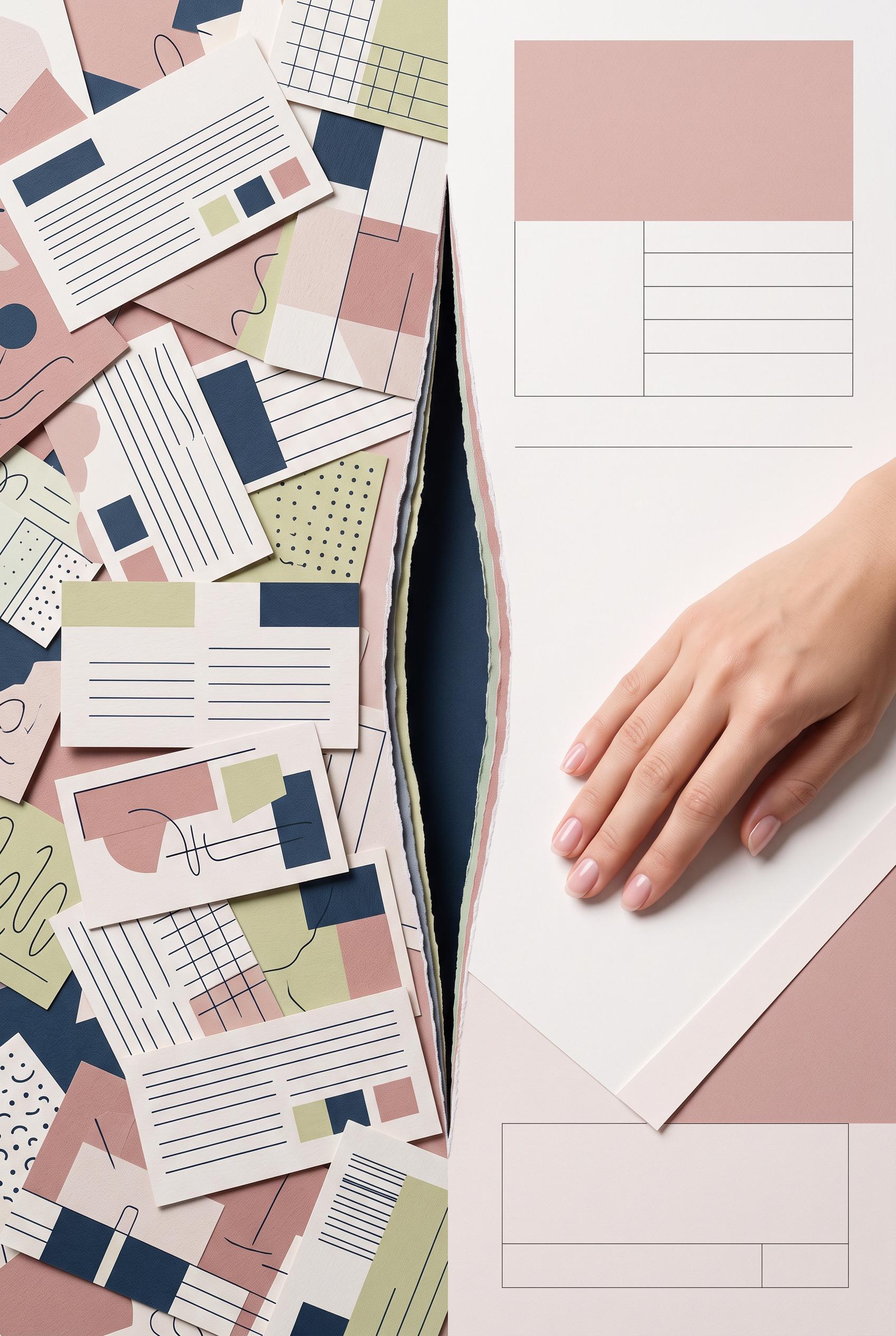
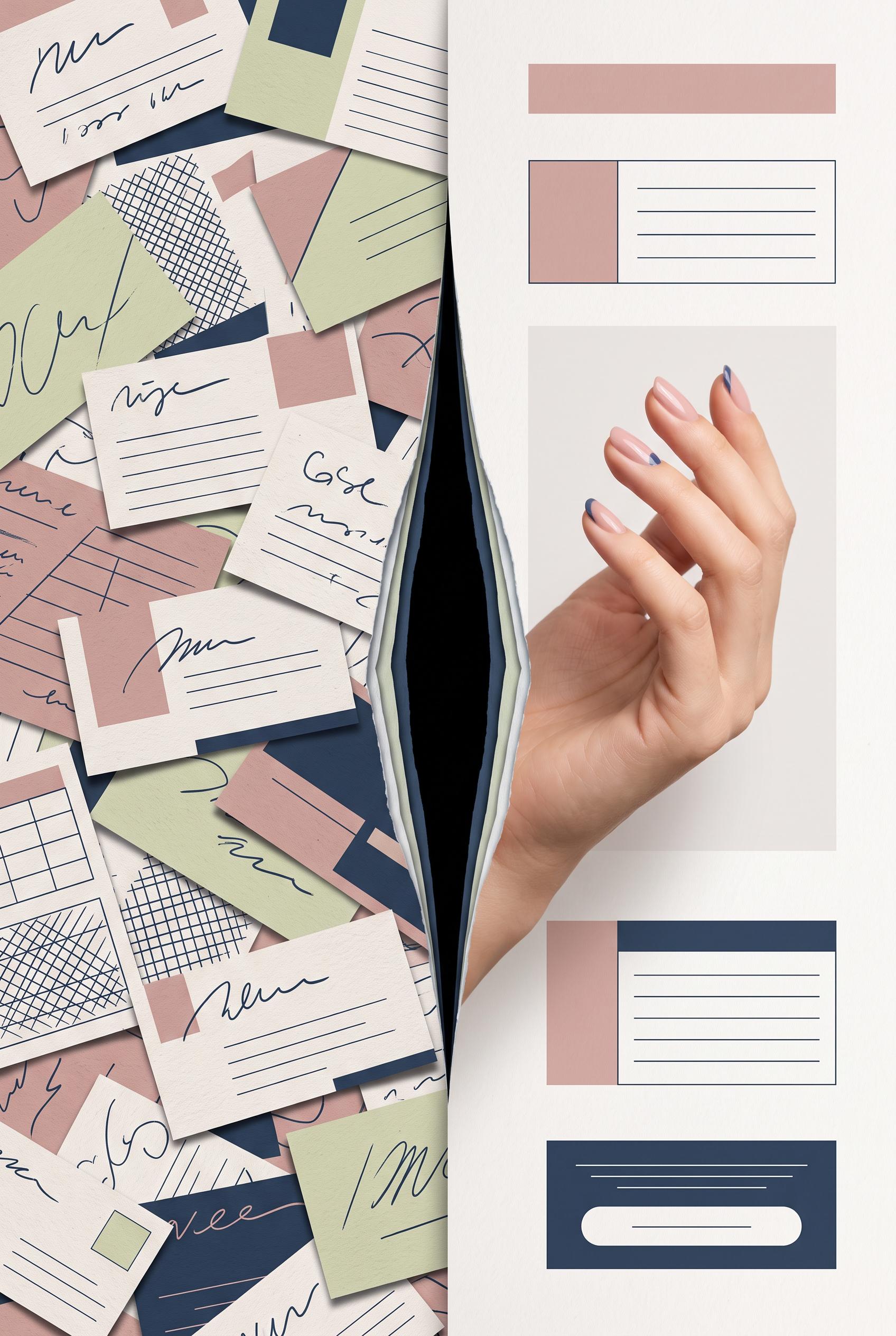
0Create a commercial-quality vertical 2:3 Pinterest composition showing a before-and-after marketing visual for an independent nail artist. Use a dramatic shadow-cast aperture opening from a cluttered collage of abstract service cards into one refined manicure promotion with a single hero hand image and clean blank text areas. Dusty rose, ink blue, celery, and alabaster palette, tactile paper surfaces, premium editorial art direction, no real brands, no trademarked characters, no watermark, no unintended readable text, AI-modified downstream. Corrective regeneration attempt 3. Produce a materially revised image, not a near-duplicate of an earlier variant. Preserve the successful subject, palette, lighting, focal hierarchy, and commercial polish from the original brief while correcting every issue below. Mandatory corrective instructions from the most recent visual QA: Preserve the vertical 2:3 format, dusty rose, ink blue, celery, and alabaster palette, tactile paper texture, soft studio lighting, premium editorial styling, busy-to-refined transformation, and natural elegant manicure hand. Replace every handwritten mark, letter-like stroke, pseudo-word, glyph, number, logo, and text-like symbol on all cards with purely abstract geometric shapes, ruled lines, dots, grids, or completely blank areas that cannot resemble writing. Remove all readable or pseudo-readable text everywhere. Replace the large central black void with a narrow elegant torn-paper aperture or sharp shadow-cast opening, showing layered paper edges and a subtle ink-blue shadow; do not use solid black. Keep the left side visibly tangled and busy, while keeping the right side calm and spacious with one clearly defined blank price-area block and one simple blank booking-path block made only of clean geometric fields and lines. Keep the manicure hand as the dominant focal point with natural anatomy and clean nails. No captions, labels, headings, words, numbers, logos, watermarks, or pseudo-text. Observed defects from prior variants that must not recur: 1) The cluttered cards contain extensive garbled and unintended pseudo-readable text. 2) The right side includes placeholder copy such as “YOUR BRAND HERE” and booking text, conflicting with the clean blank text-area requirement. 3) The aperture is an overly dominant black torn void rather than a refined shadow-cast opening, obscuring the transition and weakening hierarchy. 4) The price/booking area is not clearly resolved on the refined side. 5) Extensive handwritten pseudo-text and letter-like marks appear across the cluttered cards, violating the no-readable-text requirement. 6) The central aperture is a large, dominant solid-black void rather than a narrow refined torn-paper or shadow opening. 7) The right-side manicure is clear and attractive, but the overall transformation hierarchy is weakened by the oversized black gap. 8) The composition includes strong price and booking-style geometric areas, but the cluttered side needs non-linguistic marks only. Render no letters, words, numbers, prices, headings, labels, contact details, logos, glyphs, or pseudo-text anywhere. Use only blank surfaces, clean geometric marks, and non-linguistic placeholder shapes. Do not add explanatory captions, before/after labels, interface copy, or extra objects that the brief did not request. When a corrective instruction conflicts with a decorative detail, prioritize the corrective instruction.
 0
0Create a commercial-quality vertical 2:3 Pinterest composition showing a before-and-after marketing visual for an independent nail artist. Use a dramatic shadow-cast aperture opening from a cluttered collage of abstract service cards into one refined manicure promotion with a single hero hand image and clean blank text areas. Dusty rose, ink blue, celery, and alabaster palette, tactile paper surfaces, premium editorial art direction, no real brands, no trademarked characters, no watermark, no unintended readable text, AI-modified downstream. Corrective regeneration attempt 2. Produce a materially revised image, not a near-duplicate of an earlier variant. Preserve the successful subject, palette, lighting, focal hierarchy, and commercial polish from the original brief while correcting every issue below. Mandatory corrective instructions from the most recent visual QA: Preserve the vertical 2:3 format, dusty rose/ink blue/celery/alabaster palette, tactile paper, soft studio lighting, premium editorial styling, collage-to-refined transformation, and elegant manicure hero image. Replace every card’s writing with purely abstract marks, ruled lines, or blank areas—no readable words, letters, numbers, pseudo-text, logos, or placeholders anywhere. Remove “BEFORE,” “AFTER,” “YOUR BRAND HERE,” booking copy, and all other generated text. Make the aperture a narrow, elegant torn-paper or sharp shadow opening with visible layered paper edges and subtle ink-blue shadow, not a large solid black void. Keep the left side visibly tangled and busy, while the right side is calm and spacious with one clear price-area block and one simple booking-path block represented only by clean blank lines and geometric fields. Ensure the manicure hand has natural anatomy, clean fingers and nails, and remains the dominant focal point. Observed defects from prior variants that must not recur: 1) The cluttered cards contain extensive garbled and unintended pseudo-readable text. 2) The right side includes placeholder copy such as “YOUR BRAND HERE” and booking text, conflicting with the clean blank text-area requirement. 3) The aperture is an overly dominant black torn void rather than a refined shadow-cast opening, obscuring the transition and weakening hierarchy. 4) The price/booking area is not clearly resolved on the refined side. Render no letters, words, numbers, prices, headings, labels, contact details, logos, glyphs, or pseudo-text anywhere. Use only blank surfaces, clean geometric marks, and non-linguistic placeholder shapes. Do not add explanatory captions, before/after labels, interface copy, or extra objects that the brief did not request. When a corrective instruction conflicts with a decorative detail, prioritize the corrective instruction.
 0
0Create a commercial-quality vertical 2:3 Pinterest composition showing a before-and-after marketing visual for an independent nail artist. Use a dramatic shadow-cast aperture opening from a cluttered collage of abstract service cards into one refined manicure promotion with a single hero hand image and clean blank text areas. Dusty rose, ink blue, celery, and alabaster palette, tactile paper surfaces, premium editorial art direction, no real brands, no trademarked characters, no watermark, no unintended readable text, AI-modified downstream.
 0
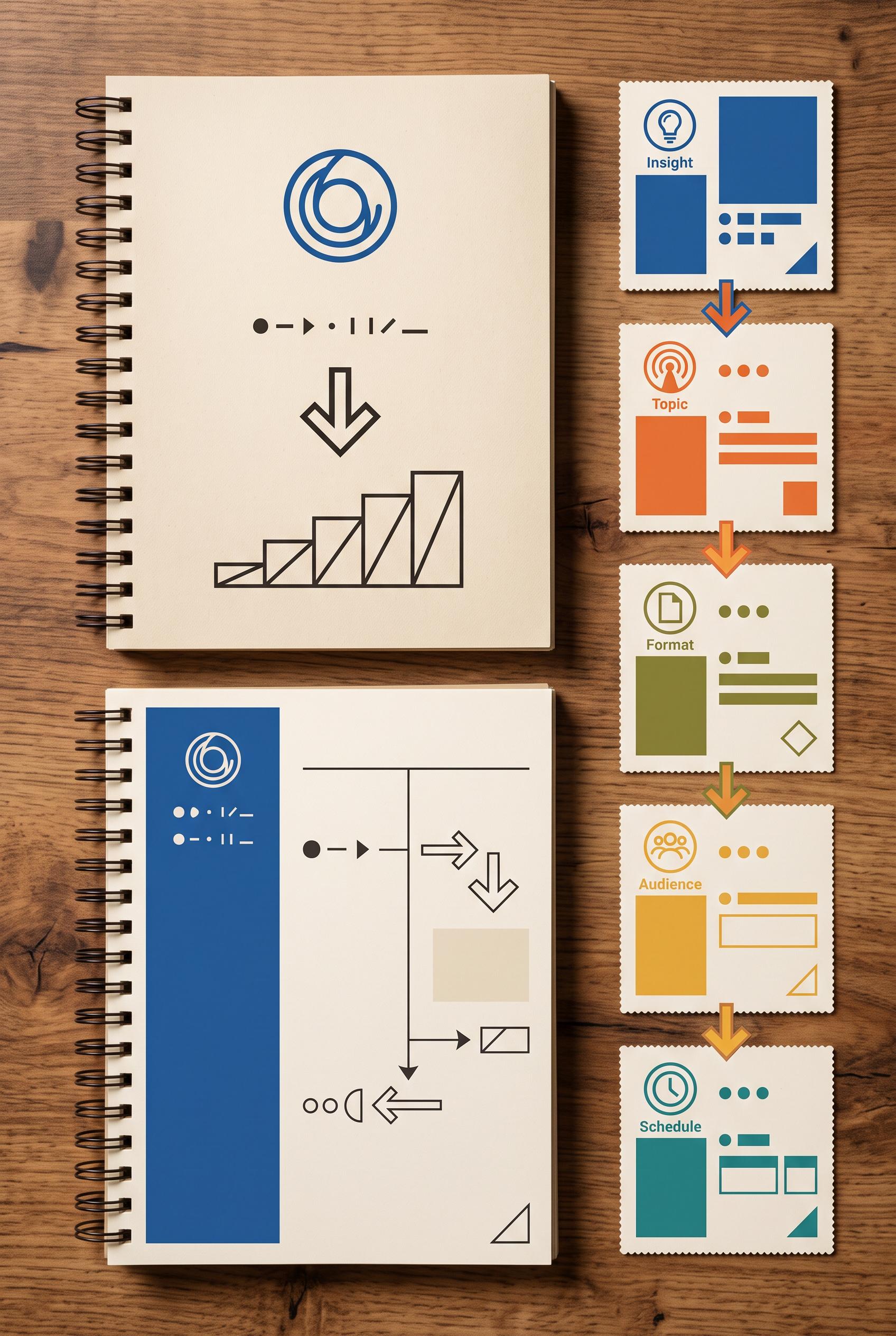
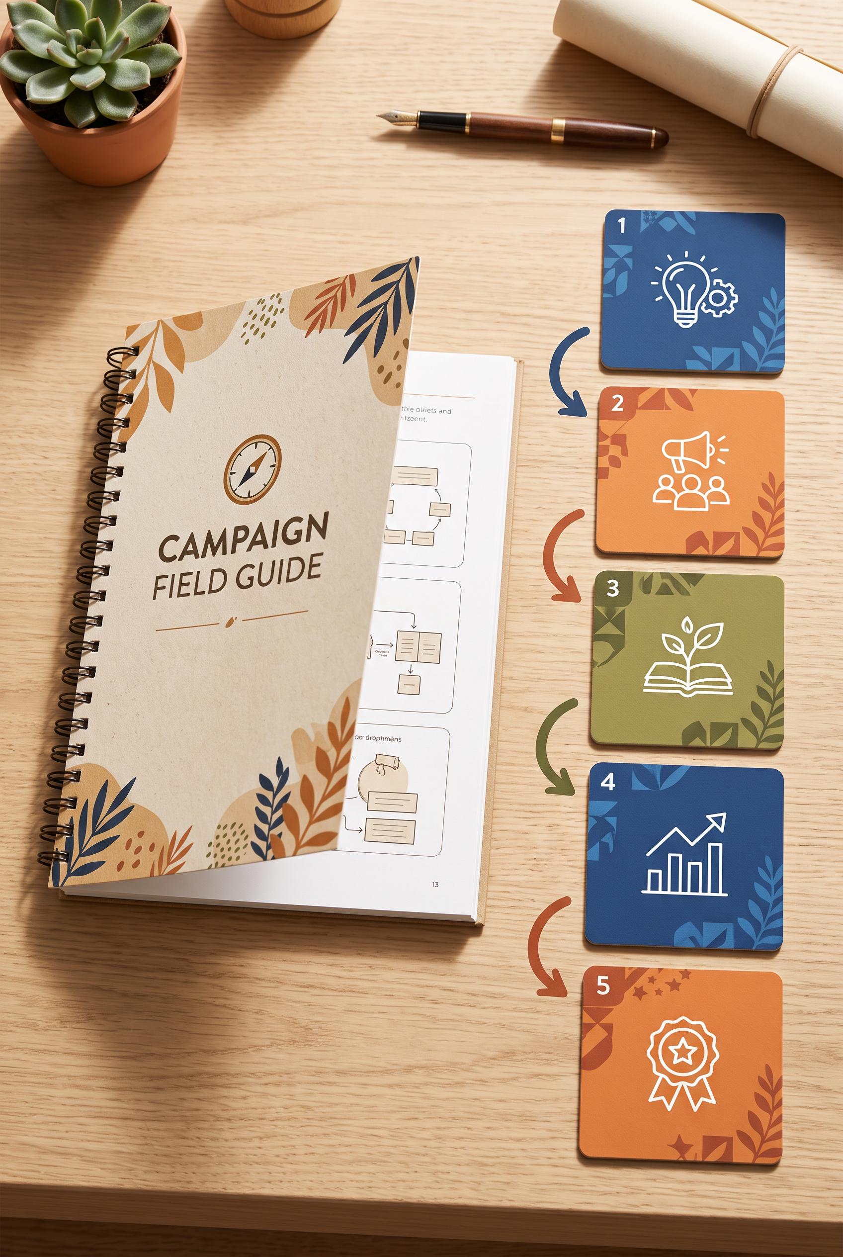
0Create a commercial-quality art-directed vertical 2:3 Pinterest composition for an educational content campaign planner. Show a spiral-bound field guide with five detachable campaign tiles, clear visual sequencing, abstract icons, arrows, punch-out edges, sapphire, tangerine, olive, and warm paper tones, crisp overhead photography, and polished instructional design. No real brands, no trademarked characters, no watermark, and no unintended readable text. Corrective regeneration attempt 5. Produce a materially revised image, not a near-duplicate of an earlier variant. Preserve the successful subject, palette, lighting, focal hierarchy, and commercial polish from the original brief while correcting every issue below. Mandatory corrective instructions from the most recent visual QA: Preserve the attractive vertical overhead composition, warm wood desk, spiral-bound field guide, sapphire/tangerine/olive palette, lighting, arrows, numbered color blocks, and five-tile focal hierarchy. Remove all readable text everywhere, including the cover title, interior page fragments, labels, and page number; replace every text area with blank paper or purely abstract non-linguistic marks. Make the five tiles visibly detachable with subtle perforated punch-out edges while retaining their simple abstract icons and numbered blocks. Keep only the requested field guide, five tiles, arrows, and existing desk styling; no extra objects, brands, trademarks, or watermark. Observed defects from prior variants that must not recur: 1) [object Object] 2) Prominent readable cover text violates the instruction to use abstract icons instead of readable text. 3) The open page contains additional garbled readable text and a page number. 4) Tiles look like clean cards rather than clearly detachable punch-out tiles. Render no letters, words, numbers, prices, headings, labels, contact details, logos, glyphs, or pseudo-text anywhere. Use only blank surfaces, clean geometric marks, and non-linguistic placeholder shapes. Do not add explanatory captions, before/after labels, interface copy, or extra objects that the brief did not request. When a corrective instruction conflicts with a decorative detail, prioritize the corrective instruction.
 0
0Create a commercial-quality art-directed vertical 2:3 Pinterest composition for an educational content campaign planner. Show a spiral-bound field guide with five detachable campaign tiles, clear visual sequencing, abstract icons, arrows, punch-out edges, sapphire, tangerine, olive, and warm paper tones, crisp overhead photography, and polished instructional design. No real brands, no trademarked characters, no watermark, and no unintended readable text. Corrective regeneration attempt 4. Produce a materially revised image, not a near-duplicate of an earlier variant. Preserve the successful subject, palette, lighting, focal hierarchy, and commercial polish from the original brief while correcting every issue below. Observed defects from prior variants that must not recur: 1) [object Object] Do not add explanatory captions, before/after labels, interface copy, or extra objects that the brief did not request. When a corrective instruction conflicts with a decorative detail, prioritize the corrective instruction.
 0
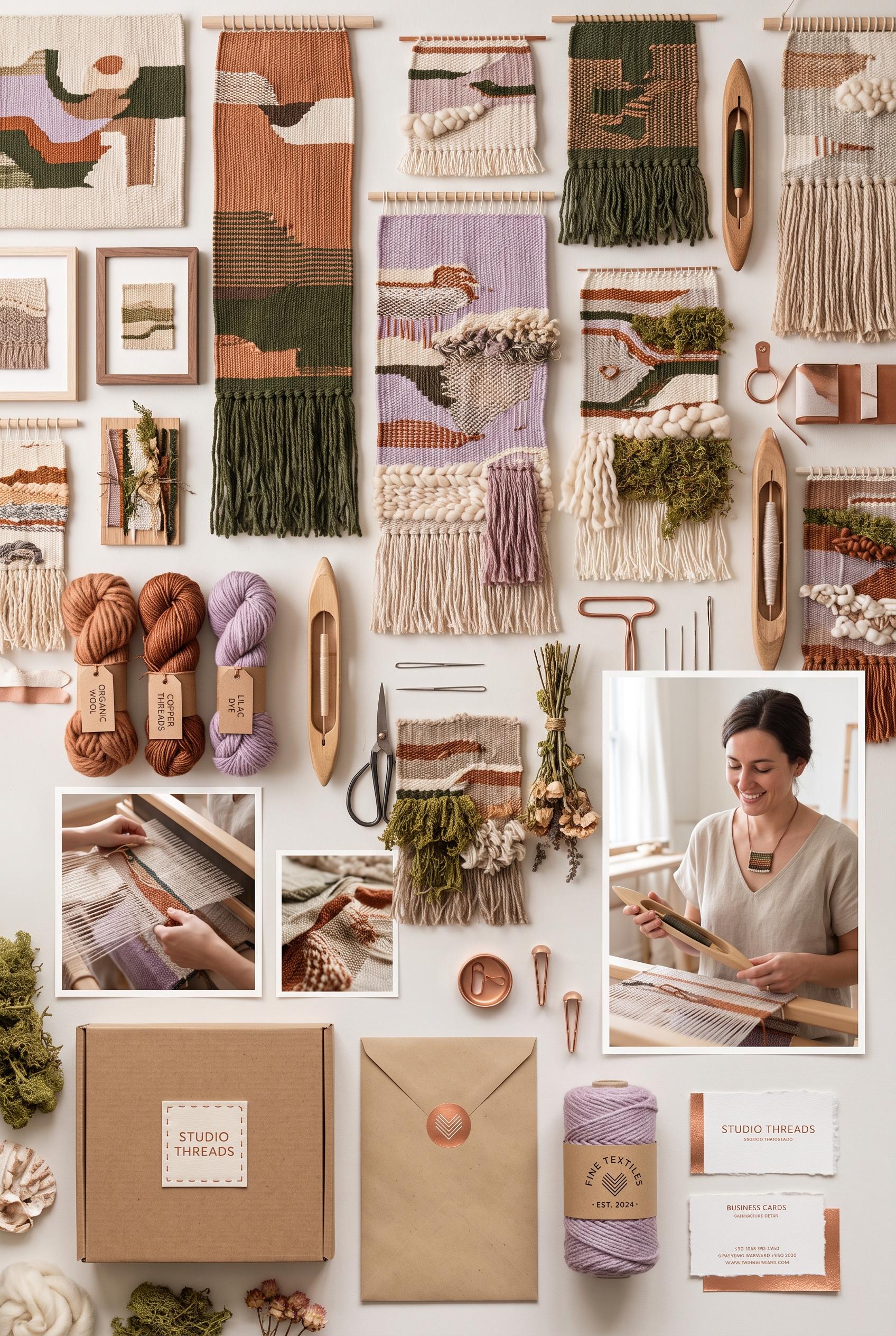
0Create a commercial-quality art-directed vertical 2:3 Pinterest composition for an inspirational personal brand showcase of an independent textile artist. Build a woven sampler wall with layered fabric studies, thread bundles, tactile process photos, profile imagery, simple packaging mockups, stitched edges, copper, moss, lilac, and shell tones, refined editorial lighting, and a premium cohesive identity system. No real brands, no trademarked characters, no watermark, and no unintended readable text.
 0
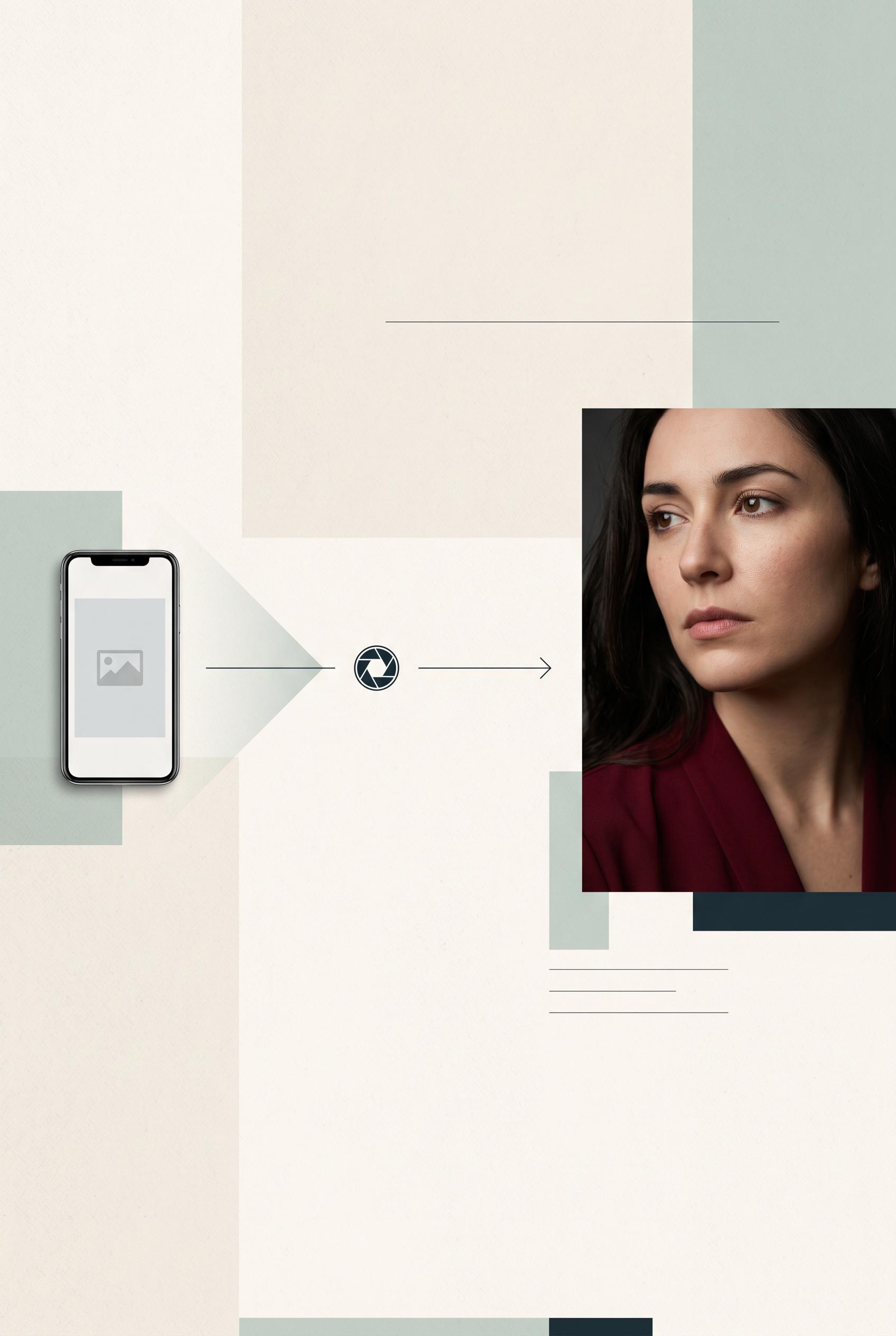
0Create a commercial-quality art-directed vertical 2:3 Pinterest composition showing a before-and-after redesign for an independent newsletter writer thumbnail. Use a lens-aperture reveal with a small phone-scale comparison, a tightly cropped thoughtful portrait, editorial paper textures, crimson, celadon, ink, and vanilla tones, strong hierarchy, polished studio lighting, and generous negative space. No real brands, no trademarked characters, no watermark, and no unintended readable text. Corrective regeneration attempt 2. Produce a materially revised image, not a near-duplicate of an earlier variant. Preserve the successful subject, palette, lighting, focal hierarchy, and commercial polish from the original brief while correcting every issue below. Mandatory corrective instructions from the most recent visual QA: Preserve the refined editorial palette, paper grain, studio lighting, portrait quality, phone comparison, typography, and generous negative space. Recompose the design into an unmistakable left-to-right layout: place the flat generic phone thumbnail on the left, a clear horizontal directional reading path through the center, and the bold cropped portrait redesign on the right. Keep the aperture as one smaller recurring editorial symbol that supports the transition rather than dominating it. Maintain a clean vertical 2:3 Pinterest composition, no brands, watermarks, garbled text, or generation artifacts. Observed defects from prior variants that must not recur: 1) The transformation is arranged primarily top-to-bottom rather than the requested clear left-to-right before/after comparison. 2) The large central aperture symbol competes with the primary transformation path and makes the before/after relationship less immediate. Render no letters, words, numbers, prices, headings, labels, contact details, logos, glyphs, or pseudo-text anywhere. Use only blank surfaces, clean geometric marks, and non-linguistic placeholder shapes. Do not add explanatory captions, before/after labels, interface copy, or extra objects that the brief did not request. When a corrective instruction conflicts with a decorative detail, prioritize the corrective instruction.
 0
0Create a commercial-quality art-directed vertical 2:3 Pinterest composition showing a before-and-after redesign for an independent newsletter writer thumbnail. Use a lens-aperture reveal with a small phone-scale comparison, a tightly cropped thoughtful portrait, editorial paper textures, crimson, celadon, ink, and vanilla tones, strong hierarchy, polished studio lighting, and generous negative space. No real brands, no trademarked characters, no watermark, and no unintended readable text.
 0
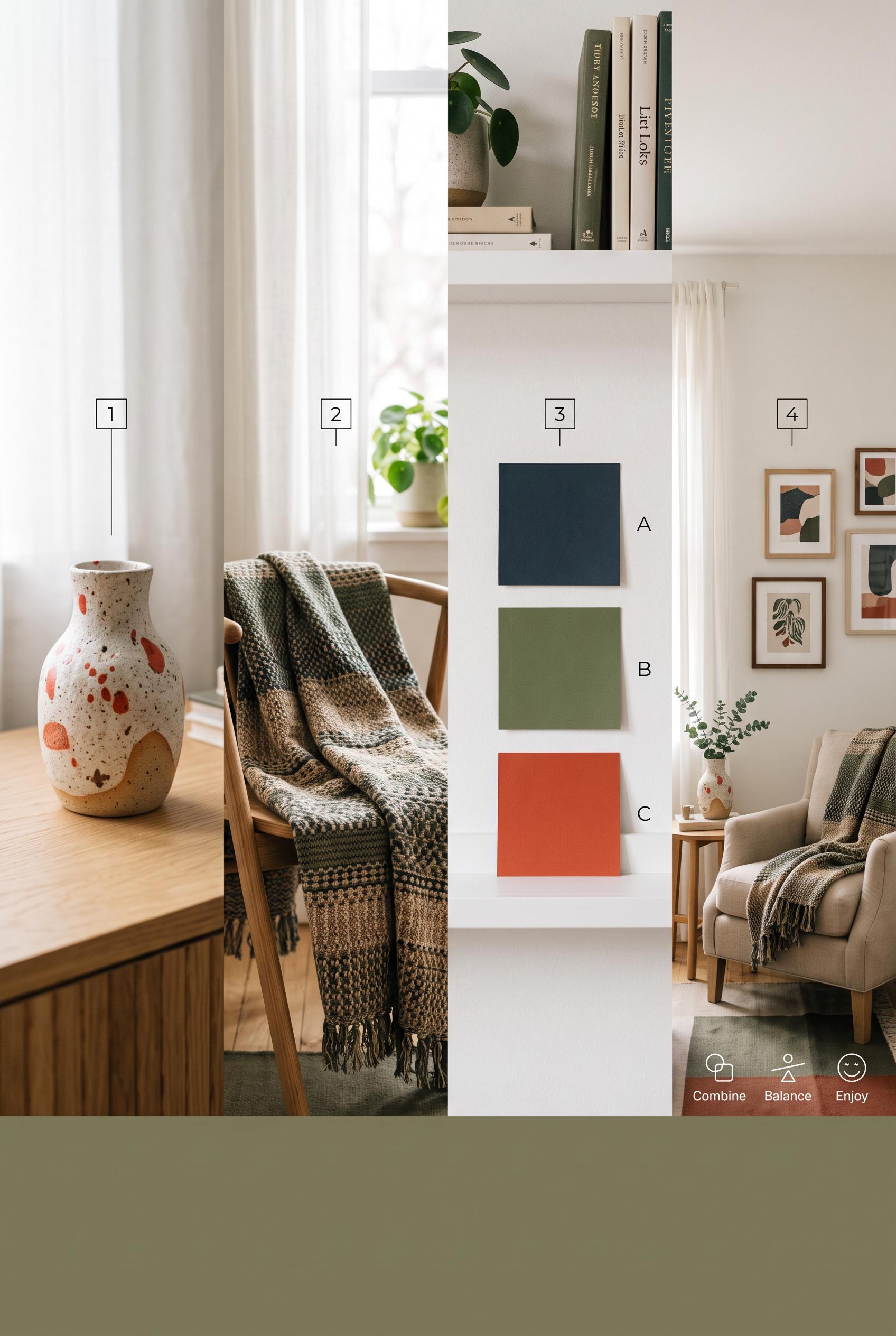
0Create a commercial-quality educational interior styling graphic in a vertical 2:3 Pinterest composition. Arrange a favorite handmade ceramic object, a woven textile, three blank color swatches, and a finished small living room vignette in a clear left-to-right visual progression. Use porcelain, tomato red, moss, ink, and warm sand with balanced natural light, crisp overhead styling, tactile materials, and simple geometric markers only. No readable text, no real brands, no trademarked characters, no watermark, and no unintended readable text. AI-modified downstream. Corrective regeneration attempt 2. Produce a materially revised image, not a near-duplicate of an earlier variant. Preserve the successful subject, palette, lighting, focal hierarchy, and commercial polish from the original brief while correcting every issue below. Mandatory corrective instructions from the most recent visual QA: Preserve the attractive vertical 2:3 layout, ceramic vessel, woven textile, three color swatches, and finished living-room vignette. Remove all readable text everywhere: replace the numbered callouts, A/B/C swatch labels, and bottom words/icons with clean, unlabeled geometric markers only. Replace book spines with blank or abstract pattern-only spines without titles, logos, symbols, or brand marks. Keep the warm natural lighting, tactile materials, balanced porcelain, tomato red, moss, ink, and warm sand palette, and crisp commercial styling. Ensure no watermark, trademark, logo, or garbled text remains. Observed defects from prior variants that must not recur: 1) The image is an attractive vertical composition with a clear four-stage progression, but it contains substantial unintended readable text: book titles, swatch labels A/B/C, step数字 2) and bottom words “Combine,” “Balance,” and “Enjoy.” 3) The brief requires simple geometric markers only, with no readable text. Render no letters, words, numbers, prices, headings, labels, contact details, logos, glyphs, or pseudo-text anywhere. Use only blank surfaces, clean geometric marks, and non-linguistic placeholder shapes. Do not add explanatory captions, before/after labels, interface copy, or extra objects that the brief did not request. When a corrective instruction conflicts with a decorative detail, prioritize the corrective instruction.
 0
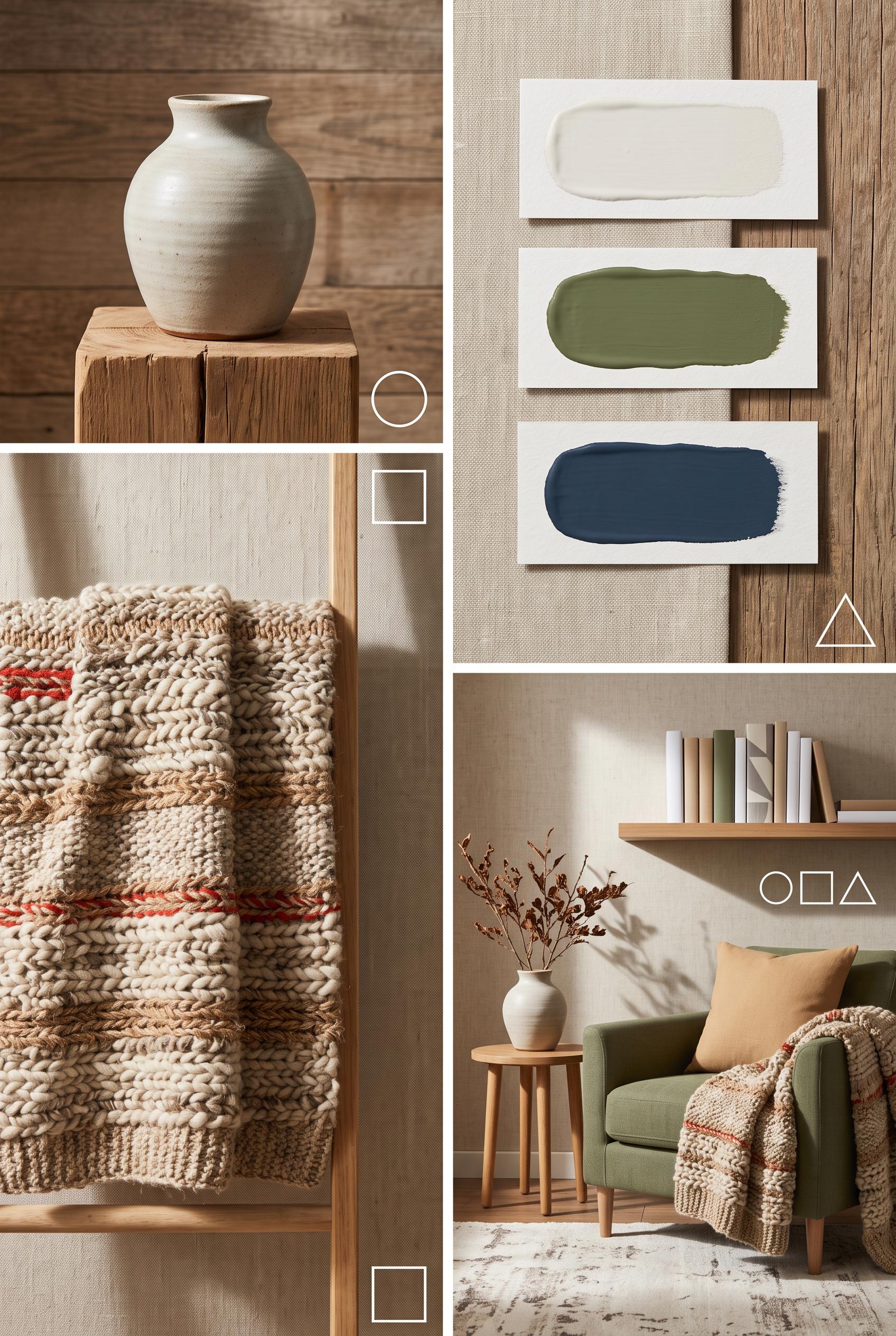
0Create a commercial-quality educational interior styling graphic in a vertical 2:3 Pinterest composition. Arrange a favorite handmade ceramic object, a woven textile, three blank color swatches, and a finished small living room vignette in a clear left-to-right visual progression. Use porcelain, tomato red, moss, ink, and warm sand with balanced natural light, crisp overhead styling, tactile materials, and simple geometric markers only. No readable text, no real brands, no trademarked characters, no watermark, and no unintended readable text. AI-modified downstream.
 0
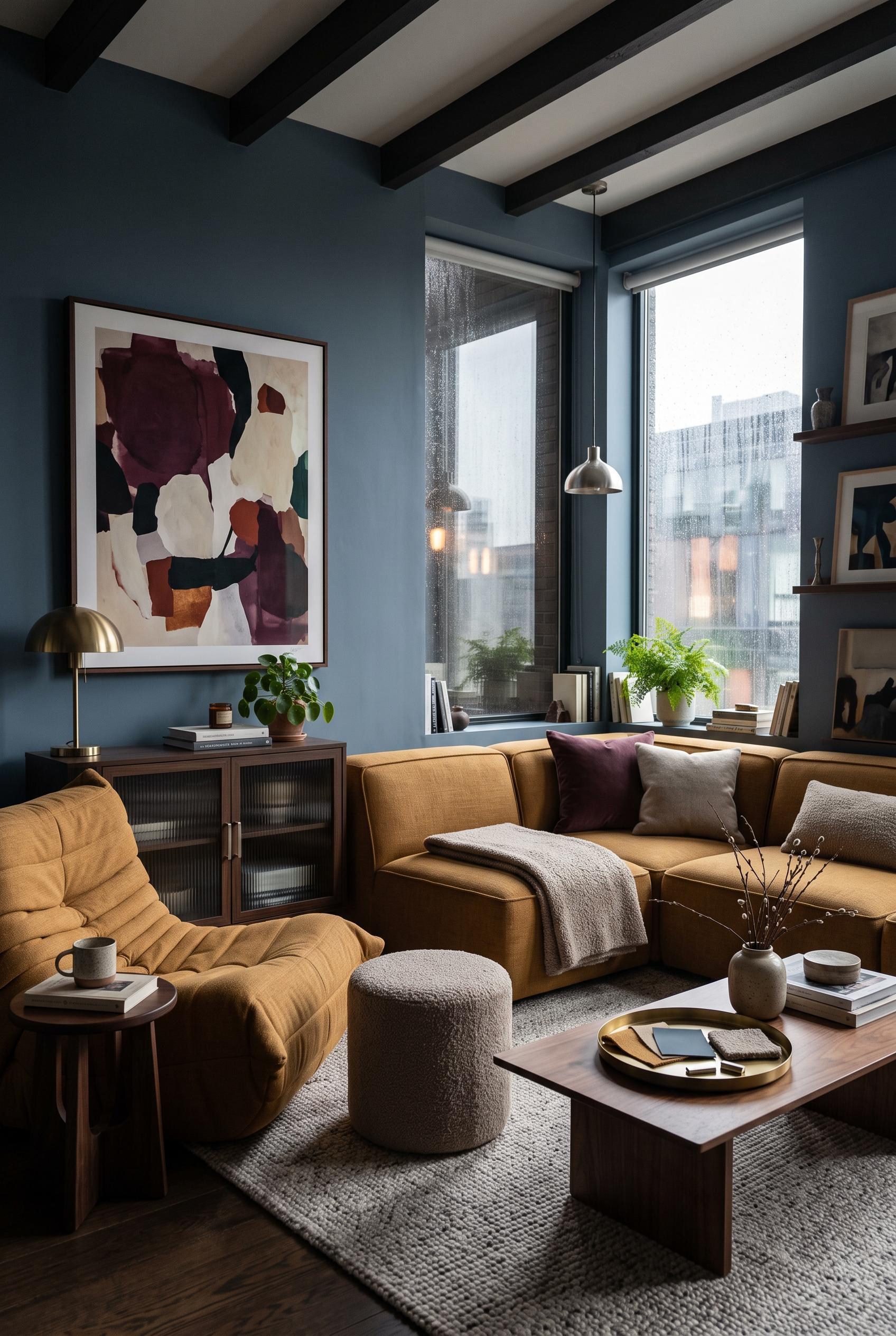
0Create a commercial-quality interior design showcase in a vertical 2:3 Pinterest composition, viewed from a three-quarter corner angle inside a compact rainy-day living room. Feature storm blue walls, ochre upholstery, mushroom boucle, mulberry art-like abstract forms, brushed nickel details, a low modular sofa, an oversized reading chair, ribbed glass, and soft window reflections. Add a small material vignette with blank swatches only. Use cinematic overcast daylight, realistic textures, sophisticated editorial styling, no real brands, no trademarked characters, no watermark, and no unintended readable text. AI-modified downstream.
 0
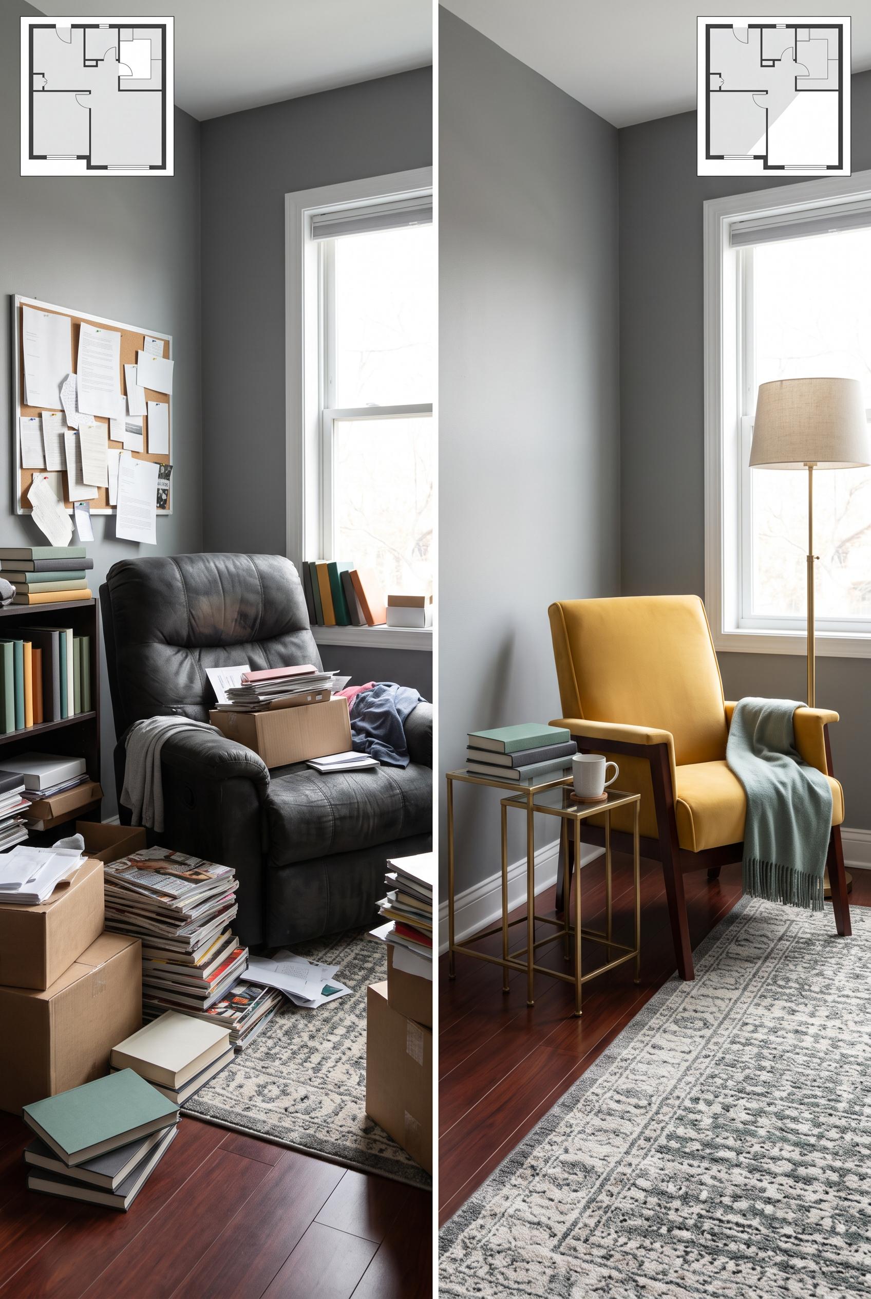
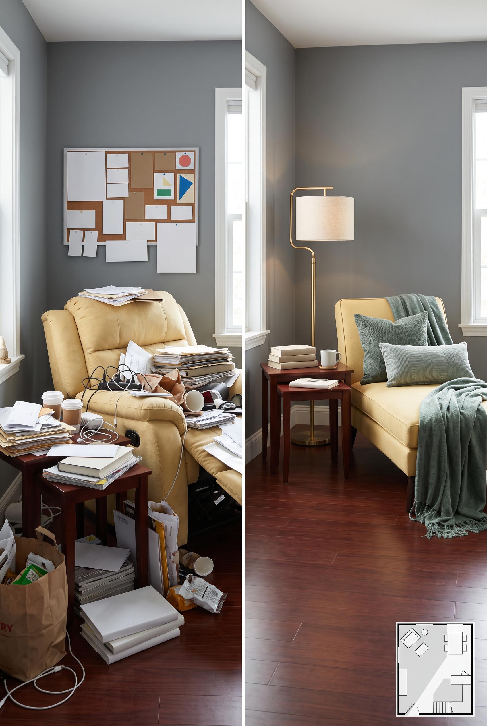
0Create a commercial-quality interior editorial image in a vertical 2:3 Pinterest composition, using a matched before-and-after split of the same compact living room. Show a cluttered recliner corner on one side and a flexible reading and conversation arrangement on the other, with butter yellow upholstery, mineral gray walls, eucalyptus textiles, and dark cherry wood accents. Include a small abstract floor plan inset with no readable labels. Use realistic materials, soft directional daylight, refined styling, no real brands, no trademarked characters, no watermark, and no unintended readable text. AI-modified downstream. Corrective regeneration attempt 5. Produce a materially revised image, not a near-duplicate of an earlier variant. Preserve the successful subject, palette, lighting, focal hierarchy, and commercial polish from the original brief while correcting every issue below. Mandatory corrective instructions from the most recent visual QA: Preserve the polished vertical 2:3 split-screen composition, matched mineral-gray living room, butter-yellow seating, eucalyptus textiles, cherry flooring, brass floor lamp, nesting tables, soft daylight, and unlabeled abstract floor-plan inset. Remove every visible letter, word, number, logo, brand mark, barcode, glyph, and pseudo-text detail from the entire image. In the cluttered panel, replace all bag printing, packaging, book spines, magazine covers, papers, labels, and bulletin-board details with completely blank surfaces or simple non-linguistic geometric shapes. Keep the before panel visibly cluttered with blank papers and objects, and keep the after panel clean with one lounge chair, narrow nesting tables, and a wide unmistakable diagonal walking path. Do not add any captions, labels, signage, or readable markings. Observed defects from prior variants that must not recur: 1) Large readable “BEFORE” and “AFTER” captions violate the instruction to render no labels or text. 2) Some magazine and book covers in the cluttered panel contain potentially readable markings. 3) The after panel’s diagonal circulation path is present but not maximally unmistakable due to the chair and table placement. 4) The left cluttered panel contains abundant readable-looking text and pseudo-text on the bulletin board, papers, books, magazines, and packaging, violating the explicit no-text rule 5) The circulation path in the after panel is visible but not strongly diagonal or unmistakable because the chair and tables still occupy much of the central floor area 6) Visible unintended text and branding remain on the left paper bag, packaging, book and magazine materials, including barcode-like markings. 7) The cluttered panel contains many paper and cover surfaces with pseudo-text-like details, violating the explicit zero-text requirement. 8) The overall composition, split-room concept, palette, lighting, and after-panel circulation are strong. Render no letters, words, numbers, prices, headings, labels, contact details, logos, glyphs, or pseudo-text anywhere. Use only blank surfaces, clean geometric marks, and non-linguistic placeholder shapes. Do not add explanatory captions, before/after labels, interface copy, or extra objects that the brief did not request. When a corrective instruction conflicts with a decorative detail, prioritize the corrective instruction.
 0
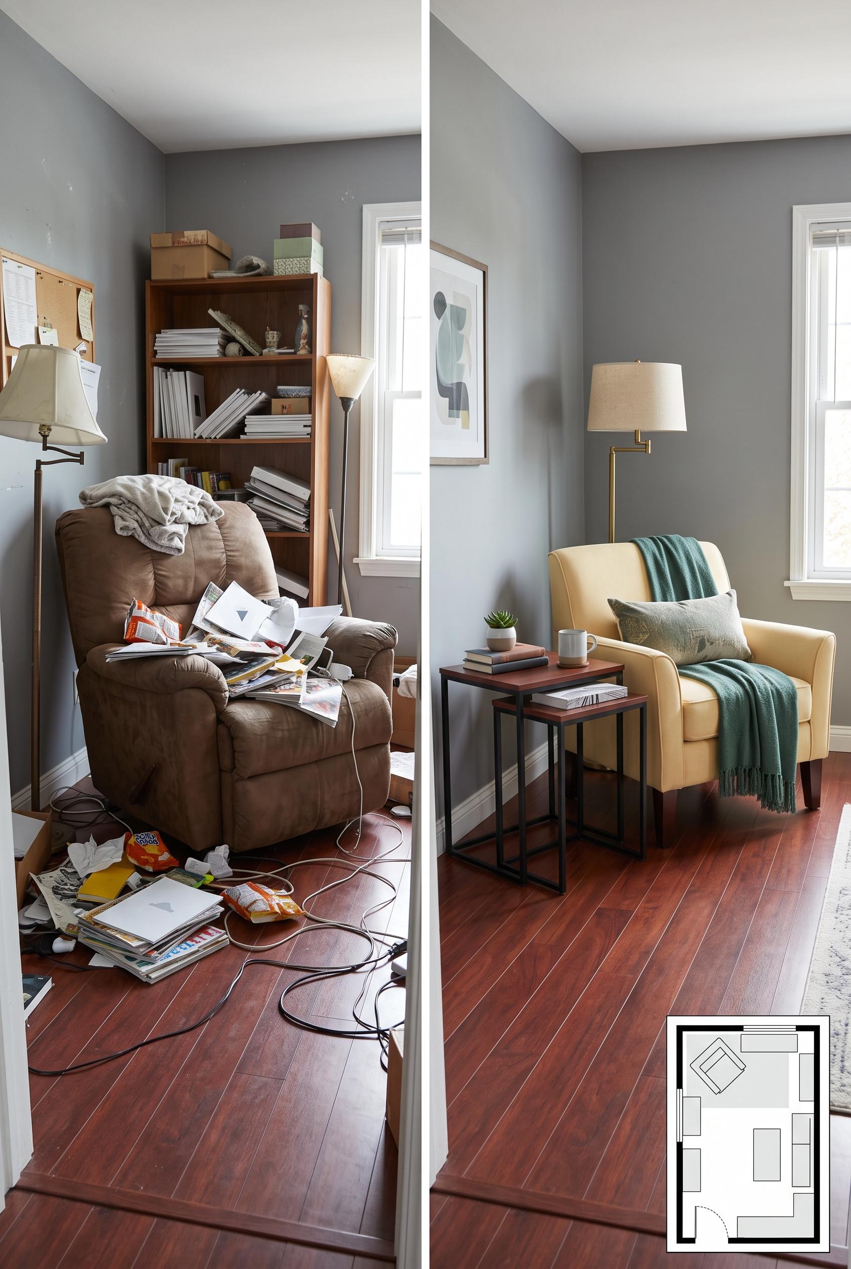
0Create a commercial-quality interior editorial image in a vertical 2:3 Pinterest composition, using a matched before-and-after split of the same compact living room. Show a cluttered recliner corner on one side and a flexible reading and conversation arrangement on the other, with butter yellow upholstery, mineral gray walls, eucalyptus textiles, and dark cherry wood accents. Include a small abstract floor plan inset with no readable labels. Use realistic materials, soft directional daylight, refined styling, no real brands, no trademarked characters, no watermark, and no unintended readable text. AI-modified downstream. Corrective regeneration attempt 4. Produce a materially revised image, not a near-duplicate of an earlier variant. Preserve the successful subject, palette, lighting, focal hierarchy, and commercial polish from the original brief while correcting every issue below. Mandatory corrective instructions from the most recent visual QA: Preserve the polished vertical 2:3 split-screen composition, matched mineral-gray room, butter-yellow lounge chair, eucalyptus textiles, cherry flooring, soft daylight, brass floor lamp, narrow nesting tables, and clean abstract floor-plan inset. Remove every letter, word, number, logo, glyph, and pseudo-text mark from the entire image. Replace all bulletin-board notices, books, magazines, papers, packaging, and covers in the cluttered panel with completely blank surfaces or simple non-linguistic geometric shapes. Move the after-panel chair and nesting tables closer to the wall and farther to the side so a wide, unmistakable open diagonal walking path runs from the entrance across the floor toward the seating area. Keep the floor-plan inset unlabeled and artifact-free. Observed defects from prior variants that must not recur: 1) The after arrangement uses a round side table rather than the specified narrow nesting table. 2) The intended clear diagonal circulation path is not strongly legible because the chair and table occupy the main floor area. 3) Several magazine/book covers contain small, potentially readable incidental text, contrary to the no unintended readable text requirement. 4) Large readable “BEFORE” and “AFTER” captions violate the instruction to render no labels or text. 5) Some magazine and book covers in the cluttered panel contain potentially readable markings. 6) The after panel’s diagonal circulation path is present but not maximally unmistakable due to the chair and table placement. 7) The left cluttered panel contains abundant readable-looking text and pseudo-text on the bulletin board, papers, books, magazines, and packaging, violating the explicit no-text rule 8) The circulation path in the after panel is visible but not strongly diagonal or unmistakable because the chair and tables still occupy much of the central floor area Render no letters, words, numbers, prices, headings, labels, contact details, logos, glyphs, or pseudo-text anywhere. Use only blank surfaces, clean geometric marks, and non-linguistic placeholder shapes. Do not add explanatory captions, before/after labels, interface copy, or extra objects that the brief did not request. When a corrective instruction conflicts with a decorative detail, prioritize the corrective instruction.
 0
0Create a commercial-quality interior editorial image in a vertical 2:3 Pinterest composition, using a matched before-and-after split of the same compact living room. Show a cluttered recliner corner on one side and a flexible reading and conversation arrangement on the other, with butter yellow upholstery, mineral gray walls, eucalyptus textiles, and dark cherry wood accents. Include a small abstract floor plan inset with no readable labels. Use realistic materials, soft directional daylight, refined styling, no real brands, no trademarked characters, no watermark, and no unintended readable text. AI-modified downstream. Corrective regeneration attempt 3. Produce a materially revised image, not a near-duplicate of an earlier variant. Preserve the successful subject, palette, lighting, focal hierarchy, and commercial polish from the original brief while correcting every issue below. Mandatory corrective instructions from the most recent visual QA: Preserve the polished vertical 2:3 split-screen composition, matched mineral-gray room, butter-yellow chair, eucalyptus textiles, cherry flooring, soft daylight, brass lamp, narrow nesting tables, and clean abstract floor-plan inset. Remove the large BEFORE and AFTER captions entirely and render no letters, words, numbers, labels, logos, glyphs, or pseudo-text anywhere. Replace every magazine, book, and paper cover in the cluttered panel with fully blank surfaces or purely abstract non-linguistic geometric marks. In the after panel, shift the chair and nesting tables closer to the wall so a wide, unmistakable open diagonal walking path remains visible from the entrance across the floor toward the seating area. Keep the floor-plan inset unlabeled, watermark-free, and artifact-free. Observed defects from prior variants that must not recur: 1) The after arrangement uses a round side table rather than the specified narrow nesting table. 2) The intended clear diagonal circulation path is not strongly legible because the chair and table occupy the main floor area. 3) Several magazine/book covers contain small, potentially readable incidental text, contrary to the no unintended readable text requirement. 4) Large readable “BEFORE” and “AFTER” captions violate the instruction to render no labels or text. 5) Some magazine and book covers in the cluttered panel contain potentially readable markings. 6) The after panel’s diagonal circulation path is present but not maximally unmistakable due to the chair and table placement. Render no letters, words, numbers, prices, headings, labels, contact details, logos, glyphs, or pseudo-text anywhere. Use only blank surfaces, clean geometric marks, and non-linguistic placeholder shapes. Do not add explanatory captions, before/after labels, interface copy, or extra objects that the brief did not request. When a corrective instruction conflicts with a decorative detail, prioritize the corrective instruction.
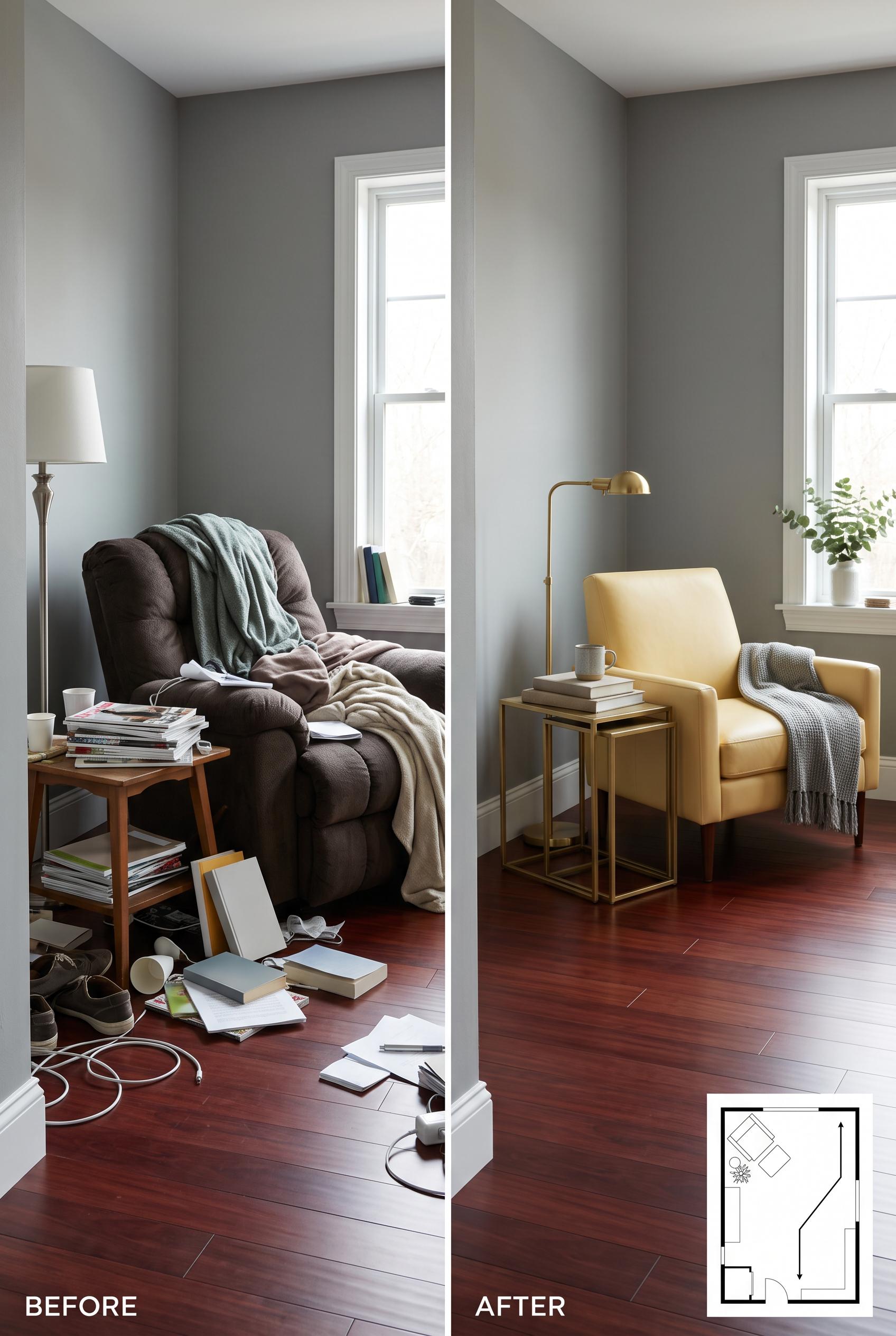 0
0Create a commercial-quality interior editorial image in a vertical 2:3 Pinterest composition, using a matched before-and-after split of the same compact living room. Show a cluttered recliner corner on one side and a flexible reading and conversation arrangement on the other, with butter yellow upholstery, mineral gray walls, eucalyptus textiles, and dark cherry wood accents. Include a small abstract floor plan inset with no readable labels. Use realistic materials, soft directional daylight, refined styling, no real brands, no trademarked characters, no watermark, and no unintended readable text. AI-modified downstream. Corrective regeneration attempt 2. Produce a materially revised image, not a near-duplicate of an earlier variant. Preserve the successful subject, palette, lighting, focal hierarchy, and commercial polish from the original brief while correcting every issue below. Mandatory corrective instructions from the most recent visual QA: Preserve the polished vertical split-screen composition, matched mineral-gray room, butter-yellow lounge chair, eucalyptus textiles, cherry flooring, soft daylight, and slim brass floor lamp. In the after panel, replace the round side table with a clearly narrow nesting table set, positioned compactly beside the chair, and leave an unmistakable open diagonal walking path across the floor from the room entrance toward the seating area. Keep the before panel cluttered with the bulky recliner and scattered tables, but make every magazine, book, and paper cover blank or abstract with no readable letters, words, logos, or numbers. Retain a small clean abstract floor-plan inset showing the improved turning space, with no labels or text, and ensure there are no watermarks or generation artifacts. Observed defects from prior variants that must not recur: 1) The after arrangement uses a round side table rather than the specified narrow nesting table. 2) The intended clear diagonal circulation path is not strongly legible because the chair and table occupy the main floor area. 3) Several magazine/book covers contain small, potentially readable incidental text, contrary to the no unintended readable text requirement. Render no letters, words, numbers, prices, headings, labels, contact details, logos, glyphs, or pseudo-text anywhere. Use only blank surfaces, clean geometric marks, and non-linguistic placeholder shapes. Do not add explanatory captions, before/after labels, interface copy, or extra objects that the brief did not request. When a corrective instruction conflicts with a decorative detail, prioritize the corrective instruction.
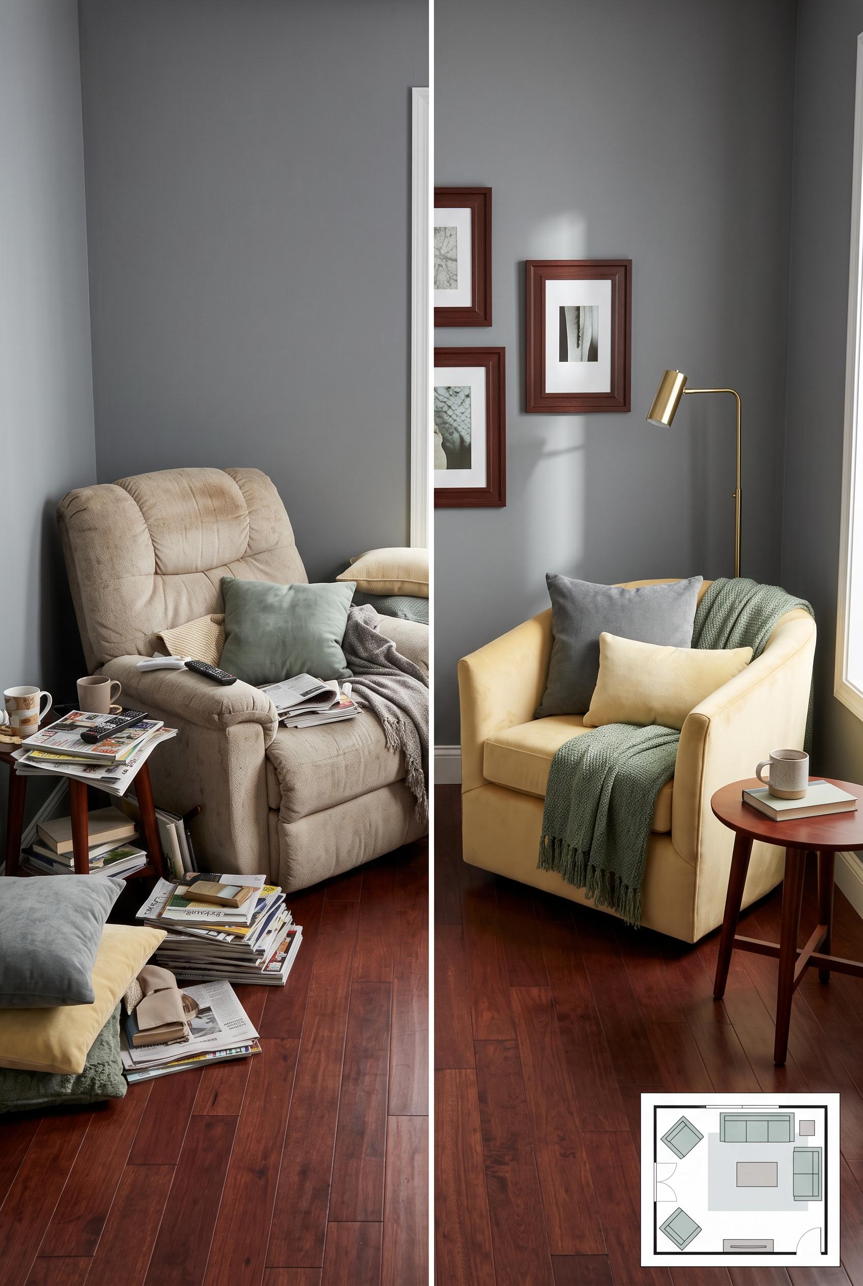 0
0Create a commercial-quality interior editorial image in a vertical 2:3 Pinterest composition, using a matched before-and-after split of the same compact living room. Show a cluttered recliner corner on one side and a flexible reading and conversation arrangement on the other, with butter yellow upholstery, mineral gray walls, eucalyptus textiles, and dark cherry wood accents. Include a small abstract floor plan inset with no readable labels. Use realistic materials, soft directional daylight, refined styling, no real brands, no trademarked characters, no watermark, and no unintended readable text. AI-modified downstream.
 0
0Create a vertical 2:3 Pinterest composition with commercial-quality art direction showing an educational campaign plan for a handmade candle shop. Arrange six distinct pin concepts as miniature panels along a cork rail, using abstract candle vessels, wax textures, botanical accents, packaging forms, and lifestyle scenes. Use terracotta, pine, cream, and lilac. No real brands, no trademarked characters, no watermark, and no unintended readable text. Corrective regeneration attempt 4. Produce a materially revised image, not a near-duplicate of an earlier variant. Preserve the successful subject, palette, lighting, focal hierarchy, and commercial polish from the original brief while correcting every issue below. Mandatory corrective instructions from the most recent visual QA: Create a polished vertical 2:3 Pinterest composition with exactly six distinct blank pin panels in one horizontal row along one clearly visible horizontal cork rail. Fit all six panels within the vertical canvas as a single cohesive row. Depict, left to right: collection reveal with multiple candles, scent mood with botanicals, candle scale comparison, making process with wax pouring, gift context with wrapped packaging, and a reminder with one candle lifestyle scene. Preserve the attractive terracotta, pine, cream, and lilac palette, warm cohesive lighting, abstract unbranded candle vessels, clean white panel borders, and commercial polish. Remove the second row, second cork rail, bottom tabletop, loose wax, flowers, pine branches, twine, and every other extra object outside the six panels. Render absolutely no letters, words, numbers, labels, logos, glyphs, symbols, pseudo-text, or circular logo-like marks anywhere. Observed defects from prior variants that must not recur: 1) The six panels cover unrelated topics instead of collection reveal, scent mood, scale, making process, gift context, and reminder. 2) Several small product labels contain garbled or pseudo-readable text. 3) The six panels are split into two rows instead of arranged along one clearly visible horizontal cork rail. 4) The making-process image is duplicated, so the required six distinct campaign concepts are not all represented. 5) A white circular glyph/logo-like mark appears in the lower-right panel, violating the no-glyph/no-pseudo-text requirement. 6) Attractive vertical composition with cohesive palette and no visible text, logos, watermark, or obvious artifacts. 7) Fails the mandatory layout: six panels are split across two rows and mounted on two cork rails rather than one horizontal row on a single rail. 8) Includes extra workspace objects and a second cork rail, weakening the focused campaign-plan composition. Render no letters, words, numbers, prices, headings, labels, contact details, logos, glyphs, or pseudo-text anywhere. Use only blank surfaces, clean geometric marks, and non-linguistic placeholder shapes. Do not add explanatory captions, before/after labels, interface copy, or extra objects that the brief did not request. When a corrective instruction conflicts with a decorative detail, prioritize the corrective instruction.
 0
0Create a vertical 2:3 Pinterest composition with commercial-quality art direction showing an educational campaign plan for a handmade candle shop. Arrange six distinct pin concepts as miniature panels along a cork rail, using abstract candle vessels, wax textures, botanical accents, packaging forms, and lifestyle scenes. Use terracotta, pine, cream, and lilac. No real brands, no trademarked characters, no watermark, and no unintended readable text. Corrective regeneration attempt 3. Produce a materially revised image, not a near-duplicate of an earlier variant. Preserve the successful subject, palette, lighting, focal hierarchy, and commercial polish from the original brief while correcting every issue below. Mandatory corrective instructions from the most recent visual QA: Create a polished vertical 2:3 composition with exactly six distinct blank pin panels arranged in one horizontal row along a single clearly visible cork rail. Depict, in order or clearly differentiated: collection reveal with multiple candles, scent mood with botanicals, candle scale comparison, making process with wax pouring, gift context with wrapped packaging, and a reminder with a single candle lifestyle scene. Preserve the terracotta, pine, cream, and lilac palette, cohesive lighting, abstract unbranded vessels, and commercial polish. Remove the duplicated making-process panel, all second-row panels, and the white circular mark. Render absolutely no letters, words, numbers, labels, logos, glyphs, symbols, or pseudo-text anywhere. Observed defects from prior variants that must not recur: 1) The composition is polished and vertical, but it does not follow the specified campaign concept: it shows six framed boards rather than six pin panels mounted along one cork rail. 2) The six panels cover unrelated topics instead of collection reveal, scent mood, scale, making process, gift context, and reminder. 3) Several small product labels contain garbled or pseudo-readable text. 4) The six panels are split into two rows instead of arranged along one clearly visible horizontal cork rail. 5) The making-process image is duplicated, so the required six distinct campaign concepts are not all represented. 6) A white circular glyph/logo-like mark appears in the lower-right panel, violating the no-glyph/no-pseudo-text requirement. Render no letters, words, numbers, prices, headings, labels, contact details, logos, glyphs, or pseudo-text anywhere. Use only blank surfaces, clean geometric marks, and non-linguistic placeholder shapes. Do not add explanatory captions, before/after labels, interface copy, or extra objects that the brief did not request. When a corrective instruction conflicts with a decorative detail, prioritize the corrective instruction.
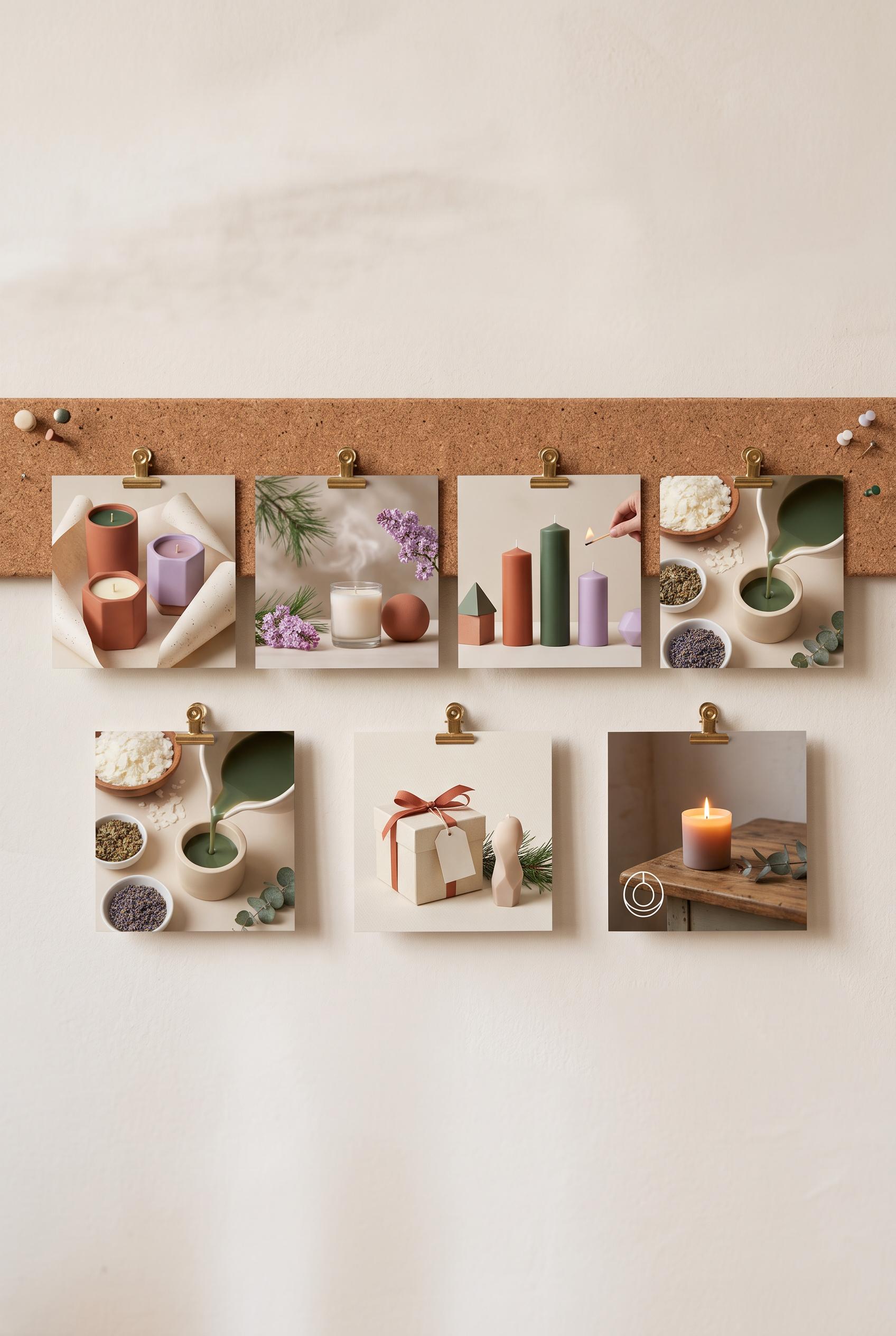 0
0Create a vertical 2:3 Pinterest composition with commercial-quality art direction showing an educational campaign plan for a handmade candle shop. Arrange six distinct pin concepts as miniature panels along a cork rail, using abstract candle vessels, wax textures, botanical accents, packaging forms, and lifestyle scenes. Use terracotta, pine, cream, and lilac. No real brands, no trademarked characters, no watermark, and no unintended readable text. Corrective regeneration attempt 2. Produce a materially revised image, not a near-duplicate of an earlier variant. Preserve the successful subject, palette, lighting, focal hierarchy, and commercial polish from the original brief while correcting every issue below. Mandatory corrective instructions from the most recent visual QA: Create a polished vertical 2:3 Pinterest graphic with one clearly visible horizontal cork rail and exactly six distinct coordinated pin panels clipped or mounted along it. Make the six panels specifically depict: collection reveal, scent mood, candle scale, making process, gift context, and a reminder. Use abstract unbranded candle vessels, wax textures, botanicals, packaging, and lifestyle imagery in terracotta, pine, cream, and lilac. Keep each panel visually distinct but cohesive, with no unrelated topics, no framed bulletin boards, no real brands or trademarks, no watermark, and absolutely no readable text or pseudo-text anywhere, including product labels. Observed defects from prior variants that must not recur: 1) The composition is polished and vertical, but it does not follow the specified campaign concept: it shows six framed boards rather than six pin panels mounted along one cork rail. 2) The six panels cover unrelated topics instead of collection reveal, scent mood, scale, making process, gift context, and reminder. 3) Several small product labels contain garbled or pseudo-readable text. Render no letters, words, numbers, prices, headings, labels, contact details, logos, glyphs, or pseudo-text anywhere. Use only blank surfaces, clean geometric marks, and non-linguistic placeholder shapes. Do not add explanatory captions, before/after labels, interface copy, or extra objects that the brief did not request. When a corrective instruction conflicts with a decorative detail, prioritize the corrective instruction.
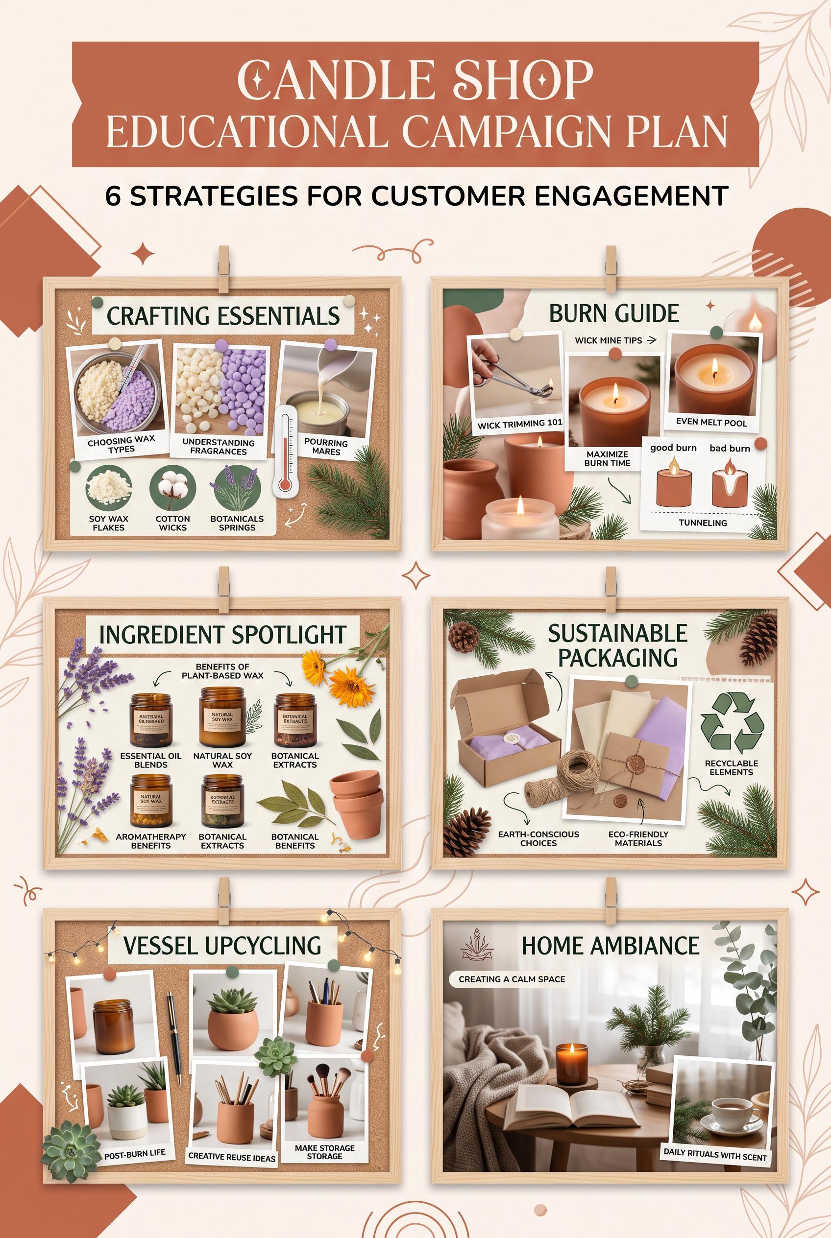 0
0Create a vertical 2:3 Pinterest composition with commercial-quality art direction showing an educational campaign plan for a handmade candle shop. Arrange six distinct pin concepts as miniature panels along a cork rail, using abstract candle vessels, wax textures, botanical accents, packaging forms, and lifestyle scenes. Use terracotta, pine, cream, and lilac. No real brands, no trademarked characters, no watermark, and no unintended readable text.
Acerca de Nuestra Galería de Imágenes IA
Nuestra Galería de Imágenes IA muestra miles de imágenes compartidas generadas por IA creadas por nuestra comunidad. Cada imagen es única, de alta calidad y representa las posibilidades creativas de la generación de arte con IA. Navega por varios estilos, sujetos y temas para inspirarte en tu próximo proyecto creativo.
¿Por qué explorar nuestra galería?
- Descubre miles de imágenes únicas generadas por IA en múltiples estilos y temas
- Inspírate con prompts creativos y estilos artísticos
- Ve imágenes compartidas por nuestra comunidad creativa
- Haz clic en cualquier imagen para ver su página de compartir y obtener más detalles
Cómo usar la galería
Usar nuestra galería es simple e intuitivo:
- Navega por la cuadrícula de imágenes compartidas
- Haz clic en cualquier imagen que llame tu atención
- Ve los detalles completos de la imagen y el enlace de compartir en la página dedicada de compartir
¿Listo para crear tus propias imágenes IA?
Únete a miles de creadores que usan AI Media Studio para generar imágenes impresionantes. ¡Comienza a crear hoy!