Galleria Immagini IA
Scopri 1696+ immagini condivise generate con IA dalla nostra comunità creativa
Tutte le Immagini Condivise
Mostrando 48 di 1696 immagini condivise
 0
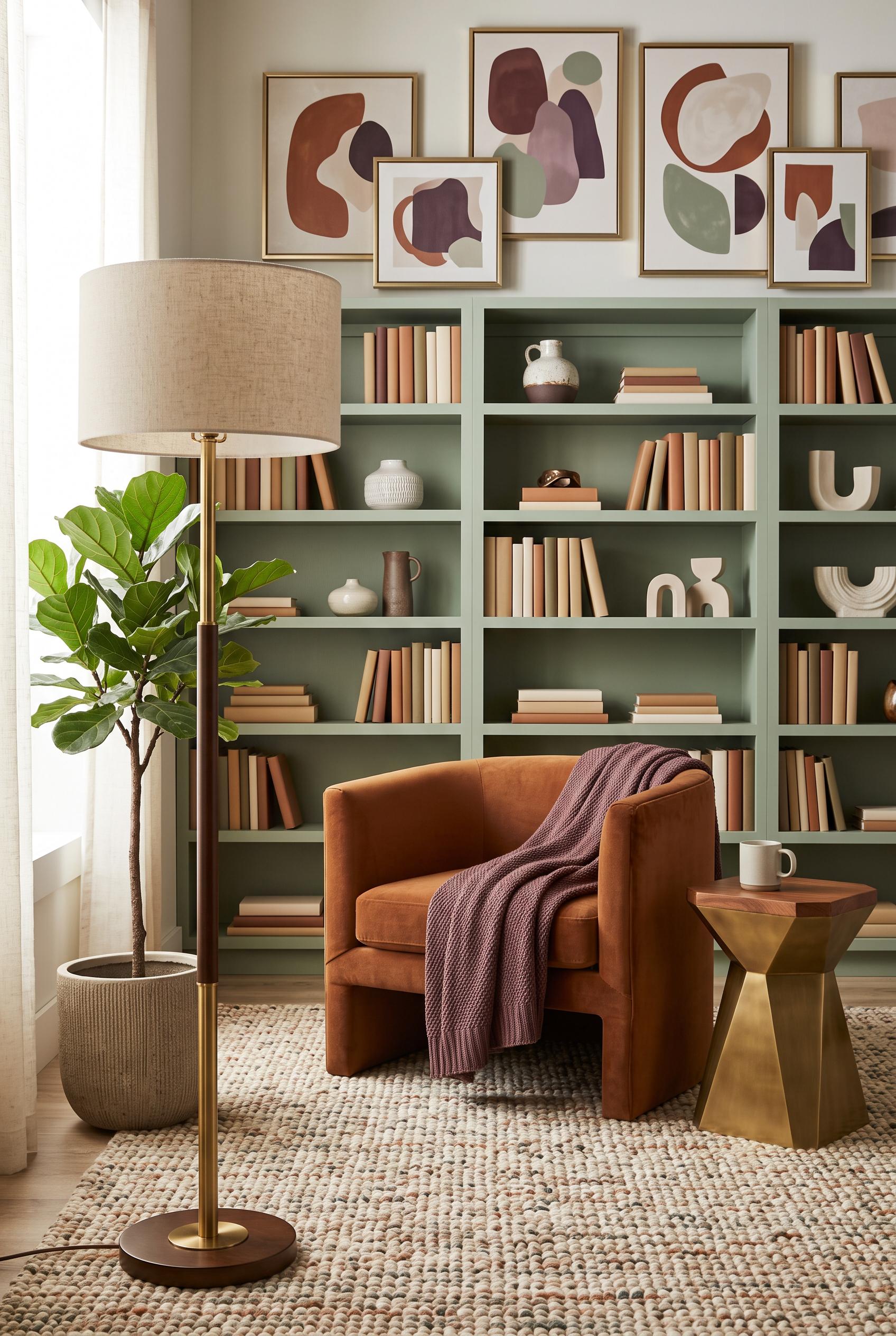
0Create a commercial-quality interior design showcase in a vertical 2:3 Pinterest composition. Present a front-facing living room library with low comfortable seating, open bookshelves, framed abstract artwork, a textured rug, a sculptural side table, and a foreground lamp creating layered sightlines. Use cinnamon, plum, sage, cream, and brushed brass. AI-modified downstream. No real brands, no trademarked characters, no watermark, and no unintended readable text. Corrective regeneration attempt 2. Produce a materially revised image, not a near-duplicate of an earlier variant. Preserve the successful subject, palette, lighting, focal hierarchy, and commercial polish from the original brief while correcting every issue below. Mandatory corrective instructions from the most recent visual QA: Preserve the warm editorial living-room library composition, vertical 2:3 framing, foreground brass-and-wood lamp, plant, cinnamon chair, plum throw, sage shelving, abstract artwork, sculptural side table, and textured rug. Remove all lettering, numbers, logos, and pseudo-readable markings from every book spine, horizontal book, and shelf object; make all book spines blank or use purely abstract non-readable textures. Retain realistic materials and commercial-quality lighting, with no watermark or branding. Observed defects from prior variants that must not recur: 1) The composition and styling are strong, but numerous book spines contain visible pseudo-readable or garbled text, violating the no unintended readable text requirement. Render no letters, words, numbers, prices, headings, labels, contact details, logos, glyphs, or pseudo-text anywhere. Use only blank surfaces, clean geometric marks, and non-linguistic placeholder shapes. Do not add explanatory captions, before/after labels, interface copy, or extra objects that the brief did not request. When a corrective instruction conflicts with a decorative detail, prioritize the corrective instruction.
 0
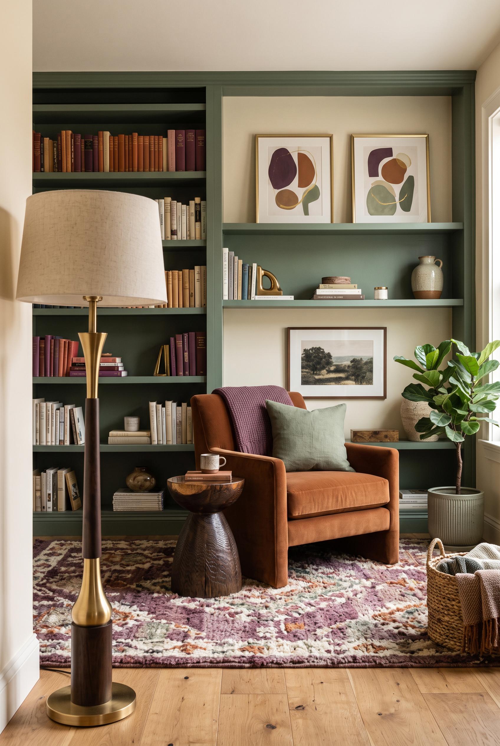
0Create a commercial-quality interior design showcase in a vertical 2:3 Pinterest composition. Present a front-facing living room library with low comfortable seating, open bookshelves, framed abstract artwork, a textured rug, a sculptural side table, and a foreground lamp creating layered sightlines. Use cinnamon, plum, sage, cream, and brushed brass. AI-modified downstream. No real brands, no trademarked characters, no watermark, and no unintended readable text.
 0
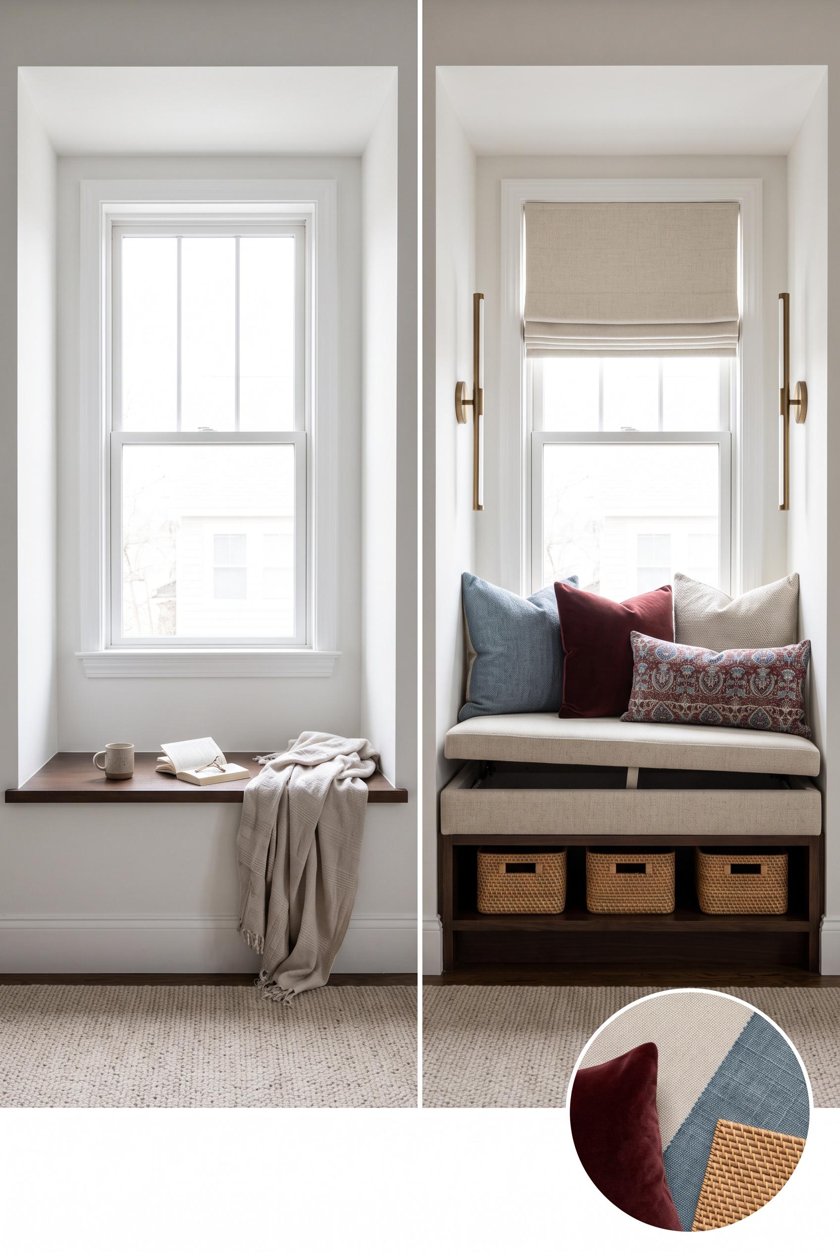
0Create a commercial-quality interior design editorial image in a vertical 2:3 Pinterest composition. Show a matched before-and-after comparison of a compact bedroom window recess transformed into a practical upholstered bench with hidden storage, slim sconces, woven baskets, and layered pillows. Use oatmeal, oxblood, dusty blue, and dark wood. Include a small circular material detail inset. AI-modified downstream. No real brands, no trademarked characters, no watermark, and no unintended readable text. Corrective regeneration attempt 2. Produce a materially revised image, not a near-duplicate of an earlier variant. Preserve the successful subject, palette, lighting, focal hierarchy, and commercial polish from the original brief while correcting every issue below. Mandatory corrective instructions from the most recent visual QA: Preserve the strong vertical 2:3 editorial split, matched architectural perspective, refined oatmeal/oxblood/dusty-blue/dark-wood palette, tailored bench, sconces, baskets, layered pillows, and circular material inset. Modify only the before/after content: add a small, believable scattering of bedroom items in the left window recess area while keeping it visibly empty and unrenovated; make the right bench clearly read as lift-top hidden storage through a subtle raised seat lid or discreet open-lid detail, without adding clutter. Keep the image photorealistic, balanced, watermark-free, brand-free, and free of garbled text or visual artifacts. Observed defects from prior variants that must not recur: 1) The polished before-and-after composition is attractive and artifact-free, but the left-side 'before' scene lacks the brief's scattered items. 2) The transformed bench does not clearly communicate a lift-top storage mechanism. Render no letters, words, numbers, prices, headings, labels, contact details, logos, glyphs, or pseudo-text anywhere. Use only blank surfaces, clean geometric marks, and non-linguistic placeholder shapes. Do not add explanatory captions, before/after labels, interface copy, or extra objects that the brief did not request. When a corrective instruction conflicts with a decorative detail, prioritize the corrective instruction.
 0
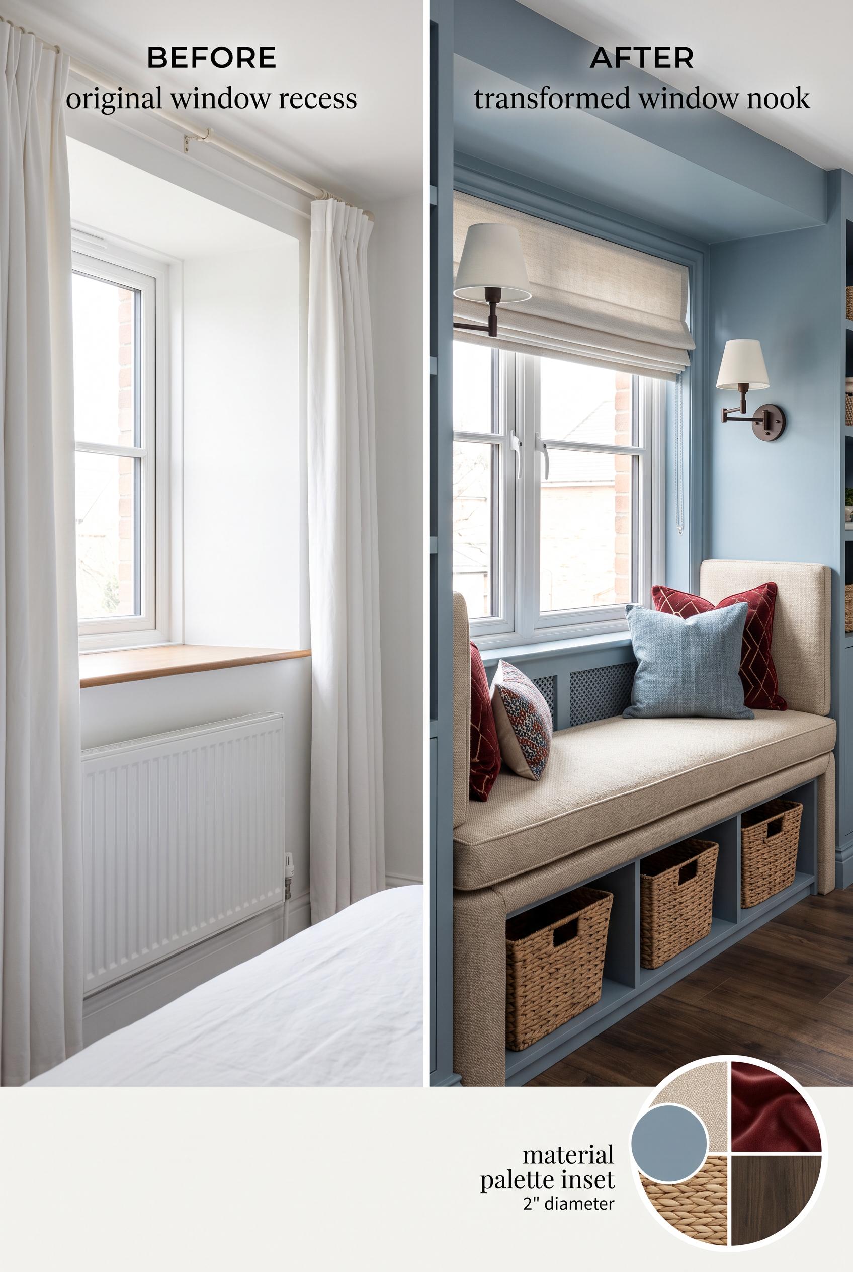
0Create a commercial-quality interior design editorial image in a vertical 2:3 Pinterest composition. Show a matched before-and-after comparison of a compact bedroom window recess transformed into a practical upholstered bench with hidden storage, slim sconces, woven baskets, and layered pillows. Use oatmeal, oxblood, dusty blue, and dark wood. Include a small circular material detail inset. AI-modified downstream. No real brands, no trademarked characters, no watermark, and no unintended readable text.
 0
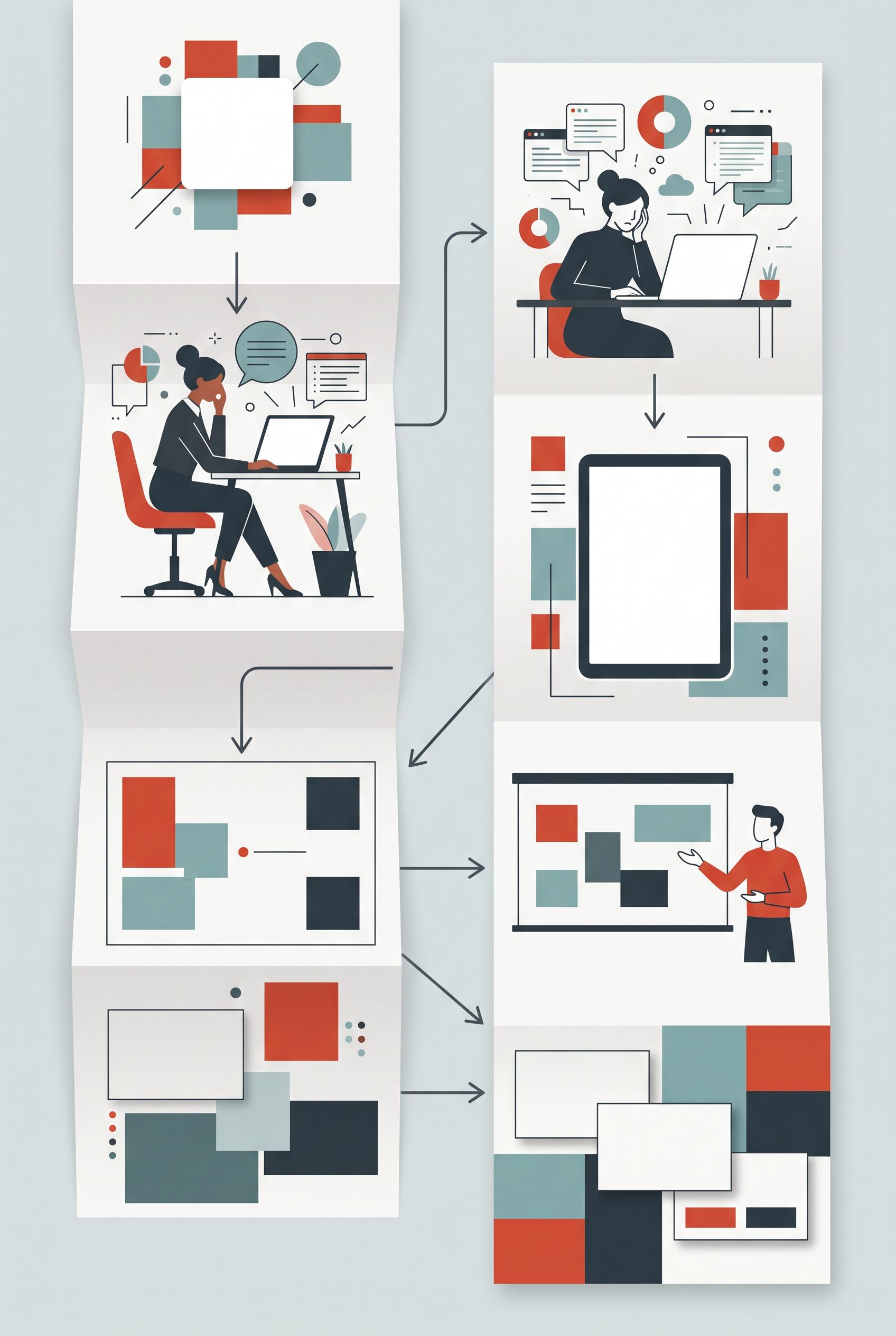
0Create a commercial-quality educational Pinterest graphic in a vertical 2:3 composition explaining how one digital product can become four pin concepts. Show a fold-out accordion pathway with four distinct visual stations: a relatable problem scene, a close product preview, a real-life use case, and a polished offer presentation. Use porcelain white, paprika red, muted teal, and charcoal. Include blank card areas and abstract diagram marks without readable text. No real brands, no trademarked characters, no watermark, and no unintended readable text. Corrective regeneration attempt 5. Produce a materially revised image, not a near-duplicate of an earlier variant. Preserve the successful subject, palette, lighting, focal hierarchy, and commercial polish from the original brief while correcting every issue below. Mandatory corrective instructions from the most recent visual QA: Keep the polished vertical 2:3 accordion layout, four distinct stations, palette, lighting, people, laptop silhouette, arrows, and overall hierarchy. Replace every paper line, flowchart, screen detail, chart, button bar, document mark, gift motif, and interface element with completely blank surfaces or only simple non-linguistic geometric blocks, circles, dots, and plain lines. Make the laptop screen a single blank porcelain-white rectangle with no dots, bars, controls, or icons. Make all papers blank. Simplify the two use-case presentation boards to blank boards with only a few geometric color blocks and no connected diagrams. Replace the bottom offer panel with a clean abstract product-card arrangement using only blank rectangles and solid color blocks. Remove all symbols, glyphs, letters, numbers, logos, watermark, pseudo-text, and readable or text-like marks. Observed defects from prior variants that must not recur: 1) Contains prominent readable text (“Digital Product”), stage numbers 1–4, and other letter-like/glyph marks, violating the requirement for no readable wording, letters, or numbers. 2) Bottom dark panel contains pseudo-text symbols that should also be removed. 3) Attractive vertical accordion pathway with clear four-stage hierarchy and suitable palette. 4) Violates the strict no-text/no-glyph requirement: visible question marks, chart/interface-like marks, button-like bars, icons, and other pseudo-interface symbols appear throughout. 5) Several panels resemble readable app screens or branded product mockups rather than purely abstract non-linguistic shapes. 6) Attractive vertical accordion composition and strong palette, but it violates the strict no-pseudo-text requirement. 7) The laptop, papers, flowcharts, and bottom offer panel contain interface-like lines, button bars, chart structures, and document-style marks that resemble text or UI. 8) The bottom presentation includes decorative gift and chart motifs that add unrequested symbolic detail. Render no letters, words, numbers, prices, headings, labels, contact details, logos, glyphs, or pseudo-text anywhere. Use only blank surfaces, clean geometric marks, and non-linguistic placeholder shapes. Do not add explanatory captions, before/after labels, interface copy, or extra objects that the brief did not request. When a corrective instruction conflicts with a decorative detail, prioritize the corrective instruction.
 0
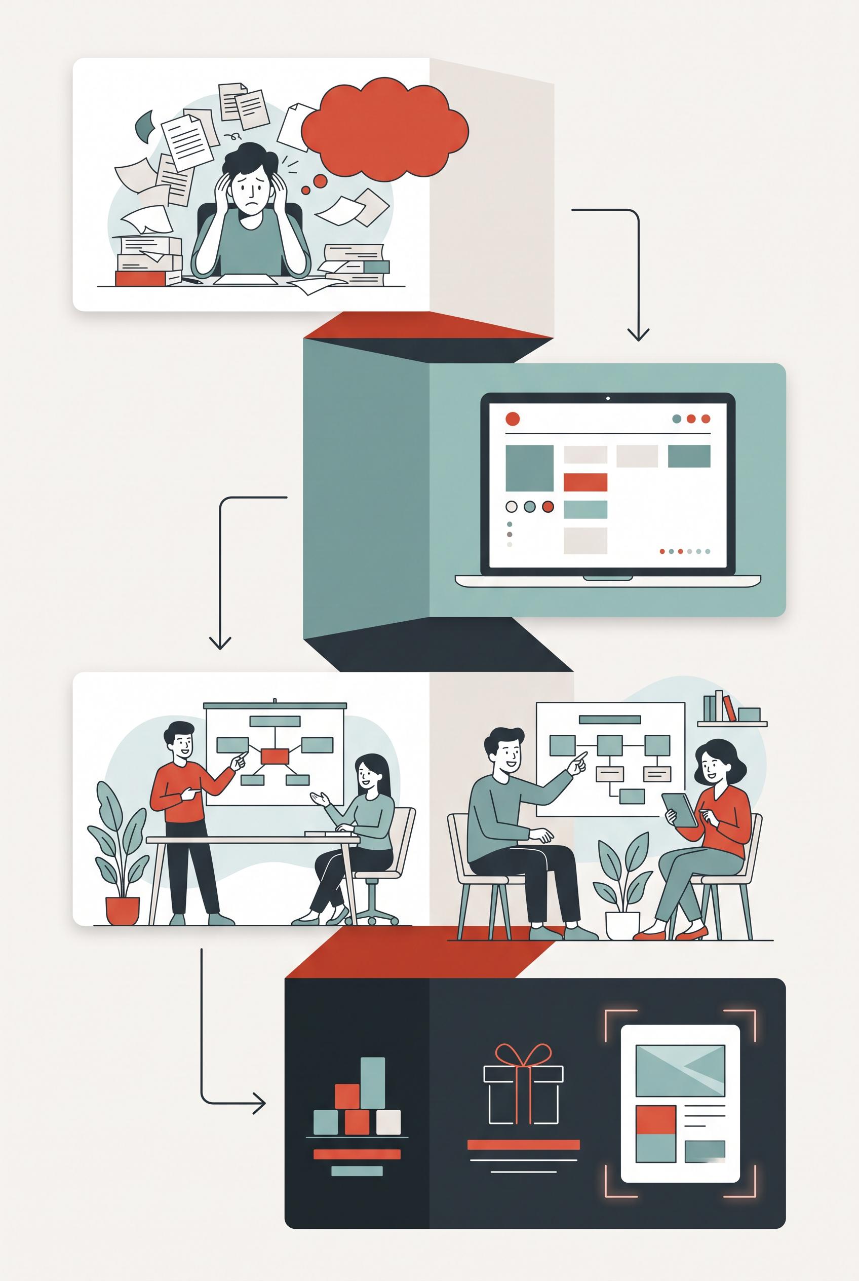
0Create a commercial-quality educational Pinterest graphic in a vertical 2:3 composition explaining how one digital product can become four pin concepts. Show a fold-out accordion pathway with four distinct visual stations: a relatable problem scene, a close product preview, a real-life use case, and a polished offer presentation. Use porcelain white, paprika red, muted teal, and charcoal. Include blank card areas and abstract diagram marks without readable text. No real brands, no trademarked characters, no watermark, and no unintended readable text. Corrective regeneration attempt 4. Produce a materially revised image, not a near-duplicate of an earlier variant. Preserve the successful subject, palette, lighting, focal hierarchy, and commercial polish from the original brief while correcting every issue below. Mandatory corrective instructions from the most recent visual QA: Preserve the polished vertical 2:3 composition, accordion pathway, four visual stations, porcelain white/paprika red/muted teal/charcoal palette, lighting, arrows, and illustrations. Remove every question mark, chart glyph, interface icon, button bar, star, check mark, symbol, and letter-like or pseudo-text mark. Replace all screen and document details with completely blank card surfaces or simple geometric blocks, circles, dots, and plain lines only. Keep the four stations visually distinct as problem scene, product preview, real-life use case, and offer presentation, but include no words, letters, numbers, prices, labels, logos, watermark, readable text, or pseudo-interface text anywhere. Observed defects from prior variants that must not recur: 1) Contains extensive readable text despite the brief requiring abstract marks only. 2) Obvious garbled text appears as “COLLIT IN,” with additional pseudo-interface wording and prices. 3) Attractive vertical accordion composition with clear four-stage focal hierarchy and suitable palette. 4) Contains prominent readable text (“Digital Product”), stage numbers 1–4, and other letter-like/glyph marks, violating the requirement for no readable wording, letters, or numbers. 5) Bottom dark panel contains pseudo-text symbols that should also be removed. 6) Attractive vertical accordion pathway with clear four-stage hierarchy and suitable palette. 7) Violates the strict no-text/no-glyph requirement: visible question marks, chart/interface-like marks, button-like bars, icons, and other pseudo-interface symbols appear throughout. 8) Several panels resemble readable app screens or branded product mockups rather than purely abstract non-linguistic shapes. Render no letters, words, numbers, prices, headings, labels, contact details, logos, glyphs, or pseudo-text anywhere. Use only blank surfaces, clean geometric marks, and non-linguistic placeholder shapes. Do not add explanatory captions, before/after labels, interface copy, or extra objects that the brief did not request. When a corrective instruction conflicts with a decorative detail, prioritize the corrective instruction.
 0
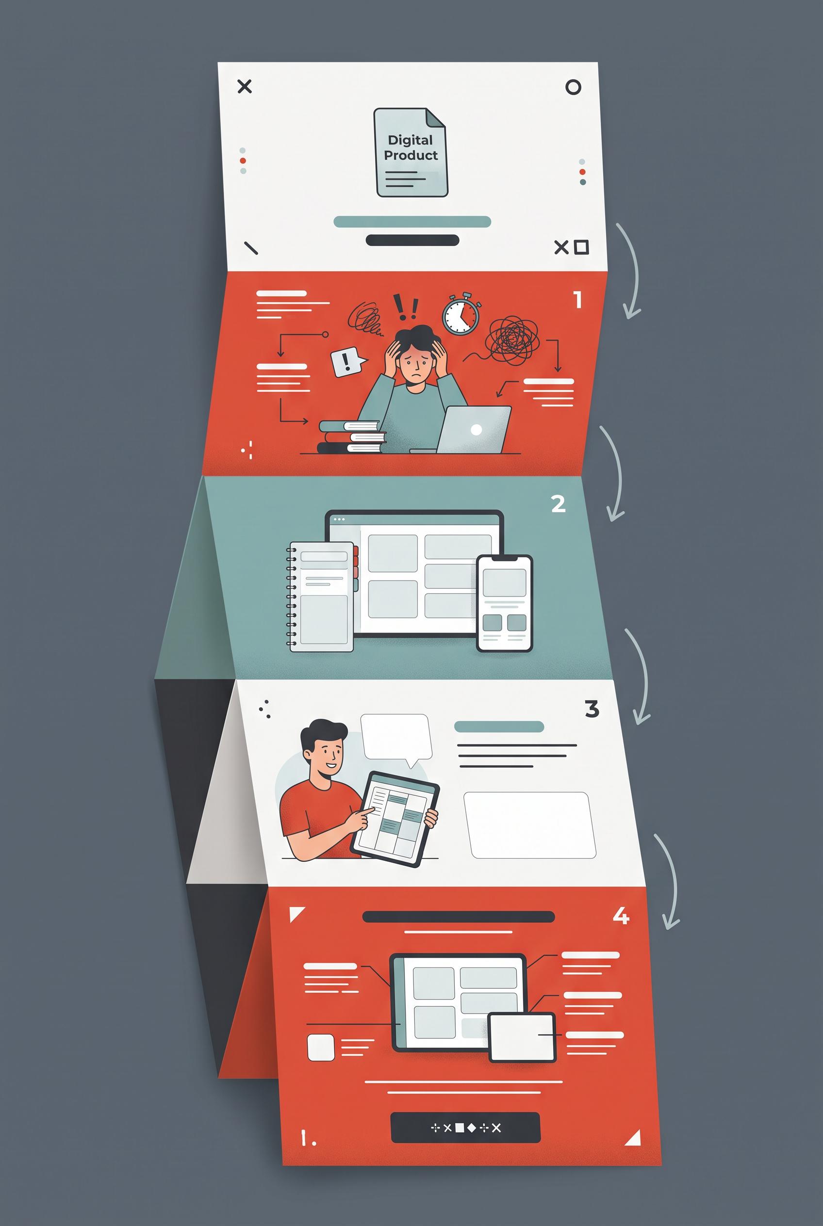
0Create a commercial-quality educational Pinterest graphic in a vertical 2:3 composition explaining how one digital product can become four pin concepts. Show a fold-out accordion pathway with four distinct visual stations: a relatable problem scene, a close product preview, a real-life use case, and a polished offer presentation. Use porcelain white, paprika red, muted teal, and charcoal. Include blank card areas and abstract diagram marks without readable text. No real brands, no trademarked characters, no watermark, and no unintended readable text. Corrective regeneration attempt 3. Produce a materially revised image, not a near-duplicate of an earlier variant. Preserve the successful subject, palette, lighting, focal hierarchy, and commercial polish from the original brief while correcting every issue below. Mandatory corrective instructions from the most recent visual QA: Preserve the polished vertical 2:3 accordion pathway, porcelain white/paprika red/muted teal/charcoal palette, illustrations, lighting, arrows, and four distinct visual stations. Remove the “Digital Product” wording entirely and replace the document text area with a blank card or abstract non-linguistic blocks. Remove all stage numbers 1, 2, 3, and 4, corner letters/symbols, and every other letter-like glyph or pseudo-text mark, including the symbol string in the bottom dark panel. Retain only clean geometric shapes, blank card surfaces, abstract lines, dots, and non-linguistic icons. Do not add any words, letters, numbers, prices, labels, logos, watermark, or pseudo-interface text anywhere. Observed defects from prior variants that must not recur: 1) Strong vertical composition and clear four-stage visual pathway. 2) Contains extensive readable text despite the brief requiring abstract marks only. 3) Obvious garbled text appears as “COLLIT IN,” with additional pseudo-interface wording and prices. 4) Attractive vertical accordion composition with clear four-stage focal hierarchy and suitable palette. 5) Contains prominent readable text (“Digital Product”), stage numbers 1–4, and other letter-like/glyph marks, violating the requirement for no readable wording, letters, or numbers. 6) Bottom dark panel contains pseudo-text symbols that should also be removed. Render no letters, words, numbers, prices, headings, labels, contact details, logos, glyphs, or pseudo-text anywhere. Use only blank surfaces, clean geometric marks, and non-linguistic placeholder shapes. Do not add explanatory captions, before/after labels, interface copy, or extra objects that the brief did not request. When a corrective instruction conflicts with a decorative detail, prioritize the corrective instruction.
 0
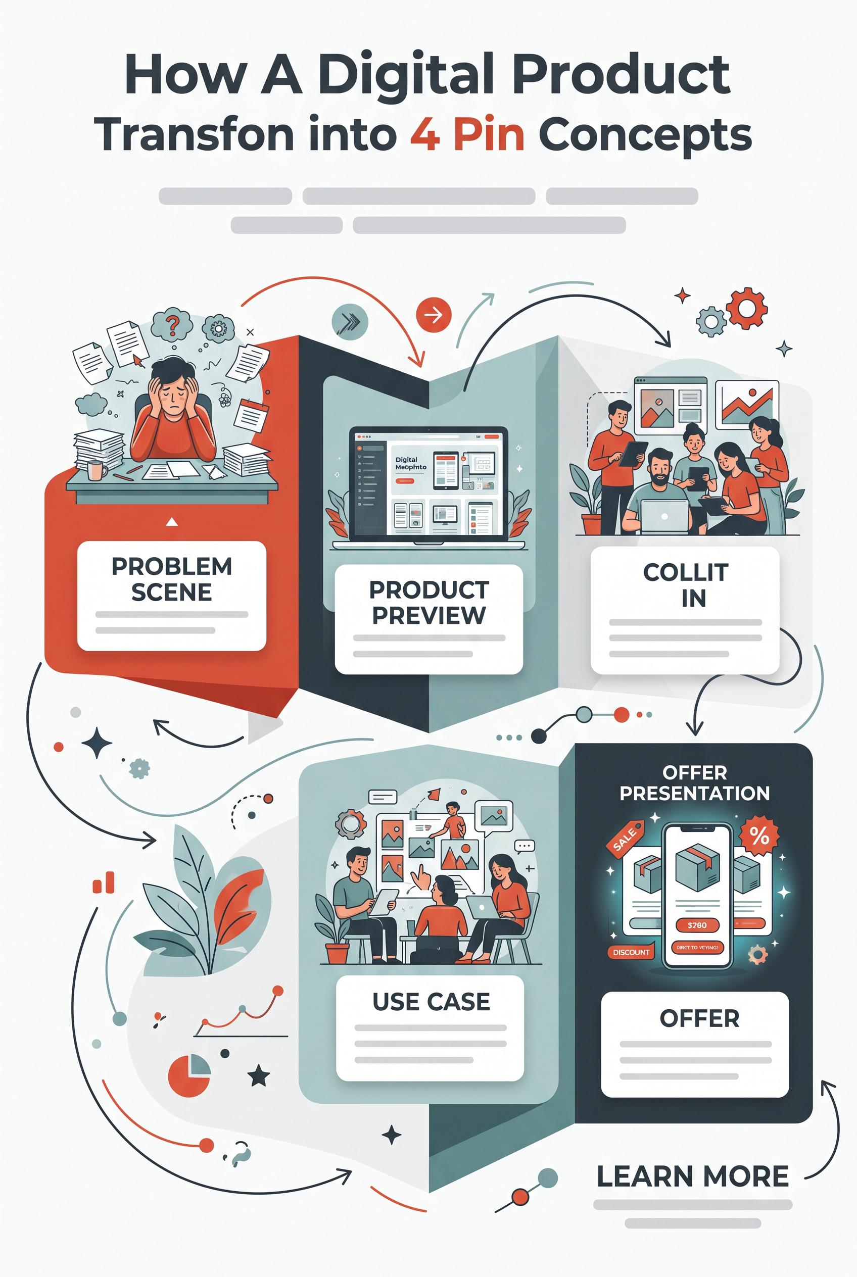
0Create a commercial-quality educational Pinterest graphic in a vertical 2:3 composition explaining how one digital product can become four pin concepts. Show a fold-out accordion pathway with four distinct visual stations: a relatable problem scene, a close product preview, a real-life use case, and a polished offer presentation. Use porcelain white, paprika red, muted teal, and charcoal. Include blank card areas and abstract diagram marks without readable text. No real brands, no trademarked characters, no watermark, and no unintended readable text. Corrective regeneration attempt 2. Produce a materially revised image, not a near-duplicate of an earlier variant. Preserve the successful subject, palette, lighting, focal hierarchy, and commercial polish from the original brief while correcting every issue below. Mandatory corrective instructions from the most recent visual QA: Preserve the attractive vertical 2:3 accordion layout, color palette, illustrations, arrows, and four visual stations. Remove every readable word, letter, number, price, sale badge, and interface label, including the large headline, station labels, “COLLIT IN,” “Digital Methmpto,” “OFFER,” “LEARN MORE,” $260, and discount text. Replace all typography with blank card areas, neutral geometric blocks, and non-readable abstract lines or symbols. Ensure no pseudo-text, garbled lettering, watermark, logo, or trademark remains. Observed defects from prior variants that must not recur: 1) Strong vertical composition and clear four-stage visual pathway. 2) Contains extensive readable text despite the brief requiring abstract marks only. 3) Obvious garbled text appears as “COLLIT IN,” with additional pseudo-interface wording and prices. Render no letters, words, numbers, prices, headings, labels, contact details, logos, glyphs, or pseudo-text anywhere. Use only blank surfaces, clean geometric marks, and non-linguistic placeholder shapes. Do not add explanatory captions, before/after labels, interface copy, or extra objects that the brief did not request. When a corrective instruction conflicts with a decorative detail, prioritize the corrective instruction.
 0
0Create a commercial-quality educational Pinterest graphic in a vertical 2:3 composition explaining how one digital product can become four pin concepts. Show a fold-out accordion pathway with four distinct visual stations: a relatable problem scene, a close product preview, a real-life use case, and a polished offer presentation. Use porcelain white, paprika red, muted teal, and charcoal. Include blank card areas and abstract diagram marks without readable text. No real brands, no trademarked characters, no watermark, and no unintended readable text.
 0
0Create a commercial-quality Pinterest showcase in a vertical 2:3 composition for an editable pet care planner collection. Arrange a tablet, phone, printed pages, binder tabs, checklist cards, and a small neutral pet bowl in stepped architectural layers with elegant spacing and directional shadows. Use ultramarine blue, melon orange, creamy ivory, and espresso brown. Leave all screens and pages visually designed but blank or filled with abstract lines only. No real brands, no trademarked characters, no watermark, and no unintended readable text. Corrective regeneration attempt 5. Produce a materially revised image, not a near-duplicate of an earlier variant. Preserve the successful subject, palette, lighting, focal hierarchy, and commercial polish from the original brief while correcting every issue below. Mandatory corrective instructions from the most recent visual QA: Preserve the polished vertical 2:3 stepped architectural composition, lighting, shadows, ultramarine blue, melon orange, creamy ivory, and espresso brown palette, tablet, clearly distinct smartphone, binder with blank tabs, printed sheets, clipped checklist cards, and neutral pet bowl. Remove every recognizable checkmark, checkbox, checklist symbol, icon, glyph, letter, number, word, logo, pseudo-text, and interface-like mark. Replace the orange clipped card’s checklists with sparse abstract rectangles, circles, and non-linguistic lines only. Simplify the foreground blue sheet into blank surfaces with a few clean geometric color blocks, not a form or interface. Keep all device screens completely blank or filled only with flat geometric color fields. Ensure no readable or symbolic marks appear anywhere. Observed defects from prior variants that must not recur: 1) Some checklist marks and icon-like symbols are more literal than the requested blank, abstract treatment. 2) Attractive vertical editorial composition with clear product-family focal hierarchy and cohesive stepped layers. 3) A readable “9:41” time and small interface/status glyphs appear on the smartphone, violating the no-text/no-glyph requirement. 4) The smartphone also contains a small magnifying-glass-like interface symbol; remove all interface-like marks. 5) Planner sheets include literal pet paw/bone iconography; replace with simpler abstract geometric shapes to align with the strict blank/abstract treatment. 6) The composition is polished and satisfies the vertical product-family arrangement, palette, and object requirements. 7) The orange clipped checklist card contains multiple recognizable checkmark glyphs, violating the requirement for only abstract, non-linguistic geometric marks. 8) The foreground blue sheet also uses structured grid marks that read somewhat like a form interface; simplify to purely abstract geometric blocks or blank areas. Render no letters, words, numbers, prices, headings, labels, contact details, logos, glyphs, or pseudo-text anywhere. Use only blank surfaces, clean geometric marks, and non-linguistic placeholder shapes. Do not add explanatory captions, before/after labels, interface copy, or extra objects that the brief did not request. When a corrective instruction conflicts with a decorative detail, prioritize the corrective instruction.
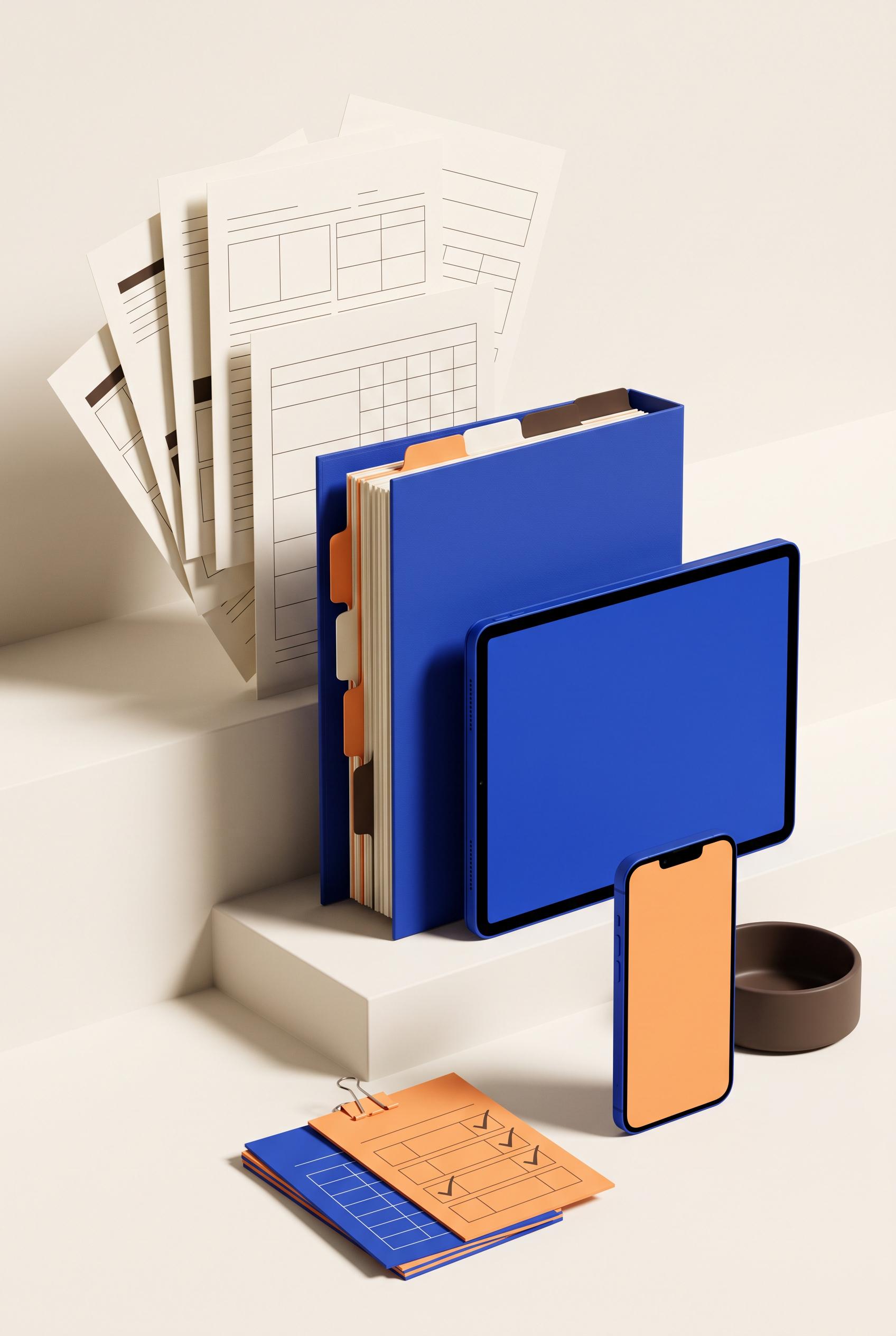 0
0Create a commercial-quality Pinterest showcase in a vertical 2:3 composition for an editable pet care planner collection. Arrange a tablet, phone, printed pages, binder tabs, checklist cards, and a small neutral pet bowl in stepped architectural layers with elegant spacing and directional shadows. Use ultramarine blue, melon orange, creamy ivory, and espresso brown. Leave all screens and pages visually designed but blank or filled with abstract lines only. No real brands, no trademarked characters, no watermark, and no unintended readable text. Corrective regeneration attempt 4. Produce a materially revised image, not a near-duplicate of an earlier variant. Preserve the successful subject, palette, lighting, focal hierarchy, and commercial polish from the original brief while correcting every issue below. Mandatory corrective instructions from the most recent visual QA: Preserve the polished vertical 2:3 stepped architectural arrangement, lighting, shadows, ultramarine blue, melon orange, creamy ivory, and espresso brown palette, tablet, clearly distinct smartphone, binder with tabs, printed sheets, clipped checklist cards, and neutral pet bowl. Remove every readable character and interface artifact from all surfaces, especially the smartphone’s “9:41,” status indicators, and bottom icon. Make the smartphone screen completely blank or use only clean geometric color blocks. Replace literal paw and bone icons on planner pages with non-linguistic circles, rectangles, abstract lines, or empty grids. Ensure no letters, numbers, words, logos, glyphs, pseudo-text, watermarks, or trademark details appear anywhere. Observed defects from prior variants that must not recur: 1) The composition and product styling are strong, with clear tablet, phone, binder, tabs, checklist cards, stepped layers, shadows, and cohesive colors. 2) Attractive vertical composition with strong palette, lighting, shadows, and product-family styling. 3) The required phone is not clearly present; only one tablet-like device is visible. 4) Some checklist marks and icon-like symbols are more literal than the requested blank, abstract treatment. 5) Attractive vertical editorial composition with clear product-family focal hierarchy and cohesive stepped layers. 6) A readable “9:41” time and small interface/status glyphs appear on the smartphone, violating the no-text/no-glyph requirement. 7) The smartphone also contains a small magnifying-glass-like interface symbol; remove all interface-like marks. 8) Planner sheets include literal pet paw/bone iconography; replace with simpler abstract geometric shapes to align with the strict blank/abstract treatment. Render no letters, words, numbers, prices, headings, labels, contact details, logos, glyphs, or pseudo-text anywhere. Use only blank surfaces, clean geometric marks, and non-linguistic placeholder shapes. Do not add explanatory captions, before/after labels, interface copy, or extra objects that the brief did not request. When a corrective instruction conflicts with a decorative detail, prioritize the corrective instruction.
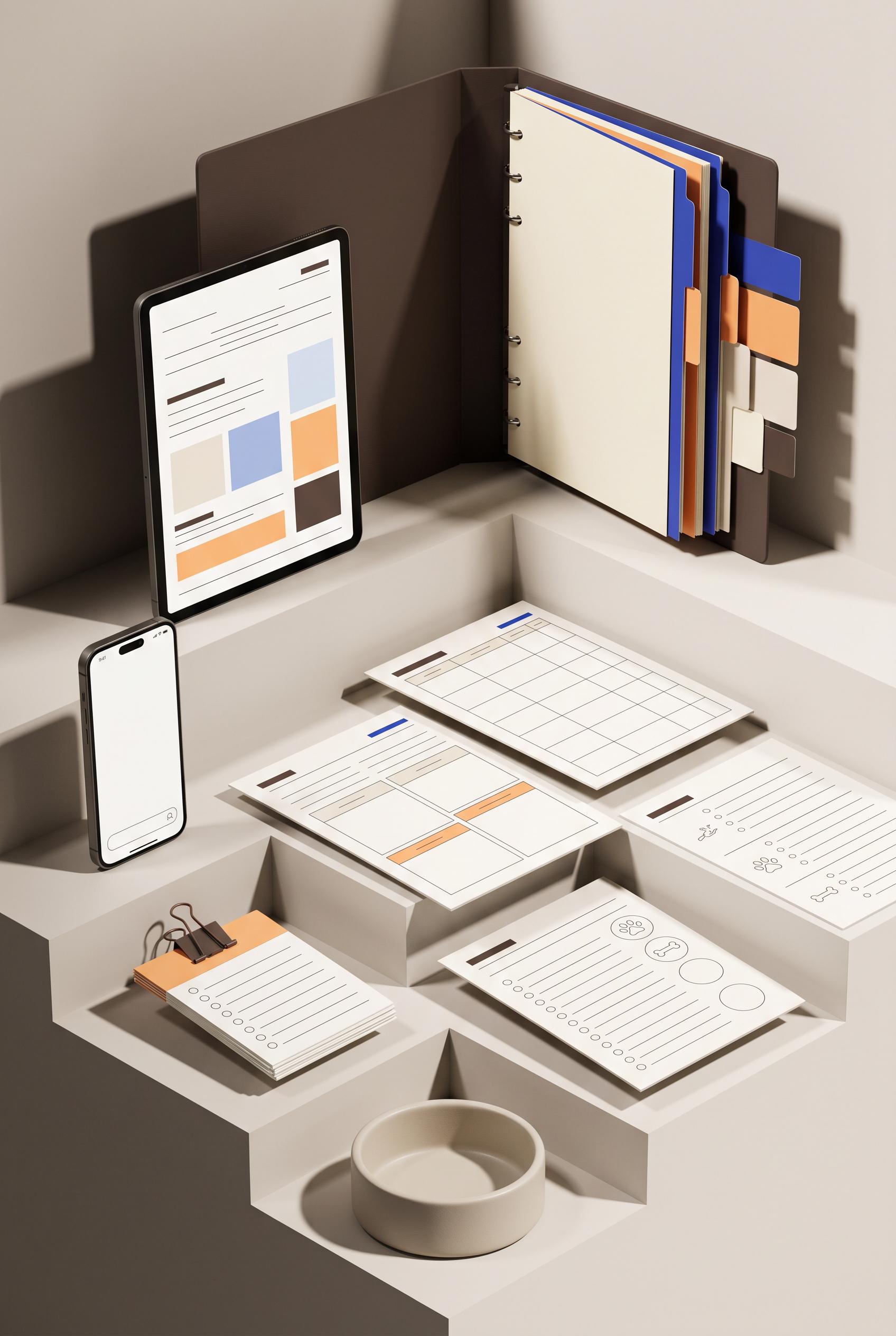 0
0Create a commercial-quality Pinterest showcase in a vertical 2:3 composition for an editable pet care planner collection. Arrange a tablet, phone, printed pages, binder tabs, checklist cards, and a small neutral pet bowl in stepped architectural layers with elegant spacing and directional shadows. Use ultramarine blue, melon orange, creamy ivory, and espresso brown. Leave all screens and pages visually designed but blank or filled with abstract lines only. No real brands, no trademarked characters, no watermark, and no unintended readable text. Corrective regeneration attempt 3. Produce a materially revised image, not a near-duplicate of an earlier variant. Preserve the successful subject, palette, lighting, focal hierarchy, and commercial polish from the original brief while correcting every issue below. Mandatory corrective instructions from the most recent visual QA: Preserve the polished vertical 2:3 stepped editorial arrangement, ultramarine blue, melon orange, creamy ivory, espresso brown palette, directional shadows, binder, printed sheets, clipped checklist cards, and neutral pet bowl. Add a clearly distinct modern smartphone alongside the tablet, with a simple blank screen. Keep all planner surfaces blank or limited to clean geometric blocks, abstract lines, empty grids, circles, and minimal non-linguistic pet-care icons; remove checkmarks, scissors-like symbols, warning symbols, envelope-like glyphs, and any other literal or potentially readable marks. Ensure every object is fully coherent, cleanly rendered, and free of text, pseudo-text, letters, numbers, logos, trademarks, watermark, or generation artifacts. Observed defects from prior variants that must not recur: 1) Prominent unintended readable text appears on multiple planner pages, including “Daily Log,” “Weekly Log,” “Health Tracker,” and “Immunization,” violating the blank/abstract-lines- 2) only requirement. 3) Several tiny pseudo-text labels also appear in table headers and fields. 4) The composition and product styling are strong, with clear tablet, phone, binder, tabs, checklist cards, stepped layers, shadows, and cohesive colors. 5) Attractive vertical composition with strong palette, lighting, shadows, and product-family styling. 6) The required phone is not clearly present; only one tablet-like device is visible. 7) Some checklist marks and icon-like symbols are more literal than the requested blank, abstract treatment. Render no letters, words, numbers, prices, headings, labels, contact details, logos, glyphs, or pseudo-text anywhere. Use only blank surfaces, clean geometric marks, and non-linguistic placeholder shapes. Do not add explanatory captions, before/after labels, interface copy, or extra objects that the brief did not request. When a corrective instruction conflicts with a decorative detail, prioritize the corrective instruction.
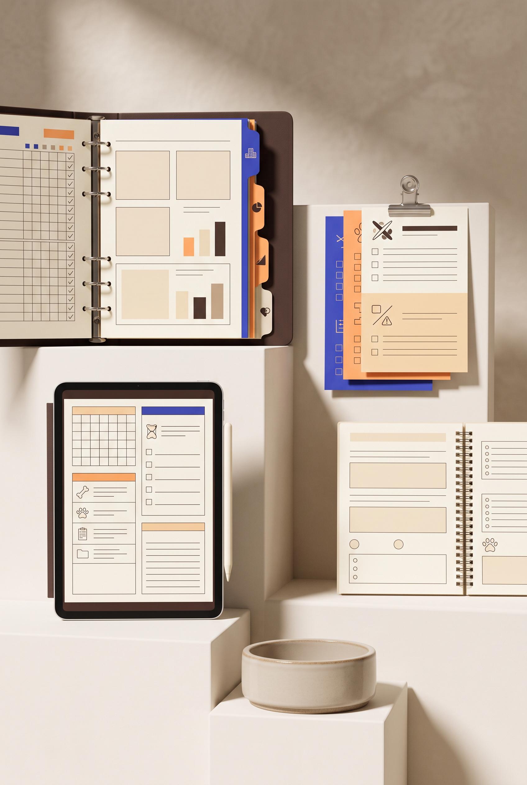 0
0Create a commercial-quality Pinterest showcase in a vertical 2:3 composition for an editable pet care planner collection. Arrange a tablet, phone, printed pages, binder tabs, checklist cards, and a small neutral pet bowl in stepped architectural layers with elegant spacing and directional shadows. Use ultramarine blue, melon orange, creamy ivory, and espresso brown. Leave all screens and pages visually designed but blank or filled with abstract lines only. No real brands, no trademarked characters, no watermark, and no unintended readable text. Corrective regeneration attempt 2. Produce a materially revised image, not a near-duplicate of an earlier variant. Preserve the successful subject, palette, lighting, focal hierarchy, and commercial polish from the original brief while correcting every issue below. Mandatory corrective instructions from the most recent visual QA: Regenerate the same attractive vertical 2:3 editorial product-family composition, preserving the ultramarine blue, melon orange, creamy ivory, espresso brown palette, stepped architectural arrangement, directional shadows, tablet, phone, printed sheets, binder tabs, clipped checklist cards, and neutral pet bowl. Remove every readable word, letter, number, caption, heading, and pseudo-text fragment from all pages, screens, tables, and cards. Replace all planner titles and tiny labels with blank areas, geometric marks, abstract lines, empty grids, and simple non-text pet-care icons only. Ensure no watermark, logo, brand mark, trademark, or generation artifacts. Observed defects from prior variants that must not recur: 1) Prominent unintended readable text appears on multiple planner pages, including “Daily Log,” “Weekly Log,” “Health Tracker,” and “Immunization,” violating the blank/abstract-lines- 2) only requirement. 3) Several tiny pseudo-text labels also appear in table headers and fields. 4) The composition and product styling are strong, with clear tablet, phone, binder, tabs, checklist cards, stepped layers, shadows, and cohesive colors. Render no letters, words, numbers, prices, headings, labels, contact details, logos, glyphs, or pseudo-text anywhere. Use only blank surfaces, clean geometric marks, and non-linguistic placeholder shapes. Do not add explanatory captions, before/after labels, interface copy, or extra objects that the brief did not request. When a corrective instruction conflicts with a decorative detail, prioritize the corrective instruction.
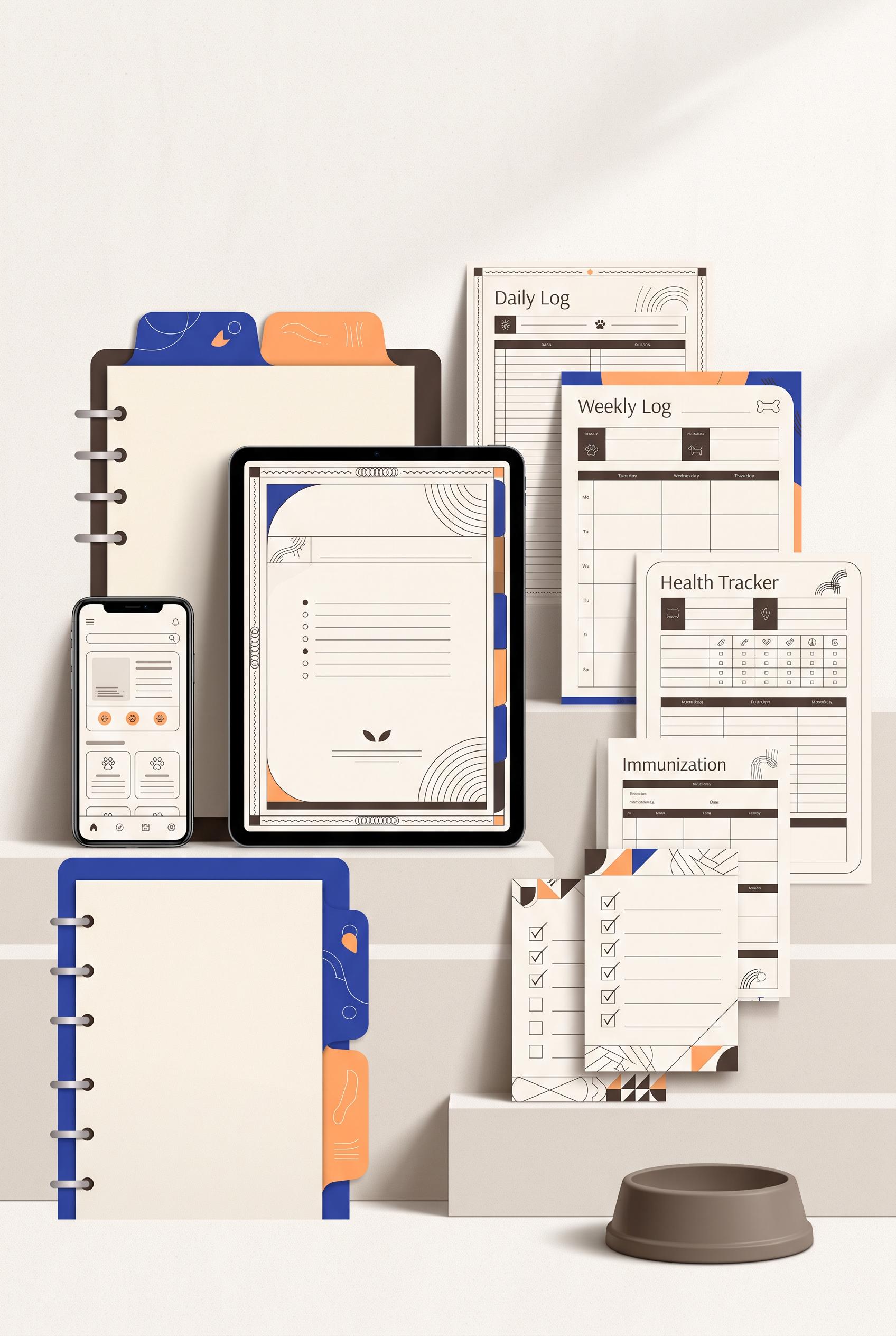 0
0Create a commercial-quality Pinterest showcase in a vertical 2:3 composition for an editable pet care planner collection. Arrange a tablet, phone, printed pages, binder tabs, checklist cards, and a small neutral pet bowl in stepped architectural layers with elegant spacing and directional shadows. Use ultramarine blue, melon orange, creamy ivory, and espresso brown. Leave all screens and pages visually designed but blank or filled with abstract lines only. No real brands, no trademarked characters, no watermark, and no unintended readable text.
 0
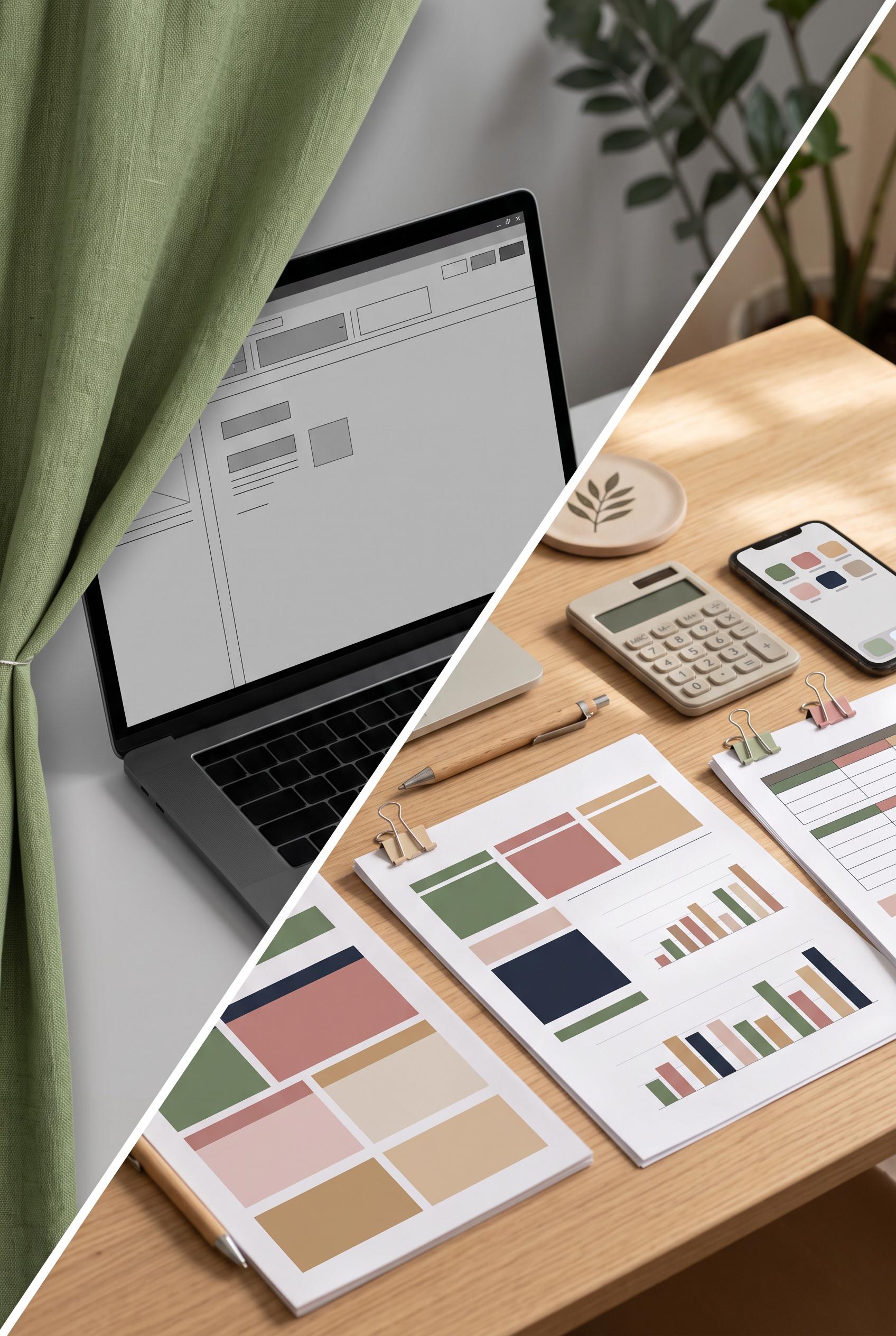
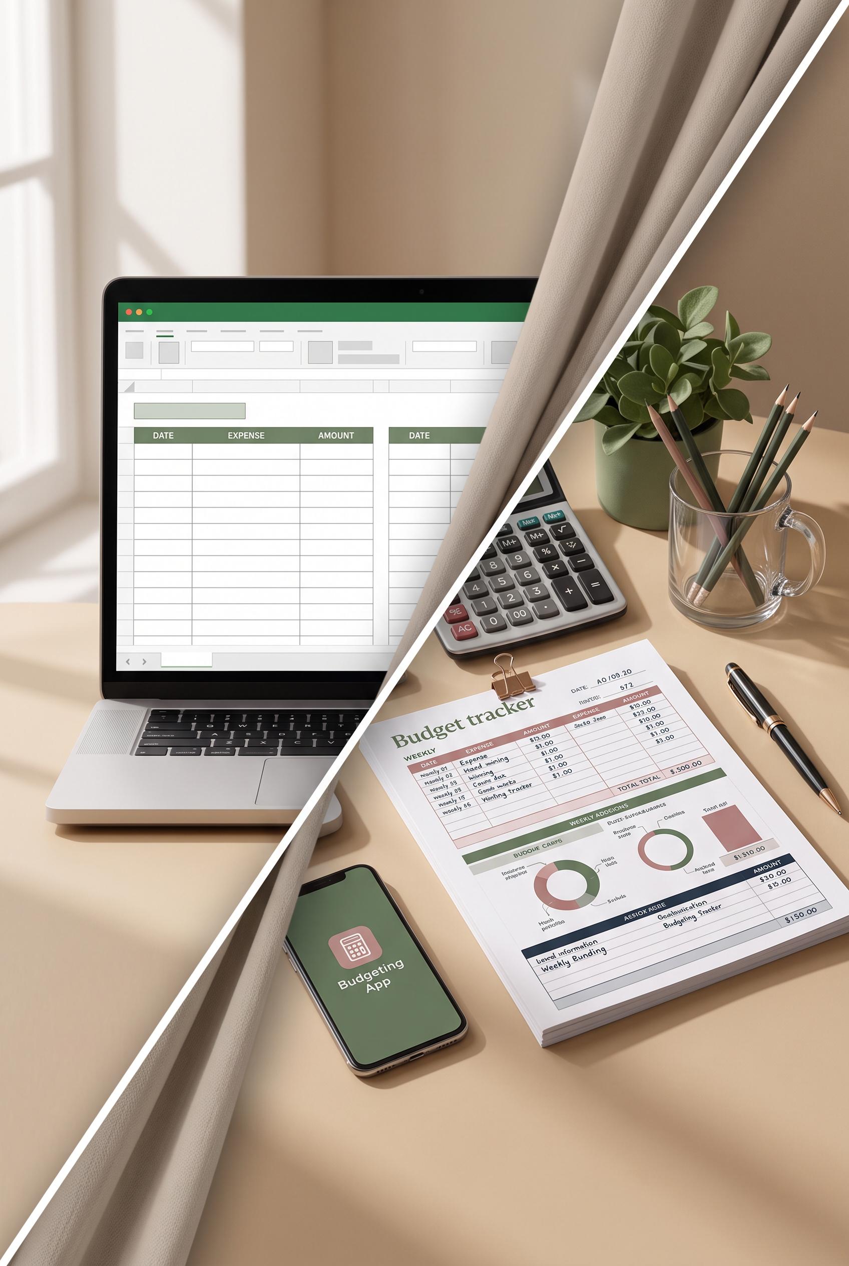
0Create a commercial-quality Pinterest graphic in a vertical 2:3 composition showing a clear before-and-after transformation of an editable budget tracker template. Use a curtain-like diagonal reveal, with an empty laptop file state on one side and a practical weekly budgeting desk setup on the other. Include neatly arranged printable pages, calculator, phone, pen, and soft natural shadows. Use moss green, dusty rose, warm sand, and deep ink. No real brands, no trademarked characters, no watermark, and no unintended readable text. Corrective regeneration attempt 4. Produce a materially revised image, not a near-duplicate of an earlier variant. Preserve the successful subject, palette, lighting, focal hierarchy, and commercial polish from the original brief while correcting every issue below. Mandatory corrective instructions from the most recent visual QA: Preserve the vertical 2:3 composition, diagonal fabric reveal, warm natural lighting, palette, laptop, phone, pen, calculator, sheets, shadows, and polished desk styling. Make the laptop screen a blank neutral surface with only a few large abstract geometric placeholder blocks, with no interface structure. Replace the laptop keyboard with completely unmarked blank keys: no letters, numbers, symbols, glyphs, or pseudo-text. Replace the calculator with blank rounded keys and a blank display, removing every numeral and symbol. Keep phone and printed sheets limited to clean color blocks, abstract lines, and geometric charts with no readable marks. Remove all logos, interface icons, watermarks, brands, trademarks, and garbled text everywhere. Observed defects from prior variants that must not recur: 1) Strong vertical composition, diagonal reveal, palette, lighting, and desk styling. 2) Calculator keypad contains clearly readable numerals and symbols. 3) Laptop screen includes small interface glyphs/icons, including a visible close mark, violating the no-glyph requirement. 4) The laptop screen still resembles a populated interface rather than a completely empty file state. 5) Attractive vertical composition, strong diagonal fabric reveal, cohesive palette, and clear desk transformation. 6) Laptop keyboard visibly contains letters and numbers, violating the no-readable-text requirement. 7) The laptop screen is still a populated dashboard-like layout rather than an unopened empty file state. 8) Calculator includes a visible central symbol/mark and should contain entirely blank keys and display. Render no letters, words, numbers, prices, headings, labels, contact details, logos, glyphs, or pseudo-text anywhere. Use only blank surfaces, clean geometric marks, and non-linguistic placeholder shapes. Do not add explanatory captions, before/after labels, interface copy, or extra objects that the brief did not request. When a corrective instruction conflicts with a decorative detail, prioritize the corrective instruction.
 0
0Create a commercial-quality Pinterest graphic in a vertical 2:3 composition showing a clear before-and-after transformation of an editable budget tracker template. Use a curtain-like diagonal reveal, with an empty laptop file state on one side and a practical weekly budgeting desk setup on the other. Include neatly arranged printable pages, calculator, phone, pen, and soft natural shadows. Use moss green, dusty rose, warm sand, and deep ink. No real brands, no trademarked characters, no watermark, and no unintended readable text. Corrective regeneration attempt 3. Produce a materially revised image, not a near-duplicate of an earlier variant. Preserve the successful subject, palette, lighting, focal hierarchy, and commercial polish from the original brief while correcting every issue below. Mandatory corrective instructions from the most recent visual QA: Preserve the attractive vertical 2:3 composition, diagonal fabric reveal, warm natural lighting, moss green/dusty rose/warm sand/deep ink palette, laptop, phone, pen, calculator, and organized desk setup. Make the laptop screen a completely blank neutral surface with only large non-linguistic geometric placeholder blocks; remove every icon, button symbol, close mark, letter, number, glyph, and pseudo-text. Replace the calculator with a visually similar calculator whose keypad contains blank rounded keys with no numerals or symbols and whose display is a blank rectangle. Keep all printed sheets limited to clean color blocks, abstract lines, and simple geometric charts with no readable marks. Remove any remaining logos, brands, trademarks, watermarks, garbled text, or recognizable interface symbols anywhere in the image. Observed defects from prior variants that must not recur: 1) Strong vertical composition and clear curtain reveal, but the image contains extensive unintended readable text and numbers on the laptop, printed sheets, and phone. 2) The laptop shows a populated spreadsheet rather than an unopened/empty digital file state. 3) The completed setup includes overly legible template copy, contrary to the visual-symbols-only requirement. 4) Strong vertical composition, diagonal reveal, palette, lighting, and desk styling. 5) Calculator keypad contains clearly readable numerals and symbols. 6) Laptop screen includes small interface glyphs/icons, including a visible close mark, violating the no-glyph requirement. 7) The laptop screen still resembles a populated interface rather than a completely empty file state. Render no letters, words, numbers, prices, headings, labels, contact details, logos, glyphs, or pseudo-text anywhere. Use only blank surfaces, clean geometric marks, and non-linguistic placeholder shapes. Do not add explanatory captions, before/after labels, interface copy, or extra objects that the brief did not request. When a corrective instruction conflicts with a decorative detail, prioritize the corrective instruction.
 0
0Create a commercial-quality Pinterest graphic in a vertical 2:3 composition showing a clear before-and-after transformation of an editable budget tracker template. Use a curtain-like diagonal reveal, with an empty laptop file state on one side and a practical weekly budgeting desk setup on the other. Include neatly arranged printable pages, calculator, phone, pen, and soft natural shadows. Use moss green, dusty rose, warm sand, and deep ink. No real brands, no trademarked characters, no watermark, and no unintended readable text. Corrective regeneration attempt 2. Produce a materially revised image, not a near-duplicate of an earlier variant. Preserve the successful subject, palette, lighting, focal hierarchy, and commercial polish from the original brief while correcting every issue below. Mandatory corrective instructions from the most recent visual QA: Preserve the attractive vertical 2:3 composition, diagonal fabric reveal, warm natural lighting, palette, laptop, calculator, phone, pen, and neatly arranged desk setup. Make the laptop side clearly an unopened empty file state: blank neutral screen with only abstract interface blocks and no letters, words, numbers, logos, or recognizable spreadsheet content. Replace all readable text and numerals on every printed page, laptop screen, calculator display, and phone screen with blank fields, abstract lines, simple geometric icons, and non-readable visual marks. Remove the phone text and app icon lettering entirely. Keep the completed side visually organized as a budget-planning setup using categorized color blocks and charts without any legible copy. Ensure no logos, brands, trademarks, watermarks, garbled text, or pseudo-readable characters appear anywhere. Observed defects from prior variants that must not recur: 1) Strong vertical composition and clear curtain reveal, but the image contains extensive unintended readable text and numbers on the laptop, printed sheets, and phone. 2) The laptop shows a populated spreadsheet rather than an unopened/empty digital file state. 3) The completed setup includes overly legible template copy, contrary to the visual-symbols-only requirement. Render no letters, words, numbers, prices, headings, labels, contact details, logos, glyphs, or pseudo-text anywhere. Use only blank surfaces, clean geometric marks, and non-linguistic placeholder shapes. Do not add explanatory captions, before/after labels, interface copy, or extra objects that the brief did not request. When a corrective instruction conflicts with a decorative detail, prioritize the corrective instruction.
 0
0Create a commercial-quality Pinterest graphic in a vertical 2:3 composition showing a clear before-and-after transformation of an editable budget tracker template. Use a curtain-like diagonal reveal, with an empty laptop file state on one side and a practical weekly budgeting desk setup on the other. Include neatly arranged printable pages, calculator, phone, pen, and soft natural shadows. Use moss green, dusty rose, warm sand, and deep ink. No real brands, no trademarked characters, no watermark, and no unintended readable text.
 0
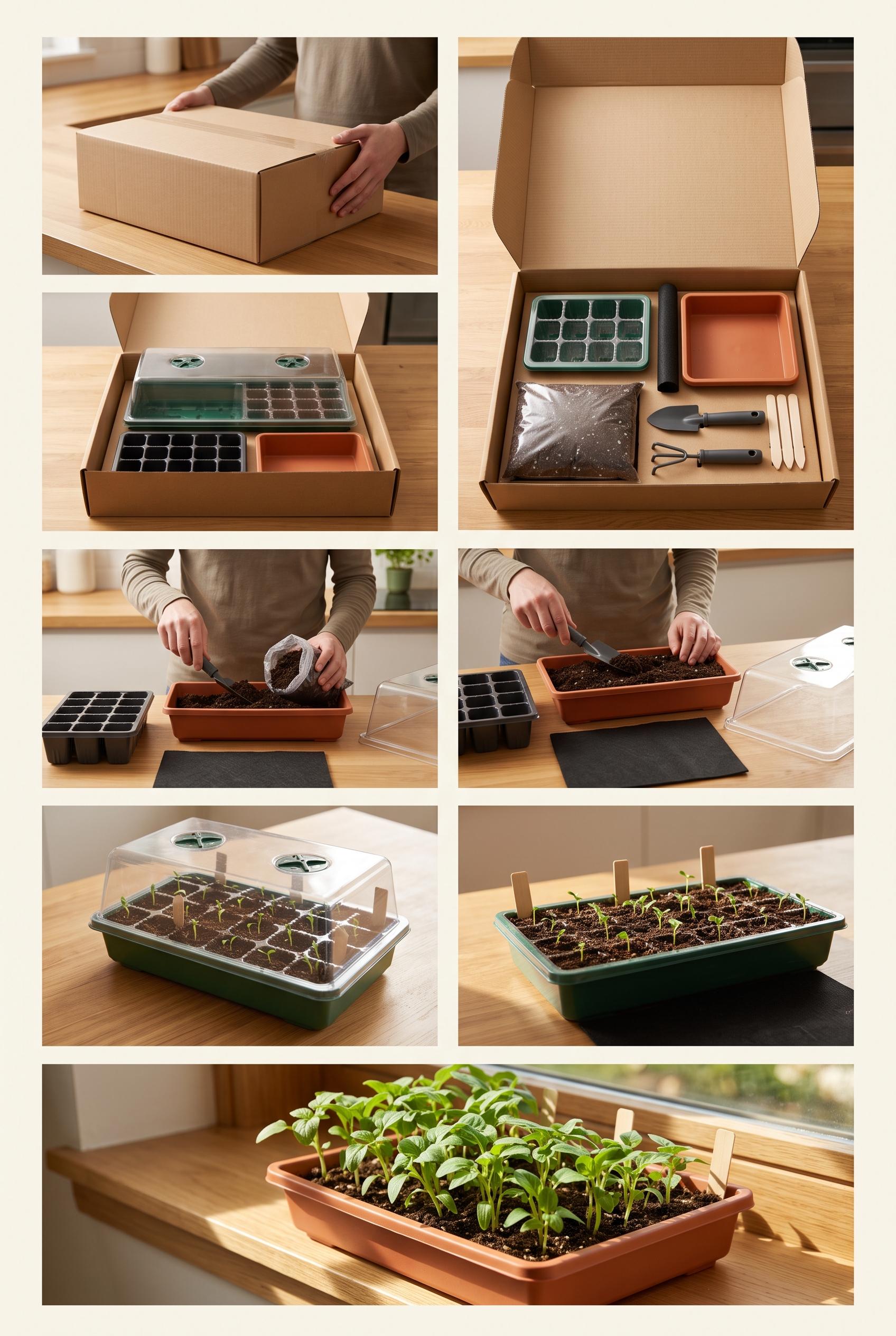
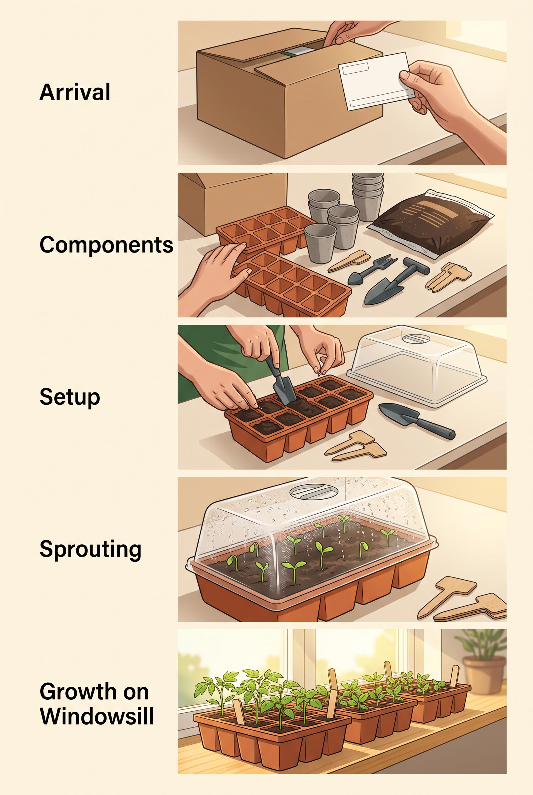
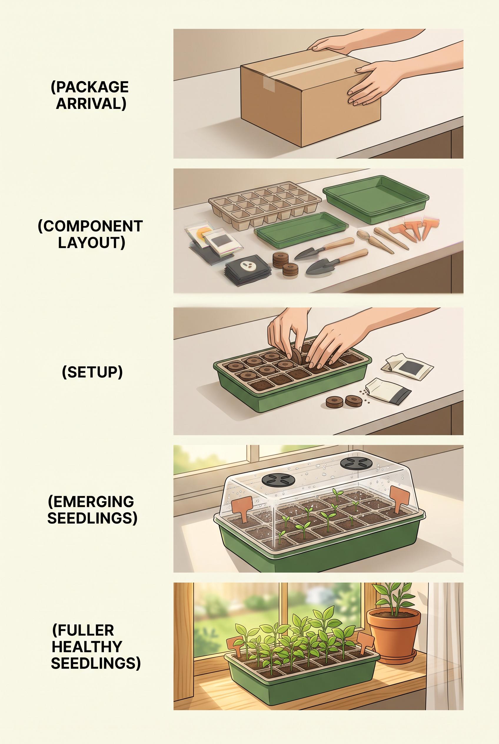
0Create a commercial-quality vertical 2:3 Pinterest composition for an unbranded countertop seed-starting greenhouse campaign, arranged as a five-beat stepped visual storyboard from package arrival to healthy seedlings on a bright windowsill. Use fern green, marigold, terracotta, cream, and charcoal, with clean instructional staging and natural morning light. No real brands, no trademarked characters, no watermark, and no unintended readable text. Corrective regeneration attempt 5. Produce a materially revised image, not a near-duplicate of an earlier variant. Preserve the successful subject, palette, lighting, focal hierarchy, and commercial polish from the original brief while correcting every issue below. Mandatory corrective instructions from the most recent visual QA: Regenerate the polished vertical 2:3 five-panel storyboard with the cream background, fern green, marigold, terracotta, charcoal palette, warm morning light, realistic hands, and unbranded countertop seed-starting greenhouse kit. Remove the entire left text column and all headings. Remove every letter, word, number, symbol, logo, label, package marking, shipping label, soil-bag marking, plant-marker marking, pseudo-text, and decorative glyph from every surface. Make the cardboard box, paper, soil bag, tools, trays, markers, and all accessories completely blank and unmarked. Preserve the intuitive progression through package arrival, component layout, setup, clearly emerging sprouts beneath the transparent lid in panel four, and fuller healthy seedlings on a bright windowsill in panel five. Use only object placement, scale, color progression, and the five visual panels to communicate the sequence. No watermark. Observed defects from prior variants that must not recur: 1) Prominent readable headings appear beside every panel, violating the no-readable-text requirement. 2) The plant markers and package/accessory surfaces contain mark-like shapes that could read as labels or symbols. 3) The composition is attractive and clearly shows the five beats, including emerging seedlings, but it fails the strict text-free commercial brief. 4) Prominent readable headings occupy the entire left column, violating the text-free requirement. 5) The package includes a readable-looking shipping label. 6) The soil bag contains mark-like lines that resemble labeling. 7) Plant markers contain visible markings and symbols. 8) The image is otherwise an attractive vertical storyboard with five clear beats and visible emerging seedlings in panel four. Render no letters, words, numbers, prices, headings, labels, contact details, logos, glyphs, or pseudo-text anywhere. Use only blank surfaces, clean geometric marks, and non-linguistic placeholder shapes. Do not add explanatory captions, before/after labels, interface copy, or extra objects that the brief did not request. When a corrective instruction conflicts with a decorative detail, prioritize the corrective instruction.
 0
0Create a commercial-quality vertical 2:3 Pinterest composition for an unbranded countertop seed-starting greenhouse campaign, arranged as a five-beat stepped visual storyboard from package arrival to healthy seedlings on a bright windowsill. Use fern green, marigold, terracotta, cream, and charcoal, with clean instructional staging and natural morning light. No real brands, no trademarked characters, no watermark, and no unintended readable text. Corrective regeneration attempt 4. Produce a materially revised image, not a near-duplicate of an earlier variant. Preserve the successful subject, palette, lighting, focal hierarchy, and commercial polish from the original brief while correcting every issue below. Mandatory corrective instructions from the most recent visual QA: Regenerate the same polished vertical 2:3 five-panel storyboard with the cream background, fern green, marigold, terracotta, charcoal palette, warm natural morning light, unbranded countertop seed-starting greenhouse kit, realistic hands, and the existing clear progression from package arrival to component layout, setup, emerging seedlings, and fuller healthy seedlings on a sunny windowsill. Remove the entire left-side text column and all headings. Remove every letter, word, number, symbol, logo, label, package marking, plant-marker marking, pseudo-text, and decorative glyph everywhere in the image. Make all packaging, tools, trays, markers, and other surfaces completely blank. Communicate the sequence only through object placement, scale, color progression, and the five visual panels. Preserve the strong vertical composition, polished illustration style, focal hierarchy, lighting, and clear sprouts beneath the transparent lid in panel four; panel five must retain fuller healthy seedlings on the bright windowsill. No watermark. Observed defects from prior variants that must not recur: 1) Prominent readable instructional text is embedded throughout the image, contrary to the brief’s visual-only storytelling requirement. 2) The fourth beat shows planted soil rather than clearly emerging seedlings. 3) The fourth-panel plant marker contains garbled pseudo-text. 4) Prominent readable headings appear throughout all five panels, violating the requirement for visual-only storytelling with no embedded text. 5) The storyboard otherwise has a strong vertical composition, clear five-step progression, attractive lighting, and visible emerging seedlings in the fourth beat. 6) Prominent readable headings appear beside every panel, violating the no-readable-text requirement. 7) The plant markers and package/accessory surfaces contain mark-like shapes that could read as labels or symbols. 8) The composition is attractive and clearly shows the five beats, including emerging seedlings, but it fails the strict text-free commercial brief. Render no letters, words, numbers, prices, headings, labels, contact details, logos, glyphs, or pseudo-text anywhere. Use only blank surfaces, clean geometric marks, and non-linguistic placeholder shapes. Do not add explanatory captions, before/after labels, interface copy, or extra objects that the brief did not request. When a corrective instruction conflicts with a decorative detail, prioritize the corrective instruction.
 0
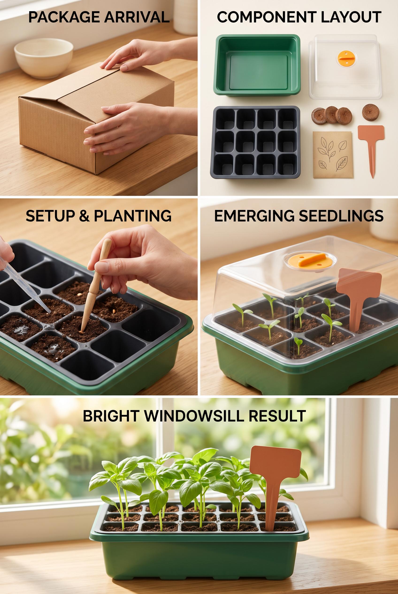
0Create a commercial-quality vertical 2:3 Pinterest composition for an unbranded countertop seed-starting greenhouse campaign, arranged as a five-beat stepped visual storyboard from package arrival to healthy seedlings on a bright windowsill. Use fern green, marigold, terracotta, cream, and charcoal, with clean instructional staging and natural morning light. No real brands, no trademarked characters, no watermark, and no unintended readable text. Corrective regeneration attempt 3. Produce a materially revised image, not a near-duplicate of an earlier variant. Preserve the successful subject, palette, lighting, focal hierarchy, and commercial polish from the original brief while correcting every issue below. Mandatory corrective instructions from the most recent visual QA: Regenerate the same polished vertical 2:3 five-panel storyboard with the cream background, fern green, marigold, terracotta, charcoal palette, warm natural morning light, unbranded countertop seed-starting greenhouse kit, realistic hands, and clear progression from package arrival to component layout, setup, emerging seedlings, and fuller healthy seedlings on a bright windowsill. Remove every heading and all other readable or pseudo-readable content everywhere: no letters, words, numbers, symbols, logos, labels, marks, packaging text, plant-marker text, or decorative glyphs. Keep all surfaces blank and use only the objects and visual staging to communicate the sequence. Ensure panel four unmistakably shows several small green sprouts emerging from multiple soil cells beneath the clear lid, while panel five shows fuller healthy seedlings in the sunny windowsill result. No watermark. Observed defects from prior variants that must not recur: 1) Prominent readable instructional text is embedded throughout the image, contrary to the brief’s visual-only storytelling requirement. 2) The fourth beat shows planted soil rather than clearly emerging seedlings. 3) The fourth-panel plant marker contains garbled pseudo-text. 4) Prominent readable headings appear throughout all five panels, violating the requirement for visual-only storytelling with no embedded text. 5) The storyboard otherwise has a strong vertical composition, clear five-step progression, attractive lighting, and visible emerging seedlings in the fourth beat. Render no letters, words, numbers, prices, headings, labels, contact details, logos, glyphs, or pseudo-text anywhere. Use only blank surfaces, clean geometric marks, and non-linguistic placeholder shapes. Do not add explanatory captions, before/after labels, interface copy, or extra objects that the brief did not request. When a corrective instruction conflicts with a decorative detail, prioritize the corrective instruction.
 0
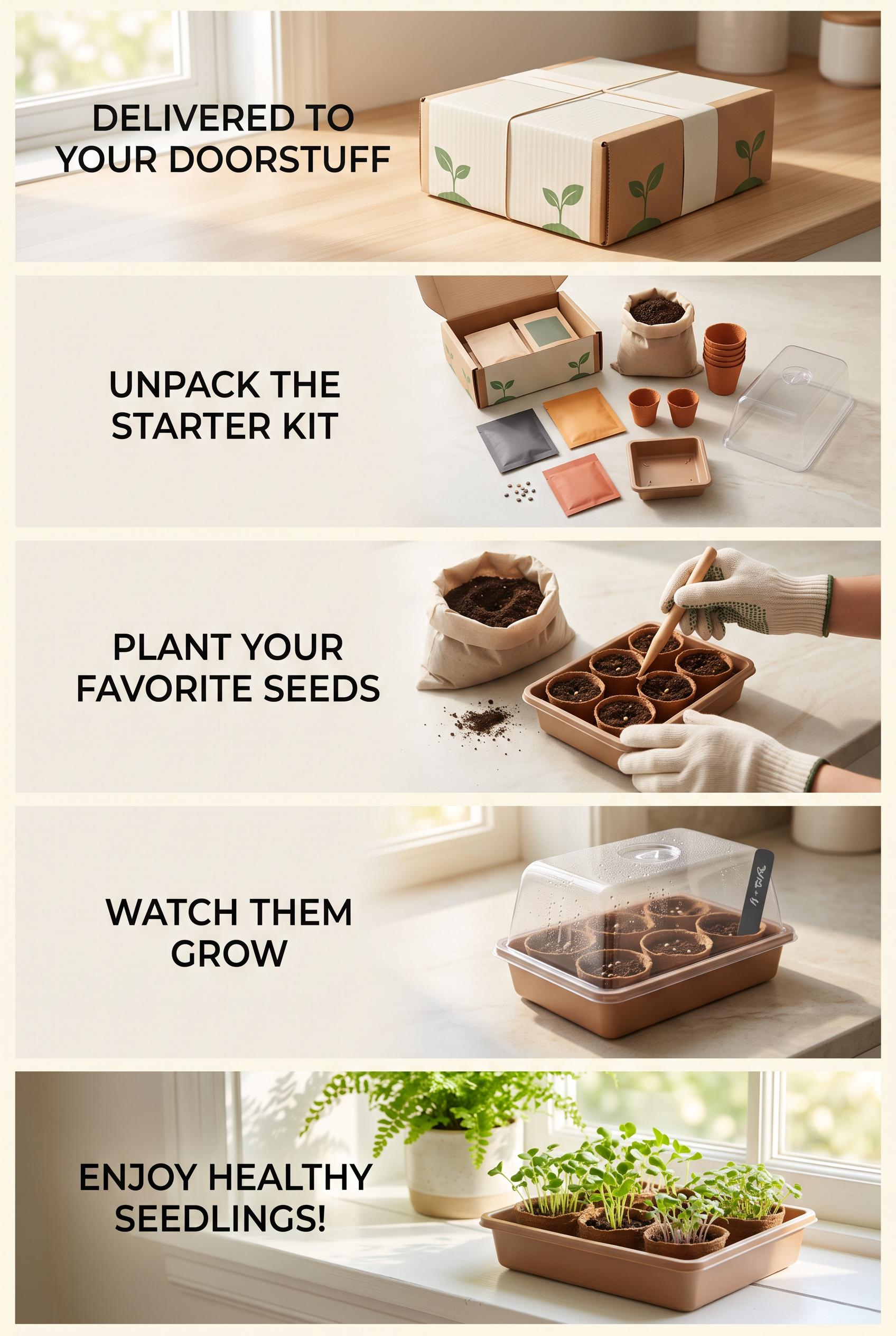
0Create a commercial-quality vertical 2:3 Pinterest composition for an unbranded countertop seed-starting greenhouse campaign, arranged as a five-beat stepped visual storyboard from package arrival to healthy seedlings on a bright windowsill. Use fern green, marigold, terracotta, cream, and charcoal, with clean instructional staging and natural morning light. No real brands, no trademarked characters, no watermark, and no unintended readable text. Corrective regeneration attempt 2. Produce a materially revised image, not a near-duplicate of an earlier variant. Preserve the successful subject, palette, lighting, focal hierarchy, and commercial polish from the original brief while correcting every issue below. Mandatory corrective instructions from the most recent visual QA: Regenerate the same attractive vertical 2:3 five-panel storyboard with the existing warm natural-light styling, cream background, fern green, marigold, terracotta, and charcoal palette, and unbranded kit. Remove every letter, word, number, symbol, label, and pseudo-text from all panels and packaging, including the plant marker. Preserve the clear progression of package arrival, component layout, setup, emerging seedlings, and bright windowsill result. Make the fourth panel unmistakably show small green sprouts emerging from several soil cells beneath the clear greenhouse lid, while keeping the final panel as fuller healthy seedlings on the sunny windowsill. Maintain clean commercial composition, realistic hands and objects, and no watermark or logos. Observed defects from prior variants that must not recur: 1) Prominent readable instructional text is embedded throughout the image, contrary to the brief’s visual-only storytelling requirement. 2) The fourth beat shows planted soil rather than clearly emerging seedlings. 3) The fourth-panel plant marker contains garbled pseudo-text. Render no letters, words, numbers, prices, headings, labels, contact details, logos, glyphs, or pseudo-text anywhere. Use only blank surfaces, clean geometric marks, and non-linguistic placeholder shapes. Do not add explanatory captions, before/after labels, interface copy, or extra objects that the brief did not request. When a corrective instruction conflicts with a decorative detail, prioritize the corrective instruction.
 0
0Create a commercial-quality vertical 2:3 Pinterest composition for an unbranded countertop seed-starting greenhouse campaign, arranged as a five-beat stepped visual storyboard from package arrival to healthy seedlings on a bright windowsill. Use fern green, marigold, terracotta, cream, and charcoal, with clean instructional staging and natural morning light. No real brands, no trademarked characters, no watermark, and no unintended readable text.
 0
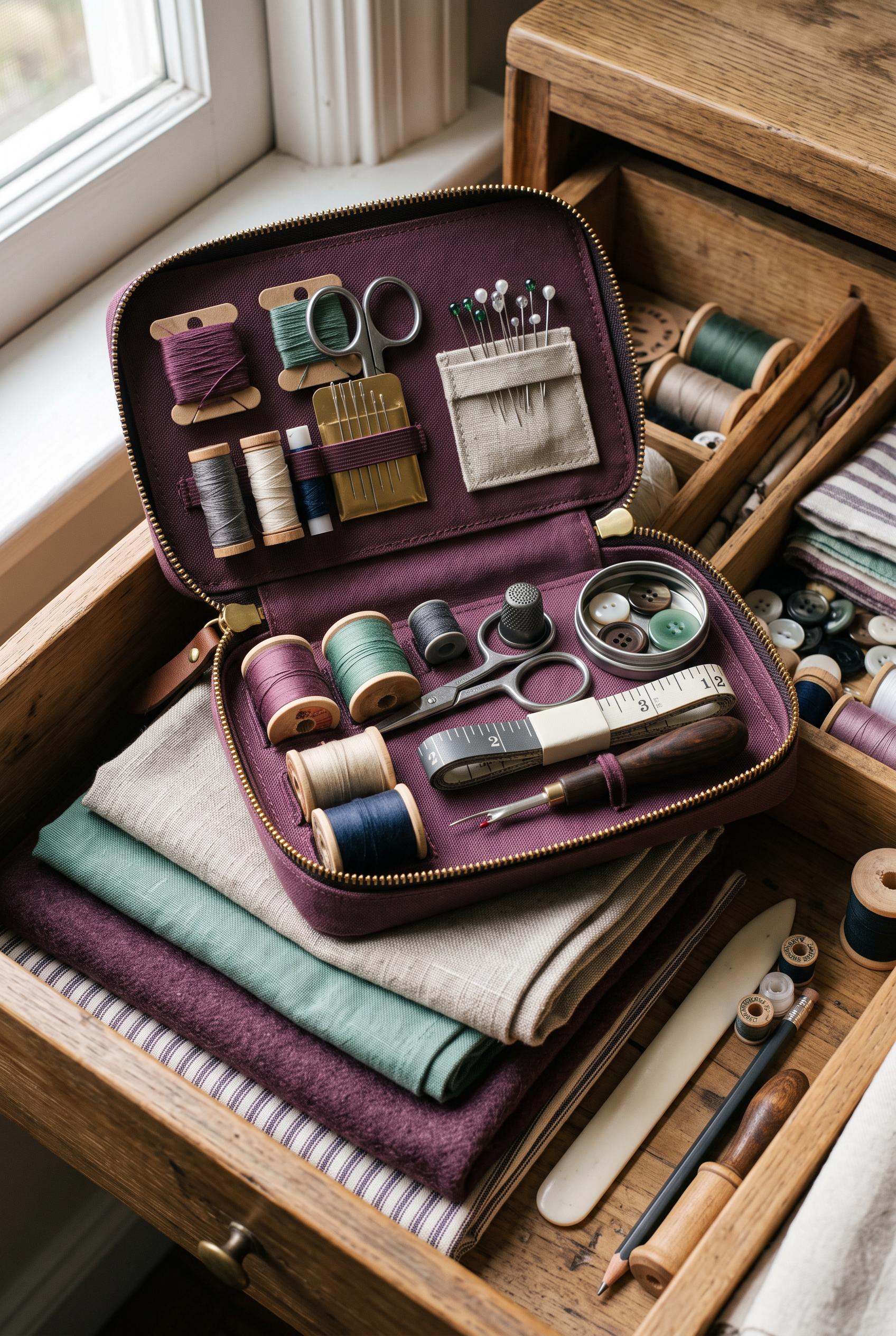
0Create a commercial-quality vertical 2:3 Pinterest composition featuring an unbranded compact travel sewing repair case in an editorial drawer scene, viewed at a gentle three-quarter angle with nested compartments, folded fabric swatches, thread spools, and precise tools. Use plum, flax, jade, and graphite with crisp studio light and refined tactile materials. No real brands, no trademarked characters, no watermark, and no unintended readable text.
 0
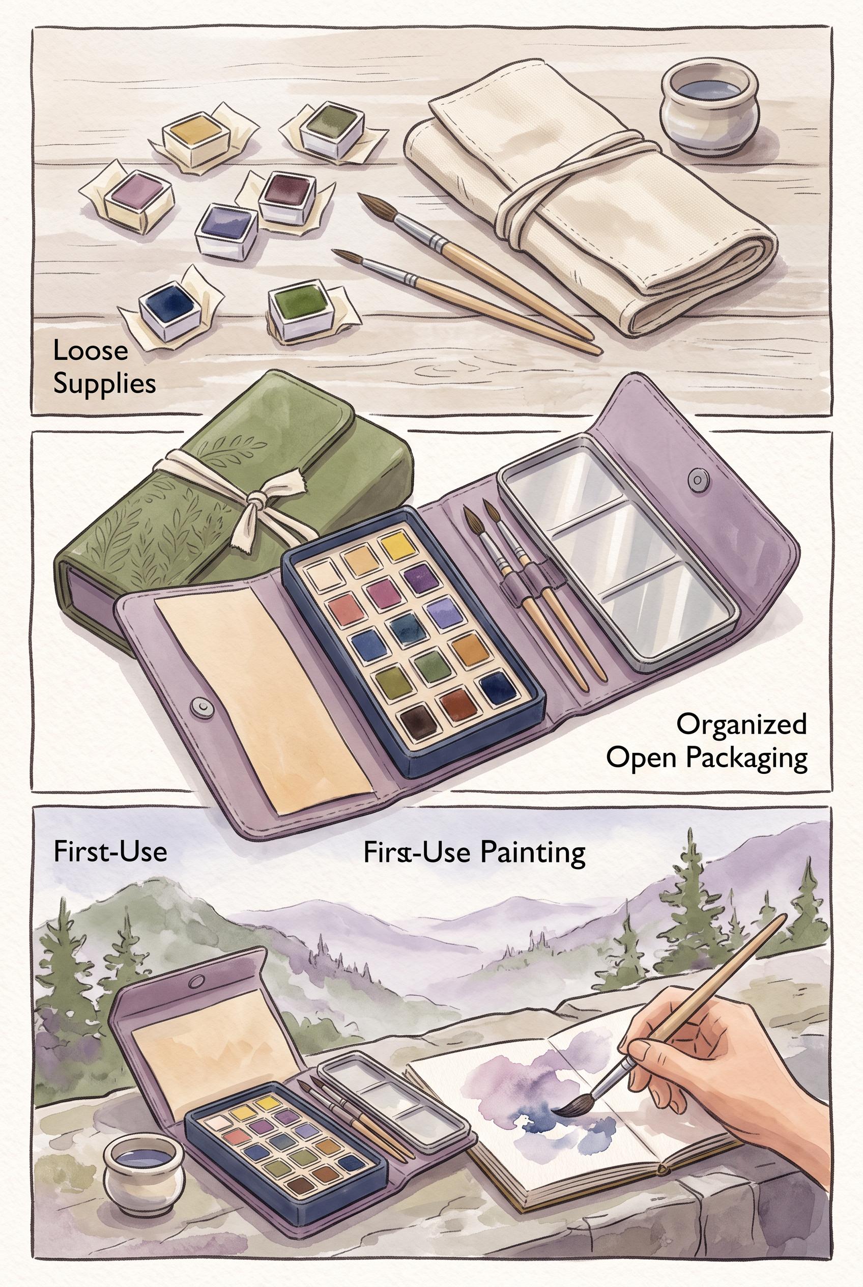
0Create a commercial-quality vertical 2:3 Pinterest composition showing an unbranded foldable travel watercolor kit transformation in a hinged three-panel reveal: loose supplies, organized open packaging, and a calm first-use painting scene. Use dusty lilac, moss green, warm paper, and ink blue, with tactile paper grain and soft directional light. No real brands, no trademarked characters, no watermark, and no unintended readable text.
 0
0Create a commercial-quality educational Pinterest campaign graphic in a vertical 2:3 composition for a fictional mobile home-cleaning service. Show a modular five-frame storyboard grid with visual steps for problem, arrival, process, result, and next action, using icons, clean interior photography, directional connectors, and blank caption areas. Use cobalt blue, peach, lime, and charcoal. AI-modified downstream. No real brands, no trademarks, no trademarked characters, no watermark, and no unintended readable text. Corrective regeneration attempt 5. Produce a materially revised image, not a near-duplicate of an earlier variant. Preserve the successful subject, palette, lighting, focal hierarchy, and commercial polish from the original brief while correcting every issue below. Mandatory corrective instructions from the most recent visual QA: Preserve the polished vertical 2:3 layout, cobalt blue, peach, lime, and charcoal palette, rounded panels, clean interior photography, workers, directional connectors, geometric circles, and blank caption bars. Rebuild the layout as exactly five clearly separated rounded panels: messy problem, cleaner arrival, cleaning process, visibly clean result, and simple next action. Remove the entire sixth panel and rebalance spacing so the five moments remain prominent and easy to follow. Keep all surfaces completely free of letters, words, numbers, labels, logos, watermarks, pseudo-text, and readable marks. Make the phone screen purely abstract with only a few irregular solid-color rounded rectangles or color fields, avoiding any form, app, or interface appearance. Use only non-linguistic geometric shapes and blank caption areas. Observed defects from prior variants that must not recur: 1) Readable headline text “HOME CLEANING GUIDE” violates the no-text requirement. 2) The layout contains six storyboard panels instead of five distinct moments. 3) Several icons are linguistic/interface-like glyphs, including a map pin, gear, clock, sparkle symbols, and detailed phone UI. 4) The phone contains pseudo-interface lines and colored UI blocks, conflicting with the requirement for purely abstract geometric placeholders. 5) The composition is polished and vertical, but it does not strictly satisfy the blank/abstract, icon-and-connector-led brief. 6) The composition is polished and vertical with a clear visual system, but it contains six storyboard panels instead of the required five. 7) The phone screen resembles a form-like interface, despite the requirement for purely abstract geometric placeholders. 8) The extra sixth panel prevents the five-moment storyboard from being unambiguous. Render no letters, words, numbers, prices, headings, labels, contact details, logos, glyphs, or pseudo-text anywhere. Use only blank surfaces, clean geometric marks, and non-linguistic placeholder shapes. Do not add explanatory captions, before/after labels, interface copy, or extra objects that the brief did not request. When a corrective instruction conflicts with a decorative detail, prioritize the corrective instruction.
 0
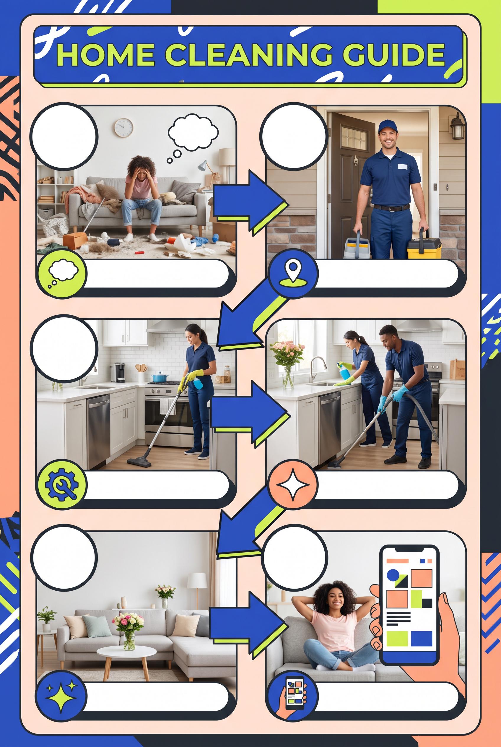
0Create a commercial-quality educational Pinterest campaign graphic in a vertical 2:3 composition for a fictional mobile home-cleaning service. Show a modular five-frame storyboard grid with visual steps for problem, arrival, process, result, and next action, using icons, clean interior photography, directional connectors, and blank caption areas. Use cobalt blue, peach, lime, and charcoal. AI-modified downstream. No real brands, no trademarks, no trademarked characters, no watermark, and no unintended readable text. Corrective regeneration attempt 4. Produce a materially revised image, not a near-duplicate of an earlier variant. Preserve the successful subject, palette, lighting, focal hierarchy, and commercial polish from the original brief while correcting every issue below. Mandatory corrective instructions from the most recent visual QA: Preserve the polished vertical 2:3 composition, cobalt blue, peach, lime, and charcoal palette, rounded panels, clean interior photography, workers, directional connectors, blank caption bars, and strong commercial hierarchy. Rebuild the storyboard as exactly five clearly separated rounded panels representing: messy problem, cleaner arrival, cleaning process, visibly clean result, and simple next action. Remove the sixth panel. Delete every letter, word, number, heading, label, URL, logo, watermark, pseudo-text line, and readable mark, including the top headline. Replace all numbered circles and semantic icons with blank white circles or simple non-linguistic geometric color shapes. Remove the map pin, gear, clock, stars, heart, arrows-as-icons, and all phone interface glyphs. Make the phone screen entirely abstract: only a few plain rounded rectangles and solid color fields, with no letters, symbols, icons, numbers, or pseudo-text. Keep caption bars completely blank. Observed defects from prior variants that must not recur: 1) The design is overly text-heavy for the requested icon-and-connector-led modular concept. 2) Strong vertical storyboard composition and polished palette, but it contains prominent readable numbers 1–5 despite the final instruction prohibiting numbers. 3) The phone includes interface glyphs and icons that should be replaced with purely abstract geometric placeholder shapes under the no-glyphs requirement. 4) Readable headline text “HOME CLEANING GUIDE” violates the no-text requirement. 5) The layout contains six storyboard panels instead of five distinct moments. 6) Several icons are linguistic/interface-like glyphs, including a map pin, gear, clock, sparkle symbols, and detailed phone UI. 7) The phone contains pseudo-interface lines and colored UI blocks, conflicting with the requirement for purely abstract geometric placeholders. 8) The composition is polished and vertical, but it does not strictly satisfy the blank/abstract, icon-and-connector-led brief. Render no letters, words, numbers, prices, headings, labels, contact details, logos, glyphs, or pseudo-text anywhere. Use only blank surfaces, clean geometric marks, and non-linguistic placeholder shapes. Do not add explanatory captions, before/after labels, interface copy, or extra objects that the brief did not request. When a corrective instruction conflicts with a decorative detail, prioritize the corrective instruction.
 0
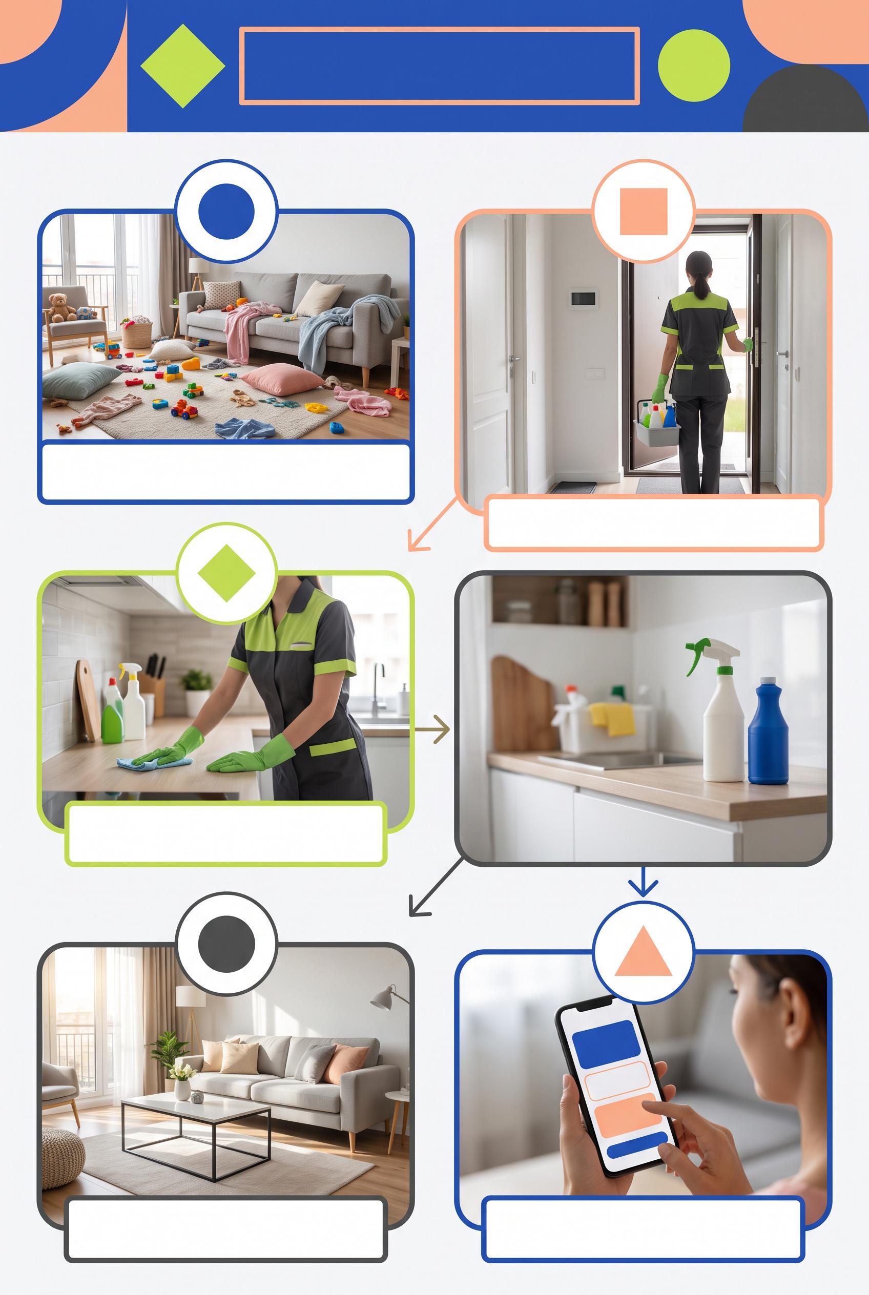
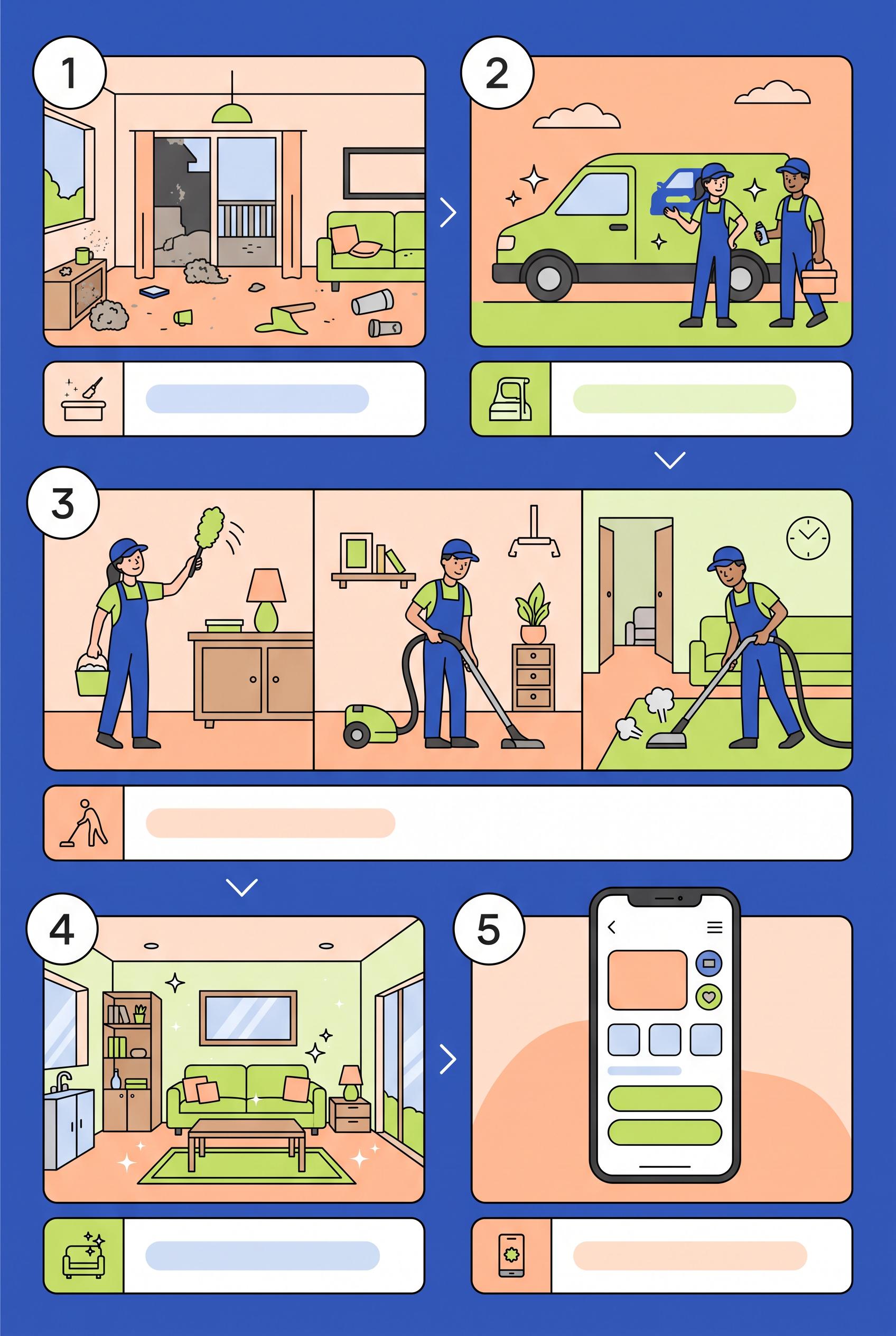
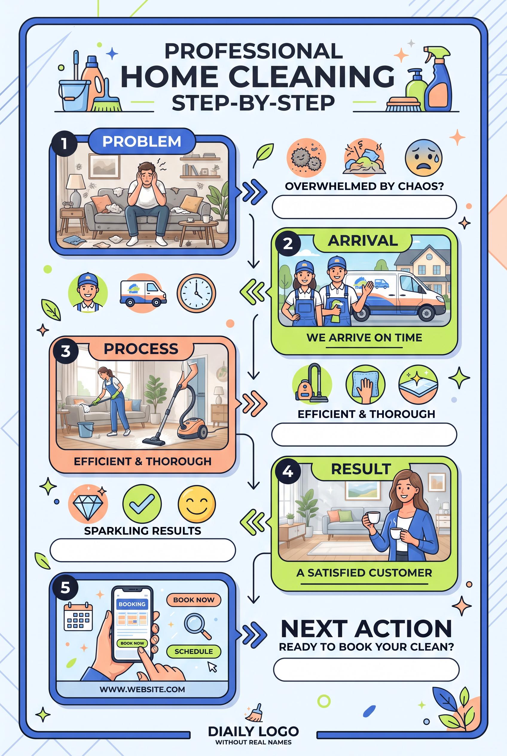
0Create a commercial-quality educational Pinterest campaign graphic in a vertical 2:3 composition for a fictional mobile home-cleaning service. Show a modular five-frame storyboard grid with visual steps for problem, arrival, process, result, and next action, using icons, clean interior photography, directional connectors, and blank caption areas. Use cobalt blue, peach, lime, and charcoal. AI-modified downstream. No real brands, no trademarks, no trademarked characters, no watermark, and no unintended readable text. Corrective regeneration attempt 3. Produce a materially revised image, not a near-duplicate of an earlier variant. Preserve the successful subject, palette, lighting, focal hierarchy, and commercial polish from the original brief while correcting every issue below. Mandatory corrective instructions from the most recent visual QA: Preserve the attractive vertical 2:3 layout, cobalt-blue, peach, lime, and charcoal palette, five rounded storyboard panels, clean interior scenes, workers, vehicle, directional connectors, blank caption bars, and overall commercial polish. Remove every visible number, including the large numbered circles, and replace those circles with blank white circles or simple non-linguistic geometric marks. Simplify the phone screen completely: remove the back arrow, menu icon, heart, circular icons, and all interface glyphs; use only abstract rounded rectangles, blocks, and color fields with no letters, words, numbers, symbols, logos, pseudo-text, or watermark anywhere. Observed defects from prior variants that must not recur: 1) Strong vertical composition and clear five-step storyboard, but it violates the brief’s requirement for blank or abstract caption areas by adding extensive embedded copy. 2) The phone contains readable interface text such as “BOOKING,” “BOOK NOW,” and “SCHEDULE,” plus the fabricated URL “WWW.WEBSITE.COM.” 3) The footer text “DAILY LOGO WITHOUT REAL NAMES” is unintended and visually distracting. 4) The design is overly text-heavy for the requested icon-and-connector-led modular concept. 5) Strong vertical storyboard composition and polished palette, but it contains prominent readable numbers 1–5 despite the final instruction prohibiting numbers. 6) The phone includes interface glyphs and icons that should be replaced with purely abstract geometric placeholder shapes under the no-glyphs requirement. Render no letters, words, numbers, prices, headings, labels, contact details, logos, glyphs, or pseudo-text anywhere. Use only blank surfaces, clean geometric marks, and non-linguistic placeholder shapes. Do not add explanatory captions, before/after labels, interface copy, or extra objects that the brief did not request. When a corrective instruction conflicts with a decorative detail, prioritize the corrective instruction.
 0
0Create a commercial-quality educational Pinterest campaign graphic in a vertical 2:3 composition for a fictional mobile home-cleaning service. Show a modular five-frame storyboard grid with visual steps for problem, arrival, process, result, and next action, using icons, clean interior photography, directional connectors, and blank caption areas. Use cobalt blue, peach, lime, and charcoal. AI-modified downstream. No real brands, no trademarks, no trademarked characters, no watermark, and no unintended readable text. Corrective regeneration attempt 2. Produce a materially revised image, not a near-duplicate of an earlier variant. Preserve the successful subject, palette, lighting, focal hierarchy, and commercial polish from the original brief while correcting every issue below. Mandatory corrective instructions from the most recent visual QA: Preserve the attractive vertical 2:3 layout, cobalt-blue/peach/lime/charcoal palette, five alternating storyboard panels, clean interior scenes, icons, numbered circles, rounded frames, and directional connectors. Remove all embedded wording except simple non-textual step numbers 1–5, and replace every headline, caption, CTA, URL, footer, and label with blank white or softly tinted abstract caption bars. Remove all readable text from the phone screen, including BOOKING, BOOK NOW, SCHEDULE, and any URL; show only generic abstract UI blocks and icons. Remove the footer phrase and simplify the composition so visuals carry the five moments: messy problem, cleaner arrival vehicle and workers, cleaning process, sparkling result, and generic booking/action phone visual. Use only invented unbranded symbols with no recognizable logos, trademarks, or watermark. Observed defects from prior variants that must not recur: 1) Strong vertical composition and clear five-step storyboard, but it violates the brief’s requirement for blank or abstract caption areas by adding extensive embedded copy. 2) The phone contains readable interface text such as “BOOKING,” “BOOK NOW,” and “SCHEDULE,” plus the fabricated URL “WWW.WEBSITE.COM.” 3) The footer text “DAILY LOGO WITHOUT REAL NAMES” is unintended and visually distracting. 4) The design is overly text-heavy for the requested icon-and-connector-led modular concept. Render no letters, words, numbers, prices, headings, labels, contact details, logos, glyphs, or pseudo-text anywhere. Use only blank surfaces, clean geometric marks, and non-linguistic placeholder shapes. Do not add explanatory captions, before/after labels, interface copy, or extra objects that the brief did not request. When a corrective instruction conflicts with a decorative detail, prioritize the corrective instruction.
 0
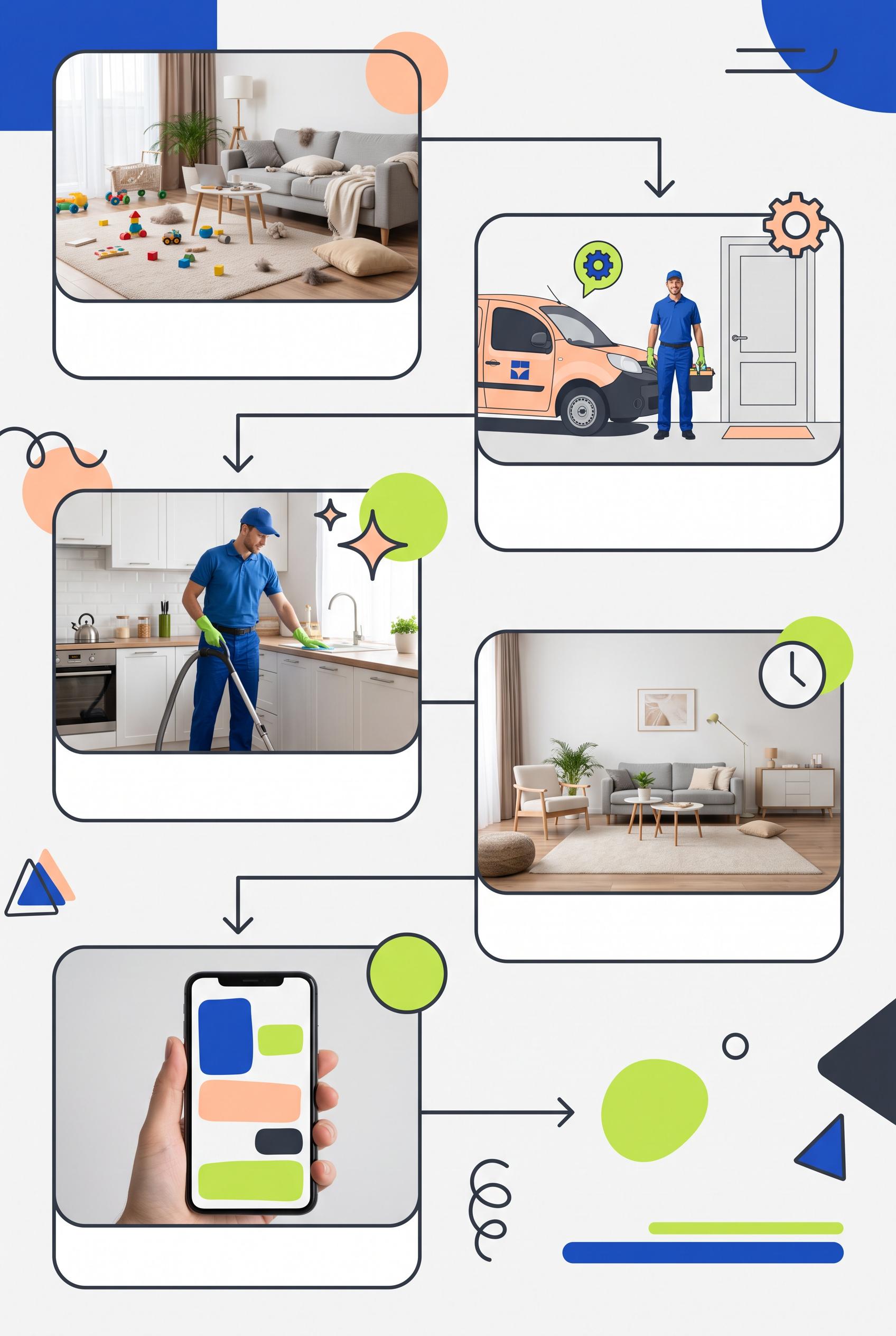
0Create a commercial-quality educational Pinterest campaign graphic in a vertical 2:3 composition for a fictional mobile home-cleaning service. Show a modular five-frame storyboard grid with visual steps for problem, arrival, process, result, and next action, using icons, clean interior photography, directional connectors, and blank caption areas. Use cobalt blue, peach, lime, and charcoal. AI-modified downstream. No real brands, no trademarks, no trademarked characters, no watermark, and no unintended readable text.
 0
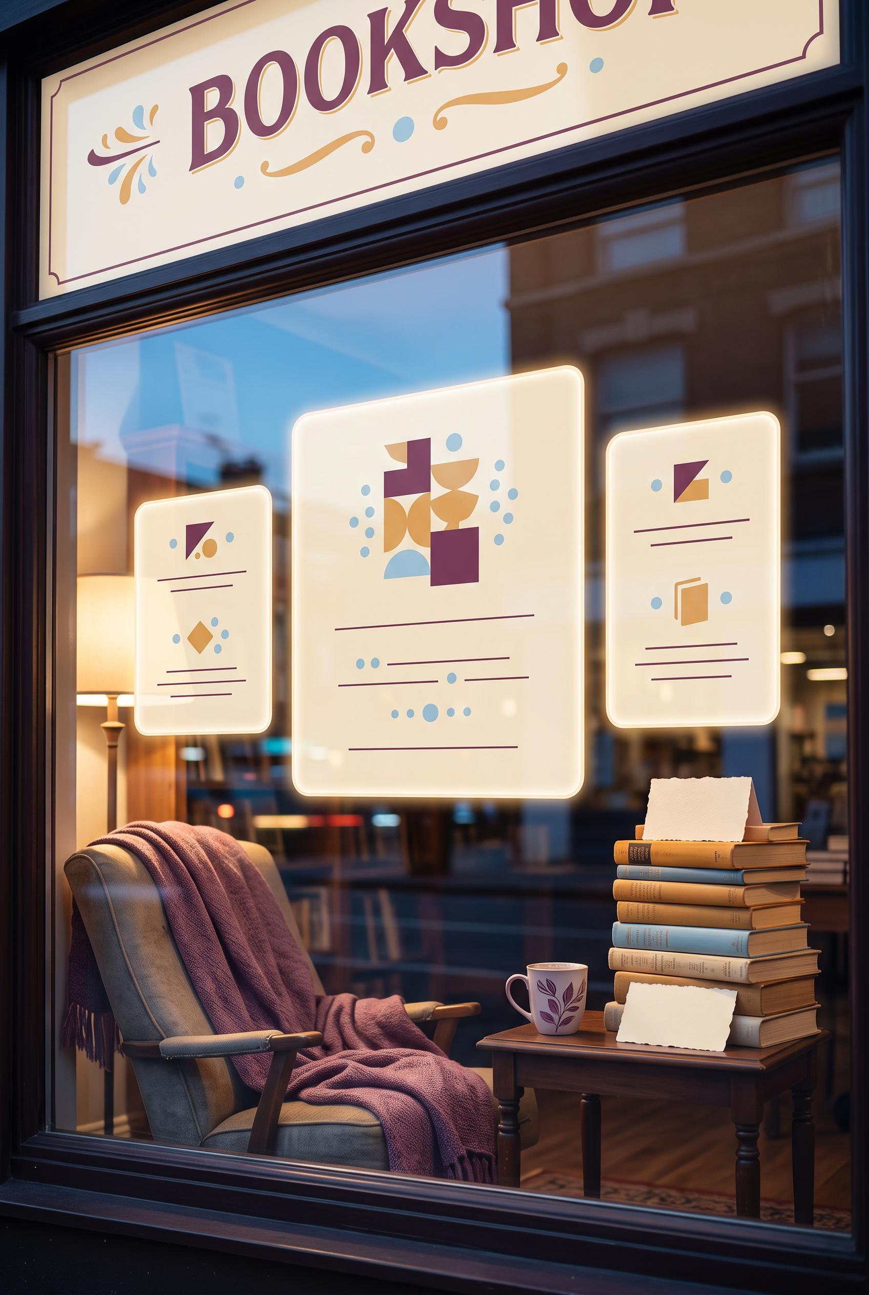
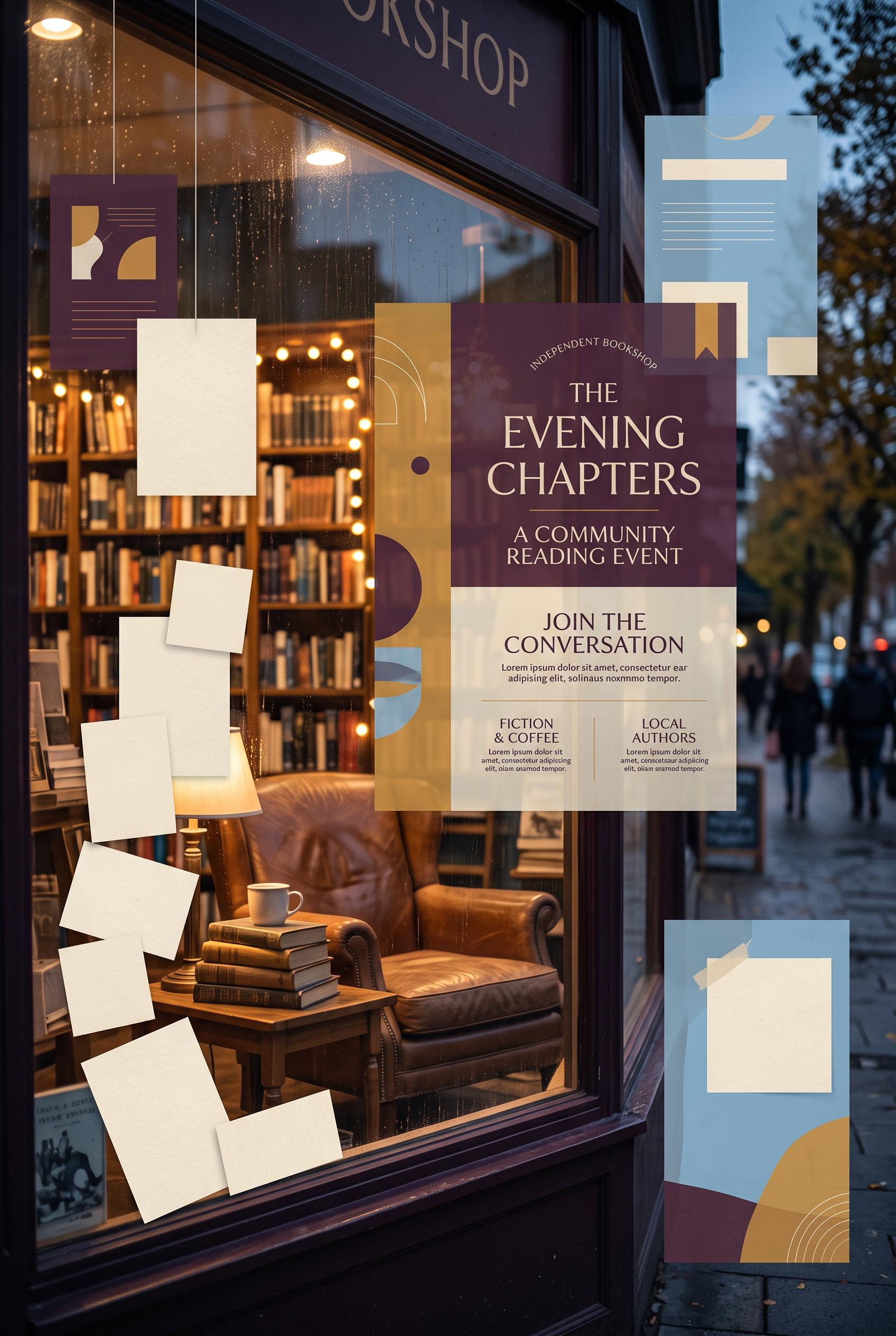
0Create a commercial-quality inspirational showcase for a fictional independent bookshop community reading event in a vertical 2:3 Pinterest composition. Use a cinematic storefront window scene with a reading chair, stacked books, soft evening light, blank event cards, and subtle floating content panels. Use plum, ochre, sky blue, and paper cream. AI-modified downstream. No real brands, no trademarks, no trademarked characters, no watermark, and no unintended readable text. Corrective regeneration attempt 4. Produce a materially revised image, not a near-duplicate of an earlier variant. Preserve the successful subject, palette, lighting, focal hierarchy, and commercial polish from the original brief while correcting every issue below. Mandatory corrective instructions from the most recent visual QA: Preserve the warm cinematic storefront window, chair with plum throw, stacked blank books, coffee cup, reflections, layered depth, vertical 2:3 framing, and plum/ochre/sky-blue/paper-cream palette. Remove every mark from both side floating cards: make them fully blank translucent cream panels with no lines, dots, bars, glyphs, or pseudo-text. Keep the central panel smaller and subtle, containing only a few clearly non-linguistic abstract geometric shapes with no text-like arrangement. Keep the top architectural panels blank, all book covers and spines unmarked, and ensure the entire image contains no letters, words, numbers, logos, watermarks, captions, or readable or text-like marks. Observed defects from prior variants that must not recur: 1) The image contains extensive readable text, including storefront signage, a large event title, headings, and lorem ipsum, contrary to the brief’s requirement for blank/non-readable 2) The large central poster dominates the composition and reads like a finished advertisement rather than subtle content panels. 3) Large storefront sign contains clearly readable “BOOKSHOP” text. 4) Book spines contain small text-like markings, violating the no-readable-text and no-pseudo-text requirement. 5) Central floating panel remains oversized and visually dominant rather than subtle. 6) The side floating cards contain repeated horizontal bars, dots, and vertical strokes that read as pseudo-text/UI copy, violating the requirement for completely blank cards and no04 Render no letters, words, numbers, prices, headings, labels, contact details, logos, glyphs, or pseudo-text anywhere. Use only blank surfaces, clean geometric marks, and non-linguistic placeholder shapes. Do not add explanatory captions, before/after labels, interface copy, or extra objects that the brief did not request. When a corrective instruction conflicts with a decorative detail, prioritize the corrective instruction.
 0
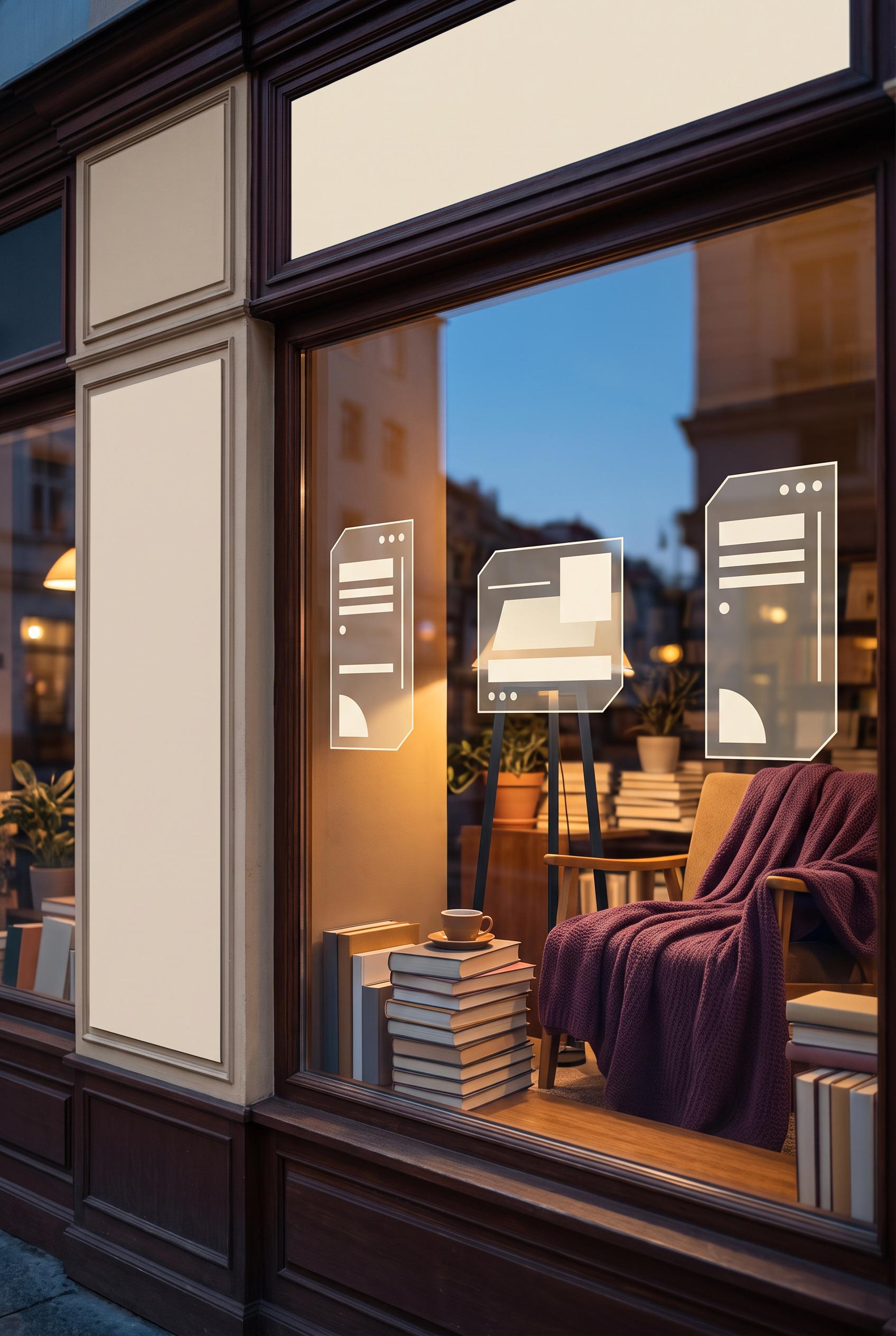
0Create a commercial-quality inspirational showcase for a fictional independent bookshop community reading event in a vertical 2:3 Pinterest composition. Use a cinematic storefront window scene with a reading chair, stacked books, soft evening light, blank event cards, and subtle floating content panels. Use plum, ochre, sky blue, and paper cream. AI-modified downstream. No real brands, no trademarks, no trademarked characters, no watermark, and no unintended readable text. Corrective regeneration attempt 3. Produce a materially revised image, not a near-duplicate of an earlier variant. Preserve the successful subject, palette, lighting, focal hierarchy, and commercial polish from the original brief while correcting every issue below. Mandatory corrective instructions from the most recent visual QA: Preserve the warm cinematic evening storefront, reading chair, plum throw, stacked books, coffee cup, reflections, layered depth, attractive 2:3 vertical composition, and plum/ochre/sky-blue/paper-cream palette. Remove the entire top storefront sign or replace it with a completely blank cream architectural panel containing no letters, words, numbers, logos, glyphs, or pseudo-text. Remove all markings from every book spine and surface; use fully blank covers and spines. Replace the large central floating advertisement with a smaller, translucent abstract panel, using only clean blank cream shapes, dots, lines, and geometric blocks that do not resemble letters or writing. Keep the side cards completely blank as well. Ensure there are no readable or text-like marks anywhere, no brands, trademarks, watermarks, or extra captions. Observed defects from prior variants that must not recur: 1) The image contains extensive readable text, including storefront signage, a large event title, headings, and lorem ipsum, contrary to the brief’s requirement for blank/non-readable 2) The large central poster dominates the composition and reads like a finished advertisement rather than subtle content panels. 3) Large storefront sign contains clearly readable “BOOKSHOP” text. 4) Book spines contain small text-like markings, violating the no-readable-text and no-pseudo-text requirement. 5) Central floating panel remains oversized and visually dominant rather than subtle. Render no letters, words, numbers, prices, headings, labels, contact details, logos, glyphs, or pseudo-text anywhere. Use only blank surfaces, clean geometric marks, and non-linguistic placeholder shapes. Do not add explanatory captions, before/after labels, interface copy, or extra objects that the brief did not request. When a corrective instruction conflicts with a decorative detail, prioritize the corrective instruction.
 0
0Create a commercial-quality inspirational showcase for a fictional independent bookshop community reading event in a vertical 2:3 Pinterest composition. Use a cinematic storefront window scene with a reading chair, stacked books, soft evening light, blank event cards, and subtle floating content panels. Use plum, ochre, sky blue, and paper cream. AI-modified downstream. No real brands, no trademarks, no trademarked characters, no watermark, and no unintended readable text. Corrective regeneration attempt 2. Produce a materially revised image, not a near-duplicate of an earlier variant. Preserve the successful subject, palette, lighting, focal hierarchy, and commercial polish from the original brief while correcting every issue below. Mandatory corrective instructions from the most recent visual QA: Preserve the warm cinematic storefront window, reading chair, stacked books, coffee cup, evening reflections, layered depth, and plum/ochre/sky-blue/paper-cream palette. Remove every instance of readable text: erase the cropped storefront signage, all event-title and poster copy, headings, labels, and lorem ipsum. Replace the large central advertisement with a smaller, translucent abstract content panel using only blank cream shapes, lines, dots, and geometric blocks that suggest host, guest, date, and take-home details without forming letters or words. Keep the handwritten-style cards completely blank. Ensure no logos, brands, watermarks, or pseudo-text glyphs remain. Observed defects from prior variants that must not recur: 1) The image contains extensive readable text, including storefront signage, a large event title, headings, and lorem ipsum, contrary to the brief’s requirement for blank/non-readable 2) The large central poster dominates the composition and reads like a finished advertisement rather than subtle content panels. Render no letters, words, numbers, prices, headings, labels, contact details, logos, glyphs, or pseudo-text anywhere. Use only blank surfaces, clean geometric marks, and non-linguistic placeholder shapes. Do not add explanatory captions, before/after labels, interface copy, or extra objects that the brief did not request. When a corrective instruction conflicts with a decorative detail, prioritize the corrective instruction.
 0
0Create a commercial-quality inspirational showcase for a fictional independent bookshop community reading event in a vertical 2:3 Pinterest composition. Use a cinematic storefront window scene with a reading chair, stacked books, soft evening light, blank event cards, and subtle floating content panels. Use plum, ochre, sky blue, and paper cream. AI-modified downstream. No real brands, no trademarks, no trademarked characters, no watermark, and no unintended readable text.
 0
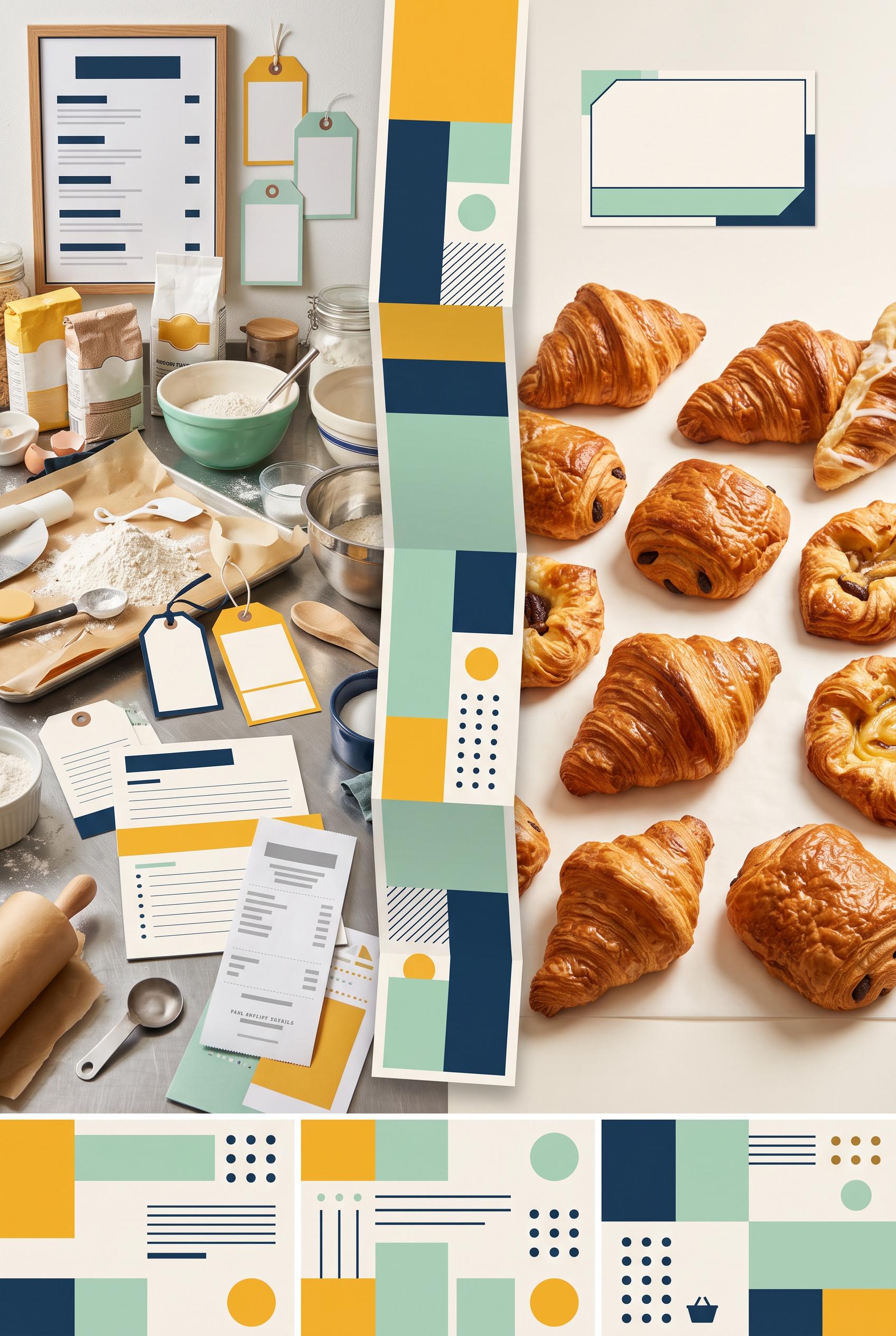
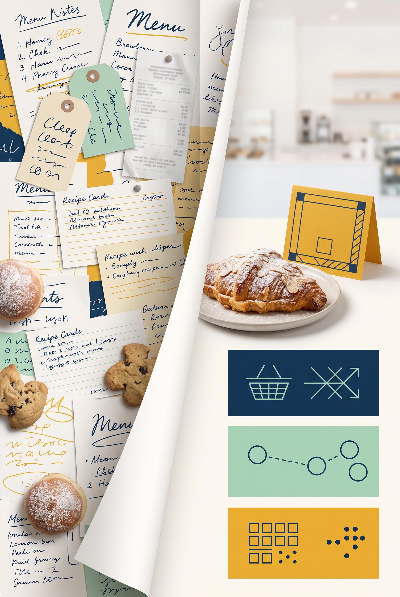
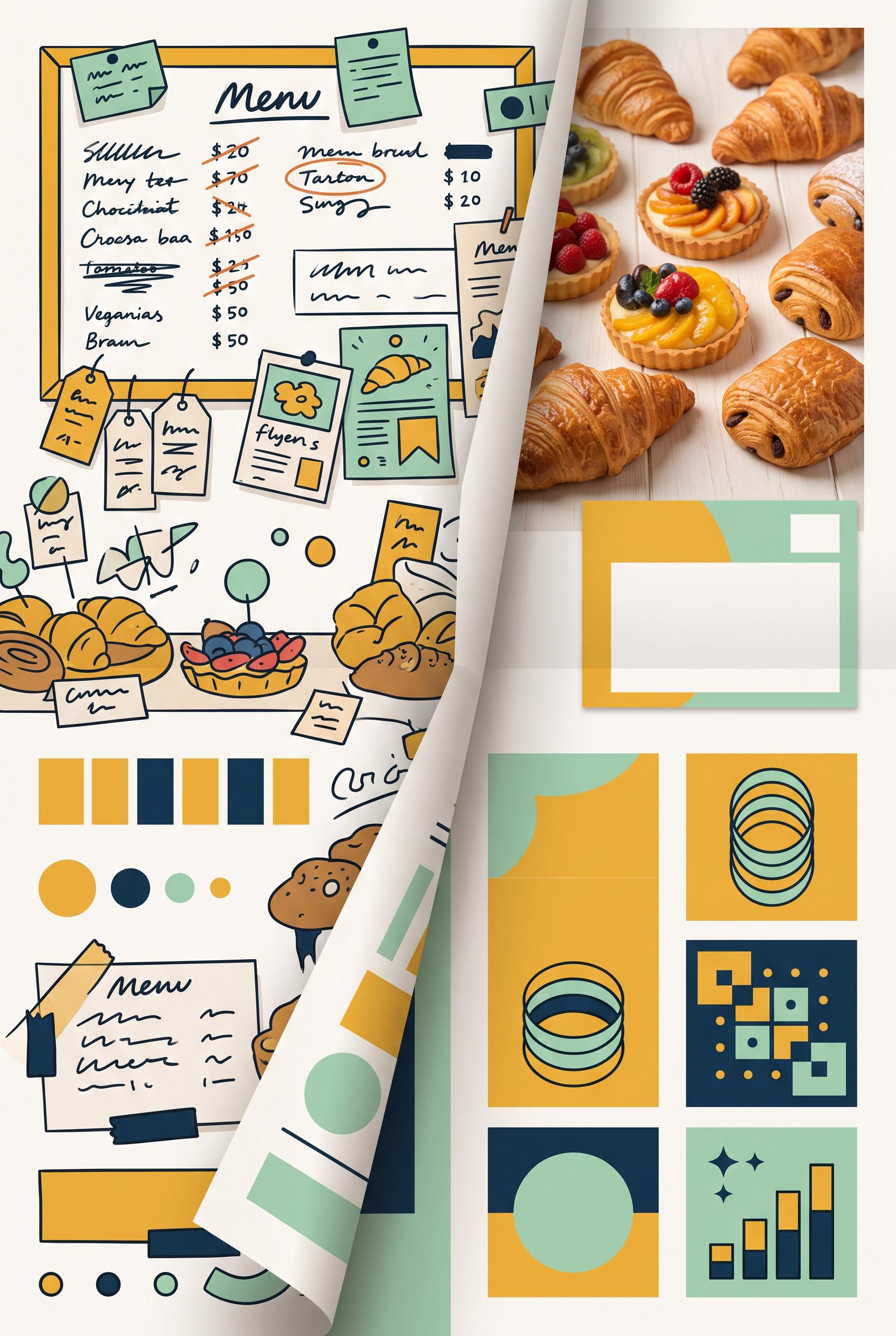
0Create a commercial-quality Pinterest marketing visual in a vertical 2:3 composition showing a before-and-after transformation for a fictional neighborhood bakery preorder campaign. Use a folded paper reveal, left side visually cluttered and right side clean and focused, with pastry photography, a simple pickup card, and three abstract information blocks. Use saffron yellow, deep ink blue, mint green, and warm white. AI-modified downstream. No real brands, no trademarks, no trademarked characters, no watermark, and no unintended readable text. Corrective regeneration attempt 5. Produce a materially revised image, not a near-duplicate of an earlier variant. Preserve the successful subject, palette, lighting, focal hierarchy, and commercial polish from the original brief while correcting every issue below. Mandatory corrective instructions from the most recent visual QA: Preserve the attractive vertical 2:3 composition, folded-paper reveal, saffron yellow/deep ink blue/mint/warm-white palette, cluttered left panel, focused right pastry hero, pickup-card silhouette, and three lower detail insets. Remove every readable word, letter, number, price, headline, menu label, product tag, receipt detail, logo, glyph, icon, pictogram, pseudo-handwritten mark, and interface symbol from the entire image. Replace all writing and receipt areas with blank paper, solid geometric bars, dots, circles, clean rectangles, and indistinct non-linguistic texture only. Make the pickup card a blank geometric card with no symbols. Replace the lower inset graphics with abstract arrangements of plain blocks, lines, dots, and circles that do not resemble letters, numbers, arrows, shopping baskets, or interfaces. Ensure no character-like marks remain anywhere, including tags, menu boards, recipe cards, pastry papers, folded strip, receipt, and bottom panels. Observed defects from prior variants that must not recur: 1) The bottom call-to-action contains readable letterforms, violating the requirement for no text or glyphs. 2) Lower inset graphics include pseudo-writing and recognizable interface symbols rather than purely abstract non-linguistic shapes. 3) Many clearly readable words, numbers, prices, and menu labels remain throughout the left panel and lower cards. 4) Pseudo-handwriting and letter-like marks appear on tags, cards, inset graphics, and the folded-paper strip, violating the no-text requirement. 5) The composition and bakery photography are attractive, but the mandatory abstraction of all labels and glyphs was not achieved. 6) Numerous clearly readable words, numbers, prices, and handwritten labels appear across the left menu papers, tags, recipe cards, receipt, and folded surfaces. 7) The right-side detail panels contain recognizable interface-like glyphs and pictograms, contrary to the requirement for purely abstract non-linguistic shapes. 8) The image does preserve an attractive vertical composition, folded-paper reveal, bakery pastry focal point, and requested palette, but it fails the strict no-text/no-glyph standard Render no letters, words, numbers, prices, headings, labels, contact details, logos, glyphs, or pseudo-text anywhere. Use only blank surfaces, clean geometric marks, and non-linguistic placeholder shapes. Do not add explanatory captions, before/after labels, interface copy, or extra objects that the brief did not request. When a corrective instruction conflicts with a decorative detail, prioritize the corrective instruction.
 0
0Create a commercial-quality Pinterest marketing visual in a vertical 2:3 composition showing a before-and-after transformation for a fictional neighborhood bakery preorder campaign. Use a folded paper reveal, left side visually cluttered and right side clean and focused, with pastry photography, a simple pickup card, and three abstract information blocks. Use saffron yellow, deep ink blue, mint green, and warm white. AI-modified downstream. No real brands, no trademarks, no trademarked characters, no watermark, and no unintended readable text. Corrective regeneration attempt 4. Produce a materially revised image, not a near-duplicate of an earlier variant. Preserve the successful subject, palette, lighting, focal hierarchy, and commercial polish from the original brief while correcting every issue below. Mandatory corrective instructions from the most recent visual QA: Preserve the strong vertical 2:3 composition, folded-paper reveal, bakery pastry photography, saffron yellow/deep ink blue/mint/warm-white palette, cluttered left side, focused right pastry hero, pickup-card shape, and three lower detail insets. Completely remove every word, letter, number, price, headline, menu label, product tag, CTA, logo, glyph, and pseudo-handwritten mark from the entire image. Replace all writing areas with blank paper, solid geometric bars, dots, circles, clean blocks, or indistinct non-linguistic texture only. Ensure no character-like symbols remain anywhere, including the left menu board, hanging tags, pastry cards, folded strip, pickup card, and all lower insets. Keep the before/after hierarchy clear through layout, contrast, color, and paper folds only, with no captions or explanatory text. Observed defects from prior variants that must not recur: 1) Numerous labels are clearly readable despite the brief requiring all labels to be abstract or unreadable, including the headline, BEFORE/AFTER, PICKUP CARD, ORDER NOW, and menu-not 2) The lower detail insets also contain readable ordering text and symbols that should be abstracted. 3) Numerous clearly readable words, numbers, prices, and labels appear throughout the menu board, product cards, pastry tags, and lower insets. 4) The bottom call-to-action contains readable letterforms, violating the requirement for no text or glyphs. 5) Lower inset graphics include pseudo-writing and recognizable interface symbols rather than purely abstract non-linguistic shapes. 6) Many clearly readable words, numbers, prices, and menu labels remain throughout the left panel and lower cards. 7) Pseudo-handwriting and letter-like marks appear on tags, cards, inset graphics, and the folded-paper strip, violating the no-text requirement. 8) The composition and bakery photography are attractive, but the mandatory abstraction of all labels and glyphs was not achieved. Render no letters, words, numbers, prices, headings, labels, contact details, logos, glyphs, or pseudo-text anywhere. Use only blank surfaces, clean geometric marks, and non-linguistic placeholder shapes. Do not add explanatory captions, before/after labels, interface copy, or extra objects that the brief did not request. When a corrective instruction conflicts with a decorative detail, prioritize the corrective instruction.
 0
0Create a commercial-quality Pinterest marketing visual in a vertical 2:3 composition showing a before-and-after transformation for a fictional neighborhood bakery preorder campaign. Use a folded paper reveal, left side visually cluttered and right side clean and focused, with pastry photography, a simple pickup card, and three abstract information blocks. Use saffron yellow, deep ink blue, mint green, and warm white. AI-modified downstream. No real brands, no trademarks, no trademarked characters, no watermark, and no unintended readable text. Corrective regeneration attempt 3. Produce a materially revised image, not a near-duplicate of an earlier variant. Preserve the successful subject, palette, lighting, focal hierarchy, and commercial polish from the original brief while correcting every issue below. Mandatory corrective instructions from the most recent visual QA: Preserve the attractive vertical 2:3 composition, bakery photography, saffron yellow/deep ink blue/mint/warm-white palette, folded-paper split, cluttered left side, focused right pastry hero, pickup-card shape, and three lower detail insets. Remove every readable or letter-like mark: erase all menu-board writing, product tags, prices, headline text, call-to-action text, and inset scribbles. Replace them with blank surfaces, solid geometric bars, dots, circles, simple non-linguistic abstract shapes, or indistinct texture only. Remove recognizable letters, numbers, words, pseudo-handwriting, logos, watermark, and brand-like marks everywhere. Keep the before/after hierarchy clear through layout, contrast, and color without labels or captions. Do not add any explanatory text or extra objects. Observed defects from prior variants that must not recur: 1) Strong vertical composition, clear before/after focal point, tactile folded-paper reveal, and appealing bakery imagery. 2) Numerous labels are clearly readable despite the brief requiring all labels to be abstract or unreadable, including the headline, BEFORE/AFTER, PICKUP CARD, ORDER NOW, and menu-not 3) The lower detail insets also contain readable ordering text and symbols that should be abstracted. 4) Numerous clearly readable words, numbers, prices, and labels appear throughout the menu board, product cards, pastry tags, and lower insets. 5) The bottom call-to-action contains readable letterforms, violating the requirement for no text or glyphs. 6) Lower inset graphics include pseudo-writing and recognizable interface symbols rather than purely abstract non-linguistic shapes. Render no letters, words, numbers, prices, headings, labels, contact details, logos, glyphs, or pseudo-text anywhere. Use only blank surfaces, clean geometric marks, and non-linguistic placeholder shapes. Do not add explanatory captions, before/after labels, interface copy, or extra objects that the brief did not request. When a corrective instruction conflicts with a decorative detail, prioritize the corrective instruction.
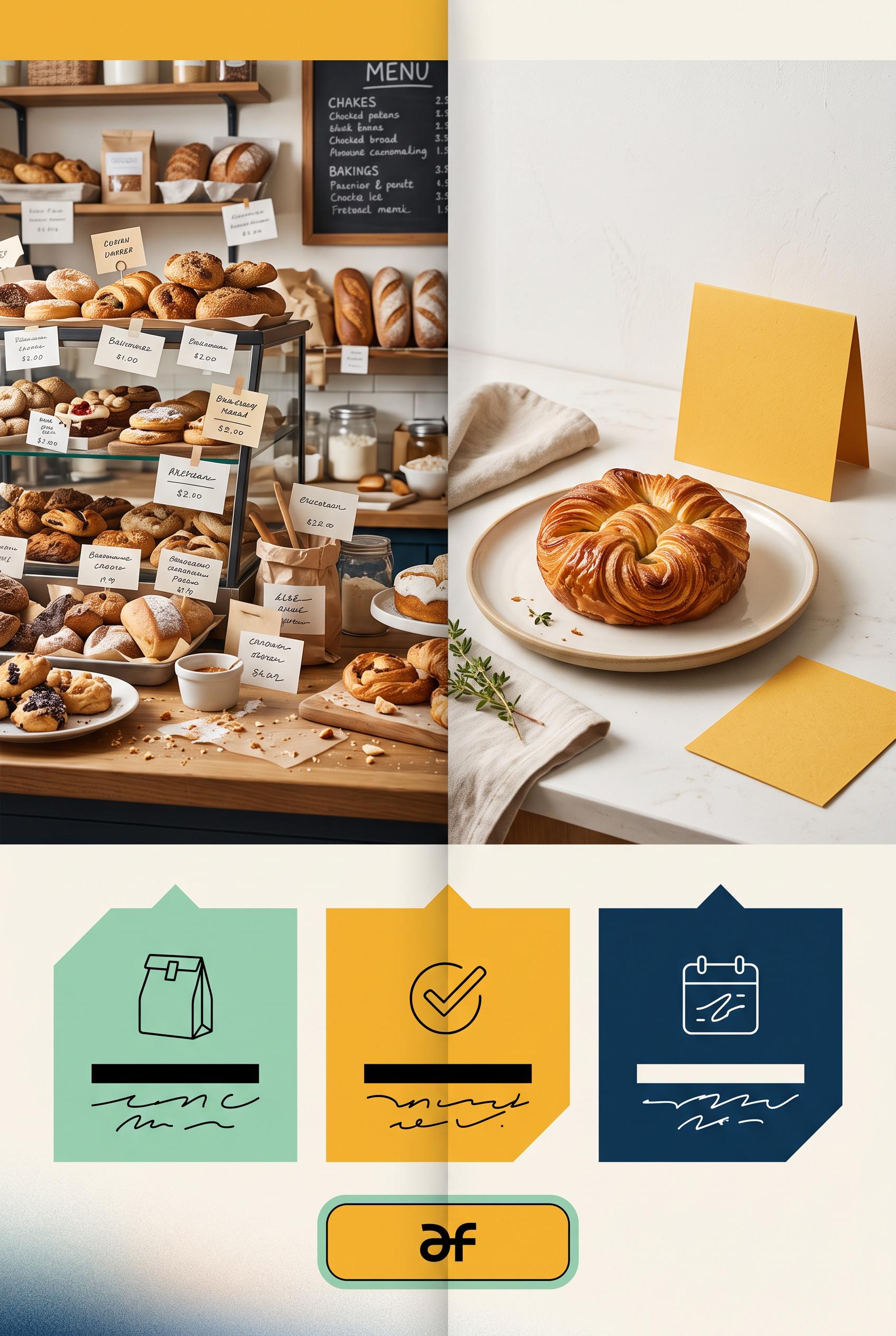 0
0Create a commercial-quality Pinterest marketing visual in a vertical 2:3 composition showing a before-and-after transformation for a fictional neighborhood bakery preorder campaign. Use a folded paper reveal, left side visually cluttered and right side clean and focused, with pastry photography, a simple pickup card, and three abstract information blocks. Use saffron yellow, deep ink blue, mint green, and warm white. AI-modified downstream. No real brands, no trademarks, no trademarked characters, no watermark, and no unintended readable text. Corrective regeneration attempt 2. Produce a materially revised image, not a near-duplicate of an earlier variant. Preserve the successful subject, palette, lighting, focal hierarchy, and commercial polish from the original brief while correcting every issue below. Mandatory corrective instructions from the most recent visual QA: Preserve the attractive vertical 2:3 layout, saffron yellow/deep ink blue/mint/warm-white palette, folded-paper reveal, cluttered left bakery scene, focused right pastry hero, pickup card, and three detail insets. Remove all readable text everywhere: replace the headline, BEFORE/AFTER labels, menu writing, pickup-card wording, order callout, and inset lettering with indistinct abstract scribbles, blank blocks, tiny unreadable marks, or purely symbolic shapes. Ensure no legible letters, words, numbers, logos, watermark, or brand-like marks remain while keeping the before/after hierarchy visually clear through composition and color. Observed defects from prior variants that must not recur: 1) Strong vertical composition, clear before/after focal point, tactile folded-paper reveal, and appealing bakery imagery. 2) Numerous labels are clearly readable despite the brief requiring all labels to be abstract or unreadable, including the headline, BEFORE/AFTER, PICKUP CARD, ORDER NOW, and menu-not 3) The lower detail insets also contain readable ordering text and symbols that should be abstracted. Render no letters, words, numbers, prices, headings, labels, contact details, logos, glyphs, or pseudo-text anywhere. Use only blank surfaces, clean geometric marks, and non-linguistic placeholder shapes. Do not add explanatory captions, before/after labels, interface copy, or extra objects that the brief did not request. When a corrective instruction conflicts with a decorative detail, prioritize the corrective instruction.
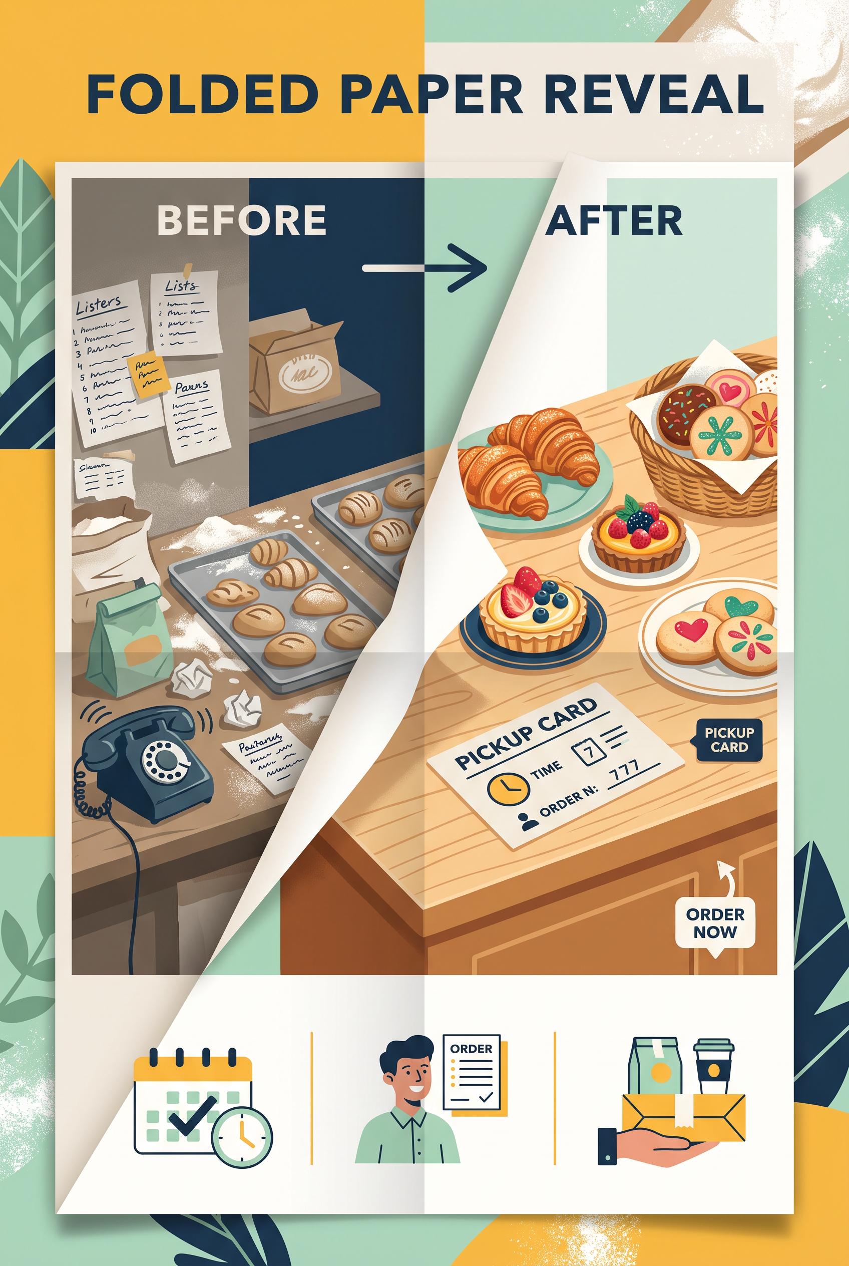 0
0Create a commercial-quality Pinterest marketing visual in a vertical 2:3 composition showing a before-and-after transformation for a fictional neighborhood bakery preorder campaign. Use a folded paper reveal, left side visually cluttered and right side clean and focused, with pastry photography, a simple pickup card, and three abstract information blocks. Use saffron yellow, deep ink blue, mint green, and warm white. AI-modified downstream. No real brands, no trademarks, no trademarked characters, no watermark, and no unintended readable text.
 0
0Create a commercial-quality vertical 2:3 Pinterest composition showing an educational seven-day creator launch campaign as a stylized postal route map. Include seven abstract destination markers, varied content-card silhouettes, arrows, crop windows, and one repeated geometric signal connecting the sequence. Use acid chartreuse, rich plum, sandy beige, graphite, and soft white. Make it visually useful and editorial, with clear grouping but no readable labels. No real brands, no trademarked characters, no watermark, no unintended readable text. Corrective regeneration attempt 5. Produce a materially revised image, not a near-duplicate of an earlier variant. Preserve the successful subject, palette, lighting, focal hierarchy, and commercial polish from the original brief while correcting every issue below. Mandatory corrective instructions from the most recent visual QA: Create a polished vertical 2:3 postal-route campaign map in the existing acid chartreuse, rich plum, sandy beige, graphite, and soft-white palette. Keep the arrows, crop windows, varied blank card silhouettes, abstract circular decoration, and editorial hierarchy. Remove exactly one destination pin so there are exactly seven clearly separated route stops. Make all seven plum pins perfectly identical in shape, scale treatment, blank interior, and internal dot arrangement. Remove every horizontal text-like bar, interface element, envelope scribble, grid, letter-like mark, and pseudo-text shape; replace them with completely blank card and envelope surfaces plus only simple non-linguistic circles, dots, and geometric shapes. Preserve clear route flow while adding more breathing room and reducing visual density. Include no letters, numbers, words, logos, glyphs, watermarks, or readable or pseudo-readable marks anywhere. Observed defects from prior variants that must not recur: 1) The repeated destination symbol varies with different inner icons, weakening consistency. 2) Attractive vertical composition and cohesive palette, but only six visible destination markers instead of exactly seven. 3) Repeated destination symbols have varying internal dot patterns and divisions rather than being identical. 4) A readable compass letter “N” is visible. 5) Some card and envelope interiors resemble pseudo-text or interface/table content, conflicting with the no-readable-text requirement. 6) Eight destination pins are visible instead of exactly seven. 7) Several cards contain pseudo-text-like horizontal bars and interface-style elements, violating the no pseudo-text requirement. 8) The composition remains visually dense, reducing clarity of the seven-stop route. Render no letters, words, numbers, prices, headings, labels, contact details, logos, glyphs, or pseudo-text anywhere. Use only blank surfaces, clean geometric marks, and non-linguistic placeholder shapes. Do not add explanatory captions, before/after labels, interface copy, or extra objects that the brief did not request. When a corrective instruction conflicts with a decorative detail, prioritize the corrective instruction.
 0
0Create a commercial-quality vertical 2:3 Pinterest composition showing an educational seven-day creator launch campaign as a stylized postal route map. Include seven abstract destination markers, varied content-card silhouettes, arrows, crop windows, and one repeated geometric signal connecting the sequence. Use acid chartreuse, rich plum, sandy beige, graphite, and soft white. Make it visually useful and editorial, with clear grouping but no readable labels. No real brands, no trademarked characters, no watermark, no unintended readable text. Corrective regeneration attempt 4. Produce a materially revised image, not a near-duplicate of an earlier variant. Preserve the successful subject, palette, lighting, focal hierarchy, and commercial polish from the original brief while correcting every issue below. Mandatory corrective instructions from the most recent visual QA: Preserve the polished vertical 2:3 postal-route map, acid chartreuse/plum/beige/graphite/soft-white palette, clear arrows, crop windows, varied blank card silhouettes, and strong editorial hierarchy. Add exactly one clearly separated seventh route stop. Make all seven destination markers perfectly identical: the same plum geometric map-pin shape with the same blank interior and identical abstract dot arrangement, with no varying pictograms. Remove the compass entirely or replace it with a purely abstract circular geometric decoration without any letters. Remove all envelope scribbles, table grids, pseudo-text lines, interface-like bars, and letter-like marks; replace them with blank surfaces and simple non-linguistic circles, dots, bars, and geometric shapes. Ensure no letters, numbers, words, logos, glyphs, watermarks, or pseudo-text appear anywhere. Observed defects from prior variants that must not recur: 1) The composition is visually dense, weakening the clarity of the seven-stop sequence. 2) Envelope inserts contain obvious pseudo-handwriting/readable text-like scribbles. 3) Compass decorations include the readable letter “N,” violating the no-text requirement. 4) The repeated destination symbol varies with different inner icons, weakening consistency. 5) Attractive vertical composition and cohesive palette, but only six visible destination markers instead of exactly seven. 6) Repeated destination symbols have varying internal dot patterns and divisions rather than being identical. 7) A readable compass letter “N” is visible. 8) Some card and envelope interiors resemble pseudo-text or interface/table content, conflicting with the no-readable-text requirement. Render no letters, words, numbers, prices, headings, labels, contact details, logos, glyphs, or pseudo-text anywhere. Use only blank surfaces, clean geometric marks, and non-linguistic placeholder shapes. Do not add explanatory captions, before/after labels, interface copy, or extra objects that the brief did not request. When a corrective instruction conflicts with a decorative detail, prioritize the corrective instruction.
 0
0Create a commercial-quality vertical 2:3 Pinterest composition showing an educational seven-day creator launch campaign as a stylized postal route map. Include seven abstract destination markers, varied content-card silhouettes, arrows, crop windows, and one repeated geometric signal connecting the sequence. Use acid chartreuse, rich plum, sandy beige, graphite, and soft white. Make it visually useful and editorial, with clear grouping but no readable labels. No real brands, no trademarked characters, no watermark, no unintended readable text. Corrective regeneration attempt 3. Produce a materially revised image, not a near-duplicate of an earlier variant. Preserve the successful subject, palette, lighting, focal hierarchy, and commercial polish from the original brief while correcting every issue below. Mandatory corrective instructions from the most recent visual QA: Preserve the attractive vertical 2:3 postal-route map, cohesive acid chartreuse/plum/beige/graphite/soft-white palette, clean editorial polish, arrows, crop windows, varied card treatments, and exactly seven separated route stops. Remove every envelope scribble and all compass letters or other letter-like marks; replace them with blank surfaces and purely abstract dots, bars, circles, and geometric shapes. Make the repeated destination symbol identical at all seven stops, with no varying inner pictograms. Keep the route visually clear and uncluttered, with no letters, numbers, pseudo-text, logos, brands, watermarks, or interface-like symbols anywhere. Observed defects from prior variants that must not recur: 1) Strong vertical editorial composition and cohesive palette, but it contains readable text-like elements, including “LIVE,” “@,” and numbered markers. 2) The route numbering is inconsistent: 06 is missing and 07 appears twice. 3) The composition is visually dense, weakening the clarity of the seven-stop sequence. 4) Envelope inserts contain obvious pseudo-handwriting/readable text-like scribbles. 5) Compass decorations include the readable letter “N,” violating the no-text requirement. 6) The repeated destination symbol varies with different inner icons, weakening consistency. Render no letters, words, numbers, prices, headings, labels, contact details, logos, glyphs, or pseudo-text anywhere. Use only blank surfaces, clean geometric marks, and non-linguistic placeholder shapes. Do not add explanatory captions, before/after labels, interface copy, or extra objects that the brief did not request. When a corrective instruction conflicts with a decorative detail, prioritize the corrective instruction.
 0
0Create a commercial-quality vertical 2:3 Pinterest composition showing an educational seven-day creator launch campaign as a stylized postal route map. Include seven abstract destination markers, varied content-card silhouettes, arrows, crop windows, and one repeated geometric signal connecting the sequence. Use acid chartreuse, rich plum, sandy beige, graphite, and soft white. Make it visually useful and editorial, with clear grouping but no readable labels. No real brands, no trademarked characters, no watermark, no unintended readable text. Corrective regeneration attempt 2. Produce a materially revised image, not a near-duplicate of an earlier variant. Preserve the successful subject, palette, lighting, focal hierarchy, and commercial polish from the original brief while correcting every issue below. Mandatory corrective instructions from the most recent visual QA: Preserve the vertical 2:3 format, editorial postal-route-map style, acid chartreuse/plum/beige/graphite/soft-white palette, repeated geometric signal, arrows, varied content-card silhouettes, and crop-window motifs. Remove all readable text and symbols that resemble text, including “LIVE,” “@,” interface-like controls, and every numeric marker. Replace them with purely abstract graphic bars, dots, icons, and geometric marks. Show exactly seven clearly separated route stops, each with one consistent repeated geometric destination symbol and a distinct crop/content-card treatment; ensure the sequence is visually unambiguous without labels. Reduce overlapping cards and decorative clutter so the route path and seven stops read clearly. Keep all shapes clean, intentional, and free of artifacts, brands, watermarks, or pseudo-lettering. Observed defects from prior variants that must not recur: 1) Strong vertical editorial composition and cohesive palette, but it contains readable text-like elements, including “LIVE,” “@,” and numbered markers. 2) The route numbering is inconsistent: 06 is missing and 07 appears twice. 3) The composition is visually dense, weakening the clarity of the seven-stop sequence. Render no letters, words, numbers, prices, headings, labels, contact details, logos, glyphs, or pseudo-text anywhere. Use only blank surfaces, clean geometric marks, and non-linguistic placeholder shapes. Do not add explanatory captions, before/after labels, interface copy, or extra objects that the brief did not request. When a corrective instruction conflicts with a decorative detail, prioritize the corrective instruction.
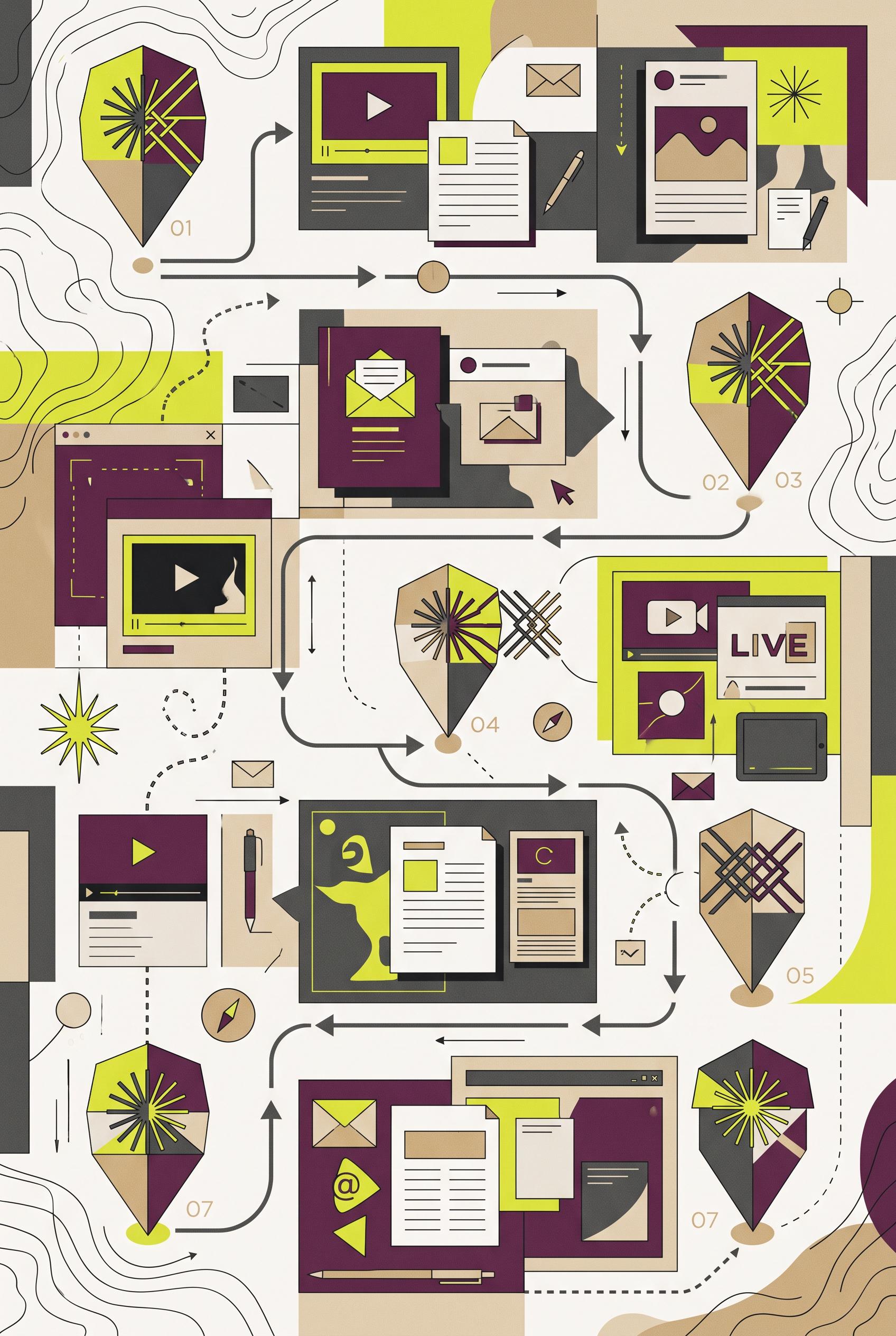 0
0Create a commercial-quality vertical 2:3 Pinterest composition showing an educational seven-day creator launch campaign as a stylized postal route map. Include seven abstract destination markers, varied content-card silhouettes, arrows, crop windows, and one repeated geometric signal connecting the sequence. Use acid chartreuse, rich plum, sandy beige, graphite, and soft white. Make it visually useful and editorial, with clear grouping but no readable labels. No real brands, no trademarked characters, no watermark, no unintended readable text.
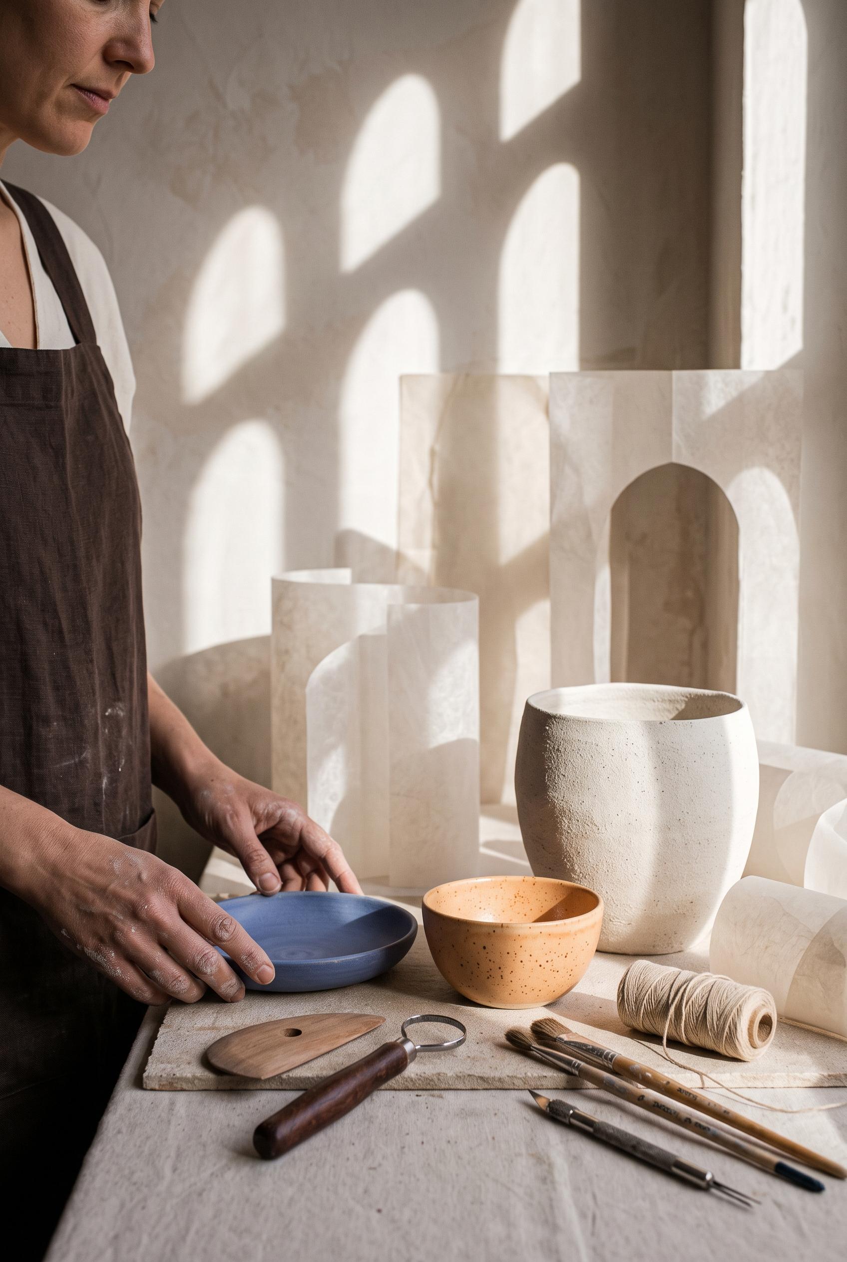 0
0Create a commercial-quality vertical 2:3 Pinterest composition for an inspirational personal brand showcase of a fictional ceramic educator. Feature a sculptural still life with handmade pottery, clay tools, linen, a partial human portrait, translucent paper forms, and a repeated arch-shaped sunlight shadow. Use apricot, ultramarine, chalk white, espresso brown, and muted skin tones. Sophisticated editorial photography, tactile textures, art-directed styling. No real brands, no trademarked characters, no watermark, no unintended readable text.
 0
0Create a commercial-quality vertical 2:3 Pinterest composition showing a fictional video essay cover transformation, with a crowded abstract before panel on the left and a focused expressive portrait cover on the right. Use cantaloupe orange, deep ink blue, pale blue, and warm cream. Use a radial crop reveal, crisp editorial lighting, polished graphic design, and clear visual hierarchy. No real brands, no trademarked characters, no watermark, no unintended readable text. Corrective regeneration attempt 2. Produce a materially revised image, not a near-duplicate of an earlier variant. Preserve the successful subject, palette, lighting, focal hierarchy, and commercial polish from the original brief while correcting every issue below. Mandatory corrective instructions from the most recent visual QA: Preserve the polished vertical 2:3 layout, orange/ink-blue/pale-blue/warm-cream palette, expressive portrait, and crowded abstract before panel. Redesign the after panel so the portrait is a close facial crop contained within one unmistakable strong circular framing device or radial crop reveal. Remove most decorative interface icons, playback controls, and secondary background shapes from the after side to create generous clean negative space around the circle and portrait. Keep the visual hierarchy crisp and commercial, with no real brands, trademarks, watermark, artifacts, or unintended garbled text. Observed defects from prior variants that must not recur: 1) The composition is polished and clearly communicates before/after, but the after panel does not use the requested strong circular framing device. 2) The after side is visually crowded with interface motifs and large headline text, leaving insufficient generous negative space. 3) The portrait is a standard rectangular crop rather than a focused circular/radial reveal. Render no letters, words, numbers, prices, headings, labels, contact details, logos, glyphs, or pseudo-text anywhere. Use only blank surfaces, clean geometric marks, and non-linguistic placeholder shapes. Do not add explanatory captions, before/after labels, interface copy, or extra objects that the brief did not request. When a corrective instruction conflicts with a decorative detail, prioritize the corrective instruction.
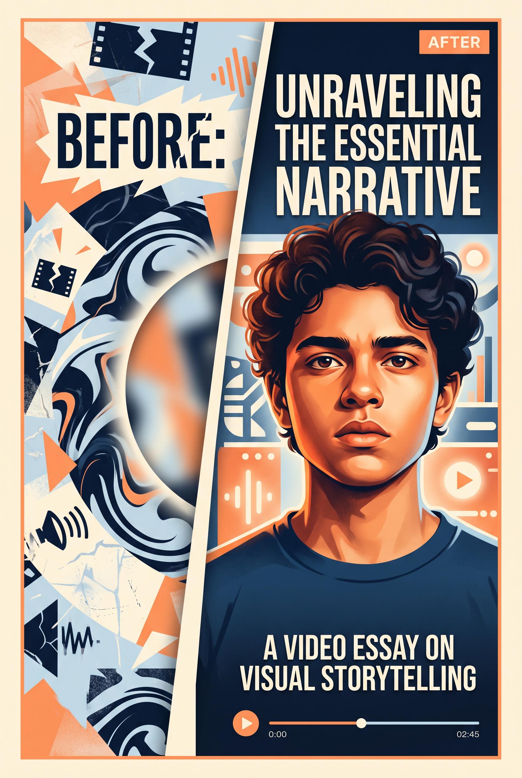 0
0Create a commercial-quality vertical 2:3 Pinterest composition showing a fictional video essay cover transformation, with a crowded abstract before panel on the left and a focused expressive portrait cover on the right. Use cantaloupe orange, deep ink blue, pale blue, and warm cream. Use a radial crop reveal, crisp editorial lighting, polished graphic design, and clear visual hierarchy. No real brands, no trademarked characters, no watermark, no unintended readable text.
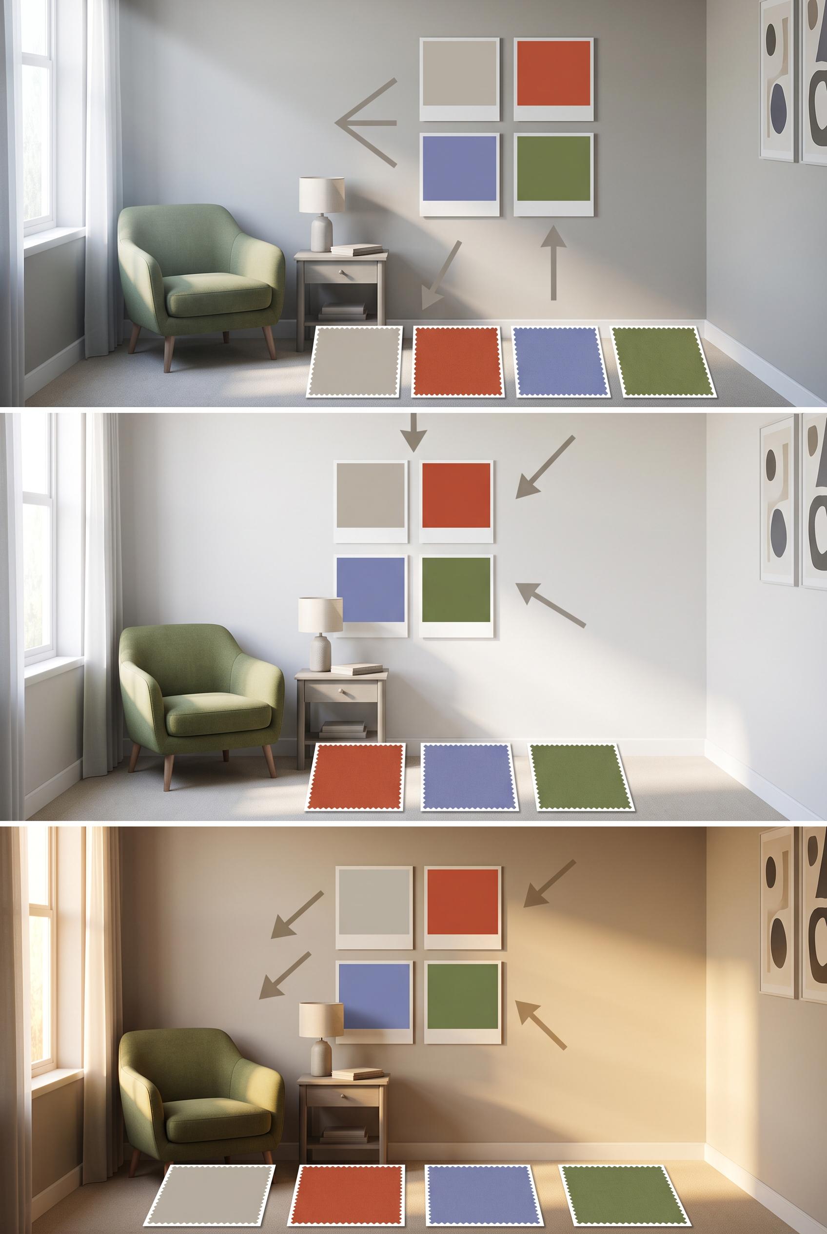 0
0Create a commercial-quality educational interior styling graphic in a vertical 2:3 Pinterest composition with three vertically stacked panels showing the same compact room in morning, midday, and evening light. Include blank color sample cards, fabric squares, a small chair, and a side table, with visual arrows made from simple shapes but no readable text. Palette of stone, paprika, periwinkle, and moss. AI-modified downstream. No real brands, no trademarked characters, no watermark, and no unintended readable text. Corrective regeneration attempt 5. Produce a materially revised image, not a near-duplicate of an earlier variant. Preserve the successful subject, palette, lighting, focal hierarchy, and commercial polish from the original brief while correcting every issue below. Mandatory corrective instructions from the most recent visual QA: Preserve the polished vertical 2:3 three-panel room composition, consistent camera position, chair, side table, window, abstract wall art, arrows, palette, and distinct morning/midday/evening lighting. Use exactly the same number, size, shape, spacing, and arrangement of removable sample cards and fabric swatches in all three panels; replicate one four-card wall grid and one four-swatch floor row identically in each panel. Make every card and swatch completely plain, solid, unmarked, texture-free, and single-color in stone, paprika, periwinkle, or moss, with no gradients, divided tones, patterns, stitching, glyphs, letters, numbers, labels, or pseudo-text. Keep all wall art non-linguistic. Do not add any text, logos, watermark, captions, or extra objects. Observed defects from prior variants that must not recur: 1) Attractive vertical three-panel composition with clear consistent room and lighting progression. 2) No readable text, logos, watermark, or obvious generation artifacts are visible. 3) Fabric swatches contain visible geometric patterns and textures, violating the requirement that all swatches be completely blank. 4) The removable sample-card arrangement is inconsistent across panels, with differing card counts and layouts. 5) Attractive vertical three-panel composition with clear lighting progression and no readable text, logos, watermark, or obvious artifacts. 6) The removable sample-card arrangement is inconsistent: the top panel has six wall cards while the middle and bottom have four. 7) Floor swatches are not fully uniform blank samples; several appear divided into two tones or contain shading/texture. 8) The exact same number, size, and arrangement of every card and swatch is not maintained across all panels. Render no letters, words, numbers, prices, headings, labels, contact details, logos, glyphs, or pseudo-text anywhere. Use only blank surfaces, clean geometric marks, and non-linguistic placeholder shapes. Do not add explanatory captions, before/after labels, interface copy, or extra objects that the brief did not request. When a corrective instruction conflicts with a decorative detail, prioritize the corrective instruction.
Informazioni sulla Nostra Galleria Immagini IA
La nostra Galleria Immagini IA mostra migliaia di immagini condivise generate con IA create dalla nostra comunità. Ogni immagine è unica, di alta qualità e rappresenta le possibilità creative della generazione artistica con IA. Sfoglia vari stili, soggetti e temi per ispirarti per il tuo prossimo progetto creativo.
Perché Esplorare la Nostra Galleria?
- Scopri migliaia di immagini uniche generate con IA in vari stili e temi
- Ispirati con prompt creativi e stili artistici
- Visualizza immagini condivise dalla nostra comunità creativa
- Fai clic su qualsiasi immagine per visualizzare la sua pagina di condivisione e ottenere maggiori dettagli
Come Usare la Galleria
Usare la nostra galleria è semplice e intuitivo:
- Sfoglia la griglia di immagini condivise
- Fai clic su qualsiasi immagine che attira la tua attenzione
- Visualizza i dettagli completi dell'immagine e il link di condivisione sulla pagina dedicata alla condivisione
Pronto a Creare le Tue Immagini IA?
Unisciti a migliaia di creatori che usano AI Media Studio per generare immagini straordinarie. Inizia a creare oggi!