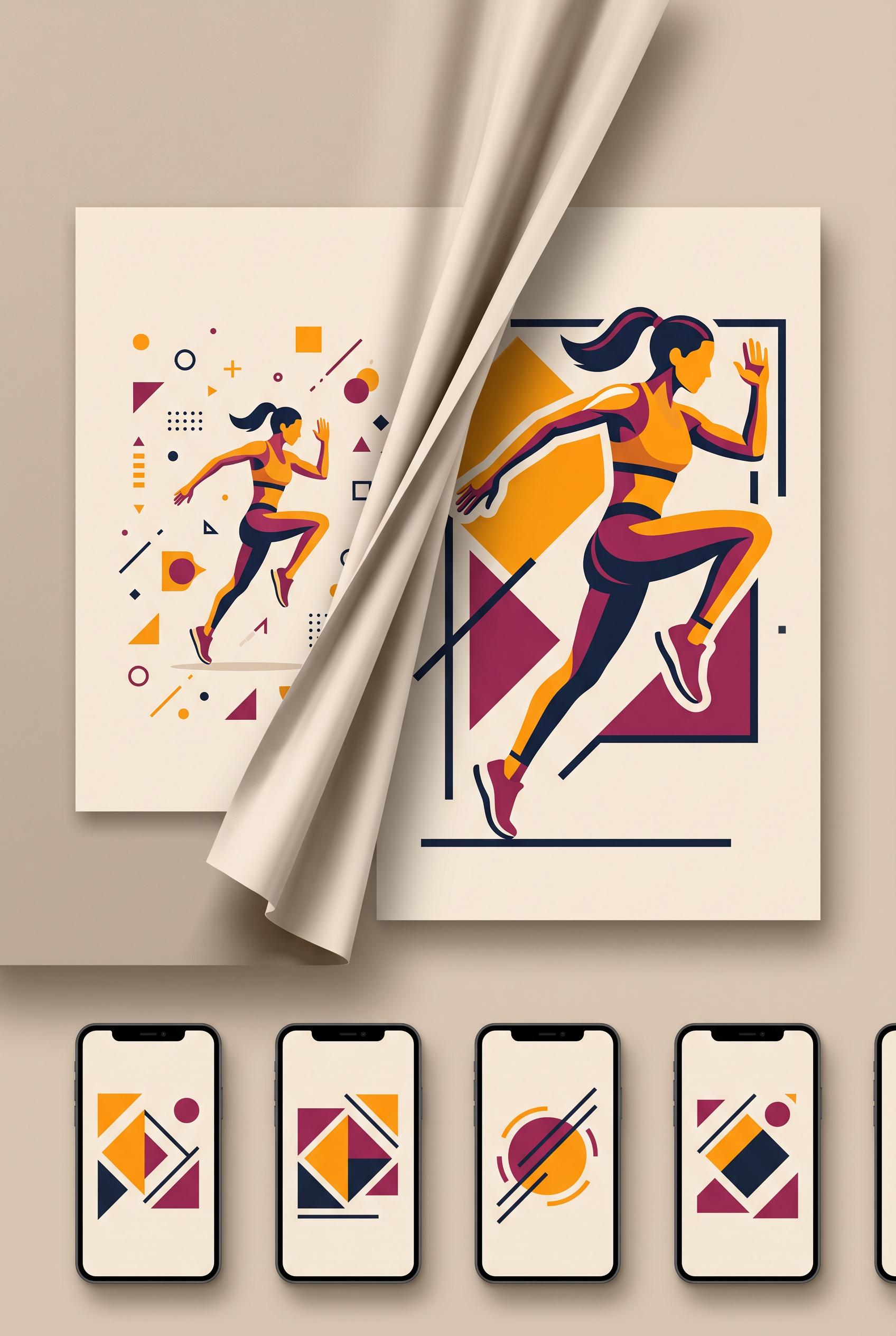
Create a commercial-quality vertical 2:3 Pinterest composition showing a before-and-after redesign of an in...
View this AI-generated image from the AI Media Studio community gallery. Prompt: Create a commercial-quality vertical 2:3 Pinterest composition showing a before-and-after redesign of an independent fitness coach video thumbnail. Use a curtain reveal composition, saffron, berry...
Prompt
Create a commercial-quality vertical 2:3 Pinterest composition showing a before-and-after redesign of an independent fitness coach video thumbnail. Use a curtain reveal composition, saffron, berry, deep ink, and almond palette, one dynamic athletic pose, abstract geometric framing, clean mockup cards, and strong visual hierarchy. No real brands, no trademarked characters, no watermark, no unintended readable text, no logos or gibberish text. AI-modified downstream. Corrective regeneration attempt 2. Produce a materially revised image, not a near-duplicate of an earlier variant. Preserve the successful subject, palette, lighting, focal hierarchy, and commercial polish from the original brief while correcting every issue below. Mandatory corrective instructions from the most recent visual QA: Create a polished vertical 2:3 Pinterest composition with a clear before-and-after redesign for an independent fitness coach. Keep the attractive almond panel, saffron and berry geometric accents, deep-ink typography, single dynamic athletic fitness pose, and fabric-like curtain reveal. Make the left version visibly cluttered with tiny low-impact elements and weak hierarchy; make the right version clean, bold, and focused with one dominant pose and strong geometric framing. Add several small phone-size preview cards neatly below the main comparison. Remove the “2:3 PINTEREST,” “COMMERCIAL,” and “PROFESSIONAL REDESIGN” meta copy, all logos, watermarks, branding, and any unintended readable text or gibberish. Use only minimal intentional generic before/after labeling, with no excessive headline copy. Reduce teal and prioritize saffron, berry, deep ink, and almond. Observed defects from prior variants that must not recur: 1) The required small phone-size preview cards below the main before/after versions are missing. 2) Unrequested meta text such as “2:3 PINTEREST” and “COMMERCIAL” appears in the layout. 3) The composition contains excessive readable copy and does not sufficiently preserve the brief’s clean, tiny-element-before versus focused-after hierarchy. 4) The palette is dominated by teal rather than the specified saffron, berry, deep ink, and almond scheme. Render no letters, words, numbers, prices, headings, labels, contact details, logos, glyphs, or pseudo-text anywhere. Use only blank surfaces, clean geometric marks, and non-linguistic placeholder shapes. Do not add explanatory captions, before/after labels, interface copy, or extra objects that the brief did not request. When a corrective instruction conflicts with a decorative detail, prioritize the corrective instruction.
Use this image as inspiration
Browse more public generations, compare prompts, and open the original share page to continue exploring this style.
More from the gallery
Recent public images on the same domain, all with their own crawlable detail pages.
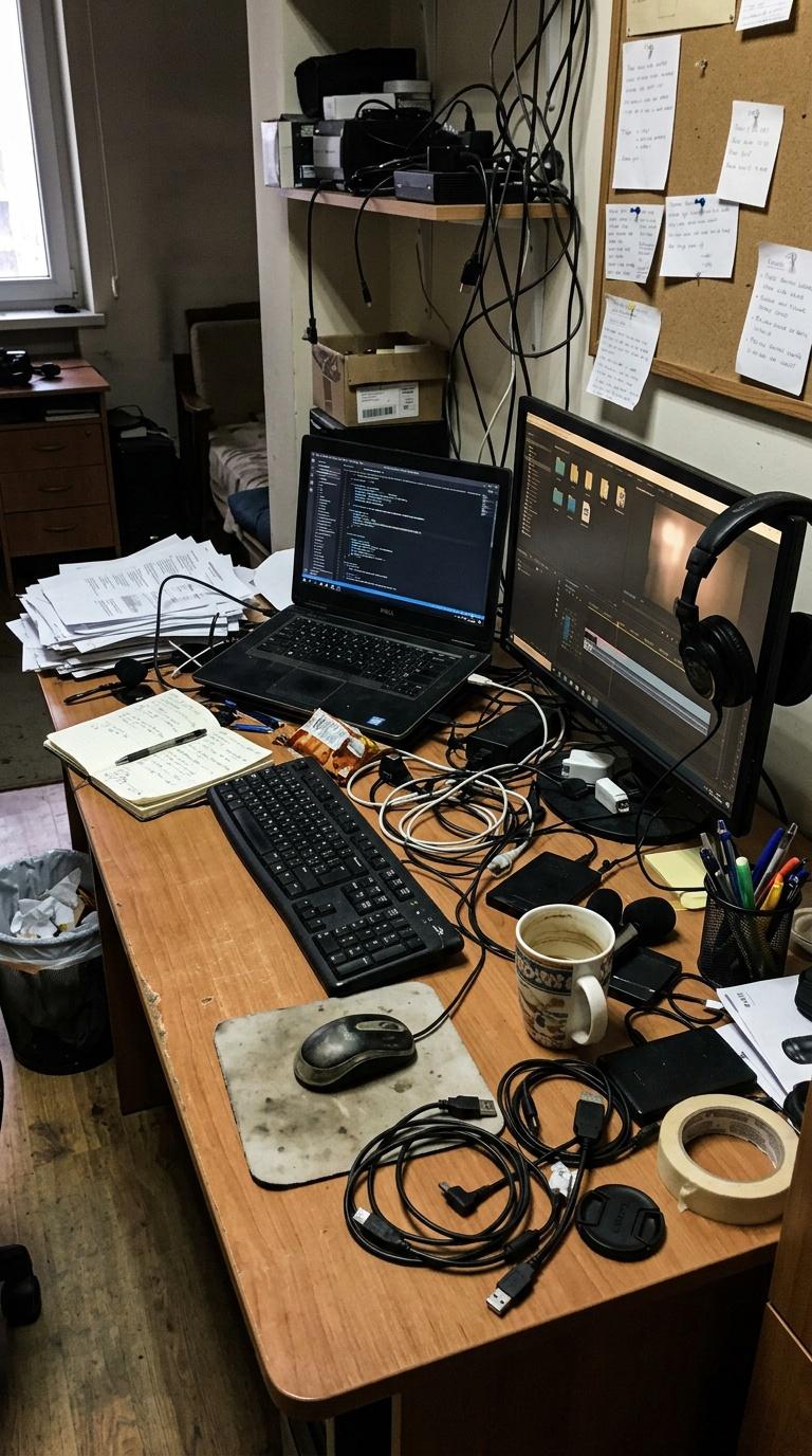
Amateur handheld phone photo of a creator's cluttered desk setup before branding and styling, imperfect pho...
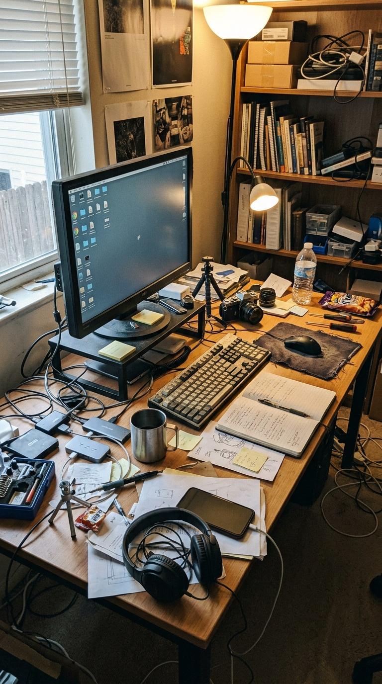
Amateur handheld phone photo of a creator's cluttered desk setup before branding and styling, imperfect pho...
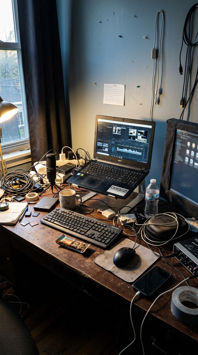
Amateur handheld phone photo of a creator's cluttered desk setup before branding and styling, imperfect pho...
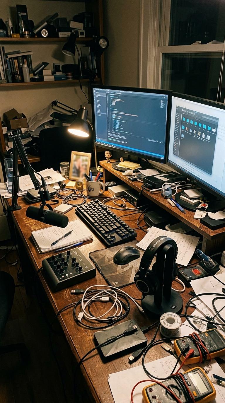
Amateur handheld phone photo of a creator's cluttered desk setup before branding and styling, imperfect pho...
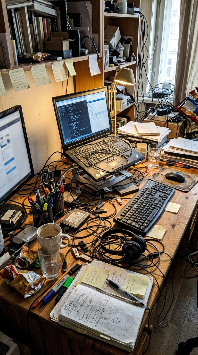
Amateur handheld phone photo of a creator's cluttered desk setup before branding and styling, imperfect pho...
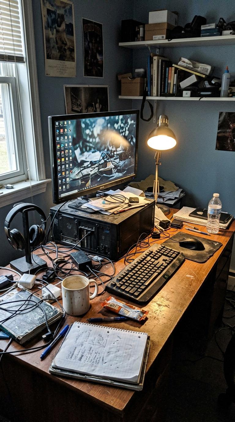
Amateur handheld phone photo of a creator's cluttered desk setup before branding and styling, imperfect pho...
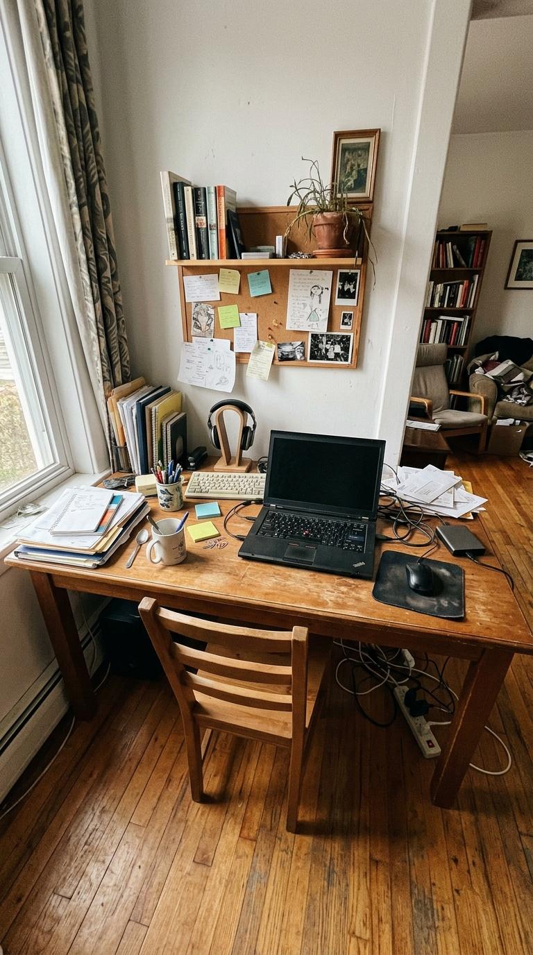
Amateur handheld phone photo of a slightly messy home desk area before redesign, imperfect wide-angle frami...
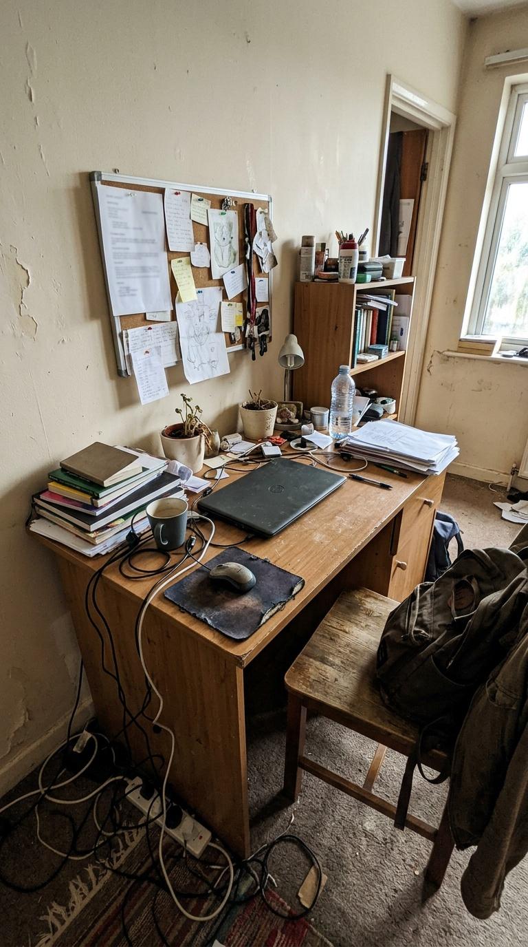
Amateur handheld phone photo of a slightly messy home desk area before redesign, imperfect wide-angle frami...