AI 이미지 갤러리
크리에이티브 커뮤니티에서 1720+개의 공유 AI 생성 이미지 발견
모든 공유 이미지
1720개 중 48개 공유 이미지 표시
 0
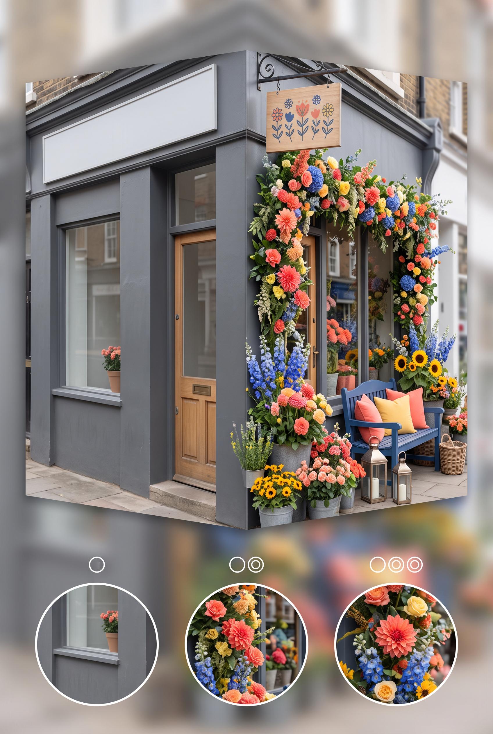
Create a commercial-quality vertical 2:3 Pinterest composition showing an independent florist storefront transformation. Use an accordion-style before-and-after reveal with three small detail insets, a plain window on one side and an abundant seasonal floral display on the other. Use coral, cobalt blue, butter yellow, and charcoal. AI-modified downstream. No real brands, no trademarked characters, no watermark, and no unintended readable text. Corrective regeneration attempt 2. Produce a materially revised image, not a near-duplicate of an earlier variant. Preserve the successful subject, palette, lighting, focal hierarchy, and commercial polish from the original brief while correcting every issue below. Mandatory corrective instructions from the most recent visual QA: Regenerate the same attractive vertical 2:3 florist storefront before-and-after composition, preserving the coral, cobalt blue, butter yellow, charcoal palette, plain storefront on the left, abundant seasonal floral display on the right, layered stems, bold floral focal point, accordion reveal, and three circular detail insets. Remove all explanatory paragraph copy from the lower-left area or replace it with clean, correctly spelled, intentional minimal typography; do not generate any pseudo-text, misspellings, malformed words, or garbled readable characters. Make exactly three clearly visible, consistently styled detail insets for color, height, and lighting changes, with simple numeral markers only if rendered cleanly. Keep all signage generic and fictional, with no real brands, trademarks, watermark, or other unintended text. Observed defects from prior variants that must not recur: 1) The lower-left explanatory copy contains obvious garbled and misspelled text, including fragments such as “seamornit wito,” “coait,” and “delsi...”. 2) The composition is visually strong and clearly communicates before/after, but the malformed paragraph is a major commercial-quality defect. 3) The three detail insets are not consistently numbered or clearly integrated. Render no letters, words, numbers, prices, headings, labels, contact details, logos, glyphs, or pseudo-text anywhere. Use only blank surfaces, clean geometric marks, and non-linguistic placeholder shapes. Do not add explanatory captions, before/after labels, interface copy, or extra objects that the brief did not request. When a corrective instruction conflicts with a decorative detail, prioritize the corrective instruction.
 0
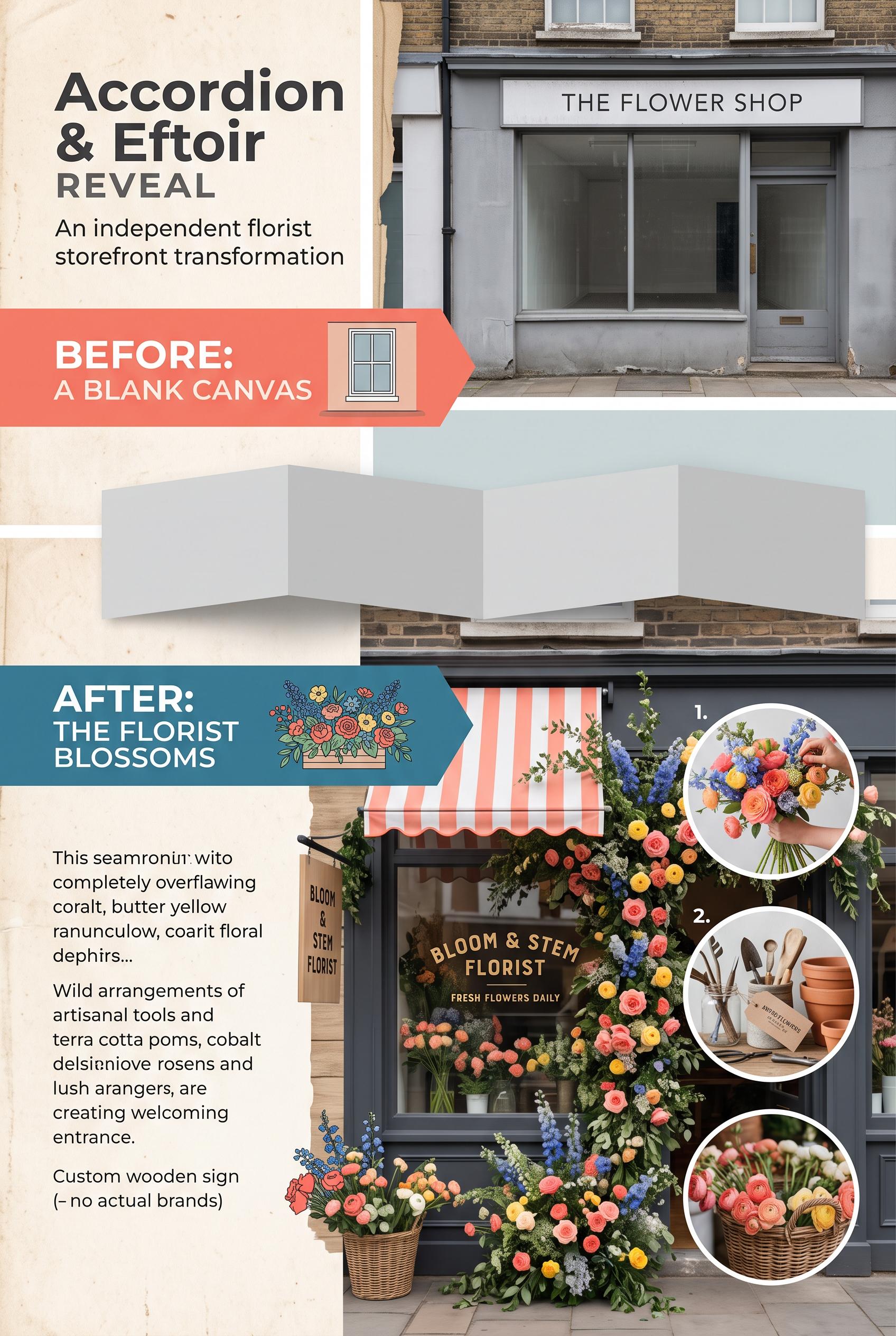
Create a commercial-quality vertical 2:3 Pinterest composition showing an independent florist storefront transformation. Use an accordion-style before-and-after reveal with three small detail insets, a plain window on one side and an abundant seasonal floral display on the other. Use coral, cobalt blue, butter yellow, and charcoal. AI-modified downstream. No real brands, no trademarked characters, no watermark, and no unintended readable text.
 0
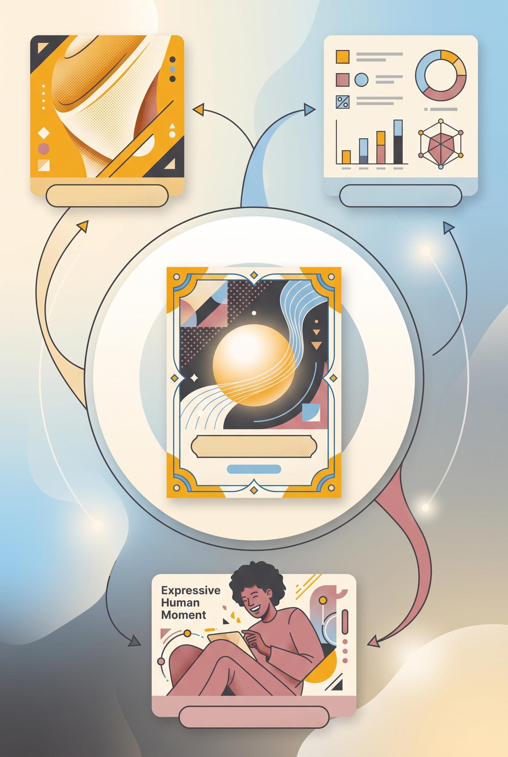
Create a commercial-quality vertical 2:3 Pinterest composition explaining a three-route visual hook system for a fictional content campaign. Place one abstract central announcement card inside a circular storyboard, with three orbiting panels represented by a surprising crop, a proof-style visual, and an expressive human moment. Use saffron yellow, charcoal, dusty rose, sky blue, and cream. Include simple blank label bars only, with no unintended readable text. No real brands, no trademarked characters, and no watermark. Corrective regeneration attempt 4. Produce a materially revised image, not a near-duplicate of an earlier variant. Preserve the successful subject, palette, lighting, focal hierarchy, and commercial polish from the original brief while correcting every issue below. Mandatory corrective instructions from the most recent visual QA: Preserve the polished vertical 2:3 composition, saffron yellow, charcoal, dusty rose, sky blue, and cream palette, circular storyboard, central announcement card, three orbiting panels, arrows, lighting, focal hierarchy, and distinct surprising crop, proof visual, and expressive human moment. Remove all readable text, including the “Expressive Human Moment” headline, and replace it with a completely blank label bar or blank surface. Remove every icon-like or interface-like mark in the proof panel, including pictograms, percent-like forms, glyphs, and pseudo-text; replace them with clean abstract geometric shapes and unlabeled geometric charts only. Ensure absolutely no letters, words, numbers, symbols, logos, watermark, or pseudo-text anywhere in the image. Observed defects from prior variants that must not recur: 1) Strong vertical composition, focal point, palette, and three distinct visual routes. 2) Large readable headline text violates the requirement for no unintended readable text and for blank label bars only. 3) Attractive vertical composition with clear circular focal hierarchy and three distinct visual routes. 4) A readable percent symbol appears in the proof panel, violating the requirement to render no glyphs, numbers, or pseudo-text. 5) Some interface-like icons and chart marks should be replaced with purely non-linguistic geometric shapes. 6) Readable headline text “Expressive Human Moment” appears in the lower panel, violating the no-readable-text requirement. 7) The proof panel contains interface-like iconography and chart marks that may read as glyphs or UI symbols rather than purely abstract geometry. Render no letters, words, numbers, prices, headings, labels, contact details, logos, glyphs, or pseudo-text anywhere. Use only blank surfaces, clean geometric marks, and non-linguistic placeholder shapes. Do not add explanatory captions, before/after labels, interface copy, or extra objects that the brief did not request. When a corrective instruction conflicts with a decorative detail, prioritize the corrective instruction.
 0
Create a commercial-quality vertical 2:3 Pinterest composition explaining a three-route visual hook system for a fictional content campaign. Place one abstract central announcement card inside a circular storyboard, with three orbiting panels represented by a surprising crop, a proof-style visual, and an expressive human moment. Use saffron yellow, charcoal, dusty rose, sky blue, and cream. Include simple blank label bars only, with no unintended readable text. No real brands, no trademarked characters, and no watermark. Corrective regeneration attempt 3. Produce a materially revised image, not a near-duplicate of an earlier variant. Preserve the successful subject, palette, lighting, focal hierarchy, and commercial polish from the original brief while correcting every issue below. Mandatory corrective instructions from the most recent visual QA: Preserve the polished vertical 2:3 layout, palette, circular storyboard, central announcement card, three orbiting panels, arrows, and distinct surprising crop, proof visual, and human moment. Remove the readable percent symbol entirely and replace it with abstract geometric shapes. Replace the small image/download/interface-like icons and any glyph-like chart marks with clean non-linguistic geometric placeholders. Ensure absolutely no letters, words, numbers, symbols, glyphs, logos, pseudo-text, or watermark anywhere; retain only blank label bars, geometric marks, charts without symbolic characters, and imagery. Observed defects from prior variants that must not recur: 1) Strong vertical composition, focal point, palette, and three distinct visual routes. 2) Large readable headline text violates the requirement for no unintended readable text and for blank label bars only. 3) Attractive vertical composition with clear circular focal hierarchy and three distinct visual routes. 4) A readable percent symbol appears in the proof panel, violating the requirement to render no glyphs, numbers, or pseudo-text. 5) Some interface-like icons and chart marks should be replaced with purely non-linguistic geometric shapes. Render no letters, words, numbers, prices, headings, labels, contact details, logos, glyphs, or pseudo-text anywhere. Use only blank surfaces, clean geometric marks, and non-linguistic placeholder shapes. Do not add explanatory captions, before/after labels, interface copy, or extra objects that the brief did not request. When a corrective instruction conflicts with a decorative detail, prioritize the corrective instruction.
 0
Create a commercial-quality vertical 2:3 Pinterest composition explaining a three-route visual hook system for a fictional content campaign. Place one abstract central announcement card inside a circular storyboard, with three orbiting panels represented by a surprising crop, a proof-style visual, and an expressive human moment. Use saffron yellow, charcoal, dusty rose, sky blue, and cream. Include simple blank label bars only, with no unintended readable text. No real brands, no trademarked characters, and no watermark. Corrective regeneration attempt 2. Produce a materially revised image, not a near-duplicate of an earlier variant. Preserve the successful subject, palette, lighting, focal hierarchy, and commercial polish from the original brief while correcting every issue below. Mandatory corrective instructions from the most recent visual QA: Preserve the attractive vertical 2:3 layout, circular storyboard, central fictional announcement card, three orbiting panels, arrows, palette, and polished illustration style. Remove the large readable headline at the top and replace it with only abstract non-readable graphic shapes or blank label bars. Ensure every label, line, and card contains no letters, words, numbers, logos, or pseudo-text; retain only clean geometric placeholders and imagery. Keep the surprising crop, proof chart, and human moment clearly distinct, with no watermark or brand marks. Observed defects from prior variants that must not recur: 1) Strong vertical composition, focal point, palette, and three distinct visual routes. 2) Large readable headline text violates the requirement for no unintended readable text and for blank label bars only. Render no letters, words, numbers, prices, headings, labels, contact details, logos, glyphs, or pseudo-text anywhere. Use only blank surfaces, clean geometric marks, and non-linguistic placeholder shapes. Do not add explanatory captions, before/after labels, interface copy, or extra objects that the brief did not request. When a corrective instruction conflicts with a decorative detail, prioritize the corrective instruction.
 0
Create a commercial-quality vertical 2:3 Pinterest composition explaining a three-route visual hook system for a fictional content campaign. Place one abstract central announcement card inside a circular storyboard, with three orbiting panels represented by a surprising crop, a proof-style visual, and an expressive human moment. Use saffron yellow, charcoal, dusty rose, sky blue, and cream. Include simple blank label bars only, with no unintended readable text. No real brands, no trademarked characters, and no watermark.
 0
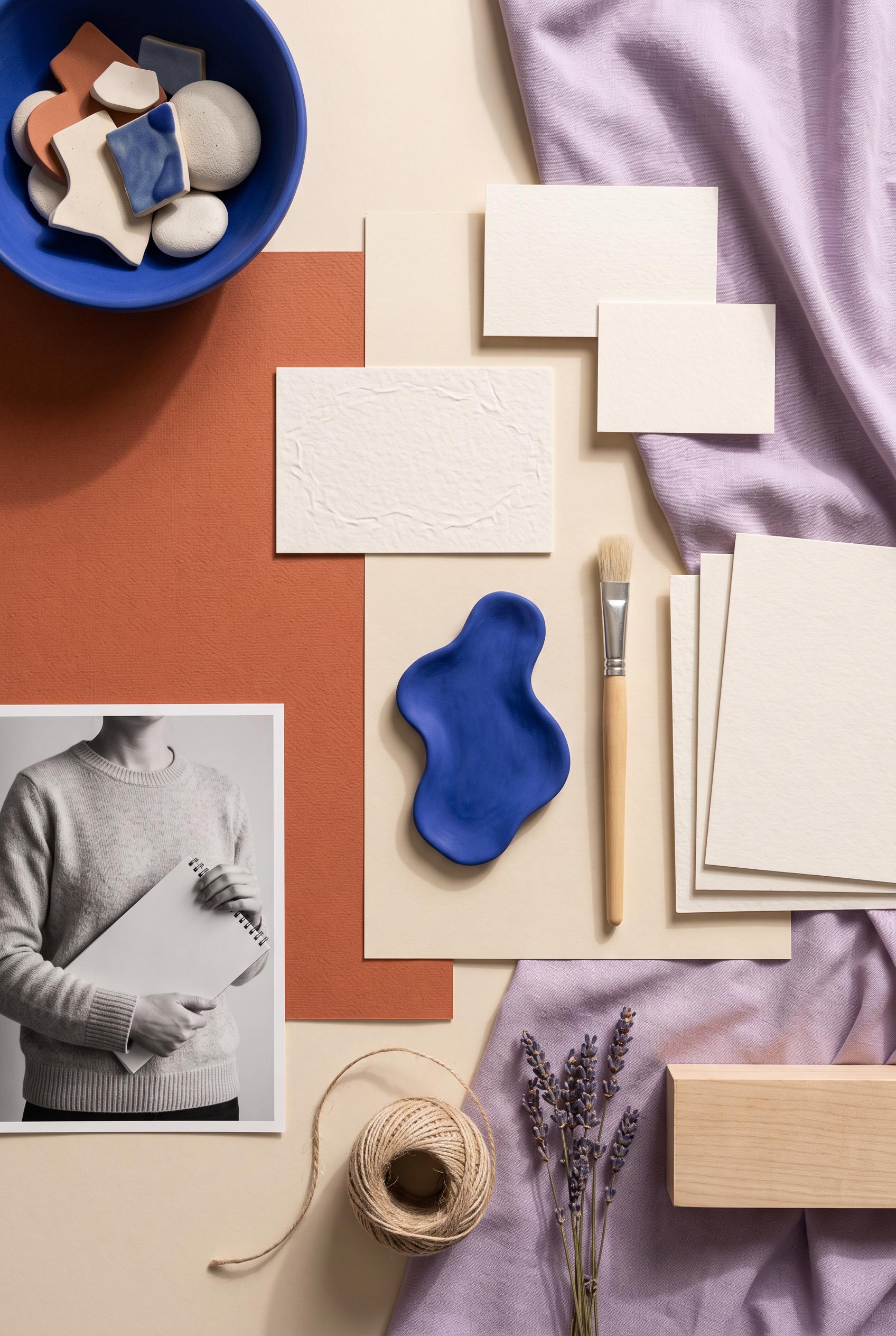
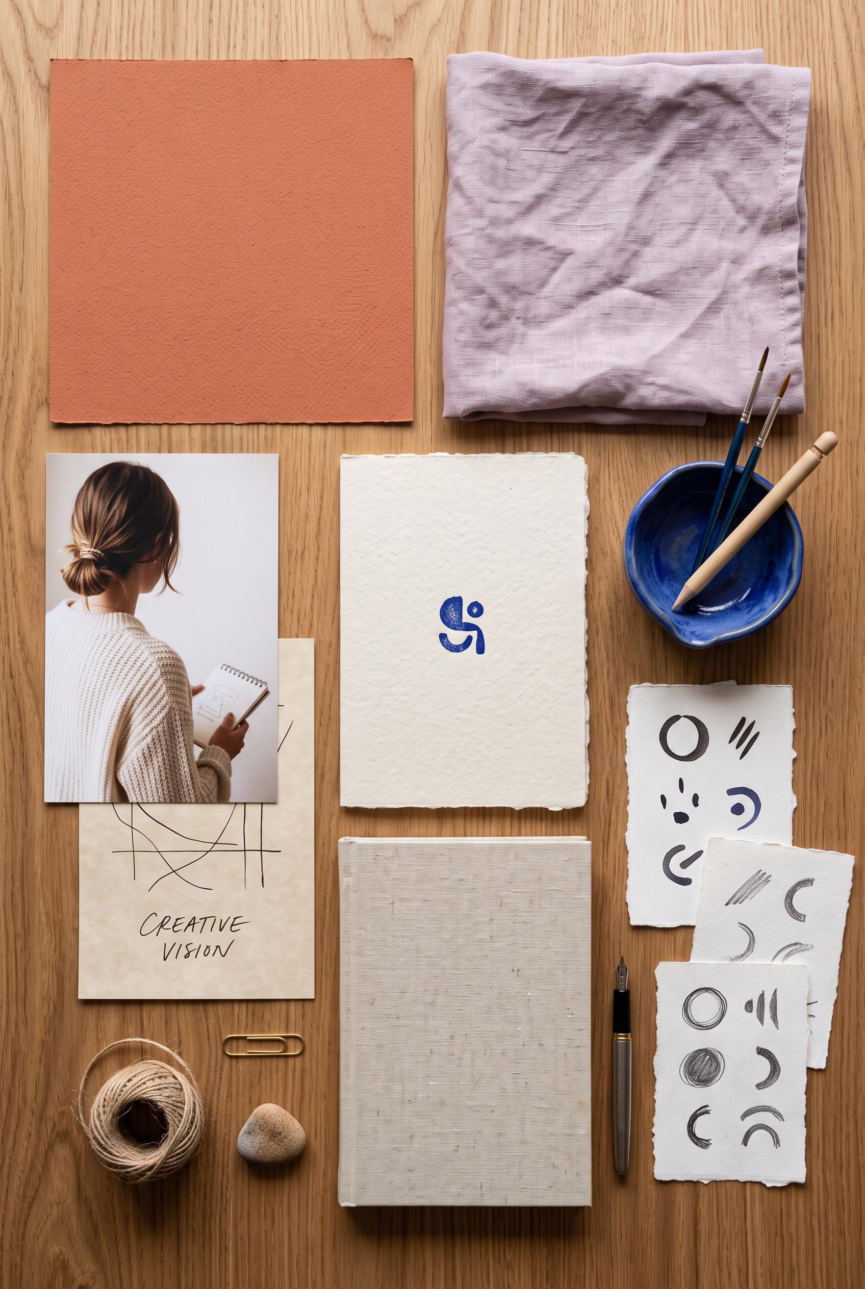
Create a commercial-quality vertical 2:3 Pinterest composition for an inspirational creator branding showcase. Arrange an overhead editorial studio table with terracotta paper, lilac fabric, parchment cards, cobalt ceramic, a cropped anonymous portrait, tactile stationery, and abstract symbol samples. Use a modular still-life layout with generous breathing room and soft directional light. No real brands, no trademarked characters, no watermark, and no unintended readable text. Corrective regeneration attempt 2. Produce a materially revised image, not a near-duplicate of an earlier variant. Preserve the successful subject, palette, lighting, focal hierarchy, and commercial polish from the original brief while correcting every issue below. Mandatory corrective instructions from the most recent visual QA: Preserve the attractive vertical overhead studio-table composition, terracotta paper, lilac fabric, cobalt ceramic bowl, anonymous portrait, tactile materials, modular spacing, and soft editorial lighting. Remove all readable lettering, especially the “CREATIVE VISION” text, replacing it with blank paper or purely non-linguistic abstract marks. Redesign the central blue symbol as an obviously irregular abstract shape rather than a logo-like glyph. Ensure every paper card and sample contains no letters, words, numbers, or recognizable brand marks, with no watermark or generation artifacts. Observed defects from prior variants that must not recur: 1) The paper card contains clearly readable unintended text: “CREATIVE VISION.” 2) The central blue symbol is somewhat logo-like and should be made more clearly abstract to avoid brand-mark resemblance. Render no letters, words, numbers, prices, headings, labels, contact details, logos, glyphs, or pseudo-text anywhere. Use only blank surfaces, clean geometric marks, and non-linguistic placeholder shapes. Do not add explanatory captions, before/after labels, interface copy, or extra objects that the brief did not request. When a corrective instruction conflicts with a decorative detail, prioritize the corrective instruction.
 0
Create a commercial-quality vertical 2:3 Pinterest composition for an inspirational creator branding showcase. Arrange an overhead editorial studio table with terracotta paper, lilac fabric, parchment cards, cobalt ceramic, a cropped anonymous portrait, tactile stationery, and abstract symbol samples. Use a modular still-life layout with generous breathing room and soft directional light. No real brands, no trademarked characters, no watermark, and no unintended readable text.
 0
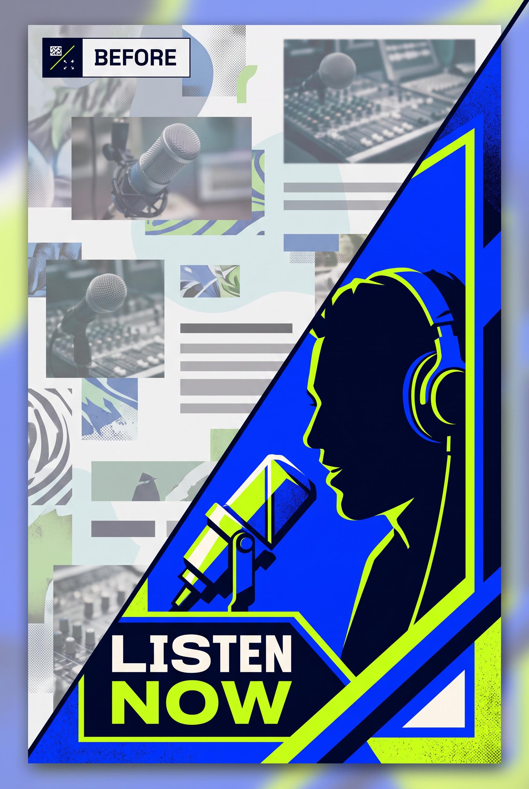
Create a commercial-quality vertical 2:3 Pinterest composition showing a before-and-after redesign of a fictional podcast thumbnail. Use a diagonal wipe: left side cluttered and low contrast, right side focused with a close-up illustrated host silhouette, strong geometric framing, and a single visual focal point. Palette of electric cobalt, acid lime, deep ink, and warm white. No real brands, no trademarked characters, no watermark, and no unintended readable text. Corrective regeneration attempt 2. Produce a materially revised image, not a near-duplicate of an earlier variant. Preserve the successful subject, palette, lighting, focal hierarchy, and commercial polish from the original brief while correcting every issue below. Mandatory corrective instructions from the most recent visual QA: Preserve the polished vertical 2:3 editorial composition, cobalt/acid-lime/deep-ink/warm-white palette, diagonal wipe, paper grain, and strong right-side close-up illustrated host silhouette with geometric framing. Redesign the left side to clearly show a weak, low-contrast podcast thumbnail with one small distant host portrait, tiny competing elements, and visibly poor hierarchy rather than repeated microphone photos. Remove all readable text, including “LISTEN NOW” and any other labels or pseudo-typography. Keep the right side focused on a single host focal point without brands, trademarks, watermarks, or visual artifacts. Observed defects from prior variants that must not recur: 1) The left-side “before” version lacks the required distant host portrait and is dominated by repeated microphone images. 2) Unrequested readable promotional text (“LISTEN NOW”) introduces an unintended call-to-action. 3) The composition is visually polished but the before/after contrast is less clear than the brief requires. Render no letters, words, numbers, prices, headings, labels, contact details, logos, glyphs, or pseudo-text anywhere. Use only blank surfaces, clean geometric marks, and non-linguistic placeholder shapes. Do not add explanatory captions, before/after labels, interface copy, or extra objects that the brief did not request. When a corrective instruction conflicts with a decorative detail, prioritize the corrective instruction.
 0
Create a commercial-quality vertical 2:3 Pinterest composition showing a before-and-after redesign of a fictional podcast thumbnail. Use a diagonal wipe: left side cluttered and low contrast, right side focused with a close-up illustrated host silhouette, strong geometric framing, and a single visual focal point. Palette of electric cobalt, acid lime, deep ink, and warm white. No real brands, no trademarked characters, no watermark, and no unintended readable text.
 0
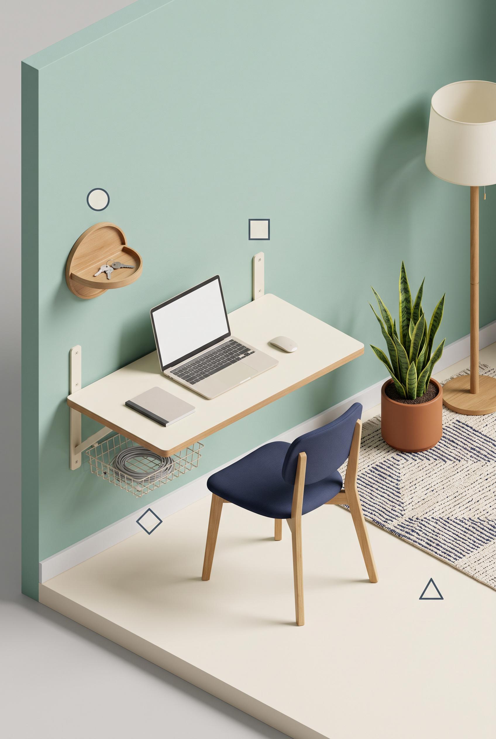
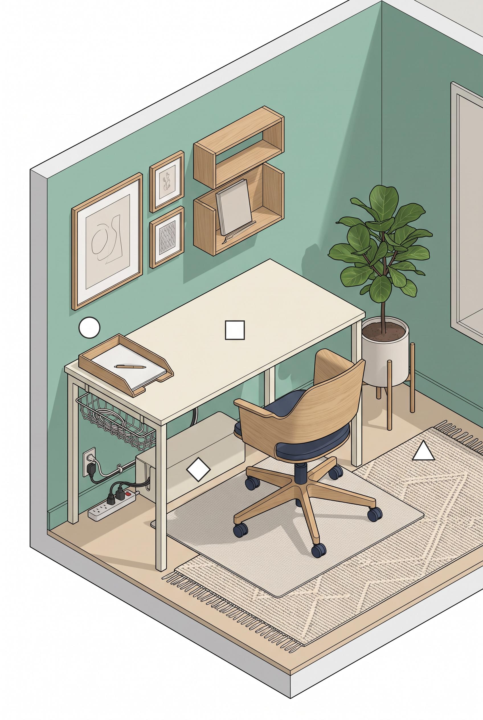
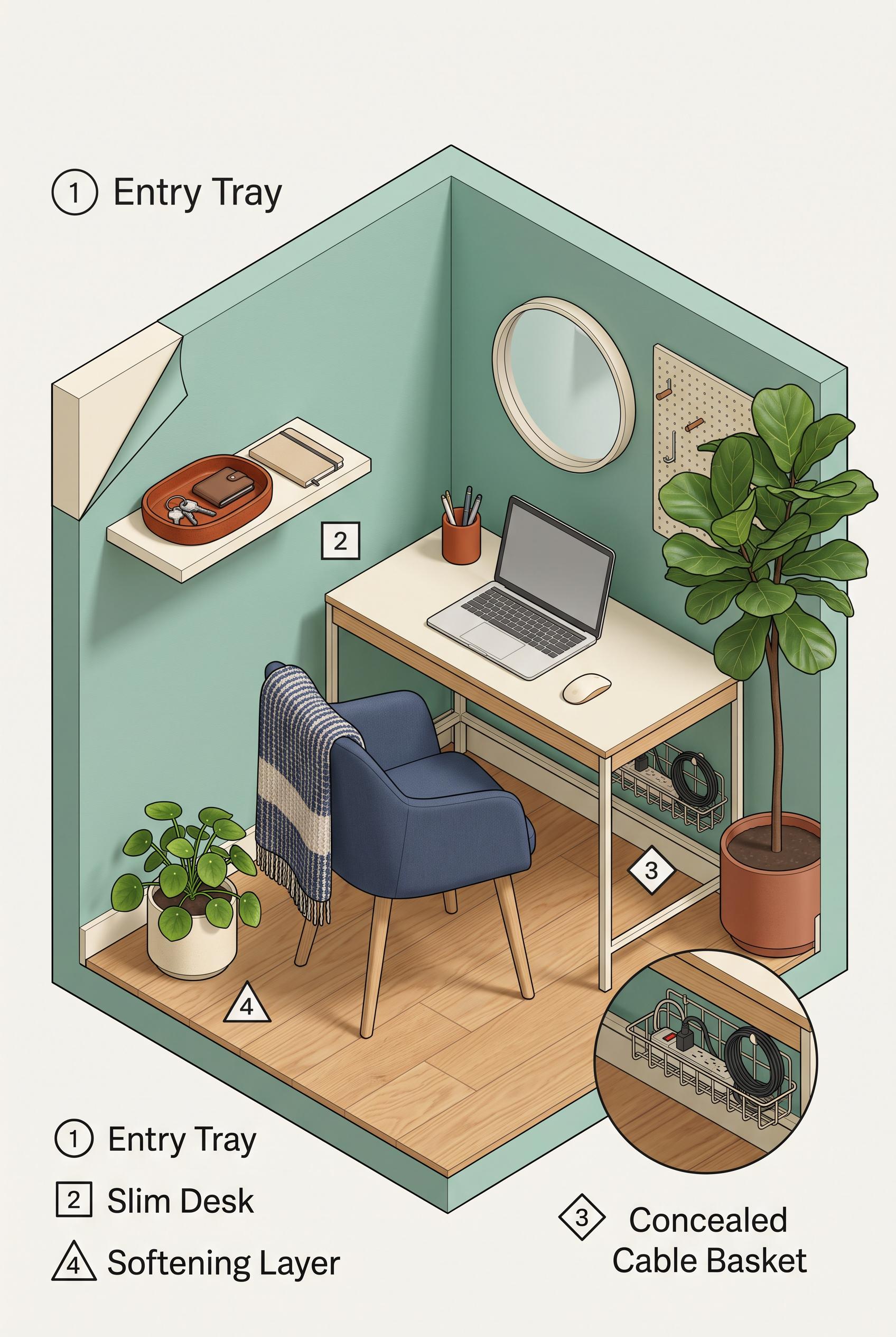
Create a commercial-quality educational interior styling graphic in a vertical 2:3 Pinterest composition. Show an isometric cutaway of a rental-friendly work nook with four clearly separated object-based zones: entry tray, slim desk, concealed cable basket, and softening layer with plant and textile. Use seafoam wall paint, rust accessories, cream surfaces, navy chair details, and natural oak. Add four simple geometric markers with no readable words. Clean instructional art direction, realistic room rendering, crisp hierarchy, no real brands, no trademarked characters, no watermark, and no unintended readable text. AI-modified downstream. Corrective regeneration attempt 3. Produce a materially revised image, not a near-duplicate of an earlier variant. Preserve the successful subject, palette, lighting, focal hierarchy, and commercial polish from the original brief while correcting every issue below. Mandatory corrective instructions from the most recent visual QA: Preserve the polished vertical 2:3 isometric cutaway, seafoam walls, cream surfaces, natural oak, navy chair, plant, textile, lighting, and exactly four existing geometric markers. Replace the freestanding desk with a clearly wall-mounted slim desk: show a cream or oak desktop attached directly to the wall with discreet brackets or a fold-down structure and no floor-standing desk legs. Keep the entry tray, visibly concealed cable basket, and plant/textile softening layer distinct and uncluttered. Retain exactly one circle, square, diamond, and triangle near their corresponding zones. Render no letters, words, numbers, labels, logos, watermark, glyphs, or pseudo-text anywhere. Observed defects from prior variants that must not recur: 1) The image contains prominent readable labels and numbered legend text despite the requirement for geometric markers only. 2) The top-left and bottom legends duplicate information and reduce the clean instructional composition. 3) Attractive vertical isometric composition with four geometric markers and no readable text or watermark. 4) The desk is a freestanding table rather than the required wall-mounted/slim desk, so a key named concept is not met. 5) The four zones are present but the wall-mounted desk zone is not visually distinct enough from the overall workstation. Render no letters, words, numbers, prices, headings, labels, contact details, logos, glyphs, or pseudo-text anywhere. Use only blank surfaces, clean geometric marks, and non-linguistic placeholder shapes. Do not add explanatory captions, before/after labels, interface copy, or extra objects that the brief did not request. When a corrective instruction conflicts with a decorative detail, prioritize the corrective instruction.
 0
Create a commercial-quality educational interior styling graphic in a vertical 2:3 Pinterest composition. Show an isometric cutaway of a rental-friendly work nook with four clearly separated object-based zones: entry tray, slim desk, concealed cable basket, and softening layer with plant and textile. Use seafoam wall paint, rust accessories, cream surfaces, navy chair details, and natural oak. Add four simple geometric markers with no readable words. Clean instructional art direction, realistic room rendering, crisp hierarchy, no real brands, no trademarked characters, no watermark, and no unintended readable text. AI-modified downstream. Corrective regeneration attempt 2. Produce a materially revised image, not a near-duplicate of an earlier variant. Preserve the successful subject, palette, lighting, focal hierarchy, and commercial polish from the original brief while correcting every issue below. Mandatory corrective instructions from the most recent visual QA: Preserve the attractive vertical 2:3 isometric rental-friendly work nook, seafoam walls, cream desk, natural oak, rust accessories, navy chair, plants, textile, and visible concealed cable basket. Remove every readable word, letter, number, caption, and legend, including “Entry Tray,” “Slim Desk,” “Concealed Cable Basket,” “Softening Layer,” and all 1–4 markers. Replace them with exactly four small, simple, distinct geometric markers only—circle, square, diamond, and triangle—placed near the corresponding tray, desk, cable basket, and plant/textile zones. Keep the four zones visually distinct through objects and color, with no watermark, logos, or other text. Observed defects from prior variants that must not recur: 1) The image contains prominent readable labels and numbered legend text despite the requirement for geometric markers only. 2) The top-left and bottom legends duplicate information and reduce the clean instructional composition. Render no letters, words, numbers, prices, headings, labels, contact details, logos, glyphs, or pseudo-text anywhere. Use only blank surfaces, clean geometric marks, and non-linguistic placeholder shapes. Do not add explanatory captions, before/after labels, interface copy, or extra objects that the brief did not request. When a corrective instruction conflicts with a decorative detail, prioritize the corrective instruction.
 0
Create a commercial-quality educational interior styling graphic in a vertical 2:3 Pinterest composition. Show an isometric cutaway of a rental-friendly work nook with four clearly separated object-based zones: entry tray, slim desk, concealed cable basket, and softening layer with plant and textile. Use seafoam wall paint, rust accessories, cream surfaces, navy chair details, and natural oak. Add four simple geometric markers with no readable words. Clean instructional art direction, realistic room rendering, crisp hierarchy, no real brands, no trademarked characters, no watermark, and no unintended readable text. AI-modified downstream.
 0
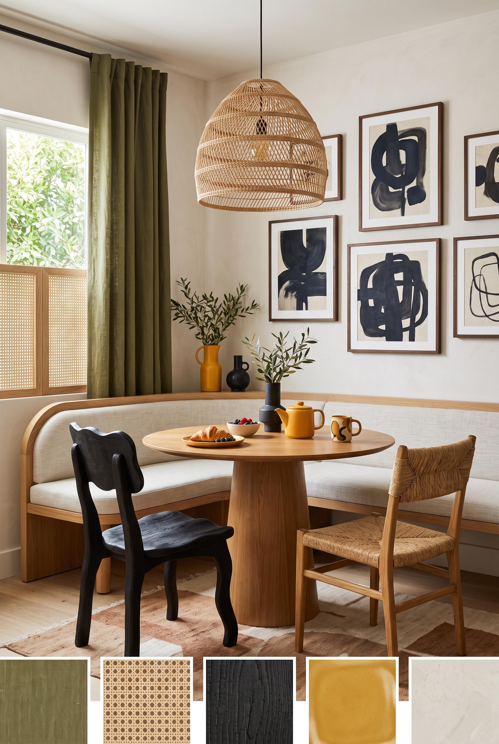
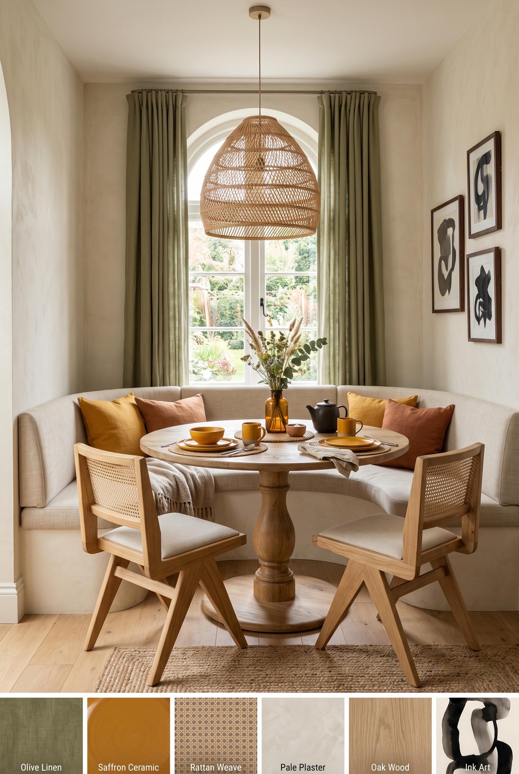
Create a commercial-quality inspirational breakfast nook interior in a vertical 2:3 Pinterest composition. Use a three-quarter editorial room view with a round pedestal table, curved built-in bench, two sculptural chairs, woven pendant light, olive linen curtains, saffron ceramic accents, ink-toned art forms, pale plaster walls, and natural cane details. Add small abstract material swatches at the bottom with no words. Sophisticated residential styling, balanced daylight, tactile surfaces, no real brands, no trademarked characters, no watermark, and no unintended readable text. AI-modified downstream. Corrective regeneration attempt 2. Produce a materially revised image, not a near-duplicate of an earlier variant. Preserve the successful subject, palette, lighting, focal hierarchy, and commercial polish from the original brief while correcting every issue below. Mandatory corrective instructions from the most recent visual QA: Preserve the polished vertical breakfast-nook interior, round pedestal table, curved bench, woven pendant, olive curtains, saffron accents, ink-toned art wall, natural materials, and balanced daylight. Remove all readable text, letters, words, labels, logos, and watermarking from the lower edge. Replace the labeled swatch strip with small subtle unlabeled abstract material swatches only. Make the two foreground chairs visibly mismatched in silhouette or material while retaining a cohesive sophisticated style. Keep the clear three-quarter room composition and realistic commercial interior quality. Observed defects from prior variants that must not recur: 1) Readable labels are embedded on every lower material swatch, violating the no-readable-text requirement. 2) The two foreground chairs appear nearly identical rather than clearly mismatched. 3) The composition is attractive and polished, but the swatch strip feels like a labeled catalog panel rather than subtle unlabeled material samples. Render no letters, words, numbers, prices, headings, labels, contact details, logos, glyphs, or pseudo-text anywhere. Use only blank surfaces, clean geometric marks, and non-linguistic placeholder shapes. Do not add explanatory captions, before/after labels, interface copy, or extra objects that the brief did not request. When a corrective instruction conflicts with a decorative detail, prioritize the corrective instruction.
 0
Create a commercial-quality inspirational breakfast nook interior in a vertical 2:3 Pinterest composition. Use a three-quarter editorial room view with a round pedestal table, curved built-in bench, two sculptural chairs, woven pendant light, olive linen curtains, saffron ceramic accents, ink-toned art forms, pale plaster walls, and natural cane details. Add small abstract material swatches at the bottom with no words. Sophisticated residential styling, balanced daylight, tactile surfaces, no real brands, no trademarked characters, no watermark, and no unintended readable text. AI-modified downstream.
 0
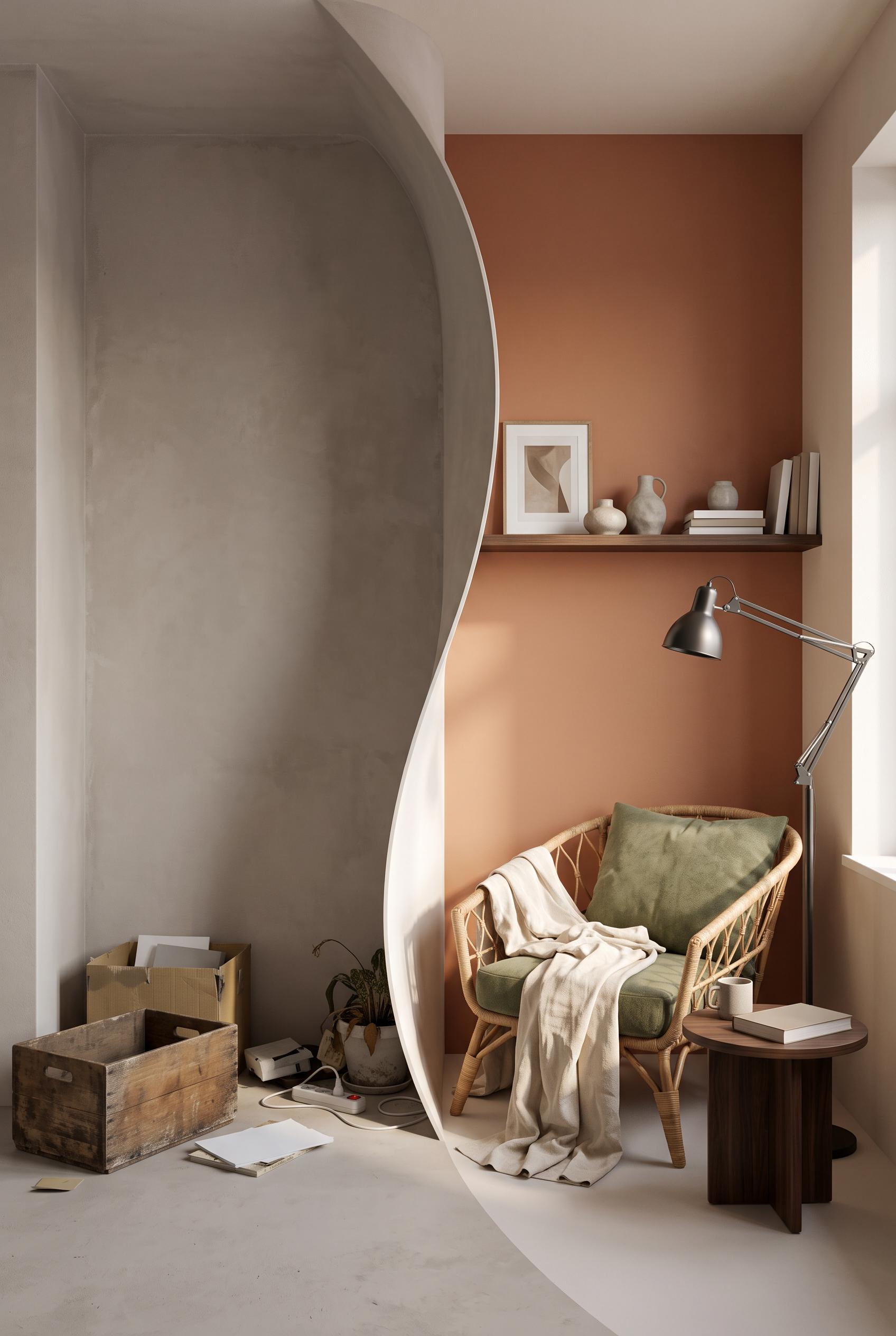
Create a commercial-quality interior design transformation image in a vertical 2:3 Pinterest composition. Use a matched split-screen view of one bedroom alcove before and after, with a central curved architectural reveal. Before: empty recess, dull wall, scattered items. After: terracotta lounge chair, moss cushion, linen throw, dark walnut shelf, ceramic lamp, and restrained artwork shapes. Editorial home magazine styling, realistic materials, natural afternoon light, strong spatial clarity, no real brands, no trademarked characters, no watermark, and no unintended readable text. AI-modified downstream. Corrective regeneration attempt 2. Produce a materially revised image, not a near-duplicate of an earlier variant. Preserve the successful subject, palette, lighting, focal hierarchy, and commercial polish from the original brief while correcting every issue below. Mandatory corrective instructions from the most recent visual QA: Preserve the realistic editorial bedroom alcove, warm natural afternoon light, terracotta-toned after wall, woven lounge chair, moss cushion, linen throw, walnut shelf, and clean vertical 2:3 composition. Replace the table lamp with a clearly visible adjustable floor lamp beside the chair, and add a compact small side table. Redesign the center transition as an unmistakable smooth curved reveal separating the bare before alcove from the furnished after alcove, while maintaining matched perspective and spatial alignment. Keep the before side bare and underused with restrained scattered items. Include no readable text, logos, trademarks, or watermark. Observed defects from prior variants that must not recur: 1) The after state lacks the required adjustable floor lamp and small side table; it shows a table lamp instead. 2) The split is a straight vertical divider rather than a clear curved reveal between the before and after states. Render no letters, words, numbers, prices, headings, labels, contact details, logos, glyphs, or pseudo-text anywhere. Use only blank surfaces, clean geometric marks, and non-linguistic placeholder shapes. Do not add explanatory captions, before/after labels, interface copy, or extra objects that the brief did not request. When a corrective instruction conflicts with a decorative detail, prioritize the corrective instruction.
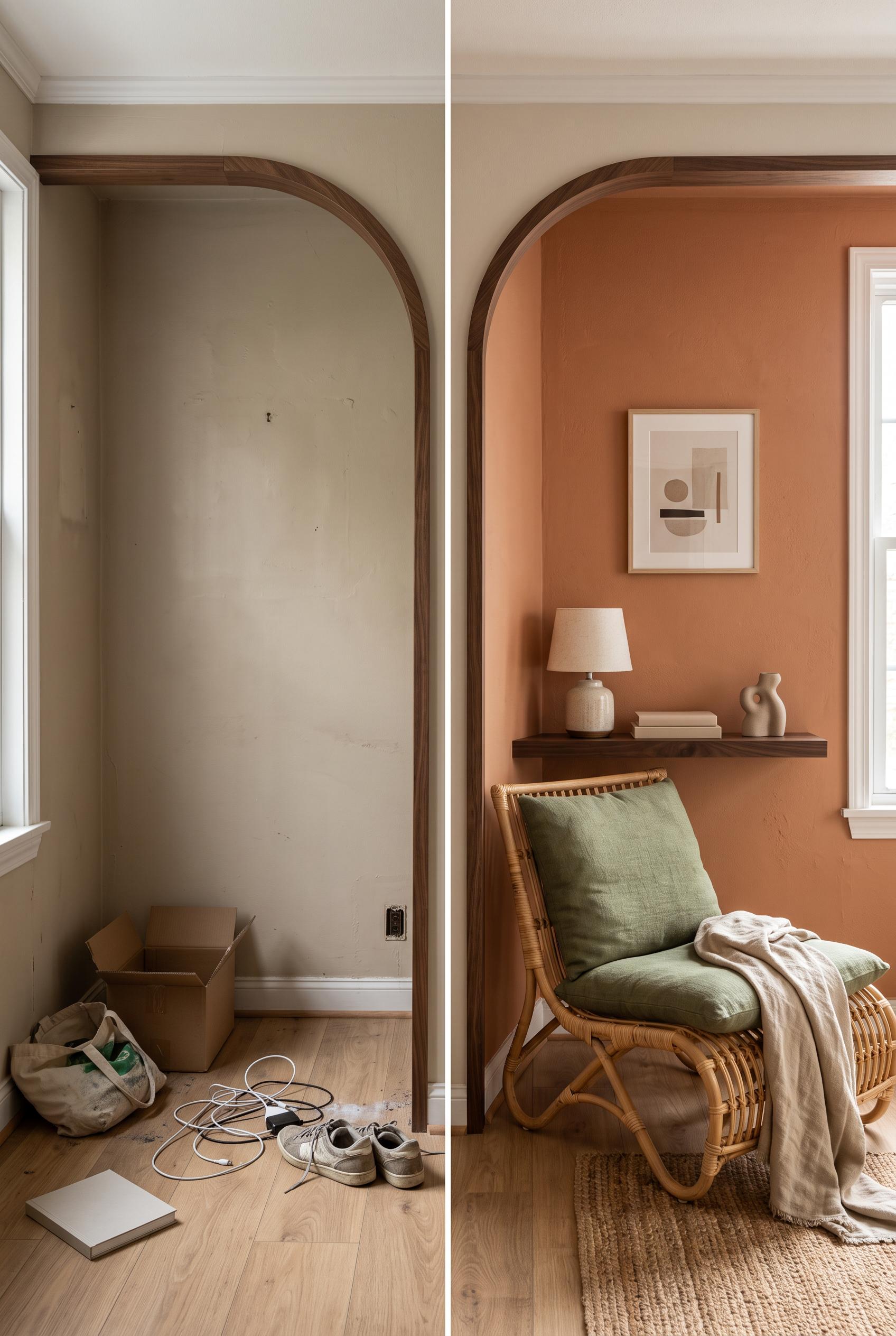 0
Create a commercial-quality interior design transformation image in a vertical 2:3 Pinterest composition. Use a matched split-screen view of one bedroom alcove before and after, with a central curved architectural reveal. Before: empty recess, dull wall, scattered items. After: terracotta lounge chair, moss cushion, linen throw, dark walnut shelf, ceramic lamp, and restrained artwork shapes. Editorial home magazine styling, realistic materials, natural afternoon light, strong spatial clarity, no real brands, no trademarked characters, no watermark, and no unintended readable text. AI-modified downstream.
 0
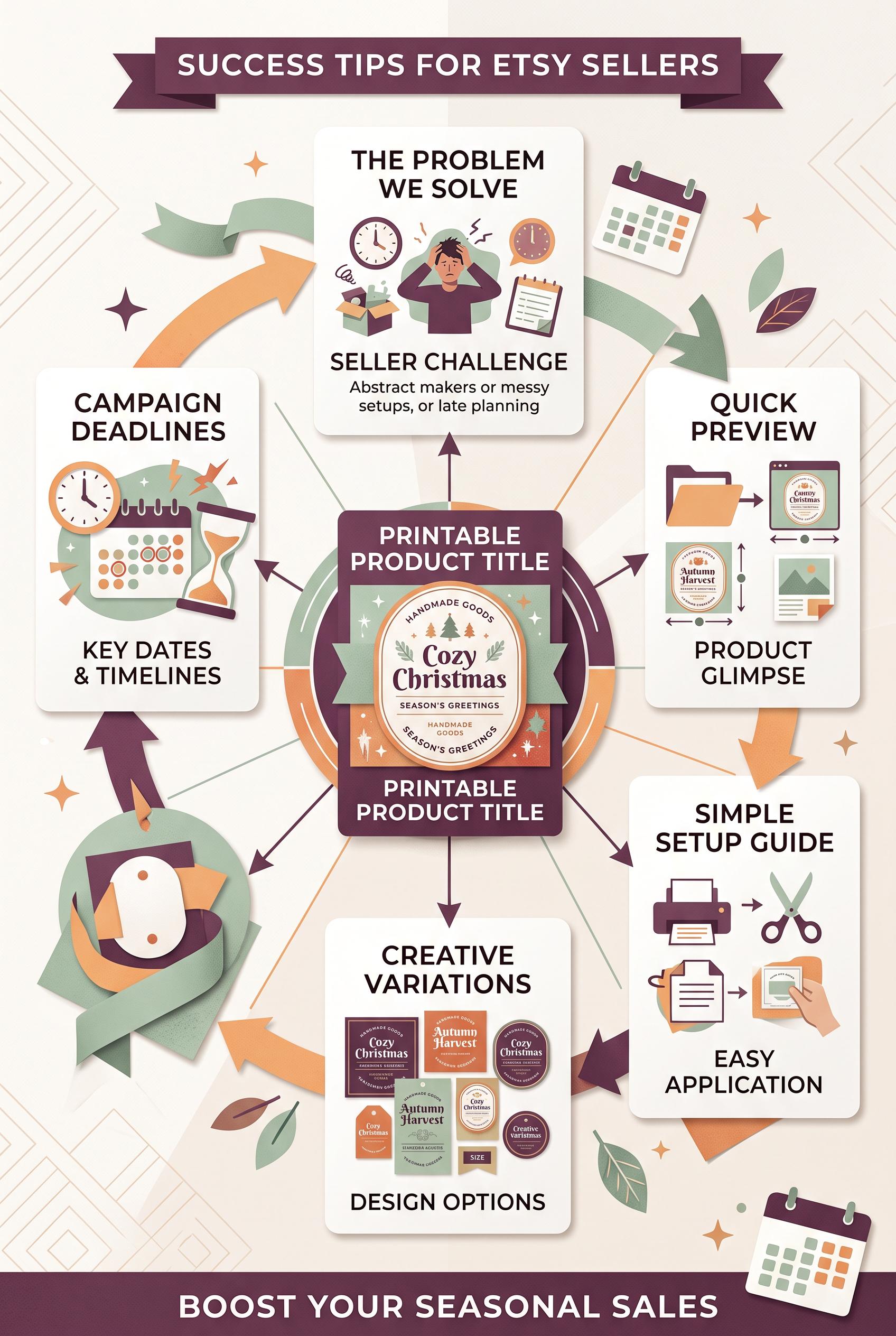
Create a commercial-quality vertical 2:3 Pinterest educational graphic for an Etsy seller campaign. Center a polished printable seasonal label product, then connect it through a radial map to five blank content cards representing problem, preview, setup, variation, and deadline. Use plum, celadon, apricot, and warm white, crisp paper collage styling, clear visual flow, small calendar motifs, no real brands, no trademarked characters, no watermark, and no unintended readable text. Corrective regeneration attempt 5. Produce a materially revised image, not a near-duplicate of an earlier variant. Preserve the successful subject, palette, lighting, focal hierarchy, and commercial polish from the original brief while correcting every issue below. Mandatory corrective instructions from the most recent visual QA: Preserve the vertical 2:3 paper-collage composition, plum/celadon/apricot/warm-white palette, central polished blank seasonal label, five surrounding cards, arrows, and commercial lighting. Remove all horizontal line marks from the upper-right and every card, replacing them with blank paper or sparse non-linguistic geometric shapes. Simplify the central circular border dramatically: remove the dense ring of repeated dots, stripes, and symbols, retaining only a few clearly geometric accents. Remove every calendar or decorative object outside the five cards, including edge-cropped calendars and corner embellishments. Keep exactly five clean cards: problem scene, preview thumbnails, setup tools, product variations, and deadline/calendar. Preserve calendar grids only as simple abstract blocks with no numbers or text-like marks. Render no letters, words, numbers, logos, glyphs, pseudo-text, banners, watermarks, or extra objects. Observed defects from prior variants that must not recur: 1) The five content cards are not consistently presented as clean blank cards because some include dense placeholder-like line marks. 2) Strong vertical composition, palette, radial flow, and five-card structure. 3) Top-right card contains text-like horizontal line marks. 4) Central circular product border includes dense pseudo-text-like line patterns and glyph-like symbols. 5) The center product is mostly blank rather than clearly presenting a polished seasonal label product. 6) Strong vertical composition, palette, focal hierarchy, five-card radial structure, and polished central label. 7) Upper-right card contains conspicuous horizontal line marks, and the central circular border is densely decorated rather than using sparse geometric shapes. 8) Several extra calendar/object elements appear outside the five-card map, weakening the requested clean composition. Render no letters, words, numbers, prices, headings, labels, contact details, logos, glyphs, or pseudo-text anywhere. Use only blank surfaces, clean geometric marks, and non-linguistic placeholder shapes. Do not add explanatory captions, before/after labels, interface copy, or extra objects that the brief did not request. When a corrective instruction conflicts with a decorative detail, prioritize the corrective instruction.
 0
Create a commercial-quality vertical 2:3 Pinterest educational graphic for an Etsy seller campaign. Center a polished printable seasonal label product, then connect it through a radial map to five blank content cards representing problem, preview, setup, variation, and deadline. Use plum, celadon, apricot, and warm white, crisp paper collage styling, clear visual flow, small calendar motifs, no real brands, no trademarked characters, no watermark, and no unintended readable text. Corrective regeneration attempt 4. Produce a materially revised image, not a near-duplicate of an earlier variant. Preserve the successful subject, palette, lighting, focal hierarchy, and commercial polish from the original brief while correcting every issue below. Mandatory corrective instructions from the most recent visual QA: Preserve the polished vertical 2:3 paper-collage layout, plum/celadon/apricot/warm-white palette, lighting, five surrounding cards, radial arrows, calendar motif, and clean commercial styling. Remove every line of text-like marks, glyph-like symbol, letter-like form, number, logo, watermark, and pseudo-text pattern, especially all horizontal lines in the upper-right card and all dense marks around the central circular product border. Replace them only with sparse, clearly geometric non-linguistic shapes or blank paper. Keep exactly five cards: problem scene, preview thumbnails, setup tools, product variations, and deadline/calendar. Make the central printable seasonal label visibly polished through a simple blank label shape with subtle geometric seasonal decoration, but no text or text-like marks. Do not add banners or extra objects. Observed defects from prior variants that must not recur: 1) The central product label includes prominent seasonal text and the cards contain detailed instructional headings, conflicting with the blank-label/map requirement. 2) Central product border contains dense pseudo-text-like glyphs, violating the requirement for no letters, numbers, glyphs, or pseudo-text. 3) Large top and bottom banner elements are extra decorative objects not requested and weaken the radial map composition. 4) The five content cards are not consistently presented as clean blank cards because some include dense placeholder-like line marks. 5) Strong vertical composition, palette, radial flow, and five-card structure. 6) Top-right card contains text-like horizontal line marks. 7) Central circular product border includes dense pseudo-text-like line patterns and glyph-like symbols. 8) The center product is mostly blank rather than clearly presenting a polished seasonal label product. Render no letters, words, numbers, prices, headings, labels, contact details, logos, glyphs, or pseudo-text anywhere. Use only blank surfaces, clean geometric marks, and non-linguistic placeholder shapes. Do not add explanatory captions, before/after labels, interface copy, or extra objects that the brief did not request. When a corrective instruction conflicts with a decorative detail, prioritize the corrective instruction.
 0
Create a commercial-quality vertical 2:3 Pinterest educational graphic for an Etsy seller campaign. Center a polished printable seasonal label product, then connect it through a radial map to five blank content cards representing problem, preview, setup, variation, and deadline. Use plum, celadon, apricot, and warm white, crisp paper collage styling, clear visual flow, small calendar motifs, no real brands, no trademarked characters, no watermark, and no unintended readable text. Corrective regeneration attempt 3. Produce a materially revised image, not a near-duplicate of an earlier variant. Preserve the successful subject, palette, lighting, focal hierarchy, and commercial polish from the original brief while correcting every issue below. Mandatory corrective instructions from the most recent visual QA: Preserve the polished vertical 2:3 paper-collage composition, plum/celadon/apricot/warm-white palette, central printable seasonal-label product, radial arrows, calendar motifs, and commercial lighting. Remove every pseudo-text mark, glyph, letter, number, logo, watermark, and text-like line pattern from the entire image, especially the dense border around the central product and the line marks inside the upper-right card. Replace them with completely blank paper surfaces or simple non-linguistic geometric shapes. Keep exactly five surrounding blank content cards: problem scene, preview thumbnails, setup tools, product variations, and deadline/calendar motif. Remove the oversized top and bottom banners and any other unrequested extra objects. Ensure all labels, cards, calendars, and product surfaces contain no readable or pseudo-readable marks. Observed defects from prior variants that must not recur: 1) The graphic contains extensive readable copy despite the brief requiring blank content cards without readable copy. 2) It uses the real trademarked brand name “Etsy” in the headline. 3) The central product label includes prominent seasonal text and the cards contain detailed instructional headings, conflicting with the blank-label/map requirement. 4) Central product border contains dense pseudo-text-like glyphs, violating the requirement for no letters, numbers, glyphs, or pseudo-text. 5) Large top and bottom banner elements are extra decorative objects not requested and weaken the radial map composition. 6) The five content cards are not consistently presented as clean blank cards because some include dense placeholder-like line marks. Render no letters, words, numbers, prices, headings, labels, contact details, logos, glyphs, or pseudo-text anywhere. Use only blank surfaces, clean geometric marks, and non-linguistic placeholder shapes. Do not add explanatory captions, before/after labels, interface copy, or extra objects that the brief did not request. When a corrective instruction conflicts with a decorative detail, prioritize the corrective instruction.
 0
Create a commercial-quality vertical 2:3 Pinterest educational graphic for an Etsy seller campaign. Center a polished printable seasonal label product, then connect it through a radial map to five blank content cards representing problem, preview, setup, variation, and deadline. Use plum, celadon, apricot, and warm white, crisp paper collage styling, clear visual flow, small calendar motifs, no real brands, no trademarked characters, no watermark, and no unintended readable text. Corrective regeneration attempt 2. Produce a materially revised image, not a near-duplicate of an earlier variant. Preserve the successful subject, palette, lighting, focal hierarchy, and commercial polish from the original brief while correcting every issue below. Mandatory corrective instructions from the most recent visual QA: Preserve the polished vertical 2:3 paper-collage style, plum/celadon/apricot/warm-white palette, strong central product focal point, radial arrows, calendar motifs, thumbnail frames, and clean spacing. Remove all readable text from the entire image, including the top and bottom banners, central product title, product-label wording, and every card heading or caption. Replace text areas with blank paper placeholders only. Remove the real brand name and any trademark references. Keep exactly five surrounding blank content cards arranged around the central printable seasonal label product, visually distinguished only by generic imagery: a problem scene, product preview thumbnails, setup tools, product variations, and a deadline/calendar motif. Ensure every label and card is blank, with no letters, numbers, logos, watermark, or pseudo-text. Observed defects from prior variants that must not recur: 1) The graphic contains extensive readable copy despite the brief requiring blank content cards without readable copy. 2) It uses the real trademarked brand name “Etsy” in the headline. 3) The central product label includes prominent seasonal text and the cards contain detailed instructional headings, conflicting with the blank-label/map requirement. Render no letters, words, numbers, prices, headings, labels, contact details, logos, glyphs, or pseudo-text anywhere. Use only blank surfaces, clean geometric marks, and non-linguistic placeholder shapes. Do not add explanatory captions, before/after labels, interface copy, or extra objects that the brief did not request. When a corrective instruction conflicts with a decorative detail, prioritize the corrective instruction.
 0
Create a commercial-quality vertical 2:3 Pinterest educational graphic for an Etsy seller campaign. Center a polished printable seasonal label product, then connect it through a radial map to five blank content cards representing problem, preview, setup, variation, and deadline. Use plum, celadon, apricot, and warm white, crisp paper collage styling, clear visual flow, small calendar motifs, no real brands, no trademarked characters, no watermark, and no unintended readable text.
 0
Create a commercial-quality vertical 2:3 Pinterest composition showcasing a cohesive Etsy maker market branding kit. Arrange a hero tablet with a blank storefront preview, mini market sign, packaging card, product tag, social post frame, and shipping insert in an elegant editorial overhead layout. Use olive, butter yellow, deep ink, and coral, with tactile paper, subtle craft materials, balanced negative space, no real brands, no trademarked characters, no watermark, and no unintended readable text. Corrective regeneration attempt 3. Produce a materially revised image, not a near-duplicate of an earlier variant. Preserve the successful subject, palette, lighting, focal hierarchy, and commercial polish from the original brief while correcting every issue below. Mandatory corrective instructions from the most recent visual QA: Preserve the polished vertical 2:3 overhead layout, wood surface, tactile paper, olive/butter-yellow/deep-ink/coral palette, tablet hero, lighting, shadows, and coordinated collection of cards, tag, sign, social frame, packaging card, and shipping insert. Remove every recognizable icon, glyph, emblem, logo-like mark, floral symbol, home symbol, search symbol, camera symbol, compass symbol, and any pseudo-text from the entire image. Make the tablet display a completely blank abstract storefront UI using only plain geometric color blocks, rectangles, circles, and non-symbolic image placeholders with no interface icons. Replace all decorative emblems on the mini sign, tag, packaging card, social frame, and insert with simple repeated borders, dots, stripes, and abstract geometric shapes only. Keep all surfaces free of letters, words, numbers, labels, handles, prices, measurement marks, and watermarks. Observed defects from prior variants that must not recur: 1) The tablet visibly uses the real Etsy trademark. 2) The composition contains extensive readable text and explanatory measurement labels, contrary to the no-unintended-readable-text requirement. 3) The storefront preview is not blank and includes branded/readable content. 4) Attractive vertical composition and cohesive palette, but the image contains prohibited recognizable glyphs/icons: tablet home and search symbols, camera symbol, compass symbol, as 5) well as emblem-like marks on the cards and tag. 6) The tablet storefront is abstract, but these marks violate the instruction to render only blank surfaces, geometric marks, and non-linguistic placeholder shapes with no glyphs or 7) logos. Render no letters, words, numbers, prices, headings, labels, contact details, logos, glyphs, or pseudo-text anywhere. Use only blank surfaces, clean geometric marks, and non-linguistic placeholder shapes. Do not add explanatory captions, before/after labels, interface copy, or extra objects that the brief did not request. When a corrective instruction conflicts with a decorative detail, prioritize the corrective instruction.
 0
Create a commercial-quality vertical 2:3 Pinterest composition showcasing a cohesive Etsy maker market branding kit. Arrange a hero tablet with a blank storefront preview, mini market sign, packaging card, product tag, social post frame, and shipping insert in an elegant editorial overhead layout. Use olive, butter yellow, deep ink, and coral, with tactile paper, subtle craft materials, balanced negative space, no real brands, no trademarked characters, no watermark, and no unintended readable text. Corrective regeneration attempt 2. Produce a materially revised image, not a near-duplicate of an earlier variant. Preserve the successful subject, palette, lighting, focal hierarchy, and commercial polish from the original brief while correcting every issue below. Mandatory corrective instructions from the most recent visual QA: Preserve the attractive vertical 2:3 overhead layout, wood surface, tactile paper, olive/butter-yellow/deep-ink/coral palette, tablet hero, and coordinated collection of cards, tag, sign, insert, and social frame. Remove every readable word, letter, number, measurement, label, handle, and watermark from the entire image. Replace the Etsy mark and all storefront copy with a completely blank abstract storefront UI using only geometric image placeholders and non-readable lines. Make the mini sign, packaging card, product tag, social frame, and shipping insert communicate cohesion through repeated colors, borders, shapes, and simple non-text icons only. Ensure no real brand or trademark appears anywhere and eliminate any garbled pseudo-text. Observed defects from prior variants that must not recur: 1) The tablet visibly uses the real Etsy trademark. 2) The composition contains extensive readable text and explanatory measurement labels, contrary to the no-unintended-readable-text requirement. 3) The storefront preview is not blank and includes branded/readable content. Render no letters, words, numbers, prices, headings, labels, contact details, logos, glyphs, or pseudo-text anywhere. Use only blank surfaces, clean geometric marks, and non-linguistic placeholder shapes. Do not add explanatory captions, before/after labels, interface copy, or extra objects that the brief did not request. When a corrective instruction conflicts with a decorative detail, prioritize the corrective instruction.
 0
Create a commercial-quality vertical 2:3 Pinterest composition showcasing a cohesive Etsy maker market branding kit. Arrange a hero tablet with a blank storefront preview, mini market sign, packaging card, product tag, social post frame, and shipping insert in an elegant editorial overhead layout. Use olive, butter yellow, deep ink, and coral, with tactile paper, subtle craft materials, balanced negative space, no real brands, no trademarked characters, no watermark, and no unintended readable text.
 0
Create a commercial-quality vertical 2:3 Pinterest composition for an Etsy listing concept. Show an editable event invitation suite transforming from a plain digital file preview into a beautifully styled celebration table with printed invitation, envelope, place card, and smartphone preview. Use a layered paper-peel reveal, terracotta, ice blue, parchment, and graphite accents, refined editorial photography, soft directional light, tactile paper, realistic shadows, no real brands, no trademarked characters, no watermark, and no unintended readable text. Corrective regeneration attempt 5. Produce a materially revised image, not a near-duplicate of an earlier variant. Preserve the successful subject, palette, lighting, focal hierarchy, and commercial polish from the original brief while correcting every issue below. Mandatory corrective instructions from the most recent visual QA: Preserve the vertical 2:3 editorial composition, paper-peel reveal, terracotta/ice-blue/parchment/graphite palette, soft directional light, tactile paper, realistic shadows, laptop, smartphone, invitation, envelope, place card, and table styling. Remove every line cluster, text-like bar, interface element, emblem, icon, glyph, logo, number, letter, handwriting mark, and pseudo-text from the laptop screen, smartphone screen, printed invitation, place card, envelope, and all other paper surfaces. Make every surface completely blank or use only sparse, clearly non-linguistic solid geometric color blocks; keep the wax seal entirely plain and circular with no symbol or texture resembling a mark. Do not add captions, labels, banners, or extra objects. Observed defects from prior variants that must not recur: 1) Place card visibly contains the word-like text “Name.” 2) Wax seal includes letter-like glyphs. 3) The otherwise strong paper-peel composition, palette, lighting, and product styling are commercially polished. 4) The wax seal still contains a recognizable emblem-like geometric glyph, violating the instruction to remove all emblem glyphs and pseudo-readable marks. 5) Strong vertical composition, palette, lighting, paper-peel reveal, and styling. 6) Multiple surfaces contain pseudo-text: invitation line clusters, laptop preview lines, phone interface bars, and place-card marks. 7) Place card includes an emblem-like geometric graphic, contrary to the blank/non-linguistic surface requirement. 8) The design does not provide sufficiently clean text-free surfaces for commercial use. Render no letters, words, numbers, prices, headings, labels, contact details, logos, glyphs, or pseudo-text anywhere. Use only blank surfaces, clean geometric marks, and non-linguistic placeholder shapes. Do not add explanatory captions, before/after labels, interface copy, or extra objects that the brief did not request. When a corrective instruction conflicts with a decorative detail, prioritize the corrective instruction.
 0
Create a commercial-quality vertical 2:3 Pinterest composition for an Etsy listing concept. Show an editable event invitation suite transforming from a plain digital file preview into a beautifully styled celebration table with printed invitation, envelope, place card, and smartphone preview. Use a layered paper-peel reveal, terracotta, ice blue, parchment, and graphite accents, refined editorial photography, soft directional light, tactile paper, realistic shadows, no real brands, no trademarked characters, no watermark, and no unintended readable text. Corrective regeneration attempt 4. Produce a materially revised image, not a near-duplicate of an earlier variant. Preserve the successful subject, palette, lighting, focal hierarchy, and commercial polish from the original brief while correcting every issue below. Mandatory corrective instructions from the most recent visual QA: Preserve the strong vertical 2:3 editorial composition, layered paper-peel reveal, terracotta/ice-blue/parchment/graphite palette, soft directional lighting, tactile paper, realistic shadows, and coordinated laptop, smartphone, invitation, envelope, place card, and table styling. Replace the wax seal’s central emblem with a completely plain circular seal or a simple non-symbolic solid abstract texture. Keep all other paper, laptop, phone, place card, and envelope surfaces free of letters, words, numbers, logos, glyphs, handwriting, interface labels, pseudo-text, and watermark. Observed defects from prior variants that must not recur: 1) Several interface labels and small text are visibly garbled or nonsensical. 2) The top and bottom text banners reduce the generous clean space for overlay text. 3) The desktop preview includes a recognizable but cluttered app interface rather than a clean unbranded file preview. 4) Printed invitation contains readable script-like text and lines resembling writing. 5) Place card visibly contains the word-like text “Name.” 6) Wax seal includes letter-like glyphs. 7) The otherwise strong paper-peel composition, palette, lighting, and product styling are commercially polished. 8) The wax seal still contains a recognizable emblem-like geometric glyph, violating the instruction to remove all emblem glyphs and pseudo-readable marks. Render no letters, words, numbers, prices, headings, labels, contact details, logos, glyphs, or pseudo-text anywhere. Use only blank surfaces, clean geometric marks, and non-linguistic placeholder shapes. Do not add explanatory captions, before/after labels, interface copy, or extra objects that the brief did not request. When a corrective instruction conflicts with a decorative detail, prioritize the corrective instruction.
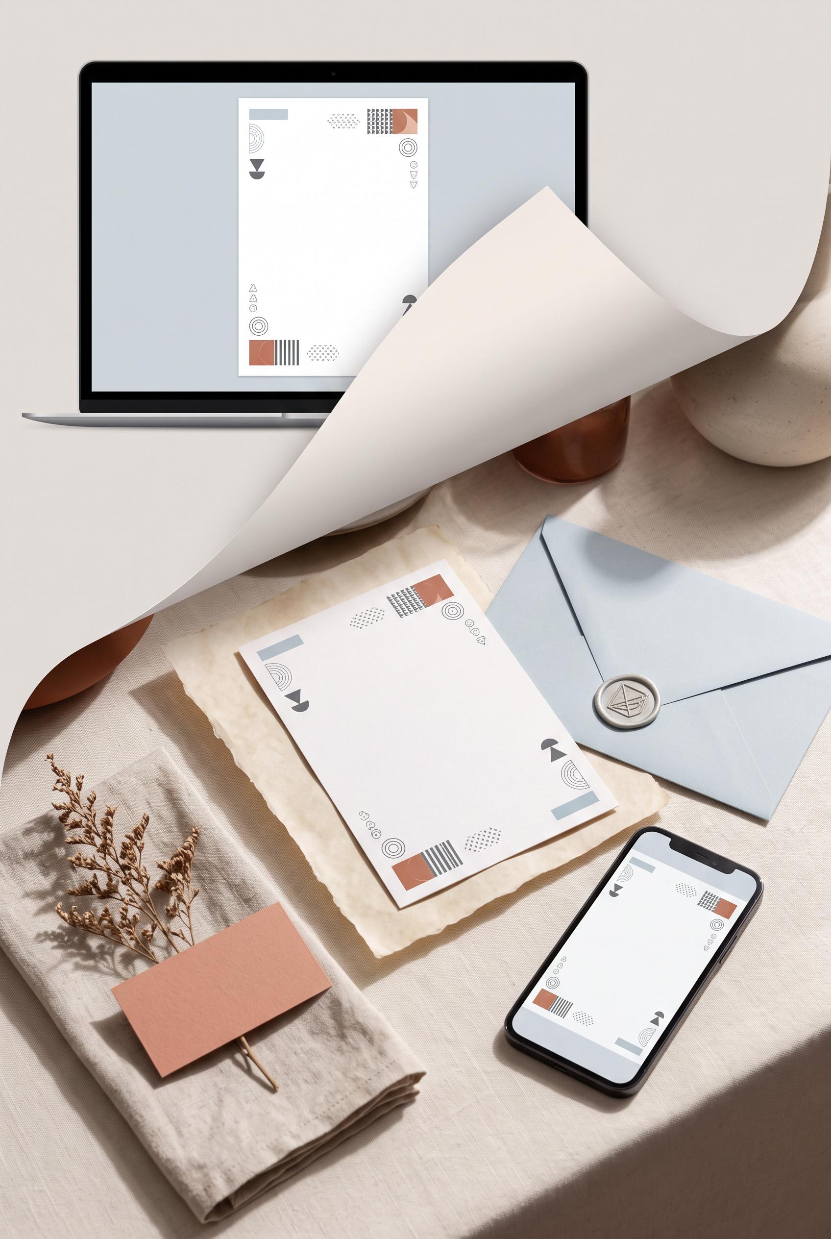 0
Create a commercial-quality vertical 2:3 Pinterest composition for an Etsy listing concept. Show an editable event invitation suite transforming from a plain digital file preview into a beautifully styled celebration table with printed invitation, envelope, place card, and smartphone preview. Use a layered paper-peel reveal, terracotta, ice blue, parchment, and graphite accents, refined editorial photography, soft directional light, tactile paper, realistic shadows, no real brands, no trademarked characters, no watermark, and no unintended readable text. Corrective regeneration attempt 3. Produce a materially revised image, not a near-duplicate of an earlier variant. Preserve the successful subject, palette, lighting, focal hierarchy, and commercial polish from the original brief while correcting every issue below. Mandatory corrective instructions from the most recent visual QA: Preserve the strong vertical 2:3 editorial composition, layered paper-peel reveal, terracotta/ice-blue/parchment/graphite palette, soft directional lighting, tactile paper, realistic shadows, and coordinated laptop preview, smartphone, printed invitation, envelope, place card, and celebration table. Remove every letter-like mark from the printed invitation, place card, and wax seal: replace all script, headings, names, labels, lines resembling handwriting, and emblem glyphs with blank surfaces or purely abstract geometric decoration. Keep the digital laptop and phone previews unbranded and limited to clean abstract shapes with no UI text. Maintain generous uncluttered negative space and do not add captions, labels, logos, watermark, or any readable or pseudo-readable text. Observed defects from prior variants that must not recur: 1) Bottom banner contains the real trademark/brand name “ETSY.” 2) Several interface labels and small text are visibly garbled or nonsensical. 3) The top and bottom text banners reduce the generous clean space for overlay text. 4) The desktop preview includes a recognizable but cluttered app interface rather than a clean unbranded file preview. 5) Printed invitation contains readable script-like text and lines resembling writing. 6) Place card visibly contains the word-like text “Name.” 7) Wax seal includes letter-like glyphs. 8) The otherwise strong paper-peel composition, palette, lighting, and product styling are commercially polished. Render no letters, words, numbers, prices, headings, labels, contact details, logos, glyphs, or pseudo-text anywhere. Use only blank surfaces, clean geometric marks, and non-linguistic placeholder shapes. Do not add explanatory captions, before/after labels, interface copy, or extra objects that the brief did not request. When a corrective instruction conflicts with a decorative detail, prioritize the corrective instruction.
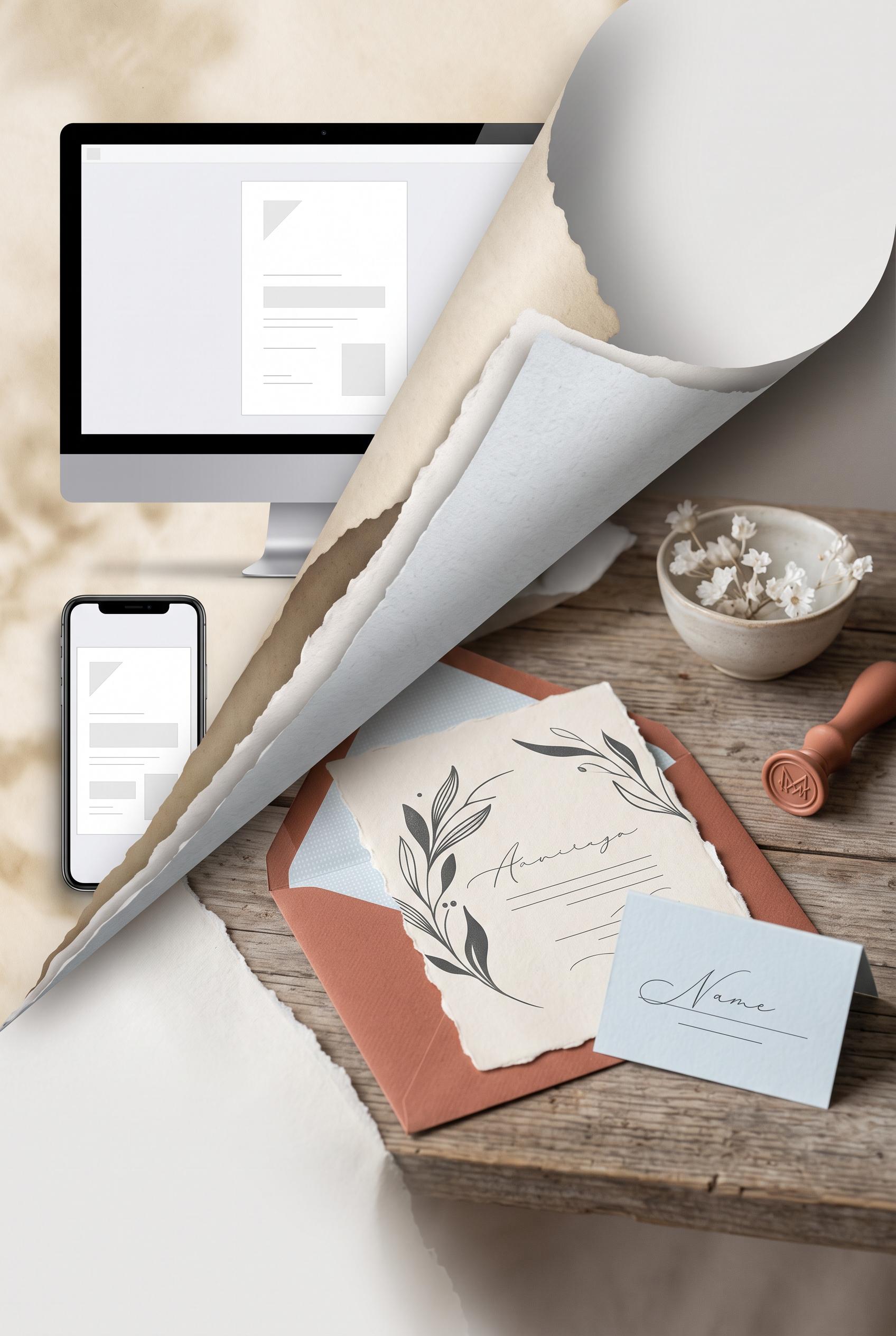 0
Create a commercial-quality vertical 2:3 Pinterest composition for an Etsy listing concept. Show an editable event invitation suite transforming from a plain digital file preview into a beautifully styled celebration table with printed invitation, envelope, place card, and smartphone preview. Use a layered paper-peel reveal, terracotta, ice blue, parchment, and graphite accents, refined editorial photography, soft directional light, tactile paper, realistic shadows, no real brands, no trademarked characters, no watermark, and no unintended readable text. Corrective regeneration attempt 2. Produce a materially revised image, not a near-duplicate of an earlier variant. Preserve the successful subject, palette, lighting, focal hierarchy, and commercial polish from the original brief while correcting every issue below. Mandatory corrective instructions from the most recent visual QA: Preserve the strong vertical 2:3 editorial composition, terracotta/ice-blue/parchment palette, clear paper-peel transition, realistic tactile paper, soft directional light, and coordinated invitation, envelope, place card, phone, and celebration table. Remove the bottom promotional banner entirely and remove all real brand or trademark references, including Etsy. Replace the desktop and phone interfaces with clean, minimal unbranded digital previews containing only abstract placeholder shapes and no legible UI labels or garbled text. Keep the printed invitation and place card elegant but use minimal non-readable typographic lines or blank text areas. Maintain a clear focal hierarchy and leave generous uncluttered negative space for overlay text. No watermark, logos, recognizable app interface, or unintended readable text. Observed defects from prior variants that must not recur: 1) Bottom banner contains the real trademark/brand name “ETSY.” 2) Several interface labels and small text are visibly garbled or nonsensical. 3) The top and bottom text banners reduce the generous clean space for overlay text. 4) The desktop preview includes a recognizable but cluttered app interface rather than a clean unbranded file preview. Render no letters, words, numbers, prices, headings, labels, contact details, logos, glyphs, or pseudo-text anywhere. Use only blank surfaces, clean geometric marks, and non-linguistic placeholder shapes. Do not add explanatory captions, before/after labels, interface copy, or extra objects that the brief did not request. When a corrective instruction conflicts with a decorative detail, prioritize the corrective instruction.
 0
Create a commercial-quality vertical 2:3 Pinterest composition for an Etsy listing concept. Show an editable event invitation suite transforming from a plain digital file preview into a beautifully styled celebration table with printed invitation, envelope, place card, and smartphone preview. Use a layered paper-peel reveal, terracotta, ice blue, parchment, and graphite accents, refined editorial photography, soft directional light, tactile paper, realistic shadows, no real brands, no trademarked characters, no watermark, and no unintended readable text.
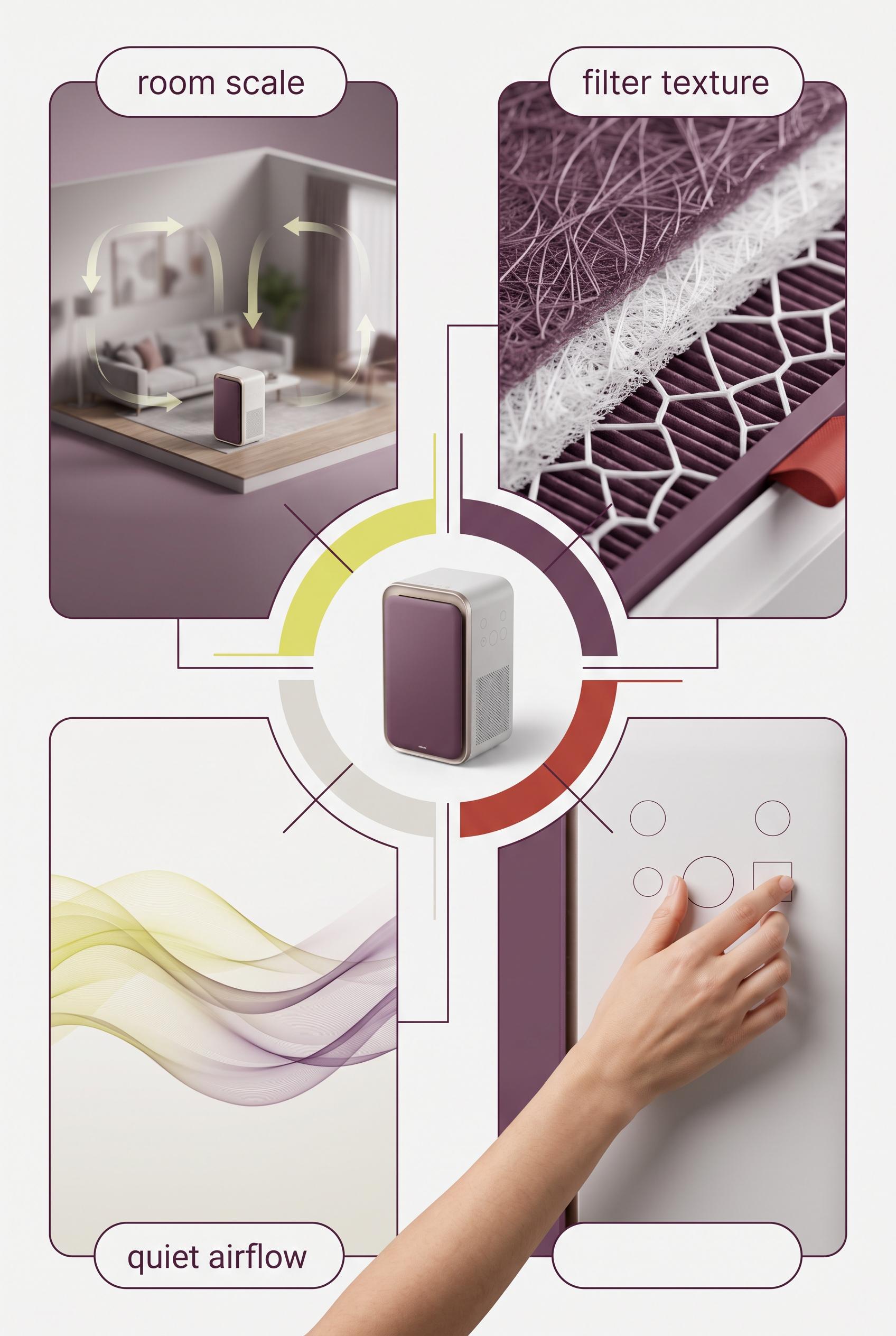 0
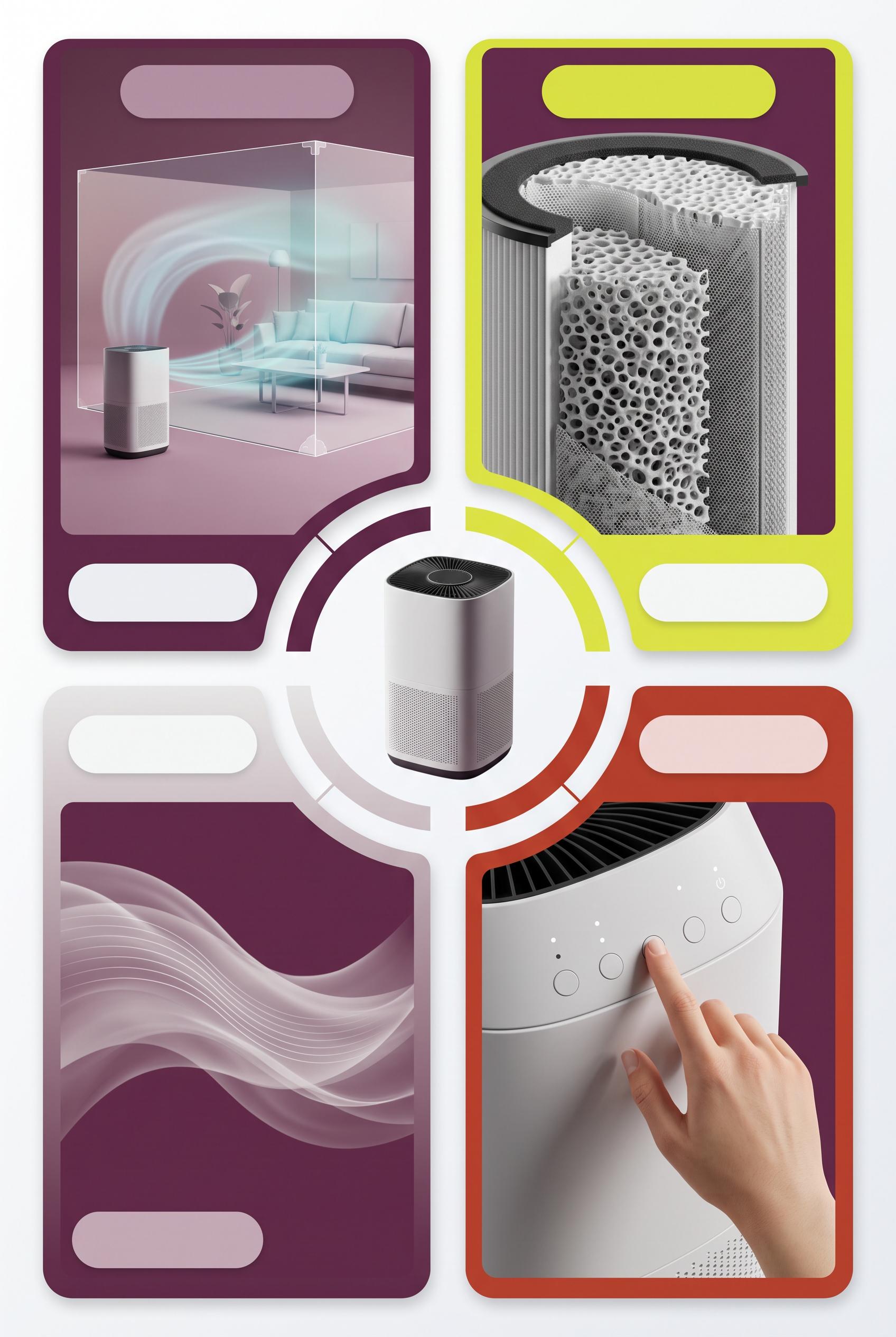
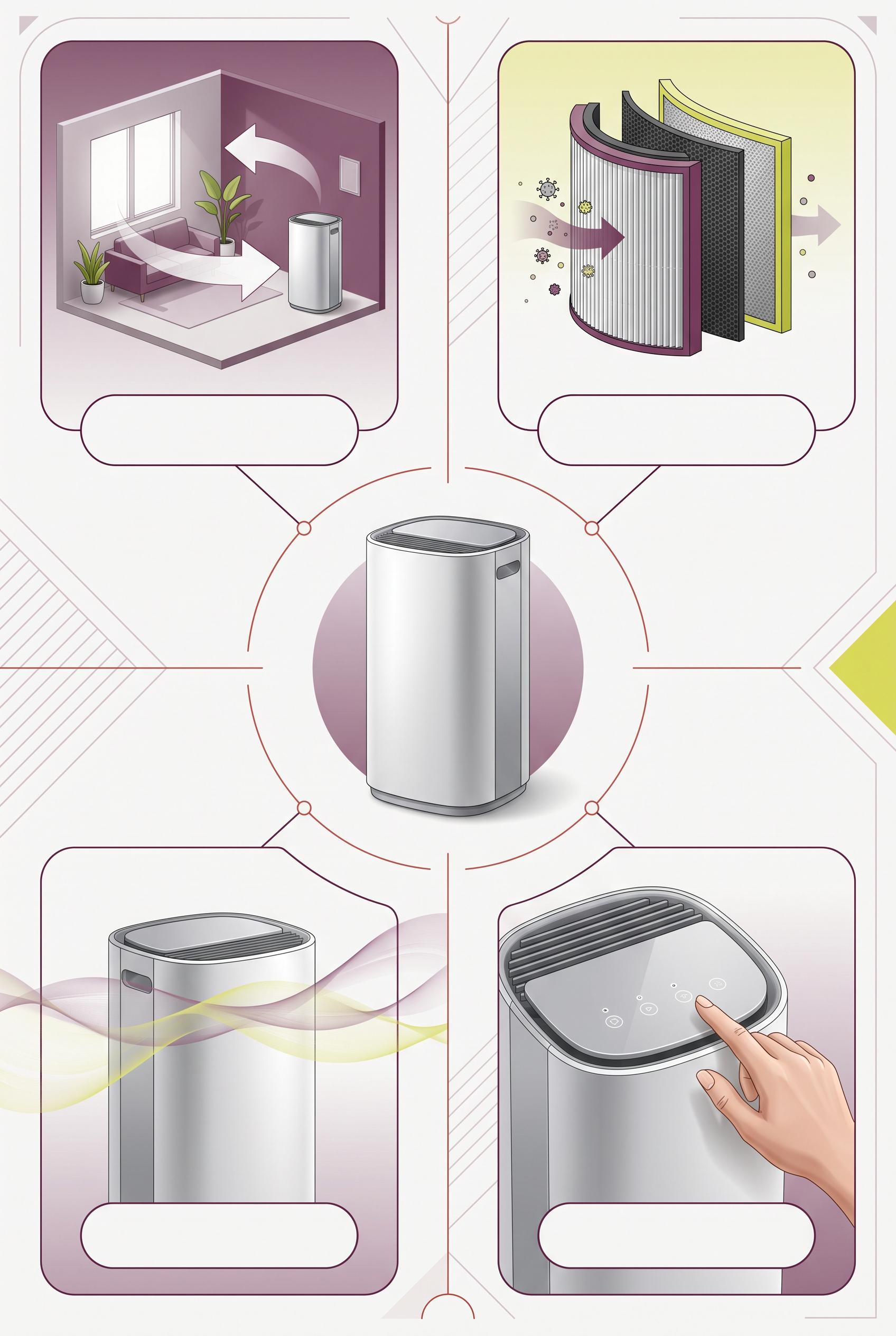
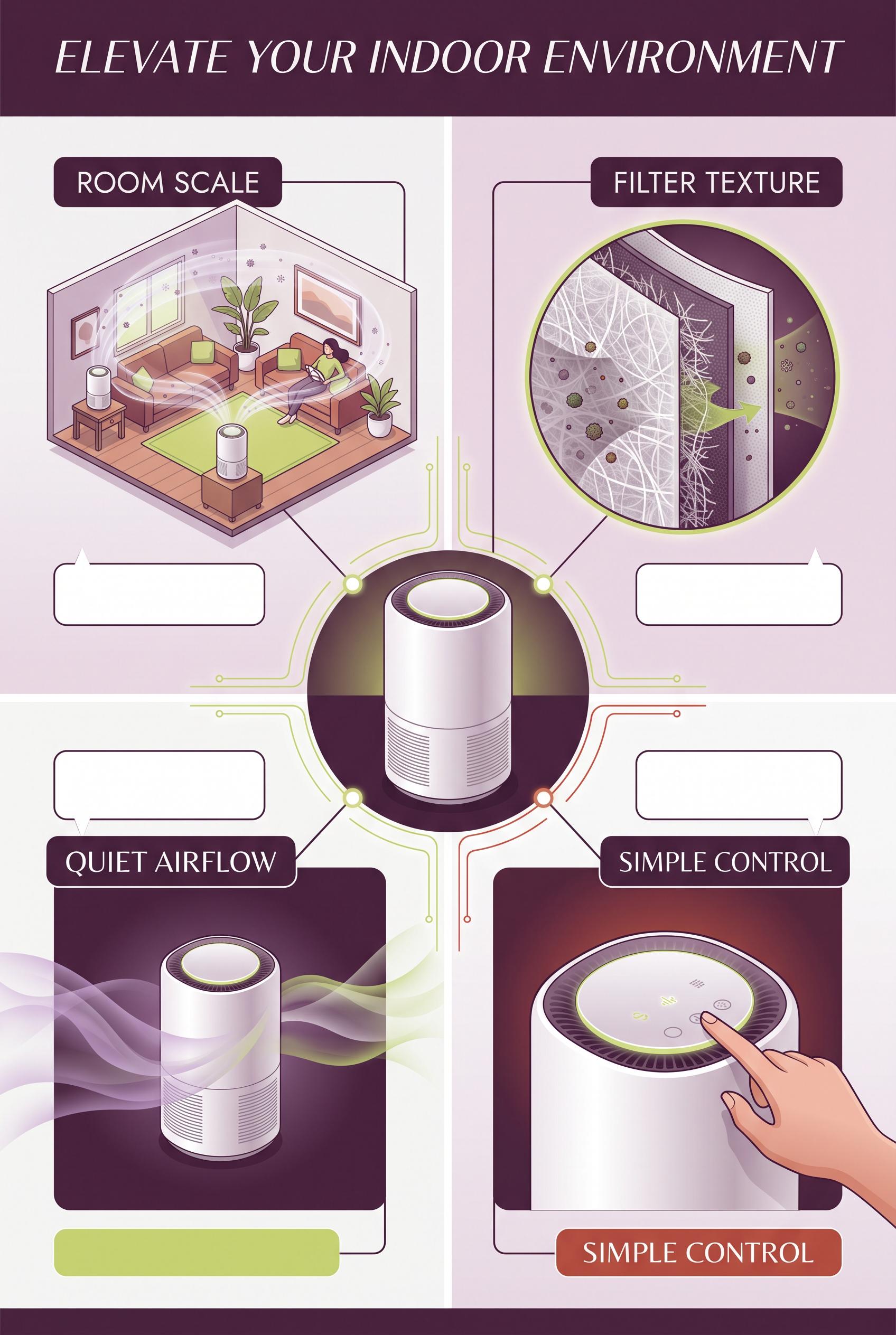
Create a commercial-quality educational campaign board in a vertical 2:3 Pinterest composition. Place an unbranded compact air purifier at the center of a radial layout with four clearly separated visual proof panels around it: room scale, filter texture, quiet airflow shown with soft translucent waves, and a hand adjusting a simple control. Use plum, citron, fog white, and oxide red with thin graphic connectors and blank label areas. AI-modified downstream. No real brands, no trademarked characters, no watermark, and no unintended readable text. Corrective regeneration attempt 5. Produce a materially revised image, not a near-duplicate of an earlier variant. Preserve the successful subject, palette, lighting, focal hierarchy, and commercial polish from the original brief while correcting every issue below. Mandatory corrective instructions from the most recent visual QA: Preserve the polished vertical 2:3 radial composition, central unbranded purifier, four proof panels, plum/citron/fog-white/oxide-red palette, thin connectors, filter detail, room-scale scene, and translucent airflow waves. Reframe the lower-right control panel so the complete natural hand, wrist, and a portion of forearm are fully inside the panel with generous margins on every side; do not crop them at any edge. Remove all small dot indicators and any interface glyphs or pseudo-text. Show only a few simple blank circular controls and clean geometric forms. Keep all rounded label areas completely blank. Render no letters, words, numbers, labels, logos, watermark, or readable text anywhere. Observed defects from prior variants that must not recur: 1) The lower-right control panel crops the hand/forearm at the right edge, contrary to the required fully visible natural hand framing. 2) The composition otherwise has a strong vertical layout, clear central purifier, four distinct image-led panels, clean blank label areas, appropriate palette, and no visible text,3D 3) watermark, or branding. 4) The lower-right control panel crops the hand and wrist against the right edge, violating the required generous framing. 5) The control panel contains small interface-like glyphs and symbols, contrary to the instruction to render no glyphs or pseudo-text. 6) The hand anatomy/framing is not fully polished for commercial use. 7) The lower-right control panel crops the forearm at the bottom edge, lacking the required generous framing. 8) Small dot indicators and interface-like control marks remain despite the no-glyph requirement. Render no letters, words, numbers, prices, headings, labels, contact details, logos, glyphs, or pseudo-text anywhere. Use only blank surfaces, clean geometric marks, and non-linguistic placeholder shapes. Do not add explanatory captions, before/after labels, interface copy, or extra objects that the brief did not request. When a corrective instruction conflicts with a decorative detail, prioritize the corrective instruction.
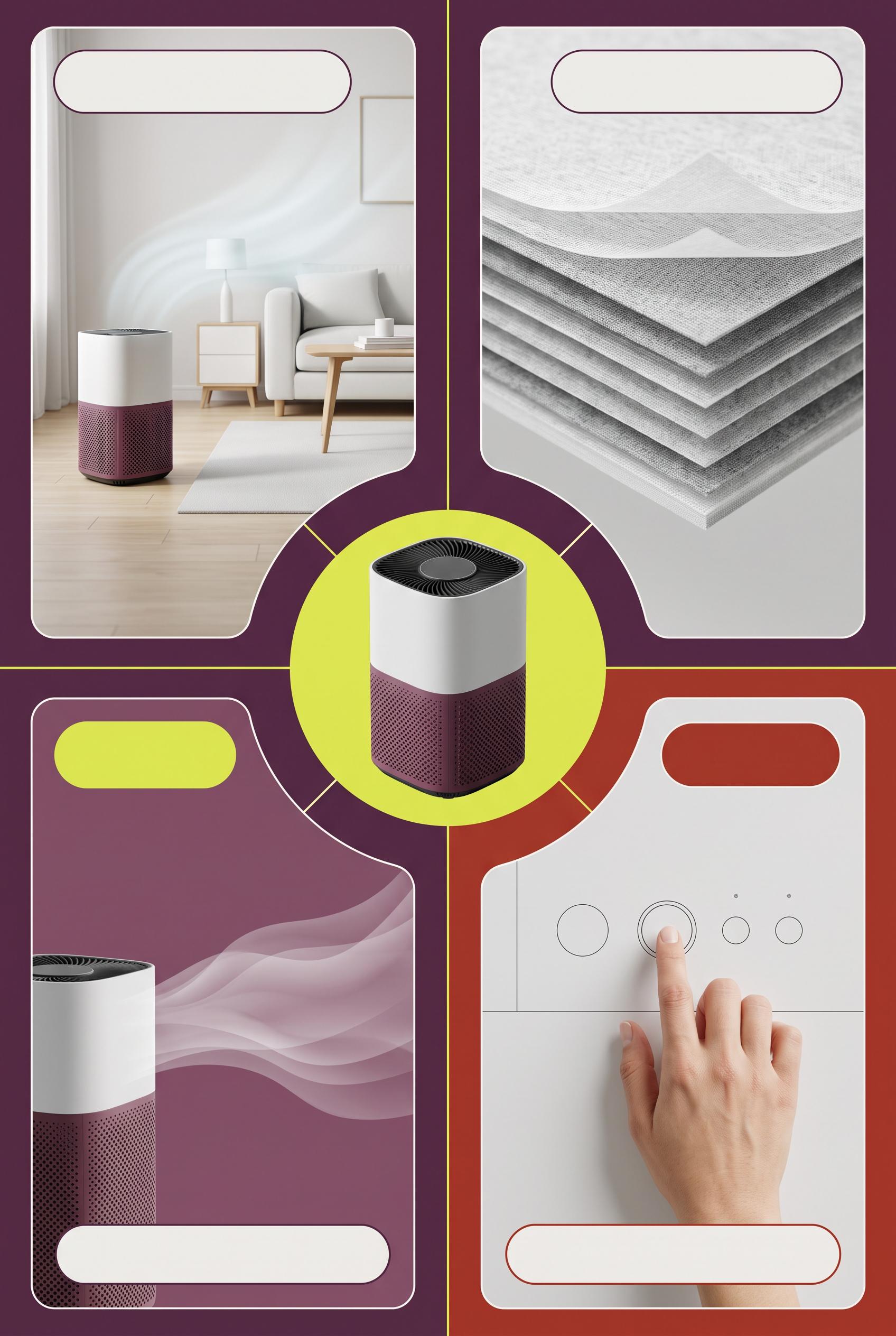 0
Create a commercial-quality educational campaign board in a vertical 2:3 Pinterest composition. Place an unbranded compact air purifier at the center of a radial layout with four clearly separated visual proof panels around it: room scale, filter texture, quiet airflow shown with soft translucent waves, and a hand adjusting a simple control. Use plum, citron, fog white, and oxide red with thin graphic connectors and blank label areas. AI-modified downstream. No real brands, no trademarked characters, no watermark, and no unintended readable text. Corrective regeneration attempt 4. Produce a materially revised image, not a near-duplicate of an earlier variant. Preserve the successful subject, palette, lighting, focal hierarchy, and commercial polish from the original brief while correcting every issue below. Mandatory corrective instructions from the most recent visual QA: Preserve the strong vertical 2:3 radial composition, central compact unbranded purifier, four distinct proof panels, plum/citron/fog-white/oxide-red palette, thin connectors, filter detail, room-scale scene, soft airflow waves, blank rounded label areas, and premium lighting. Reframe the lower-right control close-up so the entire hand, wrist, and fingertip are comfortably inside the panel with generous margins on every side; do not crop any part of the hand or forearm. Keep the anatomy natural. Remove every interface glyph, power icon, dot indicator, letter, word, number, label, logo, watermark, pseudo-text, and trademark. Show only simple blank circular controls and clean geometric forms. Observed defects from prior variants that must not recur: 1) The duplicated “SIMPLE CONTROL” label and large headline compete with the visual focal point. 2) The lower-right hand is awkwardly cropped at the edge, reducing polished commercial quality. 3) The lower-right control panel crops the hand/forearm at the right edge, contrary to the required fully visible natural hand framing. 4) The composition otherwise has a strong vertical layout, clear central purifier, four distinct image-led panels, clean blank label areas, appropriate palette, and no visible text,3D 5) watermark, or branding. 6) The lower-right control panel crops the hand and wrist against the right edge, violating the required generous framing. 7) The control panel contains small interface-like glyphs and symbols, contrary to the instruction to render no glyphs or pseudo-text. 8) The hand anatomy/framing is not fully polished for commercial use. Render no letters, words, numbers, prices, headings, labels, contact details, logos, glyphs, or pseudo-text anywhere. Use only blank surfaces, clean geometric marks, and non-linguistic placeholder shapes. Do not add explanatory captions, before/after labels, interface copy, or extra objects that the brief did not request. When a corrective instruction conflicts with a decorative detail, prioritize the corrective instruction.
 0
Create a commercial-quality educational campaign board in a vertical 2:3 Pinterest composition. Place an unbranded compact air purifier at the center of a radial layout with four clearly separated visual proof panels around it: room scale, filter texture, quiet airflow shown with soft translucent waves, and a hand adjusting a simple control. Use plum, citron, fog white, and oxide red with thin graphic connectors and blank label areas. AI-modified downstream. No real brands, no trademarked characters, no watermark, and no unintended readable text. Corrective regeneration attempt 3. Produce a materially revised image, not a near-duplicate of an earlier variant. Preserve the successful subject, palette, lighting, focal hierarchy, and commercial polish from the original brief while correcting every issue below. Mandatory corrective instructions from the most recent visual QA: Preserve the successful vertical 2:3 radial infographic layout, central unbranded purifier, plum/citron/fog-white/oxide-red palette, four distinct panels, thin connectors, clean blank rounded label areas, filter detail, room-scale scene, and soft airflow waves. Reframe only the lower-right control close-up so the complete hand, wrist, and fingertip are comfortably inside the panel with generous margins on every side; do not crop the hand against the right border. Keep anatomy natural and maintain the premium commercial finish. Render no letters, words, numbers, labels, logos, glyphs, pseudo-text, watermark, or trademark. Observed defects from prior variants that must not recur: 1) The composition is strong and clearly shows the four requested proof panels, but it is copy-heavy and includes prominent embedded headings and labels despite the brief requesting a 2) image-led design with blank label areas. 3) The duplicated “SIMPLE CONTROL” label and large headline compete with the visual focal point. 4) The lower-right hand is awkwardly cropped at the edge, reducing polished commercial quality. 5) The lower-right control panel crops the hand/forearm at the right edge, contrary to the required fully visible natural hand framing. 6) The composition otherwise has a strong vertical layout, clear central purifier, four distinct image-led panels, clean blank label areas, appropriate palette, and no visible text,3D 7) watermark, or branding. Render no letters, words, numbers, prices, headings, labels, contact details, logos, glyphs, or pseudo-text anywhere. Use only blank surfaces, clean geometric marks, and non-linguistic placeholder shapes. Do not add explanatory captions, before/after labels, interface copy, or extra objects that the brief did not request. When a corrective instruction conflicts with a decorative detail, prioritize the corrective instruction.
 0
Create a commercial-quality educational campaign board in a vertical 2:3 Pinterest composition. Place an unbranded compact air purifier at the center of a radial layout with four clearly separated visual proof panels around it: room scale, filter texture, quiet airflow shown with soft translucent waves, and a hand adjusting a simple control. Use plum, citron, fog white, and oxide red with thin graphic connectors and blank label areas. AI-modified downstream. No real brands, no trademarked characters, no watermark, and no unintended readable text. Corrective regeneration attempt 2. Produce a materially revised image, not a near-duplicate of an earlier variant. Preserve the successful subject, palette, lighting, focal hierarchy, and commercial polish from the original brief while correcting every issue below. Mandatory corrective instructions from the most recent visual QA: Preserve the vertical 2:3 radial layout, central unbranded purifier, plum/citron/fog-white/oxide-red palette, four distinct visual panels, thin connectors, filter detail, soft airflow waves, room scene, and hand-operated control. Remove all embedded words, headings, labels, and lettering; replace every text area with clean blank rounded label panels or abstract icons only. Keep the four panels clearly distinguishable through imagery and symbols. Reframe the lower-right control close-up so the entire hand and fingertip are naturally visible inside the panel, with no edge cropping or anatomy artifacts. Maintain a clean, balanced, premium commercial infographic composition with no watermark, logos, trademarks, or readable text. Observed defects from prior variants that must not recur: 1) The composition is strong and clearly shows the four requested proof panels, but it is copy-heavy and includes prominent embedded headings and labels despite the brief requesting a 2) image-led design with blank label areas. 3) The duplicated “SIMPLE CONTROL” label and large headline compete with the visual focal point. 4) The lower-right hand is awkwardly cropped at the edge, reducing polished commercial quality. Render no letters, words, numbers, prices, headings, labels, contact details, logos, glyphs, or pseudo-text anywhere. Use only blank surfaces, clean geometric marks, and non-linguistic placeholder shapes. Do not add explanatory captions, before/after labels, interface copy, or extra objects that the brief did not request. When a corrective instruction conflicts with a decorative detail, prioritize the corrective instruction.
 0
Create a commercial-quality educational campaign board in a vertical 2:3 Pinterest composition. Place an unbranded compact air purifier at the center of a radial layout with four clearly separated visual proof panels around it: room scale, filter texture, quiet airflow shown with soft translucent waves, and a hand adjusting a simple control. Use plum, citron, fog white, and oxide red with thin graphic connectors and blank label areas. AI-modified downstream. No real brands, no trademarked characters, no watermark, and no unintended readable text.
 0
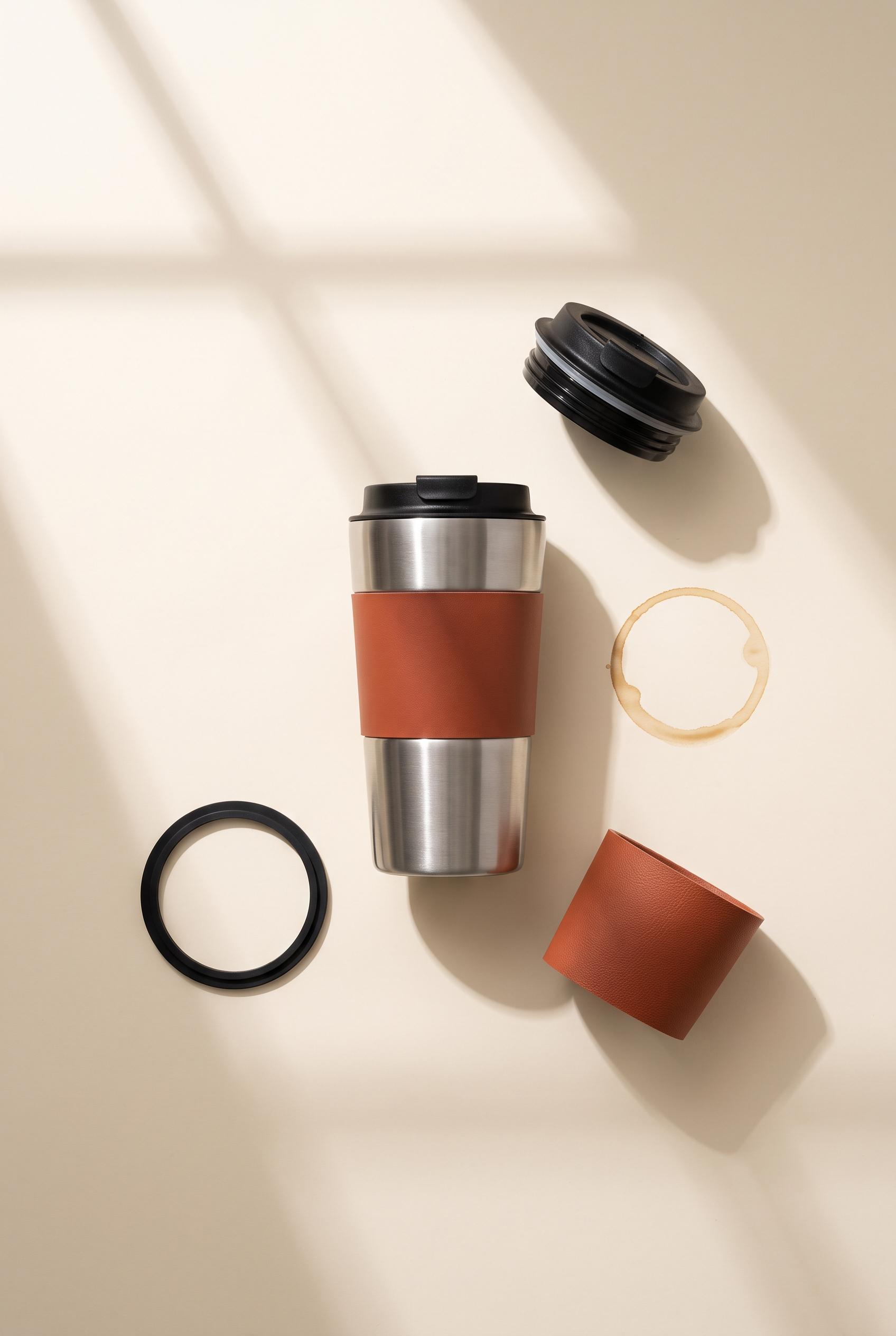
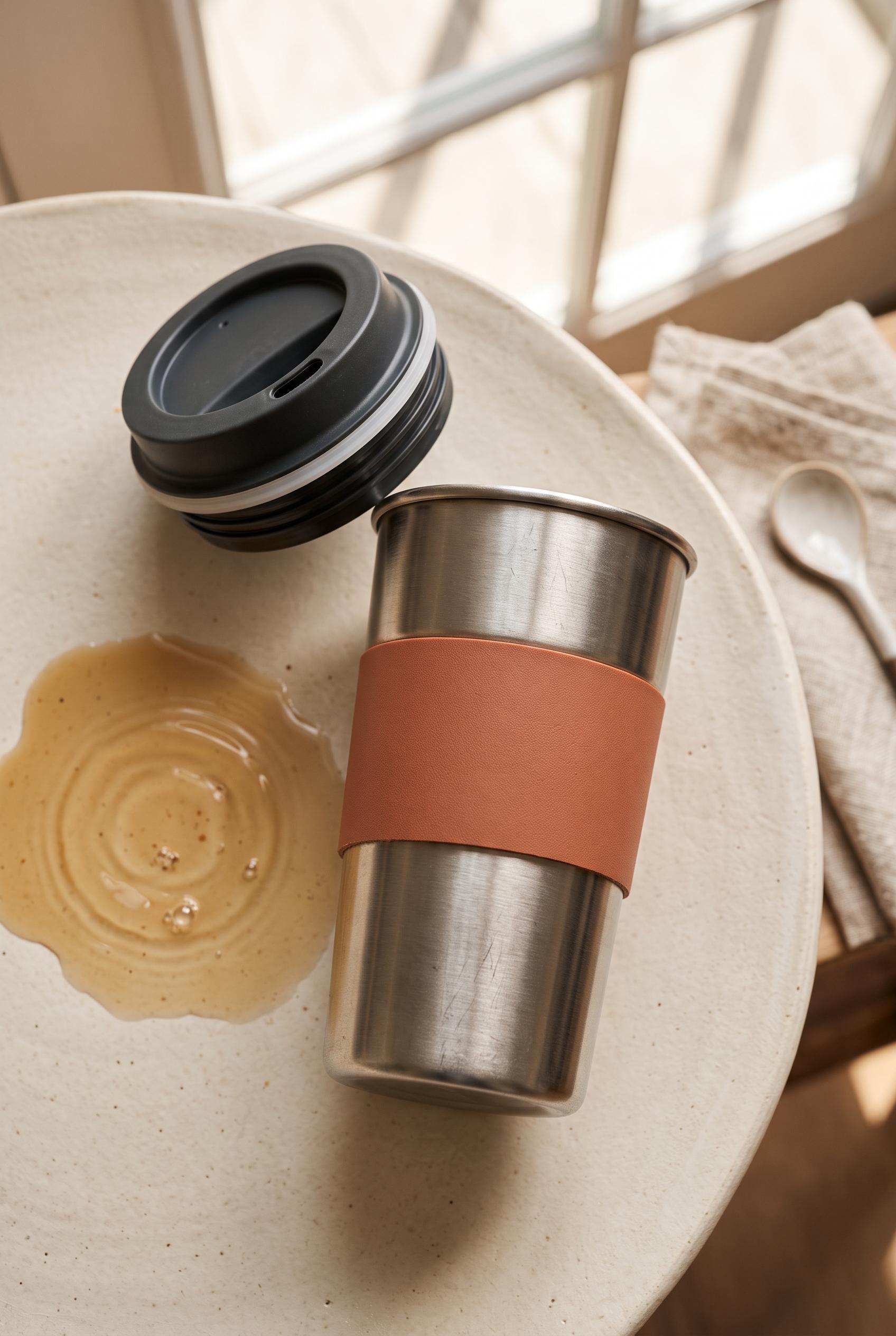
Create a commercial-quality product showcase in a vertical 2:3 Pinterest composition. Feature an unbranded reusable travel mug in brushed steel with a terracotta grip, placed on warm ivory beside a subtle coffee ripple, detached lid, gasket detail, and clean geometric window shadows. Use an overhead orbit arrangement, tactile material closeups, soft morning light, and refined editorial styling. AI-modified downstream. No real brands, no trademarked characters, no watermark, and no unintended readable text. Corrective regeneration attempt 2. Produce a materially revised image, not a near-duplicate of an earlier variant. Preserve the successful subject, palette, lighting, focal hierarchy, and commercial polish from the original brief while correcting every issue below. Mandatory corrective instructions from the most recent visual QA: Preserve the warm ivory tabletop, brushed-steel mug, terracotta grip, soft morning window shadows, and refined editorial lighting. Regenerate as a clean overhead vertical 2:3 composition with the mug centered and a precise balanced orbit of detached lid, clearly visible separate silicone gasket/seal ring, grip detail, and a small subtle coffee ripple. Replace the large irregular coffee spill with a restrained circular ripple. Keep all components fully visible, neatly spaced, unbranded, watermark-free, and free of text or generation artifacts. Observed defects from prior variants that must not recur: 1) The image is attractive and correctly vertical, but the required gasket/seal detail is missing. 2) The coffee ripple appears as a large messy spill rather than a subtle, precise ripple. 3) The orbit arrangement is not sufficiently precise or balanced for a polished product showcase. Render no letters, words, numbers, prices, headings, labels, contact details, logos, glyphs, or pseudo-text anywhere. Use only blank surfaces, clean geometric marks, and non-linguistic placeholder shapes. Do not add explanatory captions, before/after labels, interface copy, or extra objects that the brief did not request. When a corrective instruction conflicts with a decorative detail, prioritize the corrective instruction.
 0
Create a commercial-quality product showcase in a vertical 2:3 Pinterest composition. Feature an unbranded reusable travel mug in brushed steel with a terracotta grip, placed on warm ivory beside a subtle coffee ripple, detached lid, gasket detail, and clean geometric window shadows. Use an overhead orbit arrangement, tactile material closeups, soft morning light, and refined editorial styling. AI-modified downstream. No real brands, no trademarked characters, no watermark, and no unintended readable text.
 0
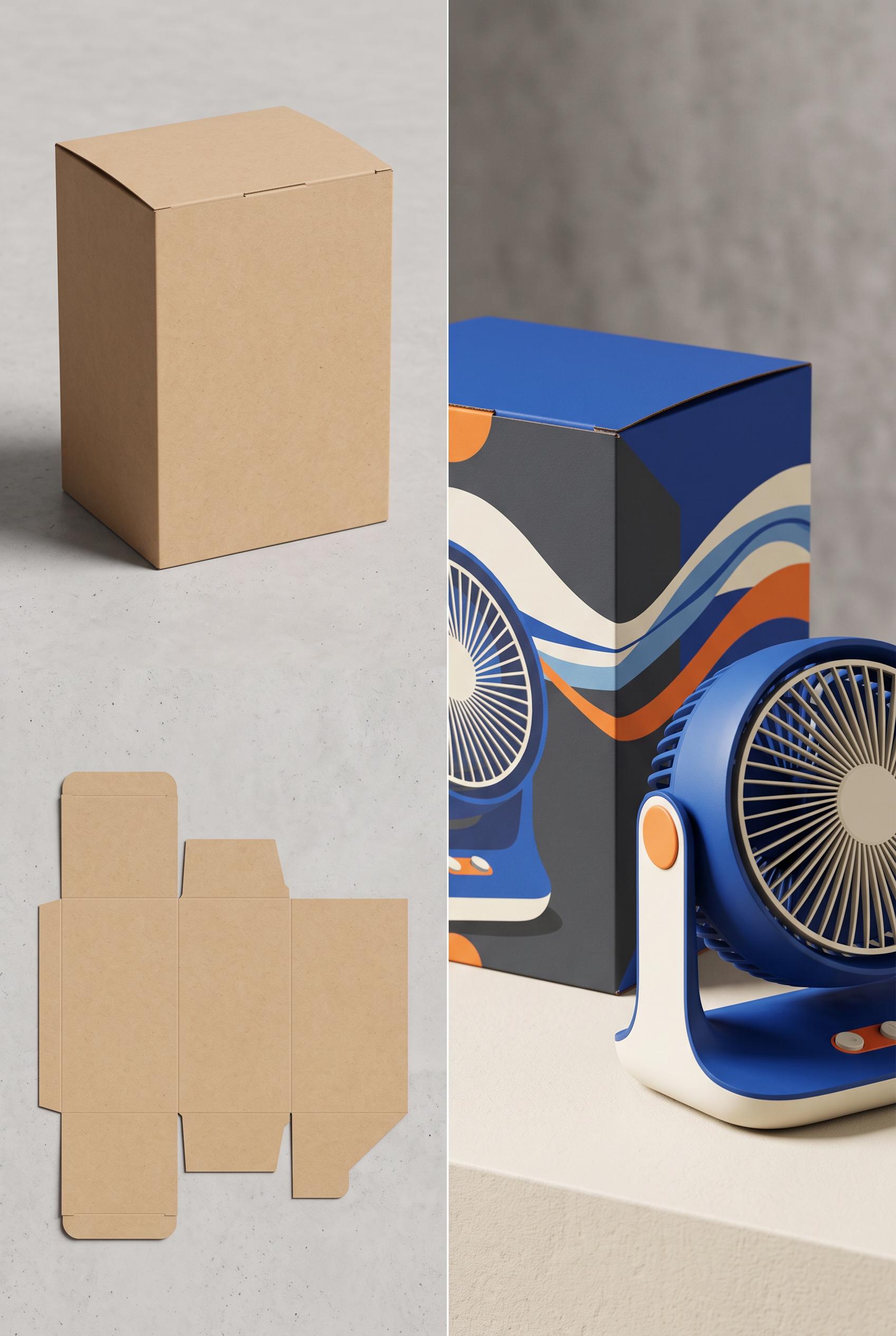
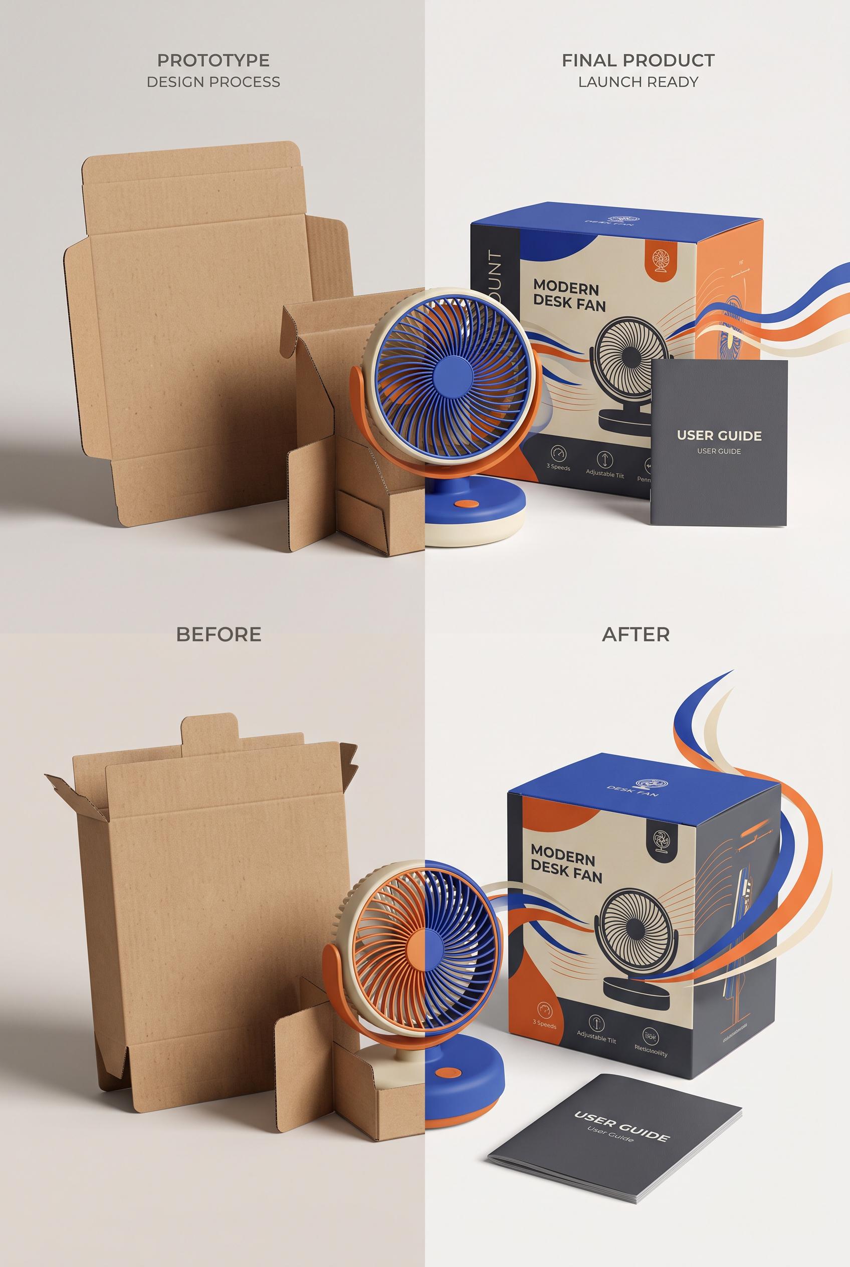
Create a commercial-quality product mockup in a vertical 2:3 Pinterest composition. Show a before-and-after transformation from a plain unprinted desk fan carton and flat dieline on the left to a polished cobalt, tangerine, cream, and charcoal launch scene on the right. Include a compact modern desk fan, folded carton structure, flowing abstract air ribbons, crisp paper edges, tactile matte surfaces, and directional studio lighting. AI-modified downstream. No real brands, no trademarked characters, no watermark, and no unintended readable text. Corrective regeneration attempt 2. Produce a materially revised image, not a near-duplicate of an earlier variant. Preserve the successful subject, palette, lighting, focal hierarchy, and commercial polish from the original brief while correcting every issue below. Mandatory corrective instructions from the most recent visual QA: Create one clean vertical 2:3 Pinterest composition with a single central vertical transformation split only: left side is a restrained blank kraft carton and flat carton dieline; right side is one polished cobalt, tangerine, cream, and charcoal desk-fan launch scene with compact fan, folded dimensional carton, flowing sliced airflow ribbons, and sculptural shadow. Remove all headings, captions, logos, brand marks, product names, feature labels, booklet text, symbols, and every other readable character. Keep the blank carton entirely unprinted. Use crisp paper edges, tactile matte surfaces, directional studio lighting, strong focal hierarchy, and a clean uninterrupted split without stacked panels, duplicated objects, seam collisions, or illegible micro-details. Observed defects from prior variants that must not recur: 1) The composition does not follow the requested single left-before/right-after transformation; it is split into two stacked panels with duplicated scenes. 2) It contains extensive embedded headings, product copy, feature labels, and booklet text despite the instruction to avoid unintended readable text. 3) The small packaging and manual text includes questionable pseudo-words and tiny illegible details, reducing commercial polish. Render no letters, words, numbers, prices, headings, labels, contact details, logos, glyphs, or pseudo-text anywhere. Use only blank surfaces, clean geometric marks, and non-linguistic placeholder shapes. Do not add explanatory captions, before/after labels, interface copy, or extra objects that the brief did not request. When a corrective instruction conflicts with a decorative detail, prioritize the corrective instruction.
 0
Create a commercial-quality product mockup in a vertical 2:3 Pinterest composition. Show a before-and-after transformation from a plain unprinted desk fan carton and flat dieline on the left to a polished cobalt, tangerine, cream, and charcoal launch scene on the right. Include a compact modern desk fan, folded carton structure, flowing abstract air ribbons, crisp paper edges, tactile matte surfaces, and directional studio lighting. AI-modified downstream. No real brands, no trademarked characters, no watermark, and no unintended readable text.
 0
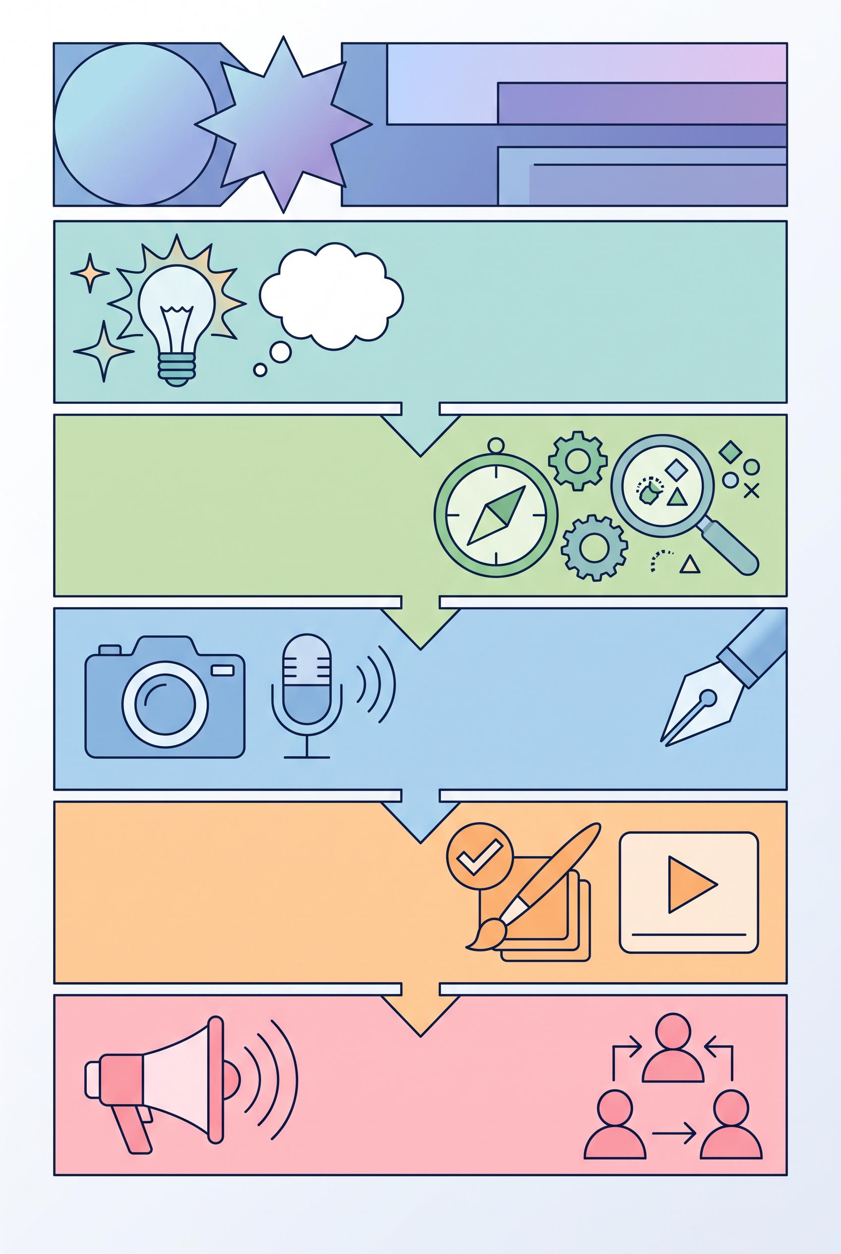
Design a vibrant vertical 2:3 infographic that outlines a five-step content creation strategy for creators. Each section should have a unique icon and pastel color, designed to be inviting and easy to read. Ensure a clean layout and professional quality artwork without any brand logos. Aim for clear visual communication of ideas. Corrective regeneration attempt 6. Produce a materially revised image, not a near-duplicate of an earlier variant. Preserve the successful subject, palette, lighting, focal hierarchy, and commercial polish from the original brief while correcting every issue below. Mandatory corrective instructions from the most recent visual QA: Create a strictly non-textual 2:3 vertical infographic consisting of five clearly delineated steps. Use pastel color blocks for each step with unique, non-textual icons or geometric shapes (no letters, numbers, words, or captions). Establish a strong focal point at the top with an abstract title area composed only of shapes. Maintain visual hierarchy through block size, spacing, and arrows, without any text. Keep all five steps visually distinct and aligned crisply. Do not include any logos, brand marks, or readable text anywhere. If needed, use a thin, unobtrusive border solely to separate sections. Replace all bottom branding areas with blank surfaces. Use neutral placeholder shapes (circles, squares, triangles, abstract glyphs) to convey progression. Ensure no letters, numbers, headings, labels, prices, or contact details appear in any panel. Deliver a single clean vertical 2:3 composition with five steps and clear progression arrows, all purely visual. Observed defects from prior variants that must not recur: 1) Not purely non-textual: letters/numbers/phrases are present 2) Images include logos or brand marks 3) Some sections use textual headings which violate the no-text requirement 4) The current image contains text/labels and visible numerals that violate the no-text, no-label requirement. 5) Branding glyphs or logos appear in the bottom area, which is not allowed. 6) Visual hierarchy relies on textual headings rather than pure non-linguistic shapes. 7) Bottom center areas show potential branding glyphs or subtle text. 8) Some sections use letters or readable captions that contradict the non-textual mandate. Render no letters, words, numbers, prices, headings, labels, contact details, logos, glyphs, or pseudo-text anywhere. Use only blank surfaces, clean geometric marks, and non-linguistic placeholder shapes. Do not add explanatory captions, before/after labels, interface copy, or extra objects that the brief did not request. When a corrective instruction conflicts with a decorative detail, prioritize the corrective instruction.
 0
Create a vertical 2:3 composition showcasing the before (plastic) and after (biodegradable) packaging side by side in a serene, natural setting, emphasizing sustainability and eco-friendliness, high-quality art direction without real brands or readable text. Corrective regeneration attempt 6. Produce a materially revised image, not a near-duplicate of an earlier variant. Preserve the successful subject, palette, lighting, focal hierarchy, and commercial polish from the original brief while correcting every issue below. Mandatory corrective instructions from the most recent visual QA: Create a new vertical 2:3 image with a seamless, uninterrupted split between left and right halves. Left half: plain plastic bag with flat, unmarked surface, cool, slightly harsh lighting. Right half: plain biodegradable bag with flat, unmarked surface, warmer, earth-toned lighting. Use a continuous horizon line with no central seam or dividing artifact. Background remains a serene forest/natural setting with consistent depth of field. Bags must be neutral in color, unmarked, without branding, logos, textures resembling logos, compostable symbols, or text. Bags should have clean, flat surfaces with no visible seams, watermarks, or artifacts. Maintain bottom alignment and a high-contrast lighting scheme to emphasize cooler plastic vs. warmer biodegradable, with no captions, labels, or extra objects. Render no letters, words, numbers, prices, headings, labels, contact details, logos, glyphs, or pseudo-text anywhere. Use only blank surfaces, clean geometric marks, and non-linguistic placeholder shapes. Observed defects from prior variants that must not recur: 1) No continuous horizon line between halves; transition is not uninterrupted. 2) Two bags are plain/unmarked but there is a visible seam/texture issue on bag surfaces near the center. 3) No captions or logos, but the split renders with a distinct seam artifact and uneven lighting across halves. 4) Ensure 2:3 vertical framing with flat bag surfaces and no central seam; maintain consistent DOF and natural background without extra objects. 5) Seam/central dividing artifact present: visible vertical seam splits the 2:3 frame, breaking the seamless horizon requirement. 6) Uninterrupted transition between halves not achieved; two bags not on a continuous horizon line. 7) Bag surfaces show texture/seams near center and appear reflective, not flat; surfaces must be flat, plain, unmarked. 8) Two bags have central seam/texture issue and potential artifacts; overall image lacks clean, flat surfaces as requested. Render no letters, words, numbers, prices, headings, labels, contact details, logos, glyphs, or pseudo-text anywhere. Use only blank surfaces, clean geometric marks, and non-linguistic placeholder shapes. Do not add explanatory captions, before/after labels, interface copy, or extra objects that the brief did not request. When a corrective instruction conflicts with a decorative detail, prioritize the corrective instruction.
 0
Flat lay of artisan tea collection with various blends, styled with dried herbs and tea cups in vertical 2:3 Pinterest composition, commercial-quality art direction, no real brands, no trademarks, no watermarks, no readable text. Corrective regeneration attempt 2. Produce a materially revised image, not a near-duplicate of an earlier variant. Preserve the successful subject, palette, lighting, focal hierarchy, and commercial polish from the original brief while correcting every issue below. Mandatory corrective instructions from the most recent visual QA: Regenerate a vertical 2:3 Pinterest-optimized flat lay with a clear focal point centered on a single or few tea jars/packs. Ensure no real brand names, trademarks, or readable text appear on any labels, packaging, or surfaces. Remove all visible text, including labels on jars and pouches. Use neutral, earthy tones and natural props (dried herbs, leaves, teacups) and ensure no watermarks or obvious generation artifacts. Suggested setup: arrange 4-6 glass jars with tea blends along a vertical axis near the top third, with a few ceramic bowls of tea leaves, scattered dried flowers, and a cup of tea toward the lower third. Maintain clean negative space and consistent lighting. Crop to a vertical orientation 2:3 (width:height ratio approximately 2:3) with a strong central focal point and balanced composition, avoiding any visible text, logos, or branding. Observed defects from prior variants that must not recur: 1) Wrong aspect ratio/orientation (image is horizontal, not vertical 2:3). 2) Readable text present on labels/packaging (violates no-readable-text rule). 3) No explicit vertical 2:3 Pinterest composition currently evident; focal point not clearly emphasized. Render no letters, words, numbers, prices, headings, labels, contact details, logos, glyphs, or pseudo-text anywhere. Use only blank surfaces, clean geometric marks, and non-linguistic placeholder shapes. Do not add explanatory captions, before/after labels, interface copy, or extra objects that the brief did not request. When a corrective instruction conflicts with a decorative detail, prioritize the corrective instruction.
 0
Flat lay of artisan tea collection with various blends, styled with dried herbs and tea cups in vertical 2:3 Pinterest composition, commercial-quality art direction, no real brands, no trademarks, no watermarks, no readable text.
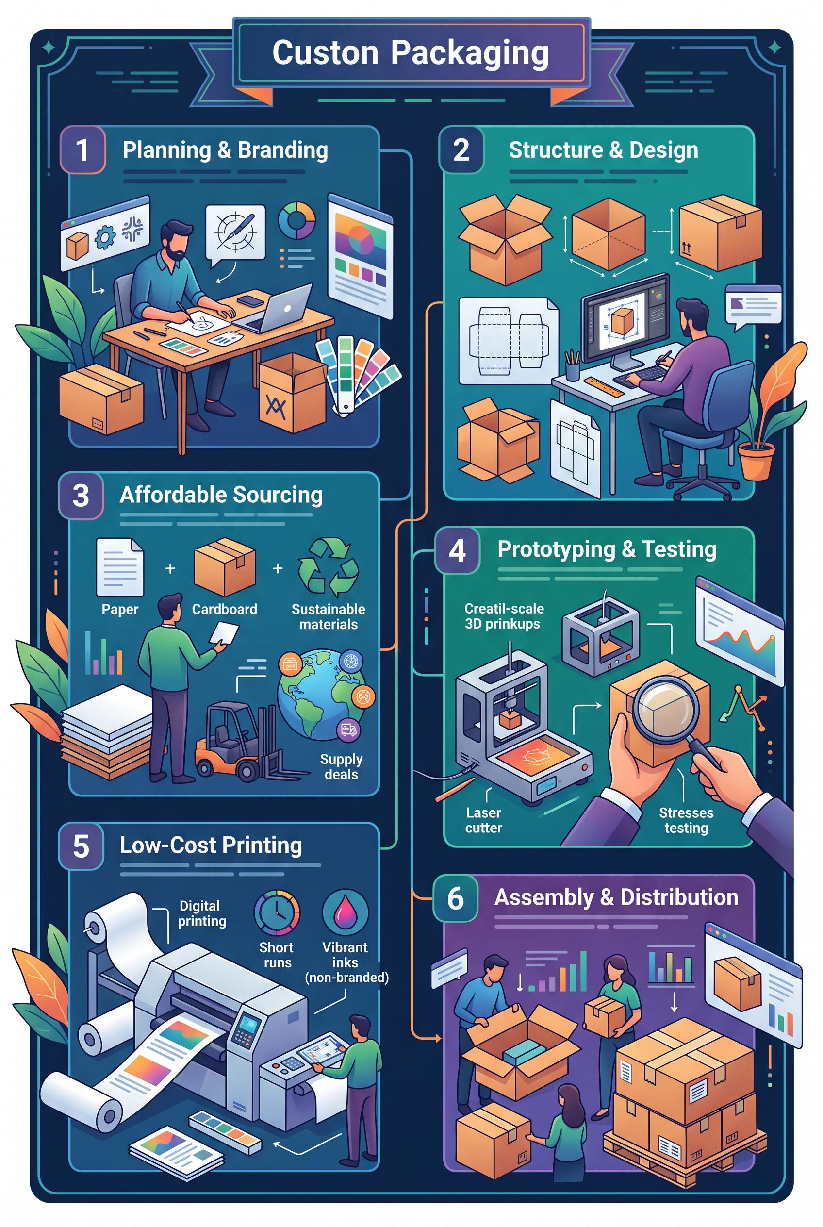 0
Infographic showing steps to create affordable custom packaging for small businesses in vertical 2:3 Pinterest composition, commercial-quality art direction, no real brands, no trademarks, no watermarks, no readable text.
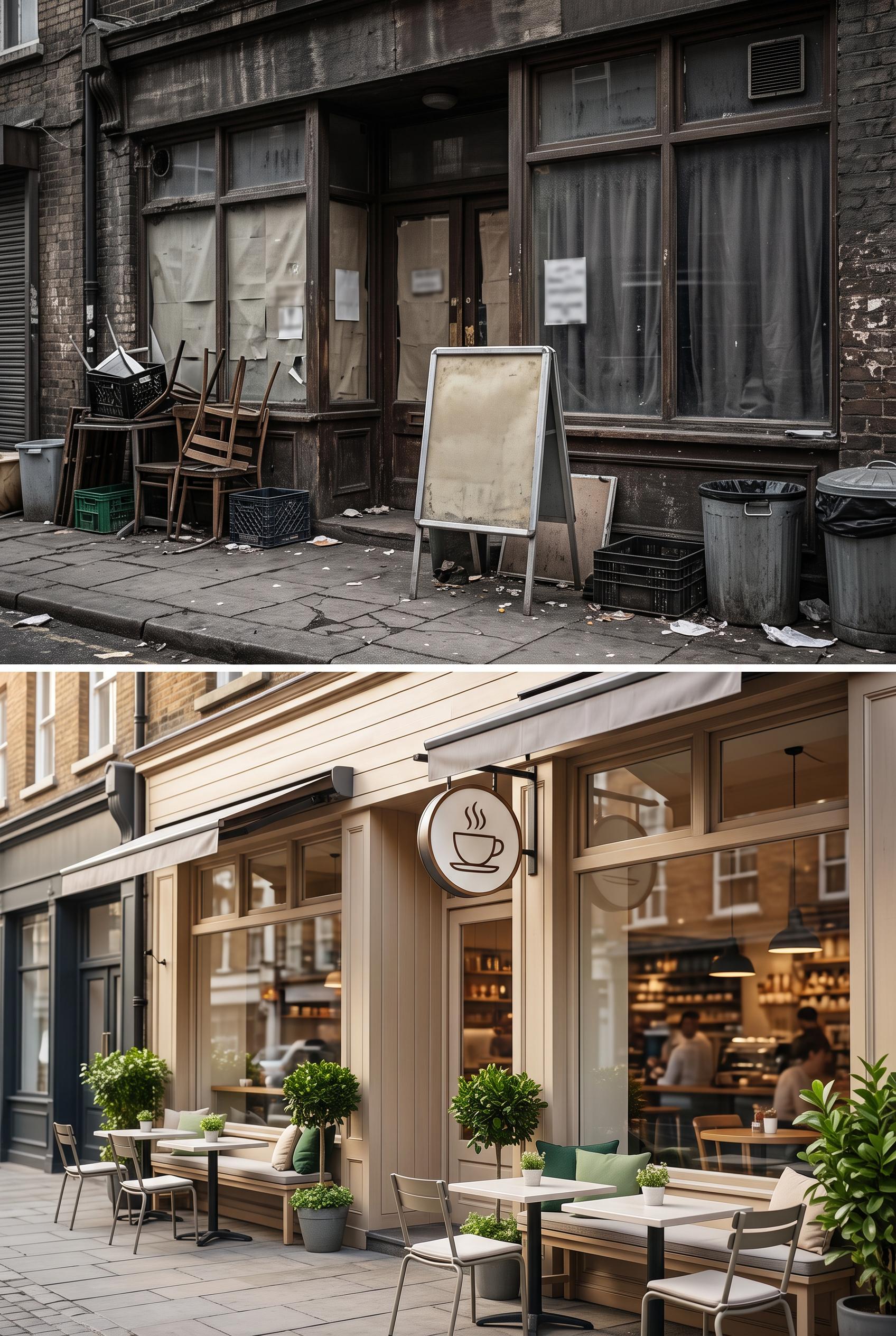 0
Split image of a local cafe entrance before (cluttered and dull) and after (cozy, inviting with outdoor seating) in vertical 2:3 Pinterest composition, commercial-quality art direction, no real brands, no trademarks, no watermarks, no readable text. Corrective regeneration attempt 3. Produce a materially revised image, not a near-duplicate of an earlier variant. Preserve the successful subject, palette, lighting, focal hierarchy, and commercial polish from the original brief while correcting every issue below. Mandatory corrective instructions from the most recent visual QA: Regenerate as a strict vertical 2:3 split image (before/after). Before panel: emphasize cluttered, dull storefront with no legible text, no logos, no signs, no notices. Remove all letters, numbers, captions, chalkboards, or readable markings; use blank surfaces or generic textures. Ensure textures are neutral (brick, wood) with debris but no signage. After panel: maintain warm, inviting storefront with outdoor seating and a clean facade; include a clearly defined focal point on the entrance and seating area; use a generic, non-brand-specific sign or icon (e.g., a simple cup icon) with no wording. All text must be non-readable or absent. Keep lighting natural and sharp detail, no watermarks or generation artifacts. Align both panels within a strict vertical 2:3 frame, no captions, no before/after labels in the image, and ensure overall commercial polish. Observed defects from prior variants that must not recur: 1) Readable text appears in the before panel (chalkboard menu and notices) which violates the no-readable-text requirement. 2) Potential real-world clutter visible in the before panel could imply branding or signage accidentally resembling a brand; ensure all text is generic or removed. 3) Readable text appears in the before panel (chalkboard/menu, notices) violating no-text requirement. 4) Potential additional legible text or signs in the before panel; ensure all text is removed or anonymized. 5) After panel contains a clear branding element without words; if needed, ensure the icon/sign is non-textual and generic. Render no letters, words, numbers, prices, headings, labels, contact details, logos, glyphs, or pseudo-text anywhere. Use only blank surfaces, clean geometric marks, and non-linguistic placeholder shapes. Do not add explanatory captions, before/after labels, interface copy, or extra objects that the brief did not request. When a corrective instruction conflicts with a decorative detail, prioritize the corrective instruction.
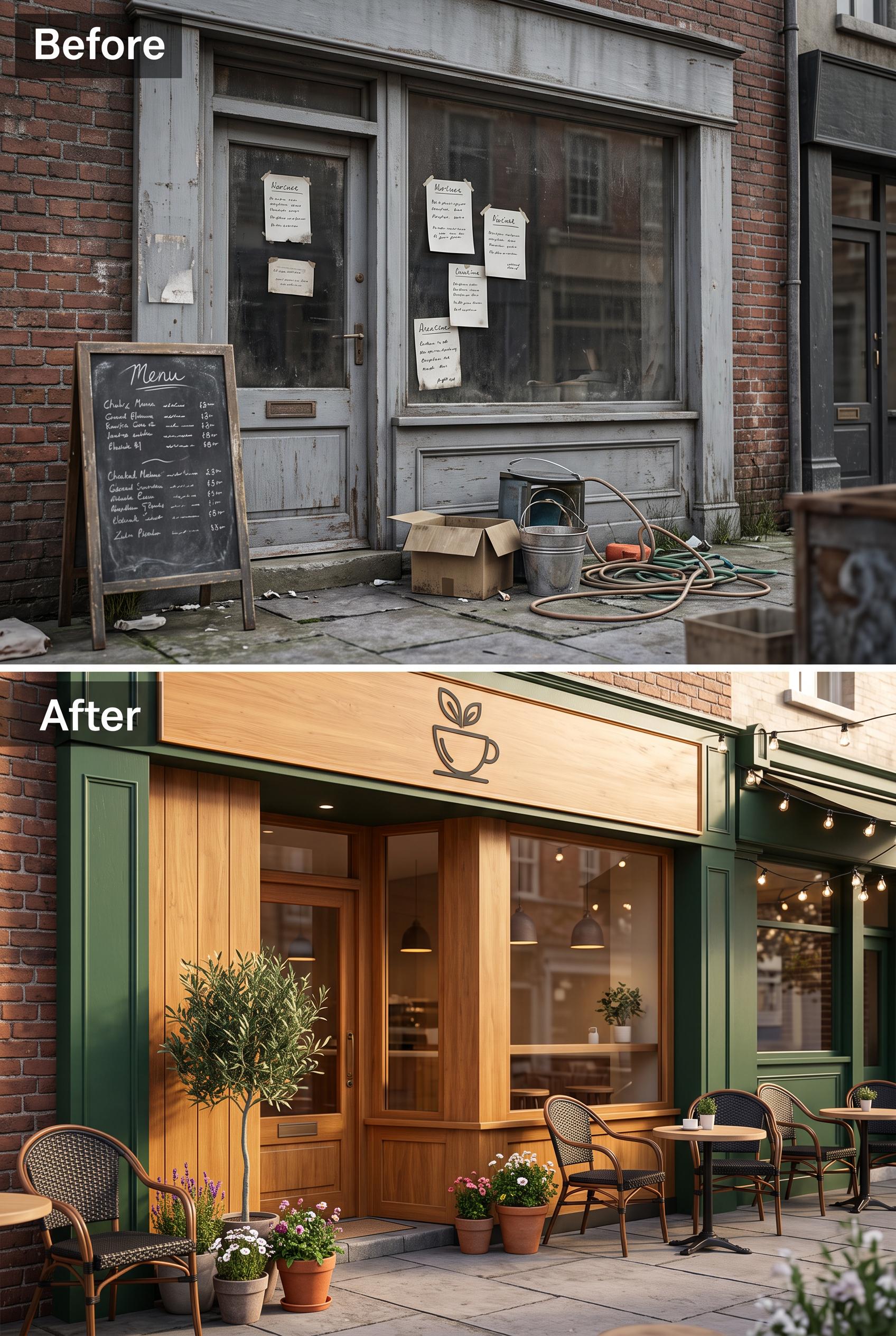 0
Split image of a local cafe entrance before (cluttered and dull) and after (cozy, inviting with outdoor seating) in vertical 2:3 Pinterest composition, commercial-quality art direction, no real brands, no trademarks, no watermarks, no readable text. Corrective regeneration attempt 2. Produce a materially revised image, not a near-duplicate of an earlier variant. Preserve the successful subject, palette, lighting, focal hierarchy, and commercial polish from the original brief while correcting every issue below. Mandatory corrective instructions from the most recent visual QA: Create a vertical 2:3 split image of a local cafe entrance before/after redesign. Before panel: emphasize cluttered, dull, non-branded storefront; remove all legible text, signs, chalkboards, and notices. Use neutral, non-specific textures and debris; ensure no visible logos or readable words. After panel: warm colors, inviting outdoor seating, clean facade, clear branding that is fictional and non-brand-specific (e.g., a generic cafe sign without words or a simple icon). Maintain a clear focal point on the entrance and seating area in the after panel. Ensure no watermarks or generation artifacts; preserve natural lighting and sharp detail, and keep both panels aligned in a strict vertical split within a 2:3 aspect ratio. Observed defects from prior variants that must not recur: 1) Readable text appears in the before panel (chalkboard menu and notices) which violates the no-readable-text requirement. 2) Potential real-world clutter visible in the before panel could imply branding or signage accidentally resembling a brand; ensure all text is generic or removed. Render no letters, words, numbers, prices, headings, labels, contact details, logos, glyphs, or pseudo-text anywhere. Use only blank surfaces, clean geometric marks, and non-linguistic placeholder shapes. Do not add explanatory captions, before/after labels, interface copy, or extra objects that the brief did not request. When a corrective instruction conflicts with a decorative detail, prioritize the corrective instruction.
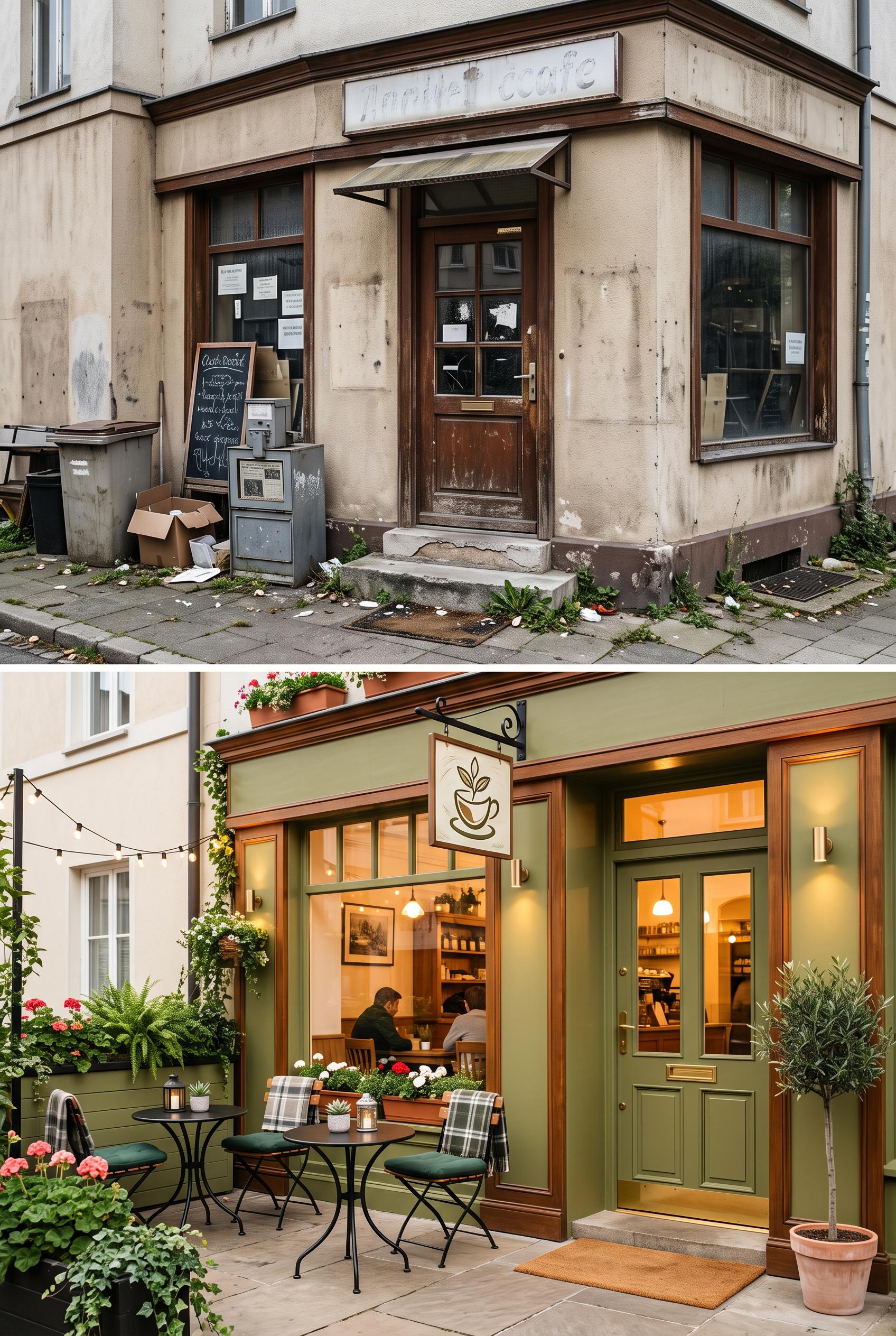 0
Split image of a local cafe entrance before (cluttered and dull) and after (cozy, inviting with outdoor seating) in vertical 2:3 Pinterest composition, commercial-quality art direction, no real brands, no trademarks, no watermarks, no readable text.
 0
Create a vertical 2:3 composition presenting a nature-inspired moodboard. Include earthy images like forests, florals, and textures paired with soft typography. Arrange elements in a collage style to reflect harmony with nature, using deep greens and cream as the primary color scheme. Ensure high-quality design and avoid any recognizable brands.
AI 이미지 갤러리 소개
AI 이미지 갤러리는 커뮤니티가 만든 공유 AI 생성 이미지를 전시합니다. 각 이미지는 독특하고 고품질이며 AI 아트 생성의 창의적 가능성을 나타냅니다. 다양한 스타일, 주제, 테마를 둘러보며 다음 크리에이티브 프로젝트에 대한 영감을 얻으세요.
왜 갤러리를 탐색해야 할까요?
- 여러 스타일과 테마에 걸친 독특한 AI 생성 이미지 발견
- 창의적인 프롬프트와 예술적 스타일에서 영감 얻기
- 크리에이티브 커뮤니티가 공유한 이미지 보기
- 아무 이미지나 클릭하여 공유 페이지를 보고 자세한 정보 확인
갤러리 사용 방법
갤러리 사용은 간단하고 직관적입니다:
- 공유 이미지 그리드 둘러보기
- 눈에 띄는 이미지 클릭
- 전용 공유 페이지에서 전체 이미지 세부 정보 및 공유 링크 보기
나만의 AI 이미지를 만들 준비가 되셨나요?
AI Media Studio로 멋진 이미지를 생성하세요. 오늘부터 만들기를 시작하세요!