Galeria Obrazów AI
Odkryj 1696+ udostępnionych obrazów wygenerowanych przez AI z naszej kreatywnej społeczności
Wszystkie Udostępnione Obrazy
Wyświetlanie 48 z 1696 udostępnionych obrazów
 0
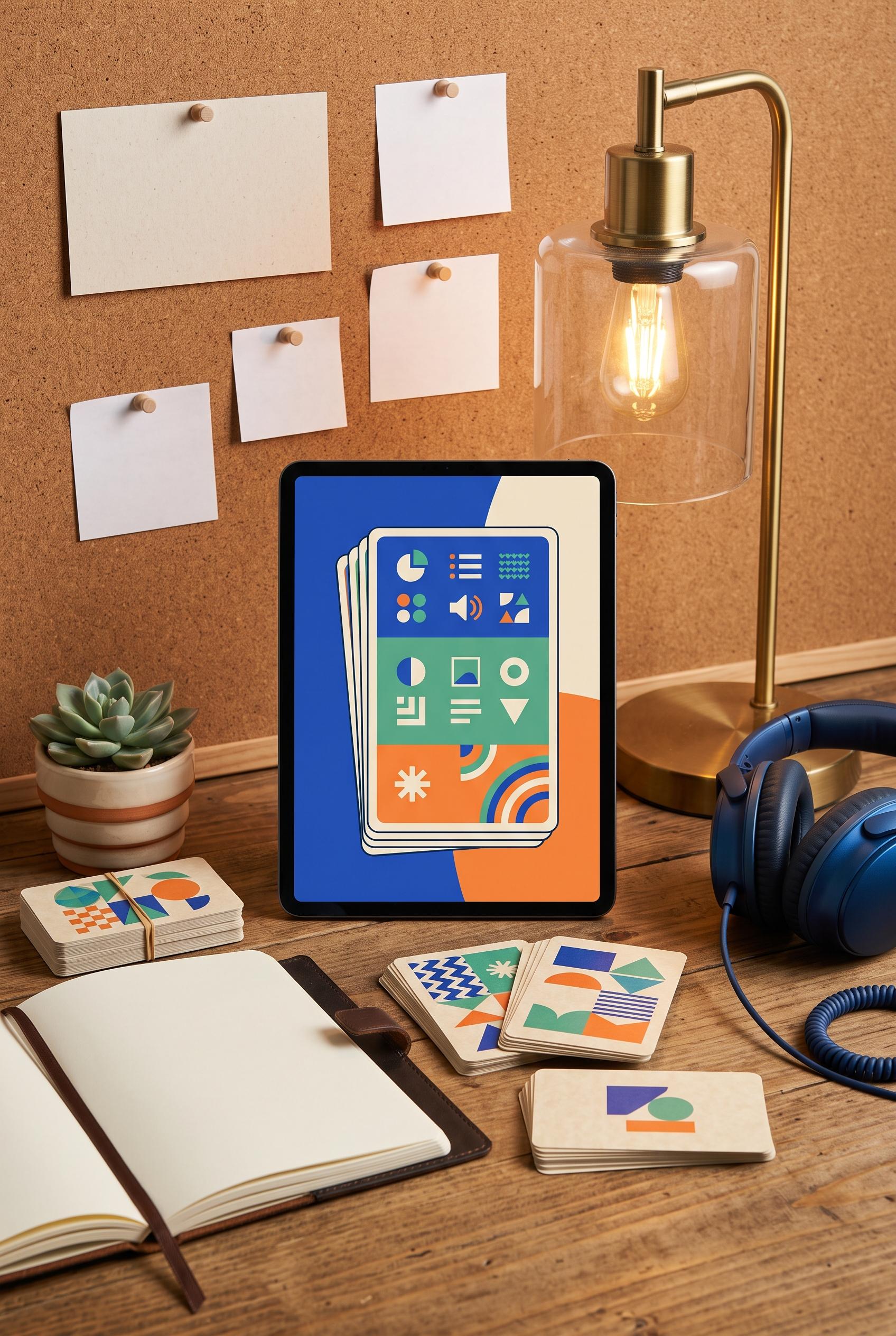
0Create a vertical 2:3 Pinterest composition with commercial-quality art direction for a digital language-learning flashcard kit. Build an immersive study nook with a tablet showing abstract card shapes, printed flashcards with no readable text, a notebook, headphones, and a warm desk lamp. Use cobalt, jade, tangerine, and parchment. No real brands, no trademarked characters, no watermark, and no unintended readable text. Corrective regeneration attempt 3. Produce a materially revised image, not a near-duplicate of an earlier variant. Preserve the successful subject, palette, lighting, focal hierarchy, and commercial polish from the original brief while correcting every issue below. Mandatory corrective instructions from the most recent visual QA: Preserve the warm polished vertical study-nook composition, tablet-centered focal hierarchy, lamp, headphones, notebook, succulent, flashcard stacks, realistic styling, and cobalt/jade/tangerine/parchment palette. Remove the calendar entirely or replace it with a completely blank pinned card. Make every wall pinboard note completely blank with no lines, letters, numbers, handwriting, calendar marks, or pseudo-text. Keep the tablet and flashcards limited to clean abstract geometric shapes and non-linguistic pictograms, with no readable glyphs or interface copy. Retain realistic clean objects and lighting; include no logos, trademarks, watermarks, or generation artifacts. Observed defects from prior variants that must not recur: 1) The composition is attractive and vertical with a clear tablet-centered focal point, but it contains extensive unintended readable text: CAT, DOG, APPLE, handwritten notebook text, 2) and wall notes. This directly violates the no-readable-text requirement. 3) The composition is polished, vertical, and on-concept with a clear tablet focal point, but the wall pinboard includes a clearly readable calendar with weekday letters and date-like 4) numbers, violating the strict no-readable-text requirement. The pinboard sheet also contains visible writing lines rather than being completely blank. Render no letters, words, numbers, prices, headings, labels, contact details, logos, glyphs, or pseudo-text anywhere. Use only blank surfaces, clean geometric marks, and non-linguistic placeholder shapes. Do not add explanatory captions, before/after labels, interface copy, or extra objects that the brief did not request. When a corrective instruction conflicts with a decorative detail, prioritize the corrective instruction.
 0
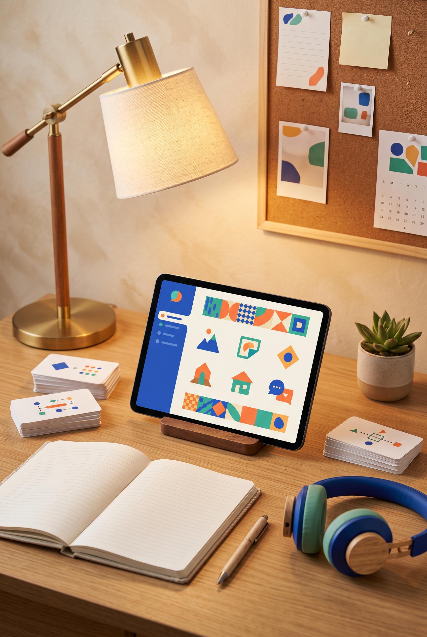
0Create a vertical 2:3 Pinterest composition with commercial-quality art direction for a digital language-learning flashcard kit. Build an immersive study nook with a tablet showing abstract card shapes, printed flashcards with no readable text, a notebook, headphones, and a warm desk lamp. Use cobalt, jade, tangerine, and parchment. No real brands, no trademarked characters, no watermark, and no unintended readable text. Corrective regeneration attempt 2. Produce a materially revised image, not a near-duplicate of an earlier variant. Preserve the successful subject, palette, lighting, focal hierarchy, and commercial polish from the original brief while correcting every issue below. Mandatory corrective instructions from the most recent visual QA: Preserve the warm, polished vertical study-nook composition, tablet focal point, lamp, headphones, notebook, flashcard deck, succulent, and cobalt/jade/tangerine/parchment palette. Remove every readable letter, word, number, and handwriting mark from the tablet, all printed flashcards, loose cards, notebook pages, and wall pinboard. Replace flashcard text with simple abstract shapes or non-text pictograms, make the notebook pages blank or use only faint non-linguistic lines, and make the wall notes completely blank. Keep all objects realistic, clean, and free of logos, trademarks, watermarks, and generation artifacts. Observed defects from prior variants that must not recur: 1) The composition is attractive and vertical with a clear tablet-centered focal point, but it contains extensive unintended readable text: CAT, DOG, APPLE, handwritten notebook text, 2) and wall notes. This directly violates the no-readable-text requirement. Render no letters, words, numbers, prices, headings, labels, contact details, logos, glyphs, or pseudo-text anywhere. Use only blank surfaces, clean geometric marks, and non-linguistic placeholder shapes. Do not add explanatory captions, before/after labels, interface copy, or extra objects that the brief did not request. When a corrective instruction conflicts with a decorative detail, prioritize the corrective instruction.
 0
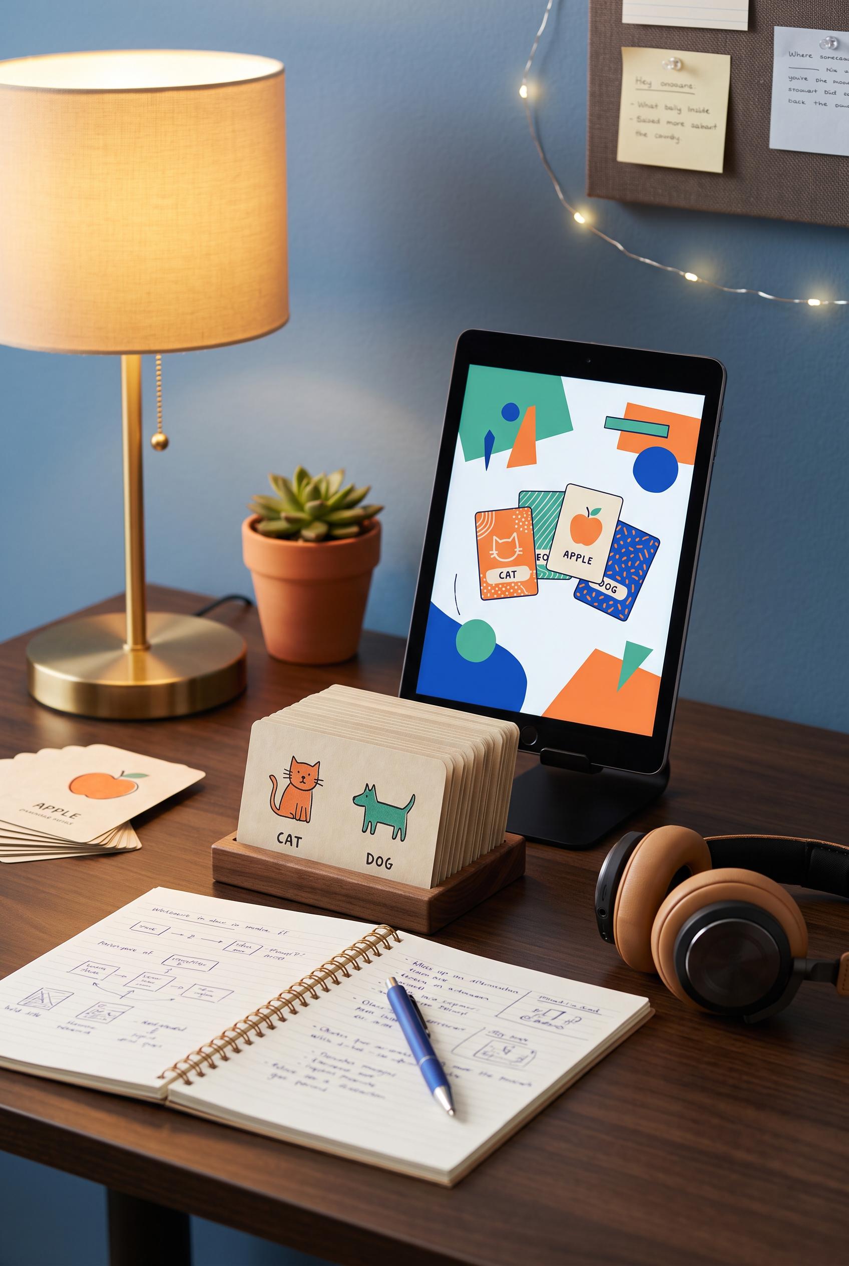
0Create a vertical 2:3 Pinterest composition with commercial-quality art direction for a digital language-learning flashcard kit. Build an immersive study nook with a tablet showing abstract card shapes, printed flashcards with no readable text, a notebook, headphones, and a warm desk lamp. Use cobalt, jade, tangerine, and parchment. No real brands, no trademarked characters, no watermark, and no unintended readable text.
 0
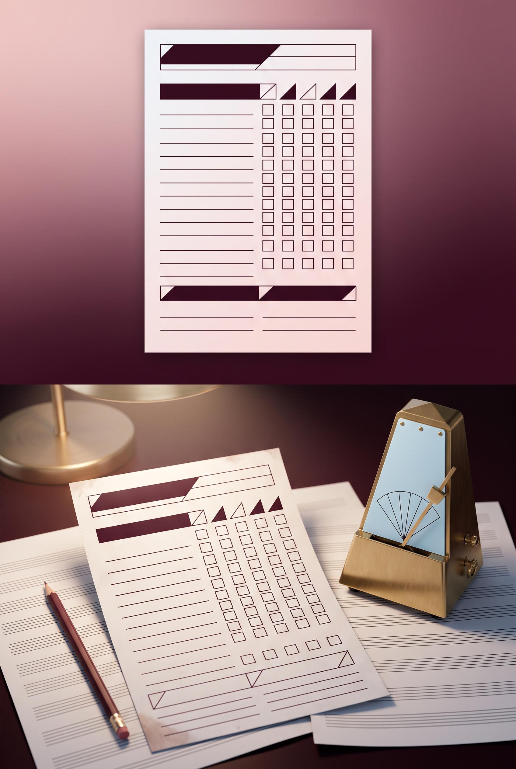
0Create a vertical 2:3 Pinterest composition with commercial-quality art direction for an editable music practice tracker listing. Show a before-and-after contact-sheet transition from a plain digital file preview to a used paper tracker on a musician desk, with sheet music, pencil, and metronome. Use black cherry, ice blue, brass, and blush. No real brands, no trademarked characters, no watermark, and no unintended readable text. Keep any interface elements abstract and illegible. Corrective regeneration attempt 4. Produce a materially revised image, not a near-duplicate of an earlier variant. Preserve the successful subject, palette, lighting, focal hierarchy, and commercial polish from the original brief while correcting every issue below. Mandatory corrective instructions from the most recent visual QA: Preserve the polished vertical contact-sheet composition, black cherry/ice blue/brass/blush palette, lighting, desk, pencil, metronome, sheet-music setting, and unused-to-used focal transition. Remove every number, letter, word, heading, label, logo, watermark, musical note, clef, checkmark, handwriting mark, and pseudo-text. Replace all metronome scale markings with a completely blank ice-blue panel containing only simple geometric divisions, with no ticks or numerals. Replace tracker entries with clean blank lines, empty square boxes, and geometric dividers only; remove all checkmarks and diagonal handwritten marks. Make all sheet music consist solely of evenly spaced blank staff-like lines with no symbols. Keep the composition free of any extra banner or captions and eliminate any generation artifacts. Observed defects from prior variants that must not recur: 1) Obvious malformed readable text appears in the tracker, including strings like “AMSITACT” and “ADOTRACT,” reducing commercial polish. 2) Several labels and handwritten entries look like generated text artifacts rather than intentional abstract interface details. 3) Strong vertical split and attractive palette, lighting, metronome, pencil, and desk scene. 4) Fails the no-readable-text requirement: large banner text, tracker headings, labels, handwritten entries, numbers, and musical notation are all visible. 5) The top banner is an unrequested extra graphic element. 6) Attractive vertical composition and clear unused-to-used transition, but the metronome visibly contains numbers and scale markings, violating the no-readable-text requirement. 7) The used tracker includes checkmarks and handwritten-like marks that read as glyphs or pseudo-text rather than purely geometric placeholders. 8) The sheet music and tracker details risk unintended notation-like symbols. Render no letters, words, numbers, prices, headings, labels, contact details, logos, glyphs, or pseudo-text anywhere. Use only blank surfaces, clean geometric marks, and non-linguistic placeholder shapes. Do not add explanatory captions, before/after labels, interface copy, or extra objects that the brief did not request. When a corrective instruction conflicts with a decorative detail, prioritize the corrective instruction.
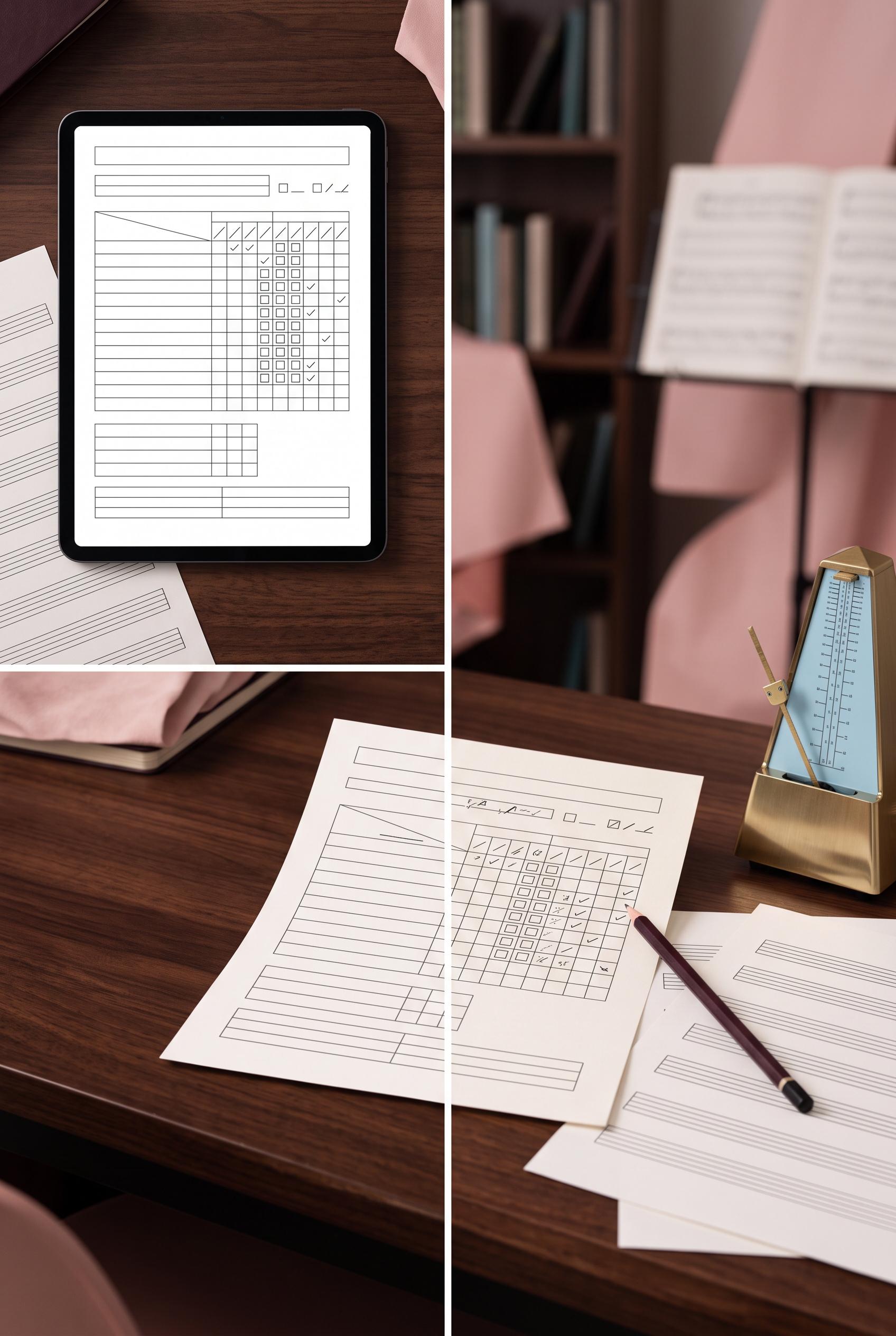 0
0Create a vertical 2:3 Pinterest composition with commercial-quality art direction for an editable music practice tracker listing. Show a before-and-after contact-sheet transition from a plain digital file preview to a used paper tracker on a musician desk, with sheet music, pencil, and metronome. Use black cherry, ice blue, brass, and blush. No real brands, no trademarked characters, no watermark, and no unintended readable text. Keep any interface elements abstract and illegible. Corrective regeneration attempt 3. Produce a materially revised image, not a near-duplicate of an earlier variant. Preserve the successful subject, palette, lighting, focal hierarchy, and commercial polish from the original brief while correcting every issue below. Mandatory corrective instructions from the most recent visual QA: Preserve the attractive vertical 2:3 split composition, black cherry/ice blue/brass/blush palette, desk lighting, metronome, pencil, sheet-music setting, and clear unused-to-used transition. Remove the top banner entirely. Render absolutely no letters, words, numbers, headings, labels, handwriting, logos, glyphs, musical notes, or pseudo-text anywhere. Replace all tracker text and entries with clean blank lines, empty boxes, geometric dividers, and abstract non-linguistic marks only. Keep the tracker structure professional and legible as a form without readable content. Make sheet music consist only of blank staff-like geometric lines with no notes or symbols. Ensure there is no watermark, brand mark, or generation artifact. Observed defects from prior variants that must not recur: 1) Strong vertical before/after composition with clear focal split and fitting desk props. 2) Obvious malformed readable text appears in the tracker, including strings like “AMSITACT” and “ADOTRACT,” reducing commercial polish. 3) Several labels and handwritten entries look like generated text artifacts rather than intentional abstract interface details. 4) Strong vertical split and attractive palette, lighting, metronome, pencil, and desk scene. 5) Fails the no-readable-text requirement: large banner text, tracker headings, labels, handwritten entries, numbers, and musical notation are all visible. 6) The top banner is an unrequested extra graphic element. Render no letters, words, numbers, prices, headings, labels, contact details, logos, glyphs, or pseudo-text anywhere. Use only blank surfaces, clean geometric marks, and non-linguistic placeholder shapes. Do not add explanatory captions, before/after labels, interface copy, or extra objects that the brief did not request. When a corrective instruction conflicts with a decorative detail, prioritize the corrective instruction.
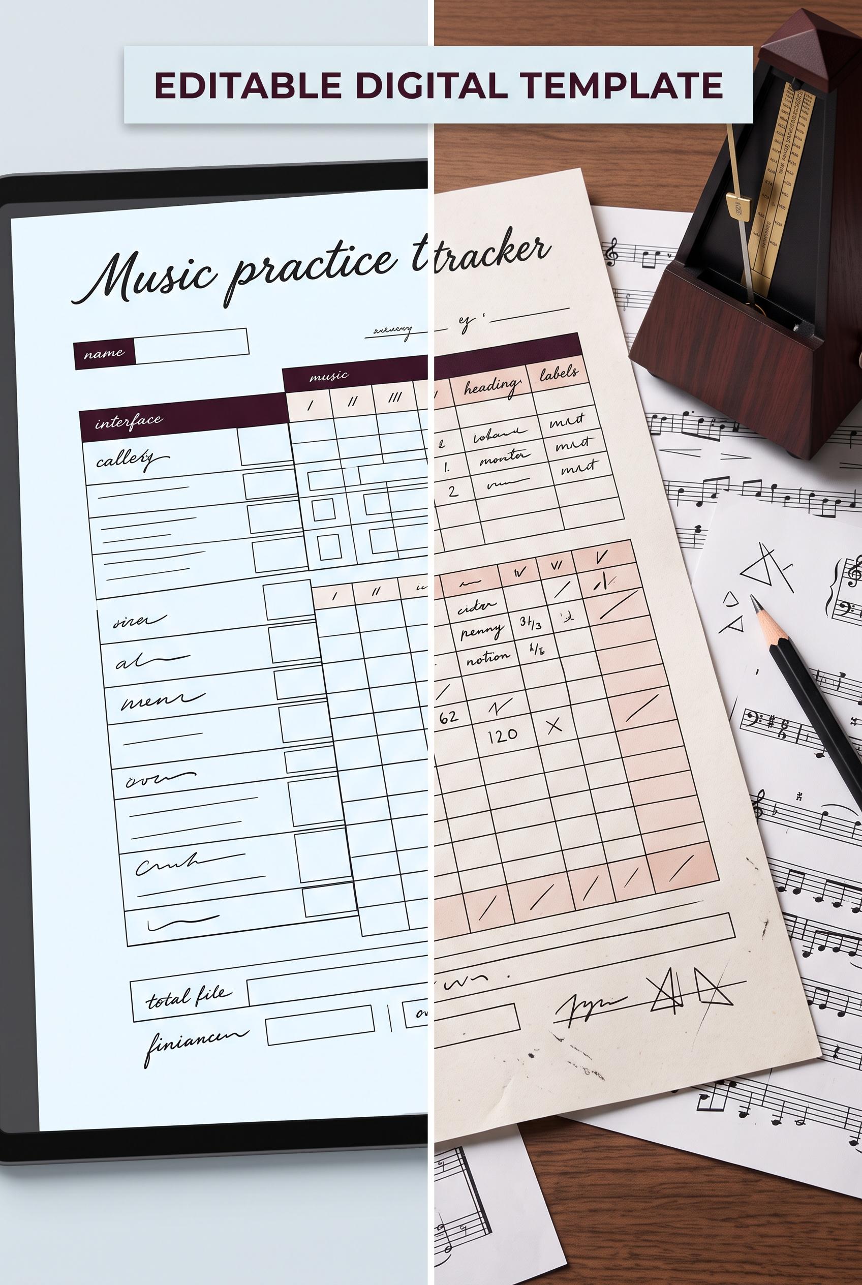 0
0Create a vertical 2:3 Pinterest composition with commercial-quality art direction for an editable music practice tracker listing. Show a before-and-after contact-sheet transition from a plain digital file preview to a used paper tracker on a musician desk, with sheet music, pencil, and metronome. Use black cherry, ice blue, brass, and blush. No real brands, no trademarked characters, no watermark, and no unintended readable text. Keep any interface elements abstract and illegible. Corrective regeneration attempt 2. Produce a materially revised image, not a near-duplicate of an earlier variant. Preserve the successful subject, palette, lighting, focal hierarchy, and commercial polish from the original brief while correcting every issue below. Mandatory corrective instructions from the most recent visual QA: Preserve the attractive vertical split composition, black cherry/ice blue/brass/blush palette, metronome, sheet music, pencil, desk lighting, and clear unused-to-used transition. Remove every malformed or unintended readable text fragment, especially “AMSITACT,” “ADOTRACT,” distorted handwritten entries, and any other gibberish. Keep the tracker structure clean and professional with blank lines, boxes, and abstract illegible marks only; retain at most clean intentional headings such as “PRACTICE LOG” and “EDITABLE DIGITAL TEMPLATE.” Ensure all sheet-music markings and interface details are coherent or non-readable, with no watermark or brand marks. Observed defects from prior variants that must not recur: 1) Strong vertical before/after composition with clear focal split and fitting desk props. 2) Obvious malformed readable text appears in the tracker, including strings like “AMSITACT” and “ADOTRACT,” reducing commercial polish. 3) Several labels and handwritten entries look like generated text artifacts rather than intentional abstract interface details. Render no letters, words, numbers, prices, headings, labels, contact details, logos, glyphs, or pseudo-text anywhere. Use only blank surfaces, clean geometric marks, and non-linguistic placeholder shapes. Do not add explanatory captions, before/after labels, interface copy, or extra objects that the brief did not request. When a corrective instruction conflicts with a decorative detail, prioritize the corrective instruction.
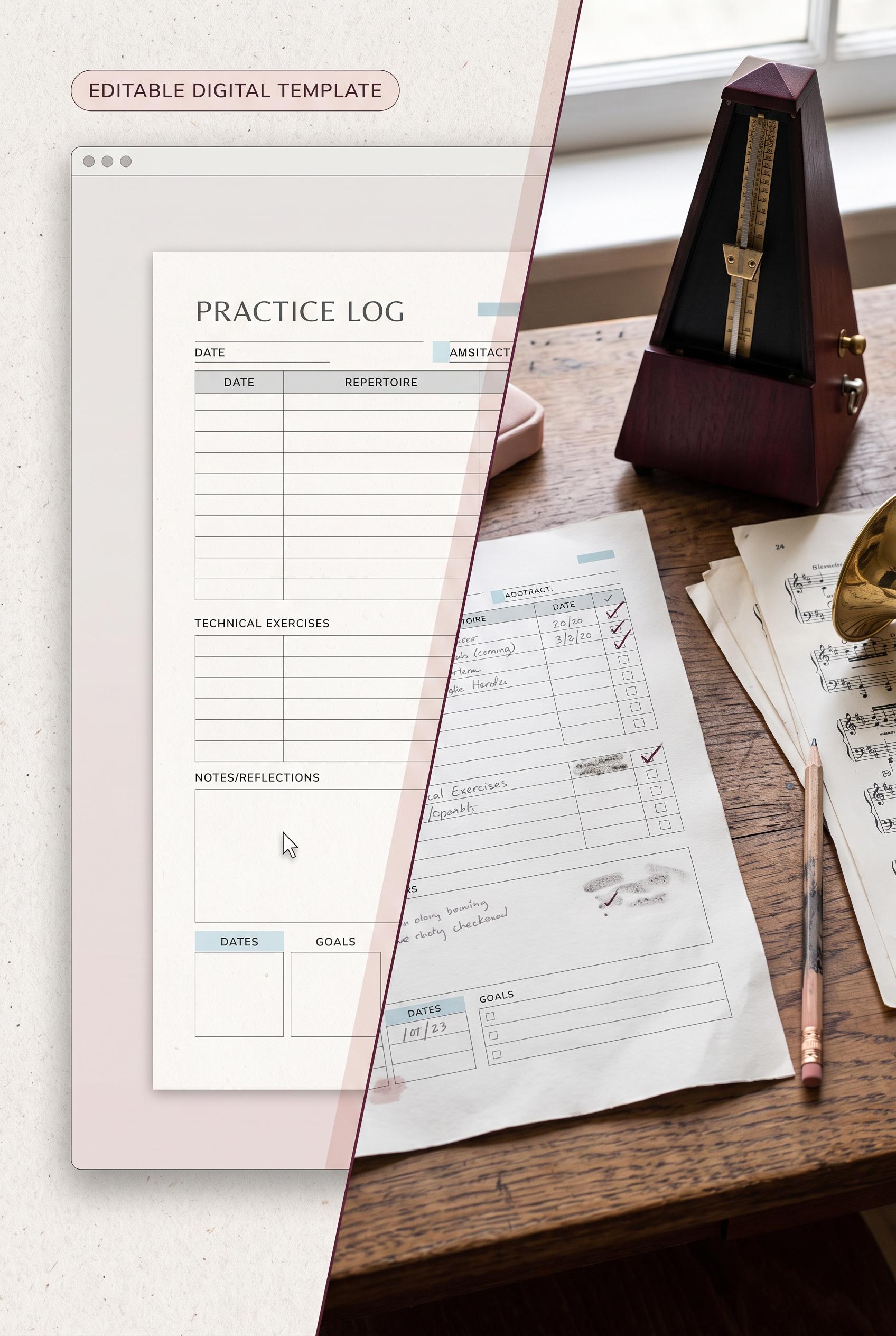 0
0Create a vertical 2:3 Pinterest composition with commercial-quality art direction for an editable music practice tracker listing. Show a before-and-after contact-sheet transition from a plain digital file preview to a used paper tracker on a musician desk, with sheet music, pencil, and metronome. Use black cherry, ice blue, brass, and blush. No real brands, no trademarked characters, no watermark, and no unintended readable text. Keep any interface elements abstract and illegible.
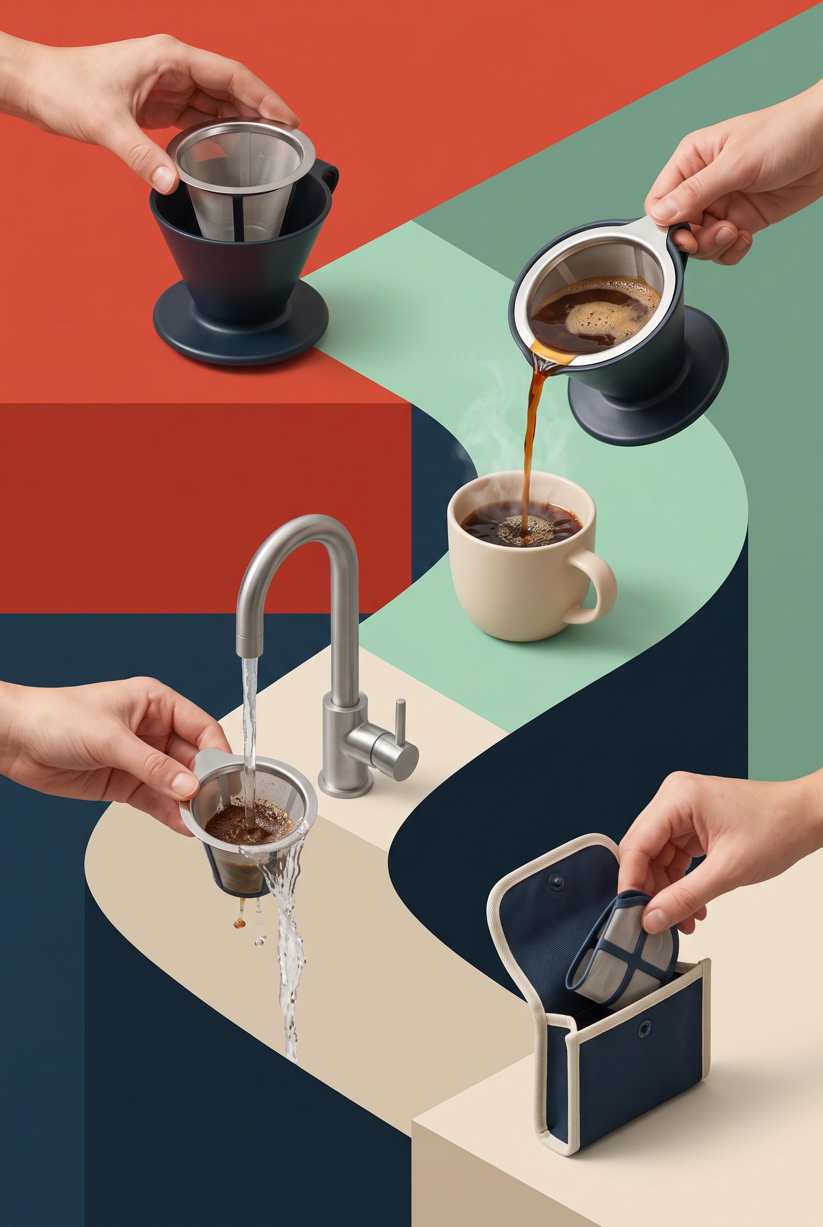 0
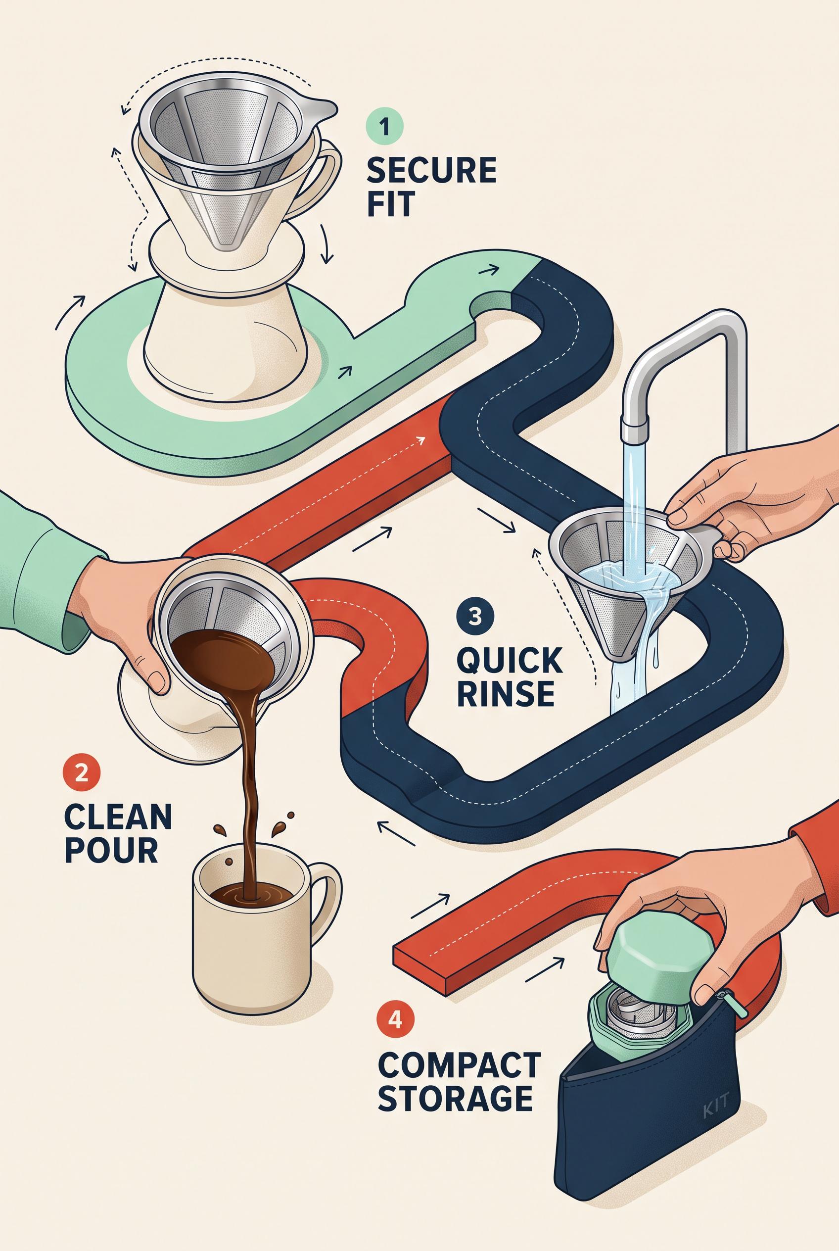
0Create a commercial-quality vertical 2:3 Pinterest composition for an educational launch campaign featuring a reusable coffee filter. Arrange four proof stations along an isometric S-curve: secure fit in a brewer, clean coffee pour, quick rinse under water, and compact storage in a small case. Use paprika red, mint, deep ink, and oat, with crisp studio lighting, realistic liquid detail, clear product scale, polished campaign art direction, no real brands, no trademarked characters, no watermark, and no unintended readable text. AI-modified downstream. Corrective regeneration attempt 2. Produce a materially revised image, not a near-duplicate of an earlier variant. Preserve the successful subject, palette, lighting, focal hierarchy, and commercial polish from the original brief while correcting every issue below. Mandatory corrective instructions from the most recent visual QA: Preserve the polished vertical 2:3 isometric composition, paprika red/mint/deep ink/oat palette, realistic coffee and rinse water, clear reusable filter, brewer, cup, storage case, hands, and four stations along the S-curve. Remove all written labels, numerals, typography, arrows that resemble text callouts, and any readable markings, including the word “KIT” on the storage pouch. Communicate each step only through the objects and actions: filter fitted in brewer, steady coffee pour, filter rinsed under running water, and filter placed in compact case. Ensure the case and every object are completely blank and free of logos, symbols, watermarks, or garbled text. Observed defects from prior variants that must not recur: 1) The composition and four-step S-curve are strong, but it includes prominent instructional labels despite the brief requiring object-based visual cues instead of text. 2) The storage pouch contains unintended readable text (“KIT”). Render no letters, words, numbers, prices, headings, labels, contact details, logos, glyphs, or pseudo-text anywhere. Use only blank surfaces, clean geometric marks, and non-linguistic placeholder shapes. Do not add explanatory captions, before/after labels, interface copy, or extra objects that the brief did not request. When a corrective instruction conflicts with a decorative detail, prioritize the corrective instruction.
 0
0Create a commercial-quality vertical 2:3 Pinterest composition for an educational launch campaign featuring a reusable coffee filter. Arrange four proof stations along an isometric S-curve: secure fit in a brewer, clean coffee pour, quick rinse under water, and compact storage in a small case. Use paprika red, mint, deep ink, and oat, with crisp studio lighting, realistic liquid detail, clear product scale, polished campaign art direction, no real brands, no trademarked characters, no watermark, and no unintended readable text. AI-modified downstream.
 0
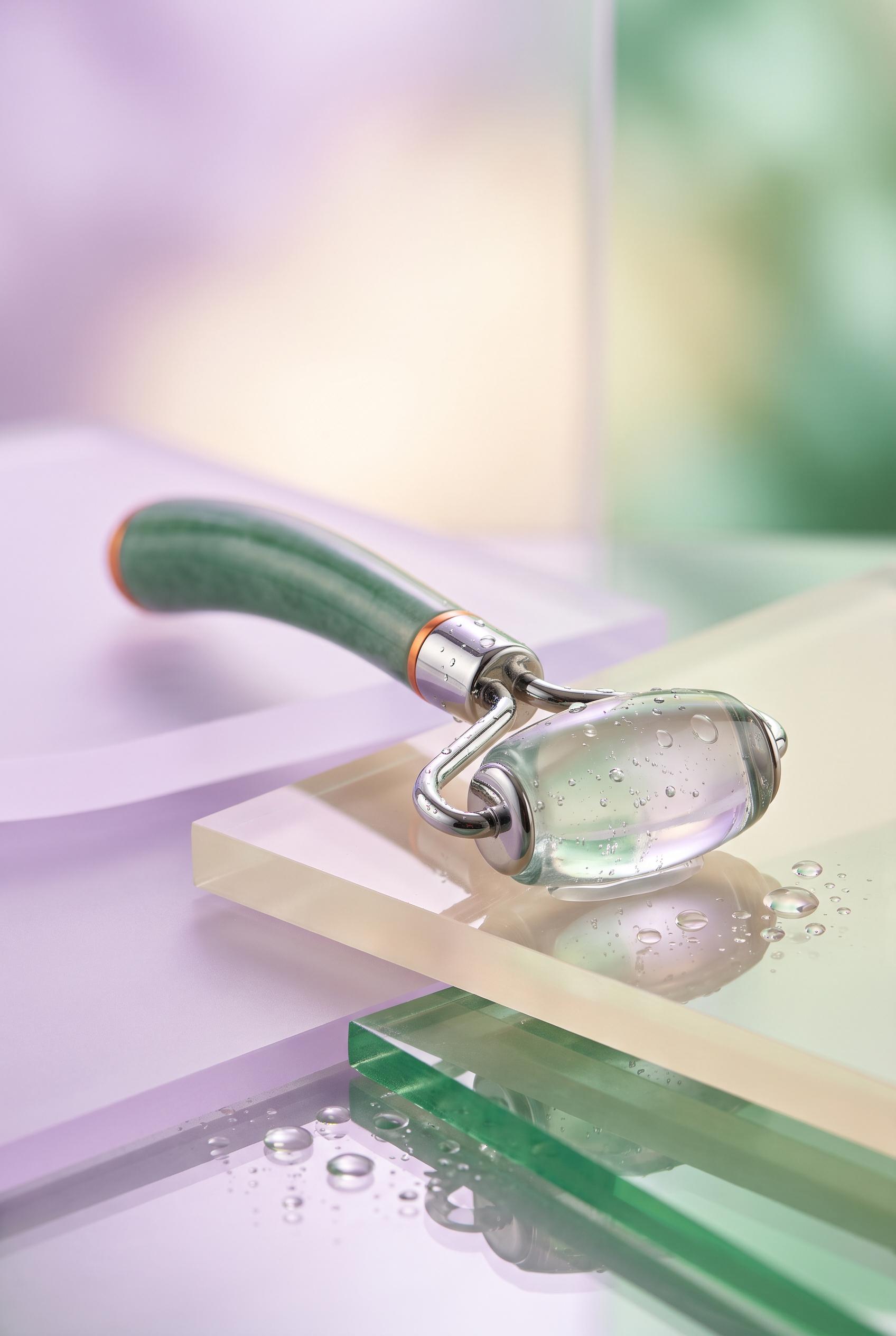
0Create a commercial-quality vertical 2:3 Pinterest composition for an inspirational product showcase featuring a refillable facial cooling roller. Place the sculptural roller on a low horizon with translucent acrylic planes, macro water droplets, subtle reflections, and a soft luminous background. Use persimmon, lilac, mineral green, and warm cream, with premium beauty editorial lighting, realistic glass and metal surfaces, refined depth of field, no real brands, no trademarked characters, no watermark, and no unintended readable text. AI-modified downstream.
 0
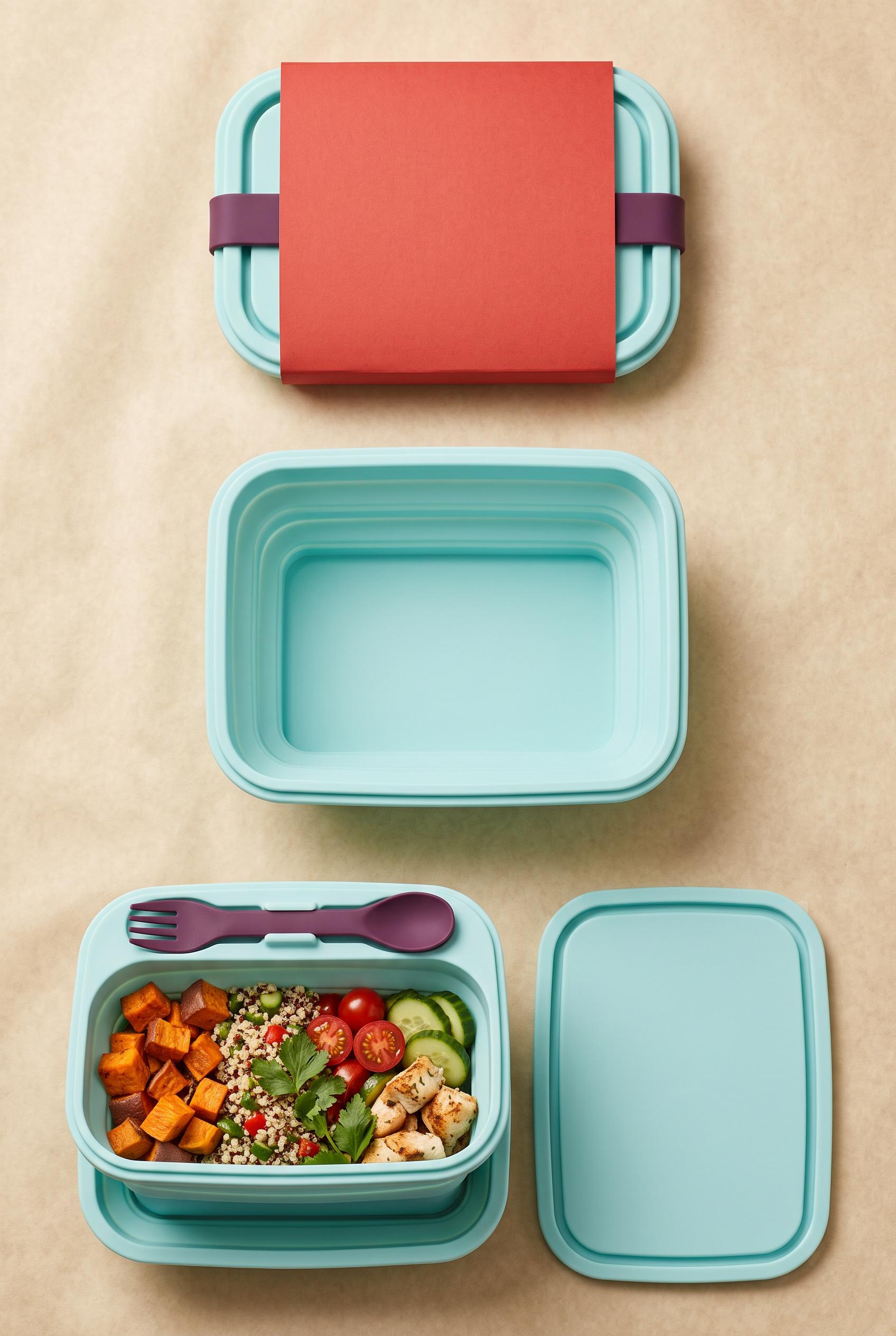
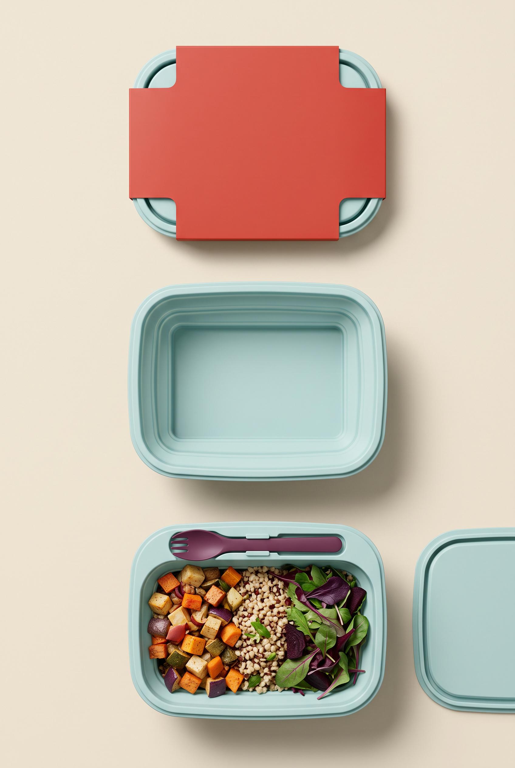
0Create a commercial-quality vertical 2:3 Pinterest composition showing a before-and-after transformation of a foldable silicone lunch bowl package. Use an overhead unfolding sequence with a soft shadow curtain, moving from a flat wrapped form to an open bowl with lid, utensil, and neatly packed food. Use paprika red, pale aqua, deep plum, and parchment tones, premium product photography, realistic silicone texture, crisp studio lighting, elegant art direction, no real brands, no trademarked characters, no watermark, and no unintended readable text. AI-modified downstream. Corrective regeneration attempt 5. Produce a materially revised image, not a near-duplicate of an earlier variant. Preserve the successful subject, palette, lighting, focal hierarchy, and commercial polish from the original brief while correcting every issue below. Mandatory corrective instructions from the most recent visual QA: Preserve the attractive vertical 2:3 overhead composition, parchment background, premium controlled shadows, paprika-red blank sleeve, pale-aqua silicone, plum utensil, and colorful packed meal. Replace the middle fully open bowl with a clearly partially expanded rectangular silicone bowl: show visible, evenly spaced accordion folds on all four sides, aligned rounded corners, consistent pale-aqua rim, and an intermediate height distinctly between the flat top form and the fully open bottom bowl. Keep exactly one plum utensil secured in one clearly integrated slot along the upper inner rim of the final bowl. Keep exactly one complete lid beside the final bowl, fully visible within the frame, with no additional lid-like objects. Keep every sleeve and product surface blank: no letters, numbers, labels, logos, icons, symbols, pseudo-text, captions, or watermark. Observed defects from prior variants that must not recur: 1) The final utensil is laid across the bowl rather than clearly held in an integrated utensil slot. 2) The middle state is a fully open empty bowl rather than a realistic partially expanded accordion-fold transition. 3) The unfolding progression is not sufficiently clear from flat wrapped form to open bowl. 4) The final arrangement shows two loose lid-like pieces instead of one lid beside the bowl. 5) The top sleeve contains ambiguous geometric marks that could read as unintended symbols. 6) The middle state is a fully open empty bowl, not the required physically realistic partially expanded accordion-fold transition. 7) The unfolding progression from flat to partially expanded to open is therefore unclear. 8) The single lid is cropped at the right edge, weakening the composition and product presentation. Render no letters, words, numbers, prices, headings, labels, contact details, logos, glyphs, or pseudo-text anywhere. Use only blank surfaces, clean geometric marks, and non-linguistic placeholder shapes. Do not add explanatory captions, before/after labels, interface copy, or extra objects that the brief did not request. When a corrective instruction conflicts with a decorative detail, prioritize the corrective instruction.
 0
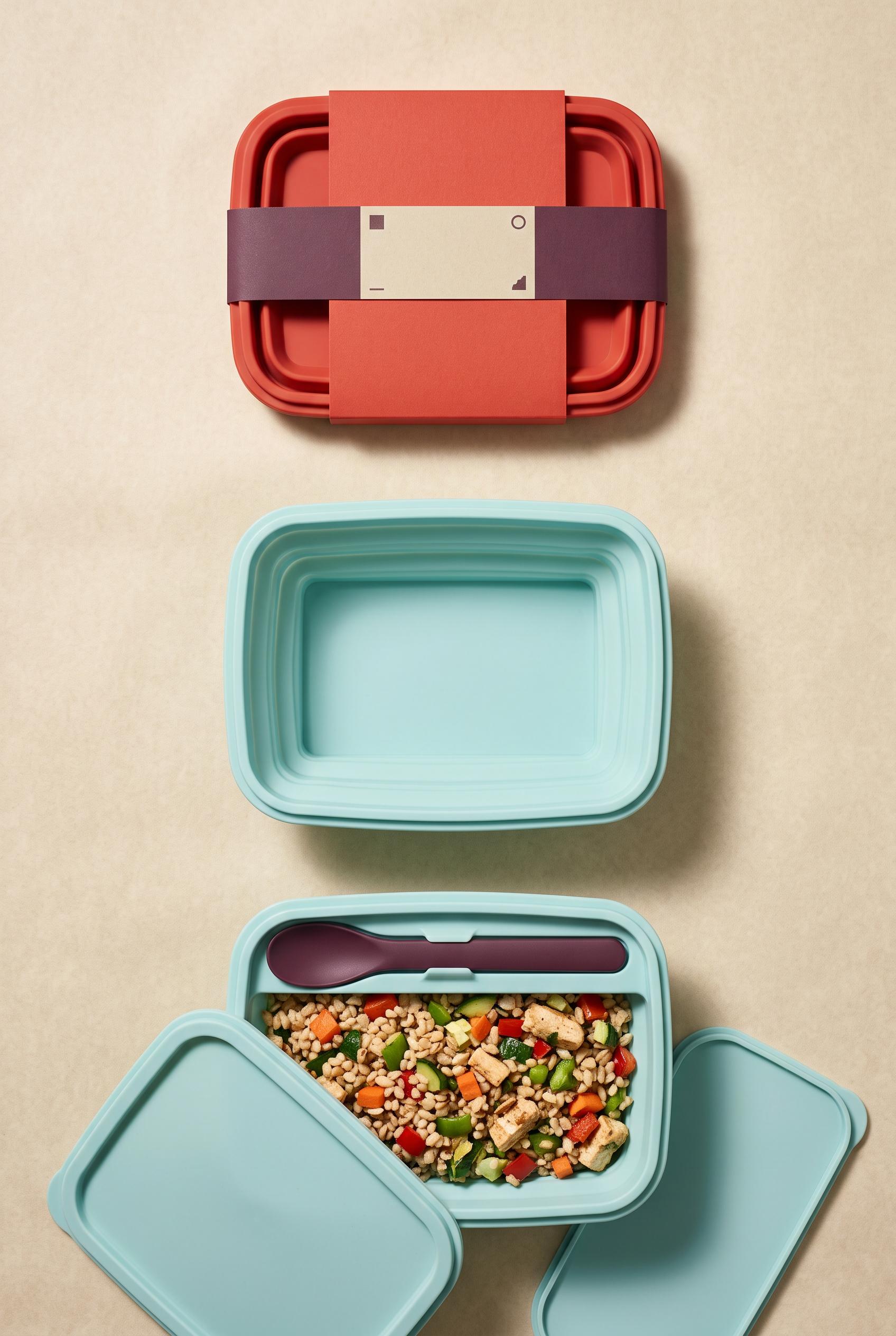
0Create a commercial-quality vertical 2:3 Pinterest composition showing a before-and-after transformation of a foldable silicone lunch bowl package. Use an overhead unfolding sequence with a soft shadow curtain, moving from a flat wrapped form to an open bowl with lid, utensil, and neatly packed food. Use paprika red, pale aqua, deep plum, and parchment tones, premium product photography, realistic silicone texture, crisp studio lighting, elegant art direction, no real brands, no trademarked characters, no watermark, and no unintended readable text. AI-modified downstream. Corrective regeneration attempt 4. Produce a materially revised image, not a near-duplicate of an earlier variant. Preserve the successful subject, palette, lighting, focal hierarchy, and commercial polish from the original brief while correcting every issue below. Mandatory corrective instructions from the most recent visual QA: Preserve the vertical 2:3 overhead composition, parchment background, premium lighting, controlled shadows, paprika-red sleeve, pale-aqua silicone, plum accents, top wrapped form, and bottom packed meal. Replace the middle fully open bowl with a physically realistic partially expanded rectangular silicone bowl, clearly between flat and open states: show evenly spaced accordion folds on all four sides, aligned rounded corners, consistent pale-aqua rim, and a natural vertical flat-to-partially-expanded-to-open progression. In the final packed bowl, retain exactly one plum utensil secured in one clearly integrated slot along the upper inner rim; do not place it loosely across the meal or outside the slot. Keep exactly one lid beside the final bowl and remove every additional lid-like or unrequested object. Make the sleeve and all product surfaces completely blank, with no letters, words, numbers, labels, logos, icons, symbols, pseudo-text, captions, watermark, or trademark-like marks. Observed defects from prior variants that must not recur: 1) The final arrangement includes utensils but does not clearly show a dedicated utensil slot. 2) The middle transition is a fully open empty bowl rather than a realistic partially expanded accordion-fold state. 3) The unfolding progression is unclear because the intermediate form lacks evenly spaced silicone folds and a natural flat-to-open progression. 4) The final utensil is laid across the bowl rather than clearly held in an integrated utensil slot. 5) The middle state is a fully open empty bowl rather than a realistic partially expanded accordion-fold transition. 6) The unfolding progression is not sufficiently clear from flat wrapped form to open bowl. 7) The final arrangement shows two loose lid-like pieces instead of one lid beside the bowl. 8) The top sleeve contains ambiguous geometric marks that could read as unintended symbols. Render no letters, words, numbers, prices, headings, labels, contact details, logos, glyphs, or pseudo-text anywhere. Use only blank surfaces, clean geometric marks, and non-linguistic placeholder shapes. Do not add explanatory captions, before/after labels, interface copy, or extra objects that the brief did not request. When a corrective instruction conflicts with a decorative detail, prioritize the corrective instruction.
 0
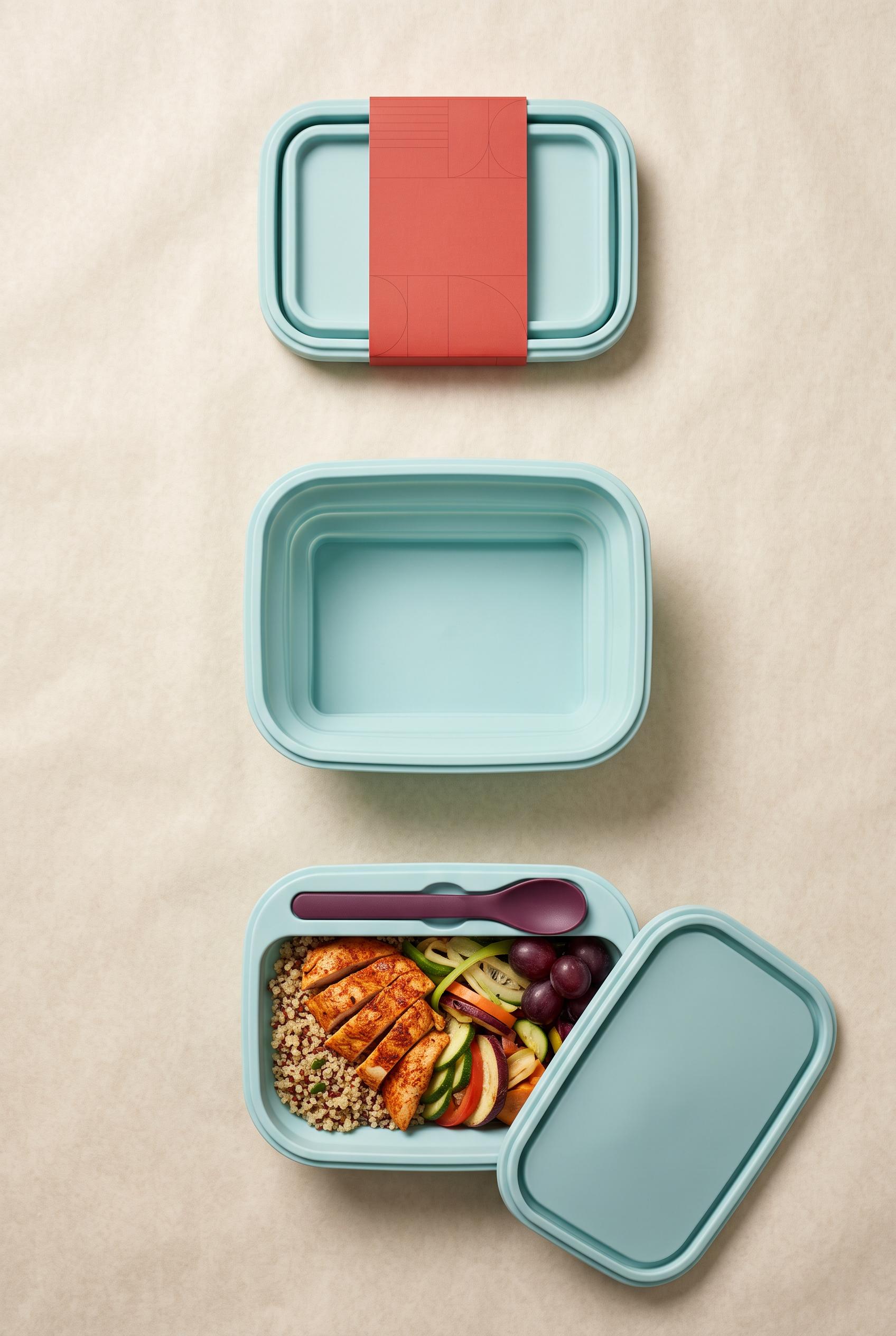
0Create a commercial-quality vertical 2:3 Pinterest composition showing a before-and-after transformation of a foldable silicone lunch bowl package. Use an overhead unfolding sequence with a soft shadow curtain, moving from a flat wrapped form to an open bowl with lid, utensil, and neatly packed food. Use paprika red, pale aqua, deep plum, and parchment tones, premium product photography, realistic silicone texture, crisp studio lighting, elegant art direction, no real brands, no trademarked characters, no watermark, and no unintended readable text. AI-modified downstream. Corrective regeneration attempt 3. Produce a materially revised image, not a near-duplicate of an earlier variant. Preserve the successful subject, palette, lighting, focal hierarchy, and commercial polish from the original brief while correcting every issue below. Mandatory corrective instructions from the most recent visual QA: Preserve the vertical 2:3 overhead composition, parchment background, premium lighting, controlled shadows, paprika-red sleeve, pale-aqua silicone, plum accents, top wrapped form, and bottom packed meal. Replace the empty middle bowl with a physically realistic partially expanded rectangular silicone bowl: show evenly spaced accordion folds on all four sides, aligned rounded corners, a consistent pale-aqua rim, and a clear natural progression from the flat wrapped form above to the open bowl below. In the final packed bowl, add one clearly integrated utensil slot along the upper inner rim and place exactly one plum utensil securely inside it; remove any utensil resting loosely across the bowl or outside it. Keep the lid beside the final bowl and the meal neatly contained. Render only blank surfaces and non-linguistic geometric details: no letters, words, numbers, labels, logos, trademarks, watermark, pseudo-text, captions, or extra objects. Observed defects from prior variants that must not recur: 1) The middle unfolding bowl has severely warped, asymmetrical, physically implausible geometry that reads as a generation artifact. 2) The transition does not clearly show a natural fold/unfold progression; the bowl appears twisted rather than unfolding. 3) The final arrangement includes utensils but does not clearly show a dedicated utensil slot. 4) The middle transition is a fully open empty bowl rather than a realistic partially expanded accordion-fold state. 5) The unfolding progression is unclear because the intermediate form lacks evenly spaced silicone folds and a natural flat-to-open progression. 6) The final utensil is laid across the bowl rather than clearly held in an integrated utensil slot. Render no letters, words, numbers, prices, headings, labels, contact details, logos, glyphs, or pseudo-text anywhere. Use only blank surfaces, clean geometric marks, and non-linguistic placeholder shapes. Do not add explanatory captions, before/after labels, interface copy, or extra objects that the brief did not request. When a corrective instruction conflicts with a decorative detail, prioritize the corrective instruction.
 0
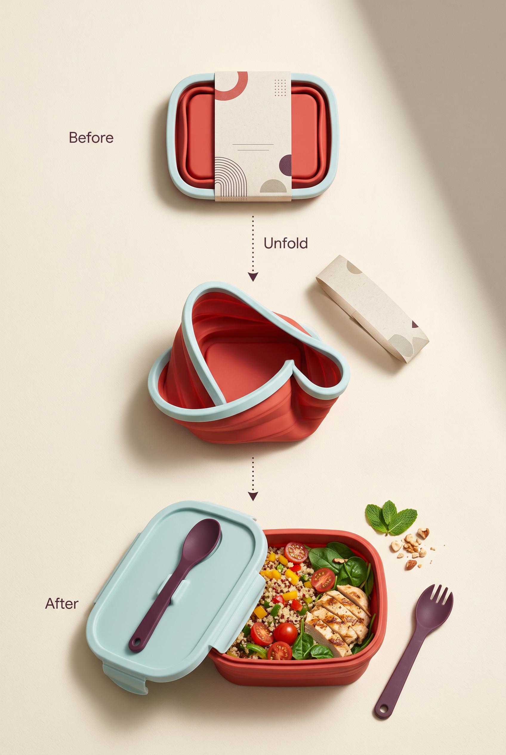
0Create a commercial-quality vertical 2:3 Pinterest composition showing a before-and-after transformation of a foldable silicone lunch bowl package. Use an overhead unfolding sequence with a soft shadow curtain, moving from a flat wrapped form to an open bowl with lid, utensil, and neatly packed food. Use paprika red, pale aqua, deep plum, and parchment tones, premium product photography, realistic silicone texture, crisp studio lighting, elegant art direction, no real brands, no trademarked characters, no watermark, and no unintended readable text. AI-modified downstream. Corrective regeneration attempt 2. Produce a materially revised image, not a near-duplicate of an earlier variant. Preserve the successful subject, palette, lighting, focal hierarchy, and commercial polish from the original brief while correcting every issue below. Mandatory corrective instructions from the most recent visual QA: Preserve the vertical 2:3 overhead composition, premium parchment background, paprika-red and pale-aqua silicone, plum accents, controlled shadows, negative space, top wrapped bowl, and bottom packed meal. Replace the distorted middle object with a physically realistic intermediate state: a partially expanded rectangular silicone bowl with evenly spaced accordion folds, aligned rounded corners, consistent pale-aqua rim, and a natural flat-to-open progression. Ensure the final open bowl has a clearly visible integrated utensil slot holding one plum utensil, with the lid positioned beside it and the packed meal neatly contained. Remove the extra loose utensil outside the bowl. Keep only clean, intentional readable labels if retained; no garbled text, logos, trademarks, or watermark. Observed defects from prior variants that must not recur: 1) The middle unfolding bowl has severely warped, asymmetrical, physically implausible geometry that reads as a generation artifact. 2) The transition does not clearly show a natural fold/unfold progression; the bowl appears twisted rather than unfolding. 3) The final arrangement includes utensils but does not clearly show a dedicated utensil slot. Render no letters, words, numbers, prices, headings, labels, contact details, logos, glyphs, or pseudo-text anywhere. Use only blank surfaces, clean geometric marks, and non-linguistic placeholder shapes. Do not add explanatory captions, before/after labels, interface copy, or extra objects that the brief did not request. When a corrective instruction conflicts with a decorative detail, prioritize the corrective instruction.
 0
0Create a commercial-quality vertical 2:3 Pinterest composition showing a before-and-after transformation of a foldable silicone lunch bowl package. Use an overhead unfolding sequence with a soft shadow curtain, moving from a flat wrapped form to an open bowl with lid, utensil, and neatly packed food. Use paprika red, pale aqua, deep plum, and parchment tones, premium product photography, realistic silicone texture, crisp studio lighting, elegant art direction, no real brands, no trademarked characters, no watermark, and no unintended readable text. AI-modified downstream.
 0
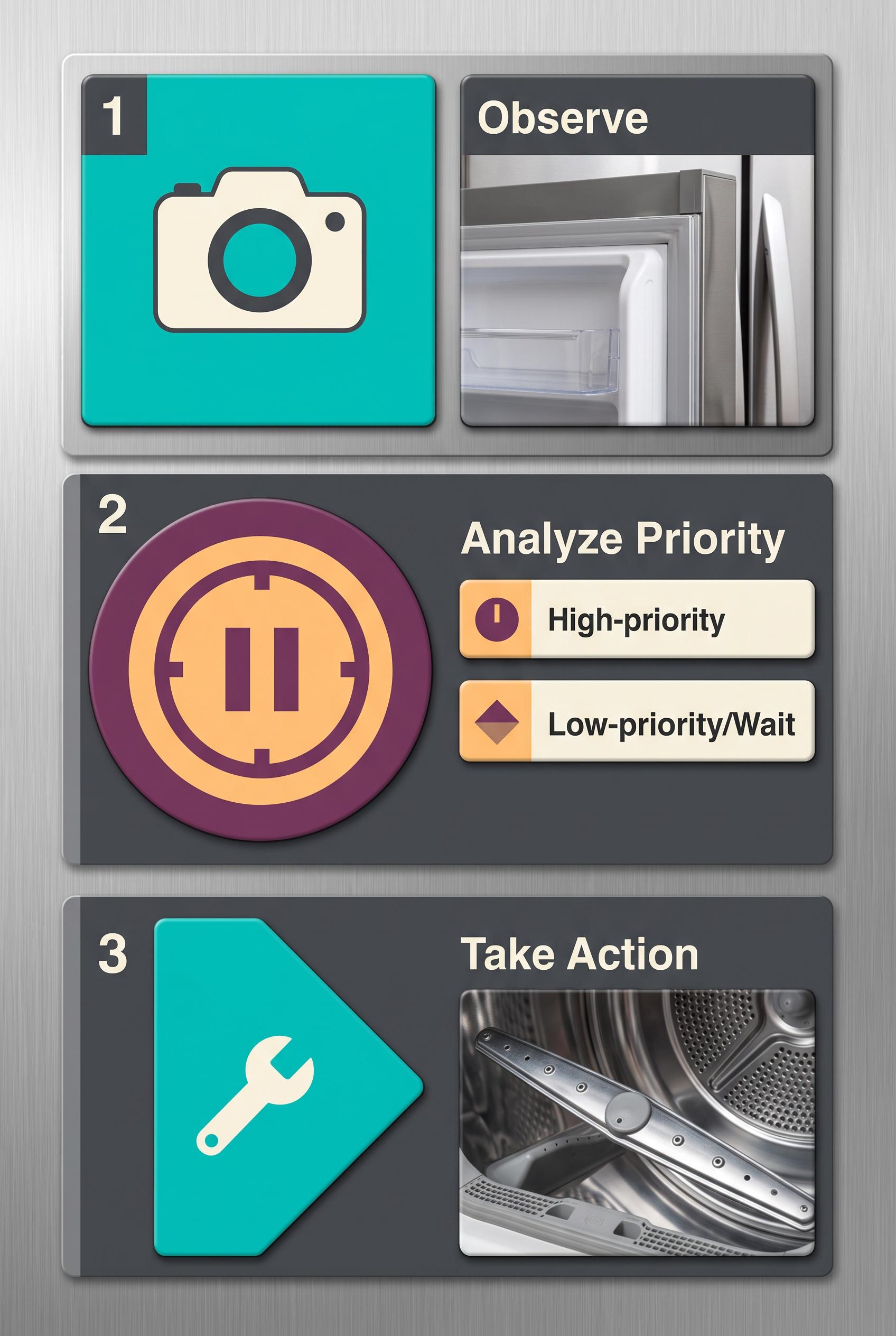
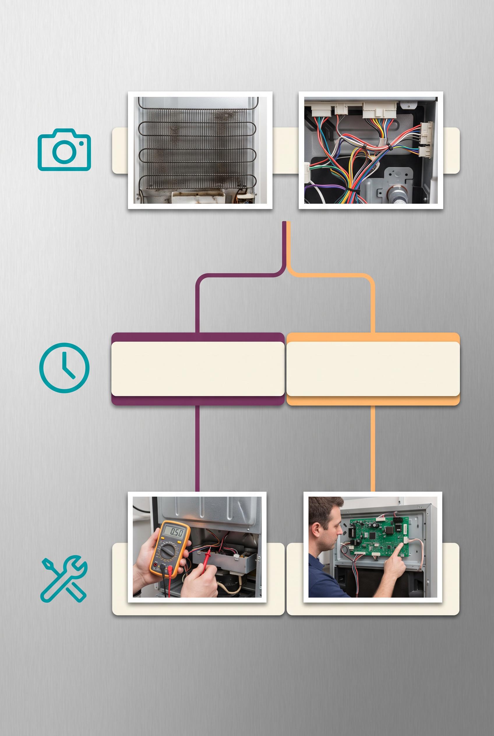
0Create a commercial-quality educational Pinterest graphic in a vertical 2:3 composition for an independent appliance repair service. Show a magnetic tile decision tree on a clean workshop board, using realistic appliance detail photos, friendly abstract icons, arrows, and three branching stages that explain how to identify an issue and choose a next step. Use electric teal, plum, apricot, ivory, and graphite. Use blank tile shapes and abstract symbol marks only, with no legible words or numbers. AI-modified downstream asset, no real brands, no trademarked characters, no watermark, no unintended readable text. Corrective regeneration attempt 5. Produce a materially revised image, not a near-duplicate of an earlier variant. Preserve the successful subject, palette, lighting, focal hierarchy, and commercial polish from the original brief while correcting every issue below. Mandatory corrective instructions from the most recent visual QA: Preserve the polished refrigerator-board surface, vertical 2:3 framing, clean lighting, teal/plum/apricot/ivory/graphite palette, magnetic tile styling, and realistic appliance-detail photography. Rebuild the composition into exactly three clearly separated stacked horizontal stages with one continuous top-to-bottom path: Stage 1 at top uses only a camera pictogram and one or two neatly spaced appliance photos; Stage 2 in the middle uses only a clock or pause-like geometric pictogram with two simple color-coded ivory paths or strips for priority versus wait; Stage 3 at bottom uses only a tool or forward-path pictogram and one or two appliance photos. Remove all branching into parallel columns, duplicated or overlapping cards, excess tiles, and lower-area clutter. Use only blank magnetic surfaces and clean non-linguistic abstract geometric marks. Remove every letter, word, number, readable digit, punctuation mark, arrowhead, chevron, pseudo-text, logo, watermark, and label, including any readable digits visible inside appliance photographs or instrument displays. Observed defects from prior variants that must not recur: 1) Strong vertical composition, palette, lighting, focal hierarchy, realistic appliance photos, and clean iconography. 2) The layout still reads as one observation stage splitting into two parallel branches rather than three clearly separated sequential stages: observation, priority-versus-wait, and 3) The lower half is crowded with many cards, branching paths, and repeated appliance photos, weakening immediate readability and approachable simplicity. 4) Several arrowheads and path marks are visually chevron-like, conflicting with the instruction to avoid glyph-like marks. 5) Attractive vertical composition with strong palette and lighting, but it still uses a two-branch layout rather than exactly three clearly separated sequential stages. 6) The connectors create an ambiguous split path instead of one unambiguous top-to-bottom decision flow. 7) The lower section remains split into parallel photo cards, weakening the observation → wait/priority → next-step hierarchy. 8) The multimeter display contains readable digits, violating the no numbers/readable glyphs requirement. Render no letters, words, numbers, prices, headings, labels, contact details, logos, glyphs, or pseudo-text anywhere. Use only blank surfaces, clean geometric marks, and non-linguistic placeholder shapes. Do not add explanatory captions, before/after labels, interface copy, or extra objects that the brief did not request. When a corrective instruction conflicts with a decorative detail, prioritize the corrective instruction.
 0
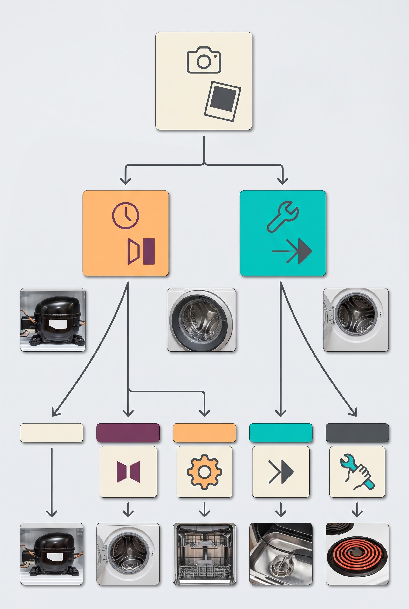
0Create a commercial-quality educational Pinterest graphic in a vertical 2:3 composition for an independent appliance repair service. Show a magnetic tile decision tree on a clean workshop board, using realistic appliance detail photos, friendly abstract icons, arrows, and three branching stages that explain how to identify an issue and choose a next step. Use electric teal, plum, apricot, ivory, and graphite. Use blank tile shapes and abstract symbol marks only, with no legible words or numbers. AI-modified downstream asset, no real brands, no trademarked characters, no watermark, no unintended readable text. Corrective regeneration attempt 4. Produce a materially revised image, not a near-duplicate of an earlier variant. Preserve the successful subject, palette, lighting, focal hierarchy, and commercial polish from the original brief while correcting every issue below. Mandatory corrective instructions from the most recent visual QA: Preserve the polished vertical 2:3 refrigerator-board composition, clean lighting, teal/plum/apricot/ivory/graphite palette, realistic appliance detail photos, magnetic tiles, and central focal hierarchy. Rebuild the layout as exactly three clearly separated horizontal or vertical sequential stages with one unambiguous top-to-bottom path: first an observation/photo stage using only a camera pictogram and one or two neatly spaced appliance photos; second a priority-versus-wait stage using only a clock or pause-like geometric pictogram and two simple color-coded paths; third an action/next-step stage using only a tool or forward-path pictogram and one or two appliance photos. Remove the parallel-branch structure, overlapping cards, repeated photos, excess tiles, and all lower-area clutter. Use blank ivory or color-coded magnetic strips and unmistakable non-linguistic abstract shapes only. Simplify all connectors into clean lines with minimal rounded endpoints, avoiding prominent chevrons, arrowheads, punctuation-like marks, pseudo-text, labels, headings, logos, watermarks, letters, numbers, and any readable glyphs anywhere. Observed defects from prior variants that must not recur: 1) The board is somewhat overfilled with many tiles, reducing the approachable simplicity of the concept. 2) Several readable punctuation/glyph marks appear on the tiles, including exclamation, question mark, pause, X, and chevron-like symbols, violating the no-readable-text/glyphs rule. 3) The three diagnostic stages are not clearly distinct; the layout mainly presents two branches rather than observation, priority/wait, and action/next-step stages. 4) The lower composition remains somewhat busy with overlapping appliance photos and extra icon cards, weakening immediate decision-path clarity. 5) Strong vertical composition, palette, lighting, focal hierarchy, realistic appliance photos, and clean iconography. 6) The layout still reads as one observation stage splitting into two parallel branches rather than three clearly separated sequential stages: observation, priority-versus-wait, and 7) The lower half is crowded with many cards, branching paths, and repeated appliance photos, weakening immediate readability and approachable simplicity. 8) Several arrowheads and path marks are visually chevron-like, conflicting with the instruction to avoid glyph-like marks. Render no letters, words, numbers, prices, headings, labels, contact details, logos, glyphs, or pseudo-text anywhere. Use only blank surfaces, clean geometric marks, and non-linguistic placeholder shapes. Do not add explanatory captions, before/after labels, interface copy, or extra objects that the brief did not request. When a corrective instruction conflicts with a decorative detail, prioritize the corrective instruction.
 0
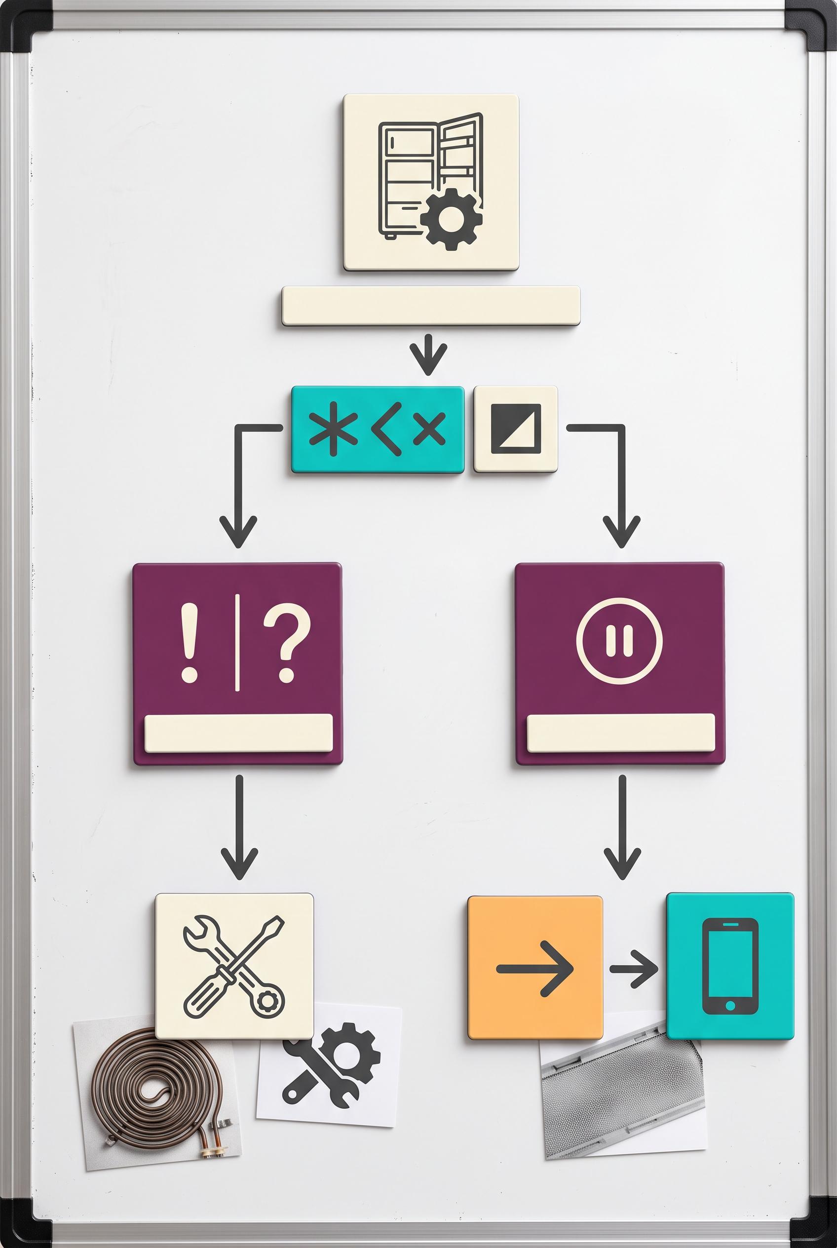
0Create a commercial-quality educational Pinterest graphic in a vertical 2:3 composition for an independent appliance repair service. Show a magnetic tile decision tree on a clean workshop board, using realistic appliance detail photos, friendly abstract icons, arrows, and three branching stages that explain how to identify an issue and choose a next step. Use electric teal, plum, apricot, ivory, and graphite. Use blank tile shapes and abstract symbol marks only, with no legible words or numbers. AI-modified downstream asset, no real brands, no trademarked characters, no watermark, no unintended readable text. Corrective regeneration attempt 3. Produce a materially revised image, not a near-duplicate of an earlier variant. Preserve the successful subject, palette, lighting, focal hierarchy, and commercial polish from the original brief while correcting every issue below. Mandatory corrective instructions from the most recent visual QA: Preserve the polished vertical 2:3 refrigerator-board composition, clean lighting, teal/plum/apricot/ivory/graphite palette, realistic appliance detail photos, magnetic tiles, arrows, and central focal hierarchy. Rebuild the decision tree as three clearly separated sequential stages: first an observation/photo stage, second a priority-versus-wait stage, and third an action/next-step stage. Use only unmistakable non-linguistic abstract shapes and simple pictograms such as a camera/photo rectangle, a clock or pause-like geometric form, and a tool or forward-path icon. Remove every exclamation mark, question mark, letter, number, punctuation mark, chevron that resembles text, pseudo-text, label, heading, logo, watermark, or brand symbol. Use blank ivory or color-coded magnetic strips and clean geometric marks only. Simplify the lower area by removing overlapping extra cards and reducing tile count and branching clutter; keep appliance photos neatly spaced beneath the relevant stage. Ensure the path reads immediately from top to bottom with three distinct stages and no unintended readable glyphs anywhere. Observed defects from prior variants that must not recur: 1) Strong vertical composition, color palette, focal point, and decision-tree structure. 2) Contains extensive clearly readable text despite the requirement for blank tiles, abstract symbols, and no legible words or numbers. 3) The three diagnostic stages are not clearly represented as distinct question-based branches. 4) The board is somewhat overfilled with many tiles, reducing the approachable simplicity of the concept. 5) Several readable punctuation/glyph marks appear on the tiles, including exclamation, question mark, pause, X, and chevron-like symbols, violating the no-readable-text/glyphs rule. 6) The three diagnostic stages are not clearly distinct; the layout mainly presents two branches rather than observation, priority/wait, and action/next-step stages. 7) The lower composition remains somewhat busy with overlapping appliance photos and extra icon cards, weakening immediate decision-path clarity. Render no letters, words, numbers, prices, headings, labels, contact details, logos, glyphs, or pseudo-text anywhere. Use only blank surfaces, clean geometric marks, and non-linguistic placeholder shapes. Do not add explanatory captions, before/after labels, interface copy, or extra objects that the brief did not request. When a corrective instruction conflicts with a decorative detail, prioritize the corrective instruction.
 0
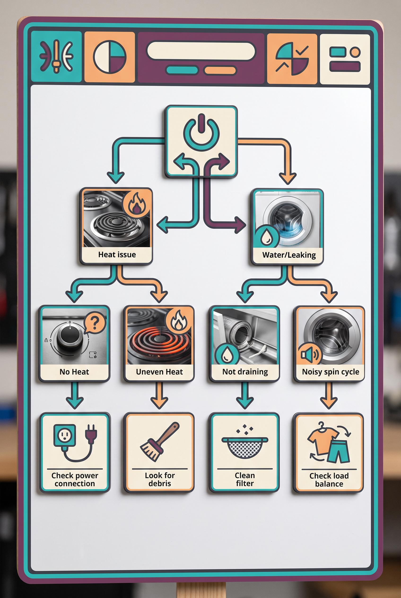
0Create a commercial-quality educational Pinterest graphic in a vertical 2:3 composition for an independent appliance repair service. Show a magnetic tile decision tree on a clean workshop board, using realistic appliance detail photos, friendly abstract icons, arrows, and three branching stages that explain how to identify an issue and choose a next step. Use electric teal, plum, apricot, ivory, and graphite. Use blank tile shapes and abstract symbol marks only, with no legible words or numbers. AI-modified downstream asset, no real brands, no trademarked characters, no watermark, no unintended readable text. Corrective regeneration attempt 2. Produce a materially revised image, not a near-duplicate of an earlier variant. Preserve the successful subject, palette, lighting, focal hierarchy, and commercial polish from the original brief while correcting every issue below. Mandatory corrective instructions from the most recent visual QA: Preserve the polished vertical 2:3 refrigerator-board composition, teal/plum/apricot/ivory/graphite palette, realistic appliance detail photos, friendly icons, magnetic tiles, arrows, and clear central branching focal point. Remove every readable word, letter, number, and label from all tiles and appliance images; replace all text areas with blank ivory or color-coded magnetic strips and abstract symbol marks only. Make three visually distinct branching stages corresponding to what happened, what can wait, and what should happen next using only abstract icons: an observation/photo stage, a priority/wait stage, and an action/next-step stage. Simplify the lower tile arrangement and spacing so the decision path is immediately understandable and less crowded. Keep the board free of logos, brands, trademarks, watermarks, and garbled pseudo-text. Observed defects from prior variants that must not recur: 1) Strong vertical composition, color palette, focal point, and decision-tree structure. 2) Contains extensive clearly readable text despite the requirement for blank tiles, abstract symbols, and no legible words or numbers. 3) The three diagnostic stages are not clearly represented as distinct question-based branches. 4) The board is somewhat overfilled with many tiles, reducing the approachable simplicity of the concept. Render no letters, words, numbers, prices, headings, labels, contact details, logos, glyphs, or pseudo-text anywhere. Use only blank surfaces, clean geometric marks, and non-linguistic placeholder shapes. Do not add explanatory captions, before/after labels, interface copy, or extra objects that the brief did not request. When a corrective instruction conflicts with a decorative detail, prioritize the corrective instruction.
 0
0Create a commercial-quality educational Pinterest graphic in a vertical 2:3 composition for an independent appliance repair service. Show a magnetic tile decision tree on a clean workshop board, using realistic appliance detail photos, friendly abstract icons, arrows, and three branching stages that explain how to identify an issue and choose a next step. Use electric teal, plum, apricot, ivory, and graphite. Use blank tile shapes and abstract symbol marks only, with no legible words or numbers. AI-modified downstream asset, no real brands, no trademarked characters, no watermark, no unintended readable text.
 0
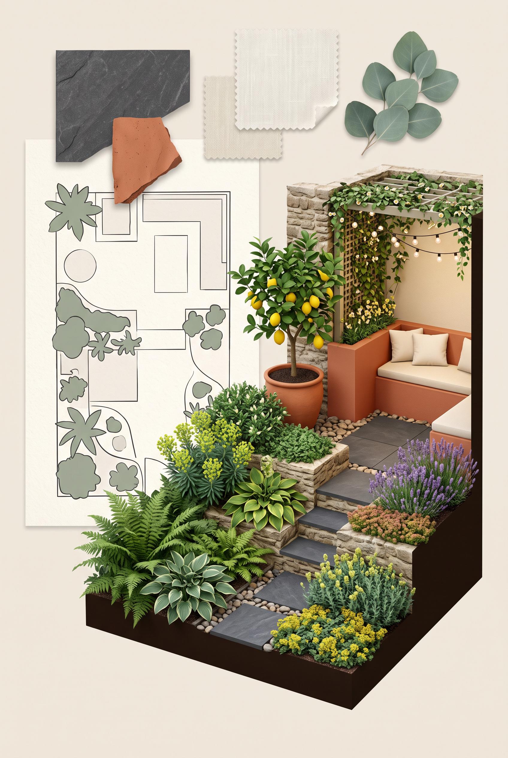
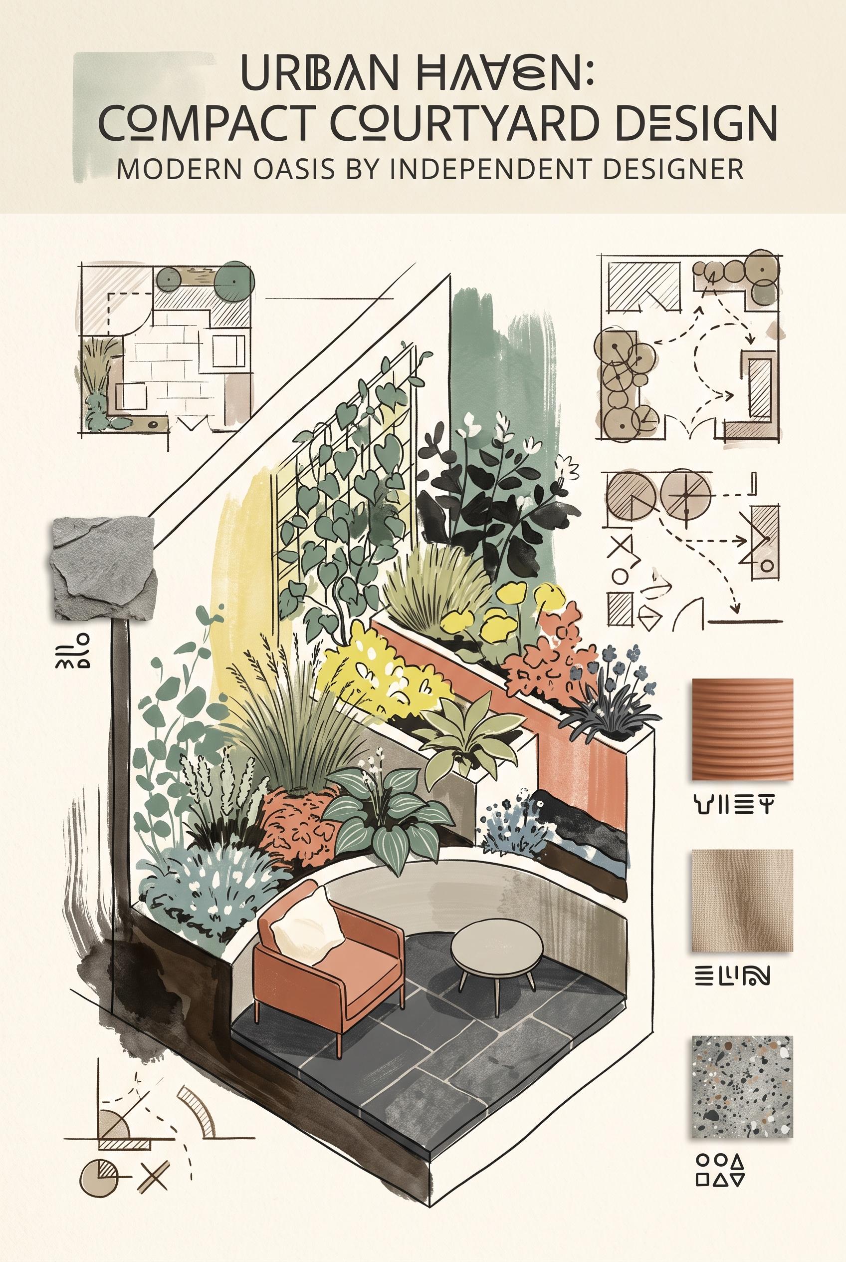
0Create a commercial-quality art-directed Pinterest showcase in a vertical 2:3 composition for an independent landscape designer. Present a compact courtyard garden as a vertical cutaway editorial scene with layered planting beds, textured stone, a small seating nook, hand-drawn plan fragments, and floating material swatches. Use eucalyptus green, terracotta, lemon yellow, charcoal, and soft ivory. Any diagrams must be abstract and contain no legible words or numbers. AI-modified downstream asset, no real brands, no trademarked characters, no watermark, no unintended readable text. Corrective regeneration attempt 5. Produce a materially revised image, not a near-duplicate of an earlier variant. Preserve the successful subject, palette, lighting, focal hierarchy, and commercial polish from the original brief while correcting every issue below. Mandatory corrective instructions from the most recent visual QA: Preserve the polished vertical 2:3 courtyard cutaway, lush layered planting, terracotta seating nook, charcoal paving, eucalyptus green and ivory palette, warm lighting, material swatches, and strong editorial hierarchy. Remove the X-shaped glyph, all arrow-like marks, notation strokes, and every thin white measurement or annotation line from the plan and garden edges. Remove every blank rectangular label plaque beside or beneath the swatches. Keep the plan limited to clean abstract geometric shapes and plant-like silhouettes only. Ensure the entire image contains no letters, numbers, glyphs, pseudo-writing, labels, captions, logos, watermark marks, arrows, or readable text. Observed defects from prior variants that must not recur: 1) Some diagram marks and arrow-like annotations remain, conflicting with the requirement for purely abstract, non-symbolic shapes. 2) Attractive vertical cutaway composition with strong garden focal point and cohesive palette. 3) The plan fragment still contains glyph-like marks resembling a lowercase letter and an X, plus small annotation-like strokes. 4) Thin white measurement/annotation lines remain along the right garden edge and lower-left area. 5) The composition is attractive, vertical, and commercially polished with a strong garden focal point. 6) The plan fragment visibly contains an X-shaped glyph and arrow-like marks. 7) Thin white measurement/annotation lines remain around the plan. 8) Blank rectangular label plaques remain beside and beneath the material swatches, creating unintended label-like elements. Render no letters, words, numbers, prices, headings, labels, contact details, logos, glyphs, or pseudo-text anywhere. Use only blank surfaces, clean geometric marks, and non-linguistic placeholder shapes. Do not add explanatory captions, before/after labels, interface copy, or extra objects that the brief did not request. When a corrective instruction conflicts with a decorative detail, prioritize the corrective instruction.
 0
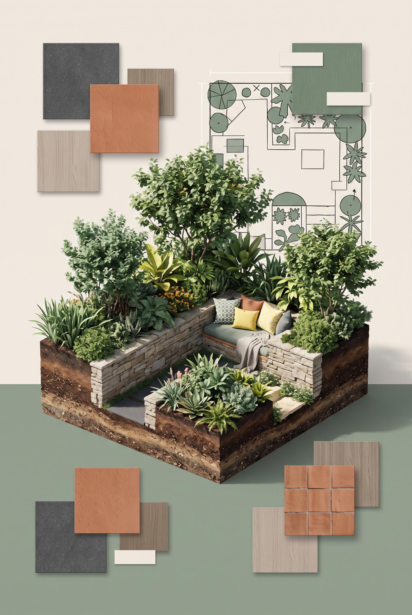
0Create a commercial-quality art-directed Pinterest showcase in a vertical 2:3 composition for an independent landscape designer. Present a compact courtyard garden as a vertical cutaway editorial scene with layered planting beds, textured stone, a small seating nook, hand-drawn plan fragments, and floating material swatches. Use eucalyptus green, terracotta, lemon yellow, charcoal, and soft ivory. Any diagrams must be abstract and contain no legible words or numbers. AI-modified downstream asset, no real brands, no trademarked characters, no watermark, no unintended readable text. Corrective regeneration attempt 4. Produce a materially revised image, not a near-duplicate of an earlier variant. Preserve the successful subject, palette, lighting, focal hierarchy, and commercial polish from the original brief while correcting every issue below. Mandatory corrective instructions from the most recent visual QA: Preserve the polished vertical 2:3 courtyard cutaway, lush layered planting, terracotta seating nook, charcoal paving, palette, lighting, material swatches, and overall editorial hierarchy. Remove every glyph-like mark from the plan fragment, including the letter-like circle mark, X-shaped mark, and tiny notation strokes. Remove the thin white measurement/annotation lines along the right garden edge and lower-left garden area. Keep diagrams limited to clean abstract geometric forms and plant-like silhouettes only. Ensure there are no letters, numbers, glyphs, pseudo-writing, arrows, labels, captions, logos, watermark marks, or readable text anywhere. Observed defects from prior variants that must not recur: 1) Several garbled symbol-like labels appear beneath the material swatches. 2) The otherwise strong editorial cutaway composition and color palette are suitable. 3) Attractive vertical editorial composition with strong focal garden and cohesive palette. 4) Multiple blank label plaques remain beneath and beside material swatches, violating the instruction to remove labels and label-like elements. 5) Some diagram marks and arrow-like annotations remain, conflicting with the requirement for purely abstract, non-symbolic shapes. 6) Attractive vertical cutaway composition with strong garden focal point and cohesive palette. 7) The plan fragment still contains glyph-like marks resembling a lowercase letter and an X, plus small annotation-like strokes. 8) Thin white measurement/annotation lines remain along the right garden edge and lower-left area. Render no letters, words, numbers, prices, headings, labels, contact details, logos, glyphs, or pseudo-text anywhere. Use only blank surfaces, clean geometric marks, and non-linguistic placeholder shapes. Do not add explanatory captions, before/after labels, interface copy, or extra objects that the brief did not request. When a corrective instruction conflicts with a decorative detail, prioritize the corrective instruction.
 0
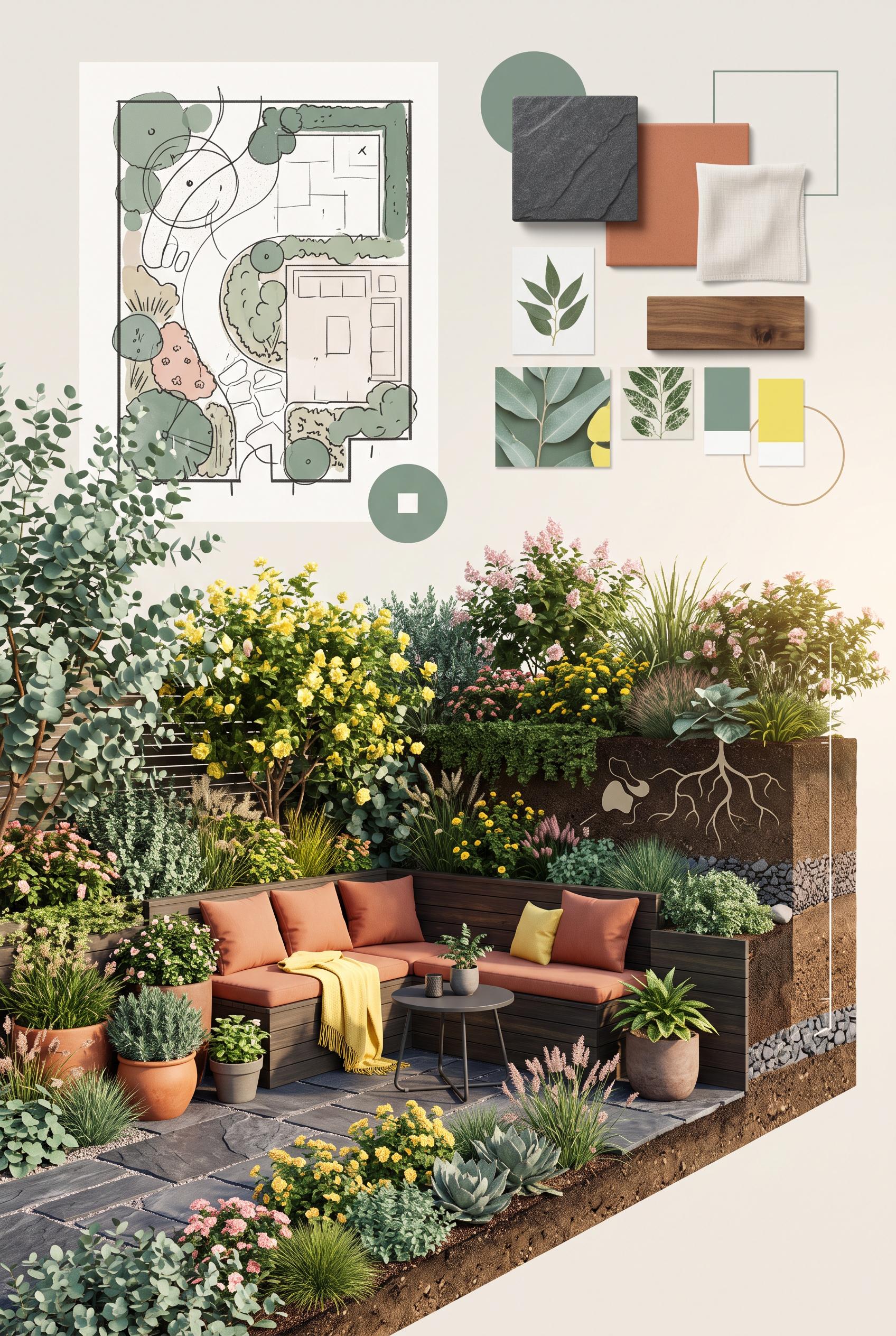
0Create a commercial-quality art-directed Pinterest showcase in a vertical 2:3 composition for an independent landscape designer. Present a compact courtyard garden as a vertical cutaway editorial scene with layered planting beds, textured stone, a small seating nook, hand-drawn plan fragments, and floating material swatches. Use eucalyptus green, terracotta, lemon yellow, charcoal, and soft ivory. Any diagrams must be abstract and contain no legible words or numbers. AI-modified downstream asset, no real brands, no trademarked characters, no watermark, no unintended readable text. Corrective regeneration attempt 3. Produce a materially revised image, not a near-duplicate of an earlier variant. Preserve the successful subject, palette, lighting, focal hierarchy, and commercial polish from the original brief while correcting every issue below. Mandatory corrective instructions from the most recent visual QA: Preserve the polished vertical 2:3 cutaway courtyard, lush layered planting, terracotta seating nook, charcoal paving, hand-drawn plan fragments, material swatches, lighting, palette, and focal hierarchy. Remove every blank label plaque, caption box, tag, tape-like label, arrow, measurement line, annotation, and other label-like or symbolic mark throughout the image. Replace them with clean blank surfaces or simple non-linguistic geometric shapes only. Keep diagrams purely abstract, with no letters, numbers, glyphs, pseudo-writing, logos, watermark marks, or readable text anywhere. Observed defects from prior variants that must not recur: 1) Large embedded headline text was not requested and violates the no-unintended-readable-text requirement. 2) Several garbled symbol-like labels appear beneath the material swatches. 3) The otherwise strong editorial cutaway composition and color palette are suitable. 4) Attractive vertical editorial composition with strong focal garden and cohesive palette. 5) Multiple blank label plaques remain beneath and beside material swatches, violating the instruction to remove labels and label-like elements. 6) Some diagram marks and arrow-like annotations remain, conflicting with the requirement for purely abstract, non-symbolic shapes. Render no letters, words, numbers, prices, headings, labels, contact details, logos, glyphs, or pseudo-text anywhere. Use only blank surfaces, clean geometric marks, and non-linguistic placeholder shapes. Do not add explanatory captions, before/after labels, interface copy, or extra objects that the brief did not request. When a corrective instruction conflicts with a decorative detail, prioritize the corrective instruction.
 0
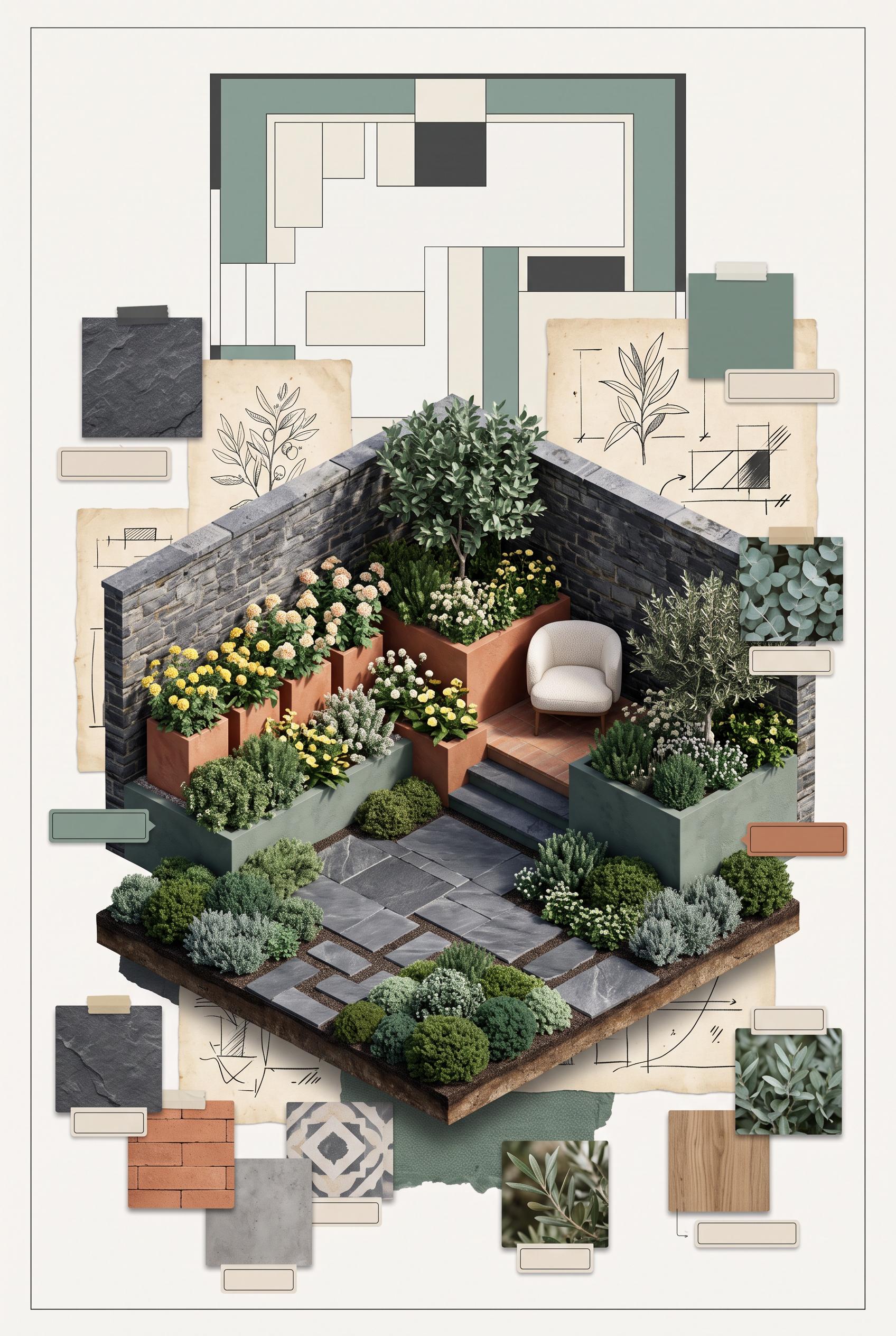
0Create a commercial-quality art-directed Pinterest showcase in a vertical 2:3 composition for an independent landscape designer. Present a compact courtyard garden as a vertical cutaway editorial scene with layered planting beds, textured stone, a small seating nook, hand-drawn plan fragments, and floating material swatches. Use eucalyptus green, terracotta, lemon yellow, charcoal, and soft ivory. Any diagrams must be abstract and contain no legible words or numbers. AI-modified downstream asset, no real brands, no trademarked characters, no watermark, no unintended readable text. Corrective regeneration attempt 2. Produce a materially revised image, not a near-duplicate of an earlier variant. Preserve the successful subject, palette, lighting, focal hierarchy, and commercial polish from the original brief while correcting every issue below. Mandatory corrective instructions from the most recent visual QA: Regenerate the same attractive vertical 2:3 editorial cutaway courtyard scene, preserving the lush layered planting beds, terracotta seating nook, charcoal stone paving, hand-drawn plan fragments, material swatches, eucalyptus/terracotta/lemon/charcoal/ivory palette, and clean focal hierarchy. Remove all headline text, captions, letters, numbers, logos, labels, and watermark-like marks everywhere, including the top area and beneath every material swatch. Keep diagrams purely abstract with clean lines and non-symbolic shapes; ensure no glyphs or pseudo-writing remain. Maintain polished commercial-art-directed finish with no distortions or generation artifacts. Observed defects from prior variants that must not recur: 1) Large embedded headline text was not requested and violates the no-unintended-readable-text requirement. 2) Several garbled symbol-like labels appear beneath the material swatches. 3) The otherwise strong editorial cutaway composition and color palette are suitable. Render no letters, words, numbers, prices, headings, labels, contact details, logos, glyphs, or pseudo-text anywhere. Use only blank surfaces, clean geometric marks, and non-linguistic placeholder shapes. Do not add explanatory captions, before/after labels, interface copy, or extra objects that the brief did not request. When a corrective instruction conflicts with a decorative detail, prioritize the corrective instruction.
 0
0Create a commercial-quality art-directed Pinterest showcase in a vertical 2:3 composition for an independent landscape designer. Present a compact courtyard garden as a vertical cutaway editorial scene with layered planting beds, textured stone, a small seating nook, hand-drawn plan fragments, and floating material swatches. Use eucalyptus green, terracotta, lemon yellow, charcoal, and soft ivory. Any diagrams must be abstract and contain no legible words or numbers. AI-modified downstream asset, no real brands, no trademarked characters, no watermark, no unintended readable text.
 0
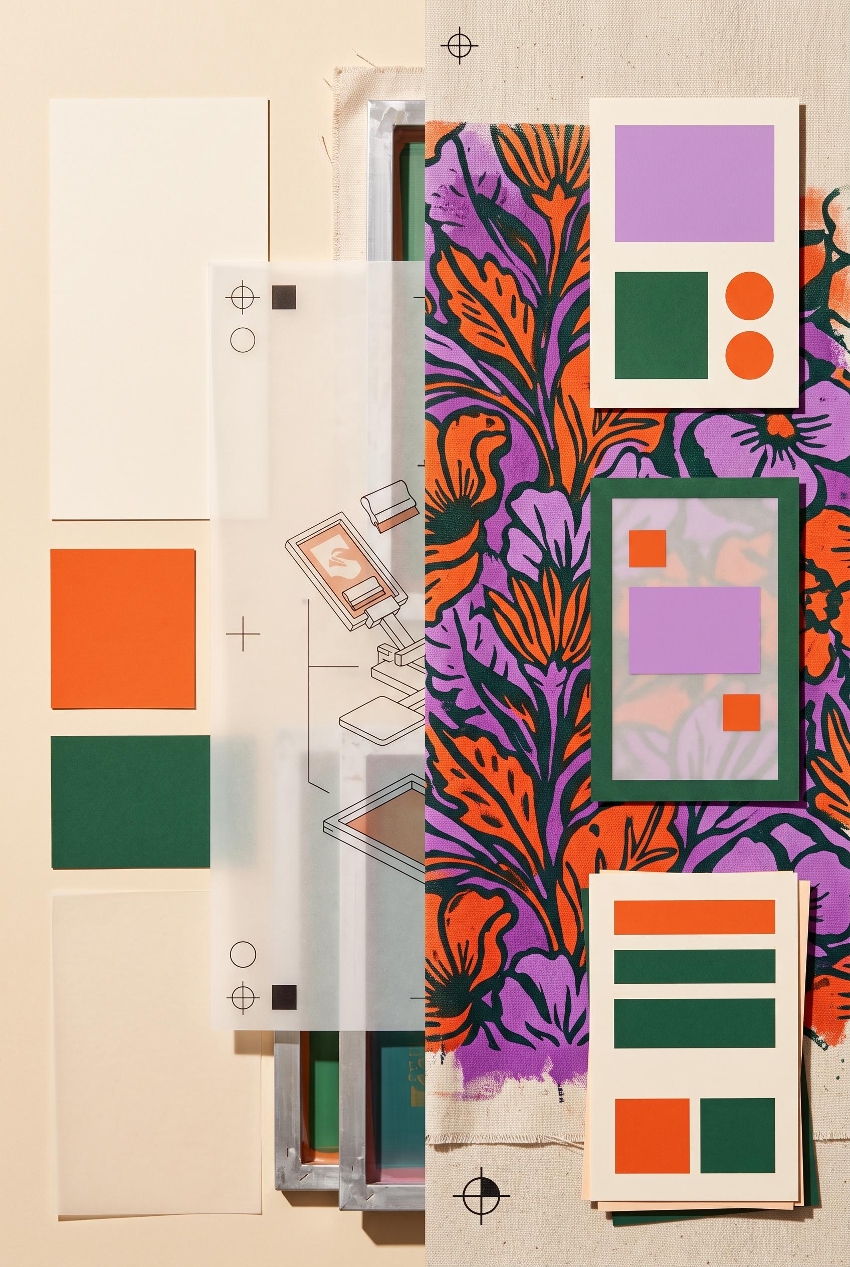
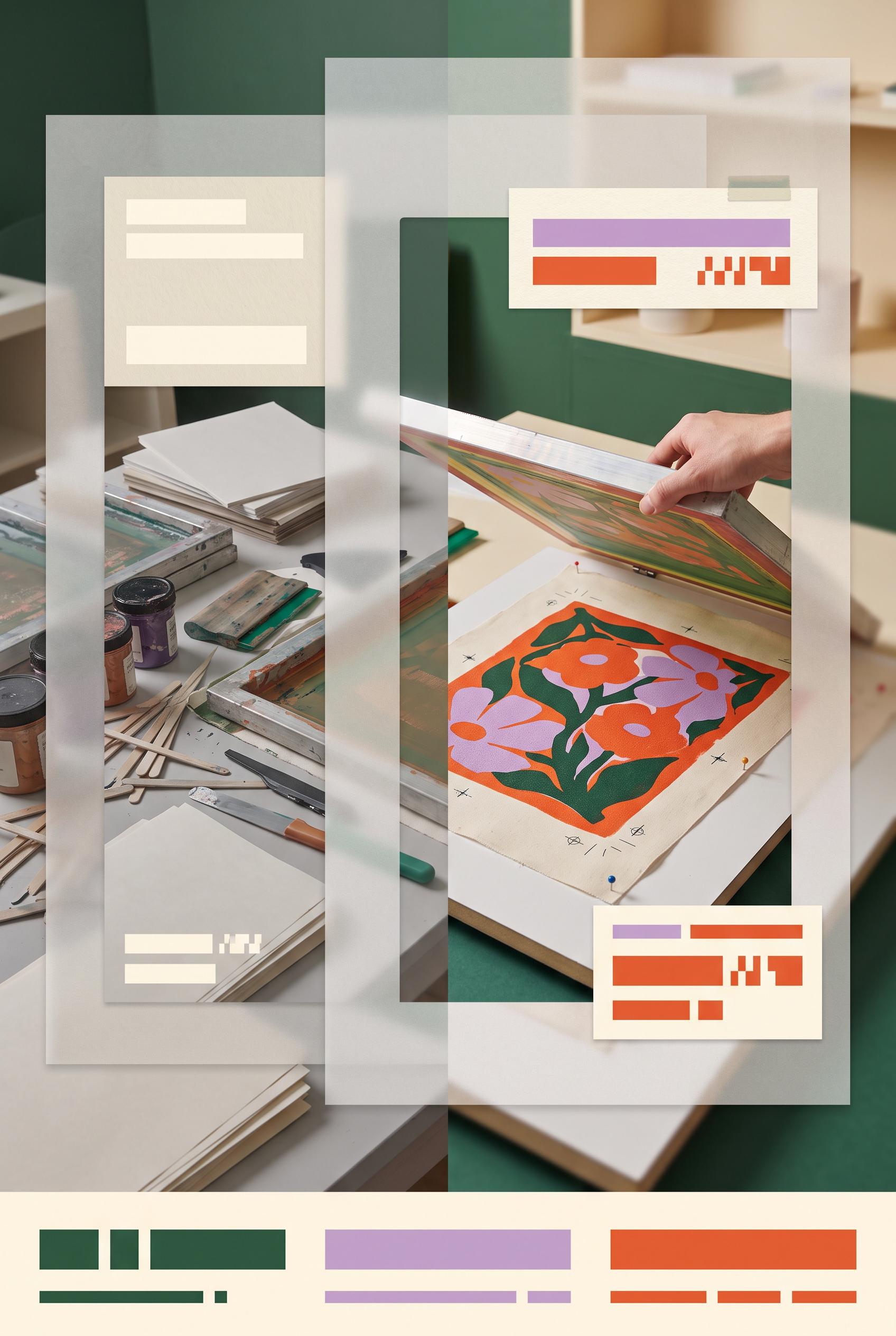
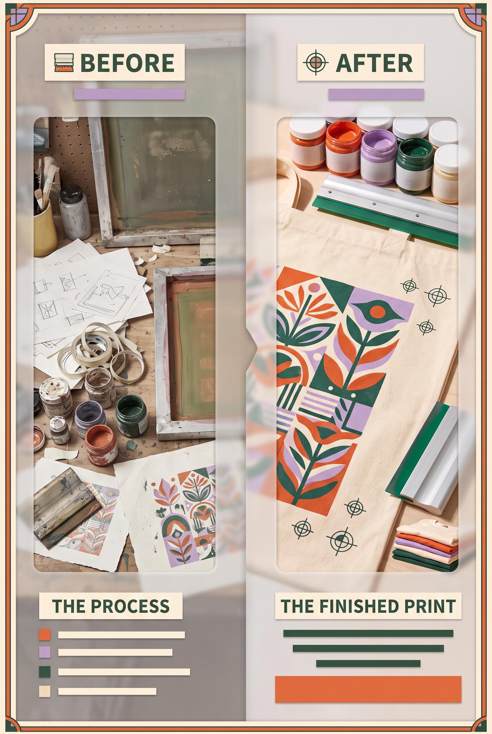
0Create a commercial-quality art-directed Pinterest graphic in a vertical 2:3 composition for an independent screen-printing studio promotion. Show a before-and-after transformation using nested paper windows and translucent vellum sheets, with the dull side appearing flat and cluttered and the after side showing vivid ink texture, printed fabric, registration marks, and a clear visual hierarchy. Use persimmon, lilac, pine green, and warm cream. Include blank abstract text blocks only, no legible words or numbers. AI-modified downstream asset, no real brands, no trademarked characters, no watermark, no unintended readable text. Corrective regeneration attempt 3. Produce a materially revised image, not a near-duplicate of an earlier variant. Preserve the successful subject, palette, lighting, focal hierarchy, and commercial polish from the original brief while correcting every issue below. Mandatory corrective instructions from the most recent visual QA: Preserve the attractive vertical 2:3 nested-window composition, translucent vellum layers, screen-printing process imagery, vivid floral fabric print, persimmon/lilac/pine/warm-cream palette, lighting, and right-side focal hierarchy. Replace every segmented mark that resembles letters, numerals, symbols, or pseudo-text—especially the orange marks on the upper-right cream card, lower-right offer card, and small lower-left panel—with only simple solid rectangles, circles, and clean non-linguistic geometric blocks. Keep all panels blank and abstract, with no letters, words, numbers, labels, logos, glyphs, watermark, or readable text anywhere. Observed defects from prior variants that must not recur: 1) The image contains prominent readable text: “BEFORE,” “AFTER,” “THE PROCESS,” and “THE FINISHED PRINT,” contrary to the brief’s requirement for blank abstract text blocks only. 2) The readable labels make the composition less aligned with the requested abstract-mark CTA treatment. 3) Strong vertical composition, palette, and finished-print focal point. 4) The orange segmented marks on the upper-right card and lower offer card resemble pseudo-text/glyphs, violating the requirement for purely non-linguistic abstract shapes. 5) The composition is polished but the CTA panels should use simpler unmistakably geometric bars and blocks. Render no letters, words, numbers, prices, headings, labels, contact details, logos, glyphs, or pseudo-text anywhere. Use only blank surfaces, clean geometric marks, and non-linguistic placeholder shapes. Do not add explanatory captions, before/after labels, interface copy, or extra objects that the brief did not request. When a corrective instruction conflicts with a decorative detail, prioritize the corrective instruction.
 0
0Create a commercial-quality art-directed Pinterest graphic in a vertical 2:3 composition for an independent screen-printing studio promotion. Show a before-and-after transformation using nested paper windows and translucent vellum sheets, with the dull side appearing flat and cluttered and the after side showing vivid ink texture, printed fabric, registration marks, and a clear visual hierarchy. Use persimmon, lilac, pine green, and warm cream. Include blank abstract text blocks only, no legible words or numbers. AI-modified downstream asset, no real brands, no trademarked characters, no watermark, no unintended readable text. Corrective regeneration attempt 2. Produce a materially revised image, not a near-duplicate of an earlier variant. Preserve the successful subject, palette, lighting, focal hierarchy, and commercial polish from the original brief while correcting every issue below. Mandatory corrective instructions from the most recent visual QA: Preserve the attractive vertical 2:3 split composition, nested translucent paper windows, strong before/after screen-printing imagery, persimmon/lilac/pine/warm-cream palette, and clear right-side finished-print focal point. Remove every readable letter and word, including “BEFORE,” “AFTER,” “THE PROCESS,” and “THE FINISHED PRINT.” Replace each label with blank cream panels containing only non-readable abstract geometric marks or solid bars; keep the lower offer/CTA zones as abstract colored blocks and lines with no letters, numbers, or glyph-like text. Ensure no unintended readable text, logos, brands, or watermark remains. Observed defects from prior variants that must not recur: 1) The image contains prominent readable text: “BEFORE,” “AFTER,” “THE PROCESS,” and “THE FINISHED PRINT,” contrary to the brief’s requirement for blank abstract text blocks only. 2) The readable labels make the composition less aligned with the requested abstract-mark CTA treatment. Render no letters, words, numbers, prices, headings, labels, contact details, logos, glyphs, or pseudo-text anywhere. Use only blank surfaces, clean geometric marks, and non-linguistic placeholder shapes. Do not add explanatory captions, before/after labels, interface copy, or extra objects that the brief did not request. When a corrective instruction conflicts with a decorative detail, prioritize the corrective instruction.
 0
0Create a commercial-quality art-directed Pinterest graphic in a vertical 2:3 composition for an independent screen-printing studio promotion. Show a before-and-after transformation using nested paper windows and translucent vellum sheets, with the dull side appearing flat and cluttered and the after side showing vivid ink texture, printed fabric, registration marks, and a clear visual hierarchy. Use persimmon, lilac, pine green, and warm cream. Include blank abstract text blocks only, no legible words or numbers. AI-modified downstream asset, no real brands, no trademarked characters, no watermark, no unintended readable text.
 0
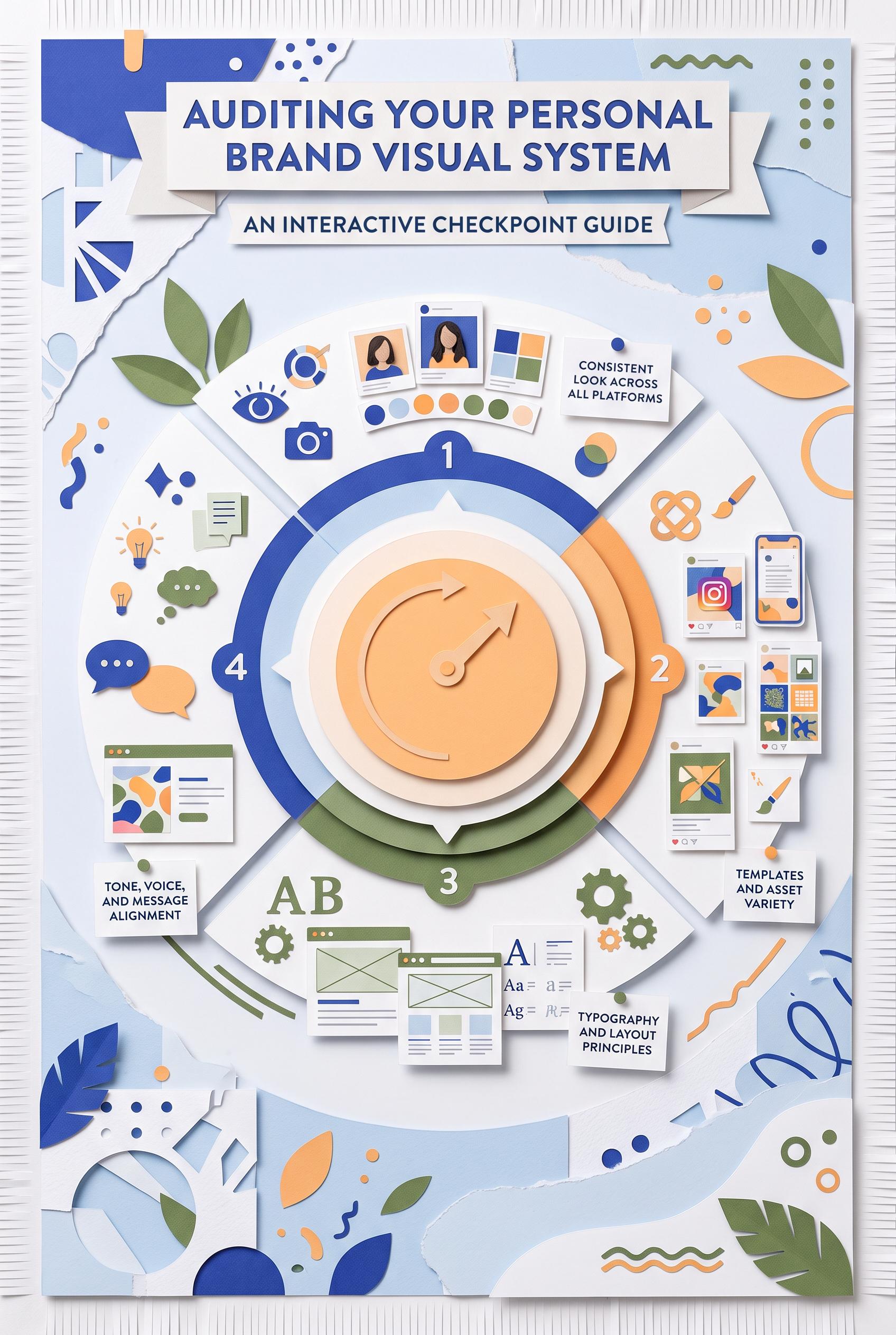
0Create a commercial-quality vertical 2:3 Pinterest educational graphic about auditing a personal brand visual system. Use an interactive dial with four content checkpoints, ultramarine, apricot, moss green, and paper white palette, tactile paper layers, miniature thumbnail and social post mockups, and abstract symbols instead of readable labels. No real brands, no trademarked characters, no watermark, no unintended readable text, no logos or gibberish text. AI-modified downstream. Corrective regeneration attempt 5. Produce a materially revised image, not a near-duplicate of an earlier variant. Preserve the successful subject, palette, lighting, focal hierarchy, and commercial polish from the original brief while correcting every issue below. Mandatory corrective instructions from the most recent visual QA: Preserve the attractive vertical 2:3 tactile paper collage, ultramarine, apricot, moss green, and paper-white palette, strong lighting and shadows, central four-part dial, and four surrounding mockup cards. Remove every recognizable interface or language-like element from all cards and the dial: no hearts, chat bubbles, share triangles, bookmarks, carousel dots, profile circles, header bars, horizontal text rows, quotation-like marks, percent-like marks, letters, numbers, icons, logos, glyphs, pseudo-text, or social-platform conventions. Replace them only with clean abstract geometry: solid blocks, circles, arcs, overlapping squares, non-directional patterns, and blank paper surfaces. Keep the four cards visually distinct as abstract thumbnail, quote-card, story-frame, and offer-tile examples without labels or interface structure. Ensure no readable or pseudo-readable marks anywhere. Observed defects from prior variants that must not recur: 1) Strong vertical composition, tactile collage styling, palette, and central four-part dial. 2) Top-left mockup contains a recognizable bookmark/ribbon UI symbol. 3) Top-right mockup contains carousel-like dot indicators. 4) Several mockup elements still resemble interface bars or profile/header layouts rather than purely abstract compositions. 5) Strong vertical tactile collage and central four-part dial are attractive and on-concept. 6) All four mockups still contain recognizable interface elements: hearts, chat bubbles, share triangles, bookmarks, carousel dots, header bars, and text-like horizontal rows. 7) The dial includes glyph-like marks that can read as pseudo-letters or symbols. 8) The composition does not satisfy the strict requirement for purely abstract, non-linguistic mockups with no UI conventions. Render no letters, words, numbers, prices, headings, labels, contact details, logos, glyphs, or pseudo-text anywhere. Use only blank surfaces, clean geometric marks, and non-linguistic placeholder shapes. Do not add explanatory captions, before/after labels, interface copy, or extra objects that the brief did not request. When a corrective instruction conflicts with a decorative detail, prioritize the corrective instruction.
 0
0Create a commercial-quality vertical 2:3 Pinterest educational graphic about auditing a personal brand visual system. Use an interactive dial with four content checkpoints, ultramarine, apricot, moss green, and paper white palette, tactile paper layers, miniature thumbnail and social post mockups, and abstract symbols instead of readable labels. No real brands, no trademarked characters, no watermark, no unintended readable text, no logos or gibberish text. AI-modified downstream. Corrective regeneration attempt 4. Produce a materially revised image, not a near-duplicate of an earlier variant. Preserve the successful subject, palette, lighting, focal hierarchy, and commercial polish from the original brief while correcting every issue below. Mandatory corrective instructions from the most recent visual QA: Preserve the attractive vertical 2:3 tactile paper collage, ultramarine/apricot/moss/paper-white palette, lighting, shadows, central four-part dial, and four surrounding mockup cards. Remove the bookmark/ribbon shape in the upper-left card and remove the row of carousel-like dots in the upper-right card. Rework all mockups so they contain only clearly abstract geometric compositions—blocks, circles, arcs, overlapping shapes, and non-directional patterns—with no UI symbols, profile/header bars, interface-like line rows, glyphs, icons, logos, letters, numbers, words, pseudo-text, or recognizable social-platform conventions anywhere. Observed defects from prior variants that must not recur: 1) Strong vertical composition, tactile collage styling, palette, and central dial. 2) Mockups still contain recognizable social-media UI iconography, including hearts, comment bubbles, paper-plane/share shapes, bookmarks, and carousel dots. 3) Quotation-mark glyphs and a percent-sign glyph violate the requirement for no readable glyphs or pseudo-text. 4) Mockups read too much like generic social-platform interfaces rather than purely abstract content examples. 5) Strong vertical composition, tactile collage styling, palette, and central four-part dial. 6) Top-left mockup contains a recognizable bookmark/ribbon UI symbol. 7) Top-right mockup contains carousel-like dot indicators. 8) Several mockup elements still resemble interface bars or profile/header layouts rather than purely abstract compositions. Render no letters, words, numbers, prices, headings, labels, contact details, logos, glyphs, or pseudo-text anywhere. Use only blank surfaces, clean geometric marks, and non-linguistic placeholder shapes. Do not add explanatory captions, before/after labels, interface copy, or extra objects that the brief did not request. When a corrective instruction conflicts with a decorative detail, prioritize the corrective instruction.
 0
0Create a commercial-quality vertical 2:3 Pinterest educational graphic about auditing a personal brand visual system. Use an interactive dial with four content checkpoints, ultramarine, apricot, moss green, and paper white palette, tactile paper layers, miniature thumbnail and social post mockups, and abstract symbols instead of readable labels. No real brands, no trademarked characters, no watermark, no unintended readable text, no logos or gibberish text. AI-modified downstream. Corrective regeneration attempt 3. Produce a materially revised image, not a near-duplicate of an earlier variant. Preserve the successful subject, palette, lighting, focal hierarchy, and commercial polish from the original brief while correcting every issue below. Mandatory corrective instructions from the most recent visual QA: Preserve the excellent vertical 2:3 tactile paper collage, ultramarine/apricot/moss/paper-white palette, lighting, shadows, central four-part dial, focal hierarchy, and four surrounding mockup cards. Replace every recognizable social-media interface element with purely abstract geometric marks: remove all hearts, comment bubbles, paper-plane/share icons, bookmarks, carousel dots, quotation marks, percent signs, play symbols, and any other familiar UI or typographic glyphs. Remove all faux interface bars that resemble text and replace them with non-linguistic blocks, circles, dots, arcs, and simple geometric compositions. Keep four distinct surrounding examples suggesting a thumbnail, quote card, story frame, and offer tile through layout and color only, with no labels, letters, numbers, words, logos, icons, glyphs, or pseudo-text anywhere. Observed defects from prior variants that must not recur: 1) The creative is visually strong and well-composed, but the mockups contain a recognizable Instagram logo/trademark. 2) Several mockups include readable interface-like text and typography samples, conflicting with the requirement for abstract symbols and no unintended readable text. 3) Strong vertical composition, tactile collage styling, palette, and central dial. 4) Mockups still contain recognizable social-media UI iconography, including hearts, comment bubbles, paper-plane/share shapes, bookmarks, and carousel dots. 5) Quotation-mark glyphs and a percent-sign glyph violate the requirement for no readable glyphs or pseudo-text. 6) Mockups read too much like generic social-platform interfaces rather than purely abstract content examples. Render no letters, words, numbers, prices, headings, labels, contact details, logos, glyphs, or pseudo-text anywhere. Use only blank surfaces, clean geometric marks, and non-linguistic placeholder shapes. Do not add explanatory captions, before/after labels, interface copy, or extra objects that the brief did not request. When a corrective instruction conflicts with a decorative detail, prioritize the corrective instruction.
 0
0Create a commercial-quality vertical 2:3 Pinterest educational graphic about auditing a personal brand visual system. Use an interactive dial with four content checkpoints, ultramarine, apricot, moss green, and paper white palette, tactile paper layers, miniature thumbnail and social post mockups, and abstract symbols instead of readable labels. No real brands, no trademarked characters, no watermark, no unintended readable text, no logos or gibberish text. AI-modified downstream. Corrective regeneration attempt 2. Produce a materially revised image, not a near-duplicate of an earlier variant. Preserve the successful subject, palette, lighting, focal hierarchy, and commercial polish from the original brief while correcting every issue below. Mandatory corrective instructions from the most recent visual QA: Preserve the vertical 2:3 tactile paper collage, ultramarine/apricot/moss/paper-white palette, large central four-part dial, strong hierarchy, shadows, and surrounding content mockups. Remove every recognizable brand or trademark, especially the Instagram icon, and replace all social-media UI elements with generic abstract shapes. Remove readable interface text, letter samples, faux words, and any gibberish from every miniature card and mockup; use only lines, dots, blocks, icons, and abstract symbols. Keep the dial as the clear focal point and retain four distinct surrounding examples representing a thumbnail, quote card, story frame, and offer tile without labels. Observed defects from prior variants that must not recur: 1) The creative is visually strong and well-composed, but the mockups contain a recognizable Instagram logo/trademark. 2) Several mockups include readable interface-like text and typography samples, conflicting with the requirement for abstract symbols and no unintended readable text. Render no letters, words, numbers, prices, headings, labels, contact details, logos, glyphs, or pseudo-text anywhere. Use only blank surfaces, clean geometric marks, and non-linguistic placeholder shapes. Do not add explanatory captions, before/after labels, interface copy, or extra objects that the brief did not request. When a corrective instruction conflicts with a decorative detail, prioritize the corrective instruction.
 0
0Create a commercial-quality vertical 2:3 Pinterest educational graphic about auditing a personal brand visual system. Use an interactive dial with four content checkpoints, ultramarine, apricot, moss green, and paper white palette, tactile paper layers, miniature thumbnail and social post mockups, and abstract symbols instead of readable labels. No real brands, no trademarked characters, no watermark, no unintended readable text, no logos or gibberish text. AI-modified downstream.
 0
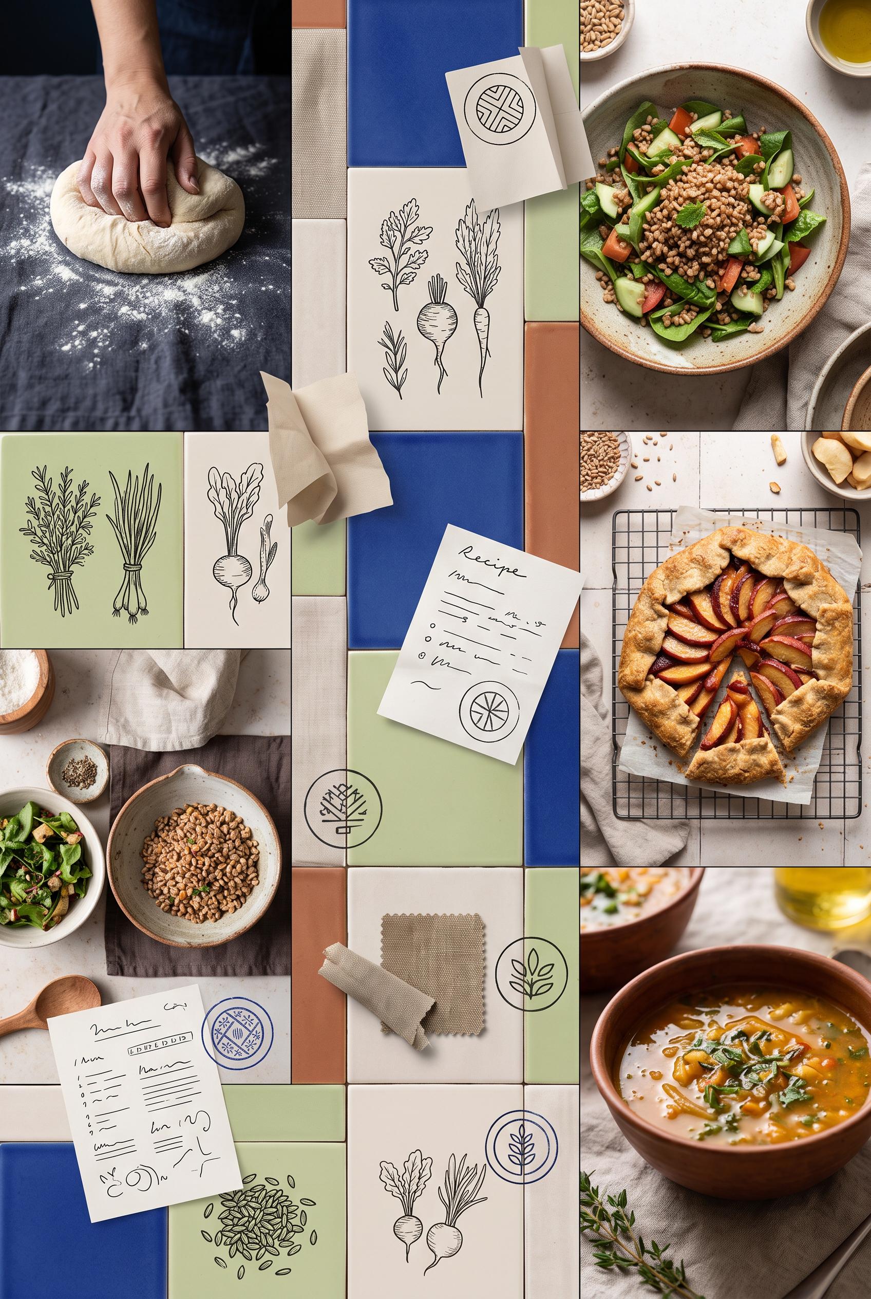
0Create a commercial-quality vertical 2:3 Pinterest moodboard for a slow-living recipe creator personal brand. Use a ceramic tile grid with floating recipe artifacts, cobalt blue, celery green, warm clay, and linen palette, tactile food photography, hand-drawn ingredient forms, folded paper, and a recurring circular stamp motif. No real brands, no trademarked characters, no watermark, no unintended readable text, no logos or gibberish text. AI-modified downstream. Corrective regeneration attempt 5. Produce a materially revised image, not a near-duplicate of an earlier variant. Preserve the successful subject, palette, lighting, focal hierarchy, and commercial polish from the original brief while correcting every issue below. Mandatory corrective instructions from the most recent visual QA: Preserve the attractive vertical 2:3 ceramic-tile moodboard, tactile food photography, cropped hands, linen and paper textures, cobalt blue/celery green/warm clay palette, lighting, spacing, and focal hierarchy. Replace every recipe card and paper note with blank paper or clean abstract geometric/botanical shapes only. Remove all words, letters, numbers, handwriting-like lines, bullets, and pseudo-text, especially “Recipe.” Replace every circular stamp interior with non-linguistic abstract botanical or geometric forms that cannot resemble letters, glyphs, logos, or numbers. Remove all watermark-like or logo-like marks. Ensure absolutely no readable text, pseudo-text, logos, trademarks, or generation artifacts anywhere. Observed defects from prior variants that must not recur: 1) Multiple circular stamps contain clearly readable text such as “SLOW COOKING” and “NATURAL KITCHEN,” violating the requirement that all sample marks remain abstract and unreadable. 2) The repeated stamped wording creates a logo-like identity mark rather than an abstract circular stamp motif. 3) Attractive vertical tiled moodboard with strong palette, tactile textures, food photography, and clear composition. 4) Recipe cards contain clearly readable text such as “Recipe” plus extensive pseudo-handwriting, violating the requirement for no letters, words, or garbled readable text. 5) Some circular marks also resemble logo-like or glyph-based symbols rather than purely abstract non-linguistic motifs. 6) Readable “Recipe” text and handwriting-like lines appear on multiple recipe cards. 7) Repeated circular marks contain logo-like geometric glyphs rather than purely abstract motifs. 8) The image violates the requirement for no readable text, pseudo-text, or logo-like symbols. Render no letters, words, numbers, prices, headings, labels, contact details, logos, glyphs, or pseudo-text anywhere. Use only blank surfaces, clean geometric marks, and non-linguistic placeholder shapes. Do not add explanatory captions, before/after labels, interface copy, or extra objects that the brief did not request. When a corrective instruction conflicts with a decorative detail, prioritize the corrective instruction.
 0
0Create a commercial-quality vertical 2:3 Pinterest moodboard for a slow-living recipe creator personal brand. Use a ceramic tile grid with floating recipe artifacts, cobalt blue, celery green, warm clay, and linen palette, tactile food photography, hand-drawn ingredient forms, folded paper, and a recurring circular stamp motif. No real brands, no trademarked characters, no watermark, no unintended readable text, no logos or gibberish text. AI-modified downstream. Corrective regeneration attempt 4. Produce a materially revised image, not a near-duplicate of an earlier variant. Preserve the successful subject, palette, lighting, focal hierarchy, and commercial polish from the original brief while correcting every issue below. Mandatory corrective instructions from the most recent visual QA: Preserve the attractive vertical 2:3 ceramic-tile moodboard, food photography, cropped hands, linen and paper textures, cobalt blue/celery green/warm clay palette, spacing, lighting, and polished focal hierarchy. Replace every recipe card and paper note with completely blank paper or paper containing only clean abstract geometric or botanical shapes; remove the readable word “Recipe” and all handwriting-like lines, numbers, bullets, and pseudo-text. Replace every circular stamp interior with purely abstract blue geometric or botanical forms that cannot resemble letters, glyphs, logos, or numbers. Ensure absolutely no text, watermark, logo, trademark, or generation artifacts anywhere. Observed defects from prior variants that must not recur: 1) Multiple circular stamps contain clearly readable text such as “SLOW COOKING” and “NATURAL KITCHEN,” violating the requirement that all sample marks remain abstract and unreadable. 2) The repeated stamped wording creates a logo-like identity mark rather than an abstract circular stamp motif. 3) Attractive vertical tiled moodboard with strong palette, tactile textures, food photography, and clear composition. 4) Recipe cards contain clearly readable text such as “Recipe” plus extensive pseudo-handwriting, violating the requirement for no letters, words, or garbled readable text. 5) Some circular marks also resemble logo-like or glyph-based symbols rather than purely abstract non-linguistic motifs. Render no letters, words, numbers, prices, headings, labels, contact details, logos, glyphs, or pseudo-text anywhere. Use only blank surfaces, clean geometric marks, and non-linguistic placeholder shapes. Do not add explanatory captions, before/after labels, interface copy, or extra objects that the brief did not request. When a corrective instruction conflicts with a decorative detail, prioritize the corrective instruction.
 0
0Create a commercial-quality vertical 2:3 Pinterest moodboard for a slow-living recipe creator personal brand. Use a ceramic tile grid with floating recipe artifacts, cobalt blue, celery green, warm clay, and linen palette, tactile food photography, hand-drawn ingredient forms, folded paper, and a recurring circular stamp motif. No real brands, no trademarked characters, no watermark, no unintended readable text, no logos or gibberish text. AI-modified downstream. Corrective regeneration attempt 3. Produce a materially revised image, not a near-duplicate of an earlier variant. Preserve the successful subject, palette, lighting, focal hierarchy, and commercial polish from the original brief while correcting every issue below. Mandatory corrective instructions from the most recent visual QA: Preserve the attractive vertical 2:3 tiled moodboard, ceramic grid, tactile food photography, linen and paper textures, cobalt blue/celery green/warm clay palette, strong spacing, and polished lighting. Replace every circular stamp and all other marks with purely abstract blue geometric or botanical symbols: no letters, words, numbers, logo-like lettering, or readable characters anywhere. Keep the recurring circular stamp shape but make its interior marks entirely non-linguistic and unreadable. Ensure no watermark or generation artifacts. Observed defects from prior variants that must not recur: 1) Multiple circular stamps contain clearly readable text such as “SLOW COOKING” and “NATURAL KITCHEN,” violating the requirement that all sample marks remain abstract and unreadable. 2) The repeated stamped wording creates a logo-like identity mark rather than an abstract circular stamp motif. Render no letters, words, numbers, prices, headings, labels, contact details, logos, glyphs, or pseudo-text anywhere. Use only blank surfaces, clean geometric marks, and non-linguistic placeholder shapes. Do not add explanatory captions, before/after labels, interface copy, or extra objects that the brief did not request. When a corrective instruction conflicts with a decorative detail, prioritize the corrective instruction.
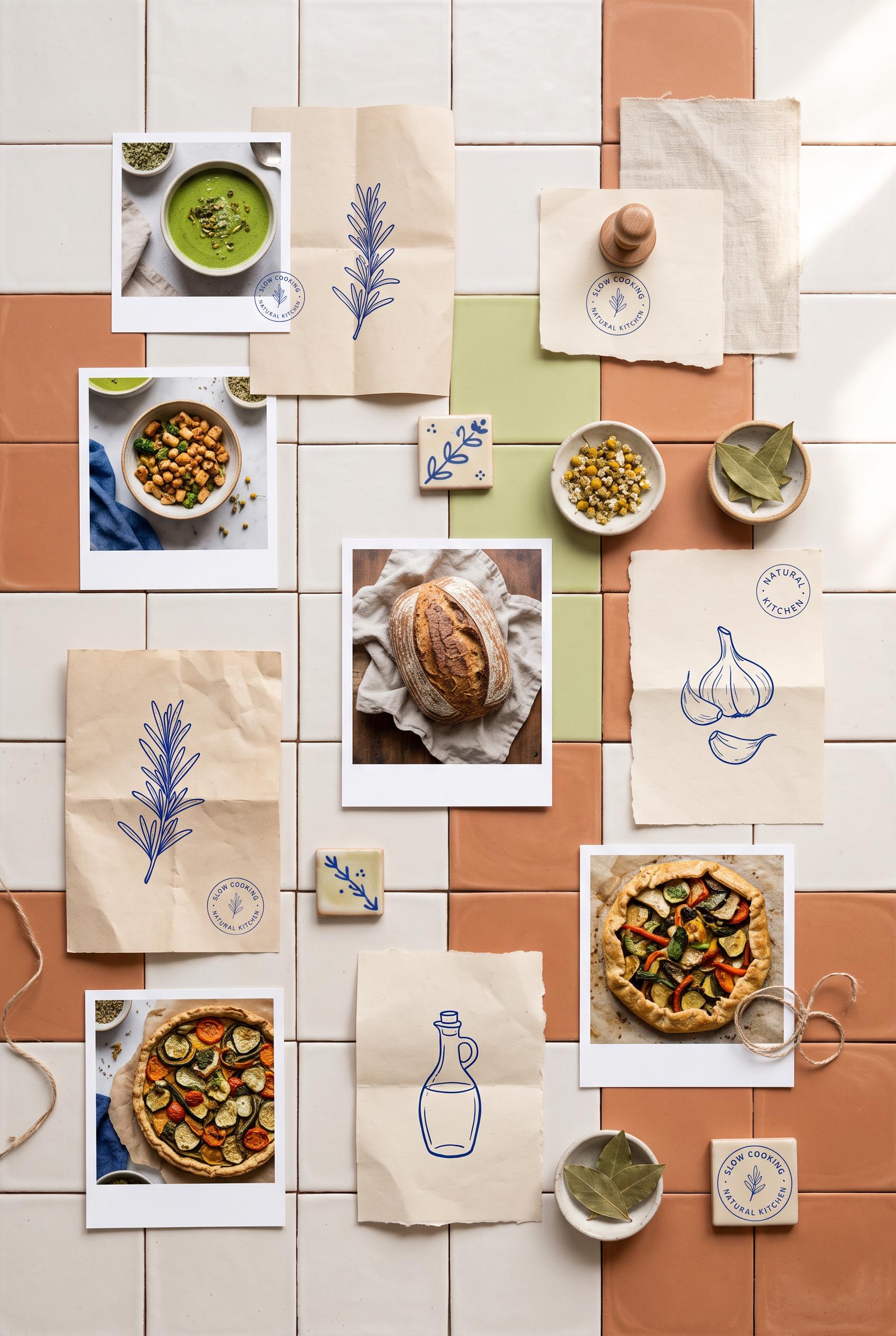 0
0Create a commercial-quality vertical 2:3 Pinterest moodboard for a slow-living recipe creator personal brand. Use a ceramic tile grid with floating recipe artifacts, cobalt blue, celery green, warm clay, and linen palette, tactile food photography, hand-drawn ingredient forms, folded paper, and a recurring circular stamp motif. No real brands, no trademarked characters, no watermark, no unintended readable text, no logos or gibberish text. AI-modified downstream. Corrective regeneration attempt 2. Produce a materially revised image, not a near-duplicate of an earlier variant. Preserve the successful subject, palette, lighting, focal hierarchy, and commercial polish from the original brief while correcting every issue below. Do not add explanatory captions, before/after labels, interface copy, or extra objects that the brief did not request. When a corrective instruction conflicts with a decorative detail, prioritize the corrective instruction.
 0
0Create a commercial-quality vertical 2:3 Pinterest composition showing a before-and-after redesign of an independent fitness coach video thumbnail. Use a curtain reveal composition, saffron, berry, deep ink, and almond palette, one dynamic athletic pose, abstract geometric framing, clean mockup cards, and strong visual hierarchy. No real brands, no trademarked characters, no watermark, no unintended readable text, no logos or gibberish text. AI-modified downstream. Corrective regeneration attempt 2. Produce a materially revised image, not a near-duplicate of an earlier variant. Preserve the successful subject, palette, lighting, focal hierarchy, and commercial polish from the original brief while correcting every issue below. Mandatory corrective instructions from the most recent visual QA: Create a polished vertical 2:3 Pinterest composition with a clear before-and-after redesign for an independent fitness coach. Keep the attractive almond panel, saffron and berry geometric accents, deep-ink typography, single dynamic athletic fitness pose, and fabric-like curtain reveal. Make the left version visibly cluttered with tiny low-impact elements and weak hierarchy; make the right version clean, bold, and focused with one dominant pose and strong geometric framing. Add several small phone-size preview cards neatly below the main comparison. Remove the “2:3 PINTEREST,” “COMMERCIAL,” and “PROFESSIONAL REDESIGN” meta copy, all logos, watermarks, branding, and any unintended readable text or gibberish. Use only minimal intentional generic before/after labeling, with no excessive headline copy. Reduce teal and prioritize saffron, berry, deep ink, and almond. Observed defects from prior variants that must not recur: 1) The required small phone-size preview cards below the main before/after versions are missing. 2) Unrequested meta text such as “2:3 PINTEREST” and “COMMERCIAL” appears in the layout. 3) The composition contains excessive readable copy and does not sufficiently preserve the brief’s clean, tiny-element-before versus focused-after hierarchy. 4) The palette is dominated by teal rather than the specified saffron, berry, deep ink, and almond scheme. Render no letters, words, numbers, prices, headings, labels, contact details, logos, glyphs, or pseudo-text anywhere. Use only blank surfaces, clean geometric marks, and non-linguistic placeholder shapes. Do not add explanatory captions, before/after labels, interface copy, or extra objects that the brief did not request. When a corrective instruction conflicts with a decorative detail, prioritize the corrective instruction.
 0
0Create a commercial-quality vertical 2:3 Pinterest composition showing a before-and-after redesign of an independent fitness coach video thumbnail. Use a curtain reveal composition, saffron, berry, deep ink, and almond palette, one dynamic athletic pose, abstract geometric framing, clean mockup cards, and strong visual hierarchy. No real brands, no trademarked characters, no watermark, no unintended readable text, no logos or gibberish text. AI-modified downstream.
 0
0Create a commercial-quality educational interior styling graphic in a vertical 2:3 Pinterest composition. Show three bedroom vignettes in an editorial contact sheet, each paired with macro textile samples demonstrating quiet texture, medium motif, and small accent scale. Use clear visual progression, fabric closeups, folded bedding, and a small styling detail, with abstract circles and lines instead of readable text. Use warm white, teal, tomato red, honey, and charcoal. No real brands, no trademarked characters, no watermark, and no unintended readable text.
 0
0Create a commercial-quality interior design showcase in a vertical 2:3 Pinterest composition. Use an orthographic cutaway view of a compact dining room with a rounded handmade wood table, stackable sculptural chairs, a textile pinboard wall, a ceramic pendant, low storage, and morning sunlight. Add separate visual vignettes of wood grain, woven fabric, matte ceramic, and brushed metal without readable labels. Use chalk white, clay, moss green, indigo, and honey. No real brands, no trademarked characters, no watermark, and no unintended readable text. Corrective regeneration attempt 3. Produce a materially revised image, not a near-duplicate of an earlier variant. Preserve the successful subject, palette, lighting, focal hierarchy, and commercial polish from the original brief while correcting every issue below. Mandatory corrective instructions from the most recent visual QA: Preserve the attractive vertical 2:3 orthographic dining-room composition, rounded wood table, stackable chairs, textile pinboard, ceramic pendant, low cabinet, warm sunlight, palette, and four unlabeled material vignettes. Remove the dense text-like sheet from the pinboard and replace it with a blank card or abstract non-linguistic shape. Remove or fully obscure any lettering on the books or papers on the cabinet, and eliminate all other letters, words, numbers, labels, logos, glyphs, pseudo-text, or watermark anywhere in the image. Keep the material vignettes as texture-only panels with no captions. Observed defects from prior variants that must not recur: 1) The four material vignettes contain prominent readable labels such as “Wood Grain,” “Woven Fabric,” “Matte Ceramic,” and “Brushed Metal,” violating the no-readable-text requirement 2) Attractive vertical composition and required room elements are present. 3) The pinboard contains a white sheet with dense pseudo-readable text-like marks, violating the no-readable-text requirement. 4) The book/paper stack on the cabinet may also contain tiny lettering or label-like marks. Render no letters, words, numbers, prices, headings, labels, contact details, logos, glyphs, or pseudo-text anywhere. Use only blank surfaces, clean geometric marks, and non-linguistic placeholder shapes. Do not add explanatory captions, before/after labels, interface copy, or extra objects that the brief did not request. When a corrective instruction conflicts with a decorative detail, prioritize the corrective instruction.
 0
0Create a commercial-quality interior design showcase in a vertical 2:3 Pinterest composition. Use an orthographic cutaway view of a compact dining room with a rounded handmade wood table, stackable sculptural chairs, a textile pinboard wall, a ceramic pendant, low storage, and morning sunlight. Add separate visual vignettes of wood grain, woven fabric, matte ceramic, and brushed metal without readable labels. Use chalk white, clay, moss green, indigo, and honey. No real brands, no trademarked characters, no watermark, and no unintended readable text. Corrective regeneration attempt 2. Produce a materially revised image, not a near-duplicate of an earlier variant. Preserve the successful subject, palette, lighting, focal hierarchy, and commercial polish from the original brief while correcting every issue below. Mandatory corrective instructions from the most recent visual QA: Preserve the attractive vertical 2:3 orthographic dining-room composition, rounded wood table, chairs, pinboard wall, ceramic pendant, low cabinet, warm sunlight, and material vignette imagery. Remove all readable words, labels, captions, and lettering from the bottom vignette panels; leave only the wood grain, woven fabric, matte ceramic, and brushed metal textures. Ensure no other unintended readable text, watermark, logo, or generation artifacts remain. Observed defects from prior variants that must not recur: 1) The four material vignettes contain prominent readable labels such as “Wood Grain,” “Woven Fabric,” “Matte Ceramic,” and “Brushed Metal,” violating the no-readable-text requirement Render no letters, words, numbers, prices, headings, labels, contact details, logos, glyphs, or pseudo-text anywhere. Use only blank surfaces, clean geometric marks, and non-linguistic placeholder shapes. Do not add explanatory captions, before/after labels, interface copy, or extra objects that the brief did not request. When a corrective instruction conflicts with a decorative detail, prioritize the corrective instruction.
 0
0Create a commercial-quality interior design showcase in a vertical 2:3 Pinterest composition. Use an orthographic cutaway view of a compact dining room with a rounded handmade wood table, stackable sculptural chairs, a textile pinboard wall, a ceramic pendant, low storage, and morning sunlight. Add separate visual vignettes of wood grain, woven fabric, matte ceramic, and brushed metal without readable labels. Use chalk white, clay, moss green, indigo, and honey. No real brands, no trademarked characters, no watermark, and no unintended readable text.
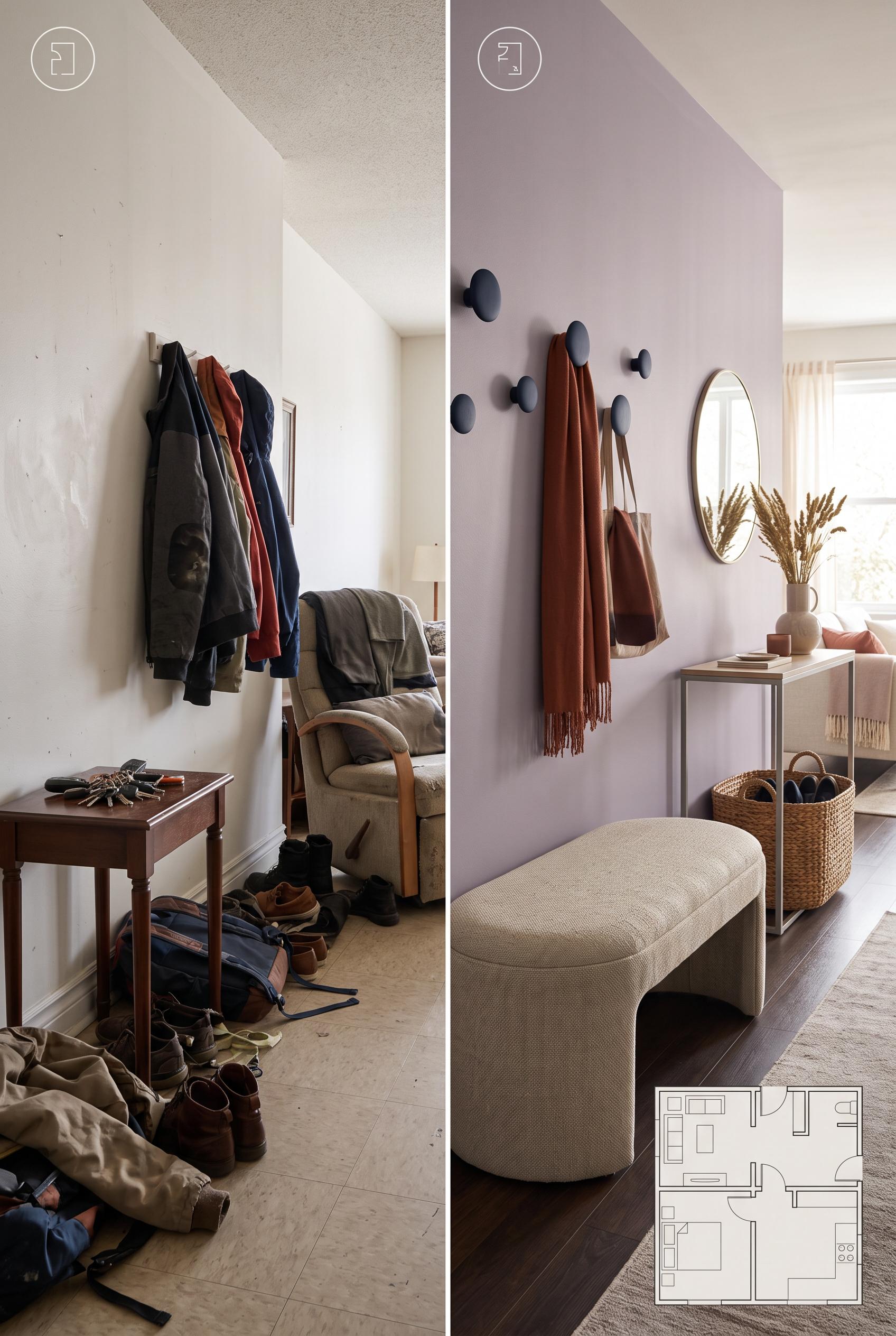 0
0Create a commercial-quality interior design editorial image in a vertical 2:3 Pinterest composition. Use a matched before-and-after split of a compact living room entry transition: left side cluttered and poorly defined, right side styled with a curved upholstered bench, slim console, woven storage, soft wall hooks, and an open circulation path. Add a subtle abstract floorplan overlay with icons only, no readable text. Use dusty lilac, rust, oat, and deep ink. No real brands, no trademarked characters, no watermark, and no unintended readable text.
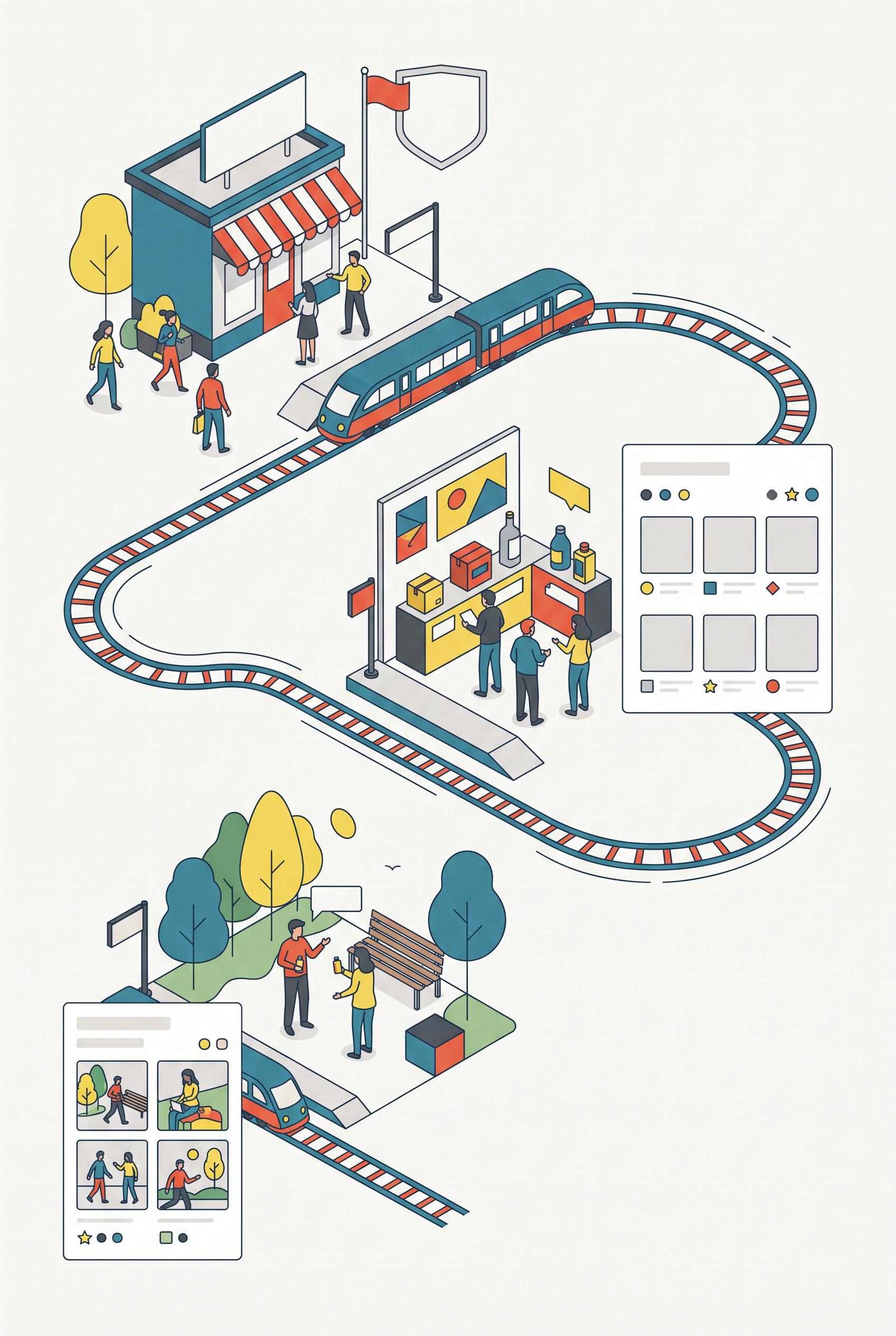 0
0Create a commercial-quality vertical 2:3 Pinterest composition explaining a three-part shop visual system through a modular train route diagram. Show three distinct miniature stations representing shop identity, product proof, and real-life use, connected by a clean illustrated track with abstract cards, icons, and image placeholders. Use sea blue, paprika red, lemon yellow, graphite, and soft white. Keep the hierarchy instructional and energetic. No real brands, no trademarked characters, no watermark, and no unintended readable text. AI-modified downstream. Corrective regeneration attempt 5. Produce a materially revised image, not a near-duplicate of an earlier variant. Preserve the successful subject, palette, lighting, focal hierarchy, and commercial polish from the original brief while correcting every issue below. Mandatory corrective instructions from the most recent visual QA: Preserve the polished vertical 2:3 flat-vector composition, sea-blue/paprika-red/lemon-yellow/graphite palette, illustrated looping train route, storefront, product-display station, lifestyle station, people, and strong focal hierarchy. Remove every horizontal line, chart axis, bar chart, dashboard, panel caption, speech-bubble text mark, product-label mark, divider, and UI-like detail. Remove the large lower-right dashboard and the lower-left cards entirely; leave spacious soft-white background there. Replace any remaining card or sign content only with blank color fields, isolated dots, circles, stars, or simple geometric icons. Keep exactly three clearly separated stations connected by the route. Render no letters, words, numbers, labels, logos, glyphs, pseudo-text, watermarks, or readable marks anywhere. Observed defects from prior variants that must not recur: 1) Strong vertical composition, polished flat-vector style, palette, train route, and three stations are successful. 2) Multiple unintended text-like horizontal lines appear in the lower-left cards and lower-right panel. 3) The composition remains overly dense with many peripheral cards and UI-like panels, weakening the three-station hierarchy. 4) Chart axes and dashboard-style details resemble interface graphics contrary to the no-glyph/no-writing requirement. 5) Attractive vertical composition with a clear train-route focal structure and suitable palette. 6) Multiple pseudo-text horizontal lines remain on signs, cards, product panels, and speech bubbles. 7) The large lower-right dashboard/chart and lower peripheral cards violate the required simplified, non-UI treatment. 8) The lower half remains visually dense, weakening separation of the three stations. Render no letters, words, numbers, prices, headings, labels, contact details, logos, glyphs, or pseudo-text anywhere. Use only blank surfaces, clean geometric marks, and non-linguistic placeholder shapes. Do not add explanatory captions, before/after labels, interface copy, or extra objects that the brief did not request. When a corrective instruction conflicts with a decorative detail, prioritize the corrective instruction.
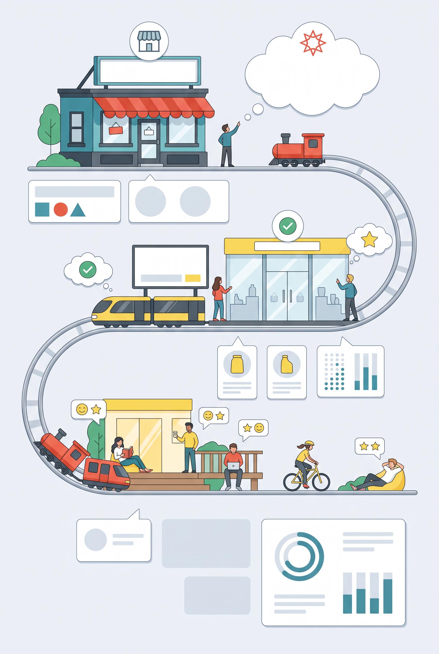 0
0Create a commercial-quality vertical 2:3 Pinterest composition explaining a three-part shop visual system through a modular train route diagram. Show three distinct miniature stations representing shop identity, product proof, and real-life use, connected by a clean illustrated track with abstract cards, icons, and image placeholders. Use sea blue, paprika red, lemon yellow, graphite, and soft white. Keep the hierarchy instructional and energetic. No real brands, no trademarked characters, no watermark, and no unintended readable text. AI-modified downstream. Corrective regeneration attempt 4. Produce a materially revised image, not a near-duplicate of an earlier variant. Preserve the successful subject, palette, lighting, focal hierarchy, and commercial polish from the original brief while correcting every issue below. Mandatory corrective instructions from the most recent visual QA: Preserve the vertical 2:3 layout, polished flat-vector style, sea-blue/paprika-red/lemon-yellow/graphite palette, illustrated train route, storefront station, product-display station, lifestyle station, people, and clear focal hierarchy. Remove every horizontal line, chart axis, dashboard detail, panel caption, card divider, and mark that could resemble writing or UI text. Replace them only with blank color fields, dots, circles, stars, simple geometric icons, or abstract non-linguistic shapes. Remove the lower-left cards and the lower-right dashboard panel entirely, or replace them with a small number of spacious blank geometric cards. Simplify the lower half and reduce peripheral decorations so the route and three stations are immediately legible and balanced. Ensure there are no letters, words, numbers, labels, logos, glyphs, pseudo-text, watermarks, or readable marks anywhere. Observed defects from prior variants that must not recur: 1) Dense lower section slightly reduces clarity of the three-part instructional hierarchy. 2) Attractive vertical composition with clear train route, palette, and three visual stations. 3) Numerous pseudo-readable text marks appear throughout cards, signs, product labels, speech bubbles, charts, and UI panels, violating the no-text requirement. 4) The lower half is overly dense, weakening the instructional hierarchy and station separation. 5) Strong vertical composition, polished flat-vector style, palette, train route, and three stations are successful. 6) Multiple unintended text-like horizontal lines appear in the lower-left cards and lower-right panel. 7) The composition remains overly dense with many peripheral cards and UI-like panels, weakening the three-station hierarchy. 8) Chart axes and dashboard-style details resemble interface graphics contrary to the no-glyph/no-writing requirement. Render no letters, words, numbers, prices, headings, labels, contact details, logos, glyphs, or pseudo-text anywhere. Use only blank surfaces, clean geometric marks, and non-linguistic placeholder shapes. Do not add explanatory captions, before/after labels, interface copy, or extra objects that the brief did not request. When a corrective instruction conflicts with a decorative detail, prioritize the corrective instruction.
 0
0Create a commercial-quality vertical 2:3 Pinterest composition explaining a three-part shop visual system through a modular train route diagram. Show three distinct miniature stations representing shop identity, product proof, and real-life use, connected by a clean illustrated track with abstract cards, icons, and image placeholders. Use sea blue, paprika red, lemon yellow, graphite, and soft white. Keep the hierarchy instructional and energetic. No real brands, no trademarked characters, no watermark, and no unintended readable text. AI-modified downstream. Corrective regeneration attempt 3. Produce a materially revised image, not a near-duplicate of an earlier variant. Preserve the successful subject, palette, lighting, focal hierarchy, and commercial polish from the original brief while correcting every issue below. Mandatory corrective instructions from the most recent visual QA: Preserve the vertical 2:3 composition, sea-blue/paprika-red/lemon-yellow/graphite palette, illustrated train route, storefront, product-display station, lifestyle station, people, icons, and polished flat-vector style. Remove every line or mark that could resemble writing, including all pseudo-text lines, labels, product packaging marks, speech-bubble contents, chart axes, UI details, signs, and card captions. Replace them only with blank color fields, simple geometric icons, dots, circles, stars, or clearly non-linguistic abstract shapes. Remove all logos, letters, numbers, symbols resembling glyphs, and watermarks. Simplify the lower section and reduce the number of peripheral cards and panels so the route and three stations remain immediately legible, spacious, and visually balanced. Observed defects from prior variants that must not recur: 1) Strong vertical composition, clear train-route organizing device, and three visually distinct stations. 2) Contains extensive readable headline and station text despite the brief requiring no readable copy. 3) Several small card and box labels appear as unintended pseudo-readable text. 4) Dense lower section slightly reduces clarity of the three-part instructional hierarchy. 5) Attractive vertical composition with clear train route, palette, and three visual stations. 6) Numerous pseudo-readable text marks appear throughout cards, signs, product labels, speech bubbles, charts, and UI panels, violating the no-text requirement. 7) The lower half is overly dense, weakening the instructional hierarchy and station separation. Render no letters, words, numbers, prices, headings, labels, contact details, logos, glyphs, or pseudo-text anywhere. Use only blank surfaces, clean geometric marks, and non-linguistic placeholder shapes. Do not add explanatory captions, before/after labels, interface copy, or extra objects that the brief did not request. When a corrective instruction conflicts with a decorative detail, prioritize the corrective instruction.
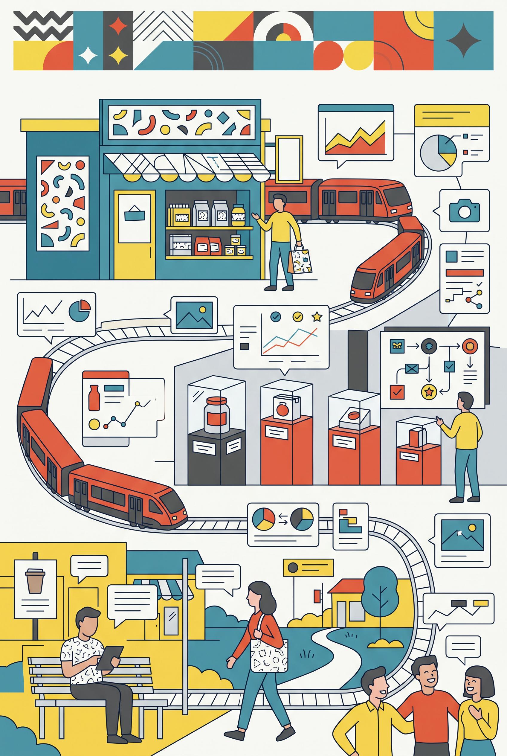 0
0Create a commercial-quality vertical 2:3 Pinterest composition explaining a three-part shop visual system through a modular train route diagram. Show three distinct miniature stations representing shop identity, product proof, and real-life use, connected by a clean illustrated track with abstract cards, icons, and image placeholders. Use sea blue, paprika red, lemon yellow, graphite, and soft white. Keep the hierarchy instructional and energetic. No real brands, no trademarked characters, no watermark, and no unintended readable text. AI-modified downstream. Corrective regeneration attempt 2. Produce a materially revised image, not a near-duplicate of an earlier variant. Preserve the successful subject, palette, lighting, focal hierarchy, and commercial polish from the original brief while correcting every issue below. Mandatory corrective instructions from the most recent visual QA: Preserve the attractive vertical 2:3 layout, sea-blue/paprika/lemon/graphite palette, illustrated train route, three miniature stations, product imagery, people, icons, and clean commercial style. Remove every readable word, letter, number, acronym, label, headline, banner caption, and pseudo-text mark from the entire image, including the large top title, station labels, box labels, cards, signs, speech bubbles, charts, and UI panels. Replace all copy areas with blank abstract shapes, color blocks, icon-only graphics, or simple non-text lines that cannot resemble letters. Keep the three stations clearly differentiated through visual motifs: shop storefront identity, product proof displays, and real-life lifestyle scenes. Simplify clutter where needed so the route and three stations remain immediately legible without text. No watermark, logo, trademark, or garbled text. Observed defects from prior variants that must not recur: 1) Strong vertical composition, clear train-route organizing device, and three visually distinct stations. 2) Contains extensive readable headline and station text despite the brief requiring no readable copy. 3) Several small card and box labels appear as unintended pseudo-readable text. 4) Dense lower section slightly reduces clarity of the three-part instructional hierarchy. Render no letters, words, numbers, prices, headings, labels, contact details, logos, glyphs, or pseudo-text anywhere. Use only blank surfaces, clean geometric marks, and non-linguistic placeholder shapes. Do not add explanatory captions, before/after labels, interface copy, or extra objects that the brief did not request. When a corrective instruction conflicts with a decorative detail, prioritize the corrective instruction.
O Naszej Galerii Obrazów AI
Nasza Galeria Obrazów AI prezentuje tysiące udostępnionych obrazów wygenerowanych przez AI stworzonych przez naszą społeczność. Każdy obraz jest unikalny, wysokiej jakości i reprezentuje kreatywne możliwości generowania sztuki przez AI. Przeglądaj różne style, tematy i motywy, aby zainspirować się do swojego następnego projektu kreatywnego.
Dlaczego Warto Poznać Naszą Galerię?
- Odkryj tysiące unikalnych obrazów wygenerowanych przez AI w różnych stylach i tematach
- Zainspiruj się kreatywnymi promptami i stylami artystycznymi
- Zobacz obrazy udostępnione przez naszą kreatywną społeczność
- Kliknij dowolny obraz, aby zobaczyć jego stronę udostępniania i uzyskać więcej szczegółów
Jak Używać Galerii
Korzystanie z naszej galerii jest proste i intuicyjne:
- Przeglądaj siatkę udostępnionych obrazów
- Kliknij dowolny obraz, który przyciąga uwagę
- Zobacz pełne szczegóły obrazu i link udostępniania na dedykowanej stronie udostępniania
Gotowy, aby Utworzyć Własne Obrazy AI?
Dołącz do tysięcy twórców używających AI Media Studio do generowania oszałamiających obrazów. Zacznij tworzyć już dziś!