Галерея AI изображений
Откройте для себя 1696+ общих изображений, сгенерированных ИИ, от нашего творческого сообщества
Все общие изображения
Показано 48 из 1696 общих изображений
 0
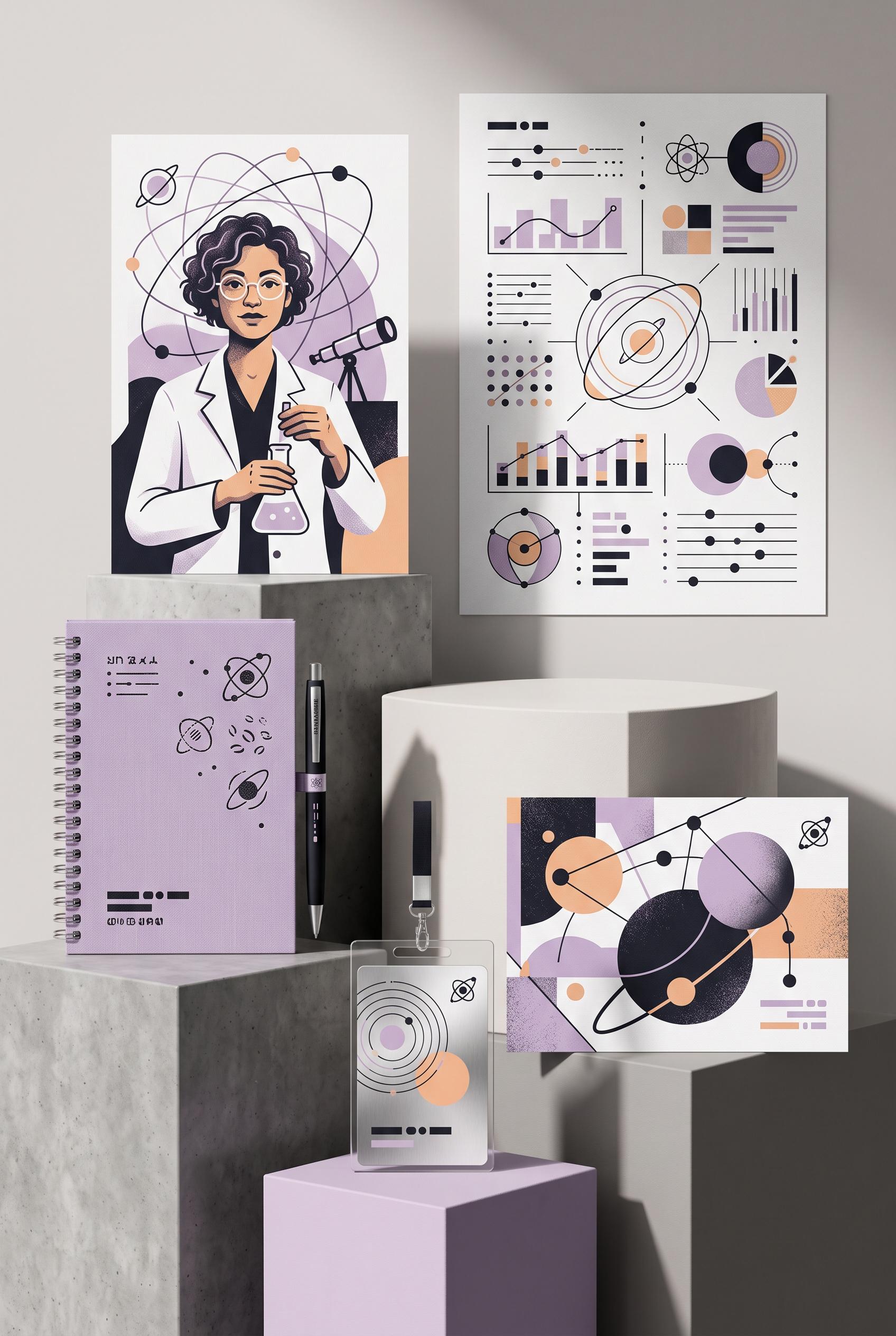
0Create a commercial-quality vertical 2:3 Pinterest composition showcasing an inspirational personal brand identity for a fictional science communicator. Arrange a portrait card, abstract diagram sheet, notebook, presentation badge, and social cover on staggered museum plinths with subtle cast shadows. Use ink black, soft lilac, brushed silver, and apricot. Refined editorial art direction, tactile print details, modular orbital motifs, AI-modified downstream. No real brands, no trademarked characters, no watermark, and no unintended readable text. Corrective regeneration attempt 2. Produce a materially revised image, not a near-duplicate of an earlier variant. Preserve the successful subject, palette, lighting, focal hierarchy, and commercial polish from the original brief while correcting every issue below. Mandatory corrective instructions from the most recent visual QA: Preserve the attractive vertical 2:3 museum still life, staggered plinths, portrait illustration, notebook, diagram sheet, badge, social cover, orbital motifs, tactile print texture, shadows, and ink black/lilac/silver/apricot palette. Remove every letter, word, number, equation, website, signature, phone number, placeholder copy, and readable mark from all objects. Replace all text areas with purely abstract modular lines, dots, orbital symbols, geometric blocks, and non-linguistic glyphs. Remove recognizable social-media icons and any brand-like symbols; retain only original abstract orbital motifs. Ensure all surfaces remain clean, coherent, and artifact-free. Observed defects from prior variants that must not recur: 1) Strong vertical museum-style composition with clear focal portrait and cohesive palette. 2) Multiple objects contain prominent readable but nonsensical or unintended text, including the portrait card, diagram sheet, notebook, badge, and social cover. 3) Social cover includes recognizable social-media-style icons and the presentation badge includes templated identity text, conflicting with the no-brand/no-readable-copy requirement. Render no letters, words, numbers, prices, headings, labels, contact details, logos, glyphs, or pseudo-text anywhere. Use only blank surfaces, clean geometric marks, and non-linguistic placeholder shapes. Do not add explanatory captions, before/after labels, interface copy, or extra objects that the brief did not request. When a corrective instruction conflicts with a decorative detail, prioritize the corrective instruction.
 0
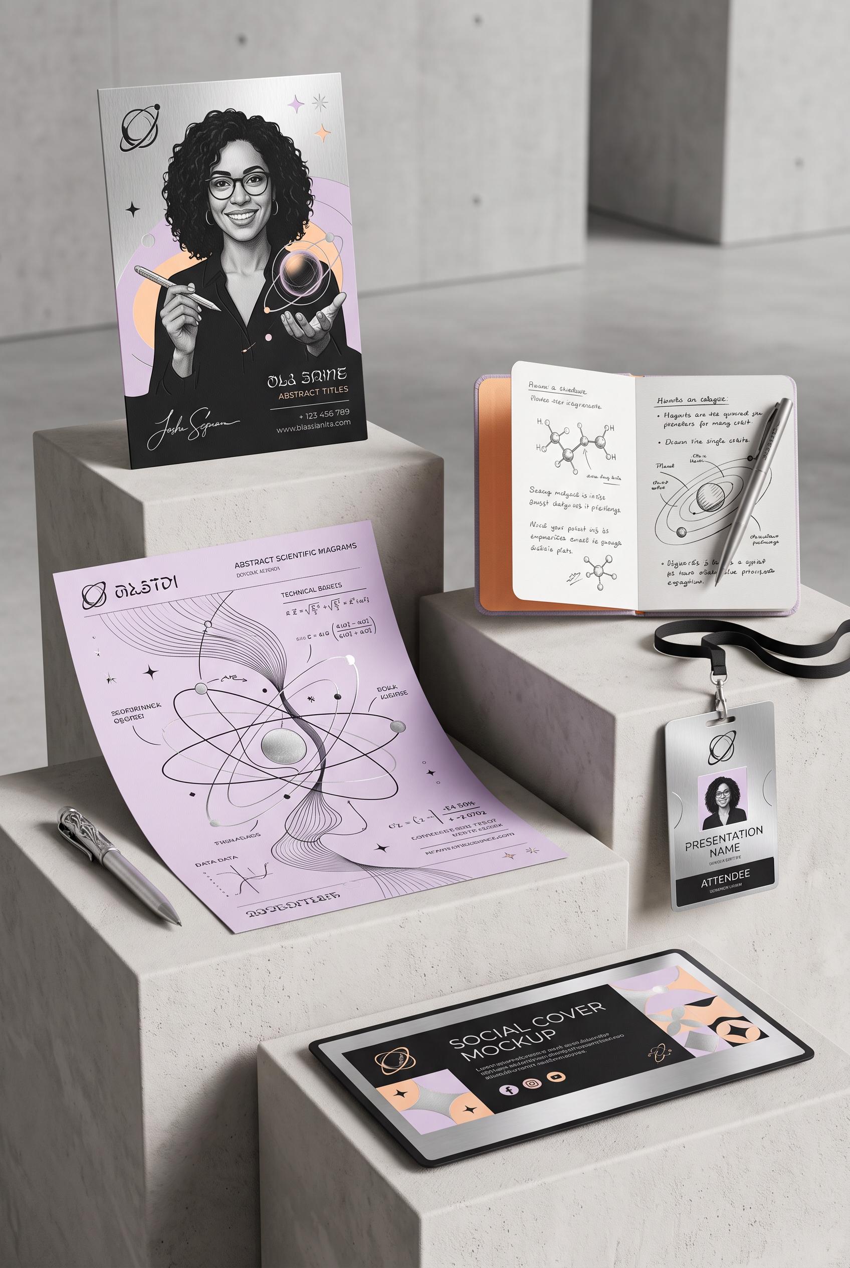
0Create a commercial-quality vertical 2:3 Pinterest composition showcasing an inspirational personal brand identity for a fictional science communicator. Arrange a portrait card, abstract diagram sheet, notebook, presentation badge, and social cover on staggered museum plinths with subtle cast shadows. Use ink black, soft lilac, brushed silver, and apricot. Refined editorial art direction, tactile print details, modular orbital motifs, AI-modified downstream. No real brands, no trademarked characters, no watermark, and no unintended readable text.
 0
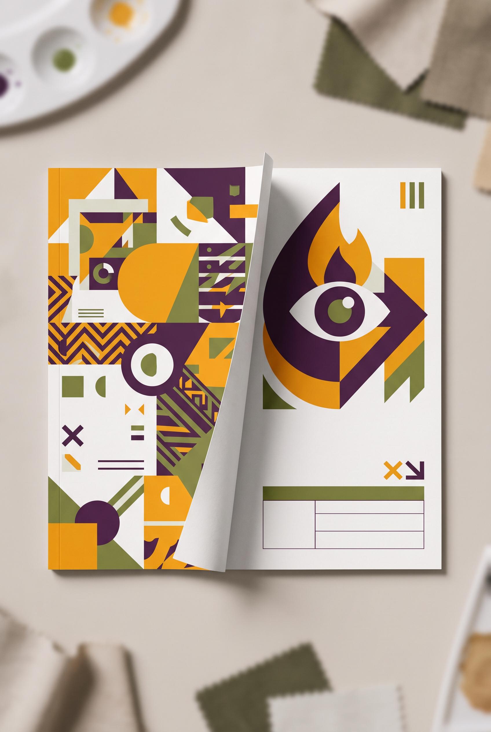
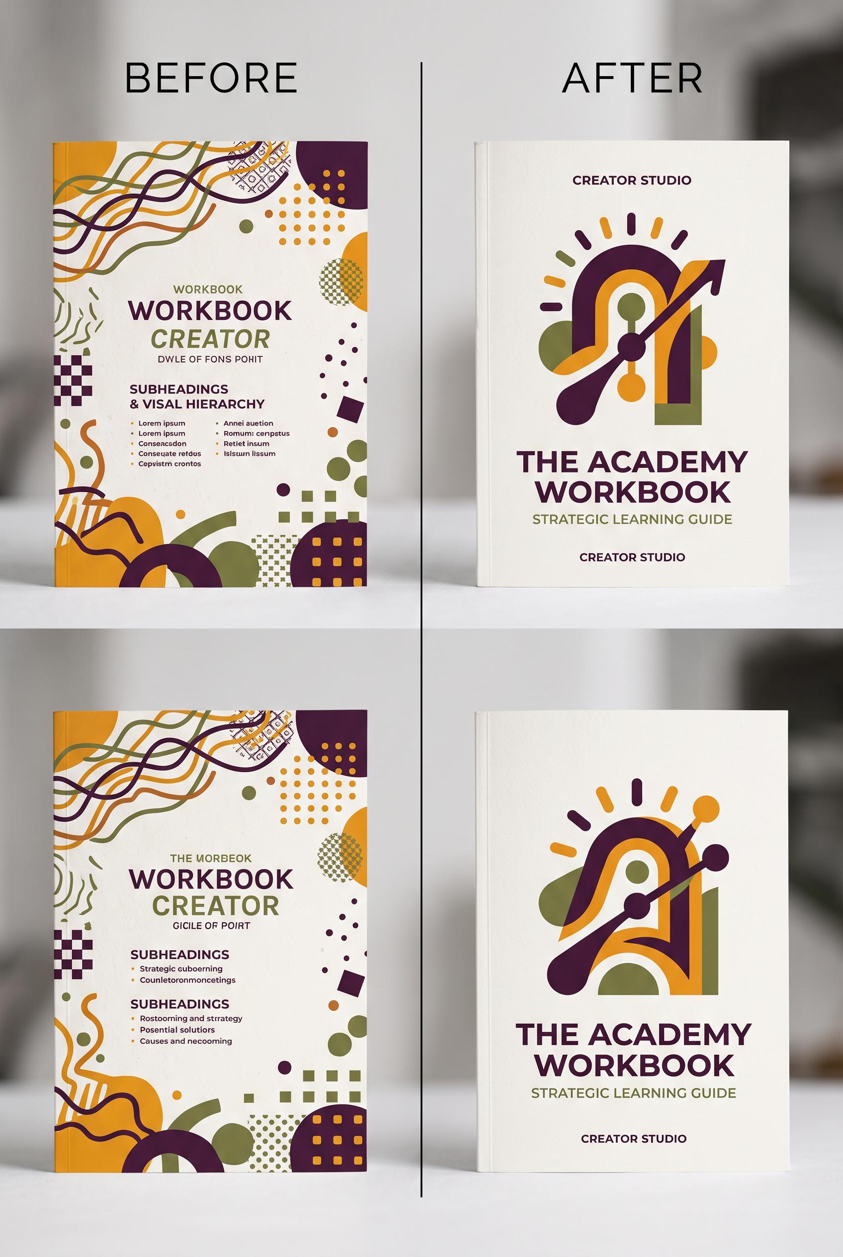
0Create a commercial-quality vertical 2:3 Pinterest composition showing a before-and-after transformation of a generic creator workshop workbook cover. Left side is cluttered with competing shapes and weak hierarchy; right side is refined with one bold abstract learning symbol, strong scale contrast, and generous negative space. Use saffron, aubergine, porcelain, and moss green. Editorial design studio lighting, tactile paper texture, crisp art direction, AI-modified downstream. No real brands, no trademarked characters, no watermark, and no unintended readable text. Corrective regeneration attempt 3. Produce a materially revised image, not a near-duplicate of an earlier variant. Preserve the successful subject, palette, lighting, focal hierarchy, and commercial polish from the original brief while correcting every issue below. Mandatory corrective instructions from the most recent visual QA: Create one clean vertical 2:3 composition with exactly two workbook covers: one cluttered cover on the left and one refined cover on the right, aligned in a single row. Remove the entire duplicated lower row and any cross-shaped four-panel layout. Add one unmistakable folded-paper reveal running between the left and right covers. Preserve the saffron, aubergine, porcelain, and moss-green palette, tactile paper texture, crisp editorial lighting, strong abstract symbol on the refined cover, accurate book geometry, and generous outer margins. Use only blank structured areas and abstract geometric marks; include no letters, words, numbers, pseudo-text, labels, logos, watermarks, or extra objects. Observed defects from prior variants that must not recur: 1) The composition is duplicated into two stacked before/after rows, weakening hierarchy and focal point. 2) It does not include the requested folded-paper reveal between states. 3) The left workbook contains obvious garbled pseudo-text, including malformed readable-looking lines. 4) The design uses prominent literal labels and workbook copy despite the brief requiring no literal copy. 5) The image is duplicated into two stacked before/after rows instead of one comparison. 6) The duplicated layout weakens the focal hierarchy and does not present a single clean vertical composition. 7) The folded-paper reveal is ambiguous and functions as a cross-shaped divider rather than a clear reveal between one left and one right state. Render no letters, words, numbers, prices, headings, labels, contact details, logos, glyphs, or pseudo-text anywhere. Use only blank surfaces, clean geometric marks, and non-linguistic placeholder shapes. Do not add explanatory captions, before/after labels, interface copy, or extra objects that the brief did not request. When a corrective instruction conflicts with a decorative detail, prioritize the corrective instruction.
 0
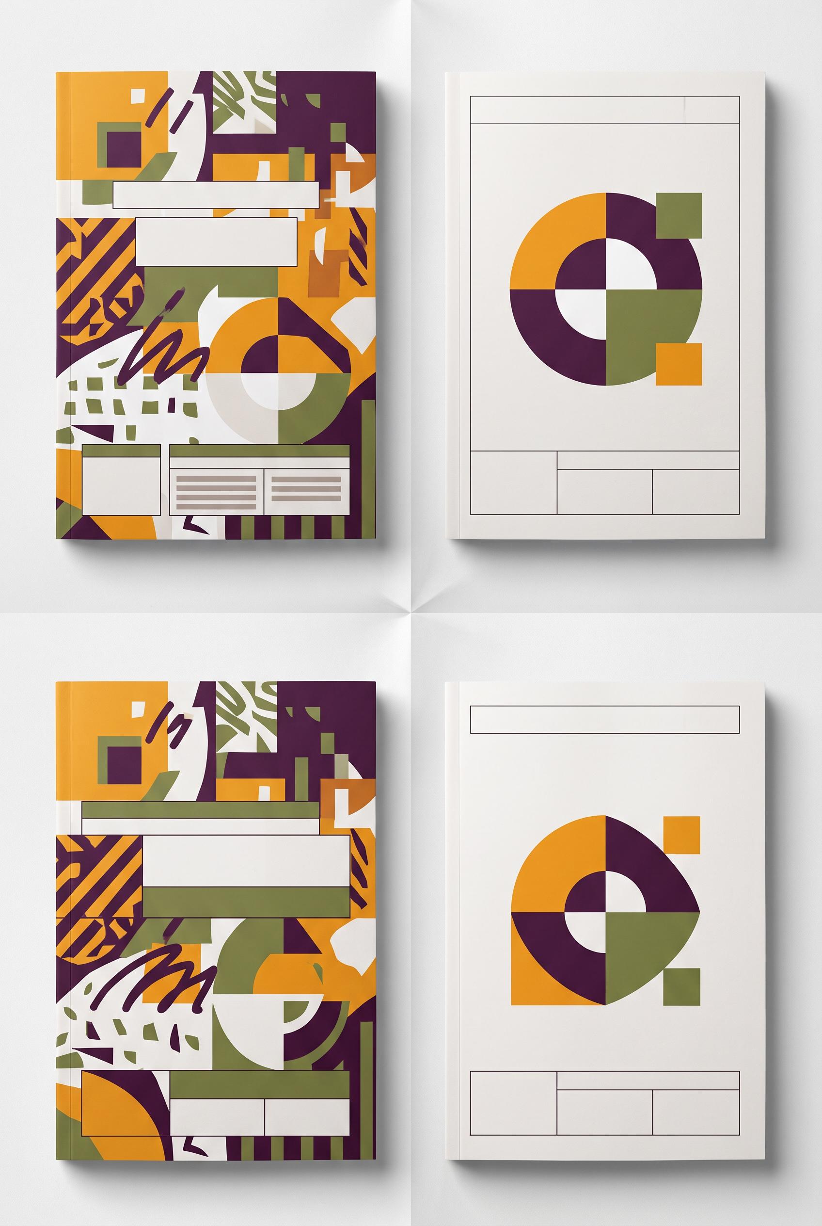
0Create a commercial-quality vertical 2:3 Pinterest composition showing a before-and-after transformation of a generic creator workshop workbook cover. Left side is cluttered with competing shapes and weak hierarchy; right side is refined with one bold abstract learning symbol, strong scale contrast, and generous negative space. Use saffron, aubergine, porcelain, and moss green. Editorial design studio lighting, tactile paper texture, crisp art direction, AI-modified downstream. No real brands, no trademarked characters, no watermark, and no unintended readable text. Corrective regeneration attempt 2. Produce a materially revised image, not a near-duplicate of an earlier variant. Preserve the successful subject, palette, lighting, focal hierarchy, and commercial polish from the original brief while correcting every issue below. Mandatory corrective instructions from the most recent visual QA: Create one clean vertical 2:3 Pinterest composition with a single before-and-after comparison, not duplicated rows. Place one cluttered generic workbook cover on the left and one refined workbook cover on the right, separated by a clear folded-paper reveal. Preserve the saffron, aubergine, porcelain, and moss-green palette, tactile paper texture, crisp editorial lighting, and strong abstract symbol on the refined cover. Use no readable words, letters, numbers, pseudo-text, or labels anywhere; replace all cover typography with blank structured areas or purely abstract graphic hierarchy. Ensure generous margins, one clear focal point, accurate book geometry, and no brands, trademarks, watermarks, or generation artifacts. Observed defects from prior variants that must not recur: 1) The composition is duplicated into two stacked before/after rows, weakening hierarchy and focal point. 2) It does not include the requested folded-paper reveal between states. 3) The left workbook contains obvious garbled pseudo-text, including malformed readable-looking lines. 4) The design uses prominent literal labels and workbook copy despite the brief requiring no literal copy. Render no letters, words, numbers, prices, headings, labels, contact details, logos, glyphs, or pseudo-text anywhere. Use only blank surfaces, clean geometric marks, and non-linguistic placeholder shapes. Do not add explanatory captions, before/after labels, interface copy, or extra objects that the brief did not request. When a corrective instruction conflicts with a decorative detail, prioritize the corrective instruction.
 0
0Create a commercial-quality vertical 2:3 Pinterest composition showing a before-and-after transformation of a generic creator workshop workbook cover. Left side is cluttered with competing shapes and weak hierarchy; right side is refined with one bold abstract learning symbol, strong scale contrast, and generous negative space. Use saffron, aubergine, porcelain, and moss green. Editorial design studio lighting, tactile paper texture, crisp art direction, AI-modified downstream. No real brands, no trademarked characters, no watermark, and no unintended readable text.
 0
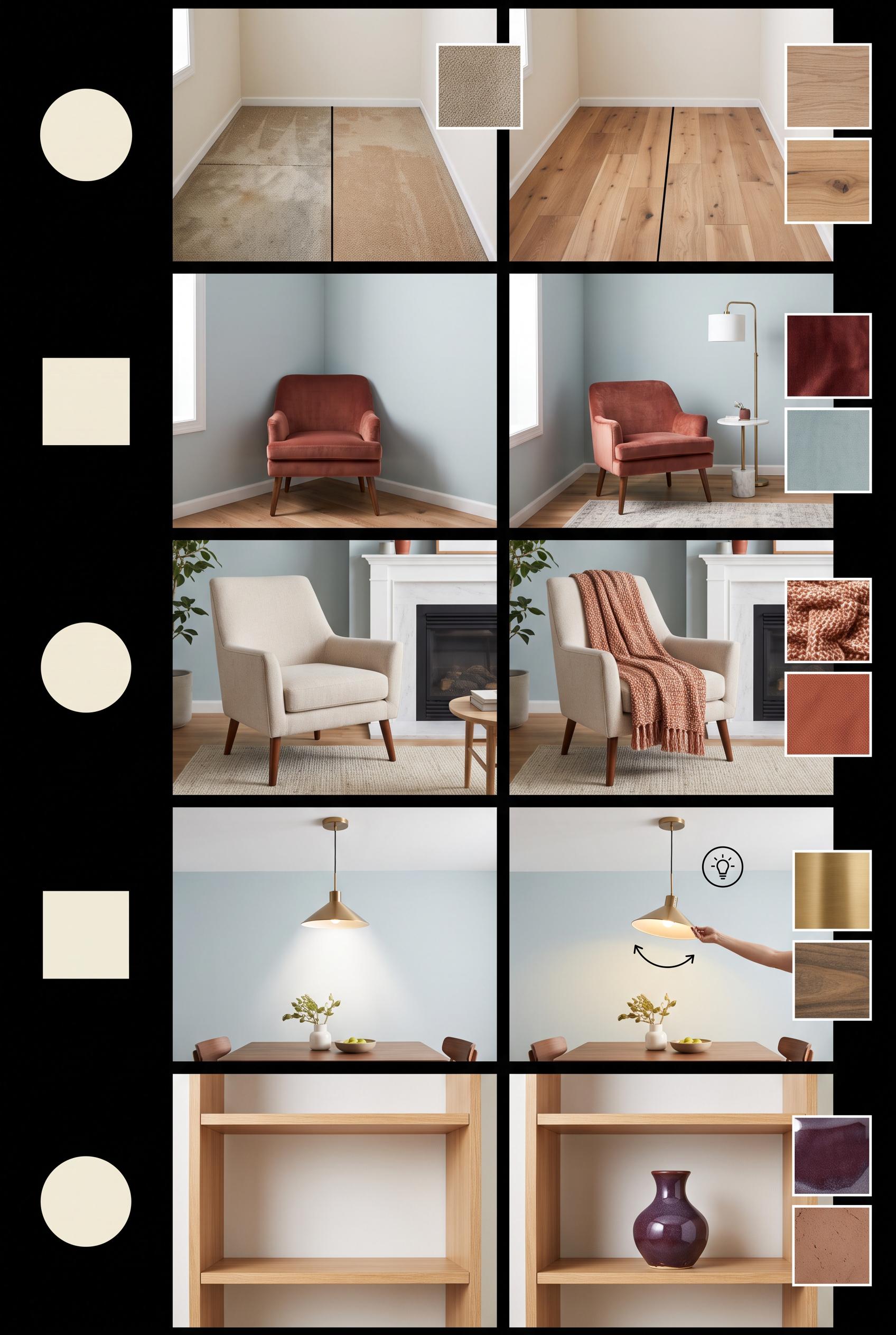
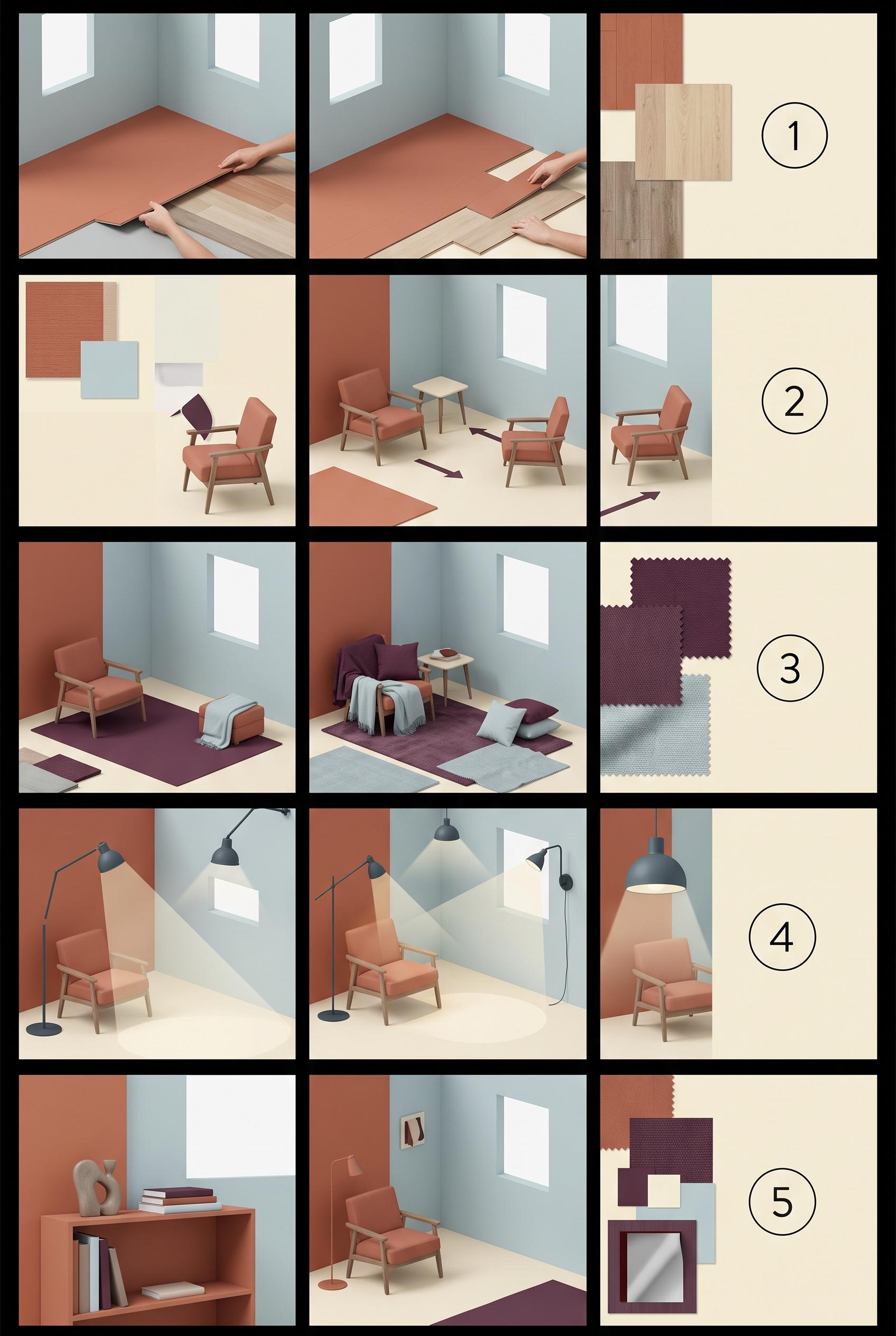
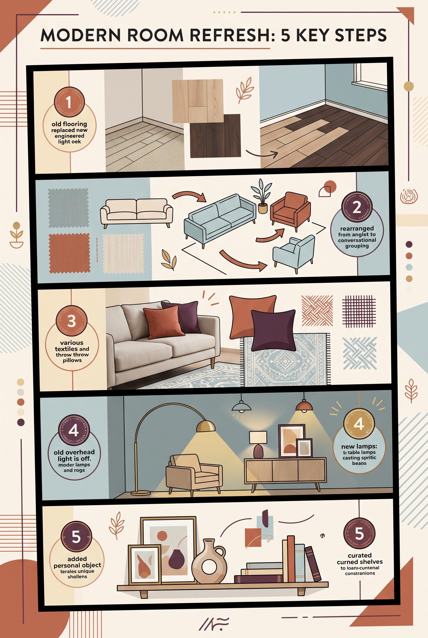
0Create a commercial-quality educational interior styling graphic in a vertical 2:3 Pinterest composition. Show a five-step room refresh as an editorial contact sheet: edited floor, repositioned seating, added textile, redirected lighting, and one personal object. Include small room vignettes, material swatches, and simple numbered circles with no readable words. Use terracotta, mist blue, buttercream, and deep plum. AI-modified downstream. No real brands, no trademarked characters, no watermark, no unintended readable text. Corrective regeneration attempt 5. Produce a materially revised image, not a near-duplicate of an earlier variant. Preserve the successful subject, palette, lighting, focal hierarchy, and commercial polish from the original brief while correcting every issue below. Mandatory corrective instructions from the most recent visual QA: Preserve the polished vertical 2:3 editorial contact-sheet layout, black dividers, palette, room styling, material swatches, lighting, and commercial finish. Remove the visible numbered circles and every numeral, letter, word, label, logo, watermark, glyph, and pseudo-text from the entire image. Replace each step marker with a simple blank, non-linguistic geometric circle or other clean geometric mark. Keep the five sequential room transformations clear through imagery alone. Preserve step 5 exactly as an empty shelf before and one ceramic vase on the shelf after, with no other decor. Observed defects from prior variants that must not recur: 1) Step 5 imagery is somewhat ambiguous and does not make the requested single-object change unmistakable. 2) Visible numerals 1–5 violate the latest instruction to render no numbers or readable glyphs. 3) Step 5 shows the vase already present before the change, so it depicts moving the object rather than adding exactly one personal object. 4) The step 5 before/after transformation is therefore ambiguous. 5) Attractive vertical editorial contact-sheet composition with strong palette and clear progression. 6) Visible numerals 1–5 violate the mandatory instruction to remove all numbers and readable glyphs. 7) The numbered ornamental circles must be replaced with blank, non-linguistic geometric marks while preserving the layout. 8) Step 5 correctly shows an empty shelf before and exactly one ceramic vase after. Render no letters, words, numbers, prices, headings, labels, contact details, logos, glyphs, or pseudo-text anywhere. Use only blank surfaces, clean geometric marks, and non-linguistic placeholder shapes. Do not add explanatory captions, before/after labels, interface copy, or extra objects that the brief did not request. When a corrective instruction conflicts with a decorative detail, prioritize the corrective instruction.
 0
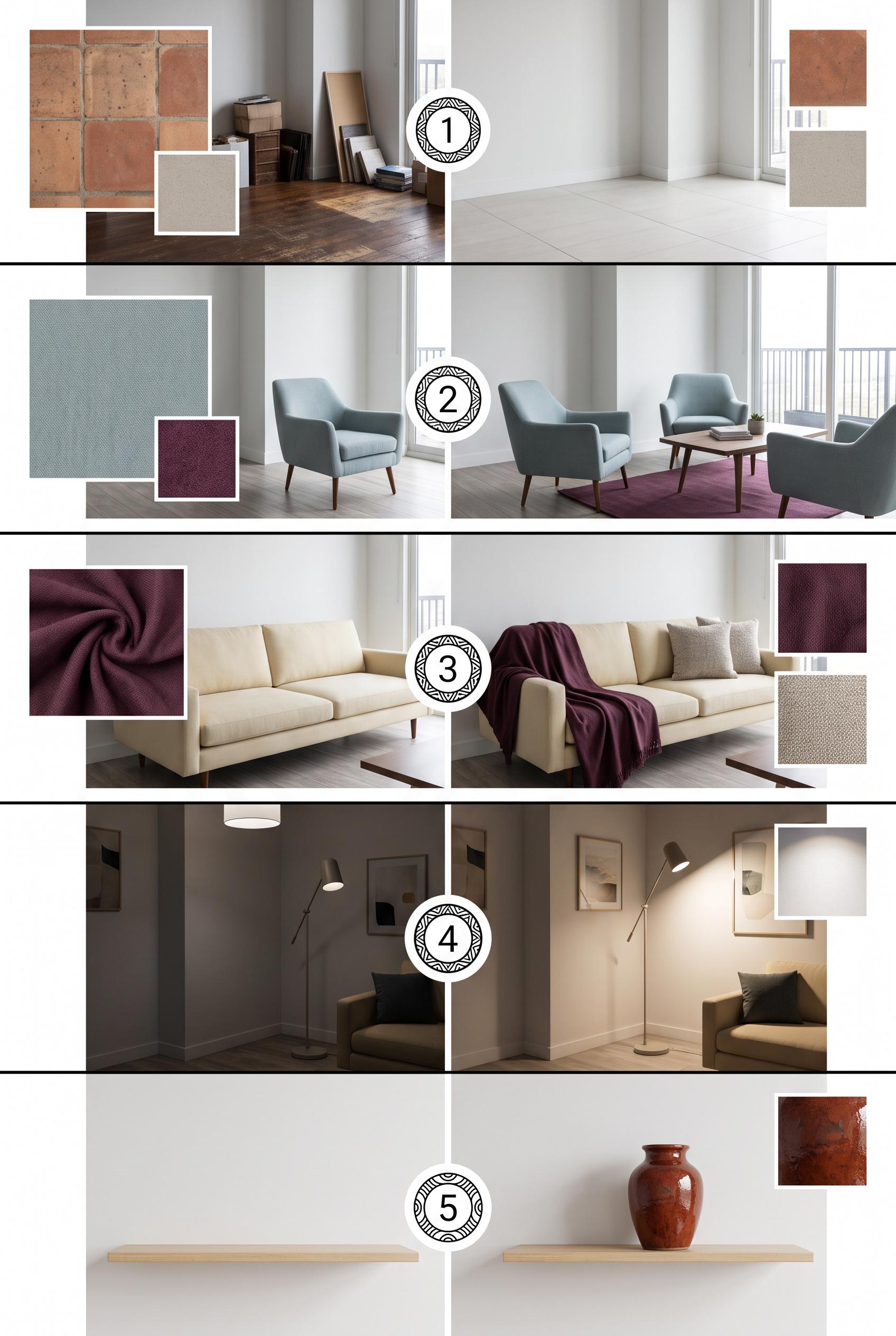
0Create a commercial-quality educational interior styling graphic in a vertical 2:3 Pinterest composition. Show a five-step room refresh as an editorial contact sheet: edited floor, repositioned seating, added textile, redirected lighting, and one personal object. Include small room vignettes, material swatches, and simple numbered circles with no readable words. Use terracotta, mist blue, buttercream, and deep plum. AI-modified downstream. No real brands, no trademarked characters, no watermark, no unintended readable text. Corrective regeneration attempt 4. Produce a materially revised image, not a near-duplicate of an earlier variant. Preserve the successful subject, palette, lighting, focal hierarchy, and commercial polish from the original brief while correcting every issue below. Mandatory corrective instructions from the most recent visual QA: Preserve the polished vertical 2:3 editorial contact-sheet layout, black dividers, palette, room styling, material swatches, lighting, and commercial finish. Remove every numeral, arrow, letter, word, label, logo, watermark, glyph, and pseudo-text from the entire image; use only blank surfaces and clean non-linguistic geometric marks if needed. Revise step 5 so the before vignette shows a completely empty wall shelf and no personal object anywhere, while the after vignette shows exactly one personal object—a single ceramic vase—added to the shelf. Remove the existing vase from the before scene and eliminate all other books, stacked items, artwork, lamps, rugs, sculptures, plants, and decor from both step 5 scenes. Make the single-object addition unmistakable while keeping all other successful visuals unchanged. Observed defects from prior variants that must not recur: 1) Several labels contain obvious garbled text and nonsensical phrases, especially steps 4 and 5. 2) The visual progression is partially obscured by oversized instructional text rather than relying on imagery. 3) Attractive vertical editorial contact-sheet composition with strong palette and clear numbered progression. 4) The fifth step does not clearly show only one personal object added to shelving; it contains multiple books, a sculpture, and additional decor. 5) Step 5 imagery is somewhat ambiguous and does not make the requested single-object change unmistakable. 6) Visible numerals 1–5 violate the latest instruction to render no numbers or readable glyphs. 7) Step 5 shows the vase already present before the change, so it depicts moving the object rather than adding exactly one personal object. 8) The step 5 before/after transformation is therefore ambiguous. Render no letters, words, numbers, prices, headings, labels, contact details, logos, glyphs, or pseudo-text anywhere. Use only blank surfaces, clean geometric marks, and non-linguistic placeholder shapes. Do not add explanatory captions, before/after labels, interface copy, or extra objects that the brief did not request. When a corrective instruction conflicts with a decorative detail, prioritize the corrective instruction.
 0
0Create a commercial-quality educational interior styling graphic in a vertical 2:3 Pinterest composition. Show a five-step room refresh as an editorial contact sheet: edited floor, repositioned seating, added textile, redirected lighting, and one personal object. Include small room vignettes, material swatches, and simple numbered circles with no readable words. Use terracotta, mist blue, buttercream, and deep plum. AI-modified downstream. No real brands, no trademarked characters, no watermark, no unintended readable text. Corrective regeneration attempt 3. Produce a materially revised image, not a near-duplicate of an earlier variant. Preserve the successful subject, palette, lighting, focal hierarchy, and commercial polish from the original brief while correcting every issue below. Mandatory corrective instructions from the most recent visual QA: Preserve the polished vertical 2:3 contact-sheet layout, black dividers, palette, room styling, material swatches, arrows, lighting, and clean numbered circles. Revise only step 5 so the shelving contains exactly one clearly personal object, such as a single ceramic vase or framed photo, with no books, stacked items, artwork, lamp, rug, or other decor. Make the before/after room vignettes unmistakably show that one object being added to the shelf. Keep every surface blank and free of words, letters, logos, watermarks, pseudo-text, or extra objects. Observed defects from prior variants that must not recur: 1) Attractive vertical editorial composition with five visual stages and appropriate palette. 2) Contains extensive readable text despite the brief requesting simple numbered shapes and no readable wording. 3) Several labels contain obvious garbled text and nonsensical phrases, especially steps 4 and 5. 4) The visual progression is partially obscured by oversized instructional text rather than relying on imagery. 5) Attractive vertical editorial contact-sheet composition with strong palette and clear numbered progression. 6) The fifth step does not clearly show only one personal object added to shelving; it contains multiple books, a sculpture, and additional decor. 7) Step 5 imagery is somewhat ambiguous and does not make the requested single-object change unmistakable. Render no letters, words, numbers, prices, headings, labels, contact details, logos, glyphs, or pseudo-text anywhere. Use only blank surfaces, clean geometric marks, and non-linguistic placeholder shapes. Do not add explanatory captions, before/after labels, interface copy, or extra objects that the brief did not request. When a corrective instruction conflicts with a decorative detail, prioritize the corrective instruction.
 0
0Create a commercial-quality educational interior styling graphic in a vertical 2:3 Pinterest composition. Show a five-step room refresh as an editorial contact sheet: edited floor, repositioned seating, added textile, redirected lighting, and one personal object. Include small room vignettes, material swatches, and simple numbered circles with no readable words. Use terracotta, mist blue, buttercream, and deep plum. AI-modified downstream. No real brands, no trademarked characters, no watermark, no unintended readable text. Corrective regeneration attempt 2. Produce a materially revised image, not a near-duplicate of an earlier variant. Preserve the successful subject, palette, lighting, focal hierarchy, and commercial polish from the original brief while correcting every issue below. Mandatory corrective instructions from the most recent visual QA: Preserve the vertical 2:3 editorial contact-sheet layout, strong black dividers, terracotta/mist-blue/buttercream/deep-plum palette, room vignettes, material swatches, arrows, and clear five-step progression. Remove every word, sentence, caption, heading, letter, and pseudo-text element from the image. Replace all instructional labels with only five clean numbered circles containing the numerals 1, 2, 3, 4, and 5. Keep the five scenes unmistakable: floor replacement with floor samples; shifted seating with directional arrows; added textile with rug, fabric swatches, and pillows; redirected lighting with lamps and visible light beams; one personal object added to shelving. Ensure all objects, hands, furniture, lighting, and patterns are clean and anatomically/geometrically coherent, with no garbled readable text, logos, brands, trademarks, or watermark. Observed defects from prior variants that must not recur: 1) Attractive vertical editorial composition with five visual stages and appropriate palette. 2) Contains extensive readable text despite the brief requesting simple numbered shapes and no readable wording. 3) Several labels contain obvious garbled text and nonsensical phrases, especially steps 4 and 5. 4) The visual progression is partially obscured by oversized instructional text rather than relying on imagery. Render no letters, words, numbers, prices, headings, labels, contact details, logos, glyphs, or pseudo-text anywhere. Use only blank surfaces, clean geometric marks, and non-linguistic placeholder shapes. Do not add explanatory captions, before/after labels, interface copy, or extra objects that the brief did not request. When a corrective instruction conflicts with a decorative detail, prioritize the corrective instruction.
 0
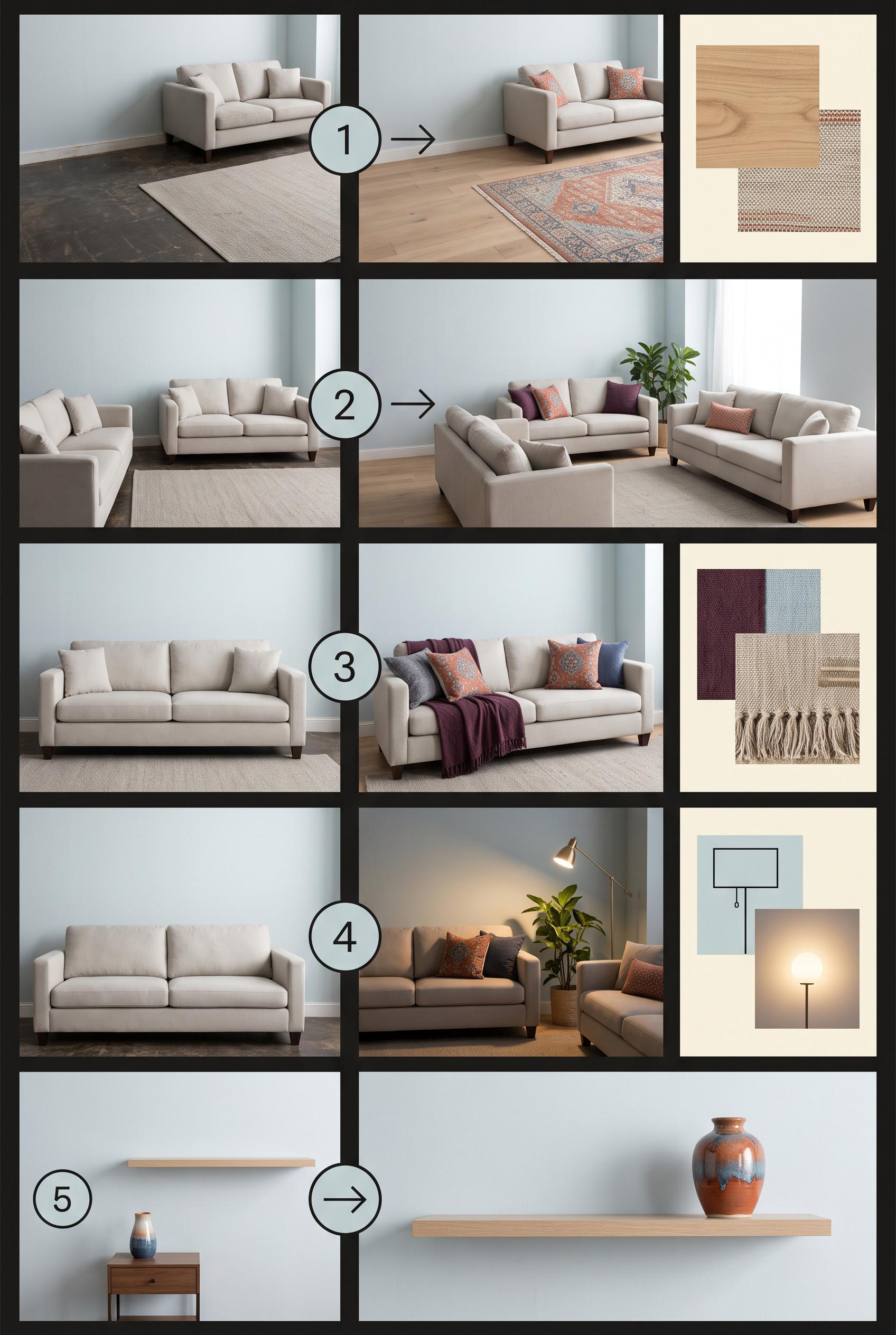
0Create a commercial-quality educational interior styling graphic in a vertical 2:3 Pinterest composition. Show a five-step room refresh as an editorial contact sheet: edited floor, repositioned seating, added textile, redirected lighting, and one personal object. Include small room vignettes, material swatches, and simple numbered circles with no readable words. Use terracotta, mist blue, buttercream, and deep plum. AI-modified downstream. No real brands, no trademarked characters, no watermark, no unintended readable text.
 0
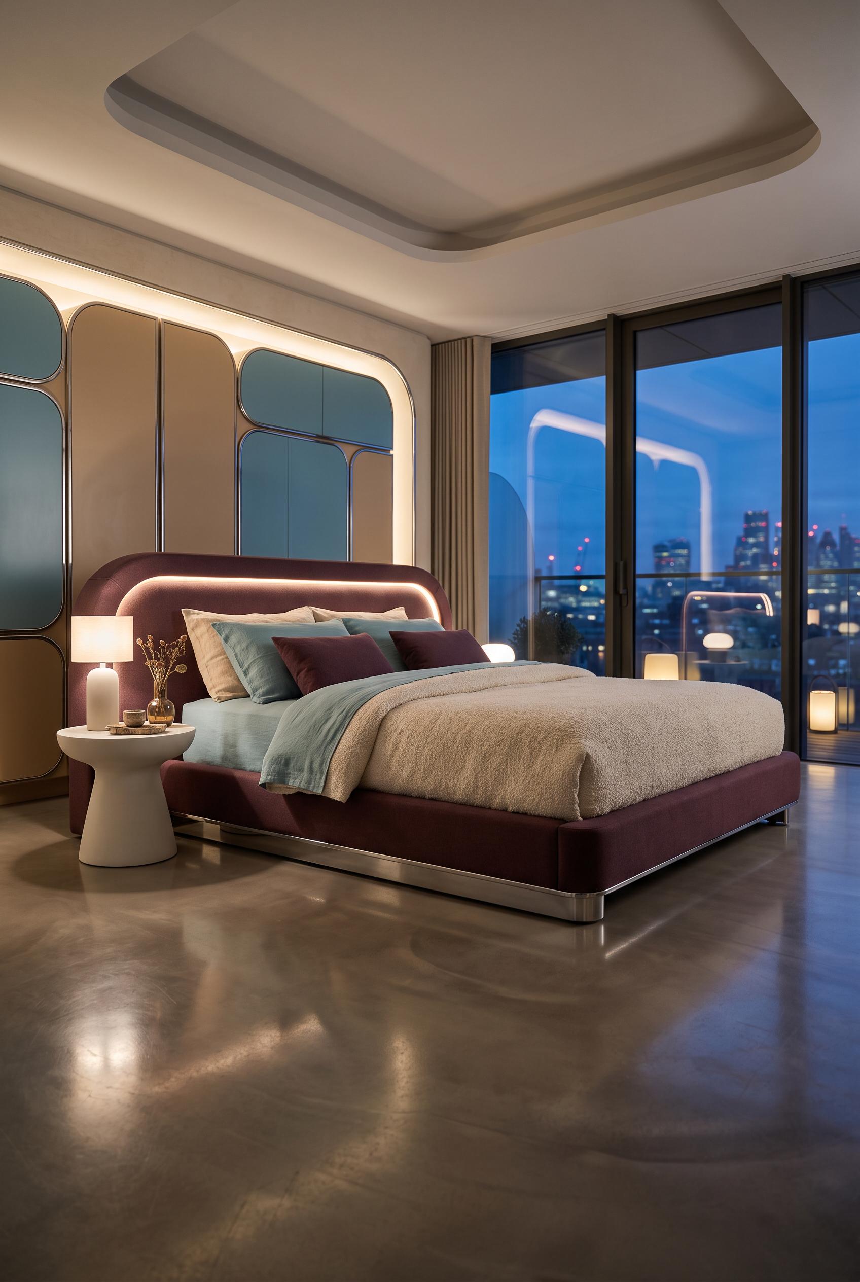
0Create a commercial-quality interior design showcase in a vertical 2:3 Pinterest composition, featuring a soft futuristic bedroom with a low platform bed, rounded modular storage, a sculptural bedside pedestal, tactile boucle and linen bedding, and subtle chrome accents. Use aubergine, warm sand, lagoon blue, and soft chrome. Low-angle cinematic hero view with reflective material layers and elegant evening light. AI-modified downstream. No real brands, no trademarked characters, no watermark, no unintended readable text.
 0
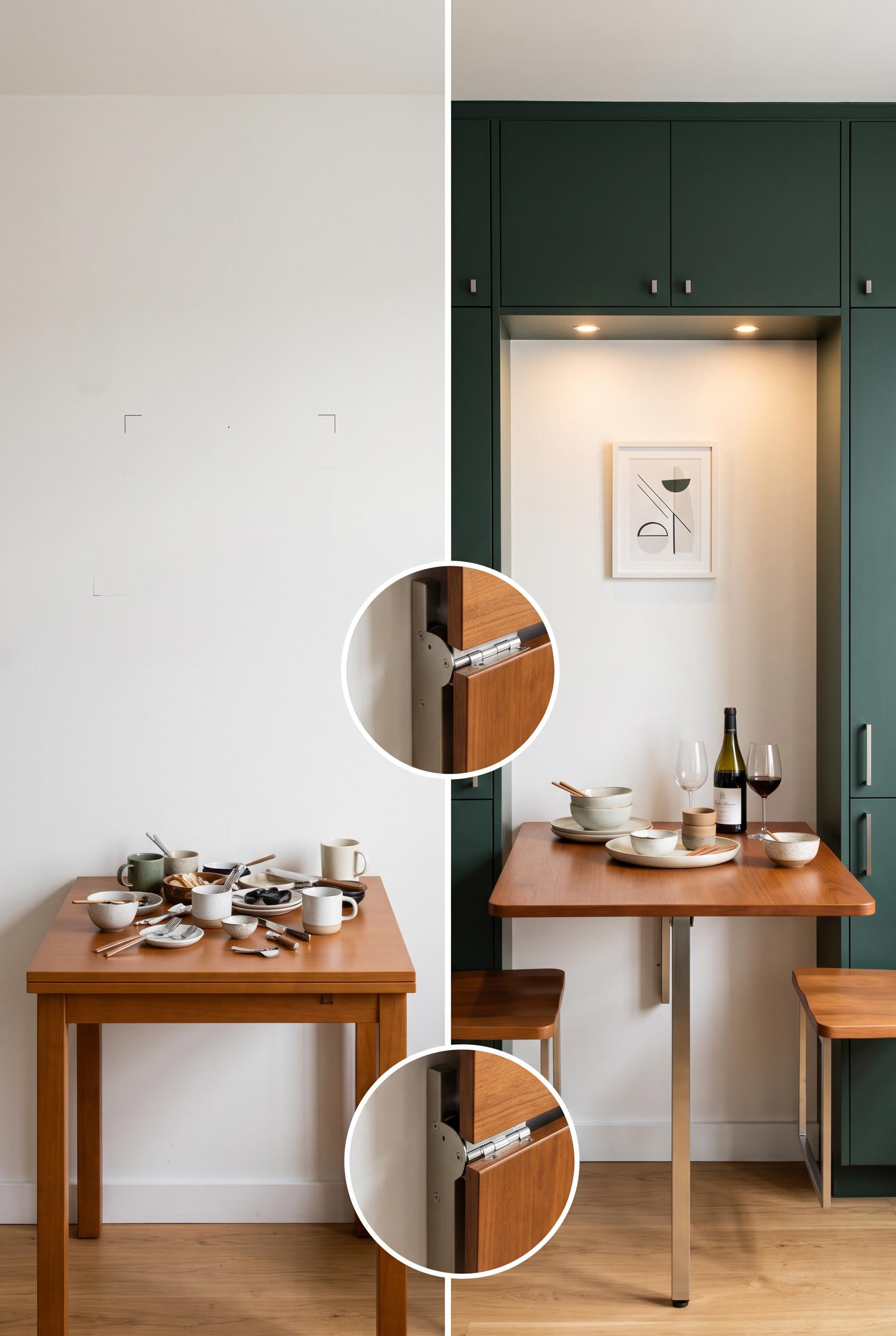
0Create a commercial-quality interior design editorial image in a vertical 2:3 Pinterest composition, showing a matched before-and-after transformation of a compact dining wall into a fold-down hosting station. Include blank wall and cluttered surfaces in the before, then concealed storage, a slim drop-leaf table, two mounted stools, warm lighting, and styled serving pieces in the after. Use chalk white, ink green, caramel, and brushed steel. AI-modified downstream. No real brands, no trademarked characters, no watermark, no unintended readable text. Corrective regeneration attempt 5. Produce a materially revised image, not a near-duplicate of an earlier variant. Preserve the successful subject, palette, lighting, focal hierarchy, and commercial polish from the original brief while correcting every issue below. Mandatory corrective instructions from the most recent visual QA: Create a polished vertical 2:3 left/right split-screen comparison of the same compact dining wall with a clean vertical centerline. Keep the left side as a mostly blank chalk-white wall with a compact table holding scattered serving items. On the right, show the complete fold-down table, concealed ink-green storage, warm task lighting, styled serving pieces, exactly two fully visible wall-mounted caramel stools positioned side by side within the frame, and one small tasteful non-textual art moment. Keep both stools entirely inside the right panel, not cropped. Reduce and reposition the single circular close-detail inset so it is fully contained within the canvas, with one clean border and no overlap. Preserve the warm editorial lighting, caramel wood, brushed steel, chalk white, and ink green palette. Render no letters, words, numbers, labels, logos, glyphs, pseudo-text, or watermark. Observed defects from prior variants that must not recur: 1) The image contains readable BEFORE and AFTER text despite the latest instruction prohibiting all letters and labels. 2) The before panel is dominated by books and paperwork rather than a compact blank-wall dining area, weakening the matched transformation. 3) Small geometric marks on the blank wall resemble unintended glyphs or generation artifacts. 4) The before/after comparison reads primarily as top-versus-bottom rather than a clear matched left/right centerline comparison. 5) The inset has awkward overlapping circular borders that reduce editorial polish. 6) The after panel does not clearly show exactly two complete wall-mounted stools; the right stool is heavily cropped at the edge. 7) The required small art moment is missing. 8) The circular detail inset is oversized and partially cropped, weakening the composition. Render no letters, words, numbers, prices, headings, labels, contact details, logos, glyphs, or pseudo-text anywhere. Use only blank surfaces, clean geometric marks, and non-linguistic placeholder shapes. Do not add explanatory captions, before/after labels, interface copy, or extra objects that the brief did not request. When a corrective instruction conflicts with a decorative detail, prioritize the corrective instruction.
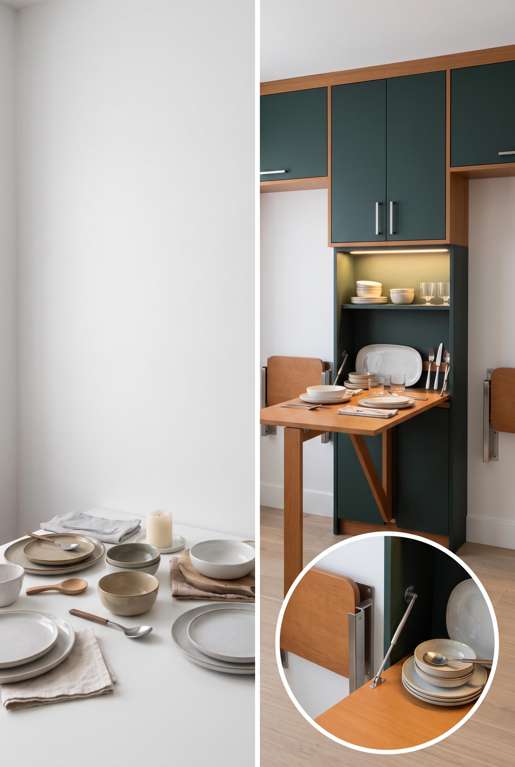 0
0Create a commercial-quality interior design editorial image in a vertical 2:3 Pinterest composition, showing a matched before-and-after transformation of a compact dining wall into a fold-down hosting station. Include blank wall and cluttered surfaces in the before, then concealed storage, a slim drop-leaf table, two mounted stools, warm lighting, and styled serving pieces in the after. Use chalk white, ink green, caramel, and brushed steel. AI-modified downstream. No real brands, no trademarked characters, no watermark, no unintended readable text. Corrective regeneration attempt 4. Produce a materially revised image, not a near-duplicate of an earlier variant. Preserve the successful subject, palette, lighting, focal hierarchy, and commercial polish from the original brief while correcting every issue below. Mandatory corrective instructions from the most recent visual QA: Create a polished vertical 2:3 left/right split-screen comparison of the exact same compact dining wall, with a strong clean vertical centerline. Place the blank-wall, cluttered dining-item version on the left and the completed fold-down hosting station on the right. Preserve the chalk white, ink green, caramel, brushed-steel palette, warm task lighting, concealed storage, slim opened table, exactly two clearly visible wall-mounted stools, serving pieces, and one clean circular close-detail inset of the opened station. Remove every mark from the blank wall and all letters, numbers, labels, logos, pseudo-text, glyphs, and watermarks. Make the inset a single undistorted circle with one clean border and no overlapping rings. Observed defects from prior variants that must not recur: 1) Strong vertical before-and-after composition with a clear transformation, but the required close detail inset of the opened station is missing. 2) The before side is dominated by books and office clutter rather than clearly scattered serving items. 3) Only one wall-mounted stool is clearly visible in the after panel; the required pair is not shown. 4) The image contains readable BEFORE and AFTER text despite the latest instruction prohibiting all letters and labels. 5) The before panel is dominated by books and paperwork rather than a compact blank-wall dining area, weakening the matched transformation. 6) Small geometric marks on the blank wall resemble unintended glyphs or generation artifacts. 7) The before/after comparison reads primarily as top-versus-bottom rather than a clear matched left/right centerline comparison. 8) The inset has awkward overlapping circular borders that reduce editorial polish. Render no letters, words, numbers, prices, headings, labels, contact details, logos, glyphs, or pseudo-text anywhere. Use only blank surfaces, clean geometric marks, and non-linguistic placeholder shapes. Do not add explanatory captions, before/after labels, interface copy, or extra objects that the brief did not request. When a corrective instruction conflicts with a decorative detail, prioritize the corrective instruction.
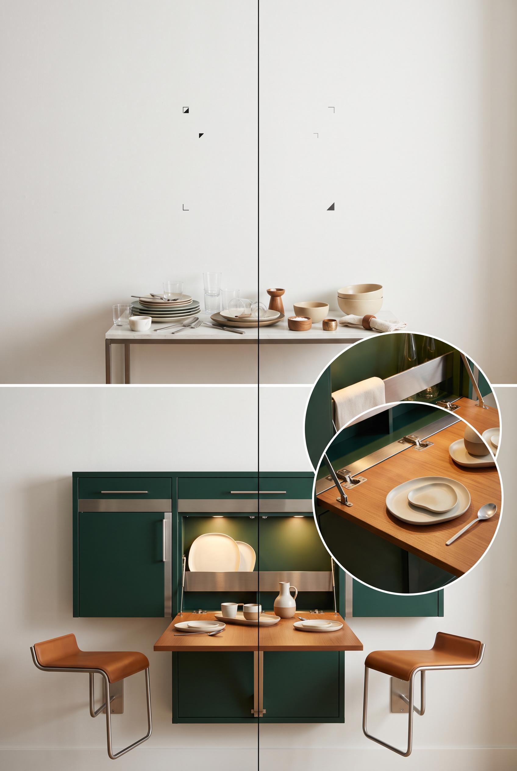 0
0Create a commercial-quality interior design editorial image in a vertical 2:3 Pinterest composition, showing a matched before-and-after transformation of a compact dining wall into a fold-down hosting station. Include blank wall and cluttered surfaces in the before, then concealed storage, a slim drop-leaf table, two mounted stools, warm lighting, and styled serving pieces in the after. Use chalk white, ink green, caramel, and brushed steel. AI-modified downstream. No real brands, no trademarked characters, no watermark, no unintended readable text. Corrective regeneration attempt 3. Produce a materially revised image, not a near-duplicate of an earlier variant. Preserve the successful subject, palette, lighting, focal hierarchy, and commercial polish from the original brief while correcting every issue below. Mandatory corrective instructions from the most recent visual QA: Preserve the polished vertical 2:3 split-screen composition, centerline comparison, chalk white/ink green/caramel/brushed-steel palette, warm task lighting, fold-down table, concealed storage, serving items, and circular close-detail inset. Show exactly two clearly visible wall-mounted stools in the after panel, both integrated beside or beneath the opened station. Replace the before shelving, books, and paperwork with a mostly blank wall and unmistakable scattered dining items—plates, glasses, utensils, bowls, and serving pieces—on a small surface. Remove all readable letters, words, numbers, labels, logos, pseudo-text, and watermarks, including BEFORE and AFTER. Observed defects from prior variants that must not recur: 1) Strong vertical before-and-after composition with a clear transformation, but the required close detail inset of the opened station is missing. 2) The before side is dominated by books and office clutter rather than clearly scattered serving items. 3) Only one wall-mounted stool is clearly visible in the after panel; the required pair is not shown. 4) The image contains readable BEFORE and AFTER text despite the latest instruction prohibiting all letters and labels. 5) The before panel is dominated by books and paperwork rather than a compact blank-wall dining area, weakening the matched transformation. Render no letters, words, numbers, prices, headings, labels, contact details, logos, glyphs, or pseudo-text anywhere. Use only blank surfaces, clean geometric marks, and non-linguistic placeholder shapes. Do not add explanatory captions, before/after labels, interface copy, or extra objects that the brief did not request. When a corrective instruction conflicts with a decorative detail, prioritize the corrective instruction.
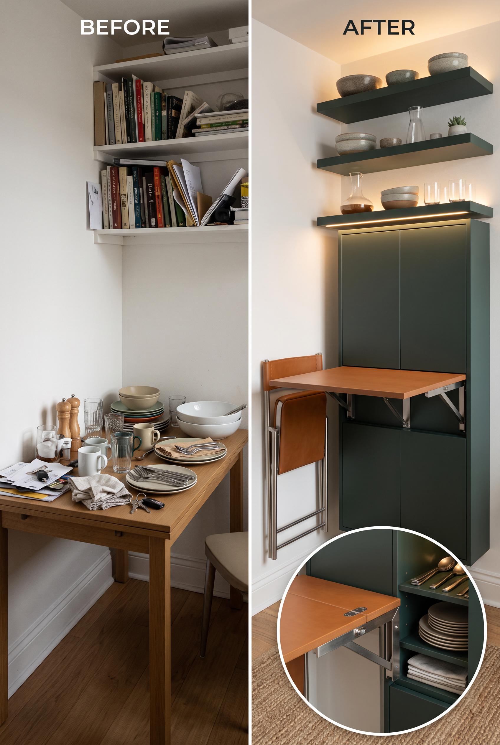 0
0Create a commercial-quality interior design editorial image in a vertical 2:3 Pinterest composition, showing a matched before-and-after transformation of a compact dining wall into a fold-down hosting station. Include blank wall and cluttered surfaces in the before, then concealed storage, a slim drop-leaf table, two mounted stools, warm lighting, and styled serving pieces in the after. Use chalk white, ink green, caramel, and brushed steel. AI-modified downstream. No real brands, no trademarked characters, no watermark, no unintended readable text. Corrective regeneration attempt 2. Produce a materially revised image, not a near-duplicate of an earlier variant. Preserve the successful subject, palette, lighting, focal hierarchy, and commercial polish from the original brief while correcting every issue below. Mandatory corrective instructions from the most recent visual QA: Preserve the attractive vertical 2:3 split-screen composition, centerline comparison, color palette, warm lighting, fold-down table, concealed storage, and two wall-mounted stools. Add a clearly framed close-detail inset—preferably in the upper or lower after panel—showing the opened fold-down station, its hardware, concealed storage, and styled serving pieces. Replace or supplement the before-side books and office clutter with unmistakable scattered dining and serving items such as plates, glasses, utensils, and serving bowls. Keep all text limited to clean intentional BEFORE and AFTER labels; remove any other readable text, brands, watermarks, or artifacts. Observed defects from prior variants that must not recur: 1) Strong vertical before-and-after composition with a clear transformation, but the required close detail inset of the opened station is missing. 2) The before side is dominated by books and office clutter rather than clearly scattered serving items. Render no letters, words, numbers, prices, headings, labels, contact details, logos, glyphs, or pseudo-text anywhere. Use only blank surfaces, clean geometric marks, and non-linguistic placeholder shapes. Do not add explanatory captions, before/after labels, interface copy, or extra objects that the brief did not request. When a corrective instruction conflicts with a decorative detail, prioritize the corrective instruction.
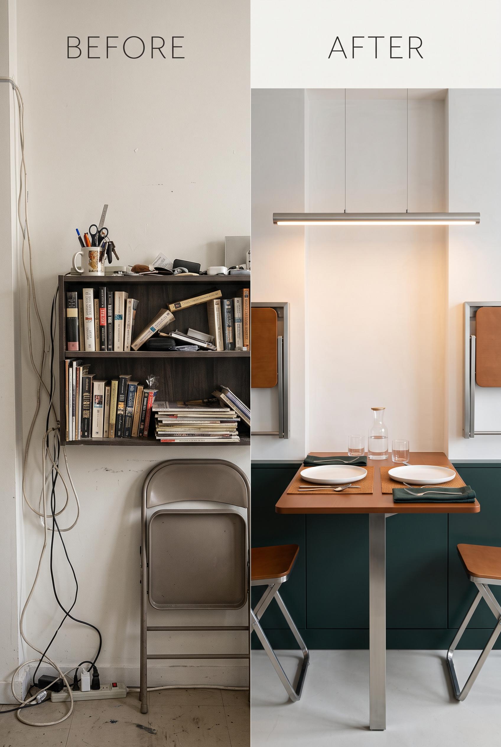 0
0Create a commercial-quality interior design editorial image in a vertical 2:3 Pinterest composition, showing a matched before-and-after transformation of a compact dining wall into a fold-down hosting station. Include blank wall and cluttered surfaces in the before, then concealed storage, a slim drop-leaf table, two mounted stools, warm lighting, and styled serving pieces in the after. Use chalk white, ink green, caramel, and brushed steel. AI-modified downstream. No real brands, no trademarked characters, no watermark, no unintended readable text.
 0
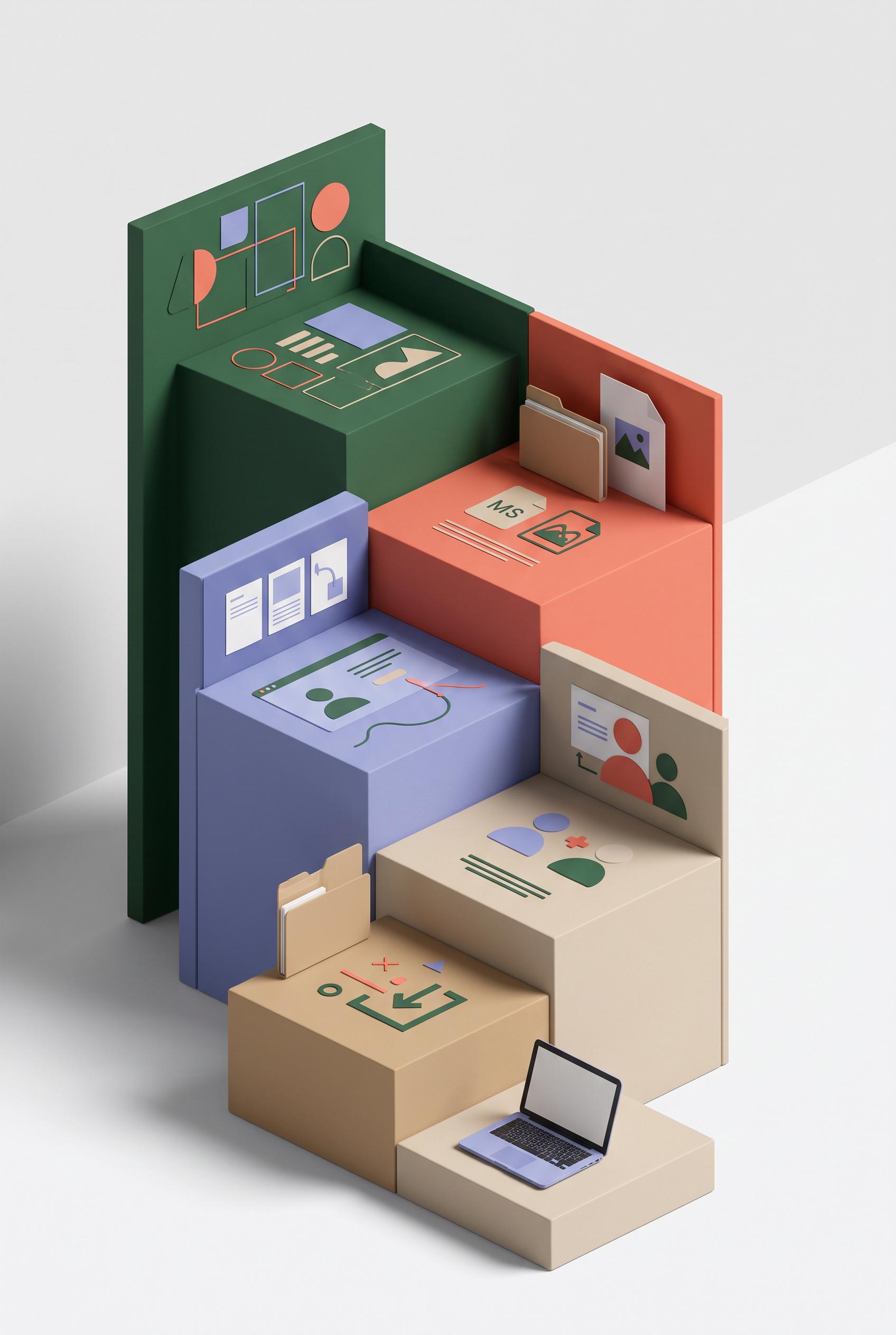
0Create a commercial-quality educational Pinterest graphic in a vertical 2:3 composition. Show a three-dimensional staircase made of five clean evidence cards for a digital download listing: product identity, included files, usage process, ideal buyer, and delivery moment. Use abstract icons, interface silhouettes, cropped page previews, folder shapes, and a small laptop, with no readable wording. Forest green, coral, periwinkle, and sand palette, sophisticated editorial infographic style, clear visual hierarchy, commercial art direction, AI-modified downstream concept. No real brands, no trademarked characters, no watermark, no unintended readable text. Corrective regeneration attempt 5. Produce a materially revised image, not a near-duplicate of an earlier variant. Preserve the successful subject, palette, lighting, focal hierarchy, and commercial polish from the original brief while correcting every issue below. Mandatory corrective instructions from the most recent visual QA: Regenerate a polished vertical 2:3 editorial infographic in the existing forest green, coral, periwinkle, and sand palette. Keep exactly five clearly separated, evenly spaced three-dimensional staircase evidence cards as the dominant focal point, with abstract icons, folder and file silhouettes, interface-like geometric previews, people silhouettes, and a small laptop. Remove every readable word, letter, number, label, heading, pseudo-text line, glyph, logo, and brand mark from all cards and the entire image; use only blank surfaces, clean color blocks, and simple non-linguistic geometric icons. Simplify the background by removing wall panels, redundant floating cards, oversized decorative blocks, and competing peripheral objects. Preserve soft lighting, clear hierarchy, commercial polish, and a clean reusable campaign-framework feel. Include no watermark or letter-like markings anywhere. Observed defects from prior variants that must not recur: 1) A clearly readable “MS” appears on the coral evidence card. 2) Multiple cards contain letter-like glyphs, pseudo-text lines, and UI-style marks despite the no-readable-text requirement. 3) The staircase is attractive but still visually dense, with competing wall panels and numerous peripheral objects weakening the five-step sequence. 4) Multiple large readable labels are present, including “Product Identity,” “Included Files,” “Usage Process,” “Ideal Buyer,” and “Delivery Moment,” violating the no-readable-text/no 5) The five cards contain prominent readable labels, directly violating the no-readable-text requirement. 6) The composition remains visually dense with competing wall panels and peripheral objects. 7) The staircase sequence is present but the cards overlap heavily and are not evenly separated. Render no letters, words, numbers, prices, headings, labels, contact details, logos, glyphs, or pseudo-text anywhere. Use only blank surfaces, clean geometric marks, and non-linguistic placeholder shapes. Do not add explanatory captions, before/after labels, interface copy, or extra objects that the brief did not request. When a corrective instruction conflicts with a decorative detail, prioritize the corrective instruction.
 0
0Create a commercial-quality educational Pinterest graphic in a vertical 2:3 composition. Show a three-dimensional staircase made of five clean evidence cards for a digital download listing: product identity, included files, usage process, ideal buyer, and delivery moment. Use abstract icons, interface silhouettes, cropped page previews, folder shapes, and a small laptop, with no readable wording. Forest green, coral, periwinkle, and sand palette, sophisticated editorial infographic style, clear visual hierarchy, commercial art direction, AI-modified downstream concept. No real brands, no trademarked characters, no watermark, no unintended readable text. Corrective regeneration attempt 4. Produce a materially revised image, not a near-duplicate of an earlier variant. Preserve the successful subject, palette, lighting, focal hierarchy, and commercial polish from the original brief while correcting every issue below. Mandatory corrective instructions from the most recent visual QA: Regenerate as a polished vertical 2:3 editorial infographic preserving the forest green, coral, periwinkle, and sand palette, soft lighting, three-dimensional staircase, abstract icons, folders, interface previews, people silhouette, and small laptop. Make exactly five clearly separated, evenly spaced staircase evidence cards the dominant focal point. Remove every readable word, letter, number, label, heading, pseudo-text line, glyph, logo, and brand mark, including all existing card labels. Replace text areas with blank surfaces, clean color blocks, abstract geometric shapes, and simple non-linguistic icons only. Simplify the background by removing peripheral wall panels, redundant floating cards, extra charts, and competing decorative objects. Keep the composition uncluttered, commercially polished, and ensure there is no watermark or letter-like marking anywhere. Observed defects from prior variants that must not recur: 1) The composition is attractive and vertical, but it is overly dense with competing peripheral panels and decorative elements, weakening the staircase sequence and focal hierarchy. 2) A readable “MS” appears on a file card, violating the no-readable-text requirement. 3) The staircase does not clearly present five distinct, evenly legible evidence cards in a reusable campaign sequence. 4) A clearly readable “MS” appears on the coral evidence card. 5) Multiple cards contain letter-like glyphs, pseudo-text lines, and UI-style marks despite the no-readable-text requirement. 6) The staircase is attractive but still visually dense, with competing wall panels and numerous peripheral objects weakening the five-step sequence. 7) Multiple large readable labels are present, including “Product Identity,” “Included Files,” “Usage Process,” “Ideal Buyer,” and “Delivery Moment,” violating the no-readable-text/no Render no letters, words, numbers, prices, headings, labels, contact details, logos, glyphs, or pseudo-text anywhere. Use only blank surfaces, clean geometric marks, and non-linguistic placeholder shapes. Do not add explanatory captions, before/after labels, interface copy, or extra objects that the brief did not request. When a corrective instruction conflicts with a decorative detail, prioritize the corrective instruction.
 0
0Create a commercial-quality educational Pinterest graphic in a vertical 2:3 composition. Show a three-dimensional staircase made of five clean evidence cards for a digital download listing: product identity, included files, usage process, ideal buyer, and delivery moment. Use abstract icons, interface silhouettes, cropped page previews, folder shapes, and a small laptop, with no readable wording. Forest green, coral, periwinkle, and sand palette, sophisticated editorial infographic style, clear visual hierarchy, commercial art direction, AI-modified downstream concept. No real brands, no trademarked characters, no watermark, no unintended readable text. Corrective regeneration attempt 3. Produce a materially revised image, not a near-duplicate of an earlier variant. Preserve the successful subject, palette, lighting, focal hierarchy, and commercial polish from the original brief while correcting every issue below. Mandatory corrective instructions from the most recent visual QA: Create a materially revised vertical 2:3 editorial infographic preserving the sophisticated forest green, coral, periwinkle, and sand palette, three-dimensional staircase, soft lighting, folders, abstract interface previews, people silhouettes, and small laptop. Make exactly five clearly separated, evenly spaced staircase evidence cards the unmistakable focal point. Simplify the background and remove peripheral wall panels, redundant decorative objects, extra charts, and competing figures. Replace every letter, number, word, logo, trademark, glyph, pseudo-text line, and the visible “MS” with purely abstract geometric shapes, blank surfaces, simple non-linguistic icons, and clean color blocks. Ensure no readable or letter-like marks appear anywhere, and include no watermark. Observed defects from prior variants that must not recur: 1) The composition is attractive and vertical, but it is overly dense with competing peripheral panels and decorative elements, weakening the staircase sequence and focal hierarchy. 2) A readable “MS” appears on a file card, violating the no-readable-text requirement. 3) The staircase does not clearly present five distinct, evenly legible evidence cards in a reusable campaign sequence. 4) A clearly readable “MS” appears on the coral evidence card. 5) Multiple cards contain letter-like glyphs, pseudo-text lines, and UI-style marks despite the no-readable-text requirement. 6) The staircase is attractive but still visually dense, with competing wall panels and numerous peripheral objects weakening the five-step sequence. Render no letters, words, numbers, prices, headings, labels, contact details, logos, glyphs, or pseudo-text anywhere. Use only blank surfaces, clean geometric marks, and non-linguistic placeholder shapes. Do not add explanatory captions, before/after labels, interface copy, or extra objects that the brief did not request. When a corrective instruction conflicts with a decorative detail, prioritize the corrective instruction.
 0
0Create a commercial-quality educational Pinterest graphic in a vertical 2:3 composition. Show a three-dimensional staircase made of five clean evidence cards for a digital download listing: product identity, included files, usage process, ideal buyer, and delivery moment. Use abstract icons, interface silhouettes, cropped page previews, folder shapes, and a small laptop, with no readable wording. Forest green, coral, periwinkle, and sand palette, sophisticated editorial infographic style, clear visual hierarchy, commercial art direction, AI-modified downstream concept. No real brands, no trademarked characters, no watermark, no unintended readable text. Corrective regeneration attempt 2. Produce a materially revised image, not a near-duplicate of an earlier variant. Preserve the successful subject, palette, lighting, focal hierarchy, and commercial polish from the original brief while correcting every issue below. Mandatory corrective instructions from the most recent visual QA: Preserve the sophisticated forest green, coral, periwinkle, and sand editorial infographic style, the three-dimensional staircase, and the useful icons, folders, interface silhouettes, people, and laptop. Simplify the background and remove peripheral decorative panels, floating blocks, extra charts, and redundant figures so the five staircase steps are the unmistakable focal point. Make exactly five clearly separated evidence cards/steps with a clean, logical ascending sequence and balanced spacing. Replace every character or letter-like mark, including the visible “MS” on the file card, with purely abstract shapes or icons; ensure there is no readable text anywhere, no logos, no trademarks, and no watermark. Observed defects from prior variants that must not recur: 1) The composition is attractive and vertical, but it is overly dense with competing peripheral panels and decorative elements, weakening the staircase sequence and focal hierarchy. 2) A readable “MS” appears on a file card, violating the no-readable-text requirement. 3) The staircase does not clearly present five distinct, evenly legible evidence cards in a reusable campaign sequence. Render no letters, words, numbers, prices, headings, labels, contact details, logos, glyphs, or pseudo-text anywhere. Use only blank surfaces, clean geometric marks, and non-linguistic placeholder shapes. Do not add explanatory captions, before/after labels, interface copy, or extra objects that the brief did not request. When a corrective instruction conflicts with a decorative detail, prioritize the corrective instruction.
 0
0Create a commercial-quality educational Pinterest graphic in a vertical 2:3 composition. Show a three-dimensional staircase made of five clean evidence cards for a digital download listing: product identity, included files, usage process, ideal buyer, and delivery moment. Use abstract icons, interface silhouettes, cropped page previews, folder shapes, and a small laptop, with no readable wording. Forest green, coral, periwinkle, and sand palette, sophisticated editorial infographic style, clear visual hierarchy, commercial art direction, AI-modified downstream concept. No real brands, no trademarked characters, no watermark, no unintended readable text.
 0
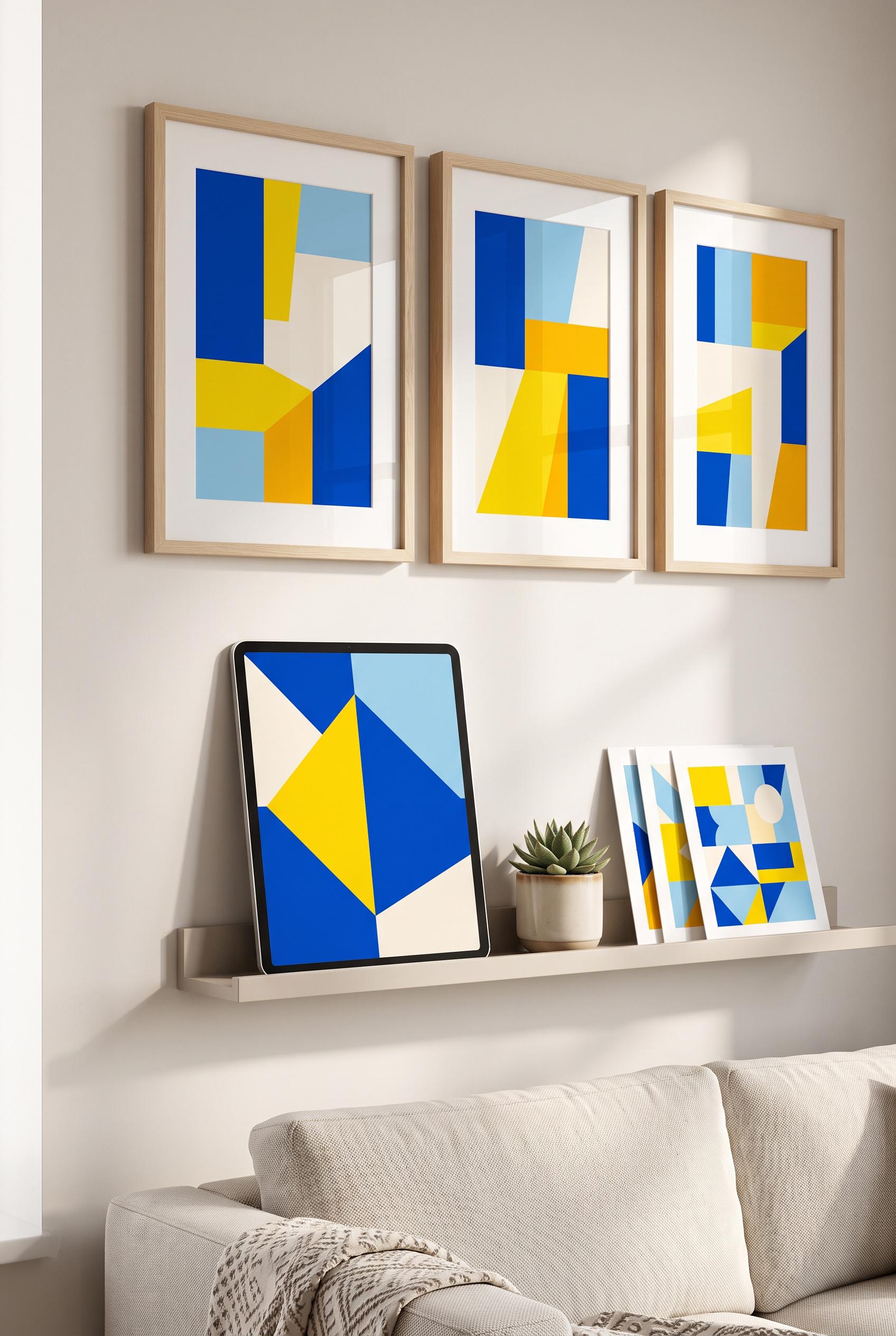
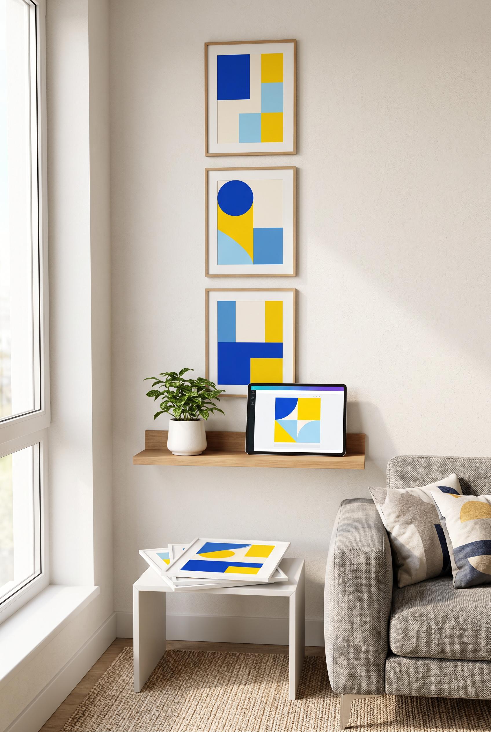
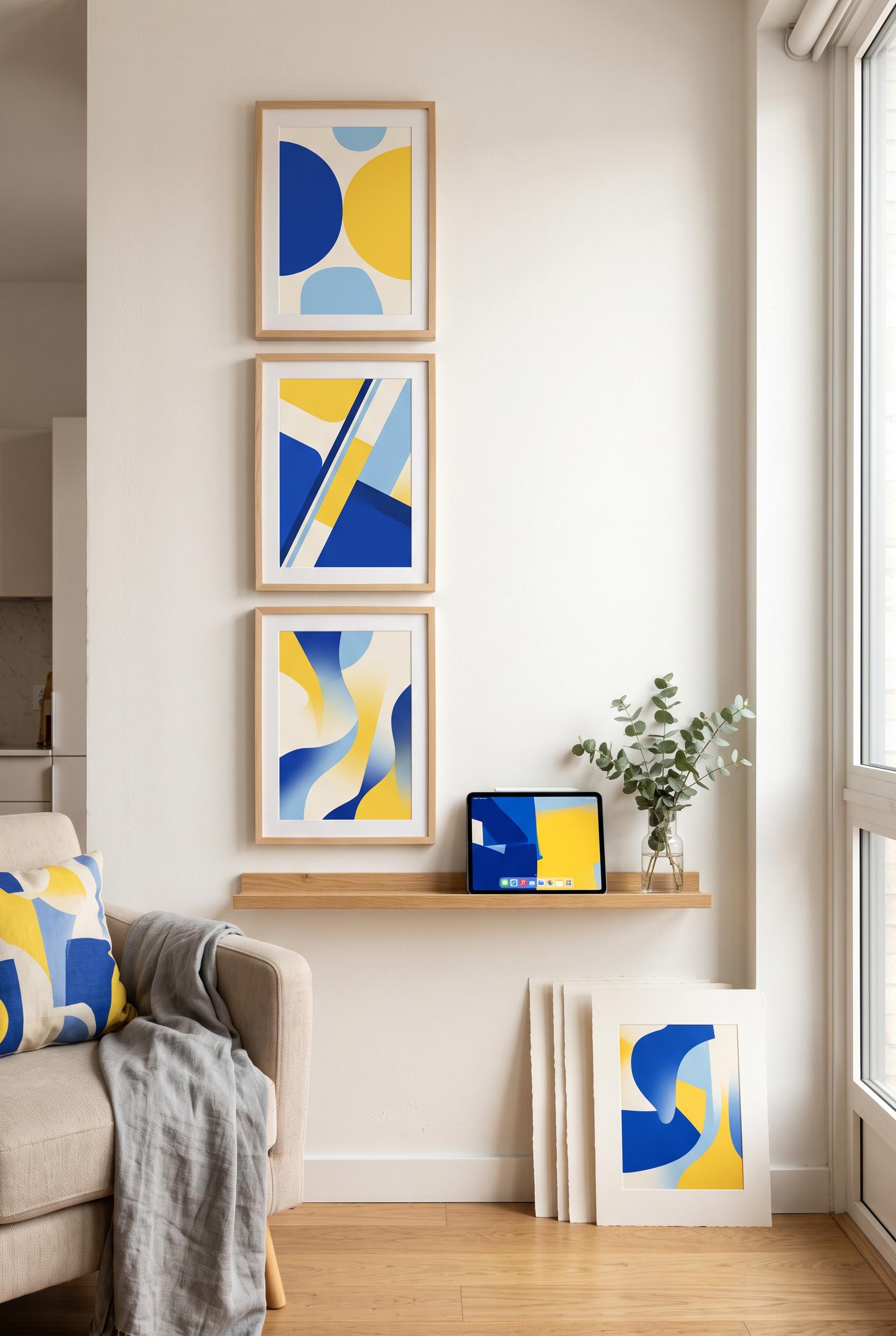
0Create a commercial-quality Pinterest showcase in a vertical 2:3 composition featuring an editable digital wall art set in a compact modern apartment corner. Show three coordinated framed prints arranged in a tall gallery wall, a slim shelf with a tablet displaying abstract color blocks, and a small stack of unframed prints. Cobalt, citrus yellow, sky blue, and warm white palette, airy sunlight, refined interior styling, premium ecommerce art direction, realistic materials, AI-modified downstream concept. No real brands, no trademarked characters, no watermark, no unintended readable text, artwork must use abstract shapes only. Corrective regeneration attempt 3. Produce a materially revised image, not a near-duplicate of an earlier variant. Preserve the successful subject, palette, lighting, focal hierarchy, and commercial polish from the original brief while correcting every issue below. Mandatory corrective instructions from the most recent visual QA: Preserve the attractive vertical 2:3 apartment composition, three framed abstract prints, cobalt/citrus yellow/sky blue/warm white palette, airy sunlight, plant, sofa, realistic materials, and premium commercial styling. Replace the tablet screen entirely with a clean blank canvas containing only large geometric abstract shapes in the specified palette. Remove every toolbar, icon, control, border element, logo, glyph, number, letter, and pseudo-text from the tablet. Place the small stack of unframed abstract prints neatly on the slim wall shelf, while keeping the tablet and plant balanced there; remove or simplify the separate side table if needed. Ensure no readable or pseudo-readable text appears anywhere in the image and render no brands, watermarks, or interface artifacts. Observed defects from prior variants that must not recur: 1) The composition is attractive and fulfills most of the product concept, but the tablet screen includes a recognizable operating-system-style dock with app icons, creating an avoida 2) ble brand/interface artifact. 3) Attractive vertical composition with strong focal hierarchy and cohesive abstract artwork. 4) Tablet screen still contains visible editor UI elements, including toolbar icons and controls, violating the requirement for a purely generic abstract display with no interface or2 5) readable symbols. 6) Print stack is placed on a separate table rather than the slim shelf, weakening the requested product arrangement. Render no letters, words, numbers, prices, headings, labels, contact details, logos, glyphs, or pseudo-text anywhere. Use only blank surfaces, clean geometric marks, and non-linguistic placeholder shapes. Do not add explanatory captions, before/after labels, interface copy, or extra objects that the brief did not request. When a corrective instruction conflicts with a decorative detail, prioritize the corrective instruction.
 0
0Create a commercial-quality Pinterest showcase in a vertical 2:3 composition featuring an editable digital wall art set in a compact modern apartment corner. Show three coordinated framed prints arranged in a tall gallery wall, a slim shelf with a tablet displaying abstract color blocks, and a small stack of unframed prints. Cobalt, citrus yellow, sky blue, and warm white palette, airy sunlight, refined interior styling, premium ecommerce art direction, realistic materials, AI-modified downstream concept. No real brands, no trademarked characters, no watermark, no unintended readable text, artwork must use abstract shapes only. Corrective regeneration attempt 2. Produce a materially revised image, not a near-duplicate of an earlier variant. Preserve the successful subject, palette, lighting, focal hierarchy, and commercial polish from the original brief while correcting every issue below. Mandatory corrective instructions from the most recent visual QA: Preserve the vertical 2:3 apartment composition, three framed abstract prints, airy sunlight, shelf, plant, sofa, and print stack. Replace the tablet display with a clean, generic abstract design editor view using only cobalt, citrus yellow, sky blue, and warm white geometric shapes; remove all dock icons, interface symbols, logos, controls, and any readable text. Ensure no recognizable branded device interface remains. Observed defects from prior variants that must not recur: 1) The composition is attractive and fulfills most of the product concept, but the tablet screen includes a recognizable operating-system-style dock with app icons, creating an avoida 2) ble brand/interface artifact. Render no letters, words, numbers, prices, headings, labels, contact details, logos, glyphs, or pseudo-text anywhere. Use only blank surfaces, clean geometric marks, and non-linguistic placeholder shapes. Do not add explanatory captions, before/after labels, interface copy, or extra objects that the brief did not request. When a corrective instruction conflicts with a decorative detail, prioritize the corrective instruction.
 0
0Create a commercial-quality Pinterest showcase in a vertical 2:3 composition featuring an editable digital wall art set in a compact modern apartment corner. Show three coordinated framed prints arranged in a tall gallery wall, a slim shelf with a tablet displaying abstract color blocks, and a small stack of unframed prints. Cobalt, citrus yellow, sky blue, and warm white palette, airy sunlight, refined interior styling, premium ecommerce art direction, realistic materials, AI-modified downstream concept. No real brands, no trademarked characters, no watermark, no unintended readable text, artwork must use abstract shapes only.
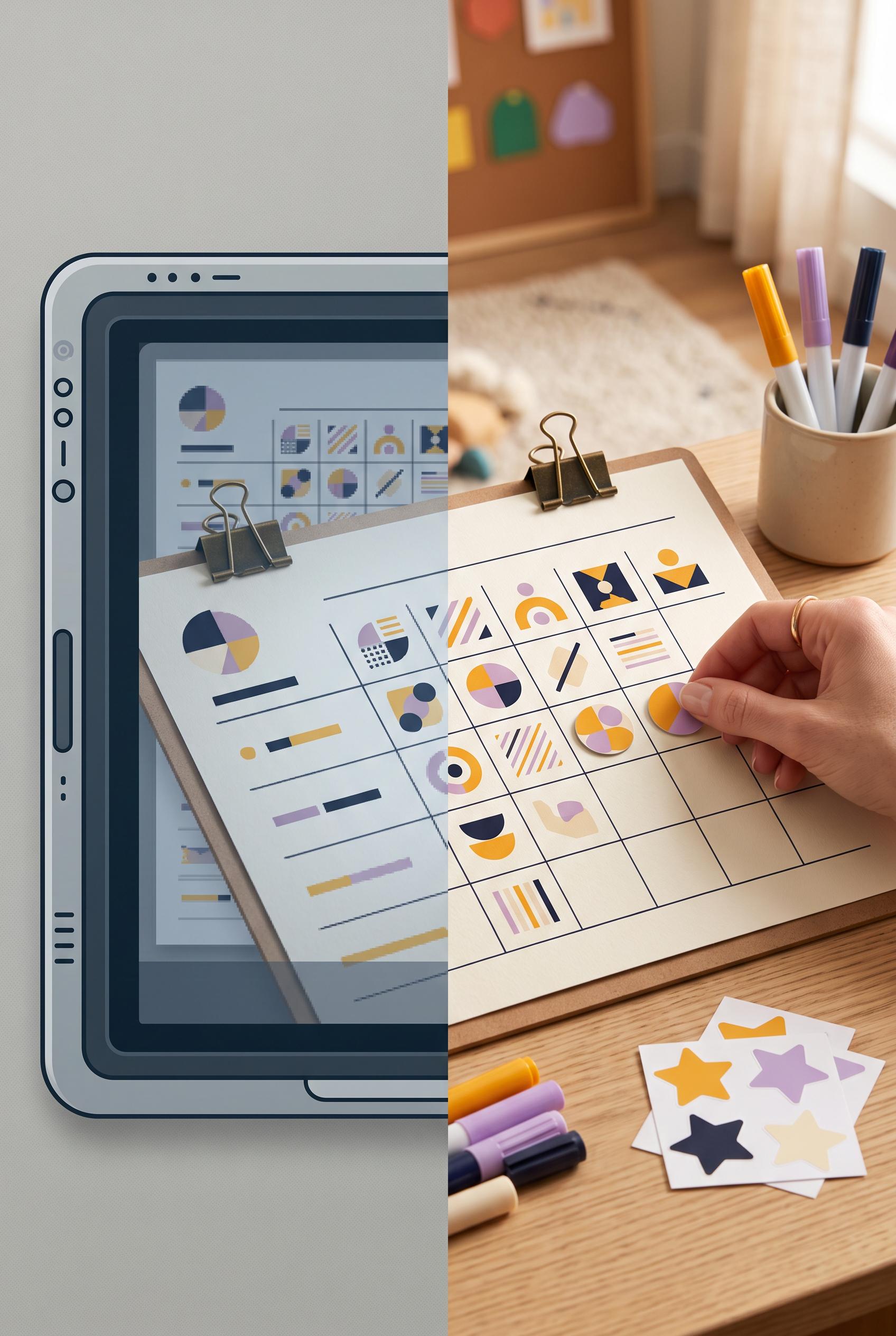 0
0Create a commercial-quality Pinterest image in a vertical 2:3 composition for a printable classroom reward chart listing. Use a hinged split-screen transformation: left side is a small, dull digital preview on a neutral screen, right side is a bright teacher desk with the chart printed, clipped, colored markers, star stickers, and a hand placing a reward token. Deep ink, marigold, lilac, and cream palette, crisp editorial lighting, realistic paper texture, strong visual contrast, polished product photography, AI-modified downstream concept. No real brands, no trademarked characters, no watermark, no unintended readable text, use abstract marks only. Corrective regeneration attempt 2. Produce a materially revised image, not a near-duplicate of an earlier variant. Preserve the successful subject, palette, lighting, focal hierarchy, and commercial polish from the original brief while correcting every issue below. Mandatory corrective instructions from the most recent visual QA: Preserve the attractive vertical 2:3 split composition, bright classroom desk, printed clipped chart, markers, stickers, hand, reward token, warm editorial lighting, and tactile paper texture. Replace every visible letter, word, number, and label on both the digital preview and printed chart with purely abstract geometric marks, icons, lines, and blank grid cells; ensure no readable text remains anywhere. Keep the improved tactile right side larger and maintain a clean hinged split-screen transformation with no watermark, logos, or brand-like elements. Observed defects from prior variants that must not recur: 1) The chart contains prominent readable text, including “REWARD CHART” and other pseudo-labels, violating the requirement for abstract marks only. 2) The left preview also includes readable interface-like text rather than fully abstract details. Render no letters, words, numbers, prices, headings, labels, contact details, logos, glyphs, or pseudo-text anywhere. Use only blank surfaces, clean geometric marks, and non-linguistic placeholder shapes. Do not add explanatory captions, before/after labels, interface copy, or extra objects that the brief did not request. When a corrective instruction conflicts with a decorative detail, prioritize the corrective instruction.
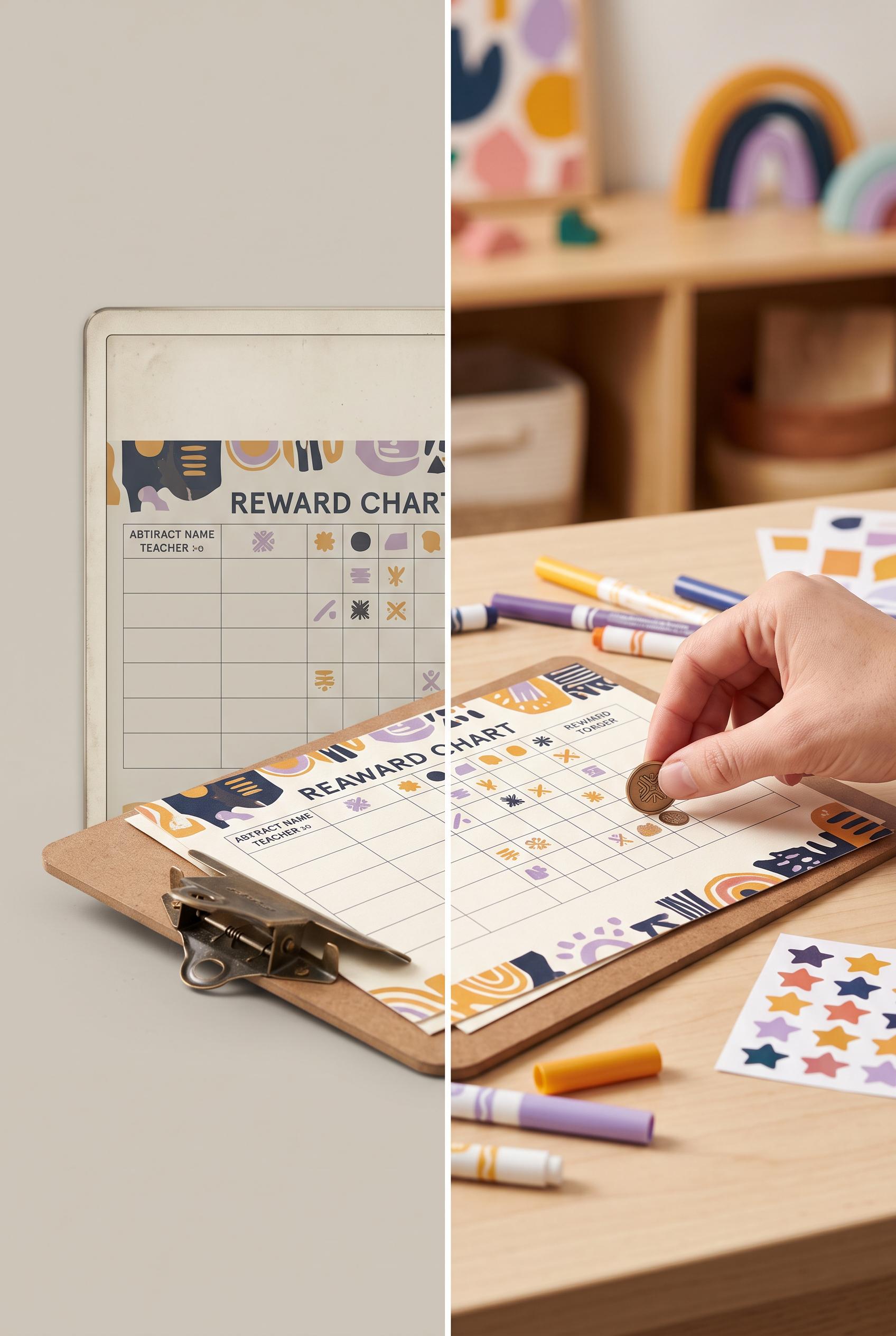 0
0Create a commercial-quality Pinterest image in a vertical 2:3 composition for a printable classroom reward chart listing. Use a hinged split-screen transformation: left side is a small, dull digital preview on a neutral screen, right side is a bright teacher desk with the chart printed, clipped, colored markers, star stickers, and a hand placing a reward token. Deep ink, marigold, lilac, and cream palette, crisp editorial lighting, realistic paper texture, strong visual contrast, polished product photography, AI-modified downstream concept. No real brands, no trademarked characters, no watermark, no unintended readable text, use abstract marks only.
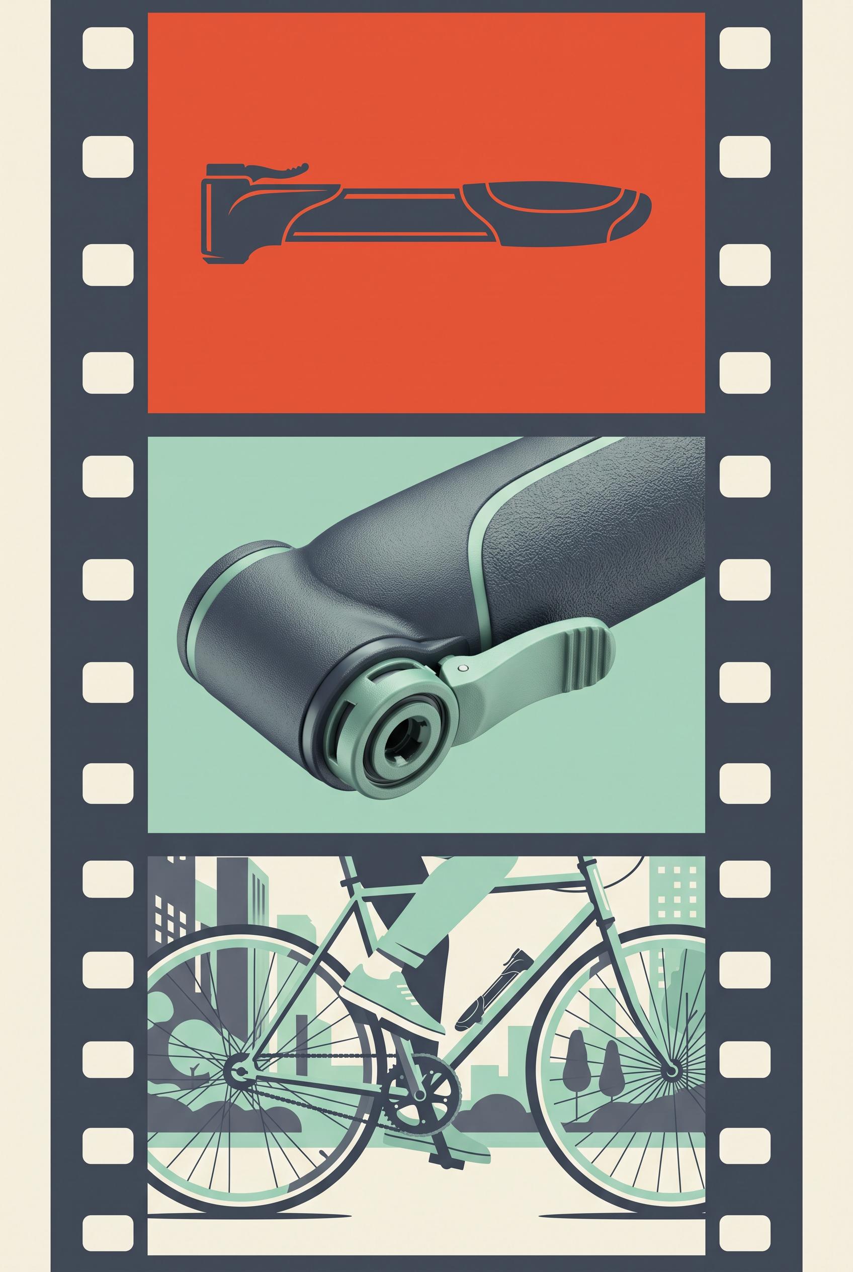 0
0Commercial-quality educational advertising concept in a vertical 2:3 Pinterest composition. Create a vertical three-frame filmstrip for a compact bicycle repair pump: first frame shows the silhouette, second frame is a macro detail of the textured grip and valve connection, third frame shows the pump beside a bicycle during an urban ride. Use vermillion, slate, mint, and paper cream, strong editorial art direction, clear visual hierarchy, no real brands, no trademarked characters, no watermark, no unintended readable text, AI-modified downstream. Corrective regeneration attempt 2. Produce a materially revised image, not a near-duplicate of an earlier variant. Preserve the successful subject, palette, lighting, focal hierarchy, and commercial polish from the original brief while correcting every issue below. Mandatory corrective instructions from the most recent visual QA: Regenerate the same vertical three-frame filmstrip, preserving the strong editorial composition, pump silhouette, textured grip and valve macro, urban bicycle scene, and vermillion/slate/mint/paper-cream palette. Remove every instance of lorem ipsum, pseudo-text, distorted microtype, and other unintended readable or text-like markings. Keep only clean graphic elements with no words, logos, brands, trademarks, or watermark. Observed defects from prior variants that must not recur: 1) Small garbled pseudo-text/lorem ipsum appears in all three frames, violating the no unintended readable text requirement. 2) The composition is otherwise strong, vertical, cohesive, and clearly presents the pump silhouette, macro detail, and urban bicycle use. Render no letters, words, numbers, prices, headings, labels, contact details, logos, glyphs, or pseudo-text anywhere. Use only blank surfaces, clean geometric marks, and non-linguistic placeholder shapes. Do not add explanatory captions, before/after labels, interface copy, or extra objects that the brief did not request. When a corrective instruction conflicts with a decorative detail, prioritize the corrective instruction.
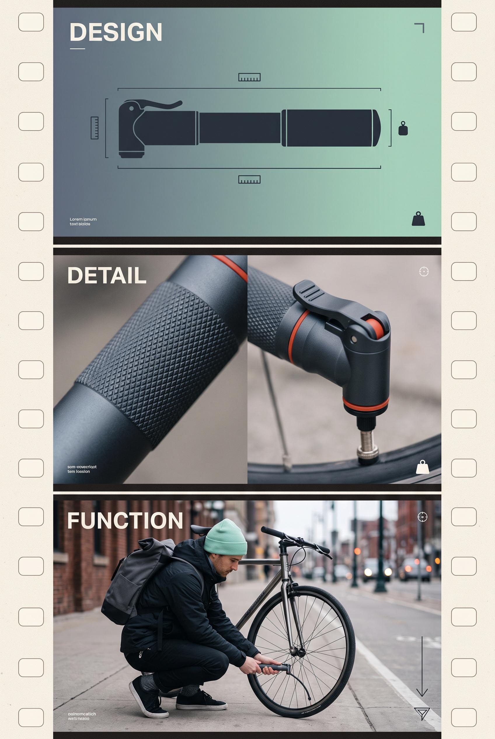 0
0Commercial-quality educational advertising concept in a vertical 2:3 Pinterest composition. Create a vertical three-frame filmstrip for a compact bicycle repair pump: first frame shows the silhouette, second frame is a macro detail of the textured grip and valve connection, third frame shows the pump beside a bicycle during an urban ride. Use vermillion, slate, mint, and paper cream, strong editorial art direction, clear visual hierarchy, no real brands, no trademarked characters, no watermark, no unintended readable text, AI-modified downstream.
 0
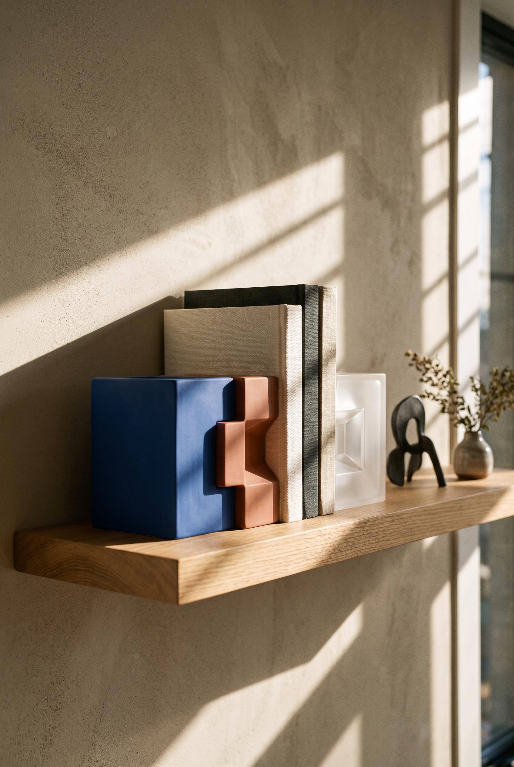
0Commercial-quality inspirational product showcase in a vertical 2:3 Pinterest composition. Feature a modular architectural bookend system on a long floating shelf with three interlocking geometric forms, a small stack of blank books, and dramatic late afternoon shadow bands. Use cobalt, muted clay, warm putty, and frosted clear materials, low-angle editorial styling, precise spacing, premium design photography, no real brands, no trademarked characters, no watermark, no unintended readable text, AI-modified downstream.
 0
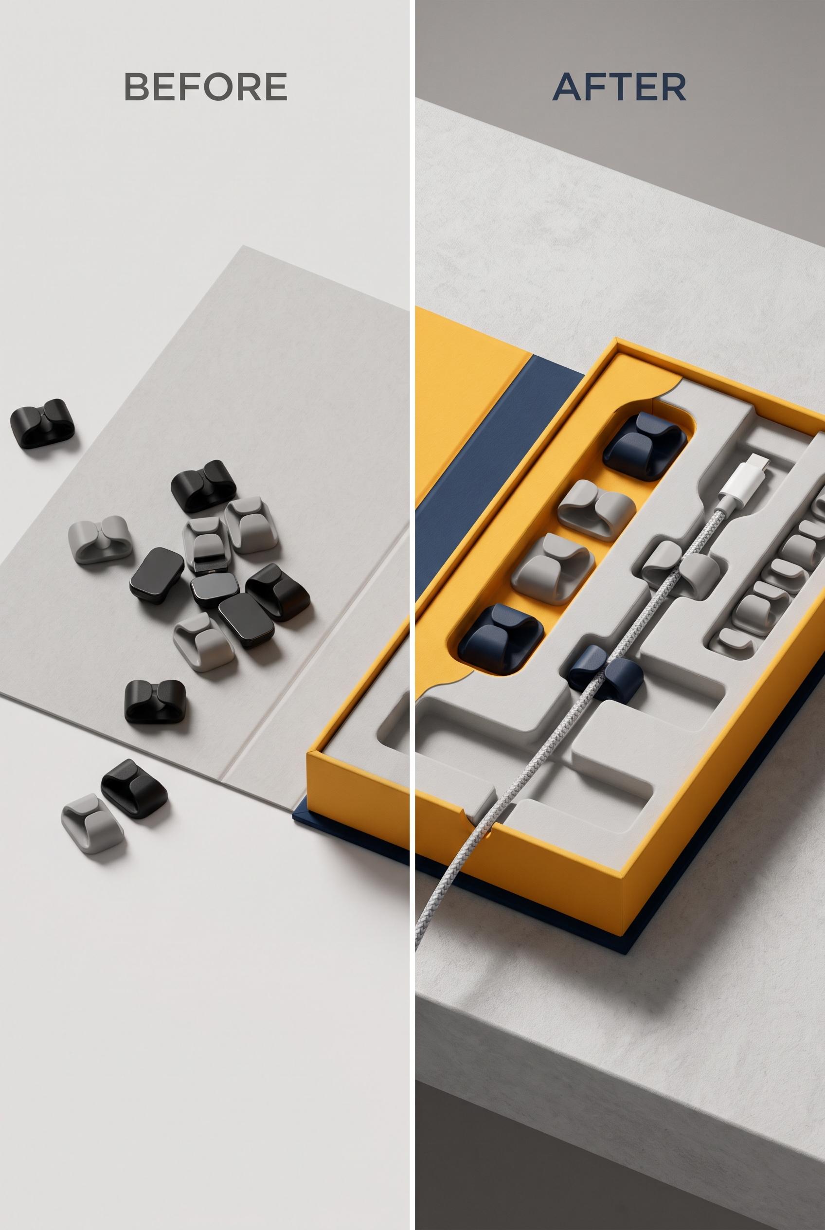
0Commercial-quality product packaging transformation image in a vertical 2:3 Pinterest composition. Show a clean vertical split: left side has a generic flat paper insert and loose magnetic cable clips, right side has a refined paperboard tray arranged on a modern desk with one cable routed neatly. Use saffron, ink blue, stone gray, and soft white, tactile uncoated paper, realistic shadows, premium studio photography, clear before-and-after storytelling, no real brands, no trademarked characters, no watermark, no unintended readable text, AI-modified downstream.
 0
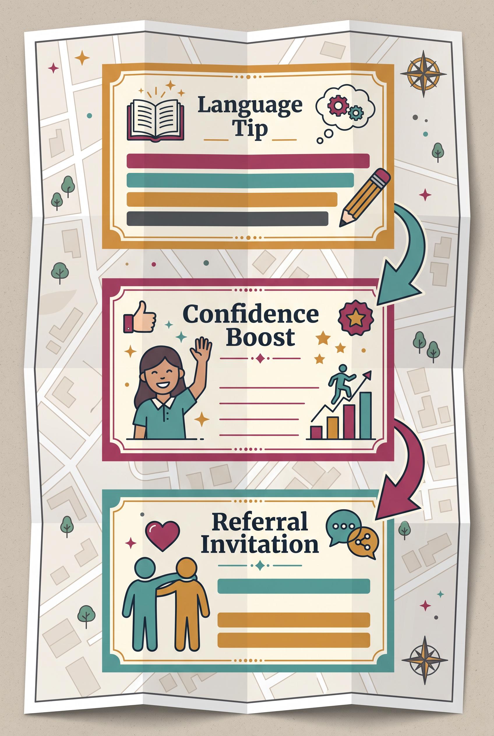
0AI-modified downstream, create a commercial-quality educational Pinterest graphic in a vertical 2:3 composition for an independent language tutor. Show a folded neighborhood map with three connected postcard panels representing a useful language tip, a confidence-building student moment, and a friendly referral invitation. Use berry, teal, ochre, and graphite, with arrows, simple icons, blank text bars, and clear visual hierarchy. No unintended readable text. No real brands, no trademarked characters, no watermark, no unintended readable text.
 0
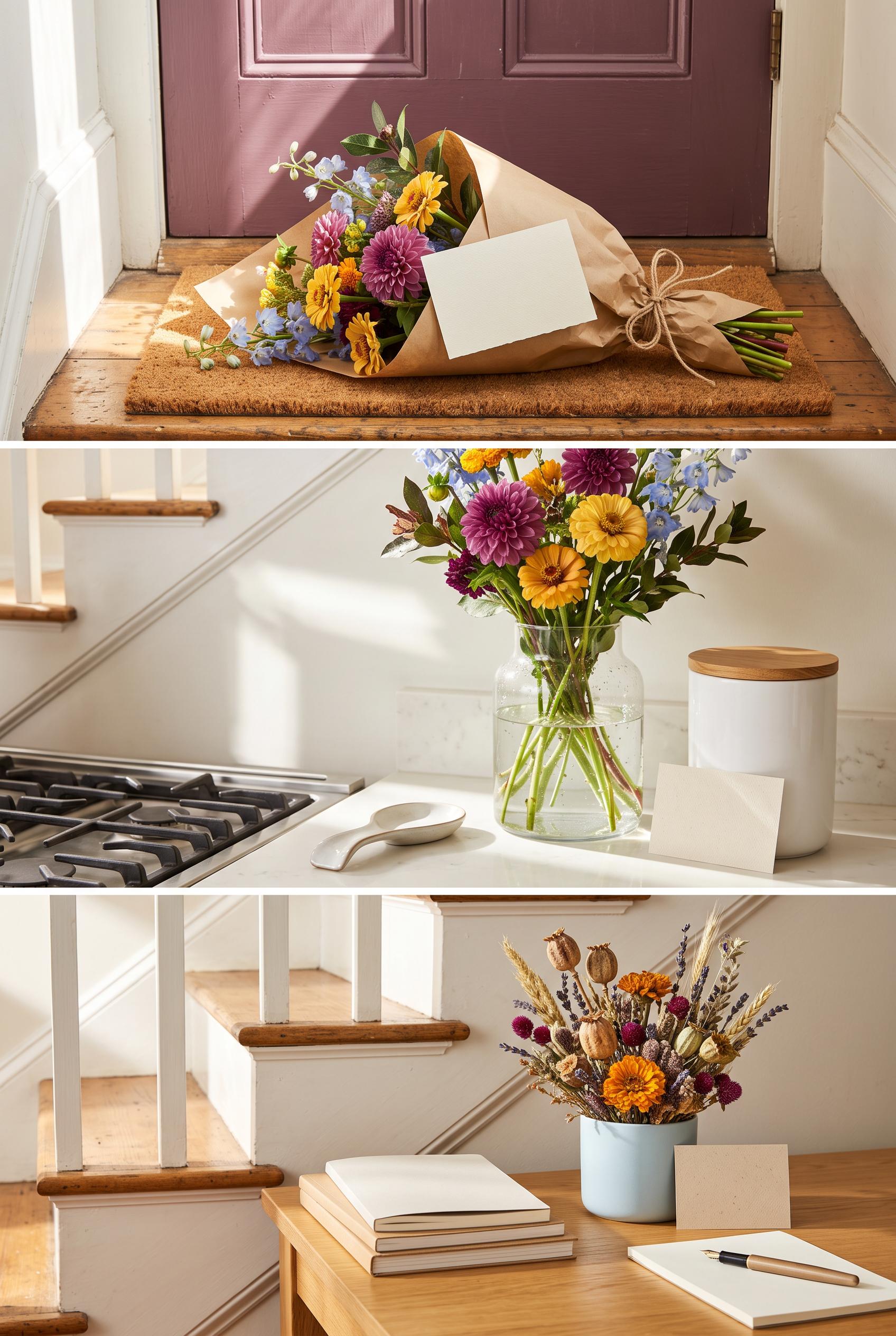
0AI-modified downstream, create a commercial-quality Pinterest showcase in a vertical 2:3 composition for an independent neighborhood flower subscription. Arrange three connected lifestyle vignettes along a sunlit staircase: a wrapped bouquet at a doorstep, fresh stems in a kitchen vase, and a small dried arrangement on a desk. Use plum, marigold, ice blue, and natural paper with tactile editorial styling. Add blank decorative cards and subtle visual rhythm, but no unintended readable text. No real brands, no trademarked characters, no watermark, no unintended readable text. Corrective regeneration attempt 3. Produce a materially revised image, not a near-duplicate of an earlier variant. Preserve the successful subject, palette, lighting, focal hierarchy, and commercial polish from the original brief while correcting every issue below. Mandatory corrective instructions from the most recent visual QA: Preserve the vertical 2:3 three-vignette staircase composition, warm sunlight, floral focal hierarchy, tactile editorial styling, and plum, marigold, ice-blue, and natural-paper palette. Remove or replace the jar labeled “SUGAR” in the middle vignette with a completely unmarked neutral container. Ensure every book, card, paper, container, background surface, and object is free of letters, words, numbers, logos, symbols, pseudo-handwriting, or text-like marks. Keep the three moments: wrapped doorstep bouquet, fresh stems in a vase, and dried desk arrangement. Do not add captions, labels, or extra objects. Observed defects from prior variants that must not recur: 1) The image is attractive and well-composed, but the middle vignette contains a card with visible small writing, violating the requirement for no unintended readable text and blank/抽 2) The three-panel staircase concept is clear, with strong floral focal points, warm sunlight, and no brands or watermark. 3) Attractive vertical three-vignette composition with strong floral focal points and warm editorial lighting. 4) The middle vignette contains clearly readable text, “SUGAR,” on the jar, violating the no-readable-text requirement. 5) The composition otherwise has no visible brands, watermark, or major generation artifacts. Render no letters, words, numbers, prices, headings, labels, contact details, logos, glyphs, or pseudo-text anywhere. Use only blank surfaces, clean geometric marks, and non-linguistic placeholder shapes. Do not add explanatory captions, before/after labels, interface copy, or extra objects that the brief did not request. When a corrective instruction conflicts with a decorative detail, prioritize the corrective instruction.
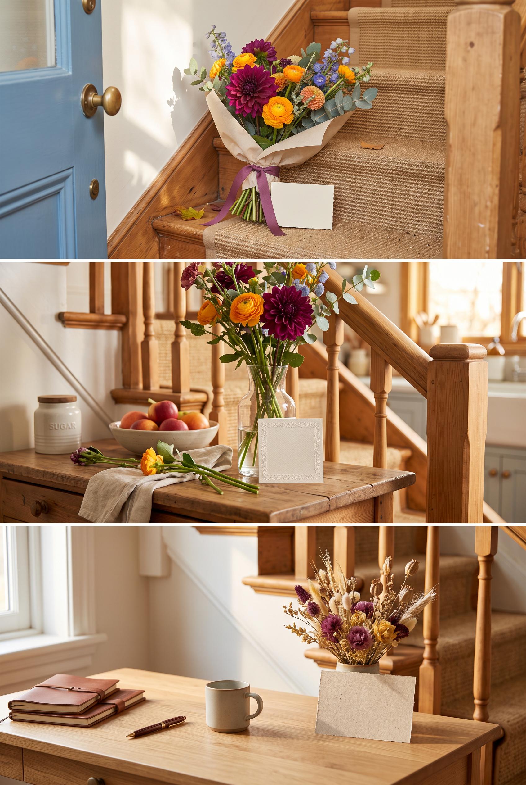 0
0AI-modified downstream, create a commercial-quality Pinterest showcase in a vertical 2:3 composition for an independent neighborhood flower subscription. Arrange three connected lifestyle vignettes along a sunlit staircase: a wrapped bouquet at a doorstep, fresh stems in a kitchen vase, and a small dried arrangement on a desk. Use plum, marigold, ice blue, and natural paper with tactile editorial styling. Add blank decorative cards and subtle visual rhythm, but no unintended readable text. No real brands, no trademarked characters, no watermark, no unintended readable text. Corrective regeneration attempt 2. Produce a materially revised image, not a near-duplicate of an earlier variant. Preserve the successful subject, palette, lighting, focal hierarchy, and commercial polish from the original brief while correcting every issue below. Mandatory corrective instructions from the most recent visual QA: Preserve the vertical 2:3 three-vignette staircase composition, warm sunlit editorial styling, flowers, plum/marigold/ice-blue palette, and blank decorative cards. Replace the small paper card beside the kitchen vase with a completely blank card containing no letters, words, symbols, lines, or pseudo-handwriting. Ensure every card and background surface is free of unintended readable or text-like marks. Observed defects from prior variants that must not recur: 1) The image is attractive and well-composed, but the middle vignette contains a card with visible small writing, violating the requirement for no unintended readable text and blank/抽 2) The three-panel staircase concept is clear, with strong floral focal points, warm sunlight, and no brands or watermark. Render no letters, words, numbers, prices, headings, labels, contact details, logos, glyphs, or pseudo-text anywhere. Use only blank surfaces, clean geometric marks, and non-linguistic placeholder shapes. Do not add explanatory captions, before/after labels, interface copy, or extra objects that the brief did not request. When a corrective instruction conflicts with a decorative detail, prioritize the corrective instruction.
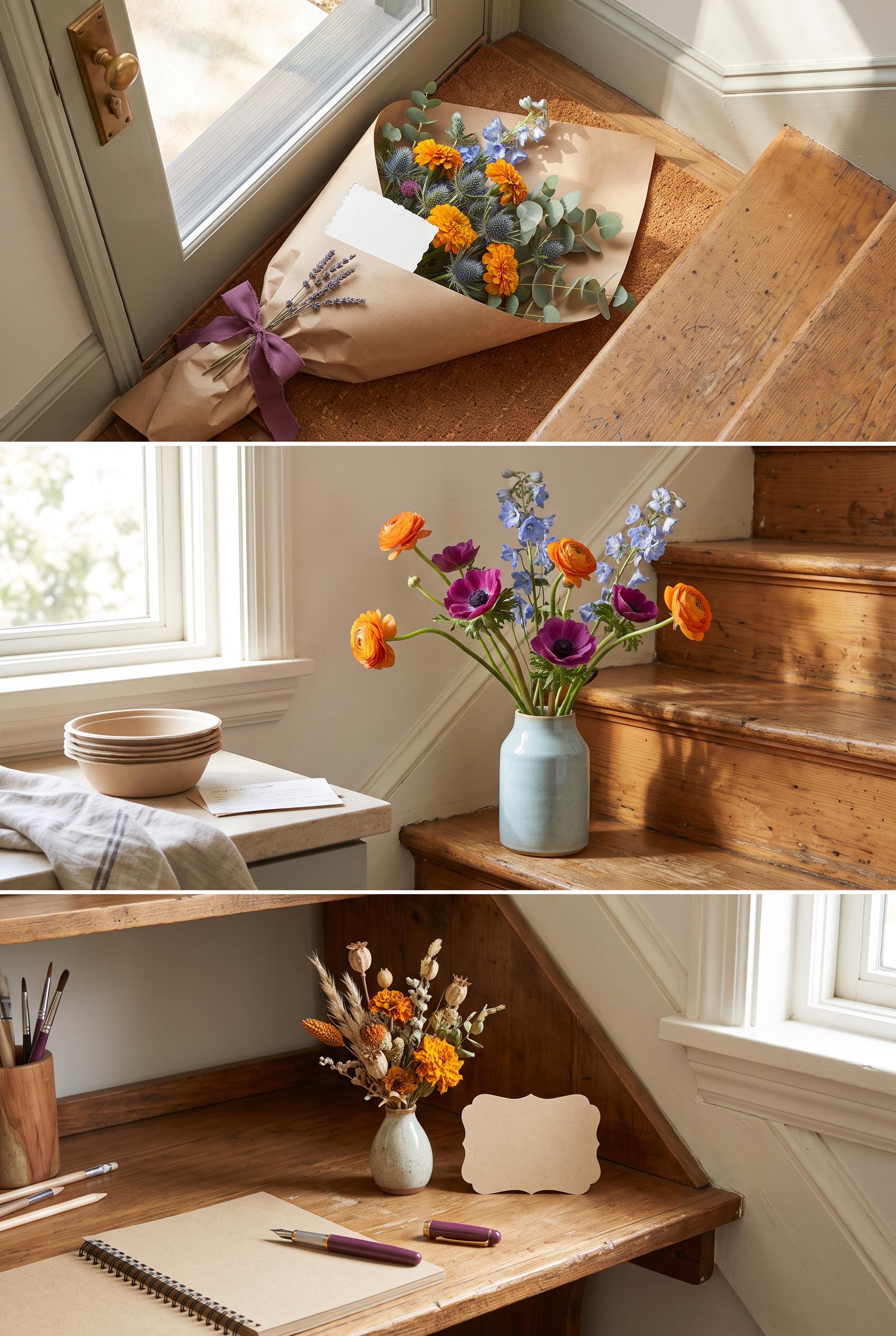 0
0AI-modified downstream, create a commercial-quality Pinterest showcase in a vertical 2:3 composition for an independent neighborhood flower subscription. Arrange three connected lifestyle vignettes along a sunlit staircase: a wrapped bouquet at a doorstep, fresh stems in a kitchen vase, and a small dried arrangement on a desk. Use plum, marigold, ice blue, and natural paper with tactile editorial styling. Add blank decorative cards and subtle visual rhythm, but no unintended readable text. No real brands, no trademarked characters, no watermark, no unintended readable text.
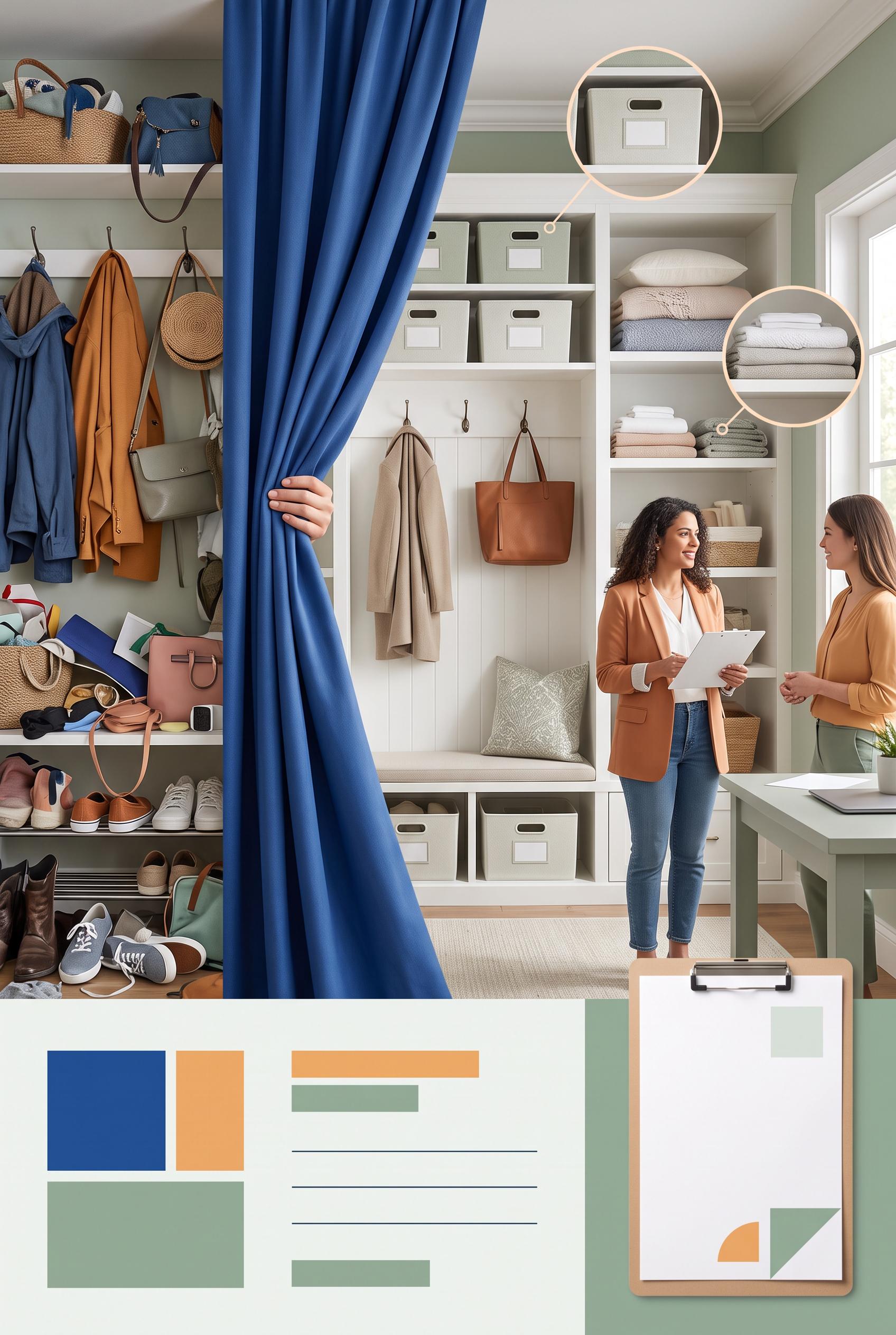 0
0AI-modified downstream, create a commercial-quality Pinterest graphic in a vertical 2:3 composition for an independent home organizer. Show a dramatic before-and-after transformation using a fabric curtain pull reveal: cluttered visual fragments on the left, calm organized entryway on the right, with small editorial detail circles for storage bins, folded linens, and a welcoming consultation moment. Use cobalt, apricot, sage, and soft white. Include minimal abstract label blocks with no unintended readable text. No real brands, no trademarked characters, no watermark, no unintended readable text. Corrective regeneration attempt 3. Produce a materially revised image, not a near-duplicate of an earlier variant. Preserve the successful subject, palette, lighting, focal hierarchy, and commercial polish from the original brief while correcting every issue below. Mandatory corrective instructions from the most recent visual QA: Preserve the attractive vertical 2:3 layout, cobalt curtain reveal, cluttered left side, calm organized entryway, circular detail insets, palette, lighting, and commercial polish. Remove every checkmark, checkbox, form-like symbol, icon, letter, number, glyph, pseudo-word, and interface-like mark from the lower booking panel and consultation clipboard. Replace the booking panel with only clean abstract geometric color blocks and simple non-directional lines, with no grid resembling a form. Replace the clipboard content with a completely blank sheet or purely subtle solid geometric shapes. Keep every storage-bin label as a completely blank unmarked panel. Do not add captions, labels, logos, watermarks, or any readable or pseudo-readable text anywhere. Observed defects from prior variants that must not recur: 1) The composition is attractive and clearly communicates a cluttered-to-organized entryway transformation, but the bin detail contains unintended readable garbled text (appearing as“ 2) Storage bants”); this violates the no-readable-text requirement. 3) Strong vertical composition and clear cluttered-to-organized transformation. 4) Visible checkmark-like glyphs and pseudo-interface marks appear in the lower booking panel and consultation inset, violating the requirement for no glyphs or readable/pseudo-text. 5) The clipboard contains line-and-checkmark symbols that resemble interface or form content rather than purely non-linguistic decoration. Render no letters, words, numbers, prices, headings, labels, contact details, logos, glyphs, or pseudo-text anywhere. Use only blank surfaces, clean geometric marks, and non-linguistic placeholder shapes. Do not add explanatory captions, before/after labels, interface copy, or extra objects that the brief did not request. When a corrective instruction conflicts with a decorative detail, prioritize the corrective instruction.
 0
0AI-modified downstream, create a commercial-quality Pinterest graphic in a vertical 2:3 composition for an independent home organizer. Show a dramatic before-and-after transformation using a fabric curtain pull reveal: cluttered visual fragments on the left, calm organized entryway on the right, with small editorial detail circles for storage bins, folded linens, and a welcoming consultation moment. Use cobalt, apricot, sage, and soft white. Include minimal abstract label blocks with no unintended readable text. No real brands, no trademarked characters, no watermark, no unintended readable text. Corrective regeneration attempt 2. Produce a materially revised image, not a near-duplicate of an earlier variant. Preserve the successful subject, palette, lighting, focal hierarchy, and commercial polish from the original brief while correcting every issue below. Mandatory corrective instructions from the most recent visual QA: Preserve the vertical 2:3 composition, strong curtain reveal, cobalt/apricot/sage palette, organized entryway, cluttered left side, and circular detail insets. Remove all readable text and lettering from the storage-bin labels and every other area of the image; replace labels with completely blank unmarked panels. Keep the abstract booking block as non-textual lines and shapes only. Ensure no watermark, logo, trademark, or garbled pseudo-words remain. Observed defects from prior variants that must not recur: 1) The composition is attractive and clearly communicates a cluttered-to-organized entryway transformation, but the bin detail contains unintended readable garbled text (appearing as“ 2) Storage bants”); this violates the no-readable-text requirement. Render no letters, words, numbers, prices, headings, labels, contact details, logos, glyphs, or pseudo-text anywhere. Use only blank surfaces, clean geometric marks, and non-linguistic placeholder shapes. Do not add explanatory captions, before/after labels, interface copy, or extra objects that the brief did not request. When a corrective instruction conflicts with a decorative detail, prioritize the corrective instruction.
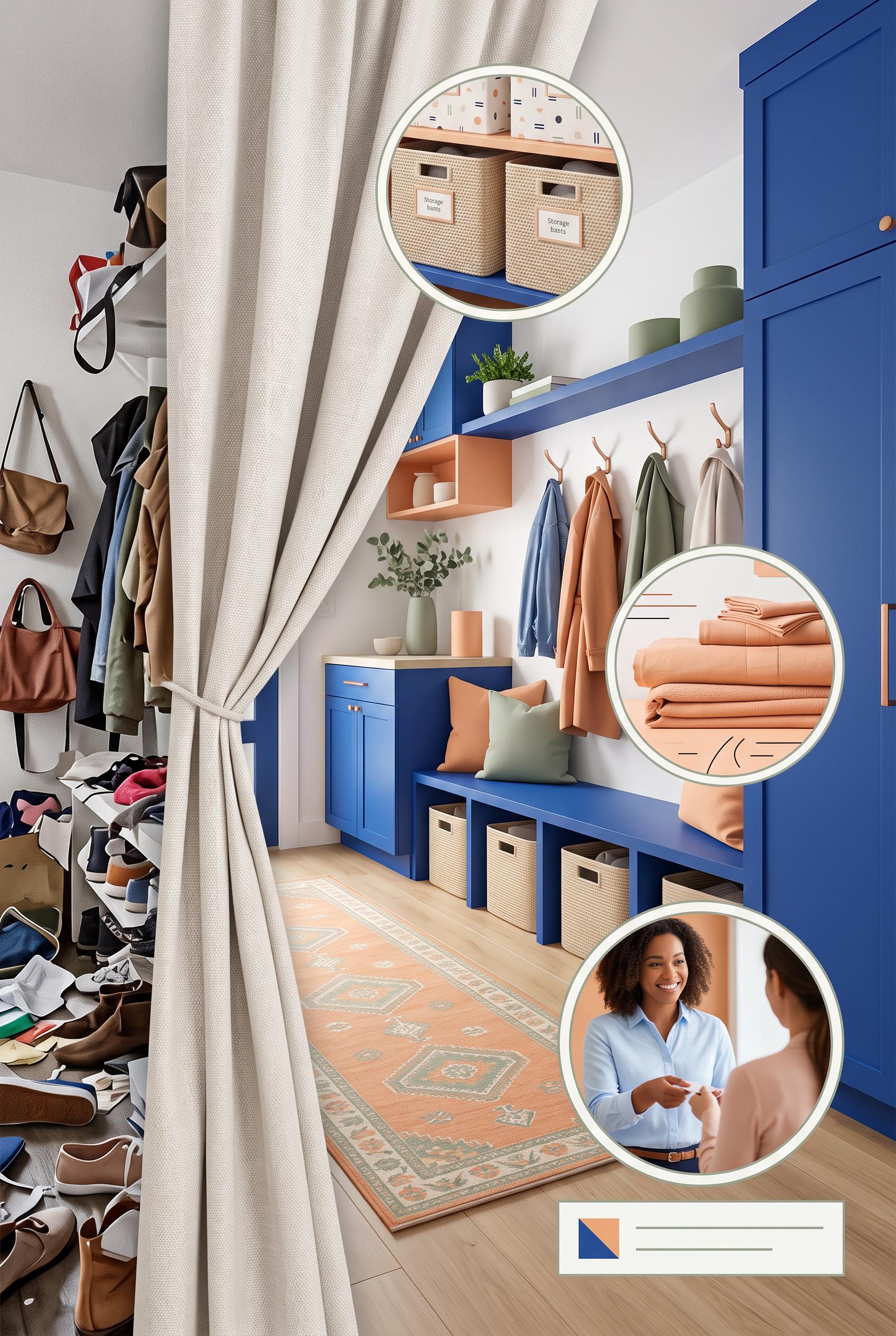 0
0AI-modified downstream, create a commercial-quality Pinterest graphic in a vertical 2:3 composition for an independent home organizer. Show a dramatic before-and-after transformation using a fabric curtain pull reveal: cluttered visual fragments on the left, calm organized entryway on the right, with small editorial detail circles for storage bins, folded linens, and a welcoming consultation moment. Use cobalt, apricot, sage, and soft white. Include minimal abstract label blocks with no unintended readable text. No real brands, no trademarked characters, no watermark, no unintended readable text.
 0
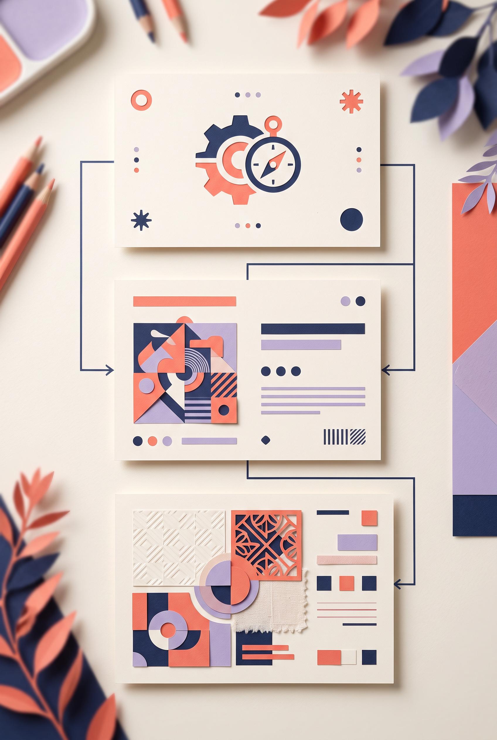
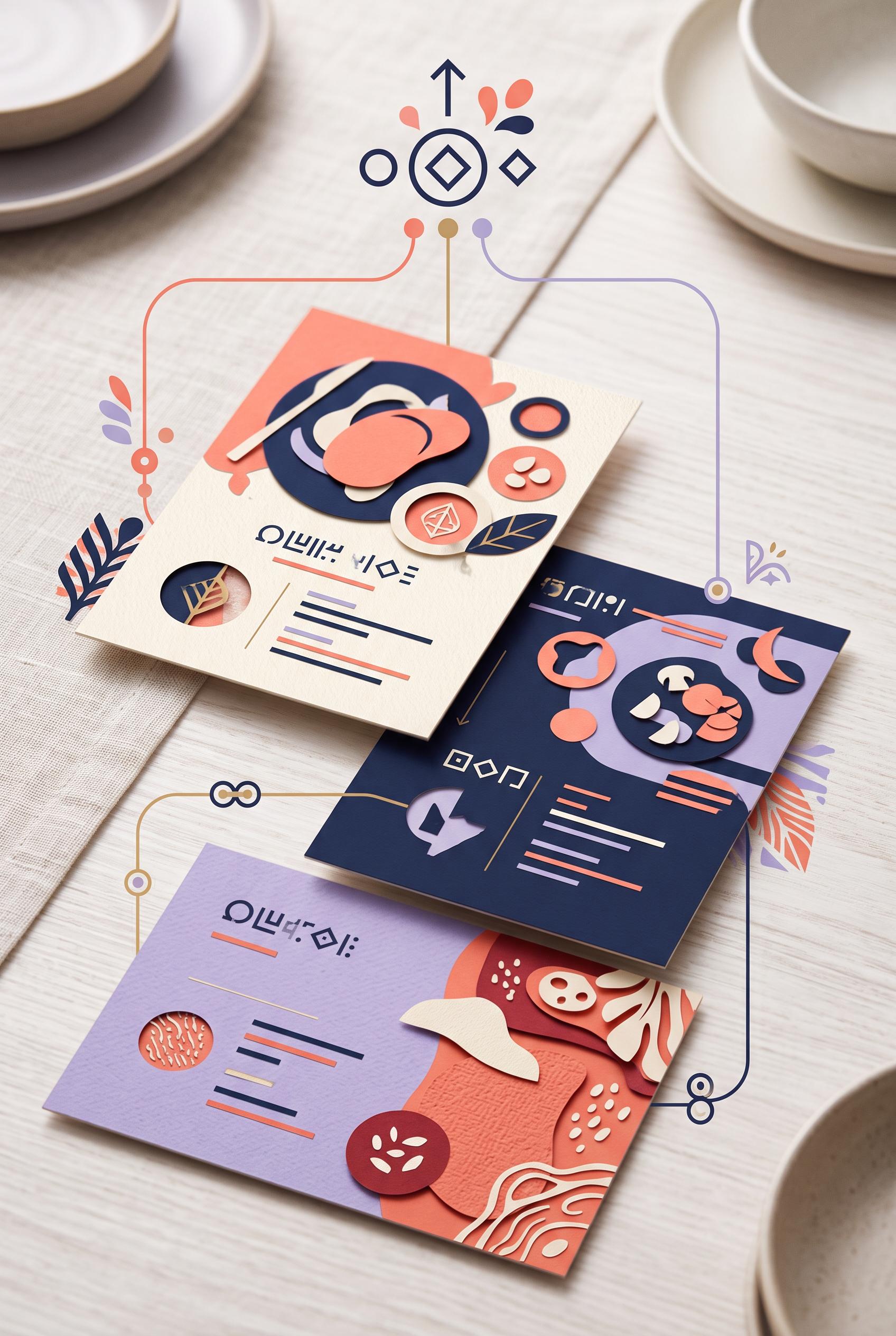
0Create an AI-modified downstream educational design in a vertical 2:3 Pinterest composition, commercial-quality art direction. Show three connected recipe cards arranged like a refined tabletop planning set, moving from a central message symbol to a focal-point card, a contrast card, and a texture card. Use coral, navy, lavender, and cream with paper layers, cut shapes, thin connector lines, and abstract placeholder glyphs only. No unintended readable text, no real brands, no trademarked characters, and no watermark. Corrective regeneration attempt 2. Produce a materially revised image, not a near-duplicate of an earlier variant. Preserve the successful subject, palette, lighting, focal hierarchy, and commercial polish from the original brief while correcting every issue below. Mandatory corrective instructions from the most recent visual QA: Preserve the vertical tabletop composition, coral/navy/lavender/cream palette, paper layers, three connected cards, icons, connector lines, shadows, and overall art direction. Remove every pseudo-letter, glyph string, and text-like mark from the cards and central symbol. Replace them only with clean abstract bars, dots, geometric marks, and simple non-letter icons; ensure no sequence resembles readable or garbled writing. Keep the three cards clearly differentiated as message/cover, contrast/quote, and texture/detail assets. Observed defects from prior variants that must not recur: 1) The composition is attractive, vertical, and clearly shows three connected cards, but the pseudo-text on all cards reads as garbled lettering, violating the requirement for no gar: Render no letters, words, numbers, prices, headings, labels, contact details, logos, glyphs, or pseudo-text anywhere. Use only blank surfaces, clean geometric marks, and non-linguistic placeholder shapes. Do not add explanatory captions, before/after labels, interface copy, or extra objects that the brief did not request. When a corrective instruction conflicts with a decorative detail, prioritize the corrective instruction.
 0
0Create an AI-modified downstream educational design in a vertical 2:3 Pinterest composition, commercial-quality art direction. Show three connected recipe cards arranged like a refined tabletop planning set, moving from a central message symbol to a focal-point card, a contrast card, and a texture card. Use coral, navy, lavender, and cream with paper layers, cut shapes, thin connector lines, and abstract placeholder glyphs only. No unintended readable text, no real brands, no trademarked characters, and no watermark.
 0
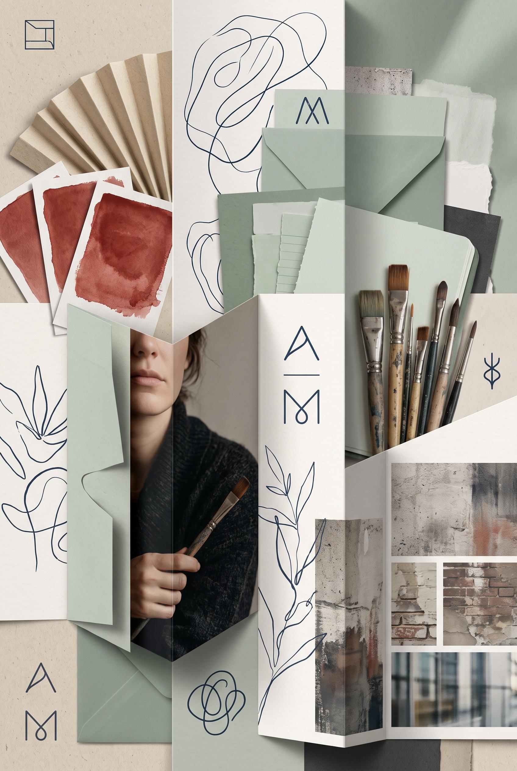
0Create an AI-modified downstream personal brand moodboard in a vertical 2:3 Pinterest composition, commercial-quality art direction. Arrange a fan-fold gallery of oat paper, mineral red paint swatches, celadon stationery, ink blue line drawings, a cropped creator portrait, brush tools, and abstract city textures. Include invented placeholder marks instead of readable words, with tactile shadows and refined editorial styling. No real brands, no trademarked characters, no watermark, and no unintended readable text.
 0
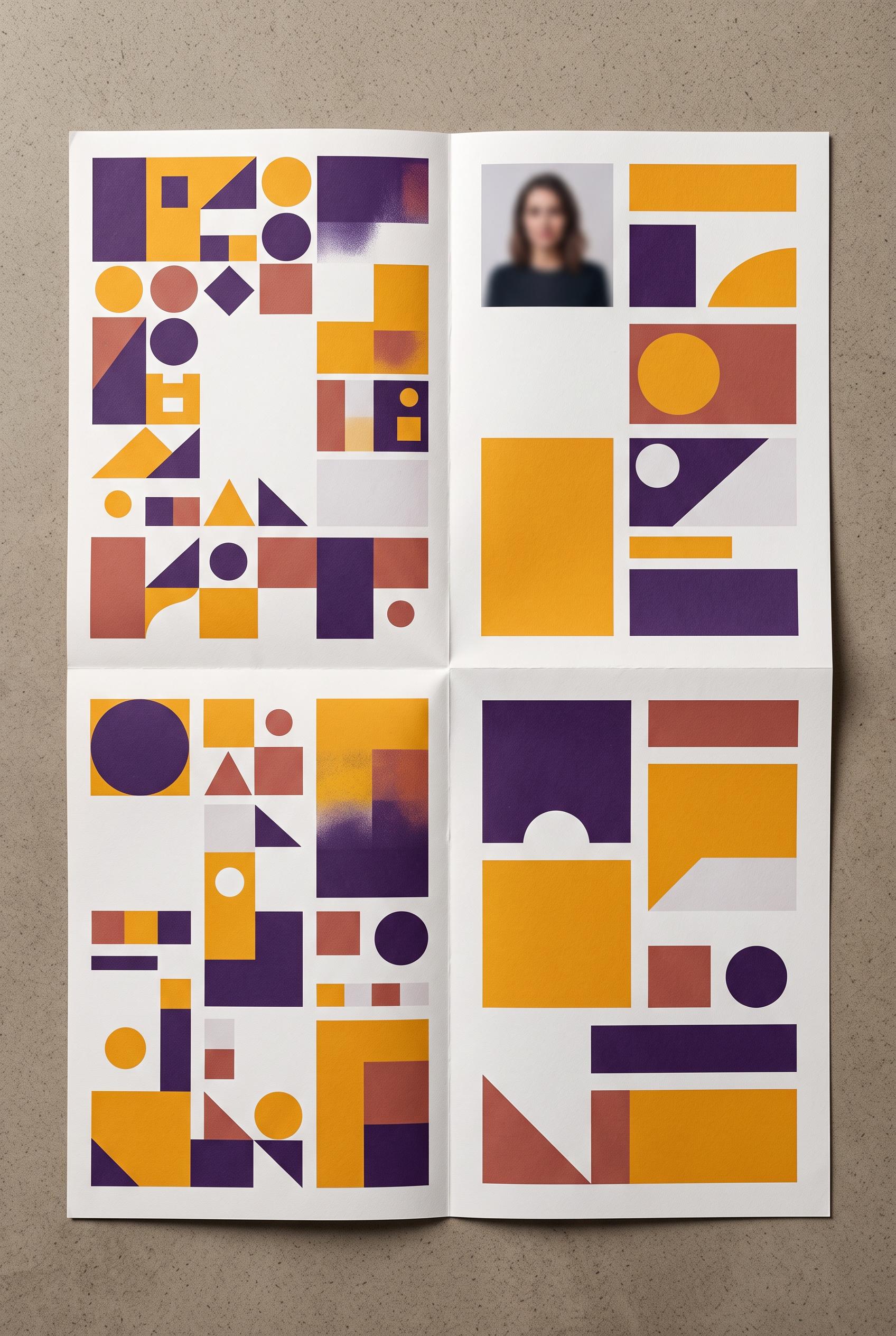
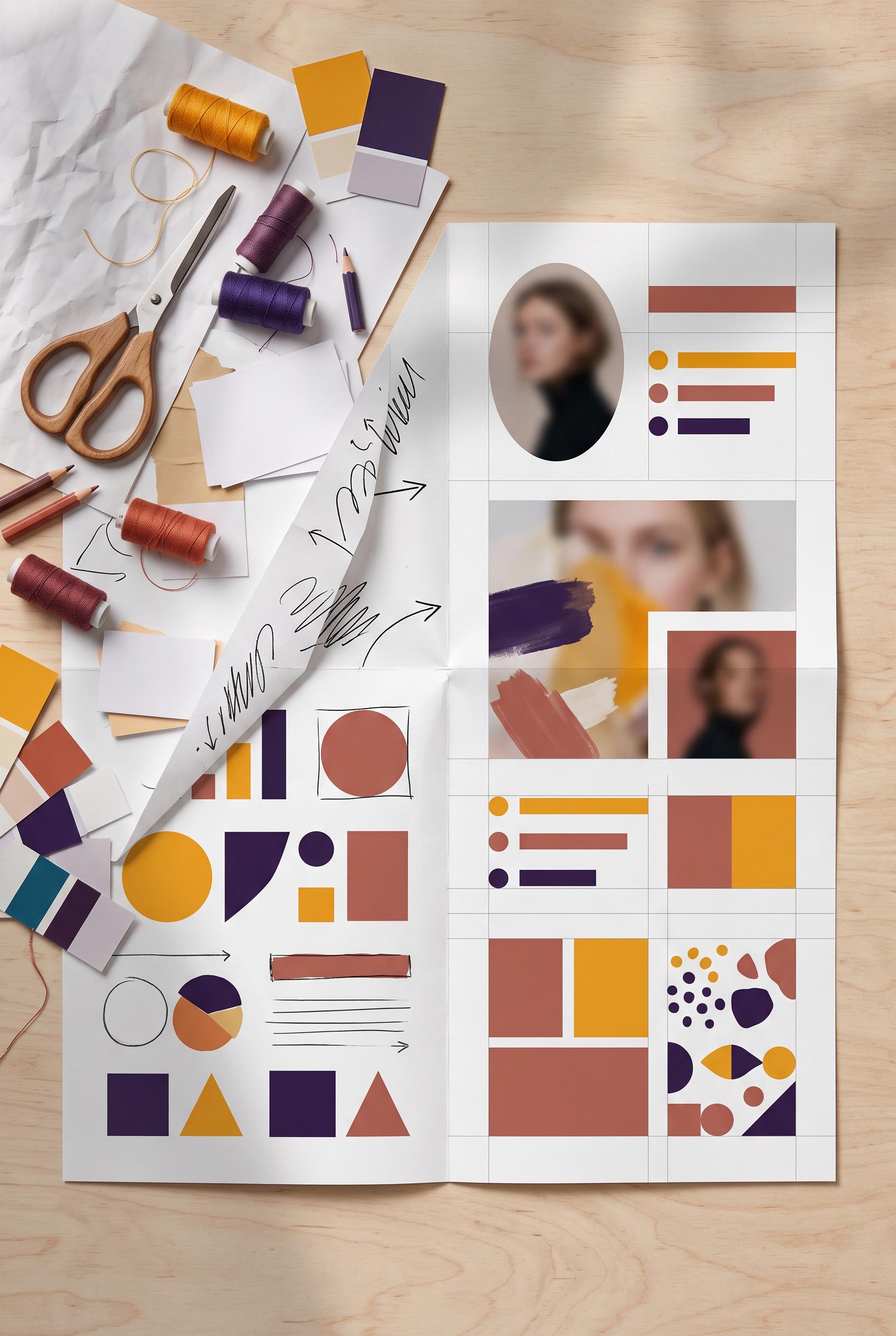
0Create an AI-modified downstream editorial design scene in a vertical 2:3 Pinterest composition, commercial-quality art direction. Show an overhead studio desk with a folded creator media kit transitioning from a cluttered page into a polished profile presentation, using marigold, deep violet, cloud white, and muted brick. Include tasteful paper textures, profile image placeholders, abstract geometric marks, alignment guides, and subtle hand shadows. Use only invented symbols and blurred placeholder lines, with no unintended readable text. No real brands, no trademarked characters, no watermark. Corrective regeneration attempt 5. Produce a materially revised image, not a near-duplicate of an earlier variant. Preserve the successful subject, palette, lighting, focal hierarchy, and commercial polish from the original brief while correcting every issue below. Mandatory corrective instructions from the most recent visual QA: Preserve the overhead vertical 2:3 desk composition, folded media kit, marigold/deep violet/muted brick palette, portraits, paper texture, lighting, shadows, and clear cluttered-to-refined progression. Remove every handwritten scribble, arrow, line stack, dot-list pattern, glyph-like mark, and text-like placeholder from both pages. Replace them only with clean, non-linguistic geometric blocks, circles, triangles, squares, abstract color fields, and blank paper areas. Ensure no letters, numbers, words, headings, labels, logos, icons, symbols resembling communication interfaces, pseudo-text, or recognizable social/contact marks appear anywhere. Keep the left side visually busier through varied geometric composition rather than writing, and keep the right side organized with one portrait area and abstract proof-point shapes. Do not add captions or explanatory labels. Observed defects from prior variants that must not recur: 1) The image violates the explicit requirement for no letters, numbers, logos, glyphs, or pseudo-text. 2) Strong vertical composition, palette, paper texture, and before/after hierarchy. 3) Many repeated horizontal bars and dot lists still function as pseudo-text or text placeholders, contrary to the explicit corrective instruction. 4) Hand-drawn scribbles and glyph-like marks remain on the cluttered page and can resemble writing. 5) The image is an attractive vertical composition with a clear cluttered-to-refined media-kit progression and strong palette, texture, and lighting. 6) It contains prominent handwritten-looking scribbles, pseudo-writing, arrows, horizontal line stacks, and list-like marks on the left page, violating the explicit requirement for no 7) letters, glyphs, or pseudo-text. 8) The dense marks undermine the intended refined hierarchy and create unintended readable-looking communication elements. Render no letters, words, numbers, prices, headings, labels, contact details, logos, glyphs, or pseudo-text anywhere. Use only blank surfaces, clean geometric marks, and non-linguistic placeholder shapes. Do not add explanatory captions, before/after labels, interface copy, or extra objects that the brief did not request. When a corrective instruction conflicts with a decorative detail, prioritize the corrective instruction.
 0
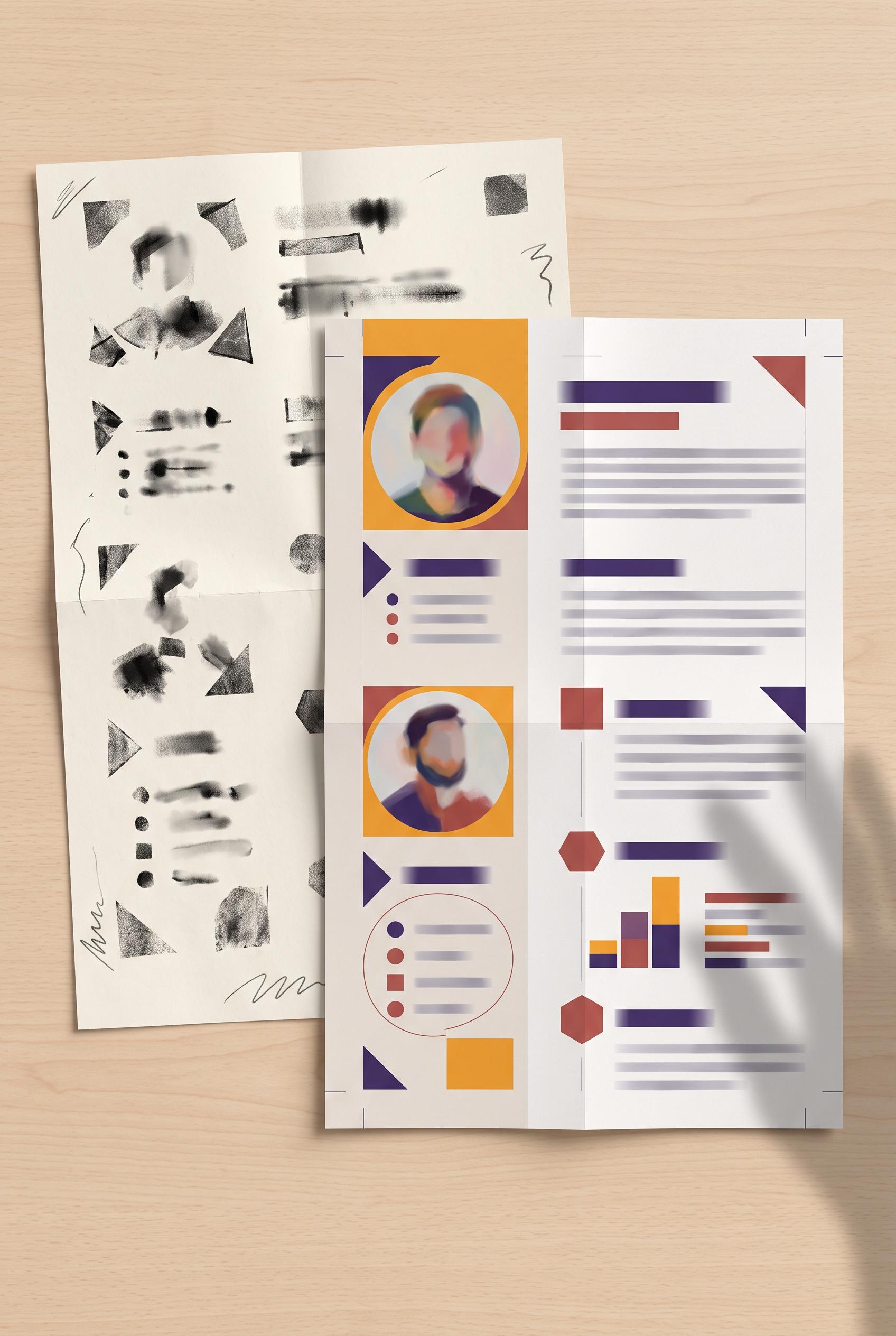
0Create an AI-modified downstream editorial design scene in a vertical 2:3 Pinterest composition, commercial-quality art direction. Show an overhead studio desk with a folded creator media kit transitioning from a cluttered page into a polished profile presentation, using marigold, deep violet, cloud white, and muted brick. Include tasteful paper textures, profile image placeholders, abstract geometric marks, alignment guides, and subtle hand shadows. Use only invented symbols and blurred placeholder lines, with no unintended readable text. No real brands, no trademarked characters, no watermark. Corrective regeneration attempt 4. Produce a materially revised image, not a near-duplicate of an earlier variant. Preserve the successful subject, palette, lighting, focal hierarchy, and commercial polish from the original brief while correcting every issue below. Mandatory corrective instructions from the most recent visual QA: Preserve the attractive overhead vertical 2:3 desk composition, folded media kit, marigold/deep violet/muted brick palette, portraits, paper texture, lighting, shadows, and clear cluttered-to-refined progression. Remove every text-like element: replace all horizontal line stacks, dot lists, blurred bars, scribbles, and glyph-like marks with blank areas or clearly non-linguistic geometric blocks, circles, triangles, and squares. Ensure no letters, numbers, words, pseudo-text, logos, icons, or recognizable communication symbols appear anywhere. Observed defects from prior variants that must not recur: 1) Clearly readable text such as “STATS” and “CONTACT” violates the no unintended readable text requirement. 2) Several glyph clusters and recognizable social/contact icons resemble text or brand-associated symbols. 3) Readable text “STATS” and “CONTACT” remains. 4) Recognizable social/contact icons are present, including Facebook, Instagram, chat, and phone-like symbols. 5) The image violates the explicit requirement for no letters, numbers, logos, glyphs, or pseudo-text. 6) Strong vertical composition, palette, paper texture, and before/after hierarchy. 7) Many repeated horizontal bars and dot lists still function as pseudo-text or text placeholders, contrary to the explicit corrective instruction. 8) Hand-drawn scribbles and glyph-like marks remain on the cluttered page and can resemble writing. Render no letters, words, numbers, prices, headings, labels, contact details, logos, glyphs, or pseudo-text anywhere. Use only blank surfaces, clean geometric marks, and non-linguistic placeholder shapes. Do not add explanatory captions, before/after labels, interface copy, or extra objects that the brief did not request. When a corrective instruction conflicts with a decorative detail, prioritize the corrective instruction.
 0
0Create an AI-modified downstream editorial design scene in a vertical 2:3 Pinterest composition, commercial-quality art direction. Show an overhead studio desk with a folded creator media kit transitioning from a cluttered page into a polished profile presentation, using marigold, deep violet, cloud white, and muted brick. Include tasteful paper textures, profile image placeholders, abstract geometric marks, alignment guides, and subtle hand shadows. Use only invented symbols and blurred placeholder lines, with no unintended readable text. No real brands, no trademarked characters, no watermark. Corrective regeneration attempt 3. Produce a materially revised image, not a near-duplicate of an earlier variant. Preserve the successful subject, palette, lighting, focal hierarchy, and commercial polish from the original brief while correcting every issue below. Mandatory corrective instructions from the most recent visual QA: Preserve the attractive vertical 2:3 overhead desk composition, folded before/after media kit, marigold/deep violet/brick palette, portraits, paper texture, hierarchy, lighting, and hand shadows. Remove every readable word, including “STATS” and “CONTACT,” and replace all text-like bars or glyph clusters with clearly non-linguistic blurred shapes or blank geometric blocks. Remove all recognizable social, messaging, email, phone, and platform icons, replacing them with generic circles, triangles, squares, or abstract geometric marks. Ensure absolutely no letters, numbers, logos, watermark, brand-associated iconography, pseudo-text, or glyph-like symbols appear anywhere. Observed defects from prior variants that must not recur: 1) Clearly readable text such as “STATS” and “CONTACT” violates the no unintended readable text requirement. 2) Several glyph clusters and recognizable social/contact icons resemble text or brand-associated symbols. 3) Readable text “STATS” and “CONTACT” remains. 4) Recognizable social/contact icons are present, including Facebook, Instagram, chat, and phone-like symbols. 5) The image violates the explicit requirement for no letters, numbers, logos, glyphs, or pseudo-text. Render no letters, words, numbers, prices, headings, labels, contact details, logos, glyphs, or pseudo-text anywhere. Use only blank surfaces, clean geometric marks, and non-linguistic placeholder shapes. Do not add explanatory captions, before/after labels, interface copy, or extra objects that the brief did not request. When a corrective instruction conflicts with a decorative detail, prioritize the corrective instruction.
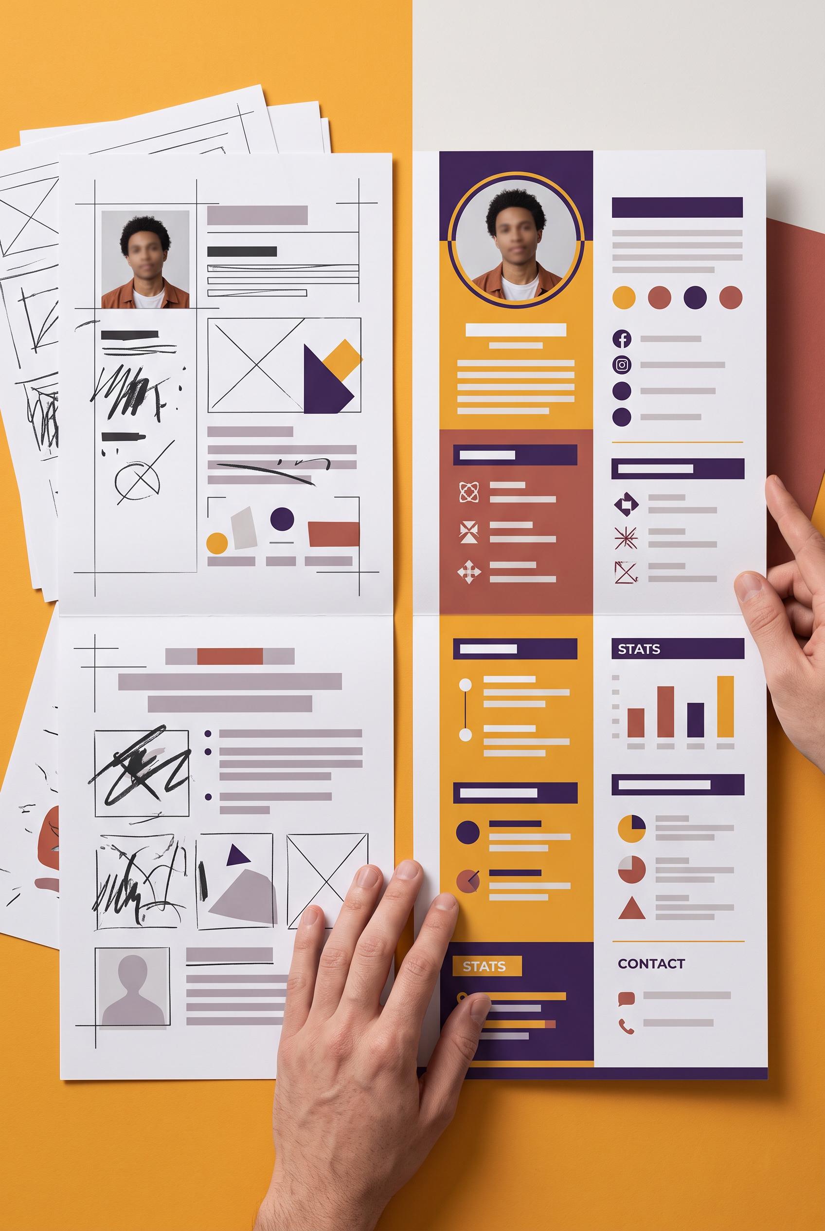 0
0Create an AI-modified downstream editorial design scene in a vertical 2:3 Pinterest composition, commercial-quality art direction. Show an overhead studio desk with a folded creator media kit transitioning from a cluttered page into a polished profile presentation, using marigold, deep violet, cloud white, and muted brick. Include tasteful paper textures, profile image placeholders, abstract geometric marks, alignment guides, and subtle hand shadows. Use only invented symbols and blurred placeholder lines, with no unintended readable text. No real brands, no trademarked characters, no watermark. Corrective regeneration attempt 2. Produce a materially revised image, not a near-duplicate of an earlier variant. Preserve the successful subject, palette, lighting, focal hierarchy, and commercial polish from the original brief while correcting every issue below. Mandatory corrective instructions from the most recent visual QA: Preserve the attractive vertical overhead desk composition, folded before/after media kit, paper texture, marigold/deep violet/brick palette, portraits, hierarchy, and hand shadows. Remove every readable word, including “STATS” and “CONTACT,” and replace all text-like glyph clusters with blurred non-readable placeholder bars or invented abstract marks. Replace recognizable social/contact icons with generic geometric symbols. Ensure no letters, numbers, logos, watermark, or brand-associated iconography remain anywhere in the image. Observed defects from prior variants that must not recur: 1) Clearly readable text such as “STATS” and “CONTACT” violates the no unintended readable text requirement. 2) Several glyph clusters and recognizable social/contact icons resemble text or brand-associated symbols. Render no letters, words, numbers, prices, headings, labels, contact details, logos, glyphs, or pseudo-text anywhere. Use only blank surfaces, clean geometric marks, and non-linguistic placeholder shapes. Do not add explanatory captions, before/after labels, interface copy, or extra objects that the brief did not request. When a corrective instruction conflicts with a decorative detail, prioritize the corrective instruction.
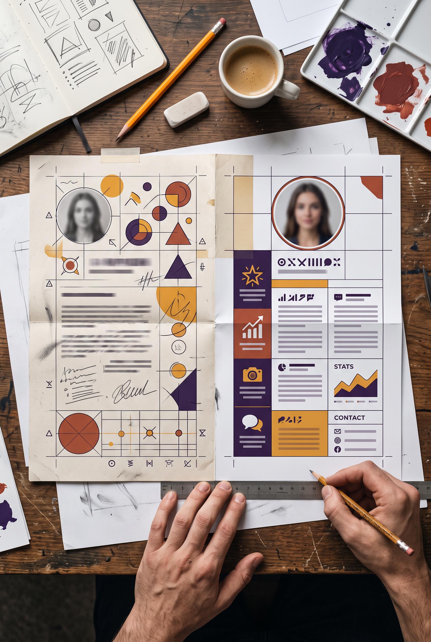 0
0Create an AI-modified downstream editorial design scene in a vertical 2:3 Pinterest composition, commercial-quality art direction. Show an overhead studio desk with a folded creator media kit transitioning from a cluttered page into a polished profile presentation, using marigold, deep violet, cloud white, and muted brick. Include tasteful paper textures, profile image placeholders, abstract geometric marks, alignment guides, and subtle hand shadows. Use only invented symbols and blurred placeholder lines, with no unintended readable text. No real brands, no trademarked characters, no watermark.
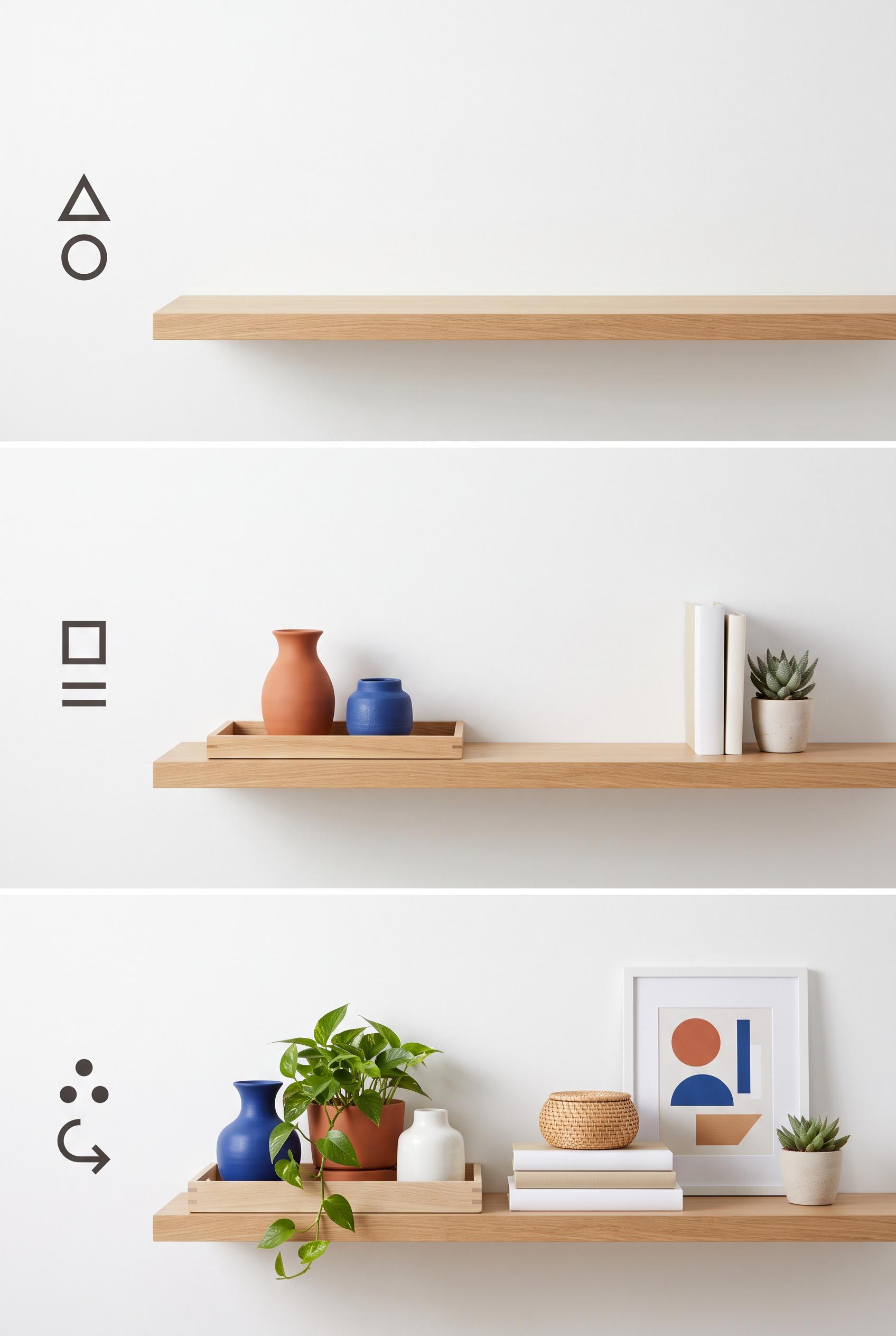 0
0Create a commercial-quality interior styling educational graphic in a vertical 2:3 Pinterest composition. Show three staged views of open shelves moving from empty to loosely arranged to balanced, using trays, pottery, blank-spine books, greenery, and framed abstract shapes. Use chalk white, terracotta, cobalt, and natural oak with overhead flat-lay framing and simple visual markers. AI-modified downstream. No real brands, no trademarked characters, no watermark, and no unintended readable text. Corrective regeneration attempt 3. Produce a materially revised image, not a near-duplicate of an earlier variant. Preserve the successful subject, palette, lighting, focal hierarchy, and commercial polish from the original brief while correcting every issue below. Mandatory corrective instructions from the most recent visual QA: Preserve the polished vertical 2:3 illustrated composition, oak shelves, chalk white/terracotta/cobalt palette, lighting, trays, pottery, blank-spine books, greenery, and framed abstract shapes. Make the top stage completely empty: remove the large circular object and leave only the bare oak shelf. Replace every left-side boxed marker and any other potentially glyph-like symbol with clearly non-linguistic abstract dots, short lines, arrows, circles, triangles, or geometric shapes that cannot resemble letters or numbers. Keep the middle stage loosely arranged and the bottom stage balanced. Render no letters, words, numbers, labels, pseudo-text, logos, watermarks, or trademark imagery. Observed defects from prior variants that must not recur: 1) The graphic is polished and clearly shows three styling stages, but it contains extensive readable headings, instructions, and labels despite the brief requiring non-readable marks 2) The left-side boxed markers visibly resemble the numbers 1, 2, and 3, violating the no-readable-numbers requirement. 3) The first stage is not empty because it contains a large circular object on the shelf. 4) The composition is polished and vertical with a clear three-stage progression, but these brief-critical defects prevent commercial-quality approval. Render no letters, words, numbers, prices, headings, labels, contact details, logos, glyphs, or pseudo-text anywhere. Use only blank surfaces, clean geometric marks, and non-linguistic placeholder shapes. Do not add explanatory captions, before/after labels, interface copy, or extra objects that the brief did not request. When a corrective instruction conflicts with a decorative detail, prioritize the corrective instruction.
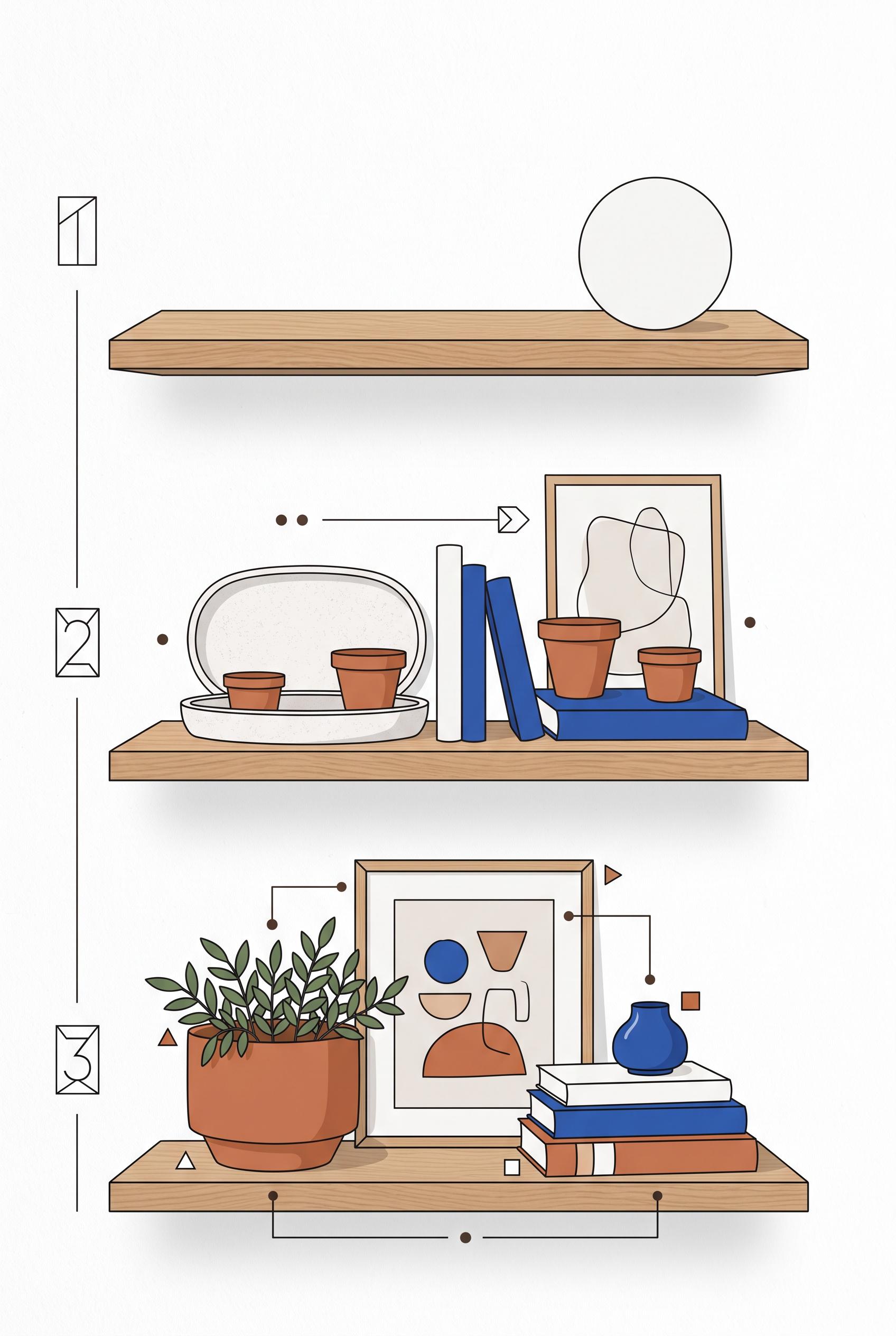 0
0Create a commercial-quality interior styling educational graphic in a vertical 2:3 Pinterest composition. Show three staged views of open shelves moving from empty to loosely arranged to balanced, using trays, pottery, blank-spine books, greenery, and framed abstract shapes. Use chalk white, terracotta, cobalt, and natural oak with overhead flat-lay framing and simple visual markers. AI-modified downstream. No real brands, no trademarked characters, no watermark, and no unintended readable text. Corrective regeneration attempt 2. Produce a materially revised image, not a near-duplicate of an earlier variant. Preserve the successful subject, palette, lighting, focal hierarchy, and commercial polish from the original brief while correcting every issue below. Mandatory corrective instructions from the most recent visual QA: Preserve the vertical 2:3 layout, clean illustrated style, oak shelves, pottery, trays, blank-spine books, greenery, framed abstract shapes, and chalk white/terracotta/cobalt palette. Remove every readable word, letter, number, heading, bullet caption, and pseudo-label. Replace all instructional text with simple non-readable dots, arrows, lines, and abstract geometric markers only. Keep the three-stage progression visually obvious: empty shelf, loosely arranged objects, then balanced arrangement. Ensure no watermark, brand marks, trademarked imagery, or garbled text. Observed defects from prior variants that must not recur: 1) The graphic is polished and clearly shows three styling stages, but it contains extensive readable headings, instructions, and labels despite the brief requiring non-readable marks Render no letters, words, numbers, prices, headings, labels, contact details, logos, glyphs, or pseudo-text anywhere. Use only blank surfaces, clean geometric marks, and non-linguistic placeholder shapes. Do not add explanatory captions, before/after labels, interface copy, or extra objects that the brief did not request. When a corrective instruction conflicts with a decorative detail, prioritize the corrective instruction.
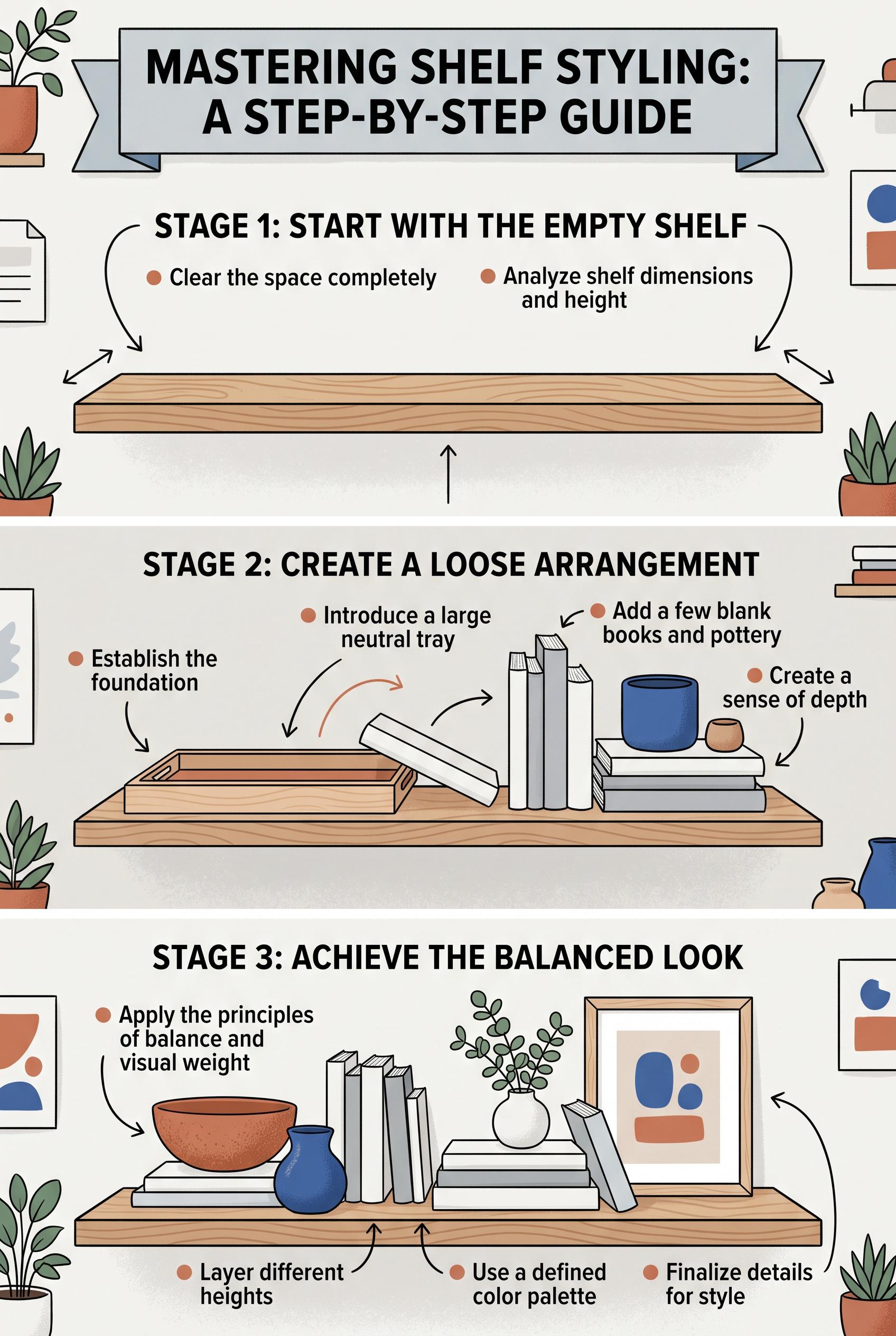 0
0Create a commercial-quality interior styling educational graphic in a vertical 2:3 Pinterest composition. Show three staged views of open shelves moving from empty to loosely arranged to balanced, using trays, pottery, blank-spine books, greenery, and framed abstract shapes. Use chalk white, terracotta, cobalt, and natural oak with overhead flat-lay framing and simple visual markers. AI-modified downstream. No real brands, no trademarked characters, no watermark, and no unintended readable text.
О нашей галерее AI изображений
Наша галерея AI изображений демонстрирует тысячи общих изображений, сгенерированных ИИ, созданных нашим сообществом. Каждое изображение уникально, высокого качества и представляет творческие возможности генерации искусства ИИ. Просматривайте различные стили, темы и сюжеты, чтобы вдохновиться для вашего следующего творческого проекта.
Почему стоит исследовать нашу галерею?
- Откройте для себя тысячи уникальных изображений, сгенерированных ИИ, в различных стилях и темах
- Вдохновляйтесь творческими подсказками и художественными стилями
- Просматривайте изображения, которыми поделилось наше творческое сообщество
- Нажмите на любое изображение, чтобы просмотреть его страницу общего доступа и получить больше деталей
Как использовать галерею
Использование нашей галереи просто и интуитивно:
- Просматривайте сетку общих изображений
- Нажмите на любое изображение, которое привлекло ваше внимание
- Просмотрите полные детали изображения и ссылку для общего доступа на специальной странице общего доступа
Готовы создать свои собственные AI изображения?
Присоединяйтесь к тысячам создателей, использующих AI Media Studio для генерации потрясающих изображений. Начните создавать сегодня!