In a crowded market, a physical or digital brochure still holds immense power, but only if it can capture attention in seconds. Generic, forgettable designs no longer make the cut. The key is to transform your brochure from a simple handout into an engaging brand experience that prompts action. This is where strategic and innovative brochure design ideas become essential marketing tools, not just informational pamphlets.
This guide moves beyond traditional layouts to explore ten modern concepts that leverage compelling aesthetics, interactive elements, and strategic storytelling. We will dissect each idea, providing specific guidance on visual styles, layout structures, typography choices, and effective color palettes. Consistency in your final output is crucial, especially when moving from screen to print. To ensure your brochures consistently reflect your brand's precise hues, dedicate effort to mastering color management in printing, a critical step for visual accuracy and brand integrity.
Whether you're a marketer needing to generate campaign visuals, a small business owner crafting promotional material, or a designer seeking fresh inspiration, you'll find actionable strategies here. We'll break down how to implement each concept, including practical tips for generating unique visuals and customizing templates. Get ready to explore designs that range from interactive PDFs and minimalist layouts with bold typography to infographic-heavy approaches and dynamic, motion-based digital brochures. Each idea is designed to help you create a memorable piece that truly connects with your audience and achieves its marketing goals.
1. Digital Interactive PDF Brochures
Move beyond static, printable documents with one of the most engaging brochure design ideas available today: the interactive PDF. This approach transforms a traditional brochure into a dynamic digital experience. By embedding clickable elements, you can guide readers to videos, websites, product demos, and even fillable forms without them ever leaving the document.
Interactive PDFs bridge the gap between a classic brochure and a mini-website. Imagine a potential customer opening your brochure and being able to click a button to watch an AI-generated video showcasing your product, or to directly access an interactive pricing calculator. This method is exceptionally effective for tech companies, SaaS businesses, and creative agencies looking to demonstrate complex services in a digestible, hands-on format.
Implementation and Best Practices
To create an interactive PDF, you'll use software like Adobe InDesign or Canva, which allow you to add hyperlinks, video embeds, and button actions to your design.
- Embed Multimedia Content: Instead of just describing a feature, show it. Embed a link to a short video tutorial or an animated GIF that demonstrates functionality. For example, you could showcase AI Media Studio's 50+ art styles through a clickable gallery.
- Simplify Navigation: Use clickable buttons for a table of contents, allowing users to jump directly to the sections that interest them most. This improves user experience and makes information more accessible.
- Create Direct Response Channels: Add form fields for lead capture or embed a direct
mailto:link for inquiries. Include clear calls-to-action (CTAs) like "Book a Demo" or "Start Your Free Trial" that link directly to the relevant landing page. - Test for Compatibility: Before distribution, rigorously test the PDF across various devices (desktops, tablets, phones) and PDF readers (Adobe Acrobat, web browsers) to ensure all interactive elements function correctly.
2. Minimalist Design with Bold Typography
Embrace the "less is more" philosophy with one of the most powerful brochure design ideas for modern brands: minimalist design paired with bold typography. This approach strips away unnecessary clutter, using generous whitespace, a limited color palette, and large, impactful headlines to create a sophisticated and focused message. It’s a design style that communicates confidence and clarity.
This technique is particularly effective for tech companies, SaaS platforms, and design-forward brands that want to convey elegance and efficiency, much like the branding seen from Apple or Notion. For a tool like AI Media Studio, a minimalist brochure allows the high-quality, AI-generated images to stand out as the heroes of the page, framed by clean lines and direct, powerful copy. The design itself reinforces a core message: simplicity and power.
Implementation and Best Practices
To execute a minimalist brochure, prioritize clarity and purpose in every element. The goal is to make a strong statement with fewer components, letting the content breathe.
- Make Typography the Centerpiece: Use a clean, sans-serif font like Helvetica, Montserrat, or Inter for your headlines. Make them large and impactful. A great headline could be as simple as: "Effortless Art. Instant Impact."
- Leverage Whitespace Strategically: Don't be afraid of empty space. Generous margins and spacing around text and images guide the reader’s eye and create a sense of calm and order, making your key messages more digestible.
- Feature High-Quality Visuals: A minimalist design relies on the strength of its imagery. Use a single, stunning image generated by AI Media Studio as the focal point for a panel or page. You can find inspiration and examples by exploring the Minimalist Style on ai-media-studio.com.
- Stick to a Limited Color Palette: Choose two or three brand colors at most. A monochrome scheme with a single accent color often works best, ensuring the typography and images command attention without being overshadowed.
- Focus on Core Messaging: With limited space for text, your copy must be concise and powerful. Highlight key differentiators like the free tier, commercial rights, or the "no credit card required" policy to remove friction and encourage action.
3. Visual Storytelling Through Image Sequences
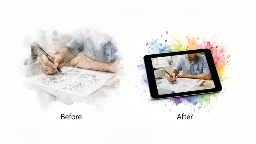
Show, don't just tell. This narrative-driven approach uses a carefully curated sequence of images to tell a story of transformation, making it one of the most compelling brochure design ideas for demonstrating value. Instead of listing features, you visually guide the reader through a "before and after" journey, illustrating how your product or service solves a problem and delivers a remarkable outcome.
This technique is powerful for tools like AI Media Studio, where the transformation from a simple idea to a professional-grade visual is the core value proposition. By showing this progression, you make the benefits tangible and relatable. This method resonates with audiences because it taps into the fundamental human desire for progress and improvement, mirroring the successful visual narratives used by brands like Adobe and Airbnb.
Implementation and Best Practices
To build a visual story, focus on a clear, sequential narrative that highlights a user's journey. Use design software to lay out the images in a logical flow, often across a multi-panel brochure like a trifold or z-fold.
- Create Persona-Based Journeys: Develop 5-7 distinct user stories (e.g., a marketer needing campaign visuals, a blogger creating article art, a small business owner designing an ad). This helps different segments of your audience see themselves in the story.
- Showcase the "How": Include the actual text prompts used to generate the "after" images with AI Media Studio. This demystifies the process and serves as a mini-tutorial, adding immense practical value.
- Quantify the Transformation: Add short, impactful copy highlighting the efficiency gains. For example, a caption could read: "From 8 hours of searching for stock photos to a unique, brand-aligned image in 30 seconds."
- Add Social Proof: Intersperse the visual sequence with short quotes or testimonials from users at each stage of their journey. For instance, "I went from concept to final art in minutes, not days."
4. Modular Card-Based Layout Design
Embrace flexibility and modern aesthetics with one of the most versatile brochure design ideas: the modular card-based layout. This design system organizes information into self-contained rectangular "cards" or tiles, arranged in a grid. Each card acts as a bite-sized package of information, showcasing a single product, feature, or benefit, making complex content easily digestible for the reader.
This approach, popularized by digital interfaces like Pinterest and Google’s Material Design, translates beautifully to both print and digital brochures. It’s perfect for businesses that need to present a variety of services, subscription tiers, or product features without overwhelming the audience. A real estate agency could use cards for different properties, while a SaaS company like AI Media Studio could dedicate cards to its 50+ unique art styles or pricing plans.
Implementation and Best Practices
To build a modular brochure, you'll need a strong grid system in your design software (like Adobe InDesign or Canva) to ensure alignment and consistency across all cards.
- Assign Each Card a Single Focus: Dedicate one card to one idea. For instance, create individual cards for key features like "Fast AI Generation," "Commercial Rights Included," and "No Credit Card Needed," each with a distinct icon and a brief description.
- Establish a Visual Hierarchy: Maintain a consistent structure within every card. Use the same font size for headers, body text, and calls-to-action across all cards to create a cohesive and professional look.
- Use Whitespace Strategically: A common mistake is cramming cards together. Ensure ample whitespace (at least 20-30% of the page) around each card to prevent the layout from feeling cluttered and to help each element stand on its own.
- Color-Code for Clarity: Assign specific colors to different categories of cards. For example, use blue for feature cards, green for use-case examples, and orange for pricing tiers. This visual cue helps readers navigate the information intuitively.
- Make Them Interactive: In a digital PDF, turn each card into a clickable element. A card showcasing a specific art style could link to a full gallery, while a pricing plan card could link directly to a signup page.
5. Infographic-Heavy Design Approach
Transform complex data and technical features into compelling visual stories with an infographic-heavy design. This is one of the most effective brochure design ideas for communicating intricate information quickly and memorably. Instead of relying on dense text, this approach uses charts, diagrams, icons, and data visualizations to make features and benefits instantly understandable and scannable for the reader.
This method is perfect for SaaS companies, financial services, and tech startups that need to explain processes, showcase results, or compare product tiers. Imagine a potential client understanding your AI's processing speed not through a paragraph of text, but through a dynamic timeline graphic comparing it to traditional methods. This visual-first strategy builds authority and makes your value proposition crystal clear.
Implementation and Best Practices
To succeed with an infographic-heavy design, focus on translating key data points and processes into clean, branded visuals. Software like Adobe Illustrator, Canva, and Visme are ideal for creating custom charts and diagrams.
- Visualize Key Processes: Use a flow chart to simplify complex workflows. For example, illustrate the journey from a simple text prompt to a finished image: Text Prompt → AI Processing → Image Output → One-Click Export. This makes an abstract process tangible.
- Use Icons and Symbols: Represent different user segments (marketers, creators, agencies) or feature categories with unique, consistently styled icons. This helps readers quickly find the information relevant to them.
- Create Comparison Graphics: Design a clear comparison table to showcase subscription tier benefits or a side-by-side graphic contrasting your solution with competitors. Use color-coding to highlight key differentiators.
- Showcase Variety Visually: Instead of listing 50+ art styles, create a vibrant style wheel or spectrum graphic. This turns a simple feature list into an engaging visual element that demonstrates the creative power of your tool.
6. Full-Bleed Image Design with Text Overlay
Create an immediate, powerful impression with one of the most visually stunning brochure design ideas: the full-bleed image. This technique involves using a single, high-impact photograph or graphic that extends to the very edges of the page, eliminating borders and creating a completely immersive visual field. By layering crisp, well-placed text over the image, you can convey your message with cinematic flair.
This bold, contemporary approach is perfect for brands that want to communicate quality, creativity, and confidence. It immediately captures attention and sets a premium tone, making it ideal for creative agency portfolios, modern fashion lookbooks, and SaaS companies showcasing a sleek user interface. The key is to let a powerful image do most of the talking, supported by concise, impactful typography.
Implementation and Best Practices
Achieving a professional full-bleed design requires a careful balance between the background image and the text overlay to ensure both impact and readability.
- Select High-Resolution Imagery: The image is the hero, so it must be flawless. Use AI Media Studio to generate ultra-high-quality, custom visuals that align perfectly with your brand. Explore the powerful results of AI-powered visuals and learn more about AI Media Studio’s photorealistic style.
- Ensure Text Legibility: Use strong contrast to make your text pop. Place light-colored text over darker areas of an image, or apply a subtle dark overlay (30-40% opacity) to the entire image to ensure your message is readable.
- Keep Copy Minimalist: A full-bleed design works best with minimal text. Focus on one powerful headline, a brief sub-heading, and a clear call-to-action per page or panel to avoid a cluttered look.
- Incorporate Strategic Negative Space: Use the "empty" areas of your image as natural placement for your text. A photo with a clear sky, a clean wall, or a simple foreground provides the perfect canvas for your message.
7. Sectioned/Tabbed Digital Brochures
Borrowing from the intuitive design of modern SaaS websites, this approach organizes your digital brochure into navigable sections or tabs. This is one of the most user-friendly brochure design ideas for complex products or services, as it allows prospects to jump directly to the information they need most, such as Features, Pricing, or Use Cases, without endless scrolling.
This structure transforms a linear document into an organized information hub, mirroring the user experience of a well-designed product page from companies like Notion or Figma. It's perfect for digital distribution where audience segments have different priorities. A developer might head straight for the "How It Works" section, while a marketing manager could start with "Testimonials" or "Use Cases." This self-guided exploration makes your content more relevant and engaging.
Implementation and Best Practices
To create a tabbed digital brochure, you can use interactive PDF features in Adobe InDesign or build it as a simple, self-contained webpage or digital flipbook.
- Establish Clear Sections: Organize your content into logical, self-explanatory tabs. Consider primary sections like 'Quick Start,' '50+ Art Styles,' 'Use Cases,' 'Pricing & Plans,' and 'FAQ' to cover the entire customer journey.
- Use Collapsible Subsections: Under broader topics like 'Use Cases,' add expandable subsections for different audiences (e.g., 'For Marketers,' 'For Educators,' 'For Creators'). This keeps the main navigation clean while providing deep-dive information.
- Make Information Actionable: Embed a filterable gallery in your 'Art Styles' section to let users explore different visual outputs. In the 'Pricing' tab, ensure plan features are easily comparable and include direct signup links for each tier.
- Guide the User: Implement simple navigation aids like breadcrumbs so users can easily backtrack without getting lost. Ensure each section has a clear, relevant call-to-action (CTA) that encourages the next step, like "Explore Styles" or "Choose Your Plan."
8. Audience-Segmented Brochure Variants
Instead of a one-size-fits-all approach, tailor your message with one of the most strategic brochure design ideas: creating variants for different audience segments. This involves developing multiple versions of a core brochure, each customized with language, imagery, and calls-to-action that resonate directly with a specific user group, such as marketers, educators, or small business owners.
This personalization strategy significantly boosts relevance and engagement. A marketer, for instance, is interested in campaign scalability and commercial rights, while an educator cares more about creative learning tools and affordability. By speaking their language and highlighting the benefits most important to them, you transform a generic marketing piece into a compelling, personalized solution. This method is highly effective for SaaS companies and service providers like HubSpot or Adobe, who cater to diverse professional audiences.
Implementation and Best Practices
Start by defining your key audience segments. Then, use a master design template to efficiently create customized versions for each group.
- Customize Content for Each Segment: Adjust copy, case studies, and visuals to align with each audience's needs. For marketers, emphasize batch generation and A/B testing visuals. For agencies, feature collaboration tools and white-labeling options. For educators, focus on student projects and classroom-friendly features.
- Use Segment-Specific Language: Speak your audience's language. Use terms like "boost engagement" and "increase conversions" for marketers, while using "inspire creativity" and "enhance learning" for educators.
- Tailor Calls-to-Action (CTAs): Your CTA should align with the segment's typical customer journey. An agency might respond to a "Schedule a Team Demo" CTA, whereas a freelancer might prefer "Start Your 7-Day Free Trial."
- Maintain Brand Consistency: While the content will vary, ensure that core branding elements like your logo, primary color palette, and typography remain consistent across all variants to maintain a unified brand identity.
9. Animated GIF and Motion-Based Digital Brochures
Elevate your digital presence by incorporating animated GIFs and micro-animations, one of the most dynamic brochure design ideas for capturing attention. This approach uses motion graphics to breathe life into static content, making complex information easier to understand and far more memorable. It is ideal for demonstrating processes, showcasing product variety, and creating highly shareable marketing assets.
This motion-based format transforms a simple brochure into a vibrant, engaging experience, similar to what you might see in Slack's feature demonstrations or Figma's animated showcases. For a tool like AI Media Studio, an animated GIF can visually narrate the entire image generation process, from a text prompt input to the final stunning artwork, all in a few seconds. This method is incredibly effective for tech startups, SaaS companies, and digital agencies wanting to present their offerings in a modern, compelling way.
Implementation and Best Practices
To integrate motion, you can use design tools like Canva, Adobe After Effects, or even specialized GIF creators. The goal is to add meaningful movement that enhances the message, not distracts from it.
- Demonstrate a Process: Create a short, looping GIF that shows a process from start to finish. For example, illustrate a prompt being typed, followed by an "AI processing" animation, and concluding with the final generated image.
- Showcase Variety with Motion: Instead of a static grid, use an animated carousel to cycle through different art styles, product features, or portfolio pieces. This adds a sense of discovery and keeps the viewer engaged.
- Guide the User's Eye: Use subtle animations, like a pulsating button or a gently bouncing arrow, to draw attention to your most important calls-to-action (CTAs). Motion naturally attracts the human eye and can significantly increase click-through rates.
- Optimize for Performance: Ensure your GIFs and animations are optimized for the web to prevent slow loading times, which can harm the user experience. Compress files without sacrificing too much quality and consider a full video for more complex animations. For a deeper dive into motion content, you can explore creating short videos using a free AI video generator.
10. Portfolio/Case Study Showcase Format
Transform your brochure into a powerful proof of capability with a portfolio or case study showcase. This is one of the most effective brochure design ideas for demonstrating tangible results and creative prowess, especially for service-based businesses like creative agencies or SaaS companies. Instead of just describing what you do, you show it through compelling visual evidence and narrative-driven success stories.
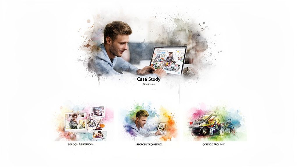
This format works brilliantly for a tool like AI Media Studio. Each page or spread can function as a mini-case study, detailing a client’s problem and demonstrating how the AI tool provided a fast, high-quality solution. By presenting a "before and after" or "prompt-to-result" story, you make the value of your service undeniable and inspire confidence in potential customers. It’s a direct, evidence-based approach that builds trust and highlights versatility.
Implementation and Best Practices
To create a compelling portfolio brochure, focus on telling a clear story for each project you feature. The design should be clean, allowing the work itself to be the hero.
- Structure Each Case Study: For each featured project, include key details like the initial prompt, the art style used, the final AI-generated image, and its real-world application (e.g., social media ad, book cover). This provides a transparent look into the creative process.
- Narrate the Problem and Solution: Frame each example with a short narrative. For instance, "A marketing director needed 50 unique product mockups in 24 hours." Follow this with the solution: "AI Media Studio generated them in under 10 minutes using the Photorealistic style."
- Showcase Diversity: Select a range of 10-15 diverse examples that highlight different art styles and use cases, from marketing content and blog illustrations to merchandise designs. This demonstrates the platform’s broad capabilities.
- Incorporate Social Proof: Add legitimacy by including a brief user quote or testimonial alongside a relevant case study. Pair a customer’s praise with the exact visual they created for maximum impact. A QR code linking to a full gallery or a live example can also provide deeper engagement.
10-Point Brochure Design Comparison
| Design Option | Complexity 🔄 | Resources 💡 | Expected Outcomes 📊 | Ideal Use Cases ⚡ | Key Advantages ⭐ |
|---|---|---|---|---|---|
| Digital Interactive PDF Brochures | High — interactive authoring, cross-reader testing | Specialized design tools, video assets, larger file sizes | High engagement and trackable interactions; richer demos | Sales decks, feature demos, lead capture campaigns | Integrates multimedia and forms for measurable conversions |
| Minimalist Design with Bold Typography | Low–Medium — precise typography and spacing | Modest design resources; strong images required | Clear messaging; high readability across formats | Brand positioning, product one-pagers, print & digital | Clean, modern look that highlights generated images |
| Visual Storytelling Through Image Sequences | High — narrative planning and cohesive sequencing | Extensive visual assets and editing time | Memorable, emotional impact; demonstrates transformation | Case-driven marketing, onboarding stories, social campaigns | Shows before/after value and builds user empathy |
| Modular Card-Based Layout Design | Medium — systems design and hierarchy planning | Reusable components, many example images | Flexible, scalable presentations; easy updates | Style galleries, responsive digital brochures, comparisons | Highly adaptable; easy to repurpose content |
| Infographic-Heavy Design Approach | High — data visualization expertise needed | Skilled designers, accurate data, chart assets | Makes complex info digestible; increases credibility | Technical explanations, product features, reports | Clarifies processes and metrics for analytical audiences |
| Full-Bleed Image Design with Text Overlay | Medium — requires high-quality imagery and legibility testing | Very high-res images, careful contrast/overlay work | Strong visual impact; immediate demonstration of image quality | Hero spreads, social shares, premium positioning | Visually striking; showcases AI output prominently |
| Sectioned/Tabbed Digital Brochures | High — interactive navigation and content structuring | Development for digital interactions; analytics setup | Fast discovery of relevant info; improved UX metrics | Comprehensive product guides, FAQ-rich materials | Allows audience self-navigation and targeted content access |
| Audience-Segmented Brochure Variants | Medium–High — multiple versions to produce and manage | Content localization, targeted imagery, workflows | Higher relevance and conversion per segment | Segment-focused campaigns (marketing, education, agencies) | Personalized messaging that improves engagement and ROI |
| Animated GIF & Motion-Based Brochures | High — motion design and optimization skills required | Animation assets, larger files; web optimization | Highly attention-grabbing; increases time-on-page & shares | Social media, feature teasers, demo highlights | Demonstrates speed/process dynamically; very shareable |
| Portfolio / Case Study Showcase Format | Medium — curation and narrative writing effort | Curated images, permissions, concise copy | Strong social proof; persuasive real-world results | Creative audiences, sales enablement, inspiration galleries | Provides concrete examples and usage context that build trust |
Start Creating Your Next Great Brochure Today
You've just explored a wide spectrum of modern and effective brochure design ideas, each offering a unique pathway to capture attention and deliver your message with impact. From the immersive experience of a Digital Interactive PDF to the clean, powerful statement of a Minimalist Design with Bold Typography, the possibilities are vast. We've seen how Visual Storytelling can create an emotional connection, how Infographic-Heavy designs can establish authority, and how Animated GIFs can bring a digital brochure to life. The core takeaway is clear: the one-size-fits-all brochure is a relic of the past. Today’s most successful marketing materials are strategic, audience-focused, and creatively executed.
The journey from concept to creation involves more than just picking a template. It's about aligning your chosen design with your core business objectives. Are you trying to generate leads, educate customers, or showcase a complex project? Your answer will guide you toward the most effective format. A Portfolio Showcase is perfect for a creative agency demonstrating its prowess, while an Audience-Segmented approach allows a real estate firm to speak directly to first-time homebuyers and luxury investors with tailored messaging. The key is to think of your brochure not as a static document, but as an active participant in your customer's journey.
Turning Inspiration into Action
Now is the time to bridge the gap between inspiration and implementation. The most impactful brochure design ideas are those that are executed flawlessly, and this often comes down to the details. Remember that a successful design is a harmonious blend of several key elements:
- Layout and Structure: Your layout dictates the flow of information. Whether you choose a Modular Card-Based design for easy scanning or a Sectioned/Tabbed digital format for deep dives into specific topics, the structure must be intuitive and guide the reader's eye effortlessly from one point to the next.
- Visuals and Imagery: High-quality, relevant imagery is non-negotiable. Full-Bleed Image designs rely on stunning photography to make an immediate impression, while even the most minimalist layouts are elevated by a single, powerful visual. The quality of your images directly reflects the quality of your brand.
- Typography and Copy: Your words bring the design to life. The font choices, text hierarchy, and message itself must be clear, concise, and compelling. A strong call-to-action is the final, crucial step that transforms a reader into a customer.
For those creating physical brochures, the tactile experience is just as important as the visual one. The texture, thickness, and finish of the paper you choose can profoundly affect how your brand is perceived. A flimsy, standard paper might work for a quick handout, but a premium project deserves a stock that feels substantial and luxurious in the reader’s hands. To make an informed decision, you can consult our comprehensive guide to paper weight, which breaks down the different options and their best use cases.
Ultimately, the best brochure design ideas are the ones that feel authentic to your brand and resonate deeply with your target audience. Don't be afraid to experiment, combine elements from different concepts, and create something truly unique. The goal is not just to inform, but to inspire, engage, and persuade. With these strategies and tools at your disposal, you are fully equipped to design a brochure that doesn't just get noticed, it gets results.
Ready to bring your visionary brochure design ideas to life with stunning, custom visuals? With ai-media-studio, you can instantly generate unlimited professional-grade images, illustrations, and icons in over 50 artistic styles, perfectly matching any concept you choose. Stop searching for stock photos and start creating the exact visuals you need at ai-media-studio.