Галерея AI изображений
Откройте для себя 1696+ общих изображений, сгенерированных ИИ, от нашего творческого сообщества
Все общие изображения
Показано 48 из 1696 общих изображений
 0
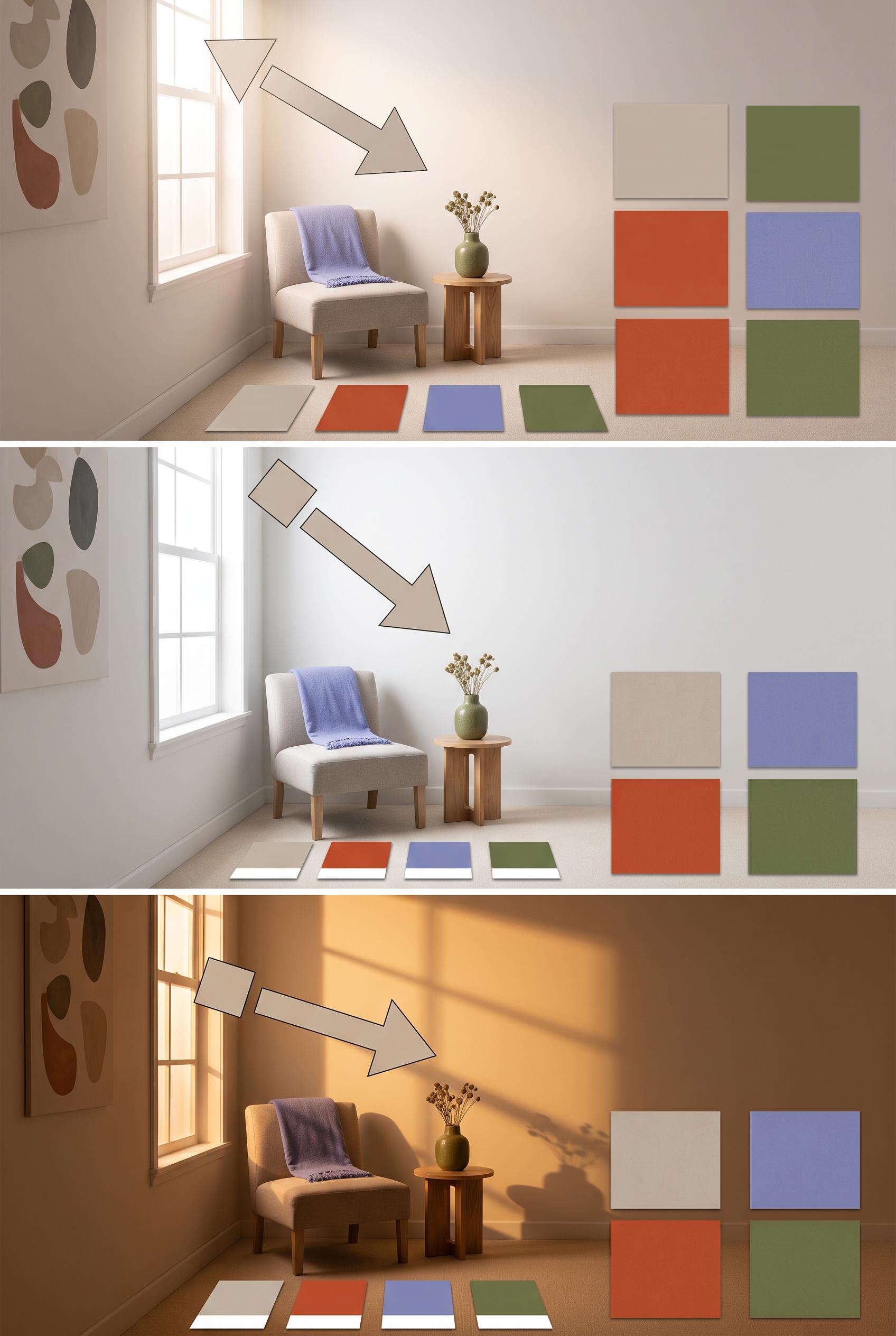
0Create a commercial-quality educational interior styling graphic in a vertical 2:3 Pinterest composition with three vertically stacked panels showing the same compact room in morning, midday, and evening light. Include blank color sample cards, fabric squares, a small chair, and a side table, with visual arrows made from simple shapes but no readable text. Palette of stone, paprika, periwinkle, and moss. AI-modified downstream. No real brands, no trademarked characters, no watermark, and no unintended readable text. Corrective regeneration attempt 4. Produce a materially revised image, not a near-duplicate of an earlier variant. Preserve the successful subject, palette, lighting, focal hierarchy, and commercial polish from the original brief while correcting every issue below. Mandatory corrective instructions from the most recent visual QA: Preserve the polished vertical 2:3 three-panel room composition, consistent camera position, chair, side table, window, palette, arrows, and distinct morning/midday/evening lighting. Make the removable color sample cards and every fabric swatch completely plain, solid, unmarked, and texture-free, with no patterns, glyphs, stitching-like symbols, or pseudo-text. Use the exact same number, size, and arrangement of blank cards and swatches in all three panels. Keep all wall art abstract and non-linguistic. Do not add any text, letters, numbers, labels, logos, captions, or extra objects. Observed defects from prior variants that must not recur: 1) No readable words. 2) The three panels are attractive and clearly communicate changing light conditions, but the text violation prevents commercial-quality approval. 3) Large readable headings appear in all three panels, violating the no-readable-text requirement. 4) The composition is otherwise attractive, vertical, consistent, and clearly communicates changing light conditions. 5) Attractive vertical three-panel composition with clear consistent room and lighting progression. 6) No readable text, logos, watermark, or obvious generation artifacts are visible. 7) Fabric swatches contain visible geometric patterns and textures, violating the requirement that all swatches be completely blank. 8) The removable sample-card arrangement is inconsistent across panels, with differing card counts and layouts. Render no letters, words, numbers, prices, headings, labels, contact details, logos, glyphs, or pseudo-text anywhere. Use only blank surfaces, clean geometric marks, and non-linguistic placeholder shapes. Do not add explanatory captions, before/after labels, interface copy, or extra objects that the brief did not request. When a corrective instruction conflicts with a decorative detail, prioritize the corrective instruction.
 0
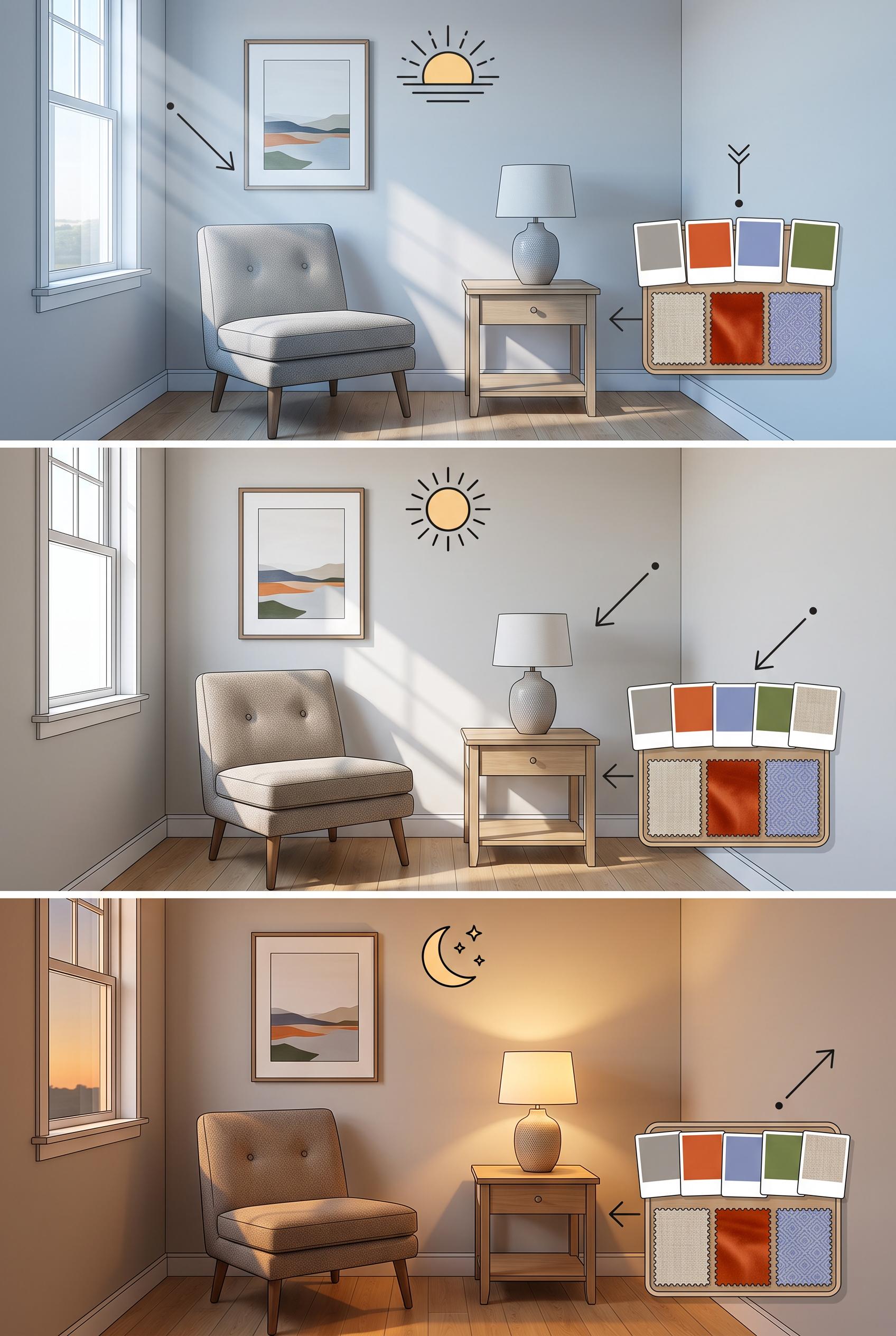
0Create a commercial-quality educational interior styling graphic in a vertical 2:3 Pinterest composition with three vertically stacked panels showing the same compact room in morning, midday, and evening light. Include blank color sample cards, fabric squares, a small chair, and a side table, with visual arrows made from simple shapes but no readable text. Palette of stone, paprika, periwinkle, and moss. AI-modified downstream. No real brands, no trademarked characters, no watermark, and no unintended readable text. Corrective regeneration attempt 3. Produce a materially revised image, not a near-duplicate of an earlier variant. Preserve the successful subject, palette, lighting, focal hierarchy, and commercial polish from the original brief while correcting every issue below. Mandatory corrective instructions from the most recent visual QA: Preserve the polished vertical 2:3 three-panel room composition, consistent chair, side table, window, fabric, color palette, camera position, and distinct morning/midday/evening lighting. Remove all readable headings, labels, letters, numbers, logos, pseudo-text, and text-like annotations from every panel. Replace the heading areas with clean wall space or minimal non-linguistic geometric markers such as simple sun icons or abstract rays. Keep all color sample cards and fabric swatches completely blank, with no markings or glyphs. Do not add captions or extra objects. Observed defects from prior variants that must not recur: 1) The image contains extensive readable labels and headings such as “MORNING LIGHT,” “MIDDAY LIGHT,” “EVENING LIGHT,” “cool light,” and other annotations, despite the brief requiring 2) No readable words. 3) The three panels are attractive and clearly communicate changing light conditions, but the text violation prevents commercial-quality approval. 4) Large readable headings appear in all three panels, violating the no-readable-text requirement. 5) The composition is otherwise attractive, vertical, consistent, and clearly communicates changing light conditions. Render no letters, words, numbers, prices, headings, labels, contact details, logos, glyphs, or pseudo-text anywhere. Use only blank surfaces, clean geometric marks, and non-linguistic placeholder shapes. Do not add explanatory captions, before/after labels, interface copy, or extra objects that the brief did not request. When a corrective instruction conflicts with a decorative detail, prioritize the corrective instruction.
 0
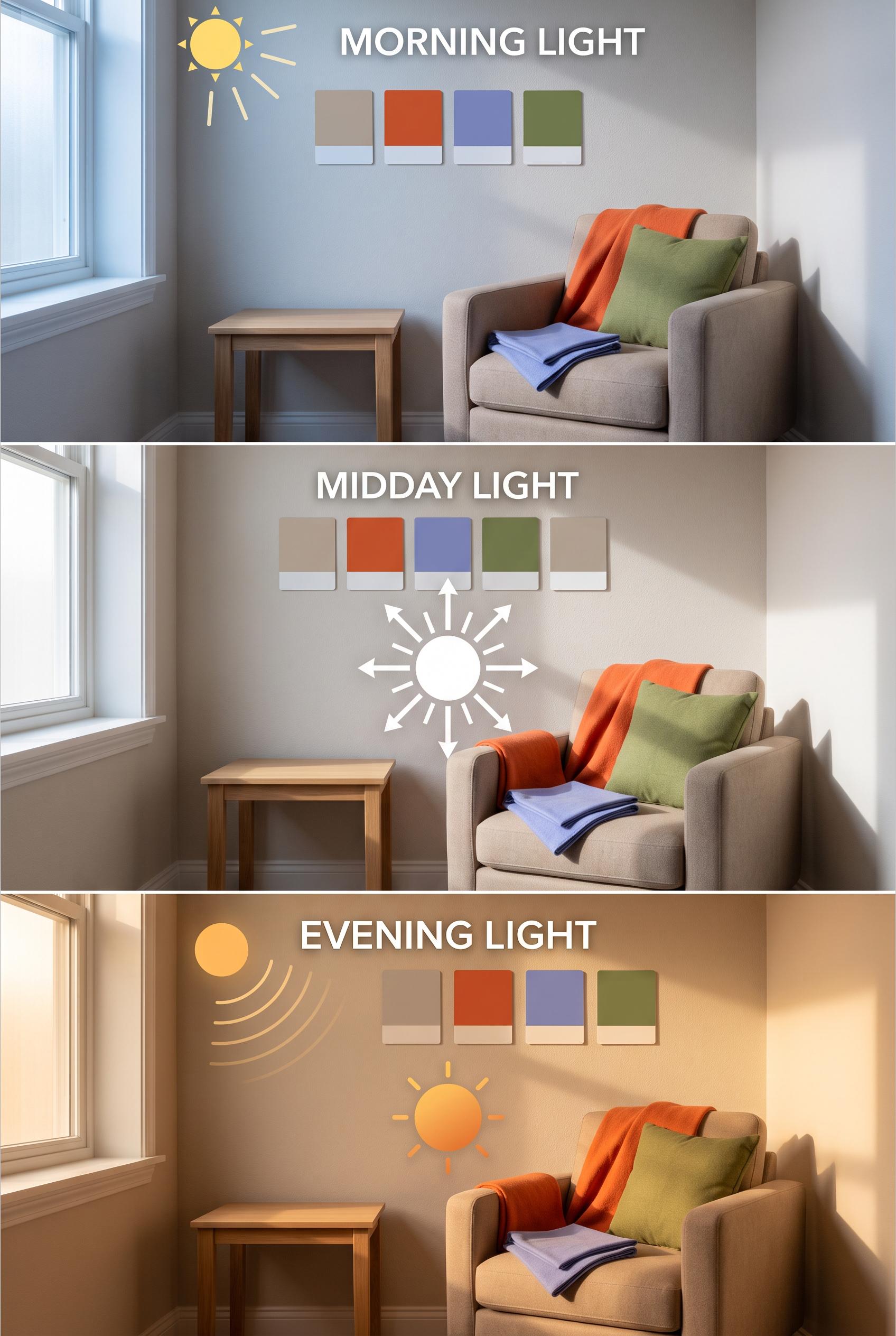
0Create a commercial-quality educational interior styling graphic in a vertical 2:3 Pinterest composition with three vertically stacked panels showing the same compact room in morning, midday, and evening light. Include blank color sample cards, fabric squares, a small chair, and a side table, with visual arrows made from simple shapes but no readable text. Palette of stone, paprika, periwinkle, and moss. AI-modified downstream. No real brands, no trademarked characters, no watermark, and no unintended readable text. Corrective regeneration attempt 2. Produce a materially revised image, not a near-duplicate of an earlier variant. Preserve the successful subject, palette, lighting, focal hierarchy, and commercial polish from the original brief while correcting every issue below. Mandatory corrective instructions from the most recent visual QA: Preserve the attractive vertical 2:3 three-panel room composition, consistent chair, side table, window, fabric, and color-swatch styling. Remove every readable word, heading, label, and text-like annotation from all panels, including all light-condition captions and descriptive phrases. Replace the text areas with clean empty wall space or simple non-text visual markers such as minimal arrows, sun icons, or abstract light rays. Keep the same room and camera position consistent across morning, midday, and evening; change only light temperature/intensity and the small removable color swatches. Ensure all sample cards remain completely blank, with no letters, numbers, logos, watermark, or pseudo-text. Observed defects from prior variants that must not recur: 1) The image contains extensive readable labels and headings such as “MORNING LIGHT,” “MIDDAY LIGHT,” “EVENING LIGHT,” “cool light,” and other annotations, despite the brief requiring 2) No readable words. 3) The three panels are attractive and clearly communicate changing light conditions, but the text violation prevents commercial-quality approval. Render no letters, words, numbers, prices, headings, labels, contact details, logos, glyphs, or pseudo-text anywhere. Use only blank surfaces, clean geometric marks, and non-linguistic placeholder shapes. Do not add explanatory captions, before/after labels, interface copy, or extra objects that the brief did not request. When a corrective instruction conflicts with a decorative detail, prioritize the corrective instruction.
 0
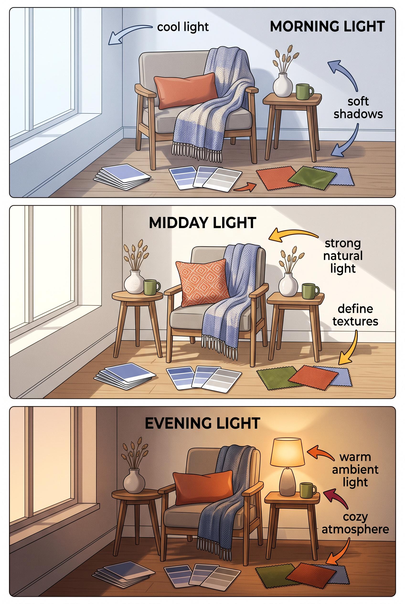
0Create a commercial-quality educational interior styling graphic in a vertical 2:3 Pinterest composition with three vertically stacked panels showing the same compact room in morning, midday, and evening light. Include blank color sample cards, fabric squares, a small chair, and a side table, with visual arrows made from simple shapes but no readable text. Palette of stone, paprika, periwinkle, and moss. AI-modified downstream. No real brands, no trademarked characters, no watermark, and no unintended readable text.
 0
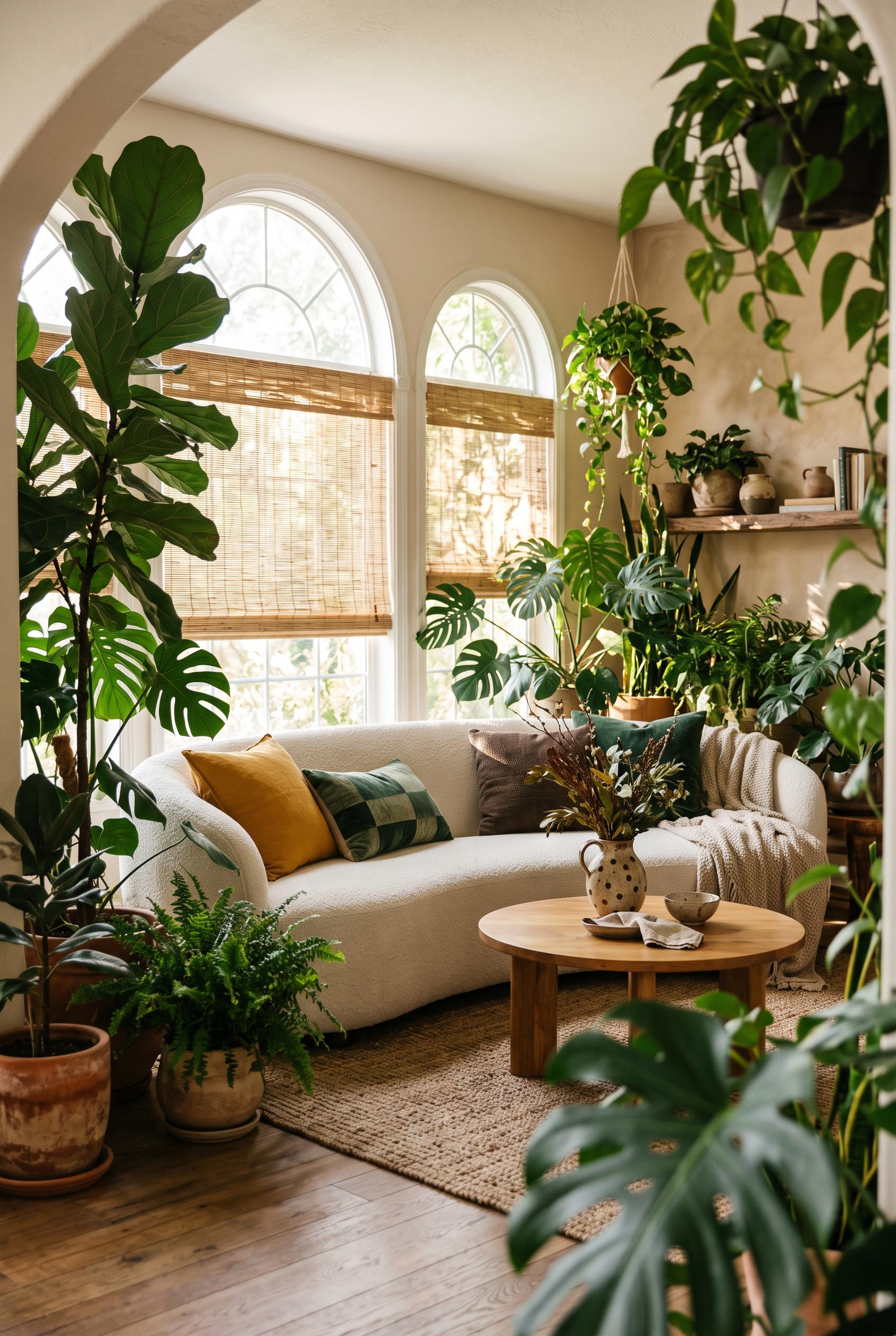
0Create a commercial-quality interior editorial photograph in a vertical 2:3 Pinterest composition of an indoor garden living room. Use a three-quarter view framed by tall leafy plants, with a curved sofa, round low table, woven window shades, handmade ceramic accents, and dappled sunlight. Palette of jade green, marigold, chalk white, and espresso brown. AI-modified downstream. No real brands, no trademarked characters, no watermark, and no unintended readable text.
 0
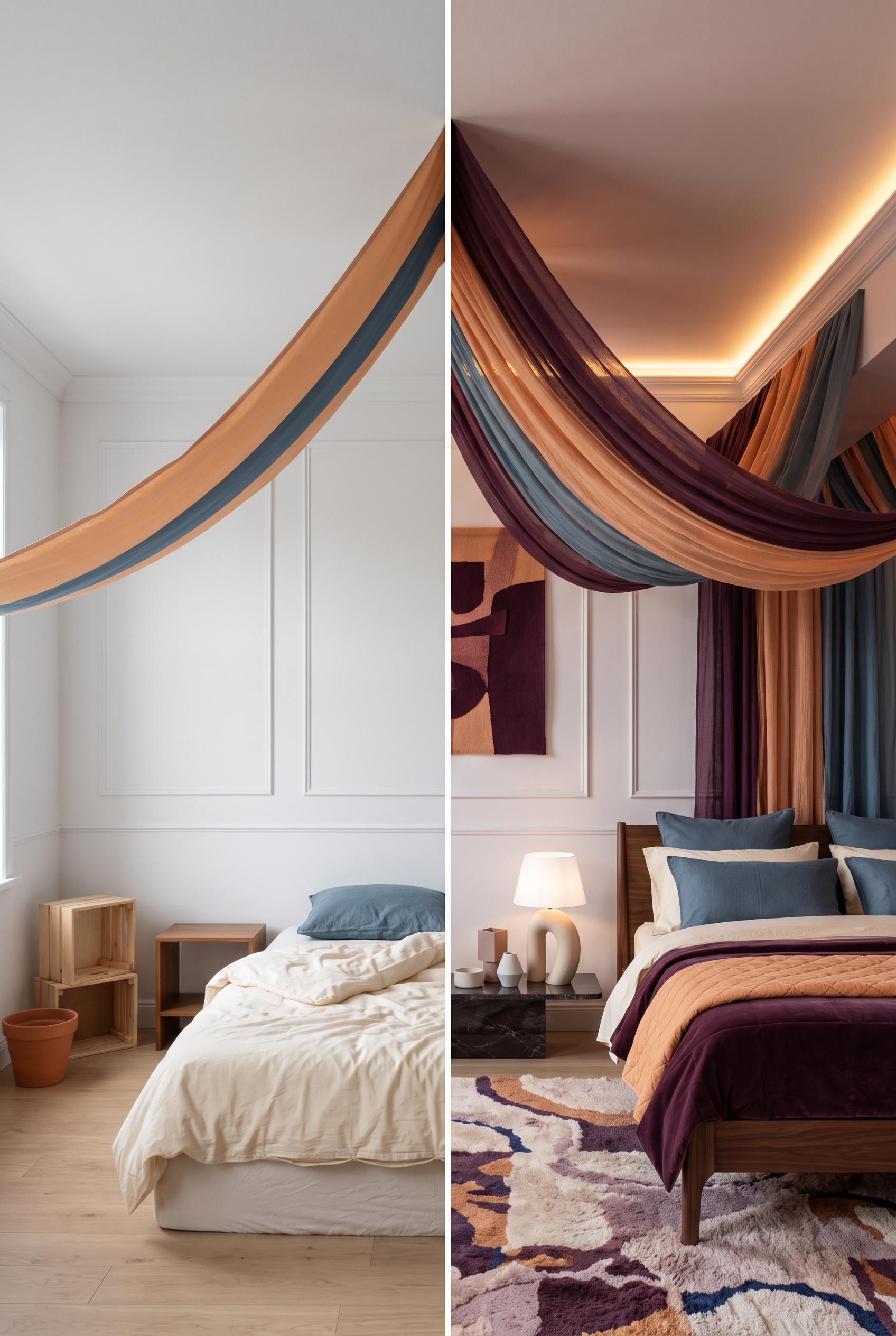
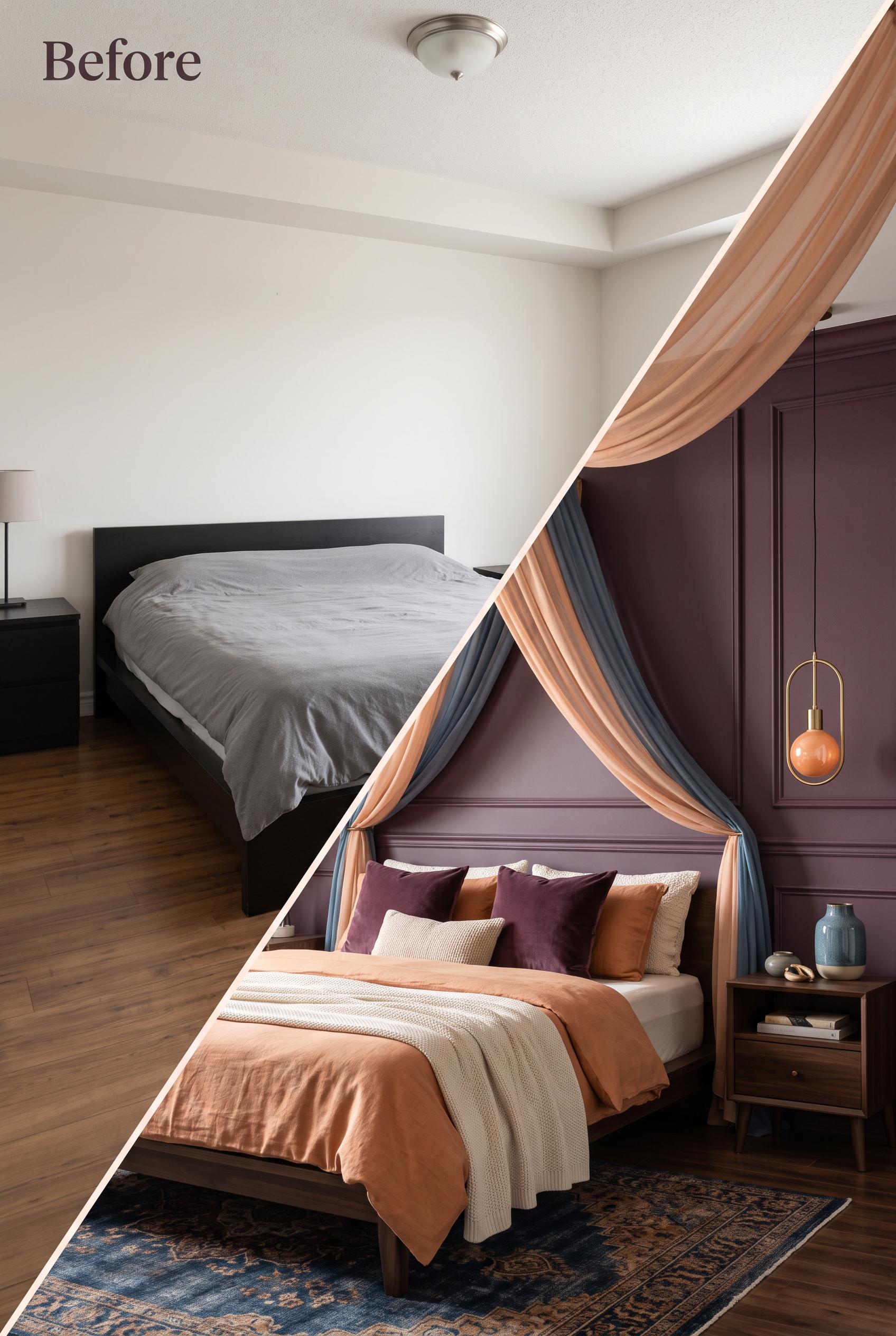
0Create a commercial-quality interior editorial image in a vertical 2:3 Pinterest composition showing a matched before-and-after bedroom transformation. Use a diagonal fabric sweep from the plain ceiling in the before scene into a softly draped canopy in the after scene. Include a low bed, sculptural bedside light, layered textiles, and subtle wall molding. Palette of deep plum, apricot, mineral blue, and warm ivory. AI-modified downstream. No real brands, no trademarked characters, no watermark, and no unintended readable text. Corrective regeneration attempt 2. Produce a materially revised image, not a near-duplicate of an earlier variant. Preserve the successful subject, palette, lighting, focal hierarchy, and commercial polish from the original brief while correcting every issue below. Mandatory corrective instructions from the most recent visual QA: Preserve the attractive vertical 2:3 composition, matched camera angle, diagonal peach-and-blue fabric sweep, canopy, low bed, coordinated plum/apricot/ivory textiles, blue accents, and wall molding. Replace the visible hanging pendant in the after scene with clearly concealed warm lighting, such as a soft warm LED glow hidden within the canopy or ceiling perimeter. Keep the before side plain with disconnected furniture and no additional unintended readable text. Observed defects from prior variants that must not recur: 1) The after scene lacks clearly concealed warm lighting; it shows a visible hanging pendant instead. 2) The diagonal transition and overall bedroom styling are strong, with no watermark, branding, or obvious artifacts. Render no letters, words, numbers, prices, headings, labels, contact details, logos, glyphs, or pseudo-text anywhere. Use only blank surfaces, clean geometric marks, and non-linguistic placeholder shapes. Do not add explanatory captions, before/after labels, interface copy, or extra objects that the brief did not request. When a corrective instruction conflicts with a decorative detail, prioritize the corrective instruction.
 0
0Create a commercial-quality interior editorial image in a vertical 2:3 Pinterest composition showing a matched before-and-after bedroom transformation. Use a diagonal fabric sweep from the plain ceiling in the before scene into a softly draped canopy in the after scene. Include a low bed, sculptural bedside light, layered textiles, and subtle wall molding. Palette of deep plum, apricot, mineral blue, and warm ivory. AI-modified downstream. No real brands, no trademarked characters, no watermark, and no unintended readable text.
 0
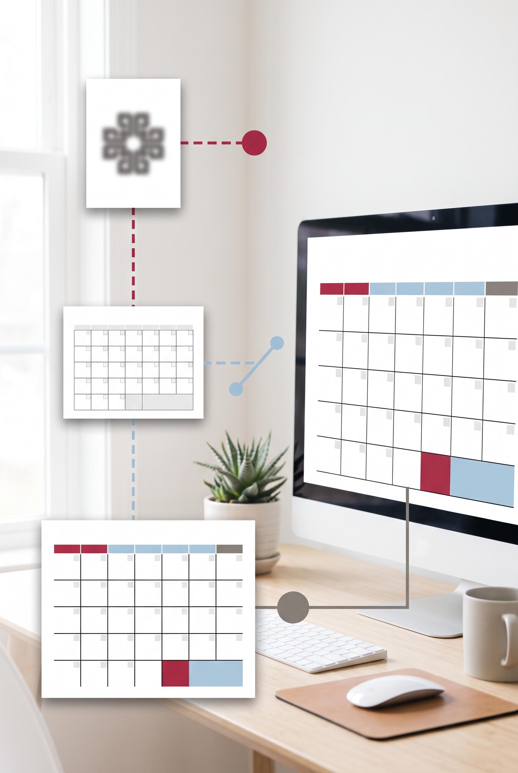
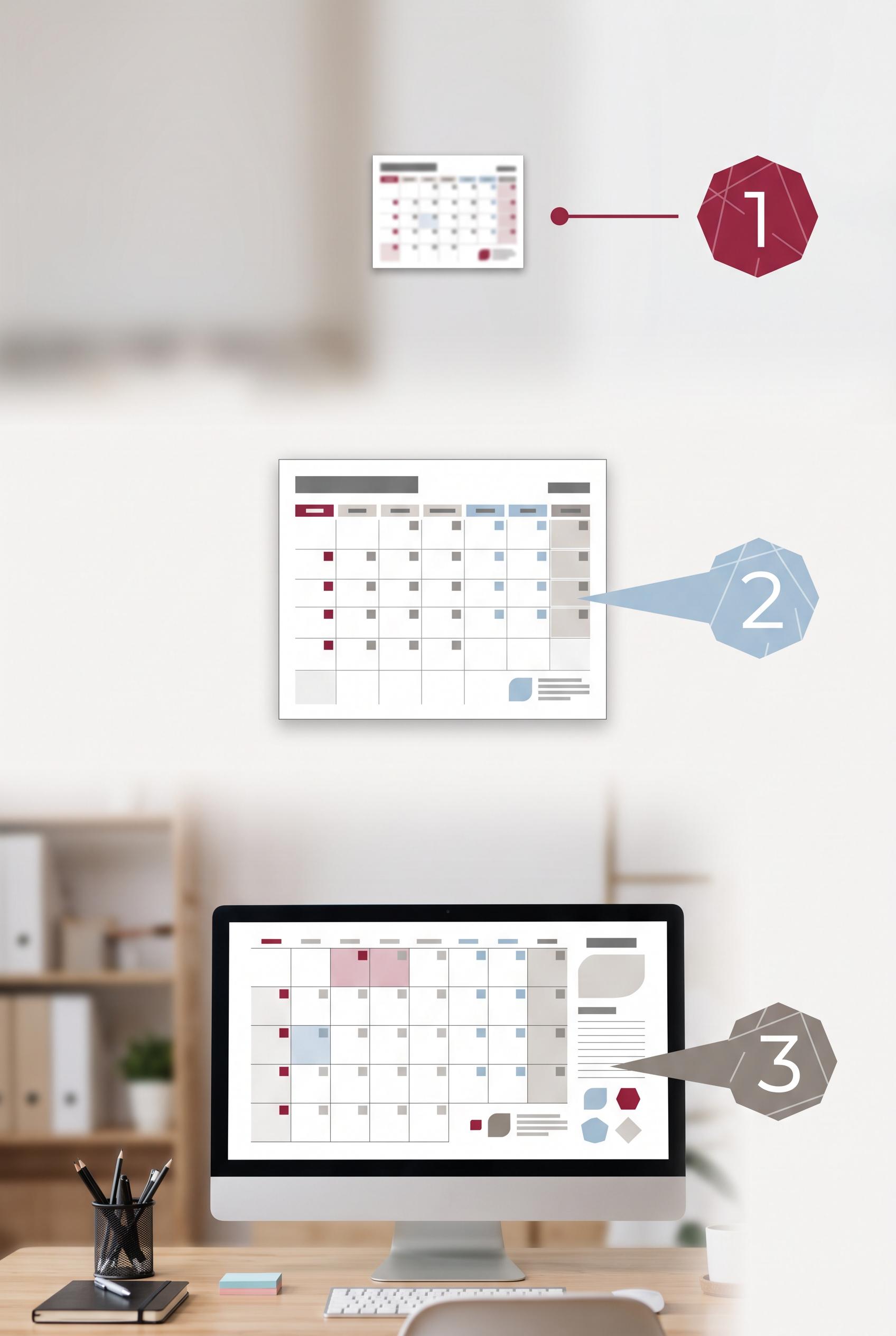
0Create a commercial-quality vertical 2:3 Pinterest composition for an educational Etsy listing image guide. Show three distinct stages of a digital wall calendar thumbnail being improved: tiny and unclear, better cropped, then highly legible in visual hierarchy with a clear home-office use case. Use a visual focus lens, clean spacing, abstract numbered marker shapes without readable text, and a cranberry, powder blue, and warm gray palette. AI-modified downstream. No real brands, no trademarked characters, no watermark, and no unintended readable text. Corrective regeneration attempt 3. Produce a materially revised image, not a near-duplicate of an earlier variant. Preserve the successful subject, palette, lighting, focal hierarchy, and commercial polish from the original brief while correcting every issue below. Mandatory corrective instructions from the most recent visual QA: Keep the attractive vertical 2:3 home-office composition, cranberry/powder-blue/warm-gray palette, lighting, three calendar-preview stages, and clear progression from tiny/unclear to cropped/contrasting to large/legible on the desktop monitor. Replace each numbered polygon marker with a distinct unnumbered abstract geometric shape or solid dot-and-line marker; remove every numeral. Simplify all calendar previews so they contain only blank grids, color blocks, and non-linguistic geometric marks—no letters, words, numbers, labels, headings, logos, icons, pseudo-text, or UI copy. Preserve generous clean negative space and the visual focus connections. Observed defects from prior variants that must not recur: 1) Contains real brand/trademark references and logos, including Etsy and Pinterest-style branding. 2) Image is overloaded with embedded instructional text despite the brief requesting abstract markers and room for text outside the image. 3) Multiple small UI areas contain garbled or pseudo-readable text. 4) Bottom social and storefront icons add distracting brand-like elements and reduce commercial cleanliness. 5) Large readable numerals appear in all three abstract markers, violating the requirement for no readable numbers. 6) Calendar interfaces contain dense pseudo-text and UI-like line elements that reduce the clean, text-free commercial presentation. 7) The composition otherwise has a strong vertical layout, clear three-stage progression, coherent palette, and recognizable home-office use case. Render no letters, words, numbers, prices, headings, labels, contact details, logos, glyphs, or pseudo-text anywhere. Use only blank surfaces, clean geometric marks, and non-linguistic placeholder shapes. Do not add explanatory captions, before/after labels, interface copy, or extra objects that the brief did not request. When a corrective instruction conflicts with a decorative detail, prioritize the corrective instruction.
 0
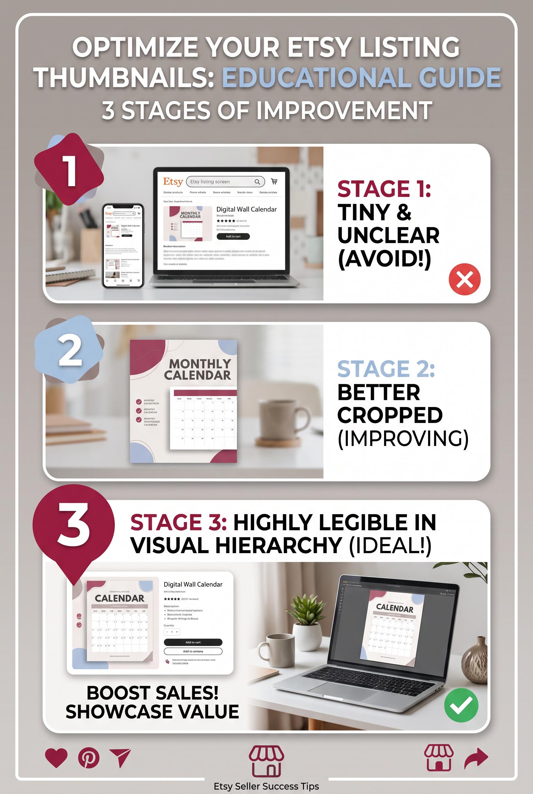
0Create a commercial-quality vertical 2:3 Pinterest composition for an educational Etsy listing image guide. Show three distinct stages of a digital wall calendar thumbnail being improved: tiny and unclear, better cropped, then highly legible in visual hierarchy with a clear home-office use case. Use a visual focus lens, clean spacing, abstract numbered marker shapes without readable text, and a cranberry, powder blue, and warm gray palette. AI-modified downstream. No real brands, no trademarked characters, no watermark, and no unintended readable text. Corrective regeneration attempt 2. Produce a materially revised image, not a near-duplicate of an earlier variant. Preserve the successful subject, palette, lighting, focal hierarchy, and commercial polish from the original brief while correcting every issue below. Mandatory corrective instructions from the most recent visual QA: Regenerate as a clean vertical 2:3 composition preserving the cranberry, powder blue, and warm gray palette, three-stage progression, visual focus lens, home-office setting, and clear product evolution. Remove all real or brand-like names, logos, social icons, storefront icons, and trademark imagery. Remove every readable word, letter, number, label, and pseudo-text element from the image, including UI copy and calendar microtext. Represent the three stages only with distinct abstract geometric markers and visual changes: tiny/unclear, better cropped with stronger contrast, and large, sharply legible calendar preview in a clear home-office use case. Keep generous blank space for text to be added externally, with no embedded instructional copy. Observed defects from prior variants that must not recur: 1) Contains real brand/trademark references and logos, including Etsy and Pinterest-style branding. 2) Image is overloaded with embedded instructional text despite the brief requesting abstract markers and room for text outside the image. 3) Multiple small UI areas contain garbled or pseudo-readable text. 4) Bottom social and storefront icons add distracting brand-like elements and reduce commercial cleanliness. Render no letters, words, numbers, prices, headings, labels, contact details, logos, glyphs, or pseudo-text anywhere. Use only blank surfaces, clean geometric marks, and non-linguistic placeholder shapes. Do not add explanatory captions, before/after labels, interface copy, or extra objects that the brief did not request. When a corrective instruction conflicts with a decorative detail, prioritize the corrective instruction.
 0
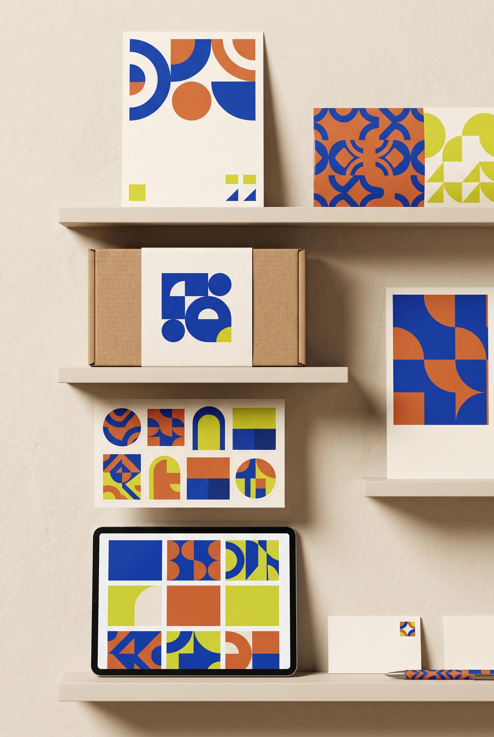
0Create a commercial-quality vertical 2:3 Pinterest composition for an educational Etsy listing image guide. Show three distinct stages of a digital wall calendar thumbnail being improved: tiny and unclear, better cropped, then highly legible in visual hierarchy with a clear home-office use case. Use a visual focus lens, clean spacing, abstract numbered marker shapes without readable text, and a cranberry, powder blue, and warm gray palette. AI-modified downstream. No real brands, no trademarked characters, no watermark, and no unintended readable text.
 0
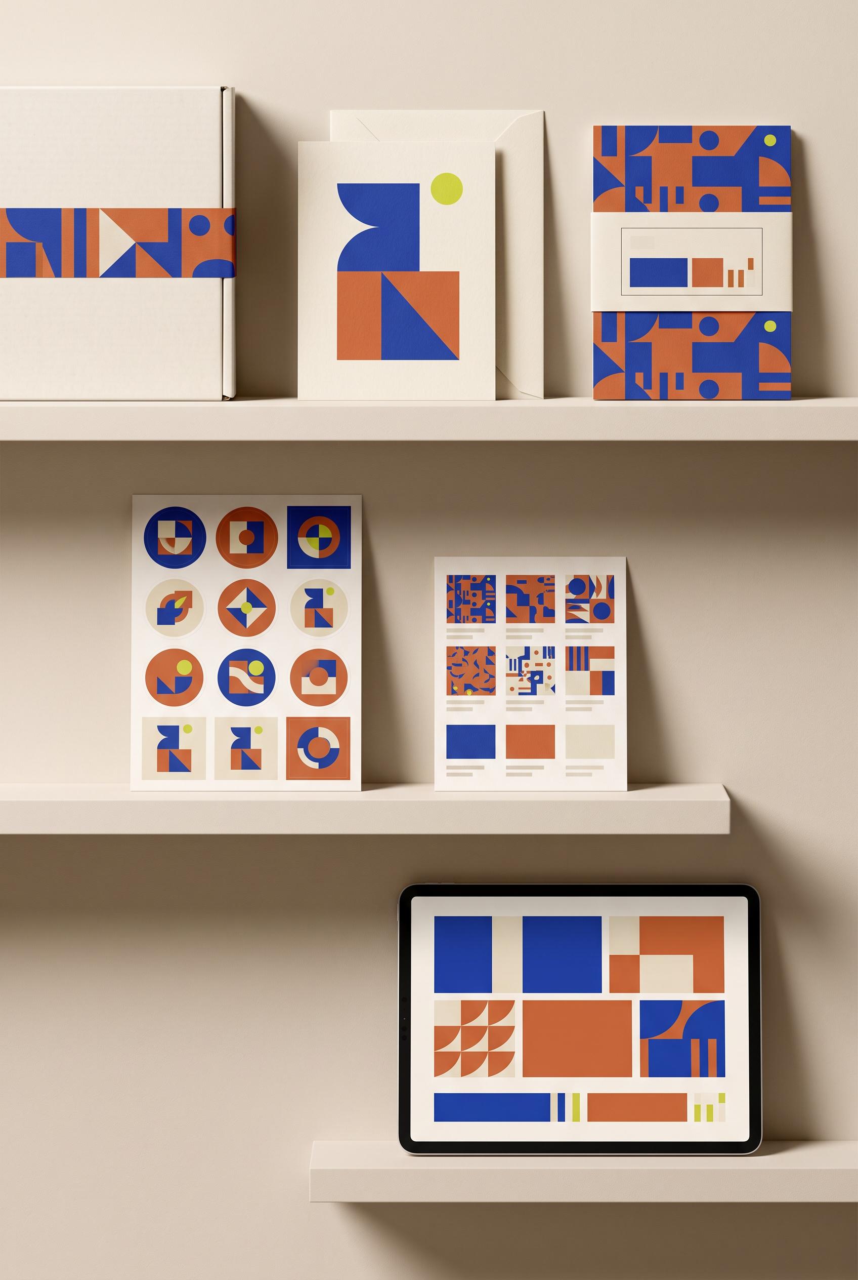
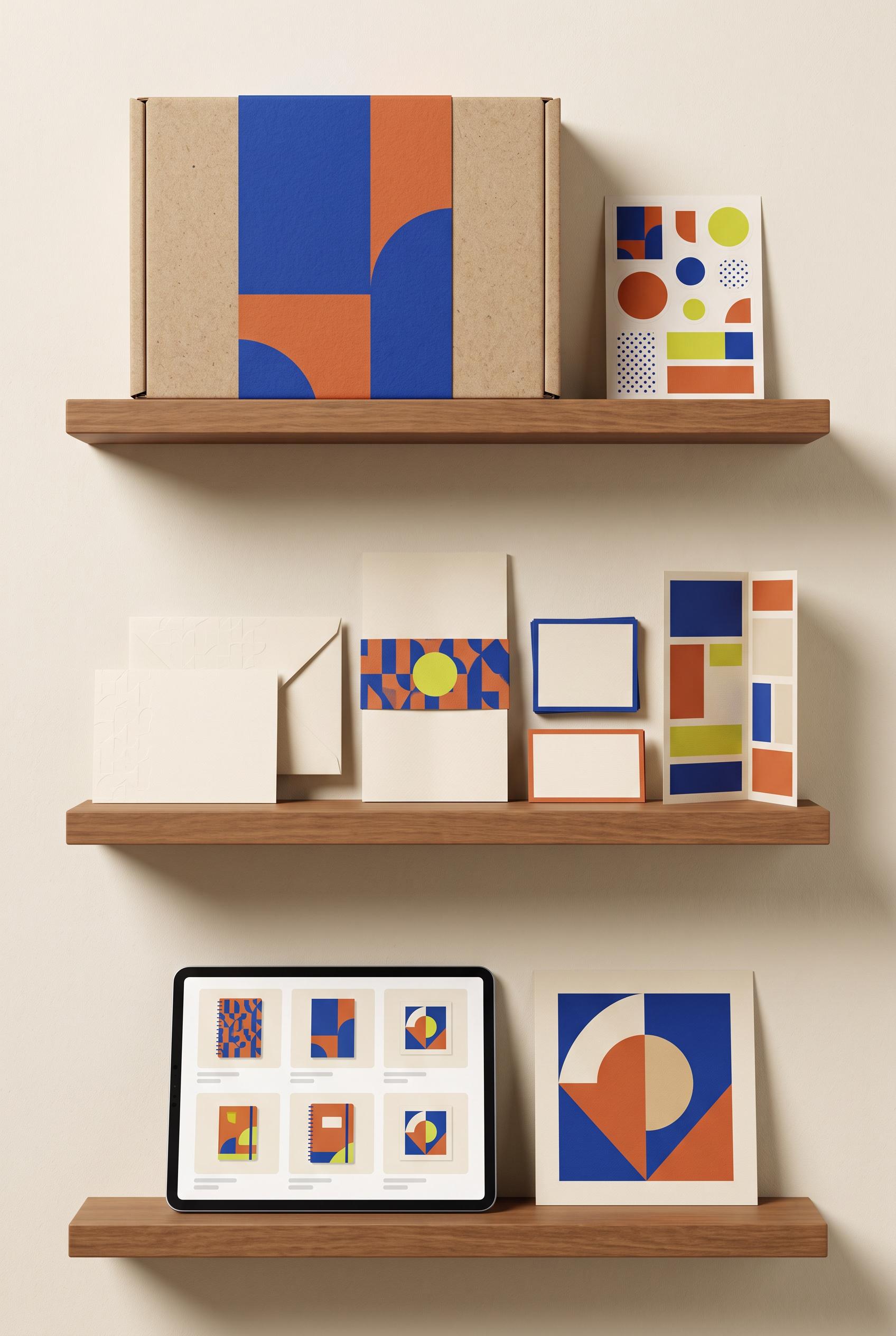
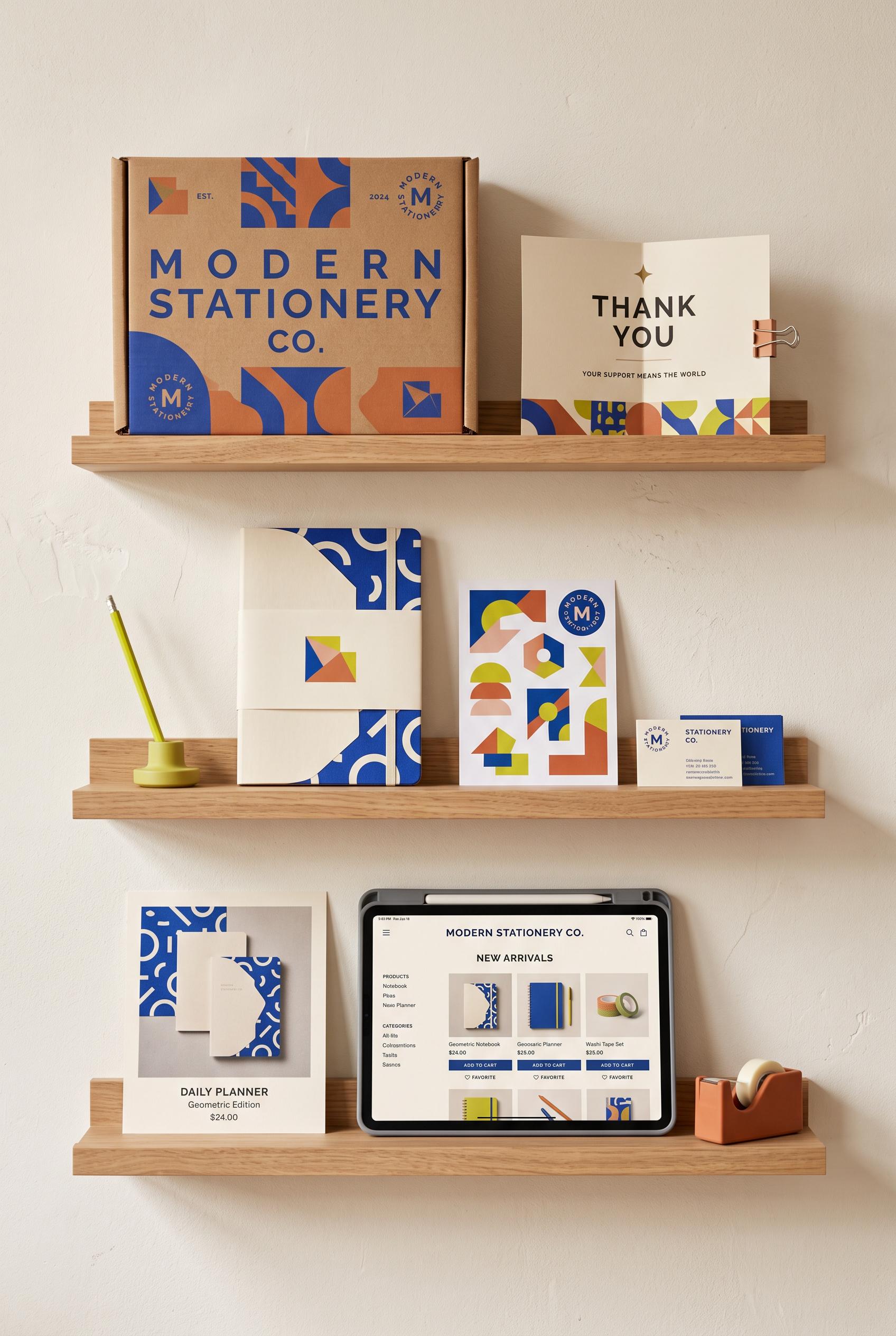
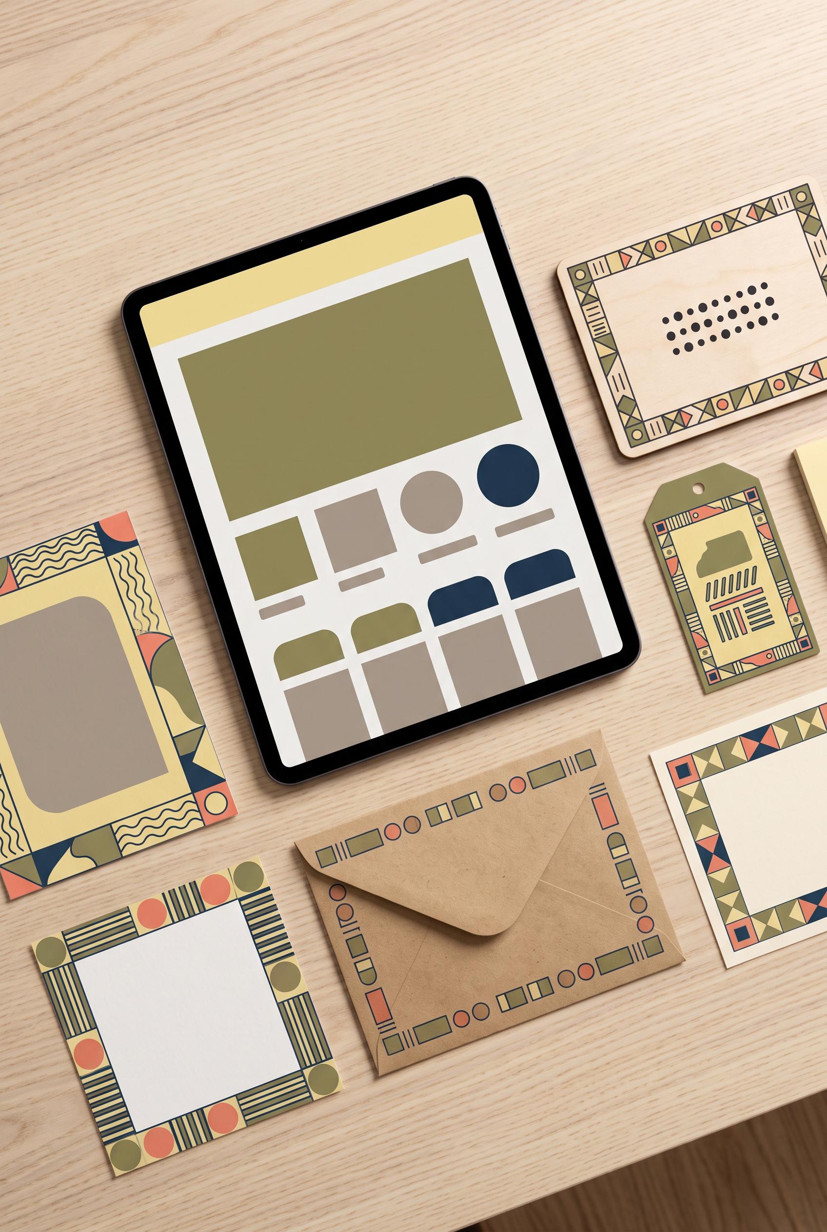
0Create a commercial-quality vertical 2:3 Pinterest composition showcasing a fictional modern stationery shop identity. Arrange a shipping box, thank-you card, paper sleeve, sticker sheet, listing thumbnail, and tablet preview on museum-style floating shelves with subtle shadows and balanced spacing. Use cobalt blue, clay orange, cream, and small chartreuse accents, bold geometric forms, tactile paper texture, and polished editorial branding photography. AI-modified downstream. No real brands, no trademarked characters, no watermark, and no unintended readable text. Corrective regeneration attempt 4. Produce a materially revised image, not a near-duplicate of an earlier variant. Preserve the successful subject, palette, lighting, focal hierarchy, and commercial polish from the original brief while correcting every issue below. Mandatory corrective instructions from the most recent visual QA: Preserve the current vertical floating-shelf composition, recognizable stationery objects, cobalt blue/clay orange/cream/chartreuse palette, tactile paper, balanced spacing, and warm commercial lighting. Remove every horizontal line cluster, outlined information box, bar-chart-like arrangement, caption-like mark, and any other text-like or interface-like element from the upper-right card, center-right listing thumbnail, sticker sheet, box sleeve, thank-you card, and tablet. Replace them only with clean, clearly non-linguistic geometric shapes and patterns, with blank negative space between motifs. Keep the tablet as a purely abstract geometric grid. Render no letters, words, numbers, labels, logos, glyphs, or pseudo-text anywhere. Observed defects from prior variants that must not recur: 1) Visible brand and marketing text appears throughout the box, card, business card, poster, and tablet, despite the brief requiring no visible brand text. 2) The tablet contains extensive readable interface copy and the small cards contain readable details; these are unnecessary text elements for the requested identity showcase. 3) Attractive vertical shelf composition with cohesive palette and strong commercial styling. 4) Tablet preview contains interface-like placeholder text lines, violating the requirement for no pseudo-text or readable text anywhere. 5) The tablet should be a purely visual abstract preview rather than a UI layout with copy-like marks. 6) Attractive vertical 2:3 composition with strong palette and polished lighting. 7) Several stationery surfaces, especially the center-right listing sheet and upper-right card, contain horizontal line clusters and boxed bar layouts that read as pseudo-text or UI/ 8) The requested no text-like marks, labels, glyphs, or pseudo-text standard is not fully met. Render no letters, words, numbers, prices, headings, labels, contact details, logos, glyphs, or pseudo-text anywhere. Use only blank surfaces, clean geometric marks, and non-linguistic placeholder shapes. Do not add explanatory captions, before/after labels, interface copy, or extra objects that the brief did not request. When a corrective instruction conflicts with a decorative detail, prioritize the corrective instruction.
 0
0Create a commercial-quality vertical 2:3 Pinterest composition showcasing a fictional modern stationery shop identity. Arrange a shipping box, thank-you card, paper sleeve, sticker sheet, listing thumbnail, and tablet preview on museum-style floating shelves with subtle shadows and balanced spacing. Use cobalt blue, clay orange, cream, and small chartreuse accents, bold geometric forms, tactile paper texture, and polished editorial branding photography. AI-modified downstream. No real brands, no trademarked characters, no watermark, and no unintended readable text. Corrective regeneration attempt 3. Produce a materially revised image, not a near-duplicate of an earlier variant. Preserve the successful subject, palette, lighting, focal hierarchy, and commercial polish from the original brief while correcting every issue below. Mandatory corrective instructions from the most recent visual QA: Preserve the vertical 2:3 floating-shelf composition, warm editorial lighting, tactile paper textures, balanced spacing, and cobalt blue, clay orange, cream, and chartreuse geometric identity. Remove every gray line, text-like mark, letter, number, logo, label, glyph, and pseudo-text element from the tablet screen and all stationery surfaces. Replace the tablet interface with a clean abstract visual grid of geometric blocks and patterns only, with no captions or copy. Keep the shipping box, thank-you card, sleeve, sticker sheet, listing thumbnail, and tablet clearly recognizable, and retain the polished commercial product-photography finish. Observed defects from prior variants that must not recur: 1) Strong vertical composition, cohesive palette, and polished product styling. 2) Visible brand and marketing text appears throughout the box, card, business card, poster, and tablet, despite the brief requiring no visible brand text. 3) The tablet contains extensive readable interface copy and the small cards contain readable details; these are unnecessary text elements for the requested identity showcase. 4) Attractive vertical shelf composition with cohesive palette and strong commercial styling. 5) Tablet preview contains interface-like placeholder text lines, violating the requirement for no pseudo-text or readable text anywhere. 6) The tablet should be a purely visual abstract preview rather than a UI layout with copy-like marks. Render no letters, words, numbers, prices, headings, labels, contact details, logos, glyphs, or pseudo-text anywhere. Use only blank surfaces, clean geometric marks, and non-linguistic placeholder shapes. Do not add explanatory captions, before/after labels, interface copy, or extra objects that the brief did not request. When a corrective instruction conflicts with a decorative detail, prioritize the corrective instruction.
 0
0Create a commercial-quality vertical 2:3 Pinterest composition showcasing a fictional modern stationery shop identity. Arrange a shipping box, thank-you card, paper sleeve, sticker sheet, listing thumbnail, and tablet preview on museum-style floating shelves with subtle shadows and balanced spacing. Use cobalt blue, clay orange, cream, and small chartreuse accents, bold geometric forms, tactile paper texture, and polished editorial branding photography. AI-modified downstream. No real brands, no trademarked characters, no watermark, and no unintended readable text. Corrective regeneration attempt 2. Produce a materially revised image, not a near-duplicate of an earlier variant. Preserve the successful subject, palette, lighting, focal hierarchy, and commercial polish from the original brief while correcting every issue below. Mandatory corrective instructions from the most recent visual QA: Preserve the attractive vertical 2:3 shelf composition, warm editorial lighting, tactile paper, cobalt blue/clay orange/cream/chartreuse palette, and coordinated geometric identity. Remove every readable word, letter, number, logo, monogram, URL, product label, and interface copy from all objects, including the shipping box, thank-you card, sleeve, sticker sheet, listing thumbnail, business cards, poster, and tablet. Replace text areas with clean blank paper or abstract geometric blocks/patterns only. Keep the tablet as a blank visual product preview with abstract shapes, and ensure all stationery items remain clearly recognizable without typography. Observed defects from prior variants that must not recur: 1) Strong vertical composition, cohesive palette, and polished product styling. 2) Visible brand and marketing text appears throughout the box, card, business card, poster, and tablet, despite the brief requiring no visible brand text. 3) The tablet contains extensive readable interface copy and the small cards contain readable details; these are unnecessary text elements for the requested identity showcase. Render no letters, words, numbers, prices, headings, labels, contact details, logos, glyphs, or pseudo-text anywhere. Use only blank surfaces, clean geometric marks, and non-linguistic placeholder shapes. Do not add explanatory captions, before/after labels, interface copy, or extra objects that the brief did not request. When a corrective instruction conflicts with a decorative detail, prioritize the corrective instruction.
 0
0Create a commercial-quality vertical 2:3 Pinterest composition showcasing a fictional modern stationery shop identity. Arrange a shipping box, thank-you card, paper sleeve, sticker sheet, listing thumbnail, and tablet preview on museum-style floating shelves with subtle shadows and balanced spacing. Use cobalt blue, clay orange, cream, and small chartreuse accents, bold geometric forms, tactile paper texture, and polished editorial branding photography. AI-modified downstream. No real brands, no trademarked characters, no watermark, and no unintended readable text.
 0
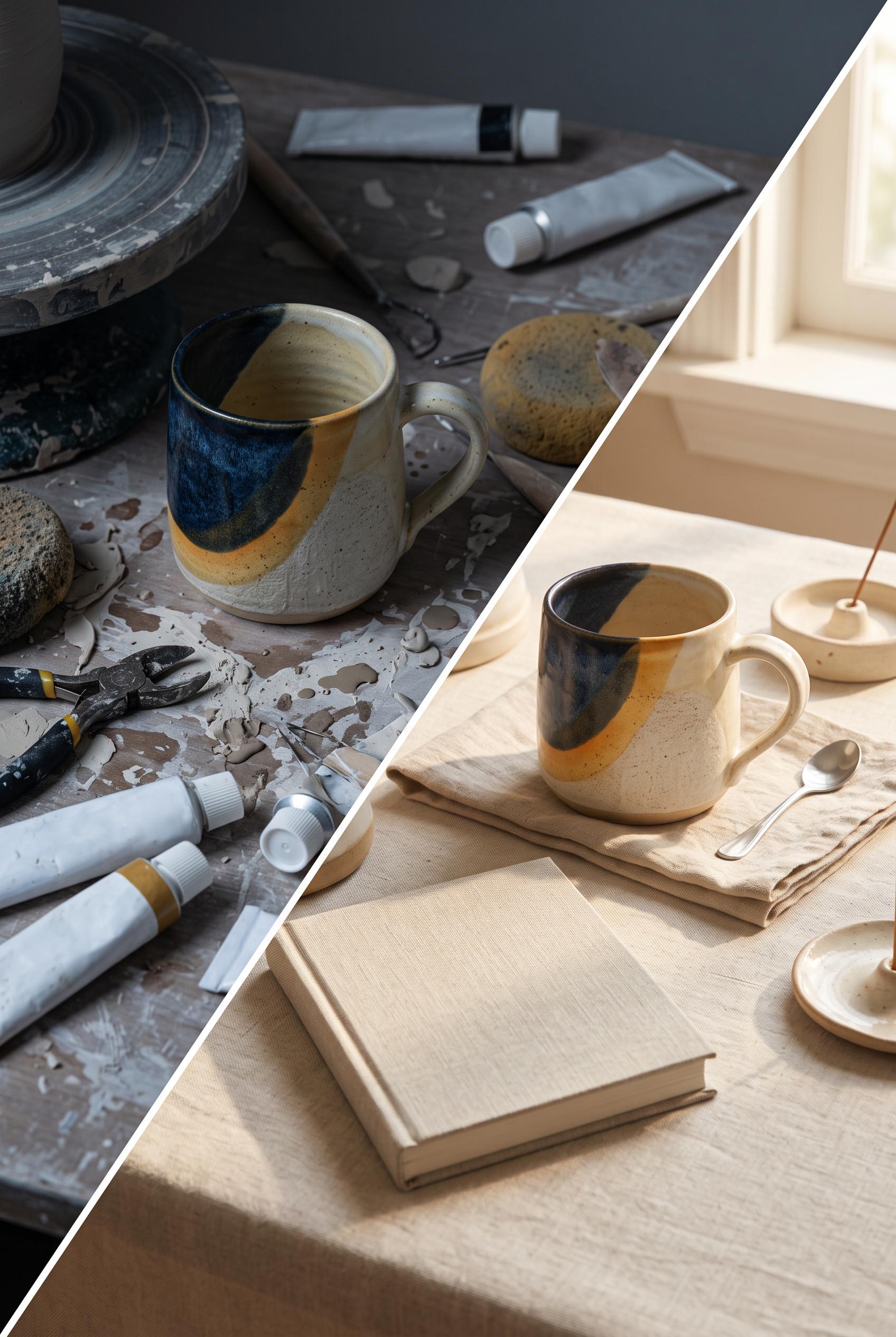
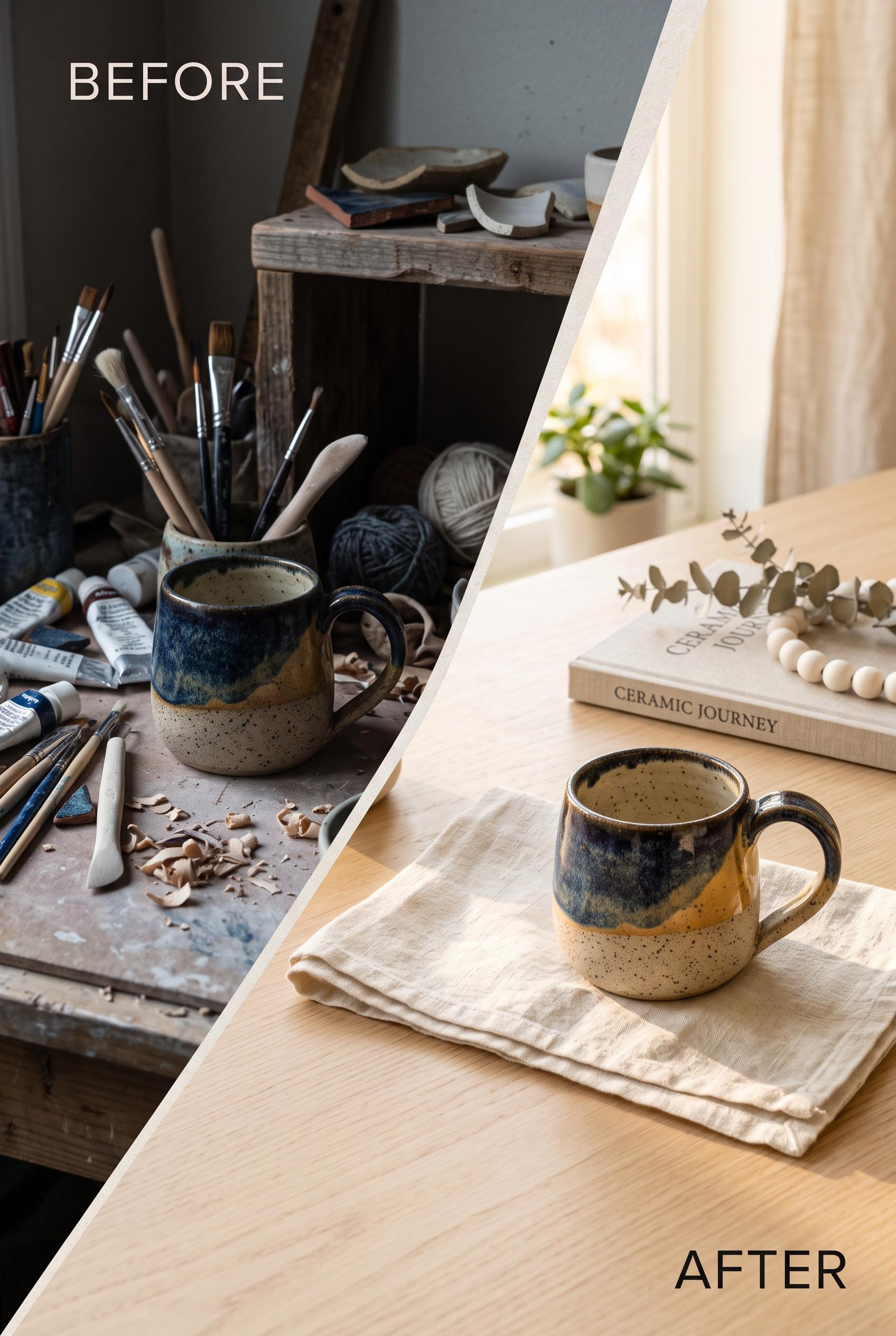
0Create a commercial-quality vertical 2:3 Pinterest composition for an Etsy seller visual concept. Show a diagonal before-and-after transformation: on the left, a handmade ceramic mug in a cluttered dim workspace with weak lighting; on the right, the same mug in a refined ivory setting with linen, a small neutral book, and warm sunlight. Use midnight blue, saffron, and ivory accents, realistic editorial product photography, clear material texture, premium art direction, and strong visual contrast. AI-modified downstream. No real brands, no trademarked characters, no watermark, and no unintended readable text. Corrective regeneration attempt 2. Produce a materially revised image, not a near-duplicate of an earlier variant. Preserve the successful subject, palette, lighting, focal hierarchy, and commercial polish from the original brief while correcting every issue below. Mandatory corrective instructions from the most recent visual QA: Preserve the polished 2:3 composition, diagonal transition, matching ceramic mug, lighting contrast, linen, warm ivory styling, and generous negative space. Remove all readable or pseudo-readable text from the book, paint tubes, and any other objects; make the book cover completely blank and all supply packaging unmarked. Keep surfaces, materials, proportions, and product realism clean and commercially photographic. Observed defects from prior variants that must not recur: 1) Strong vertical composition and clear before/after mug transformation, but the workspace supplies contain visibly garbled pseudo-text and the book has unintended readable title/cut Render no letters, words, numbers, prices, headings, labels, contact details, logos, glyphs, or pseudo-text anywhere. Use only blank surfaces, clean geometric marks, and non-linguistic placeholder shapes. Do not add explanatory captions, before/after labels, interface copy, or extra objects that the brief did not request. When a corrective instruction conflicts with a decorative detail, prioritize the corrective instruction.
 0
0Create a commercial-quality vertical 2:3 Pinterest composition for an Etsy seller visual concept. Show a diagonal before-and-after transformation: on the left, a handmade ceramic mug in a cluttered dim workspace with weak lighting; on the right, the same mug in a refined ivory setting with linen, a small neutral book, and warm sunlight. Use midnight blue, saffron, and ivory accents, realistic editorial product photography, clear material texture, premium art direction, and strong visual contrast. AI-modified downstream. No real brands, no trademarked characters, no watermark, and no unintended readable text.
 0
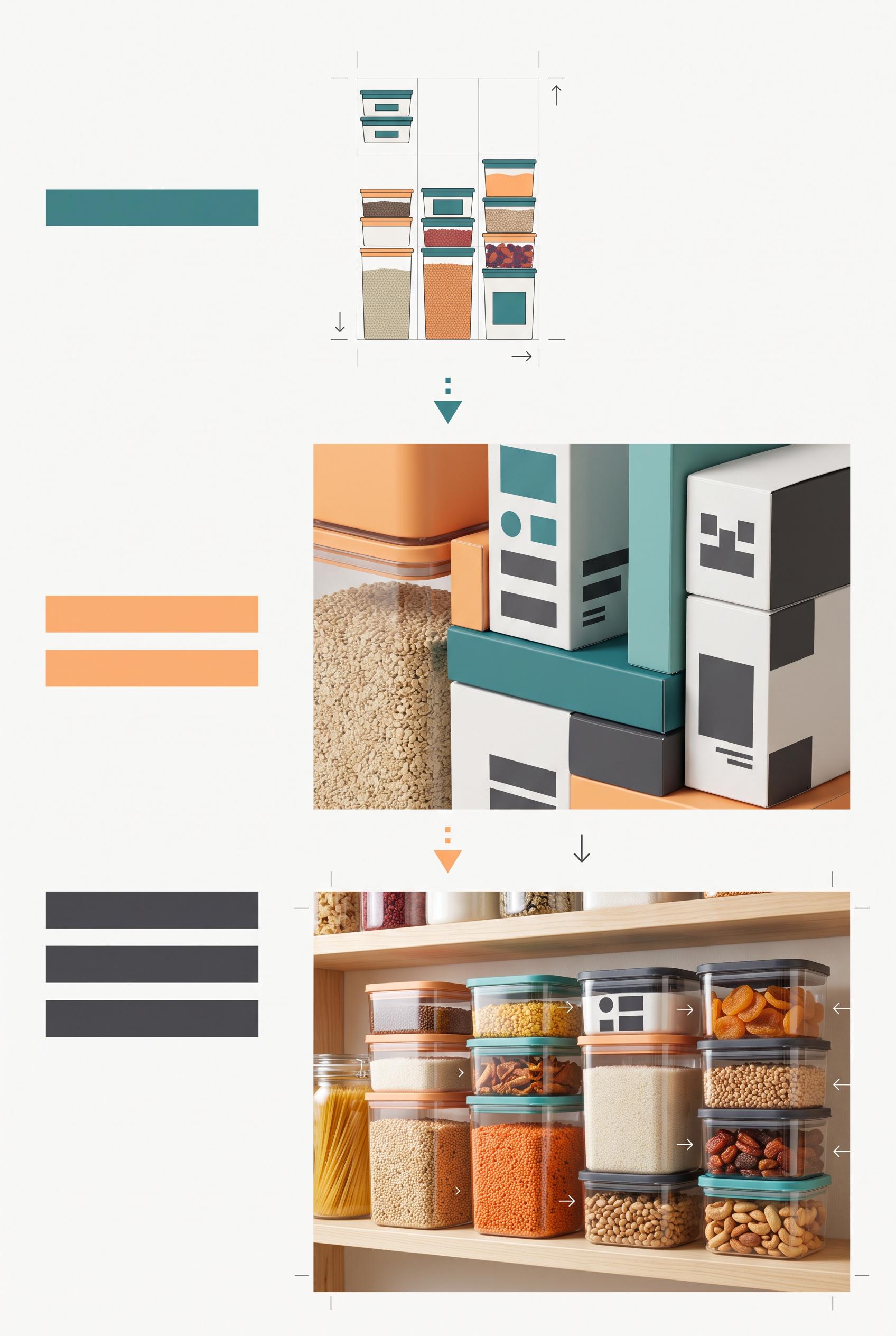
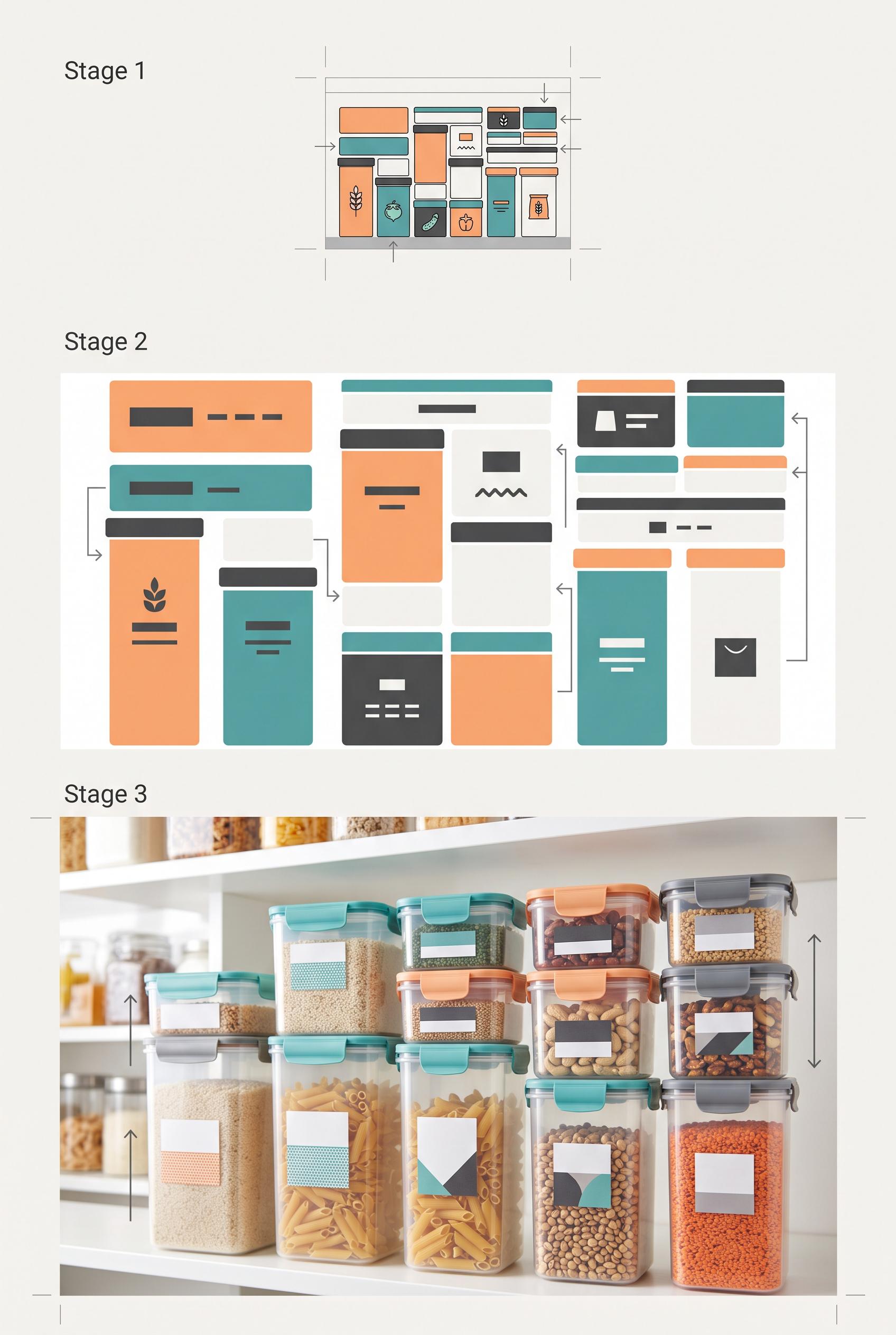
0Create a commercial-quality vertical 2:3 Pinterest educational campaign graphic for modular food storage packaging. Use a three-stage vertical stack: a tiny thumbnail composition test, a close view of packaging hierarchy with abstract unreadable blocks, and a bright pantry lifestyle hero showing stackable containers. Include subtle crop guides and directional arrows, with apricot, teal, charcoal, and paper white. Clean editorial art direction, realistic packaging mockups, useful visual teaching structure. No real brands, no trademarks, no trademarked characters, no watermark, and no unintended readable text. Corrective regeneration attempt 3. Produce a materially revised image, not a near-duplicate of an earlier variant. Preserve the successful subject, palette, lighting, focal hierarchy, and commercial polish from the original brief while correcting every issue below. Mandatory corrective instructions from the most recent visual QA: Preserve the attractive vertical 2:3 editorial composition, three clearly separated vertical stages, apricot/teal/charcoal/paper-white palette, realistic stackable containers, bright pantry lifestyle hero, crop marks, arrows, and polished lighting. Remove every readable character, including the words “Stage 1,” “Stage 2,” and “Stage 3.” Replace those headings with simple abstract solid bars or geometric markers only. Ensure all packaging labels remain purely geometric and non-linguistic, with no letters, numbers, words, logos, glyphs, pseudo-text, watermark, or branding anywhere. Observed defects from prior variants that must not recur: 1) The composition is split into side-by-side panels rather than a clear three-stage vertical stack. 2) The packaging hierarchy section contains prominent readable labels and headings, contrary to the requirement for simple abstract unreadable blocks. 3) The duplicated mid/lower panels weaken the intended sequential how-to teaching flow. 4) Prominent readable text “Stage 1,” “Stage 2,” and “Stage 3” violates the requirement for no readable labels or words. 5) The overall three-stage vertical structure, palette, pantry hero, containers, crop marks, and arrows are otherwise strong and commercially polished. Render no letters, words, numbers, prices, headings, labels, contact details, logos, glyphs, or pseudo-text anywhere. Use only blank surfaces, clean geometric marks, and non-linguistic placeholder shapes. Do not add explanatory captions, before/after labels, interface copy, or extra objects that the brief did not request. When a corrective instruction conflicts with a decorative detail, prioritize the corrective instruction.
 0
0Create a commercial-quality vertical 2:3 Pinterest educational campaign graphic for modular food storage packaging. Use a three-stage vertical stack: a tiny thumbnail composition test, a close view of packaging hierarchy with abstract unreadable blocks, and a bright pantry lifestyle hero showing stackable containers. Include subtle crop guides and directional arrows, with apricot, teal, charcoal, and paper white. Clean editorial art direction, realistic packaging mockups, useful visual teaching structure. No real brands, no trademarks, no trademarked characters, no watermark, and no unintended readable text. Corrective regeneration attempt 2. Produce a materially revised image, not a near-duplicate of an earlier variant. Preserve the successful subject, palette, lighting, focal hierarchy, and commercial polish from the original brief while correcting every issue below. Mandatory corrective instructions from the most recent visual QA: Preserve the polished editorial styling, realistic containers, bright pantry photography, apricot/teal/charcoal/paper-white palette, crop marks, and directional arrows. Rebuild the layout as exactly three distinct stages stacked vertically from top to bottom: a small thumbnail test, a close packaging-hierarchy test, and one large lifestyle hero of stacked containers in a bright pantry. Remove the side-by-side duplication. Replace every readable heading, label, and text-like word with purely abstract solid blocks, bars, and simple icon-like shapes; ensure no legible letters or words appear anywhere. Keep the visual progression immediately actionable and maintain a clean vertical 2:3 composition with no watermark or branding. Observed defects from prior variants that must not recur: 1) The composition is split into side-by-side panels rather than a clear three-stage vertical stack. 2) The packaging hierarchy section contains prominent readable labels and headings, contrary to the requirement for simple abstract unreadable blocks. 3) The duplicated mid/lower panels weaken the intended sequential how-to teaching flow. Render no letters, words, numbers, prices, headings, labels, contact details, logos, glyphs, or pseudo-text anywhere. Use only blank surfaces, clean geometric marks, and non-linguistic placeholder shapes. Do not add explanatory captions, before/after labels, interface copy, or extra objects that the brief did not request. When a corrective instruction conflicts with a decorative detail, prioritize the corrective instruction.
 0
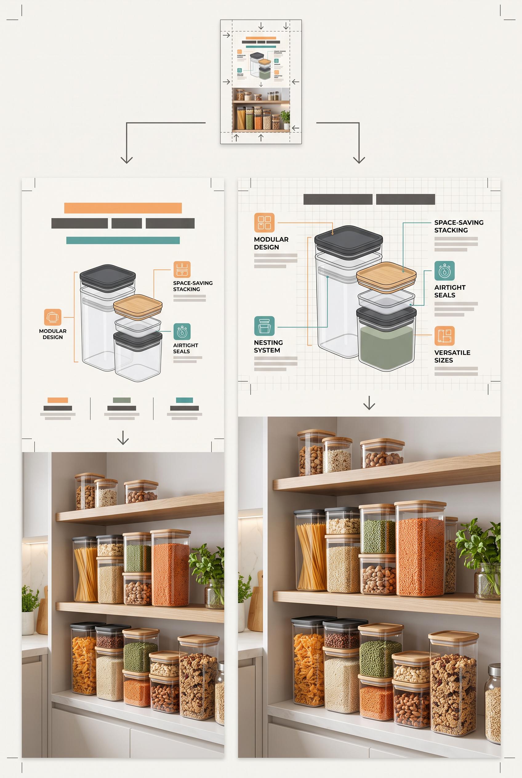
0Create a commercial-quality vertical 2:3 Pinterest educational campaign graphic for modular food storage packaging. Use a three-stage vertical stack: a tiny thumbnail composition test, a close view of packaging hierarchy with abstract unreadable blocks, and a bright pantry lifestyle hero showing stackable containers. Include subtle crop guides and directional arrows, with apricot, teal, charcoal, and paper white. Clean editorial art direction, realistic packaging mockups, useful visual teaching structure. No real brands, no trademarks, no trademarked characters, no watermark, and no unintended readable text.
 0
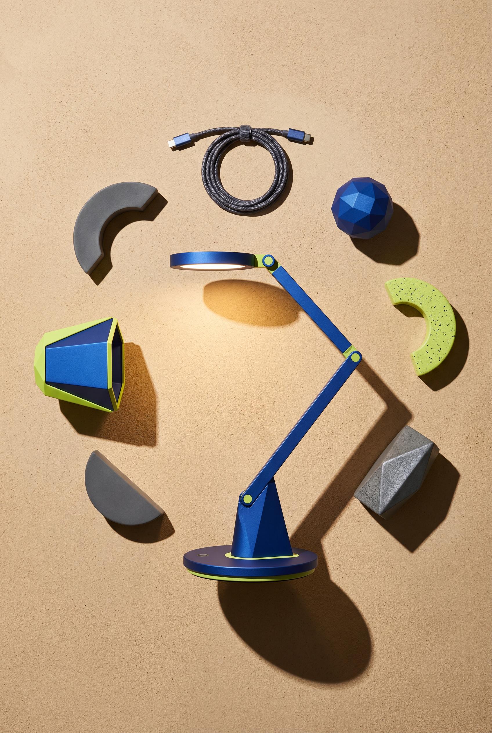
0Create a commercial-quality vertical 2:3 Pinterest product showcase of a sculptural rechargeable desk lamp arranged in an overhead circular composition with its charging base, detachable shade, cable, and abstract geometric accessories. Use a cobalt lamp, lime highlights, sand background, and smoke-gray shadows. Add a precise pool of warm light and crescent-shaped cast shadows, realistic premium materials, refined art direction, and strong visual balance. No real brands, no trademarks, no trademarked characters, no watermark, and no unintended readable text.
 0
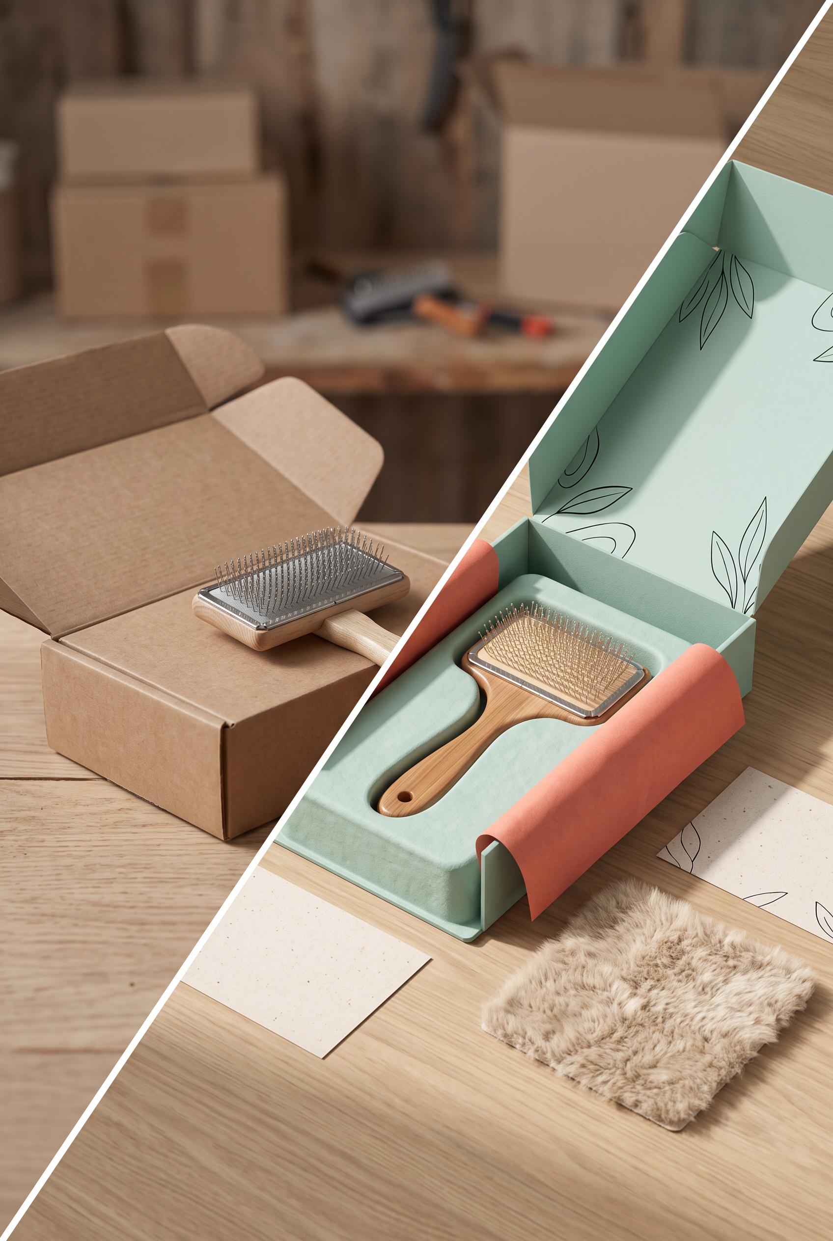
0Create a commercial-quality vertical 2:3 Pinterest composition showing a diagonal wipe transformation from a blank folding carton with a simple pet grooming brush prototype into a polished unboxing scene with the same brush, seafoam packaging, coral tissue, ink accents, oat paper, soft fur texture, rounded paper inserts, and gentle side lighting. Make the transformation obvious but elegant, with realistic materials, premium product photography, and clear depth. No real brands, no trademarks, no trademarked characters, no watermark, and no unintended readable text.
 0
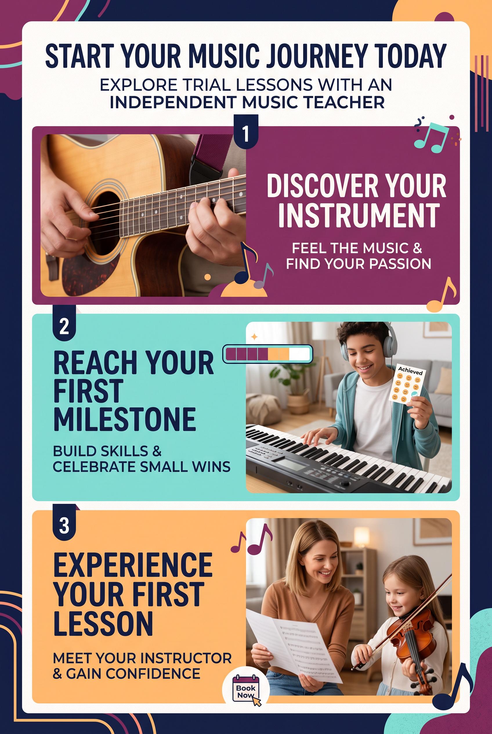
0Create a commercial-quality vertical 2:3 Pinterest composition for an educational campaign about an independent music teacher promoting trial lessons. Use a stacked three-stage progression with a close-up instrument detail, a simple practice milestone, and a welcoming lesson scene. Use plum, aqua, apricot, and deep navy. AI-modified downstream. No real brands, no trademarked characters, no watermark, and no unintended readable text.
 0
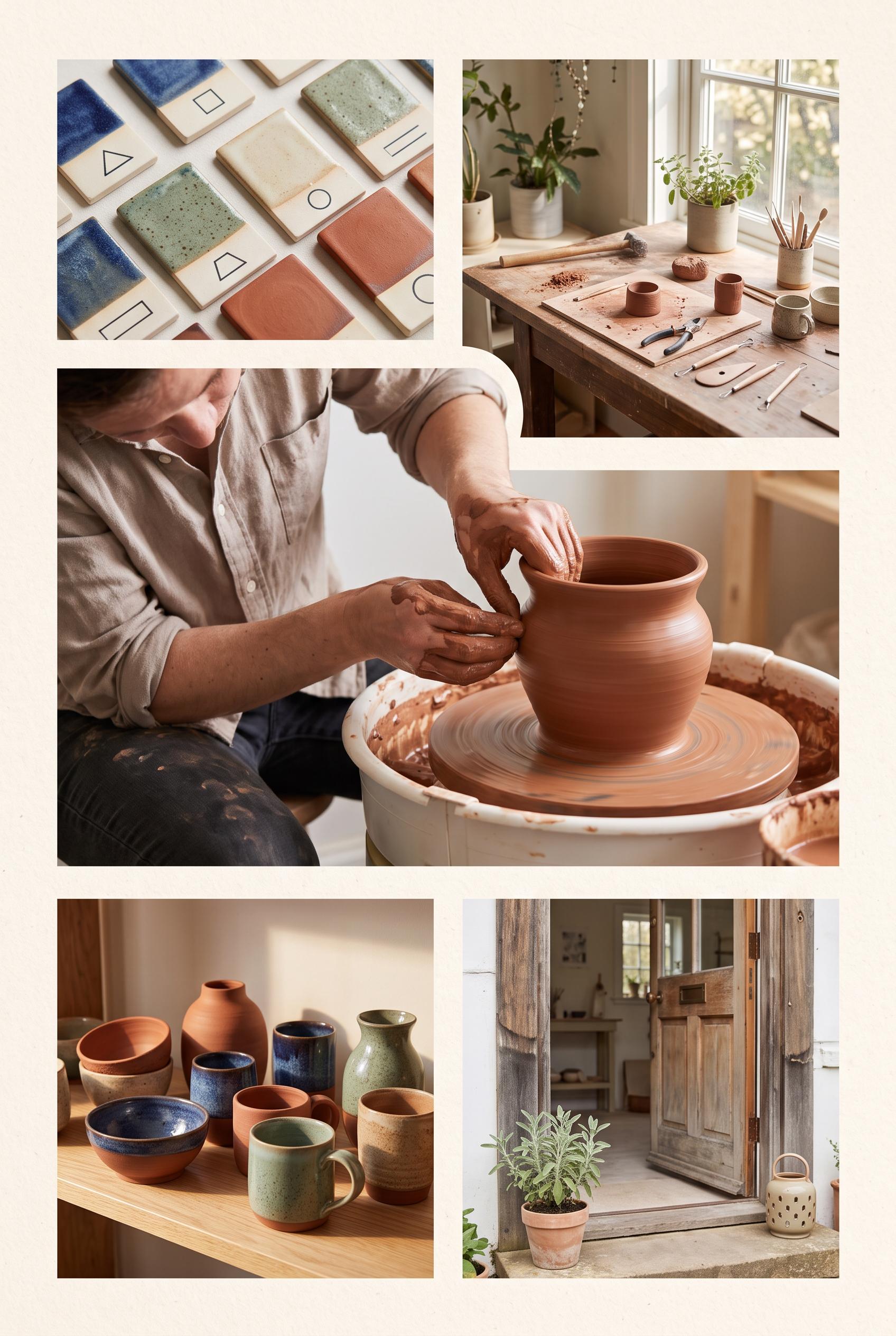
0Create a commercial-quality vertical 2:3 Pinterest composition as an inspirational showcase for an independent pottery studio open house. Use an editorial contact sheet with one large hero scene and four smaller photographic moments: hands shaping clay, glaze samples, a sunlit worktable, and finished vessels. Use terracotta, indigo, sage green, and warm cream. AI-modified downstream. No real brands, no trademarked characters, no watermark, and no unintended readable text. Corrective regeneration attempt 2. Produce a materially revised image, not a near-duplicate of an earlier variant. Preserve the successful subject, palette, lighting, focal hierarchy, and commercial polish from the original brief while correcting every issue below. Mandatory corrective instructions from the most recent visual QA: Preserve the polished vertical 2:3 editorial contact-sheet style, warm cream paper framing, terracotta/indigo/sage palette, soft natural light, and tactile pottery photography. Make the large dominant hero panel clearly show a maker shaping clay at a wheel. Use four smaller panels for: glaze tests, a sunlit worktable, finished vessels, and a welcoming studio entry moment with an inviting doorway. Remove all embedded words, captions, labels, signage, logos, watermarks, and other readable text; keep every image free of garbled details and generation artifacts. Observed defects from prior variants that must not recur: 1) Attractive vertical contact-sheet composition with strong palette and photography. 2) The required hero image of a maker shaping clay is relegated to a smaller panel; the hero is shelving instead. 3) No clear welcoming entry moment is shown. 4) The graphic contains substantial embedded readable copy and labels, which are not requested and create avoidable text-generation risk. Render no letters, words, numbers, prices, headings, labels, contact details, logos, glyphs, or pseudo-text anywhere. Use only blank surfaces, clean geometric marks, and non-linguistic placeholder shapes. Do not add explanatory captions, before/after labels, interface copy, or extra objects that the brief did not request. When a corrective instruction conflicts with a decorative detail, prioritize the corrective instruction.
 0
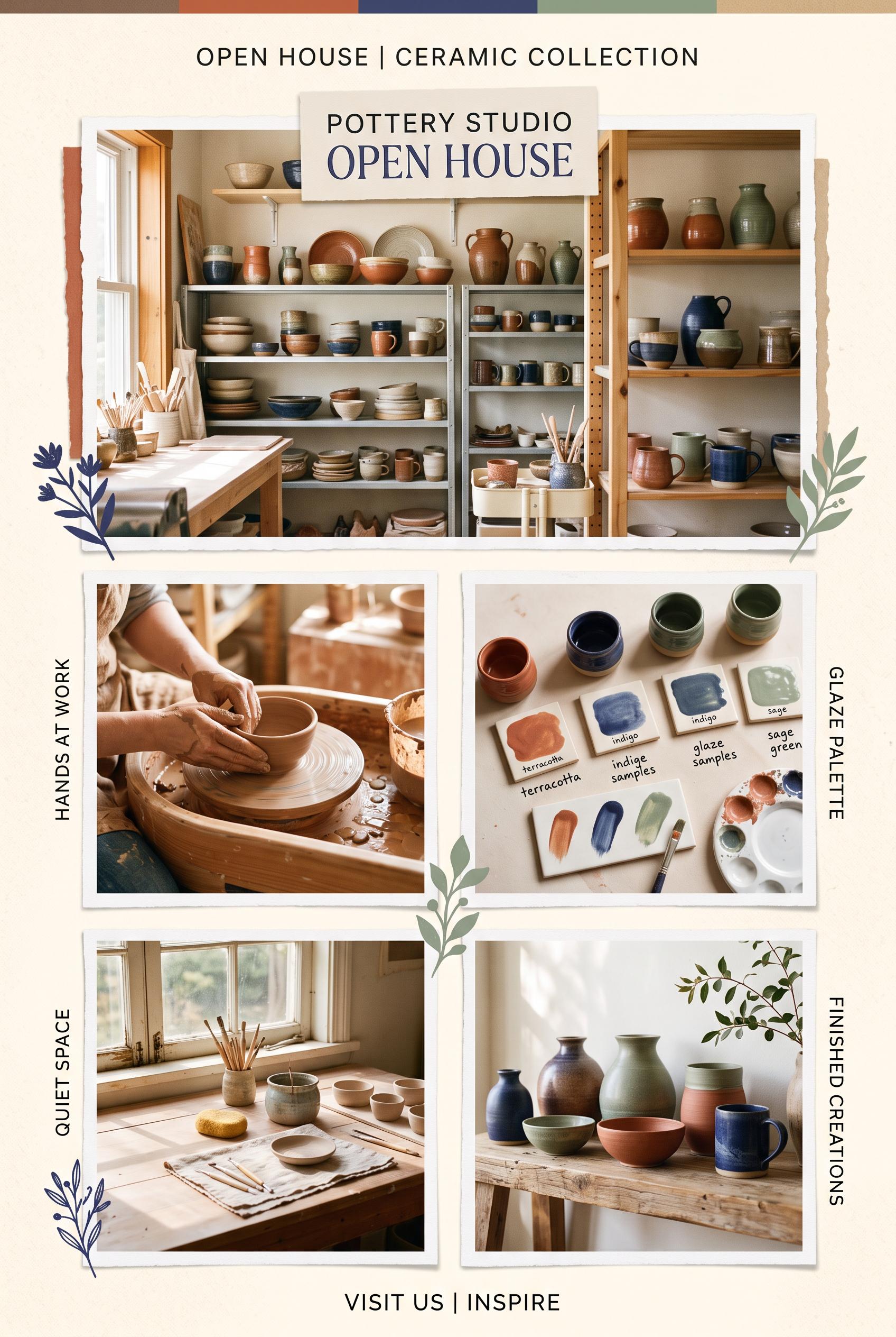
0Create a commercial-quality vertical 2:3 Pinterest composition as an inspirational showcase for an independent pottery studio open house. Use an editorial contact sheet with one large hero scene and four smaller photographic moments: hands shaping clay, glaze samples, a sunlit worktable, and finished vessels. Use terracotta, indigo, sage green, and warm cream. AI-modified downstream. No real brands, no trademarked characters, no watermark, and no unintended readable text.
 0
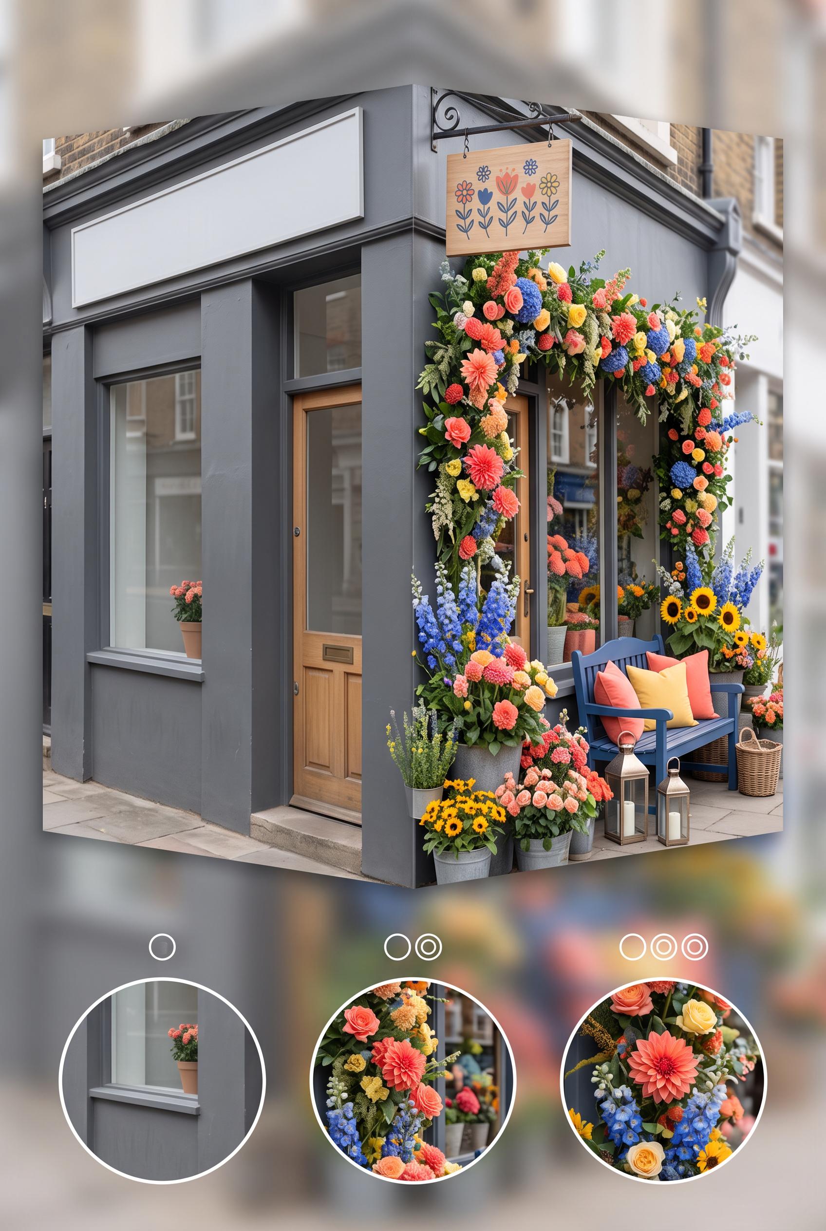
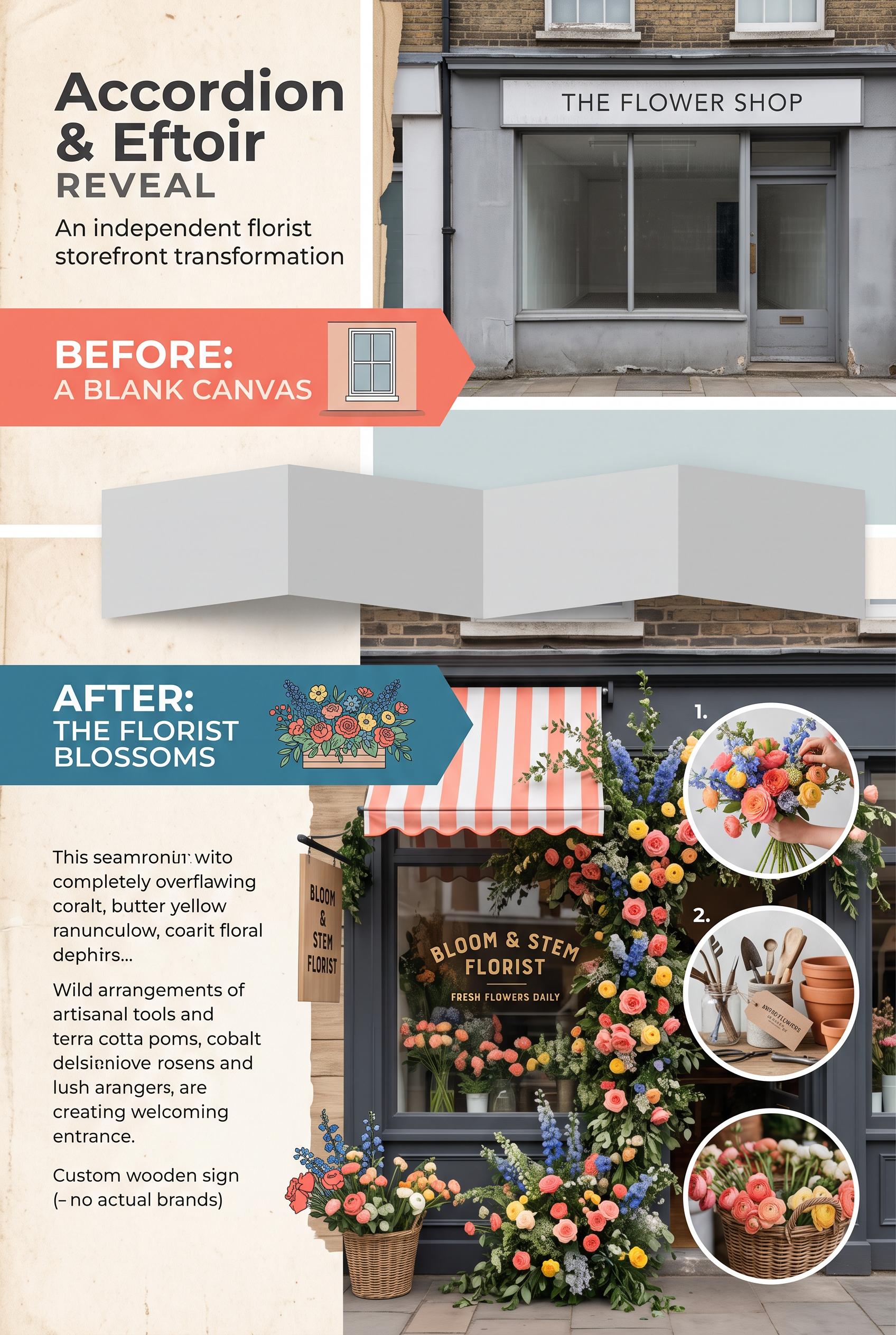
0Create a commercial-quality vertical 2:3 Pinterest composition showing an independent florist storefront transformation. Use an accordion-style before-and-after reveal with three small detail insets, a plain window on one side and an abundant seasonal floral display on the other. Use coral, cobalt blue, butter yellow, and charcoal. AI-modified downstream. No real brands, no trademarked characters, no watermark, and no unintended readable text. Corrective regeneration attempt 2. Produce a materially revised image, not a near-duplicate of an earlier variant. Preserve the successful subject, palette, lighting, focal hierarchy, and commercial polish from the original brief while correcting every issue below. Mandatory corrective instructions from the most recent visual QA: Regenerate the same attractive vertical 2:3 florist storefront before-and-after composition, preserving the coral, cobalt blue, butter yellow, charcoal palette, plain storefront on the left, abundant seasonal floral display on the right, layered stems, bold floral focal point, accordion reveal, and three circular detail insets. Remove all explanatory paragraph copy from the lower-left area or replace it with clean, correctly spelled, intentional minimal typography; do not generate any pseudo-text, misspellings, malformed words, or garbled readable characters. Make exactly three clearly visible, consistently styled detail insets for color, height, and lighting changes, with simple numeral markers only if rendered cleanly. Keep all signage generic and fictional, with no real brands, trademarks, watermark, or other unintended text. Observed defects from prior variants that must not recur: 1) The lower-left explanatory copy contains obvious garbled and misspelled text, including fragments such as “seamornit wito,” “coait,” and “delsi...”. 2) The composition is visually strong and clearly communicates before/after, but the malformed paragraph is a major commercial-quality defect. 3) The three detail insets are not consistently numbered or clearly integrated. Render no letters, words, numbers, prices, headings, labels, contact details, logos, glyphs, or pseudo-text anywhere. Use only blank surfaces, clean geometric marks, and non-linguistic placeholder shapes. Do not add explanatory captions, before/after labels, interface copy, or extra objects that the brief did not request. When a corrective instruction conflicts with a decorative detail, prioritize the corrective instruction.
 0
0Create a commercial-quality vertical 2:3 Pinterest composition showing an independent florist storefront transformation. Use an accordion-style before-and-after reveal with three small detail insets, a plain window on one side and an abundant seasonal floral display on the other. Use coral, cobalt blue, butter yellow, and charcoal. AI-modified downstream. No real brands, no trademarked characters, no watermark, and no unintended readable text.
 0
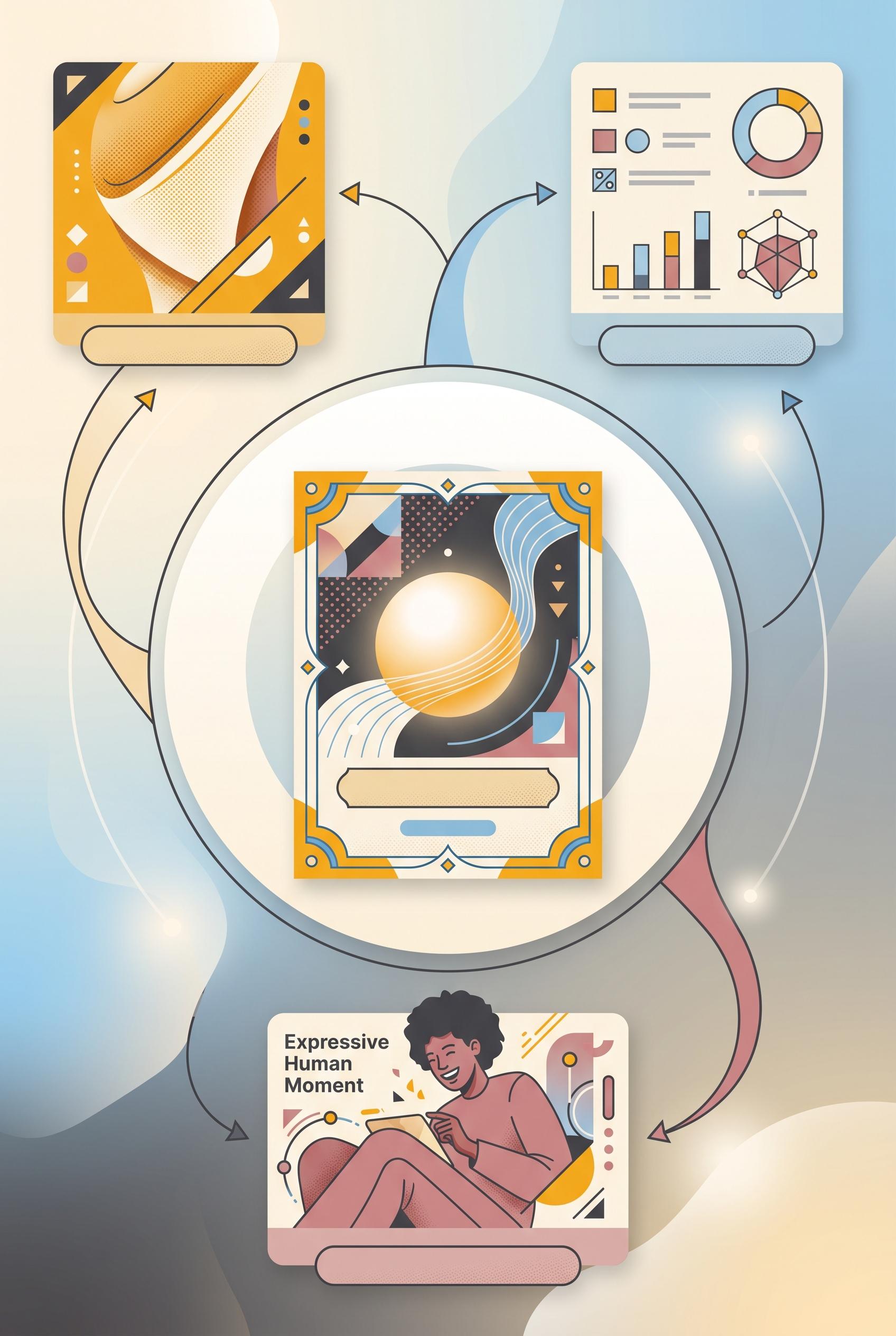
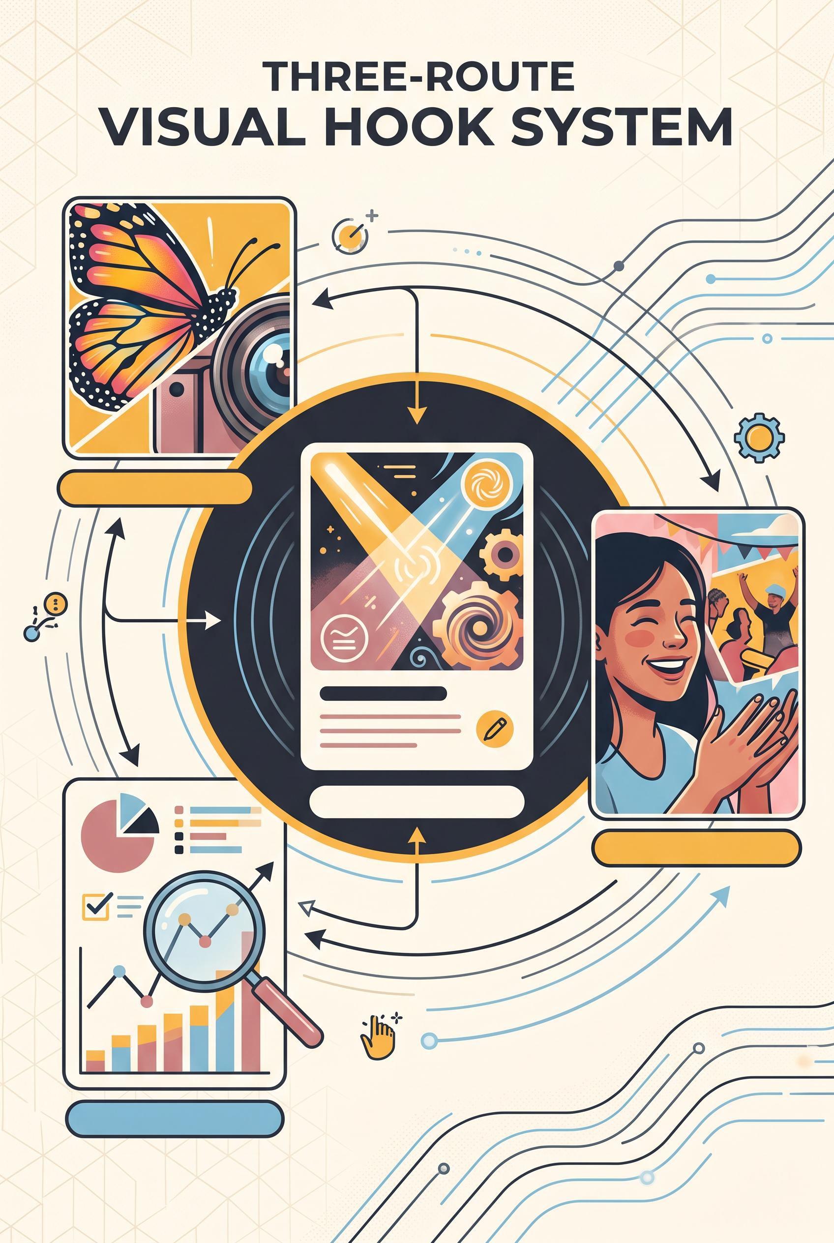
0Create a commercial-quality vertical 2:3 Pinterest composition explaining a three-route visual hook system for a fictional content campaign. Place one abstract central announcement card inside a circular storyboard, with three orbiting panels represented by a surprising crop, a proof-style visual, and an expressive human moment. Use saffron yellow, charcoal, dusty rose, sky blue, and cream. Include simple blank label bars only, with no unintended readable text. No real brands, no trademarked characters, and no watermark. Corrective regeneration attempt 4. Produce a materially revised image, not a near-duplicate of an earlier variant. Preserve the successful subject, palette, lighting, focal hierarchy, and commercial polish from the original brief while correcting every issue below. Mandatory corrective instructions from the most recent visual QA: Preserve the polished vertical 2:3 composition, saffron yellow, charcoal, dusty rose, sky blue, and cream palette, circular storyboard, central announcement card, three orbiting panels, arrows, lighting, focal hierarchy, and distinct surprising crop, proof visual, and expressive human moment. Remove all readable text, including the “Expressive Human Moment” headline, and replace it with a completely blank label bar or blank surface. Remove every icon-like or interface-like mark in the proof panel, including pictograms, percent-like forms, glyphs, and pseudo-text; replace them with clean abstract geometric shapes and unlabeled geometric charts only. Ensure absolutely no letters, words, numbers, symbols, logos, watermark, or pseudo-text anywhere in the image. Observed defects from prior variants that must not recur: 1) Strong vertical composition, focal point, palette, and three distinct visual routes. 2) Large readable headline text violates the requirement for no unintended readable text and for blank label bars only. 3) Attractive vertical composition with clear circular focal hierarchy and three distinct visual routes. 4) A readable percent symbol appears in the proof panel, violating the requirement to render no glyphs, numbers, or pseudo-text. 5) Some interface-like icons and chart marks should be replaced with purely non-linguistic geometric shapes. 6) Readable headline text “Expressive Human Moment” appears in the lower panel, violating the no-readable-text requirement. 7) The proof panel contains interface-like iconography and chart marks that may read as glyphs or UI symbols rather than purely abstract geometry. Render no letters, words, numbers, prices, headings, labels, contact details, logos, glyphs, or pseudo-text anywhere. Use only blank surfaces, clean geometric marks, and non-linguistic placeholder shapes. Do not add explanatory captions, before/after labels, interface copy, or extra objects that the brief did not request. When a corrective instruction conflicts with a decorative detail, prioritize the corrective instruction.
 0
0Create a commercial-quality vertical 2:3 Pinterest composition explaining a three-route visual hook system for a fictional content campaign. Place one abstract central announcement card inside a circular storyboard, with three orbiting panels represented by a surprising crop, a proof-style visual, and an expressive human moment. Use saffron yellow, charcoal, dusty rose, sky blue, and cream. Include simple blank label bars only, with no unintended readable text. No real brands, no trademarked characters, and no watermark. Corrective regeneration attempt 3. Produce a materially revised image, not a near-duplicate of an earlier variant. Preserve the successful subject, palette, lighting, focal hierarchy, and commercial polish from the original brief while correcting every issue below. Mandatory corrective instructions from the most recent visual QA: Preserve the polished vertical 2:3 layout, palette, circular storyboard, central announcement card, three orbiting panels, arrows, and distinct surprising crop, proof visual, and human moment. Remove the readable percent symbol entirely and replace it with abstract geometric shapes. Replace the small image/download/interface-like icons and any glyph-like chart marks with clean non-linguistic geometric placeholders. Ensure absolutely no letters, words, numbers, symbols, glyphs, logos, pseudo-text, or watermark anywhere; retain only blank label bars, geometric marks, charts without symbolic characters, and imagery. Observed defects from prior variants that must not recur: 1) Strong vertical composition, focal point, palette, and three distinct visual routes. 2) Large readable headline text violates the requirement for no unintended readable text and for blank label bars only. 3) Attractive vertical composition with clear circular focal hierarchy and three distinct visual routes. 4) A readable percent symbol appears in the proof panel, violating the requirement to render no glyphs, numbers, or pseudo-text. 5) Some interface-like icons and chart marks should be replaced with purely non-linguistic geometric shapes. Render no letters, words, numbers, prices, headings, labels, contact details, logos, glyphs, or pseudo-text anywhere. Use only blank surfaces, clean geometric marks, and non-linguistic placeholder shapes. Do not add explanatory captions, before/after labels, interface copy, or extra objects that the brief did not request. When a corrective instruction conflicts with a decorative detail, prioritize the corrective instruction.
 0
0Create a commercial-quality vertical 2:3 Pinterest composition explaining a three-route visual hook system for a fictional content campaign. Place one abstract central announcement card inside a circular storyboard, with three orbiting panels represented by a surprising crop, a proof-style visual, and an expressive human moment. Use saffron yellow, charcoal, dusty rose, sky blue, and cream. Include simple blank label bars only, with no unintended readable text. No real brands, no trademarked characters, and no watermark. Corrective regeneration attempt 2. Produce a materially revised image, not a near-duplicate of an earlier variant. Preserve the successful subject, palette, lighting, focal hierarchy, and commercial polish from the original brief while correcting every issue below. Mandatory corrective instructions from the most recent visual QA: Preserve the attractive vertical 2:3 layout, circular storyboard, central fictional announcement card, three orbiting panels, arrows, palette, and polished illustration style. Remove the large readable headline at the top and replace it with only abstract non-readable graphic shapes or blank label bars. Ensure every label, line, and card contains no letters, words, numbers, logos, or pseudo-text; retain only clean geometric placeholders and imagery. Keep the surprising crop, proof chart, and human moment clearly distinct, with no watermark or brand marks. Observed defects from prior variants that must not recur: 1) Strong vertical composition, focal point, palette, and three distinct visual routes. 2) Large readable headline text violates the requirement for no unintended readable text and for blank label bars only. Render no letters, words, numbers, prices, headings, labels, contact details, logos, glyphs, or pseudo-text anywhere. Use only blank surfaces, clean geometric marks, and non-linguistic placeholder shapes. Do not add explanatory captions, before/after labels, interface copy, or extra objects that the brief did not request. When a corrective instruction conflicts with a decorative detail, prioritize the corrective instruction.
 0
0Create a commercial-quality vertical 2:3 Pinterest composition explaining a three-route visual hook system for a fictional content campaign. Place one abstract central announcement card inside a circular storyboard, with three orbiting panels represented by a surprising crop, a proof-style visual, and an expressive human moment. Use saffron yellow, charcoal, dusty rose, sky blue, and cream. Include simple blank label bars only, with no unintended readable text. No real brands, no trademarked characters, and no watermark.
 0
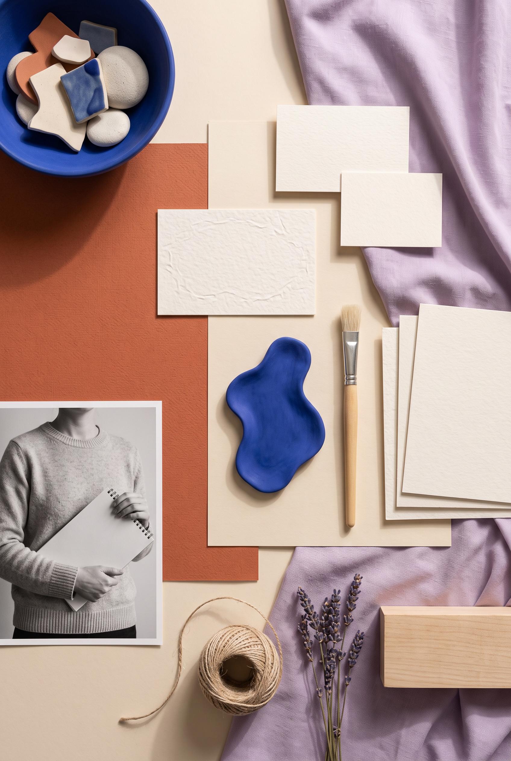
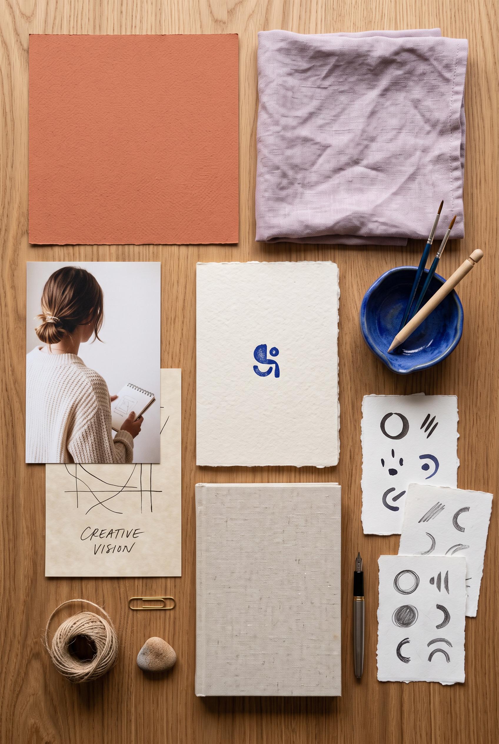
0Create a commercial-quality vertical 2:3 Pinterest composition for an inspirational creator branding showcase. Arrange an overhead editorial studio table with terracotta paper, lilac fabric, parchment cards, cobalt ceramic, a cropped anonymous portrait, tactile stationery, and abstract symbol samples. Use a modular still-life layout with generous breathing room and soft directional light. No real brands, no trademarked characters, no watermark, and no unintended readable text. Corrective regeneration attempt 2. Produce a materially revised image, not a near-duplicate of an earlier variant. Preserve the successful subject, palette, lighting, focal hierarchy, and commercial polish from the original brief while correcting every issue below. Mandatory corrective instructions from the most recent visual QA: Preserve the attractive vertical overhead studio-table composition, terracotta paper, lilac fabric, cobalt ceramic bowl, anonymous portrait, tactile materials, modular spacing, and soft editorial lighting. Remove all readable lettering, especially the “CREATIVE VISION” text, replacing it with blank paper or purely non-linguistic abstract marks. Redesign the central blue symbol as an obviously irregular abstract shape rather than a logo-like glyph. Ensure every paper card and sample contains no letters, words, numbers, or recognizable brand marks, with no watermark or generation artifacts. Observed defects from prior variants that must not recur: 1) The paper card contains clearly readable unintended text: “CREATIVE VISION.” 2) The central blue symbol is somewhat logo-like and should be made more clearly abstract to avoid brand-mark resemblance. Render no letters, words, numbers, prices, headings, labels, contact details, logos, glyphs, or pseudo-text anywhere. Use only blank surfaces, clean geometric marks, and non-linguistic placeholder shapes. Do not add explanatory captions, before/after labels, interface copy, or extra objects that the brief did not request. When a corrective instruction conflicts with a decorative detail, prioritize the corrective instruction.
 0
0Create a commercial-quality vertical 2:3 Pinterest composition for an inspirational creator branding showcase. Arrange an overhead editorial studio table with terracotta paper, lilac fabric, parchment cards, cobalt ceramic, a cropped anonymous portrait, tactile stationery, and abstract symbol samples. Use a modular still-life layout with generous breathing room and soft directional light. No real brands, no trademarked characters, no watermark, and no unintended readable text.
 0
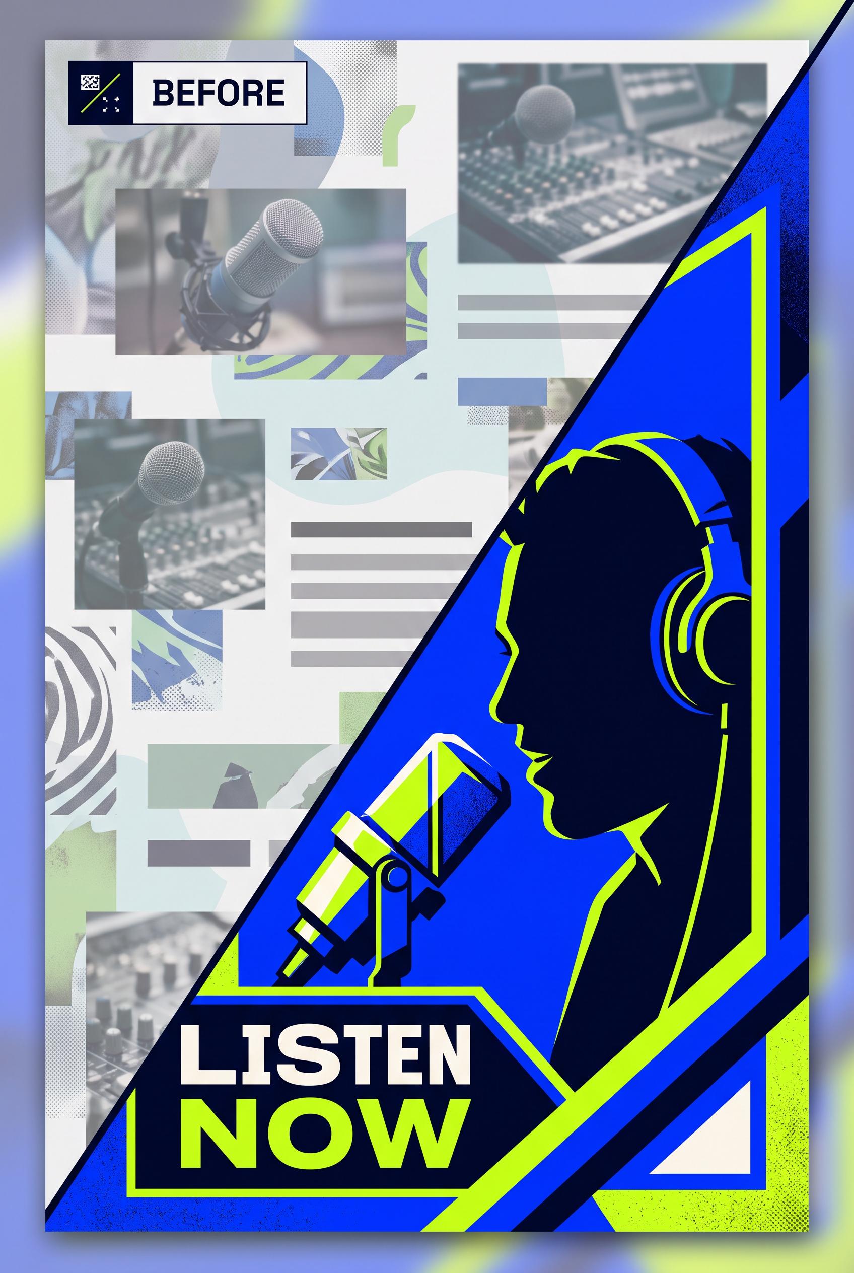
0Create a commercial-quality vertical 2:3 Pinterest composition showing a before-and-after redesign of a fictional podcast thumbnail. Use a diagonal wipe: left side cluttered and low contrast, right side focused with a close-up illustrated host silhouette, strong geometric framing, and a single visual focal point. Palette of electric cobalt, acid lime, deep ink, and warm white. No real brands, no trademarked characters, no watermark, and no unintended readable text. Corrective regeneration attempt 2. Produce a materially revised image, not a near-duplicate of an earlier variant. Preserve the successful subject, palette, lighting, focal hierarchy, and commercial polish from the original brief while correcting every issue below. Mandatory corrective instructions from the most recent visual QA: Preserve the polished vertical 2:3 editorial composition, cobalt/acid-lime/deep-ink/warm-white palette, diagonal wipe, paper grain, and strong right-side close-up illustrated host silhouette with geometric framing. Redesign the left side to clearly show a weak, low-contrast podcast thumbnail with one small distant host portrait, tiny competing elements, and visibly poor hierarchy rather than repeated microphone photos. Remove all readable text, including “LISTEN NOW” and any other labels or pseudo-typography. Keep the right side focused on a single host focal point without brands, trademarks, watermarks, or visual artifacts. Observed defects from prior variants that must not recur: 1) The left-side “before” version lacks the required distant host portrait and is dominated by repeated microphone images. 2) Unrequested readable promotional text (“LISTEN NOW”) introduces an unintended call-to-action. 3) The composition is visually polished but the before/after contrast is less clear than the brief requires. Render no letters, words, numbers, prices, headings, labels, contact details, logos, glyphs, or pseudo-text anywhere. Use only blank surfaces, clean geometric marks, and non-linguistic placeholder shapes. Do not add explanatory captions, before/after labels, interface copy, or extra objects that the brief did not request. When a corrective instruction conflicts with a decorative detail, prioritize the corrective instruction.
 0
0Create a commercial-quality vertical 2:3 Pinterest composition showing a before-and-after redesign of a fictional podcast thumbnail. Use a diagonal wipe: left side cluttered and low contrast, right side focused with a close-up illustrated host silhouette, strong geometric framing, and a single visual focal point. Palette of electric cobalt, acid lime, deep ink, and warm white. No real brands, no trademarked characters, no watermark, and no unintended readable text.
 0
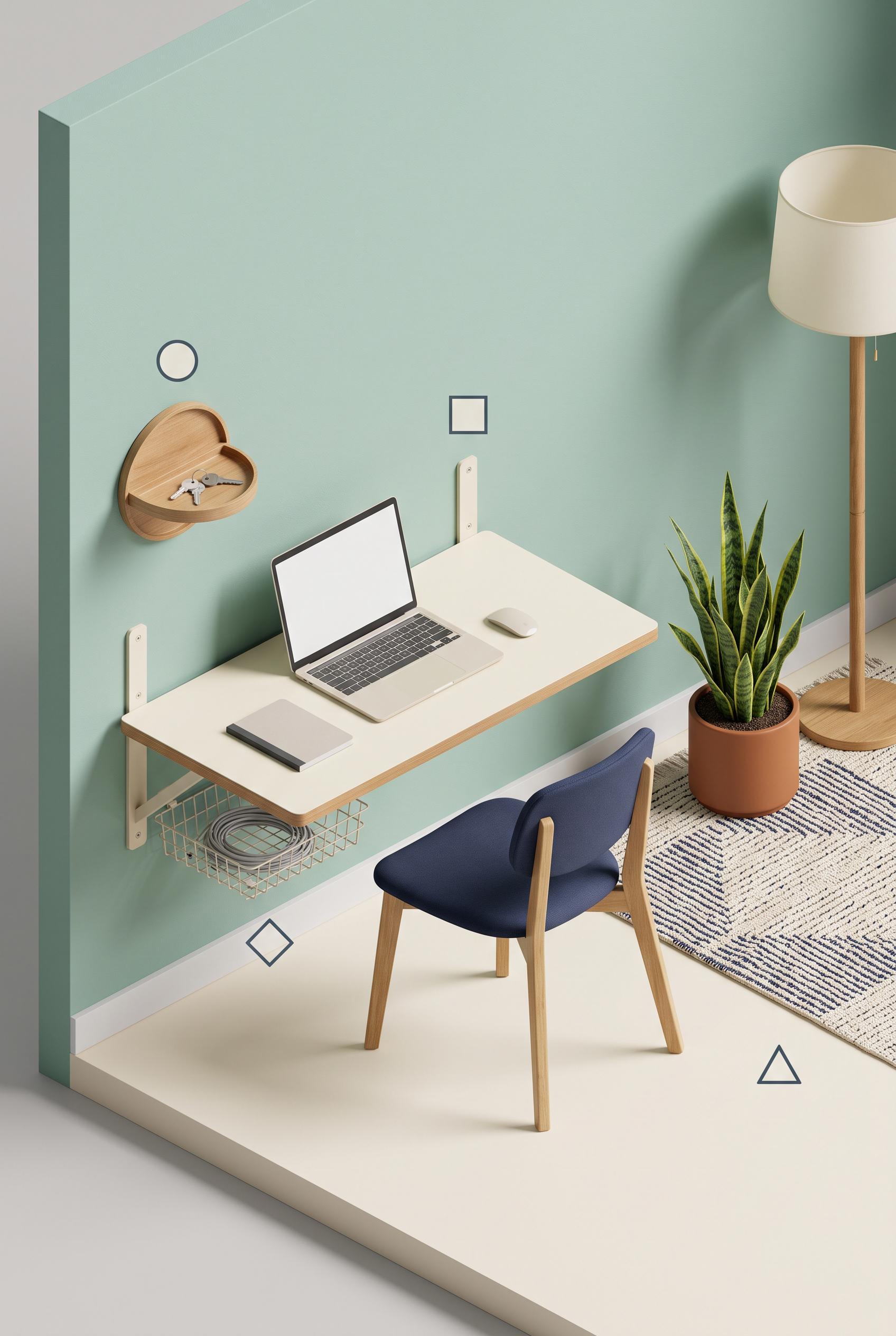
0Create a commercial-quality educational interior styling graphic in a vertical 2:3 Pinterest composition. Show an isometric cutaway of a rental-friendly work nook with four clearly separated object-based zones: entry tray, slim desk, concealed cable basket, and softening layer with plant and textile. Use seafoam wall paint, rust accessories, cream surfaces, navy chair details, and natural oak. Add four simple geometric markers with no readable words. Clean instructional art direction, realistic room rendering, crisp hierarchy, no real brands, no trademarked characters, no watermark, and no unintended readable text. AI-modified downstream. Corrective regeneration attempt 3. Produce a materially revised image, not a near-duplicate of an earlier variant. Preserve the successful subject, palette, lighting, focal hierarchy, and commercial polish from the original brief while correcting every issue below. Mandatory corrective instructions from the most recent visual QA: Preserve the polished vertical 2:3 isometric cutaway, seafoam walls, cream surfaces, natural oak, navy chair, plant, textile, lighting, and exactly four existing geometric markers. Replace the freestanding desk with a clearly wall-mounted slim desk: show a cream or oak desktop attached directly to the wall with discreet brackets or a fold-down structure and no floor-standing desk legs. Keep the entry tray, visibly concealed cable basket, and plant/textile softening layer distinct and uncluttered. Retain exactly one circle, square, diamond, and triangle near their corresponding zones. Render no letters, words, numbers, labels, logos, watermark, glyphs, or pseudo-text anywhere. Observed defects from prior variants that must not recur: 1) The image contains prominent readable labels and numbered legend text despite the requirement for geometric markers only. 2) The top-left and bottom legends duplicate information and reduce the clean instructional composition. 3) Attractive vertical isometric composition with four geometric markers and no readable text or watermark. 4) The desk is a freestanding table rather than the required wall-mounted/slim desk, so a key named concept is not met. 5) The four zones are present but the wall-mounted desk zone is not visually distinct enough from the overall workstation. Render no letters, words, numbers, prices, headings, labels, contact details, logos, glyphs, or pseudo-text anywhere. Use only blank surfaces, clean geometric marks, and non-linguistic placeholder shapes. Do not add explanatory captions, before/after labels, interface copy, or extra objects that the brief did not request. When a corrective instruction conflicts with a decorative detail, prioritize the corrective instruction.
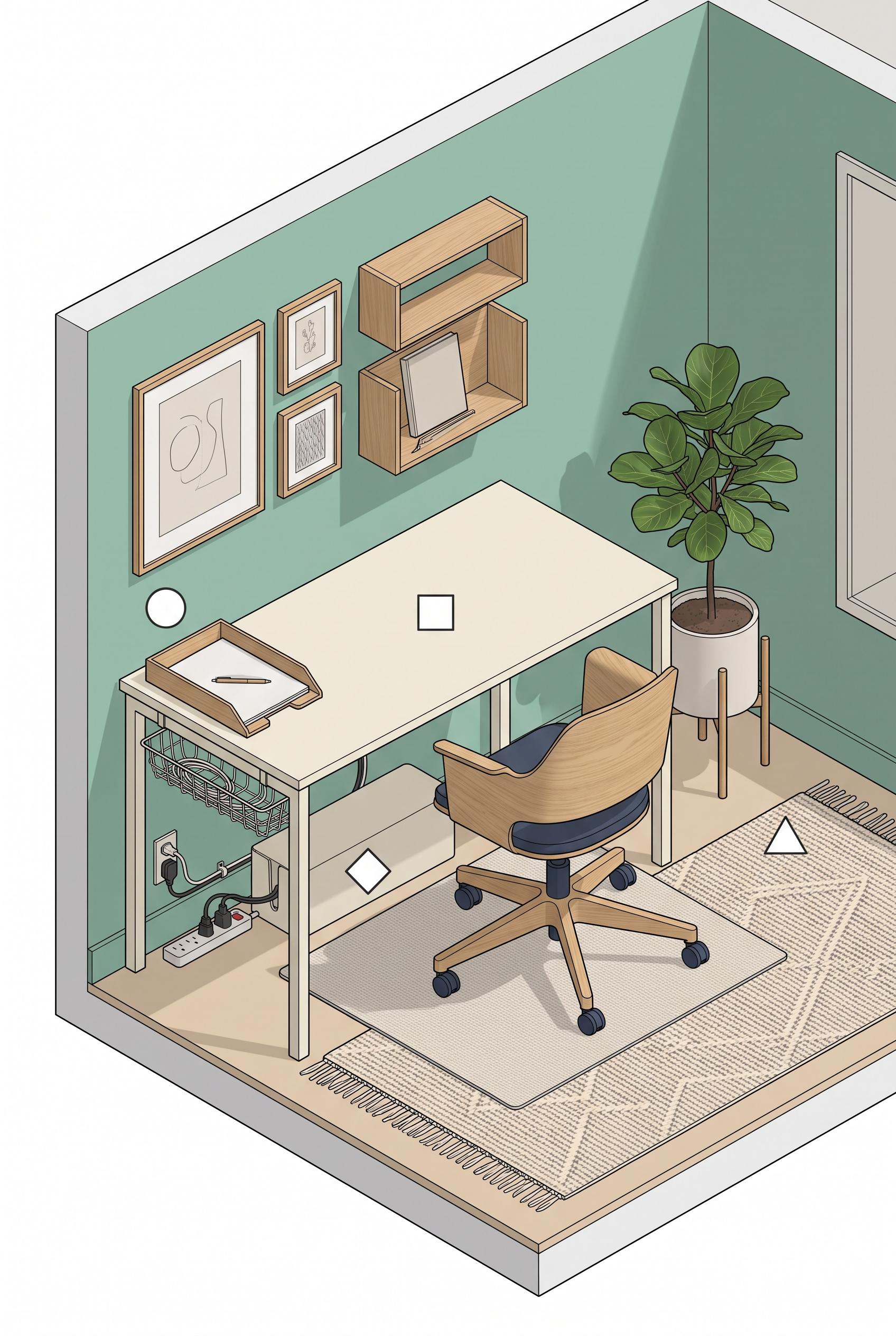 0
0Create a commercial-quality educational interior styling graphic in a vertical 2:3 Pinterest composition. Show an isometric cutaway of a rental-friendly work nook with four clearly separated object-based zones: entry tray, slim desk, concealed cable basket, and softening layer with plant and textile. Use seafoam wall paint, rust accessories, cream surfaces, navy chair details, and natural oak. Add four simple geometric markers with no readable words. Clean instructional art direction, realistic room rendering, crisp hierarchy, no real brands, no trademarked characters, no watermark, and no unintended readable text. AI-modified downstream. Corrective regeneration attempt 2. Produce a materially revised image, not a near-duplicate of an earlier variant. Preserve the successful subject, palette, lighting, focal hierarchy, and commercial polish from the original brief while correcting every issue below. Mandatory corrective instructions from the most recent visual QA: Preserve the attractive vertical 2:3 isometric rental-friendly work nook, seafoam walls, cream desk, natural oak, rust accessories, navy chair, plants, textile, and visible concealed cable basket. Remove every readable word, letter, number, caption, and legend, including “Entry Tray,” “Slim Desk,” “Concealed Cable Basket,” “Softening Layer,” and all 1–4 markers. Replace them with exactly four small, simple, distinct geometric markers only—circle, square, diamond, and triangle—placed near the corresponding tray, desk, cable basket, and plant/textile zones. Keep the four zones visually distinct through objects and color, with no watermark, logos, or other text. Observed defects from prior variants that must not recur: 1) The image contains prominent readable labels and numbered legend text despite the requirement for geometric markers only. 2) The top-left and bottom legends duplicate information and reduce the clean instructional composition. Render no letters, words, numbers, prices, headings, labels, contact details, logos, glyphs, or pseudo-text anywhere. Use only blank surfaces, clean geometric marks, and non-linguistic placeholder shapes. Do not add explanatory captions, before/after labels, interface copy, or extra objects that the brief did not request. When a corrective instruction conflicts with a decorative detail, prioritize the corrective instruction.
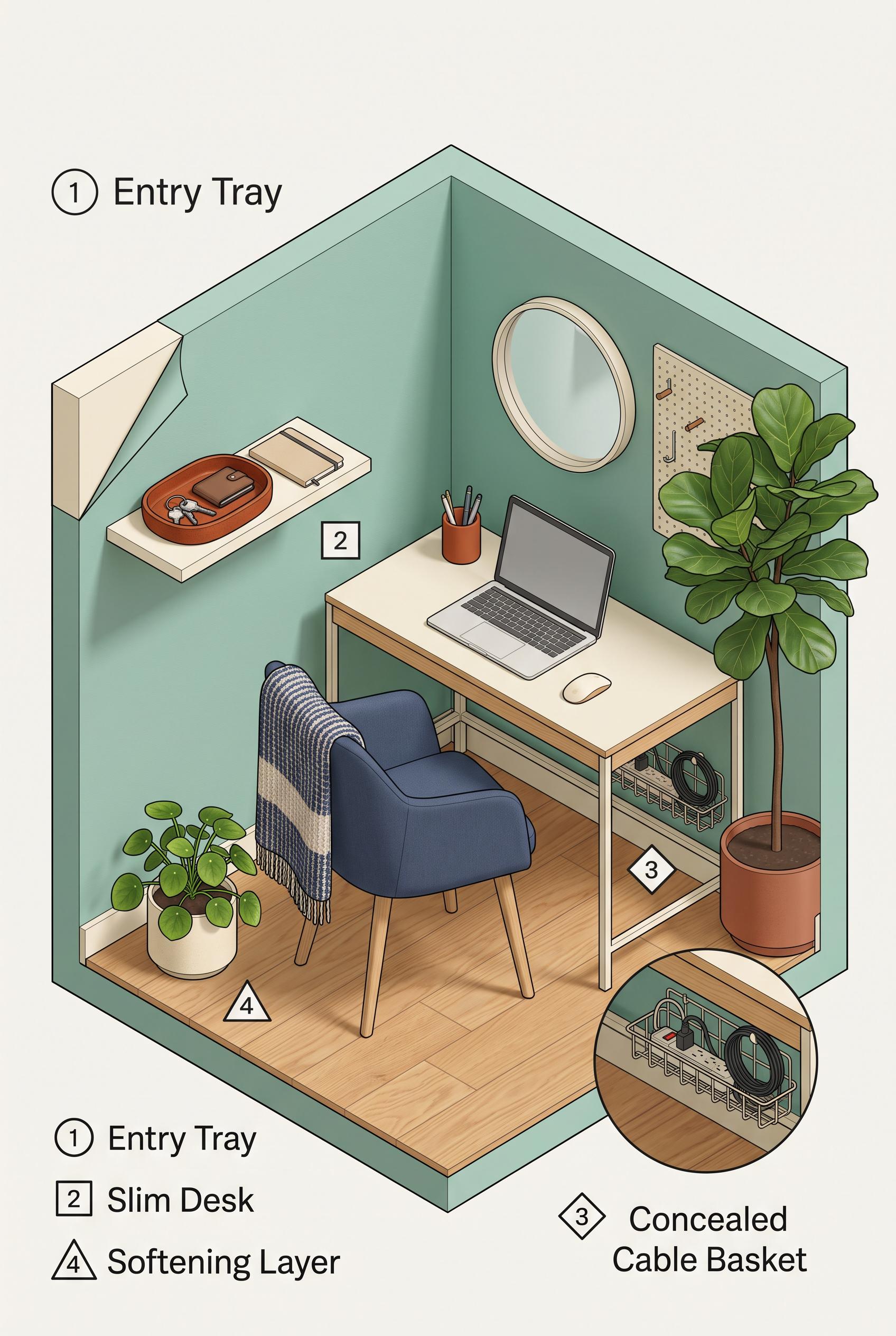 0
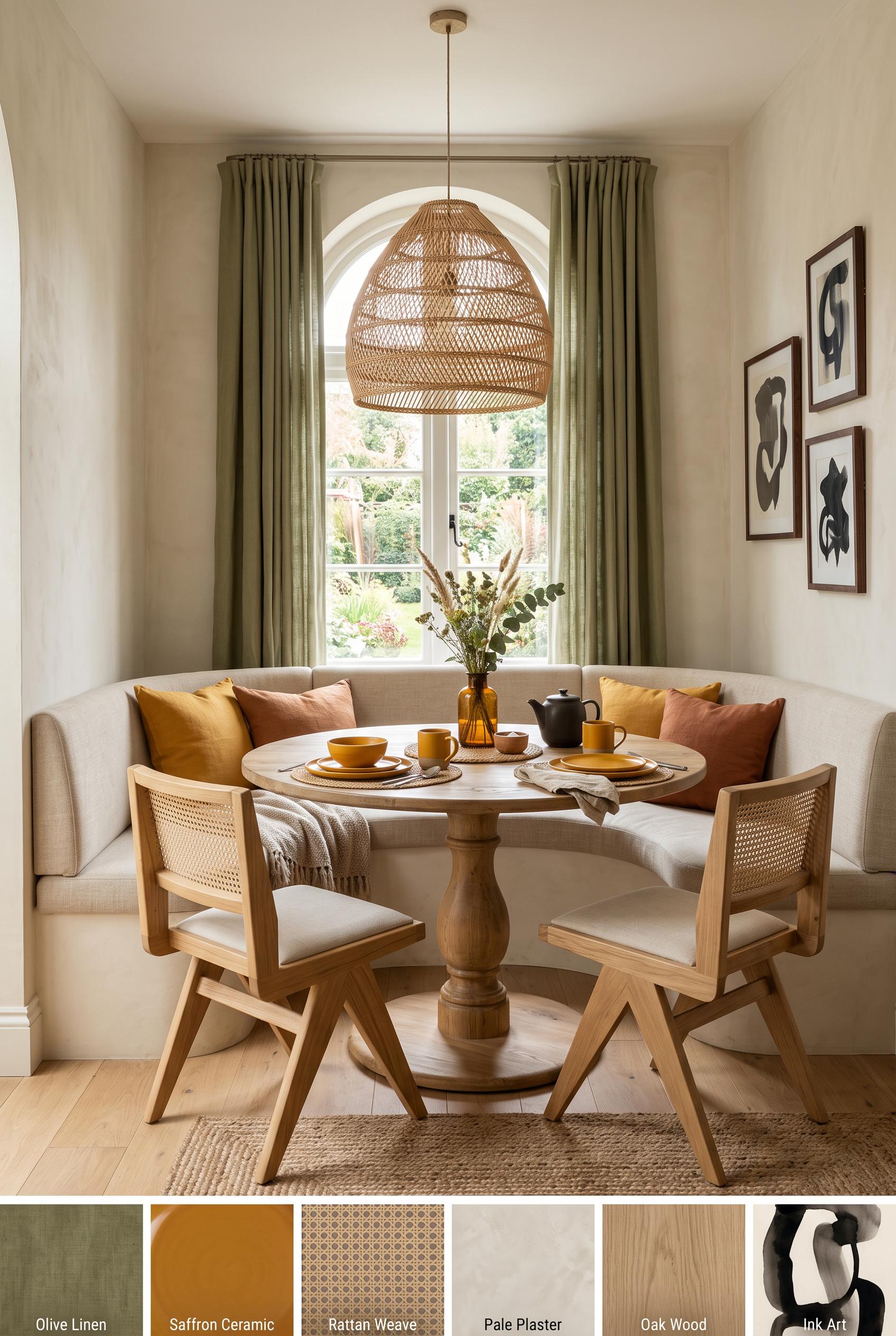
0Create a commercial-quality educational interior styling graphic in a vertical 2:3 Pinterest composition. Show an isometric cutaway of a rental-friendly work nook with four clearly separated object-based zones: entry tray, slim desk, concealed cable basket, and softening layer with plant and textile. Use seafoam wall paint, rust accessories, cream surfaces, navy chair details, and natural oak. Add four simple geometric markers with no readable words. Clean instructional art direction, realistic room rendering, crisp hierarchy, no real brands, no trademarked characters, no watermark, and no unintended readable text. AI-modified downstream.
 0
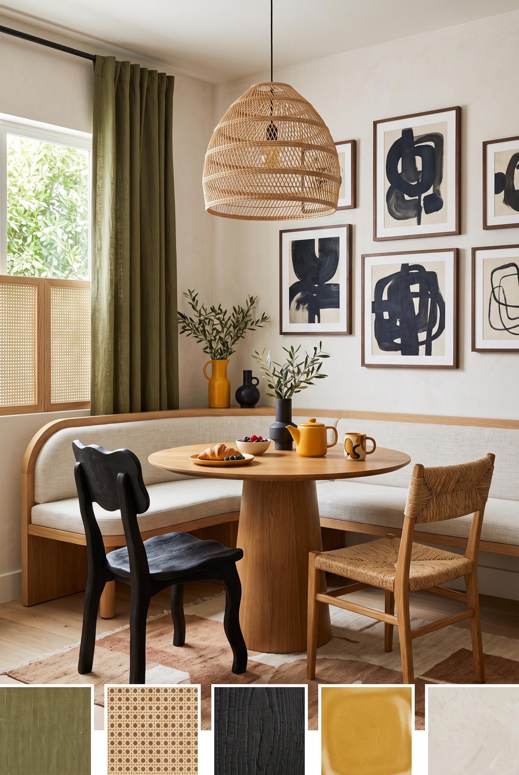
0Create a commercial-quality inspirational breakfast nook interior in a vertical 2:3 Pinterest composition. Use a three-quarter editorial room view with a round pedestal table, curved built-in bench, two sculptural chairs, woven pendant light, olive linen curtains, saffron ceramic accents, ink-toned art forms, pale plaster walls, and natural cane details. Add small abstract material swatches at the bottom with no words. Sophisticated residential styling, balanced daylight, tactile surfaces, no real brands, no trademarked characters, no watermark, and no unintended readable text. AI-modified downstream. Corrective regeneration attempt 2. Produce a materially revised image, not a near-duplicate of an earlier variant. Preserve the successful subject, palette, lighting, focal hierarchy, and commercial polish from the original brief while correcting every issue below. Mandatory corrective instructions from the most recent visual QA: Preserve the polished vertical breakfast-nook interior, round pedestal table, curved bench, woven pendant, olive curtains, saffron accents, ink-toned art wall, natural materials, and balanced daylight. Remove all readable text, letters, words, labels, logos, and watermarking from the lower edge. Replace the labeled swatch strip with small subtle unlabeled abstract material swatches only. Make the two foreground chairs visibly mismatched in silhouette or material while retaining a cohesive sophisticated style. Keep the clear three-quarter room composition and realistic commercial interior quality. Observed defects from prior variants that must not recur: 1) Readable labels are embedded on every lower material swatch, violating the no-readable-text requirement. 2) The two foreground chairs appear nearly identical rather than clearly mismatched. 3) The composition is attractive and polished, but the swatch strip feels like a labeled catalog panel rather than subtle unlabeled material samples. Render no letters, words, numbers, prices, headings, labels, contact details, logos, glyphs, or pseudo-text anywhere. Use only blank surfaces, clean geometric marks, and non-linguistic placeholder shapes. Do not add explanatory captions, before/after labels, interface copy, or extra objects that the brief did not request. When a corrective instruction conflicts with a decorative detail, prioritize the corrective instruction.
 0
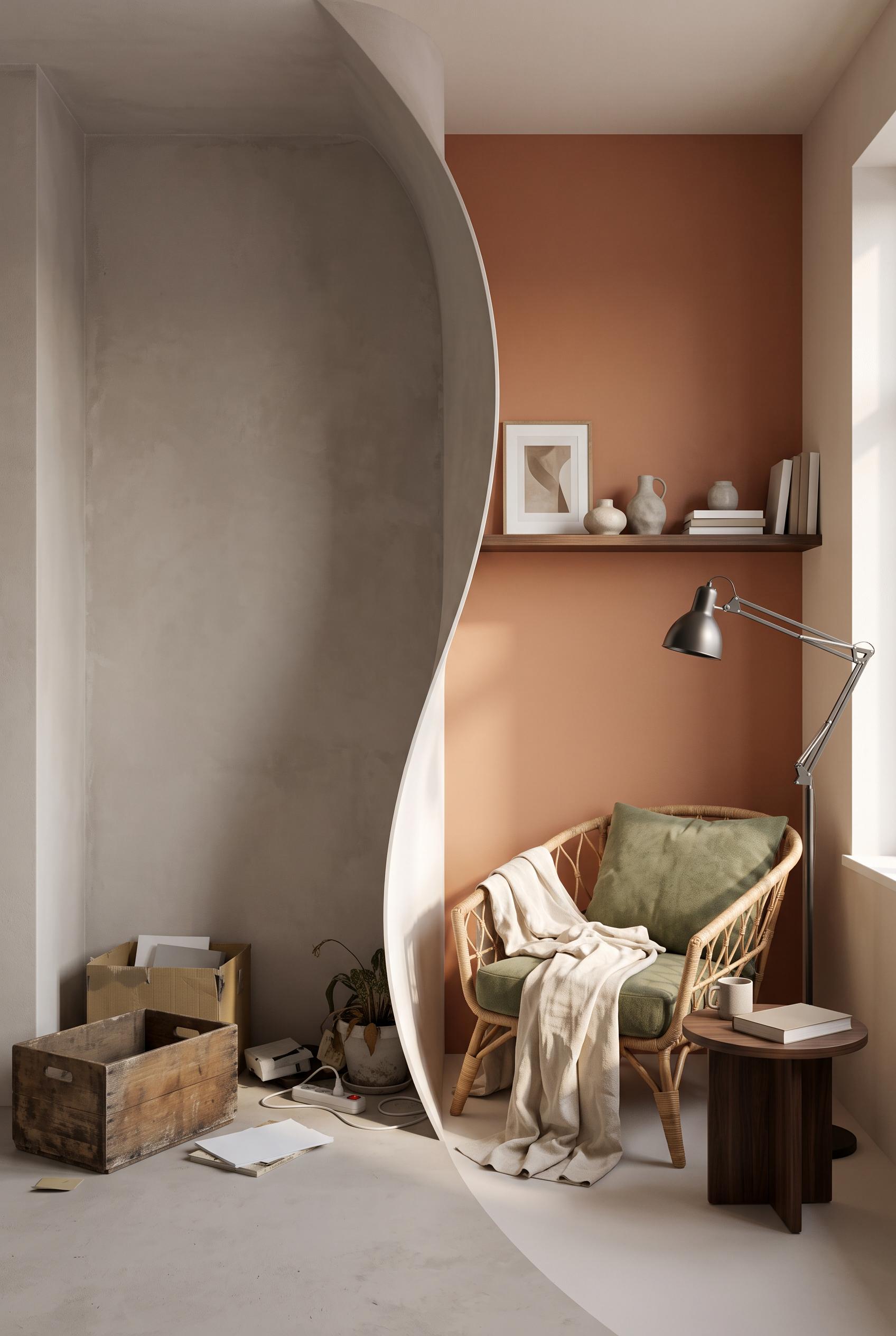
0Create a commercial-quality inspirational breakfast nook interior in a vertical 2:3 Pinterest composition. Use a three-quarter editorial room view with a round pedestal table, curved built-in bench, two sculptural chairs, woven pendant light, olive linen curtains, saffron ceramic accents, ink-toned art forms, pale plaster walls, and natural cane details. Add small abstract material swatches at the bottom with no words. Sophisticated residential styling, balanced daylight, tactile surfaces, no real brands, no trademarked characters, no watermark, and no unintended readable text. AI-modified downstream.
 0
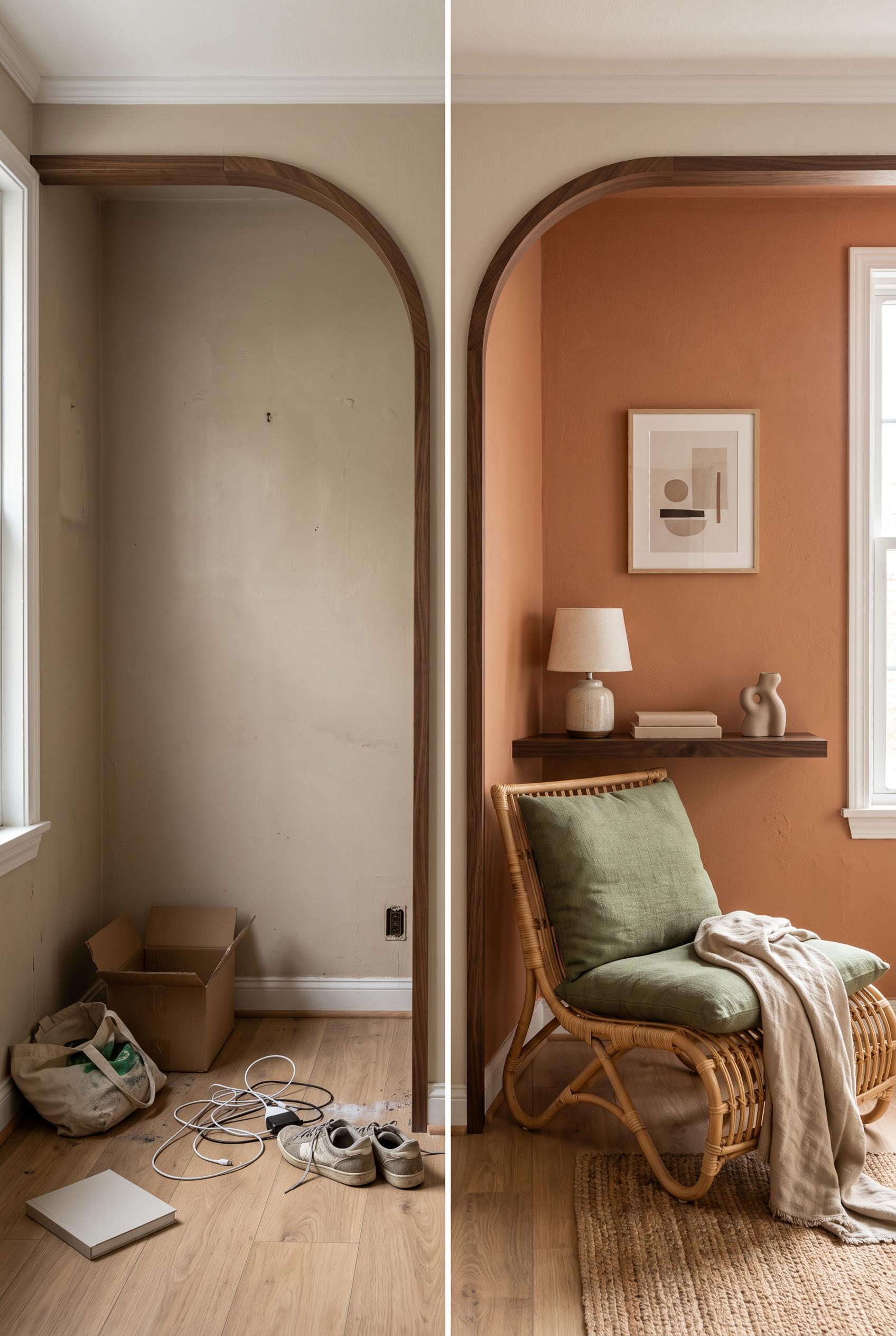
0Create a commercial-quality interior design transformation image in a vertical 2:3 Pinterest composition. Use a matched split-screen view of one bedroom alcove before and after, with a central curved architectural reveal. Before: empty recess, dull wall, scattered items. After: terracotta lounge chair, moss cushion, linen throw, dark walnut shelf, ceramic lamp, and restrained artwork shapes. Editorial home magazine styling, realistic materials, natural afternoon light, strong spatial clarity, no real brands, no trademarked characters, no watermark, and no unintended readable text. AI-modified downstream. Corrective regeneration attempt 2. Produce a materially revised image, not a near-duplicate of an earlier variant. Preserve the successful subject, palette, lighting, focal hierarchy, and commercial polish from the original brief while correcting every issue below. Mandatory corrective instructions from the most recent visual QA: Preserve the realistic editorial bedroom alcove, warm natural afternoon light, terracotta-toned after wall, woven lounge chair, moss cushion, linen throw, walnut shelf, and clean vertical 2:3 composition. Replace the table lamp with a clearly visible adjustable floor lamp beside the chair, and add a compact small side table. Redesign the center transition as an unmistakable smooth curved reveal separating the bare before alcove from the furnished after alcove, while maintaining matched perspective and spatial alignment. Keep the before side bare and underused with restrained scattered items. Include no readable text, logos, trademarks, or watermark. Observed defects from prior variants that must not recur: 1) The after state lacks the required adjustable floor lamp and small side table; it shows a table lamp instead. 2) The split is a straight vertical divider rather than a clear curved reveal between the before and after states. Render no letters, words, numbers, prices, headings, labels, contact details, logos, glyphs, or pseudo-text anywhere. Use only blank surfaces, clean geometric marks, and non-linguistic placeholder shapes. Do not add explanatory captions, before/after labels, interface copy, or extra objects that the brief did not request. When a corrective instruction conflicts with a decorative detail, prioritize the corrective instruction.
 0
0Create a commercial-quality interior design transformation image in a vertical 2:3 Pinterest composition. Use a matched split-screen view of one bedroom alcove before and after, with a central curved architectural reveal. Before: empty recess, dull wall, scattered items. After: terracotta lounge chair, moss cushion, linen throw, dark walnut shelf, ceramic lamp, and restrained artwork shapes. Editorial home magazine styling, realistic materials, natural afternoon light, strong spatial clarity, no real brands, no trademarked characters, no watermark, and no unintended readable text. AI-modified downstream.
 0
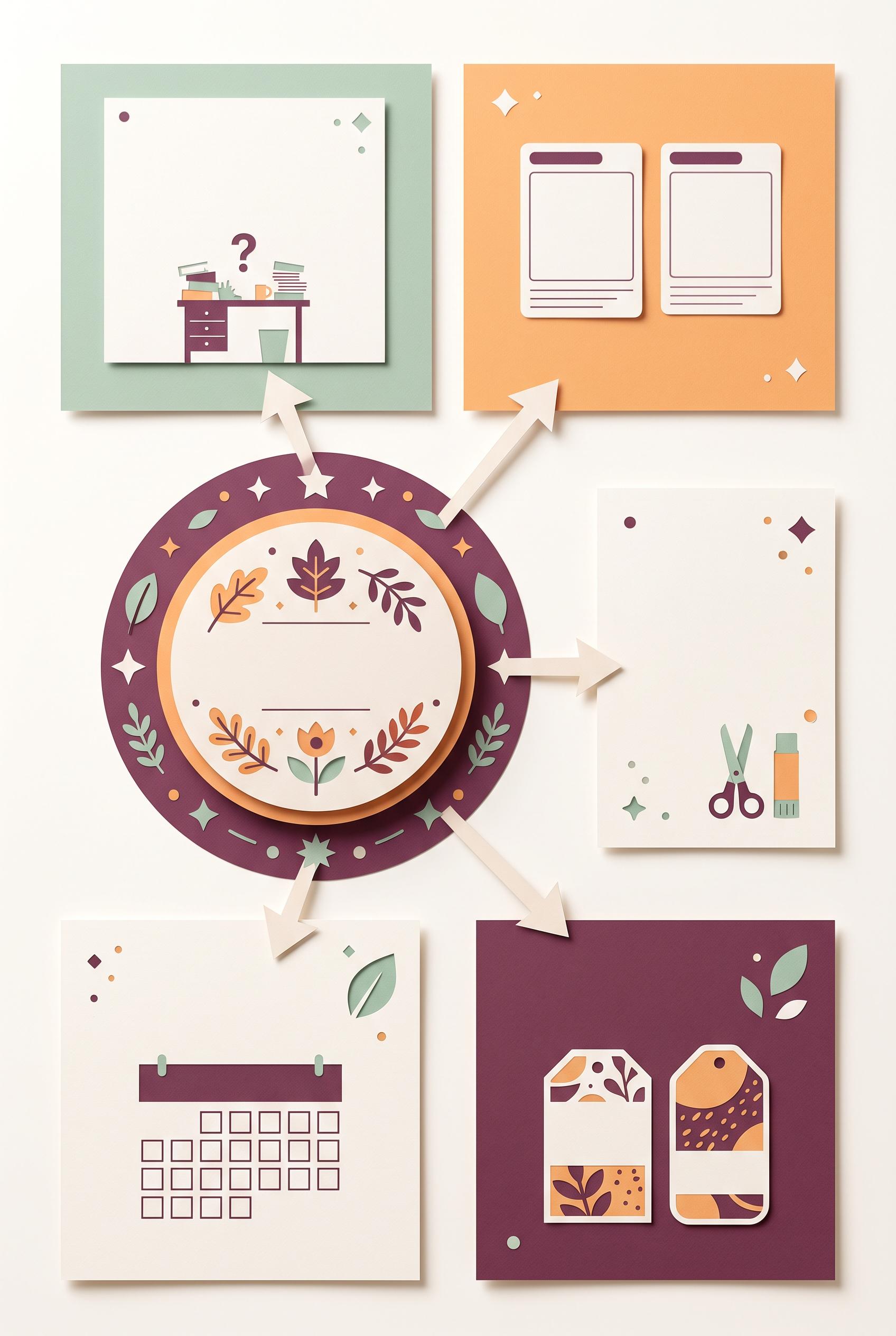
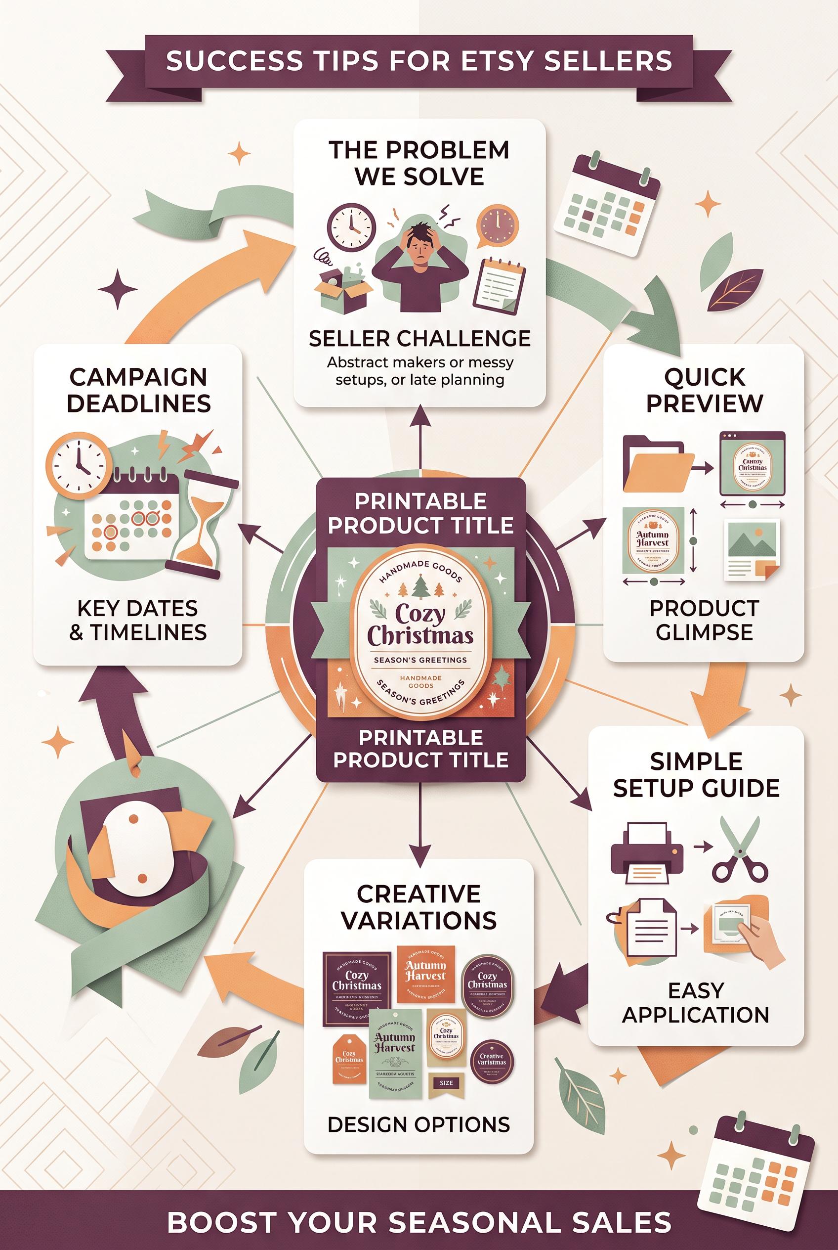
0Create a commercial-quality vertical 2:3 Pinterest educational graphic for an Etsy seller campaign. Center a polished printable seasonal label product, then connect it through a radial map to five blank content cards representing problem, preview, setup, variation, and deadline. Use plum, celadon, apricot, and warm white, crisp paper collage styling, clear visual flow, small calendar motifs, no real brands, no trademarked characters, no watermark, and no unintended readable text. Corrective regeneration attempt 5. Produce a materially revised image, not a near-duplicate of an earlier variant. Preserve the successful subject, palette, lighting, focal hierarchy, and commercial polish from the original brief while correcting every issue below. Mandatory corrective instructions from the most recent visual QA: Preserve the vertical 2:3 paper-collage composition, plum/celadon/apricot/warm-white palette, central polished blank seasonal label, five surrounding cards, arrows, and commercial lighting. Remove all horizontal line marks from the upper-right and every card, replacing them with blank paper or sparse non-linguistic geometric shapes. Simplify the central circular border dramatically: remove the dense ring of repeated dots, stripes, and symbols, retaining only a few clearly geometric accents. Remove every calendar or decorative object outside the five cards, including edge-cropped calendars and corner embellishments. Keep exactly five clean cards: problem scene, preview thumbnails, setup tools, product variations, and deadline/calendar. Preserve calendar grids only as simple abstract blocks with no numbers or text-like marks. Render no letters, words, numbers, logos, glyphs, pseudo-text, banners, watermarks, or extra objects. Observed defects from prior variants that must not recur: 1) The five content cards are not consistently presented as clean blank cards because some include dense placeholder-like line marks. 2) Strong vertical composition, palette, radial flow, and five-card structure. 3) Top-right card contains text-like horizontal line marks. 4) Central circular product border includes dense pseudo-text-like line patterns and glyph-like symbols. 5) The center product is mostly blank rather than clearly presenting a polished seasonal label product. 6) Strong vertical composition, palette, focal hierarchy, five-card radial structure, and polished central label. 7) Upper-right card contains conspicuous horizontal line marks, and the central circular border is densely decorated rather than using sparse geometric shapes. 8) Several extra calendar/object elements appear outside the five-card map, weakening the requested clean composition. Render no letters, words, numbers, prices, headings, labels, contact details, logos, glyphs, or pseudo-text anywhere. Use only blank surfaces, clean geometric marks, and non-linguistic placeholder shapes. Do not add explanatory captions, before/after labels, interface copy, or extra objects that the brief did not request. When a corrective instruction conflicts with a decorative detail, prioritize the corrective instruction.
 0
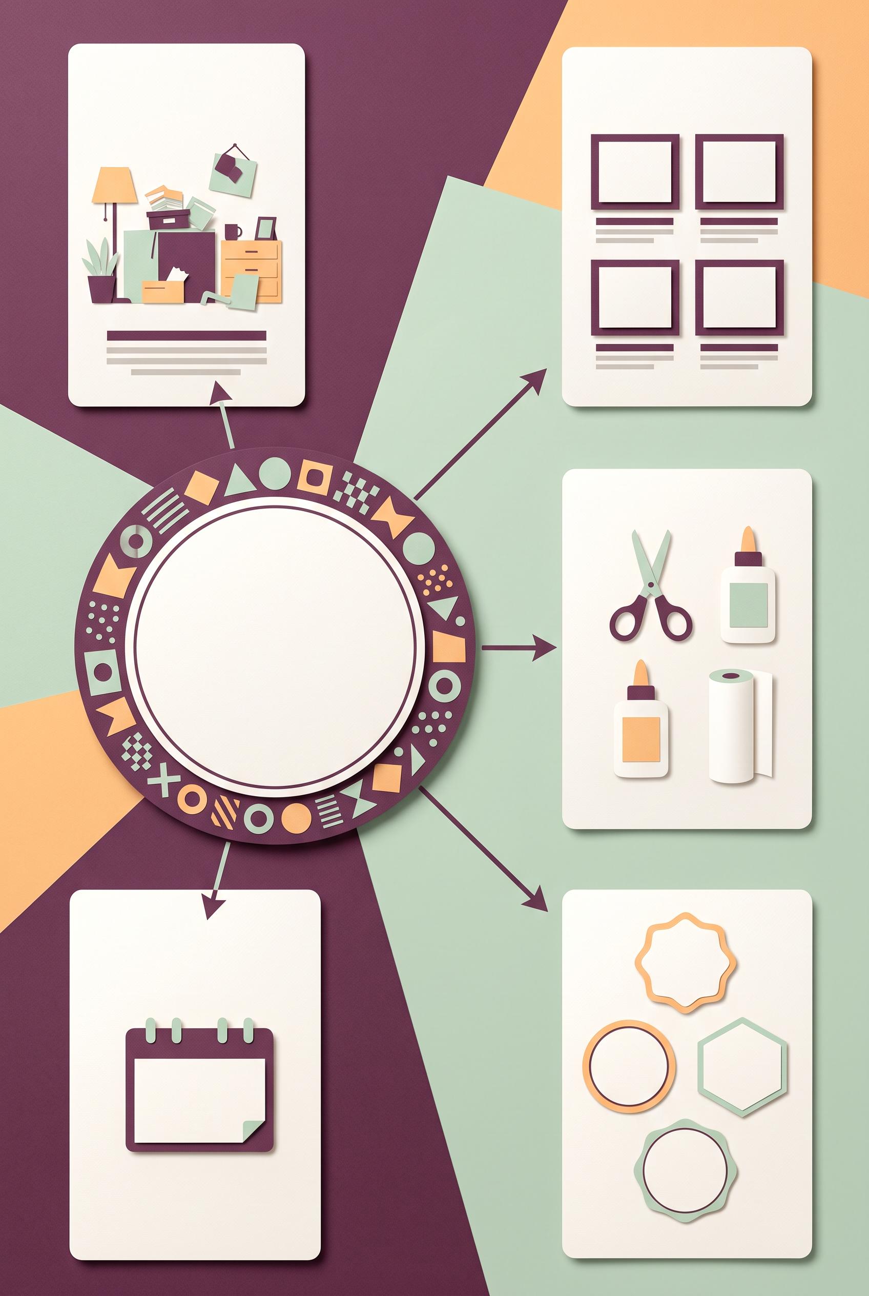
0Create a commercial-quality vertical 2:3 Pinterest educational graphic for an Etsy seller campaign. Center a polished printable seasonal label product, then connect it through a radial map to five blank content cards representing problem, preview, setup, variation, and deadline. Use plum, celadon, apricot, and warm white, crisp paper collage styling, clear visual flow, small calendar motifs, no real brands, no trademarked characters, no watermark, and no unintended readable text. Corrective regeneration attempt 4. Produce a materially revised image, not a near-duplicate of an earlier variant. Preserve the successful subject, palette, lighting, focal hierarchy, and commercial polish from the original brief while correcting every issue below. Mandatory corrective instructions from the most recent visual QA: Preserve the polished vertical 2:3 paper-collage layout, plum/celadon/apricot/warm-white palette, lighting, five surrounding cards, radial arrows, calendar motif, and clean commercial styling. Remove every line of text-like marks, glyph-like symbol, letter-like form, number, logo, watermark, and pseudo-text pattern, especially all horizontal lines in the upper-right card and all dense marks around the central circular product border. Replace them only with sparse, clearly geometric non-linguistic shapes or blank paper. Keep exactly five cards: problem scene, preview thumbnails, setup tools, product variations, and deadline/calendar. Make the central printable seasonal label visibly polished through a simple blank label shape with subtle geometric seasonal decoration, but no text or text-like marks. Do not add banners or extra objects. Observed defects from prior variants that must not recur: 1) The central product label includes prominent seasonal text and the cards contain detailed instructional headings, conflicting with the blank-label/map requirement. 2) Central product border contains dense pseudo-text-like glyphs, violating the requirement for no letters, numbers, glyphs, or pseudo-text. 3) Large top and bottom banner elements are extra decorative objects not requested and weaken the radial map composition. 4) The five content cards are not consistently presented as clean blank cards because some include dense placeholder-like line marks. 5) Strong vertical composition, palette, radial flow, and five-card structure. 6) Top-right card contains text-like horizontal line marks. 7) Central circular product border includes dense pseudo-text-like line patterns and glyph-like symbols. 8) The center product is mostly blank rather than clearly presenting a polished seasonal label product. Render no letters, words, numbers, prices, headings, labels, contact details, logos, glyphs, or pseudo-text anywhere. Use only blank surfaces, clean geometric marks, and non-linguistic placeholder shapes. Do not add explanatory captions, before/after labels, interface copy, or extra objects that the brief did not request. When a corrective instruction conflicts with a decorative detail, prioritize the corrective instruction.
 0
0Create a commercial-quality vertical 2:3 Pinterest educational graphic for an Etsy seller campaign. Center a polished printable seasonal label product, then connect it through a radial map to five blank content cards representing problem, preview, setup, variation, and deadline. Use plum, celadon, apricot, and warm white, crisp paper collage styling, clear visual flow, small calendar motifs, no real brands, no trademarked characters, no watermark, and no unintended readable text. Corrective regeneration attempt 3. Produce a materially revised image, not a near-duplicate of an earlier variant. Preserve the successful subject, palette, lighting, focal hierarchy, and commercial polish from the original brief while correcting every issue below. Mandatory corrective instructions from the most recent visual QA: Preserve the polished vertical 2:3 paper-collage composition, plum/celadon/apricot/warm-white palette, central printable seasonal-label product, radial arrows, calendar motifs, and commercial lighting. Remove every pseudo-text mark, glyph, letter, number, logo, watermark, and text-like line pattern from the entire image, especially the dense border around the central product and the line marks inside the upper-right card. Replace them with completely blank paper surfaces or simple non-linguistic geometric shapes. Keep exactly five surrounding blank content cards: problem scene, preview thumbnails, setup tools, product variations, and deadline/calendar motif. Remove the oversized top and bottom banners and any other unrequested extra objects. Ensure all labels, cards, calendars, and product surfaces contain no readable or pseudo-readable marks. Observed defects from prior variants that must not recur: 1) The graphic contains extensive readable copy despite the brief requiring blank content cards without readable copy. 2) It uses the real trademarked brand name “Etsy” in the headline. 3) The central product label includes prominent seasonal text and the cards contain detailed instructional headings, conflicting with the blank-label/map requirement. 4) Central product border contains dense pseudo-text-like glyphs, violating the requirement for no letters, numbers, glyphs, or pseudo-text. 5) Large top and bottom banner elements are extra decorative objects not requested and weaken the radial map composition. 6) The five content cards are not consistently presented as clean blank cards because some include dense placeholder-like line marks. Render no letters, words, numbers, prices, headings, labels, contact details, logos, glyphs, or pseudo-text anywhere. Use only blank surfaces, clean geometric marks, and non-linguistic placeholder shapes. Do not add explanatory captions, before/after labels, interface copy, or extra objects that the brief did not request. When a corrective instruction conflicts with a decorative detail, prioritize the corrective instruction.
 0
0Create a commercial-quality vertical 2:3 Pinterest educational graphic for an Etsy seller campaign. Center a polished printable seasonal label product, then connect it through a radial map to five blank content cards representing problem, preview, setup, variation, and deadline. Use plum, celadon, apricot, and warm white, crisp paper collage styling, clear visual flow, small calendar motifs, no real brands, no trademarked characters, no watermark, and no unintended readable text. Corrective regeneration attempt 2. Produce a materially revised image, not a near-duplicate of an earlier variant. Preserve the successful subject, palette, lighting, focal hierarchy, and commercial polish from the original brief while correcting every issue below. Mandatory corrective instructions from the most recent visual QA: Preserve the polished vertical 2:3 paper-collage style, plum/celadon/apricot/warm-white palette, strong central product focal point, radial arrows, calendar motifs, thumbnail frames, and clean spacing. Remove all readable text from the entire image, including the top and bottom banners, central product title, product-label wording, and every card heading or caption. Replace text areas with blank paper placeholders only. Remove the real brand name and any trademark references. Keep exactly five surrounding blank content cards arranged around the central printable seasonal label product, visually distinguished only by generic imagery: a problem scene, product preview thumbnails, setup tools, product variations, and a deadline/calendar motif. Ensure every label and card is blank, with no letters, numbers, logos, watermark, or pseudo-text. Observed defects from prior variants that must not recur: 1) The graphic contains extensive readable copy despite the brief requiring blank content cards without readable copy. 2) It uses the real trademarked brand name “Etsy” in the headline. 3) The central product label includes prominent seasonal text and the cards contain detailed instructional headings, conflicting with the blank-label/map requirement. Render no letters, words, numbers, prices, headings, labels, contact details, logos, glyphs, or pseudo-text anywhere. Use only blank surfaces, clean geometric marks, and non-linguistic placeholder shapes. Do not add explanatory captions, before/after labels, interface copy, or extra objects that the brief did not request. When a corrective instruction conflicts with a decorative detail, prioritize the corrective instruction.
 0
0Create a commercial-quality vertical 2:3 Pinterest educational graphic for an Etsy seller campaign. Center a polished printable seasonal label product, then connect it through a radial map to five blank content cards representing problem, preview, setup, variation, and deadline. Use plum, celadon, apricot, and warm white, crisp paper collage styling, clear visual flow, small calendar motifs, no real brands, no trademarked characters, no watermark, and no unintended readable text.
 0
0Create a commercial-quality vertical 2:3 Pinterest composition showcasing a cohesive Etsy maker market branding kit. Arrange a hero tablet with a blank storefront preview, mini market sign, packaging card, product tag, social post frame, and shipping insert in an elegant editorial overhead layout. Use olive, butter yellow, deep ink, and coral, with tactile paper, subtle craft materials, balanced negative space, no real brands, no trademarked characters, no watermark, and no unintended readable text. Corrective regeneration attempt 3. Produce a materially revised image, not a near-duplicate of an earlier variant. Preserve the successful subject, palette, lighting, focal hierarchy, and commercial polish from the original brief while correcting every issue below. Mandatory corrective instructions from the most recent visual QA: Preserve the polished vertical 2:3 overhead layout, wood surface, tactile paper, olive/butter-yellow/deep-ink/coral palette, tablet hero, lighting, shadows, and coordinated collection of cards, tag, sign, social frame, packaging card, and shipping insert. Remove every recognizable icon, glyph, emblem, logo-like mark, floral symbol, home symbol, search symbol, camera symbol, compass symbol, and any pseudo-text from the entire image. Make the tablet display a completely blank abstract storefront UI using only plain geometric color blocks, rectangles, circles, and non-symbolic image placeholders with no interface icons. Replace all decorative emblems on the mini sign, tag, packaging card, social frame, and insert with simple repeated borders, dots, stripes, and abstract geometric shapes only. Keep all surfaces free of letters, words, numbers, labels, handles, prices, measurement marks, and watermarks. Observed defects from prior variants that must not recur: 1) The tablet visibly uses the real Etsy trademark. 2) The composition contains extensive readable text and explanatory measurement labels, contrary to the no-unintended-readable-text requirement. 3) The storefront preview is not blank and includes branded/readable content. 4) Attractive vertical composition and cohesive palette, but the image contains prohibited recognizable glyphs/icons: tablet home and search symbols, camera symbol, compass symbol, as 5) well as emblem-like marks on the cards and tag. 6) The tablet storefront is abstract, but these marks violate the instruction to render only blank surfaces, geometric marks, and non-linguistic placeholder shapes with no glyphs or 7) logos. Render no letters, words, numbers, prices, headings, labels, contact details, logos, glyphs, or pseudo-text anywhere. Use only blank surfaces, clean geometric marks, and non-linguistic placeholder shapes. Do not add explanatory captions, before/after labels, interface copy, or extra objects that the brief did not request. When a corrective instruction conflicts with a decorative detail, prioritize the corrective instruction.
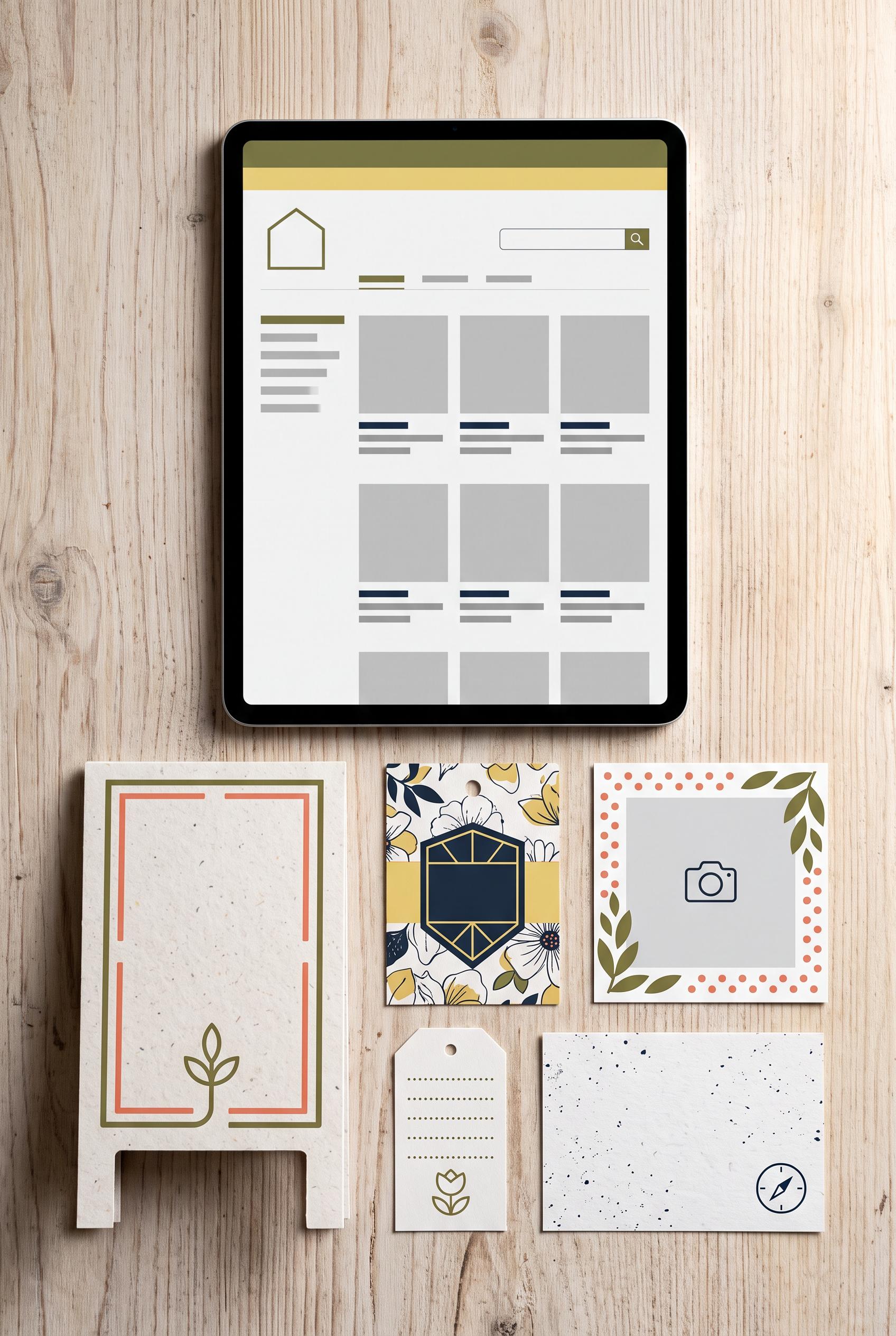 0
0Create a commercial-quality vertical 2:3 Pinterest composition showcasing a cohesive Etsy maker market branding kit. Arrange a hero tablet with a blank storefront preview, mini market sign, packaging card, product tag, social post frame, and shipping insert in an elegant editorial overhead layout. Use olive, butter yellow, deep ink, and coral, with tactile paper, subtle craft materials, balanced negative space, no real brands, no trademarked characters, no watermark, and no unintended readable text. Corrective regeneration attempt 2. Produce a materially revised image, not a near-duplicate of an earlier variant. Preserve the successful subject, palette, lighting, focal hierarchy, and commercial polish from the original brief while correcting every issue below. Mandatory corrective instructions from the most recent visual QA: Preserve the attractive vertical 2:3 overhead layout, wood surface, tactile paper, olive/butter-yellow/deep-ink/coral palette, tablet hero, and coordinated collection of cards, tag, sign, insert, and social frame. Remove every readable word, letter, number, measurement, label, handle, and watermark from the entire image. Replace the Etsy mark and all storefront copy with a completely blank abstract storefront UI using only geometric image placeholders and non-readable lines. Make the mini sign, packaging card, product tag, social frame, and shipping insert communicate cohesion through repeated colors, borders, shapes, and simple non-text icons only. Ensure no real brand or trademark appears anywhere and eliminate any garbled pseudo-text. Observed defects from prior variants that must not recur: 1) The tablet visibly uses the real Etsy trademark. 2) The composition contains extensive readable text and explanatory measurement labels, contrary to the no-unintended-readable-text requirement. 3) The storefront preview is not blank and includes branded/readable content. Render no letters, words, numbers, prices, headings, labels, contact details, logos, glyphs, or pseudo-text anywhere. Use only blank surfaces, clean geometric marks, and non-linguistic placeholder shapes. Do not add explanatory captions, before/after labels, interface copy, or extra objects that the brief did not request. When a corrective instruction conflicts with a decorative detail, prioritize the corrective instruction.
О нашей галерее AI изображений
Наша галерея AI изображений демонстрирует тысячи общих изображений, сгенерированных ИИ, созданных нашим сообществом. Каждое изображение уникально, высокого качества и представляет творческие возможности генерации искусства ИИ. Просматривайте различные стили, темы и сюжеты, чтобы вдохновиться для вашего следующего творческого проекта.
Почему стоит исследовать нашу галерею?
- Откройте для себя тысячи уникальных изображений, сгенерированных ИИ, в различных стилях и темах
- Вдохновляйтесь творческими подсказками и художественными стилями
- Просматривайте изображения, которыми поделилось наше творческое сообщество
- Нажмите на любое изображение, чтобы просмотреть его страницу общего доступа и получить больше деталей
Как использовать галерею
Использование нашей галереи просто и интуитивно:
- Просматривайте сетку общих изображений
- Нажмите на любое изображение, которое привлекло ваше внимание
- Просмотрите полные детали изображения и ссылку для общего доступа на специальной странице общего доступа
Готовы создать свои собственные AI изображения?
Присоединяйтесь к тысячам создателей, использующих AI Media Studio для генерации потрясающих изображений. Начните создавать сегодня!