Галерея AI изображений
Откройте для себя 1696+ общих изображений, сгенерированных ИИ, от нашего творческого сообщества
Все общие изображения
Показано 48 из 1696 общих изображений
 0
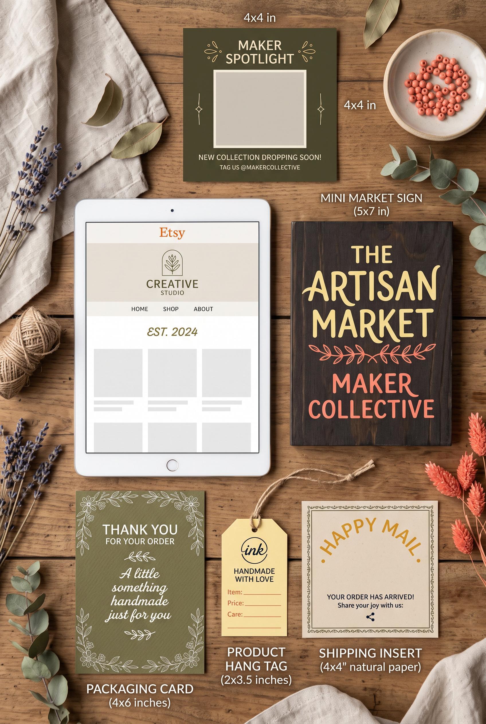
0Create a commercial-quality vertical 2:3 Pinterest composition showcasing a cohesive Etsy maker market branding kit. Arrange a hero tablet with a blank storefront preview, mini market sign, packaging card, product tag, social post frame, and shipping insert in an elegant editorial overhead layout. Use olive, butter yellow, deep ink, and coral, with tactile paper, subtle craft materials, balanced negative space, no real brands, no trademarked characters, no watermark, and no unintended readable text.
 0
0Create a commercial-quality vertical 2:3 Pinterest composition for an Etsy listing concept. Show an editable event invitation suite transforming from a plain digital file preview into a beautifully styled celebration table with printed invitation, envelope, place card, and smartphone preview. Use a layered paper-peel reveal, terracotta, ice blue, parchment, and graphite accents, refined editorial photography, soft directional light, tactile paper, realistic shadows, no real brands, no trademarked characters, no watermark, and no unintended readable text. Corrective regeneration attempt 5. Produce a materially revised image, not a near-duplicate of an earlier variant. Preserve the successful subject, palette, lighting, focal hierarchy, and commercial polish from the original brief while correcting every issue below. Mandatory corrective instructions from the most recent visual QA: Preserve the vertical 2:3 editorial composition, paper-peel reveal, terracotta/ice-blue/parchment/graphite palette, soft directional light, tactile paper, realistic shadows, laptop, smartphone, invitation, envelope, place card, and table styling. Remove every line cluster, text-like bar, interface element, emblem, icon, glyph, logo, number, letter, handwriting mark, and pseudo-text from the laptop screen, smartphone screen, printed invitation, place card, envelope, and all other paper surfaces. Make every surface completely blank or use only sparse, clearly non-linguistic solid geometric color blocks; keep the wax seal entirely plain and circular with no symbol or texture resembling a mark. Do not add captions, labels, banners, or extra objects. Observed defects from prior variants that must not recur: 1) Place card visibly contains the word-like text “Name.” 2) Wax seal includes letter-like glyphs. 3) The otherwise strong paper-peel composition, palette, lighting, and product styling are commercially polished. 4) The wax seal still contains a recognizable emblem-like geometric glyph, violating the instruction to remove all emblem glyphs and pseudo-readable marks. 5) Strong vertical composition, palette, lighting, paper-peel reveal, and styling. 6) Multiple surfaces contain pseudo-text: invitation line clusters, laptop preview lines, phone interface bars, and place-card marks. 7) Place card includes an emblem-like geometric graphic, contrary to the blank/non-linguistic surface requirement. 8) The design does not provide sufficiently clean text-free surfaces for commercial use. Render no letters, words, numbers, prices, headings, labels, contact details, logos, glyphs, or pseudo-text anywhere. Use only blank surfaces, clean geometric marks, and non-linguistic placeholder shapes. Do not add explanatory captions, before/after labels, interface copy, or extra objects that the brief did not request. When a corrective instruction conflicts with a decorative detail, prioritize the corrective instruction.
 0
0Create a commercial-quality vertical 2:3 Pinterest composition for an Etsy listing concept. Show an editable event invitation suite transforming from a plain digital file preview into a beautifully styled celebration table with printed invitation, envelope, place card, and smartphone preview. Use a layered paper-peel reveal, terracotta, ice blue, parchment, and graphite accents, refined editorial photography, soft directional light, tactile paper, realistic shadows, no real brands, no trademarked characters, no watermark, and no unintended readable text. Corrective regeneration attempt 4. Produce a materially revised image, not a near-duplicate of an earlier variant. Preserve the successful subject, palette, lighting, focal hierarchy, and commercial polish from the original brief while correcting every issue below. Mandatory corrective instructions from the most recent visual QA: Preserve the strong vertical 2:3 editorial composition, layered paper-peel reveal, terracotta/ice-blue/parchment/graphite palette, soft directional lighting, tactile paper, realistic shadows, and coordinated laptop, smartphone, invitation, envelope, place card, and table styling. Replace the wax seal’s central emblem with a completely plain circular seal or a simple non-symbolic solid abstract texture. Keep all other paper, laptop, phone, place card, and envelope surfaces free of letters, words, numbers, logos, glyphs, handwriting, interface labels, pseudo-text, and watermark. Observed defects from prior variants that must not recur: 1) Several interface labels and small text are visibly garbled or nonsensical. 2) The top and bottom text banners reduce the generous clean space for overlay text. 3) The desktop preview includes a recognizable but cluttered app interface rather than a clean unbranded file preview. 4) Printed invitation contains readable script-like text and lines resembling writing. 5) Place card visibly contains the word-like text “Name.” 6) Wax seal includes letter-like glyphs. 7) The otherwise strong paper-peel composition, palette, lighting, and product styling are commercially polished. 8) The wax seal still contains a recognizable emblem-like geometric glyph, violating the instruction to remove all emblem glyphs and pseudo-readable marks. Render no letters, words, numbers, prices, headings, labels, contact details, logos, glyphs, or pseudo-text anywhere. Use only blank surfaces, clean geometric marks, and non-linguistic placeholder shapes. Do not add explanatory captions, before/after labels, interface copy, or extra objects that the brief did not request. When a corrective instruction conflicts with a decorative detail, prioritize the corrective instruction.
 0
0Create a commercial-quality vertical 2:3 Pinterest composition for an Etsy listing concept. Show an editable event invitation suite transforming from a plain digital file preview into a beautifully styled celebration table with printed invitation, envelope, place card, and smartphone preview. Use a layered paper-peel reveal, terracotta, ice blue, parchment, and graphite accents, refined editorial photography, soft directional light, tactile paper, realistic shadows, no real brands, no trademarked characters, no watermark, and no unintended readable text. Corrective regeneration attempt 3. Produce a materially revised image, not a near-duplicate of an earlier variant. Preserve the successful subject, palette, lighting, focal hierarchy, and commercial polish from the original brief while correcting every issue below. Mandatory corrective instructions from the most recent visual QA: Preserve the strong vertical 2:3 editorial composition, layered paper-peel reveal, terracotta/ice-blue/parchment/graphite palette, soft directional lighting, tactile paper, realistic shadows, and coordinated laptop preview, smartphone, printed invitation, envelope, place card, and celebration table. Remove every letter-like mark from the printed invitation, place card, and wax seal: replace all script, headings, names, labels, lines resembling handwriting, and emblem glyphs with blank surfaces or purely abstract geometric decoration. Keep the digital laptop and phone previews unbranded and limited to clean abstract shapes with no UI text. Maintain generous uncluttered negative space and do not add captions, labels, logos, watermark, or any readable or pseudo-readable text. Observed defects from prior variants that must not recur: 1) Bottom banner contains the real trademark/brand name “ETSY.” 2) Several interface labels and small text are visibly garbled or nonsensical. 3) The top and bottom text banners reduce the generous clean space for overlay text. 4) The desktop preview includes a recognizable but cluttered app interface rather than a clean unbranded file preview. 5) Printed invitation contains readable script-like text and lines resembling writing. 6) Place card visibly contains the word-like text “Name.” 7) Wax seal includes letter-like glyphs. 8) The otherwise strong paper-peel composition, palette, lighting, and product styling are commercially polished. Render no letters, words, numbers, prices, headings, labels, contact details, logos, glyphs, or pseudo-text anywhere. Use only blank surfaces, clean geometric marks, and non-linguistic placeholder shapes. Do not add explanatory captions, before/after labels, interface copy, or extra objects that the brief did not request. When a corrective instruction conflicts with a decorative detail, prioritize the corrective instruction.
 0
0Create a commercial-quality vertical 2:3 Pinterest composition for an Etsy listing concept. Show an editable event invitation suite transforming from a plain digital file preview into a beautifully styled celebration table with printed invitation, envelope, place card, and smartphone preview. Use a layered paper-peel reveal, terracotta, ice blue, parchment, and graphite accents, refined editorial photography, soft directional light, tactile paper, realistic shadows, no real brands, no trademarked characters, no watermark, and no unintended readable text. Corrective regeneration attempt 2. Produce a materially revised image, not a near-duplicate of an earlier variant. Preserve the successful subject, palette, lighting, focal hierarchy, and commercial polish from the original brief while correcting every issue below. Mandatory corrective instructions from the most recent visual QA: Preserve the strong vertical 2:3 editorial composition, terracotta/ice-blue/parchment palette, clear paper-peel transition, realistic tactile paper, soft directional light, and coordinated invitation, envelope, place card, phone, and celebration table. Remove the bottom promotional banner entirely and remove all real brand or trademark references, including Etsy. Replace the desktop and phone interfaces with clean, minimal unbranded digital previews containing only abstract placeholder shapes and no legible UI labels or garbled text. Keep the printed invitation and place card elegant but use minimal non-readable typographic lines or blank text areas. Maintain a clear focal hierarchy and leave generous uncluttered negative space for overlay text. No watermark, logos, recognizable app interface, or unintended readable text. Observed defects from prior variants that must not recur: 1) Bottom banner contains the real trademark/brand name “ETSY.” 2) Several interface labels and small text are visibly garbled or nonsensical. 3) The top and bottom text banners reduce the generous clean space for overlay text. 4) The desktop preview includes a recognizable but cluttered app interface rather than a clean unbranded file preview. Render no letters, words, numbers, prices, headings, labels, contact details, logos, glyphs, or pseudo-text anywhere. Use only blank surfaces, clean geometric marks, and non-linguistic placeholder shapes. Do not add explanatory captions, before/after labels, interface copy, or extra objects that the brief did not request. When a corrective instruction conflicts with a decorative detail, prioritize the corrective instruction.
 0
0Create a commercial-quality vertical 2:3 Pinterest composition for an Etsy listing concept. Show an editable event invitation suite transforming from a plain digital file preview into a beautifully styled celebration table with printed invitation, envelope, place card, and smartphone preview. Use a layered paper-peel reveal, terracotta, ice blue, parchment, and graphite accents, refined editorial photography, soft directional light, tactile paper, realistic shadows, no real brands, no trademarked characters, no watermark, and no unintended readable text.
 0
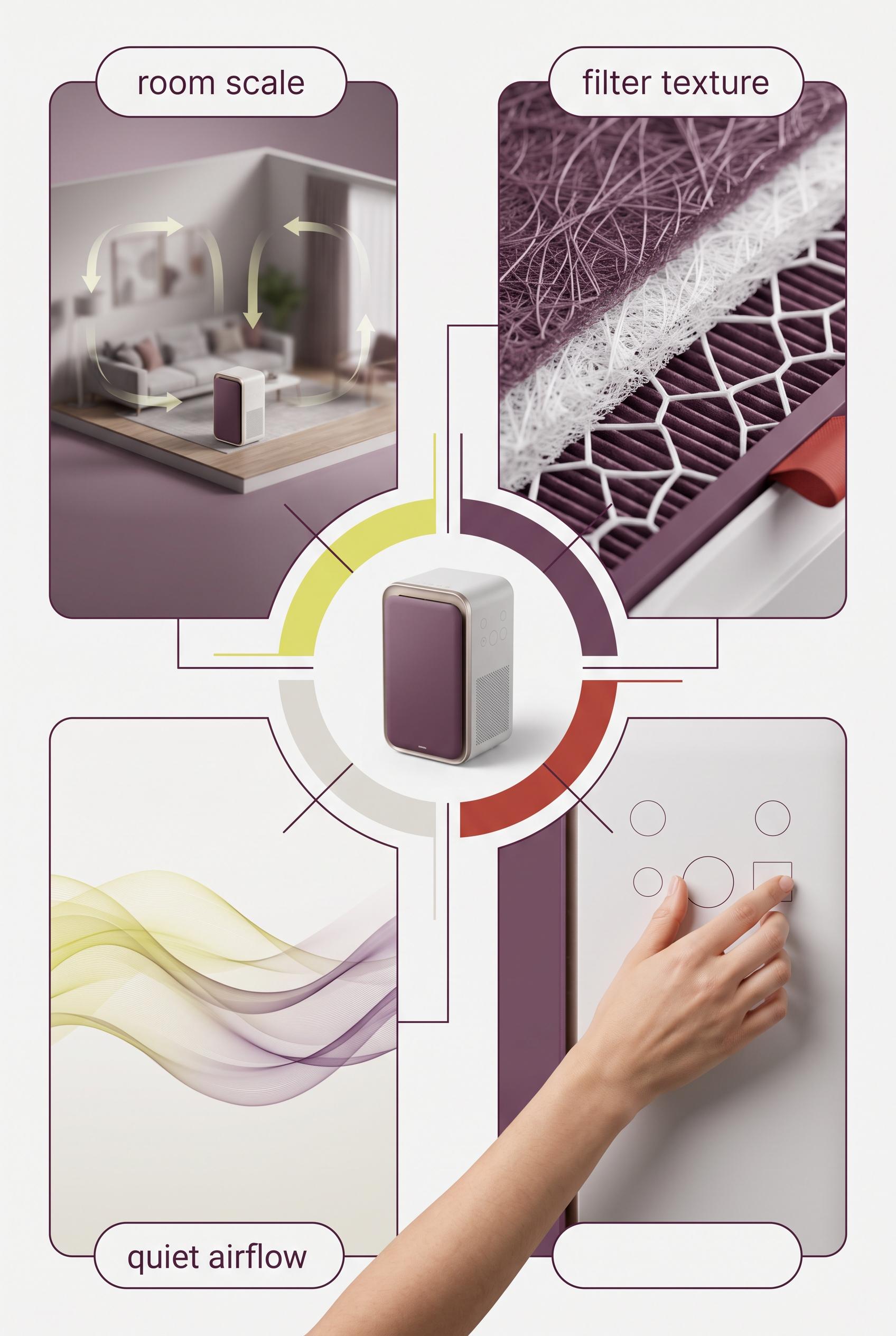
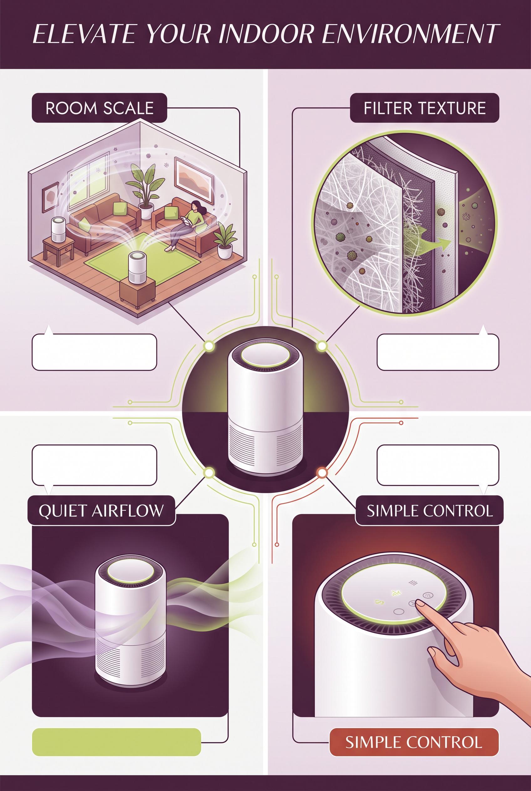
0Create a commercial-quality educational campaign board in a vertical 2:3 Pinterest composition. Place an unbranded compact air purifier at the center of a radial layout with four clearly separated visual proof panels around it: room scale, filter texture, quiet airflow shown with soft translucent waves, and a hand adjusting a simple control. Use plum, citron, fog white, and oxide red with thin graphic connectors and blank label areas. AI-modified downstream. No real brands, no trademarked characters, no watermark, and no unintended readable text. Corrective regeneration attempt 5. Produce a materially revised image, not a near-duplicate of an earlier variant. Preserve the successful subject, palette, lighting, focal hierarchy, and commercial polish from the original brief while correcting every issue below. Mandatory corrective instructions from the most recent visual QA: Preserve the polished vertical 2:3 radial composition, central unbranded purifier, four proof panels, plum/citron/fog-white/oxide-red palette, thin connectors, filter detail, room-scale scene, and translucent airflow waves. Reframe the lower-right control panel so the complete natural hand, wrist, and a portion of forearm are fully inside the panel with generous margins on every side; do not crop them at any edge. Remove all small dot indicators and any interface glyphs or pseudo-text. Show only a few simple blank circular controls and clean geometric forms. Keep all rounded label areas completely blank. Render no letters, words, numbers, labels, logos, watermark, or readable text anywhere. Observed defects from prior variants that must not recur: 1) The lower-right control panel crops the hand/forearm at the right edge, contrary to the required fully visible natural hand framing. 2) The composition otherwise has a strong vertical layout, clear central purifier, four distinct image-led panels, clean blank label areas, appropriate palette, and no visible text,3D 3) watermark, or branding. 4) The lower-right control panel crops the hand and wrist against the right edge, violating the required generous framing. 5) The control panel contains small interface-like glyphs and symbols, contrary to the instruction to render no glyphs or pseudo-text. 6) The hand anatomy/framing is not fully polished for commercial use. 7) The lower-right control panel crops the forearm at the bottom edge, lacking the required generous framing. 8) Small dot indicators and interface-like control marks remain despite the no-glyph requirement. Render no letters, words, numbers, prices, headings, labels, contact details, logos, glyphs, or pseudo-text anywhere. Use only blank surfaces, clean geometric marks, and non-linguistic placeholder shapes. Do not add explanatory captions, before/after labels, interface copy, or extra objects that the brief did not request. When a corrective instruction conflicts with a decorative detail, prioritize the corrective instruction.
 0
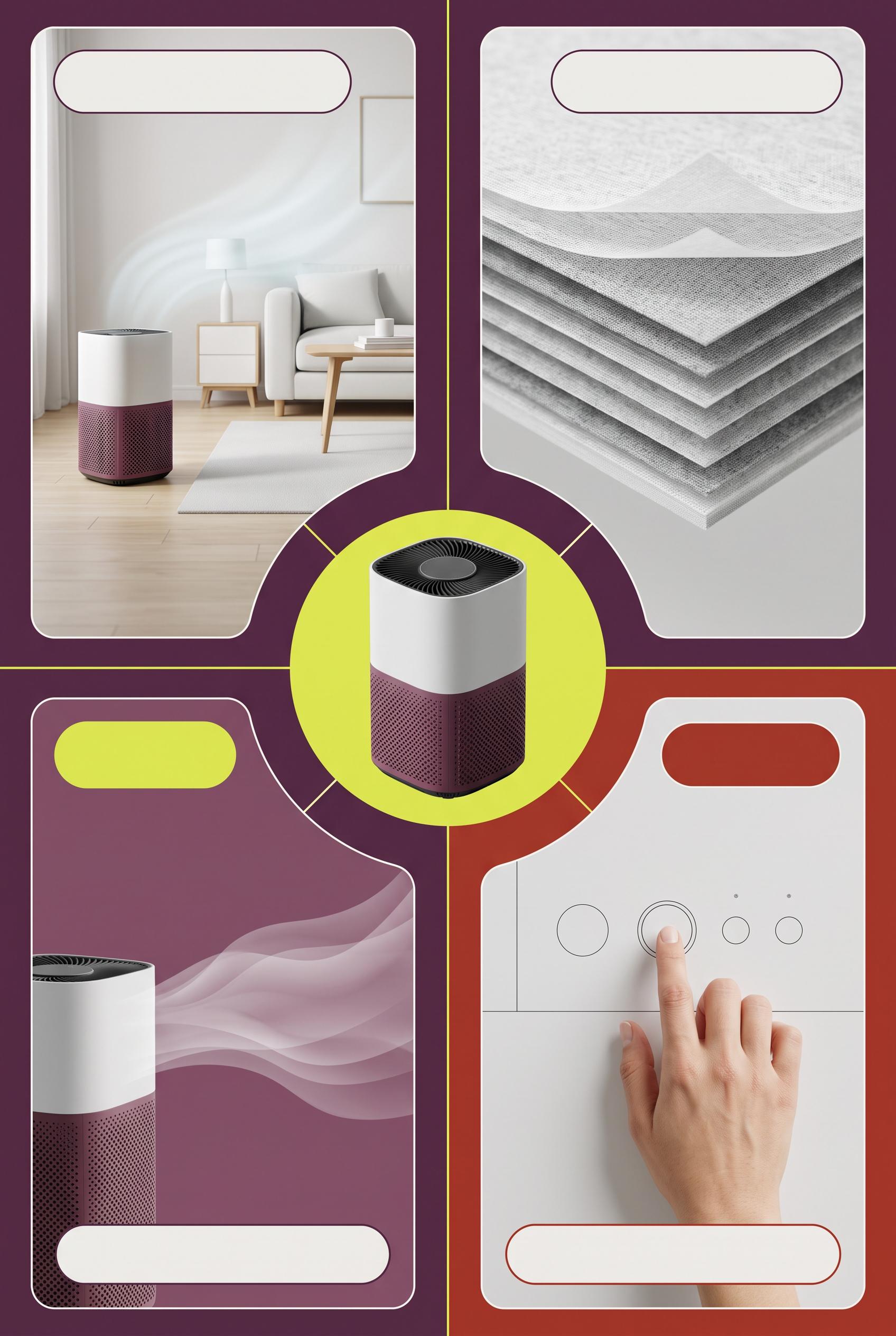
0Create a commercial-quality educational campaign board in a vertical 2:3 Pinterest composition. Place an unbranded compact air purifier at the center of a radial layout with four clearly separated visual proof panels around it: room scale, filter texture, quiet airflow shown with soft translucent waves, and a hand adjusting a simple control. Use plum, citron, fog white, and oxide red with thin graphic connectors and blank label areas. AI-modified downstream. No real brands, no trademarked characters, no watermark, and no unintended readable text. Corrective regeneration attempt 4. Produce a materially revised image, not a near-duplicate of an earlier variant. Preserve the successful subject, palette, lighting, focal hierarchy, and commercial polish from the original brief while correcting every issue below. Mandatory corrective instructions from the most recent visual QA: Preserve the strong vertical 2:3 radial composition, central compact unbranded purifier, four distinct proof panels, plum/citron/fog-white/oxide-red palette, thin connectors, filter detail, room-scale scene, soft airflow waves, blank rounded label areas, and premium lighting. Reframe the lower-right control close-up so the entire hand, wrist, and fingertip are comfortably inside the panel with generous margins on every side; do not crop any part of the hand or forearm. Keep the anatomy natural. Remove every interface glyph, power icon, dot indicator, letter, word, number, label, logo, watermark, pseudo-text, and trademark. Show only simple blank circular controls and clean geometric forms. Observed defects from prior variants that must not recur: 1) The duplicated “SIMPLE CONTROL” label and large headline compete with the visual focal point. 2) The lower-right hand is awkwardly cropped at the edge, reducing polished commercial quality. 3) The lower-right control panel crops the hand/forearm at the right edge, contrary to the required fully visible natural hand framing. 4) The composition otherwise has a strong vertical layout, clear central purifier, four distinct image-led panels, clean blank label areas, appropriate palette, and no visible text,3D 5) watermark, or branding. 6) The lower-right control panel crops the hand and wrist against the right edge, violating the required generous framing. 7) The control panel contains small interface-like glyphs and symbols, contrary to the instruction to render no glyphs or pseudo-text. 8) The hand anatomy/framing is not fully polished for commercial use. Render no letters, words, numbers, prices, headings, labels, contact details, logos, glyphs, or pseudo-text anywhere. Use only blank surfaces, clean geometric marks, and non-linguistic placeholder shapes. Do not add explanatory captions, before/after labels, interface copy, or extra objects that the brief did not request. When a corrective instruction conflicts with a decorative detail, prioritize the corrective instruction.
 0
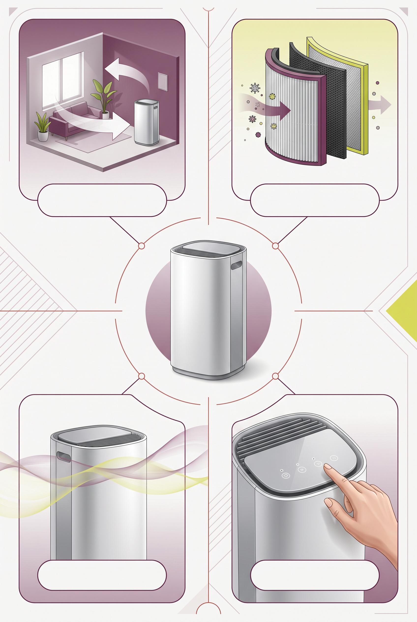
0Create a commercial-quality educational campaign board in a vertical 2:3 Pinterest composition. Place an unbranded compact air purifier at the center of a radial layout with four clearly separated visual proof panels around it: room scale, filter texture, quiet airflow shown with soft translucent waves, and a hand adjusting a simple control. Use plum, citron, fog white, and oxide red with thin graphic connectors and blank label areas. AI-modified downstream. No real brands, no trademarked characters, no watermark, and no unintended readable text. Corrective regeneration attempt 3. Produce a materially revised image, not a near-duplicate of an earlier variant. Preserve the successful subject, palette, lighting, focal hierarchy, and commercial polish from the original brief while correcting every issue below. Mandatory corrective instructions from the most recent visual QA: Preserve the successful vertical 2:3 radial infographic layout, central unbranded purifier, plum/citron/fog-white/oxide-red palette, four distinct panels, thin connectors, clean blank rounded label areas, filter detail, room-scale scene, and soft airflow waves. Reframe only the lower-right control close-up so the complete hand, wrist, and fingertip are comfortably inside the panel with generous margins on every side; do not crop the hand against the right border. Keep anatomy natural and maintain the premium commercial finish. Render no letters, words, numbers, labels, logos, glyphs, pseudo-text, watermark, or trademark. Observed defects from prior variants that must not recur: 1) The composition is strong and clearly shows the four requested proof panels, but it is copy-heavy and includes prominent embedded headings and labels despite the brief requesting a 2) image-led design with blank label areas. 3) The duplicated “SIMPLE CONTROL” label and large headline compete with the visual focal point. 4) The lower-right hand is awkwardly cropped at the edge, reducing polished commercial quality. 5) The lower-right control panel crops the hand/forearm at the right edge, contrary to the required fully visible natural hand framing. 6) The composition otherwise has a strong vertical layout, clear central purifier, four distinct image-led panels, clean blank label areas, appropriate palette, and no visible text,3D 7) watermark, or branding. Render no letters, words, numbers, prices, headings, labels, contact details, logos, glyphs, or pseudo-text anywhere. Use only blank surfaces, clean geometric marks, and non-linguistic placeholder shapes. Do not add explanatory captions, before/after labels, interface copy, or extra objects that the brief did not request. When a corrective instruction conflicts with a decorative detail, prioritize the corrective instruction.
 0
0Create a commercial-quality educational campaign board in a vertical 2:3 Pinterest composition. Place an unbranded compact air purifier at the center of a radial layout with four clearly separated visual proof panels around it: room scale, filter texture, quiet airflow shown with soft translucent waves, and a hand adjusting a simple control. Use plum, citron, fog white, and oxide red with thin graphic connectors and blank label areas. AI-modified downstream. No real brands, no trademarked characters, no watermark, and no unintended readable text. Corrective regeneration attempt 2. Produce a materially revised image, not a near-duplicate of an earlier variant. Preserve the successful subject, palette, lighting, focal hierarchy, and commercial polish from the original brief while correcting every issue below. Mandatory corrective instructions from the most recent visual QA: Preserve the vertical 2:3 radial layout, central unbranded purifier, plum/citron/fog-white/oxide-red palette, four distinct visual panels, thin connectors, filter detail, soft airflow waves, room scene, and hand-operated control. Remove all embedded words, headings, labels, and lettering; replace every text area with clean blank rounded label panels or abstract icons only. Keep the four panels clearly distinguishable through imagery and symbols. Reframe the lower-right control close-up so the entire hand and fingertip are naturally visible inside the panel, with no edge cropping or anatomy artifacts. Maintain a clean, balanced, premium commercial infographic composition with no watermark, logos, trademarks, or readable text. Observed defects from prior variants that must not recur: 1) The composition is strong and clearly shows the four requested proof panels, but it is copy-heavy and includes prominent embedded headings and labels despite the brief requesting a 2) image-led design with blank label areas. 3) The duplicated “SIMPLE CONTROL” label and large headline compete with the visual focal point. 4) The lower-right hand is awkwardly cropped at the edge, reducing polished commercial quality. Render no letters, words, numbers, prices, headings, labels, contact details, logos, glyphs, or pseudo-text anywhere. Use only blank surfaces, clean geometric marks, and non-linguistic placeholder shapes. Do not add explanatory captions, before/after labels, interface copy, or extra objects that the brief did not request. When a corrective instruction conflicts with a decorative detail, prioritize the corrective instruction.
 0
0Create a commercial-quality educational campaign board in a vertical 2:3 Pinterest composition. Place an unbranded compact air purifier at the center of a radial layout with four clearly separated visual proof panels around it: room scale, filter texture, quiet airflow shown with soft translucent waves, and a hand adjusting a simple control. Use plum, citron, fog white, and oxide red with thin graphic connectors and blank label areas. AI-modified downstream. No real brands, no trademarked characters, no watermark, and no unintended readable text.
 0
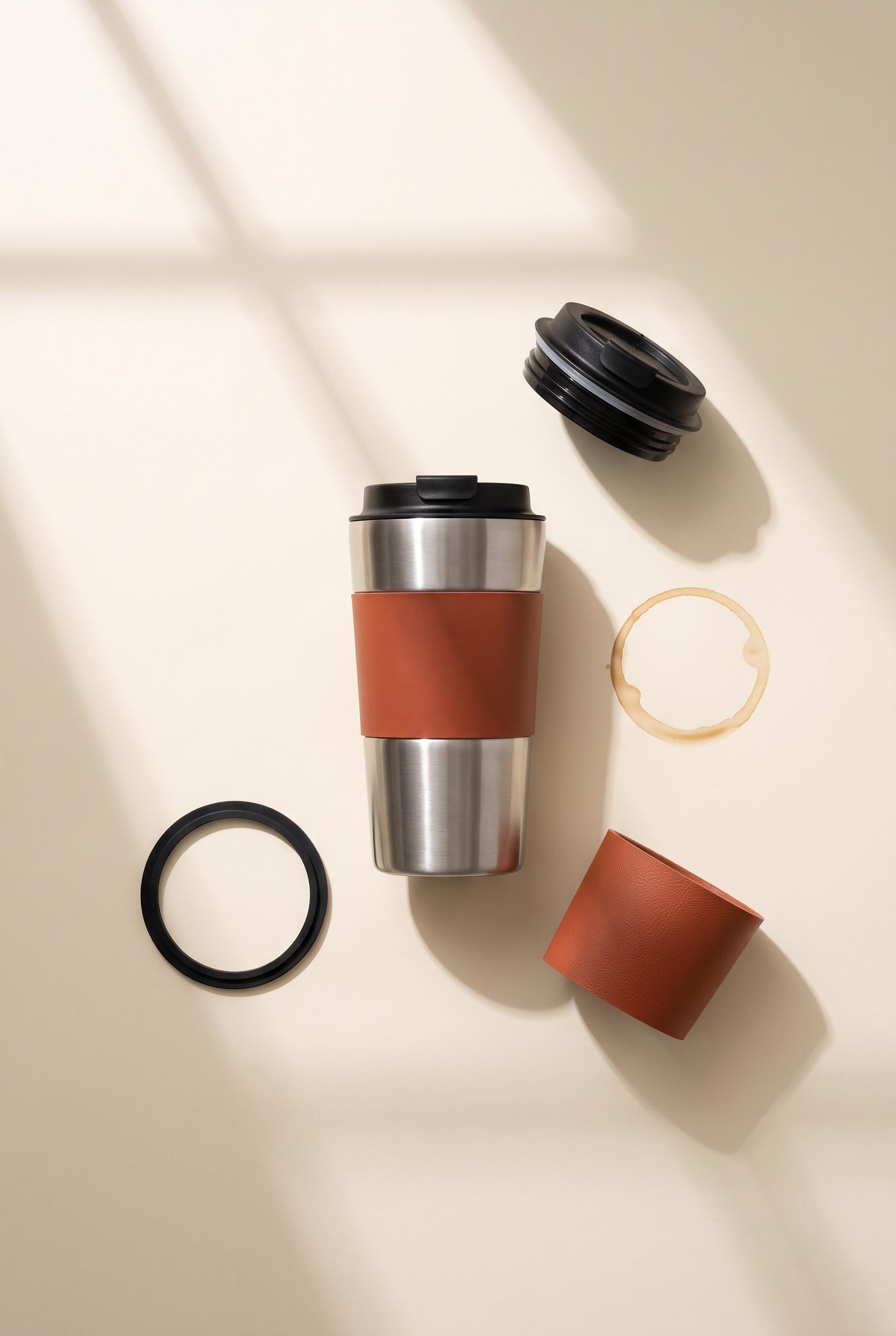
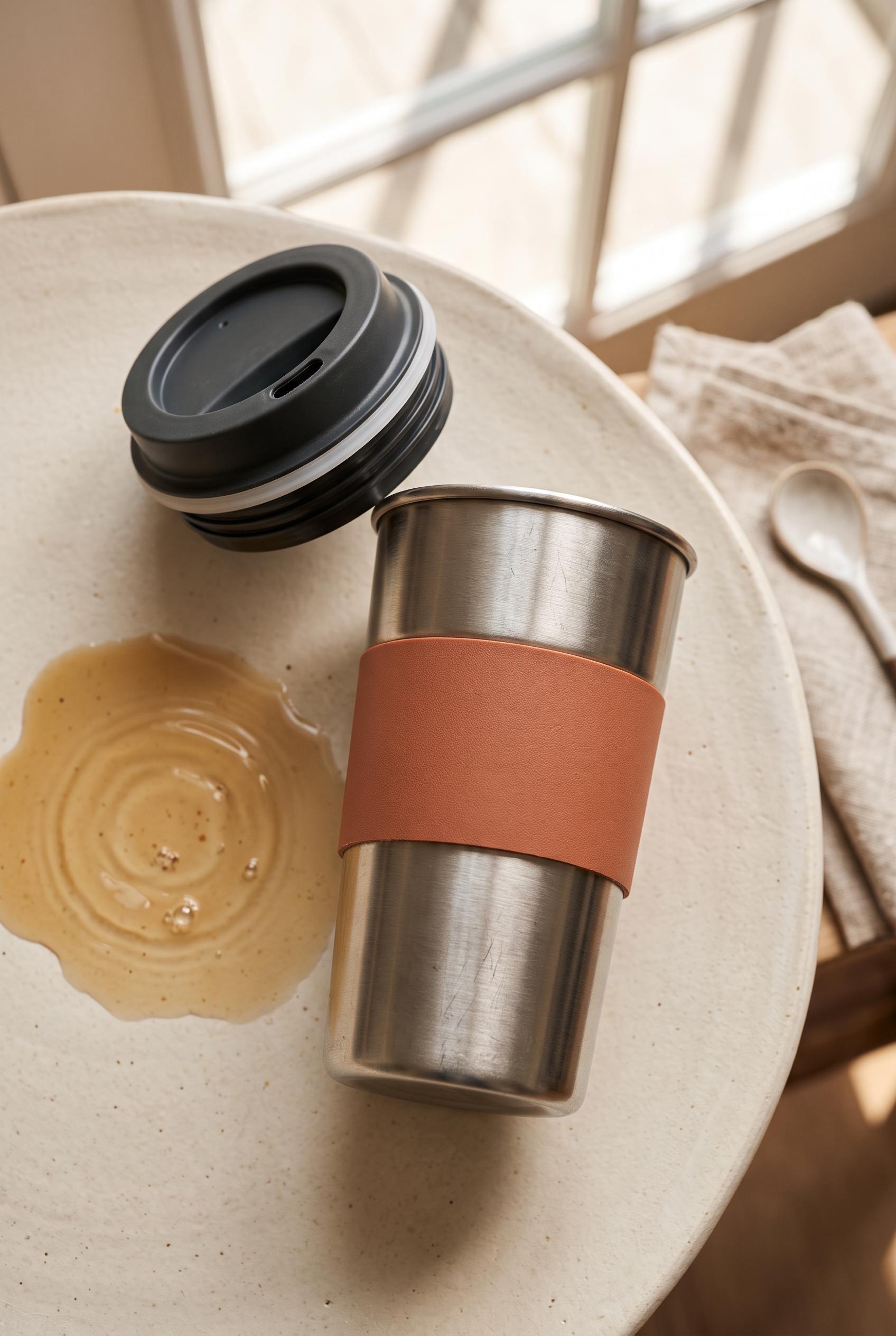
0Create a commercial-quality product showcase in a vertical 2:3 Pinterest composition. Feature an unbranded reusable travel mug in brushed steel with a terracotta grip, placed on warm ivory beside a subtle coffee ripple, detached lid, gasket detail, and clean geometric window shadows. Use an overhead orbit arrangement, tactile material closeups, soft morning light, and refined editorial styling. AI-modified downstream. No real brands, no trademarked characters, no watermark, and no unintended readable text. Corrective regeneration attempt 2. Produce a materially revised image, not a near-duplicate of an earlier variant. Preserve the successful subject, palette, lighting, focal hierarchy, and commercial polish from the original brief while correcting every issue below. Mandatory corrective instructions from the most recent visual QA: Preserve the warm ivory tabletop, brushed-steel mug, terracotta grip, soft morning window shadows, and refined editorial lighting. Regenerate as a clean overhead vertical 2:3 composition with the mug centered and a precise balanced orbit of detached lid, clearly visible separate silicone gasket/seal ring, grip detail, and a small subtle coffee ripple. Replace the large irregular coffee spill with a restrained circular ripple. Keep all components fully visible, neatly spaced, unbranded, watermark-free, and free of text or generation artifacts. Observed defects from prior variants that must not recur: 1) The image is attractive and correctly vertical, but the required gasket/seal detail is missing. 2) The coffee ripple appears as a large messy spill rather than a subtle, precise ripple. 3) The orbit arrangement is not sufficiently precise or balanced for a polished product showcase. Render no letters, words, numbers, prices, headings, labels, contact details, logos, glyphs, or pseudo-text anywhere. Use only blank surfaces, clean geometric marks, and non-linguistic placeholder shapes. Do not add explanatory captions, before/after labels, interface copy, or extra objects that the brief did not request. When a corrective instruction conflicts with a decorative detail, prioritize the corrective instruction.
 0
0Create a commercial-quality product showcase in a vertical 2:3 Pinterest composition. Feature an unbranded reusable travel mug in brushed steel with a terracotta grip, placed on warm ivory beside a subtle coffee ripple, detached lid, gasket detail, and clean geometric window shadows. Use an overhead orbit arrangement, tactile material closeups, soft morning light, and refined editorial styling. AI-modified downstream. No real brands, no trademarked characters, no watermark, and no unintended readable text.
 0
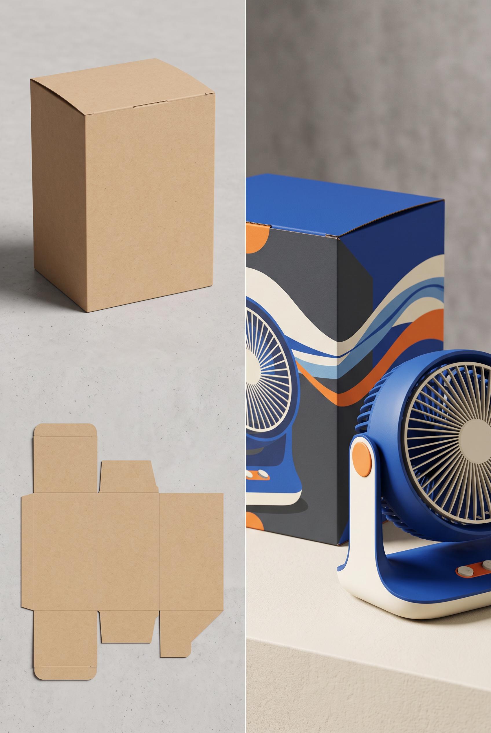
0Create a commercial-quality product mockup in a vertical 2:3 Pinterest composition. Show a before-and-after transformation from a plain unprinted desk fan carton and flat dieline on the left to a polished cobalt, tangerine, cream, and charcoal launch scene on the right. Include a compact modern desk fan, folded carton structure, flowing abstract air ribbons, crisp paper edges, tactile matte surfaces, and directional studio lighting. AI-modified downstream. No real brands, no trademarked characters, no watermark, and no unintended readable text. Corrective regeneration attempt 2. Produce a materially revised image, not a near-duplicate of an earlier variant. Preserve the successful subject, palette, lighting, focal hierarchy, and commercial polish from the original brief while correcting every issue below. Mandatory corrective instructions from the most recent visual QA: Create one clean vertical 2:3 Pinterest composition with a single central vertical transformation split only: left side is a restrained blank kraft carton and flat carton dieline; right side is one polished cobalt, tangerine, cream, and charcoal desk-fan launch scene with compact fan, folded dimensional carton, flowing sliced airflow ribbons, and sculptural shadow. Remove all headings, captions, logos, brand marks, product names, feature labels, booklet text, symbols, and every other readable character. Keep the blank carton entirely unprinted. Use crisp paper edges, tactile matte surfaces, directional studio lighting, strong focal hierarchy, and a clean uninterrupted split without stacked panels, duplicated objects, seam collisions, or illegible micro-details. Observed defects from prior variants that must not recur: 1) The composition does not follow the requested single left-before/right-after transformation; it is split into two stacked panels with duplicated scenes. 2) It contains extensive embedded headings, product copy, feature labels, and booklet text despite the instruction to avoid unintended readable text. 3) The small packaging and manual text includes questionable pseudo-words and tiny illegible details, reducing commercial polish. Render no letters, words, numbers, prices, headings, labels, contact details, logos, glyphs, or pseudo-text anywhere. Use only blank surfaces, clean geometric marks, and non-linguistic placeholder shapes. Do not add explanatory captions, before/after labels, interface copy, or extra objects that the brief did not request. When a corrective instruction conflicts with a decorative detail, prioritize the corrective instruction.
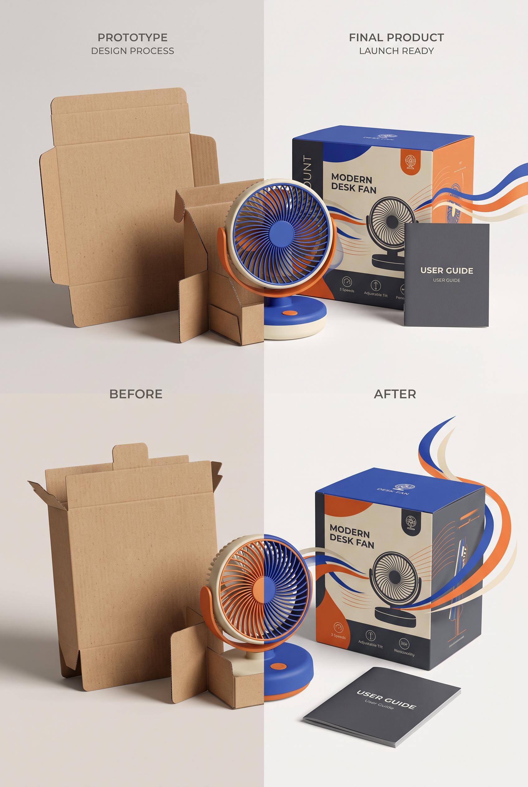 0
0Create a commercial-quality product mockup in a vertical 2:3 Pinterest composition. Show a before-and-after transformation from a plain unprinted desk fan carton and flat dieline on the left to a polished cobalt, tangerine, cream, and charcoal launch scene on the right. Include a compact modern desk fan, folded carton structure, flowing abstract air ribbons, crisp paper edges, tactile matte surfaces, and directional studio lighting. AI-modified downstream. No real brands, no trademarked characters, no watermark, and no unintended readable text.
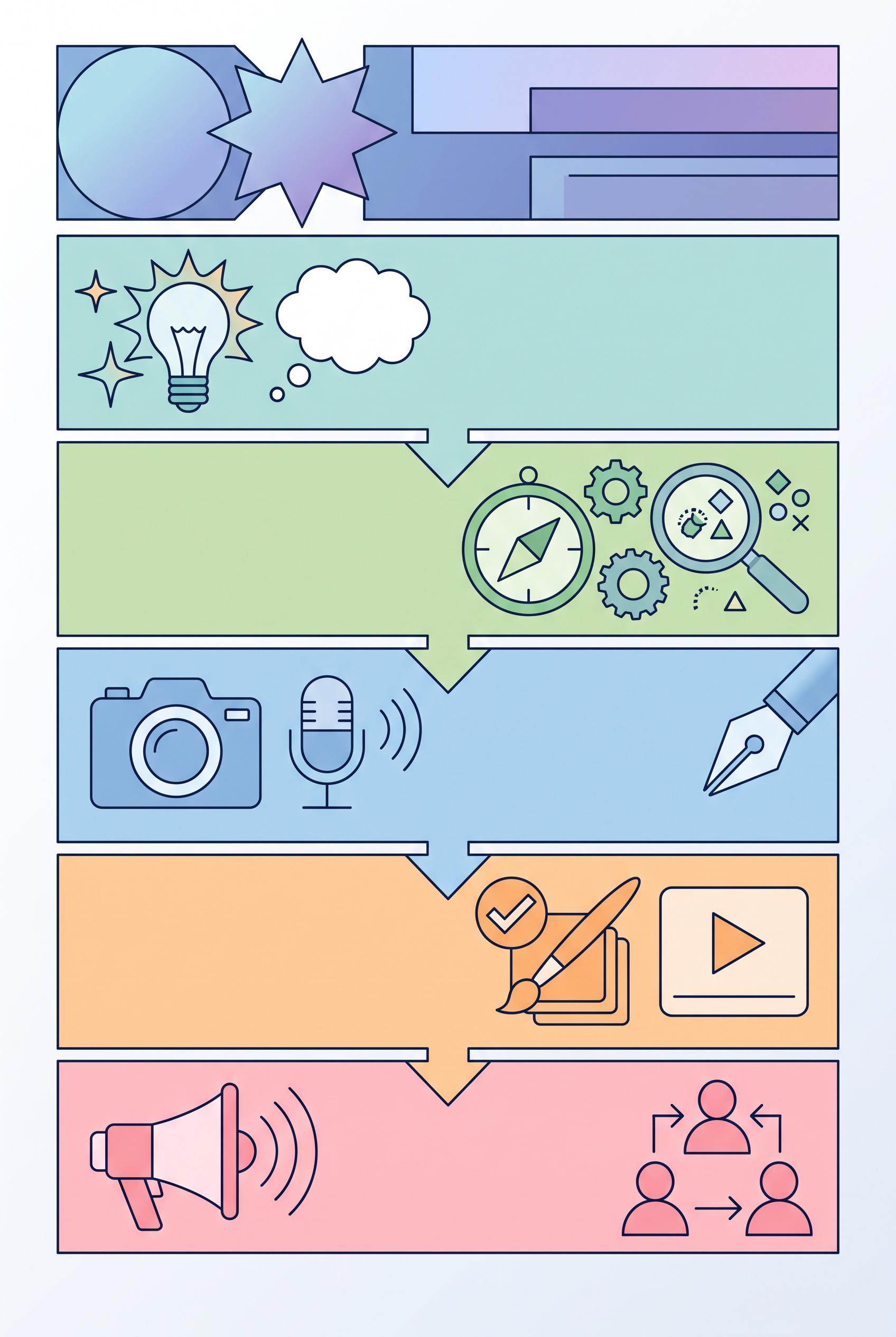 0
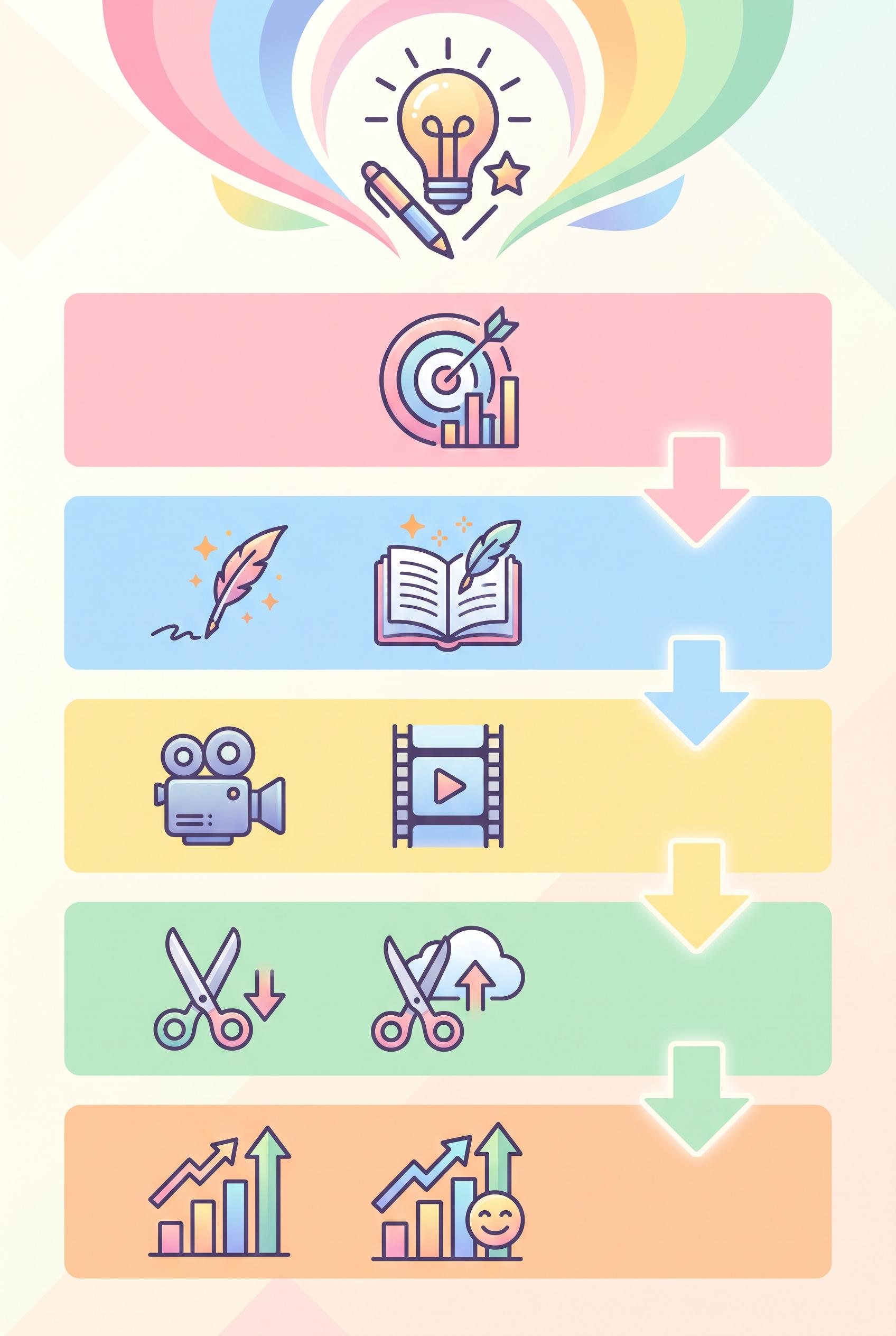
0Design a vibrant vertical 2:3 infographic that outlines a five-step content creation strategy for creators. Each section should have a unique icon and pastel color, designed to be inviting and easy to read. Ensure a clean layout and professional quality artwork without any brand logos. Aim for clear visual communication of ideas. Corrective regeneration attempt 6. Produce a materially revised image, not a near-duplicate of an earlier variant. Preserve the successful subject, palette, lighting, focal hierarchy, and commercial polish from the original brief while correcting every issue below. Mandatory corrective instructions from the most recent visual QA: Create a strictly non-textual 2:3 vertical infographic consisting of five clearly delineated steps. Use pastel color blocks for each step with unique, non-textual icons or geometric shapes (no letters, numbers, words, or captions). Establish a strong focal point at the top with an abstract title area composed only of shapes. Maintain visual hierarchy through block size, spacing, and arrows, without any text. Keep all five steps visually distinct and aligned crisply. Do not include any logos, brand marks, or readable text anywhere. If needed, use a thin, unobtrusive border solely to separate sections. Replace all bottom branding areas with blank surfaces. Use neutral placeholder shapes (circles, squares, triangles, abstract glyphs) to convey progression. Ensure no letters, numbers, headings, labels, prices, or contact details appear in any panel. Deliver a single clean vertical 2:3 composition with five steps and clear progression arrows, all purely visual. Observed defects from prior variants that must not recur: 1) Not purely non-textual: letters/numbers/phrases are present 2) Images include logos or brand marks 3) Some sections use textual headings which violate the no-text requirement 4) The current image contains text/labels and visible numerals that violate the no-text, no-label requirement. 5) Branding glyphs or logos appear in the bottom area, which is not allowed. 6) Visual hierarchy relies on textual headings rather than pure non-linguistic shapes. 7) Bottom center areas show potential branding glyphs or subtle text. 8) Some sections use letters or readable captions that contradict the non-textual mandate. Render no letters, words, numbers, prices, headings, labels, contact details, logos, glyphs, or pseudo-text anywhere. Use only blank surfaces, clean geometric marks, and non-linguistic placeholder shapes. Do not add explanatory captions, before/after labels, interface copy, or extra objects that the brief did not request. When a corrective instruction conflicts with a decorative detail, prioritize the corrective instruction.
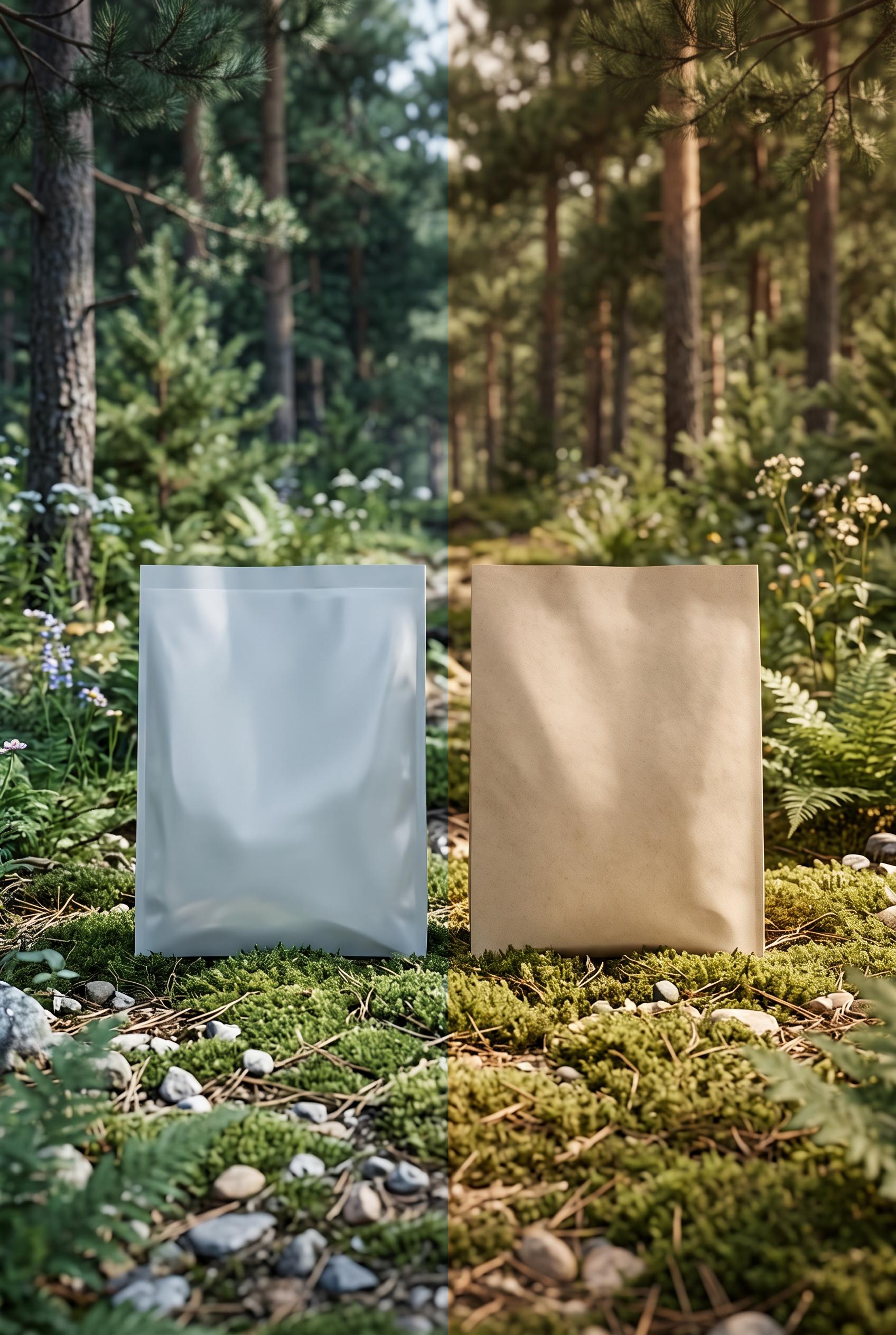 0
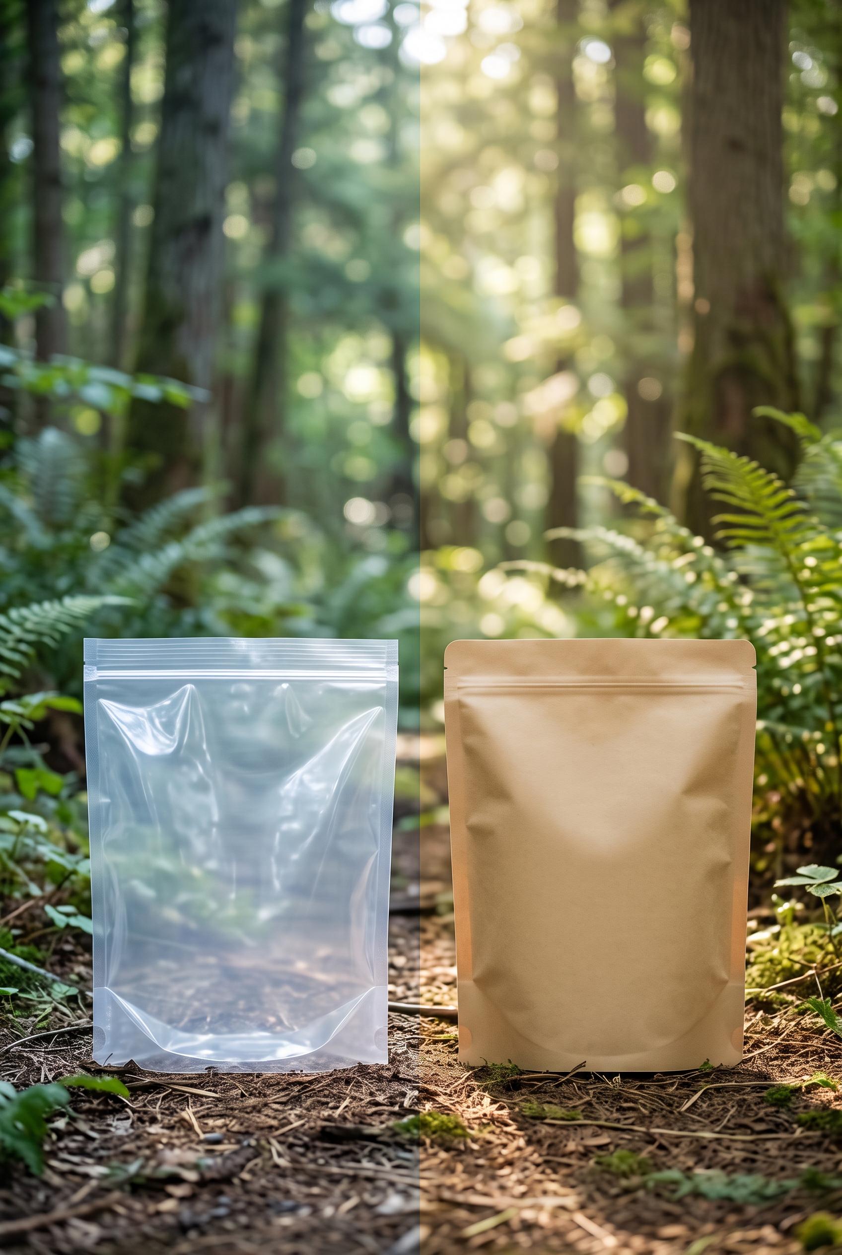
0Create a vertical 2:3 composition showcasing the before (plastic) and after (biodegradable) packaging side by side in a serene, natural setting, emphasizing sustainability and eco-friendliness, high-quality art direction without real brands or readable text. Corrective regeneration attempt 6. Produce a materially revised image, not a near-duplicate of an earlier variant. Preserve the successful subject, palette, lighting, focal hierarchy, and commercial polish from the original brief while correcting every issue below. Mandatory corrective instructions from the most recent visual QA: Create a new vertical 2:3 image with a seamless, uninterrupted split between left and right halves. Left half: plain plastic bag with flat, unmarked surface, cool, slightly harsh lighting. Right half: plain biodegradable bag with flat, unmarked surface, warmer, earth-toned lighting. Use a continuous horizon line with no central seam or dividing artifact. Background remains a serene forest/natural setting with consistent depth of field. Bags must be neutral in color, unmarked, without branding, logos, textures resembling logos, compostable symbols, or text. Bags should have clean, flat surfaces with no visible seams, watermarks, or artifacts. Maintain bottom alignment and a high-contrast lighting scheme to emphasize cooler plastic vs. warmer biodegradable, with no captions, labels, or extra objects. Render no letters, words, numbers, prices, headings, labels, contact details, logos, glyphs, or pseudo-text anywhere. Use only blank surfaces, clean geometric marks, and non-linguistic placeholder shapes. Observed defects from prior variants that must not recur: 1) No continuous horizon line between halves; transition is not uninterrupted. 2) Two bags are plain/unmarked but there is a visible seam/texture issue on bag surfaces near the center. 3) No captions or logos, but the split renders with a distinct seam artifact and uneven lighting across halves. 4) Ensure 2:3 vertical framing with flat bag surfaces and no central seam; maintain consistent DOF and natural background without extra objects. 5) Seam/central dividing artifact present: visible vertical seam splits the 2:3 frame, breaking the seamless horizon requirement. 6) Uninterrupted transition between halves not achieved; two bags not on a continuous horizon line. 7) Bag surfaces show texture/seams near center and appear reflective, not flat; surfaces must be flat, plain, unmarked. 8) Two bags have central seam/texture issue and potential artifacts; overall image lacks clean, flat surfaces as requested. Render no letters, words, numbers, prices, headings, labels, contact details, logos, glyphs, or pseudo-text anywhere. Use only blank surfaces, clean geometric marks, and non-linguistic placeholder shapes. Do not add explanatory captions, before/after labels, interface copy, or extra objects that the brief did not request. When a corrective instruction conflicts with a decorative detail, prioritize the corrective instruction.
 0
0Flat lay of artisan tea collection with various blends, styled with dried herbs and tea cups in vertical 2:3 Pinterest composition, commercial-quality art direction, no real brands, no trademarks, no watermarks, no readable text. Corrective regeneration attempt 2. Produce a materially revised image, not a near-duplicate of an earlier variant. Preserve the successful subject, palette, lighting, focal hierarchy, and commercial polish from the original brief while correcting every issue below. Mandatory corrective instructions from the most recent visual QA: Regenerate a vertical 2:3 Pinterest-optimized flat lay with a clear focal point centered on a single or few tea jars/packs. Ensure no real brand names, trademarks, or readable text appear on any labels, packaging, or surfaces. Remove all visible text, including labels on jars and pouches. Use neutral, earthy tones and natural props (dried herbs, leaves, teacups) and ensure no watermarks or obvious generation artifacts. Suggested setup: arrange 4-6 glass jars with tea blends along a vertical axis near the top third, with a few ceramic bowls of tea leaves, scattered dried flowers, and a cup of tea toward the lower third. Maintain clean negative space and consistent lighting. Crop to a vertical orientation 2:3 (width:height ratio approximately 2:3) with a strong central focal point and balanced composition, avoiding any visible text, logos, or branding. Observed defects from prior variants that must not recur: 1) Wrong aspect ratio/orientation (image is horizontal, not vertical 2:3). 2) Readable text present on labels/packaging (violates no-readable-text rule). 3) No explicit vertical 2:3 Pinterest composition currently evident; focal point not clearly emphasized. Render no letters, words, numbers, prices, headings, labels, contact details, logos, glyphs, or pseudo-text anywhere. Use only blank surfaces, clean geometric marks, and non-linguistic placeholder shapes. Do not add explanatory captions, before/after labels, interface copy, or extra objects that the brief did not request. When a corrective instruction conflicts with a decorative detail, prioritize the corrective instruction.
 0
0Flat lay of artisan tea collection with various blends, styled with dried herbs and tea cups in vertical 2:3 Pinterest composition, commercial-quality art direction, no real brands, no trademarks, no watermarks, no readable text.
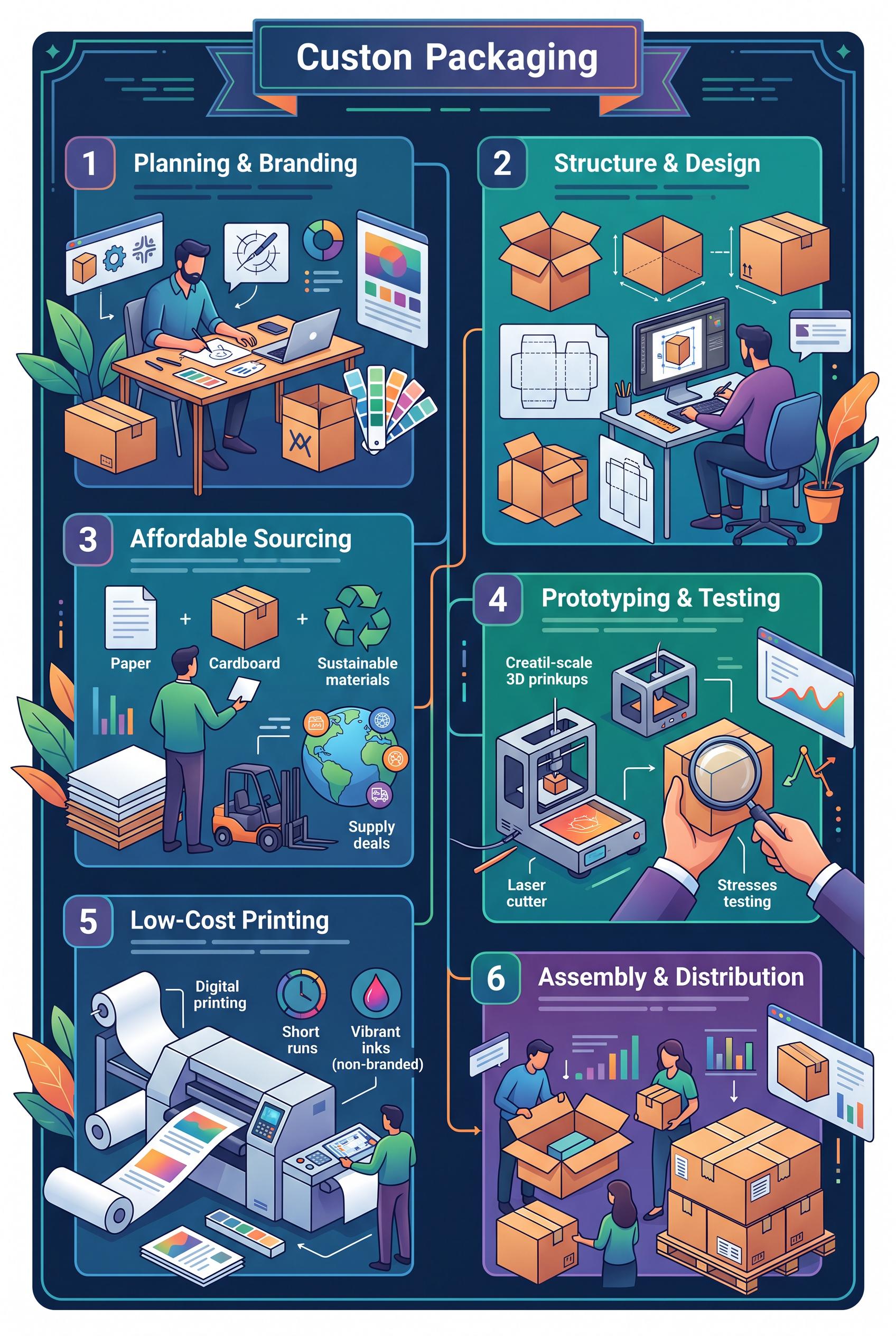 0
0Infographic showing steps to create affordable custom packaging for small businesses in vertical 2:3 Pinterest composition, commercial-quality art direction, no real brands, no trademarks, no watermarks, no readable text.
 0
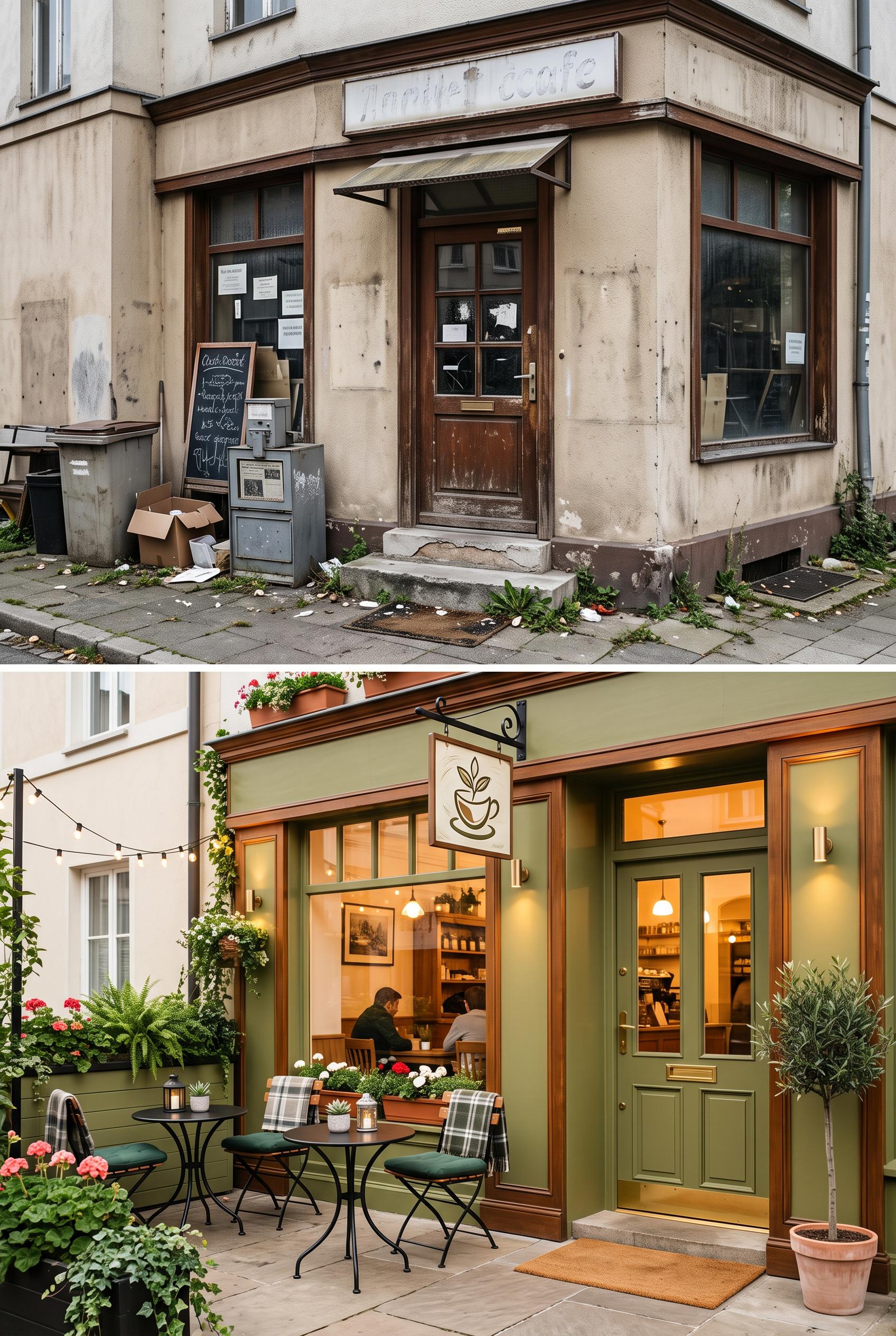
0Split image of a local cafe entrance before (cluttered and dull) and after (cozy, inviting with outdoor seating) in vertical 2:3 Pinterest composition, commercial-quality art direction, no real brands, no trademarks, no watermarks, no readable text. Corrective regeneration attempt 3. Produce a materially revised image, not a near-duplicate of an earlier variant. Preserve the successful subject, palette, lighting, focal hierarchy, and commercial polish from the original brief while correcting every issue below. Mandatory corrective instructions from the most recent visual QA: Regenerate as a strict vertical 2:3 split image (before/after). Before panel: emphasize cluttered, dull storefront with no legible text, no logos, no signs, no notices. Remove all letters, numbers, captions, chalkboards, or readable markings; use blank surfaces or generic textures. Ensure textures are neutral (brick, wood) with debris but no signage. After panel: maintain warm, inviting storefront with outdoor seating and a clean facade; include a clearly defined focal point on the entrance and seating area; use a generic, non-brand-specific sign or icon (e.g., a simple cup icon) with no wording. All text must be non-readable or absent. Keep lighting natural and sharp detail, no watermarks or generation artifacts. Align both panels within a strict vertical 2:3 frame, no captions, no before/after labels in the image, and ensure overall commercial polish. Observed defects from prior variants that must not recur: 1) Readable text appears in the before panel (chalkboard menu and notices) which violates the no-readable-text requirement. 2) Potential real-world clutter visible in the before panel could imply branding or signage accidentally resembling a brand; ensure all text is generic or removed. 3) Readable text appears in the before panel (chalkboard/menu, notices) violating no-text requirement. 4) Potential additional legible text or signs in the before panel; ensure all text is removed or anonymized. 5) After panel contains a clear branding element without words; if needed, ensure the icon/sign is non-textual and generic. Render no letters, words, numbers, prices, headings, labels, contact details, logos, glyphs, or pseudo-text anywhere. Use only blank surfaces, clean geometric marks, and non-linguistic placeholder shapes. Do not add explanatory captions, before/after labels, interface copy, or extra objects that the brief did not request. When a corrective instruction conflicts with a decorative detail, prioritize the corrective instruction.
 0
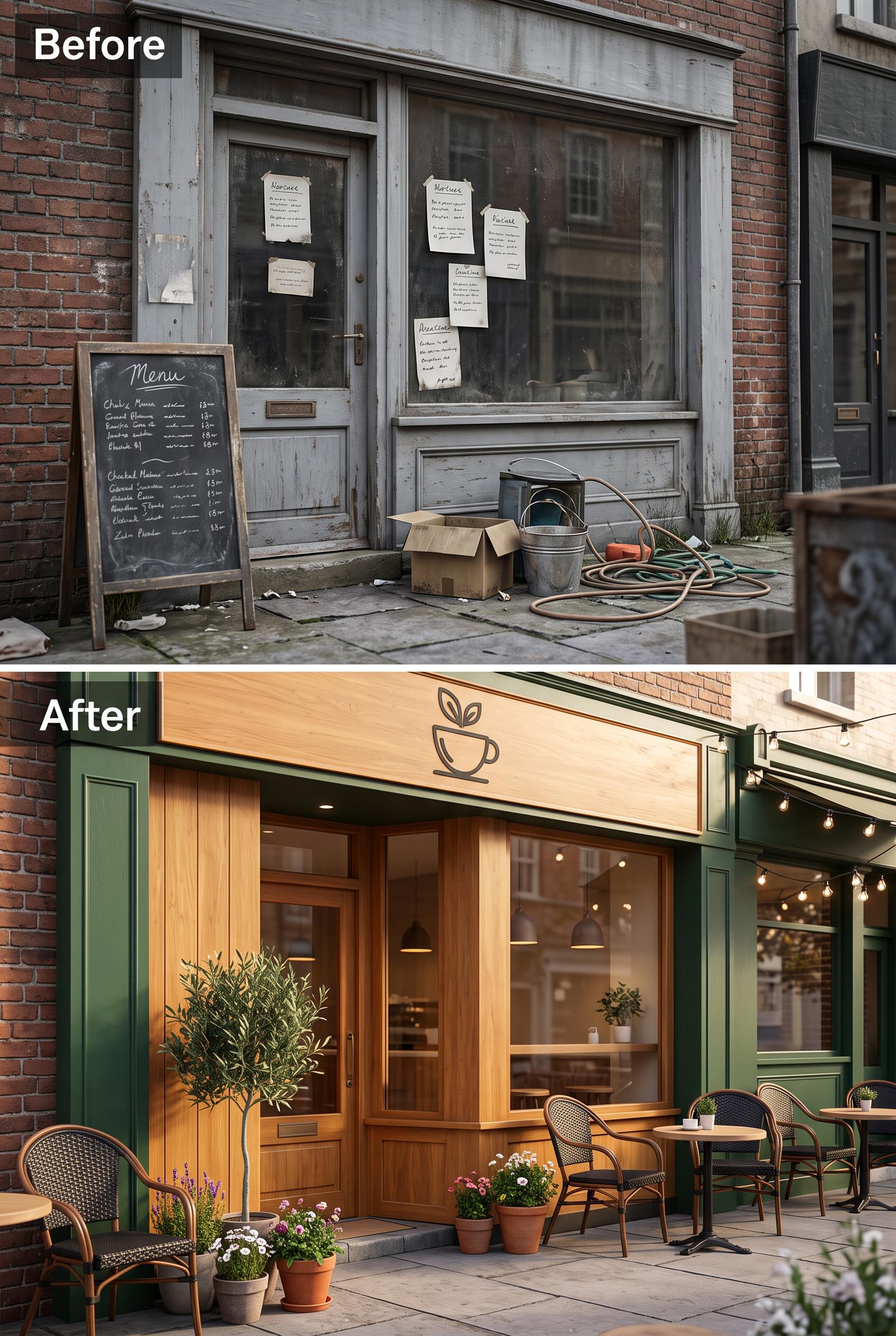
0Split image of a local cafe entrance before (cluttered and dull) and after (cozy, inviting with outdoor seating) in vertical 2:3 Pinterest composition, commercial-quality art direction, no real brands, no trademarks, no watermarks, no readable text. Corrective regeneration attempt 2. Produce a materially revised image, not a near-duplicate of an earlier variant. Preserve the successful subject, palette, lighting, focal hierarchy, and commercial polish from the original brief while correcting every issue below. Mandatory corrective instructions from the most recent visual QA: Create a vertical 2:3 split image of a local cafe entrance before/after redesign. Before panel: emphasize cluttered, dull, non-branded storefront; remove all legible text, signs, chalkboards, and notices. Use neutral, non-specific textures and debris; ensure no visible logos or readable words. After panel: warm colors, inviting outdoor seating, clean facade, clear branding that is fictional and non-brand-specific (e.g., a generic cafe sign without words or a simple icon). Maintain a clear focal point on the entrance and seating area in the after panel. Ensure no watermarks or generation artifacts; preserve natural lighting and sharp detail, and keep both panels aligned in a strict vertical split within a 2:3 aspect ratio. Observed defects from prior variants that must not recur: 1) Readable text appears in the before panel (chalkboard menu and notices) which violates the no-readable-text requirement. 2) Potential real-world clutter visible in the before panel could imply branding or signage accidentally resembling a brand; ensure all text is generic or removed. Render no letters, words, numbers, prices, headings, labels, contact details, logos, glyphs, or pseudo-text anywhere. Use only blank surfaces, clean geometric marks, and non-linguistic placeholder shapes. Do not add explanatory captions, before/after labels, interface copy, or extra objects that the brief did not request. When a corrective instruction conflicts with a decorative detail, prioritize the corrective instruction.
 0
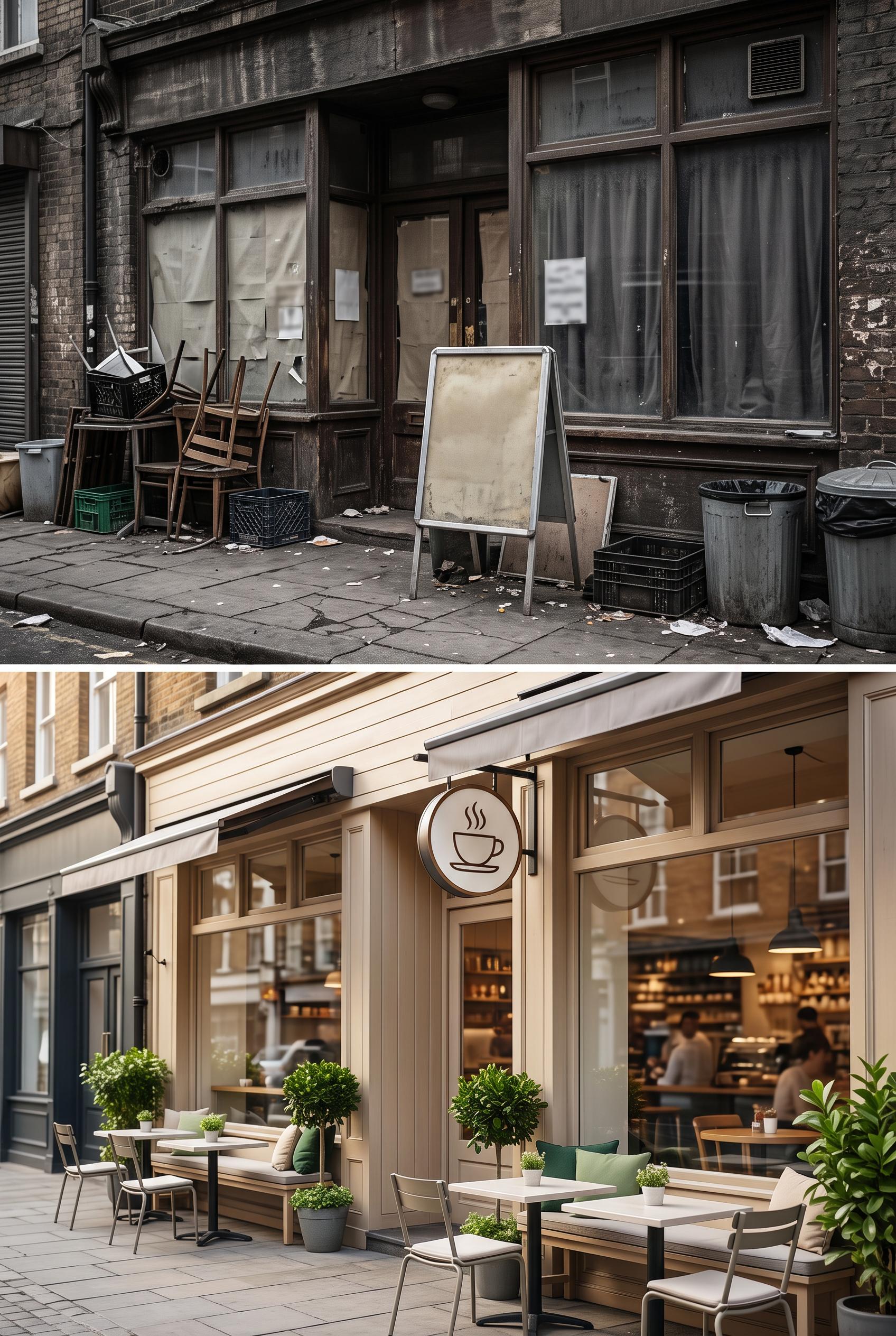
0Split image of a local cafe entrance before (cluttered and dull) and after (cozy, inviting with outdoor seating) in vertical 2:3 Pinterest composition, commercial-quality art direction, no real brands, no trademarks, no watermarks, no readable text.
 0
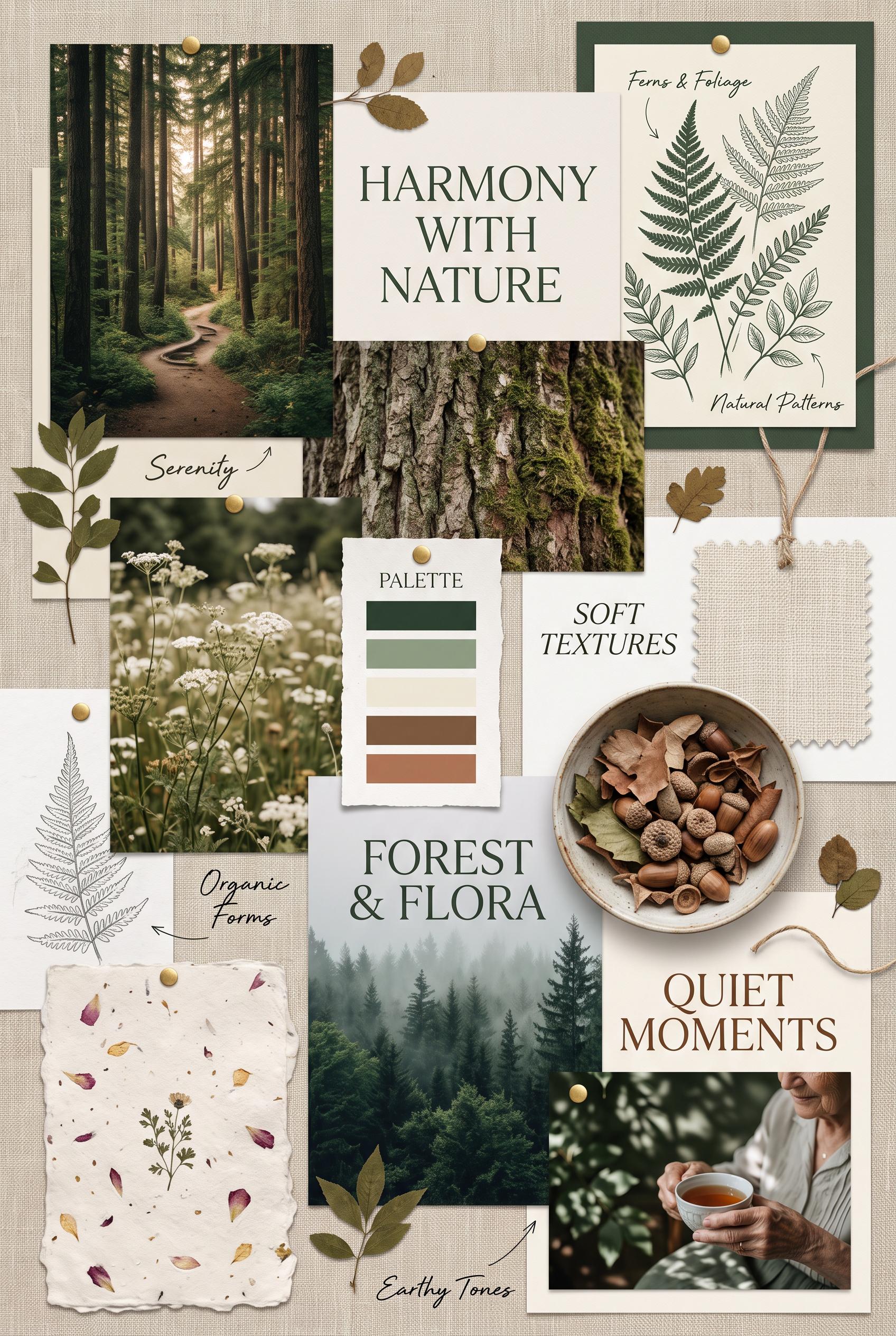
0Create a vertical 2:3 composition presenting a nature-inspired moodboard. Include earthy images like forests, florals, and textures paired with soft typography. Arrange elements in a collage style to reflect harmony with nature, using deep greens and cream as the primary color scheme. Ensure high-quality design and avoid any recognizable brands.
 0
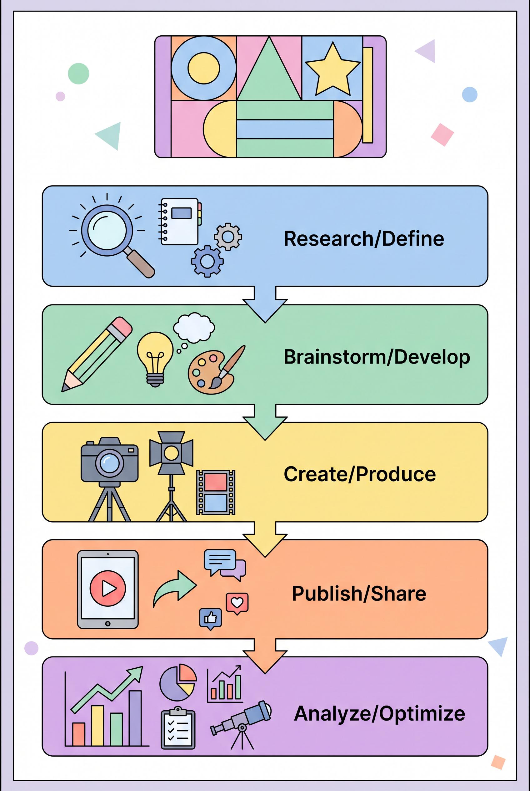
0Design a vibrant vertical 2:3 infographic that outlines a five-step content creation strategy for creators. Each section should have a unique icon and pastel color, designed to be inviting and easy to read. Ensure a clean layout and professional quality artwork without any brand logos. Aim for clear visual communication of ideas. Corrective regeneration attempt 5. Produce a materially revised image, not a near-duplicate of an earlier variant. Preserve the successful subject, palette, lighting, focal hierarchy, and commercial polish from the original brief while correcting every issue below. Mandatory corrective instructions from the most recent visual QA: Create a strictly non-textual 2:3 vertical infographic with five clearly delineated steps. Use pastel color blocks for each step and assign a unique, non-textual icon or geometric shape to each step (no letters, numbers, or words). Establish a strong focal point at the top with an abstract title area composed of shapes. Maintain consistent visual hierarchy through block size, spacing, and arrows, not text. Preserve the five-step sequence and the how_to concept, but render with pure visuals only. Ensure no watermarks, logos, brand marks, or readable text anywhere. Use a thin, unobtrusive border only if separation is needed. All five steps must be visually distinct with clean alignment for a crisp 2:3 composition. Remove any bottom-center logo or branding glyphs. If shapes imply content, rely on neutral non-linguistic markers (e.g., icons, abstract shapes) to convey progression. Do not include any letters, numbers, headings, labels, prices, contact details, or captions anywhere. Use only blank surfaces, clean geometric marks, and non-linguistic placeholder shapes. Observed defects from prior variants that must not recur: 1) Layout relies on text-based hierarchy (labels/headings) instead of visual shapes 2) Bottom area may contain branding or logos not allowed 3) Includes branding/watermark elements present in prior variants 4) Layout relies on text-based hierarchy rather than purely visual cues 5) Bottom area/areas show branding glyphs 6) Not purely non-textual: letters/numbers/phrases are present 7) Images include logos or brand marks 8) Some sections use textual headings which violate the no-text requirement Render no letters, words, numbers, prices, headings, labels, contact details, logos, glyphs, or pseudo-text anywhere. Use only blank surfaces, clean geometric marks, and non-linguistic placeholder shapes. Do not add explanatory captions, before/after labels, interface copy, or extra objects that the brief did not request. When a corrective instruction conflicts with a decorative detail, prioritize the corrective instruction.
 0
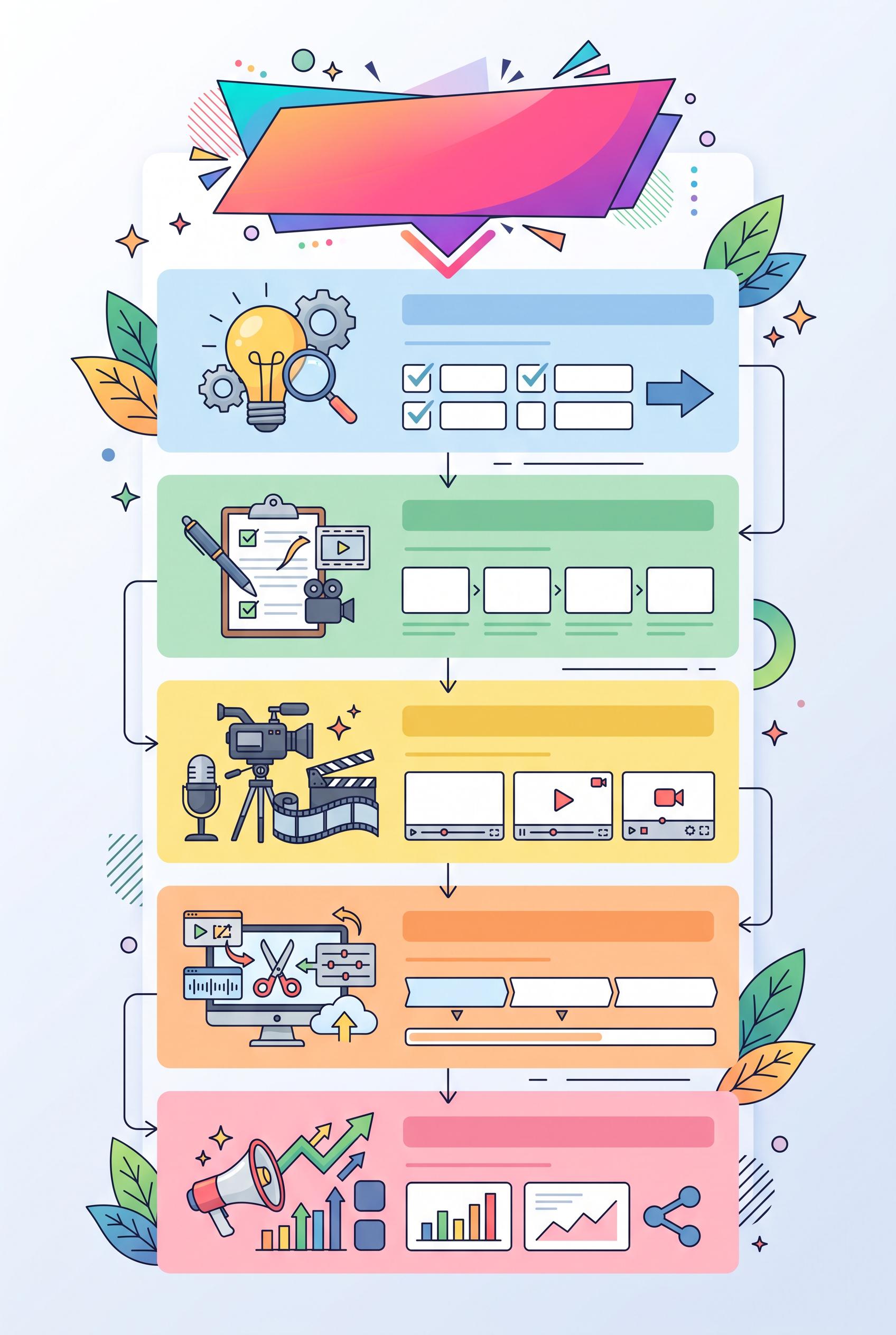
0Design a vibrant vertical 2:3 infographic that outlines a five-step content creation strategy for creators. Each section should have a unique icon and pastel color, designed to be inviting and easy to read. Ensure a clean layout and professional quality artwork without any brand logos. Aim for clear visual communication of ideas. Corrective regeneration attempt 4. Produce a materially revised image, not a near-duplicate of an earlier variant. Preserve the successful subject, palette, lighting, focal hierarchy, and commercial polish from the original brief while correcting every issue below. Mandatory corrective instructions from the most recent visual QA: Regenerate a strictly non-textual 2:3 vertical infographic with five clearly delineated steps. Use pastel color blocks for each step and assign a unique, non-textual icon or geometric shape to each step (no letters, numbers, or words). Establish a strong focal point at the top (abstract title area made from shapes) and consistent visual hierarchy through block size, spacing, and arrows, not text. Maintain the five-step sequence and the how_to concept, but render with pure visuals only. Ensure no watermarks, logos, brand marks, or readable text anywhere. Use a thin, unobtrusive border only if separation is needed. All five steps must be visually distinct with clean alignment for a crisp 2:3 composition. Remove any bottom-center logo or branding glyphs. If shapes imply content, rely on neutral non-linguistic markers (e.g., icons, abstract shapes) to convey progression. Observed defects from prior variants that must not recur: 1) Visible branding/watermark or logo present in prior variants (flag) 2) Not purely non-textual: includes letters/numbers/labels that violate the no-text requirement 3) Layout currently relies on textual headings for hierarchy instead of purely visual cues 4) Contains readable text and labels within the image 5) Contains visible branding/watermark 6) Not purely non-textual: letters/numbers/phrases present 7) Layout relies on text-based hierarchy (labels/headings) instead of visual shapes 8) Bottom area may contain branding or logos not allowed Render no letters, words, numbers, prices, headings, labels, contact details, logos, glyphs, or pseudo-text anywhere. Use only blank surfaces, clean geometric marks, and non-linguistic placeholder shapes. Do not add explanatory captions, before/after labels, interface copy, or extra objects that the brief did not request. When a corrective instruction conflicts with a decorative detail, prioritize the corrective instruction.
 0
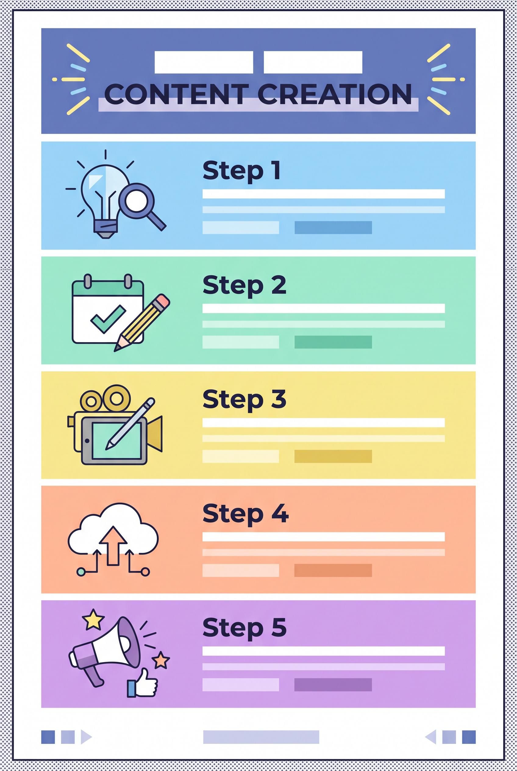
0Design a vibrant vertical 2:3 infographic that outlines a five-step content creation strategy for creators. Each section should have a unique icon and pastel color, designed to be inviting and easy to read. Ensure a clean layout and professional quality artwork without any brand logos. Aim for clear visual communication of ideas. Corrective regeneration attempt 3. Produce a materially revised image, not a near-duplicate of an earlier variant. Preserve the successful subject, palette, lighting, focal hierarchy, and commercial polish from the original brief while correcting every issue below. Mandatory corrective instructions from the most recent visual QA: Regenerate a vertical 2:3 infographic with five clearly delineated steps. Use pastel color blocks for each step, each with a unique non-textual icon and brief non-linguistic markers (shapes) to imply content. Ensure a clean, professional layout with a strong focal point at the top (e.g., abstract title area or first step) and clear visual hierarchy without any readable letters, numbers, prices, or brand marks. Remove all watermarks, logos, or brand marks. Do not include any real-brand imagery or trademarks. Include a thin, unobtrusive border only if needed for separation, but exclude any bottom-center logo. Use high-contrast text alternatives only if necessary, but avoid readable text—rely on shapes/iconography to convey steps. Preserve the five-step sequence and concept type how_to, but render with pure visuals (no words). Ensure no garbled readable text remains and no generation artifacts that resemble text. All five steps should be visually distinct, with consistent spacing and alignment for a crisp 2:3 vertical composition. Observed defects from prior variants that must not recur: 1) Contains a visible watermark/logo at the bottom center 2) Brand/logo presence violates the 'no brand logos' requirement 3) Overall layout is heavy but could be clearer as a strict 2:3 vertical infographic with distinct focal point 4) Contains readable text (e.g., Step 1, Step 2, etc.) within the image 5) Visible branding/watermark or logo present in prior variants (flag) 6) Not purely non-textual: includes letters/numbers/labels that violate the no-text requirement 7) Layout currently relies on textual headings for hierarchy instead of purely visual cues Render no letters, words, numbers, prices, headings, labels, contact details, logos, glyphs, or pseudo-text anywhere. Use only blank surfaces, clean geometric marks, and non-linguistic placeholder shapes. Do not add explanatory captions, before/after labels, interface copy, or extra objects that the brief did not request. When a corrective instruction conflicts with a decorative detail, prioritize the corrective instruction.
 0
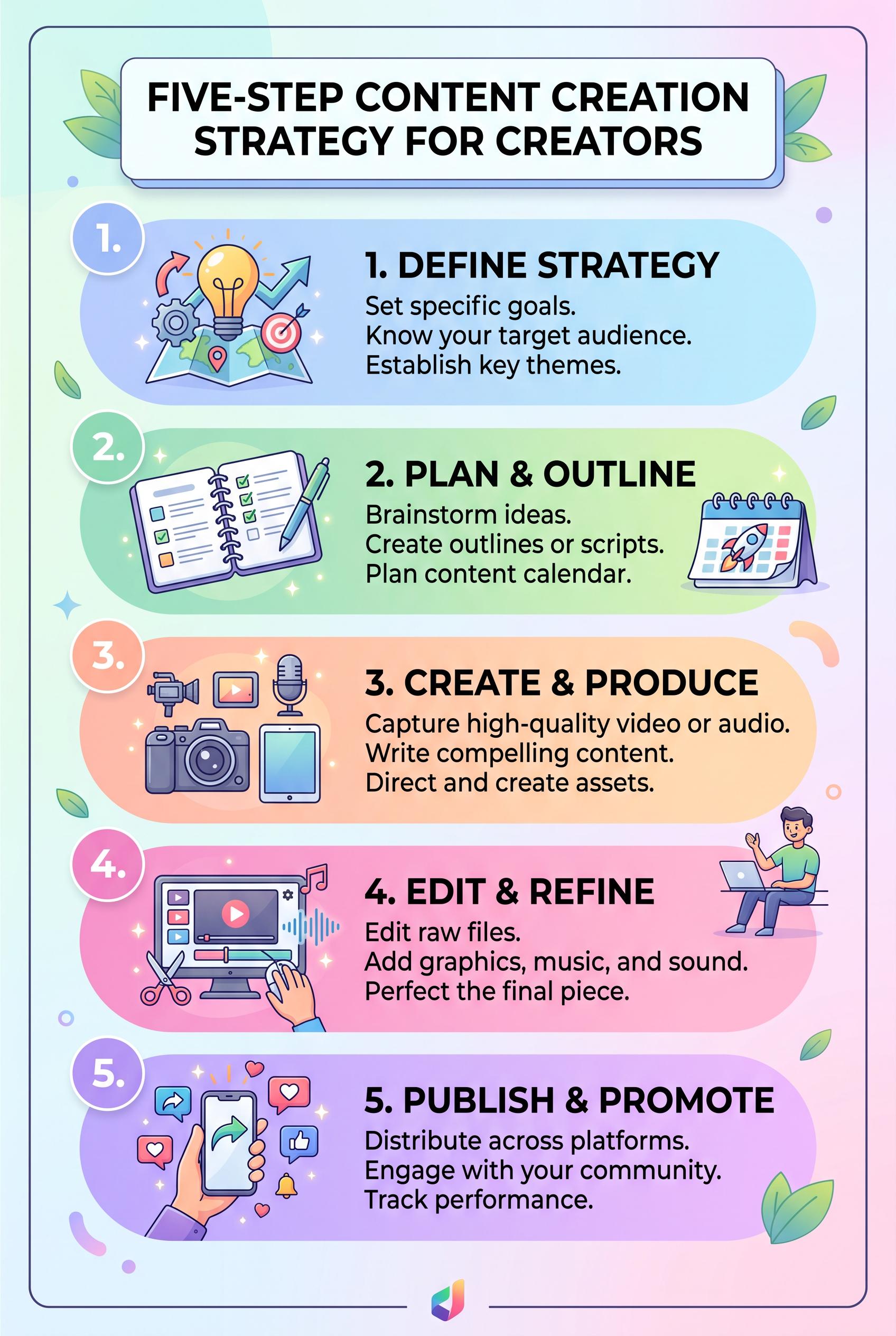
0Design a vibrant vertical 2:3 infographic that outlines a five-step content creation strategy for creators. Each section should have a unique icon and pastel color, designed to be inviting and easy to read. Ensure a clean layout and professional quality artwork without any brand logos. Aim for clear visual communication of ideas. Corrective regeneration attempt 2. Produce a materially revised image, not a near-duplicate of an earlier variant. Preserve the successful subject, palette, lighting, focal hierarchy, and commercial polish from the original brief while correcting every issue below. Mandatory corrective instructions from the most recent visual QA: Regenerate a vertical 2:3 infographic with five clearly delineated steps. Use pastel color blocks for each step, each with a unique icon and brief text. Ensure a clean, professional layout with a strong focal point (preferably the title area or the first step). Remove all watermarks, logos, or any brand marks from the image. Ensure no garbled or unreadable text, no copyrighted branding, and no visible generation artifacts. Place a small, unobtrusive design border if needed, but exclude any bottom-center logo. Maintain high contrast between text and backgrounds for readability. Preserve the concept type how_to and the five-step sequence, but avoid any real-brand imagery or trademarks. Observed defects from prior variants that must not recur: 1) Contains a visible watermark/logo at the bottom center 2) Brand/logo presence violates the 'no brand logos' requirement 3) Overall layout is heavy but could be clearer as a strict 2:3 vertical infographic with distinct focal point Render no letters, words, numbers, prices, headings, labels, contact details, logos, glyphs, or pseudo-text anywhere. Use only blank surfaces, clean geometric marks, and non-linguistic placeholder shapes. Do not add explanatory captions, before/after labels, interface copy, or extra objects that the brief did not request. When a corrective instruction conflicts with a decorative detail, prioritize the corrective instruction.
 0
0Design a vibrant vertical 2:3 infographic that outlines a five-step content creation strategy for creators. Each section should have a unique icon and pastel color, designed to be inviting and easy to read. Ensure a clean layout and professional quality artwork without any brand logos. Aim for clear visual communication of ideas.
 0
0Create a vertical 2:3 composition showcasing a split image: one side shows a cluttered, old-style thumbnail featuring outdated colors and overlapped text, and the other side features a modern, eye-catching thumbnail with a bold design, simplified layout, and contrasting colors. No real brand elements, ensure commercial art direction. Art should be crisp and vibrant. Corrective regeneration attempt 3. Produce a materially revised image, not a near-duplicate of an earlier variant. Preserve the successful subject, palette, lighting, focal hierarchy, and commercial polish from the original brief while correcting every issue below. Mandatory corrective instructions from the most recent visual QA: Create a clean vertical 2:3 canvas with a sharp, centered split seam. Left panel: render a subdued, uncluttered surface with no text, logos, or symbols; include a single, very small abstract form if needed and ensure it does not overpower the split. Right panel: render a bold, modern thumbnail aesthetic with high-contrast colors (e.g., dark navy to electric cyan) and large, legible abstract shapes only; no letters, numbers, or text. Remove all bottom caption bars, overlays, or watermark-like elements. Ensure the split seam is pixel-perfect and seamless with no artifacts. Do not include real brand elements or trademarks; replace with generic shapes/icons if necessary. Both sides must have clean, non-garbled visual elements with a clear focal point on the right. No visible text anywhere on either panel. Observed defects from prior variants that must not recur: 1) Presence of extraneous bottom overlays/text that resemble captions (garbled/embedded text) reduces readability and perceived quality. 2) Potential small artifacts or seams at the split reduce polish; needs tighter join line. 3) No real brand elements, but the overall contrast and readability across the split need improvement to meet a high commercial standard. 4) Contains letters/text-like shapes in the bottom right panel (appears as OIA), which violates 'no letters, words, numbers, prices, headings, labels, logos, glyphs' rule. 5) Left panel remains cluttered with background elements that compete with the right side for attention. 6) Split seam is present but still shows some edge artifacts and slight misalignment, reducing polish. 7) Bottom overlays or bars resembling captions/watermarks appear and should be removed. 8) Overall image still shows generation artifacts and lacks a crisp, seamless 2:3 vertical split with a singular focal point on the right. Render no letters, words, numbers, prices, headings, labels, contact details, logos, glyphs, or pseudo-text anywhere. Use only blank surfaces, clean geometric marks, and non-linguistic placeholder shapes. Do not add explanatory captions, before/after labels, interface copy, or extra objects that the brief did not request. When a corrective instruction conflicts with a decorative detail, prioritize the corrective instruction.
 0
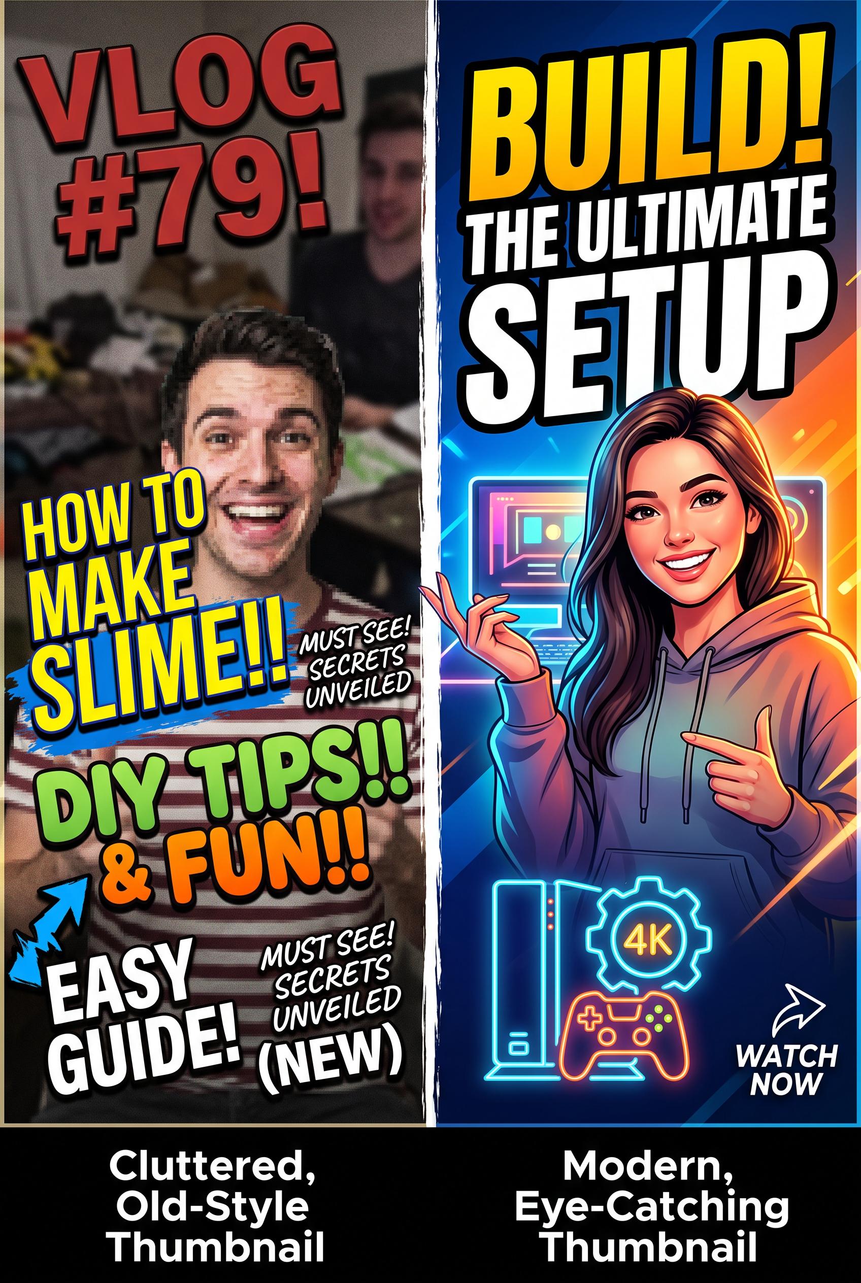
0Create a vertical 2:3 composition showcasing a split image: one side shows a cluttered, old-style thumbnail featuring outdated colors and overlapped text, and the other side features a modern, eye-catching thumbnail with a bold design, simplified layout, and contrasting colors. No real brand elements, ensure commercial art direction. Art should be crisp and vibrant. Corrective regeneration attempt 2. Produce a materially revised image, not a near-duplicate of an earlier variant. Preserve the successful subject, palette, lighting, focal hierarchy, and commercial polish from the original brief while correcting every issue below. Mandatory corrective instructions from the most recent visual QA: Regenerate to produce a vertical 2:3 split thumbnail with a distinct, high-contrast bold right side and a simplified, legible left side. Specific changes: - Create a clean vertical 2:3 canvas; ensure the split line is sharp and centered vertically. - Left panel: remove clutter, reduce busy background, replace with a subdued tone to emphasize the old thumbnail critique; keep a single, readable headline if any but ensure it does not overpower the split. - Right panel: maintain bold, modern thumbnail aesthetic with high-contrast colors (e.g., dark blue to electric cyan) and clear, large typography; ensure no overlapping elements obscure main text. - Remove any bottom caption bars or overlays that resemble watermarks or instructions; ensure only the two halves are visible. - Ensure no generation artifacts or pixelation around the split seam; apply a clean, seamless edge. - Ensure no real brand elements or trademarks appear; substitute with generic icons if necessary. - Text on both sides should be legible at thumbnail size; avoid garbled or overlapping letters. - Overall look should be crisp, vibrant, and professional, suitable for Pinterest vertical 2:3 format. Observed defects from prior variants that must not recur: 1) Not a clean 2:3 vertical composition with a clear, singular focal point across the split. 2) Left (old) side remains cluttered and competes with the right for attention; fails to deliver a sleek, bold after-design as described. 3) Presence of extraneous bottom overlays/text that resemble captions (garbled/embedded text) reduces readability and perceived quality. 4) Potential small artifacts or seams at the split reduce polish; needs tighter join line. 5) No real brand elements, but the overall contrast and readability across the split need improvement to meet a high commercial standard. Render no letters, words, numbers, prices, headings, labels, contact details, logos, glyphs, or pseudo-text anywhere. Use only blank surfaces, clean geometric marks, and non-linguistic placeholder shapes. Do not add explanatory captions, before/after labels, interface copy, or extra objects that the brief did not request. When a corrective instruction conflicts with a decorative detail, prioritize the corrective instruction.
 0
0Create a vertical 2:3 composition showcasing a split image: one side shows a cluttered, old-style thumbnail featuring outdated colors and overlapped text, and the other side features a modern, eye-catching thumbnail with a bold design, simplified layout, and contrasting colors. No real brand elements, ensure commercial art direction. Art should be crisp and vibrant.
 0
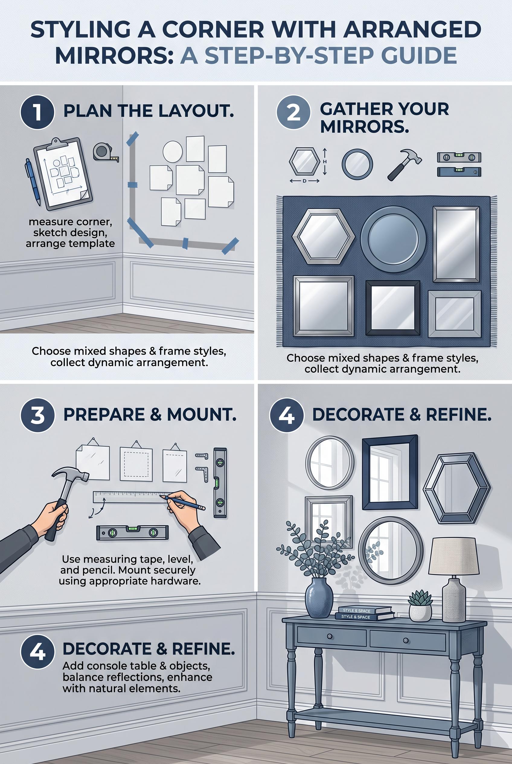
0A vertical 2:3 composition detailing a stylish corner with arranged wall mirrors, incorporating cool blues and grays, presented in a step-by-step format, no real brands included.
 0
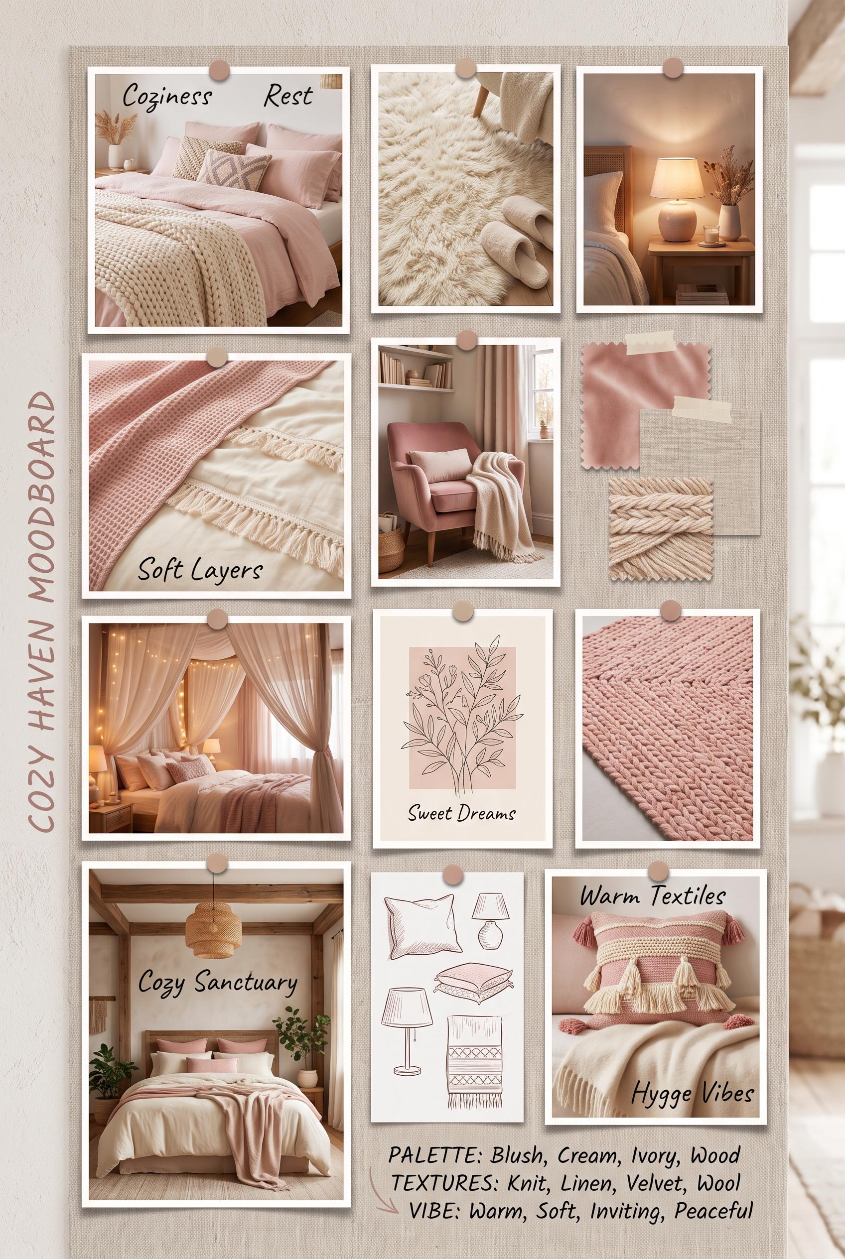
0A vertical 2:3 moodboard of various cozy bedroom setups, featuring soft pinks and creams, highlighting textures like bedding and rugs, all in a gallery layout, without real brands.
 0
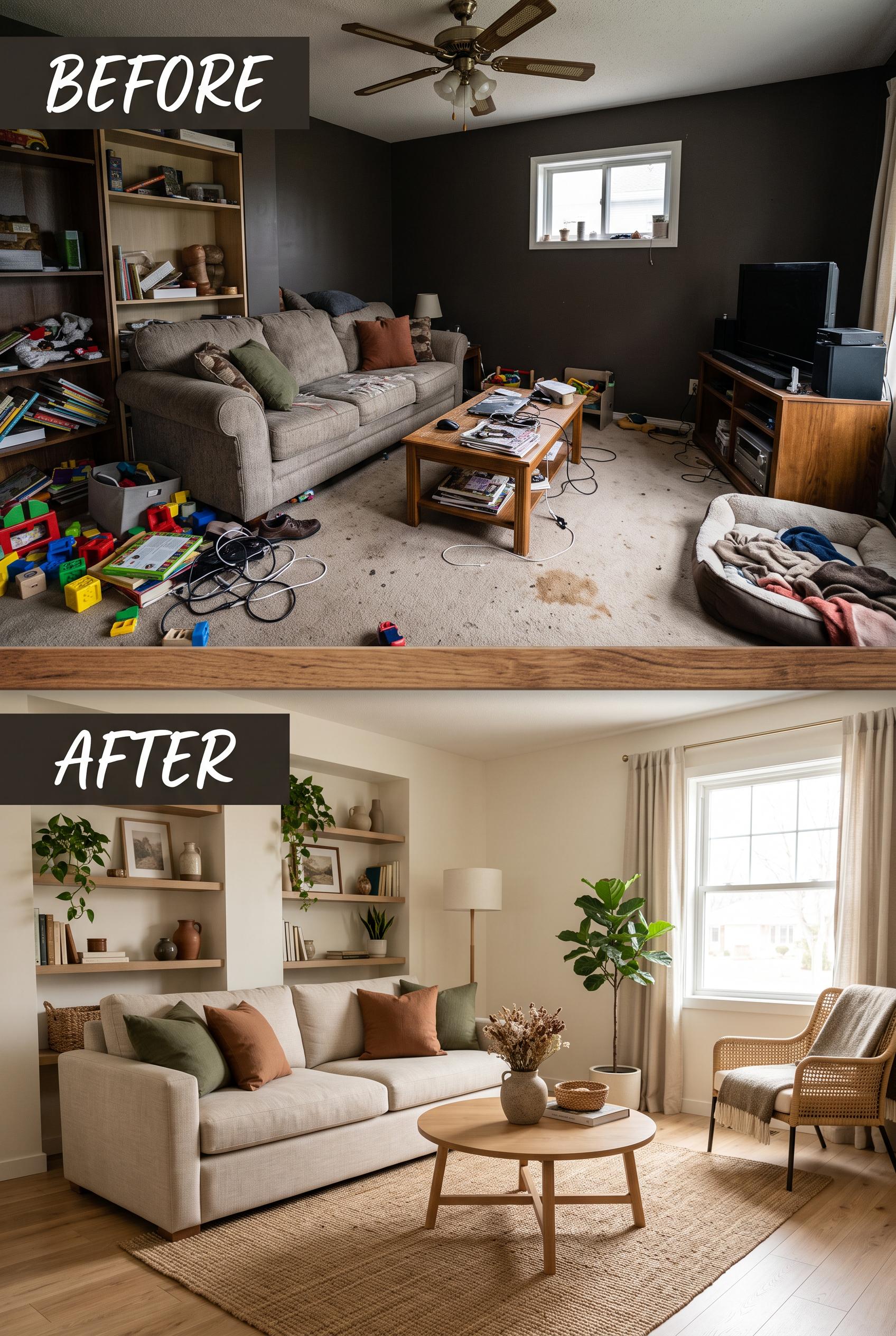
0A vertical 2:3 composition featuring a before-and-after layout of a living room, showing a cluttered setup transforming into a spacious and inviting space with earthy tones, cozy furniture, and greenery without real brands.
 0
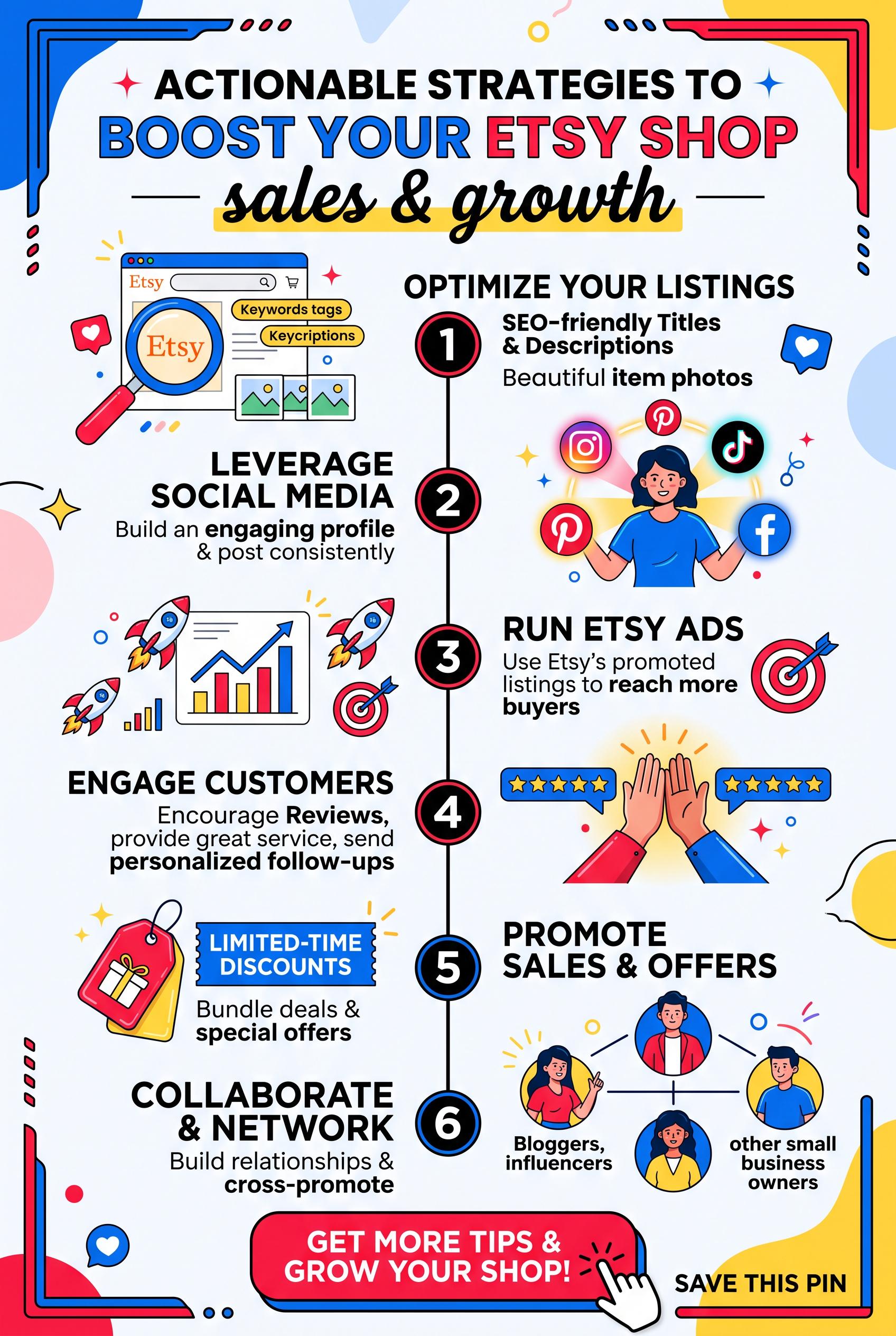
0Create a vertical 2:3 Pinterest storyboard image that outlines actionable strategies to promote an Etsy shop, featuring engaging visuals of social media icons, call-to-actions, and vibrant colors. Use a palette of bold reds, blues, and yellows for attention-grabbing effects. Corrective regeneration attempt 2. Produce a materially revised image, not a near-duplicate of an earlier variant. Preserve the successful subject, palette, lighting, focal hierarchy, and commercial polish from the original brief while correcting every issue below. Mandatory corrective instructions from the most recent visual QA: Regenerate to produce a brand-free vertical 2:3 Pinterest storyboard. Use generic icons (no Etsy, Pinterest, Instagram logos, or other trademarks). Maintain a clear focal point around the central tip/step (e.g., “Actionable Strategies to Boost Your Shop”) with a strong contrast color palette (bold reds, blues, yellows) and a prominent numbered step indicator. Replace any brand text/images with neutral placeholders. Ensure no watermark or embedded text resembles a brand name. Remove any garbled or unreadable text, and place all step titles and descriptions in clean, legible typography. Keep the concept as a how-to guide with a single, clear visual hierarchy and a cohesive, commercial-quality layout suitable for a vertical 2:3 pin. Observed defects from prior variants that must not recur: 1) Contains real brand/trademark (Etsy) visible in the design; must be brand-free. Render no letters, words, numbers, prices, headings, labels, contact details, logos, glyphs, or pseudo-text anywhere. Use only blank surfaces, clean geometric marks, and non-linguistic placeholder shapes. Do not add explanatory captions, before/after labels, interface copy, or extra objects that the brief did not request. When a corrective instruction conflicts with a decorative detail, prioritize the corrective instruction.
 0
0Create a vertical 2:3 Pinterest storyboard image that outlines actionable strategies to promote an Etsy shop, featuring engaging visuals of social media icons, call-to-actions, and vibrant colors. Use a palette of bold reds, blues, and yellows for attention-grabbing effects.
 0
0Design a vertical 2:3 Pinterest image in a grid layout, showcasing pastel images of a beautifully designed wellness journal, calming teas, soft blankets, and nature-inspired visuals. Emphasize a soothing palette with soft pinks, blues, and earthy tones.
 0
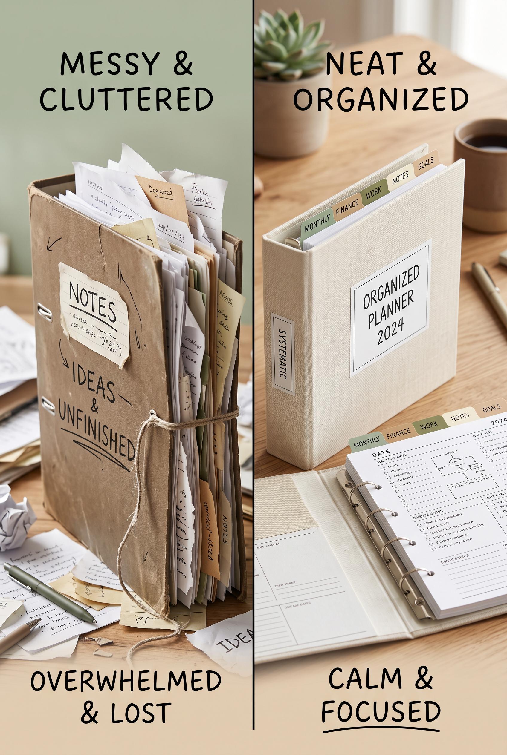
0Create a vertical 2:3 Pinterest composition that visually splits the scene: on one side, a messy, cluttered binder with scattered papers; on the other, a neatly organized binder with color-coded tabs and labeled sections. Use a soft earthy palette of muted greens, browns, and creams to give a calming feel.
 0
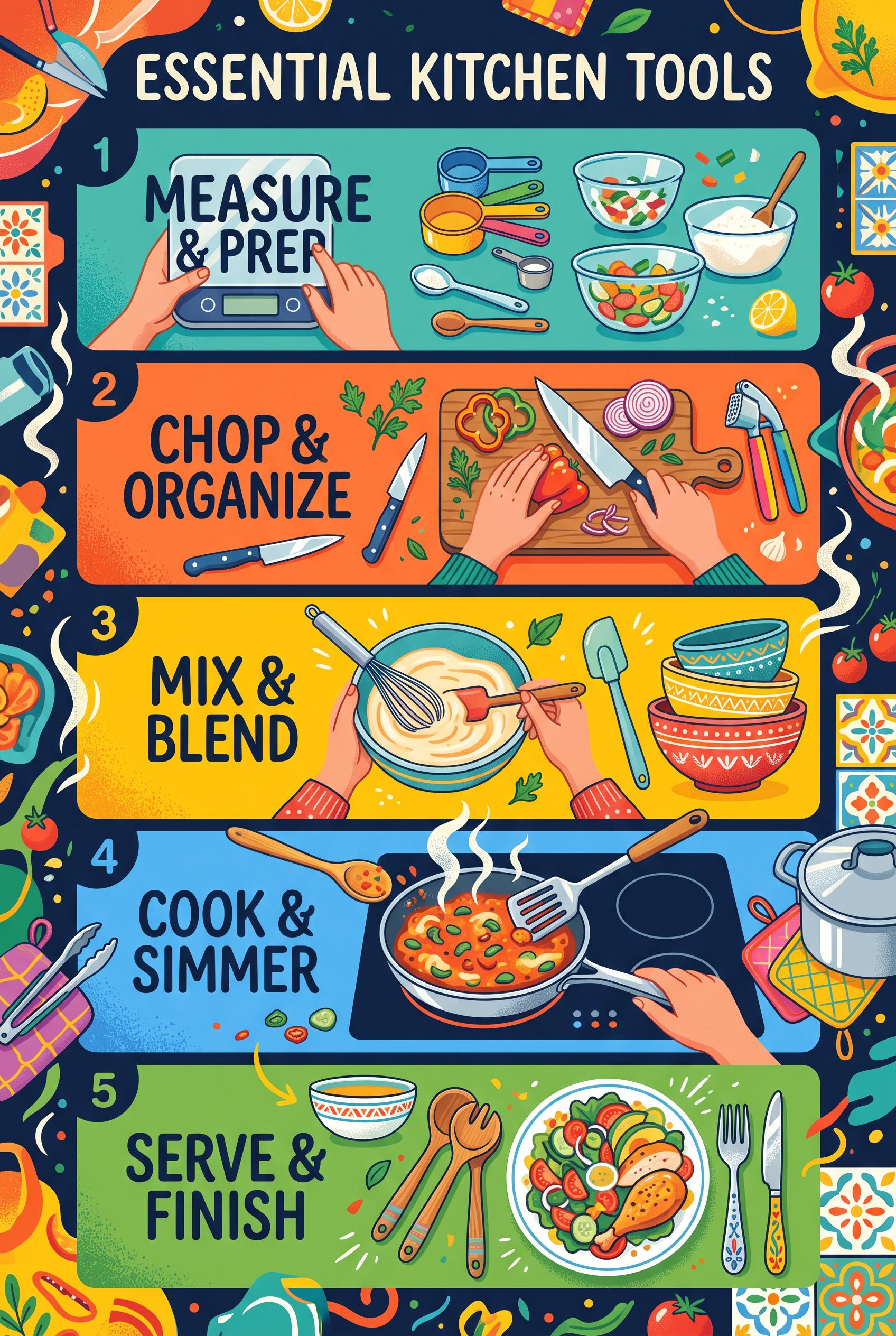
0Create a vertical 2:3 composition illustrating essential kitchen tools through a step-by-step format, vibrant colors capturing the fun and efficiency of cooking, high-quality art direction without real brands or readable text.
 0
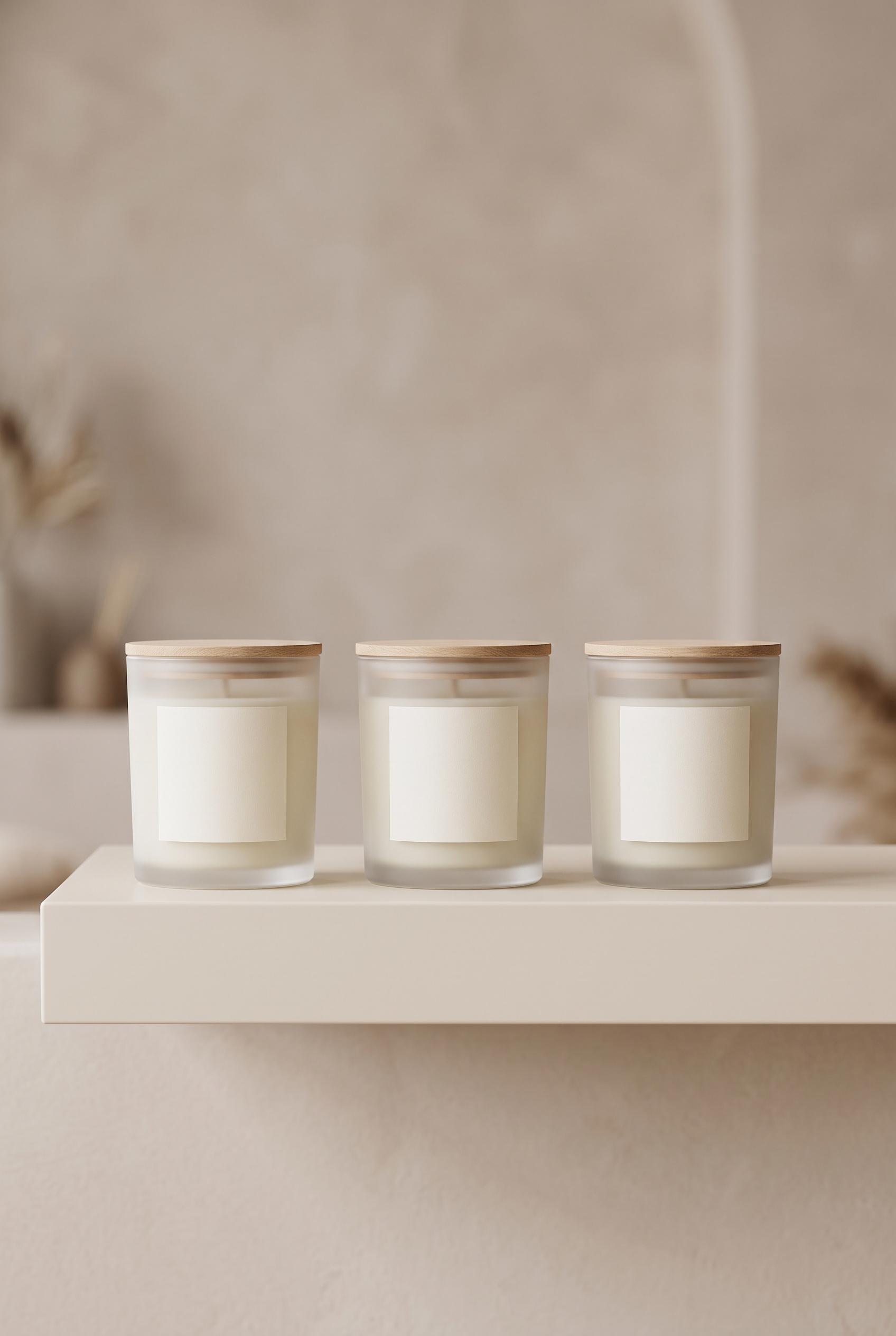
0Create a vertical 2:3 composition featuring a clean, minimal design for an aromatic candle collection against a soft-toned backdrop, exuding luxury and calmness, high-quality art direction without real brands or readable text. Corrective regeneration attempt 2. Produce a materially revised image, not a near-duplicate of an earlier variant. Preserve the successful subject, palette, lighting, focal hierarchy, and commercial polish from the original brief while correcting every issue below. Mandatory corrective instructions from the most recent visual QA: 1) Replace the surface with a sleek, modern shelf in a neutral tone; arrange candles in a neat row with even spacing to create a clear focal line at the center of the frame. 2) Remove all brand names/text from labels; replace with neutral, non-brand identifiers (e.g., generic icons or blank labels). 3) Ensure the image is strictly vertical 2:3 aspect ratio, cropping so the candles occupy the lower third to middle of the frame with a subtle background blur to enhance depth. 4) Maintain soft, ambient lighting without harsh highlights; preserve a calm, luxurious mood. 5) Remove any watermark or embedded text artifacts; verify no legible text remains anywhere in the image. 6) Keep a clean backdrop with a soft-toned, minimal aesthetic that supports the product mockup concept. Observed defects from prior variants that must not recur: 1) Contains identifiable brand text on candle labels (AURA, BLOSSOM, SANCTUARY, TRANQUIL) which violates the no real brands/trademarks rule. 2) The scene uses a wooden table rather than a sleek modern shelf as described, and does not match the 'shelf' setting. 3) Possible composition misalignment with a clear vertical 2:3 focal arrangement; current arrangement lacks a precise focal emphasis on a single product. 4) Potentially visible branding or text could be interpreted as readable; ensure all text is non-brand and non-readable. 5) No obvious watermark currently, but ensure caption-safe rendering and remove any embedded text that could resemble brand names in future iterations. Render no letters, words, numbers, prices, headings, labels, contact details, logos, glyphs, or pseudo-text anywhere. Use only blank surfaces, clean geometric marks, and non-linguistic placeholder shapes. Do not add explanatory captions, before/after labels, interface copy, or extra objects that the brief did not request. When a corrective instruction conflicts with a decorative detail, prioritize the corrective instruction.
 0
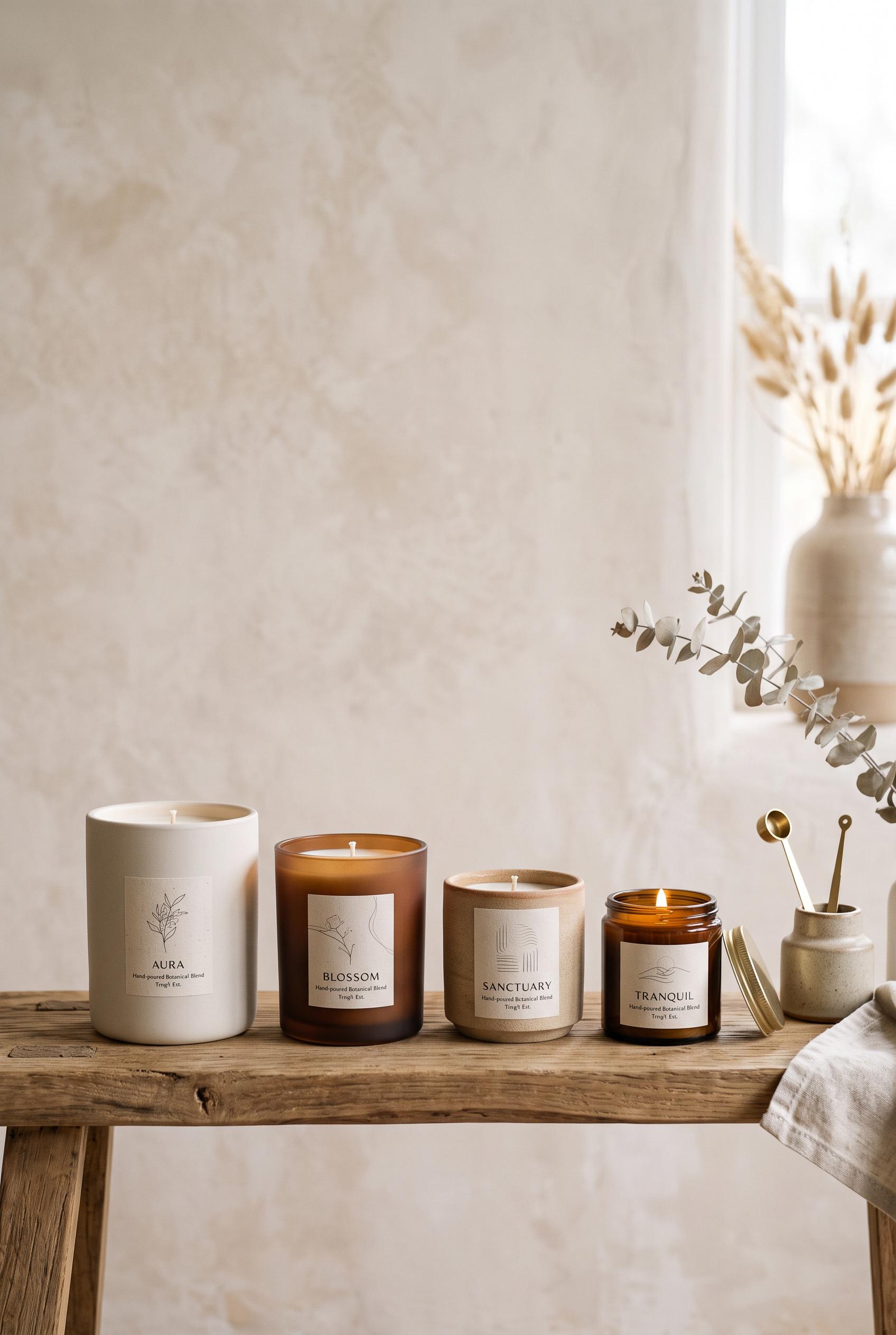
0Create a vertical 2:3 composition featuring a clean, minimal design for an aromatic candle collection against a soft-toned backdrop, exuding luxury and calmness, high-quality art direction without real brands or readable text.
 0
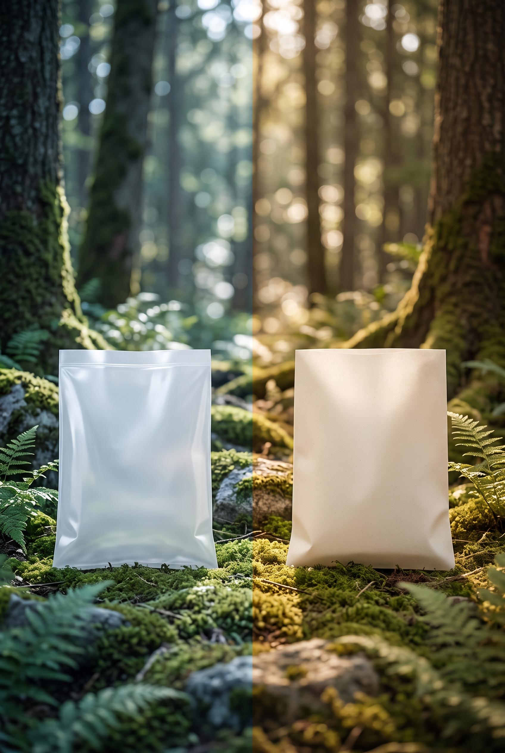
0Create a vertical 2:3 composition showcasing the before (plastic) and after (biodegradable) packaging side by side in a serene, natural setting, emphasizing sustainability and eco-friendliness, high-quality art direction without real brands or readable text. Corrective regeneration attempt 5. Produce a materially revised image, not a near-duplicate of an earlier variant. Preserve the successful subject, palette, lighting, focal hierarchy, and commercial polish from the original brief while correcting every issue below. Mandatory corrective instructions from the most recent visual QA: Create a new vertical 2:3 before/after composition with a seamless, uninterrupted split between halves. Left half: plain plastic bag in a cool, slightly harsh light. Right half: plain biodegradable bag in a warmer, earth-toned light. Use a continuous horizon line with no central seam. Background remains a serene forest/natural setting with consistent depth of field. Bags must be neutral in color, unmarked, without any branding, logos, textures resembling logos, compostable symbols, or text. Bags should have clean, flat surfaces with no visible seams, watermarks, or artifacts. Ensure no captions, labels, or extra objects. Maintain bottom alignment and a high-contrast lighting scheme to emphasize the cooler plastic vs. warmer biodegradable, while preserving a natural, soft bokeh backdrop. Render no letters, words, numbers, prices, headings, labels, contact details, logos, glyphs, or pseudo-text anywhere. Use only blank surfaces, clean geometric marks, and non-linguistic placeholder shapes. Observed defects from prior variants that must not recur: 1) 2:3 vertical framing is present, but the visual quality is compromised by the seam and artifact rendering 2) Ensure the surfaces are flat and free of watermark, specks, or artifacts 3) Maintain focus on the two bags with a continuous transition and a clear focal point without extra objects 4) Seam/central dividing artifact present: a visible vertical seam line splits the 2:3 frame, breaking the seamless horizon requirement. 5) No continuous horizon line between halves; transition is not uninterrupted. 6) Two bags are plain/unmarked but there is a visible seam/texture issue on bag surfaces near the center. 7) No captions or logos, but the split renders with a distinct seam artifact and uneven lighting across halves. 8) Ensure 2:3 vertical framing with flat bag surfaces and no central seam; maintain consistent DOF and natural background without extra objects. Render no letters, words, numbers, prices, headings, labels, contact details, logos, glyphs, or pseudo-text anywhere. Use only blank surfaces, clean geometric marks, and non-linguistic placeholder shapes. Do not add explanatory captions, before/after labels, interface copy, or extra objects that the brief did not request. When a corrective instruction conflicts with a decorative detail, prioritize the corrective instruction.
 0
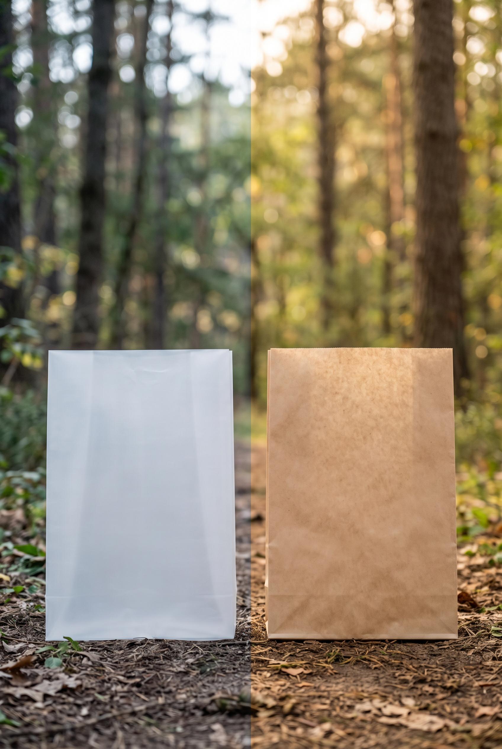
0Create a vertical 2:3 composition showcasing the before (plastic) and after (biodegradable) packaging side by side in a serene, natural setting, emphasizing sustainability and eco-friendliness, high-quality art direction without real brands or readable text. Corrective regeneration attempt 4. Produce a materially revised image, not a near-duplicate of an earlier variant. Preserve the successful subject, palette, lighting, focal hierarchy, and commercial polish from the original brief while correcting every issue below. Mandatory corrective instructions from the most recent visual QA: Create a new vertical 2:3 before/after composition with a seamless, uninterrupted split between halves. Left half: plain plastic bag in a cool, slightly harsh light. Right half: plain biodegradable bag in a warmer, earth-toned light. Use a continuous horizon line with no central seam. Background remains a serene forest/natural setting with consistent depth of field. Bags must be neutral in color, unmarked, without any branding, logos, textures resembling logos, compostable symbols, or text. Bags should have clean, flat surfaces with no visible seams, watermarks, or artifacts. Ensure no captions, labels, or extra objects. Maintain bottom alignment and a high-contrast lighting scheme to emphasize the cooler plastic vs. warmer biodegradable, while preserving a natural, soft bokeh backdrop. Observed defects from prior variants that must not recur: 1) 2:3 vertical composition must have a seamless horizon line and clear transition with no visible seams 2) Central vertical seam artifact dividing the composition (unwanted seam) 3) No seamless horizon line between halves; transition not continuous 4) Two bags show no-brand but need completely plain, unmarked surfaces (avoid any texture that could be perceived as branding) 5) No visible captions/text; verify none present 6) 2:3 vertical framing is present, but the visual quality is compromised by the seam and artifact rendering 7) Ensure the surfaces are flat and free of watermark, specks, or artifacts 8) Maintain focus on the two bags with a continuous transition and a clear focal point without extra objects Render no letters, words, numbers, prices, headings, labels, contact details, logos, glyphs, or pseudo-text anywhere. Use only blank surfaces, clean geometric marks, and non-linguistic placeholder shapes. Do not add explanatory captions, before/after labels, interface copy, or extra objects that the brief did not request. When a corrective instruction conflicts with a decorative detail, prioritize the corrective instruction.
 0
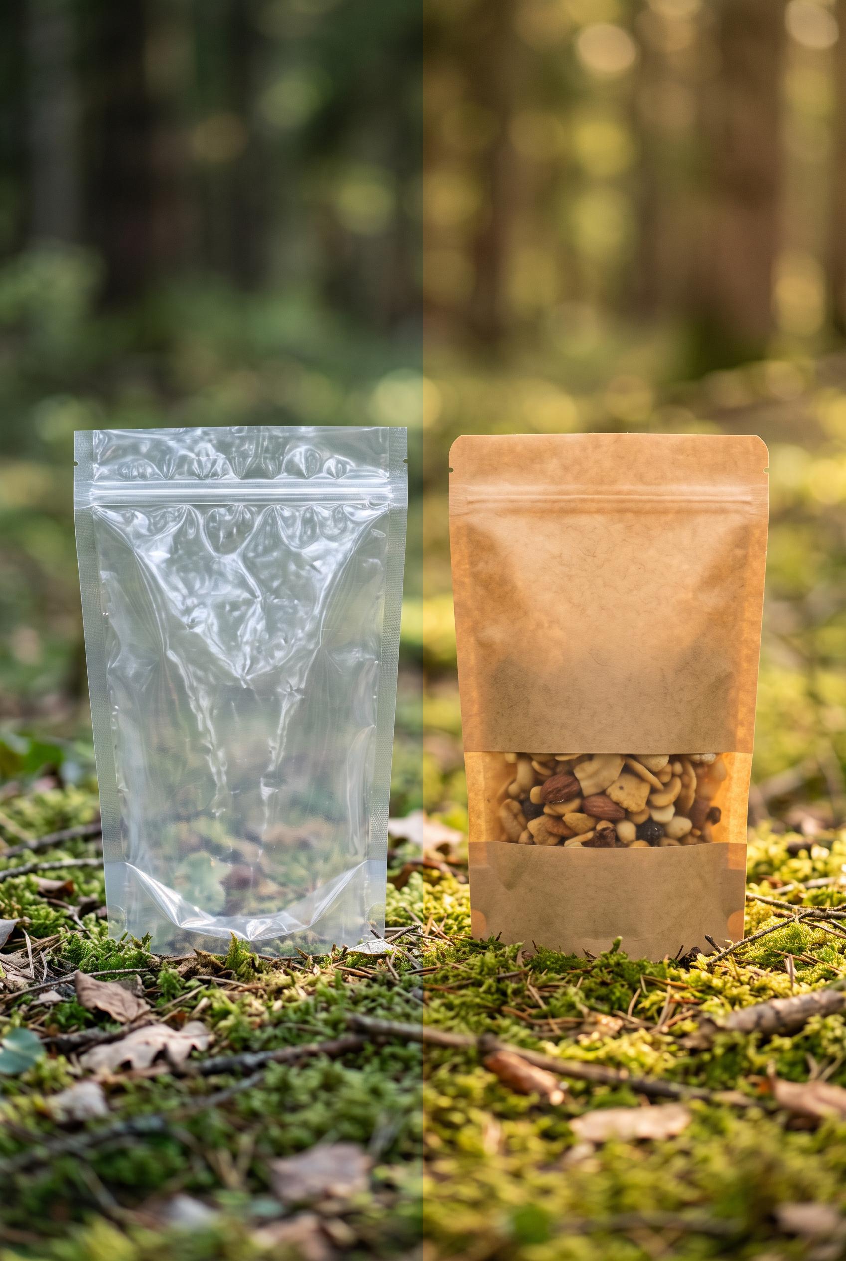
0Create a vertical 2:3 composition showcasing the before (plastic) and after (biodegradable) packaging side by side in a serene, natural setting, emphasizing sustainability and eco-friendliness, high-quality art direction without real brands or readable text. Corrective regeneration attempt 3. Produce a materially revised image, not a near-duplicate of an earlier variant. Preserve the successful subject, palette, lighting, focal hierarchy, and commercial polish from the original brief while correcting every issue below. Mandatory corrective instructions from the most recent visual QA: Create a new vertical 2:3 before/after composition: left side shows a plain, unmarked plastic bag in a cool, slightly harsh light; right side shows a plain, unmarked biodegradable bag in a warmer, earth-toned light. Use a seamless horizon line with no central seam; ensure a flawless, continuous split between halves. Background remains a serene forest/natural backdrop with consistent depth of field, but avoid any visible logos, text, glyphs, or trademarks on both bags. Bags should be neutral colors, no branding, no compostable logos, no text. Maintain focus on the two bags and the transition; keep the bottom aligned and avoid any watermark, specks, or artifacts. Ensure 2:3 vertical framing, high-contrast lighting to emphasize plastic (cooler) vs. biodegradable (warmer), and render with clean, flat surfaces on the bags. Do not include captions, labels, or extra objects. Observed defects from prior variants that must not recur: 1) Visible generation artifact: a vertical seam line down the center reduces perceived quality and clearly looks artificial. 2) No-Brand requirement not fully met: packaging shows brand-like symbol/text that could be interpreted as branding; need a neutral, non-branded look. 3) Ensure strict 2:3 vertical composition with a clear focal point (the transition) and remove any watermark or recognizable marks. 4) Visible central vertical seam artifact dividing the composition (unwanted seam) 5) Left/right packaging currently include minor branding/texture that could be construed as branding 6) No-brand requirement not fully met: ensure plain, unmarked packaging with neutral colors 7) No watermark or readable text present, but ensure no subtle marks appear 8) 2:3 vertical composition must have a seamless horizon line and clear transition with no visible seams Render no letters, words, numbers, prices, headings, labels, contact details, logos, glyphs, or pseudo-text anywhere. Use only blank surfaces, clean geometric marks, and non-linguistic placeholder shapes. Do not add explanatory captions, before/after labels, interface copy, or extra objects that the brief did not request. When a corrective instruction conflicts with a decorative detail, prioritize the corrective instruction.
 0
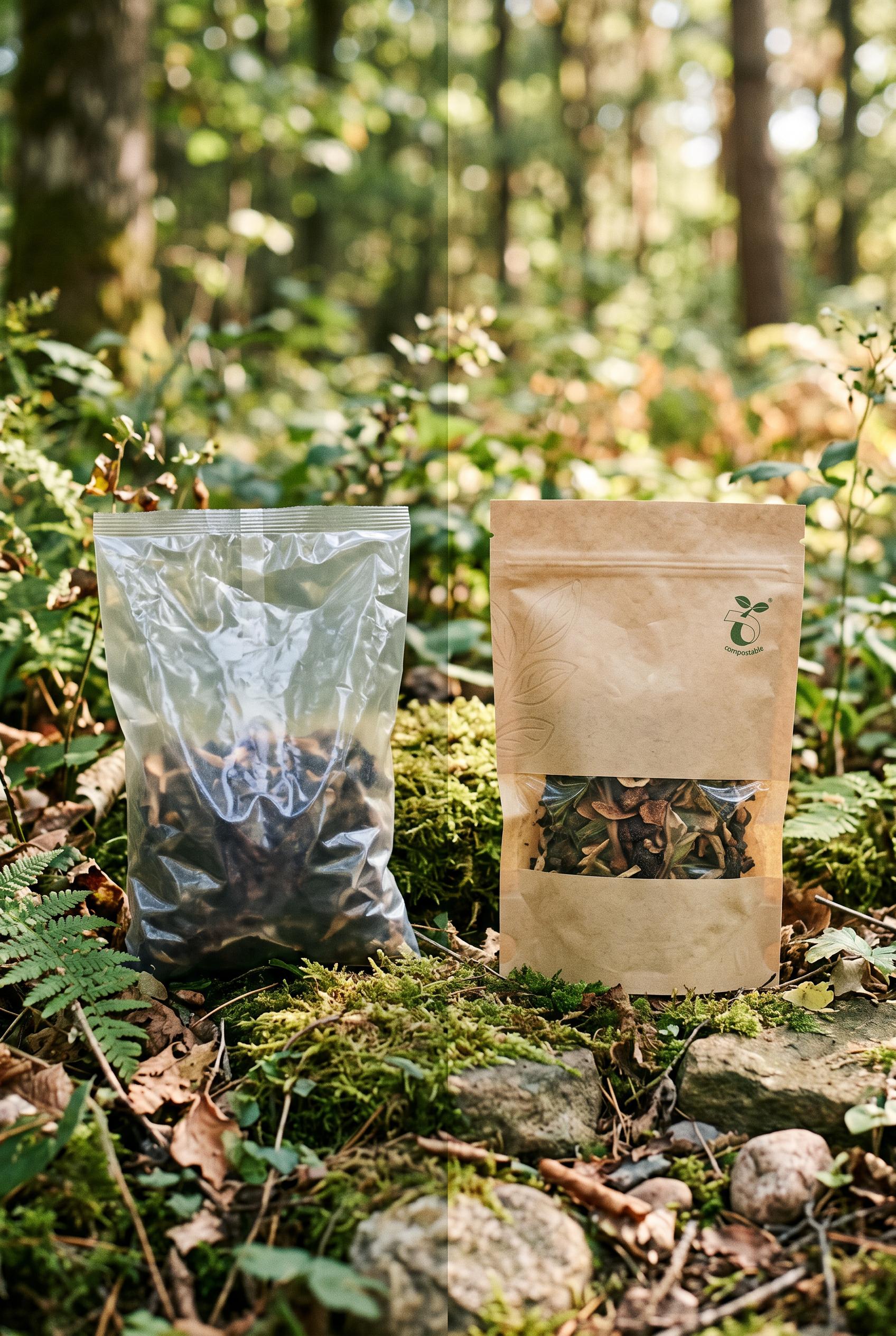
0Create a vertical 2:3 composition showcasing the before (plastic) and after (biodegradable) packaging side by side in a serene, natural setting, emphasizing sustainability and eco-friendliness, high-quality art direction without real brands or readable text. Corrective regeneration attempt 2. Produce a materially revised image, not a near-duplicate of an earlier variant. Preserve the successful subject, palette, lighting, focal hierarchy, and commercial polish from the original brief while correcting every issue below. Mandatory corrective instructions from the most recent visual QA: Create a new vertical 2:3 before/after composition showing plastic bag on the left and a biodegradable bag on the right with a clear, branded-free transition. Remove all logos, text, and trademarks from both bags. Use plain, unmarked packaging (neutral colors, no brand markings). Eliminate the central seam artifact; render a seamless split or unified horizon line to reinforce the transition. Enhance lighting contrast to emphasize the difference: left side with cooler, slightly harsher light indicating plastic; right side with warmer, earth-toned light to imply biodegradability. Use an earth/natural backdrop with consistent depth of field, ensuring no visibleWatermarks or garbled/readable text. Maintain serene forest setting but ensure the focus remains clearly on the two bags and the before/after transition. Observed defects from prior variants that must not recur: 1) Contains readable branding/text on the right packaging (compostable logo and text) which violates 'no real brand or trademark' and 'no readable text'. 2) Visible generation artifact: a vertical seam line down the center reduces perceived quality and clearly looks artificial. 3) No-Brand requirement not fully met: packaging shows brand-like symbol/text that could be interpreted as branding; need a neutral, non-branded look. 4) Ensure strict 2:3 vertical composition with a clear focal point (the transition) and remove any watermark or recognizable marks. Render no letters, words, numbers, prices, headings, labels, contact details, logos, glyphs, or pseudo-text anywhere. Use only blank surfaces, clean geometric marks, and non-linguistic placeholder shapes. Do not add explanatory captions, before/after labels, interface copy, or extra objects that the brief did not request. When a corrective instruction conflicts with a decorative detail, prioritize the corrective instruction.
 0
0Create a vertical 2:3 composition showcasing the before (plastic) and after (biodegradable) packaging side by side in a serene, natural setting, emphasizing sustainability and eco-friendliness, high-quality art direction without real brands or readable text.
 0
0Create a vertical 2:3 Pinterest composition with commercial-quality art direction, showing a before-and-after makeover for a fictional mobile pet-grooming promotion. Use a centered physical paper-peel reveal: the upper layer is a cluttered, low-contrast generic service flyer with abstract placeholder marks, while the revealed layer is a refined ultramarine-and-blush ad card with a friendly generic dog silhouette, one large offer area, clean whitespace, and a small van-shaped neighborhood cue. Editorial product photography blended with polished graphic design, tactile paper fibers, crisp shadows, and cream and coffee accents. AI-modified downstream: yes. No real brands, no trademarked characters, no watermark, and no unintended readable text; use only abstract glyphs and blank placeholder areas. Vertical 2:3 Pinterest composition. Corrective regeneration attempt 4. Produce a materially revised image, not a near-duplicate of an earlier variant. Preserve the successful subject, palette, lighting, focal hierarchy, and commercial polish from the original brief while correcting every issue below. Observed defects from prior variants that must not recur: 1) Strong vertical composition and clear dog focal point, with a convincing paper-peel transformation and neighborhood cue. 2) The revealed promotion is largely blank and lacks a clear service message or hierarchy, weakening the commercial concept. 3) The old flyer contains prominent garbled pseudo-text and unreadable glyph strings, which violates the clean-text requirement. 4) Prominent garbled pseudo-text appears across the peeled flyer and the main promotion. 5) The central offer typography is malformed, undermining commercial readability. 6) The peel, dog silhouette, whitespace, and neighborhood van cue are attractive, but the text artifacts fail the strict quality bar. 7) Prominent garbled and malformed text appears throughout the flyer, including the main service heading and contact details. 8) The peel obscures much of the layout and the embedded meta-style copy makes the design feel unfinished rather than commercially polished. Render no letters, words, numbers, prices, headings, labels, contact details, logos, glyphs, or pseudo-text anywhere. Use only blank surfaces, clean geometric marks, and non-linguistic placeholder shapes. Do not add explanatory captions, before/after labels, interface copy, or extra objects that the brief did not request. When a corrective instruction conflicts with a decorative detail, prioritize the corrective instruction.
О нашей галерее AI изображений
Наша галерея AI изображений демонстрирует тысячи общих изображений, сгенерированных ИИ, созданных нашим сообществом. Каждое изображение уникально, высокого качества и представляет творческие возможности генерации искусства ИИ. Просматривайте различные стили, темы и сюжеты, чтобы вдохновиться для вашего следующего творческого проекта.
Почему стоит исследовать нашу галерею?
- Откройте для себя тысячи уникальных изображений, сгенерированных ИИ, в различных стилях и темах
- Вдохновляйтесь творческими подсказками и художественными стилями
- Просматривайте изображения, которыми поделилось наше творческое сообщество
- Нажмите на любое изображение, чтобы просмотреть его страницу общего доступа и получить больше деталей
Как использовать галерею
Использование нашей галереи просто и интуитивно:
- Просматривайте сетку общих изображений
- Нажмите на любое изображение, которое привлекло ваше внимание
- Просмотрите полные детали изображения и ссылку для общего доступа на специальной странице общего доступа
Готовы создать свои собственные AI изображения?
Присоединяйтесь к тысячам создателей, использующих AI Media Studio для генерации потрясающих изображений. Начните создавать сегодня!