AI 图片图库
发现来自创意社区的 1696+ 张共享 AI 生成图片
所有共享图片
显示 1696 张中的 48 张共享图片
 0
0Commercial-quality educational marketing visual for an independent bookkeeping consultant, vertical 2:3 Pinterest composition, three concentric proof rings surrounding a calm central business scene, symbolic calculator, organized folders, upward trend line, and checkmark tokens placed along the rings, indigo, apricot, sage, and graphite palette, clean editorial infographic art direction, spacious layout, no real brands, no trademarked characters, no watermark, no unintended readable text. Corrective regeneration attempt 3. Produce a materially revised image, not a near-duplicate of an earlier variant. Preserve the successful subject, palette, lighting, focal hierarchy, and commercial polish from the original brief while correcting every issue below. Mandatory corrective instructions from the most recent visual QA: Preserve the polished vertical 2:3 layout, calm consultant-at-desk focal scene, palette, concentric rings, folders, calculator, upward trend, and checkmark. Remove the large question mark entirely and replace it with a purely abstract question-bubble icon using only dots and geometric marks. Remove every scribble, line of pseudo-writing, chart label, interface line, or text-like mark from the documents, speech bubble, monitor, and all other surfaces. Make the documents and monitor completely blank or use only simple non-linguistic geometric shapes. Retain the progression visually: outer ring uses an abstract bubble and calculator, middle ring uses a blank speech bubble and organized folders, inner/final ring uses an upward chart and checkmark. Include no letters, numbers, words, symbols, glyphs, prices, logos, or pseudo-text anywhere. Observed defects from prior variants that must not recur: 1) Strong vertical composition, palette, focal point, and iconography. 2) Contains extensive readable headline, ring labels, and footer text despite the brief requiring no readable text. 3) The three rings do not clearly depict the specified progression from client question to plain-language explanation to visible business outcome. 4) Strong vertical composition, palette, focal point, and ring-based visual progression. 5) Fails the no-readable-text requirement: document sheets contain pseudo-writing, the speech bubble contains text-like strokes, and the monitor contains interface-like lines and data 6) The large question mark is a prohibited readable glyph under the corrective instructions. Render no letters, words, numbers, prices, headings, labels, contact details, logos, glyphs, or pseudo-text anywhere. Use only blank surfaces, clean geometric marks, and non-linguistic placeholder shapes. Do not add explanatory captions, before/after labels, interface copy, or extra objects that the brief did not request. When a corrective instruction conflicts with a decorative detail, prioritize the corrective instruction.
 0
0Commercial-quality educational marketing visual for an independent bookkeeping consultant, vertical 2:3 Pinterest composition, three concentric proof rings surrounding a calm central business scene, symbolic calculator, organized folders, upward trend line, and checkmark tokens placed along the rings, indigo, apricot, sage, and graphite palette, clean editorial infographic art direction, spacious layout, no real brands, no trademarked characters, no watermark, no unintended readable text. Corrective regeneration attempt 2. Produce a materially revised image, not a near-duplicate of an earlier variant. Preserve the successful subject, palette, lighting, focal hierarchy, and commercial polish from the original brief while correcting every issue below. Mandatory corrective instructions from the most recent visual QA: Preserve the polished vertical 2:3 layout, calm central consultant-at-desk scene, indigo/apricot/sage/graphite palette, concentric-ring structure, folders, calculator, checkmarks, and upward trend motif. Remove all readable text everywhere, including the large headline, every ring label, footer banner, symbols containing letters or numerals, percentage signs, dollar sign, and any monitor text. Make the three rings communicate the intended progression purely through visuals: outer ring with a question bubble and calculator, middle ring with simplified speech/explanation and organized folders, inner or final ring with a clear upward chart and checkmark outcome. Use only abstract marks and icons, with no letters, numbers, or pseudo-text. Keep the rings clean, evenly spaced, spacious, and easy to reuse as an educational template. Observed defects from prior variants that must not recur: 1) Strong vertical composition, palette, focal point, and iconography. 2) Contains extensive readable headline, ring labels, and footer text despite the brief requiring no readable text. 3) The three rings do not clearly depict the specified progression from client question to plain-language explanation to visible business outcome. Render no letters, words, numbers, prices, headings, labels, contact details, logos, glyphs, or pseudo-text anywhere. Use only blank surfaces, clean geometric marks, and non-linguistic placeholder shapes. Do not add explanatory captions, before/after labels, interface copy, or extra objects that the brief did not request. When a corrective instruction conflicts with a decorative detail, prioritize the corrective instruction.
 0
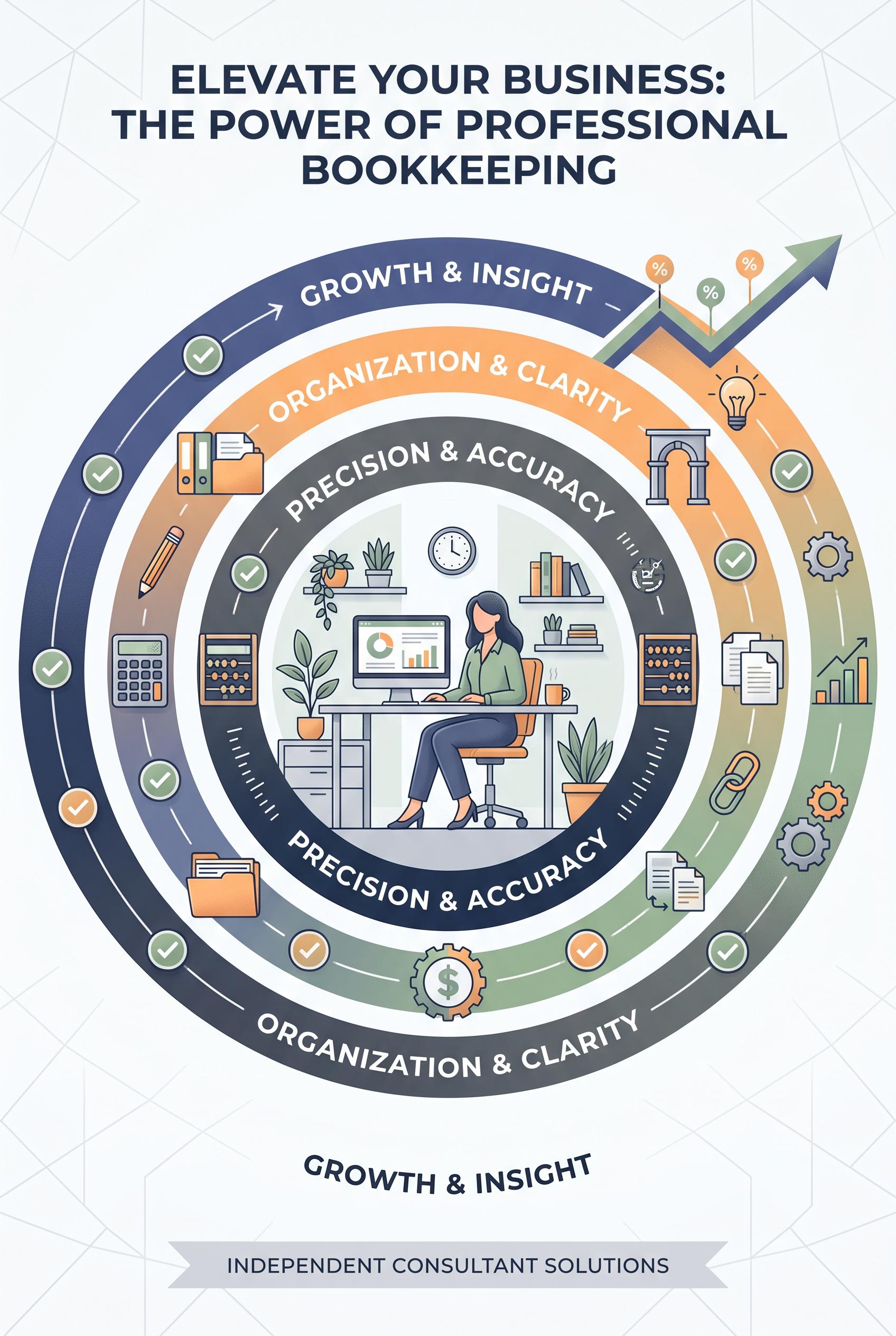
0Commercial-quality educational marketing visual for an independent bookkeeping consultant, vertical 2:3 Pinterest composition, three concentric proof rings surrounding a calm central business scene, symbolic calculator, organized folders, upward trend line, and checkmark tokens placed along the rings, indigo, apricot, sage, and graphite palette, clean editorial infographic art direction, spacious layout, no real brands, no trademarked characters, no watermark, no unintended readable text.
 0
0Commercial-quality Pinterest moodboard for a small-batch hot sauce maker, vertical 2:3 composition, richly styled market table with an unbranded sauce bottle silhouette in the center, orbiting ingredient swatches, sliced peppers, citrus, handmade paper, ceramic tasting spoon, and three tiny serving vignettes, paprika red, turquoise, parchment, and charcoal palette, editorial food photography with graphic art direction, no real brands, no trademarked characters, no watermark, no unintended readable text. Corrective regeneration attempt 2. Produce a materially revised image, not a near-duplicate of an earlier variant. Preserve the successful subject, palette, lighting, focal hierarchy, and commercial polish from the original brief while correcting every issue below. Mandatory corrective instructions from the most recent visual QA: Preserve the vertical 2:3 editorial market-table moodboard, centered unbranded dark bottle silhouette, peppers, citrus, spice swatches, ceramic tasting spoons, textured fabrics, wooden produce crate, tile base, and paprika-red/turquoise/parchment/charcoal palette. Remove every letter, word, numeral, handwriting mark, logo, label, and symbol from all paper cards and recipe-card surfaces; replace them with completely blank textured parchment, abstract color blocks, or non-readable decorative marks. Ensure no text-like glyphs appear anywhere, while keeping the composition photorealistic, polished, and commercially styled. Observed defects from prior variants that must not recur: 1) Multiple paper cards contain clearly readable handwritten text, violating the requirement for no unintended readable text. 2) The composition is otherwise strong: vertical 2:3 format, attractive market-table styling, clear centered bottle focal point, suitable palette, and no visible branding or watermark Render no letters, words, numbers, prices, headings, labels, contact details, logos, glyphs, or pseudo-text anywhere. Use only blank surfaces, clean geometric marks, and non-linguistic placeholder shapes. Do not add explanatory captions, before/after labels, interface copy, or extra objects that the brief did not request. When a corrective instruction conflicts with a decorative detail, prioritize the corrective instruction.
 0
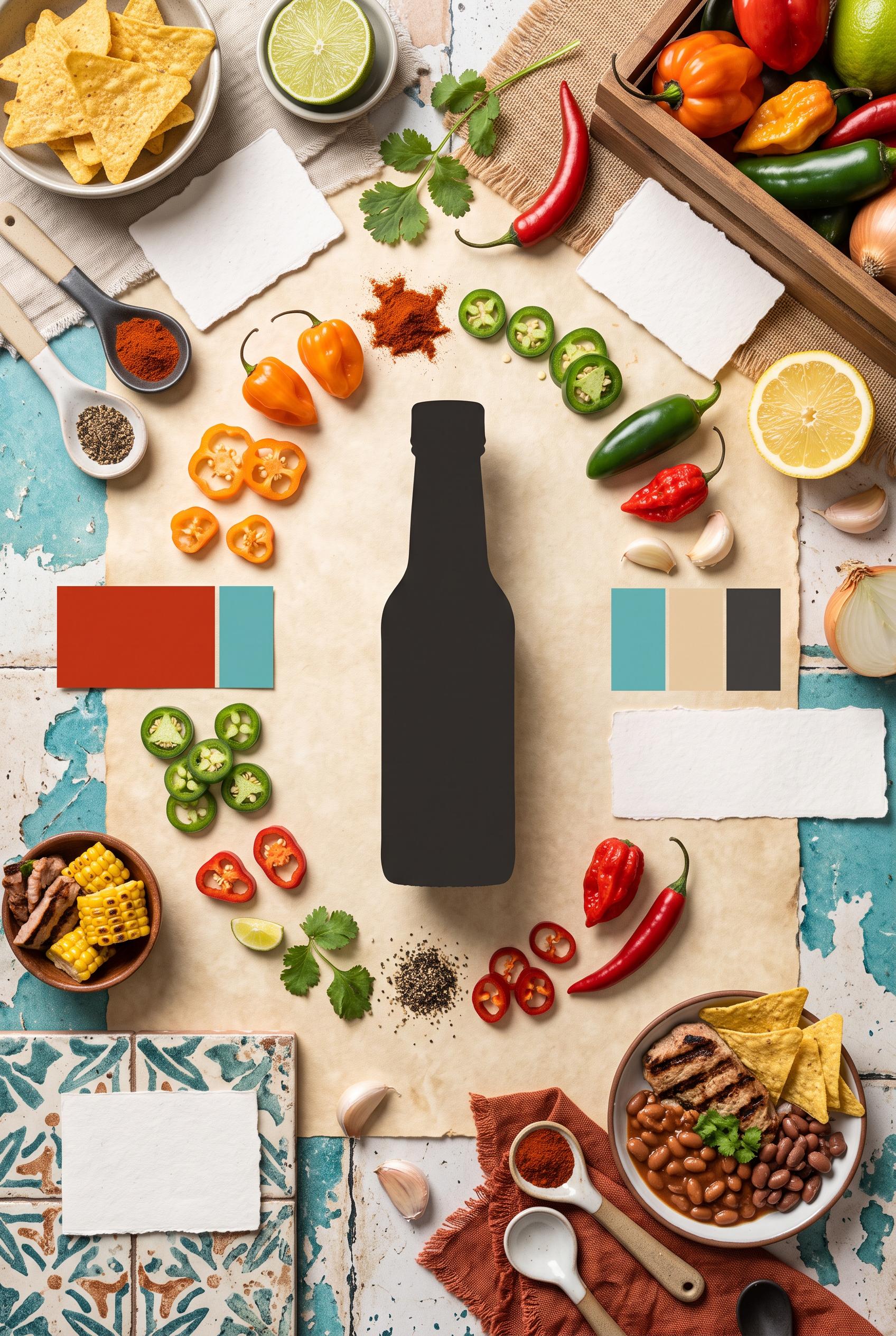
0Commercial-quality Pinterest moodboard for a small-batch hot sauce maker, vertical 2:3 composition, richly styled market table with an unbranded sauce bottle silhouette in the center, orbiting ingredient swatches, sliced peppers, citrus, handmade paper, ceramic tasting spoon, and three tiny serving vignettes, paprika red, turquoise, parchment, and charcoal palette, editorial food photography with graphic art direction, no real brands, no trademarked characters, no watermark, no unintended readable text.
 0
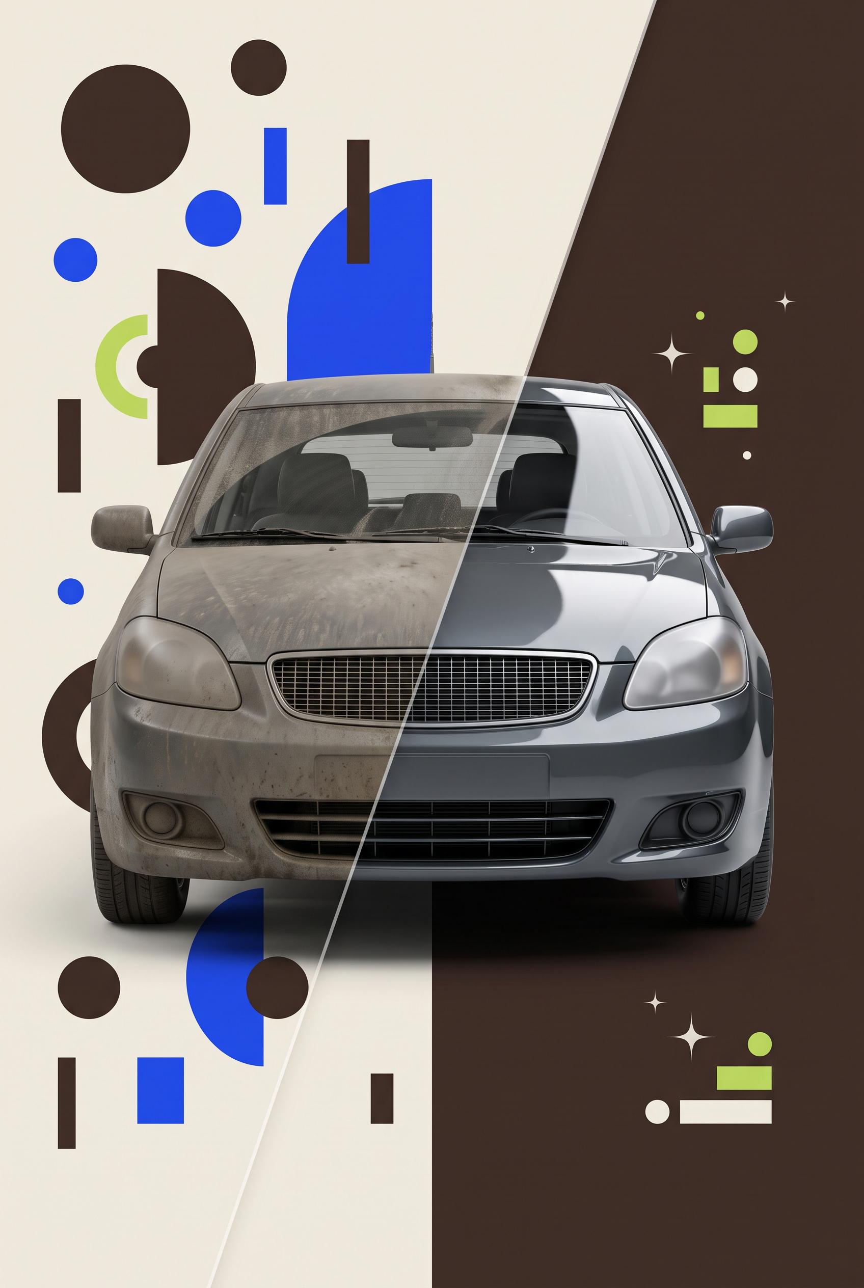
0Commercial-quality Pinterest marketing visual for an independent auto detailing service, vertical 2:3 composition, translucent acetate wipe reveal across one consistent vehicle scene, left side visually cluttered with competing icons and scattered shapes, right side refined with glossy highlights and one strong offer cue, espresso brown, electric blue, cream, and lime palette, crisp studio lighting, premium small-business advertising art direction, no real brands, no trademarked characters, no watermark, no unintended readable text. Corrective regeneration attempt 5. Produce a materially revised image, not a near-duplicate of an earlier variant. Preserve the successful subject, palette, lighting, focal hierarchy, and commercial polish from the original brief while correcting every issue below. Mandatory corrective instructions from the most recent visual QA: Preserve the vertical 2:3 composition, diagonal translucent acetate wipe, espresso brown/electric blue/cream/lime palette, crisp studio lighting, strong front-facing vehicle focal point, and dirty-to-glossy transformation. Redesign the exact same vehicle on both sides with fully generic automotive styling: plain rectangular grille with neutral mesh, generic headlights, no luxury-brand cues, badges, emblems, or distinctive contours. Replace every left-side decoration with sparse, irregular abstract circles, rectangles, arcs, and color blocks that cannot resemble letters, numbers, symbols, icons, or pseudo-text; remove all stacked bars and glyph-like forms. On the polished side use only a tiny restrained cluster of simple lime-and-cream geometric shapes and a few subtle sparkle points; remove the squiggle and all pictogram-like marks. Keep all vehicle surfaces blank and include no text, labels, numbers, logos, watermark, buttons, badges, calendars, phones, clocks, arrows, or other recognizable symbols. Observed defects from prior variants that must not recur: 1) Left-side decorative marks resemble letters and pseudo-text, violating the no-readable or text-like marks requirement. 2) The vehicle grille is strongly recognizable as a specific automotive brand style. 3) The two vehicle views do not match closely enough as one consistent scene and perspective. 4) The right-side clock/arrow symbol is too prominent relative to the required restrained offer cue. 5) The grille and headlight styling strongly resemble a recognizable luxury automotive brand. 6) Left-side decorations include symbol-like marks and stacked bars that can read as pseudo-text or glyphs. 7) The right-side decorative cluster includes a squiggle and multiple pictogram-like shapes rather than restrained nonverbal accents. 8) The vehicle is visually polished, but the corrective requirements for generic styling and purely abstract marks are not met. Render no letters, words, numbers, prices, headings, labels, contact details, logos, glyphs, or pseudo-text anywhere. Use only blank surfaces, clean geometric marks, and non-linguistic placeholder shapes. Do not add explanatory captions, before/after labels, interface copy, or extra objects that the brief did not request. When a corrective instruction conflicts with a decorative detail, prioritize the corrective instruction.
 0
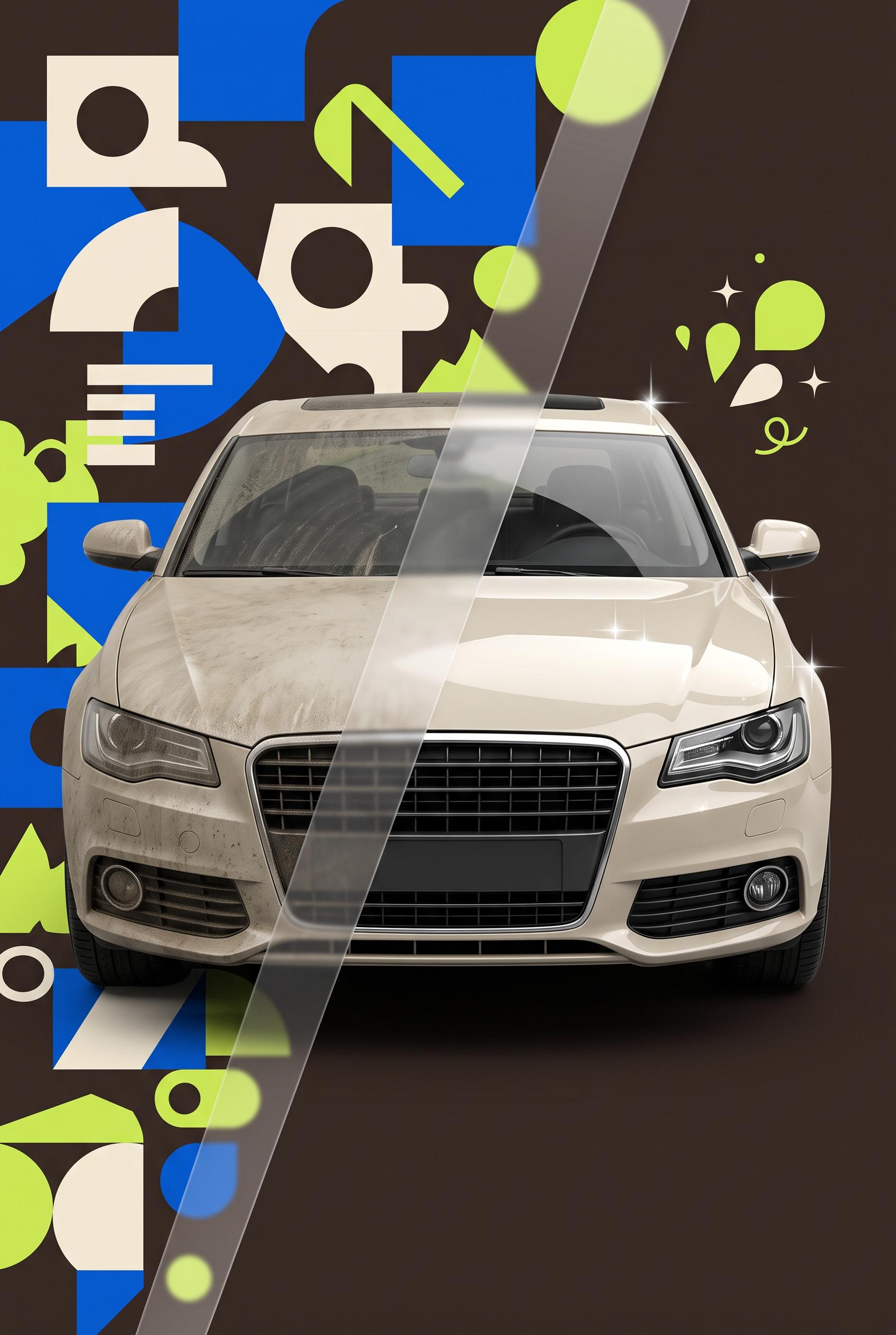
0Commercial-quality Pinterest marketing visual for an independent auto detailing service, vertical 2:3 composition, translucent acetate wipe reveal across one consistent vehicle scene, left side visually cluttered with competing icons and scattered shapes, right side refined with glossy highlights and one strong offer cue, espresso brown, electric blue, cream, and lime palette, crisp studio lighting, premium small-business advertising art direction, no real brands, no trademarked characters, no watermark, no unintended readable text. Corrective regeneration attempt 4. Produce a materially revised image, not a near-duplicate of an earlier variant. Preserve the successful subject, palette, lighting, focal hierarchy, and commercial polish from the original brief while correcting every issue below. Mandatory corrective instructions from the most recent visual QA: Keep the vertical 2:3 layout, diagonal translucent acetate wipe, espresso brown/electric blue/cream/lime palette, crisp studio lighting, dirty-to-glossy transformation, and strong vehicle focal point. Replace all left-side scattered marks with purely abstract geometric shapes that cannot resemble letters, numbers, symbols, or pseudo-text. Redesign the vehicle with a generic unbranded grille, headlights, body styling, and blank surfaces; remove any distinctive luxury-brand cues. Show the exact same vehicle, color, camera angle, scale, and perspective on both sides of the wipe, with only the cleanliness and gloss changing. Reduce the upper-right offer cue to one small restrained cluster of simple lime-and-cream nonverbal shapes, a few subtle sparkles, and a tiny generic motion or time cue; remove the large clock-arrow emblem. Do not include any letters, words, numbers, labels, logos, glyphs, pseudo-text, watermark, badge, button, calendar, phone, wrench, or other pictograms. Observed defects from prior variants that must not recur: 1) The large badge and booking button dominate the composition rather than using purely visual cues for the offer and easy booking. 2) The oversized lime-and-cream emblem dominates the polished side, contrary to the brief’s restrained single-offer cue. 3) The vehicle’s kidney-style grille strongly resembles a recognizable automotive brand design. 4) The transformation uses noticeably different vehicle views/colors, weakening the sense of one consistent scene. 5) Left-side decorative marks resemble letters and pseudo-text, violating the no-readable or text-like marks requirement. 6) The vehicle grille is strongly recognizable as a specific automotive brand style. 7) The two vehicle views do not match closely enough as one consistent scene and perspective. 8) The right-side clock/arrow symbol is too prominent relative to the required restrained offer cue. Render no letters, words, numbers, prices, headings, labels, contact details, logos, glyphs, or pseudo-text anywhere. Use only blank surfaces, clean geometric marks, and non-linguistic placeholder shapes. Do not add explanatory captions, before/after labels, interface copy, or extra objects that the brief did not request. When a corrective instruction conflicts with a decorative detail, prioritize the corrective instruction.
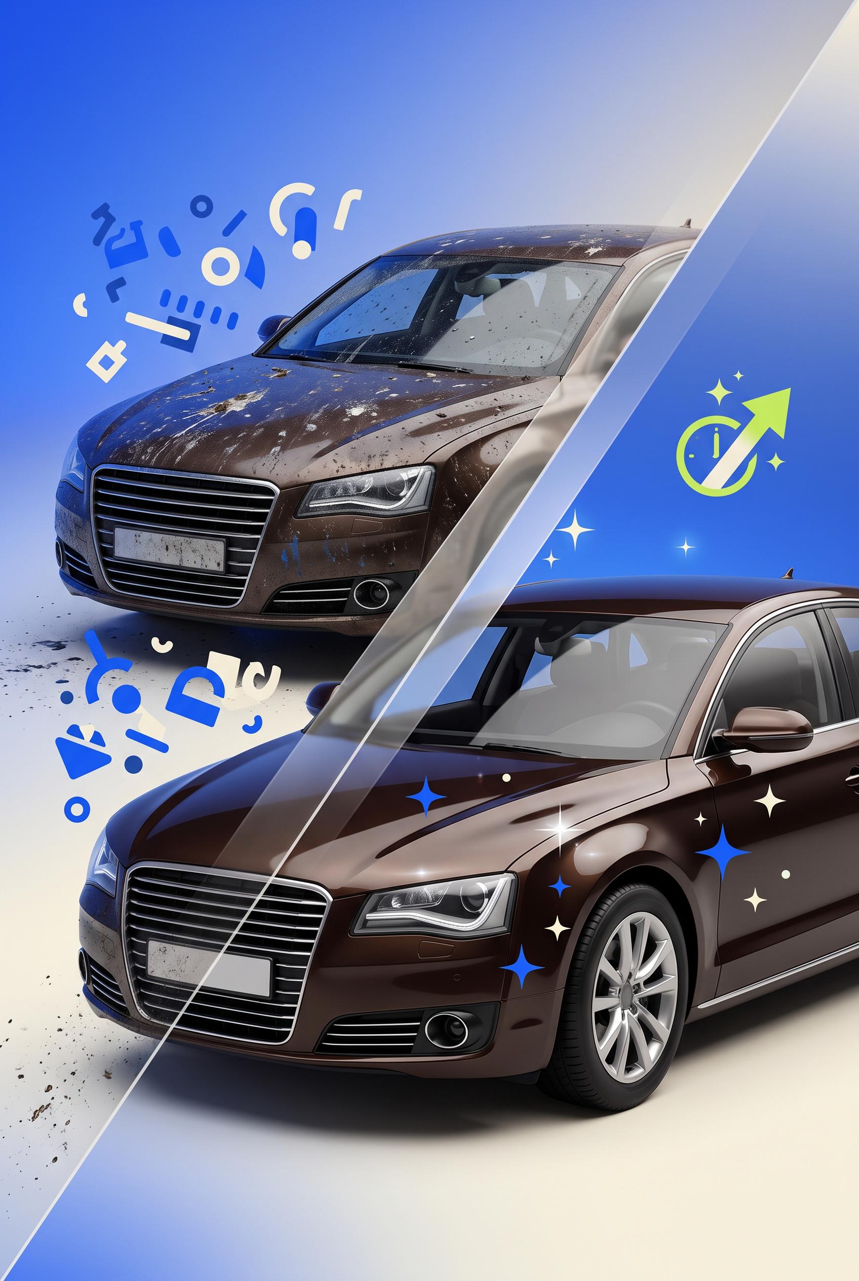 0
0Commercial-quality Pinterest marketing visual for an independent auto detailing service, vertical 2:3 composition, translucent acetate wipe reveal across one consistent vehicle scene, left side visually cluttered with competing icons and scattered shapes, right side refined with glossy highlights and one strong offer cue, espresso brown, electric blue, cream, and lime palette, crisp studio lighting, premium small-business advertising art direction, no real brands, no trademarked characters, no watermark, no unintended readable text. Corrective regeneration attempt 3. Produce a materially revised image, not a near-duplicate of an earlier variant. Preserve the successful subject, palette, lighting, focal hierarchy, and commercial polish from the original brief while correcting every issue below. Mandatory corrective instructions from the most recent visual QA: Preserve the vertical 2:3 composition, diagonal translucent acetate wipe, espresso brown/electric blue/cream/lime palette, crisp studio lighting, dirty-versus-glossy transformation, and strong vehicle focal point. Replace the oversized right-side emblem with one small, restrained abstract lime-and-cream offer symbol placed near the upper-right, using only simple nonverbal shapes plus a few subtle sparkles and a tiny generic clock or motion cue; do not include a large badge, button, gear cluster, calendar, phone, wrench, or competing pictograms. Use the same unbranded vehicle model and matching camera perspective on both sides of the wipe, avoiding any distinctive trademark grille, badge, logo, or brand-specific styling. Remove all letters, numbers, words, labels, logos, watermarks, pseudo-text, and text-like marks. Observed defects from prior variants that must not recur: 1) Embedded readable promotional text is contrary to the brief’s no-readable-text requirement. 2) The large badge and booking button dominate the composition rather than using purely visual cues for the offer and easy booking. 3) The oversized lime-and-cream emblem dominates the polished side, contrary to the brief’s restrained single-offer cue. 4) The vehicle’s kidney-style grille strongly resembles a recognizable automotive brand design. 5) The transformation uses noticeably different vehicle views/colors, weakening the sense of one consistent scene. Render no letters, words, numbers, prices, headings, labels, contact details, logos, glyphs, or pseudo-text anywhere. Use only blank surfaces, clean geometric marks, and non-linguistic placeholder shapes. Do not add explanatory captions, before/after labels, interface copy, or extra objects that the brief did not request. When a corrective instruction conflicts with a decorative detail, prioritize the corrective instruction.
 0
0Commercial-quality Pinterest marketing visual for an independent auto detailing service, vertical 2:3 composition, translucent acetate wipe reveal across one consistent vehicle scene, left side visually cluttered with competing icons and scattered shapes, right side refined with glossy highlights and one strong offer cue, espresso brown, electric blue, cream, and lime palette, crisp studio lighting, premium small-business advertising art direction, no real brands, no trademarked characters, no watermark, no unintended readable text. Corrective regeneration attempt 2. Produce a materially revised image, not a near-duplicate of an earlier variant. Preserve the successful subject, palette, lighting, focal hierarchy, and commercial polish from the original brief while correcting every issue below. Mandatory corrective instructions from the most recent visual QA: Preserve the strong vertical 2:3 composition, consistent vehicle scene, diagonal translucent acetate wipe, glossy blue polished side, cluttered dirty side, and espresso brown/electric blue/cream/lime palette. Remove every readable letter, word, number, percentage symbol, and text-like label from the image, including the premium service badge and booking button. Replace them with a single abstract lime-and-cream offer emblem made only of simple nonverbal shapes, a sparkle/shine icon, a subtle clock or motion cue for time saved, and a generic phone or calendar pictogram for easy booking. Keep all icons clearly nonverbal, with no logos, brands, trademarks, watermarks, or pseudo-text. Observed defects from prior variants that must not recur: 1) Embedded readable promotional text is contrary to the brief’s no-readable-text requirement. 2) The large badge and booking button dominate the composition rather than using purely visual cues for the offer and easy booking. Render no letters, words, numbers, prices, headings, labels, contact details, logos, glyphs, or pseudo-text anywhere. Use only blank surfaces, clean geometric marks, and non-linguistic placeholder shapes. Do not add explanatory captions, before/after labels, interface copy, or extra objects that the brief did not request. When a corrective instruction conflicts with a decorative detail, prioritize the corrective instruction.
 0
0Commercial-quality Pinterest marketing visual for an independent auto detailing service, vertical 2:3 composition, translucent acetate wipe reveal across one consistent vehicle scene, left side visually cluttered with competing icons and scattered shapes, right side refined with glossy highlights and one strong offer cue, espresso brown, electric blue, cream, and lime palette, crisp studio lighting, premium small-business advertising art direction, no real brands, no trademarked characters, no watermark, no unintended readable text.
 0
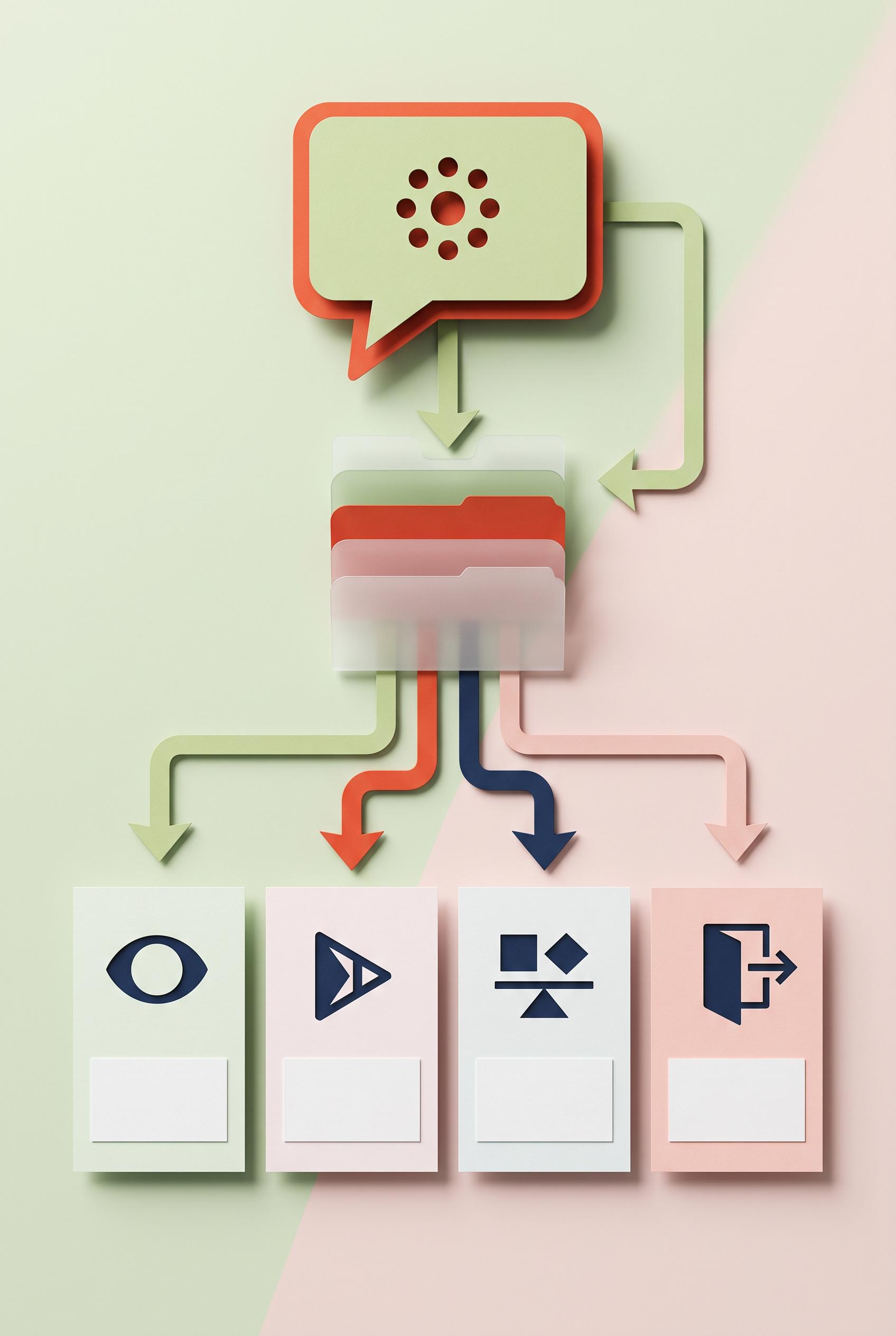
0Create a commercial-quality educational campaign planning graphic in a vertical 2:3 Pinterest composition. Depict one audience question flowing through layered translucent tabs into four distinct content moments represented by abstract symbols for clarify, demonstrate, compare, and invite. Use pistachio green, vermilion, deep navy, and soft blush. Clean dimensional paper craft, crisp shadows, clear hierarchy, polished art direction, no readable text, no real brands, no trademarked characters, no watermark, no unintended readable text. Corrective regeneration attempt 3. Produce a materially revised image, not a near-duplicate of an earlier variant. Preserve the successful subject, palette, lighting, focal hierarchy, and commercial polish from the original brief while correcting every issue below. Mandatory corrective instructions from the most recent visual QA: Preserve the attractive vertical 2:3 paper-craft composition, palette, shadows, translucent layered tabs, central branching flow, and four distinct cards. Remove every letter, word, number, question mark, glyph, and pseudo-text element. Replace the question mark in the audience bubble with a purely abstract non-linguistic symbol, such as a simple geometric dot cluster or blank speech bubble. Replace the four readable card headings with distinct abstract symbols only: a simple lens or focus shape for clarify, a play-like geometric shape without interface details for demonstrate, balanced geometric forms for compare, and an open doorway or outward arrow shape for invite. Keep empty text blocks as clean blank rectangles only, with no simulated writing. Retain arrows and generic format icons only as non-linguistic geometric shapes, ensuring no logos, watermarks, trademarks, or unintended readable marks anywhere. Observed defects from prior variants that must not recur: 1) Attractive vertical composition with strong hierarchy and no readable text, watermark, or brand artifacts. 2) The four content moments are presented as a linear stack rather than branching from the layered tabs, weakening the requested campaign-planning system. 3) The top tab combines multiple concepts instead of clearly separating four distinct moments. 4) The four cards contain clearly readable words: “Clarify,” “Demonstrate,” “Compare,” and “Invite,” violating the no-readable-text requirement. 5) The question mark is a readable glyph, also prohibited by the corrective instructions. Render no letters, words, numbers, prices, headings, labels, contact details, logos, glyphs, or pseudo-text anywhere. Use only blank surfaces, clean geometric marks, and non-linguistic placeholder shapes. Do not add explanatory captions, before/after labels, interface copy, or extra objects that the brief did not request. When a corrective instruction conflicts with a decorative detail, prioritize the corrective instruction.
 0
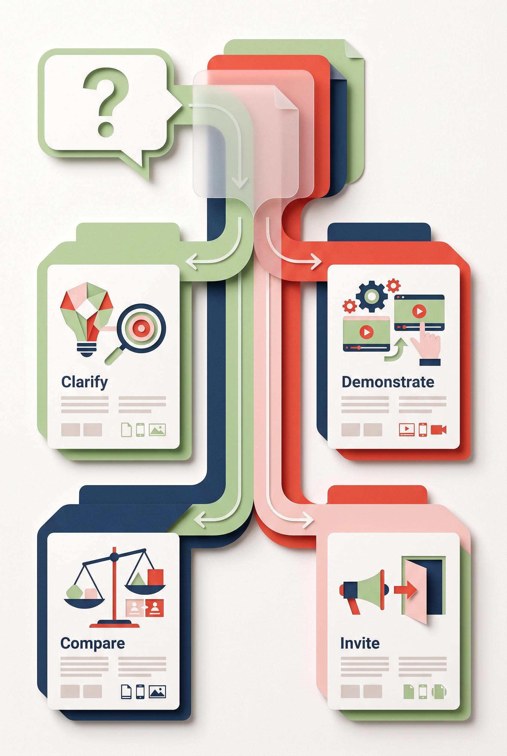
0Create a commercial-quality educational campaign planning graphic in a vertical 2:3 Pinterest composition. Depict one audience question flowing through layered translucent tabs into four distinct content moments represented by abstract symbols for clarify, demonstrate, compare, and invite. Use pistachio green, vermilion, deep navy, and soft blush. Clean dimensional paper craft, crisp shadows, clear hierarchy, polished art direction, no readable text, no real brands, no trademarked characters, no watermark, no unintended readable text. Corrective regeneration attempt 2. Produce a materially revised image, not a near-duplicate of an earlier variant. Preserve the successful subject, palette, lighting, focal hierarchy, and commercial polish from the original brief while correcting every issue below. Mandatory corrective instructions from the most recent visual QA: Preserve the polished paper-craft style, palette, shadows, question bubble, and phone-friendly vertical layout. Redesign the central flow so one audience question enters a layered set of translucent tabs and then clearly branches into four distinct, separately readable content moments arranged around a central junction: clarify, demonstrate, compare, and invite. Use only abstract symbols, empty text blocks, arrows, and small generic format icons; do not add readable words, logos, trademarks, or watermark. Ensure each of the four moments has its own tab/card and symbol, with no combined concepts and no linear-only stack. Observed defects from prior variants that must not recur: 1) Attractive vertical composition with strong hierarchy and no readable text, watermark, or brand artifacts. 2) The four content moments are presented as a linear stack rather than branching from the layered tabs, weakening the requested campaign-planning system. 3) The top tab combines multiple concepts instead of clearly separating four distinct moments. Render no letters, words, numbers, prices, headings, labels, contact details, logos, glyphs, or pseudo-text anywhere. Use only blank surfaces, clean geometric marks, and non-linguistic placeholder shapes. Do not add explanatory captions, before/after labels, interface copy, or extra objects that the brief did not request. When a corrective instruction conflicts with a decorative detail, prioritize the corrective instruction.
 0
0Create a commercial-quality educational campaign planning graphic in a vertical 2:3 Pinterest composition. Depict one audience question flowing through layered translucent tabs into four distinct content moments represented by abstract symbols for clarify, demonstrate, compare, and invite. Use pistachio green, vermilion, deep navy, and soft blush. Clean dimensional paper craft, crisp shadows, clear hierarchy, polished art direction, no readable text, no real brands, no trademarked characters, no watermark, no unintended readable text.
 0
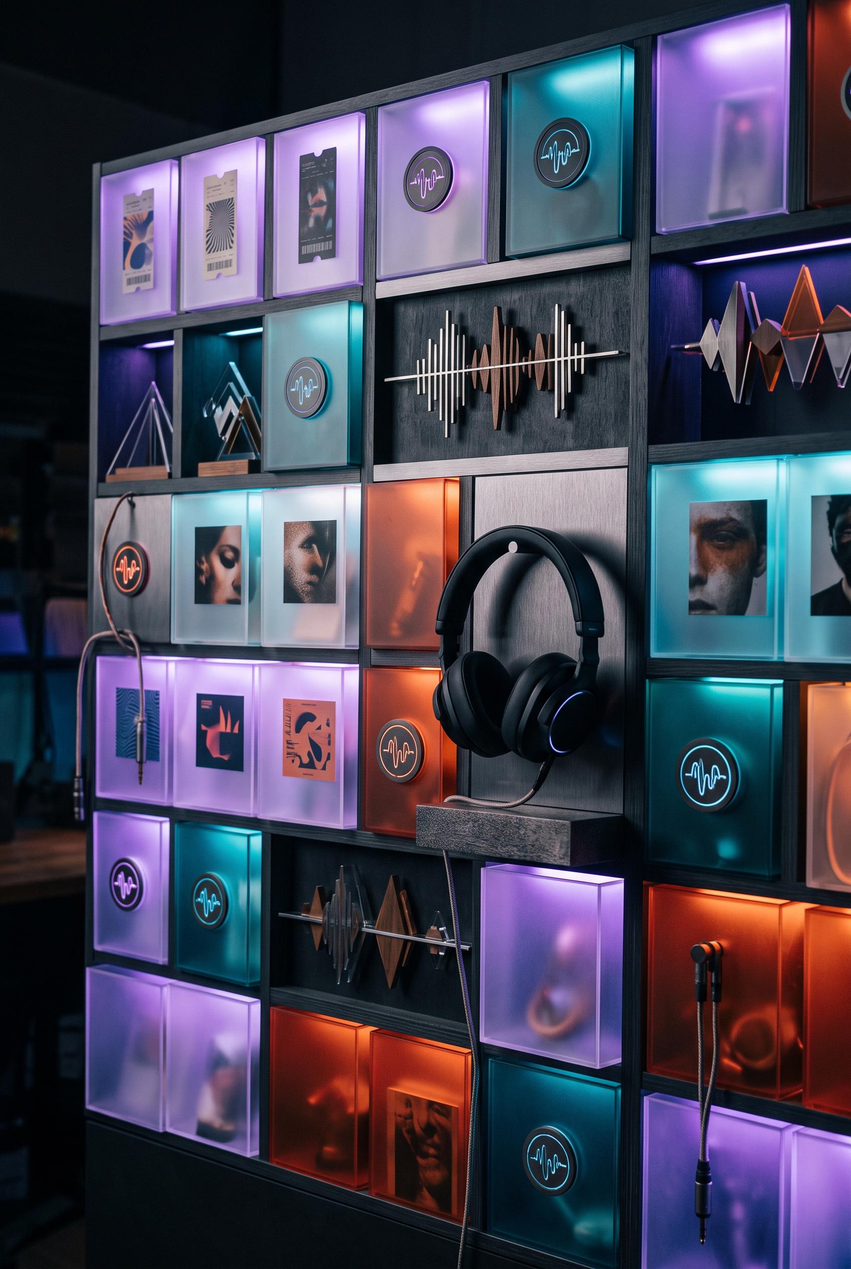
0Create a commercial-quality personal branding showcase in a vertical 2:3 Pinterest composition for an independent after-hours music curator. Build an illuminated modular lightbox wall with translucent sleeves, abstract waveform sculptures, ticket-like cards, portrait fragments, headphones, and a repeated circular listening marker. Use ultraviolet, paprika orange, aqua, and charcoal. Sophisticated nocturnal studio lighting, premium art direction, tactile materials, no readable text, no real brands, no trademarked characters, no watermark, no unintended readable text.
 0
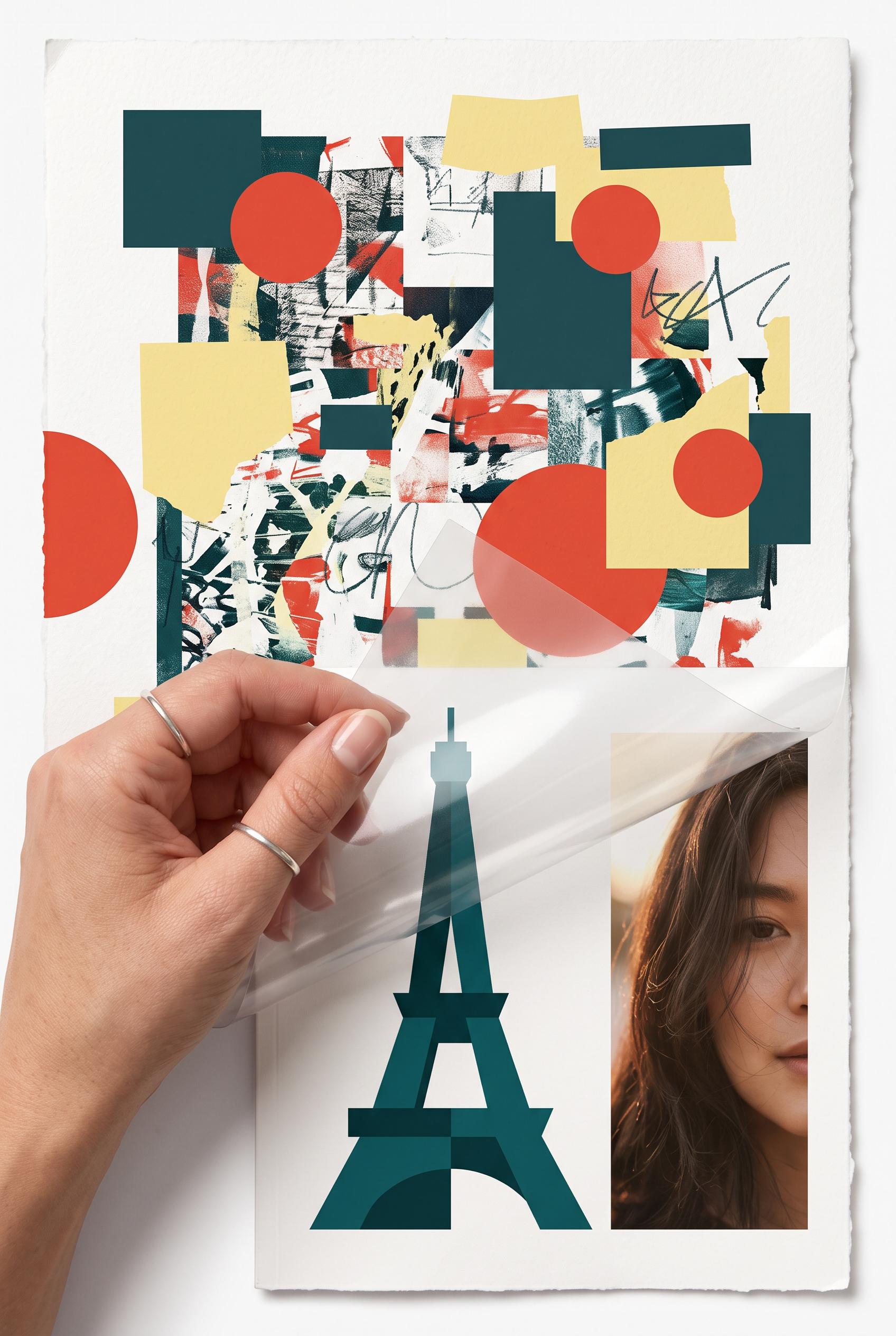
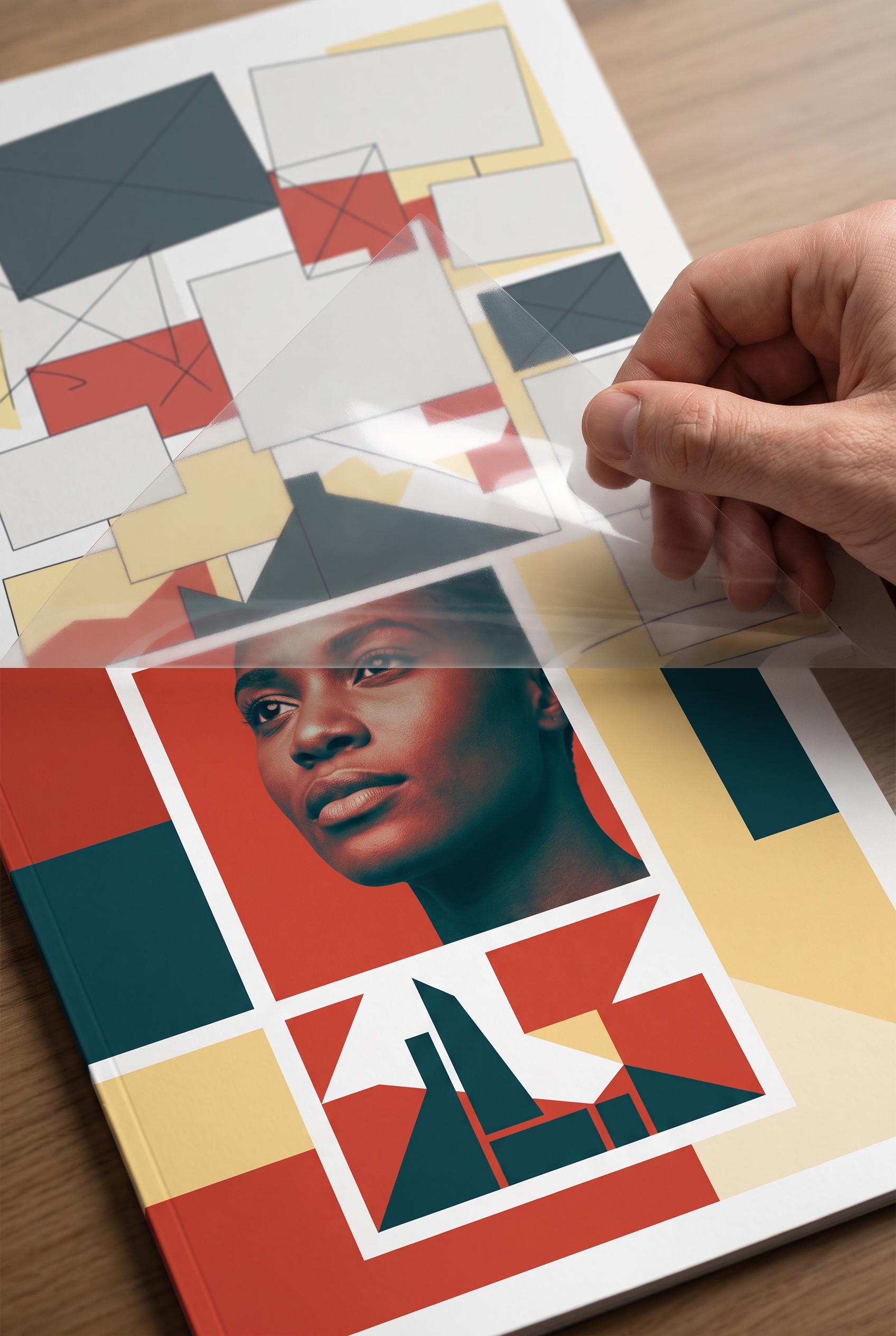
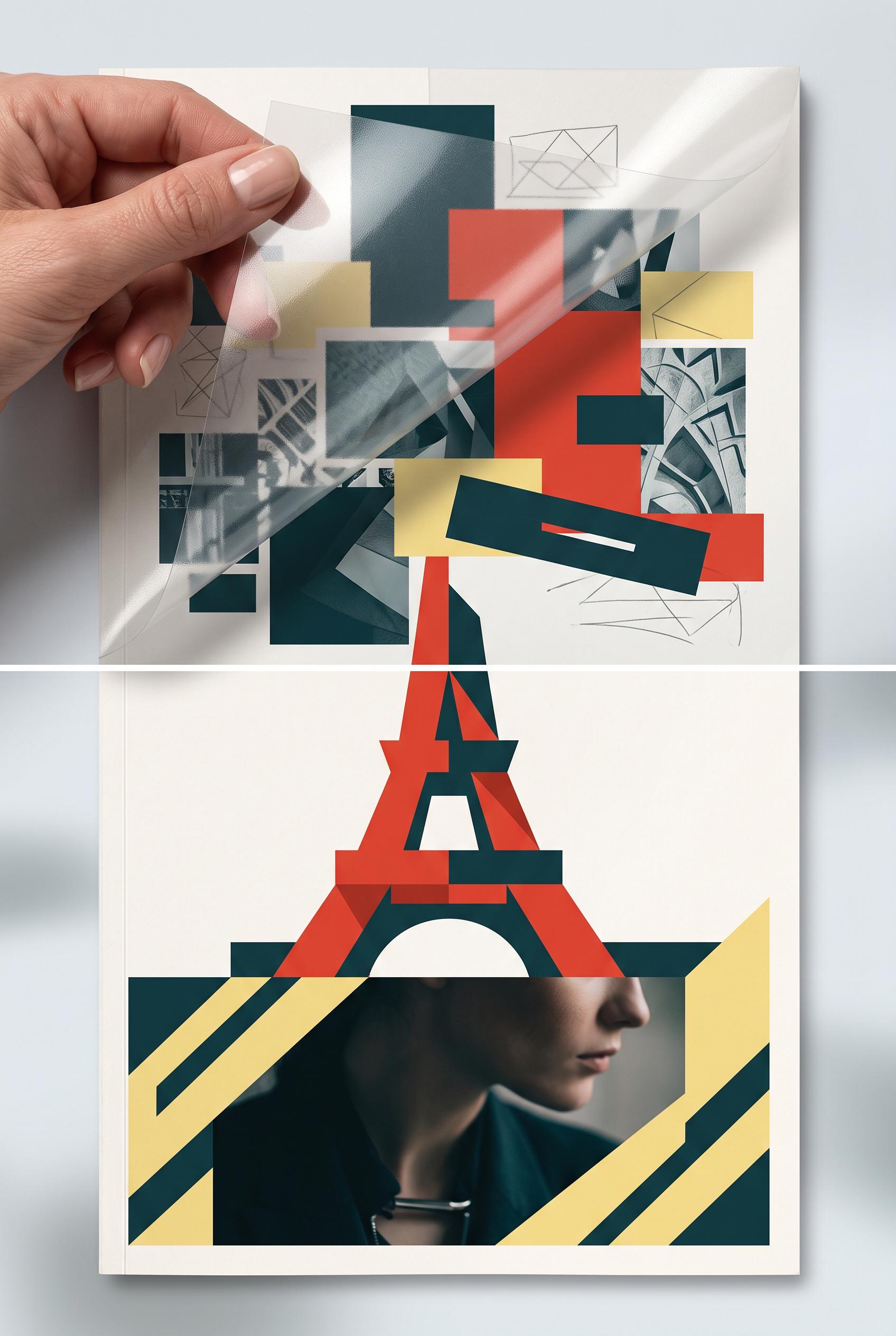
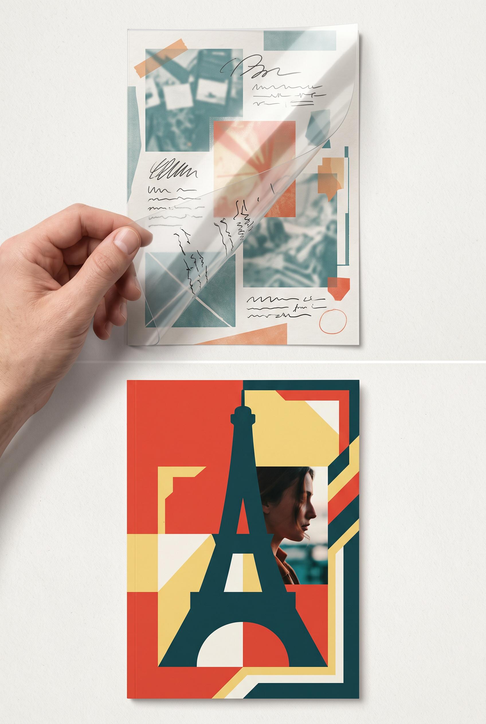
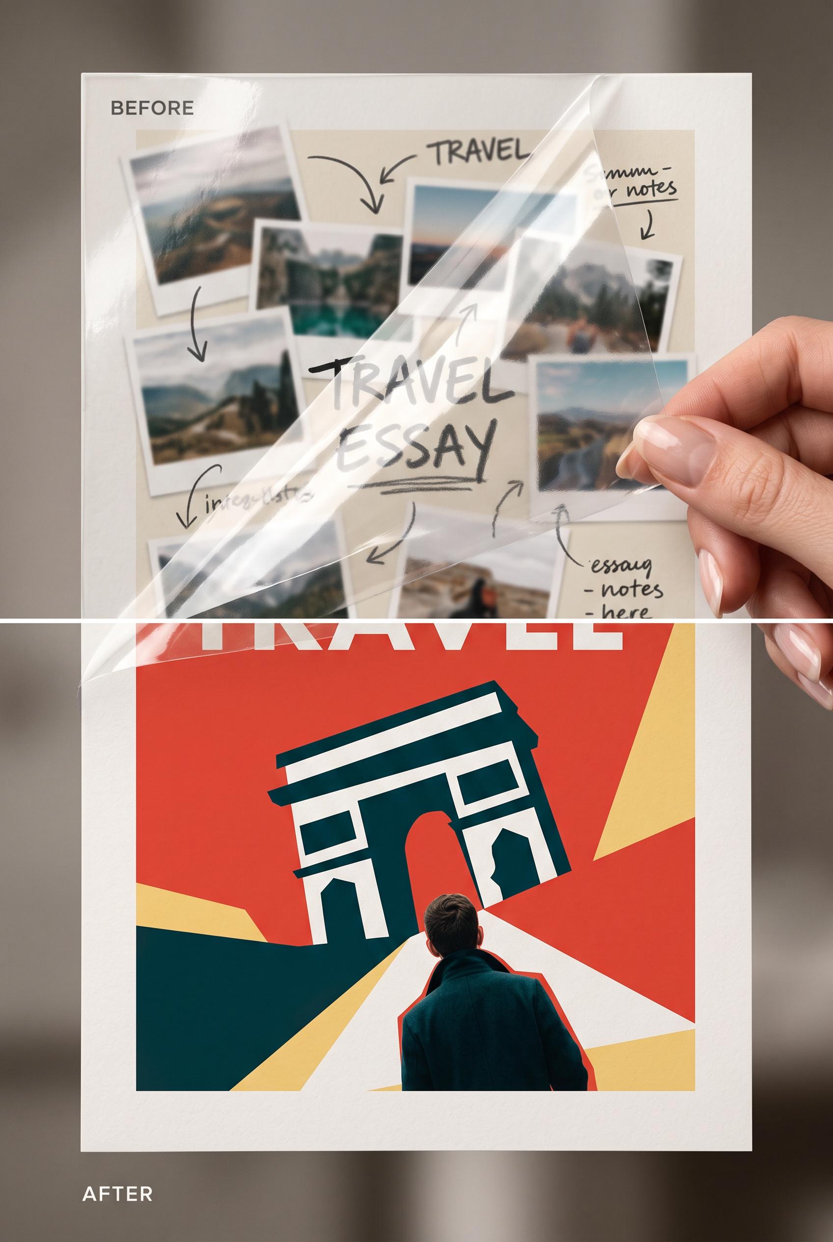
0Create a commercial-quality editorial design case study in a vertical 2:3 Pinterest composition, showing a before-and-after transformation of a travel essay creator thumbnail. Use a tactile acetate overlay being lifted from a cluttered draft to reveal a confident cover with one abstract landmark silhouette, cropped human detail, strong directional framing, and no readable text. Palette: tomato red, butter yellow, dark teal, paper white. Premium studio lighting, realistic paper and acetate textures, refined art direction, no real brands, no trademarked characters, no watermark, no unintended readable text. Corrective regeneration attempt 5. Produce a materially revised image, not a near-duplicate of an earlier variant. Preserve the successful subject, palette, lighting, focal hierarchy, and commercial polish from the original brief while correcting every issue below. Mandatory corrective instructions from the most recent visual QA: Regenerate the same polished vertical 2:3 editorial composition, preserving the realistic lifted acetate, hand interaction, cropped portrait, paper texture, palette, lighting, and strong lower-panel focal hierarchy. Replace the hard horizontal white seam with one seamless physical transition where the acetate naturally lifts from the cluttered upper draft into the refined lower cover. Remove every line drawing, arrow-like mark, glyph, letter, word, number, label, logo, caption, and pseudo-text from the upper panel; use only restrained abstract color blocks, geometric shapes, and non-linguistic texture. Redesign the lower landmark as one unmistakably non-identifiable abstract form built from clean intentional geometric planes, avoiding any tower or Eiffel-like proportions. Keep all surfaces blank and commercially polished. Observed defects from prior variants that must not recur: 1) Strong vertical composition, acetate interaction, palette, and cropped portrait focal point. 2) The lower landmark is clearly Eiffel-Tower-like, violating the abstract/non-identifiable requirement. 3) A harsh horizontal white seam visibly cuts across the transition. 4) Upper-panel line drawings resemble handwritten or diagrammatic marks and weaken the clean commercial hierarchy. 5) The lower landmark geometry appears awkward and artifact-like rather than polished editorial design. 6) A harsh, conspicuous horizontal white seam divides the upper draft and lower cover. 7) The upper panel contains numerous diagram-like lines and arrow-like marks, contrary to the requirement for only clean abstract blocks and non-linguistic texture. 8) The lower landmark is somewhat awkward and structurally tower-like, weakening the polished abstract landmark requirement. Render no letters, words, numbers, prices, headings, labels, contact details, logos, glyphs, or pseudo-text anywhere. Use only blank surfaces, clean geometric marks, and non-linguistic placeholder shapes. Do not add explanatory captions, before/after labels, interface copy, or extra objects that the brief did not request. When a corrective instruction conflicts with a decorative detail, prioritize the corrective instruction.
 0
0Create a commercial-quality editorial design case study in a vertical 2:3 Pinterest composition, showing a before-and-after transformation of a travel essay creator thumbnail. Use a tactile acetate overlay being lifted from a cluttered draft to reveal a confident cover with one abstract landmark silhouette, cropped human detail, strong directional framing, and no readable text. Palette: tomato red, butter yellow, dark teal, paper white. Premium studio lighting, realistic paper and acetate textures, refined art direction, no real brands, no trademarked characters, no watermark, no unintended readable text. Corrective regeneration attempt 4. Produce a materially revised image, not a near-duplicate of an earlier variant. Preserve the successful subject, palette, lighting, focal hierarchy, and commercial polish from the original brief while correcting every issue below. Mandatory corrective instructions from the most recent visual QA: Regenerate as a polished vertical 2:3 editorial before-and-after layout, preserving the realistic lifted acetate, hand, paper texture, premium lighting, palette, and cropped portrait. Remove the harsh horizontal white seam and create one seamless physical transition between the cluttered low-contrast upper draft and refined lower cover. Replace the recognizable Eiffel-Tower-like landmark with one clearly abstract, non-identifiable landmark silhouette made from clean geometric forms; ensure its proportions and edges are intentional and polished. Remove every line drawing, handwritten-looking mark, arrow, glyph, letter, word, number, label, logo, caption, and pseudo-text from both panels. Use only abstract image blocks, geometric shapes, and non-linguistic texture. Keep strong directional framing and a clear lower-panel focal hierarchy without adding any text or extra objects. Observed defects from prior variants that must not recur: 1) A harsh horizontal white seam visibly divides the two panels. 2) The lower panel contains a large landmark silhouette that reads as a recognizable Eiffel Tower rather than a fully abstract landmark form. 3) The upper panel is cluttered with annotation-like marks that weaken the commercial hierarchy. 4) Strong vertical composition, acetate interaction, palette, and cropped portrait focal point. 5) The lower landmark is clearly Eiffel-Tower-like, violating the abstract/non-identifiable requirement. 6) A harsh horizontal white seam visibly cuts across the transition. 7) Upper-panel line drawings resemble handwritten or diagrammatic marks and weaken the clean commercial hierarchy. 8) The lower landmark geometry appears awkward and artifact-like rather than polished editorial design. Render no letters, words, numbers, prices, headings, labels, contact details, logos, glyphs, or pseudo-text anywhere. Use only blank surfaces, clean geometric marks, and non-linguistic placeholder shapes. Do not add explanatory captions, before/after labels, interface copy, or extra objects that the brief did not request. When a corrective instruction conflicts with a decorative detail, prioritize the corrective instruction.
 0
0Create a commercial-quality editorial design case study in a vertical 2:3 Pinterest composition, showing a before-and-after transformation of a travel essay creator thumbnail. Use a tactile acetate overlay being lifted from a cluttered draft to reveal a confident cover with one abstract landmark silhouette, cropped human detail, strong directional framing, and no readable text. Palette: tomato red, butter yellow, dark teal, paper white. Premium studio lighting, realistic paper and acetate textures, refined art direction, no real brands, no trademarked characters, no watermark, no unintended readable text. Corrective regeneration attempt 3. Produce a materially revised image, not a near-duplicate of an earlier variant. Preserve the successful subject, palette, lighting, focal hierarchy, and commercial polish from the original brief while correcting every issue below. Mandatory corrective instructions from the most recent visual QA: Create a polished vertical 2:3 editorial before-and-after composition with the same premium paper texture, lifted transparent acetate, realistic hand, shadows, tomato red/butter yellow/dark teal/paper-white palette, and strong lower-panel focal hierarchy. Remove every letter, word, number, label, handwritten stroke, arrow, logo, glyph, and pseudo-text-like mark from both panels; use only abstract image blocks, geometric shapes, and non-linguistic texture. Eliminate the harsh horizontal white seam and create a seamless physical transition between the cluttered low-contrast draft above and the refined cover below. Keep the lower cover focused on one oversized, clearly abstract landmark silhouette, cropped portrait detail, and directional geometric framing, but make the landmark non-identifiable and not Eiffel-Tower-like. Preserve realistic acetate reflections and lifted-edge shadows without adding captions or explanatory text. Observed defects from prior variants that must not recur: 1) Strong vertical composition, tactile acetate, palette, and clear before/after transformation. 2) Contains abundant unintended readable text, including “BEFORE,” “AFTER,” “TRAVEL,” and handwritten notes, despite the no-readable-text requirement. 3) A harsh horizontal white seam crosses the composition, and the cropped large lettering in the lower panel looks like an artifact rather than polished design. 4) The after panel is strong but the overall hierarchy is weakened by the text clutter and seam. 5) The upper draft contains abundant handwritten pseudo-text and typographic fragments, violating the no-readable-text requirement. 6) A harsh horizontal white seam visibly divides the two panels. 7) The lower panel contains a large landmark silhouette that reads as a recognizable Eiffel Tower rather than a fully abstract landmark form. 8) The upper panel is cluttered with annotation-like marks that weaken the commercial hierarchy. Render no letters, words, numbers, prices, headings, labels, contact details, logos, glyphs, or pseudo-text anywhere. Use only blank surfaces, clean geometric marks, and non-linguistic placeholder shapes. Do not add explanatory captions, before/after labels, interface copy, or extra objects that the brief did not request. When a corrective instruction conflicts with a decorative detail, prioritize the corrective instruction.
 0
0Create a commercial-quality editorial design case study in a vertical 2:3 Pinterest composition, showing a before-and-after transformation of a travel essay creator thumbnail. Use a tactile acetate overlay being lifted from a cluttered draft to reveal a confident cover with one abstract landmark silhouette, cropped human detail, strong directional framing, and no readable text. Palette: tomato red, butter yellow, dark teal, paper white. Premium studio lighting, realistic paper and acetate textures, refined art direction, no real brands, no trademarked characters, no watermark, no unintended readable text. Corrective regeneration attempt 2. Produce a materially revised image, not a near-duplicate of an earlier variant. Preserve the successful subject, palette, lighting, focal hierarchy, and commercial polish from the original brief while correcting every issue below. Mandatory corrective instructions from the most recent visual QA: Preserve the vertical 2:3 editorial composition, premium paper and acetate textures, lifted transparent overlay, tomato red/butter yellow/dark teal/paper-white palette, cluttered low-contrast draft above, and bold landmark silhouette with cropped human detail below. Remove every readable letter, word, label, handwritten note, arrow annotation, and typographic fragment from both panels; use only abstract image blocks, shapes, and texture. Remove the harsh horizontal white seam across the middle. Make the after panel a clean, polished cover with one oversized abstract landmark silhouette, directional geometric framing, and a cropped portrait detail, with no text-like glyphs or accidental lettering. Retain realistic hand, acetate reflections, shadows, and refined commercial styling; no watermark or brands. Observed defects from prior variants that must not recur: 1) Strong vertical composition, tactile acetate, palette, and clear before/after transformation. 2) Contains abundant unintended readable text, including “BEFORE,” “AFTER,” “TRAVEL,” and handwritten notes, despite the no-readable-text requirement. 3) A harsh horizontal white seam crosses the composition, and the cropped large lettering in the lower panel looks like an artifact rather than polished design. 4) The after panel is strong but the overall hierarchy is weakened by the text clutter and seam. Render no letters, words, numbers, prices, headings, labels, contact details, logos, glyphs, or pseudo-text anywhere. Use only blank surfaces, clean geometric marks, and non-linguistic placeholder shapes. Do not add explanatory captions, before/after labels, interface copy, or extra objects that the brief did not request. When a corrective instruction conflicts with a decorative detail, prioritize the corrective instruction.
 0
0Create a commercial-quality editorial design case study in a vertical 2:3 Pinterest composition, showing a before-and-after transformation of a travel essay creator thumbnail. Use a tactile acetate overlay being lifted from a cluttered draft to reveal a confident cover with one abstract landmark silhouette, cropped human detail, strong directional framing, and no readable text. Palette: tomato red, butter yellow, dark teal, paper white. Premium studio lighting, realistic paper and acetate textures, refined art direction, no real brands, no trademarked characters, no watermark, no unintended readable text.
 0
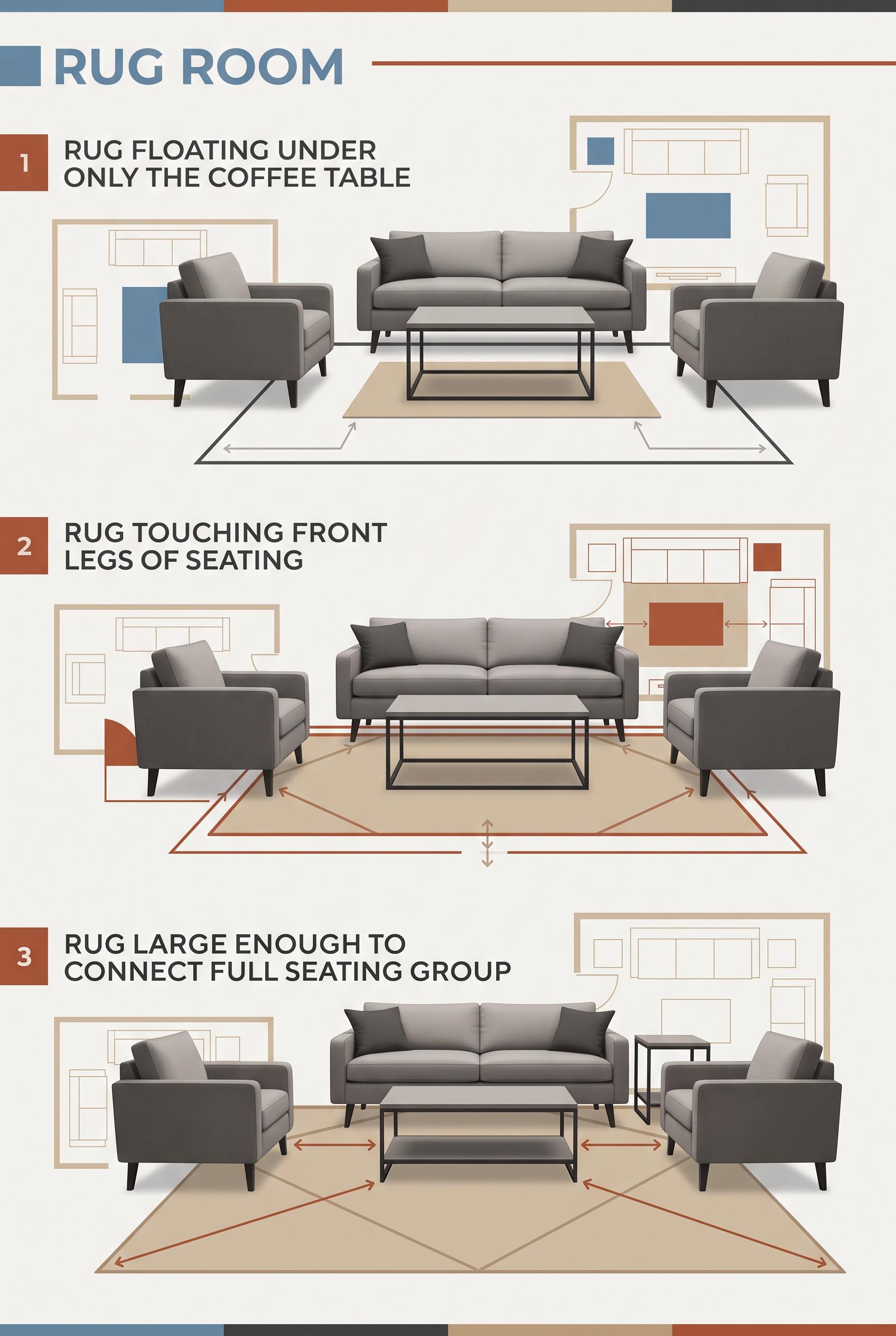
0Create a commercial-quality interior styling education graphic in a vertical 2:3 Pinterest composition. Show three distinct living room setups arranged from top to bottom: a rug floating under only the coffee table, a rug touching the front legs of seating, and a rug large enough to connect the full seating group. Use chalk blue, russet, sand, and charcoal with clear geometric floor-plan overlays, realistic furniture silhouettes, and subtle measurement arrows without numbers or text. No real brands, no trademarked characters, no watermark, no unintended readable text, no logos.
 0
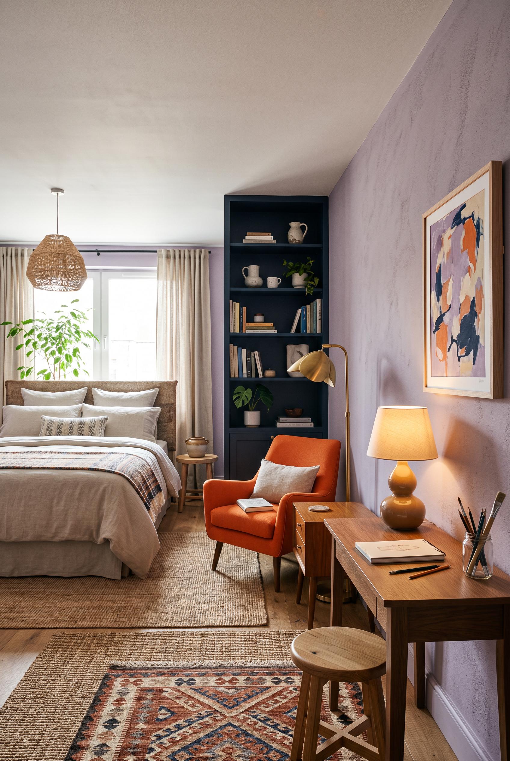
0Create a commercial-quality interior design editorial scene in a vertical 2:3 Pinterest composition. Show an inspirational compact bedroom studio with a neatly made bed, mineral lilac wall color, tangerine accent chair, flax linen bedding, ink blue shelving, a small creative desk, sculptural lamp, and layered woven rug. Use an eye-level three-quarter view with clear visual separation between sleeping, reading, and making zones. Include abstract artwork with no readable text. No real brands, no trademarked characters, no watermark, no unintended readable text, no logos.
 0
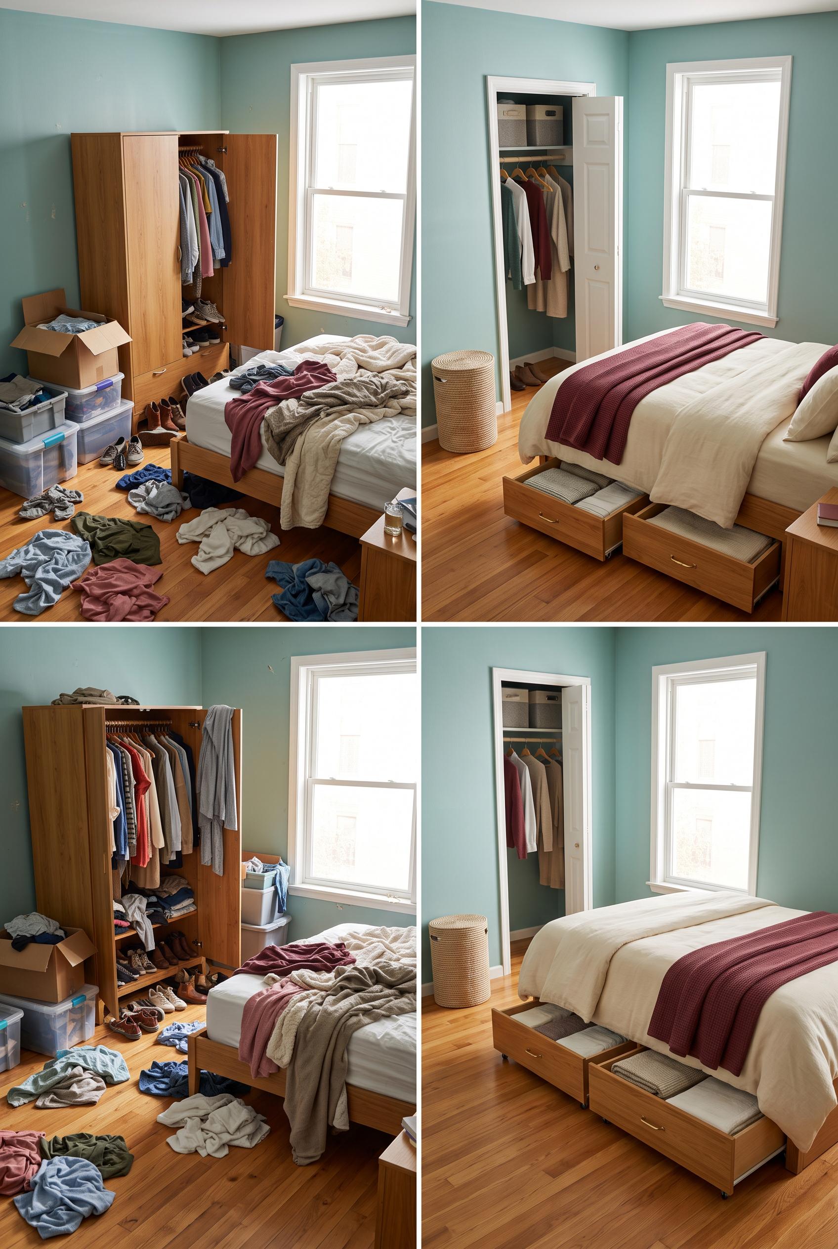
0Create a commercial-quality interior design editorial image in a vertical 2:3 Pinterest composition. Show a matched before-and-after transformation of a small bedroom: left side cluttered with loose clothing and crowded wardrobe storage, right side calm and organized with low rolling drawers beneath the bed, clear floor space, folded linens, and a slim laundry basket. Use sea-glass walls, maroon textiles, warm cream bedding, and honey oak accents. Include a small close-up inset of the under-bed storage mechanism. No real brands, no trademarked characters, no watermark, no unintended readable text, no logos. Corrective regeneration attempt 5. Produce a materially revised image, not a near-duplicate of an earlier variant. Preserve the successful subject, palette, lighting, focal hierarchy, and commercial polish from the original brief while correcting every issue below. Mandatory corrective instructions from the most recent visual QA: Create one cohesive vertical 2:3 editorial image with exactly two equal-width left and right views of the same compact bedroom from the same elevated camera angle and matching perspective. Put the cluttered before room only on the left, including the overloaded wardrobe and loose clothing on the floor. Put the refined after room only on the right, with clear floor space, partly pulled shallow honey-oak rolling drawers beneath the bed containing folded textiles, a slim laundry basket, and exactly one open wardrobe/storage detail. Remove all lower panels and remove the large inset entirely. Preserve sea-glass walls, maroon textiles, warm cream bedding, honey-oak accents, and polished photorealistic lighting. Use no letters, words, numbers, labels, logos, glyphs, pseudo-text, watermark, captions, or extra panels. Observed defects from prior variants that must not recur: 1) The after view and close-up dominate the canvas, weakening immediate before/after legibility. 2) The image uses a four-panel grid instead of one clean two-panel left/right composition. 3) The lower panels are redundant bedroom views and violate the matched before/after layout. 4) The inset is oversized and further overcrowds the composition. 5) The two primary views are not the only visual focus, weakening immediate before/after legibility. 6) Uses a four-panel grid plus a large inset instead of exactly two equal-width matched views. 7) Lower panels are redundant and disrupt the intended before/after focal hierarchy. 8) The composition does not present one cohesive left/right bedroom transformation. Render no letters, words, numbers, prices, headings, labels, contact details, logos, glyphs, or pseudo-text anywhere. Use only blank surfaces, clean geometric marks, and non-linguistic placeholder shapes. Do not add explanatory captions, before/after labels, interface copy, or extra objects that the brief did not request. When a corrective instruction conflicts with a decorative detail, prioritize the corrective instruction.
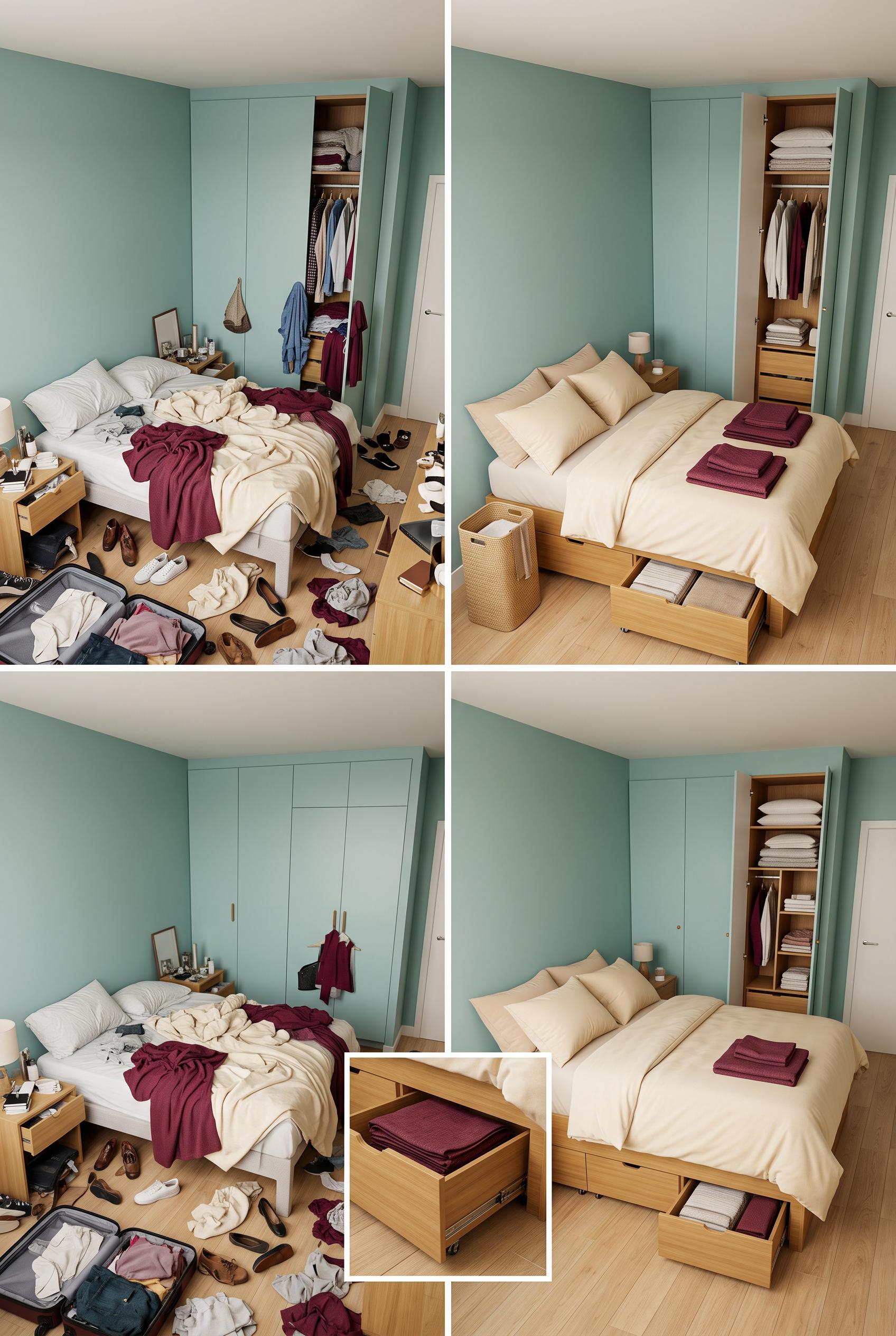 0
0Create a commercial-quality interior design editorial image in a vertical 2:3 Pinterest composition. Show a matched before-and-after transformation of a small bedroom: left side cluttered with loose clothing and crowded wardrobe storage, right side calm and organized with low rolling drawers beneath the bed, clear floor space, folded linens, and a slim laundry basket. Use sea-glass walls, maroon textiles, warm cream bedding, and honey oak accents. Include a small close-up inset of the under-bed storage mechanism. No real brands, no trademarked characters, no watermark, no unintended readable text, no logos. Corrective regeneration attempt 4. Produce a materially revised image, not a near-duplicate of an earlier variant. Preserve the successful subject, palette, lighting, focal hierarchy, and commercial polish from the original brief while correcting every issue below. Mandatory corrective instructions from the most recent visual QA: Regenerate as one cohesive vertical 2:3 editorial image with exactly two equal-width left/right views of the same compact bedroom from the same elevated camera angle and matching perspective. Keep the cluttered before room only on the left, with an overloaded wardrobe and loose clothing on the floor. Keep the refined after room only on the right, with clear floor space, partly pulled shallow honey-oak rolling drawers beneath the bed containing folded textiles, a slim laundry basket, and exactly one open wardrobe/storage detail. Remove all lower panels and remove the large inset; include no inset unless it is tiny and does not disrupt the two-panel layout. Preserve sea-glass walls, maroon textiles, warm cream bedding, honey-oak accents, and polished photorealistic lighting. Use no letters, words, numbers, labels, logos, glyphs, pseudo-text, or watermark. Observed defects from prior variants that must not recur: 1) Attractive photorealistic palette and clear before/after subject, with no visible text, watermark, logos, or obvious artifacts. 2) The layout is overcrowded and uses multiple mismatched panels rather than one clean matched left/right composition. 3) The before and after views do not share a consistent elevated camera angle; the lower-left panel repeats a separate bedroom view. 4) The after view and close-up dominate the canvas, weakening immediate before/after legibility. 5) The image uses a four-panel grid instead of one clean two-panel left/right composition. 6) The lower panels are redundant bedroom views and violate the matched before/after layout. 7) The inset is oversized and further overcrowds the composition. 8) The two primary views are not the only visual focus, weakening immediate before/after legibility. Render no letters, words, numbers, prices, headings, labels, contact details, logos, glyphs, or pseudo-text anywhere. Use only blank surfaces, clean geometric marks, and non-linguistic placeholder shapes. Do not add explanatory captions, before/after labels, interface copy, or extra objects that the brief did not request. When a corrective instruction conflicts with a decorative detail, prioritize the corrective instruction.
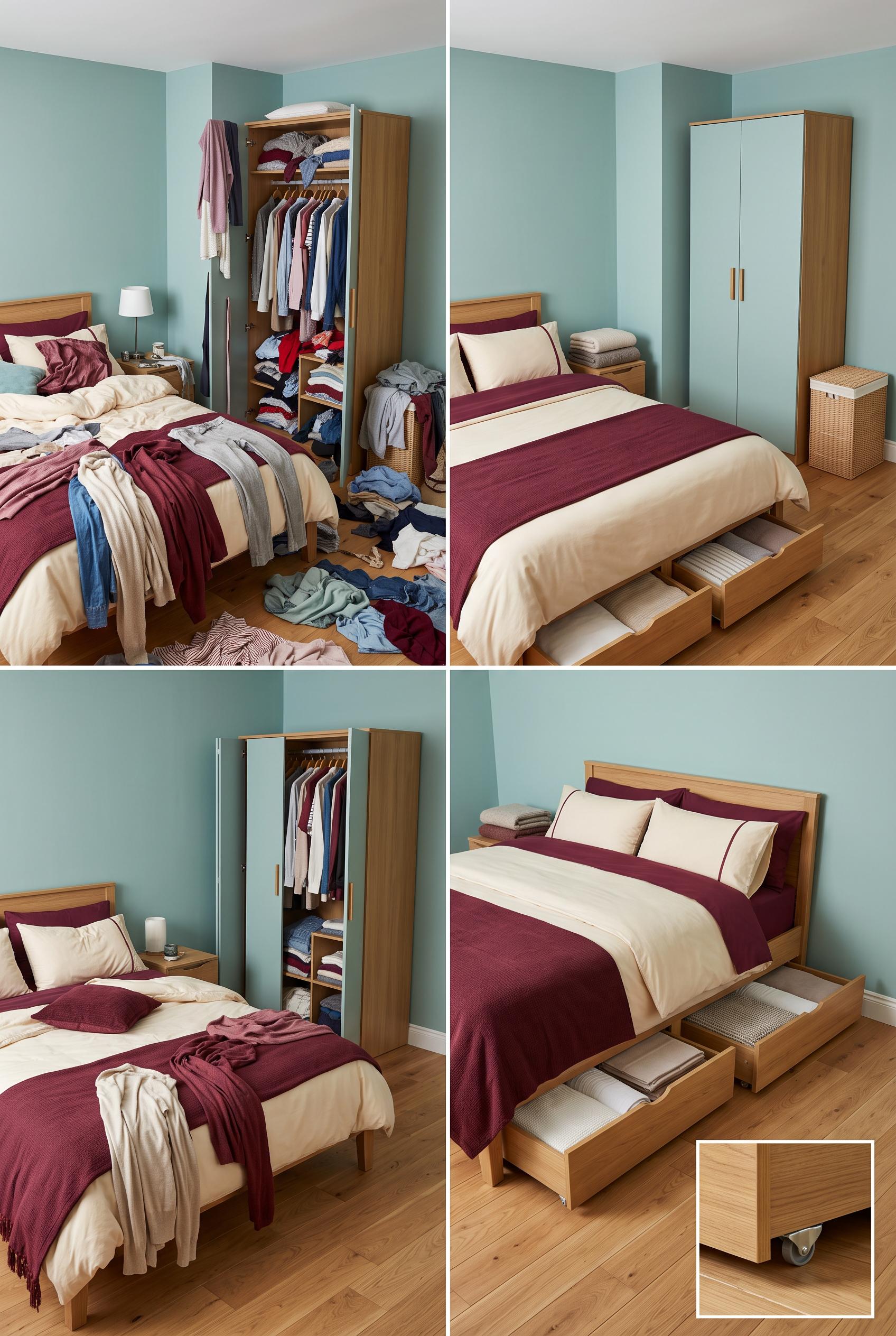 0
0Create a commercial-quality interior design editorial image in a vertical 2:3 Pinterest composition. Show a matched before-and-after transformation of a small bedroom: left side cluttered with loose clothing and crowded wardrobe storage, right side calm and organized with low rolling drawers beneath the bed, clear floor space, folded linens, and a slim laundry basket. Use sea-glass walls, maroon textiles, warm cream bedding, and honey oak accents. Include a small close-up inset of the under-bed storage mechanism. No real brands, no trademarked characters, no watermark, no unintended readable text, no logos. Corrective regeneration attempt 3. Produce a materially revised image, not a near-duplicate of an earlier variant. Preserve the successful subject, palette, lighting, focal hierarchy, and commercial polish from the original brief while correcting every issue below. Mandatory corrective instructions from the most recent visual QA: Create one cohesive vertical 2:3 editorial image split cleanly into exactly two equal left/right views of the same compact bedroom from the same elevated camera angle and matching perspective. Put the cluttered before room only on the left, with an overloaded wardrobe and loose clothing across the floor. Put the refined after room only on the right, with clear floor space, shallow honey-oak rolling drawers visibly partly pulled from beneath the bed, folded textiles inside, a slim laundry basket, and exactly one open wardrobe/storage detail. Include one small unobtrusive inset of the drawer mechanism only if it does not disrupt the two-panel layout. Remove the extra lower bedroom panel and oversized close-up. Preserve sea-glass walls, maroon textiles, warm cream bedding, honey-oak accents, and polished photorealistic lighting. Use visual cues only: no letters, words, numbers, labels, logos, glyphs, pseudo-text, or watermark anywhere. Observed defects from prior variants that must not recur: 1) The composition includes large readable “BEFORE” and “AFTER” labels despite the brief requiring visual-only labeling. 2) The before and after views are not consistently matched from the same elevated angle; the image repeats a separate after view in the lower section. 3) The after view in the top comparison does not clearly show the rolling under-bed drawers, making the transformation inconsistent. 4) The layout is visually overcrowded and less immediately legible as a clean before-after editorial pin. 5) Attractive photorealistic palette and clear before/after subject, with no visible text, watermark, logos, or obvious artifacts. 6) The layout is overcrowded and uses multiple mismatched panels rather than one clean matched left/right composition. 7) The before and after views do not share a consistent elevated camera angle; the lower-left panel repeats a separate bedroom view. 8) The after view and close-up dominate the canvas, weakening immediate before/after legibility. Render no letters, words, numbers, prices, headings, labels, contact details, logos, glyphs, or pseudo-text anywhere. Use only blank surfaces, clean geometric marks, and non-linguistic placeholder shapes. Do not add explanatory captions, before/after labels, interface copy, or extra objects that the brief did not request. When a corrective instruction conflicts with a decorative detail, prioritize the corrective instruction.
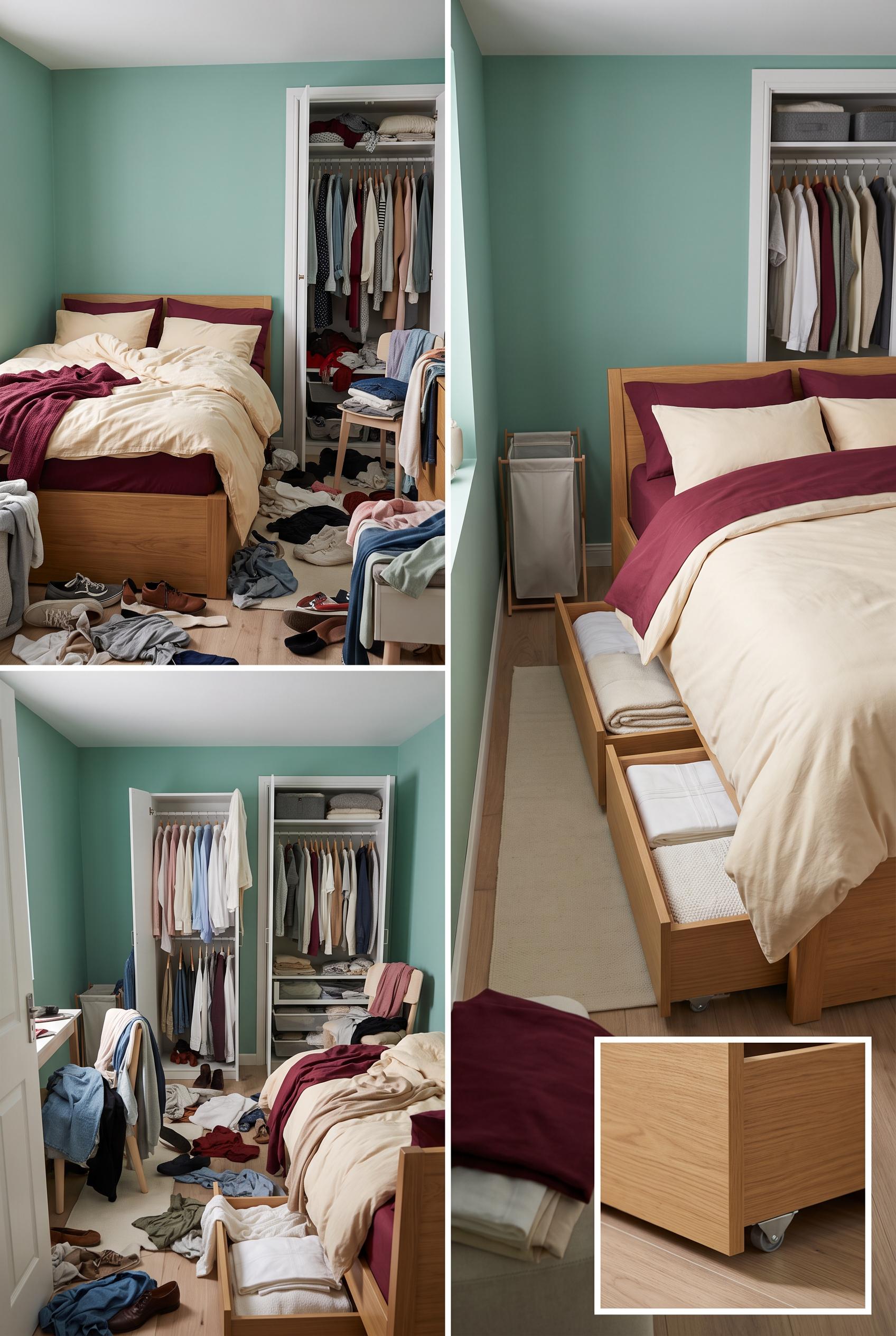 0
0Create a commercial-quality interior design editorial image in a vertical 2:3 Pinterest composition. Show a matched before-and-after transformation of a small bedroom: left side cluttered with loose clothing and crowded wardrobe storage, right side calm and organized with low rolling drawers beneath the bed, clear floor space, folded linens, and a slim laundry basket. Use sea-glass walls, maroon textiles, warm cream bedding, and honey oak accents. Include a small close-up inset of the under-bed storage mechanism. No real brands, no trademarked characters, no watermark, no unintended readable text, no logos. Corrective regeneration attempt 2. Produce a materially revised image, not a near-duplicate of an earlier variant. Preserve the successful subject, palette, lighting, focal hierarchy, and commercial polish from the original brief while correcting every issue below. Mandatory corrective instructions from the most recent visual QA: Create a single cohesive vertical 2:3 before-and-after editorial composition of the same compact bedroom from one consistent elevated camera angle, split cleanly into matched left and right views. Remove all readable text, labels, typography, logos, and watermarks. The left view must show the overloaded wardrobe and visibly cluttered floor with loose clothing. The right view must show the same room transformed with clear floor space, shallow honey-oak rolling drawers visibly pulled partly from beneath the bed, folded textiles, a slim laundry basket, and one open wardrobe/storage detail. Use sea-glass walls, maroon textiles, warm cream bedding, and honey-oak accents. Include only one small, clean visual close-up inset of the drawer mechanism without text. Do not duplicate the after view, change camera angle, or introduce unrelated furniture; preserve the polished photorealistic interior styling. Observed defects from prior variants that must not recur: 1) The composition includes large readable “BEFORE” and “AFTER” labels despite the brief requiring visual-only labeling. 2) The before and after views are not consistently matched from the same elevated angle; the image repeats a separate after view in the lower section. 3) The after view in the top comparison does not clearly show the rolling under-bed drawers, making the transformation inconsistent. 4) The layout is visually overcrowded and less immediately legible as a clean before-after editorial pin. Render no letters, words, numbers, prices, headings, labels, contact details, logos, glyphs, or pseudo-text anywhere. Use only blank surfaces, clean geometric marks, and non-linguistic placeholder shapes. Do not add explanatory captions, before/after labels, interface copy, or extra objects that the brief did not request. When a corrective instruction conflicts with a decorative detail, prioritize the corrective instruction.
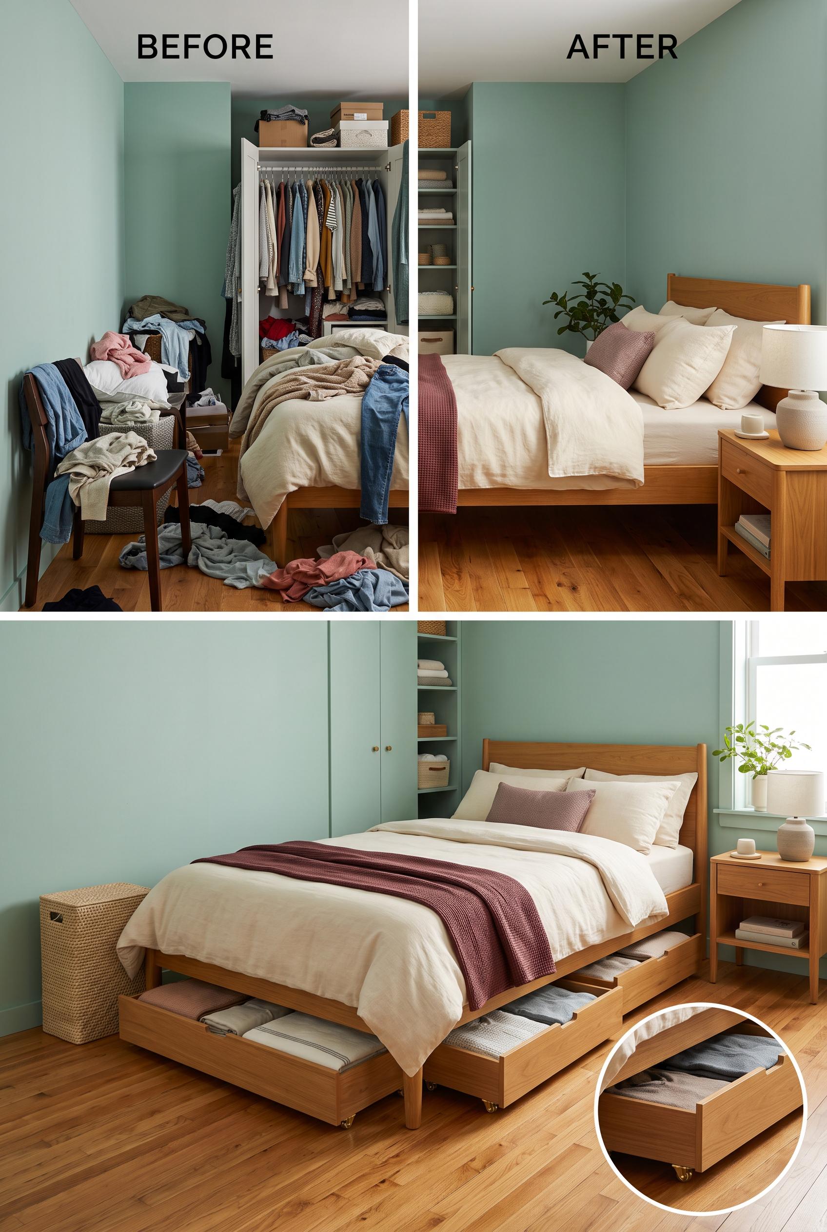 0
0Create a commercial-quality interior design editorial image in a vertical 2:3 Pinterest composition. Show a matched before-and-after transformation of a small bedroom: left side cluttered with loose clothing and crowded wardrobe storage, right side calm and organized with low rolling drawers beneath the bed, clear floor space, folded linens, and a slim laundry basket. Use sea-glass walls, maroon textiles, warm cream bedding, and honey oak accents. Include a small close-up inset of the under-bed storage mechanism. No real brands, no trademarked characters, no watermark, no unintended readable text, no logos.
 0
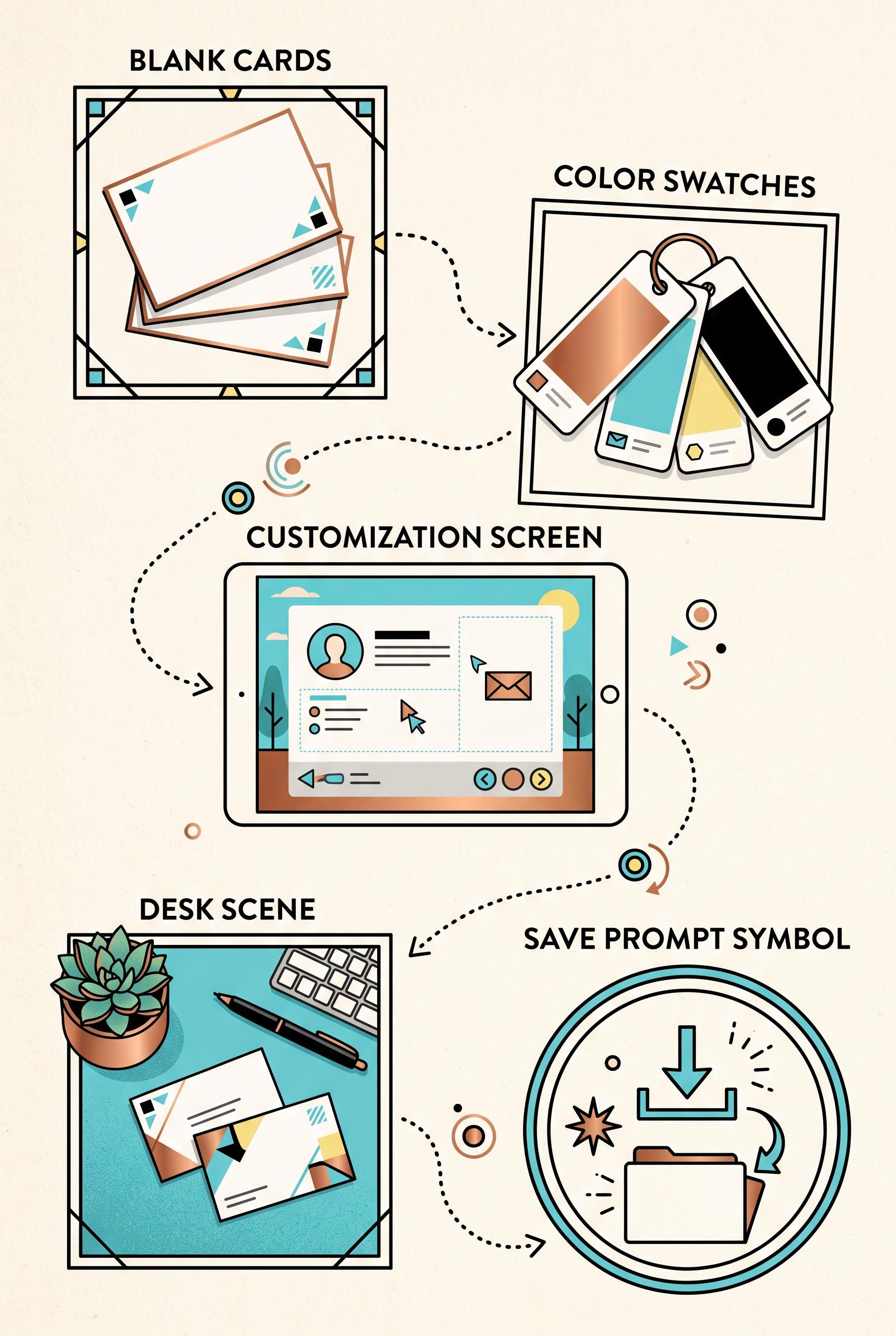
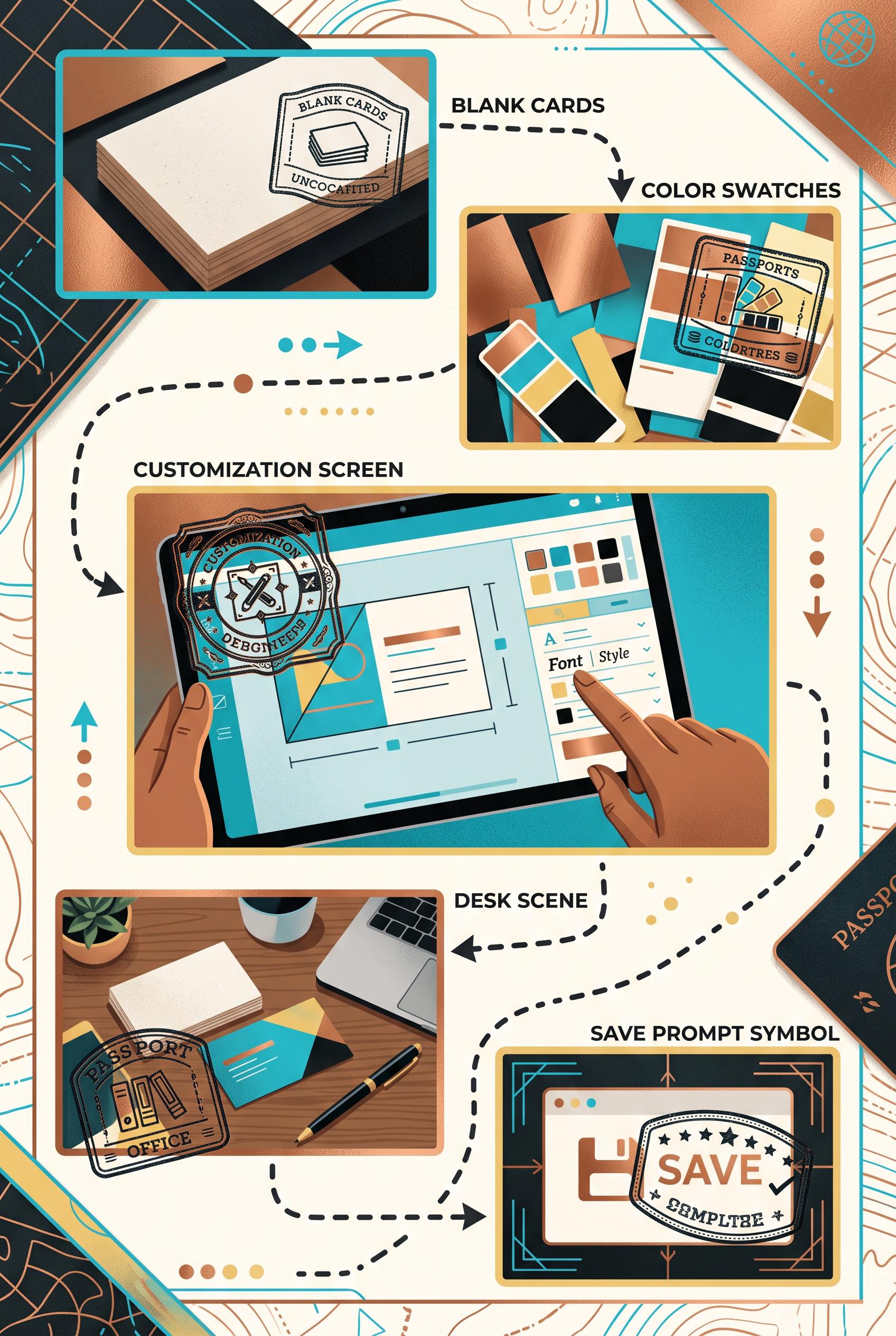
0Create a vertical 2:3 Pinterest composition with commercial-quality art direction showing a passport stamp trail for launching a customizable business card template. Include five connected visual stops represented by blank cards, color swatches, a customization screen, a desk scene, and a save prompt symbol, with varied crops and clear hierarchy. Use copper, cyan, butter yellow, and black. No real brands, no trademarked characters, no watermark, and no unintended readable text. AI-modified downstream. Corrective regeneration attempt 2. Produce a materially revised image, not a near-duplicate of an earlier variant. Preserve the successful subject, palette, lighting, focal hierarchy, and commercial polish from the original brief while correcting every issue below. Mandatory corrective instructions from the most recent visual QA: Preserve the attractive vertical 2:3 passport-trail layout, copper/cyan/butter-yellow/black palette, five connected stops, varied crops, clear hierarchy, and illustrated commercial style. Remove all passport-stamp lettering and any other decorative pseudo-text inside the images; use only clean blank stamp marks, icons, borders, and symbols. Keep the intentional section headings “BLANK CARDS,” “COLOR SWATCHES,” “CUSTOMIZATION SCREEN,” “DESK SCENE,” and “SAVE PROMPT SYMBOL” crisp and correctly spelled. Ensure the final save panel uses a clear save icon rather than malformed lettering. No watermark, brand names, trademarked elements, or garbled readable text. Observed defects from prior variants that must not recur: 1) Several passport stamps contain obvious garbled or malformed text, including “UNCOCAIFIED,” “COLDRTRES,” “OEBGNEERS,” and “CEMPLATE.” 2) The composition is strong and coherent, but the corrupted stamp lettering fails the no-unintended-readable-text requirement. Render no letters, words, numbers, prices, headings, labels, contact details, logos, glyphs, or pseudo-text anywhere. Use only blank surfaces, clean geometric marks, and non-linguistic placeholder shapes. Do not add explanatory captions, before/after labels, interface copy, or extra objects that the brief did not request. When a corrective instruction conflicts with a decorative detail, prioritize the corrective instruction.
 0
0Create a vertical 2:3 Pinterest composition with commercial-quality art direction showing a passport stamp trail for launching a customizable business card template. Include five connected visual stops represented by blank cards, color swatches, a customization screen, a desk scene, and a save prompt symbol, with varied crops and clear hierarchy. Use copper, cyan, butter yellow, and black. No real brands, no trademarked characters, no watermark, and no unintended readable text. AI-modified downstream.
 0
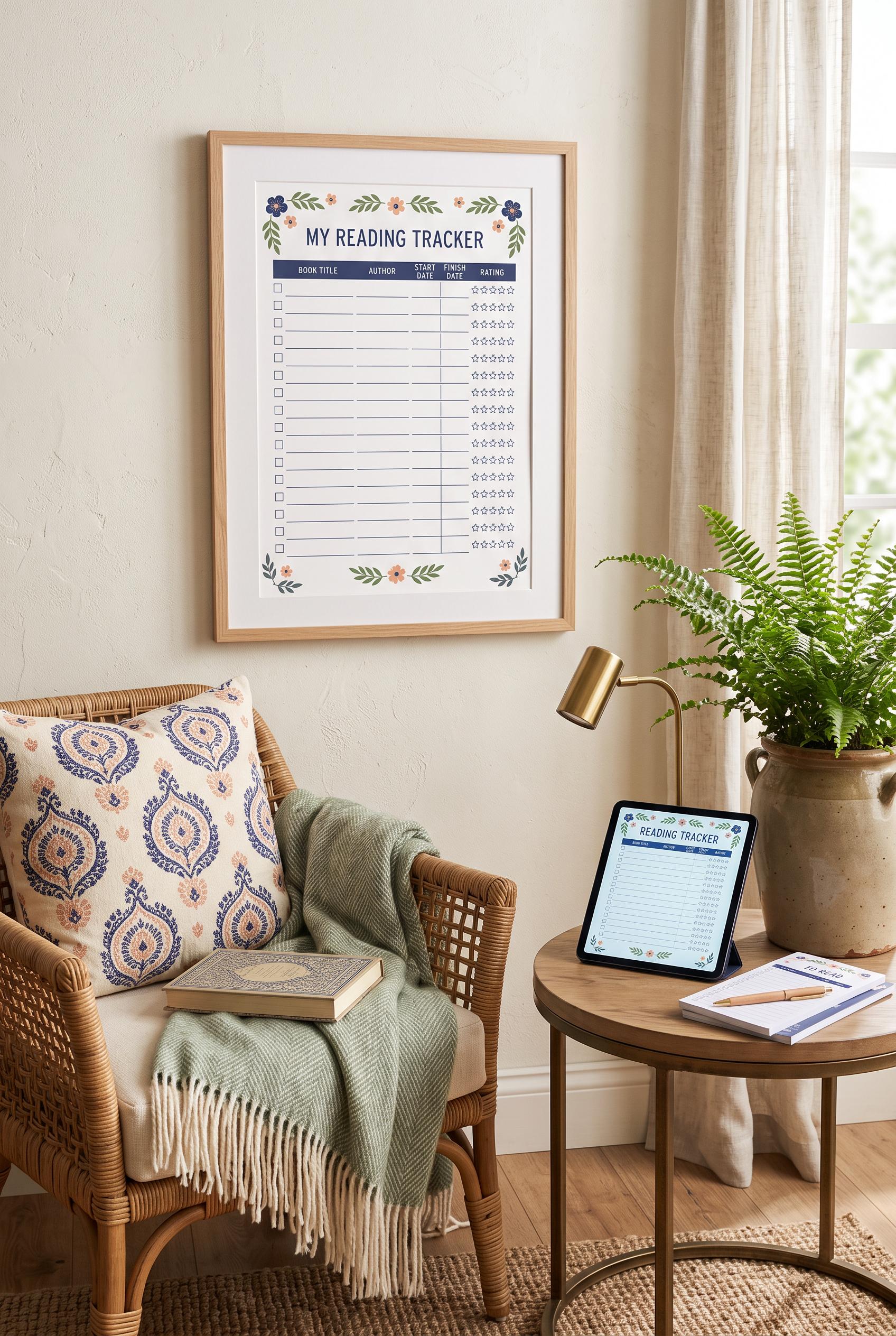
0Create a vertical 2:3 Pinterest composition with commercial-quality art direction showing an aspirational reading nook centered on a printable reading tracker: framed page on the wall, tablet preview on a side table, coordinated paper stack, woven chair, soft book light, and subtle botanical accents. Use indigo, peach, fern, and cream. No real brands, no trademarked characters, no watermark, and no unintended readable text. AI-modified downstream.
 0
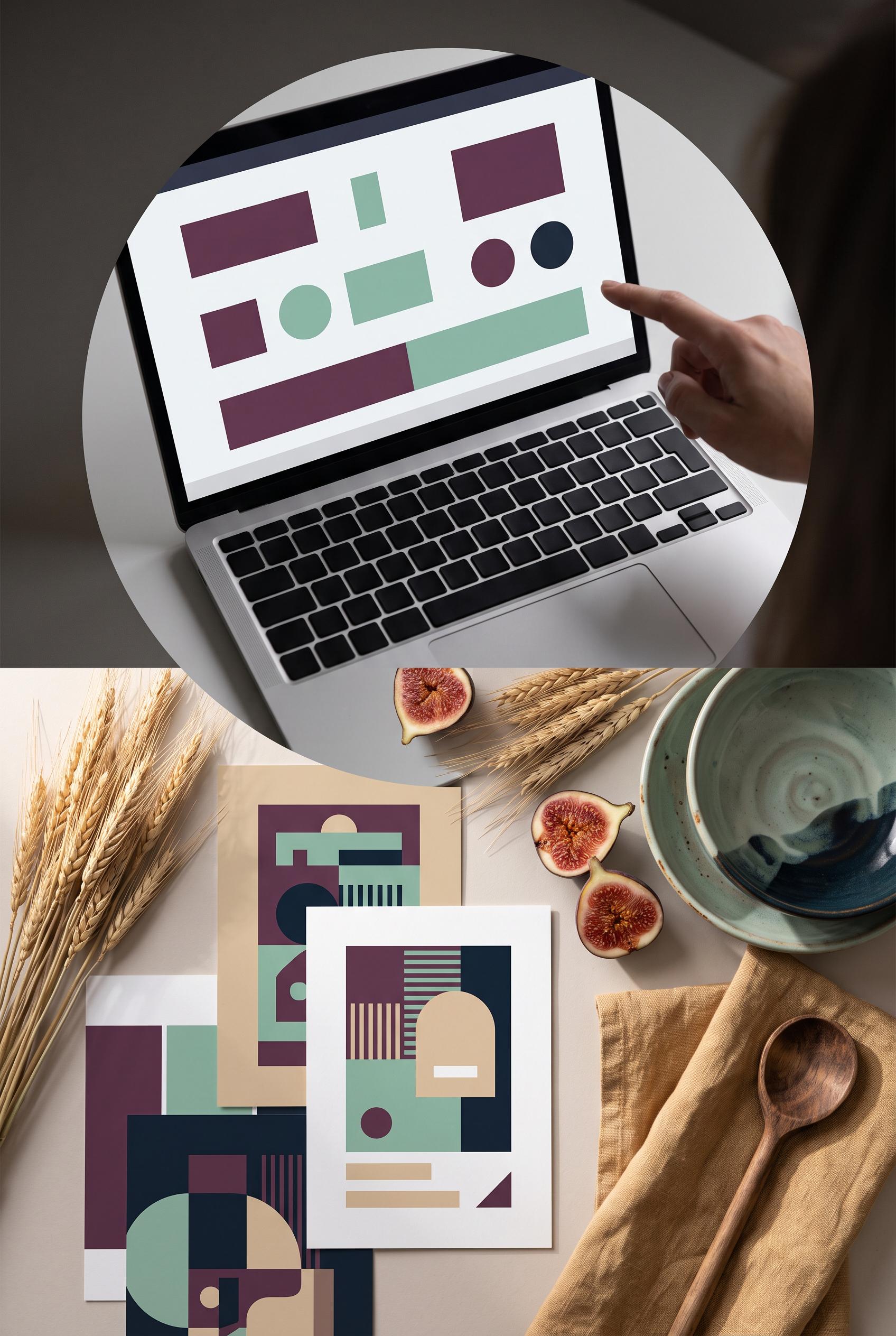
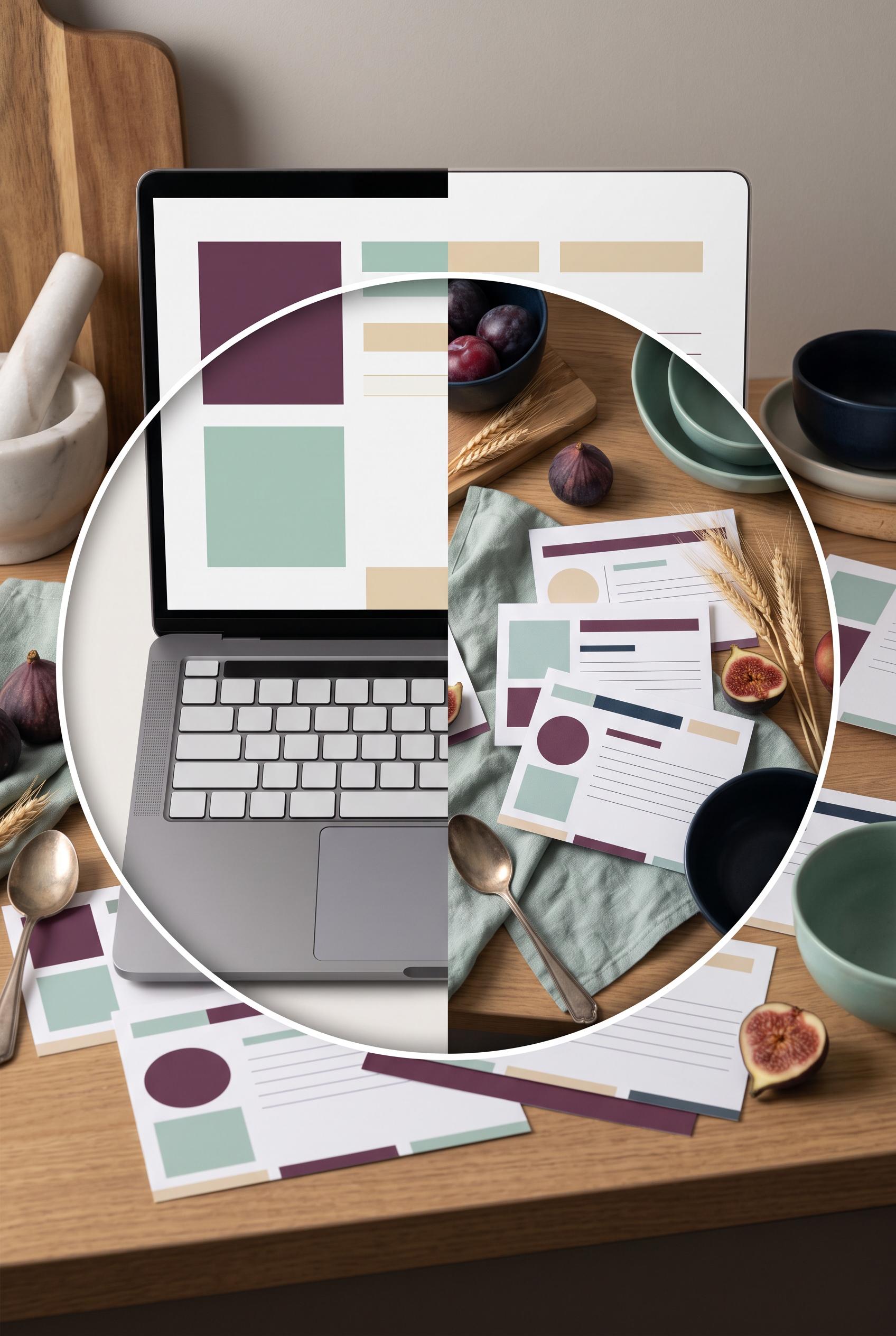
0Create a vertical 2:3 Pinterest composition with commercial-quality art direction showing a circular aperture before-and-after reveal: a plain editable recipe card file on a laptop transforms into printed recipe cards arranged in a refined kitchen scene with ingredients, linen, and a ceramic bowl. Use fig plum, seafoam, wheat, and deep ink. No real brands, no trademarked characters, no watermark, and no unintended readable text. AI-modified downstream. Corrective regeneration attempt 5. Produce a materially revised image, not a near-duplicate of an earlier variant. Preserve the successful subject, palette, lighting, focal hierarchy, and commercial polish from the original brief while correcting every issue below. Mandatory corrective instructions from the most recent visual QA: Preserve the vertical 2:3 composition, circular aperture, premium still-life lighting, fig plum/seafoam/wheat/deep-ink palette, laptop, linen, figs, wheat, spoon, bowls, and clear transformation. Remove all letter-like markings from every keyboard key; make keys completely blank and unmarked. Replace every thin repeated horizontal line on the printed cards and laptop screen with unmistakable broad geometric elements only: solid rectangles, broad color bars, circles, squares, and clean abstract blocks. Do not include any letters, numbers, words, labels, glyphs, logos, captions, handwriting, pseudo-text, or watermark anywhere. Observed defects from prior variants that must not recur: 1) Laptop keyboard keys contain visible letter-like markings, violating the requirement for no letters or readable glyphs anywhere. 2) Some printed-card decorative marks resemble pseudo-writing and should be made purely geometric and non-linguistic. 3) Strong premium vertical composition and clear laptop-to-styled-card transformation. 4) Printed cards contain repeated thin horizontal lines that resemble handwriting or pseudo-text, violating the requirement for purely geometric, non-linguistic marks. 5) Circular aperture and still-life styling are otherwise cohesive; no obvious brand or watermark is visible. 6) Strong vertical composition, premium lighting, palette, and clear laptop-to-printed-card transformation. 7) Laptop keyboard keys visibly contain letter-like markings. 8) Printed cards and laptop screen use repeated thin horizontal bars that resemble pseudo-text, contrary to the geometric-only requirement. Render no letters, words, numbers, prices, headings, labels, contact details, logos, glyphs, or pseudo-text anywhere. Use only blank surfaces, clean geometric marks, and non-linguistic placeholder shapes. Do not add explanatory captions, before/after labels, interface copy, or extra objects that the brief did not request. When a corrective instruction conflicts with a decorative detail, prioritize the corrective instruction.
 0
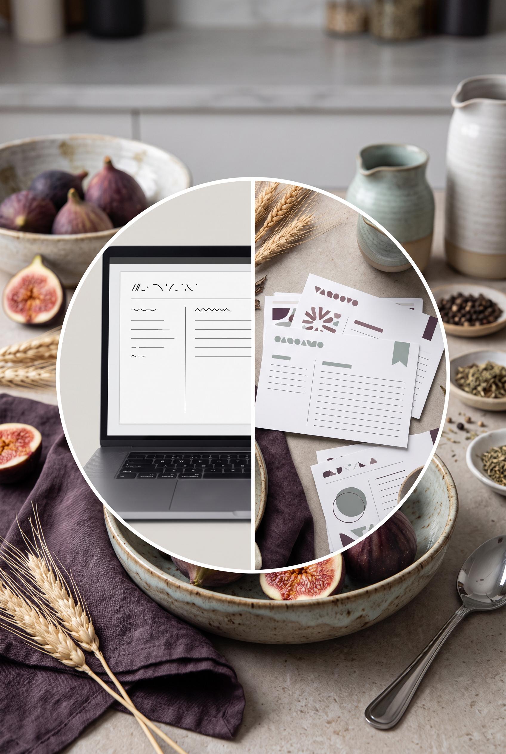
0Create a vertical 2:3 Pinterest composition with commercial-quality art direction showing a circular aperture before-and-after reveal: a plain editable recipe card file on a laptop transforms into printed recipe cards arranged in a refined kitchen scene with ingredients, linen, and a ceramic bowl. Use fig plum, seafoam, wheat, and deep ink. No real brands, no trademarked characters, no watermark, and no unintended readable text. AI-modified downstream. Corrective regeneration attempt 4. Produce a materially revised image, not a near-duplicate of an earlier variant. Preserve the successful subject, palette, lighting, focal hierarchy, and commercial polish from the original brief while correcting every issue below. Mandatory corrective instructions from the most recent visual QA: Preserve the strong vertical 2:3 composition, crisp circular aperture, premium lighting, fig plum/seafoam/wheat/deep-ink palette, laptop, linen, figs, wheat, spoon, bowls, and clear laptop-to-printed-card transformation. Remove every thin horizontal line and any other mark on every printed card that could resemble handwriting, text, or pseudo-writing. Replace all card details with only unmistakable geometric elements: solid rectangles, broad color bars, circles, squares, and clean abstract blocks with no repeated text-like line patterns. Keep the laptop screen limited to blank space and simple geometric color blocks, and keep every keyboard key completely blank and unmarked. Do not add any letters, numbers, words, labels, glyphs, logos, captions, or watermark. Observed defects from prior variants that must not recur: 1) Recipe-card text is visibly readable, including “Recipe Card Template,” “Ingredients,” and “Instructions,” contrary to the no-unintended-readable-text requirement. 2) Some tiny card text is garbled and artifact-like. 3) The vertical composition, circular aperture, styling, palette, and transformation concept are strong. 4) Laptop keyboard keys contain visible letter-like markings, violating the requirement for no letters or readable glyphs anywhere. 5) Some printed-card decorative marks resemble pseudo-writing and should be made purely geometric and non-linguistic. 6) Strong premium vertical composition and clear laptop-to-styled-card transformation. 7) Printed cards contain repeated thin horizontal lines that resemble handwriting or pseudo-text, violating the requirement for purely geometric, non-linguistic marks. 8) Circular aperture and still-life styling are otherwise cohesive; no obvious brand or watermark is visible. Render no letters, words, numbers, prices, headings, labels, contact details, logos, glyphs, or pseudo-text anywhere. Use only blank surfaces, clean geometric marks, and non-linguistic placeholder shapes. Do not add explanatory captions, before/after labels, interface copy, or extra objects that the brief did not request. When a corrective instruction conflicts with a decorative detail, prioritize the corrective instruction.
 0
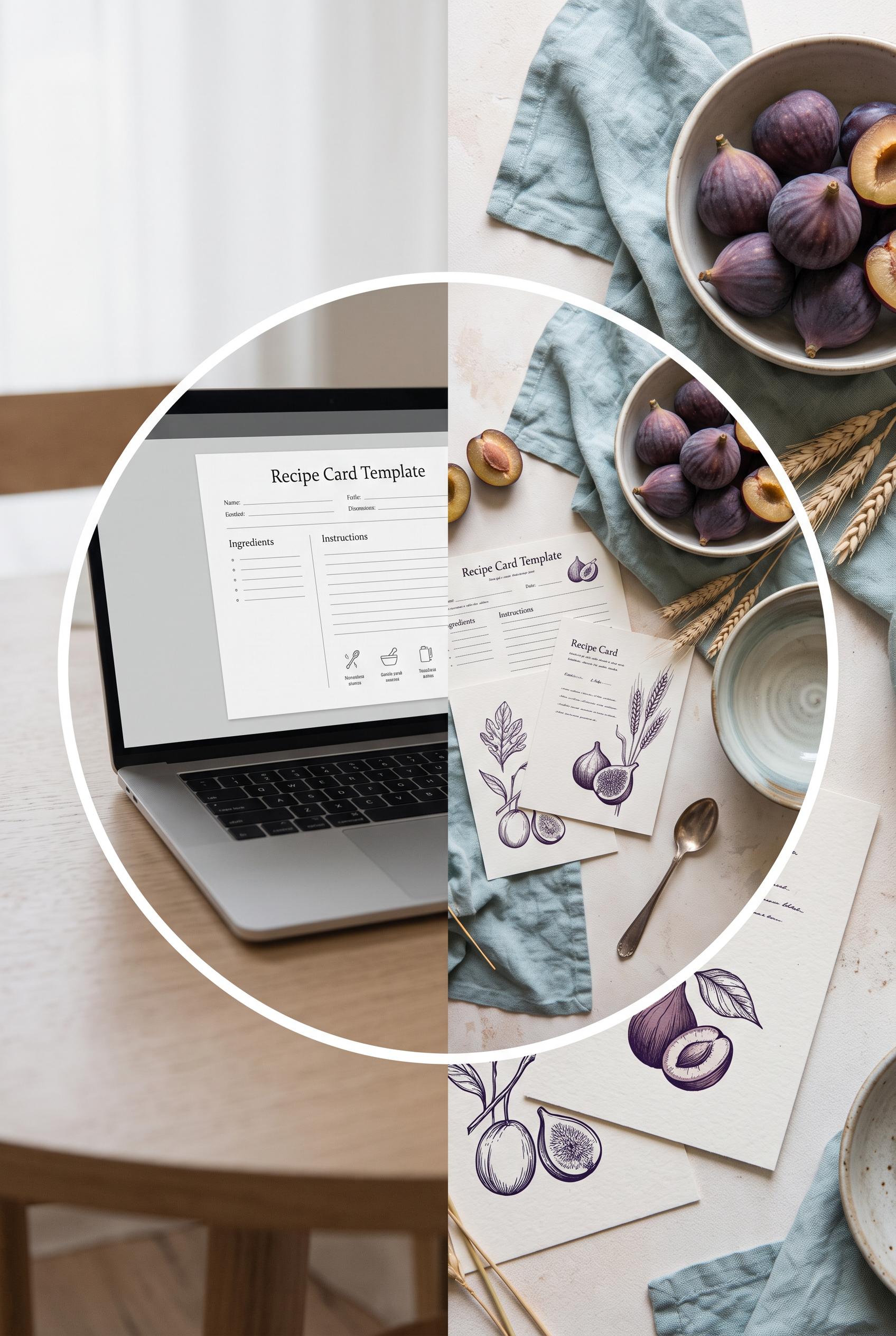
0Create a vertical 2:3 Pinterest composition with commercial-quality art direction showing a circular aperture before-and-after reveal: a plain editable recipe card file on a laptop transforms into printed recipe cards arranged in a refined kitchen scene with ingredients, linen, and a ceramic bowl. Use fig plum, seafoam, wheat, and deep ink. No real brands, no trademarked characters, no watermark, and no unintended readable text. AI-modified downstream. Corrective regeneration attempt 3. Produce a materially revised image, not a near-duplicate of an earlier variant. Preserve the successful subject, palette, lighting, focal hierarchy, and commercial polish from the original brief while correcting every issue below. Mandatory corrective instructions from the most recent visual QA: Preserve the strong vertical 2:3 composition, clean circular split aperture, premium still-life lighting, fig plum/seafoam/wheat/deep-ink palette, laptop-to-printed-card transformation, linen, figs, wheat, spoon, and ceramic bowls. Remove every letter, number, word, logo, glyph, heading, label, and pseudo-text mark from the entire image. Replace the laptop keyboard with completely blank, unmarked keys or an abstract keyboard surface; make the laptop screen entirely blank with only subtle non-linguistic geometric blocks if needed. Replace all card markings with simple geometric shapes, solid color bars, circles, and clean lines that cannot resemble handwriting or letters. Keep the aperture edge crisp and the cards naturally arranged in a polished commercial still life. Do not add captions, labels, or explanatory text. Observed defects from prior variants that must not recur: 1) Strong vertical composition, focal aperture, and cohesive premium styling. 2) Recipe-card text is visibly readable, including “Recipe Card Template,” “Ingredients,” and “Instructions,” contrary to the no-unintended-readable-text requirement. 3) Some tiny card text is garbled and artifact-like. 4) The vertical composition, circular aperture, styling, palette, and transformation concept are strong. 5) Laptop keyboard keys contain visible letter-like markings, violating the requirement for no letters or readable glyphs anywhere. 6) Some printed-card decorative marks resemble pseudo-writing and should be made purely geometric and non-linguistic. Render no letters, words, numbers, prices, headings, labels, contact details, logos, glyphs, or pseudo-text anywhere. Use only blank surfaces, clean geometric marks, and non-linguistic placeholder shapes. Do not add explanatory captions, before/after labels, interface copy, or extra objects that the brief did not request. When a corrective instruction conflicts with a decorative detail, prioritize the corrective instruction.
 0
0Create a vertical 2:3 Pinterest composition with commercial-quality art direction showing a circular aperture before-and-after reveal: a plain editable recipe card file on a laptop transforms into printed recipe cards arranged in a refined kitchen scene with ingredients, linen, and a ceramic bowl. Use fig plum, seafoam, wheat, and deep ink. No real brands, no trademarked characters, no watermark, and no unintended readable text. AI-modified downstream. Corrective regeneration attempt 2. Produce a materially revised image, not a near-duplicate of an earlier variant. Preserve the successful subject, palette, lighting, focal hierarchy, and commercial polish from the original brief while correcting every issue below. Mandatory corrective instructions from the most recent visual QA: Preserve the vertical 2:3 composition, circular split aperture, laptop-to-printed-card transformation, fig plum/seafoam/wheat/deep-ink palette, linen, figs, wheat, spoon, and ceramic bowls. Remove all readable text from every laptop and printed card: use only abstract blank lines, indistinct marks, or decorative non-letter forms, with no recognizable words, headings, labels, or pseudo-writing. Ensure no garbled text, logos, brands, watermarks, or trademarked imagery. Keep the aperture edge clean and the cards naturally arranged in a polished commercial still-life. Observed defects from prior variants that must not recur: 1) Strong vertical composition, focal aperture, and cohesive premium styling. 2) Recipe-card text is visibly readable, including “Recipe Card Template,” “Ingredients,” and “Instructions,” contrary to the no-unintended-readable-text requirement. 3) Some tiny card text is garbled and artifact-like. Render no letters, words, numbers, prices, headings, labels, contact details, logos, glyphs, or pseudo-text anywhere. Use only blank surfaces, clean geometric marks, and non-linguistic placeholder shapes. Do not add explanatory captions, before/after labels, interface copy, or extra objects that the brief did not request. When a corrective instruction conflicts with a decorative detail, prioritize the corrective instruction.
 0
0Create a vertical 2:3 Pinterest composition with commercial-quality art direction showing a circular aperture before-and-after reveal: a plain editable recipe card file on a laptop transforms into printed recipe cards arranged in a refined kitchen scene with ingredients, linen, and a ceramic bowl. Use fig plum, seafoam, wheat, and deep ink. No real brands, no trademarked characters, no watermark, and no unintended readable text. AI-modified downstream.
 0
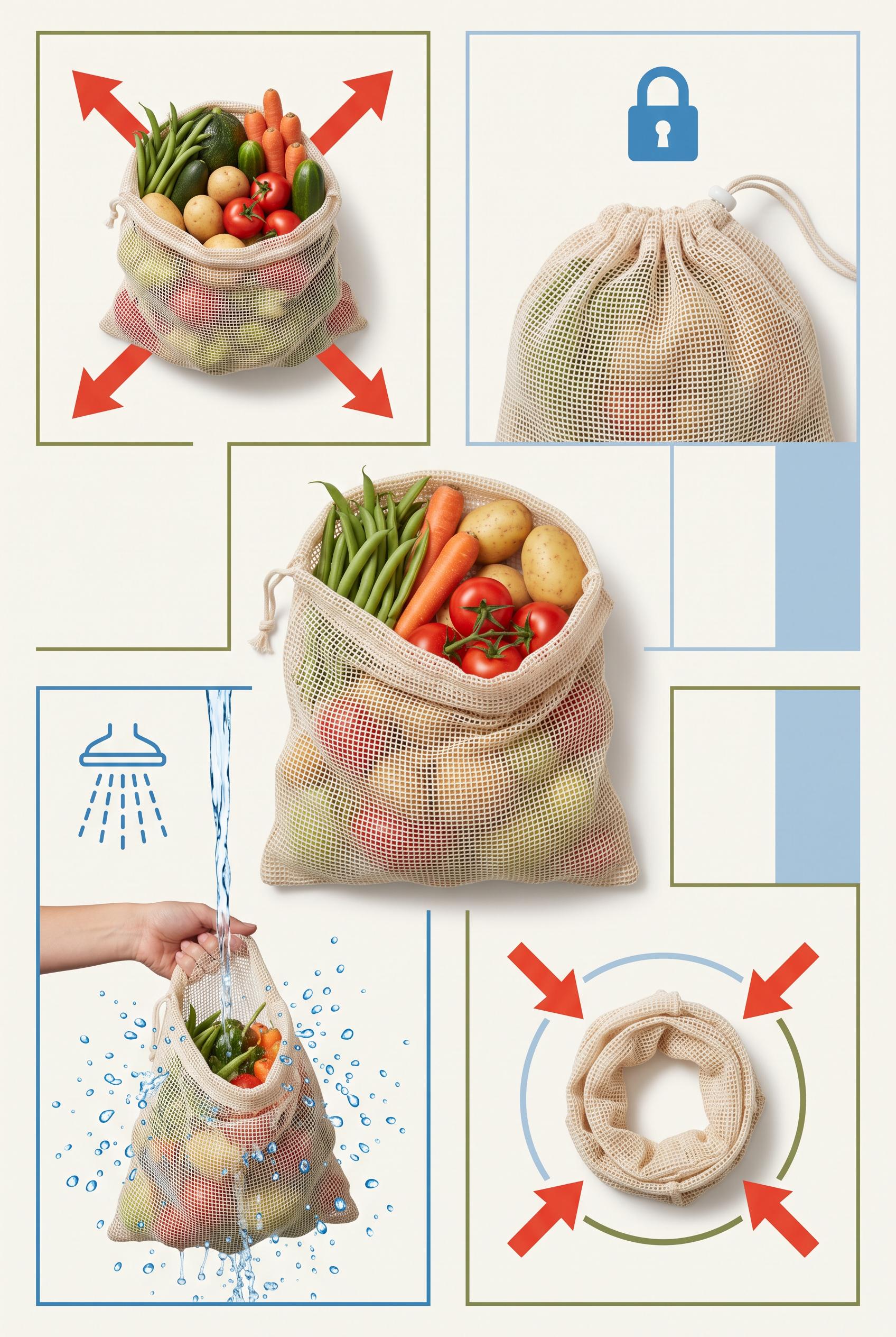
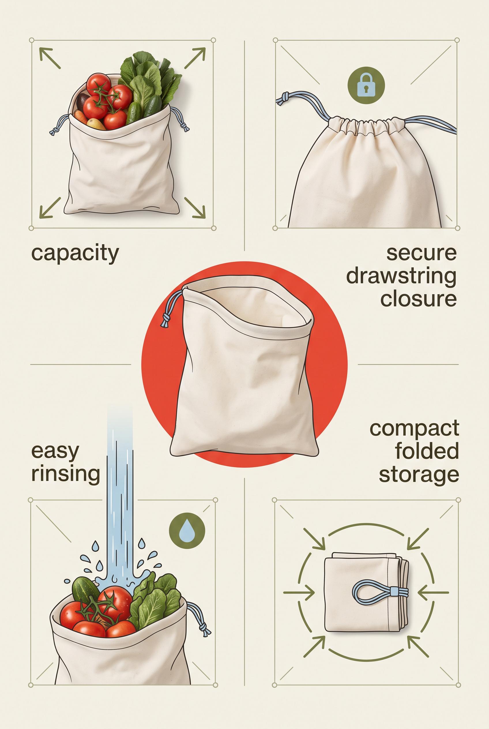
0Create a commercial-quality educational product campaign in a vertical 2:3 Pinterest composition. Arrange one unbranded reusable produce bag at the center with four surrounding visual proof scenes showing capacity with vegetables, a secure drawstring closure, easy rinsing, and compact folded storage. Use tomato red, powder blue, olive green, and bone, crisp overhead photography mixed with subtle diagrammatic framing, no real brands, no trademarked characters, no watermark, and no unintended readable text. Corrective regeneration attempt 3. Produce a materially revised image, not a near-duplicate of an earlier variant. Preserve the successful subject, palette, lighting, focal hierarchy, and commercial polish from the original brief while correcting every issue below. Mandatory corrective instructions from the most recent visual QA: Preserve the attractive vertical 2:3 layout, bone background, tomato red/powder blue/olive palette, central unbranded reusable produce bag, clean four-panel grid, lighting, and polished illustration/photo hybrid style. Remove all readable text and lettering everywhere, including the visible capacity, secure drawstring closure, easy rinsing, and compact folded storage labels. Do not replace them with pseudo-text, numbers, logos, glyphs, or symbols resembling letters. Use only non-linguistic visual cues: four outward arrows around the vegetable-filled bag, a simple lock or cinch icon above the closed bag, blue water droplets and a rinse stream around the washed bag, and inward arrows circling the compact folded loop. Keep panels visually distinct, retain strong scale contrast and a clear promise-to-evidence flow, and ensure there are no watermarks, brands, trademarks, or generation artifacts. Observed defects from prior variants that must not recur: 1) The composition is attractive and clearly organized, but it contains extensive readable labels and headline text, contrary to the brief's requirement for visual cues without words. 2) The text is not garbled, but it is still an unintended mismatch with the requested text-free educational design. 3) Prominent readable labels appear throughout the composition, violating the text-free requirement. 4) The visual hierarchy is weakened by oversized text competing with the central hero bag. 5) The image otherwise has a strong vertical composition, clean grid, suitable palette, clear product focus, and distinct proof scenes. Render no letters, words, numbers, prices, headings, labels, contact details, logos, glyphs, or pseudo-text anywhere. Use only blank surfaces, clean geometric marks, and non-linguistic placeholder shapes. Do not add explanatory captions, before/after labels, interface copy, or extra objects that the brief did not request. When a corrective instruction conflicts with a decorative detail, prioritize the corrective instruction.
 0
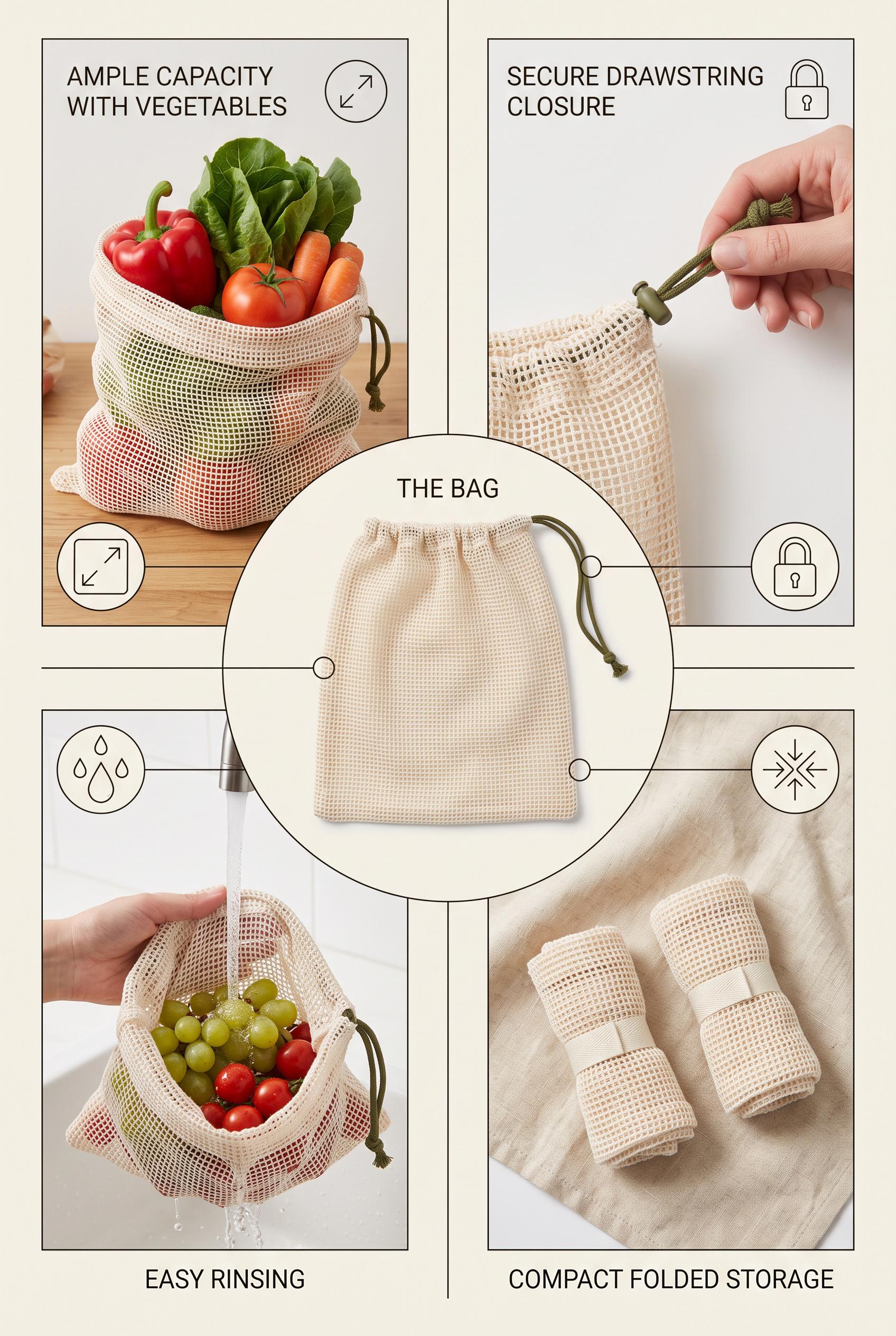
0Create a commercial-quality educational product campaign in a vertical 2:3 Pinterest composition. Arrange one unbranded reusable produce bag at the center with four surrounding visual proof scenes showing capacity with vegetables, a secure drawstring closure, easy rinsing, and compact folded storage. Use tomato red, powder blue, olive green, and bone, crisp overhead photography mixed with subtle diagrammatic framing, no real brands, no trademarked characters, no watermark, and no unintended readable text. Corrective regeneration attempt 2. Produce a materially revised image, not a near-duplicate of an earlier variant. Preserve the successful subject, palette, lighting, focal hierarchy, and commercial polish from the original brief while correcting every issue below. Mandatory corrective instructions from the most recent visual QA: Preserve the vertical 2:3 layout, clean grid, bone background, tomato red/powder blue/olive palette, central hero reusable produce bag, and four surrounding proof scenes. Remove every readable word and letter, including “AMPLE CAPACITY WITH VEGETABLES,” “SECURE DRAWSTRING CLOSURE,” “THE BAG,” “EASY RINSING,” and “COMPACT FOLDED STORAGE.” Replace all labels with simple non-text visual icons and shape cues only: expansion arrows for capacity, a lock or cinch icon for closure, water droplets for rinsing, and inward arrows around a compact folded loop for storage. Keep the scenes visually distinct, unbranded, watermark-free, and free of any other readable text. Observed defects from prior variants that must not recur: 1) The composition is attractive and clearly organized, but it contains extensive readable labels and headline text, contrary to the brief's requirement for visual cues without words. 2) The text is not garbled, but it is still an unintended mismatch with the requested text-free educational design. Render no letters, words, numbers, prices, headings, labels, contact details, logos, glyphs, or pseudo-text anywhere. Use only blank surfaces, clean geometric marks, and non-linguistic placeholder shapes. Do not add explanatory captions, before/after labels, interface copy, or extra objects that the brief did not request. When a corrective instruction conflicts with a decorative detail, prioritize the corrective instruction.
 0
0Create a commercial-quality educational product campaign in a vertical 2:3 Pinterest composition. Arrange one unbranded reusable produce bag at the center with four surrounding visual proof scenes showing capacity with vegetables, a secure drawstring closure, easy rinsing, and compact folded storage. Use tomato red, powder blue, olive green, and bone, crisp overhead photography mixed with subtle diagrammatic framing, no real brands, no trademarked characters, no watermark, and no unintended readable text.
 0
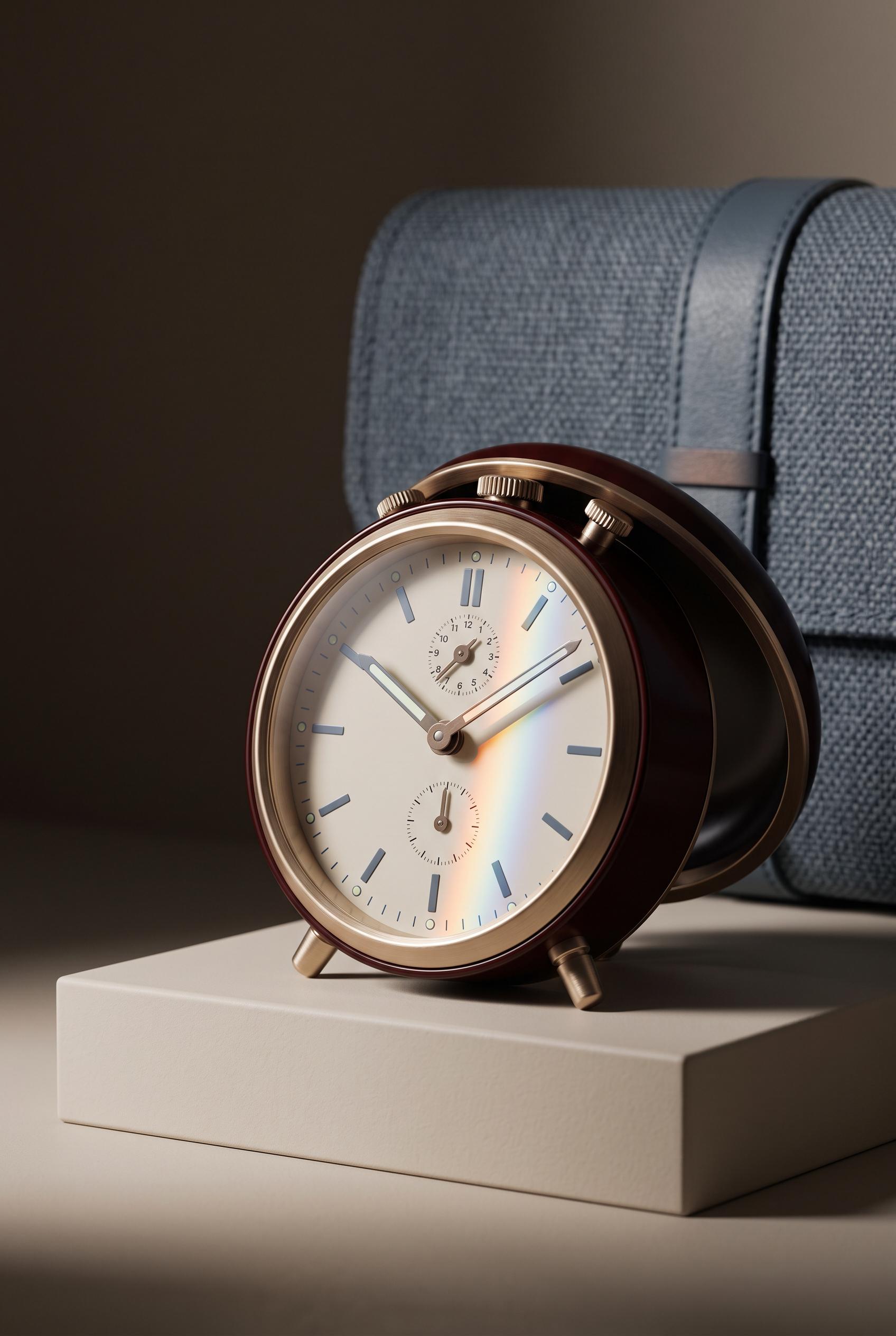
0Create a commercial-quality inspirational product showcase in a vertical 2:3 Pinterest composition. Feature an unbranded analog travel alarm clock on a low cream plinth, hinged cover slightly open, soft woven case in the background, and a narrow prism of colored light crossing the face. Use oxblood, champagne metal, blue-grey, and cream, elegant editorial photography, controlled shadows, refined material detail, no real brands, no trademarked characters, no watermark, and no unintended readable text.
 0
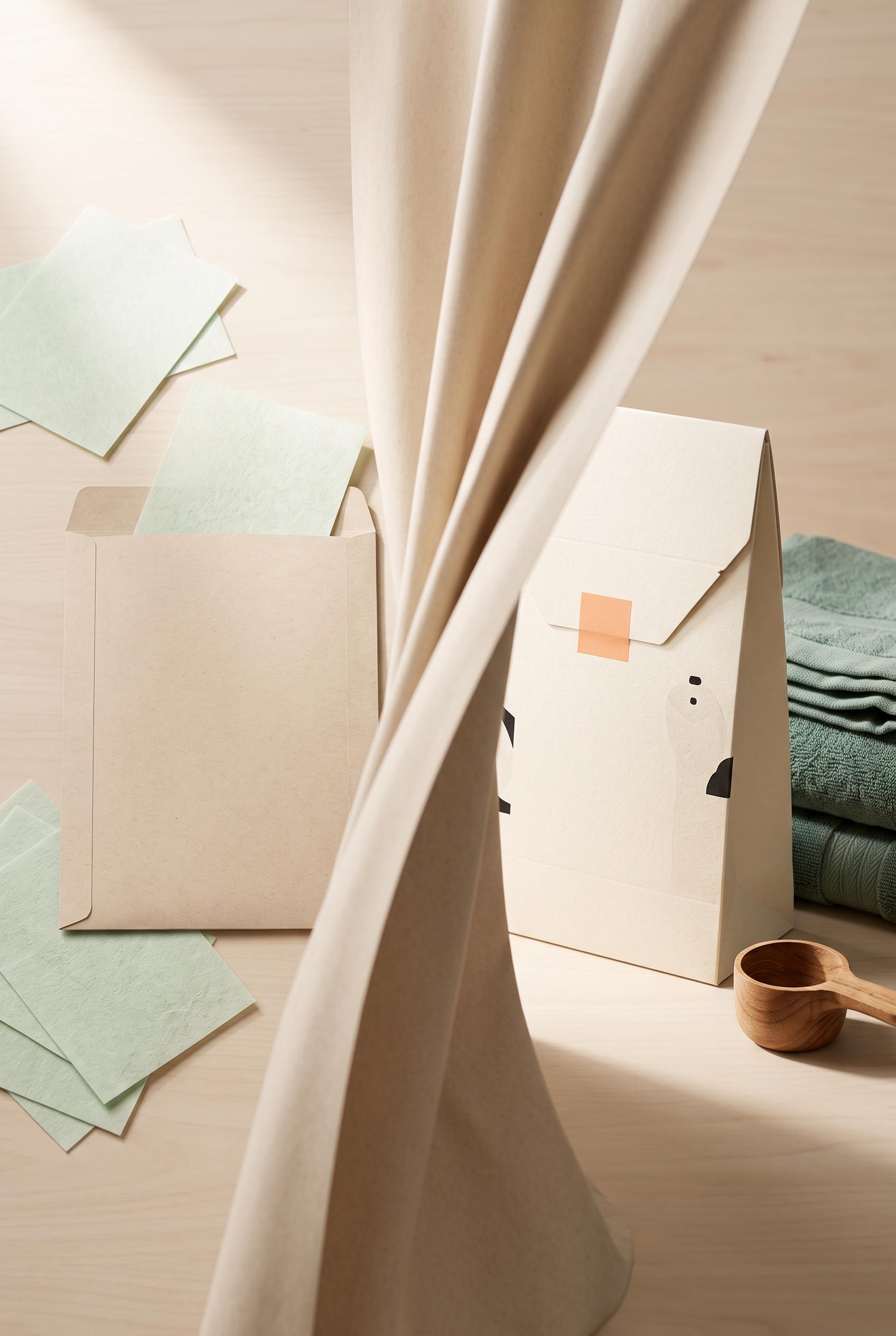
0Create a commercial-quality product packaging scene in a vertical 2:3 Pinterest composition. Show a tactile curtain reveal from a flat unbranded laundry sheet refill envelope with loose sheets into a refined upright package beside folded towels and a small scoop. Use ink black, celadon green, apricot, and unbleached paper, soft studio light, realistic paper grain, crisp die-cut edges, premium art direction, no real brands, no trademarked characters, no watermark, and no unintended readable text. Corrective regeneration attempt 2. Produce a materially revised image, not a near-duplicate of an earlier variant. Preserve the successful subject, palette, lighting, focal hierarchy, and commercial polish from the original brief while correcting every issue below. Mandatory corrective instructions from the most recent visual QA: Preserve the warm premium studio styling, vertical 2:3 framing, paper grain, realistic shadows, folded towels, and wooden scoop. Rebuild the left side as a genuinely flat, unbranded refill envelope lying on the surface with several loose laundry sheets scattered nearby; use only blank paper surfaces with no letters, symbols, logos, icons, or pseudo-text. Add a clearly visible soft unbleached-paper curtain reveal sweeping through the center toward the right. On the right, show one refined upright unbranded package beside the neatly folded towel and small measuring scoop, with crisp die-cut edges and dimensional shadow. Keep all package and sheet surfaces completely free of readable or garbled text and remove the illustrated curtain print from the packaging. Observed defects from prior variants that must not recur: 1) Contains extensive readable packaging copy despite the no-readable-copy requirement. 2) Left-side package is not plain or flat; it is an upright decorated package rather than a flat refill envelope with scattered sheets. 3) The intended soft paper curtain reveal is not clearly depicted; the curtain graphic is printed on the package instead. 4) Composition and styling are attractive, with good paper texture, towels, scoop, lighting, and vertical framing. Render no letters, words, numbers, prices, headings, labels, contact details, logos, glyphs, or pseudo-text anywhere. Use only blank surfaces, clean geometric marks, and non-linguistic placeholder shapes. Do not add explanatory captions, before/after labels, interface copy, or extra objects that the brief did not request. When a corrective instruction conflicts with a decorative detail, prioritize the corrective instruction.
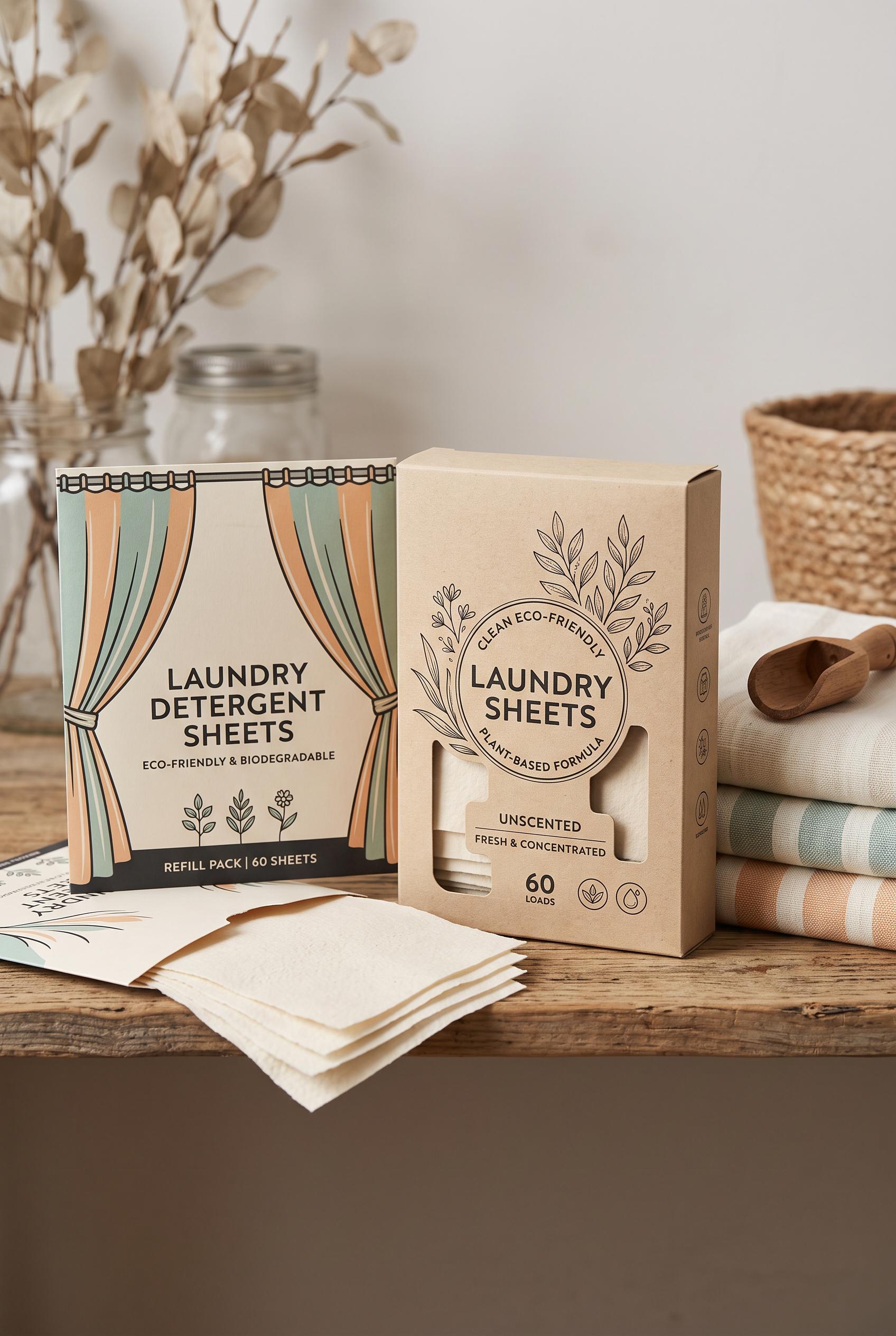 0
0Create a commercial-quality product packaging scene in a vertical 2:3 Pinterest composition. Show a tactile curtain reveal from a flat unbranded laundry sheet refill envelope with loose sheets into a refined upright package beside folded towels and a small scoop. Use ink black, celadon green, apricot, and unbleached paper, soft studio light, realistic paper grain, crisp die-cut edges, premium art direction, no real brands, no trademarked characters, no watermark, and no unintended readable text.
 0
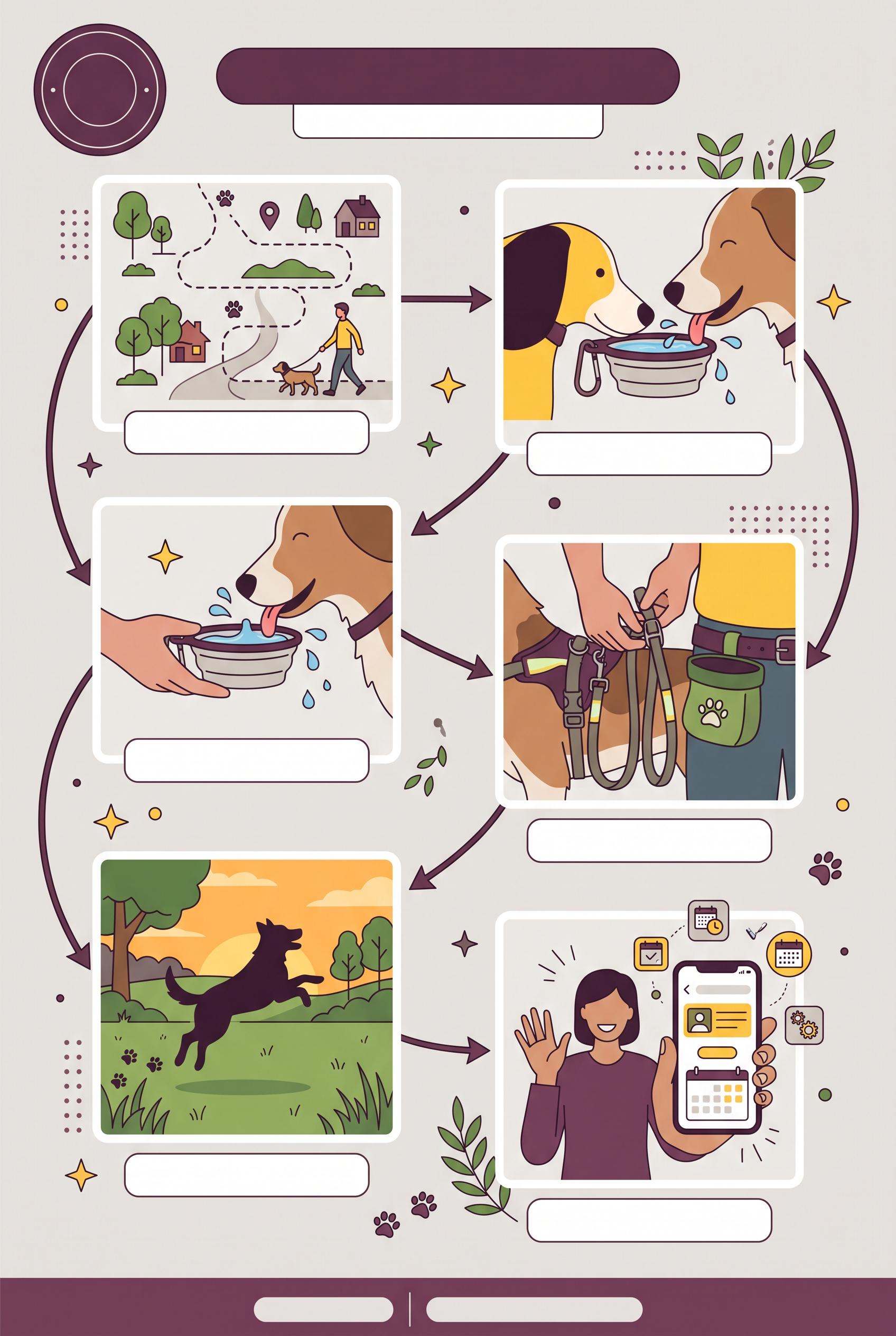
0Create a commercial-quality AI-modified downstream Pinterest image in a vertical 2:3 composition for an independent dog-walking service. Use a circular day-planner path connecting five distinct photo tiles: neighborhood route, water break, safety detail, happy dog silhouette, and friendly booking gesture, plum, sunflower yellow, leafy green, and warm gray palette, clean editorial infographic styling, blank label areas with no readable text, no real brands, no trademarked characters, no watermark, no unintended readable text.
 0
0Create a commercial-quality AI-modified downstream Pinterest image in a vertical 2:3 composition for an independent furniture restoration studio. Show one beautifully restored vintage cabinet in a sunlit editorial room, surrounded by four floating framed visual moments of worn wood, hand repair, texture, and styled home placement, cobalt blue, tan, clay, and cream palette, cinematic natural light, refined campaign art direction, no real brands, no trademarked characters, no watermark, no unintended readable text. Corrective regeneration attempt 2. Produce a materially revised image, not a near-duplicate of an earlier variant. Preserve the successful subject, palette, lighting, focal hierarchy, and commercial polish from the original brief while correcting every issue below. Mandatory corrective instructions from the most recent visual QA: Preserve the existing composition, cabinet styling, sunlit editorial room, four framed moments, palette, and cinematic natural light. Remove all lettering, symbols, and markings from the book spines and replace them with completely blank, texture-only spines. Ensure there is no readable or garbled text anywhere in the image, with no other changes. Observed defects from prior variants that must not recur: 1) Strong vertical composition, clear cabinet focal point, and all four requested visual moments are present. 2) Tiny malformed/readable-looking text appears on the book spines, violating the no unintended readable text requirement. Render no letters, words, numbers, prices, headings, labels, contact details, logos, glyphs, or pseudo-text anywhere. Use only blank surfaces, clean geometric marks, and non-linguistic placeholder shapes. Do not add explanatory captions, before/after labels, interface copy, or extra objects that the brief did not request. When a corrective instruction conflicts with a decorative detail, prioritize the corrective instruction.
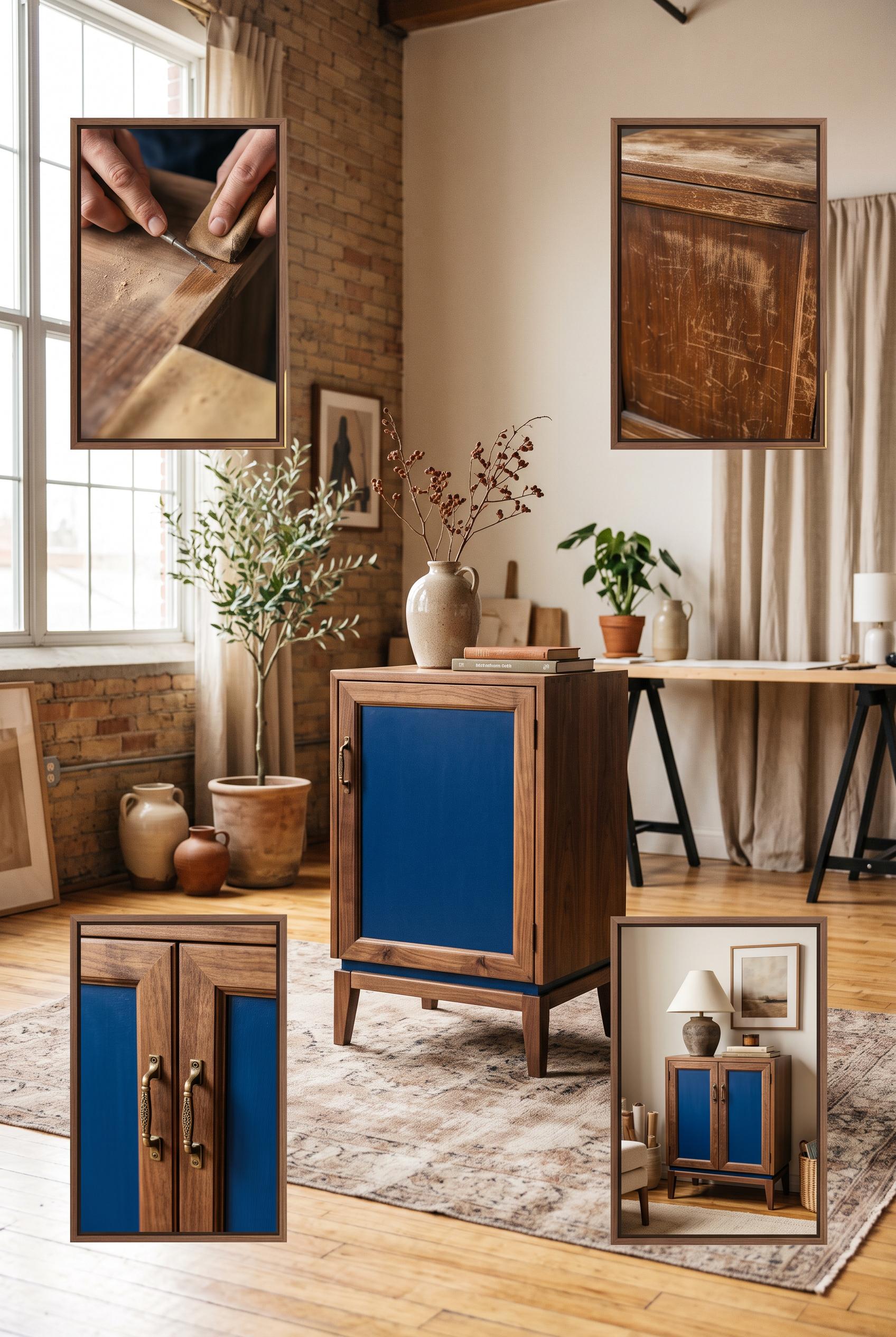 0
0Create a commercial-quality AI-modified downstream Pinterest image in a vertical 2:3 composition for an independent furniture restoration studio. Show one beautifully restored vintage cabinet in a sunlit editorial room, surrounded by four floating framed visual moments of worn wood, hand repair, texture, and styled home placement, cobalt blue, tan, clay, and cream palette, cinematic natural light, refined campaign art direction, no real brands, no trademarked characters, no watermark, no unintended readable text.
 0
0Create a commercial-quality AI-modified downstream Pinterest image in a vertical 2:3 composition for a neighborhood meal-prep service. Use an overhead tabletop scene with rotating translucent reveal panels, scattered generic menu cards transforming into one elegant meal box and pickup cue, tomato red, oatmeal, muted blue, and charcoal palette, tactile paper and food photography, premium small-business advertising art direction, no real brands, no trademarked characters, no watermark, no unintended readable text. Corrective regeneration attempt 2. Produce a materially revised image, not a near-duplicate of an earlier variant. Preserve the successful subject, palette, lighting, focal hierarchy, and commercial polish from the original brief while correcting every issue below. Mandatory corrective instructions from the most recent visual QA: Preserve the attractive overhead tabletop, vertical 2:3 framing, tomato-red/oatmeal/muted-blue/charcoal palette, realistic food photography, translucent reveal panels, and central meal box. Remove all readable lettering, logos, business names, seals, receipts, handwriting, menu titles, and labels. Replace every card and note with blank tactile paper or abstract non-text marks. Make the central hero a single elegant meal box with one prominent blank pickup cue card or simple non-linguistic calendar/checkmark icon, clearly communicating one weekly pickup promise without words. Reduce the number of competing objects and keep the meal box and pickup cue as the unmistakable focal point. Ensure there are no brand-like emblems, watermarks, garbled characters, or pseudo-text. Observed defects from prior variants that must not recur: 1) The image contains extensive unintended readable/generated text across the central panel, menu cards, package seal, pickup note, and receipt. 2) The package seal creates a brand-like identity with readable business wording, conflicting with the no-brand requirement. 3) The focal message does not clearly center on one weekly pickup promise; the composition is visually busy with multiple competing cards and documents. 4) The receipt and small notes contain visibly malformed or nonsensical text, failing the no-garbled-text requirement. Render no letters, words, numbers, prices, headings, labels, contact details, logos, glyphs, or pseudo-text anywhere. Use only blank surfaces, clean geometric marks, and non-linguistic placeholder shapes. Do not add explanatory captions, before/after labels, interface copy, or extra objects that the brief did not request. When a corrective instruction conflicts with a decorative detail, prioritize the corrective instruction.
 0
0Create a commercial-quality AI-modified downstream Pinterest image in a vertical 2:3 composition for a neighborhood meal-prep service. Use an overhead tabletop scene with rotating translucent reveal panels, scattered generic menu cards transforming into one elegant meal box and pickup cue, tomato red, oatmeal, muted blue, and charcoal palette, tactile paper and food photography, premium small-business advertising art direction, no real brands, no trademarked characters, no watermark, no unintended readable text.
 0
0Create a commercial-quality vertical 2:3 Pinterest composition for an educational creator campaign planner. Feature a large rotating diagnostic wheel divided into four abstract sections representing problem, process, evidence, and invitation, surrounded by four coordinated content cards. Use cobalt blue, clay orange, acid lime, and warm cream. Dynamic overhead studio layout, precise paper cutouts, clear visual sequencing, AI-modified downstream. No real brands, no trademarked characters, no watermark, and no unintended readable text.
 0
0Create a commercial-quality vertical 2:3 Pinterest composition showcasing an inspirational personal brand identity for a fictional science communicator. Arrange a portrait card, abstract diagram sheet, notebook, presentation badge, and social cover on staggered museum plinths with subtle cast shadows. Use ink black, soft lilac, brushed silver, and apricot. Refined editorial art direction, tactile print details, modular orbital motifs, AI-modified downstream. No real brands, no trademarked characters, no watermark, and no unintended readable text. Corrective regeneration attempt 4. Produce a materially revised image, not a near-duplicate of an earlier variant. Preserve the successful subject, palette, lighting, focal hierarchy, and commercial polish from the original brief while correcting every issue below. Mandatory corrective instructions from the most recent visual QA: Preserve the polished vertical museum still life, portrait focal point, staggered plinths, lighting, tactile print texture, and ink black, lilac, brushed silver, and apricot palette. Replace every letter-like or logo-like form on the upper diagram sheet with clearly non-linguistic orbital arcs, concentric circles, dots, short rectangular bars, and modular geometric blocks; eliminate any shapes that resemble lowercase letters or typography. Simplify the notebook embossing into disconnected abstract circles and orbital arcs with no monogram-like silhouette. Keep the portrait card, badge, social cover, notebook, and pen completely text-free, with no words, numbers, glyphs, signatures, logos, icons, or pseudo-text anywhere. Observed defects from prior variants that must not recur: 1) Social cover includes recognizable social-media-style icons and the presentation badge includes templated identity text, conflicting with the no-brand/no-readable-copy requirement. 2) Attractive vertical museum-style composition with strong portrait focal point, cohesive palette, plinths, shadows, and requested identity objects. 3) Notebook contains clearly readable-looking pseudo-text and letter-like marks. 4) Pen includes a vertical brand-like text mark. 5) Some badge and notebook marks resemble templated identity copy rather than purely abstract non-linguistic geometry. 6) Strong vertical composition, focal portrait, plinth arrangement, palette, lighting, and object coverage are successful. 7) The upper diagram sheet contains prominent letter-like forms resembling lowercase typography, violating the no-letters/no-pseudo-text requirement. 8) The notebook embossing and some diagram marks could read as a logo-like identity symbol rather than purely non-linguistic geometry. Render no letters, words, numbers, prices, headings, labels, contact details, logos, glyphs, or pseudo-text anywhere. Use only blank surfaces, clean geometric marks, and non-linguistic placeholder shapes. Do not add explanatory captions, before/after labels, interface copy, or extra objects that the brief did not request. When a corrective instruction conflicts with a decorative detail, prioritize the corrective instruction.
 0
0Create a commercial-quality vertical 2:3 Pinterest composition showcasing an inspirational personal brand identity for a fictional science communicator. Arrange a portrait card, abstract diagram sheet, notebook, presentation badge, and social cover on staggered museum plinths with subtle cast shadows. Use ink black, soft lilac, brushed silver, and apricot. Refined editorial art direction, tactile print details, modular orbital motifs, AI-modified downstream. No real brands, no trademarked characters, no watermark, and no unintended readable text. Corrective regeneration attempt 3. Produce a materially revised image, not a near-duplicate of an earlier variant. Preserve the successful subject, palette, lighting, focal hierarchy, and commercial polish from the original brief while correcting every issue below. Mandatory corrective instructions from the most recent visual QA: Preserve the vertical 2:3 museum still life, portrait focal point, staggered plinths, lighting, tactile print texture, orbital motifs, and ink black, lilac, silver, and apricot palette. Remove all letter-like marks, pseudo-text, words, numbers, signatures, logos, and brand-like symbols from the notebook, pen, badge, portrait card, diagram sheet, and social cover. Replace every such area with clean blank space or unmistakably non-linguistic circles, dots, bars, orbital arcs, and geometric blocks. Ensure the notebook cover and pen are completely text-free, and make all object surfaces clean and artifact-free. Observed defects from prior variants that must not recur: 1) Strong vertical museum-style composition with clear focal portrait and cohesive palette. 2) Multiple objects contain prominent readable but nonsensical or unintended text, including the portrait card, diagram sheet, notebook, badge, and social cover. 3) Social cover includes recognizable social-media-style icons and the presentation badge includes templated identity text, conflicting with the no-brand/no-readable-copy requirement. 4) Attractive vertical museum-style composition with strong portrait focal point, cohesive palette, plinths, shadows, and requested identity objects. 5) Notebook contains clearly readable-looking pseudo-text and letter-like marks. 6) Pen includes a vertical brand-like text mark. 7) Some badge and notebook marks resemble templated identity copy rather than purely abstract non-linguistic geometry. Render no letters, words, numbers, prices, headings, labels, contact details, logos, glyphs, or pseudo-text anywhere. Use only blank surfaces, clean geometric marks, and non-linguistic placeholder shapes. Do not add explanatory captions, before/after labels, interface copy, or extra objects that the brief did not request. When a corrective instruction conflicts with a decorative detail, prioritize the corrective instruction.
关于我们的 AI 图片图库
我们的 AI 图片图库展示了社区创作的数千张共享 AI 生成图片。每张图片都独一无二、质量上乘,体现了 AI 艺术生成的创意可能性。浏览各种风格、主题和类型,为你的下一个创意项目获取灵感。
为什么探索我们的图库?
- 发现跨多种风格和主题的数千张独特 AI 生成图片
- 从创意提示和艺术风格中获取灵感
- 查看创意社区分享的图片
- 点击任意图片查看其分享页面并获取更多详情
如何使用图库
使用我们的图库简单直观:
- 浏览共享图片网格
- 点击任何吸引你的图片
- 在专用分享页面查看完整图片详情和分享链接
准备好创建你自己的 AI 图片了吗?
加入数千名使用 AI Media Studio 生成精美图片的创作者。今天就开始创作!