AI 图片图库
发现来自创意社区的 1720+ 张共享 AI 生成图片
所有共享图片
显示 1720 张中的 48 张共享图片
 0
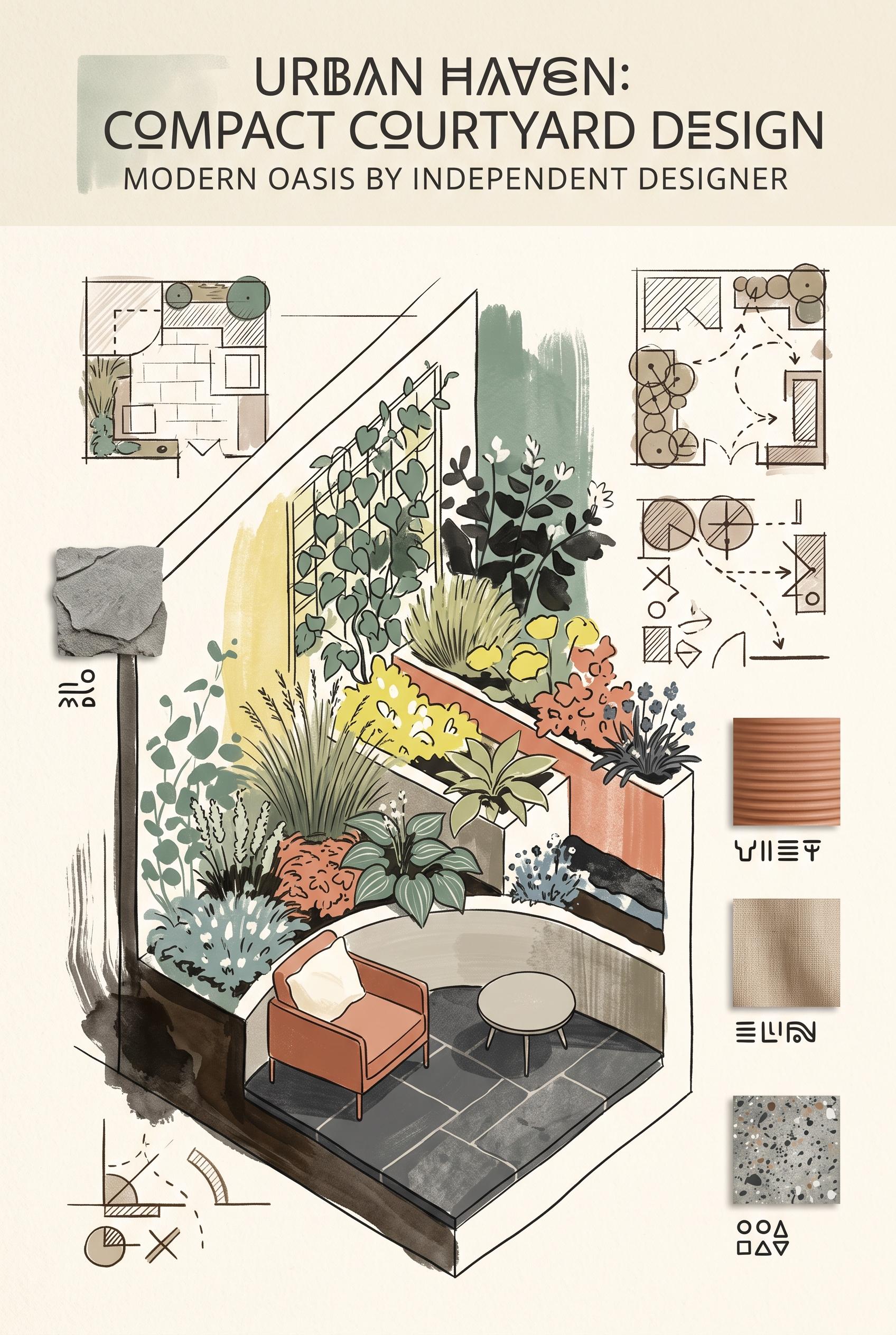
Create a commercial-quality art-directed Pinterest showcase in a vertical 2:3 composition for an independent landscape designer. Present a compact courtyard garden as a vertical cutaway editorial scene with layered planting beds, textured stone, a small seating nook, hand-drawn plan fragments, and floating material swatches. Use eucalyptus green, terracotta, lemon yellow, charcoal, and soft ivory. Any diagrams must be abstract and contain no legible words or numbers. AI-modified downstream asset, no real brands, no trademarked characters, no watermark, no unintended readable text.
 0
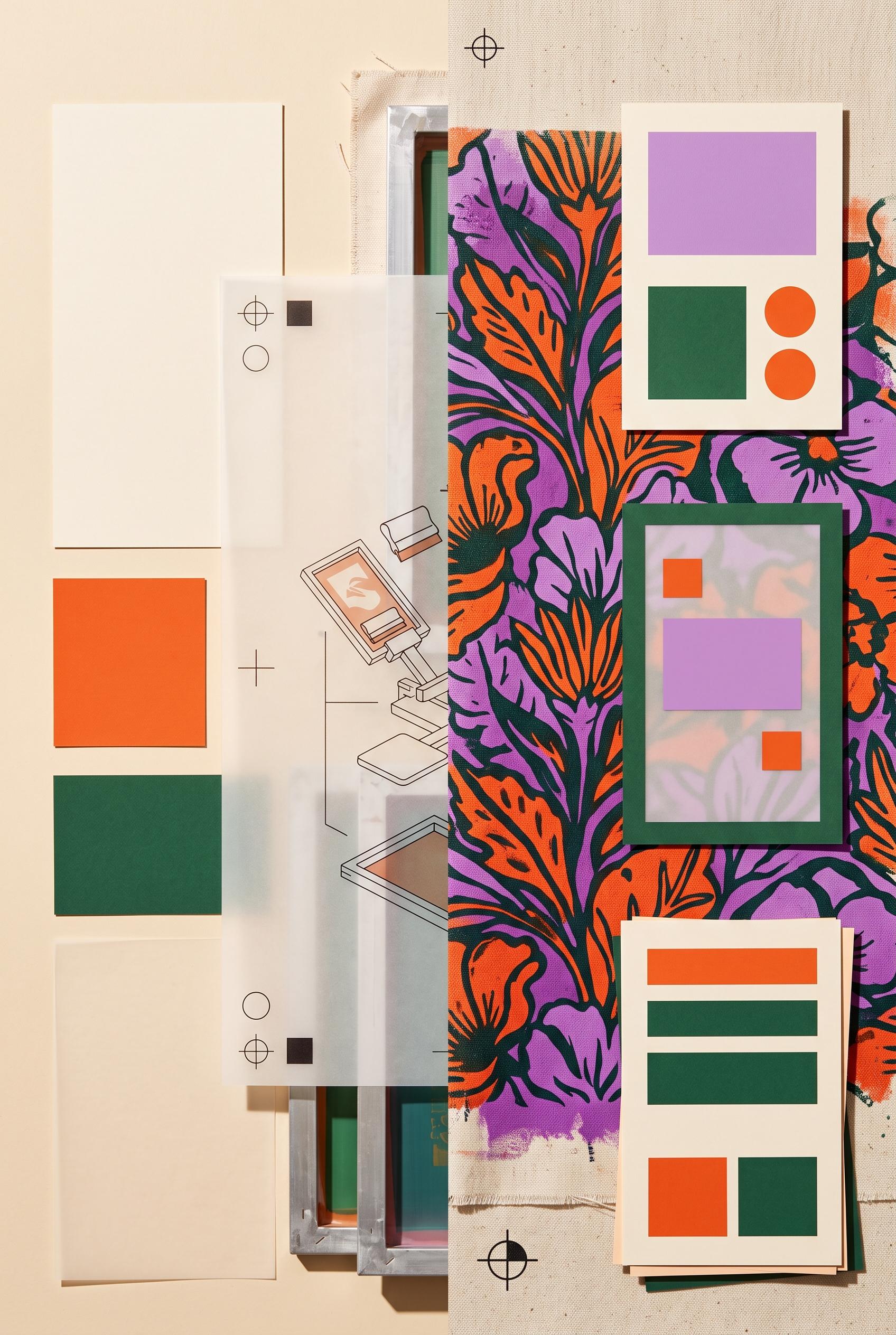
Create a commercial-quality art-directed Pinterest graphic in a vertical 2:3 composition for an independent screen-printing studio promotion. Show a before-and-after transformation using nested paper windows and translucent vellum sheets, with the dull side appearing flat and cluttered and the after side showing vivid ink texture, printed fabric, registration marks, and a clear visual hierarchy. Use persimmon, lilac, pine green, and warm cream. Include blank abstract text blocks only, no legible words or numbers. AI-modified downstream asset, no real brands, no trademarked characters, no watermark, no unintended readable text. Corrective regeneration attempt 3. Produce a materially revised image, not a near-duplicate of an earlier variant. Preserve the successful subject, palette, lighting, focal hierarchy, and commercial polish from the original brief while correcting every issue below. Mandatory corrective instructions from the most recent visual QA: Preserve the attractive vertical 2:3 nested-window composition, translucent vellum layers, screen-printing process imagery, vivid floral fabric print, persimmon/lilac/pine/warm-cream palette, lighting, and right-side focal hierarchy. Replace every segmented mark that resembles letters, numerals, symbols, or pseudo-text—especially the orange marks on the upper-right cream card, lower-right offer card, and small lower-left panel—with only simple solid rectangles, circles, and clean non-linguistic geometric blocks. Keep all panels blank and abstract, with no letters, words, numbers, labels, logos, glyphs, watermark, or readable text anywhere. Observed defects from prior variants that must not recur: 1) The image contains prominent readable text: “BEFORE,” “AFTER,” “THE PROCESS,” and “THE FINISHED PRINT,” contrary to the brief’s requirement for blank abstract text blocks only. 2) The readable labels make the composition less aligned with the requested abstract-mark CTA treatment. 3) Strong vertical composition, palette, and finished-print focal point. 4) The orange segmented marks on the upper-right card and lower offer card resemble pseudo-text/glyphs, violating the requirement for purely non-linguistic abstract shapes. 5) The composition is polished but the CTA panels should use simpler unmistakably geometric bars and blocks. Render no letters, words, numbers, prices, headings, labels, contact details, logos, glyphs, or pseudo-text anywhere. Use only blank surfaces, clean geometric marks, and non-linguistic placeholder shapes. Do not add explanatory captions, before/after labels, interface copy, or extra objects that the brief did not request. When a corrective instruction conflicts with a decorative detail, prioritize the corrective instruction.
 0
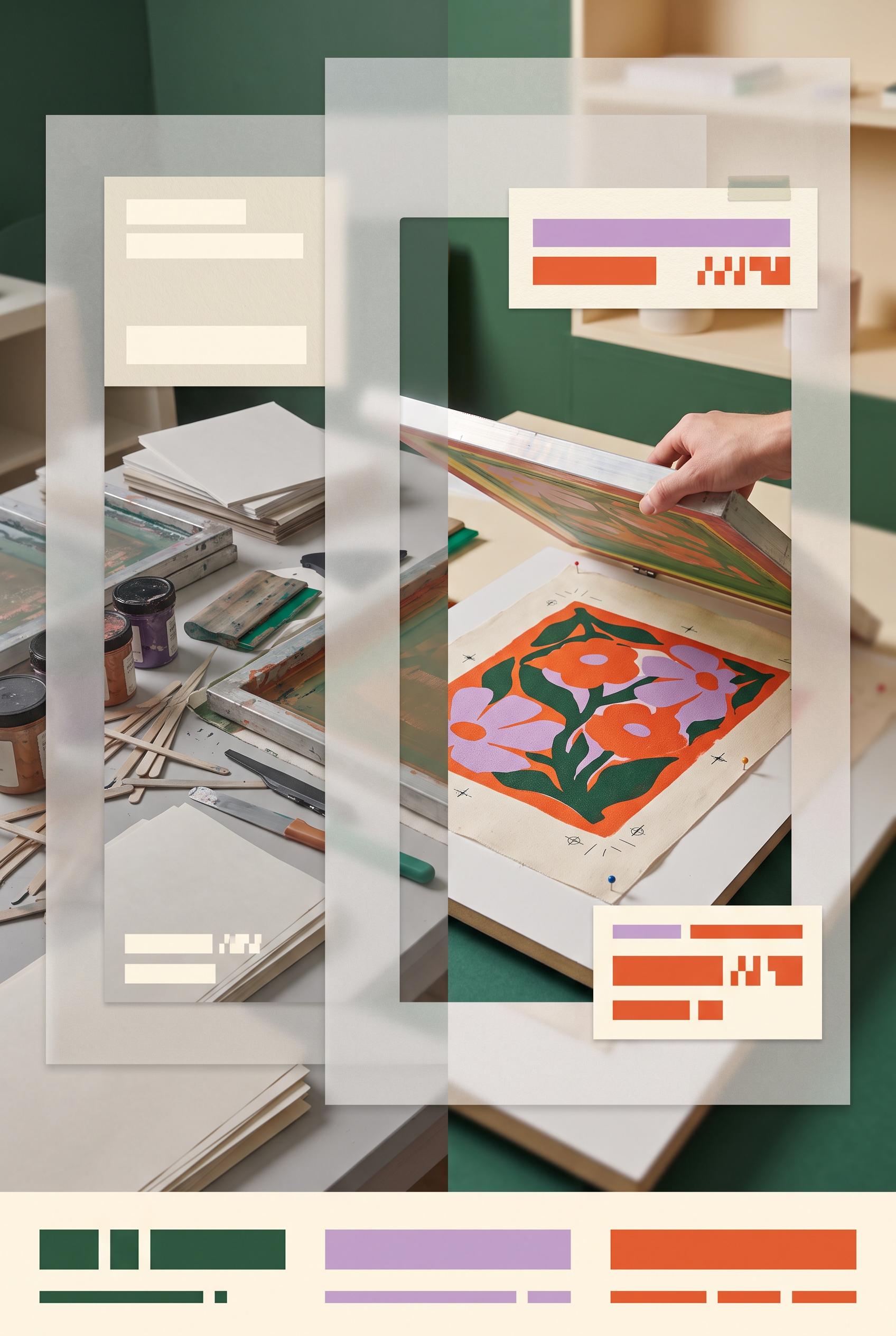
Create a commercial-quality art-directed Pinterest graphic in a vertical 2:3 composition for an independent screen-printing studio promotion. Show a before-and-after transformation using nested paper windows and translucent vellum sheets, with the dull side appearing flat and cluttered and the after side showing vivid ink texture, printed fabric, registration marks, and a clear visual hierarchy. Use persimmon, lilac, pine green, and warm cream. Include blank abstract text blocks only, no legible words or numbers. AI-modified downstream asset, no real brands, no trademarked characters, no watermark, no unintended readable text. Corrective regeneration attempt 2. Produce a materially revised image, not a near-duplicate of an earlier variant. Preserve the successful subject, palette, lighting, focal hierarchy, and commercial polish from the original brief while correcting every issue below. Mandatory corrective instructions from the most recent visual QA: Preserve the attractive vertical 2:3 split composition, nested translucent paper windows, strong before/after screen-printing imagery, persimmon/lilac/pine/warm-cream palette, and clear right-side finished-print focal point. Remove every readable letter and word, including “BEFORE,” “AFTER,” “THE PROCESS,” and “THE FINISHED PRINT.” Replace each label with blank cream panels containing only non-readable abstract geometric marks or solid bars; keep the lower offer/CTA zones as abstract colored blocks and lines with no letters, numbers, or glyph-like text. Ensure no unintended readable text, logos, brands, or watermark remains. Observed defects from prior variants that must not recur: 1) The image contains prominent readable text: “BEFORE,” “AFTER,” “THE PROCESS,” and “THE FINISHED PRINT,” contrary to the brief’s requirement for blank abstract text blocks only. 2) The readable labels make the composition less aligned with the requested abstract-mark CTA treatment. Render no letters, words, numbers, prices, headings, labels, contact details, logos, glyphs, or pseudo-text anywhere. Use only blank surfaces, clean geometric marks, and non-linguistic placeholder shapes. Do not add explanatory captions, before/after labels, interface copy, or extra objects that the brief did not request. When a corrective instruction conflicts with a decorative detail, prioritize the corrective instruction.
 0
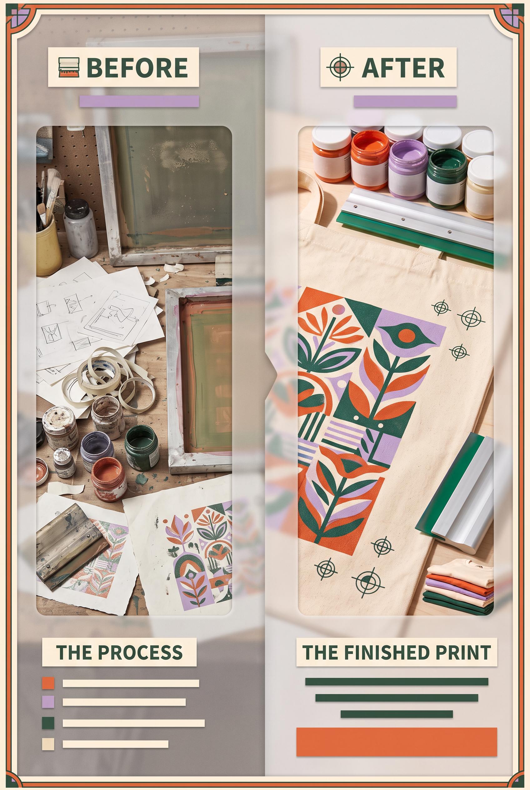
Create a commercial-quality art-directed Pinterest graphic in a vertical 2:3 composition for an independent screen-printing studio promotion. Show a before-and-after transformation using nested paper windows and translucent vellum sheets, with the dull side appearing flat and cluttered and the after side showing vivid ink texture, printed fabric, registration marks, and a clear visual hierarchy. Use persimmon, lilac, pine green, and warm cream. Include blank abstract text blocks only, no legible words or numbers. AI-modified downstream asset, no real brands, no trademarked characters, no watermark, no unintended readable text.
 0
Create a commercial-quality vertical 2:3 Pinterest educational graphic about auditing a personal brand visual system. Use an interactive dial with four content checkpoints, ultramarine, apricot, moss green, and paper white palette, tactile paper layers, miniature thumbnail and social post mockups, and abstract symbols instead of readable labels. No real brands, no trademarked characters, no watermark, no unintended readable text, no logos or gibberish text. AI-modified downstream. Corrective regeneration attempt 5. Produce a materially revised image, not a near-duplicate of an earlier variant. Preserve the successful subject, palette, lighting, focal hierarchy, and commercial polish from the original brief while correcting every issue below. Mandatory corrective instructions from the most recent visual QA: Preserve the attractive vertical 2:3 tactile paper collage, ultramarine, apricot, moss green, and paper-white palette, strong lighting and shadows, central four-part dial, and four surrounding mockup cards. Remove every recognizable interface or language-like element from all cards and the dial: no hearts, chat bubbles, share triangles, bookmarks, carousel dots, profile circles, header bars, horizontal text rows, quotation-like marks, percent-like marks, letters, numbers, icons, logos, glyphs, pseudo-text, or social-platform conventions. Replace them only with clean abstract geometry: solid blocks, circles, arcs, overlapping squares, non-directional patterns, and blank paper surfaces. Keep the four cards visually distinct as abstract thumbnail, quote-card, story-frame, and offer-tile examples without labels or interface structure. Ensure no readable or pseudo-readable marks anywhere. Observed defects from prior variants that must not recur: 1) Strong vertical composition, tactile collage styling, palette, and central four-part dial. 2) Top-left mockup contains a recognizable bookmark/ribbon UI symbol. 3) Top-right mockup contains carousel-like dot indicators. 4) Several mockup elements still resemble interface bars or profile/header layouts rather than purely abstract compositions. 5) Strong vertical tactile collage and central four-part dial are attractive and on-concept. 6) All four mockups still contain recognizable interface elements: hearts, chat bubbles, share triangles, bookmarks, carousel dots, header bars, and text-like horizontal rows. 7) The dial includes glyph-like marks that can read as pseudo-letters or symbols. 8) The composition does not satisfy the strict requirement for purely abstract, non-linguistic mockups with no UI conventions. Render no letters, words, numbers, prices, headings, labels, contact details, logos, glyphs, or pseudo-text anywhere. Use only blank surfaces, clean geometric marks, and non-linguistic placeholder shapes. Do not add explanatory captions, before/after labels, interface copy, or extra objects that the brief did not request. When a corrective instruction conflicts with a decorative detail, prioritize the corrective instruction.
 0
Create a commercial-quality vertical 2:3 Pinterest educational graphic about auditing a personal brand visual system. Use an interactive dial with four content checkpoints, ultramarine, apricot, moss green, and paper white palette, tactile paper layers, miniature thumbnail and social post mockups, and abstract symbols instead of readable labels. No real brands, no trademarked characters, no watermark, no unintended readable text, no logos or gibberish text. AI-modified downstream. Corrective regeneration attempt 4. Produce a materially revised image, not a near-duplicate of an earlier variant. Preserve the successful subject, palette, lighting, focal hierarchy, and commercial polish from the original brief while correcting every issue below. Mandatory corrective instructions from the most recent visual QA: Preserve the attractive vertical 2:3 tactile paper collage, ultramarine/apricot/moss/paper-white palette, lighting, shadows, central four-part dial, and four surrounding mockup cards. Remove the bookmark/ribbon shape in the upper-left card and remove the row of carousel-like dots in the upper-right card. Rework all mockups so they contain only clearly abstract geometric compositions—blocks, circles, arcs, overlapping shapes, and non-directional patterns—with no UI symbols, profile/header bars, interface-like line rows, glyphs, icons, logos, letters, numbers, words, pseudo-text, or recognizable social-platform conventions anywhere. Observed defects from prior variants that must not recur: 1) Strong vertical composition, tactile collage styling, palette, and central dial. 2) Mockups still contain recognizable social-media UI iconography, including hearts, comment bubbles, paper-plane/share shapes, bookmarks, and carousel dots. 3) Quotation-mark glyphs and a percent-sign glyph violate the requirement for no readable glyphs or pseudo-text. 4) Mockups read too much like generic social-platform interfaces rather than purely abstract content examples. 5) Strong vertical composition, tactile collage styling, palette, and central four-part dial. 6) Top-left mockup contains a recognizable bookmark/ribbon UI symbol. 7) Top-right mockup contains carousel-like dot indicators. 8) Several mockup elements still resemble interface bars or profile/header layouts rather than purely abstract compositions. Render no letters, words, numbers, prices, headings, labels, contact details, logos, glyphs, or pseudo-text anywhere. Use only blank surfaces, clean geometric marks, and non-linguistic placeholder shapes. Do not add explanatory captions, before/after labels, interface copy, or extra objects that the brief did not request. When a corrective instruction conflicts with a decorative detail, prioritize the corrective instruction.
 0
Create a commercial-quality vertical 2:3 Pinterest educational graphic about auditing a personal brand visual system. Use an interactive dial with four content checkpoints, ultramarine, apricot, moss green, and paper white palette, tactile paper layers, miniature thumbnail and social post mockups, and abstract symbols instead of readable labels. No real brands, no trademarked characters, no watermark, no unintended readable text, no logos or gibberish text. AI-modified downstream. Corrective regeneration attempt 3. Produce a materially revised image, not a near-duplicate of an earlier variant. Preserve the successful subject, palette, lighting, focal hierarchy, and commercial polish from the original brief while correcting every issue below. Mandatory corrective instructions from the most recent visual QA: Preserve the excellent vertical 2:3 tactile paper collage, ultramarine/apricot/moss/paper-white palette, lighting, shadows, central four-part dial, focal hierarchy, and four surrounding mockup cards. Replace every recognizable social-media interface element with purely abstract geometric marks: remove all hearts, comment bubbles, paper-plane/share icons, bookmarks, carousel dots, quotation marks, percent signs, play symbols, and any other familiar UI or typographic glyphs. Remove all faux interface bars that resemble text and replace them with non-linguistic blocks, circles, dots, arcs, and simple geometric compositions. Keep four distinct surrounding examples suggesting a thumbnail, quote card, story frame, and offer tile through layout and color only, with no labels, letters, numbers, words, logos, icons, glyphs, or pseudo-text anywhere. Observed defects from prior variants that must not recur: 1) The creative is visually strong and well-composed, but the mockups contain a recognizable Instagram logo/trademark. 2) Several mockups include readable interface-like text and typography samples, conflicting with the requirement for abstract symbols and no unintended readable text. 3) Strong vertical composition, tactile collage styling, palette, and central dial. 4) Mockups still contain recognizable social-media UI iconography, including hearts, comment bubbles, paper-plane/share shapes, bookmarks, and carousel dots. 5) Quotation-mark glyphs and a percent-sign glyph violate the requirement for no readable glyphs or pseudo-text. 6) Mockups read too much like generic social-platform interfaces rather than purely abstract content examples. Render no letters, words, numbers, prices, headings, labels, contact details, logos, glyphs, or pseudo-text anywhere. Use only blank surfaces, clean geometric marks, and non-linguistic placeholder shapes. Do not add explanatory captions, before/after labels, interface copy, or extra objects that the brief did not request. When a corrective instruction conflicts with a decorative detail, prioritize the corrective instruction.
 0
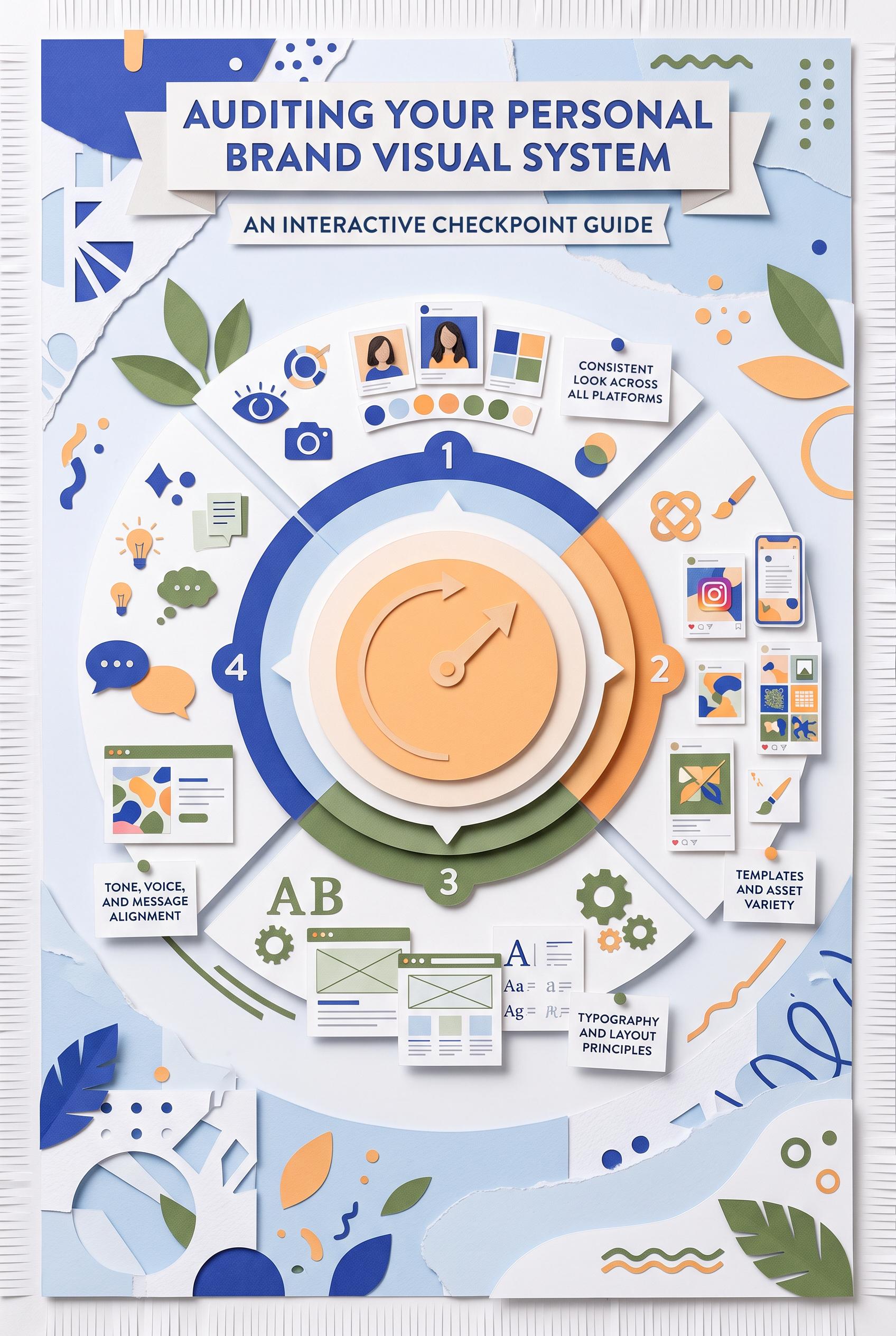
Create a commercial-quality vertical 2:3 Pinterest educational graphic about auditing a personal brand visual system. Use an interactive dial with four content checkpoints, ultramarine, apricot, moss green, and paper white palette, tactile paper layers, miniature thumbnail and social post mockups, and abstract symbols instead of readable labels. No real brands, no trademarked characters, no watermark, no unintended readable text, no logos or gibberish text. AI-modified downstream. Corrective regeneration attempt 2. Produce a materially revised image, not a near-duplicate of an earlier variant. Preserve the successful subject, palette, lighting, focal hierarchy, and commercial polish from the original brief while correcting every issue below. Mandatory corrective instructions from the most recent visual QA: Preserve the vertical 2:3 tactile paper collage, ultramarine/apricot/moss/paper-white palette, large central four-part dial, strong hierarchy, shadows, and surrounding content mockups. Remove every recognizable brand or trademark, especially the Instagram icon, and replace all social-media UI elements with generic abstract shapes. Remove readable interface text, letter samples, faux words, and any gibberish from every miniature card and mockup; use only lines, dots, blocks, icons, and abstract symbols. Keep the dial as the clear focal point and retain four distinct surrounding examples representing a thumbnail, quote card, story frame, and offer tile without labels. Observed defects from prior variants that must not recur: 1) The creative is visually strong and well-composed, but the mockups contain a recognizable Instagram logo/trademark. 2) Several mockups include readable interface-like text and typography samples, conflicting with the requirement for abstract symbols and no unintended readable text. Render no letters, words, numbers, prices, headings, labels, contact details, logos, glyphs, or pseudo-text anywhere. Use only blank surfaces, clean geometric marks, and non-linguistic placeholder shapes. Do not add explanatory captions, before/after labels, interface copy, or extra objects that the brief did not request. When a corrective instruction conflicts with a decorative detail, prioritize the corrective instruction.
 0
Create a commercial-quality vertical 2:3 Pinterest educational graphic about auditing a personal brand visual system. Use an interactive dial with four content checkpoints, ultramarine, apricot, moss green, and paper white palette, tactile paper layers, miniature thumbnail and social post mockups, and abstract symbols instead of readable labels. No real brands, no trademarked characters, no watermark, no unintended readable text, no logos or gibberish text. AI-modified downstream.
 0
Create a commercial-quality vertical 2:3 Pinterest moodboard for a slow-living recipe creator personal brand. Use a ceramic tile grid with floating recipe artifacts, cobalt blue, celery green, warm clay, and linen palette, tactile food photography, hand-drawn ingredient forms, folded paper, and a recurring circular stamp motif. No real brands, no trademarked characters, no watermark, no unintended readable text, no logos or gibberish text. AI-modified downstream. Corrective regeneration attempt 5. Produce a materially revised image, not a near-duplicate of an earlier variant. Preserve the successful subject, palette, lighting, focal hierarchy, and commercial polish from the original brief while correcting every issue below. Mandatory corrective instructions from the most recent visual QA: Preserve the attractive vertical 2:3 ceramic-tile moodboard, tactile food photography, cropped hands, linen and paper textures, cobalt blue/celery green/warm clay palette, lighting, spacing, and focal hierarchy. Replace every recipe card and paper note with blank paper or clean abstract geometric/botanical shapes only. Remove all words, letters, numbers, handwriting-like lines, bullets, and pseudo-text, especially “Recipe.” Replace every circular stamp interior with non-linguistic abstract botanical or geometric forms that cannot resemble letters, glyphs, logos, or numbers. Remove all watermark-like or logo-like marks. Ensure absolutely no readable text, pseudo-text, logos, trademarks, or generation artifacts anywhere. Observed defects from prior variants that must not recur: 1) Multiple circular stamps contain clearly readable text such as “SLOW COOKING” and “NATURAL KITCHEN,” violating the requirement that all sample marks remain abstract and unreadable. 2) The repeated stamped wording creates a logo-like identity mark rather than an abstract circular stamp motif. 3) Attractive vertical tiled moodboard with strong palette, tactile textures, food photography, and clear composition. 4) Recipe cards contain clearly readable text such as “Recipe” plus extensive pseudo-handwriting, violating the requirement for no letters, words, or garbled readable text. 5) Some circular marks also resemble logo-like or glyph-based symbols rather than purely abstract non-linguistic motifs. 6) Readable “Recipe” text and handwriting-like lines appear on multiple recipe cards. 7) Repeated circular marks contain logo-like geometric glyphs rather than purely abstract motifs. 8) The image violates the requirement for no readable text, pseudo-text, or logo-like symbols. Render no letters, words, numbers, prices, headings, labels, contact details, logos, glyphs, or pseudo-text anywhere. Use only blank surfaces, clean geometric marks, and non-linguistic placeholder shapes. Do not add explanatory captions, before/after labels, interface copy, or extra objects that the brief did not request. When a corrective instruction conflicts with a decorative detail, prioritize the corrective instruction.
 0
Create a commercial-quality vertical 2:3 Pinterest moodboard for a slow-living recipe creator personal brand. Use a ceramic tile grid with floating recipe artifacts, cobalt blue, celery green, warm clay, and linen palette, tactile food photography, hand-drawn ingredient forms, folded paper, and a recurring circular stamp motif. No real brands, no trademarked characters, no watermark, no unintended readable text, no logos or gibberish text. AI-modified downstream. Corrective regeneration attempt 4. Produce a materially revised image, not a near-duplicate of an earlier variant. Preserve the successful subject, palette, lighting, focal hierarchy, and commercial polish from the original brief while correcting every issue below. Mandatory corrective instructions from the most recent visual QA: Preserve the attractive vertical 2:3 ceramic-tile moodboard, food photography, cropped hands, linen and paper textures, cobalt blue/celery green/warm clay palette, spacing, lighting, and polished focal hierarchy. Replace every recipe card and paper note with completely blank paper or paper containing only clean abstract geometric or botanical shapes; remove the readable word “Recipe” and all handwriting-like lines, numbers, bullets, and pseudo-text. Replace every circular stamp interior with purely abstract blue geometric or botanical forms that cannot resemble letters, glyphs, logos, or numbers. Ensure absolutely no text, watermark, logo, trademark, or generation artifacts anywhere. Observed defects from prior variants that must not recur: 1) Multiple circular stamps contain clearly readable text such as “SLOW COOKING” and “NATURAL KITCHEN,” violating the requirement that all sample marks remain abstract and unreadable. 2) The repeated stamped wording creates a logo-like identity mark rather than an abstract circular stamp motif. 3) Attractive vertical tiled moodboard with strong palette, tactile textures, food photography, and clear composition. 4) Recipe cards contain clearly readable text such as “Recipe” plus extensive pseudo-handwriting, violating the requirement for no letters, words, or garbled readable text. 5) Some circular marks also resemble logo-like or glyph-based symbols rather than purely abstract non-linguistic motifs. Render no letters, words, numbers, prices, headings, labels, contact details, logos, glyphs, or pseudo-text anywhere. Use only blank surfaces, clean geometric marks, and non-linguistic placeholder shapes. Do not add explanatory captions, before/after labels, interface copy, or extra objects that the brief did not request. When a corrective instruction conflicts with a decorative detail, prioritize the corrective instruction.
 0
Create a commercial-quality vertical 2:3 Pinterest moodboard for a slow-living recipe creator personal brand. Use a ceramic tile grid with floating recipe artifacts, cobalt blue, celery green, warm clay, and linen palette, tactile food photography, hand-drawn ingredient forms, folded paper, and a recurring circular stamp motif. No real brands, no trademarked characters, no watermark, no unintended readable text, no logos or gibberish text. AI-modified downstream. Corrective regeneration attempt 3. Produce a materially revised image, not a near-duplicate of an earlier variant. Preserve the successful subject, palette, lighting, focal hierarchy, and commercial polish from the original brief while correcting every issue below. Mandatory corrective instructions from the most recent visual QA: Preserve the attractive vertical 2:3 tiled moodboard, ceramic grid, tactile food photography, linen and paper textures, cobalt blue/celery green/warm clay palette, strong spacing, and polished lighting. Replace every circular stamp and all other marks with purely abstract blue geometric or botanical symbols: no letters, words, numbers, logo-like lettering, or readable characters anywhere. Keep the recurring circular stamp shape but make its interior marks entirely non-linguistic and unreadable. Ensure no watermark or generation artifacts. Observed defects from prior variants that must not recur: 1) Multiple circular stamps contain clearly readable text such as “SLOW COOKING” and “NATURAL KITCHEN,” violating the requirement that all sample marks remain abstract and unreadable. 2) The repeated stamped wording creates a logo-like identity mark rather than an abstract circular stamp motif. Render no letters, words, numbers, prices, headings, labels, contact details, logos, glyphs, or pseudo-text anywhere. Use only blank surfaces, clean geometric marks, and non-linguistic placeholder shapes. Do not add explanatory captions, before/after labels, interface copy, or extra objects that the brief did not request. When a corrective instruction conflicts with a decorative detail, prioritize the corrective instruction.
 0
Create a commercial-quality vertical 2:3 Pinterest moodboard for a slow-living recipe creator personal brand. Use a ceramic tile grid with floating recipe artifacts, cobalt blue, celery green, warm clay, and linen palette, tactile food photography, hand-drawn ingredient forms, folded paper, and a recurring circular stamp motif. No real brands, no trademarked characters, no watermark, no unintended readable text, no logos or gibberish text. AI-modified downstream. Corrective regeneration attempt 2. Produce a materially revised image, not a near-duplicate of an earlier variant. Preserve the successful subject, palette, lighting, focal hierarchy, and commercial polish from the original brief while correcting every issue below. Do not add explanatory captions, before/after labels, interface copy, or extra objects that the brief did not request. When a corrective instruction conflicts with a decorative detail, prioritize the corrective instruction.
 0
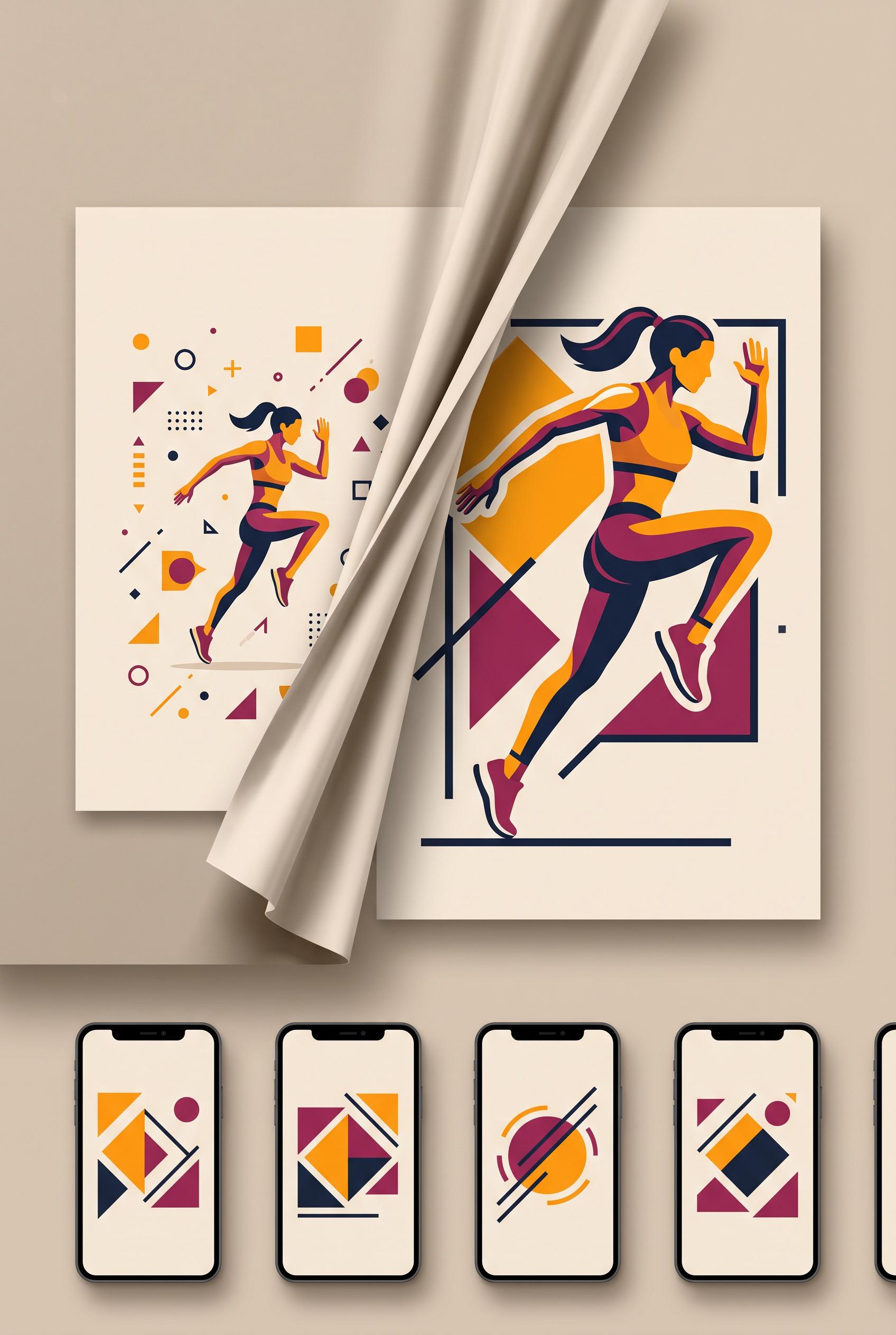
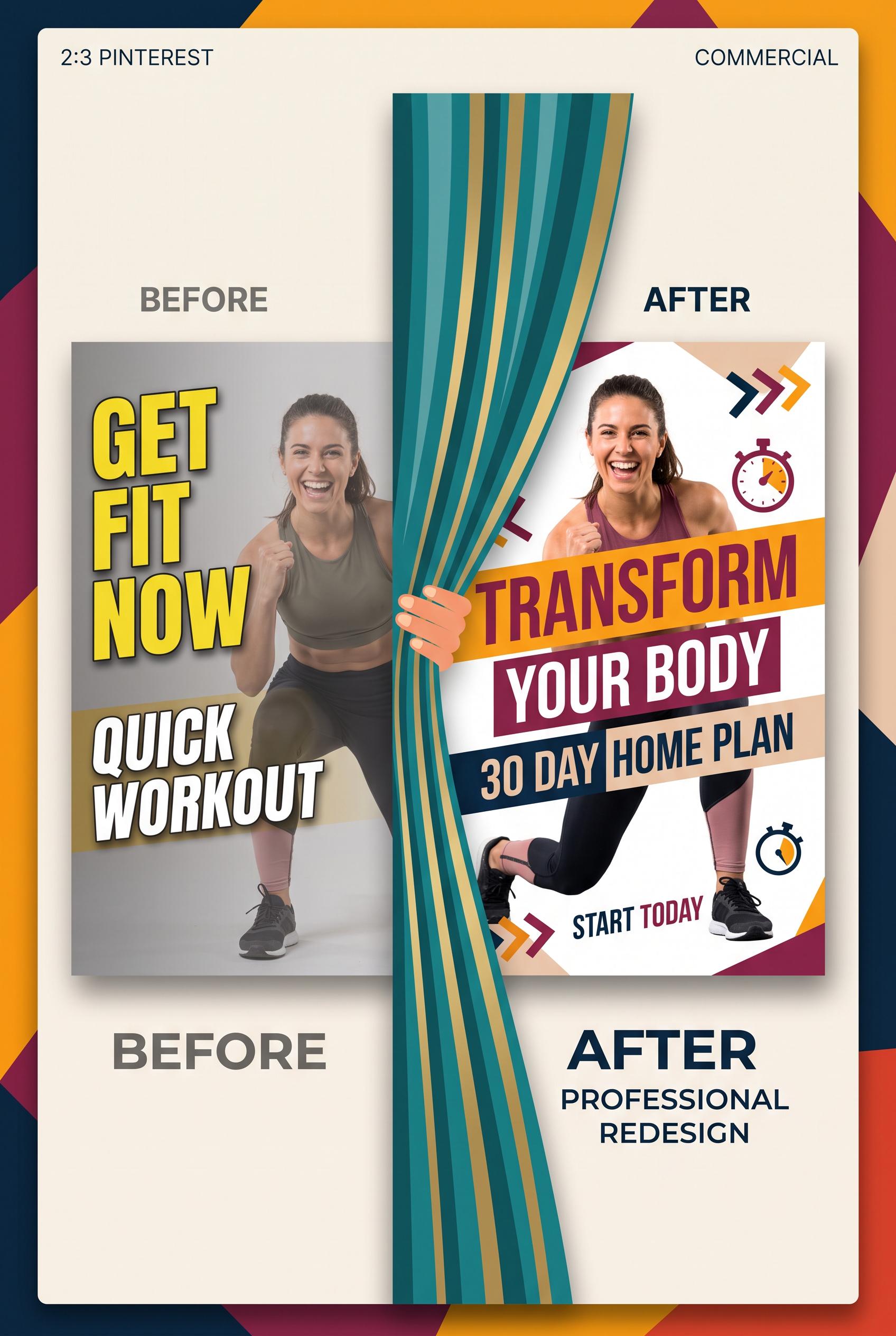
Create a commercial-quality vertical 2:3 Pinterest composition showing a before-and-after redesign of an independent fitness coach video thumbnail. Use a curtain reveal composition, saffron, berry, deep ink, and almond palette, one dynamic athletic pose, abstract geometric framing, clean mockup cards, and strong visual hierarchy. No real brands, no trademarked characters, no watermark, no unintended readable text, no logos or gibberish text. AI-modified downstream. Corrective regeneration attempt 2. Produce a materially revised image, not a near-duplicate of an earlier variant. Preserve the successful subject, palette, lighting, focal hierarchy, and commercial polish from the original brief while correcting every issue below. Mandatory corrective instructions from the most recent visual QA: Create a polished vertical 2:3 Pinterest composition with a clear before-and-after redesign for an independent fitness coach. Keep the attractive almond panel, saffron and berry geometric accents, deep-ink typography, single dynamic athletic fitness pose, and fabric-like curtain reveal. Make the left version visibly cluttered with tiny low-impact elements and weak hierarchy; make the right version clean, bold, and focused with one dominant pose and strong geometric framing. Add several small phone-size preview cards neatly below the main comparison. Remove the “2:3 PINTEREST,” “COMMERCIAL,” and “PROFESSIONAL REDESIGN” meta copy, all logos, watermarks, branding, and any unintended readable text or gibberish. Use only minimal intentional generic before/after labeling, with no excessive headline copy. Reduce teal and prioritize saffron, berry, deep ink, and almond. Observed defects from prior variants that must not recur: 1) The required small phone-size preview cards below the main before/after versions are missing. 2) Unrequested meta text such as “2:3 PINTEREST” and “COMMERCIAL” appears in the layout. 3) The composition contains excessive readable copy and does not sufficiently preserve the brief’s clean, tiny-element-before versus focused-after hierarchy. 4) The palette is dominated by teal rather than the specified saffron, berry, deep ink, and almond scheme. Render no letters, words, numbers, prices, headings, labels, contact details, logos, glyphs, or pseudo-text anywhere. Use only blank surfaces, clean geometric marks, and non-linguistic placeholder shapes. Do not add explanatory captions, before/after labels, interface copy, or extra objects that the brief did not request. When a corrective instruction conflicts with a decorative detail, prioritize the corrective instruction.
 0
Create a commercial-quality vertical 2:3 Pinterest composition showing a before-and-after redesign of an independent fitness coach video thumbnail. Use a curtain reveal composition, saffron, berry, deep ink, and almond palette, one dynamic athletic pose, abstract geometric framing, clean mockup cards, and strong visual hierarchy. No real brands, no trademarked characters, no watermark, no unintended readable text, no logos or gibberish text. AI-modified downstream.
 0
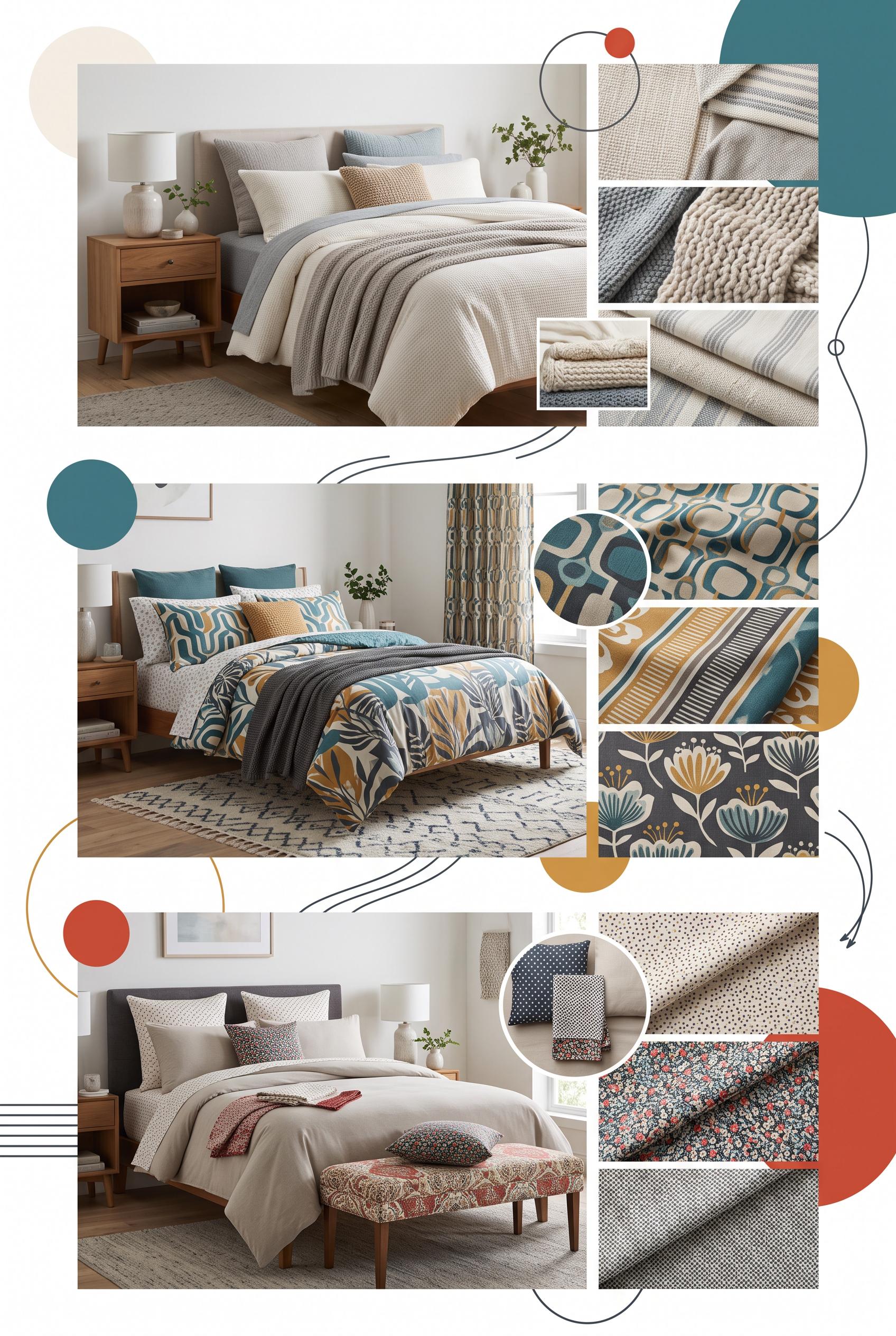
Create a commercial-quality educational interior styling graphic in a vertical 2:3 Pinterest composition. Show three bedroom vignettes in an editorial contact sheet, each paired with macro textile samples demonstrating quiet texture, medium motif, and small accent scale. Use clear visual progression, fabric closeups, folded bedding, and a small styling detail, with abstract circles and lines instead of readable text. Use warm white, teal, tomato red, honey, and charcoal. No real brands, no trademarked characters, no watermark, and no unintended readable text.
 0
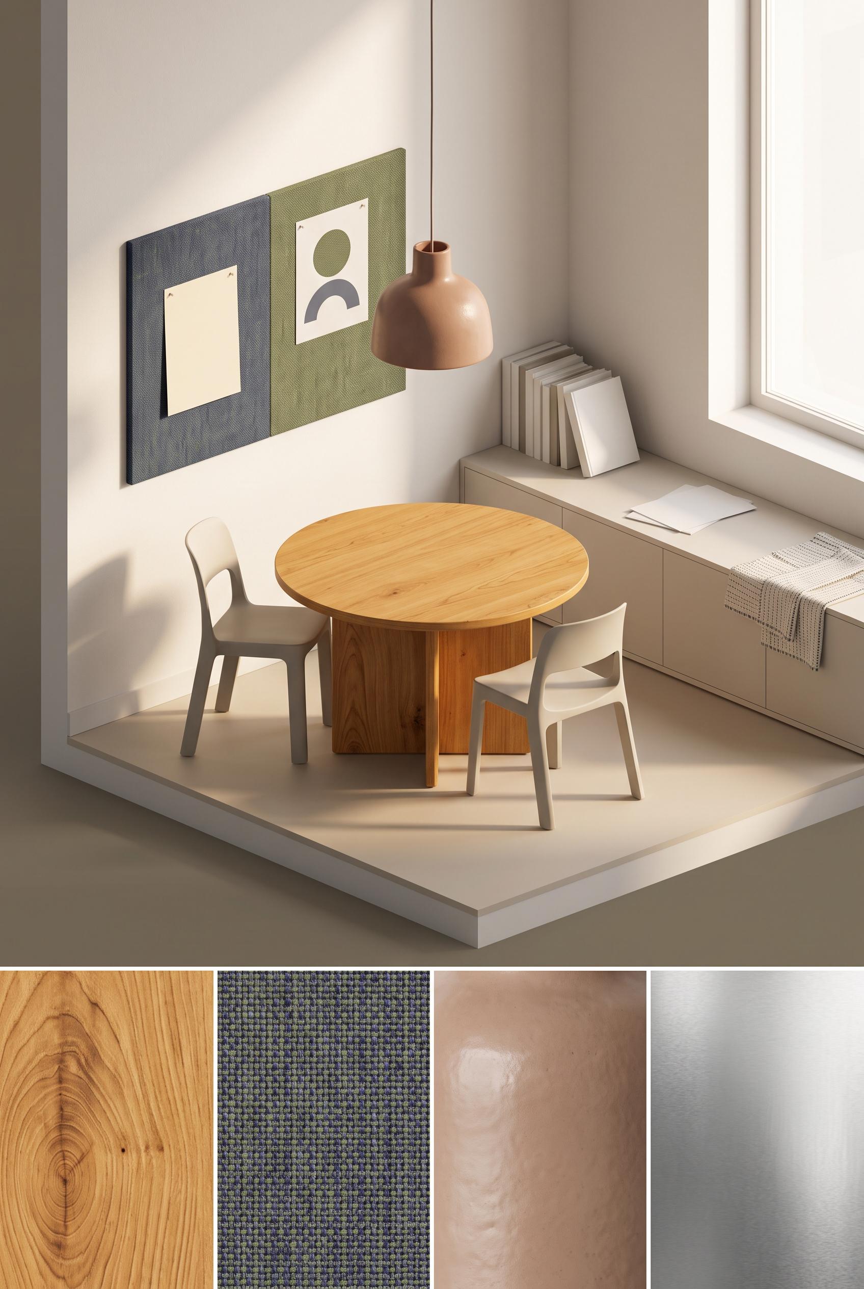
Create a commercial-quality interior design showcase in a vertical 2:3 Pinterest composition. Use an orthographic cutaway view of a compact dining room with a rounded handmade wood table, stackable sculptural chairs, a textile pinboard wall, a ceramic pendant, low storage, and morning sunlight. Add separate visual vignettes of wood grain, woven fabric, matte ceramic, and brushed metal without readable labels. Use chalk white, clay, moss green, indigo, and honey. No real brands, no trademarked characters, no watermark, and no unintended readable text. Corrective regeneration attempt 3. Produce a materially revised image, not a near-duplicate of an earlier variant. Preserve the successful subject, palette, lighting, focal hierarchy, and commercial polish from the original brief while correcting every issue below. Mandatory corrective instructions from the most recent visual QA: Preserve the attractive vertical 2:3 orthographic dining-room composition, rounded wood table, stackable chairs, textile pinboard, ceramic pendant, low cabinet, warm sunlight, palette, and four unlabeled material vignettes. Remove the dense text-like sheet from the pinboard and replace it with a blank card or abstract non-linguistic shape. Remove or fully obscure any lettering on the books or papers on the cabinet, and eliminate all other letters, words, numbers, labels, logos, glyphs, pseudo-text, or watermark anywhere in the image. Keep the material vignettes as texture-only panels with no captions. Observed defects from prior variants that must not recur: 1) The four material vignettes contain prominent readable labels such as “Wood Grain,” “Woven Fabric,” “Matte Ceramic,” and “Brushed Metal,” violating the no-readable-text requirement 2) Attractive vertical composition and required room elements are present. 3) The pinboard contains a white sheet with dense pseudo-readable text-like marks, violating the no-readable-text requirement. 4) The book/paper stack on the cabinet may also contain tiny lettering or label-like marks. Render no letters, words, numbers, prices, headings, labels, contact details, logos, glyphs, or pseudo-text anywhere. Use only blank surfaces, clean geometric marks, and non-linguistic placeholder shapes. Do not add explanatory captions, before/after labels, interface copy, or extra objects that the brief did not request. When a corrective instruction conflicts with a decorative detail, prioritize the corrective instruction.
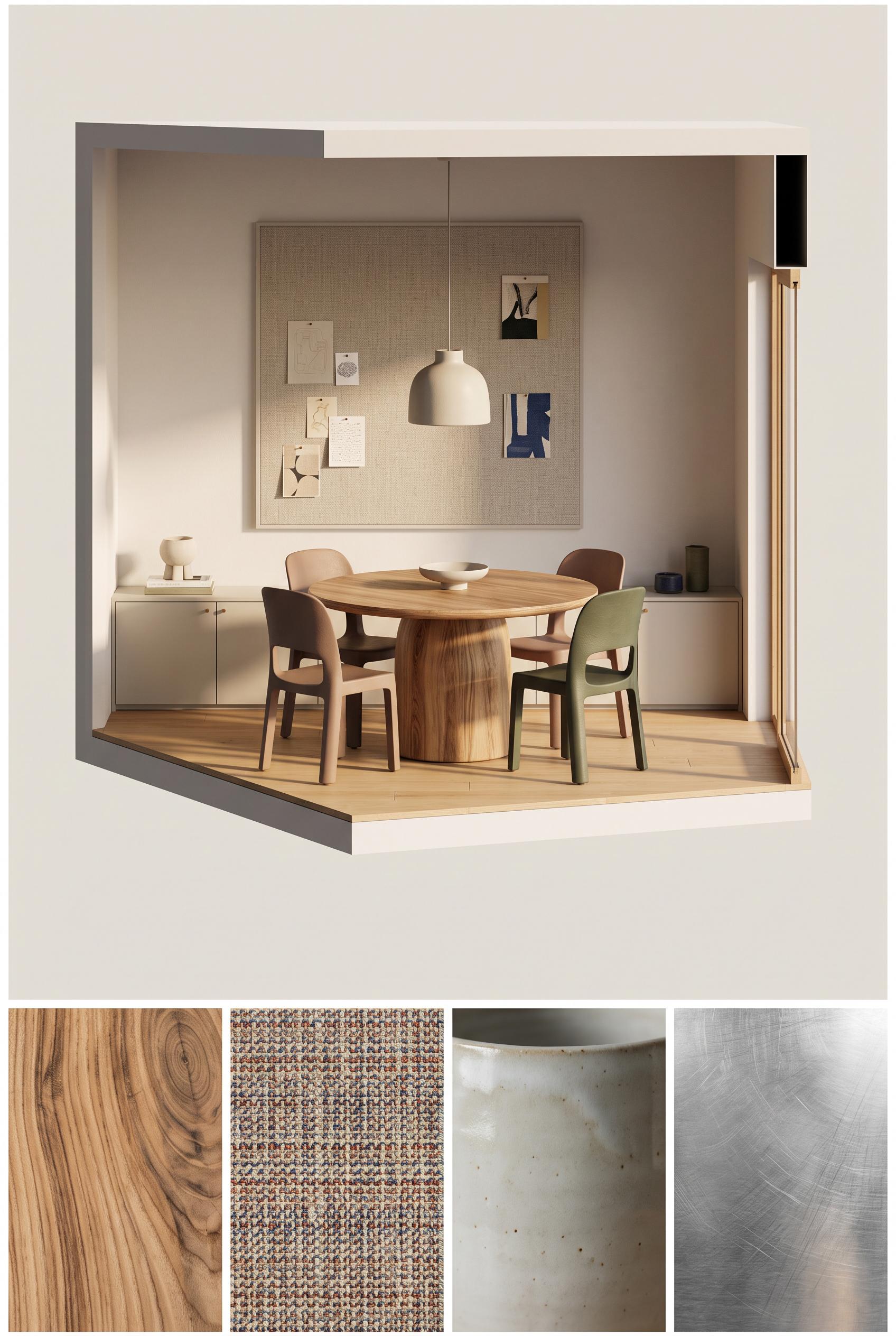 0
Create a commercial-quality interior design showcase in a vertical 2:3 Pinterest composition. Use an orthographic cutaway view of a compact dining room with a rounded handmade wood table, stackable sculptural chairs, a textile pinboard wall, a ceramic pendant, low storage, and morning sunlight. Add separate visual vignettes of wood grain, woven fabric, matte ceramic, and brushed metal without readable labels. Use chalk white, clay, moss green, indigo, and honey. No real brands, no trademarked characters, no watermark, and no unintended readable text. Corrective regeneration attempt 2. Produce a materially revised image, not a near-duplicate of an earlier variant. Preserve the successful subject, palette, lighting, focal hierarchy, and commercial polish from the original brief while correcting every issue below. Mandatory corrective instructions from the most recent visual QA: Preserve the attractive vertical 2:3 orthographic dining-room composition, rounded wood table, chairs, pinboard wall, ceramic pendant, low cabinet, warm sunlight, and material vignette imagery. Remove all readable words, labels, captions, and lettering from the bottom vignette panels; leave only the wood grain, woven fabric, matte ceramic, and brushed metal textures. Ensure no other unintended readable text, watermark, logo, or generation artifacts remain. Observed defects from prior variants that must not recur: 1) The four material vignettes contain prominent readable labels such as “Wood Grain,” “Woven Fabric,” “Matte Ceramic,” and “Brushed Metal,” violating the no-readable-text requirement Render no letters, words, numbers, prices, headings, labels, contact details, logos, glyphs, or pseudo-text anywhere. Use only blank surfaces, clean geometric marks, and non-linguistic placeholder shapes. Do not add explanatory captions, before/after labels, interface copy, or extra objects that the brief did not request. When a corrective instruction conflicts with a decorative detail, prioritize the corrective instruction.
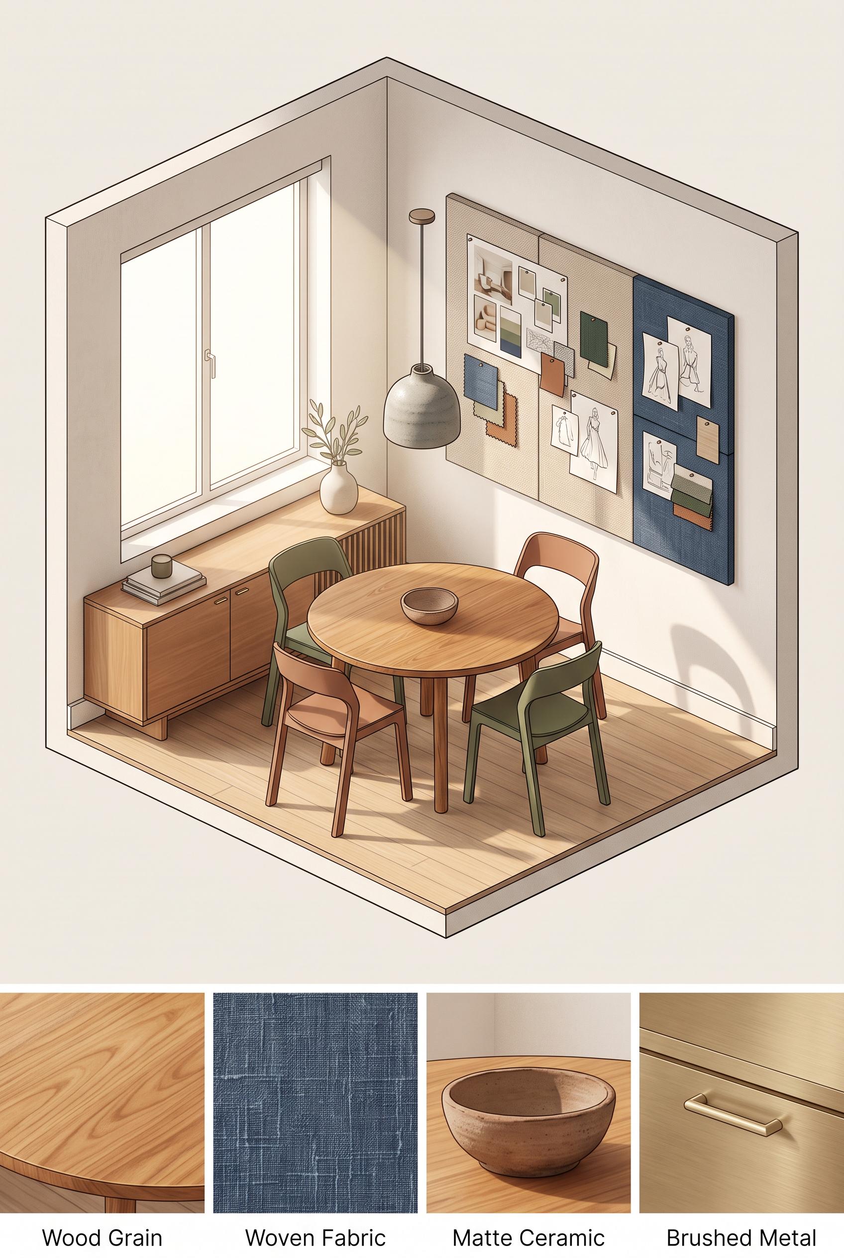 0
Create a commercial-quality interior design showcase in a vertical 2:3 Pinterest composition. Use an orthographic cutaway view of a compact dining room with a rounded handmade wood table, stackable sculptural chairs, a textile pinboard wall, a ceramic pendant, low storage, and morning sunlight. Add separate visual vignettes of wood grain, woven fabric, matte ceramic, and brushed metal without readable labels. Use chalk white, clay, moss green, indigo, and honey. No real brands, no trademarked characters, no watermark, and no unintended readable text.
 0
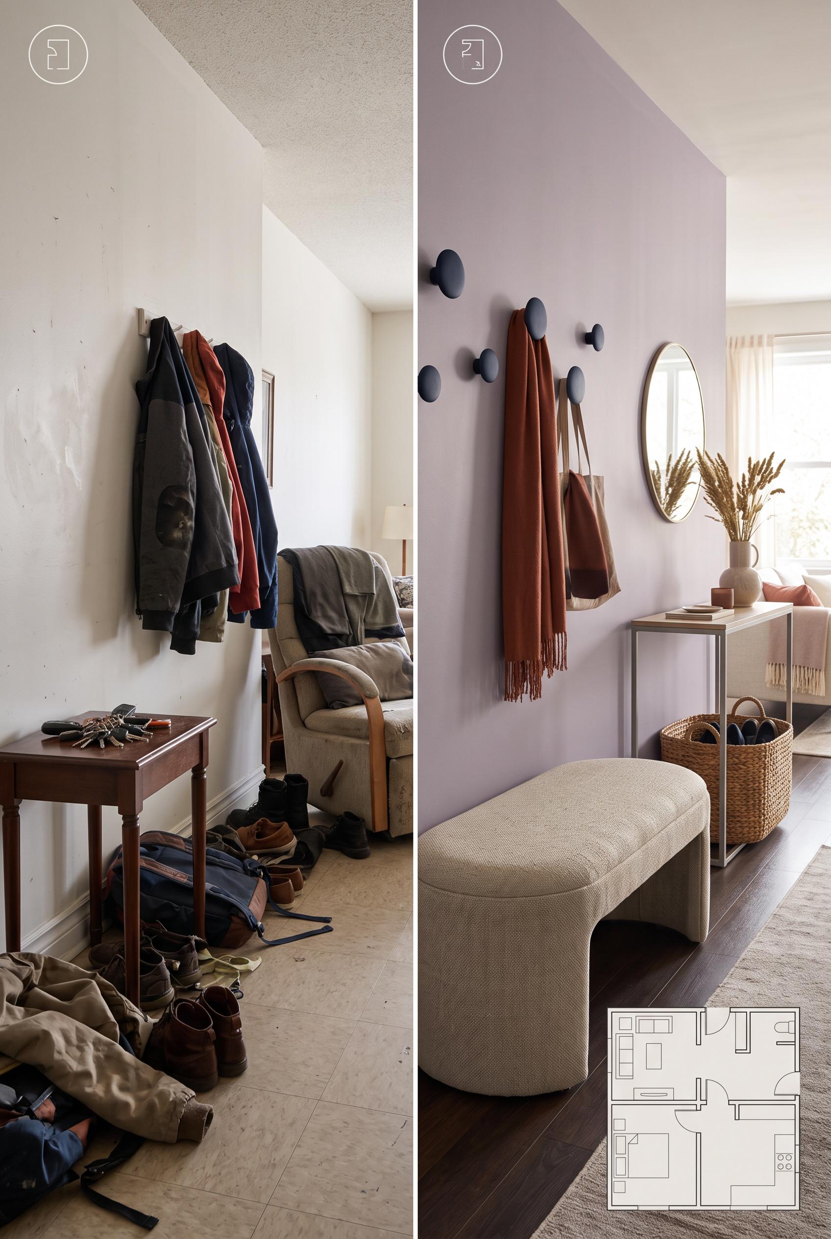
Create a commercial-quality interior design editorial image in a vertical 2:3 Pinterest composition. Use a matched before-and-after split of a compact living room entry transition: left side cluttered and poorly defined, right side styled with a curved upholstered bench, slim console, woven storage, soft wall hooks, and an open circulation path. Add a subtle abstract floorplan overlay with icons only, no readable text. Use dusty lilac, rust, oat, and deep ink. No real brands, no trademarked characters, no watermark, and no unintended readable text.
 0
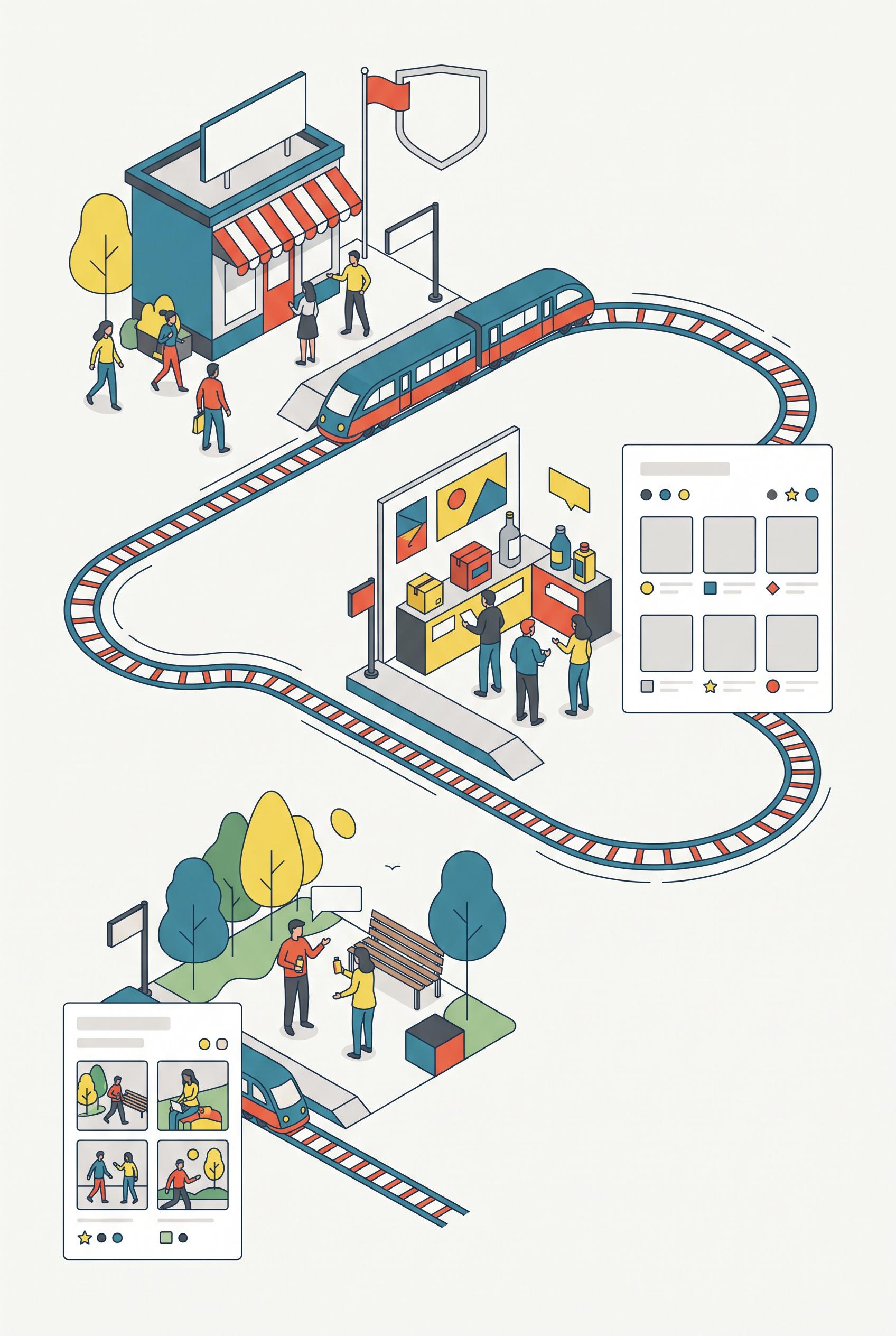
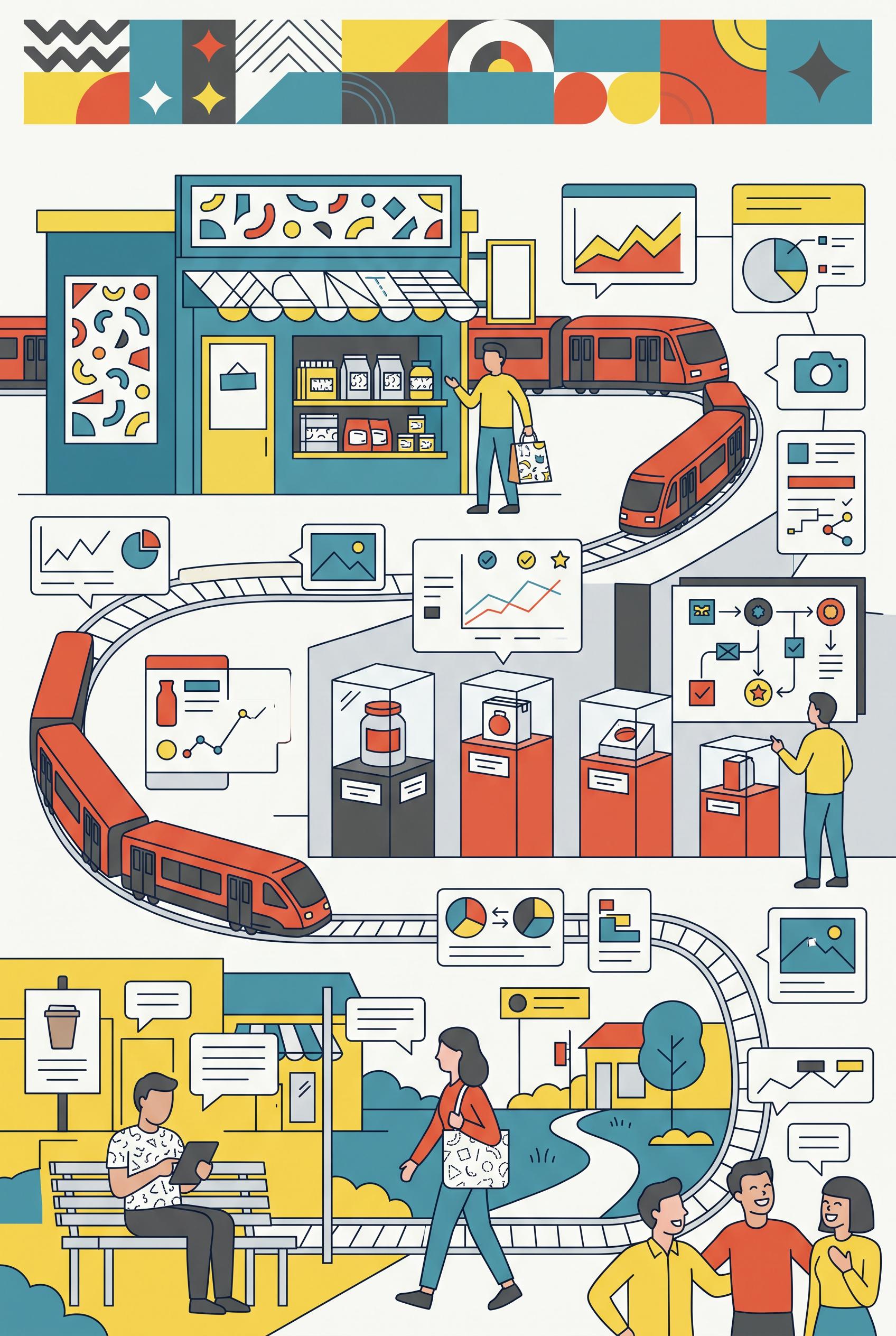
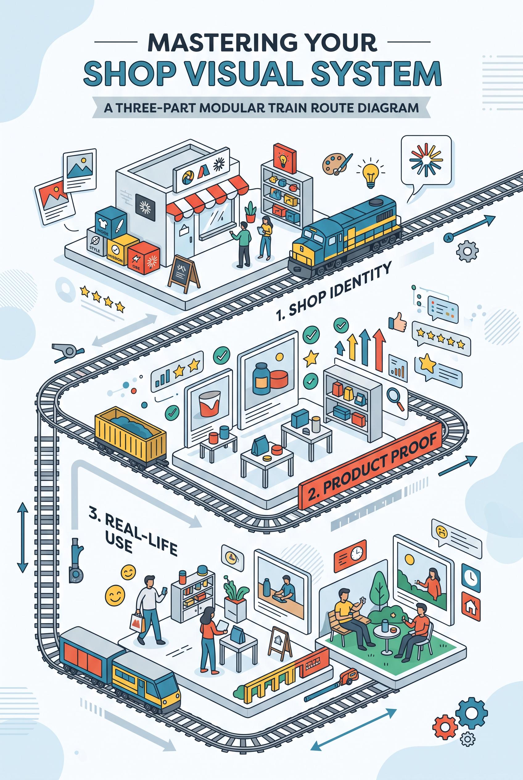
Create a commercial-quality vertical 2:3 Pinterest composition explaining a three-part shop visual system through a modular train route diagram. Show three distinct miniature stations representing shop identity, product proof, and real-life use, connected by a clean illustrated track with abstract cards, icons, and image placeholders. Use sea blue, paprika red, lemon yellow, graphite, and soft white. Keep the hierarchy instructional and energetic. No real brands, no trademarked characters, no watermark, and no unintended readable text. AI-modified downstream. Corrective regeneration attempt 5. Produce a materially revised image, not a near-duplicate of an earlier variant. Preserve the successful subject, palette, lighting, focal hierarchy, and commercial polish from the original brief while correcting every issue below. Mandatory corrective instructions from the most recent visual QA: Preserve the polished vertical 2:3 flat-vector composition, sea-blue/paprika-red/lemon-yellow/graphite palette, illustrated looping train route, storefront, product-display station, lifestyle station, people, and strong focal hierarchy. Remove every horizontal line, chart axis, bar chart, dashboard, panel caption, speech-bubble text mark, product-label mark, divider, and UI-like detail. Remove the large lower-right dashboard and the lower-left cards entirely; leave spacious soft-white background there. Replace any remaining card or sign content only with blank color fields, isolated dots, circles, stars, or simple geometric icons. Keep exactly three clearly separated stations connected by the route. Render no letters, words, numbers, labels, logos, glyphs, pseudo-text, watermarks, or readable marks anywhere. Observed defects from prior variants that must not recur: 1) Strong vertical composition, polished flat-vector style, palette, train route, and three stations are successful. 2) Multiple unintended text-like horizontal lines appear in the lower-left cards and lower-right panel. 3) The composition remains overly dense with many peripheral cards and UI-like panels, weakening the three-station hierarchy. 4) Chart axes and dashboard-style details resemble interface graphics contrary to the no-glyph/no-writing requirement. 5) Attractive vertical composition with a clear train-route focal structure and suitable palette. 6) Multiple pseudo-text horizontal lines remain on signs, cards, product panels, and speech bubbles. 7) The large lower-right dashboard/chart and lower peripheral cards violate the required simplified, non-UI treatment. 8) The lower half remains visually dense, weakening separation of the three stations. Render no letters, words, numbers, prices, headings, labels, contact details, logos, glyphs, or pseudo-text anywhere. Use only blank surfaces, clean geometric marks, and non-linguistic placeholder shapes. Do not add explanatory captions, before/after labels, interface copy, or extra objects that the brief did not request. When a corrective instruction conflicts with a decorative detail, prioritize the corrective instruction.
 0
Create a commercial-quality vertical 2:3 Pinterest composition explaining a three-part shop visual system through a modular train route diagram. Show three distinct miniature stations representing shop identity, product proof, and real-life use, connected by a clean illustrated track with abstract cards, icons, and image placeholders. Use sea blue, paprika red, lemon yellow, graphite, and soft white. Keep the hierarchy instructional and energetic. No real brands, no trademarked characters, no watermark, and no unintended readable text. AI-modified downstream. Corrective regeneration attempt 4. Produce a materially revised image, not a near-duplicate of an earlier variant. Preserve the successful subject, palette, lighting, focal hierarchy, and commercial polish from the original brief while correcting every issue below. Mandatory corrective instructions from the most recent visual QA: Preserve the vertical 2:3 layout, polished flat-vector style, sea-blue/paprika-red/lemon-yellow/graphite palette, illustrated train route, storefront station, product-display station, lifestyle station, people, and clear focal hierarchy. Remove every horizontal line, chart axis, dashboard detail, panel caption, card divider, and mark that could resemble writing or UI text. Replace them only with blank color fields, dots, circles, stars, simple geometric icons, or abstract non-linguistic shapes. Remove the lower-left cards and the lower-right dashboard panel entirely, or replace them with a small number of spacious blank geometric cards. Simplify the lower half and reduce peripheral decorations so the route and three stations are immediately legible and balanced. Ensure there are no letters, words, numbers, labels, logos, glyphs, pseudo-text, watermarks, or readable marks anywhere. Observed defects from prior variants that must not recur: 1) Dense lower section slightly reduces clarity of the three-part instructional hierarchy. 2) Attractive vertical composition with clear train route, palette, and three visual stations. 3) Numerous pseudo-readable text marks appear throughout cards, signs, product labels, speech bubbles, charts, and UI panels, violating the no-text requirement. 4) The lower half is overly dense, weakening the instructional hierarchy and station separation. 5) Strong vertical composition, polished flat-vector style, palette, train route, and three stations are successful. 6) Multiple unintended text-like horizontal lines appear in the lower-left cards and lower-right panel. 7) The composition remains overly dense with many peripheral cards and UI-like panels, weakening the three-station hierarchy. 8) Chart axes and dashboard-style details resemble interface graphics contrary to the no-glyph/no-writing requirement. Render no letters, words, numbers, prices, headings, labels, contact details, logos, glyphs, or pseudo-text anywhere. Use only blank surfaces, clean geometric marks, and non-linguistic placeholder shapes. Do not add explanatory captions, before/after labels, interface copy, or extra objects that the brief did not request. When a corrective instruction conflicts with a decorative detail, prioritize the corrective instruction.
 0
Create a commercial-quality vertical 2:3 Pinterest composition explaining a three-part shop visual system through a modular train route diagram. Show three distinct miniature stations representing shop identity, product proof, and real-life use, connected by a clean illustrated track with abstract cards, icons, and image placeholders. Use sea blue, paprika red, lemon yellow, graphite, and soft white. Keep the hierarchy instructional and energetic. No real brands, no trademarked characters, no watermark, and no unintended readable text. AI-modified downstream. Corrective regeneration attempt 3. Produce a materially revised image, not a near-duplicate of an earlier variant. Preserve the successful subject, palette, lighting, focal hierarchy, and commercial polish from the original brief while correcting every issue below. Mandatory corrective instructions from the most recent visual QA: Preserve the vertical 2:3 composition, sea-blue/paprika-red/lemon-yellow/graphite palette, illustrated train route, storefront, product-display station, lifestyle station, people, icons, and polished flat-vector style. Remove every line or mark that could resemble writing, including all pseudo-text lines, labels, product packaging marks, speech-bubble contents, chart axes, UI details, signs, and card captions. Replace them only with blank color fields, simple geometric icons, dots, circles, stars, or clearly non-linguistic abstract shapes. Remove all logos, letters, numbers, symbols resembling glyphs, and watermarks. Simplify the lower section and reduce the number of peripheral cards and panels so the route and three stations remain immediately legible, spacious, and visually balanced. Observed defects from prior variants that must not recur: 1) Strong vertical composition, clear train-route organizing device, and three visually distinct stations. 2) Contains extensive readable headline and station text despite the brief requiring no readable copy. 3) Several small card and box labels appear as unintended pseudo-readable text. 4) Dense lower section slightly reduces clarity of the three-part instructional hierarchy. 5) Attractive vertical composition with clear train route, palette, and three visual stations. 6) Numerous pseudo-readable text marks appear throughout cards, signs, product labels, speech bubbles, charts, and UI panels, violating the no-text requirement. 7) The lower half is overly dense, weakening the instructional hierarchy and station separation. Render no letters, words, numbers, prices, headings, labels, contact details, logos, glyphs, or pseudo-text anywhere. Use only blank surfaces, clean geometric marks, and non-linguistic placeholder shapes. Do not add explanatory captions, before/after labels, interface copy, or extra objects that the brief did not request. When a corrective instruction conflicts with a decorative detail, prioritize the corrective instruction.
 0
Create a commercial-quality vertical 2:3 Pinterest composition explaining a three-part shop visual system through a modular train route diagram. Show three distinct miniature stations representing shop identity, product proof, and real-life use, connected by a clean illustrated track with abstract cards, icons, and image placeholders. Use sea blue, paprika red, lemon yellow, graphite, and soft white. Keep the hierarchy instructional and energetic. No real brands, no trademarked characters, no watermark, and no unintended readable text. AI-modified downstream. Corrective regeneration attempt 2. Produce a materially revised image, not a near-duplicate of an earlier variant. Preserve the successful subject, palette, lighting, focal hierarchy, and commercial polish from the original brief while correcting every issue below. Mandatory corrective instructions from the most recent visual QA: Preserve the attractive vertical 2:3 layout, sea-blue/paprika/lemon/graphite palette, illustrated train route, three miniature stations, product imagery, people, icons, and clean commercial style. Remove every readable word, letter, number, acronym, label, headline, banner caption, and pseudo-text mark from the entire image, including the large top title, station labels, box labels, cards, signs, speech bubbles, charts, and UI panels. Replace all copy areas with blank abstract shapes, color blocks, icon-only graphics, or simple non-text lines that cannot resemble letters. Keep the three stations clearly differentiated through visual motifs: shop storefront identity, product proof displays, and real-life lifestyle scenes. Simplify clutter where needed so the route and three stations remain immediately legible without text. No watermark, logo, trademark, or garbled text. Observed defects from prior variants that must not recur: 1) Strong vertical composition, clear train-route organizing device, and three visually distinct stations. 2) Contains extensive readable headline and station text despite the brief requiring no readable copy. 3) Several small card and box labels appear as unintended pseudo-readable text. 4) Dense lower section slightly reduces clarity of the three-part instructional hierarchy. Render no letters, words, numbers, prices, headings, labels, contact details, logos, glyphs, or pseudo-text anywhere. Use only blank surfaces, clean geometric marks, and non-linguistic placeholder shapes. Do not add explanatory captions, before/after labels, interface copy, or extra objects that the brief did not request. When a corrective instruction conflicts with a decorative detail, prioritize the corrective instruction.
 0
Create a commercial-quality vertical 2:3 Pinterest composition explaining a three-part shop visual system through a modular train route diagram. Show three distinct miniature stations representing shop identity, product proof, and real-life use, connected by a clean illustrated track with abstract cards, icons, and image placeholders. Use sea blue, paprika red, lemon yellow, graphite, and soft white. Keep the hierarchy instructional and energetic. No real brands, no trademarked characters, no watermark, and no unintended readable text. AI-modified downstream.
 0
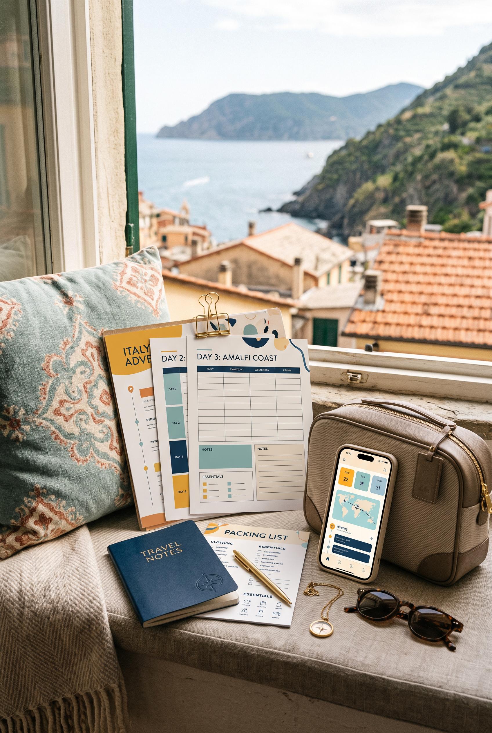
Create a commercial-quality vertical 2:3 Pinterest composition showcasing an editable travel planner bundle in a sunlit window-seat vignette. Arrange printed itinerary pages, packing cards, a small notebook, a phone with abstract interface blocks, sunglasses, and a compact neutral travel bag. Use saffron yellow, dusty aqua, deep ink blue, and warm cream. Make the scene aspirational, organized, and editorial. No real brands, no trademarked characters, no watermark, and no unintended readable text. AI-modified downstream.
 0
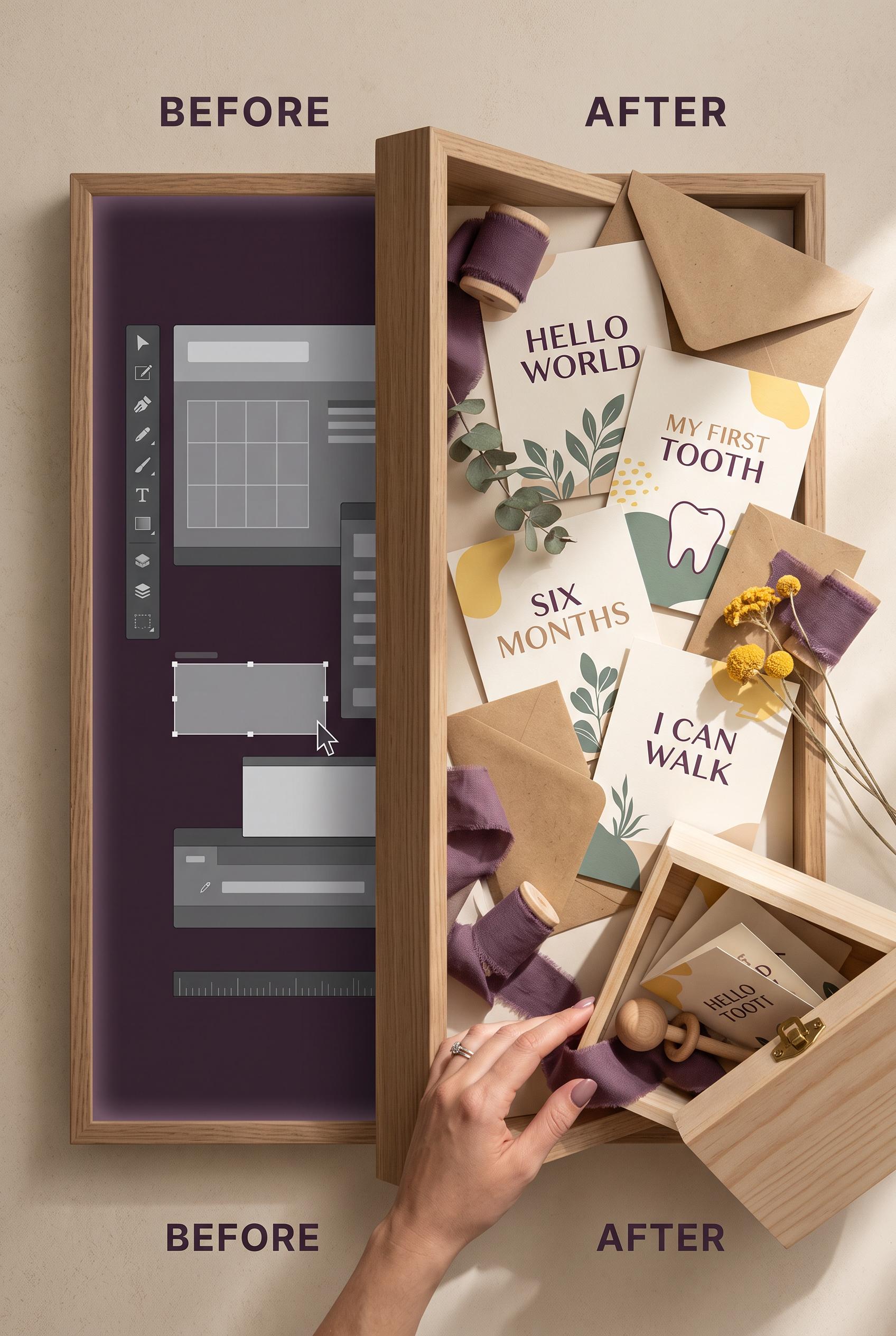
Create a commercial-quality vertical 2:3 Pinterest composition showing a before-and-after transformation of an editable milestone card suite. Use a shadow-box portal reveal, with an unstyled digital preview on one side and a warm tactile arrangement of printed cards, envelopes, ribbon, and a small keepsake box on the other. Use aubergine, warm sand, butter yellow, and eucalyptus green. Include subtle interface shapes without readable text. No real brands, no trademarked characters, no watermark, and no unintended readable text. AI-modified downstream.
 0
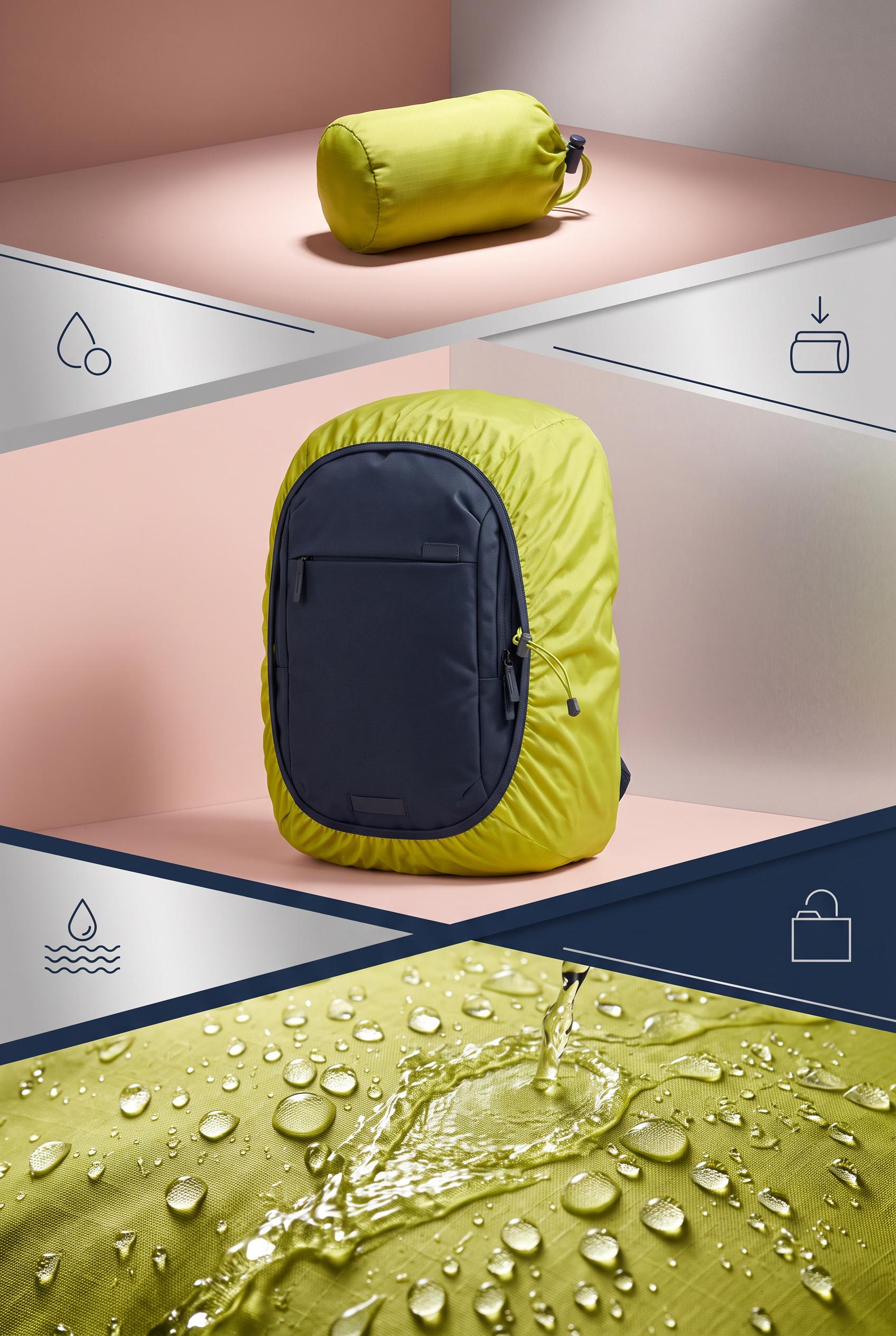
Create a commercial-quality educational product campaign in a vertical 2:3 Pinterest composition. Show a foldable backpack rain cover through three connected stages: compact silhouette, fitted backpack contour, and beaded water rolling off fabric in a controlled rain test. Use chartreuse, ink navy, blush, and satin silver, bold directional lighting, crisp close-up details, simple geometric dividers, no real brands, no trademarked characters, no watermark, and no unintended readable text.
 0
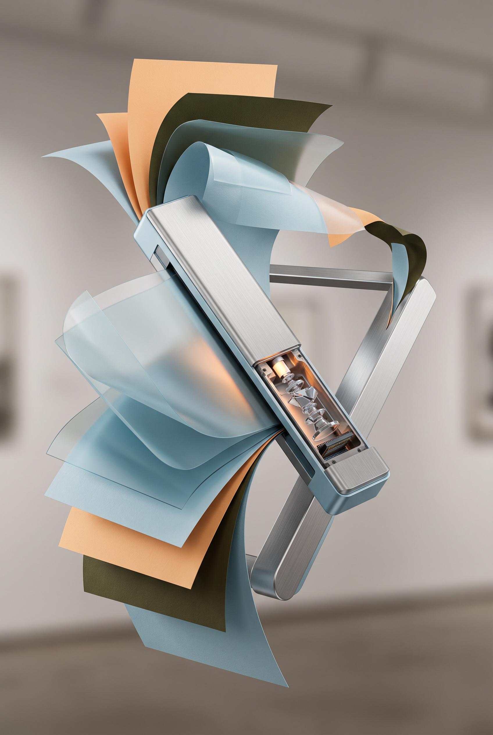
Create a commercial-quality product mockup in a vertical 2:3 Pinterest composition. Feature a slim portable document scanner floating among sculptural curled paper sheets, translucent scan layers, and a brushed metal support, with a subtle cutaway view of its internal optical path. Use glacier blue, apricot, dark olive, and brushed silver, controlled gallery lighting, crisp material detail, refined shadows, no real brands, no trademarked characters, no watermark, and no unintended readable text.
 0
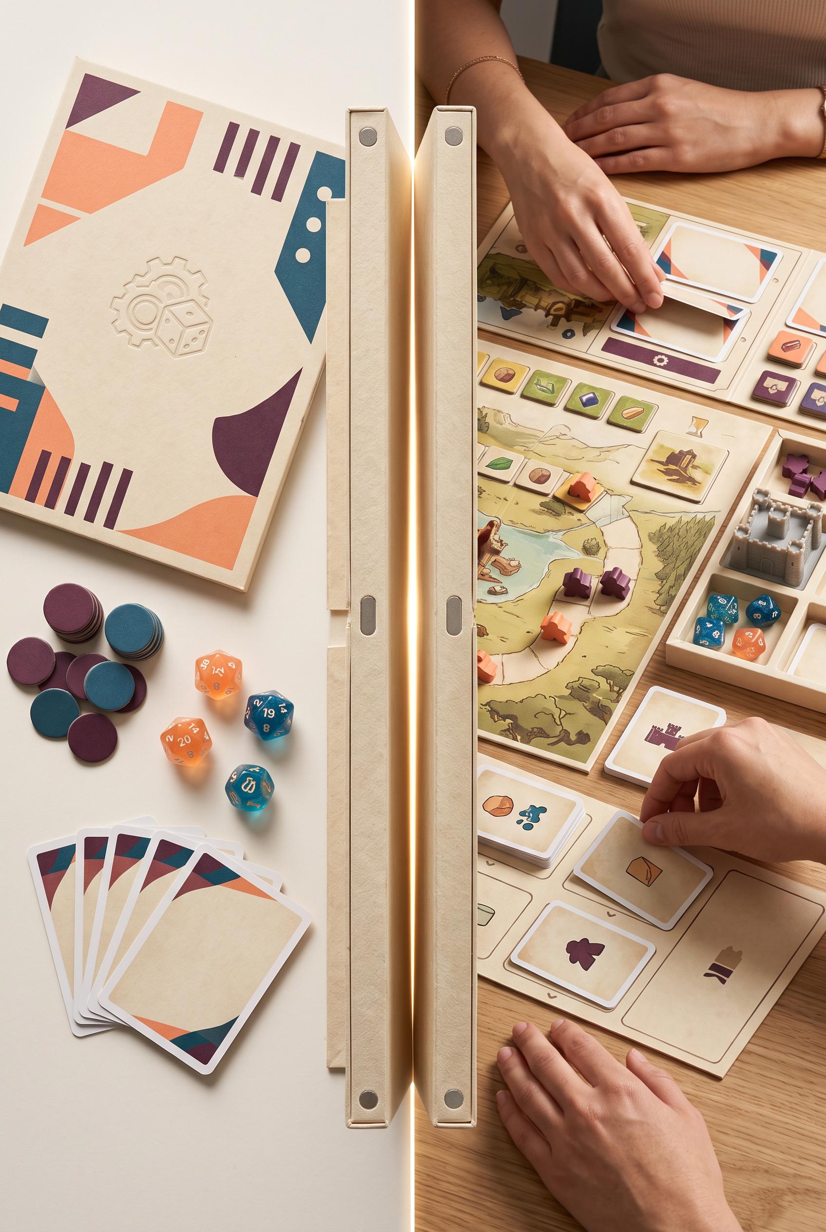
Create a commercial-quality product packaging transformation in a vertical 2:3 Pinterest composition. Show a flat illustrated-free game sleeve and loose components on one side, transitioning through a dramatic hinged paper reveal into an organized tabletop game setup on the other side. Use melon, petrol blue, parchment, and deep plum accents, tactile uncoated paper, magnetic closures, soft studio shadows, premium editorial art direction, no real brands, no trademarked characters, no watermark, and no unintended readable text.
 0
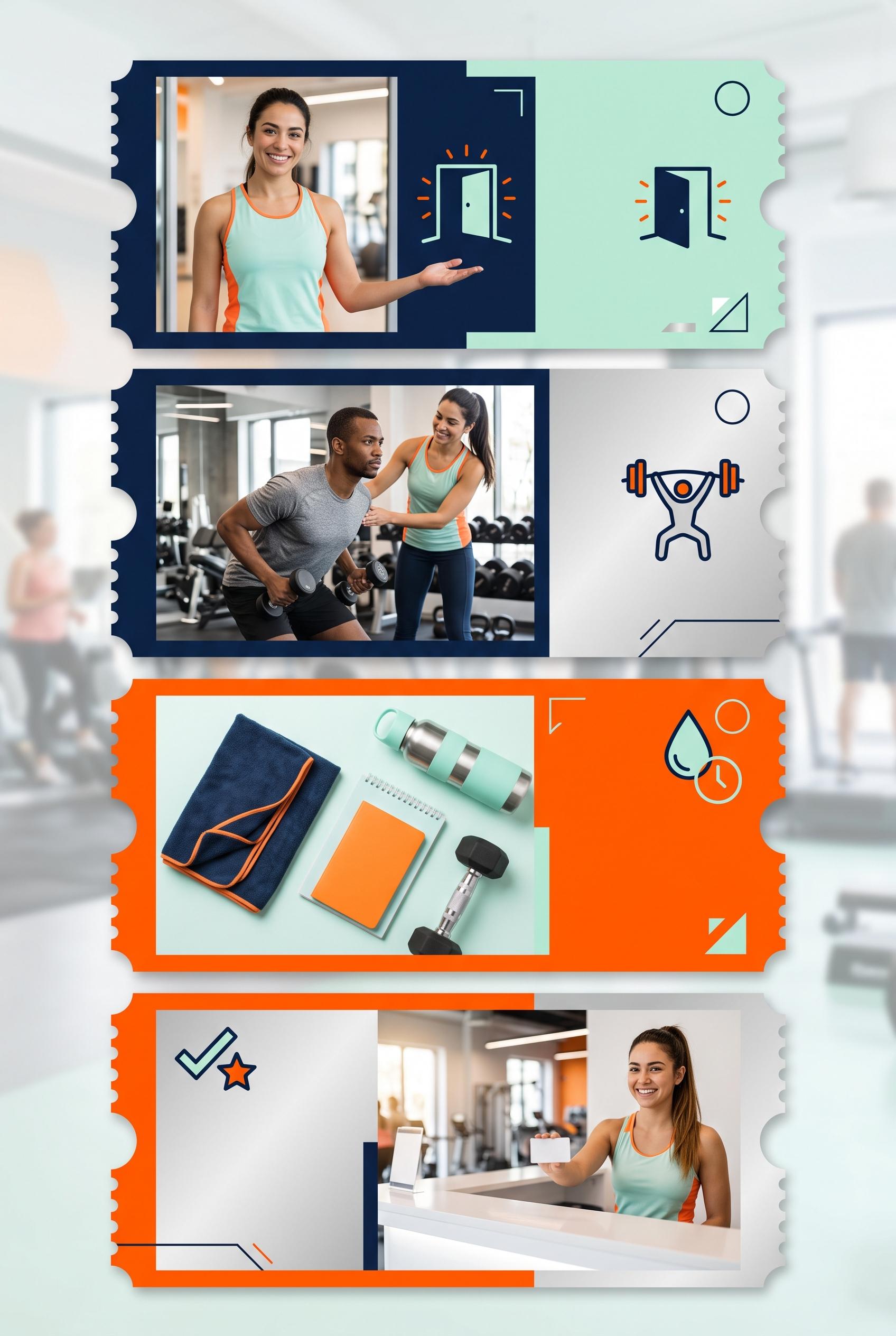
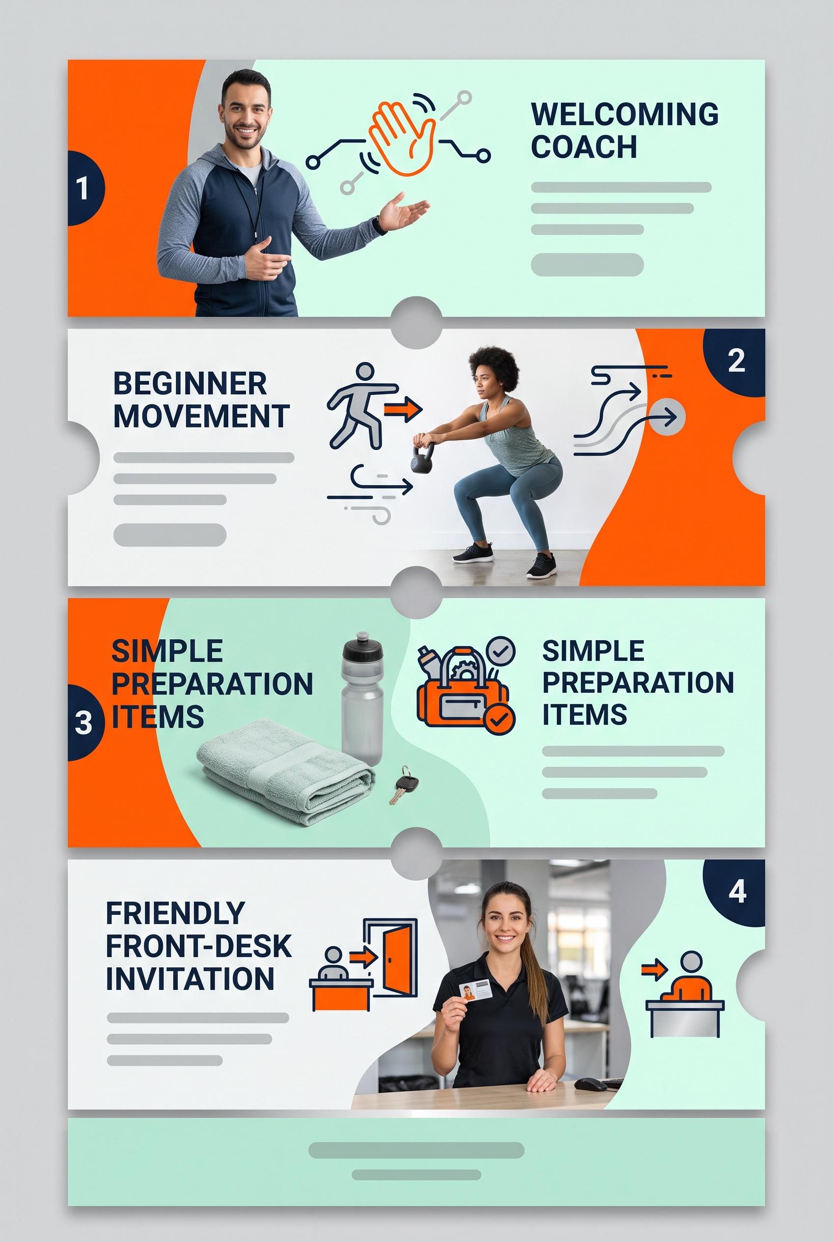
Create a commercial-quality vertical 2:3 Pinterest composition explaining a four-part trial class campaign for a neighborhood independent gym. Show a foldout ticket strip running vertically through four connected panels, each with a distinct visual moment: welcoming coach, beginner movement, simple preparation items, and friendly front-desk invitation. Use electric orange, midnight blue, mint, and silver. Blend clean campaign design with realistic lifestyle photography, crisp spacing, energetic but approachable art direction, and abstract iconography. AI-modified downstream. No real brands, no trademarked characters, no watermark, and no unintended readable text. Corrective regeneration attempt 3. Produce a materially revised image, not a near-duplicate of an earlier variant. Preserve the successful subject, palette, lighting, focal hierarchy, and commercial polish from the original brief while correcting every issue below. Mandatory corrective instructions from the most recent visual QA: Preserve the polished vertical 2:3 foldout ticket strip, four connected panels, orange/midnight-blue/mint/silver palette, realistic coach, beginner movement, preparation items, welcoming front desk, icons, lighting, and spacing. Remove every letter, word, number, numeral, heading, label, logo, glyph, price, and pseudo-text shape, including all panel titles, numbered badges, and bottom footer marks. Replace text regions with clean blank mint, pale, or white surfaces and only subtle non-linguistic geometric accents; use abstract icons and visual scenes alone to communicate the four steps. Ensure no readable or malformed text appears anywhere. Observed defects from prior variants that must not recur: 1) Strong vertical ticket-strip composition with clear four-part sequence and attractive photography. 2) The creative contradicts the brief’s requirement for blank text areas and visual understanding without readable copy: every panel and the footer contain extensive embedded text. 3) The dense typography makes the design feel like a finished infographic rather than the requested abstract campaign system. 4) Strong vertical 2:3 composition with clear four-panel structure and polished photography. 5) Extensive readable text remains throughout, including headings, numbered badges, and footer placeholder marks that resemble designed copy, directly violating the no-readable-text/c 6) ampaign-system requirement. 7) The dense typography makes the creative function as a finished infographic rather than an abstract visual system. Render no letters, words, numbers, prices, headings, labels, contact details, logos, glyphs, or pseudo-text anywhere. Use only blank surfaces, clean geometric marks, and non-linguistic placeholder shapes. Do not add explanatory captions, before/after labels, interface copy, or extra objects that the brief did not request. When a corrective instruction conflicts with a decorative detail, prioritize the corrective instruction.
 0
Create a commercial-quality vertical 2:3 Pinterest composition explaining a four-part trial class campaign for a neighborhood independent gym. Show a foldout ticket strip running vertically through four connected panels, each with a distinct visual moment: welcoming coach, beginner movement, simple preparation items, and friendly front-desk invitation. Use electric orange, midnight blue, mint, and silver. Blend clean campaign design with realistic lifestyle photography, crisp spacing, energetic but approachable art direction, and abstract iconography. AI-modified downstream. No real brands, no trademarked characters, no watermark, and no unintended readable text. Corrective regeneration attempt 2. Produce a materially revised image, not a near-duplicate of an earlier variant. Preserve the successful subject, palette, lighting, focal hierarchy, and commercial polish from the original brief while correcting every issue below. Mandatory corrective instructions from the most recent visual QA: Preserve the vertical 2:3 foldout ticket strip, orange/midnight-blue/mint/silver palette, connected four-panel structure, realistic coach, beginner movement, preparation items, welcoming front desk, icons, and crisp spacing. Remove all readable words and letters from the image, including the top headline, all panel headings/body copy, and the bottom call-to-action banner. Replace each text area with clean blank mint or pale panels containing only subtle abstract gray placeholder lines or empty shapes; keep numbered shapes and icons to communicate the four steps visually. Ensure no logos, brands, watermark, or malformed text remain. Observed defects from prior variants that must not recur: 1) Strong vertical ticket-strip composition with clear four-part sequence and attractive photography. 2) The creative contradicts the brief’s requirement for blank text areas and visual understanding without readable copy: every panel and the footer contain extensive embedded text. 3) The dense typography makes the design feel like a finished infographic rather than the requested abstract campaign system. Render no letters, words, numbers, prices, headings, labels, contact details, logos, glyphs, or pseudo-text anywhere. Use only blank surfaces, clean geometric marks, and non-linguistic placeholder shapes. Do not add explanatory captions, before/after labels, interface copy, or extra objects that the brief did not request. When a corrective instruction conflicts with a decorative detail, prioritize the corrective instruction.
 0
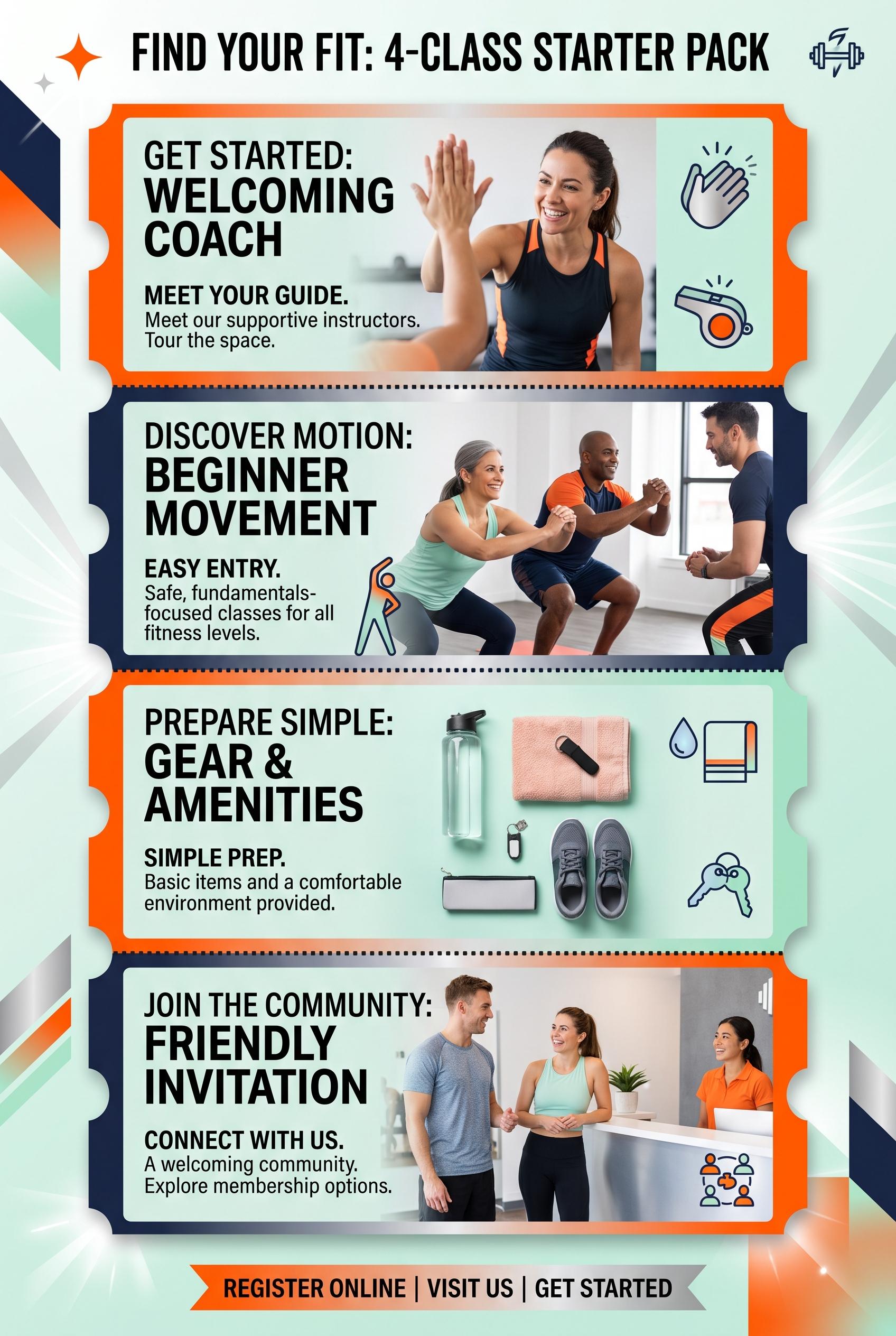
Create a commercial-quality vertical 2:3 Pinterest composition explaining a four-part trial class campaign for a neighborhood independent gym. Show a foldout ticket strip running vertically through four connected panels, each with a distinct visual moment: welcoming coach, beginner movement, simple preparation items, and friendly front-desk invitation. Use electric orange, midnight blue, mint, and silver. Blend clean campaign design with realistic lifestyle photography, crisp spacing, energetic but approachable art direction, and abstract iconography. AI-modified downstream. No real brands, no trademarked characters, no watermark, and no unintended readable text.
 0
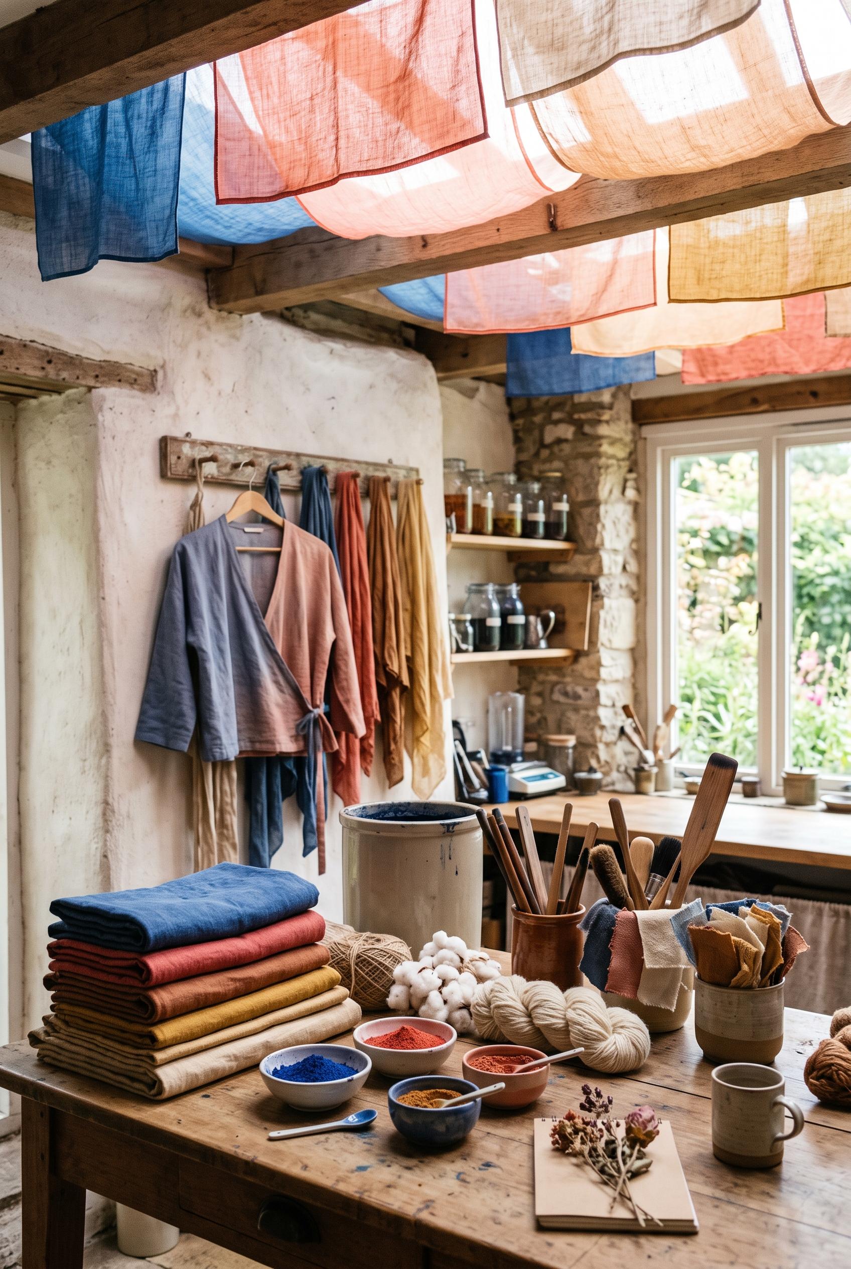
Create a commercial-quality vertical 2:3 Pinterest composition showcasing an independent fabric dyeing studio. Arrange richly dyed folded textiles, pigment bowls, natural fibers, wooden tools, loose swatches, and one finished garment in a sunlit gallery-like workspace. Add suspended translucent color panels overhead as a distinctive visual mechanism. Use lapis blue, coral, clay, and parchment with refined editorial styling, realistic material detail, soft directional light, and an inviting handmade atmosphere. AI-modified downstream. No real brands, no trademarked characters, no watermark, and no unintended readable text.
 0
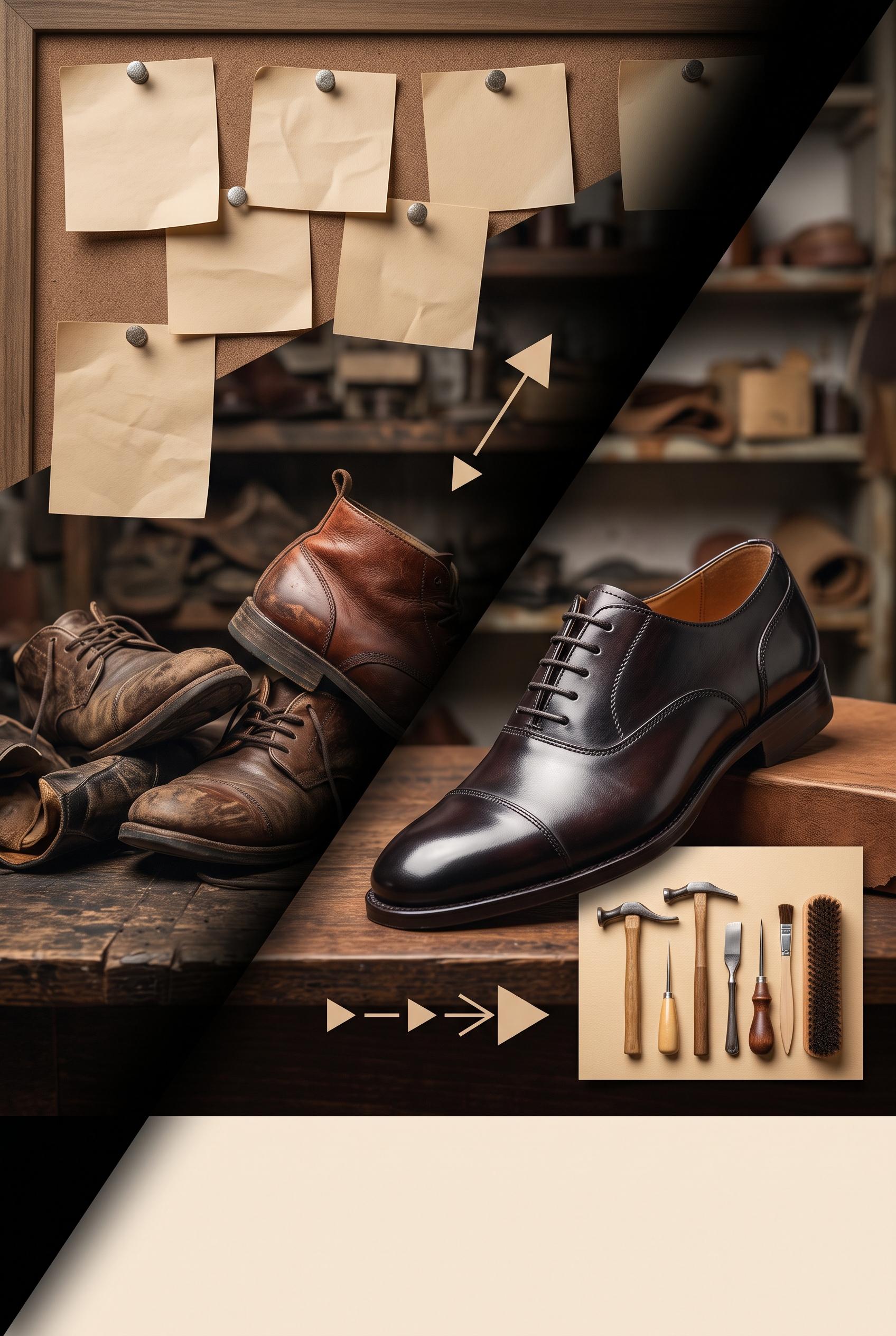
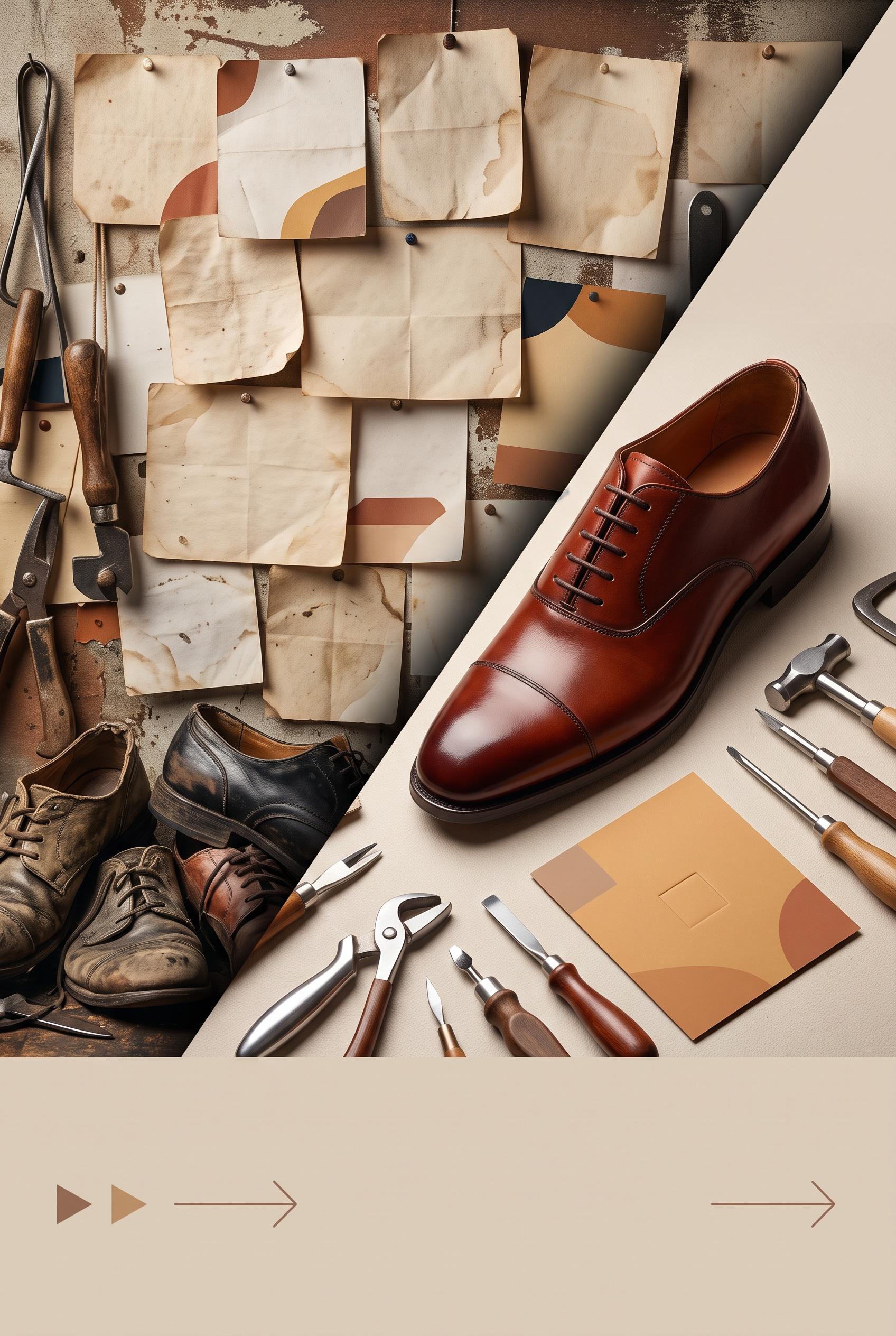
Create a commercial-quality vertical 2:3 Pinterest composition for an independent shoe repair studio promotion, showing a before-and-after transformation through a sliding shadow mask: left side cluttered with mismatched service notes and worn shoes, right side elegant with one beautifully restored leather shoe, neat tools, warm paper card, and directional visual cues. Use burnt sienna, deep ink, ochre, and almond. Editorial product photography, tactile textures, controlled studio lighting, strong focal hierarchy, premium small-business art direction. AI-modified downstream. No real brands, no trademarked characters, no watermark, and no unintended readable text. Corrective regeneration attempt 5. Produce a materially revised image, not a near-duplicate of an earlier variant. Preserve the successful subject, palette, lighting, focal hierarchy, and commercial polish from the original brief while correcting every issue below. Mandatory corrective instructions from the most recent visual QA: Recompose and crop to an exact vertical 2:3 canvas. Preserve the polished restored leather shoe, diagonal sliding shadow mask, warm burnt-sienna/ochre/almond palette, tactile textures, worn shoes and completely blank abstract notes on the left, tools on the right, geometric blank offer card, and simple abstract directional arrows. Reduce the oversized bottom blank area so the shoe and transformation scene occupy more of the frame while retaining clean negative space. Keep every paper surface free of letters, numbers, symbols, pseudo-writing, logos, watermarks, and readable or text-like marks. Observed defects from prior variants that must not recur: 1) Extensive readable text appears on the pinned notes and central card, including labels and handwritten phrases, violating the no-readable-text requirement. 2) Some marks resemble pseudo-writing and compete with the otherwise premium presentation. 3) Strong vertical composition, focal shoe, palette, and sliding-mask transformation are successful. 4) Pinned notes contain pseudo-writing, lines, and glyph-like symbols. 5) Central card contains recognizable calendar and phone icons, which violate the abstract non-linguistic cue requirement. 6) Bottom arrows are acceptable directionally, but the image still has unintended text-like marks throughout. 7) The composition is approximately 3:4 rather than the required vertical 2:3 format. 8) The lower negative-space area is oversized, weakening the commercial composition and focal hierarchy. Render no letters, words, numbers, prices, headings, labels, contact details, logos, glyphs, or pseudo-text anywhere. Use only blank surfaces, clean geometric marks, and non-linguistic placeholder shapes. Do not add explanatory captions, before/after labels, interface copy, or extra objects that the brief did not request. When a corrective instruction conflicts with a decorative detail, prioritize the corrective instruction.
 0
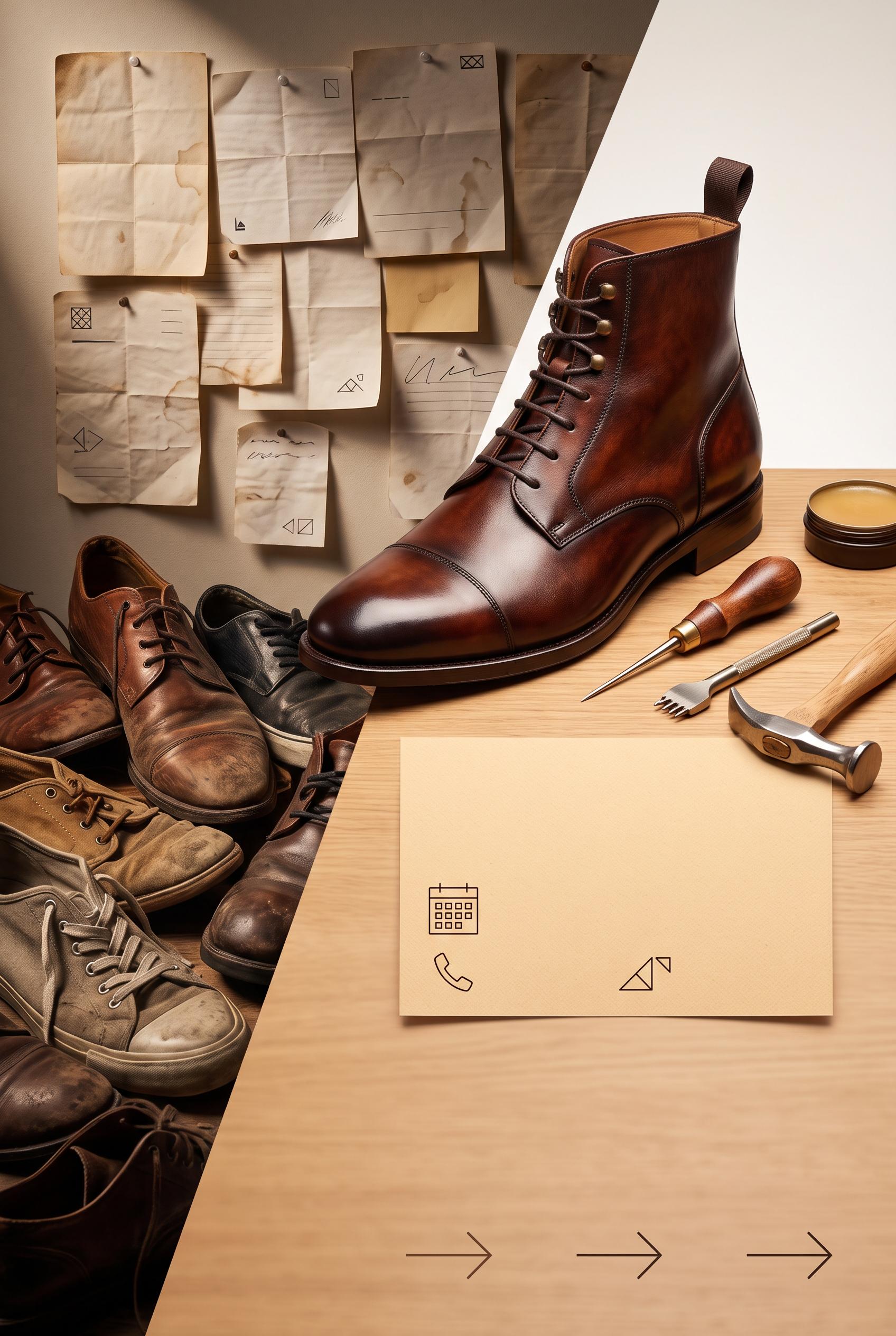
Create a commercial-quality vertical 2:3 Pinterest composition for an independent shoe repair studio promotion, showing a before-and-after transformation through a sliding shadow mask: left side cluttered with mismatched service notes and worn shoes, right side elegant with one beautifully restored leather shoe, neat tools, warm paper card, and directional visual cues. Use burnt sienna, deep ink, ochre, and almond. Editorial product photography, tactile textures, controlled studio lighting, strong focal hierarchy, premium small-business art direction. AI-modified downstream. No real brands, no trademarked characters, no watermark, and no unintended readable text. Corrective regeneration attempt 4. Produce a materially revised image, not a near-duplicate of an earlier variant. Preserve the successful subject, palette, lighting, focal hierarchy, and commercial polish from the original brief while correcting every issue below. Mandatory corrective instructions from the most recent visual QA: Preserve the vertical 2:3 editorial composition, diagonal sliding shadow mask, warm burnt-sienna/ochre/almond palette, tactile paper and leather textures, cluttered worn shoes on the left, dominant polished restored shoe on the right, tools, and premium lighting. Remove every line, handwriting stroke, pseudo-letter, number, label, logo, glyph, calendar icon, phone icon, and text-like mark from all pinned notes and papers. Make every note completely blank except subtle folds, stains, and non-linguistic abstract color shapes. Make the central warm paper card entirely blank or use only soft geometric color blocks with no recognizable symbols. Keep the bottom as clean negative space with only a few simple geometric directional arrows. Ensure no watermark, brand, trademark, caption, or readable or pseudo-readable text anywhere. Observed defects from prior variants that must not recur: 1) The lower typography is prominent and competes with the restored shoe focal point. 2) Strong vertical 2:3 composition, palette, lighting, diagonal transformation mask, and restored-shoe focal point. 3) Extensive readable text appears on the pinned notes and central card, including labels and handwritten phrases, violating the no-readable-text requirement. 4) Some marks resemble pseudo-writing and compete with the otherwise premium presentation. 5) Strong vertical composition, focal shoe, palette, and sliding-mask transformation are successful. 6) Pinned notes contain pseudo-writing, lines, and glyph-like symbols. 7) Central card contains recognizable calendar and phone icons, which violate the abstract non-linguistic cue requirement. 8) Bottom arrows are acceptable directionally, but the image still has unintended text-like marks throughout. Render no letters, words, numbers, prices, headings, labels, contact details, logos, glyphs, or pseudo-text anywhere. Use only blank surfaces, clean geometric marks, and non-linguistic placeholder shapes. Do not add explanatory captions, before/after labels, interface copy, or extra objects that the brief did not request. When a corrective instruction conflicts with a decorative detail, prioritize the corrective instruction.
 0
Create a commercial-quality vertical 2:3 Pinterest composition for an independent shoe repair studio promotion, showing a before-and-after transformation through a sliding shadow mask: left side cluttered with mismatched service notes and worn shoes, right side elegant with one beautifully restored leather shoe, neat tools, warm paper card, and directional visual cues. Use burnt sienna, deep ink, ochre, and almond. Editorial product photography, tactile textures, controlled studio lighting, strong focal hierarchy, premium small-business art direction. AI-modified downstream. No real brands, no trademarked characters, no watermark, and no unintended readable text. Corrective regeneration attempt 3. Produce a materially revised image, not a near-duplicate of an earlier variant. Preserve the successful subject, palette, lighting, focal hierarchy, and commercial polish from the original brief while correcting every issue below. Mandatory corrective instructions from the most recent visual QA: Preserve the attractive vertical 2:3 editorial shoe-repair composition, diagonal sliding shadow mask, warm burnt-sienna/ochre/almond palette, tactile leather and paper textures, cluttered worn shoes on the left, and one dominant polished restored leather shoe with tools on the right. Completely remove every letter, word, number, label, handwriting stroke, logo, glyph, pseudo-text mark, and line of writing from every pinned note, loose paper, central card, and lower area. Replace all notes with blank paper showing only subtle folds, stains, or abstract non-linguistic geometric marks. Replace the central offer card with a completely blank warm paper card containing only simple abstract booking symbols, not letter-like glyphs. Keep the bottom area as clean negative space with only a few simple directional geometric arrows; remove any typography-like lines or text placeholders. Ensure no watermark, brand, trademark, caption, or text-like artifact appears anywhere. Observed defects from prior variants that must not recur: 1) The composition is attractive and clearly split before/after, but it contains extensive readable text on the notes, offer card, and bottom banner, contrary to the brief’s abstract, 2) non-readable booking cue requirement. 3) The handwritten notes include apparent names and detailed phrases, creating unintended readable copy and a less premium commercial finish. 4) The lower typography is prominent and competes with the restored shoe focal point. 5) Strong vertical 2:3 composition, palette, lighting, diagonal transformation mask, and restored-shoe focal point. 6) Extensive readable text appears on the pinned notes and central card, including labels and handwritten phrases, violating the no-readable-text requirement. 7) Some marks resemble pseudo-writing and compete with the otherwise premium presentation. Render no letters, words, numbers, prices, headings, labels, contact details, logos, glyphs, or pseudo-text anywhere. Use only blank surfaces, clean geometric marks, and non-linguistic placeholder shapes. Do not add explanatory captions, before/after labels, interface copy, or extra objects that the brief did not request. When a corrective instruction conflicts with a decorative detail, prioritize the corrective instruction.
 0
Create a commercial-quality vertical 2:3 Pinterest composition for an independent shoe repair studio promotion, showing a before-and-after transformation through a sliding shadow mask: left side cluttered with mismatched service notes and worn shoes, right side elegant with one beautifully restored leather shoe, neat tools, warm paper card, and directional visual cues. Use burnt sienna, deep ink, ochre, and almond. Editorial product photography, tactile textures, controlled studio lighting, strong focal hierarchy, premium small-business art direction. AI-modified downstream. No real brands, no trademarked characters, no watermark, and no unintended readable text. Corrective regeneration attempt 2. Produce a materially revised image, not a near-duplicate of an earlier variant. Preserve the successful subject, palette, lighting, focal hierarchy, and commercial polish from the original brief while correcting every issue below. Mandatory corrective instructions from the most recent visual QA: Preserve the vertical 2:3 editorial shoe-repair scene, strong diagonal sliding shadow mask, tactile leather and paper textures, warm burnt-sienna/ochre/almond palette, cluttered worn shoes on the left, and one polished restored leather shoe with tools on the right. Remove every readable letter, word, number, name, logo, and pseudo-text mark from all notes, cards, and lower banners. Replace the offer card with a blank warm paper card containing only abstract geometric booking symbols; replace all bottom typography with clean negative space and simple abstract directional shapes/arrows. Keep the restored shoe as the dominant focal point and ensure there are no watermarks, brands, trademarks, or text-like artifacts. Observed defects from prior variants that must not recur: 1) The composition is attractive and clearly split before/after, but it contains extensive readable text on the notes, offer card, and bottom banner, contrary to the brief’s abstract, 2) non-readable booking cue requirement. 3) The handwritten notes include apparent names and detailed phrases, creating unintended readable copy and a less premium commercial finish. 4) The lower typography is prominent and competes with the restored shoe focal point. Render no letters, words, numbers, prices, headings, labels, contact details, logos, glyphs, or pseudo-text anywhere. Use only blank surfaces, clean geometric marks, and non-linguistic placeholder shapes. Do not add explanatory captions, before/after labels, interface copy, or extra objects that the brief did not request. When a corrective instruction conflicts with a decorative detail, prioritize the corrective instruction.
 0
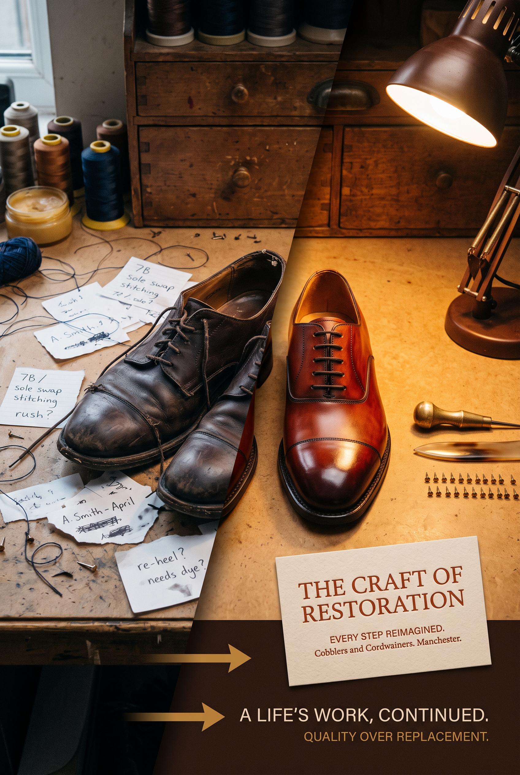
Create a commercial-quality vertical 2:3 Pinterest composition for an independent shoe repair studio promotion, showing a before-and-after transformation through a sliding shadow mask: left side cluttered with mismatched service notes and worn shoes, right side elegant with one beautifully restored leather shoe, neat tools, warm paper card, and directional visual cues. Use burnt sienna, deep ink, ochre, and almond. Editorial product photography, tactile textures, controlled studio lighting, strong focal hierarchy, premium small-business art direction. AI-modified downstream. No real brands, no trademarked characters, no watermark, and no unintended readable text.
 0
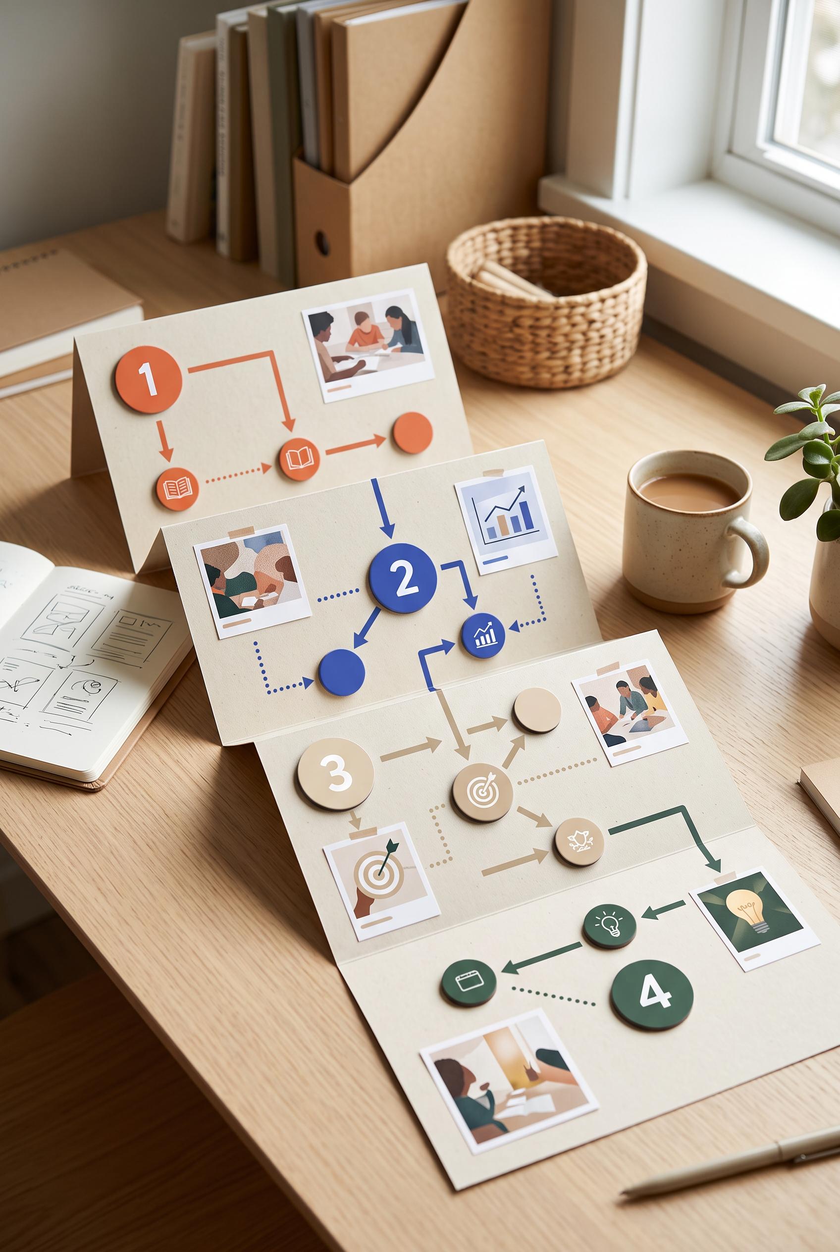
Create a commercial-quality vertical 2:3 Pinterest composition for an educational portfolio case study campaign planner. Show a foldout decision tree on a desk with four distinct content stages represented by magnetic tokens, arrows, small abstract image placeholders, and clean numbered shapes without readable words. Use persimmon, ultramarine, oat, and pine, with crisp daylight, no real brands, no trademarked characters, no watermark, no unintended readable text.
 0
Create a commercial-quality vertical 2:3 Pinterest composition showcasing a botanical macro photographer personal brand identity. Arrange close-up flower textures, translucent image overlays, circular lens motifs, tactile paper swatches, camera-inspired shapes, and a specimen-drawer grid in smoky lilac, mineral blue, citron, and espresso. Use elegant editorial art direction, no real brands, no trademarked characters, no watermark, no unintended readable text. Corrective regeneration attempt 3. Produce a materially revised image, not a near-duplicate of an earlier variant. Preserve the successful subject, palette, lighting, focal hierarchy, and commercial polish from the original brief while correcting every issue below. Mandatory corrective instructions from the most recent visual QA: Preserve the exact vertical 2:3 editorial collage, botanical macro focal point, smoky lilac/mineral blue/citron/espresso palette, lighting, translucent overlays, lens motifs, camera-inspired geometry, paper textures, and refined collectible commercial polish. Remove every stacked line, paragraph-like mark, caption-like rule, label-like text treatment, and logo-like symbol from all specimen cards and paper elements. Replace them only with isolated abstract dots, simple geometric bars, solid blocks, blank rounded shapes, or non-linguistic patterns with no repeated line spacing and no writing-like rhythm. Keep the botanical photos and overall layout, but ensure absolutely no letters, words, numbers, glyphs, labels, contact details, pseudo-text, watermark, trademark, or garbled readable marks appear anywhere. Observed defects from prior variants that must not recur: 1) Strong vertical composition, palette, botanical macro focal points, lens motifs, and cohesive identity-system styling. 2) Specimen cards contain numerous tiny pseudo-readable words and paragraph-like marks, creating unintended garbled text and reducing commercial polish. 3) Strong vertical editorial composition, focal botanical macro imagery, cohesive palette, and polished branding-system aesthetic. 4) Specimen cards and paper elements still contain stacked horizontal pseudo-text lines and label-like marks, violating the requirement for no pseudo-readable text. Render no letters, words, numbers, prices, headings, labels, contact details, logos, glyphs, or pseudo-text anywhere. Use only blank surfaces, clean geometric marks, and non-linguistic placeholder shapes. Do not add explanatory captions, before/after labels, interface copy, or extra objects that the brief did not request. When a corrective instruction conflicts with a decorative detail, prioritize the corrective instruction.
 0
Create a commercial-quality vertical 2:3 Pinterest composition showcasing a botanical macro photographer personal brand identity. Arrange close-up flower textures, translucent image overlays, circular lens motifs, tactile paper swatches, camera-inspired shapes, and a specimen-drawer grid in smoky lilac, mineral blue, citron, and espresso. Use elegant editorial art direction, no real brands, no trademarked characters, no watermark, no unintended readable text. Corrective regeneration attempt 2. Produce a materially revised image, not a near-duplicate of an earlier variant. Preserve the successful subject, palette, lighting, focal hierarchy, and commercial polish from the original brief while correcting every issue below. Mandatory corrective instructions from the most recent visual QA: Preserve the exact vertical 2:3 editorial collage, botanical macro flowers, smoky lilac/mineral blue/citron/espresso palette, translucent overlays, circular lens motifs, paper swatches, camera-inspired shapes, and specimen-drawer grid. Remove every readable or pseudo-readable character, word, paragraph, caption, label, and logo-like mark from all specimen cards and paper elements. Replace them only with clean abstract lines, dots, geometric bars, or blank label shapes that cannot resemble writing. Keep the refined collectible branding-system aesthetic and ensure there are no watermarks, trademarks, or generation artifacts. Observed defects from prior variants that must not recur: 1) Strong vertical composition, palette, botanical macro focal points, lens motifs, and cohesive identity-system styling. 2) Specimen cards contain numerous tiny pseudo-readable words and paragraph-like marks, creating unintended garbled text and reducing commercial polish. Render no letters, words, numbers, prices, headings, labels, contact details, logos, glyphs, or pseudo-text anywhere. Use only blank surfaces, clean geometric marks, and non-linguistic placeholder shapes. Do not add explanatory captions, before/after labels, interface copy, or extra objects that the brief did not request. When a corrective instruction conflicts with a decorative detail, prioritize the corrective instruction.
 0
Create a commercial-quality vertical 2:3 Pinterest composition showcasing a botanical macro photographer personal brand identity. Arrange close-up flower textures, translucent image overlays, circular lens motifs, tactile paper swatches, camera-inspired shapes, and a specimen-drawer grid in smoky lilac, mineral blue, citron, and espresso. Use elegant editorial art direction, no real brands, no trademarked characters, no watermark, no unintended readable text.
 0
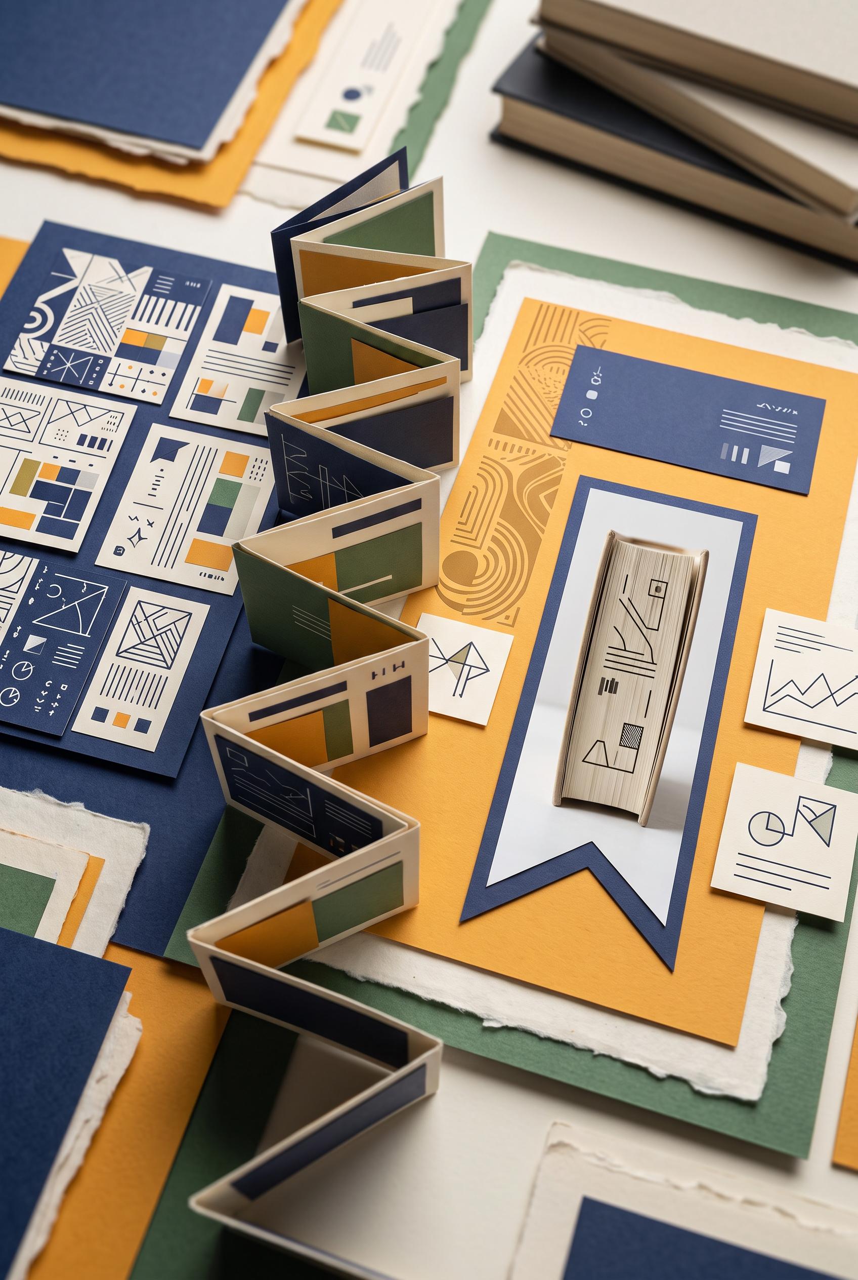
Create a commercial-quality vertical 2:3 Pinterest composition showing a before-and-after transformation for an independent book reviewer personal brand. Use an accordion-fold reveal with layered paper cards, a bold bookmark-shaped image crop, tactile editorial materials, indigo, marigold, bone, and fern palette, refined studio lighting, premium design direction, no real brands, no trademarked characters, no watermark, no unintended readable text. Corrective regeneration attempt 3. Produce a materially revised image, not a near-duplicate of an earlier variant. Preserve the successful subject, palette, lighting, focal hierarchy, and commercial polish from the original brief while correcting every issue below. Mandatory corrective instructions from the most recent visual QA: Preserve the premium indigo, marigold, bone, and fern palette, refined studio lighting, tactile torn-paper edges, accordion-fold structure, left-to-right transformation, and bookmark-shaped crop. Remove every text-like or glyph-like mark from all cards, book surfaces, notes, spines, and background objects, including the small symbols and line clusters on the left cards, top-center card, blue card, and bookmark image. Replace them only with clean abstract geometric blocks, dots, stripes, arcs, and non-linguistic shapes. Keep the left side crowded but purely geometric, and the right side focused and clean. Do not add any letters, words, numbers, labels, logos, pseudo-text, watermark, or captions. Observed defects from prior variants that must not recur: 1) Strong vertical composition and attractive tactile palette, but multiple areas contain garbled or awkward pseudo-readable text, especially the handwritten notes, brochure copy, and 2) Strong vertical composition, tactile paper collage, palette, lighting, accordion reveal, and bookmark-shaped focal crop are successful. 3) Multiple cards and book surfaces contain pseudo-readable glyphs and text-like marks, violating the explicit requirement for no letters, words, numbers, logos, glyphs, or pseudo-tex 4) The left-side abstract cards are visually busy and include several marks that could be interpreted as writing rather than purely non-linguistic geometry. Render no letters, words, numbers, prices, headings, labels, contact details, logos, glyphs, or pseudo-text anywhere. Use only blank surfaces, clean geometric marks, and non-linguistic placeholder shapes. Do not add explanatory captions, before/after labels, interface copy, or extra objects that the brief did not request. When a corrective instruction conflicts with a decorative detail, prioritize the corrective instruction.
 0
Create a commercial-quality vertical 2:3 Pinterest composition showing a before-and-after transformation for an independent book reviewer personal brand. Use an accordion-fold reveal with layered paper cards, a bold bookmark-shaped image crop, tactile editorial materials, indigo, marigold, bone, and fern palette, refined studio lighting, premium design direction, no real brands, no trademarked characters, no watermark, no unintended readable text. Corrective regeneration attempt 2. Produce a materially revised image, not a near-duplicate of an earlier variant. Preserve the successful subject, palette, lighting, focal hierarchy, and commercial polish from the original brief while correcting every issue below. Mandatory corrective instructions from the most recent visual QA: Preserve the premium indigo, marigold, bone, and fern paper collage, refined lighting, accordion-fold structure, and bookmark-shaped crop. Remove every readable word, letter, number, logo, and pseudo-text mark from all cards, book spines, notes, and background objects. Replace them with clean abstract lines, blocks, and tiny non-text graphic marks only. Keep the before-to-after transformation unmistakable through composition: a crowded generic card on the left transitioning to one focused bookmark-framed book image and a clean personal-brand layout on the right. Maintain clear hierarchy, tactile paper edges, small abstract content cards, and a commercial-quality vertical 2:3 composition. No watermark or brand-like markings. Observed defects from prior variants that must not recur: 1) Strong vertical composition and attractive tactile palette, but multiple areas contain garbled or awkward pseudo-readable text, especially the handwritten notes, brochure copy, and Render no letters, words, numbers, prices, headings, labels, contact details, logos, glyphs, or pseudo-text anywhere. Use only blank surfaces, clean geometric marks, and non-linguistic placeholder shapes. Do not add explanatory captions, before/after labels, interface copy, or extra objects that the brief did not request. When a corrective instruction conflicts with a decorative detail, prioritize the corrective instruction.
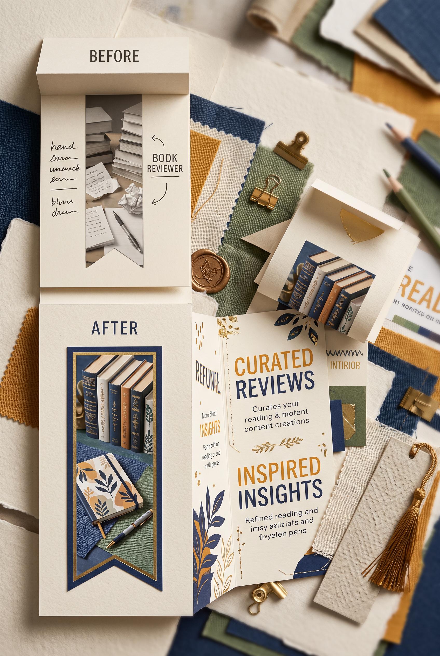 0
Create a commercial-quality vertical 2:3 Pinterest composition showing a before-and-after transformation for an independent book reviewer personal brand. Use an accordion-fold reveal with layered paper cards, a bold bookmark-shaped image crop, tactile editorial materials, indigo, marigold, bone, and fern palette, refined studio lighting, premium design direction, no real brands, no trademarked characters, no watermark, no unintended readable text.
 0
Create a commercial-quality educational interior design graphic in a vertical 2:3 Pinterest composition. Arrange a top-down measurement toolkit with tape measure, floor-plan cards, paper templates, and three miniature living room scenes demonstrating poor, balanced, and excessive coffee table spacing. Use visual arrows and blank diagram labels only, with no readable text. Palette of clay pink, pine green, ivory, cobalt, and natural cork. Crisp studio lighting, premium editorial layout, no real brands, no trademarked characters, no watermark, no unintended readable text, AI-modified downstream. Corrective regeneration attempt 2. Produce a materially revised image, not a near-duplicate of an earlier variant. Preserve the successful subject, palette, lighting, focal hierarchy, and commercial polish from the original brief while correcting every issue below. Mandatory corrective instructions from the most recent visual QA: Preserve the premium top-down vertical 2:3 layout, warm wood and cork surfaces, clay pink/pine green/ivory/cobalt palette, crisp lighting, tape measure, floor-plan card, three miniature living-room scenes, and blank arrow callouts. Change the final styled living-room example to feature an unmistakable compact oval coffee table. Add clearly folded paper template sheets in the measurement toolkit area, while keeping all diagrams abstract and free of readable words or numbers. Keep the three spacing demonstrations visually distinct: too tight, balanced, and too distant. Remove any unintended readable text, branding, watermark, or artifacts. Observed defects from prior variants that must not recur: 1) The final styled example uses a rectangular coffee table instead of the required compact oval table. 2) Folded paper templates are not clearly depicted; the upper-right sheets appear as flat outline cards. Render no letters, words, numbers, prices, headings, labels, contact details, logos, glyphs, or pseudo-text anywhere. Use only blank surfaces, clean geometric marks, and non-linguistic placeholder shapes. Do not add explanatory captions, before/after labels, interface copy, or extra objects that the brief did not request. When a corrective instruction conflicts with a decorative detail, prioritize the corrective instruction.
 0
Create a commercial-quality educational interior design graphic in a vertical 2:3 Pinterest composition. Arrange a top-down measurement toolkit with tape measure, floor-plan cards, paper templates, and three miniature living room scenes demonstrating poor, balanced, and excessive coffee table spacing. Use visual arrows and blank diagram labels only, with no readable text. Palette of clay pink, pine green, ivory, cobalt, and natural cork. Crisp studio lighting, premium editorial layout, no real brands, no trademarked characters, no watermark, no unintended readable text, AI-modified downstream.
关于我们的 AI 图片图库
我们的 AI 图片图库展示了社区创作的共享 AI 生成图片。每张图片都独一无二、质量上乘,体现了 AI 艺术生成的创意可能性。浏览各种风格、主题和类型,为你的下一个创意项目获取灵感。
为什么探索我们的图库?
- 发现跨多种风格和主题的独特 AI 生成图片
- 从创意提示和艺术风格中获取灵感
- 查看创意社区分享的图片
- 点击任意图片查看其分享页面并获取更多详情
如何使用图库
使用我们的图库简单直观:
- 浏览共享图片网格
- 点击任何吸引你的图片
- 在专用分享页面查看完整图片详情和分享链接
准备好创建你自己的 AI 图片了吗?
使用 AI Media Studio 生成精美图片。今天就开始创作!