KI-Bildergalerie
Entdecke 1720+ geteilte KI-generierte Bilder von unserer kreativen Community
Alle geteilten Bilder
Zeige 48 von 1720 geteilten Bildern
 0
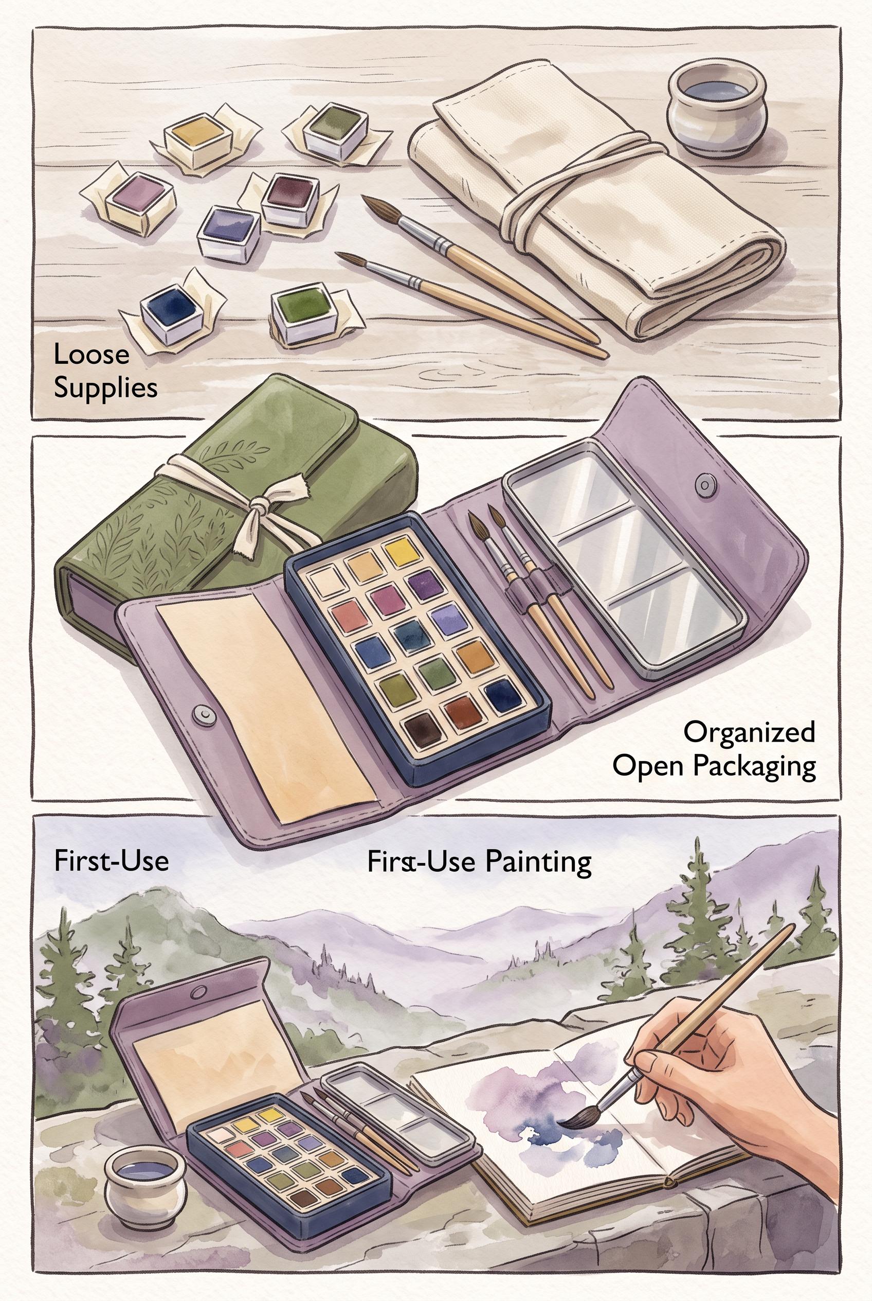
Create a commercial-quality vertical 2:3 Pinterest composition showing an unbranded foldable travel watercolor kit transformation in a hinged three-panel reveal: loose supplies, organized open packaging, and a calm first-use painting scene. Use dusty lilac, moss green, warm paper, and ink blue, with tactile paper grain and soft directional light. No real brands, no trademarked characters, no watermark, and no unintended readable text.
 0
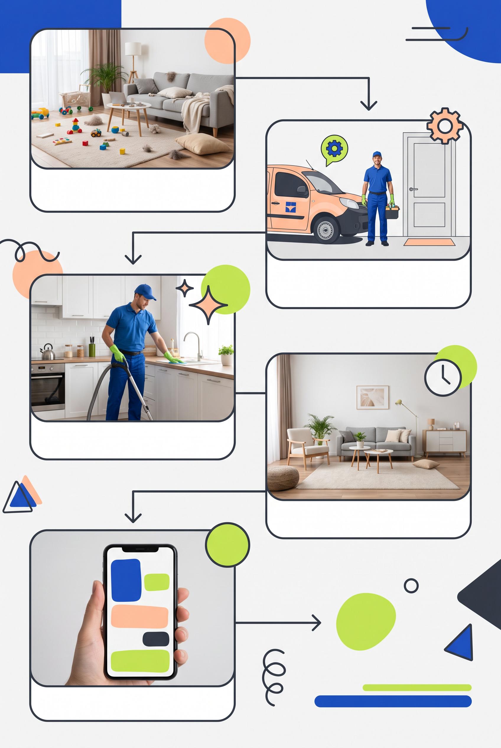
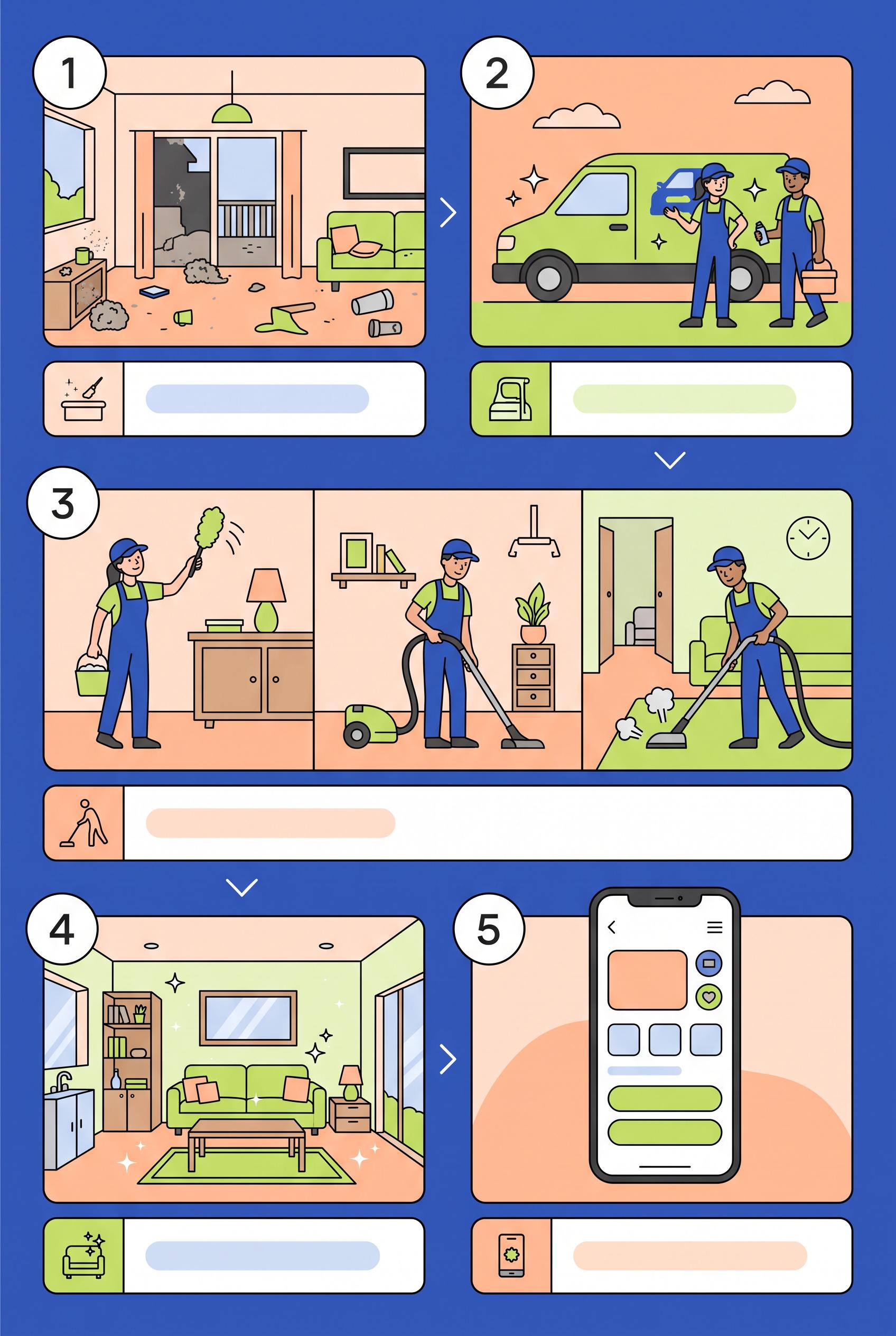
Create a commercial-quality educational Pinterest campaign graphic in a vertical 2:3 composition for a fictional mobile home-cleaning service. Show a modular five-frame storyboard grid with visual steps for problem, arrival, process, result, and next action, using icons, clean interior photography, directional connectors, and blank caption areas. Use cobalt blue, peach, lime, and charcoal. AI-modified downstream. No real brands, no trademarks, no trademarked characters, no watermark, and no unintended readable text. Corrective regeneration attempt 5. Produce a materially revised image, not a near-duplicate of an earlier variant. Preserve the successful subject, palette, lighting, focal hierarchy, and commercial polish from the original brief while correcting every issue below. Mandatory corrective instructions from the most recent visual QA: Preserve the polished vertical 2:3 layout, cobalt blue, peach, lime, and charcoal palette, rounded panels, clean interior photography, workers, directional connectors, geometric circles, and blank caption bars. Rebuild the layout as exactly five clearly separated rounded panels: messy problem, cleaner arrival, cleaning process, visibly clean result, and simple next action. Remove the entire sixth panel and rebalance spacing so the five moments remain prominent and easy to follow. Keep all surfaces completely free of letters, words, numbers, labels, logos, watermarks, pseudo-text, and readable marks. Make the phone screen purely abstract with only a few irregular solid-color rounded rectangles or color fields, avoiding any form, app, or interface appearance. Use only non-linguistic geometric shapes and blank caption areas. Observed defects from prior variants that must not recur: 1) Readable headline text “HOME CLEANING GUIDE” violates the no-text requirement. 2) The layout contains six storyboard panels instead of five distinct moments. 3) Several icons are linguistic/interface-like glyphs, including a map pin, gear, clock, sparkle symbols, and detailed phone UI. 4) The phone contains pseudo-interface lines and colored UI blocks, conflicting with the requirement for purely abstract geometric placeholders. 5) The composition is polished and vertical, but it does not strictly satisfy the blank/abstract, icon-and-connector-led brief. 6) The composition is polished and vertical with a clear visual system, but it contains six storyboard panels instead of the required five. 7) The phone screen resembles a form-like interface, despite the requirement for purely abstract geometric placeholders. 8) The extra sixth panel prevents the five-moment storyboard from being unambiguous. Render no letters, words, numbers, prices, headings, labels, contact details, logos, glyphs, or pseudo-text anywhere. Use only blank surfaces, clean geometric marks, and non-linguistic placeholder shapes. Do not add explanatory captions, before/after labels, interface copy, or extra objects that the brief did not request. When a corrective instruction conflicts with a decorative detail, prioritize the corrective instruction.
 0
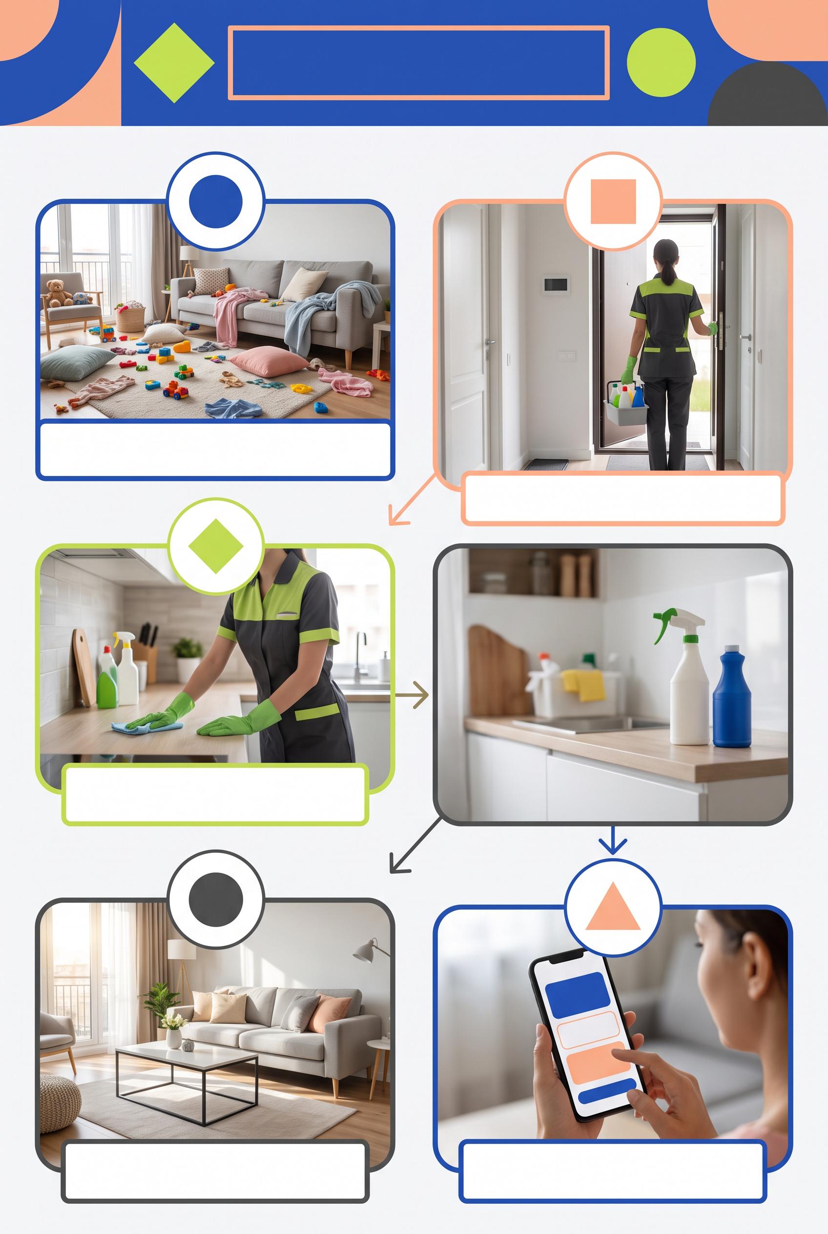
Create a commercial-quality educational Pinterest campaign graphic in a vertical 2:3 composition for a fictional mobile home-cleaning service. Show a modular five-frame storyboard grid with visual steps for problem, arrival, process, result, and next action, using icons, clean interior photography, directional connectors, and blank caption areas. Use cobalt blue, peach, lime, and charcoal. AI-modified downstream. No real brands, no trademarks, no trademarked characters, no watermark, and no unintended readable text. Corrective regeneration attempt 4. Produce a materially revised image, not a near-duplicate of an earlier variant. Preserve the successful subject, palette, lighting, focal hierarchy, and commercial polish from the original brief while correcting every issue below. Mandatory corrective instructions from the most recent visual QA: Preserve the polished vertical 2:3 composition, cobalt blue, peach, lime, and charcoal palette, rounded panels, clean interior photography, workers, directional connectors, blank caption bars, and strong commercial hierarchy. Rebuild the storyboard as exactly five clearly separated rounded panels representing: messy problem, cleaner arrival, cleaning process, visibly clean result, and simple next action. Remove the sixth panel. Delete every letter, word, number, heading, label, URL, logo, watermark, pseudo-text line, and readable mark, including the top headline. Replace all numbered circles and semantic icons with blank white circles or simple non-linguistic geometric color shapes. Remove the map pin, gear, clock, stars, heart, arrows-as-icons, and all phone interface glyphs. Make the phone screen entirely abstract: only a few plain rounded rectangles and solid color fields, with no letters, symbols, icons, numbers, or pseudo-text. Keep caption bars completely blank. Observed defects from prior variants that must not recur: 1) The design is overly text-heavy for the requested icon-and-connector-led modular concept. 2) Strong vertical storyboard composition and polished palette, but it contains prominent readable numbers 1–5 despite the final instruction prohibiting numbers. 3) The phone includes interface glyphs and icons that should be replaced with purely abstract geometric placeholder shapes under the no-glyphs requirement. 4) Readable headline text “HOME CLEANING GUIDE” violates the no-text requirement. 5) The layout contains six storyboard panels instead of five distinct moments. 6) Several icons are linguistic/interface-like glyphs, including a map pin, gear, clock, sparkle symbols, and detailed phone UI. 7) The phone contains pseudo-interface lines and colored UI blocks, conflicting with the requirement for purely abstract geometric placeholders. 8) The composition is polished and vertical, but it does not strictly satisfy the blank/abstract, icon-and-connector-led brief. Render no letters, words, numbers, prices, headings, labels, contact details, logos, glyphs, or pseudo-text anywhere. Use only blank surfaces, clean geometric marks, and non-linguistic placeholder shapes. Do not add explanatory captions, before/after labels, interface copy, or extra objects that the brief did not request. When a corrective instruction conflicts with a decorative detail, prioritize the corrective instruction.
 0
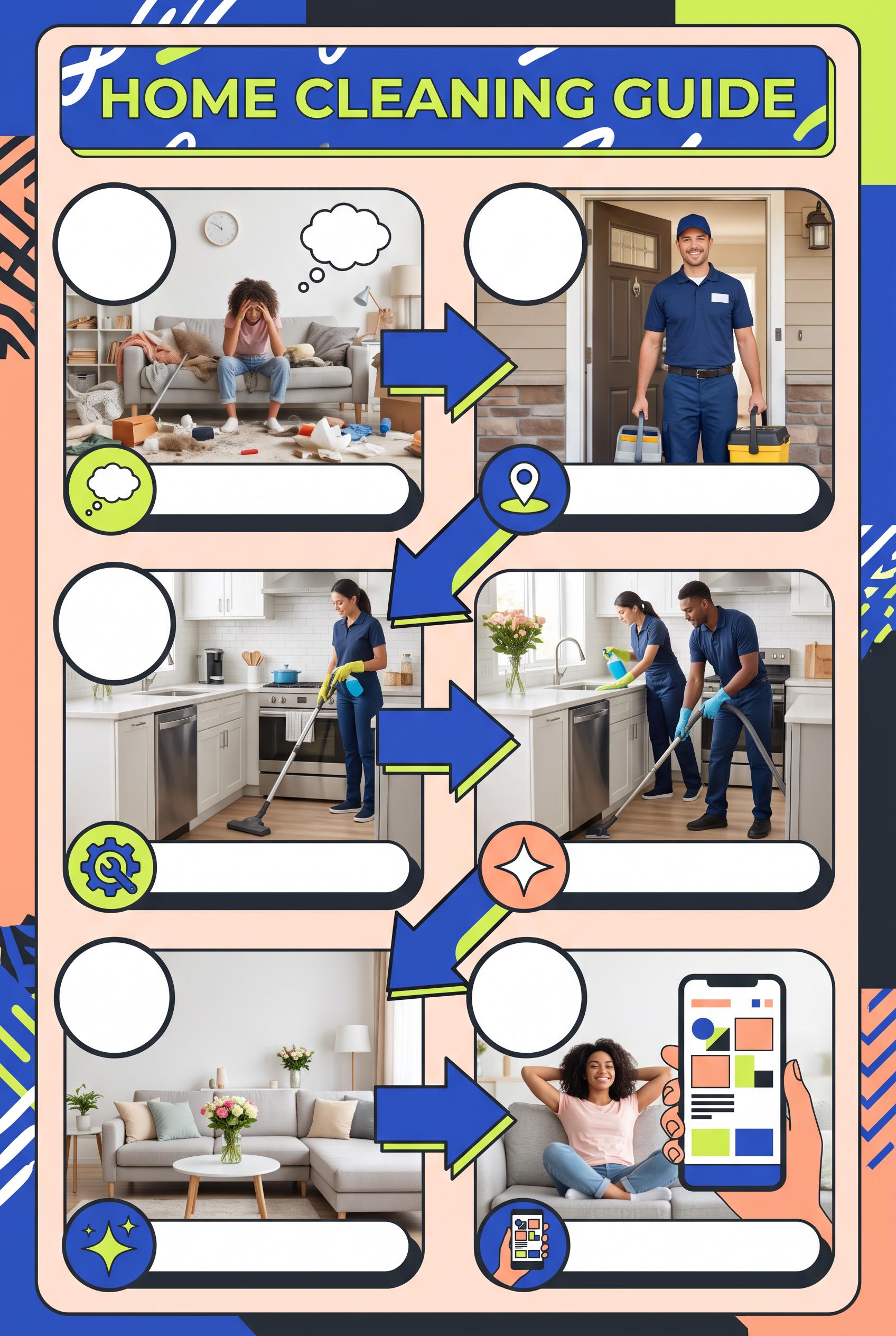
Create a commercial-quality educational Pinterest campaign graphic in a vertical 2:3 composition for a fictional mobile home-cleaning service. Show a modular five-frame storyboard grid with visual steps for problem, arrival, process, result, and next action, using icons, clean interior photography, directional connectors, and blank caption areas. Use cobalt blue, peach, lime, and charcoal. AI-modified downstream. No real brands, no trademarks, no trademarked characters, no watermark, and no unintended readable text. Corrective regeneration attempt 3. Produce a materially revised image, not a near-duplicate of an earlier variant. Preserve the successful subject, palette, lighting, focal hierarchy, and commercial polish from the original brief while correcting every issue below. Mandatory corrective instructions from the most recent visual QA: Preserve the attractive vertical 2:3 layout, cobalt-blue, peach, lime, and charcoal palette, five rounded storyboard panels, clean interior scenes, workers, vehicle, directional connectors, blank caption bars, and overall commercial polish. Remove every visible number, including the large numbered circles, and replace those circles with blank white circles or simple non-linguistic geometric marks. Simplify the phone screen completely: remove the back arrow, menu icon, heart, circular icons, and all interface glyphs; use only abstract rounded rectangles, blocks, and color fields with no letters, words, numbers, symbols, logos, pseudo-text, or watermark anywhere. Observed defects from prior variants that must not recur: 1) Strong vertical composition and clear five-step storyboard, but it violates the brief’s requirement for blank or abstract caption areas by adding extensive embedded copy. 2) The phone contains readable interface text such as “BOOKING,” “BOOK NOW,” and “SCHEDULE,” plus the fabricated URL “WWW.WEBSITE.COM.” 3) The footer text “DAILY LOGO WITHOUT REAL NAMES” is unintended and visually distracting. 4) The design is overly text-heavy for the requested icon-and-connector-led modular concept. 5) Strong vertical storyboard composition and polished palette, but it contains prominent readable numbers 1–5 despite the final instruction prohibiting numbers. 6) The phone includes interface glyphs and icons that should be replaced with purely abstract geometric placeholder shapes under the no-glyphs requirement. Render no letters, words, numbers, prices, headings, labels, contact details, logos, glyphs, or pseudo-text anywhere. Use only blank surfaces, clean geometric marks, and non-linguistic placeholder shapes. Do not add explanatory captions, before/after labels, interface copy, or extra objects that the brief did not request. When a corrective instruction conflicts with a decorative detail, prioritize the corrective instruction.
 0
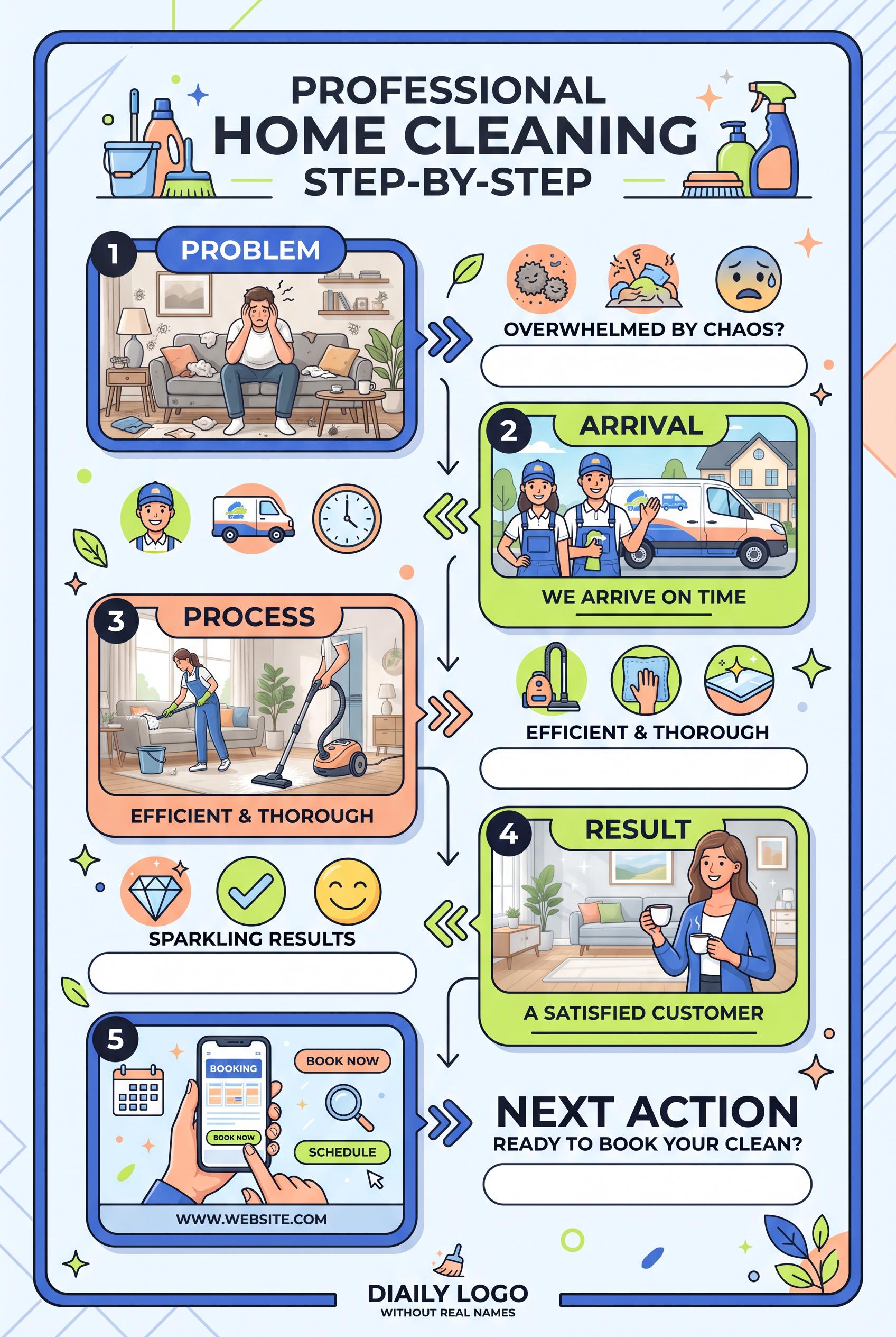
Create a commercial-quality educational Pinterest campaign graphic in a vertical 2:3 composition for a fictional mobile home-cleaning service. Show a modular five-frame storyboard grid with visual steps for problem, arrival, process, result, and next action, using icons, clean interior photography, directional connectors, and blank caption areas. Use cobalt blue, peach, lime, and charcoal. AI-modified downstream. No real brands, no trademarks, no trademarked characters, no watermark, and no unintended readable text. Corrective regeneration attempt 2. Produce a materially revised image, not a near-duplicate of an earlier variant. Preserve the successful subject, palette, lighting, focal hierarchy, and commercial polish from the original brief while correcting every issue below. Mandatory corrective instructions from the most recent visual QA: Preserve the attractive vertical 2:3 layout, cobalt-blue/peach/lime/charcoal palette, five alternating storyboard panels, clean interior scenes, icons, numbered circles, rounded frames, and directional connectors. Remove all embedded wording except simple non-textual step numbers 1–5, and replace every headline, caption, CTA, URL, footer, and label with blank white or softly tinted abstract caption bars. Remove all readable text from the phone screen, including BOOKING, BOOK NOW, SCHEDULE, and any URL; show only generic abstract UI blocks and icons. Remove the footer phrase and simplify the composition so visuals carry the five moments: messy problem, cleaner arrival vehicle and workers, cleaning process, sparkling result, and generic booking/action phone visual. Use only invented unbranded symbols with no recognizable logos, trademarks, or watermark. Observed defects from prior variants that must not recur: 1) Strong vertical composition and clear five-step storyboard, but it violates the brief’s requirement for blank or abstract caption areas by adding extensive embedded copy. 2) The phone contains readable interface text such as “BOOKING,” “BOOK NOW,” and “SCHEDULE,” plus the fabricated URL “WWW.WEBSITE.COM.” 3) The footer text “DAILY LOGO WITHOUT REAL NAMES” is unintended and visually distracting. 4) The design is overly text-heavy for the requested icon-and-connector-led modular concept. Render no letters, words, numbers, prices, headings, labels, contact details, logos, glyphs, or pseudo-text anywhere. Use only blank surfaces, clean geometric marks, and non-linguistic placeholder shapes. Do not add explanatory captions, before/after labels, interface copy, or extra objects that the brief did not request. When a corrective instruction conflicts with a decorative detail, prioritize the corrective instruction.
 0
Create a commercial-quality educational Pinterest campaign graphic in a vertical 2:3 composition for a fictional mobile home-cleaning service. Show a modular five-frame storyboard grid with visual steps for problem, arrival, process, result, and next action, using icons, clean interior photography, directional connectors, and blank caption areas. Use cobalt blue, peach, lime, and charcoal. AI-modified downstream. No real brands, no trademarks, no trademarked characters, no watermark, and no unintended readable text.
 0
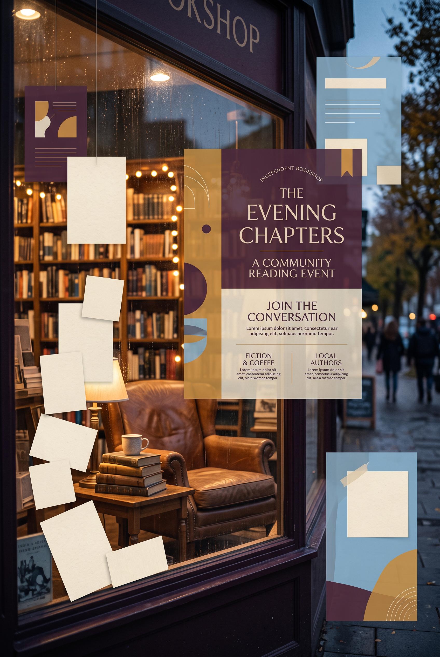
Create a commercial-quality inspirational showcase for a fictional independent bookshop community reading event in a vertical 2:3 Pinterest composition. Use a cinematic storefront window scene with a reading chair, stacked books, soft evening light, blank event cards, and subtle floating content panels. Use plum, ochre, sky blue, and paper cream. AI-modified downstream. No real brands, no trademarks, no trademarked characters, no watermark, and no unintended readable text. Corrective regeneration attempt 4. Produce a materially revised image, not a near-duplicate of an earlier variant. Preserve the successful subject, palette, lighting, focal hierarchy, and commercial polish from the original brief while correcting every issue below. Mandatory corrective instructions from the most recent visual QA: Preserve the warm cinematic storefront window, chair with plum throw, stacked blank books, coffee cup, reflections, layered depth, vertical 2:3 framing, and plum/ochre/sky-blue/paper-cream palette. Remove every mark from both side floating cards: make them fully blank translucent cream panels with no lines, dots, bars, glyphs, or pseudo-text. Keep the central panel smaller and subtle, containing only a few clearly non-linguistic abstract geometric shapes with no text-like arrangement. Keep the top architectural panels blank, all book covers and spines unmarked, and ensure the entire image contains no letters, words, numbers, logos, watermarks, captions, or readable or text-like marks. Observed defects from prior variants that must not recur: 1) The image contains extensive readable text, including storefront signage, a large event title, headings, and lorem ipsum, contrary to the brief’s requirement for blank/non-readable 2) The large central poster dominates the composition and reads like a finished advertisement rather than subtle content panels. 3) Large storefront sign contains clearly readable “BOOKSHOP” text. 4) Book spines contain small text-like markings, violating the no-readable-text and no-pseudo-text requirement. 5) Central floating panel remains oversized and visually dominant rather than subtle. 6) The side floating cards contain repeated horizontal bars, dots, and vertical strokes that read as pseudo-text/UI copy, violating the requirement for completely blank cards and no04 Render no letters, words, numbers, prices, headings, labels, contact details, logos, glyphs, or pseudo-text anywhere. Use only blank surfaces, clean geometric marks, and non-linguistic placeholder shapes. Do not add explanatory captions, before/after labels, interface copy, or extra objects that the brief did not request. When a corrective instruction conflicts with a decorative detail, prioritize the corrective instruction.
 0
Create a commercial-quality inspirational showcase for a fictional independent bookshop community reading event in a vertical 2:3 Pinterest composition. Use a cinematic storefront window scene with a reading chair, stacked books, soft evening light, blank event cards, and subtle floating content panels. Use plum, ochre, sky blue, and paper cream. AI-modified downstream. No real brands, no trademarks, no trademarked characters, no watermark, and no unintended readable text. Corrective regeneration attempt 3. Produce a materially revised image, not a near-duplicate of an earlier variant. Preserve the successful subject, palette, lighting, focal hierarchy, and commercial polish from the original brief while correcting every issue below. Mandatory corrective instructions from the most recent visual QA: Preserve the warm cinematic evening storefront, reading chair, plum throw, stacked books, coffee cup, reflections, layered depth, attractive 2:3 vertical composition, and plum/ochre/sky-blue/paper-cream palette. Remove the entire top storefront sign or replace it with a completely blank cream architectural panel containing no letters, words, numbers, logos, glyphs, or pseudo-text. Remove all markings from every book spine and surface; use fully blank covers and spines. Replace the large central floating advertisement with a smaller, translucent abstract panel, using only clean blank cream shapes, dots, lines, and geometric blocks that do not resemble letters or writing. Keep the side cards completely blank as well. Ensure there are no readable or text-like marks anywhere, no brands, trademarks, watermarks, or extra captions. Observed defects from prior variants that must not recur: 1) The image contains extensive readable text, including storefront signage, a large event title, headings, and lorem ipsum, contrary to the brief’s requirement for blank/non-readable 2) The large central poster dominates the composition and reads like a finished advertisement rather than subtle content panels. 3) Large storefront sign contains clearly readable “BOOKSHOP” text. 4) Book spines contain small text-like markings, violating the no-readable-text and no-pseudo-text requirement. 5) Central floating panel remains oversized and visually dominant rather than subtle. Render no letters, words, numbers, prices, headings, labels, contact details, logos, glyphs, or pseudo-text anywhere. Use only blank surfaces, clean geometric marks, and non-linguistic placeholder shapes. Do not add explanatory captions, before/after labels, interface copy, or extra objects that the brief did not request. When a corrective instruction conflicts with a decorative detail, prioritize the corrective instruction.
 0
Create a commercial-quality inspirational showcase for a fictional independent bookshop community reading event in a vertical 2:3 Pinterest composition. Use a cinematic storefront window scene with a reading chair, stacked books, soft evening light, blank event cards, and subtle floating content panels. Use plum, ochre, sky blue, and paper cream. AI-modified downstream. No real brands, no trademarks, no trademarked characters, no watermark, and no unintended readable text. Corrective regeneration attempt 2. Produce a materially revised image, not a near-duplicate of an earlier variant. Preserve the successful subject, palette, lighting, focal hierarchy, and commercial polish from the original brief while correcting every issue below. Mandatory corrective instructions from the most recent visual QA: Preserve the warm cinematic storefront window, reading chair, stacked books, coffee cup, evening reflections, layered depth, and plum/ochre/sky-blue/paper-cream palette. Remove every instance of readable text: erase the cropped storefront signage, all event-title and poster copy, headings, labels, and lorem ipsum. Replace the large central advertisement with a smaller, translucent abstract content panel using only blank cream shapes, lines, dots, and geometric blocks that suggest host, guest, date, and take-home details without forming letters or words. Keep the handwritten-style cards completely blank. Ensure no logos, brands, watermarks, or pseudo-text glyphs remain. Observed defects from prior variants that must not recur: 1) The image contains extensive readable text, including storefront signage, a large event title, headings, and lorem ipsum, contrary to the brief’s requirement for blank/non-readable 2) The large central poster dominates the composition and reads like a finished advertisement rather than subtle content panels. Render no letters, words, numbers, prices, headings, labels, contact details, logos, glyphs, or pseudo-text anywhere. Use only blank surfaces, clean geometric marks, and non-linguistic placeholder shapes. Do not add explanatory captions, before/after labels, interface copy, or extra objects that the brief did not request. When a corrective instruction conflicts with a decorative detail, prioritize the corrective instruction.
 0
Create a commercial-quality inspirational showcase for a fictional independent bookshop community reading event in a vertical 2:3 Pinterest composition. Use a cinematic storefront window scene with a reading chair, stacked books, soft evening light, blank event cards, and subtle floating content panels. Use plum, ochre, sky blue, and paper cream. AI-modified downstream. No real brands, no trademarks, no trademarked characters, no watermark, and no unintended readable text.
 0
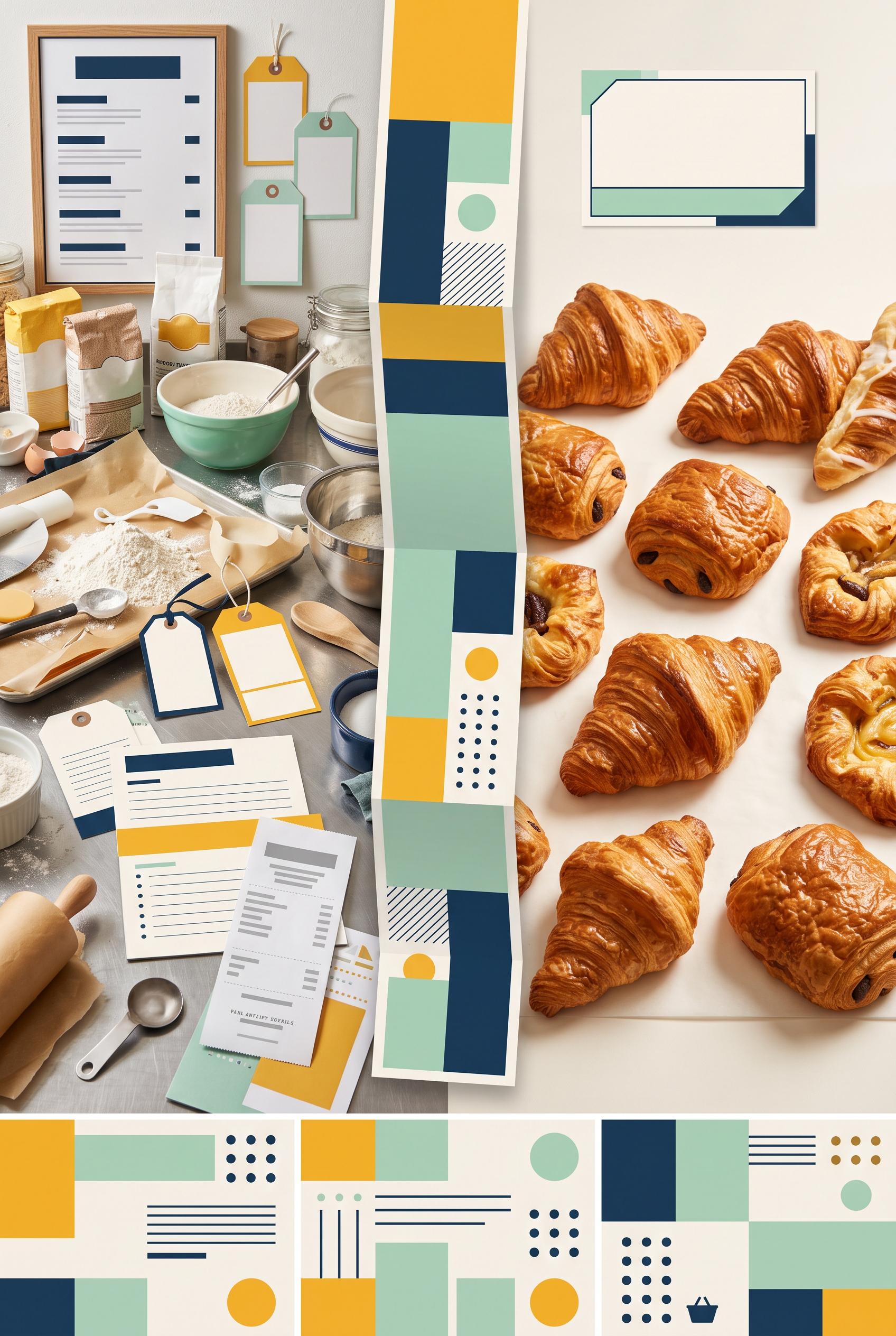
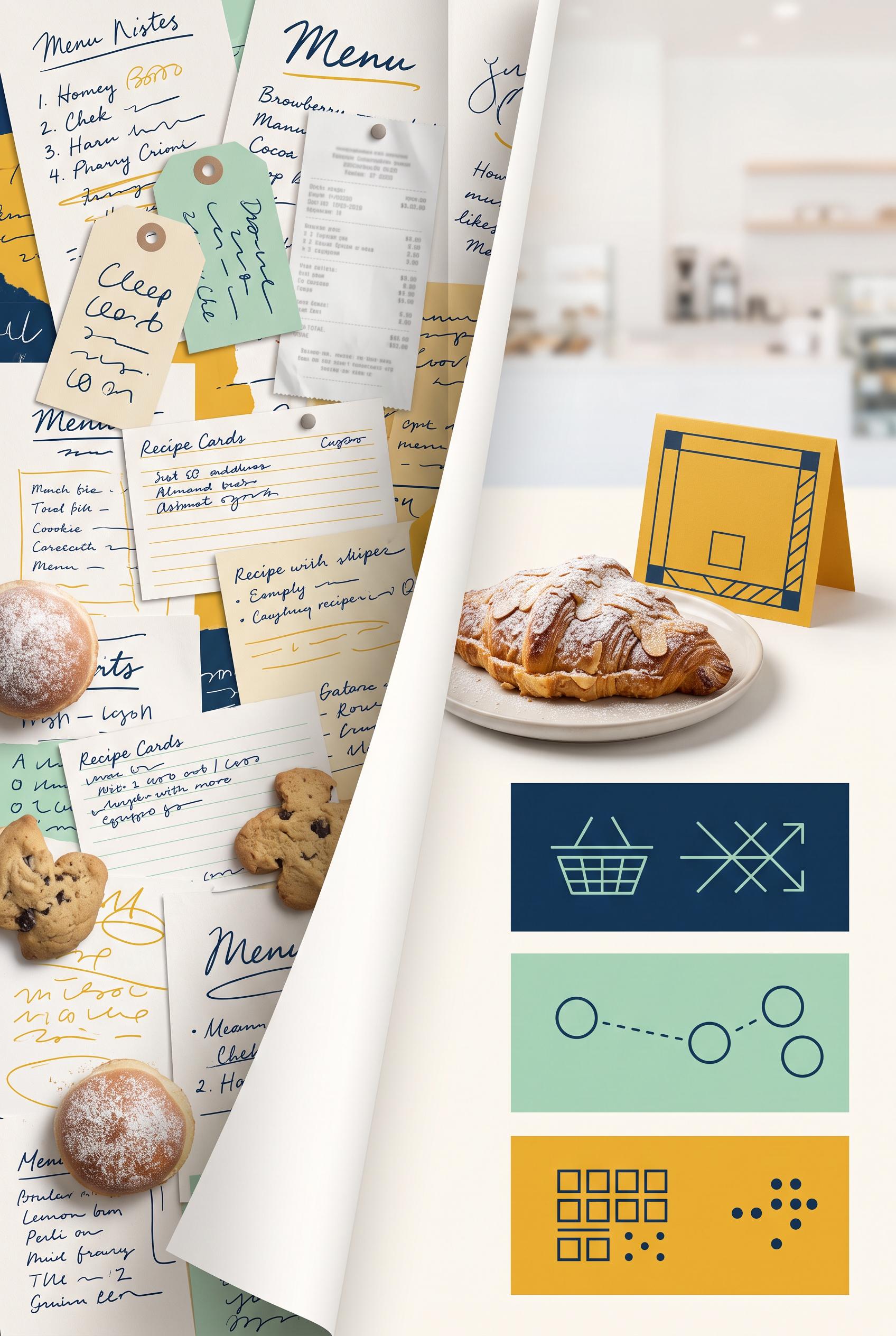
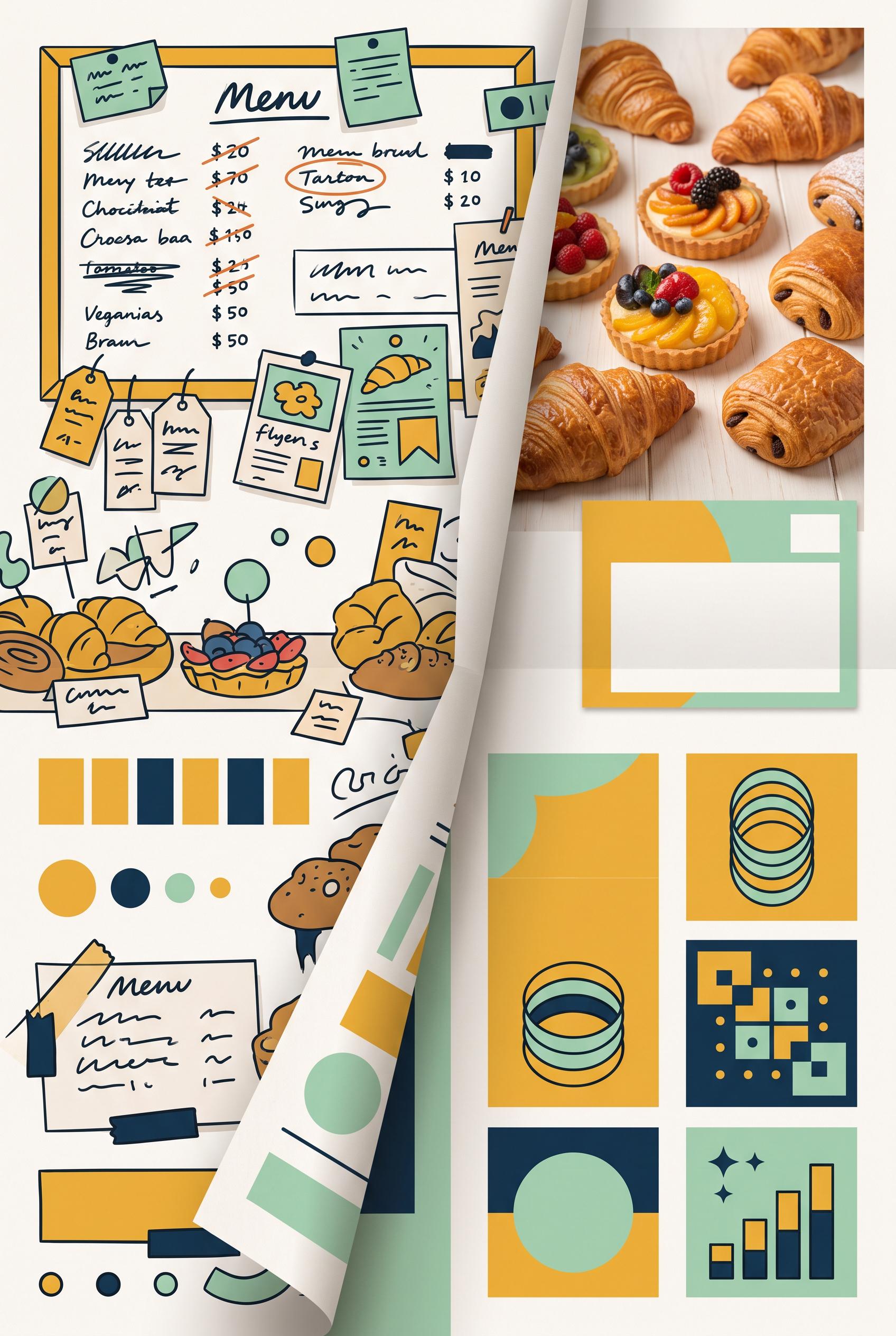
Create a commercial-quality Pinterest marketing visual in a vertical 2:3 composition showing a before-and-after transformation for a fictional neighborhood bakery preorder campaign. Use a folded paper reveal, left side visually cluttered and right side clean and focused, with pastry photography, a simple pickup card, and three abstract information blocks. Use saffron yellow, deep ink blue, mint green, and warm white. AI-modified downstream. No real brands, no trademarks, no trademarked characters, no watermark, and no unintended readable text. Corrective regeneration attempt 5. Produce a materially revised image, not a near-duplicate of an earlier variant. Preserve the successful subject, palette, lighting, focal hierarchy, and commercial polish from the original brief while correcting every issue below. Mandatory corrective instructions from the most recent visual QA: Preserve the attractive vertical 2:3 composition, folded-paper reveal, saffron yellow/deep ink blue/mint/warm-white palette, cluttered left panel, focused right pastry hero, pickup-card silhouette, and three lower detail insets. Remove every readable word, letter, number, price, headline, menu label, product tag, receipt detail, logo, glyph, icon, pictogram, pseudo-handwritten mark, and interface symbol from the entire image. Replace all writing and receipt areas with blank paper, solid geometric bars, dots, circles, clean rectangles, and indistinct non-linguistic texture only. Make the pickup card a blank geometric card with no symbols. Replace the lower inset graphics with abstract arrangements of plain blocks, lines, dots, and circles that do not resemble letters, numbers, arrows, shopping baskets, or interfaces. Ensure no character-like marks remain anywhere, including tags, menu boards, recipe cards, pastry papers, folded strip, receipt, and bottom panels. Observed defects from prior variants that must not recur: 1) The bottom call-to-action contains readable letterforms, violating the requirement for no text or glyphs. 2) Lower inset graphics include pseudo-writing and recognizable interface symbols rather than purely abstract non-linguistic shapes. 3) Many clearly readable words, numbers, prices, and menu labels remain throughout the left panel and lower cards. 4) Pseudo-handwriting and letter-like marks appear on tags, cards, inset graphics, and the folded-paper strip, violating the no-text requirement. 5) The composition and bakery photography are attractive, but the mandatory abstraction of all labels and glyphs was not achieved. 6) Numerous clearly readable words, numbers, prices, and handwritten labels appear across the left menu papers, tags, recipe cards, receipt, and folded surfaces. 7) The right-side detail panels contain recognizable interface-like glyphs and pictograms, contrary to the requirement for purely abstract non-linguistic shapes. 8) The image does preserve an attractive vertical composition, folded-paper reveal, bakery pastry focal point, and requested palette, but it fails the strict no-text/no-glyph standard Render no letters, words, numbers, prices, headings, labels, contact details, logos, glyphs, or pseudo-text anywhere. Use only blank surfaces, clean geometric marks, and non-linguistic placeholder shapes. Do not add explanatory captions, before/after labels, interface copy, or extra objects that the brief did not request. When a corrective instruction conflicts with a decorative detail, prioritize the corrective instruction.
 0
Create a commercial-quality Pinterest marketing visual in a vertical 2:3 composition showing a before-and-after transformation for a fictional neighborhood bakery preorder campaign. Use a folded paper reveal, left side visually cluttered and right side clean and focused, with pastry photography, a simple pickup card, and three abstract information blocks. Use saffron yellow, deep ink blue, mint green, and warm white. AI-modified downstream. No real brands, no trademarks, no trademarked characters, no watermark, and no unintended readable text. Corrective regeneration attempt 4. Produce a materially revised image, not a near-duplicate of an earlier variant. Preserve the successful subject, palette, lighting, focal hierarchy, and commercial polish from the original brief while correcting every issue below. Mandatory corrective instructions from the most recent visual QA: Preserve the strong vertical 2:3 composition, folded-paper reveal, bakery pastry photography, saffron yellow/deep ink blue/mint/warm-white palette, cluttered left side, focused right pastry hero, pickup-card shape, and three lower detail insets. Completely remove every word, letter, number, price, headline, menu label, product tag, CTA, logo, glyph, and pseudo-handwritten mark from the entire image. Replace all writing areas with blank paper, solid geometric bars, dots, circles, clean blocks, or indistinct non-linguistic texture only. Ensure no character-like symbols remain anywhere, including the left menu board, hanging tags, pastry cards, folded strip, pickup card, and all lower insets. Keep the before/after hierarchy clear through layout, contrast, color, and paper folds only, with no captions or explanatory text. Observed defects from prior variants that must not recur: 1) Numerous labels are clearly readable despite the brief requiring all labels to be abstract or unreadable, including the headline, BEFORE/AFTER, PICKUP CARD, ORDER NOW, and menu-not 2) The lower detail insets also contain readable ordering text and symbols that should be abstracted. 3) Numerous clearly readable words, numbers, prices, and labels appear throughout the menu board, product cards, pastry tags, and lower insets. 4) The bottom call-to-action contains readable letterforms, violating the requirement for no text or glyphs. 5) Lower inset graphics include pseudo-writing and recognizable interface symbols rather than purely abstract non-linguistic shapes. 6) Many clearly readable words, numbers, prices, and menu labels remain throughout the left panel and lower cards. 7) Pseudo-handwriting and letter-like marks appear on tags, cards, inset graphics, and the folded-paper strip, violating the no-text requirement. 8) The composition and bakery photography are attractive, but the mandatory abstraction of all labels and glyphs was not achieved. Render no letters, words, numbers, prices, headings, labels, contact details, logos, glyphs, or pseudo-text anywhere. Use only blank surfaces, clean geometric marks, and non-linguistic placeholder shapes. Do not add explanatory captions, before/after labels, interface copy, or extra objects that the brief did not request. When a corrective instruction conflicts with a decorative detail, prioritize the corrective instruction.
 0
Create a commercial-quality Pinterest marketing visual in a vertical 2:3 composition showing a before-and-after transformation for a fictional neighborhood bakery preorder campaign. Use a folded paper reveal, left side visually cluttered and right side clean and focused, with pastry photography, a simple pickup card, and three abstract information blocks. Use saffron yellow, deep ink blue, mint green, and warm white. AI-modified downstream. No real brands, no trademarks, no trademarked characters, no watermark, and no unintended readable text. Corrective regeneration attempt 3. Produce a materially revised image, not a near-duplicate of an earlier variant. Preserve the successful subject, palette, lighting, focal hierarchy, and commercial polish from the original brief while correcting every issue below. Mandatory corrective instructions from the most recent visual QA: Preserve the attractive vertical 2:3 composition, bakery photography, saffron yellow/deep ink blue/mint/warm-white palette, folded-paper split, cluttered left side, focused right pastry hero, pickup-card shape, and three lower detail insets. Remove every readable or letter-like mark: erase all menu-board writing, product tags, prices, headline text, call-to-action text, and inset scribbles. Replace them with blank surfaces, solid geometric bars, dots, circles, simple non-linguistic abstract shapes, or indistinct texture only. Remove recognizable letters, numbers, words, pseudo-handwriting, logos, watermark, and brand-like marks everywhere. Keep the before/after hierarchy clear through layout, contrast, and color without labels or captions. Do not add any explanatory text or extra objects. Observed defects from prior variants that must not recur: 1) Strong vertical composition, clear before/after focal point, tactile folded-paper reveal, and appealing bakery imagery. 2) Numerous labels are clearly readable despite the brief requiring all labels to be abstract or unreadable, including the headline, BEFORE/AFTER, PICKUP CARD, ORDER NOW, and menu-not 3) The lower detail insets also contain readable ordering text and symbols that should be abstracted. 4) Numerous clearly readable words, numbers, prices, and labels appear throughout the menu board, product cards, pastry tags, and lower insets. 5) The bottom call-to-action contains readable letterforms, violating the requirement for no text or glyphs. 6) Lower inset graphics include pseudo-writing and recognizable interface symbols rather than purely abstract non-linguistic shapes. Render no letters, words, numbers, prices, headings, labels, contact details, logos, glyphs, or pseudo-text anywhere. Use only blank surfaces, clean geometric marks, and non-linguistic placeholder shapes. Do not add explanatory captions, before/after labels, interface copy, or extra objects that the brief did not request. When a corrective instruction conflicts with a decorative detail, prioritize the corrective instruction.
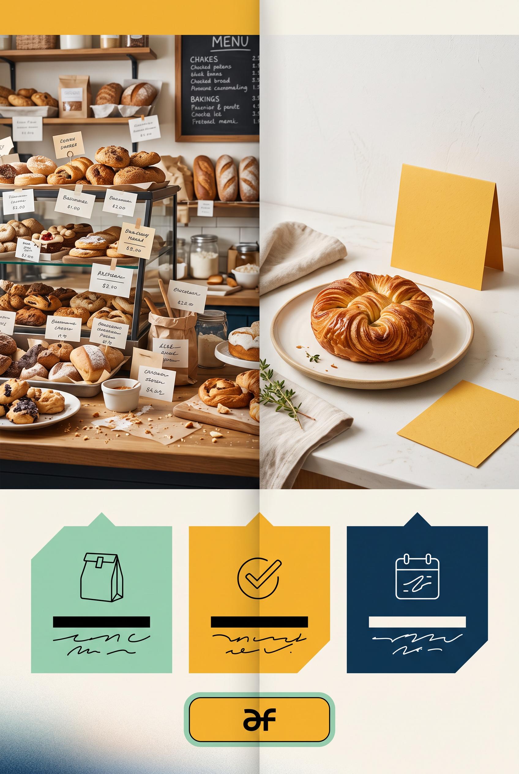 0
Create a commercial-quality Pinterest marketing visual in a vertical 2:3 composition showing a before-and-after transformation for a fictional neighborhood bakery preorder campaign. Use a folded paper reveal, left side visually cluttered and right side clean and focused, with pastry photography, a simple pickup card, and three abstract information blocks. Use saffron yellow, deep ink blue, mint green, and warm white. AI-modified downstream. No real brands, no trademarks, no trademarked characters, no watermark, and no unintended readable text. Corrective regeneration attempt 2. Produce a materially revised image, not a near-duplicate of an earlier variant. Preserve the successful subject, palette, lighting, focal hierarchy, and commercial polish from the original brief while correcting every issue below. Mandatory corrective instructions from the most recent visual QA: Preserve the attractive vertical 2:3 layout, saffron yellow/deep ink blue/mint/warm-white palette, folded-paper reveal, cluttered left bakery scene, focused right pastry hero, pickup card, and three detail insets. Remove all readable text everywhere: replace the headline, BEFORE/AFTER labels, menu writing, pickup-card wording, order callout, and inset lettering with indistinct abstract scribbles, blank blocks, tiny unreadable marks, or purely symbolic shapes. Ensure no legible letters, words, numbers, logos, watermark, or brand-like marks remain while keeping the before/after hierarchy visually clear through composition and color. Observed defects from prior variants that must not recur: 1) Strong vertical composition, clear before/after focal point, tactile folded-paper reveal, and appealing bakery imagery. 2) Numerous labels are clearly readable despite the brief requiring all labels to be abstract or unreadable, including the headline, BEFORE/AFTER, PICKUP CARD, ORDER NOW, and menu-not 3) The lower detail insets also contain readable ordering text and symbols that should be abstracted. Render no letters, words, numbers, prices, headings, labels, contact details, logos, glyphs, or pseudo-text anywhere. Use only blank surfaces, clean geometric marks, and non-linguistic placeholder shapes. Do not add explanatory captions, before/after labels, interface copy, or extra objects that the brief did not request. When a corrective instruction conflicts with a decorative detail, prioritize the corrective instruction.
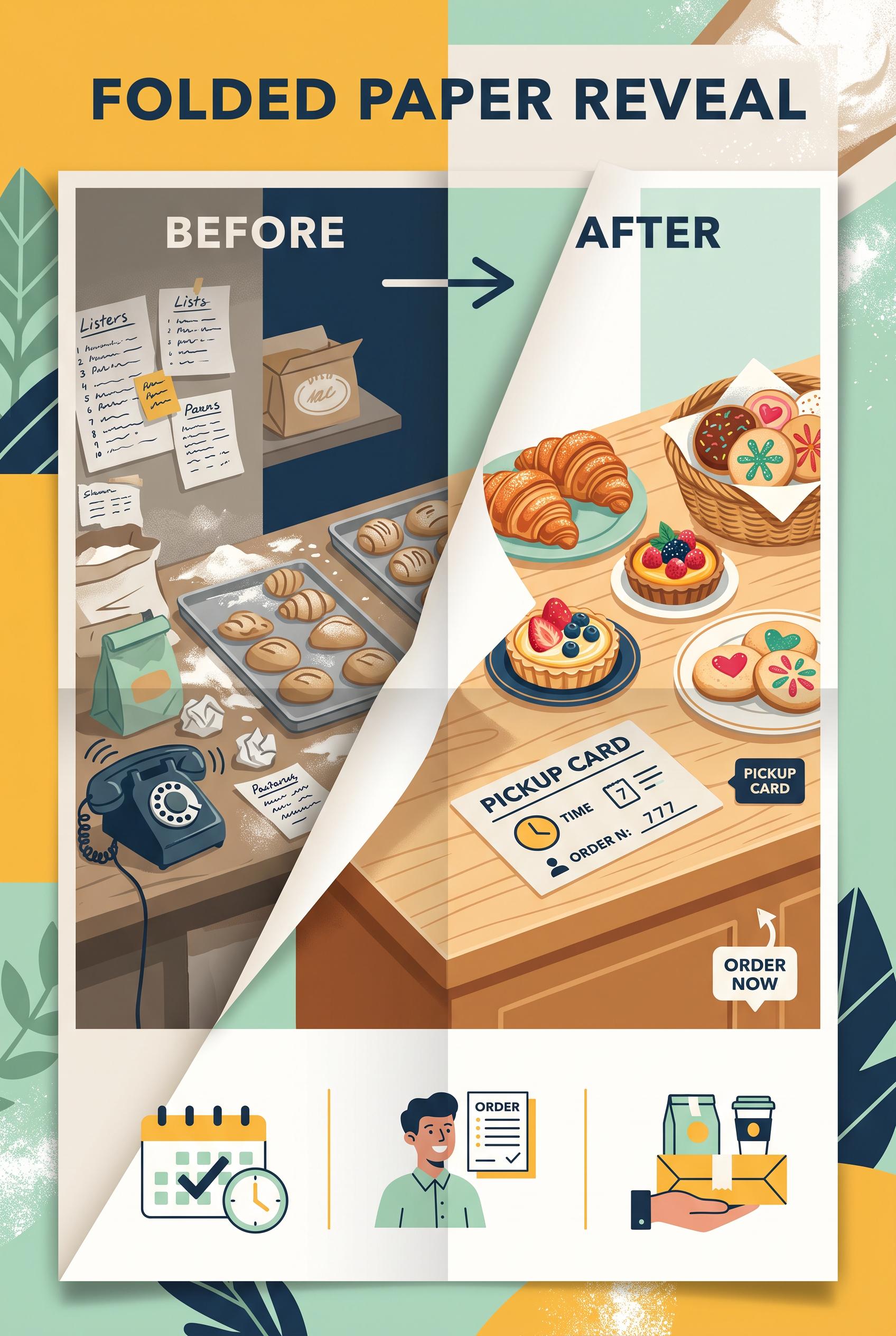 0
Create a commercial-quality Pinterest marketing visual in a vertical 2:3 composition showing a before-and-after transformation for a fictional neighborhood bakery preorder campaign. Use a folded paper reveal, left side visually cluttered and right side clean and focused, with pastry photography, a simple pickup card, and three abstract information blocks. Use saffron yellow, deep ink blue, mint green, and warm white. AI-modified downstream. No real brands, no trademarks, no trademarked characters, no watermark, and no unintended readable text.
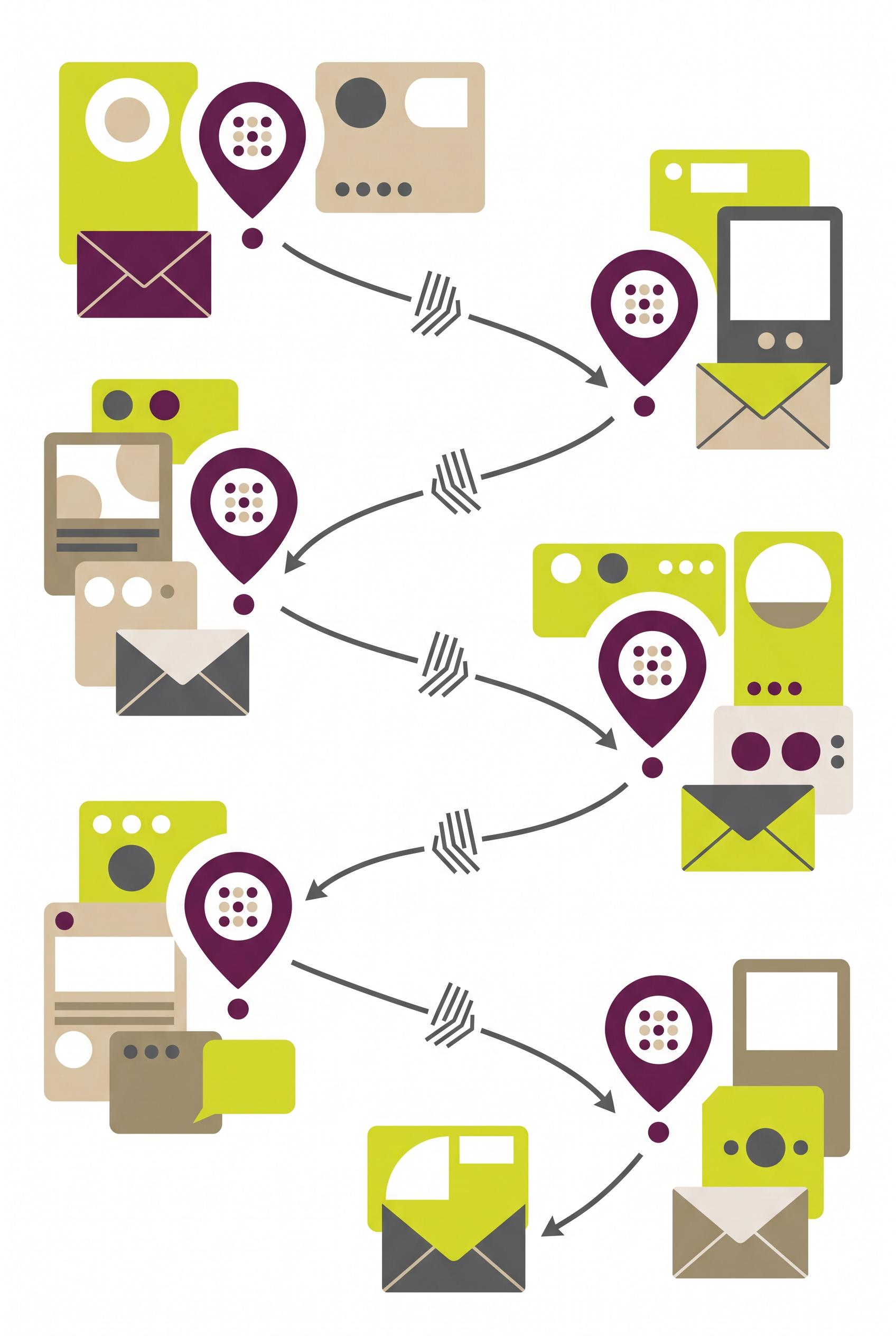 0
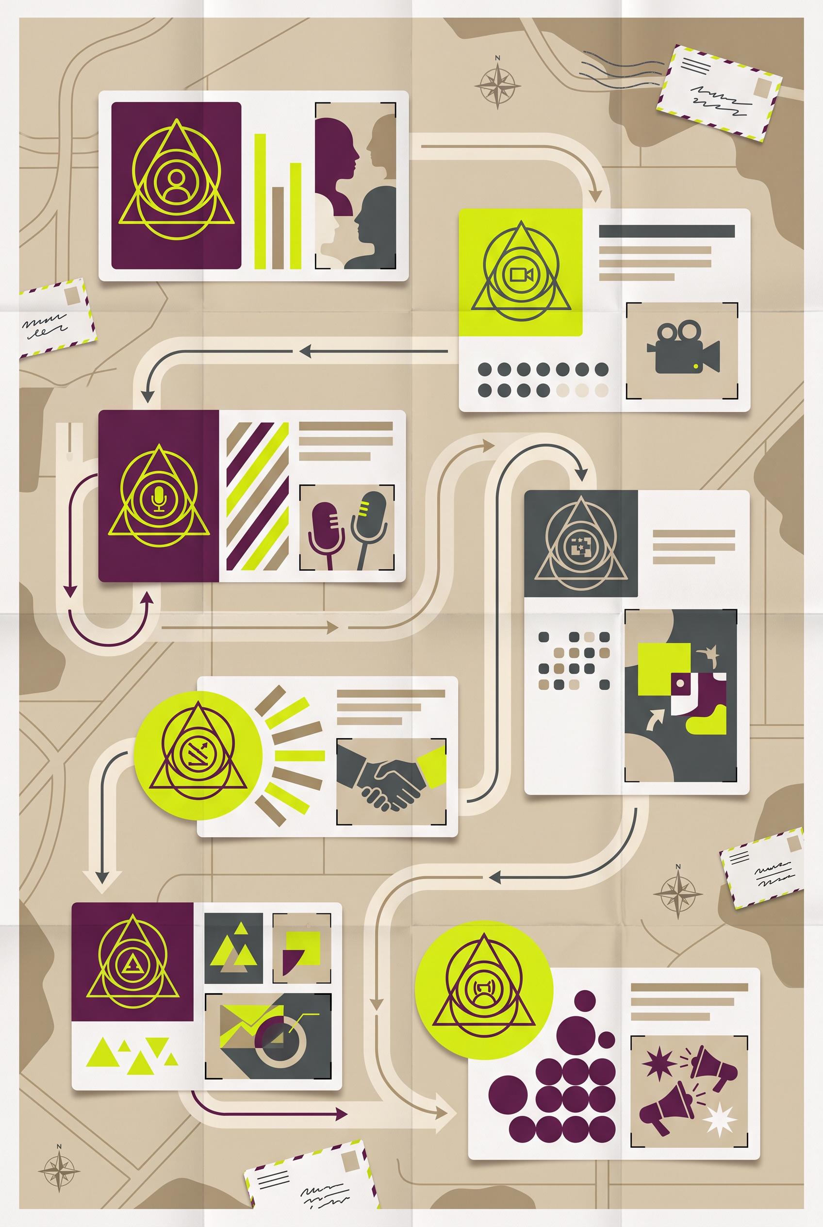
Create a commercial-quality vertical 2:3 Pinterest composition showing an educational seven-day creator launch campaign as a stylized postal route map. Include seven abstract destination markers, varied content-card silhouettes, arrows, crop windows, and one repeated geometric signal connecting the sequence. Use acid chartreuse, rich plum, sandy beige, graphite, and soft white. Make it visually useful and editorial, with clear grouping but no readable labels. No real brands, no trademarked characters, no watermark, no unintended readable text. Corrective regeneration attempt 5. Produce a materially revised image, not a near-duplicate of an earlier variant. Preserve the successful subject, palette, lighting, focal hierarchy, and commercial polish from the original brief while correcting every issue below. Mandatory corrective instructions from the most recent visual QA: Create a polished vertical 2:3 postal-route campaign map in the existing acid chartreuse, rich plum, sandy beige, graphite, and soft-white palette. Keep the arrows, crop windows, varied blank card silhouettes, abstract circular decoration, and editorial hierarchy. Remove exactly one destination pin so there are exactly seven clearly separated route stops. Make all seven plum pins perfectly identical in shape, scale treatment, blank interior, and internal dot arrangement. Remove every horizontal text-like bar, interface element, envelope scribble, grid, letter-like mark, and pseudo-text shape; replace them with completely blank card and envelope surfaces plus only simple non-linguistic circles, dots, and geometric shapes. Preserve clear route flow while adding more breathing room and reducing visual density. Include no letters, numbers, words, logos, glyphs, watermarks, or readable or pseudo-readable marks anywhere. Observed defects from prior variants that must not recur: 1) The repeated destination symbol varies with different inner icons, weakening consistency. 2) Attractive vertical composition and cohesive palette, but only six visible destination markers instead of exactly seven. 3) Repeated destination symbols have varying internal dot patterns and divisions rather than being identical. 4) A readable compass letter “N” is visible. 5) Some card and envelope interiors resemble pseudo-text or interface/table content, conflicting with the no-readable-text requirement. 6) Eight destination pins are visible instead of exactly seven. 7) Several cards contain pseudo-text-like horizontal bars and interface-style elements, violating the no pseudo-text requirement. 8) The composition remains visually dense, reducing clarity of the seven-stop route. Render no letters, words, numbers, prices, headings, labels, contact details, logos, glyphs, or pseudo-text anywhere. Use only blank surfaces, clean geometric marks, and non-linguistic placeholder shapes. Do not add explanatory captions, before/after labels, interface copy, or extra objects that the brief did not request. When a corrective instruction conflicts with a decorative detail, prioritize the corrective instruction.
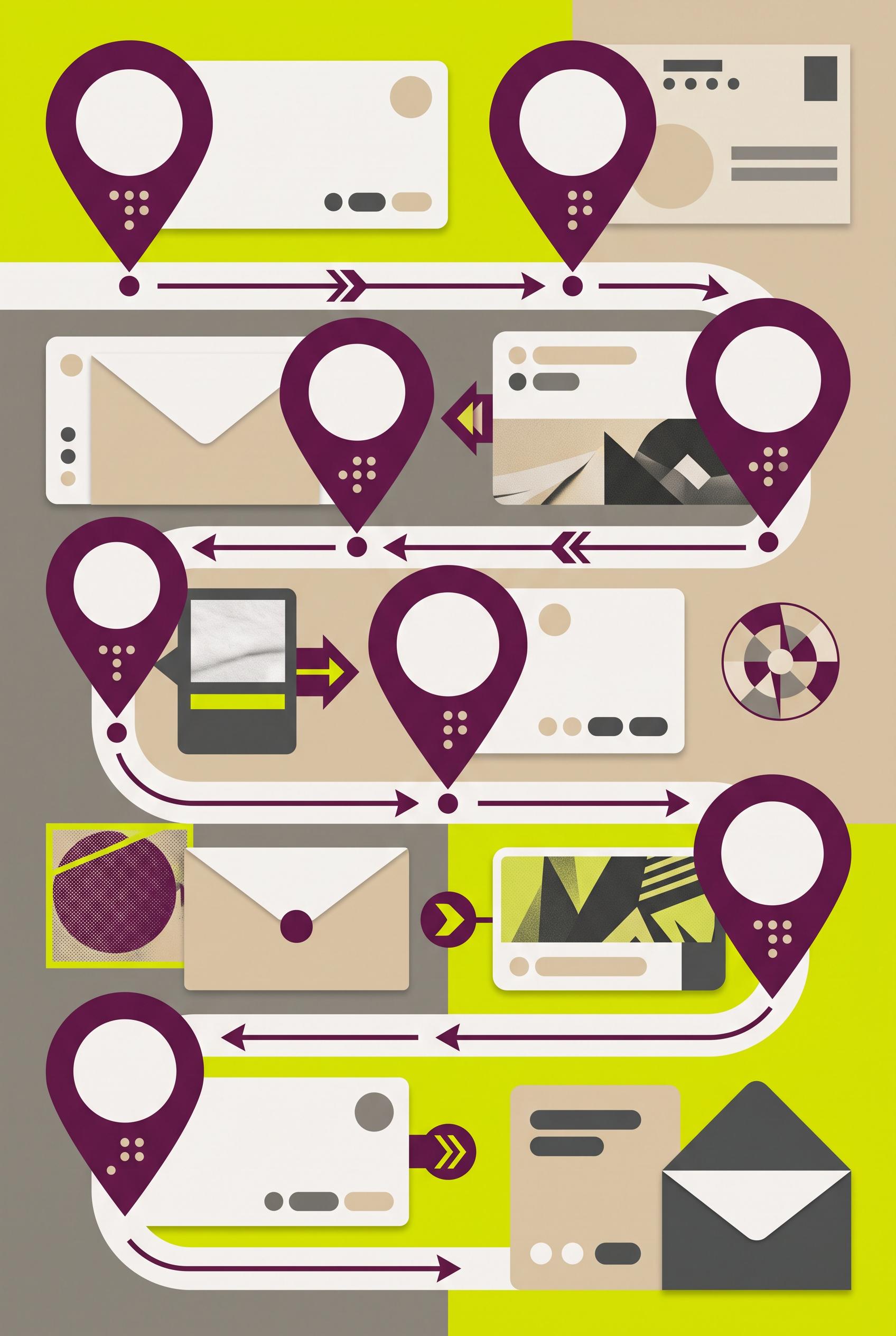 0
Create a commercial-quality vertical 2:3 Pinterest composition showing an educational seven-day creator launch campaign as a stylized postal route map. Include seven abstract destination markers, varied content-card silhouettes, arrows, crop windows, and one repeated geometric signal connecting the sequence. Use acid chartreuse, rich plum, sandy beige, graphite, and soft white. Make it visually useful and editorial, with clear grouping but no readable labels. No real brands, no trademarked characters, no watermark, no unintended readable text. Corrective regeneration attempt 4. Produce a materially revised image, not a near-duplicate of an earlier variant. Preserve the successful subject, palette, lighting, focal hierarchy, and commercial polish from the original brief while correcting every issue below. Mandatory corrective instructions from the most recent visual QA: Preserve the polished vertical 2:3 postal-route map, acid chartreuse/plum/beige/graphite/soft-white palette, clear arrows, crop windows, varied blank card silhouettes, and strong editorial hierarchy. Add exactly one clearly separated seventh route stop. Make all seven destination markers perfectly identical: the same plum geometric map-pin shape with the same blank interior and identical abstract dot arrangement, with no varying pictograms. Remove the compass entirely or replace it with a purely abstract circular geometric decoration without any letters. Remove all envelope scribbles, table grids, pseudo-text lines, interface-like bars, and letter-like marks; replace them with blank surfaces and simple non-linguistic circles, dots, bars, and geometric shapes. Ensure no letters, numbers, words, logos, glyphs, watermarks, or pseudo-text appear anywhere. Observed defects from prior variants that must not recur: 1) The composition is visually dense, weakening the clarity of the seven-stop sequence. 2) Envelope inserts contain obvious pseudo-handwriting/readable text-like scribbles. 3) Compass decorations include the readable letter “N,” violating the no-text requirement. 4) The repeated destination symbol varies with different inner icons, weakening consistency. 5) Attractive vertical composition and cohesive palette, but only six visible destination markers instead of exactly seven. 6) Repeated destination symbols have varying internal dot patterns and divisions rather than being identical. 7) A readable compass letter “N” is visible. 8) Some card and envelope interiors resemble pseudo-text or interface/table content, conflicting with the no-readable-text requirement. Render no letters, words, numbers, prices, headings, labels, contact details, logos, glyphs, or pseudo-text anywhere. Use only blank surfaces, clean geometric marks, and non-linguistic placeholder shapes. Do not add explanatory captions, before/after labels, interface copy, or extra objects that the brief did not request. When a corrective instruction conflicts with a decorative detail, prioritize the corrective instruction.
 0
Create a commercial-quality vertical 2:3 Pinterest composition showing an educational seven-day creator launch campaign as a stylized postal route map. Include seven abstract destination markers, varied content-card silhouettes, arrows, crop windows, and one repeated geometric signal connecting the sequence. Use acid chartreuse, rich plum, sandy beige, graphite, and soft white. Make it visually useful and editorial, with clear grouping but no readable labels. No real brands, no trademarked characters, no watermark, no unintended readable text. Corrective regeneration attempt 3. Produce a materially revised image, not a near-duplicate of an earlier variant. Preserve the successful subject, palette, lighting, focal hierarchy, and commercial polish from the original brief while correcting every issue below. Mandatory corrective instructions from the most recent visual QA: Preserve the attractive vertical 2:3 postal-route map, cohesive acid chartreuse/plum/beige/graphite/soft-white palette, clean editorial polish, arrows, crop windows, varied card treatments, and exactly seven separated route stops. Remove every envelope scribble and all compass letters or other letter-like marks; replace them with blank surfaces and purely abstract dots, bars, circles, and geometric shapes. Make the repeated destination symbol identical at all seven stops, with no varying inner pictograms. Keep the route visually clear and uncluttered, with no letters, numbers, pseudo-text, logos, brands, watermarks, or interface-like symbols anywhere. Observed defects from prior variants that must not recur: 1) Strong vertical editorial composition and cohesive palette, but it contains readable text-like elements, including “LIVE,” “@,” and numbered markers. 2) The route numbering is inconsistent: 06 is missing and 07 appears twice. 3) The composition is visually dense, weakening the clarity of the seven-stop sequence. 4) Envelope inserts contain obvious pseudo-handwriting/readable text-like scribbles. 5) Compass decorations include the readable letter “N,” violating the no-text requirement. 6) The repeated destination symbol varies with different inner icons, weakening consistency. Render no letters, words, numbers, prices, headings, labels, contact details, logos, glyphs, or pseudo-text anywhere. Use only blank surfaces, clean geometric marks, and non-linguistic placeholder shapes. Do not add explanatory captions, before/after labels, interface copy, or extra objects that the brief did not request. When a corrective instruction conflicts with a decorative detail, prioritize the corrective instruction.
 0
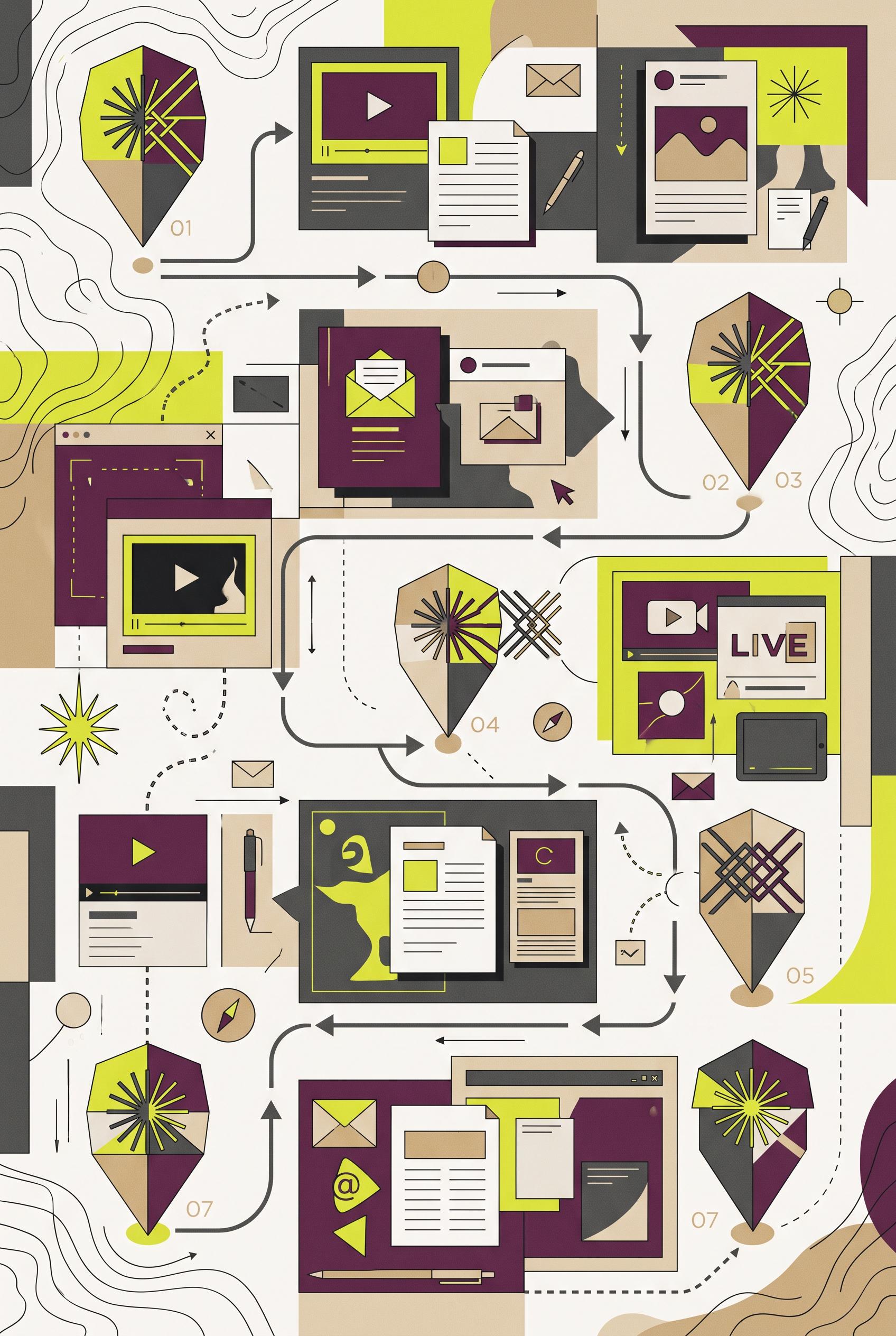
Create a commercial-quality vertical 2:3 Pinterest composition showing an educational seven-day creator launch campaign as a stylized postal route map. Include seven abstract destination markers, varied content-card silhouettes, arrows, crop windows, and one repeated geometric signal connecting the sequence. Use acid chartreuse, rich plum, sandy beige, graphite, and soft white. Make it visually useful and editorial, with clear grouping but no readable labels. No real brands, no trademarked characters, no watermark, no unintended readable text. Corrective regeneration attempt 2. Produce a materially revised image, not a near-duplicate of an earlier variant. Preserve the successful subject, palette, lighting, focal hierarchy, and commercial polish from the original brief while correcting every issue below. Mandatory corrective instructions from the most recent visual QA: Preserve the vertical 2:3 format, editorial postal-route-map style, acid chartreuse/plum/beige/graphite/soft-white palette, repeated geometric signal, arrows, varied content-card silhouettes, and crop-window motifs. Remove all readable text and symbols that resemble text, including “LIVE,” “@,” interface-like controls, and every numeric marker. Replace them with purely abstract graphic bars, dots, icons, and geometric marks. Show exactly seven clearly separated route stops, each with one consistent repeated geometric destination symbol and a distinct crop/content-card treatment; ensure the sequence is visually unambiguous without labels. Reduce overlapping cards and decorative clutter so the route path and seven stops read clearly. Keep all shapes clean, intentional, and free of artifacts, brands, watermarks, or pseudo-lettering. Observed defects from prior variants that must not recur: 1) Strong vertical editorial composition and cohesive palette, but it contains readable text-like elements, including “LIVE,” “@,” and numbered markers. 2) The route numbering is inconsistent: 06 is missing and 07 appears twice. 3) The composition is visually dense, weakening the clarity of the seven-stop sequence. Render no letters, words, numbers, prices, headings, labels, contact details, logos, glyphs, or pseudo-text anywhere. Use only blank surfaces, clean geometric marks, and non-linguistic placeholder shapes. Do not add explanatory captions, before/after labels, interface copy, or extra objects that the brief did not request. When a corrective instruction conflicts with a decorative detail, prioritize the corrective instruction.
 0
Create a commercial-quality vertical 2:3 Pinterest composition showing an educational seven-day creator launch campaign as a stylized postal route map. Include seven abstract destination markers, varied content-card silhouettes, arrows, crop windows, and one repeated geometric signal connecting the sequence. Use acid chartreuse, rich plum, sandy beige, graphite, and soft white. Make it visually useful and editorial, with clear grouping but no readable labels. No real brands, no trademarked characters, no watermark, no unintended readable text.
 0
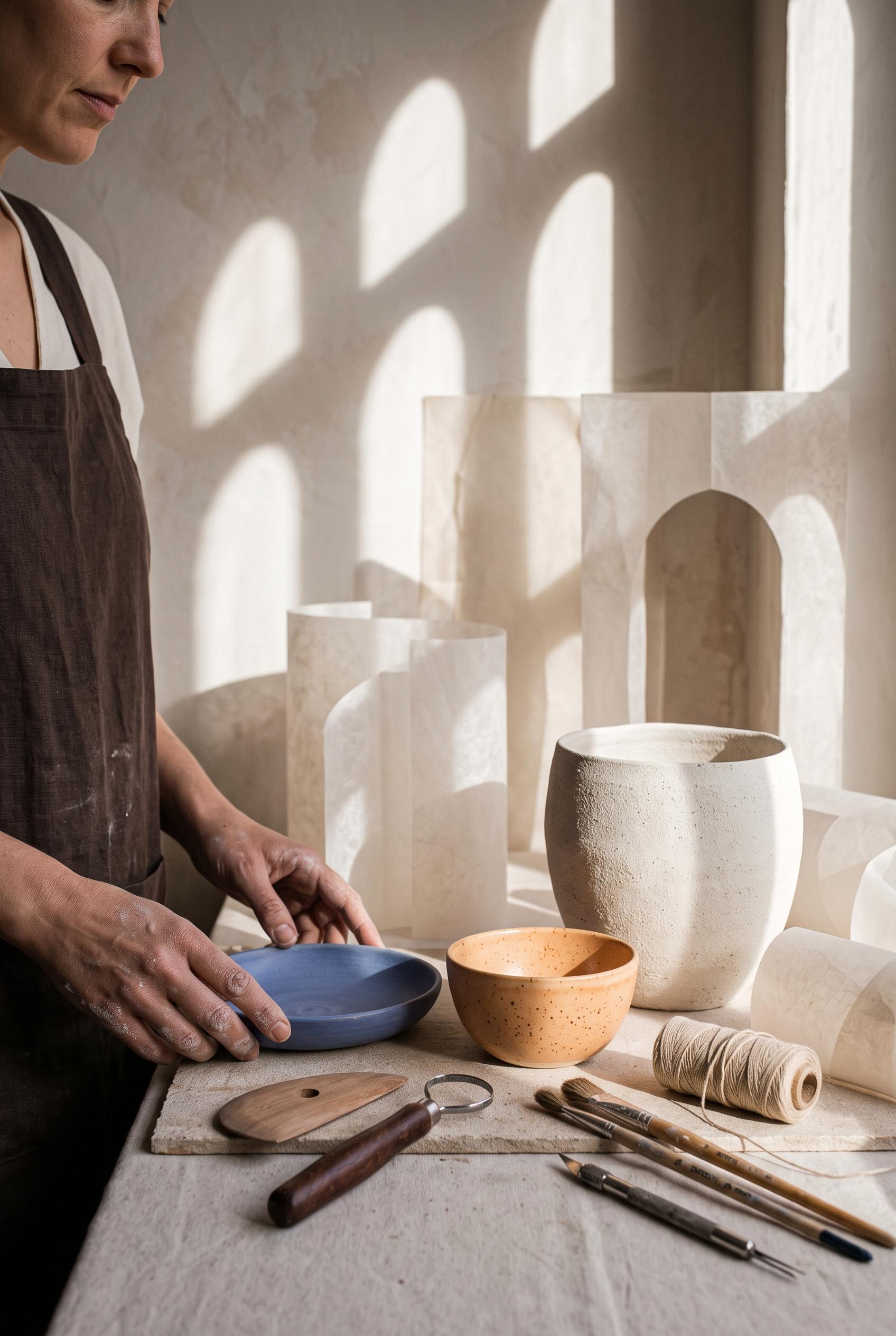
Create a commercial-quality vertical 2:3 Pinterest composition for an inspirational personal brand showcase of a fictional ceramic educator. Feature a sculptural still life with handmade pottery, clay tools, linen, a partial human portrait, translucent paper forms, and a repeated arch-shaped sunlight shadow. Use apricot, ultramarine, chalk white, espresso brown, and muted skin tones. Sophisticated editorial photography, tactile textures, art-directed styling. No real brands, no trademarked characters, no watermark, no unintended readable text.
 0
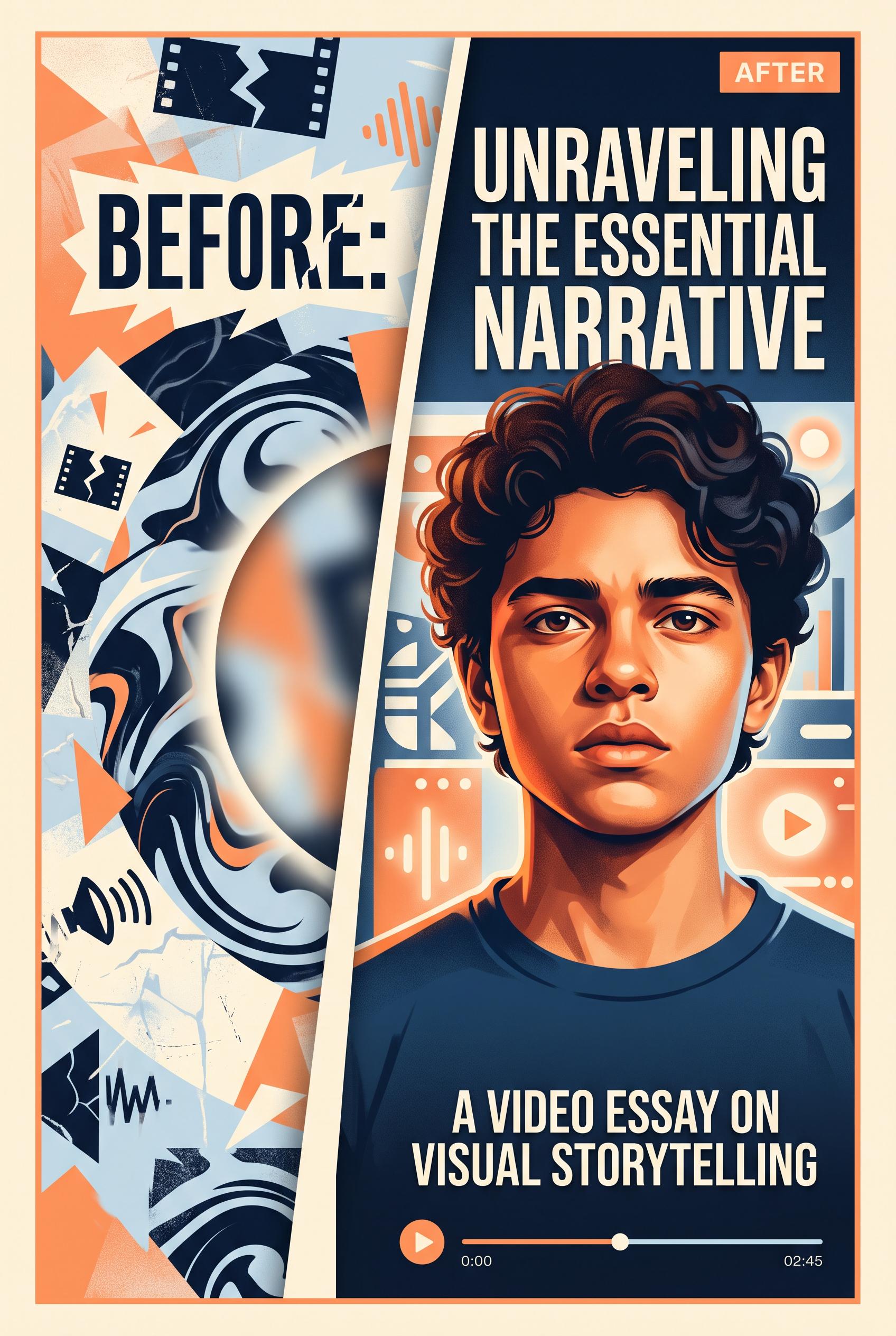
Create a commercial-quality vertical 2:3 Pinterest composition showing a fictional video essay cover transformation, with a crowded abstract before panel on the left and a focused expressive portrait cover on the right. Use cantaloupe orange, deep ink blue, pale blue, and warm cream. Use a radial crop reveal, crisp editorial lighting, polished graphic design, and clear visual hierarchy. No real brands, no trademarked characters, no watermark, no unintended readable text. Corrective regeneration attempt 2. Produce a materially revised image, not a near-duplicate of an earlier variant. Preserve the successful subject, palette, lighting, focal hierarchy, and commercial polish from the original brief while correcting every issue below. Mandatory corrective instructions from the most recent visual QA: Preserve the polished vertical 2:3 layout, orange/ink-blue/pale-blue/warm-cream palette, expressive portrait, and crowded abstract before panel. Redesign the after panel so the portrait is a close facial crop contained within one unmistakable strong circular framing device or radial crop reveal. Remove most decorative interface icons, playback controls, and secondary background shapes from the after side to create generous clean negative space around the circle and portrait. Keep the visual hierarchy crisp and commercial, with no real brands, trademarks, watermark, artifacts, or unintended garbled text. Observed defects from prior variants that must not recur: 1) The composition is polished and clearly communicates before/after, but the after panel does not use the requested strong circular framing device. 2) The after side is visually crowded with interface motifs and large headline text, leaving insufficient generous negative space. 3) The portrait is a standard rectangular crop rather than a focused circular/radial reveal. Render no letters, words, numbers, prices, headings, labels, contact details, logos, glyphs, or pseudo-text anywhere. Use only blank surfaces, clean geometric marks, and non-linguistic placeholder shapes. Do not add explanatory captions, before/after labels, interface copy, or extra objects that the brief did not request. When a corrective instruction conflicts with a decorative detail, prioritize the corrective instruction.
 0
Create a commercial-quality vertical 2:3 Pinterest composition showing a fictional video essay cover transformation, with a crowded abstract before panel on the left and a focused expressive portrait cover on the right. Use cantaloupe orange, deep ink blue, pale blue, and warm cream. Use a radial crop reveal, crisp editorial lighting, polished graphic design, and clear visual hierarchy. No real brands, no trademarked characters, no watermark, no unintended readable text.
 0
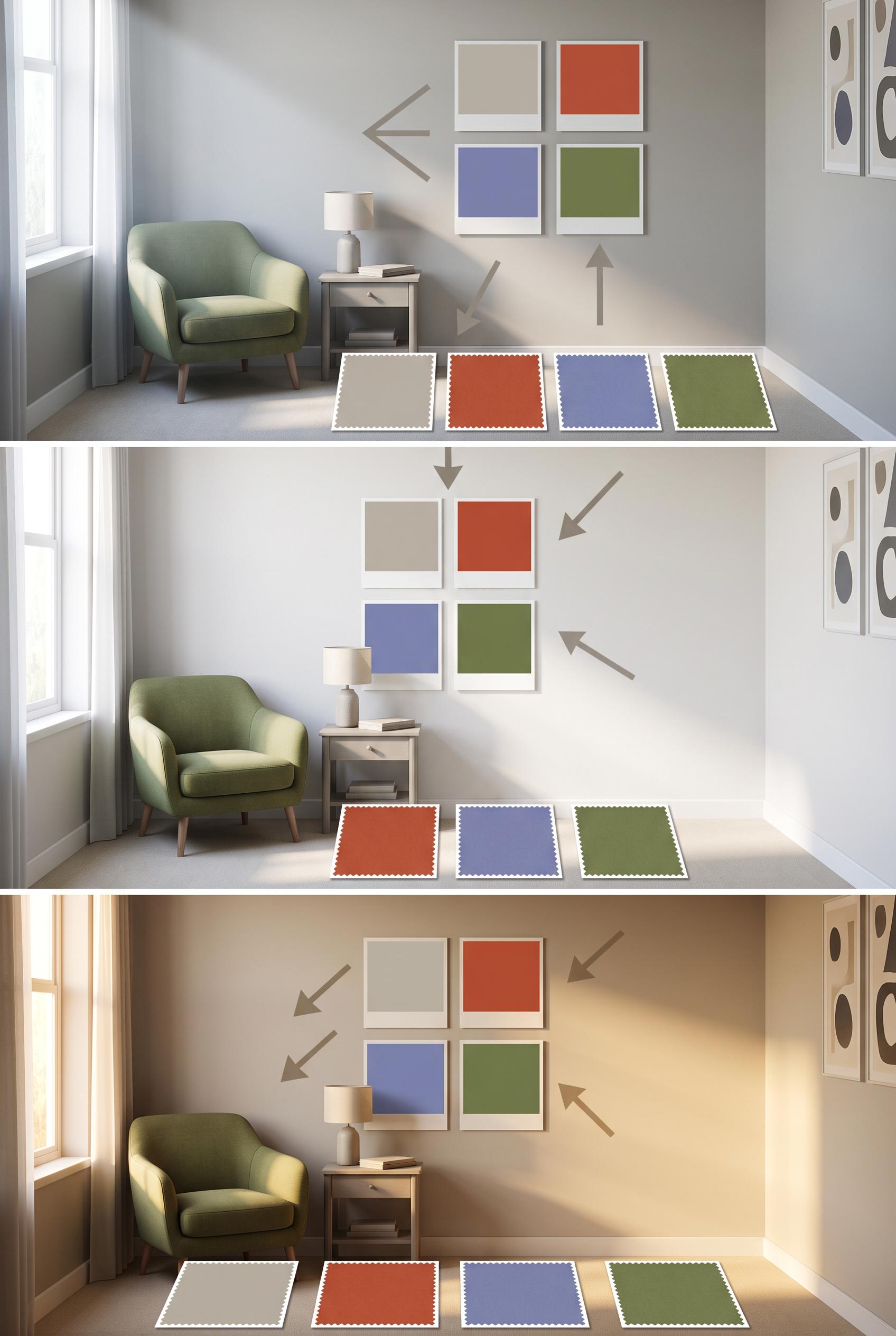
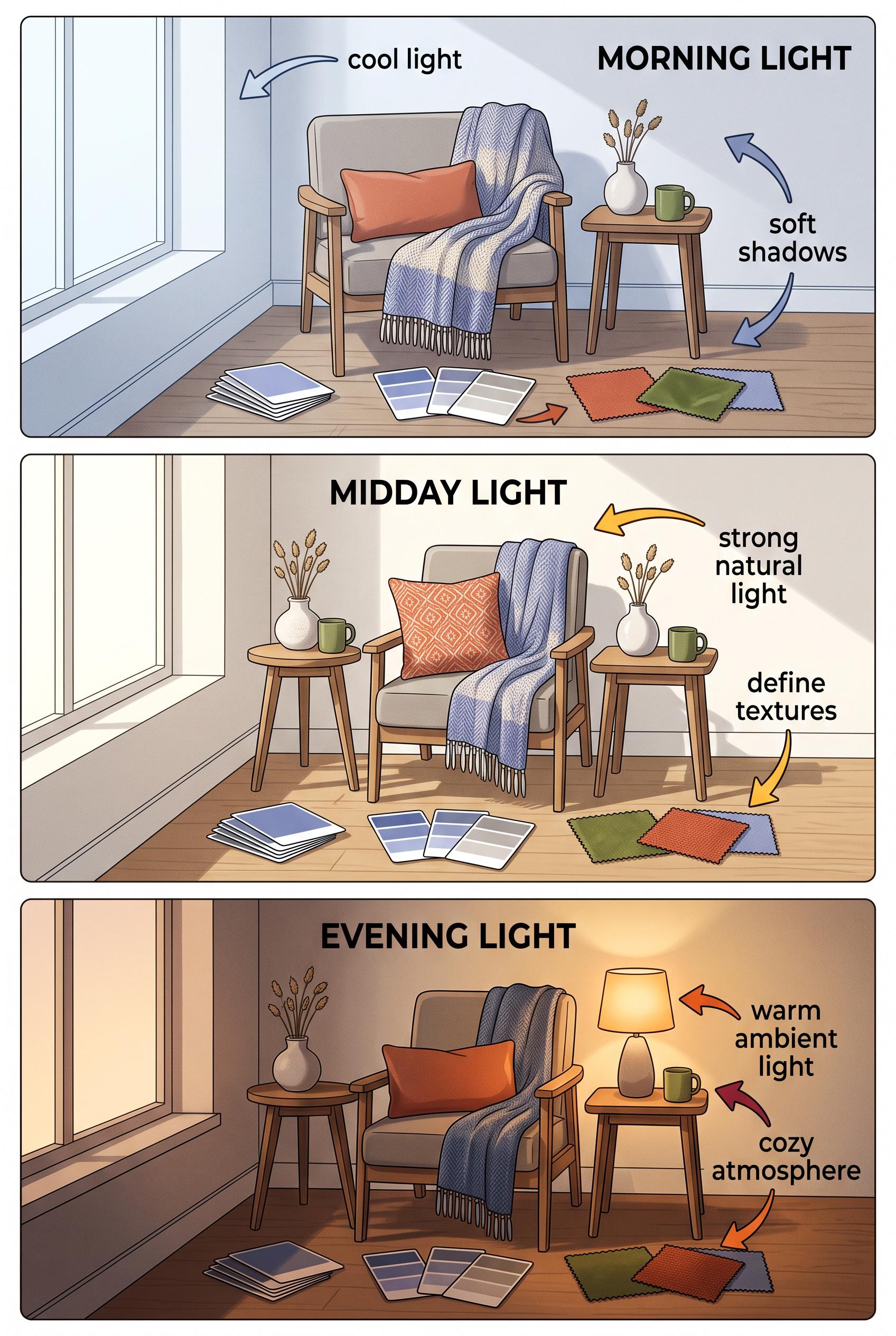
Create a commercial-quality educational interior styling graphic in a vertical 2:3 Pinterest composition with three vertically stacked panels showing the same compact room in morning, midday, and evening light. Include blank color sample cards, fabric squares, a small chair, and a side table, with visual arrows made from simple shapes but no readable text. Palette of stone, paprika, periwinkle, and moss. AI-modified downstream. No real brands, no trademarked characters, no watermark, and no unintended readable text. Corrective regeneration attempt 5. Produce a materially revised image, not a near-duplicate of an earlier variant. Preserve the successful subject, palette, lighting, focal hierarchy, and commercial polish from the original brief while correcting every issue below. Mandatory corrective instructions from the most recent visual QA: Preserve the polished vertical 2:3 three-panel room composition, consistent camera position, chair, side table, window, abstract wall art, arrows, palette, and distinct morning/midday/evening lighting. Use exactly the same number, size, shape, spacing, and arrangement of removable sample cards and fabric swatches in all three panels; replicate one four-card wall grid and one four-swatch floor row identically in each panel. Make every card and swatch completely plain, solid, unmarked, texture-free, and single-color in stone, paprika, periwinkle, or moss, with no gradients, divided tones, patterns, stitching, glyphs, letters, numbers, labels, or pseudo-text. Keep all wall art non-linguistic. Do not add any text, logos, watermark, captions, or extra objects. Observed defects from prior variants that must not recur: 1) Attractive vertical three-panel composition with clear consistent room and lighting progression. 2) No readable text, logos, watermark, or obvious generation artifacts are visible. 3) Fabric swatches contain visible geometric patterns and textures, violating the requirement that all swatches be completely blank. 4) The removable sample-card arrangement is inconsistent across panels, with differing card counts and layouts. 5) Attractive vertical three-panel composition with clear lighting progression and no readable text, logos, watermark, or obvious artifacts. 6) The removable sample-card arrangement is inconsistent: the top panel has six wall cards while the middle and bottom have four. 7) Floor swatches are not fully uniform blank samples; several appear divided into two tones or contain shading/texture. 8) The exact same number, size, and arrangement of every card and swatch is not maintained across all panels. Render no letters, words, numbers, prices, headings, labels, contact details, logos, glyphs, or pseudo-text anywhere. Use only blank surfaces, clean geometric marks, and non-linguistic placeholder shapes. Do not add explanatory captions, before/after labels, interface copy, or extra objects that the brief did not request. When a corrective instruction conflicts with a decorative detail, prioritize the corrective instruction.
 0
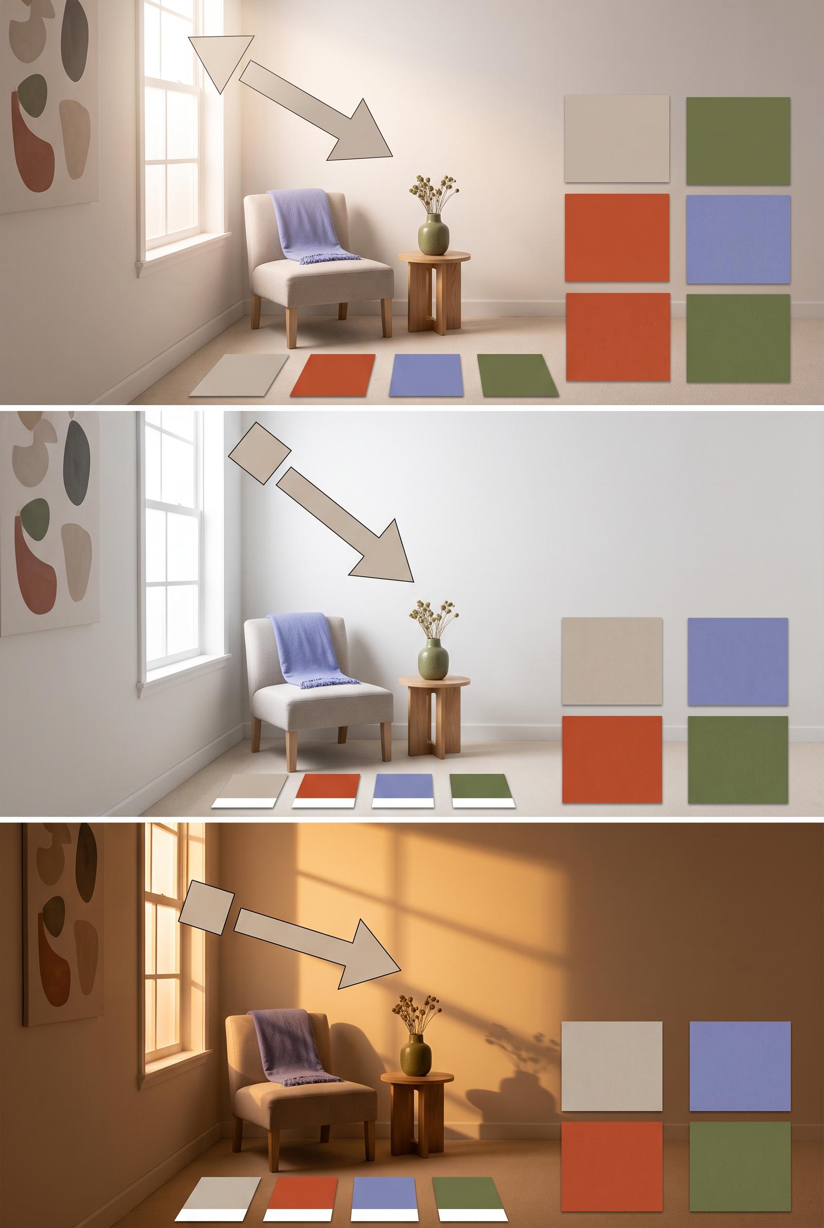
Create a commercial-quality educational interior styling graphic in a vertical 2:3 Pinterest composition with three vertically stacked panels showing the same compact room in morning, midday, and evening light. Include blank color sample cards, fabric squares, a small chair, and a side table, with visual arrows made from simple shapes but no readable text. Palette of stone, paprika, periwinkle, and moss. AI-modified downstream. No real brands, no trademarked characters, no watermark, and no unintended readable text. Corrective regeneration attempt 4. Produce a materially revised image, not a near-duplicate of an earlier variant. Preserve the successful subject, palette, lighting, focal hierarchy, and commercial polish from the original brief while correcting every issue below. Mandatory corrective instructions from the most recent visual QA: Preserve the polished vertical 2:3 three-panel room composition, consistent camera position, chair, side table, window, palette, arrows, and distinct morning/midday/evening lighting. Make the removable color sample cards and every fabric swatch completely plain, solid, unmarked, and texture-free, with no patterns, glyphs, stitching-like symbols, or pseudo-text. Use the exact same number, size, and arrangement of blank cards and swatches in all three panels. Keep all wall art abstract and non-linguistic. Do not add any text, letters, numbers, labels, logos, captions, or extra objects. Observed defects from prior variants that must not recur: 1) No readable words. 2) The three panels are attractive and clearly communicate changing light conditions, but the text violation prevents commercial-quality approval. 3) Large readable headings appear in all three panels, violating the no-readable-text requirement. 4) The composition is otherwise attractive, vertical, consistent, and clearly communicates changing light conditions. 5) Attractive vertical three-panel composition with clear consistent room and lighting progression. 6) No readable text, logos, watermark, or obvious generation artifacts are visible. 7) Fabric swatches contain visible geometric patterns and textures, violating the requirement that all swatches be completely blank. 8) The removable sample-card arrangement is inconsistent across panels, with differing card counts and layouts. Render no letters, words, numbers, prices, headings, labels, contact details, logos, glyphs, or pseudo-text anywhere. Use only blank surfaces, clean geometric marks, and non-linguistic placeholder shapes. Do not add explanatory captions, before/after labels, interface copy, or extra objects that the brief did not request. When a corrective instruction conflicts with a decorative detail, prioritize the corrective instruction.
 0
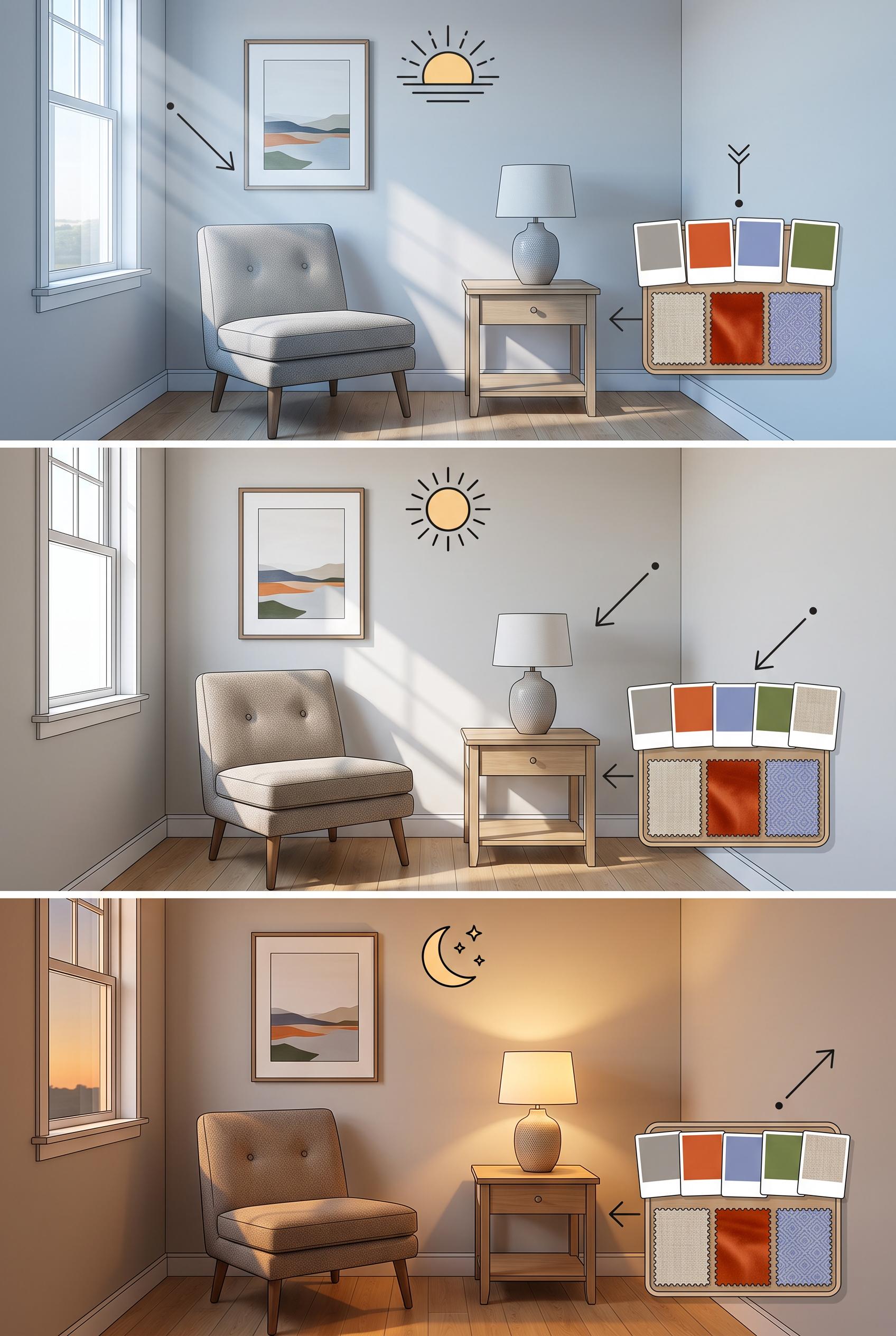
Create a commercial-quality educational interior styling graphic in a vertical 2:3 Pinterest composition with three vertically stacked panels showing the same compact room in morning, midday, and evening light. Include blank color sample cards, fabric squares, a small chair, and a side table, with visual arrows made from simple shapes but no readable text. Palette of stone, paprika, periwinkle, and moss. AI-modified downstream. No real brands, no trademarked characters, no watermark, and no unintended readable text. Corrective regeneration attempt 3. Produce a materially revised image, not a near-duplicate of an earlier variant. Preserve the successful subject, palette, lighting, focal hierarchy, and commercial polish from the original brief while correcting every issue below. Mandatory corrective instructions from the most recent visual QA: Preserve the polished vertical 2:3 three-panel room composition, consistent chair, side table, window, fabric, color palette, camera position, and distinct morning/midday/evening lighting. Remove all readable headings, labels, letters, numbers, logos, pseudo-text, and text-like annotations from every panel. Replace the heading areas with clean wall space or minimal non-linguistic geometric markers such as simple sun icons or abstract rays. Keep all color sample cards and fabric swatches completely blank, with no markings or glyphs. Do not add captions or extra objects. Observed defects from prior variants that must not recur: 1) The image contains extensive readable labels and headings such as “MORNING LIGHT,” “MIDDAY LIGHT,” “EVENING LIGHT,” “cool light,” and other annotations, despite the brief requiring 2) No readable words. 3) The three panels are attractive and clearly communicate changing light conditions, but the text violation prevents commercial-quality approval. 4) Large readable headings appear in all three panels, violating the no-readable-text requirement. 5) The composition is otherwise attractive, vertical, consistent, and clearly communicates changing light conditions. Render no letters, words, numbers, prices, headings, labels, contact details, logos, glyphs, or pseudo-text anywhere. Use only blank surfaces, clean geometric marks, and non-linguistic placeholder shapes. Do not add explanatory captions, before/after labels, interface copy, or extra objects that the brief did not request. When a corrective instruction conflicts with a decorative detail, prioritize the corrective instruction.
 0
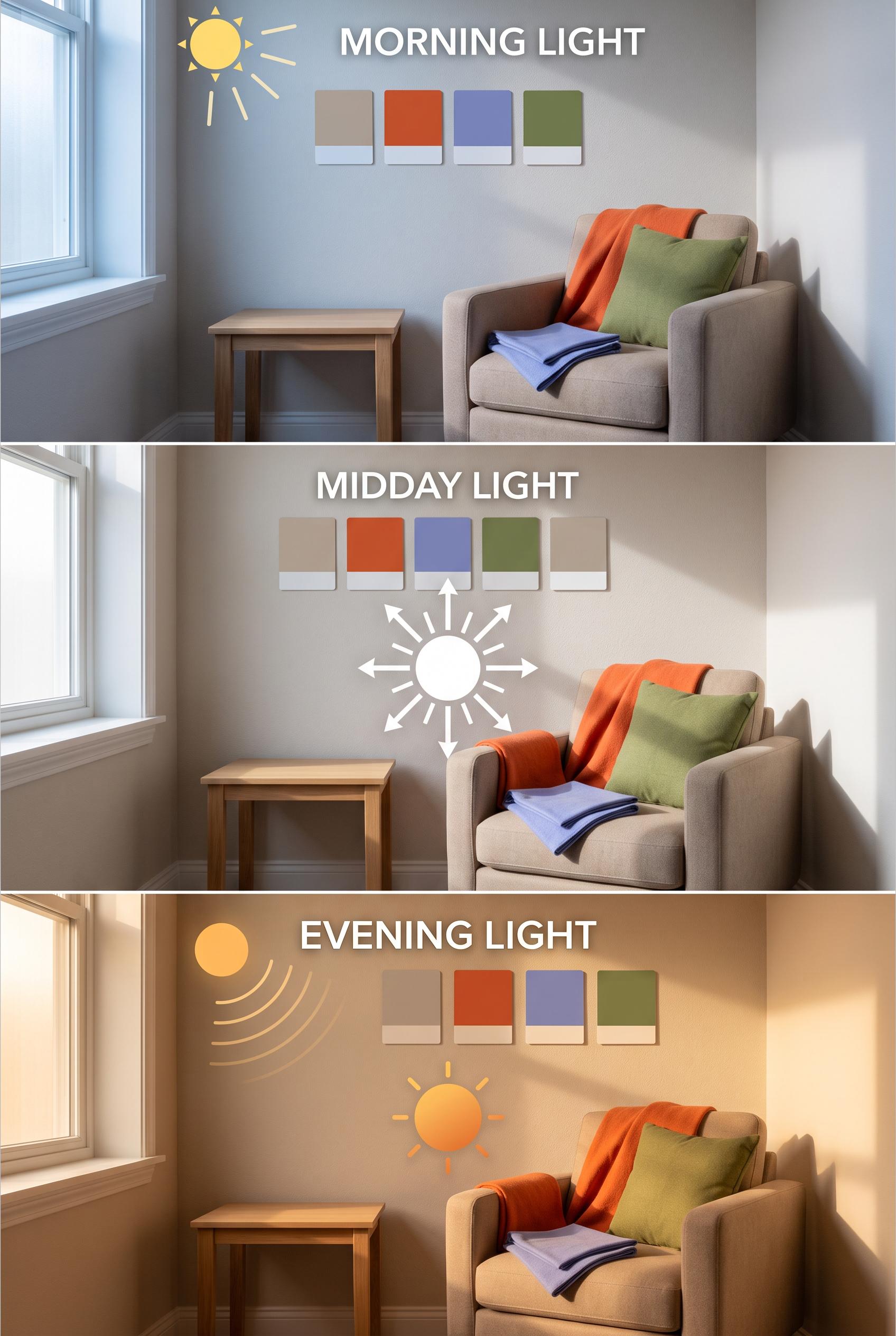
Create a commercial-quality educational interior styling graphic in a vertical 2:3 Pinterest composition with three vertically stacked panels showing the same compact room in morning, midday, and evening light. Include blank color sample cards, fabric squares, a small chair, and a side table, with visual arrows made from simple shapes but no readable text. Palette of stone, paprika, periwinkle, and moss. AI-modified downstream. No real brands, no trademarked characters, no watermark, and no unintended readable text. Corrective regeneration attempt 2. Produce a materially revised image, not a near-duplicate of an earlier variant. Preserve the successful subject, palette, lighting, focal hierarchy, and commercial polish from the original brief while correcting every issue below. Mandatory corrective instructions from the most recent visual QA: Preserve the attractive vertical 2:3 three-panel room composition, consistent chair, side table, window, fabric, and color-swatch styling. Remove every readable word, heading, label, and text-like annotation from all panels, including all light-condition captions and descriptive phrases. Replace the text areas with clean empty wall space or simple non-text visual markers such as minimal arrows, sun icons, or abstract light rays. Keep the same room and camera position consistent across morning, midday, and evening; change only light temperature/intensity and the small removable color swatches. Ensure all sample cards remain completely blank, with no letters, numbers, logos, watermark, or pseudo-text. Observed defects from prior variants that must not recur: 1) The image contains extensive readable labels and headings such as “MORNING LIGHT,” “MIDDAY LIGHT,” “EVENING LIGHT,” “cool light,” and other annotations, despite the brief requiring 2) No readable words. 3) The three panels are attractive and clearly communicate changing light conditions, but the text violation prevents commercial-quality approval. Render no letters, words, numbers, prices, headings, labels, contact details, logos, glyphs, or pseudo-text anywhere. Use only blank surfaces, clean geometric marks, and non-linguistic placeholder shapes. Do not add explanatory captions, before/after labels, interface copy, or extra objects that the brief did not request. When a corrective instruction conflicts with a decorative detail, prioritize the corrective instruction.
 0
Create a commercial-quality educational interior styling graphic in a vertical 2:3 Pinterest composition with three vertically stacked panels showing the same compact room in morning, midday, and evening light. Include blank color sample cards, fabric squares, a small chair, and a side table, with visual arrows made from simple shapes but no readable text. Palette of stone, paprika, periwinkle, and moss. AI-modified downstream. No real brands, no trademarked characters, no watermark, and no unintended readable text.
 0
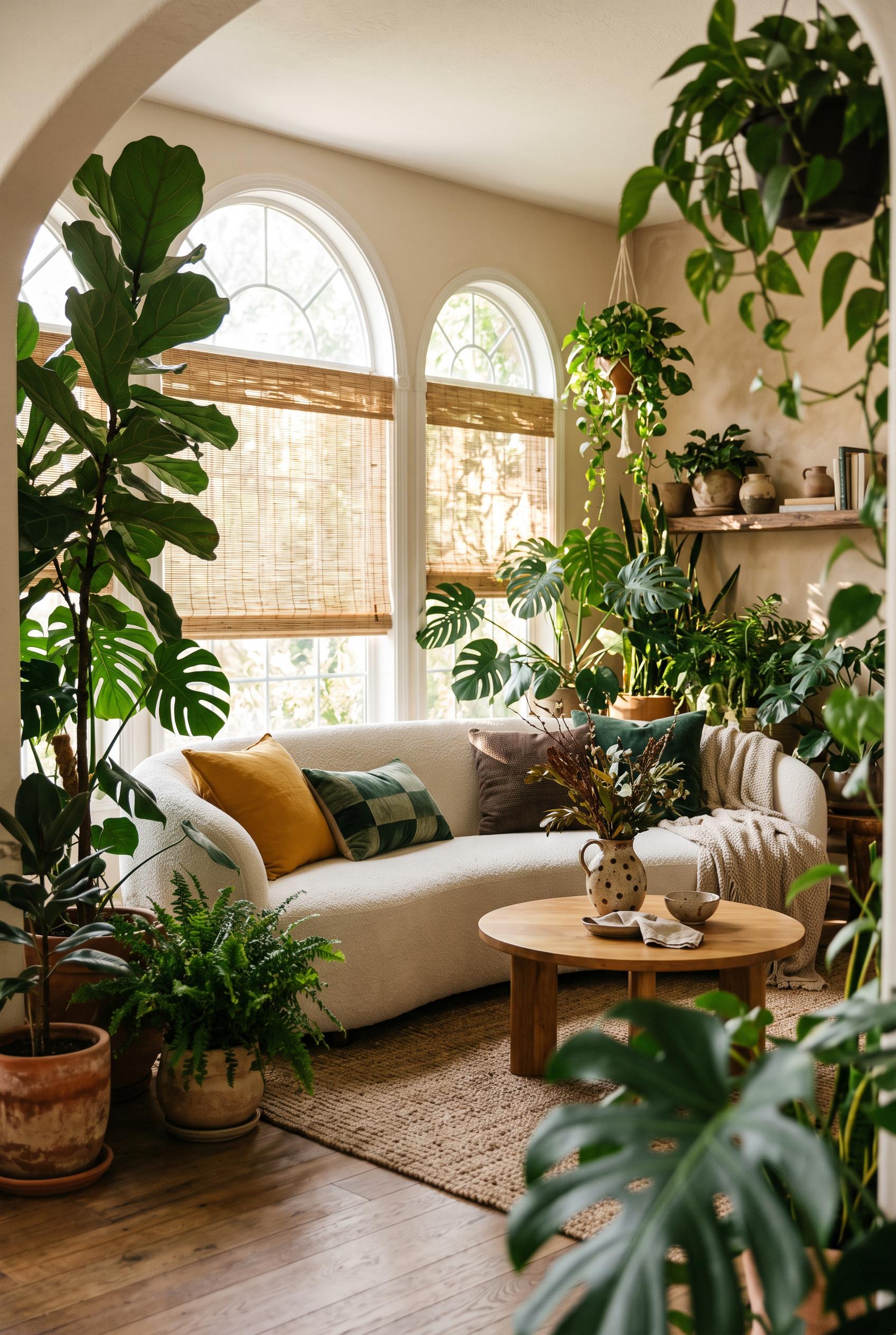
Create a commercial-quality interior editorial photograph in a vertical 2:3 Pinterest composition of an indoor garden living room. Use a three-quarter view framed by tall leafy plants, with a curved sofa, round low table, woven window shades, handmade ceramic accents, and dappled sunlight. Palette of jade green, marigold, chalk white, and espresso brown. AI-modified downstream. No real brands, no trademarked characters, no watermark, and no unintended readable text.
 0
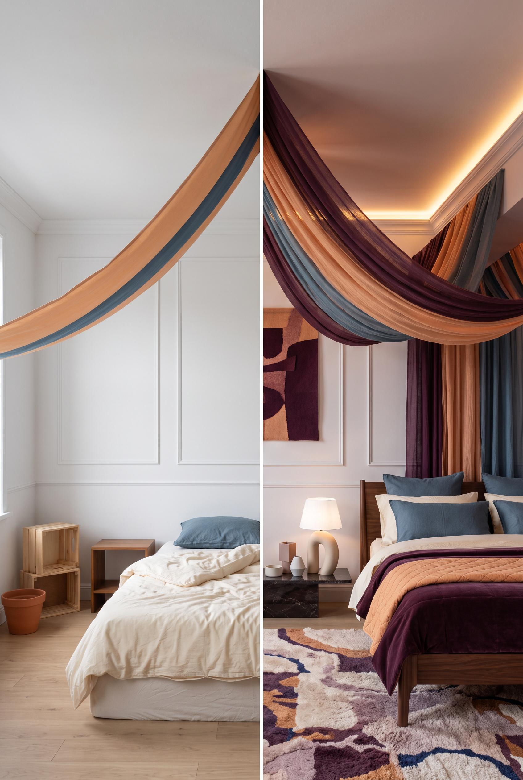
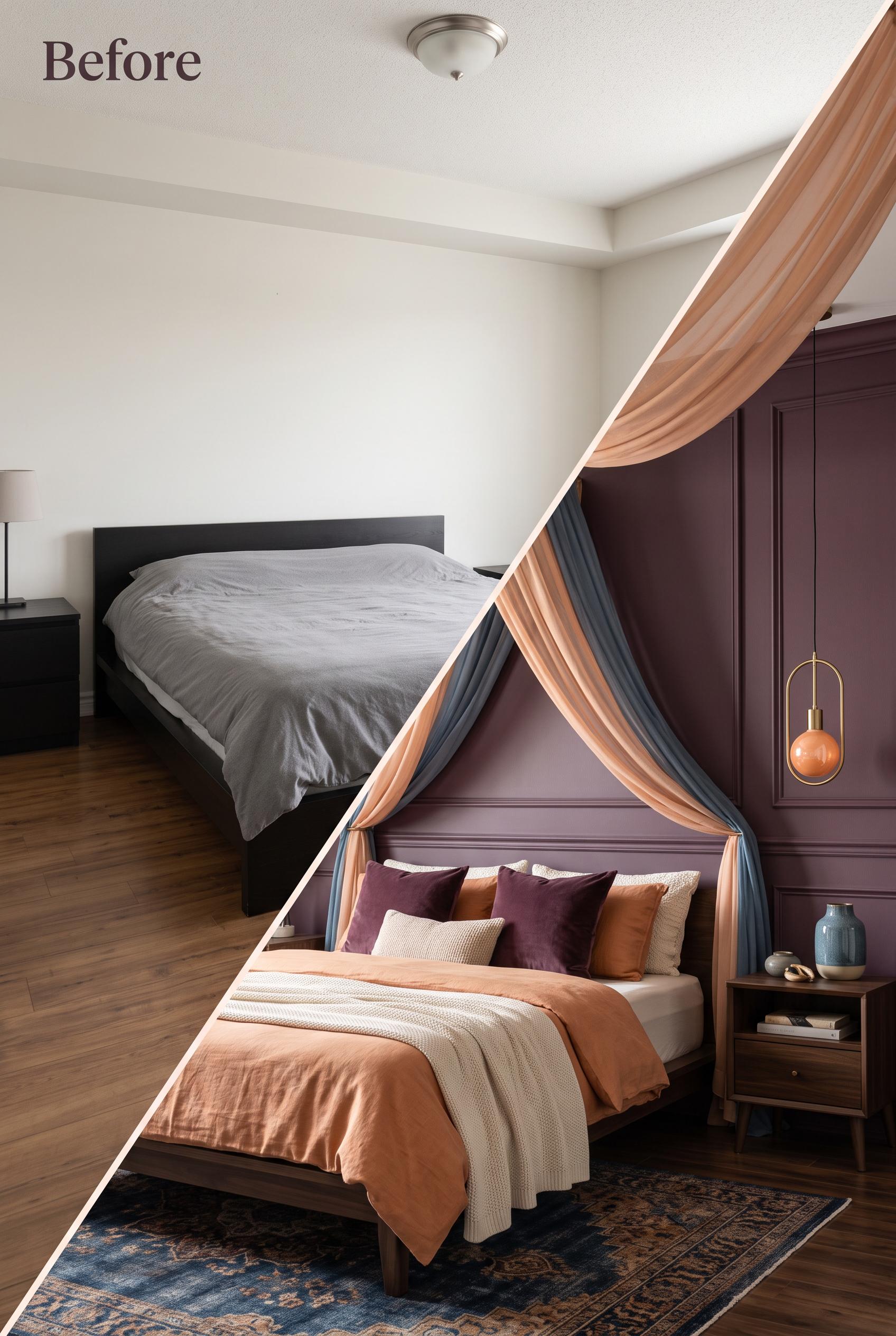
Create a commercial-quality interior editorial image in a vertical 2:3 Pinterest composition showing a matched before-and-after bedroom transformation. Use a diagonal fabric sweep from the plain ceiling in the before scene into a softly draped canopy in the after scene. Include a low bed, sculptural bedside light, layered textiles, and subtle wall molding. Palette of deep plum, apricot, mineral blue, and warm ivory. AI-modified downstream. No real brands, no trademarked characters, no watermark, and no unintended readable text. Corrective regeneration attempt 2. Produce a materially revised image, not a near-duplicate of an earlier variant. Preserve the successful subject, palette, lighting, focal hierarchy, and commercial polish from the original brief while correcting every issue below. Mandatory corrective instructions from the most recent visual QA: Preserve the attractive vertical 2:3 composition, matched camera angle, diagonal peach-and-blue fabric sweep, canopy, low bed, coordinated plum/apricot/ivory textiles, blue accents, and wall molding. Replace the visible hanging pendant in the after scene with clearly concealed warm lighting, such as a soft warm LED glow hidden within the canopy or ceiling perimeter. Keep the before side plain with disconnected furniture and no additional unintended readable text. Observed defects from prior variants that must not recur: 1) The after scene lacks clearly concealed warm lighting; it shows a visible hanging pendant instead. 2) The diagonal transition and overall bedroom styling are strong, with no watermark, branding, or obvious artifacts. Render no letters, words, numbers, prices, headings, labels, contact details, logos, glyphs, or pseudo-text anywhere. Use only blank surfaces, clean geometric marks, and non-linguistic placeholder shapes. Do not add explanatory captions, before/after labels, interface copy, or extra objects that the brief did not request. When a corrective instruction conflicts with a decorative detail, prioritize the corrective instruction.
 0
Create a commercial-quality interior editorial image in a vertical 2:3 Pinterest composition showing a matched before-and-after bedroom transformation. Use a diagonal fabric sweep from the plain ceiling in the before scene into a softly draped canopy in the after scene. Include a low bed, sculptural bedside light, layered textiles, and subtle wall molding. Palette of deep plum, apricot, mineral blue, and warm ivory. AI-modified downstream. No real brands, no trademarked characters, no watermark, and no unintended readable text.
 0
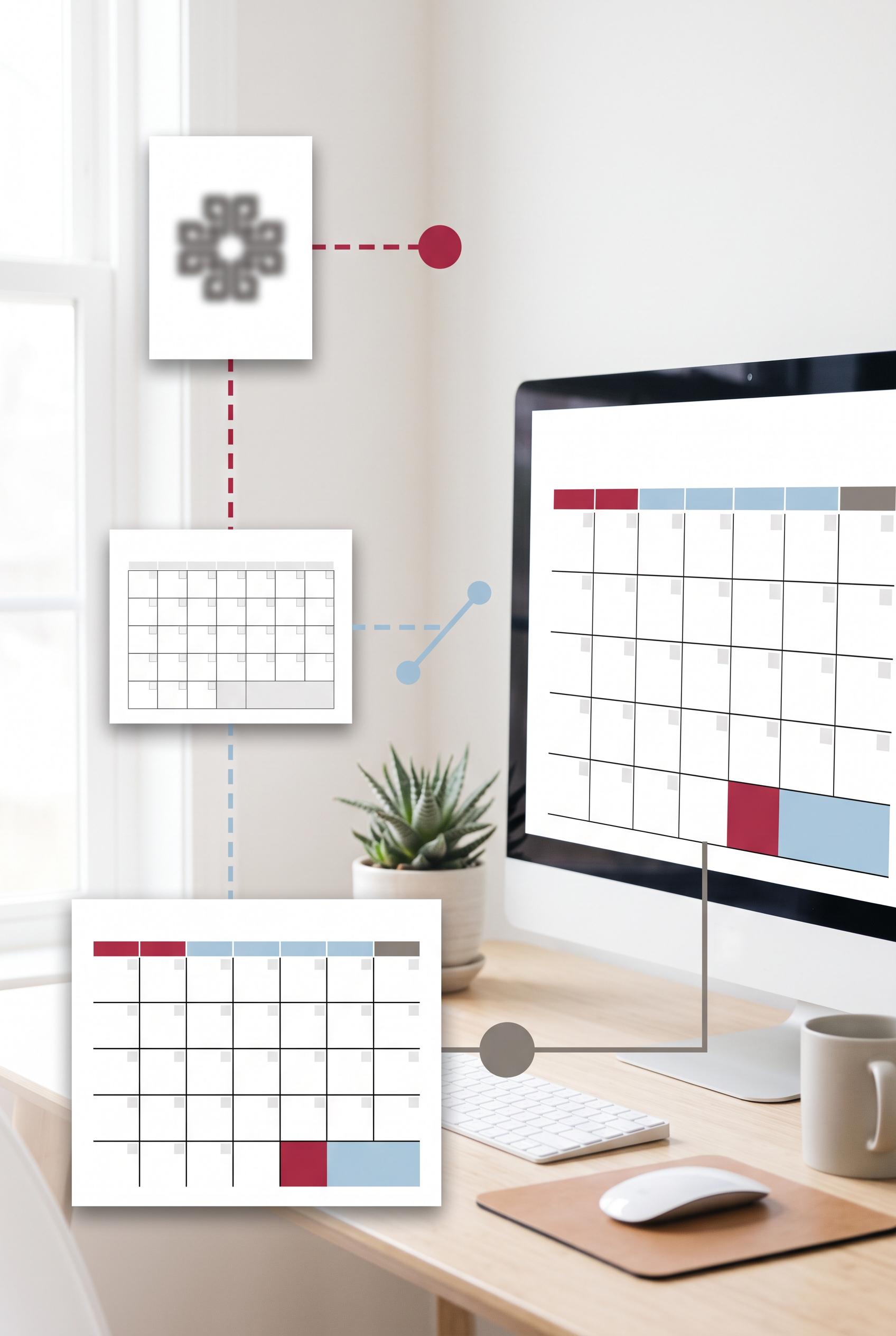
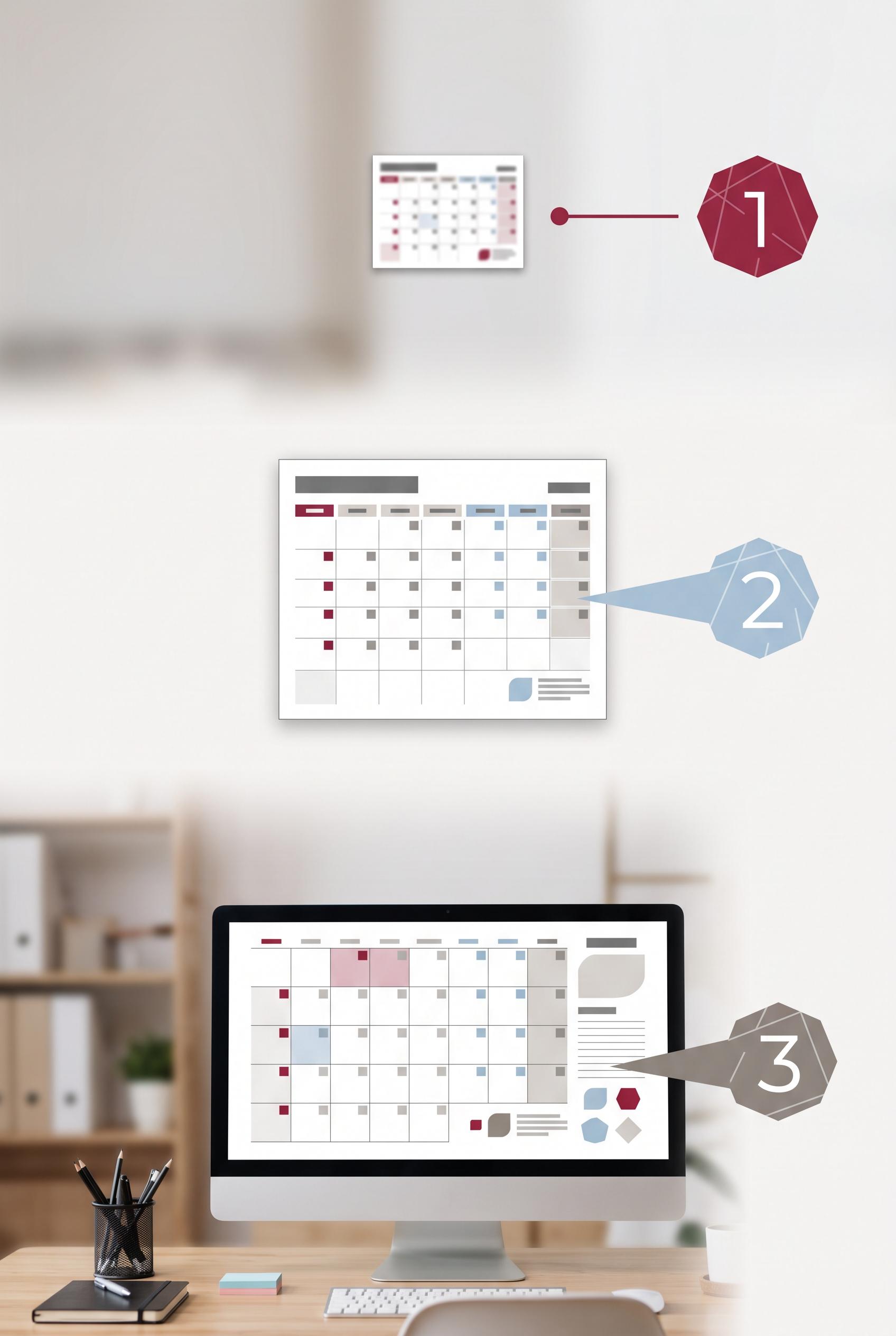
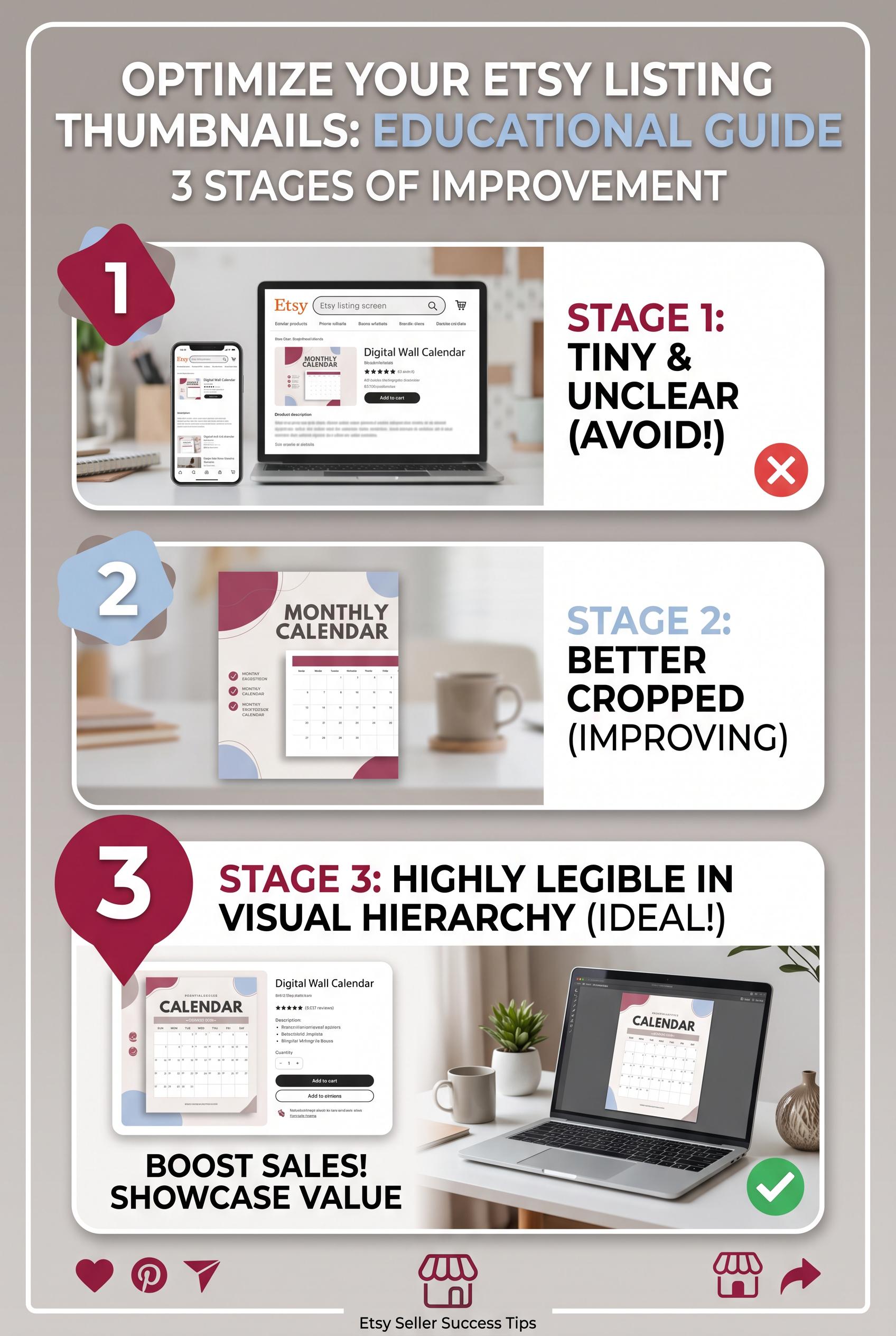
Create a commercial-quality vertical 2:3 Pinterest composition for an educational Etsy listing image guide. Show three distinct stages of a digital wall calendar thumbnail being improved: tiny and unclear, better cropped, then highly legible in visual hierarchy with a clear home-office use case. Use a visual focus lens, clean spacing, abstract numbered marker shapes without readable text, and a cranberry, powder blue, and warm gray palette. AI-modified downstream. No real brands, no trademarked characters, no watermark, and no unintended readable text. Corrective regeneration attempt 3. Produce a materially revised image, not a near-duplicate of an earlier variant. Preserve the successful subject, palette, lighting, focal hierarchy, and commercial polish from the original brief while correcting every issue below. Mandatory corrective instructions from the most recent visual QA: Keep the attractive vertical 2:3 home-office composition, cranberry/powder-blue/warm-gray palette, lighting, three calendar-preview stages, and clear progression from tiny/unclear to cropped/contrasting to large/legible on the desktop monitor. Replace each numbered polygon marker with a distinct unnumbered abstract geometric shape or solid dot-and-line marker; remove every numeral. Simplify all calendar previews so they contain only blank grids, color blocks, and non-linguistic geometric marks—no letters, words, numbers, labels, headings, logos, icons, pseudo-text, or UI copy. Preserve generous clean negative space and the visual focus connections. Observed defects from prior variants that must not recur: 1) Contains real brand/trademark references and logos, including Etsy and Pinterest-style branding. 2) Image is overloaded with embedded instructional text despite the brief requesting abstract markers and room for text outside the image. 3) Multiple small UI areas contain garbled or pseudo-readable text. 4) Bottom social and storefront icons add distracting brand-like elements and reduce commercial cleanliness. 5) Large readable numerals appear in all three abstract markers, violating the requirement for no readable numbers. 6) Calendar interfaces contain dense pseudo-text and UI-like line elements that reduce the clean, text-free commercial presentation. 7) The composition otherwise has a strong vertical layout, clear three-stage progression, coherent palette, and recognizable home-office use case. Render no letters, words, numbers, prices, headings, labels, contact details, logos, glyphs, or pseudo-text anywhere. Use only blank surfaces, clean geometric marks, and non-linguistic placeholder shapes. Do not add explanatory captions, before/after labels, interface copy, or extra objects that the brief did not request. When a corrective instruction conflicts with a decorative detail, prioritize the corrective instruction.
 0
Create a commercial-quality vertical 2:3 Pinterest composition for an educational Etsy listing image guide. Show three distinct stages of a digital wall calendar thumbnail being improved: tiny and unclear, better cropped, then highly legible in visual hierarchy with a clear home-office use case. Use a visual focus lens, clean spacing, abstract numbered marker shapes without readable text, and a cranberry, powder blue, and warm gray palette. AI-modified downstream. No real brands, no trademarked characters, no watermark, and no unintended readable text. Corrective regeneration attempt 2. Produce a materially revised image, not a near-duplicate of an earlier variant. Preserve the successful subject, palette, lighting, focal hierarchy, and commercial polish from the original brief while correcting every issue below. Mandatory corrective instructions from the most recent visual QA: Regenerate as a clean vertical 2:3 composition preserving the cranberry, powder blue, and warm gray palette, three-stage progression, visual focus lens, home-office setting, and clear product evolution. Remove all real or brand-like names, logos, social icons, storefront icons, and trademark imagery. Remove every readable word, letter, number, label, and pseudo-text element from the image, including UI copy and calendar microtext. Represent the three stages only with distinct abstract geometric markers and visual changes: tiny/unclear, better cropped with stronger contrast, and large, sharply legible calendar preview in a clear home-office use case. Keep generous blank space for text to be added externally, with no embedded instructional copy. Observed defects from prior variants that must not recur: 1) Contains real brand/trademark references and logos, including Etsy and Pinterest-style branding. 2) Image is overloaded with embedded instructional text despite the brief requesting abstract markers and room for text outside the image. 3) Multiple small UI areas contain garbled or pseudo-readable text. 4) Bottom social and storefront icons add distracting brand-like elements and reduce commercial cleanliness. Render no letters, words, numbers, prices, headings, labels, contact details, logos, glyphs, or pseudo-text anywhere. Use only blank surfaces, clean geometric marks, and non-linguistic placeholder shapes. Do not add explanatory captions, before/after labels, interface copy, or extra objects that the brief did not request. When a corrective instruction conflicts with a decorative detail, prioritize the corrective instruction.
 0
Create a commercial-quality vertical 2:3 Pinterest composition for an educational Etsy listing image guide. Show three distinct stages of a digital wall calendar thumbnail being improved: tiny and unclear, better cropped, then highly legible in visual hierarchy with a clear home-office use case. Use a visual focus lens, clean spacing, abstract numbered marker shapes without readable text, and a cranberry, powder blue, and warm gray palette. AI-modified downstream. No real brands, no trademarked characters, no watermark, and no unintended readable text.
 0
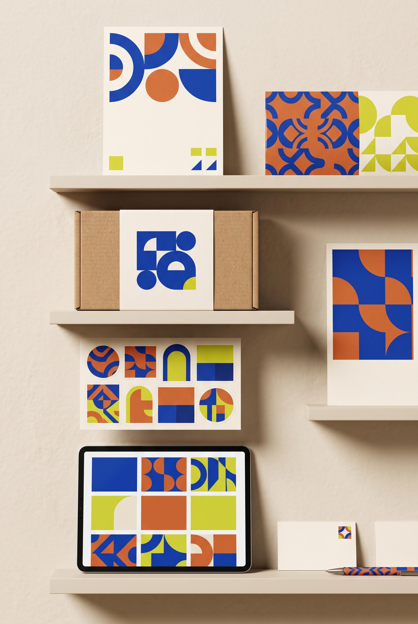
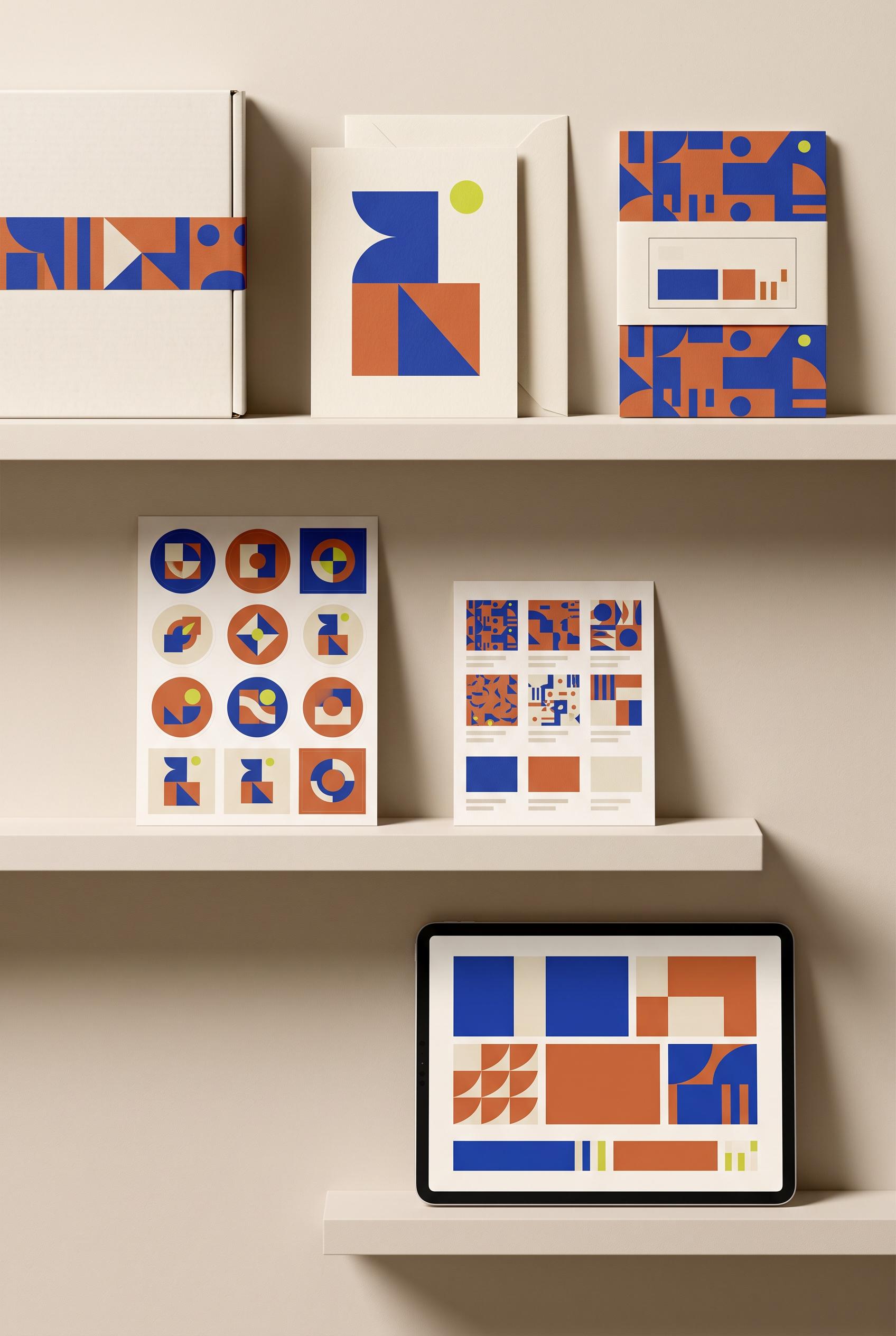
Create a commercial-quality vertical 2:3 Pinterest composition showcasing a fictional modern stationery shop identity. Arrange a shipping box, thank-you card, paper sleeve, sticker sheet, listing thumbnail, and tablet preview on museum-style floating shelves with subtle shadows and balanced spacing. Use cobalt blue, clay orange, cream, and small chartreuse accents, bold geometric forms, tactile paper texture, and polished editorial branding photography. AI-modified downstream. No real brands, no trademarked characters, no watermark, and no unintended readable text. Corrective regeneration attempt 4. Produce a materially revised image, not a near-duplicate of an earlier variant. Preserve the successful subject, palette, lighting, focal hierarchy, and commercial polish from the original brief while correcting every issue below. Mandatory corrective instructions from the most recent visual QA: Preserve the current vertical floating-shelf composition, recognizable stationery objects, cobalt blue/clay orange/cream/chartreuse palette, tactile paper, balanced spacing, and warm commercial lighting. Remove every horizontal line cluster, outlined information box, bar-chart-like arrangement, caption-like mark, and any other text-like or interface-like element from the upper-right card, center-right listing thumbnail, sticker sheet, box sleeve, thank-you card, and tablet. Replace them only with clean, clearly non-linguistic geometric shapes and patterns, with blank negative space between motifs. Keep the tablet as a purely abstract geometric grid. Render no letters, words, numbers, labels, logos, glyphs, or pseudo-text anywhere. Observed defects from prior variants that must not recur: 1) Visible brand and marketing text appears throughout the box, card, business card, poster, and tablet, despite the brief requiring no visible brand text. 2) The tablet contains extensive readable interface copy and the small cards contain readable details; these are unnecessary text elements for the requested identity showcase. 3) Attractive vertical shelf composition with cohesive palette and strong commercial styling. 4) Tablet preview contains interface-like placeholder text lines, violating the requirement for no pseudo-text or readable text anywhere. 5) The tablet should be a purely visual abstract preview rather than a UI layout with copy-like marks. 6) Attractive vertical 2:3 composition with strong palette and polished lighting. 7) Several stationery surfaces, especially the center-right listing sheet and upper-right card, contain horizontal line clusters and boxed bar layouts that read as pseudo-text or UI/ 8) The requested no text-like marks, labels, glyphs, or pseudo-text standard is not fully met. Render no letters, words, numbers, prices, headings, labels, contact details, logos, glyphs, or pseudo-text anywhere. Use only blank surfaces, clean geometric marks, and non-linguistic placeholder shapes. Do not add explanatory captions, before/after labels, interface copy, or extra objects that the brief did not request. When a corrective instruction conflicts with a decorative detail, prioritize the corrective instruction.
 0
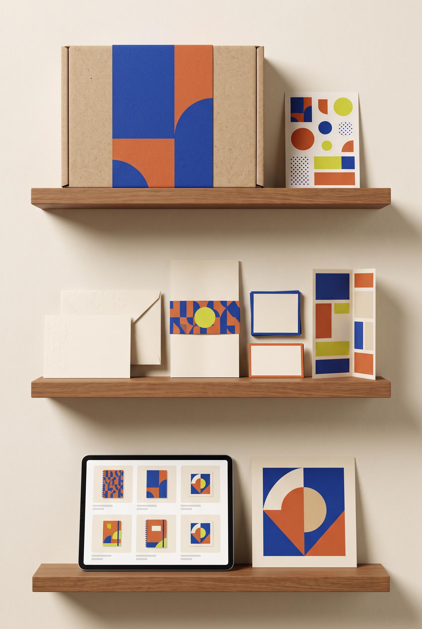
Create a commercial-quality vertical 2:3 Pinterest composition showcasing a fictional modern stationery shop identity. Arrange a shipping box, thank-you card, paper sleeve, sticker sheet, listing thumbnail, and tablet preview on museum-style floating shelves with subtle shadows and balanced spacing. Use cobalt blue, clay orange, cream, and small chartreuse accents, bold geometric forms, tactile paper texture, and polished editorial branding photography. AI-modified downstream. No real brands, no trademarked characters, no watermark, and no unintended readable text. Corrective regeneration attempt 3. Produce a materially revised image, not a near-duplicate of an earlier variant. Preserve the successful subject, palette, lighting, focal hierarchy, and commercial polish from the original brief while correcting every issue below. Mandatory corrective instructions from the most recent visual QA: Preserve the vertical 2:3 floating-shelf composition, warm editorial lighting, tactile paper textures, balanced spacing, and cobalt blue, clay orange, cream, and chartreuse geometric identity. Remove every gray line, text-like mark, letter, number, logo, label, glyph, and pseudo-text element from the tablet screen and all stationery surfaces. Replace the tablet interface with a clean abstract visual grid of geometric blocks and patterns only, with no captions or copy. Keep the shipping box, thank-you card, sleeve, sticker sheet, listing thumbnail, and tablet clearly recognizable, and retain the polished commercial product-photography finish. Observed defects from prior variants that must not recur: 1) Strong vertical composition, cohesive palette, and polished product styling. 2) Visible brand and marketing text appears throughout the box, card, business card, poster, and tablet, despite the brief requiring no visible brand text. 3) The tablet contains extensive readable interface copy and the small cards contain readable details; these are unnecessary text elements for the requested identity showcase. 4) Attractive vertical shelf composition with cohesive palette and strong commercial styling. 5) Tablet preview contains interface-like placeholder text lines, violating the requirement for no pseudo-text or readable text anywhere. 6) The tablet should be a purely visual abstract preview rather than a UI layout with copy-like marks. Render no letters, words, numbers, prices, headings, labels, contact details, logos, glyphs, or pseudo-text anywhere. Use only blank surfaces, clean geometric marks, and non-linguistic placeholder shapes. Do not add explanatory captions, before/after labels, interface copy, or extra objects that the brief did not request. When a corrective instruction conflicts with a decorative detail, prioritize the corrective instruction.
 0
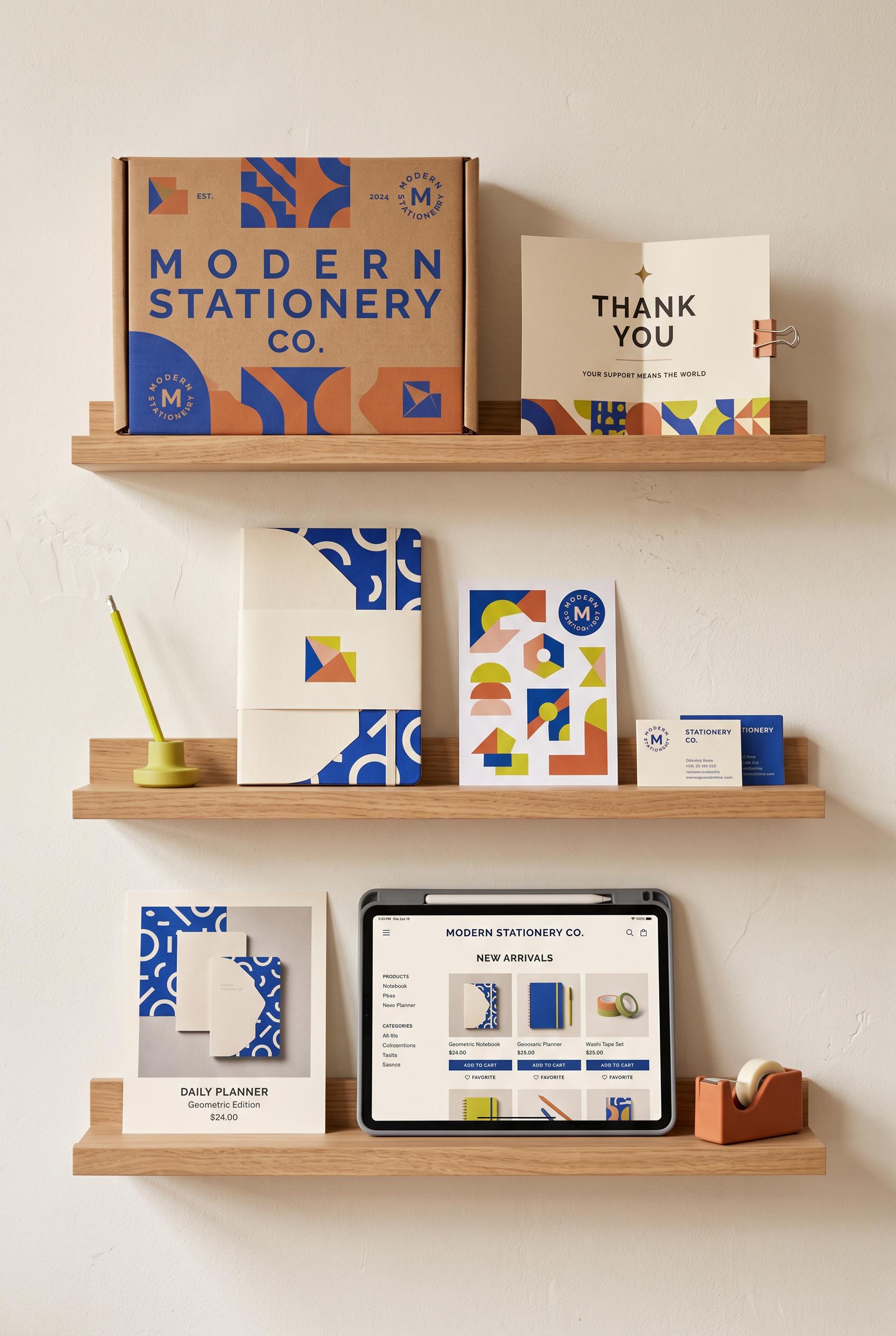
Create a commercial-quality vertical 2:3 Pinterest composition showcasing a fictional modern stationery shop identity. Arrange a shipping box, thank-you card, paper sleeve, sticker sheet, listing thumbnail, and tablet preview on museum-style floating shelves with subtle shadows and balanced spacing. Use cobalt blue, clay orange, cream, and small chartreuse accents, bold geometric forms, tactile paper texture, and polished editorial branding photography. AI-modified downstream. No real brands, no trademarked characters, no watermark, and no unintended readable text. Corrective regeneration attempt 2. Produce a materially revised image, not a near-duplicate of an earlier variant. Preserve the successful subject, palette, lighting, focal hierarchy, and commercial polish from the original brief while correcting every issue below. Mandatory corrective instructions from the most recent visual QA: Preserve the attractive vertical 2:3 shelf composition, warm editorial lighting, tactile paper, cobalt blue/clay orange/cream/chartreuse palette, and coordinated geometric identity. Remove every readable word, letter, number, logo, monogram, URL, product label, and interface copy from all objects, including the shipping box, thank-you card, sleeve, sticker sheet, listing thumbnail, business cards, poster, and tablet. Replace text areas with clean blank paper or abstract geometric blocks/patterns only. Keep the tablet as a blank visual product preview with abstract shapes, and ensure all stationery items remain clearly recognizable without typography. Observed defects from prior variants that must not recur: 1) Strong vertical composition, cohesive palette, and polished product styling. 2) Visible brand and marketing text appears throughout the box, card, business card, poster, and tablet, despite the brief requiring no visible brand text. 3) The tablet contains extensive readable interface copy and the small cards contain readable details; these are unnecessary text elements for the requested identity showcase. Render no letters, words, numbers, prices, headings, labels, contact details, logos, glyphs, or pseudo-text anywhere. Use only blank surfaces, clean geometric marks, and non-linguistic placeholder shapes. Do not add explanatory captions, before/after labels, interface copy, or extra objects that the brief did not request. When a corrective instruction conflicts with a decorative detail, prioritize the corrective instruction.
 0
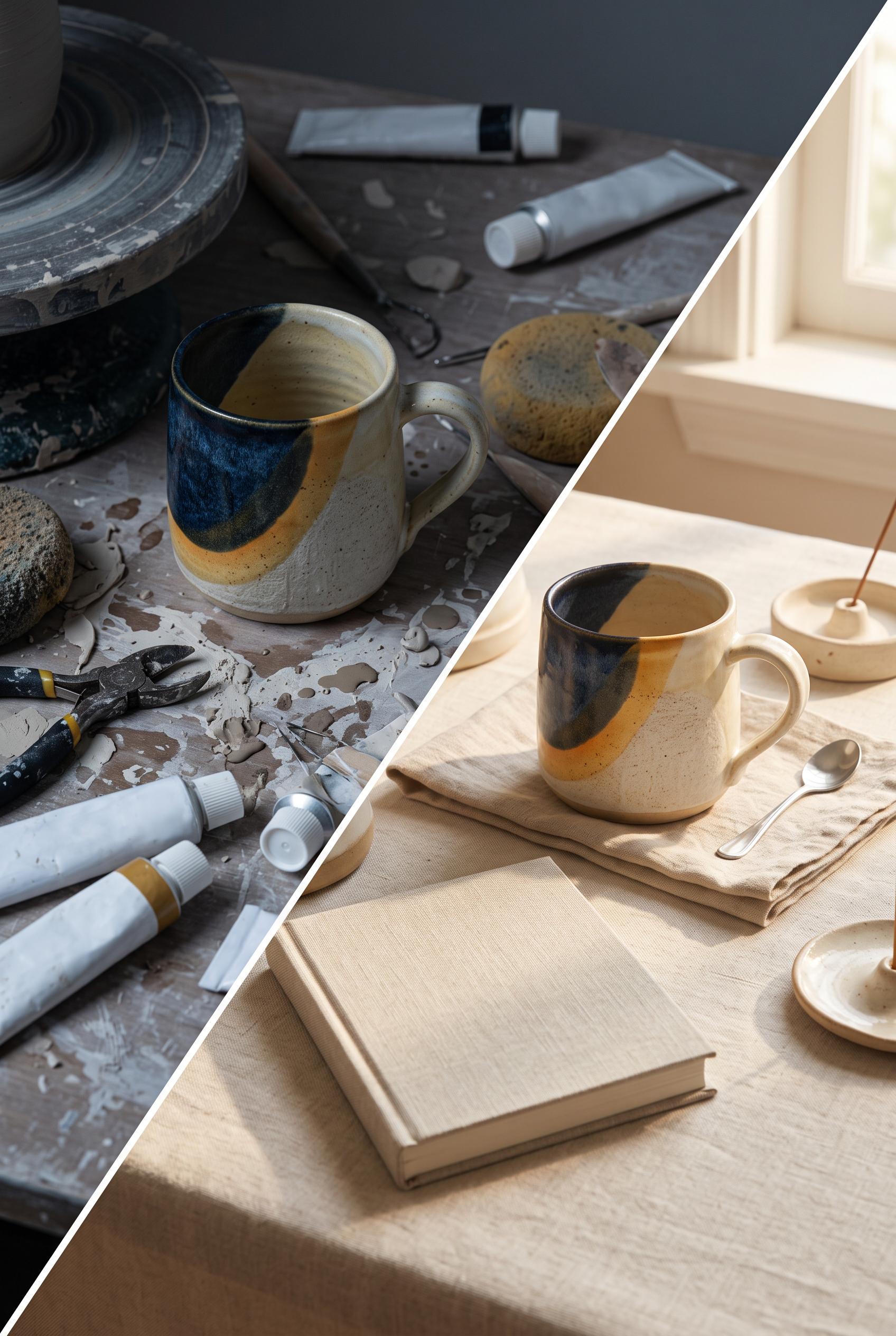
Create a commercial-quality vertical 2:3 Pinterest composition showcasing a fictional modern stationery shop identity. Arrange a shipping box, thank-you card, paper sleeve, sticker sheet, listing thumbnail, and tablet preview on museum-style floating shelves with subtle shadows and balanced spacing. Use cobalt blue, clay orange, cream, and small chartreuse accents, bold geometric forms, tactile paper texture, and polished editorial branding photography. AI-modified downstream. No real brands, no trademarked characters, no watermark, and no unintended readable text.
 0
Create a commercial-quality vertical 2:3 Pinterest composition for an Etsy seller visual concept. Show a diagonal before-and-after transformation: on the left, a handmade ceramic mug in a cluttered dim workspace with weak lighting; on the right, the same mug in a refined ivory setting with linen, a small neutral book, and warm sunlight. Use midnight blue, saffron, and ivory accents, realistic editorial product photography, clear material texture, premium art direction, and strong visual contrast. AI-modified downstream. No real brands, no trademarked characters, no watermark, and no unintended readable text. Corrective regeneration attempt 2. Produce a materially revised image, not a near-duplicate of an earlier variant. Preserve the successful subject, palette, lighting, focal hierarchy, and commercial polish from the original brief while correcting every issue below. Mandatory corrective instructions from the most recent visual QA: Preserve the polished 2:3 composition, diagonal transition, matching ceramic mug, lighting contrast, linen, warm ivory styling, and generous negative space. Remove all readable or pseudo-readable text from the book, paint tubes, and any other objects; make the book cover completely blank and all supply packaging unmarked. Keep surfaces, materials, proportions, and product realism clean and commercially photographic. Observed defects from prior variants that must not recur: 1) Strong vertical composition and clear before/after mug transformation, but the workspace supplies contain visibly garbled pseudo-text and the book has unintended readable title/cut Render no letters, words, numbers, prices, headings, labels, contact details, logos, glyphs, or pseudo-text anywhere. Use only blank surfaces, clean geometric marks, and non-linguistic placeholder shapes. Do not add explanatory captions, before/after labels, interface copy, or extra objects that the brief did not request. When a corrective instruction conflicts with a decorative detail, prioritize the corrective instruction.
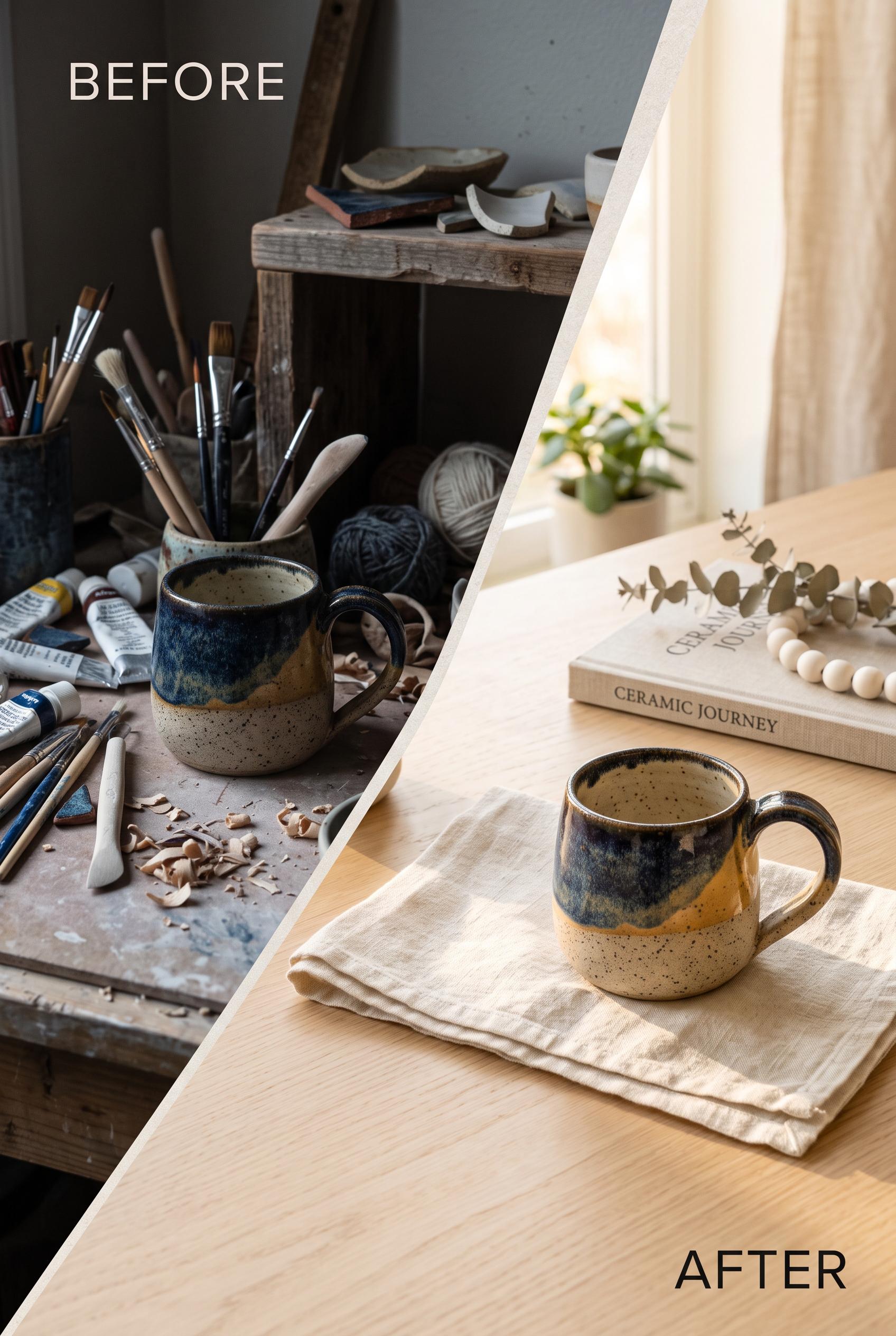 0
Create a commercial-quality vertical 2:3 Pinterest composition for an Etsy seller visual concept. Show a diagonal before-and-after transformation: on the left, a handmade ceramic mug in a cluttered dim workspace with weak lighting; on the right, the same mug in a refined ivory setting with linen, a small neutral book, and warm sunlight. Use midnight blue, saffron, and ivory accents, realistic editorial product photography, clear material texture, premium art direction, and strong visual contrast. AI-modified downstream. No real brands, no trademarked characters, no watermark, and no unintended readable text.
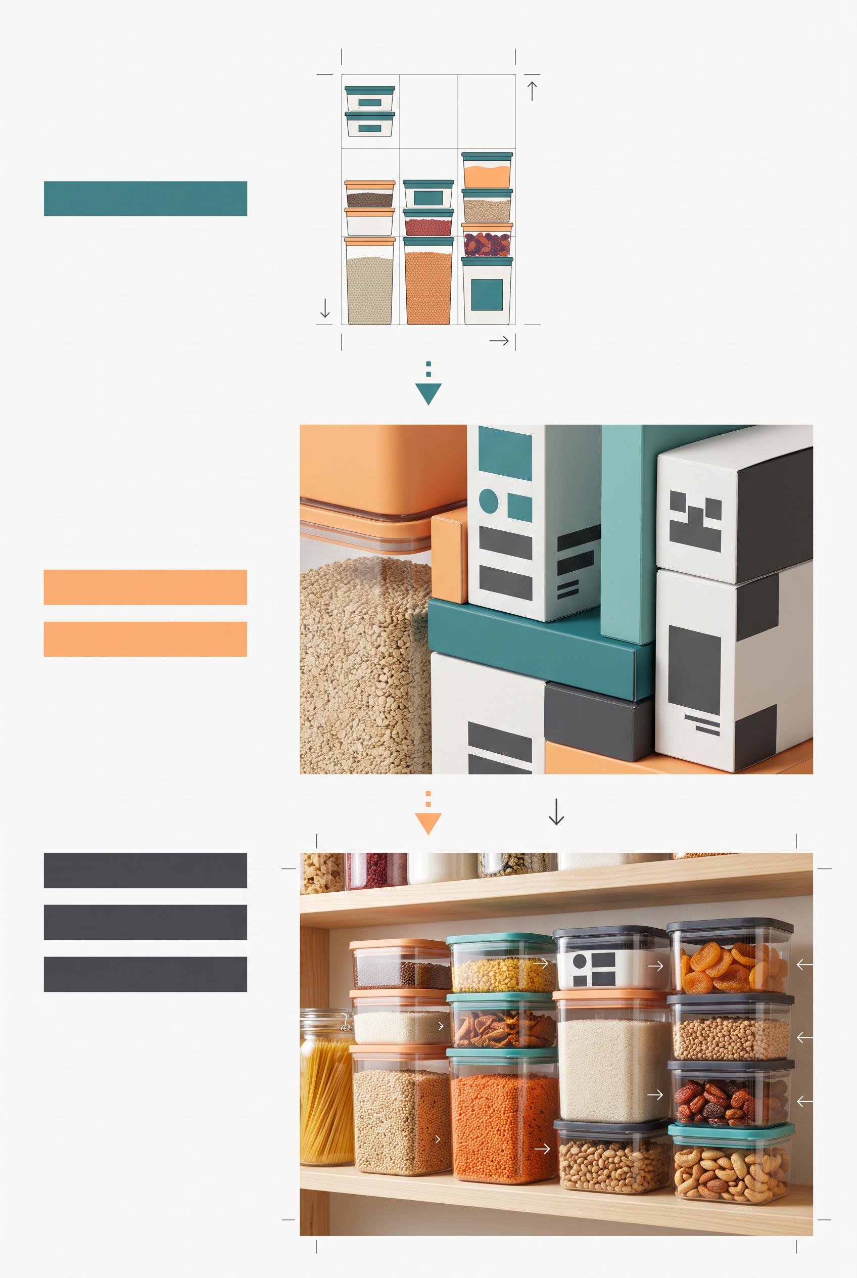 0
Create a commercial-quality vertical 2:3 Pinterest educational campaign graphic for modular food storage packaging. Use a three-stage vertical stack: a tiny thumbnail composition test, a close view of packaging hierarchy with abstract unreadable blocks, and a bright pantry lifestyle hero showing stackable containers. Include subtle crop guides and directional arrows, with apricot, teal, charcoal, and paper white. Clean editorial art direction, realistic packaging mockups, useful visual teaching structure. No real brands, no trademarks, no trademarked characters, no watermark, and no unintended readable text. Corrective regeneration attempt 3. Produce a materially revised image, not a near-duplicate of an earlier variant. Preserve the successful subject, palette, lighting, focal hierarchy, and commercial polish from the original brief while correcting every issue below. Mandatory corrective instructions from the most recent visual QA: Preserve the attractive vertical 2:3 editorial composition, three clearly separated vertical stages, apricot/teal/charcoal/paper-white palette, realistic stackable containers, bright pantry lifestyle hero, crop marks, arrows, and polished lighting. Remove every readable character, including the words “Stage 1,” “Stage 2,” and “Stage 3.” Replace those headings with simple abstract solid bars or geometric markers only. Ensure all packaging labels remain purely geometric and non-linguistic, with no letters, numbers, words, logos, glyphs, pseudo-text, watermark, or branding anywhere. Observed defects from prior variants that must not recur: 1) The composition is split into side-by-side panels rather than a clear three-stage vertical stack. 2) The packaging hierarchy section contains prominent readable labels and headings, contrary to the requirement for simple abstract unreadable blocks. 3) The duplicated mid/lower panels weaken the intended sequential how-to teaching flow. 4) Prominent readable text “Stage 1,” “Stage 2,” and “Stage 3” violates the requirement for no readable labels or words. 5) The overall three-stage vertical structure, palette, pantry hero, containers, crop marks, and arrows are otherwise strong and commercially polished. Render no letters, words, numbers, prices, headings, labels, contact details, logos, glyphs, or pseudo-text anywhere. Use only blank surfaces, clean geometric marks, and non-linguistic placeholder shapes. Do not add explanatory captions, before/after labels, interface copy, or extra objects that the brief did not request. When a corrective instruction conflicts with a decorative detail, prioritize the corrective instruction.
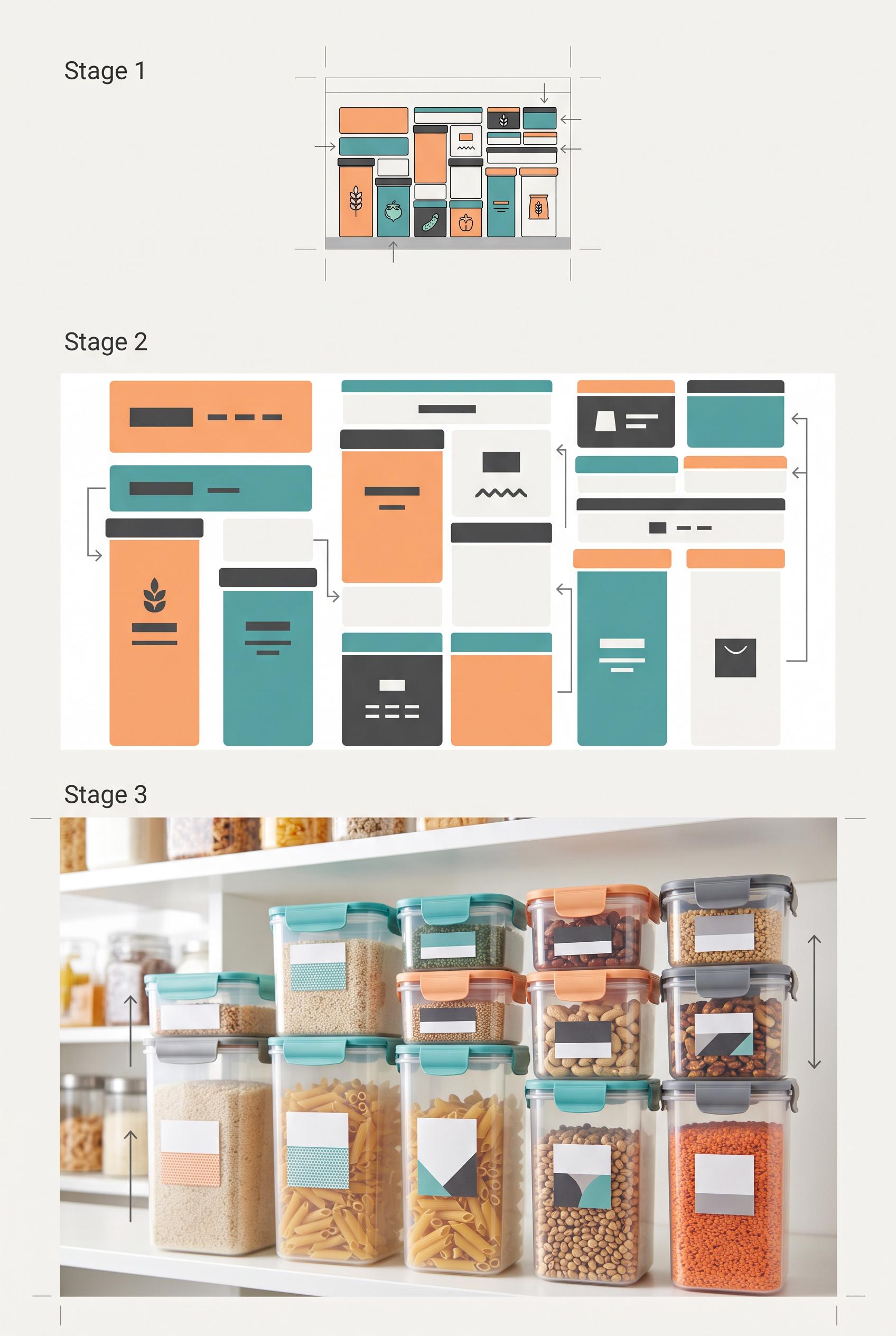 0
Create a commercial-quality vertical 2:3 Pinterest educational campaign graphic for modular food storage packaging. Use a three-stage vertical stack: a tiny thumbnail composition test, a close view of packaging hierarchy with abstract unreadable blocks, and a bright pantry lifestyle hero showing stackable containers. Include subtle crop guides and directional arrows, with apricot, teal, charcoal, and paper white. Clean editorial art direction, realistic packaging mockups, useful visual teaching structure. No real brands, no trademarks, no trademarked characters, no watermark, and no unintended readable text. Corrective regeneration attempt 2. Produce a materially revised image, not a near-duplicate of an earlier variant. Preserve the successful subject, palette, lighting, focal hierarchy, and commercial polish from the original brief while correcting every issue below. Mandatory corrective instructions from the most recent visual QA: Preserve the polished editorial styling, realistic containers, bright pantry photography, apricot/teal/charcoal/paper-white palette, crop marks, and directional arrows. Rebuild the layout as exactly three distinct stages stacked vertically from top to bottom: a small thumbnail test, a close packaging-hierarchy test, and one large lifestyle hero of stacked containers in a bright pantry. Remove the side-by-side duplication. Replace every readable heading, label, and text-like word with purely abstract solid blocks, bars, and simple icon-like shapes; ensure no legible letters or words appear anywhere. Keep the visual progression immediately actionable and maintain a clean vertical 2:3 composition with no watermark or branding. Observed defects from prior variants that must not recur: 1) The composition is split into side-by-side panels rather than a clear three-stage vertical stack. 2) The packaging hierarchy section contains prominent readable labels and headings, contrary to the requirement for simple abstract unreadable blocks. 3) The duplicated mid/lower panels weaken the intended sequential how-to teaching flow. Render no letters, words, numbers, prices, headings, labels, contact details, logos, glyphs, or pseudo-text anywhere. Use only blank surfaces, clean geometric marks, and non-linguistic placeholder shapes. Do not add explanatory captions, before/after labels, interface copy, or extra objects that the brief did not request. When a corrective instruction conflicts with a decorative detail, prioritize the corrective instruction.
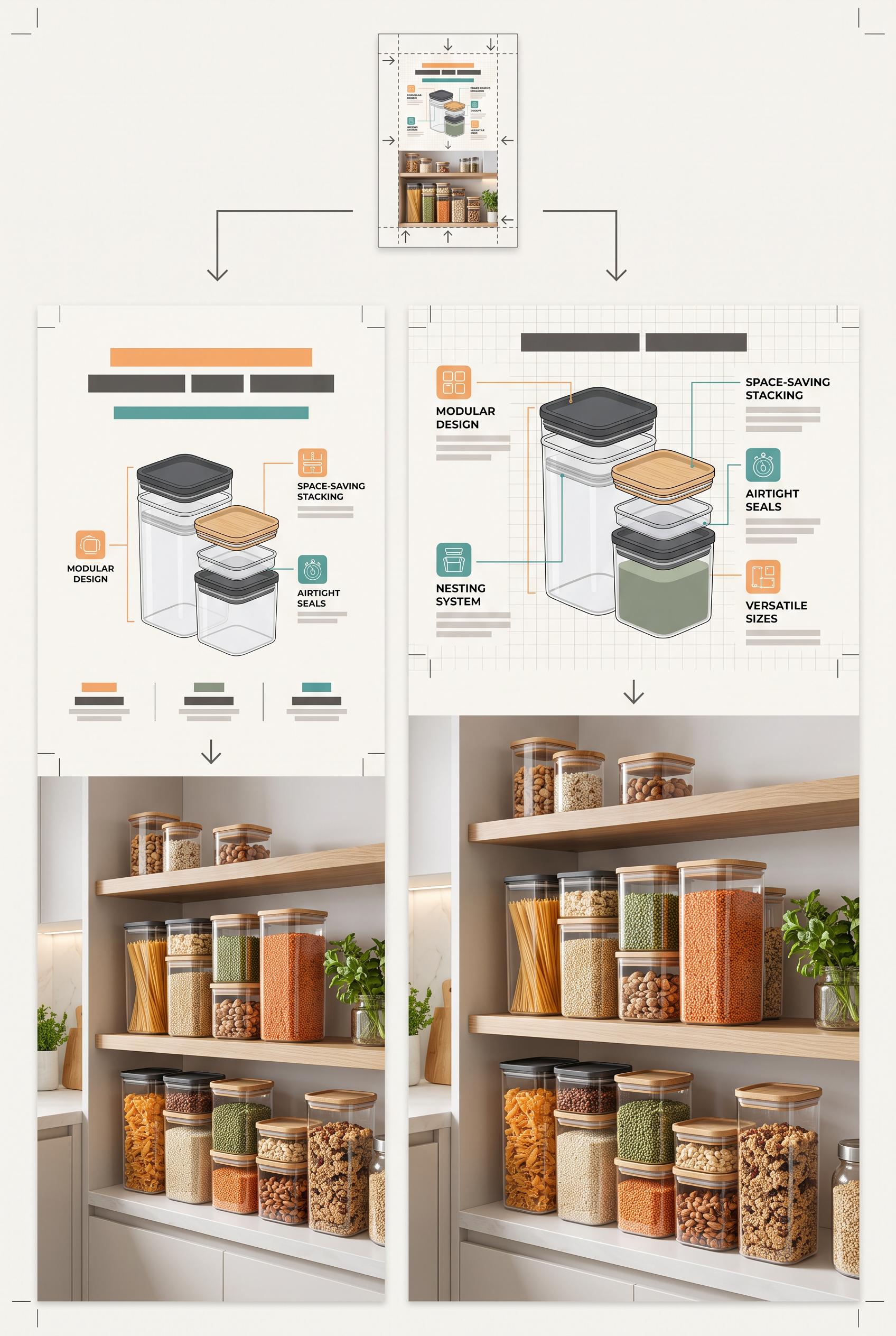 0
Create a commercial-quality vertical 2:3 Pinterest educational campaign graphic for modular food storage packaging. Use a three-stage vertical stack: a tiny thumbnail composition test, a close view of packaging hierarchy with abstract unreadable blocks, and a bright pantry lifestyle hero showing stackable containers. Include subtle crop guides and directional arrows, with apricot, teal, charcoal, and paper white. Clean editorial art direction, realistic packaging mockups, useful visual teaching structure. No real brands, no trademarks, no trademarked characters, no watermark, and no unintended readable text.
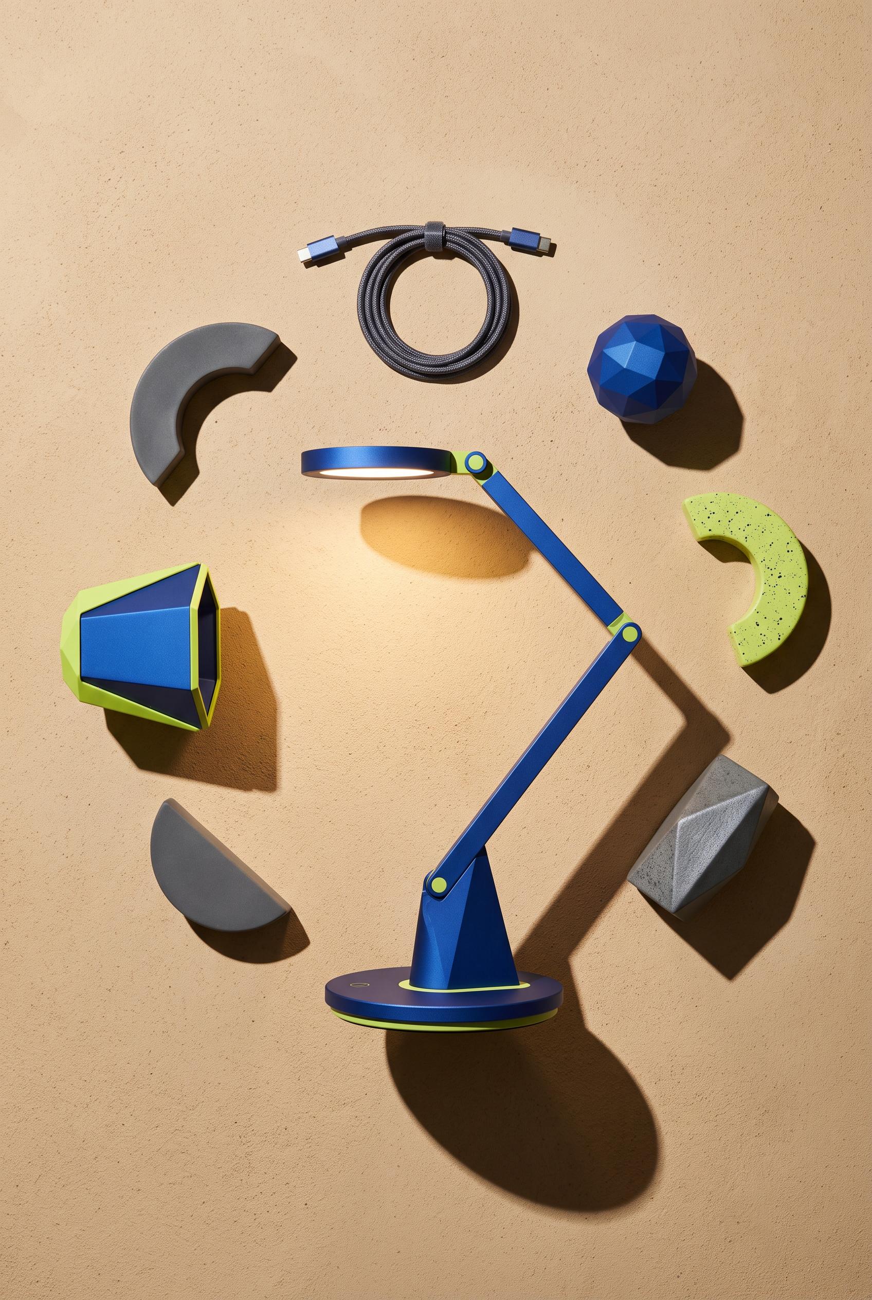 0
Create a commercial-quality vertical 2:3 Pinterest product showcase of a sculptural rechargeable desk lamp arranged in an overhead circular composition with its charging base, detachable shade, cable, and abstract geometric accessories. Use a cobalt lamp, lime highlights, sand background, and smoke-gray shadows. Add a precise pool of warm light and crescent-shaped cast shadows, realistic premium materials, refined art direction, and strong visual balance. No real brands, no trademarks, no trademarked characters, no watermark, and no unintended readable text.
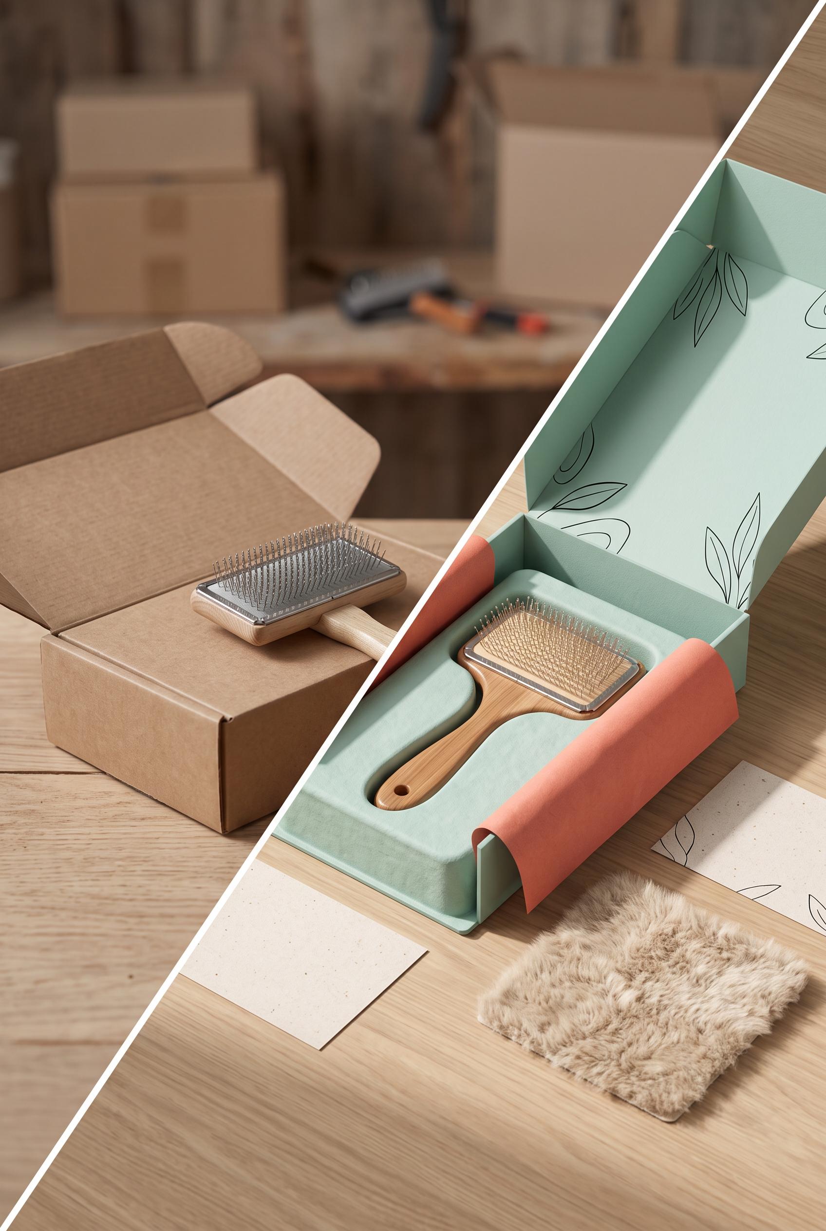 0
Create a commercial-quality vertical 2:3 Pinterest composition showing a diagonal wipe transformation from a blank folding carton with a simple pet grooming brush prototype into a polished unboxing scene with the same brush, seafoam packaging, coral tissue, ink accents, oat paper, soft fur texture, rounded paper inserts, and gentle side lighting. Make the transformation obvious but elegant, with realistic materials, premium product photography, and clear depth. No real brands, no trademarks, no trademarked characters, no watermark, and no unintended readable text.
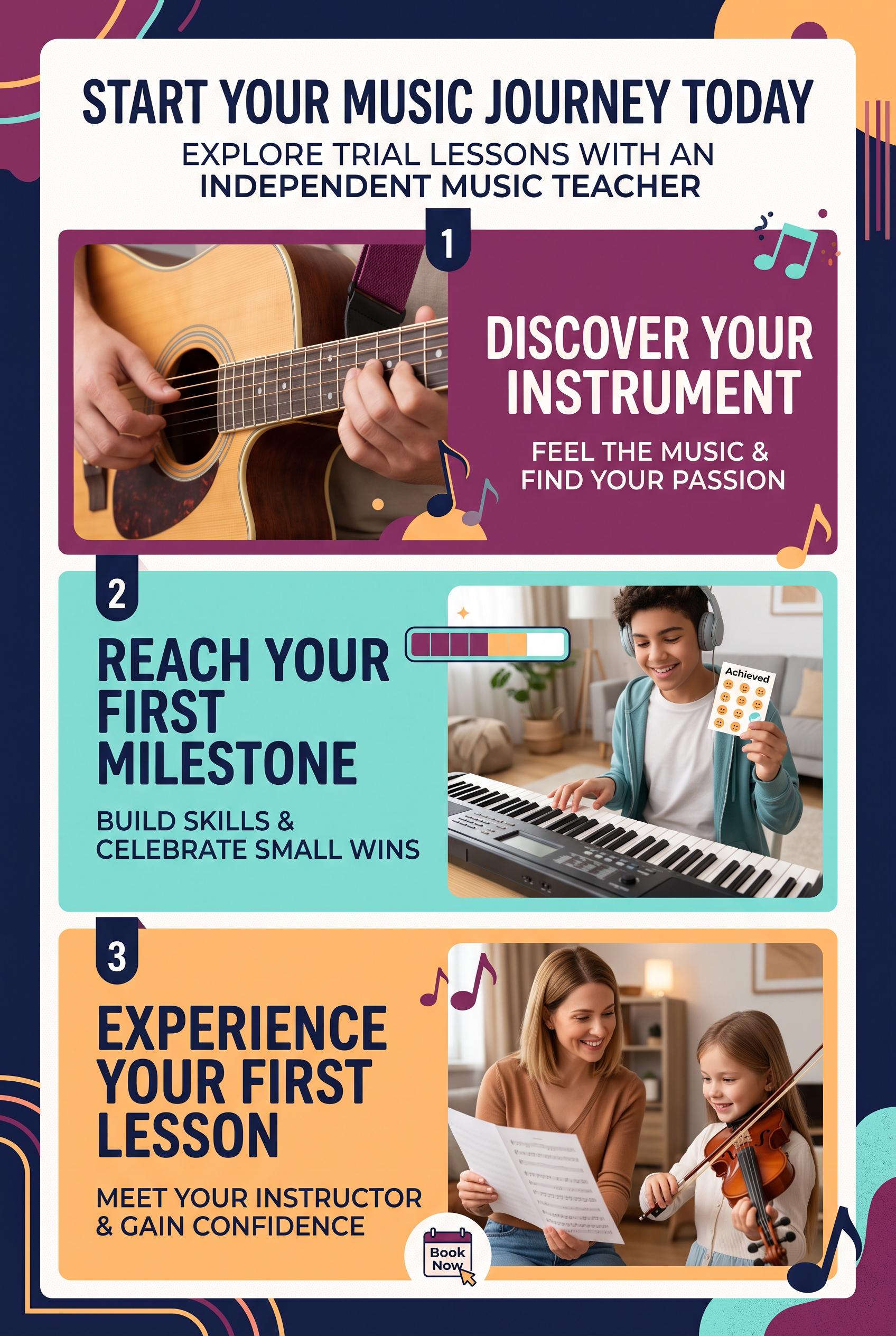 0
Create a commercial-quality vertical 2:3 Pinterest composition for an educational campaign about an independent music teacher promoting trial lessons. Use a stacked three-stage progression with a close-up instrument detail, a simple practice milestone, and a welcoming lesson scene. Use plum, aqua, apricot, and deep navy. AI-modified downstream. No real brands, no trademarked characters, no watermark, and no unintended readable text.
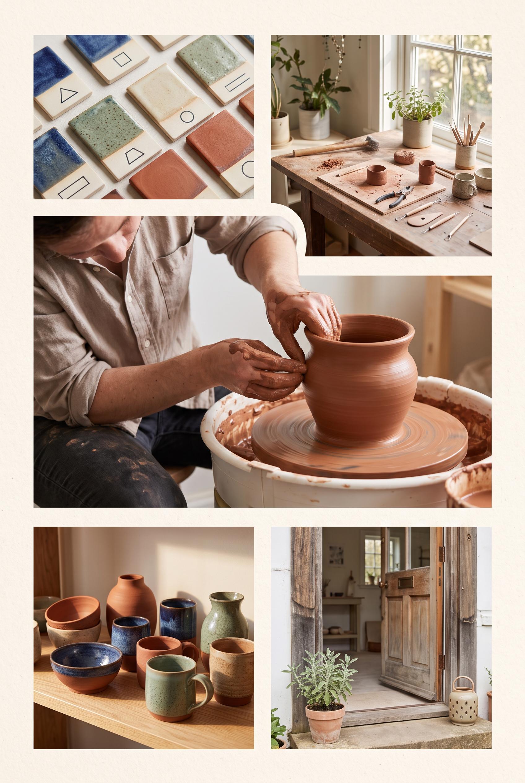 0
Create a commercial-quality vertical 2:3 Pinterest composition as an inspirational showcase for an independent pottery studio open house. Use an editorial contact sheet with one large hero scene and four smaller photographic moments: hands shaping clay, glaze samples, a sunlit worktable, and finished vessels. Use terracotta, indigo, sage green, and warm cream. AI-modified downstream. No real brands, no trademarked characters, no watermark, and no unintended readable text. Corrective regeneration attempt 2. Produce a materially revised image, not a near-duplicate of an earlier variant. Preserve the successful subject, palette, lighting, focal hierarchy, and commercial polish from the original brief while correcting every issue below. Mandatory corrective instructions from the most recent visual QA: Preserve the polished vertical 2:3 editorial contact-sheet style, warm cream paper framing, terracotta/indigo/sage palette, soft natural light, and tactile pottery photography. Make the large dominant hero panel clearly show a maker shaping clay at a wheel. Use four smaller panels for: glaze tests, a sunlit worktable, finished vessels, and a welcoming studio entry moment with an inviting doorway. Remove all embedded words, captions, labels, signage, logos, watermarks, and other readable text; keep every image free of garbled details and generation artifacts. Observed defects from prior variants that must not recur: 1) Attractive vertical contact-sheet composition with strong palette and photography. 2) The required hero image of a maker shaping clay is relegated to a smaller panel; the hero is shelving instead. 3) No clear welcoming entry moment is shown. 4) The graphic contains substantial embedded readable copy and labels, which are not requested and create avoidable text-generation risk. Render no letters, words, numbers, prices, headings, labels, contact details, logos, glyphs, or pseudo-text anywhere. Use only blank surfaces, clean geometric marks, and non-linguistic placeholder shapes. Do not add explanatory captions, before/after labels, interface copy, or extra objects that the brief did not request. When a corrective instruction conflicts with a decorative detail, prioritize the corrective instruction.
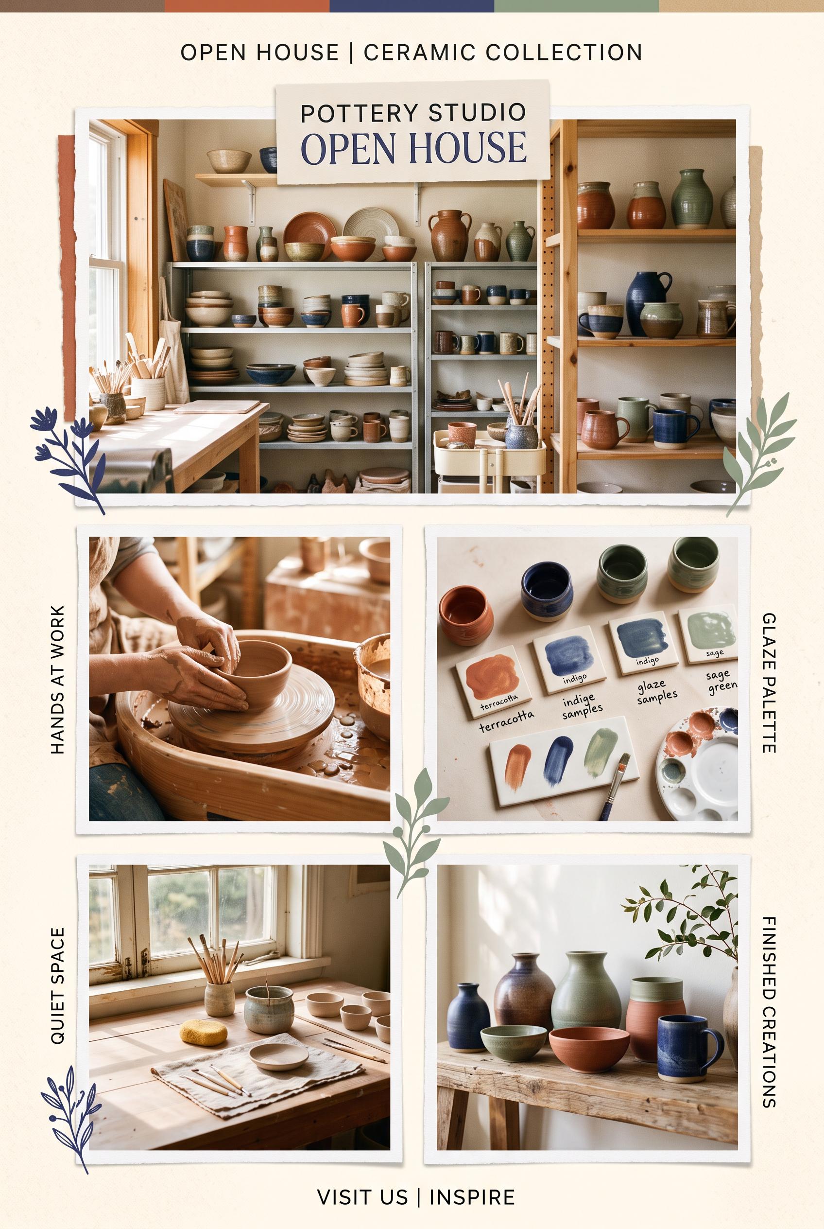 0
Create a commercial-quality vertical 2:3 Pinterest composition as an inspirational showcase for an independent pottery studio open house. Use an editorial contact sheet with one large hero scene and four smaller photographic moments: hands shaping clay, glaze samples, a sunlit worktable, and finished vessels. Use terracotta, indigo, sage green, and warm cream. AI-modified downstream. No real brands, no trademarked characters, no watermark, and no unintended readable text.
Über unsere KI-Bildergalerie
Unsere KI-Bildergalerie präsentiert geteilte KI-generierte Bilder, die von unserer Community erstellt wurden. Jedes Bild ist einzigartig, hochwertig und repräsentiert die kreativen Möglichkeiten der KI-Kunstgenerierung. Durchsuche verschiedene Stile, Motive und Themen, um dich für dein nächstes kreatives Projekt inspirieren zu lassen.
Warum unsere Galerie erkunden?
- Entdecke einzigartige KI-generierte Bilder in verschiedenen Stilen und Themen
- Lass dich von kreativen Prompts und künstlerischen Stilen inspirieren
- Sieh dir Bilder an, die von unserer kreativen Community geteilt wurden
- Klicke auf ein beliebiges Bild, um die Freigabeseite zu sehen und weitere Details zu erhalten
So verwendest du die Galerie
Die Verwendung unserer Galerie ist einfach und intuitiv:
- Durchsuche das Raster mit geteilten Bildern
- Klicke auf ein beliebiges Bild, das deine Aufmerksamkeit erregt
- Sieh dir die vollständigen Bilddetails und den Freigabelink auf der eigenen Freigabeseite an
Bereit, deine eigenen KI-Bilder zu erstellen?
Schließe dich Katalog-Händlern an, die mit AI Media Studio aus einem Produktfoto ein fertiges Bilderset für ihre Listings machen.