AI画像ギャラリー
クリエイティブコミュニティから1696+枚の共有AI生成画像を発見
すべての共有画像
1696枚中48枚を表示
 0
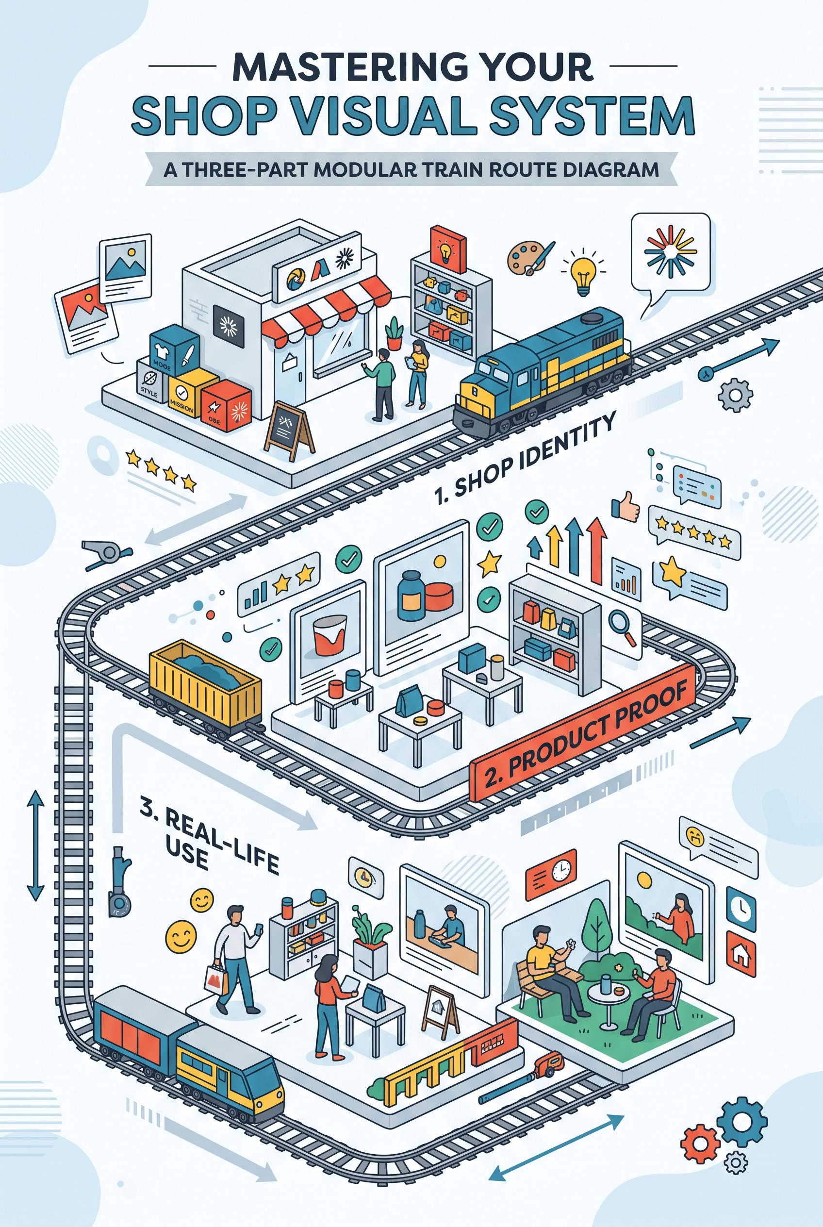
0Create a commercial-quality vertical 2:3 Pinterest composition explaining a three-part shop visual system through a modular train route diagram. Show three distinct miniature stations representing shop identity, product proof, and real-life use, connected by a clean illustrated track with abstract cards, icons, and image placeholders. Use sea blue, paprika red, lemon yellow, graphite, and soft white. Keep the hierarchy instructional and energetic. No real brands, no trademarked characters, no watermark, and no unintended readable text. AI-modified downstream.
 0
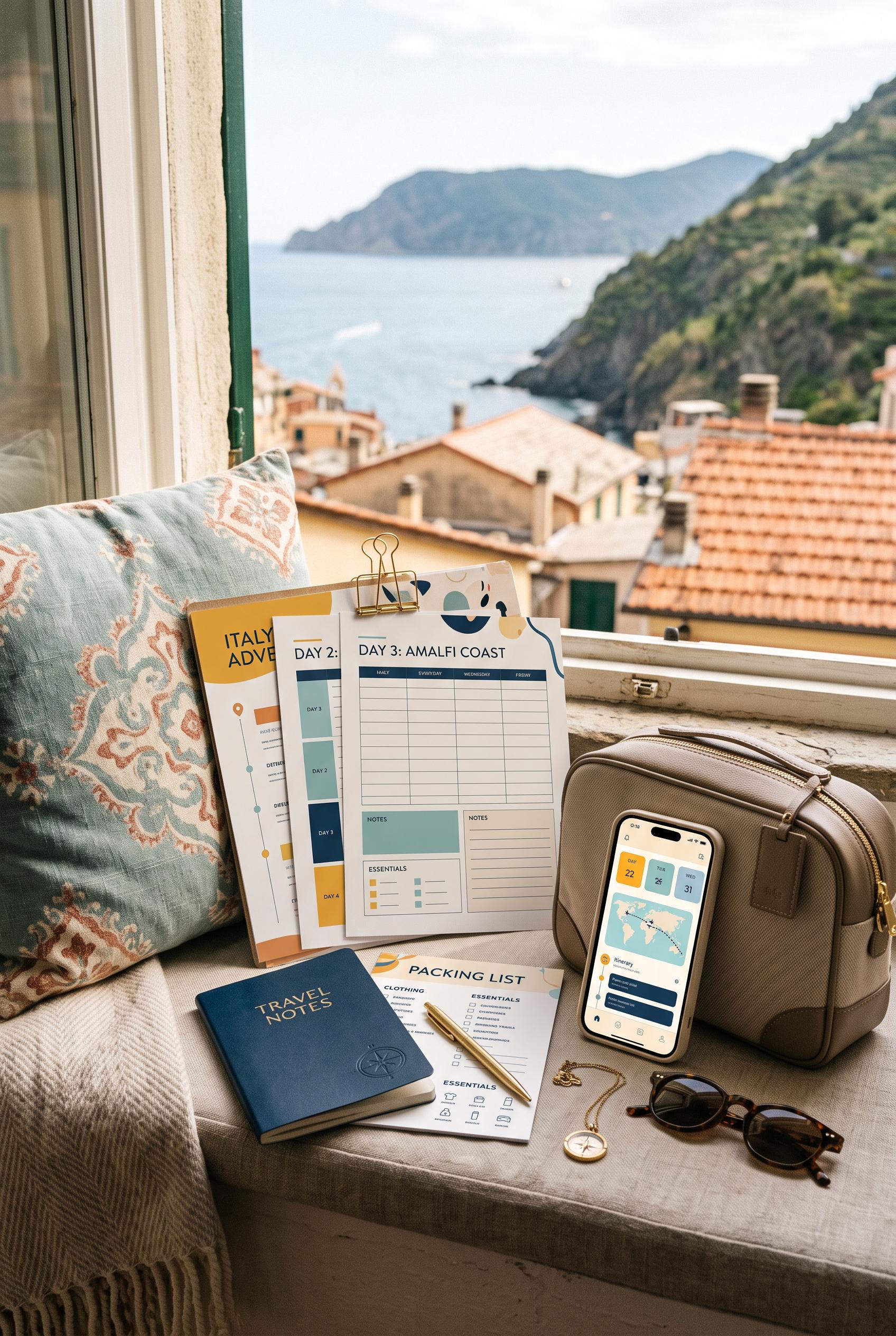
0Create a commercial-quality vertical 2:3 Pinterest composition showcasing an editable travel planner bundle in a sunlit window-seat vignette. Arrange printed itinerary pages, packing cards, a small notebook, a phone with abstract interface blocks, sunglasses, and a compact neutral travel bag. Use saffron yellow, dusty aqua, deep ink blue, and warm cream. Make the scene aspirational, organized, and editorial. No real brands, no trademarked characters, no watermark, and no unintended readable text. AI-modified downstream.
 0
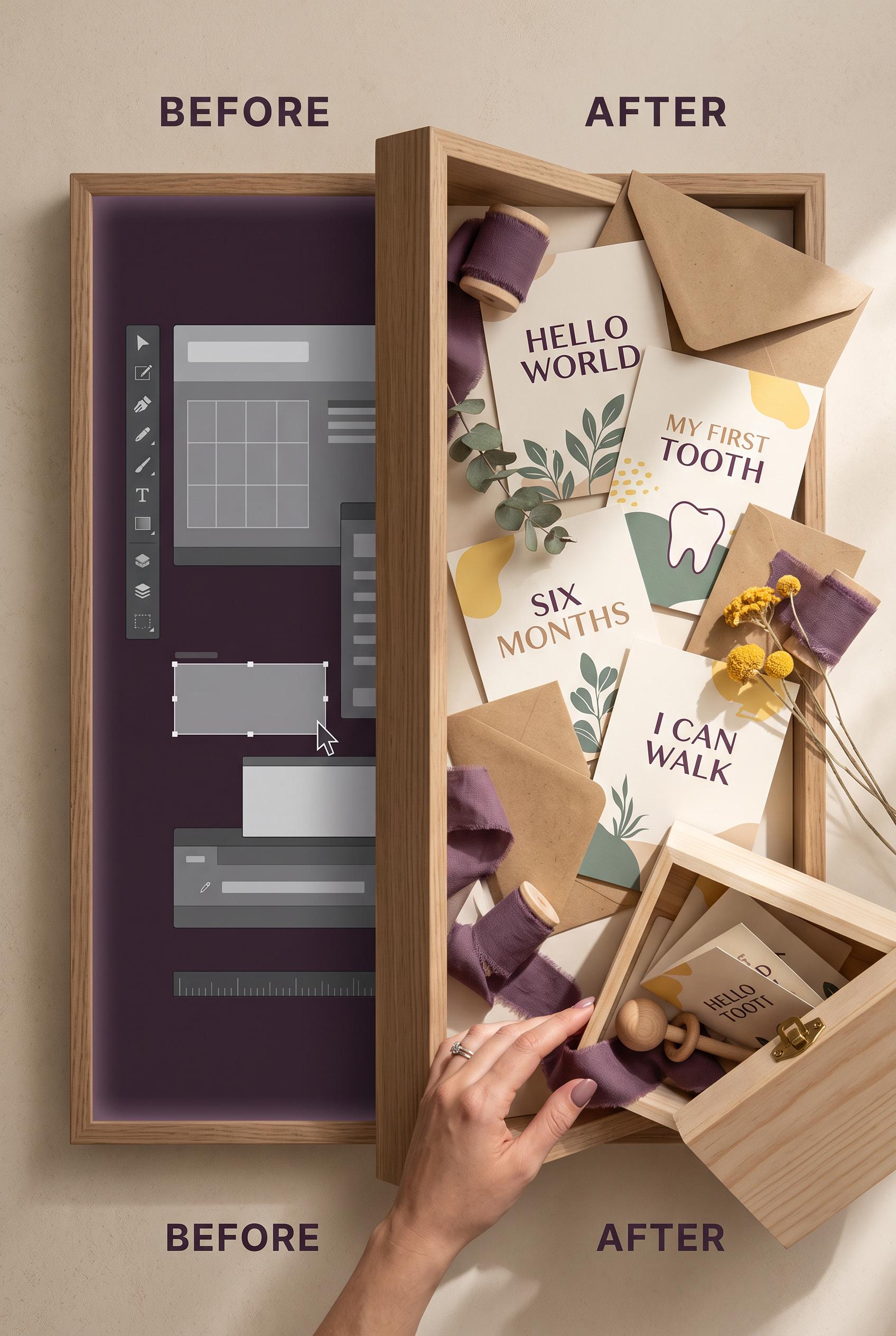
0Create a commercial-quality vertical 2:3 Pinterest composition showing a before-and-after transformation of an editable milestone card suite. Use a shadow-box portal reveal, with an unstyled digital preview on one side and a warm tactile arrangement of printed cards, envelopes, ribbon, and a small keepsake box on the other. Use aubergine, warm sand, butter yellow, and eucalyptus green. Include subtle interface shapes without readable text. No real brands, no trademarked characters, no watermark, and no unintended readable text. AI-modified downstream.
 0
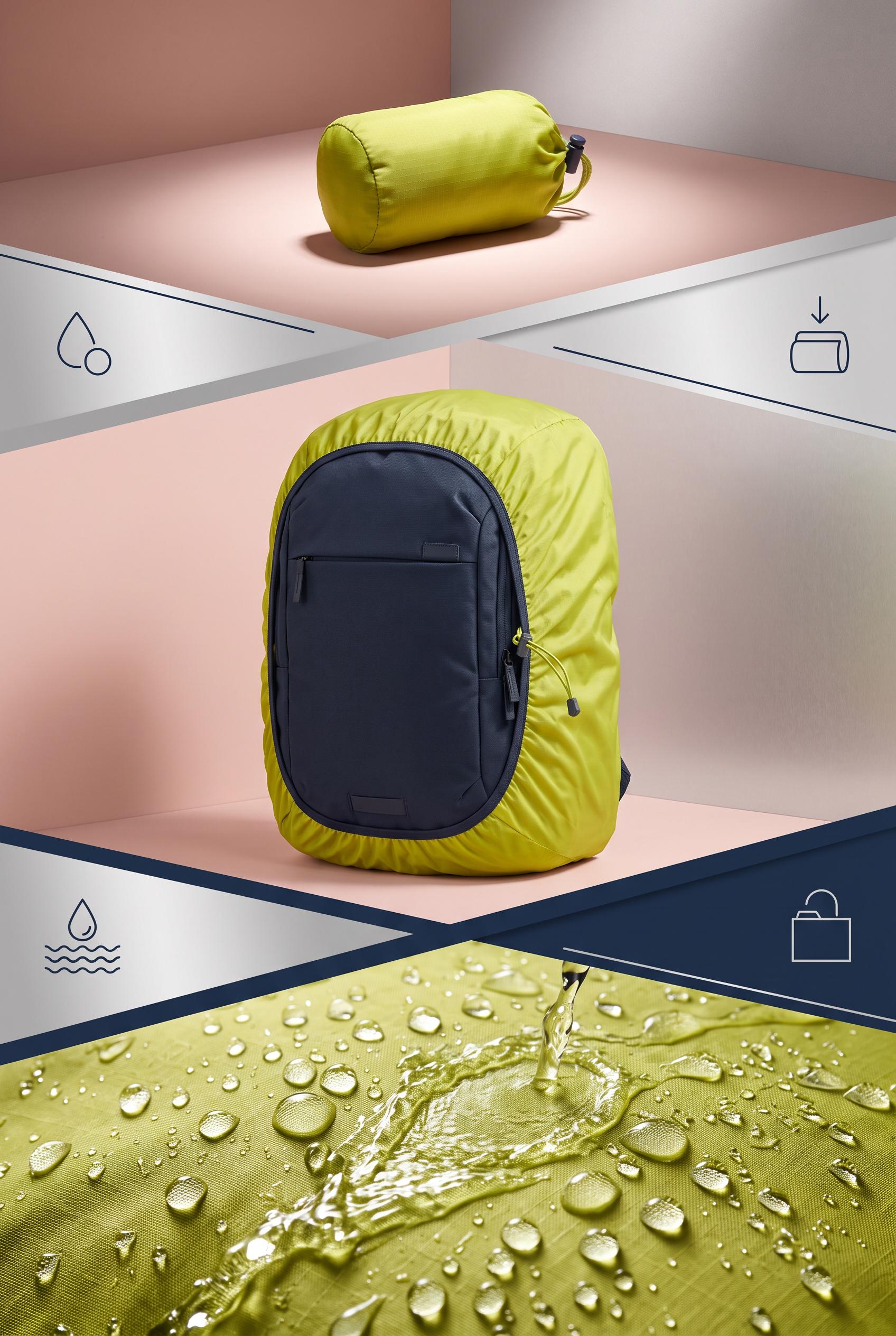
0Create a commercial-quality educational product campaign in a vertical 2:3 Pinterest composition. Show a foldable backpack rain cover through three connected stages: compact silhouette, fitted backpack contour, and beaded water rolling off fabric in a controlled rain test. Use chartreuse, ink navy, blush, and satin silver, bold directional lighting, crisp close-up details, simple geometric dividers, no real brands, no trademarked characters, no watermark, and no unintended readable text.
 0
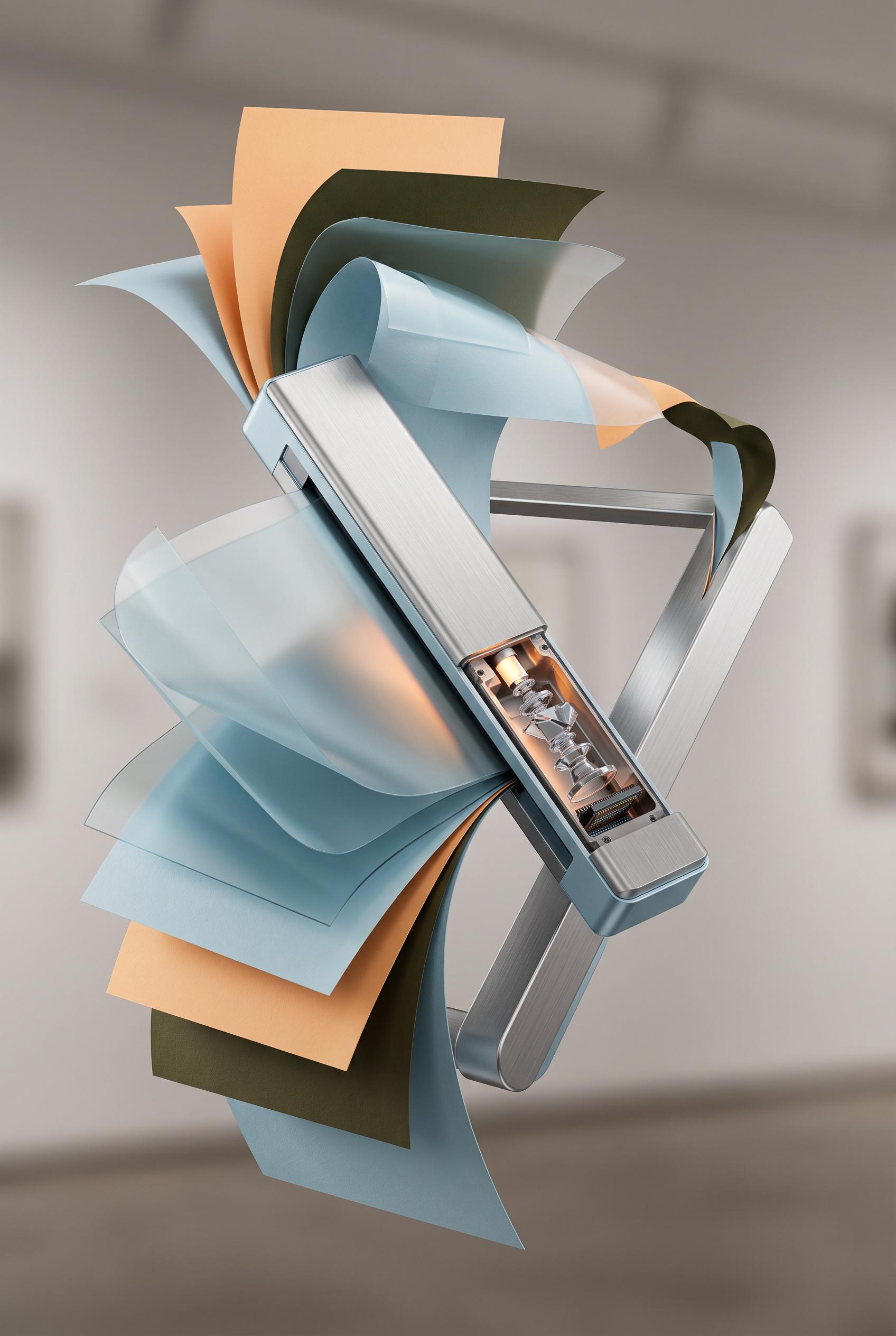
0Create a commercial-quality product mockup in a vertical 2:3 Pinterest composition. Feature a slim portable document scanner floating among sculptural curled paper sheets, translucent scan layers, and a brushed metal support, with a subtle cutaway view of its internal optical path. Use glacier blue, apricot, dark olive, and brushed silver, controlled gallery lighting, crisp material detail, refined shadows, no real brands, no trademarked characters, no watermark, and no unintended readable text.
 0
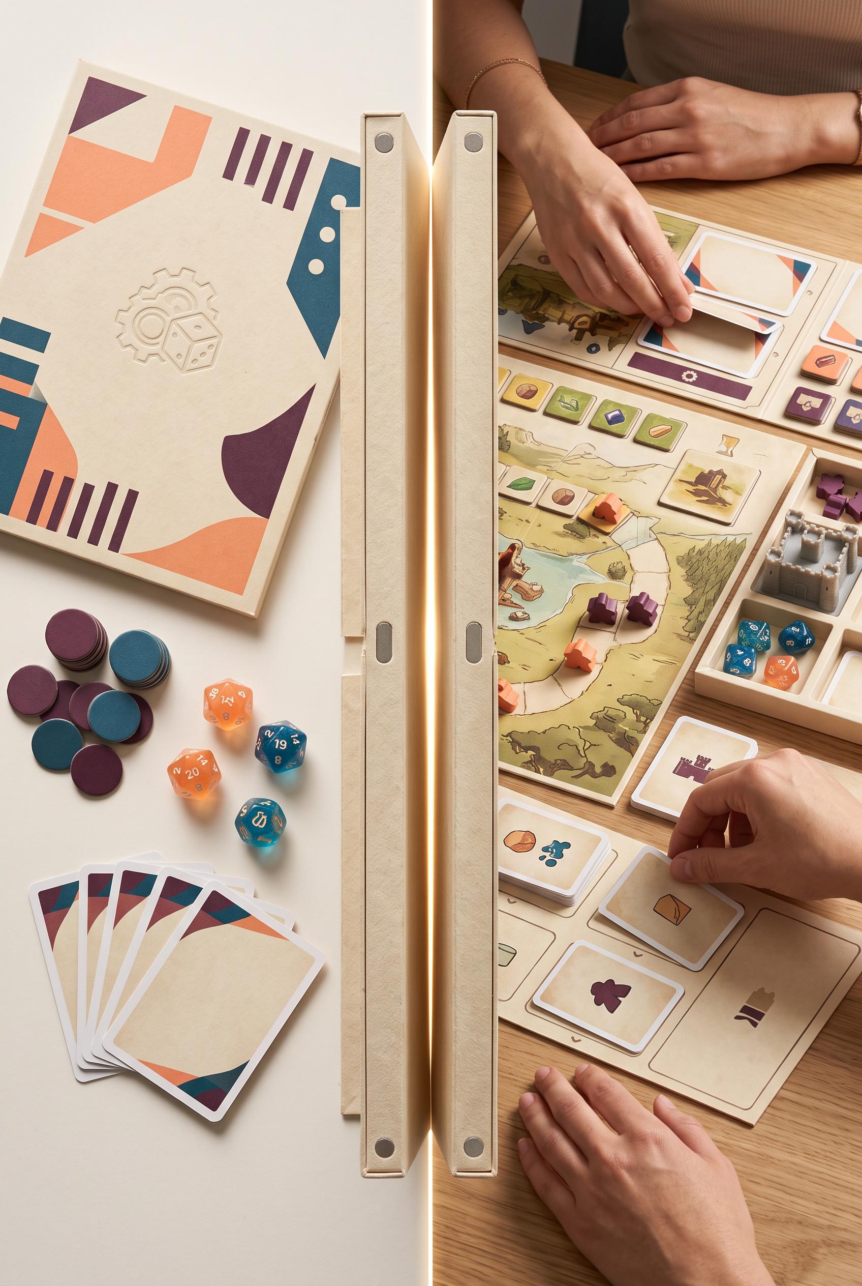
0Create a commercial-quality product packaging transformation in a vertical 2:3 Pinterest composition. Show a flat illustrated-free game sleeve and loose components on one side, transitioning through a dramatic hinged paper reveal into an organized tabletop game setup on the other side. Use melon, petrol blue, parchment, and deep plum accents, tactile uncoated paper, magnetic closures, soft studio shadows, premium editorial art direction, no real brands, no trademarked characters, no watermark, and no unintended readable text.
 0
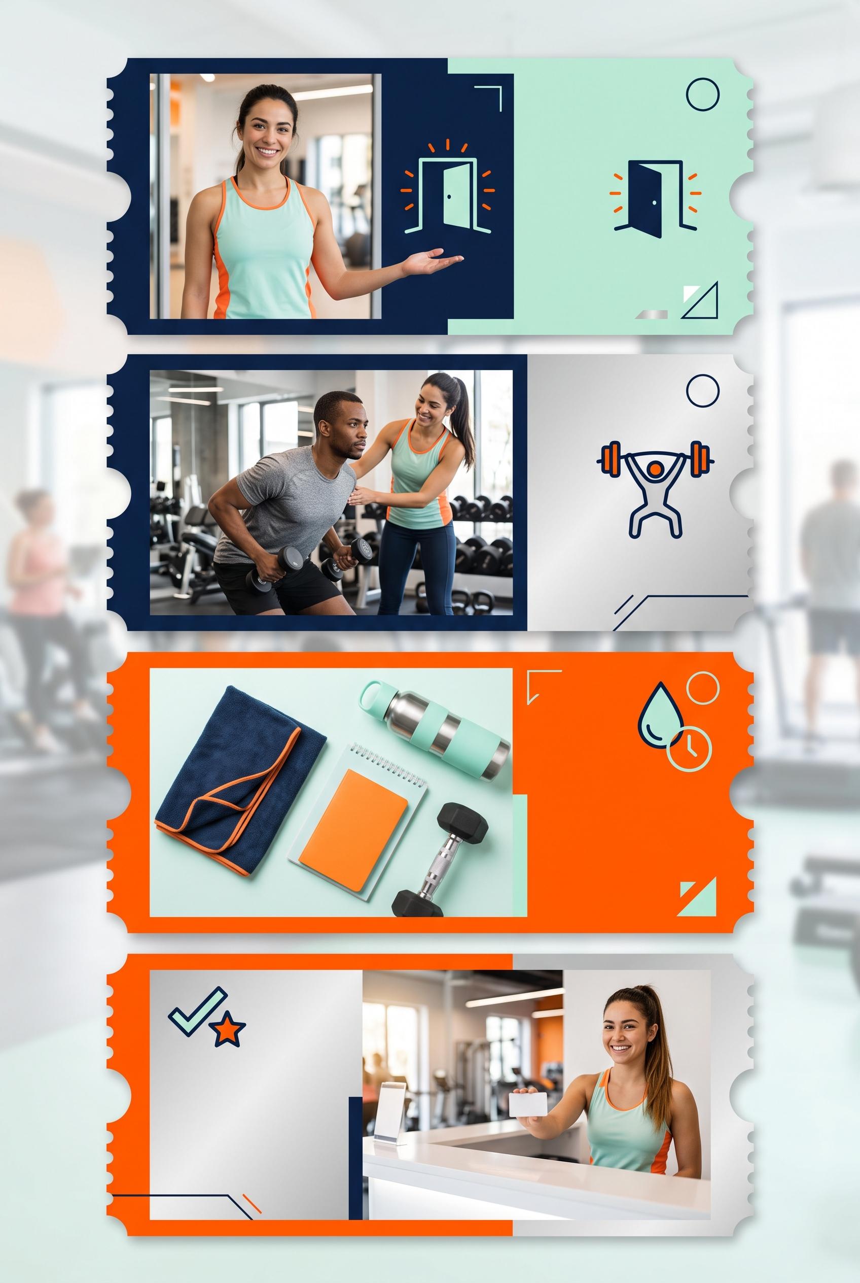
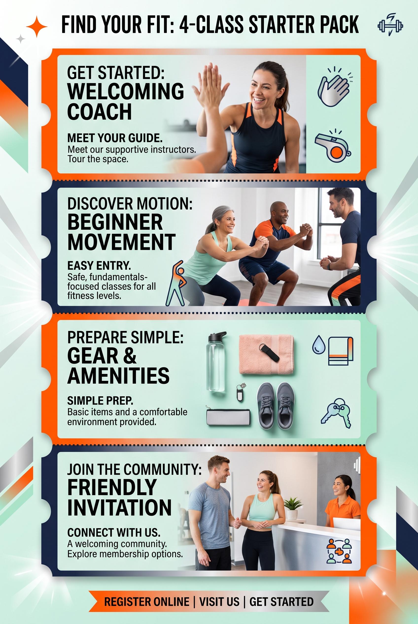
0Create a commercial-quality vertical 2:3 Pinterest composition explaining a four-part trial class campaign for a neighborhood independent gym. Show a foldout ticket strip running vertically through four connected panels, each with a distinct visual moment: welcoming coach, beginner movement, simple preparation items, and friendly front-desk invitation. Use electric orange, midnight blue, mint, and silver. Blend clean campaign design with realistic lifestyle photography, crisp spacing, energetic but approachable art direction, and abstract iconography. AI-modified downstream. No real brands, no trademarked characters, no watermark, and no unintended readable text. Corrective regeneration attempt 3. Produce a materially revised image, not a near-duplicate of an earlier variant. Preserve the successful subject, palette, lighting, focal hierarchy, and commercial polish from the original brief while correcting every issue below. Mandatory corrective instructions from the most recent visual QA: Preserve the polished vertical 2:3 foldout ticket strip, four connected panels, orange/midnight-blue/mint/silver palette, realistic coach, beginner movement, preparation items, welcoming front desk, icons, lighting, and spacing. Remove every letter, word, number, numeral, heading, label, logo, glyph, price, and pseudo-text shape, including all panel titles, numbered badges, and bottom footer marks. Replace text regions with clean blank mint, pale, or white surfaces and only subtle non-linguistic geometric accents; use abstract icons and visual scenes alone to communicate the four steps. Ensure no readable or malformed text appears anywhere. Observed defects from prior variants that must not recur: 1) Strong vertical ticket-strip composition with clear four-part sequence and attractive photography. 2) The creative contradicts the brief’s requirement for blank text areas and visual understanding without readable copy: every panel and the footer contain extensive embedded text. 3) The dense typography makes the design feel like a finished infographic rather than the requested abstract campaign system. 4) Strong vertical 2:3 composition with clear four-panel structure and polished photography. 5) Extensive readable text remains throughout, including headings, numbered badges, and footer placeholder marks that resemble designed copy, directly violating the no-readable-text/c 6) ampaign-system requirement. 7) The dense typography makes the creative function as a finished infographic rather than an abstract visual system. Render no letters, words, numbers, prices, headings, labels, contact details, logos, glyphs, or pseudo-text anywhere. Use only blank surfaces, clean geometric marks, and non-linguistic placeholder shapes. Do not add explanatory captions, before/after labels, interface copy, or extra objects that the brief did not request. When a corrective instruction conflicts with a decorative detail, prioritize the corrective instruction.
 0
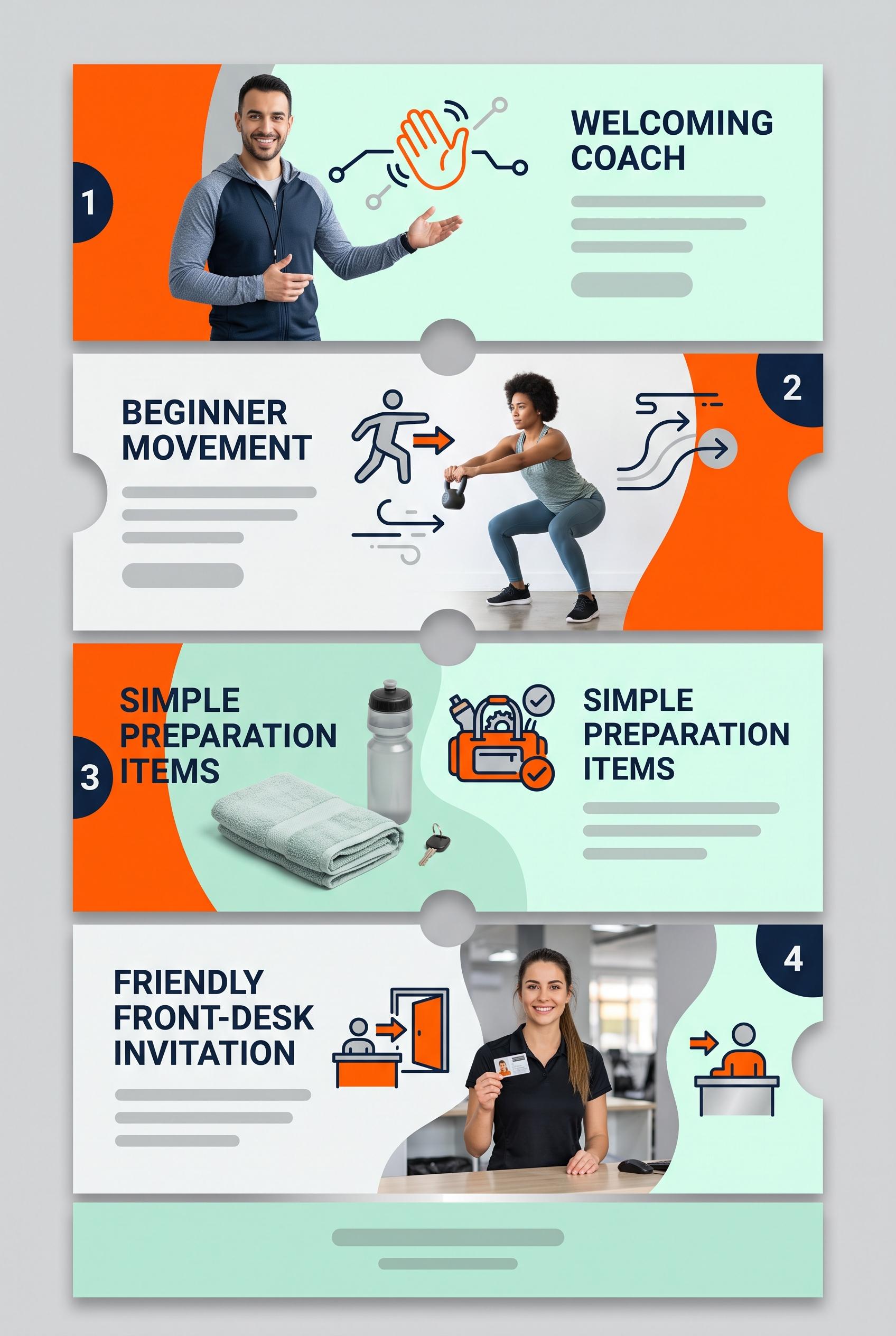
0Create a commercial-quality vertical 2:3 Pinterest composition explaining a four-part trial class campaign for a neighborhood independent gym. Show a foldout ticket strip running vertically through four connected panels, each with a distinct visual moment: welcoming coach, beginner movement, simple preparation items, and friendly front-desk invitation. Use electric orange, midnight blue, mint, and silver. Blend clean campaign design with realistic lifestyle photography, crisp spacing, energetic but approachable art direction, and abstract iconography. AI-modified downstream. No real brands, no trademarked characters, no watermark, and no unintended readable text. Corrective regeneration attempt 2. Produce a materially revised image, not a near-duplicate of an earlier variant. Preserve the successful subject, palette, lighting, focal hierarchy, and commercial polish from the original brief while correcting every issue below. Mandatory corrective instructions from the most recent visual QA: Preserve the vertical 2:3 foldout ticket strip, orange/midnight-blue/mint/silver palette, connected four-panel structure, realistic coach, beginner movement, preparation items, welcoming front desk, icons, and crisp spacing. Remove all readable words and letters from the image, including the top headline, all panel headings/body copy, and the bottom call-to-action banner. Replace each text area with clean blank mint or pale panels containing only subtle abstract gray placeholder lines or empty shapes; keep numbered shapes and icons to communicate the four steps visually. Ensure no logos, brands, watermark, or malformed text remain. Observed defects from prior variants that must not recur: 1) Strong vertical ticket-strip composition with clear four-part sequence and attractive photography. 2) The creative contradicts the brief’s requirement for blank text areas and visual understanding without readable copy: every panel and the footer contain extensive embedded text. 3) The dense typography makes the design feel like a finished infographic rather than the requested abstract campaign system. Render no letters, words, numbers, prices, headings, labels, contact details, logos, glyphs, or pseudo-text anywhere. Use only blank surfaces, clean geometric marks, and non-linguistic placeholder shapes. Do not add explanatory captions, before/after labels, interface copy, or extra objects that the brief did not request. When a corrective instruction conflicts with a decorative detail, prioritize the corrective instruction.
 0
0Create a commercial-quality vertical 2:3 Pinterest composition explaining a four-part trial class campaign for a neighborhood independent gym. Show a foldout ticket strip running vertically through four connected panels, each with a distinct visual moment: welcoming coach, beginner movement, simple preparation items, and friendly front-desk invitation. Use electric orange, midnight blue, mint, and silver. Blend clean campaign design with realistic lifestyle photography, crisp spacing, energetic but approachable art direction, and abstract iconography. AI-modified downstream. No real brands, no trademarked characters, no watermark, and no unintended readable text.
 0
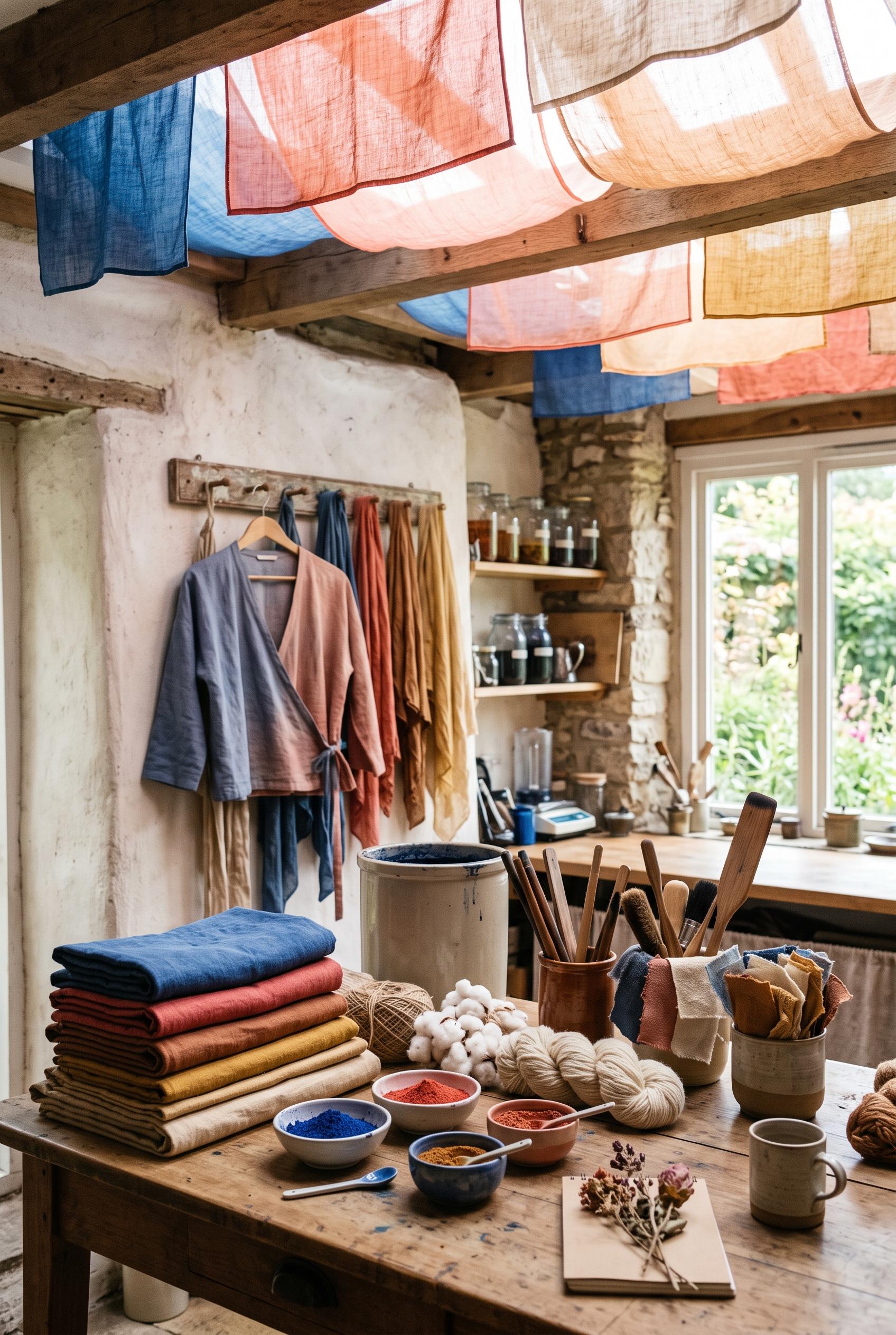
0Create a commercial-quality vertical 2:3 Pinterest composition showcasing an independent fabric dyeing studio. Arrange richly dyed folded textiles, pigment bowls, natural fibers, wooden tools, loose swatches, and one finished garment in a sunlit gallery-like workspace. Add suspended translucent color panels overhead as a distinctive visual mechanism. Use lapis blue, coral, clay, and parchment with refined editorial styling, realistic material detail, soft directional light, and an inviting handmade atmosphere. AI-modified downstream. No real brands, no trademarked characters, no watermark, and no unintended readable text.
 0
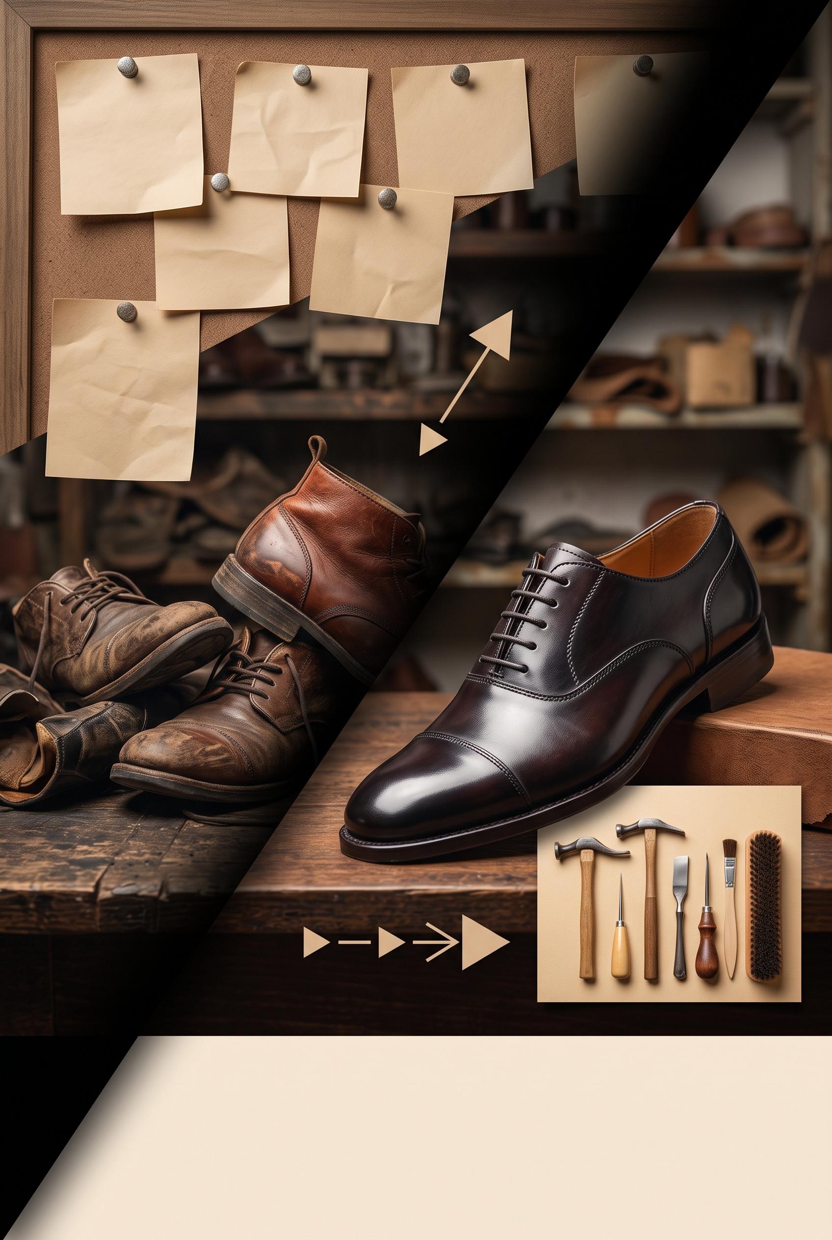
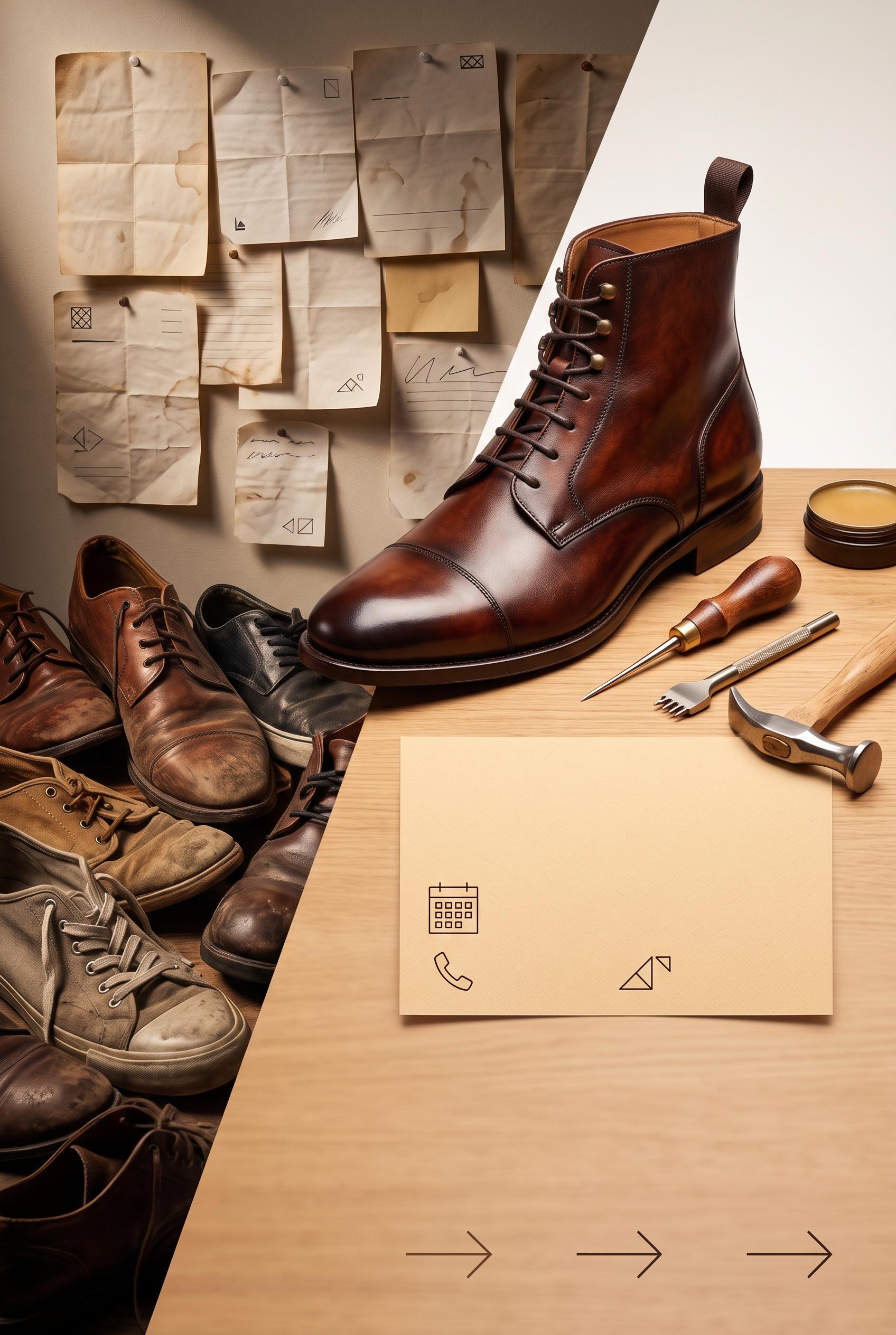
0Create a commercial-quality vertical 2:3 Pinterest composition for an independent shoe repair studio promotion, showing a before-and-after transformation through a sliding shadow mask: left side cluttered with mismatched service notes and worn shoes, right side elegant with one beautifully restored leather shoe, neat tools, warm paper card, and directional visual cues. Use burnt sienna, deep ink, ochre, and almond. Editorial product photography, tactile textures, controlled studio lighting, strong focal hierarchy, premium small-business art direction. AI-modified downstream. No real brands, no trademarked characters, no watermark, and no unintended readable text. Corrective regeneration attempt 5. Produce a materially revised image, not a near-duplicate of an earlier variant. Preserve the successful subject, palette, lighting, focal hierarchy, and commercial polish from the original brief while correcting every issue below. Mandatory corrective instructions from the most recent visual QA: Recompose and crop to an exact vertical 2:3 canvas. Preserve the polished restored leather shoe, diagonal sliding shadow mask, warm burnt-sienna/ochre/almond palette, tactile textures, worn shoes and completely blank abstract notes on the left, tools on the right, geometric blank offer card, and simple abstract directional arrows. Reduce the oversized bottom blank area so the shoe and transformation scene occupy more of the frame while retaining clean negative space. Keep every paper surface free of letters, numbers, symbols, pseudo-writing, logos, watermarks, and readable or text-like marks. Observed defects from prior variants that must not recur: 1) Extensive readable text appears on the pinned notes and central card, including labels and handwritten phrases, violating the no-readable-text requirement. 2) Some marks resemble pseudo-writing and compete with the otherwise premium presentation. 3) Strong vertical composition, focal shoe, palette, and sliding-mask transformation are successful. 4) Pinned notes contain pseudo-writing, lines, and glyph-like symbols. 5) Central card contains recognizable calendar and phone icons, which violate the abstract non-linguistic cue requirement. 6) Bottom arrows are acceptable directionally, but the image still has unintended text-like marks throughout. 7) The composition is approximately 3:4 rather than the required vertical 2:3 format. 8) The lower negative-space area is oversized, weakening the commercial composition and focal hierarchy. Render no letters, words, numbers, prices, headings, labels, contact details, logos, glyphs, or pseudo-text anywhere. Use only blank surfaces, clean geometric marks, and non-linguistic placeholder shapes. Do not add explanatory captions, before/after labels, interface copy, or extra objects that the brief did not request. When a corrective instruction conflicts with a decorative detail, prioritize the corrective instruction.
 0
0Create a commercial-quality vertical 2:3 Pinterest composition for an independent shoe repair studio promotion, showing a before-and-after transformation through a sliding shadow mask: left side cluttered with mismatched service notes and worn shoes, right side elegant with one beautifully restored leather shoe, neat tools, warm paper card, and directional visual cues. Use burnt sienna, deep ink, ochre, and almond. Editorial product photography, tactile textures, controlled studio lighting, strong focal hierarchy, premium small-business art direction. AI-modified downstream. No real brands, no trademarked characters, no watermark, and no unintended readable text. Corrective regeneration attempt 4. Produce a materially revised image, not a near-duplicate of an earlier variant. Preserve the successful subject, palette, lighting, focal hierarchy, and commercial polish from the original brief while correcting every issue below. Mandatory corrective instructions from the most recent visual QA: Preserve the vertical 2:3 editorial composition, diagonal sliding shadow mask, warm burnt-sienna/ochre/almond palette, tactile paper and leather textures, cluttered worn shoes on the left, dominant polished restored shoe on the right, tools, and premium lighting. Remove every line, handwriting stroke, pseudo-letter, number, label, logo, glyph, calendar icon, phone icon, and text-like mark from all pinned notes and papers. Make every note completely blank except subtle folds, stains, and non-linguistic abstract color shapes. Make the central warm paper card entirely blank or use only soft geometric color blocks with no recognizable symbols. Keep the bottom as clean negative space with only a few simple geometric directional arrows. Ensure no watermark, brand, trademark, caption, or readable or pseudo-readable text anywhere. Observed defects from prior variants that must not recur: 1) The lower typography is prominent and competes with the restored shoe focal point. 2) Strong vertical 2:3 composition, palette, lighting, diagonal transformation mask, and restored-shoe focal point. 3) Extensive readable text appears on the pinned notes and central card, including labels and handwritten phrases, violating the no-readable-text requirement. 4) Some marks resemble pseudo-writing and compete with the otherwise premium presentation. 5) Strong vertical composition, focal shoe, palette, and sliding-mask transformation are successful. 6) Pinned notes contain pseudo-writing, lines, and glyph-like symbols. 7) Central card contains recognizable calendar and phone icons, which violate the abstract non-linguistic cue requirement. 8) Bottom arrows are acceptable directionally, but the image still has unintended text-like marks throughout. Render no letters, words, numbers, prices, headings, labels, contact details, logos, glyphs, or pseudo-text anywhere. Use only blank surfaces, clean geometric marks, and non-linguistic placeholder shapes. Do not add explanatory captions, before/after labels, interface copy, or extra objects that the brief did not request. When a corrective instruction conflicts with a decorative detail, prioritize the corrective instruction.
 0
0Create a commercial-quality vertical 2:3 Pinterest composition for an independent shoe repair studio promotion, showing a before-and-after transformation through a sliding shadow mask: left side cluttered with mismatched service notes and worn shoes, right side elegant with one beautifully restored leather shoe, neat tools, warm paper card, and directional visual cues. Use burnt sienna, deep ink, ochre, and almond. Editorial product photography, tactile textures, controlled studio lighting, strong focal hierarchy, premium small-business art direction. AI-modified downstream. No real brands, no trademarked characters, no watermark, and no unintended readable text. Corrective regeneration attempt 3. Produce a materially revised image, not a near-duplicate of an earlier variant. Preserve the successful subject, palette, lighting, focal hierarchy, and commercial polish from the original brief while correcting every issue below. Mandatory corrective instructions from the most recent visual QA: Preserve the attractive vertical 2:3 editorial shoe-repair composition, diagonal sliding shadow mask, warm burnt-sienna/ochre/almond palette, tactile leather and paper textures, cluttered worn shoes on the left, and one dominant polished restored leather shoe with tools on the right. Completely remove every letter, word, number, label, handwriting stroke, logo, glyph, pseudo-text mark, and line of writing from every pinned note, loose paper, central card, and lower area. Replace all notes with blank paper showing only subtle folds, stains, or abstract non-linguistic geometric marks. Replace the central offer card with a completely blank warm paper card containing only simple abstract booking symbols, not letter-like glyphs. Keep the bottom area as clean negative space with only a few simple directional geometric arrows; remove any typography-like lines or text placeholders. Ensure no watermark, brand, trademark, caption, or text-like artifact appears anywhere. Observed defects from prior variants that must not recur: 1) The composition is attractive and clearly split before/after, but it contains extensive readable text on the notes, offer card, and bottom banner, contrary to the brief’s abstract, 2) non-readable booking cue requirement. 3) The handwritten notes include apparent names and detailed phrases, creating unintended readable copy and a less premium commercial finish. 4) The lower typography is prominent and competes with the restored shoe focal point. 5) Strong vertical 2:3 composition, palette, lighting, diagonal transformation mask, and restored-shoe focal point. 6) Extensive readable text appears on the pinned notes and central card, including labels and handwritten phrases, violating the no-readable-text requirement. 7) Some marks resemble pseudo-writing and compete with the otherwise premium presentation. Render no letters, words, numbers, prices, headings, labels, contact details, logos, glyphs, or pseudo-text anywhere. Use only blank surfaces, clean geometric marks, and non-linguistic placeholder shapes. Do not add explanatory captions, before/after labels, interface copy, or extra objects that the brief did not request. When a corrective instruction conflicts with a decorative detail, prioritize the corrective instruction.
 0
0Create a commercial-quality vertical 2:3 Pinterest composition for an independent shoe repair studio promotion, showing a before-and-after transformation through a sliding shadow mask: left side cluttered with mismatched service notes and worn shoes, right side elegant with one beautifully restored leather shoe, neat tools, warm paper card, and directional visual cues. Use burnt sienna, deep ink, ochre, and almond. Editorial product photography, tactile textures, controlled studio lighting, strong focal hierarchy, premium small-business art direction. AI-modified downstream. No real brands, no trademarked characters, no watermark, and no unintended readable text. Corrective regeneration attempt 2. Produce a materially revised image, not a near-duplicate of an earlier variant. Preserve the successful subject, palette, lighting, focal hierarchy, and commercial polish from the original brief while correcting every issue below. Mandatory corrective instructions from the most recent visual QA: Preserve the vertical 2:3 editorial shoe-repair scene, strong diagonal sliding shadow mask, tactile leather and paper textures, warm burnt-sienna/ochre/almond palette, cluttered worn shoes on the left, and one polished restored leather shoe with tools on the right. Remove every readable letter, word, number, name, logo, and pseudo-text mark from all notes, cards, and lower banners. Replace the offer card with a blank warm paper card containing only abstract geometric booking symbols; replace all bottom typography with clean negative space and simple abstract directional shapes/arrows. Keep the restored shoe as the dominant focal point and ensure there are no watermarks, brands, trademarks, or text-like artifacts. Observed defects from prior variants that must not recur: 1) The composition is attractive and clearly split before/after, but it contains extensive readable text on the notes, offer card, and bottom banner, contrary to the brief’s abstract, 2) non-readable booking cue requirement. 3) The handwritten notes include apparent names and detailed phrases, creating unintended readable copy and a less premium commercial finish. 4) The lower typography is prominent and competes with the restored shoe focal point. Render no letters, words, numbers, prices, headings, labels, contact details, logos, glyphs, or pseudo-text anywhere. Use only blank surfaces, clean geometric marks, and non-linguistic placeholder shapes. Do not add explanatory captions, before/after labels, interface copy, or extra objects that the brief did not request. When a corrective instruction conflicts with a decorative detail, prioritize the corrective instruction.
 0
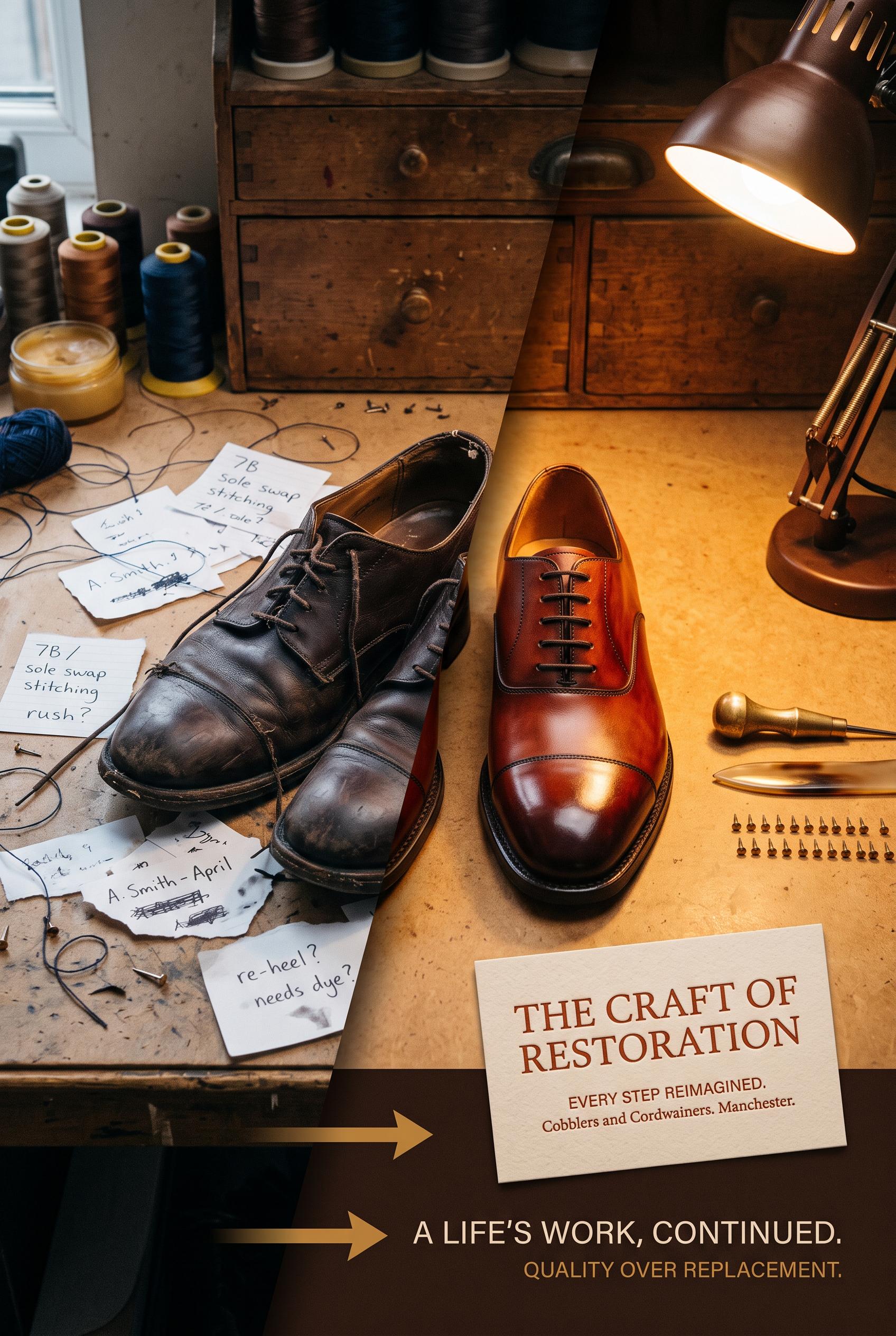
0Create a commercial-quality vertical 2:3 Pinterest composition for an independent shoe repair studio promotion, showing a before-and-after transformation through a sliding shadow mask: left side cluttered with mismatched service notes and worn shoes, right side elegant with one beautifully restored leather shoe, neat tools, warm paper card, and directional visual cues. Use burnt sienna, deep ink, ochre, and almond. Editorial product photography, tactile textures, controlled studio lighting, strong focal hierarchy, premium small-business art direction. AI-modified downstream. No real brands, no trademarked characters, no watermark, and no unintended readable text.
 0
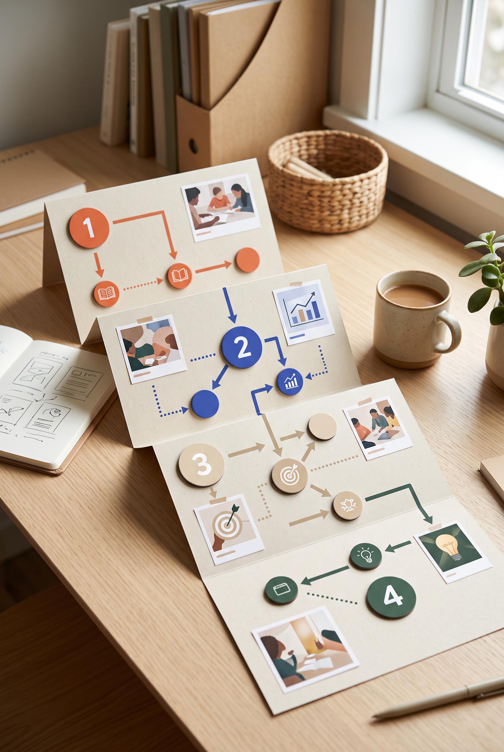
0Create a commercial-quality vertical 2:3 Pinterest composition for an educational portfolio case study campaign planner. Show a foldout decision tree on a desk with four distinct content stages represented by magnetic tokens, arrows, small abstract image placeholders, and clean numbered shapes without readable words. Use persimmon, ultramarine, oat, and pine, with crisp daylight, no real brands, no trademarked characters, no watermark, no unintended readable text.
 0
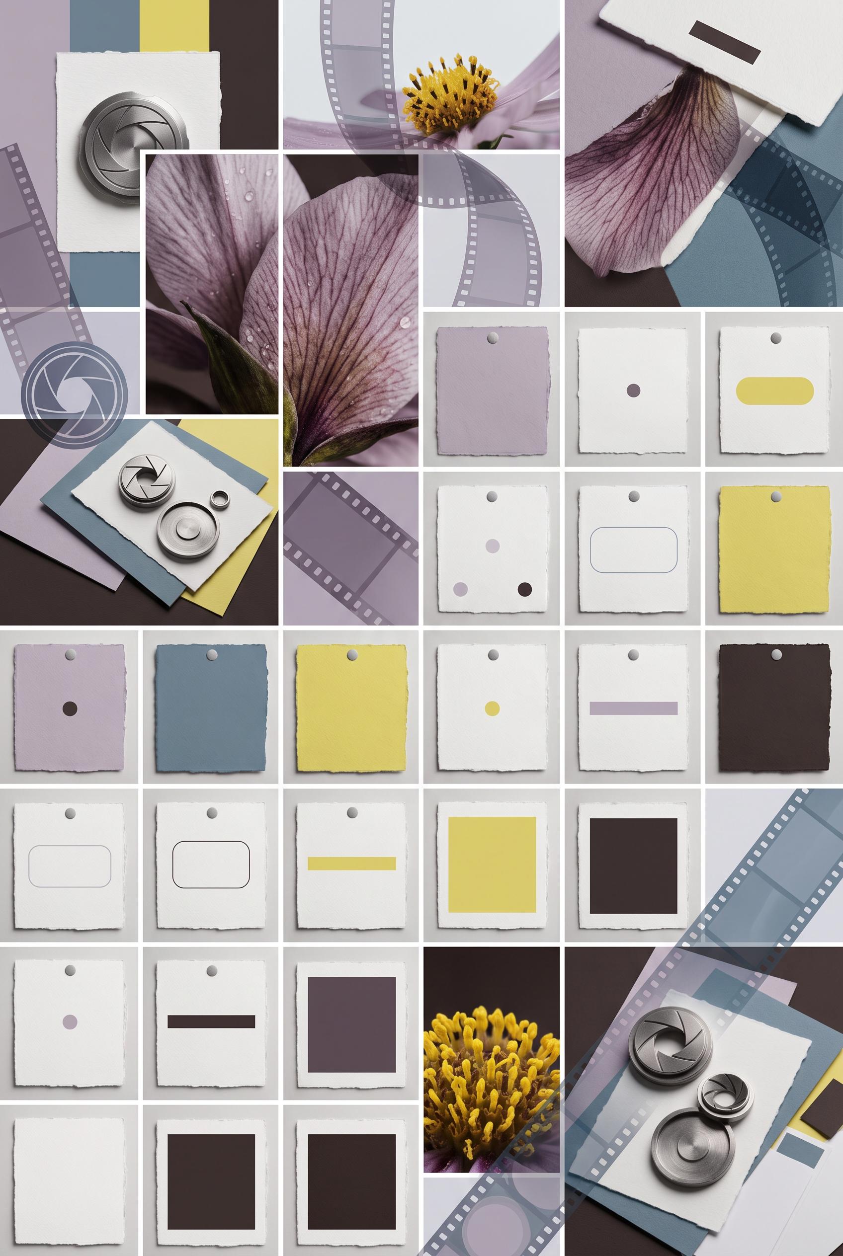
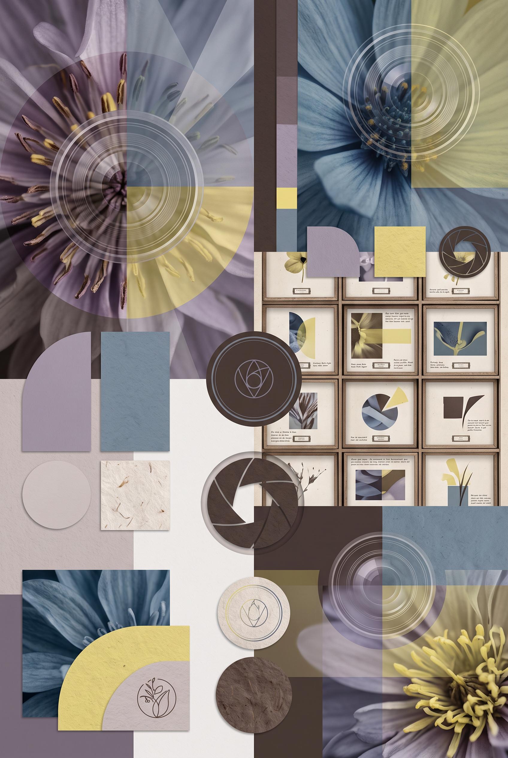
0Create a commercial-quality vertical 2:3 Pinterest composition showcasing a botanical macro photographer personal brand identity. Arrange close-up flower textures, translucent image overlays, circular lens motifs, tactile paper swatches, camera-inspired shapes, and a specimen-drawer grid in smoky lilac, mineral blue, citron, and espresso. Use elegant editorial art direction, no real brands, no trademarked characters, no watermark, no unintended readable text. Corrective regeneration attempt 3. Produce a materially revised image, not a near-duplicate of an earlier variant. Preserve the successful subject, palette, lighting, focal hierarchy, and commercial polish from the original brief while correcting every issue below. Mandatory corrective instructions from the most recent visual QA: Preserve the exact vertical 2:3 editorial collage, botanical macro focal point, smoky lilac/mineral blue/citron/espresso palette, lighting, translucent overlays, lens motifs, camera-inspired geometry, paper textures, and refined collectible commercial polish. Remove every stacked line, paragraph-like mark, caption-like rule, label-like text treatment, and logo-like symbol from all specimen cards and paper elements. Replace them only with isolated abstract dots, simple geometric bars, solid blocks, blank rounded shapes, or non-linguistic patterns with no repeated line spacing and no writing-like rhythm. Keep the botanical photos and overall layout, but ensure absolutely no letters, words, numbers, glyphs, labels, contact details, pseudo-text, watermark, trademark, or garbled readable marks appear anywhere. Observed defects from prior variants that must not recur: 1) Strong vertical composition, palette, botanical macro focal points, lens motifs, and cohesive identity-system styling. 2) Specimen cards contain numerous tiny pseudo-readable words and paragraph-like marks, creating unintended garbled text and reducing commercial polish. 3) Strong vertical editorial composition, focal botanical macro imagery, cohesive palette, and polished branding-system aesthetic. 4) Specimen cards and paper elements still contain stacked horizontal pseudo-text lines and label-like marks, violating the requirement for no pseudo-readable text. Render no letters, words, numbers, prices, headings, labels, contact details, logos, glyphs, or pseudo-text anywhere. Use only blank surfaces, clean geometric marks, and non-linguistic placeholder shapes. Do not add explanatory captions, before/after labels, interface copy, or extra objects that the brief did not request. When a corrective instruction conflicts with a decorative detail, prioritize the corrective instruction.
 0
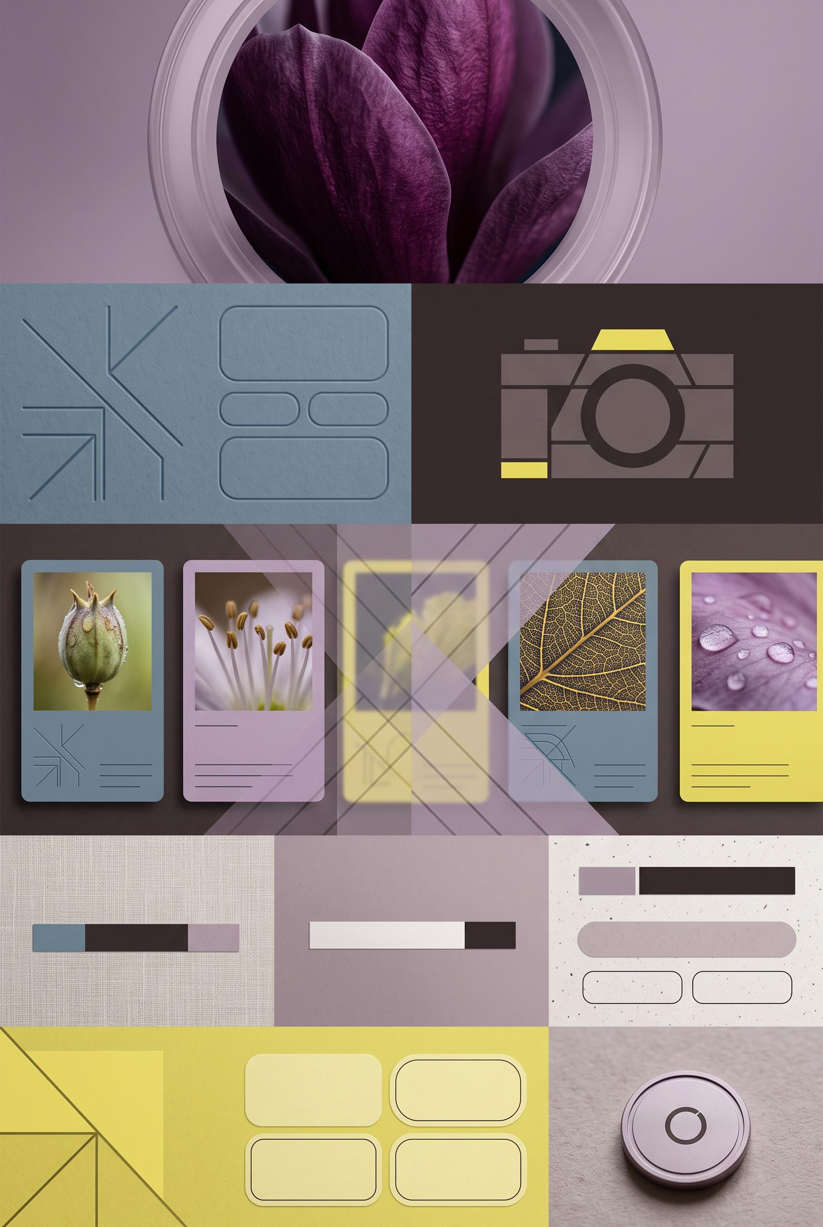
0Create a commercial-quality vertical 2:3 Pinterest composition showcasing a botanical macro photographer personal brand identity. Arrange close-up flower textures, translucent image overlays, circular lens motifs, tactile paper swatches, camera-inspired shapes, and a specimen-drawer grid in smoky lilac, mineral blue, citron, and espresso. Use elegant editorial art direction, no real brands, no trademarked characters, no watermark, no unintended readable text. Corrective regeneration attempt 2. Produce a materially revised image, not a near-duplicate of an earlier variant. Preserve the successful subject, palette, lighting, focal hierarchy, and commercial polish from the original brief while correcting every issue below. Mandatory corrective instructions from the most recent visual QA: Preserve the exact vertical 2:3 editorial collage, botanical macro flowers, smoky lilac/mineral blue/citron/espresso palette, translucent overlays, circular lens motifs, paper swatches, camera-inspired shapes, and specimen-drawer grid. Remove every readable or pseudo-readable character, word, paragraph, caption, label, and logo-like mark from all specimen cards and paper elements. Replace them only with clean abstract lines, dots, geometric bars, or blank label shapes that cannot resemble writing. Keep the refined collectible branding-system aesthetic and ensure there are no watermarks, trademarks, or generation artifacts. Observed defects from prior variants that must not recur: 1) Strong vertical composition, palette, botanical macro focal points, lens motifs, and cohesive identity-system styling. 2) Specimen cards contain numerous tiny pseudo-readable words and paragraph-like marks, creating unintended garbled text and reducing commercial polish. Render no letters, words, numbers, prices, headings, labels, contact details, logos, glyphs, or pseudo-text anywhere. Use only blank surfaces, clean geometric marks, and non-linguistic placeholder shapes. Do not add explanatory captions, before/after labels, interface copy, or extra objects that the brief did not request. When a corrective instruction conflicts with a decorative detail, prioritize the corrective instruction.
 0
0Create a commercial-quality vertical 2:3 Pinterest composition showcasing a botanical macro photographer personal brand identity. Arrange close-up flower textures, translucent image overlays, circular lens motifs, tactile paper swatches, camera-inspired shapes, and a specimen-drawer grid in smoky lilac, mineral blue, citron, and espresso. Use elegant editorial art direction, no real brands, no trademarked characters, no watermark, no unintended readable text.
 0
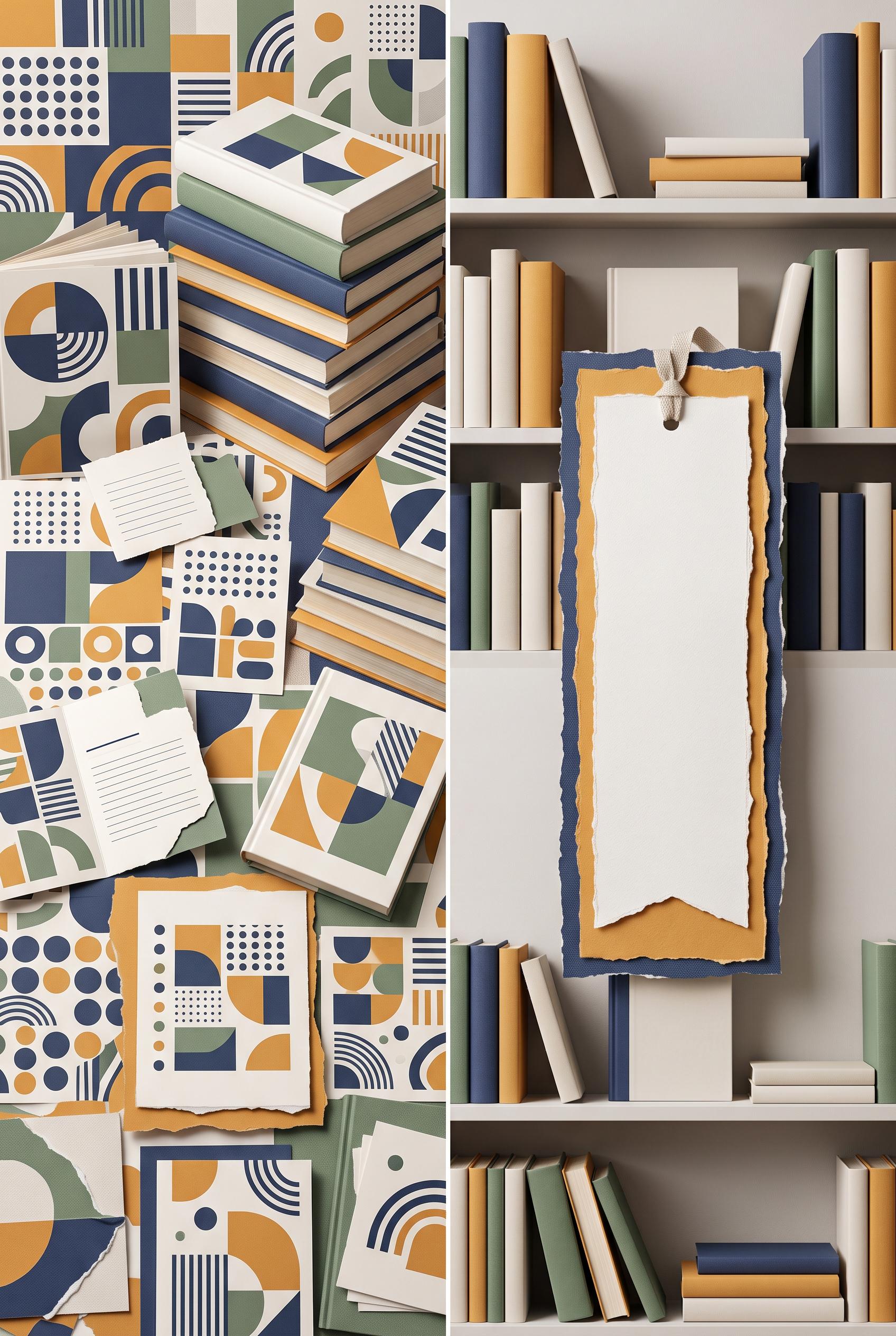
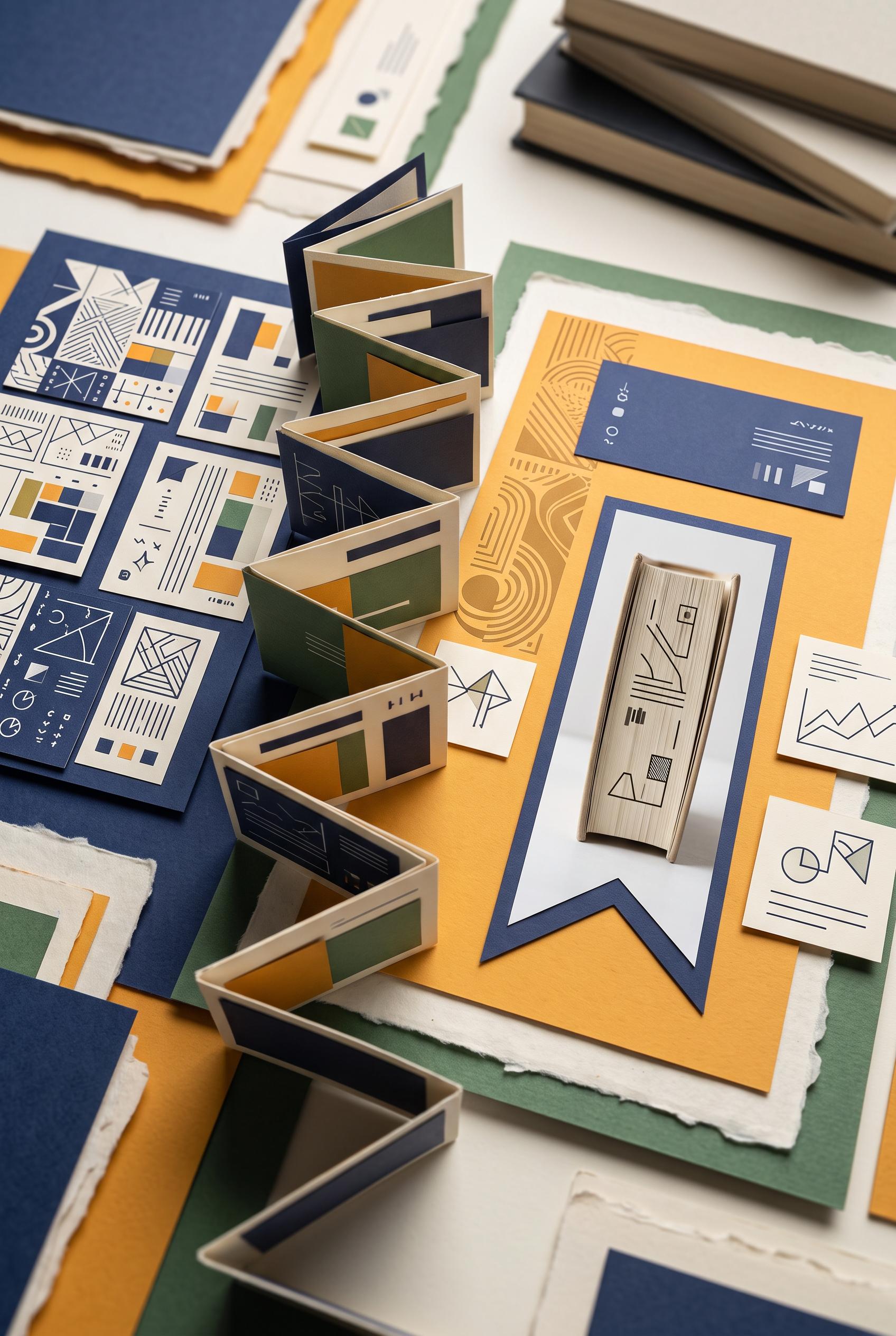
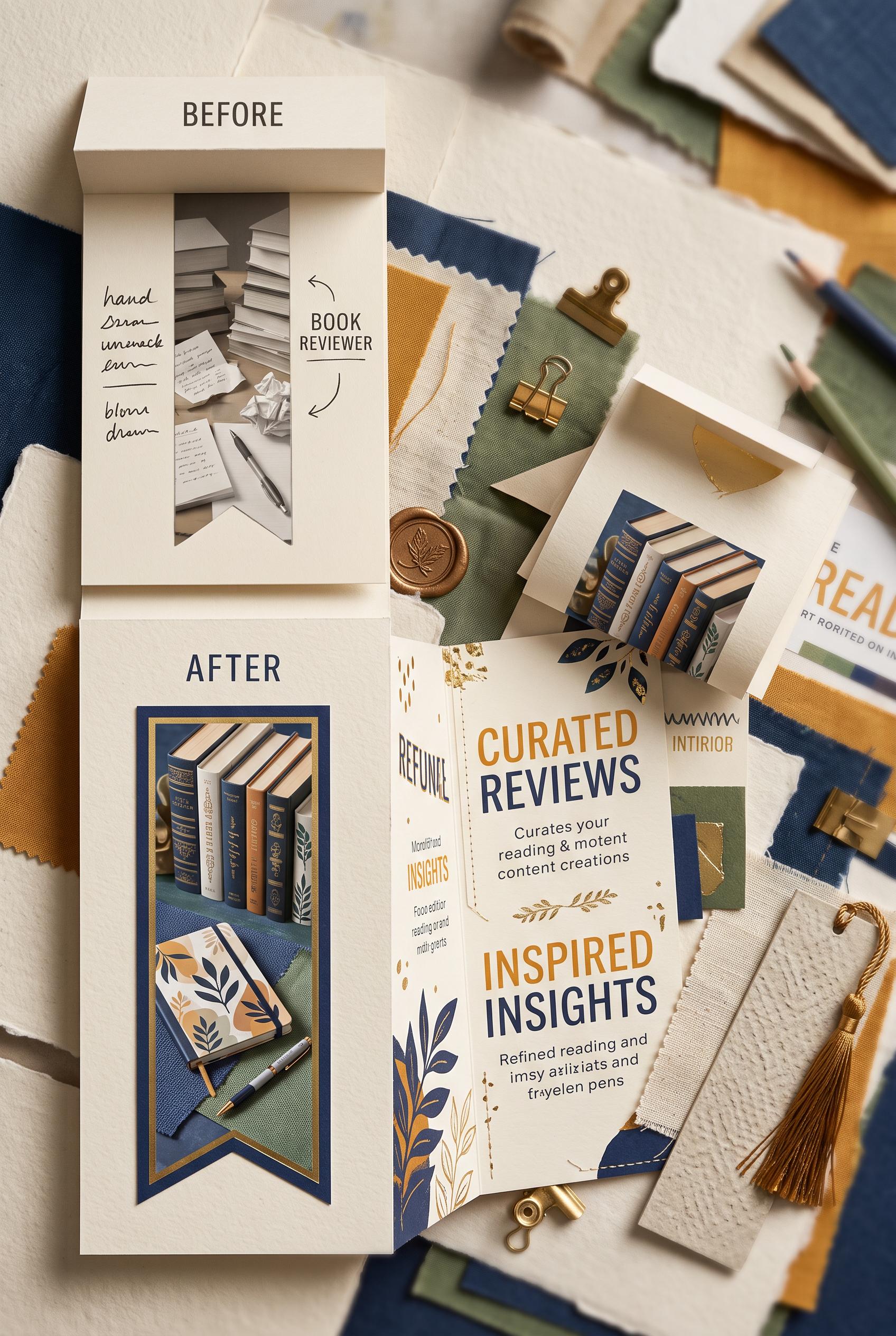
0Create a commercial-quality vertical 2:3 Pinterest composition showing a before-and-after transformation for an independent book reviewer personal brand. Use an accordion-fold reveal with layered paper cards, a bold bookmark-shaped image crop, tactile editorial materials, indigo, marigold, bone, and fern palette, refined studio lighting, premium design direction, no real brands, no trademarked characters, no watermark, no unintended readable text. Corrective regeneration attempt 3. Produce a materially revised image, not a near-duplicate of an earlier variant. Preserve the successful subject, palette, lighting, focal hierarchy, and commercial polish from the original brief while correcting every issue below. Mandatory corrective instructions from the most recent visual QA: Preserve the premium indigo, marigold, bone, and fern palette, refined studio lighting, tactile torn-paper edges, accordion-fold structure, left-to-right transformation, and bookmark-shaped crop. Remove every text-like or glyph-like mark from all cards, book surfaces, notes, spines, and background objects, including the small symbols and line clusters on the left cards, top-center card, blue card, and bookmark image. Replace them only with clean abstract geometric blocks, dots, stripes, arcs, and non-linguistic shapes. Keep the left side crowded but purely geometric, and the right side focused and clean. Do not add any letters, words, numbers, labels, logos, pseudo-text, watermark, or captions. Observed defects from prior variants that must not recur: 1) Strong vertical composition and attractive tactile palette, but multiple areas contain garbled or awkward pseudo-readable text, especially the handwritten notes, brochure copy, and 2) Strong vertical composition, tactile paper collage, palette, lighting, accordion reveal, and bookmark-shaped focal crop are successful. 3) Multiple cards and book surfaces contain pseudo-readable glyphs and text-like marks, violating the explicit requirement for no letters, words, numbers, logos, glyphs, or pseudo-tex 4) The left-side abstract cards are visually busy and include several marks that could be interpreted as writing rather than purely non-linguistic geometry. Render no letters, words, numbers, prices, headings, labels, contact details, logos, glyphs, or pseudo-text anywhere. Use only blank surfaces, clean geometric marks, and non-linguistic placeholder shapes. Do not add explanatory captions, before/after labels, interface copy, or extra objects that the brief did not request. When a corrective instruction conflicts with a decorative detail, prioritize the corrective instruction.
 0
0Create a commercial-quality vertical 2:3 Pinterest composition showing a before-and-after transformation for an independent book reviewer personal brand. Use an accordion-fold reveal with layered paper cards, a bold bookmark-shaped image crop, tactile editorial materials, indigo, marigold, bone, and fern palette, refined studio lighting, premium design direction, no real brands, no trademarked characters, no watermark, no unintended readable text. Corrective regeneration attempt 2. Produce a materially revised image, not a near-duplicate of an earlier variant. Preserve the successful subject, palette, lighting, focal hierarchy, and commercial polish from the original brief while correcting every issue below. Mandatory corrective instructions from the most recent visual QA: Preserve the premium indigo, marigold, bone, and fern paper collage, refined lighting, accordion-fold structure, and bookmark-shaped crop. Remove every readable word, letter, number, logo, and pseudo-text mark from all cards, book spines, notes, and background objects. Replace them with clean abstract lines, blocks, and tiny non-text graphic marks only. Keep the before-to-after transformation unmistakable through composition: a crowded generic card on the left transitioning to one focused bookmark-framed book image and a clean personal-brand layout on the right. Maintain clear hierarchy, tactile paper edges, small abstract content cards, and a commercial-quality vertical 2:3 composition. No watermark or brand-like markings. Observed defects from prior variants that must not recur: 1) Strong vertical composition and attractive tactile palette, but multiple areas contain garbled or awkward pseudo-readable text, especially the handwritten notes, brochure copy, and Render no letters, words, numbers, prices, headings, labels, contact details, logos, glyphs, or pseudo-text anywhere. Use only blank surfaces, clean geometric marks, and non-linguistic placeholder shapes. Do not add explanatory captions, before/after labels, interface copy, or extra objects that the brief did not request. When a corrective instruction conflicts with a decorative detail, prioritize the corrective instruction.
 0
0Create a commercial-quality vertical 2:3 Pinterest composition showing a before-and-after transformation for an independent book reviewer personal brand. Use an accordion-fold reveal with layered paper cards, a bold bookmark-shaped image crop, tactile editorial materials, indigo, marigold, bone, and fern palette, refined studio lighting, premium design direction, no real brands, no trademarked characters, no watermark, no unintended readable text.
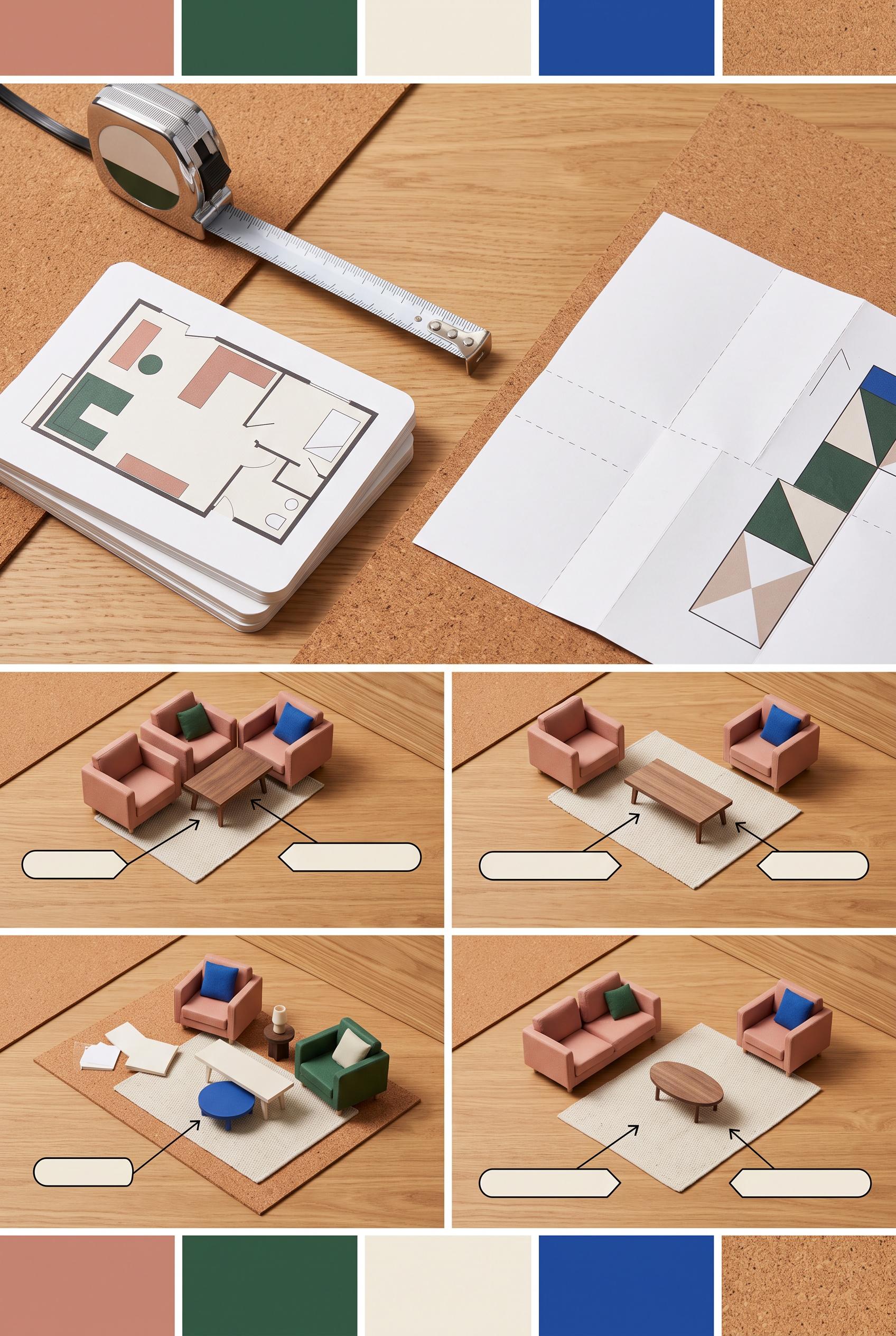 0
0Create a commercial-quality educational interior design graphic in a vertical 2:3 Pinterest composition. Arrange a top-down measurement toolkit with tape measure, floor-plan cards, paper templates, and three miniature living room scenes demonstrating poor, balanced, and excessive coffee table spacing. Use visual arrows and blank diagram labels only, with no readable text. Palette of clay pink, pine green, ivory, cobalt, and natural cork. Crisp studio lighting, premium editorial layout, no real brands, no trademarked characters, no watermark, no unintended readable text, AI-modified downstream. Corrective regeneration attempt 2. Produce a materially revised image, not a near-duplicate of an earlier variant. Preserve the successful subject, palette, lighting, focal hierarchy, and commercial polish from the original brief while correcting every issue below. Mandatory corrective instructions from the most recent visual QA: Preserve the premium top-down vertical 2:3 layout, warm wood and cork surfaces, clay pink/pine green/ivory/cobalt palette, crisp lighting, tape measure, floor-plan card, three miniature living-room scenes, and blank arrow callouts. Change the final styled living-room example to feature an unmistakable compact oval coffee table. Add clearly folded paper template sheets in the measurement toolkit area, while keeping all diagrams abstract and free of readable words or numbers. Keep the three spacing demonstrations visually distinct: too tight, balanced, and too distant. Remove any unintended readable text, branding, watermark, or artifacts. Observed defects from prior variants that must not recur: 1) The final styled example uses a rectangular coffee table instead of the required compact oval table. 2) Folded paper templates are not clearly depicted; the upper-right sheets appear as flat outline cards. Render no letters, words, numbers, prices, headings, labels, contact details, logos, glyphs, or pseudo-text anywhere. Use only blank surfaces, clean geometric marks, and non-linguistic placeholder shapes. Do not add explanatory captions, before/after labels, interface copy, or extra objects that the brief did not request. When a corrective instruction conflicts with a decorative detail, prioritize the corrective instruction.
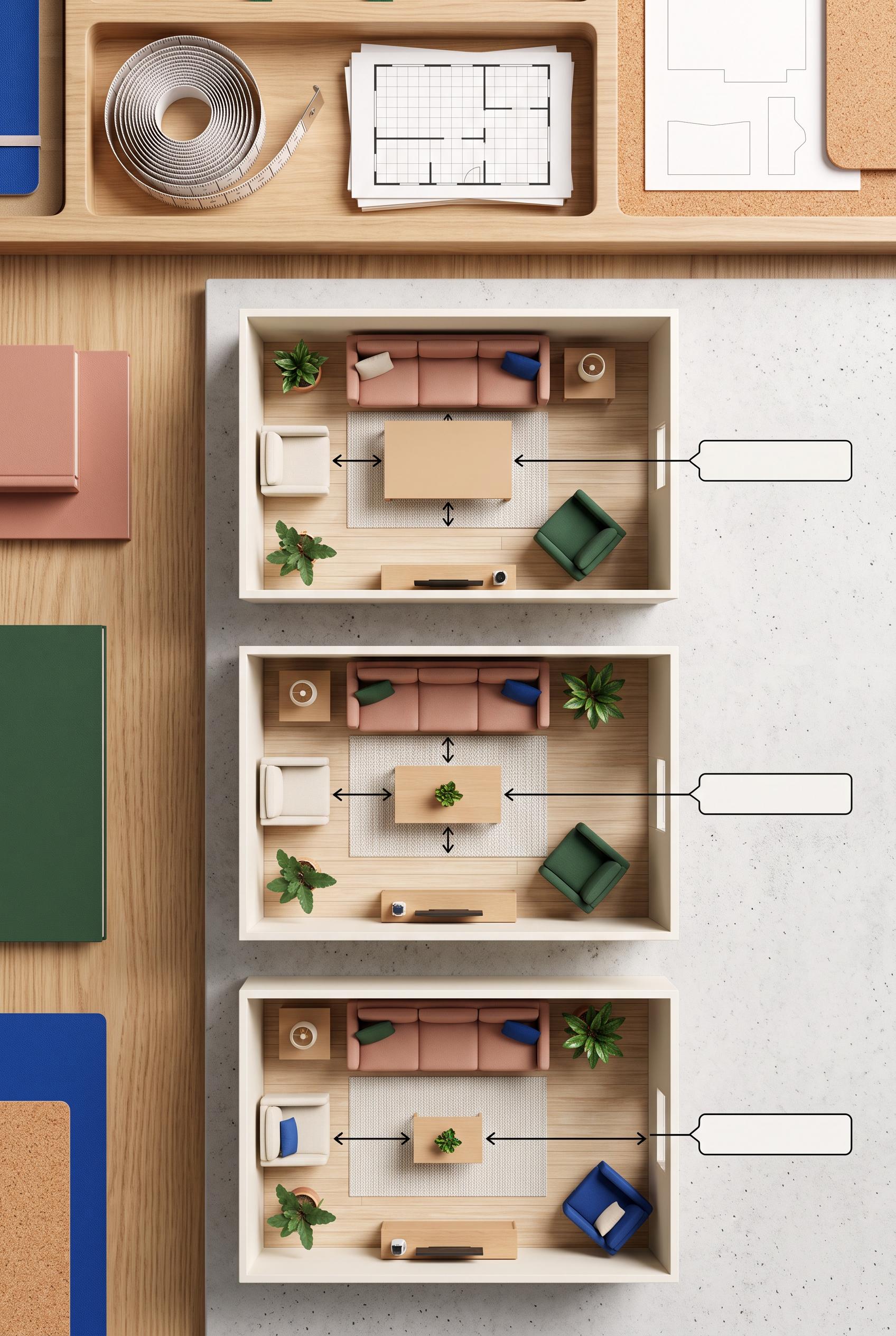 0
0Create a commercial-quality educational interior design graphic in a vertical 2:3 Pinterest composition. Arrange a top-down measurement toolkit with tape measure, floor-plan cards, paper templates, and three miniature living room scenes demonstrating poor, balanced, and excessive coffee table spacing. Use visual arrows and blank diagram labels only, with no readable text. Palette of clay pink, pine green, ivory, cobalt, and natural cork. Crisp studio lighting, premium editorial layout, no real brands, no trademarked characters, no watermark, no unintended readable text, AI-modified downstream.
 0
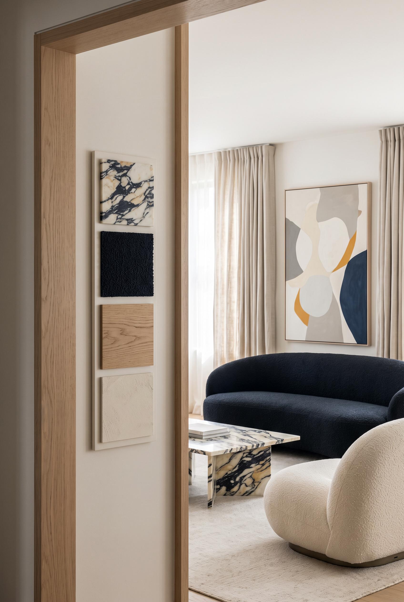
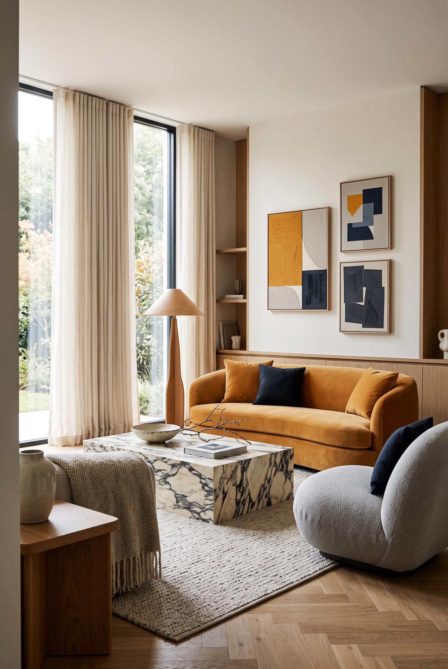
0Create a commercial-quality interior design showcase in a vertical 2:3 Pinterest composition. Depict a sophisticated living room with a low curved sofa, rounded lounge chair, boldly veined stone coffee table, soft pleated curtains, oak accents, and a restrained abstract art wall with no legible markings. Use saffron, dove, blue-black, oak, and soft cream. Three-quarter camera angle, foreground framing, editorial daylight, tactile materials, highly polished art direction, no real brands, no trademarked characters, no watermark, no unintended readable text, AI-modified downstream. Corrective regeneration attempt 2. Produce a materially revised image, not a near-duplicate of an earlier variant. Preserve the successful subject, palette, lighting, focal hierarchy, and commercial polish from the original brief while correcting every issue below. Mandatory corrective instructions from the most recent visual QA: Preserve the existing room composition, lighting, furnishings, color palette, foreground doorway framing, and abstract artwork. Add a small, elegant, unobtrusive material sample strip in a clear lower-side or wall-edge area, visibly showing four labeled-free swatches/material samples: boldly veined stone, boucle fabric, oak wood, and painted plaster. Do not add any text, logos, labels, watermark, or other readable markings. Observed defects from prior variants that must not recur: 1) The image is polished, attractive, vertical, and free of visible branding, watermark, or garbled text. 2) The required discreet material strip showing stone, boucle, oak, and painted plaster is absent. Render no letters, words, numbers, prices, headings, labels, contact details, logos, glyphs, or pseudo-text anywhere. Use only blank surfaces, clean geometric marks, and non-linguistic placeholder shapes. Do not add explanatory captions, before/after labels, interface copy, or extra objects that the brief did not request. When a corrective instruction conflicts with a decorative detail, prioritize the corrective instruction.
 0
0Create a commercial-quality interior design showcase in a vertical 2:3 Pinterest composition. Depict a sophisticated living room with a low curved sofa, rounded lounge chair, boldly veined stone coffee table, soft pleated curtains, oak accents, and a restrained abstract art wall with no legible markings. Use saffron, dove, blue-black, oak, and soft cream. Three-quarter camera angle, foreground framing, editorial daylight, tactile materials, highly polished art direction, no real brands, no trademarked characters, no watermark, no unintended readable text, AI-modified downstream.
 0
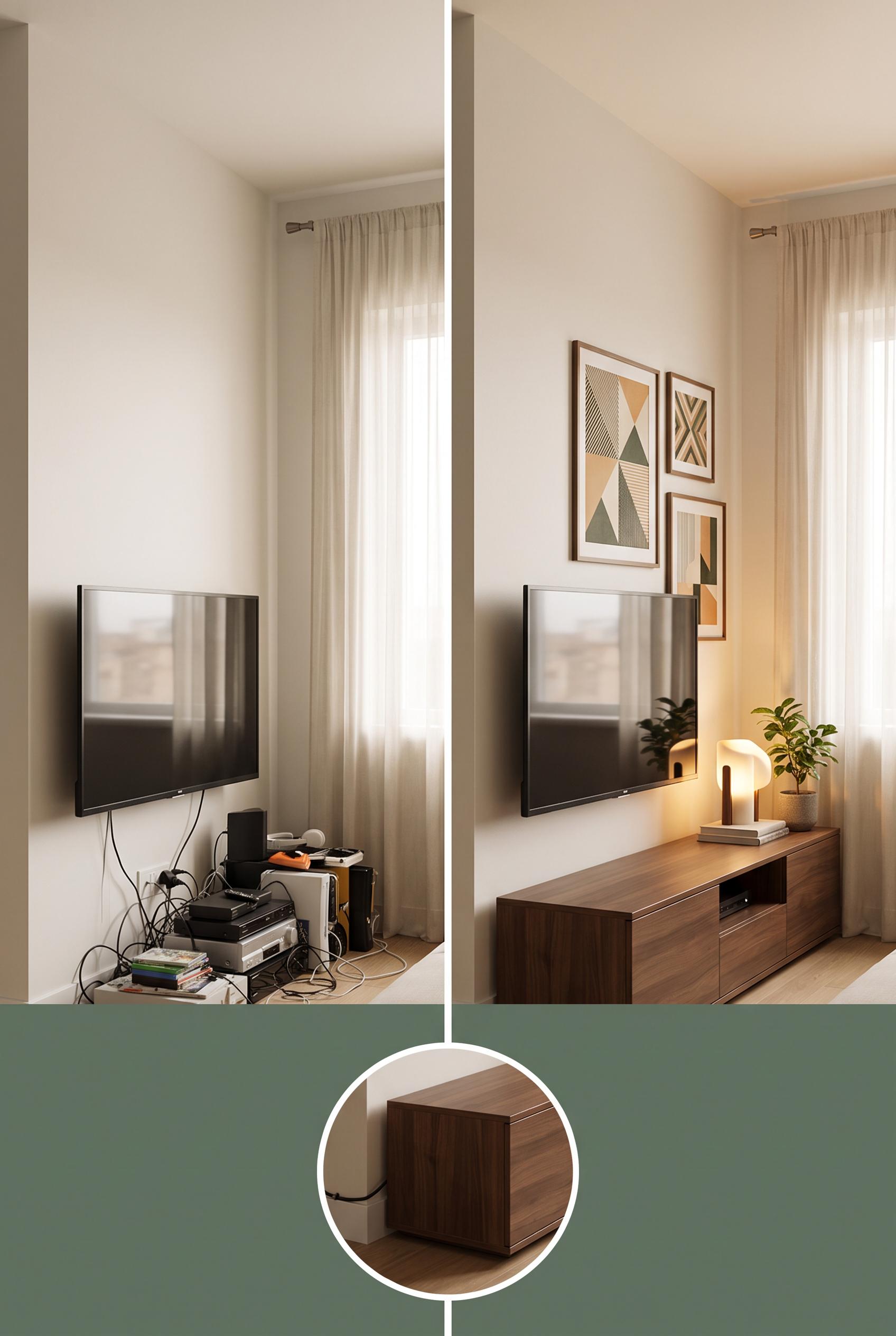
0Create a commercial-quality interior design editorial image in a vertical 2:3 Pinterest composition. Use a matched before-and-after split view of a compact living room media corner, with tangled cables and visual clutter on the left and a refined organized setup on the right. Add a small detail inset showing concealed cable routing behind low storage. Use mineral green, toasted apricot, warm white, and walnut. Photorealistic styling, natural window light, polished art direction, no real brands, no trademarked characters, no watermark, no unintended readable text, AI-modified downstream. Corrective regeneration attempt 4. Produce a materially revised image, not a near-duplicate of an earlier variant. Preserve the successful subject, palette, lighting, focal hierarchy, and commercial polish from the original brief while correcting every issue below. Mandatory corrective instructions from the most recent visual QA: Create a single clean vertical 2:3 split image with one central divider, using the exact same fixed frontal camera position, framing, wall geometry, window, and media-corner proportions on both sides. Show the TV from the same frontal angle in both views; do not show the back or side of the TV on the before side. Preserve the left-side tangled cords, mismatched devices, and empty wall, and preserve the right-side low closed walnut storage, framed art arrangement, exactly one sculptural lamp, and one small leafy plant. Reduce the circular concealed-cable inset to a small unobtrusive circle positioned in unused lower space without covering the storage or main comparison. Preserve the warm natural light, mineral green, toasted apricot, warm white, walnut palette, photorealistic editorial styling, and clean artifact-free appearance. Include no text, labels, logos, brands, watermark, or pseudo-text. Observed defects from prior variants that must not recur: 1) The after view lacks the requested sculptural lamp and small plant. 2) The after composition does not clearly correspond to the same compact living-room media corner, weakening the before/after comparison. 3) The image is attractive and artifact-free, but the before/after comparison is not a clear matched split view from one identical camera position. 4) The 2x2 collage shows different framings and perspectives between upper and lower sections, weakening the same-room before/after concept. 5) The after side is split across two panels rather than presenting one directly comparable organized room view. 6) Attractive vertical composition with clear before/after hierarchy and strong styling. 7) The two views are not matched from the identical camera position: the left shows the rear of the TV while the right shows the TV front, making the comparison visually inconsistent. 8) The circular cable inset is oversized and overlaps the main storage area, weakening the clean comparison. Render no letters, words, numbers, prices, headings, labels, contact details, logos, glyphs, or pseudo-text anywhere. Use only blank surfaces, clean geometric marks, and non-linguistic placeholder shapes. Do not add explanatory captions, before/after labels, interface copy, or extra objects that the brief did not request. When a corrective instruction conflicts with a decorative detail, prioritize the corrective instruction.
 0
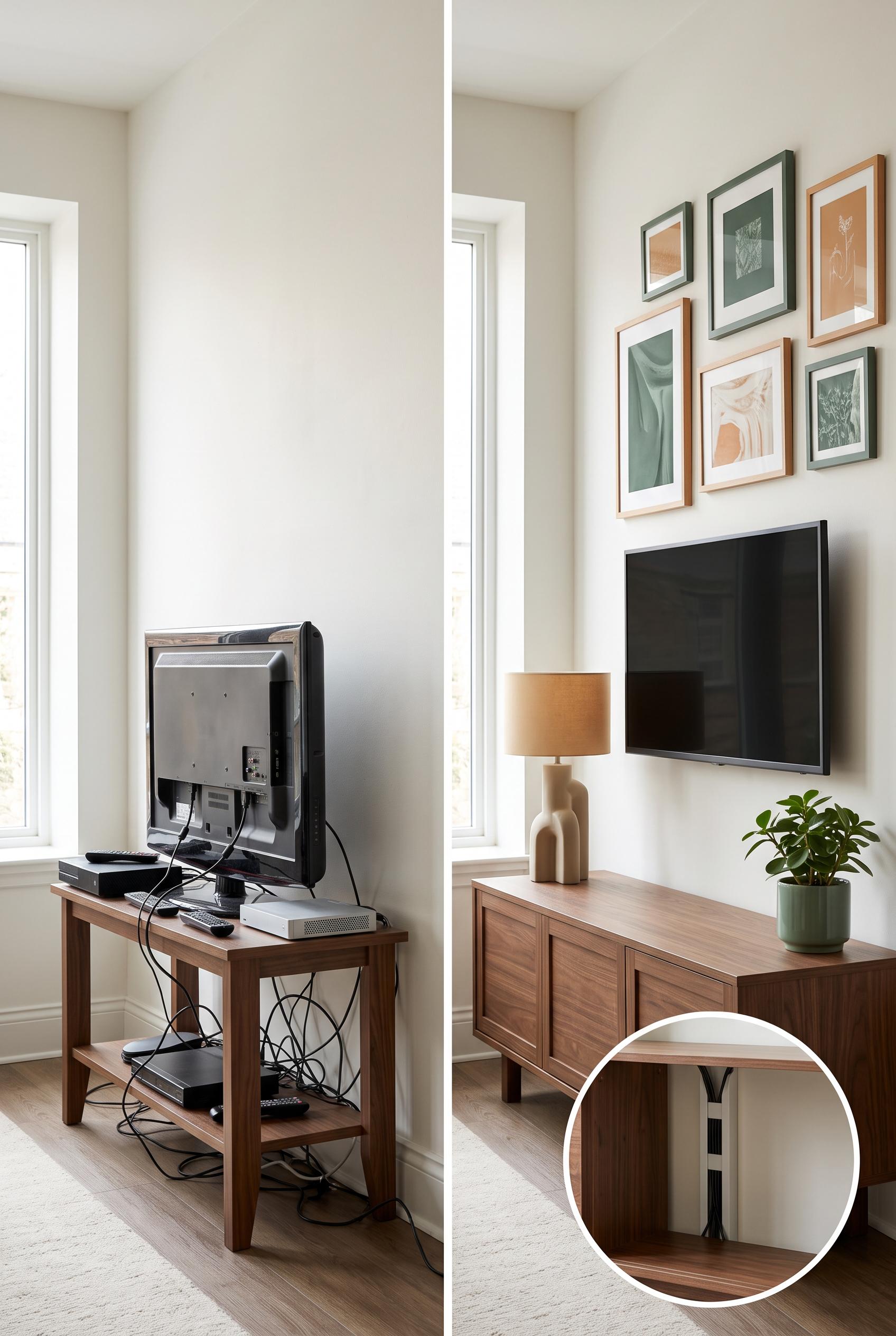
0Create a commercial-quality interior design editorial image in a vertical 2:3 Pinterest composition. Use a matched before-and-after split view of a compact living room media corner, with tangled cables and visual clutter on the left and a refined organized setup on the right. Add a small detail inset showing concealed cable routing behind low storage. Use mineral green, toasted apricot, warm white, and walnut. Photorealistic styling, natural window light, polished art direction, no real brands, no trademarked characters, no watermark, no unintended readable text, AI-modified downstream. Corrective regeneration attempt 3. Produce a materially revised image, not a near-duplicate of an earlier variant. Preserve the successful subject, palette, lighting, focal hierarchy, and commercial polish from the original brief while correcting every issue below. Mandatory corrective instructions from the most recent visual QA: Create a single clean vertical 2:3 before-and-after split image with one central vertical divider, not a 2x2 collage. Show the exact same compact living-room media corner from the identical fixed frontal camera position and framing on both sides. Left: visibly tangled cords, mismatched media devices, bare empty wall space, and the same window and room geometry. Right: the same wall and devices with low closed walnut storage, concealed cable routing, a tasteful framed art arrangement, exactly one sculptural lamp, and one small leafy plant. Add one small circular inset focused only on the concealed cable solution without obscuring the main comparison. Preserve the warm natural light, mineral green, toasted apricot, warm white, and walnut palette, photorealistic editorial styling, and clean commercial composition. Include no text, labels, logos, brands, watermark, or pseudo-text. Observed defects from prior variants that must not recur: 1) The before and after views are not matched from the same camera position; the left shows the back/side of a TV while the right shows a frontal media wall. 2) The after view lacks the requested sculptural lamp and small plant. 3) The after composition does not clearly correspond to the same compact living-room media corner, weakening the before/after comparison. 4) The image is attractive and artifact-free, but the before/after comparison is not a clear matched split view from one identical camera position. 5) The 2x2 collage shows different framings and perspectives between upper and lower sections, weakening the same-room before/after concept. 6) The after side is split across two panels rather than presenting one directly comparable organized room view. Render no letters, words, numbers, prices, headings, labels, contact details, logos, glyphs, or pseudo-text anywhere. Use only blank surfaces, clean geometric marks, and non-linguistic placeholder shapes. Do not add explanatory captions, before/after labels, interface copy, or extra objects that the brief did not request. When a corrective instruction conflicts with a decorative detail, prioritize the corrective instruction.
 0
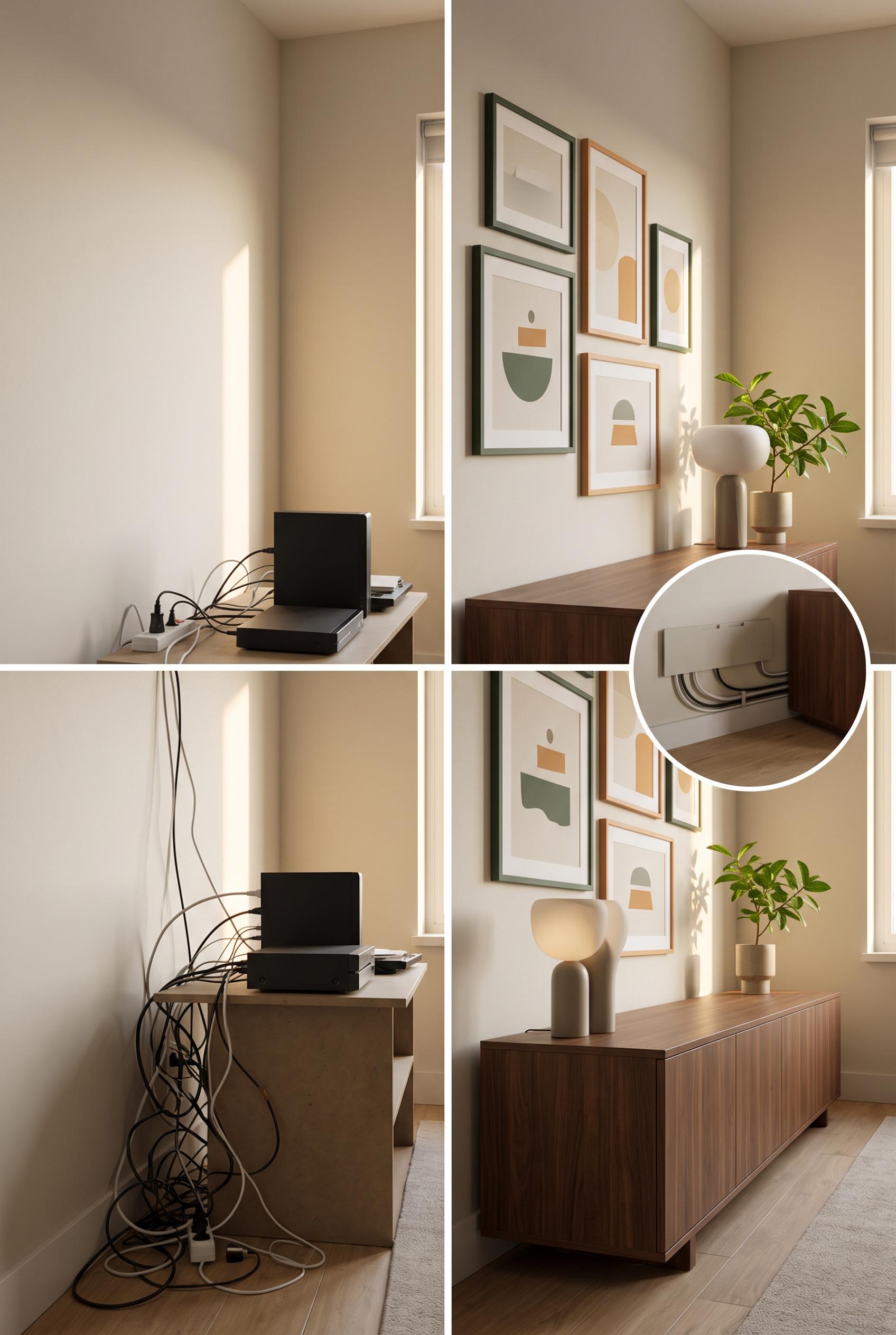
0Create a commercial-quality interior design editorial image in a vertical 2:3 Pinterest composition. Use a matched before-and-after split view of a compact living room media corner, with tangled cables and visual clutter on the left and a refined organized setup on the right. Add a small detail inset showing concealed cable routing behind low storage. Use mineral green, toasted apricot, warm white, and walnut. Photorealistic styling, natural window light, polished art direction, no real brands, no trademarked characters, no watermark, no unintended readable text, AI-modified downstream. Corrective regeneration attempt 2. Produce a materially revised image, not a near-duplicate of an earlier variant. Preserve the successful subject, palette, lighting, focal hierarchy, and commercial polish from the original brief while correcting every issue below. Mandatory corrective instructions from the most recent visual QA: Preserve the polished photorealistic editorial styling, vertical 2:3 layout, warm natural light, mineral green/toasted apricot/warm white/walnut palette, clean split composition, and circular cable-detail inset. Rebuild both halves as the exact same compact living-room media corner photographed from the identical fixed camera position and framing: left half should show the cluttered front-facing media wall with visible tangled cords, mismatched devices, and empty wall space; right half should show that same wall and perspective with low closed walnut storage, concealed cable routing, a tasteful framed art arrangement, exactly one sculptural lamp, and a small leafy plant. Keep the inset focused on the concealed cable solution. Remove any visual mismatch in room geometry or camera angle, and include no readable text, logos, brands, or watermark. Observed defects from prior variants that must not recur: 1) The before and after views are not matched from the same camera position; the left shows the back/side of a TV while the right shows a frontal media wall. 2) The after view lacks the requested sculptural lamp and small plant. 3) The after composition does not clearly correspond to the same compact living-room media corner, weakening the before/after comparison. Render no letters, words, numbers, prices, headings, labels, contact details, logos, glyphs, or pseudo-text anywhere. Use only blank surfaces, clean geometric marks, and non-linguistic placeholder shapes. Do not add explanatory captions, before/after labels, interface copy, or extra objects that the brief did not request. When a corrective instruction conflicts with a decorative detail, prioritize the corrective instruction.
 0
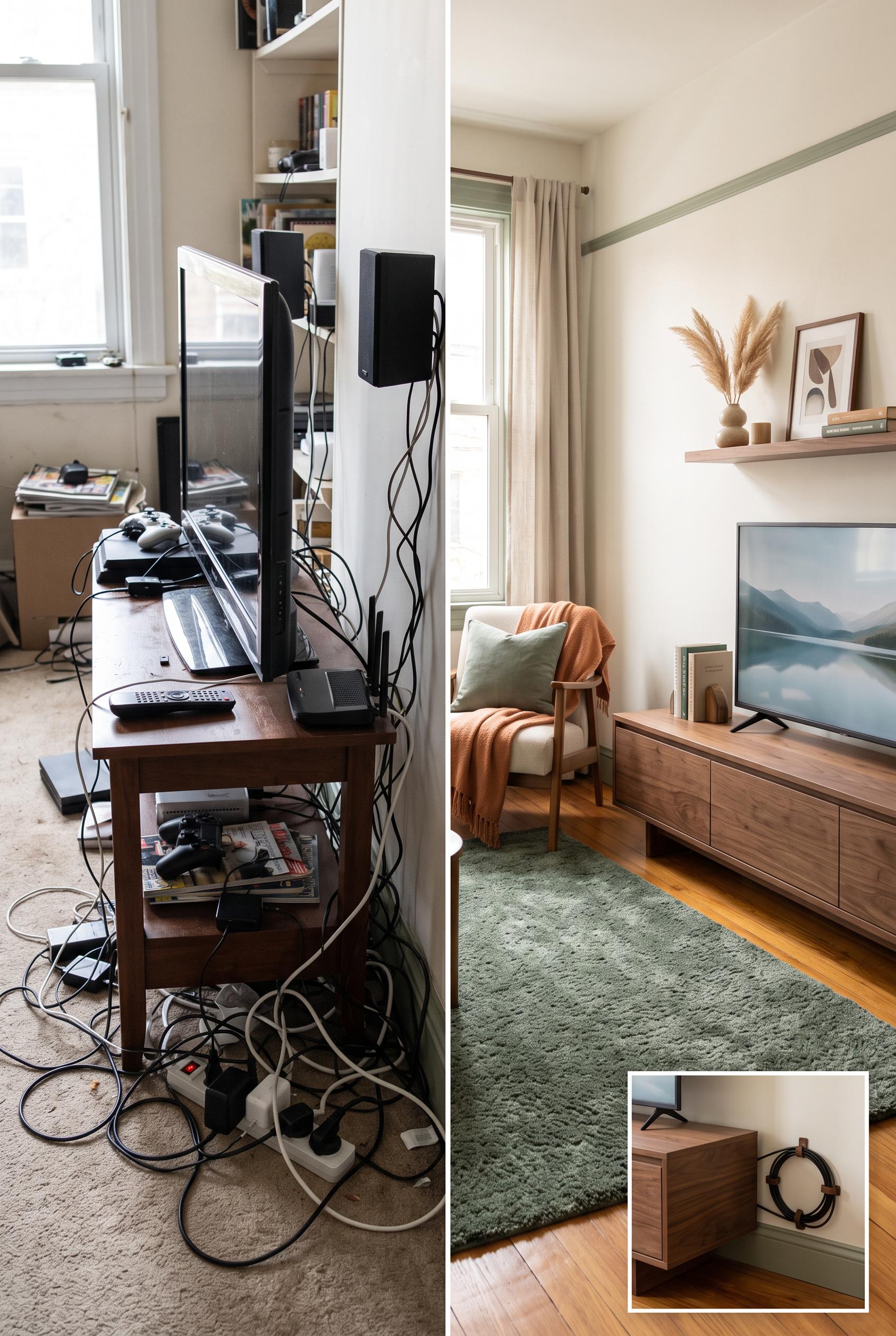
0Create a commercial-quality interior design editorial image in a vertical 2:3 Pinterest composition. Use a matched before-and-after split view of a compact living room media corner, with tangled cables and visual clutter on the left and a refined organized setup on the right. Add a small detail inset showing concealed cable routing behind low storage. Use mineral green, toasted apricot, warm white, and walnut. Photorealistic styling, natural window light, polished art direction, no real brands, no trademarked characters, no watermark, no unintended readable text, AI-modified downstream.
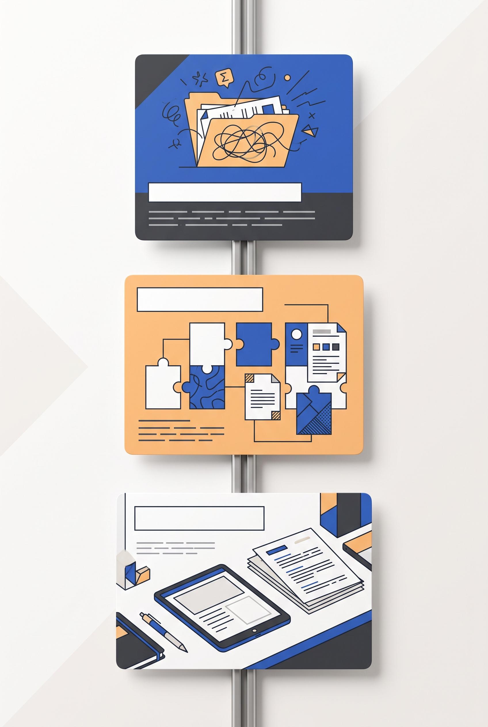 0
0Create a commercial-quality educational Pinterest graphic in a vertical 2:3 composition explaining a three-part campaign for an editable resume template kit. Arrange three magnetic cards climbing a slim vertical metal rail: audience problem represented by a tangled folder, flexible editing shown through modular page tiles, and finished confidence shown through a clean desk scene with tablet and printed pages. Palette: cobalt blue, apricot, charcoal, and porcelain. Use simple abstract diagrams, strong visual hierarchy, generous margins, and premium instructional art direction. AI-modified downstream. No real brands, no trademarked characters, no watermark, no unintended readable text; use blank cards, geometric symbols, and illegible placeholder lines only.
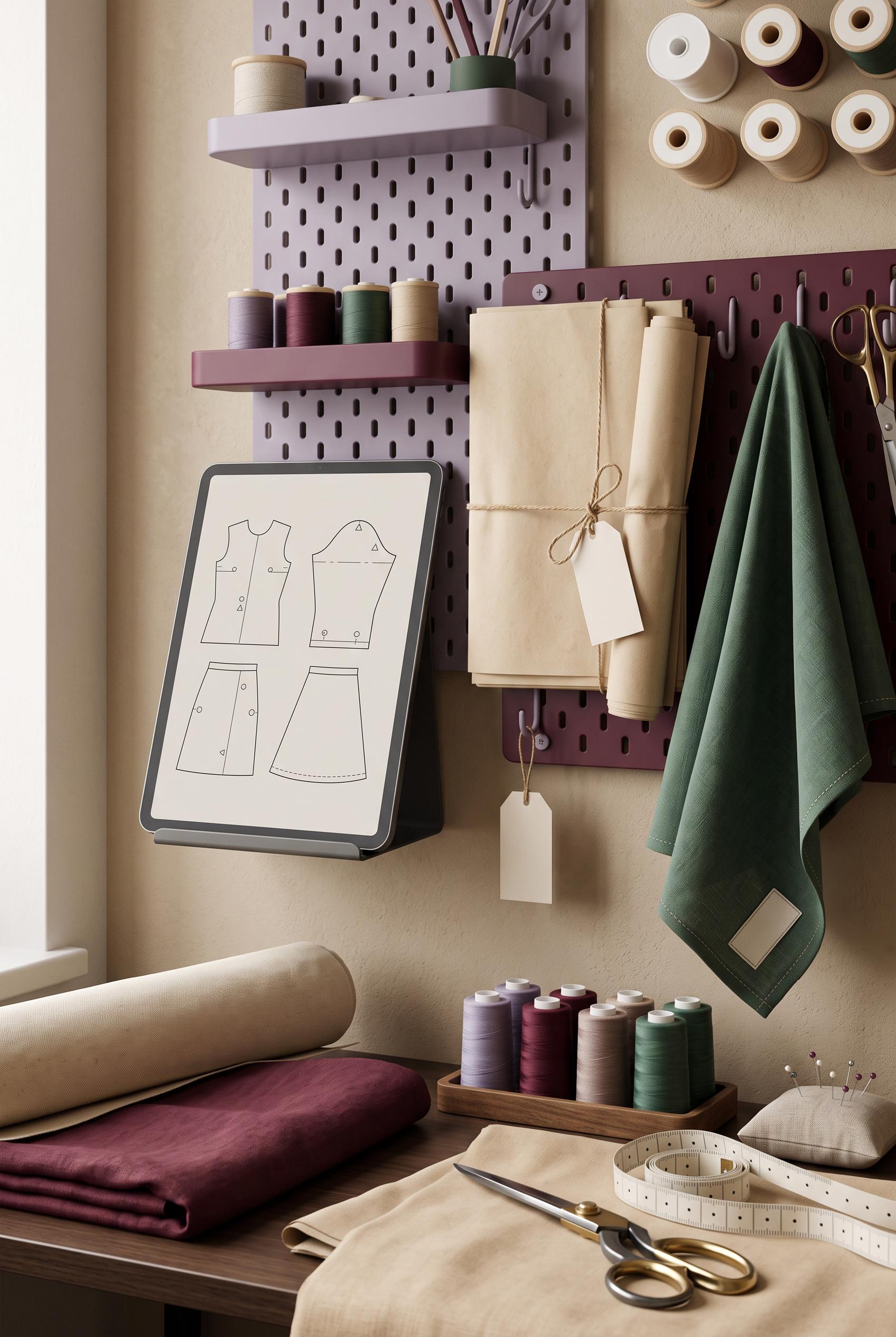 0
0Create a commercial-quality Pinterest product showcase in a vertical 2:3 composition for a digital sewing pattern bundle staged in a refined maker workroom. Use a sculptural pegboard display with coordinated blank pattern sheets, a tablet showing abstract garment diagrams, folded fabric, thread spools, scissors, and a measuring tape. Palette: muted lavender, deep wine, warm oat, and spruce green. Use elegant asymmetry, tactile materials, soft window light, and premium editorial styling. AI-modified downstream. No real brands, no trademarked characters, no watermark, no unintended readable text; all pages and screens must contain abstract shapes or illegible placeholder marks. Corrective regeneration attempt 2. Produce a materially revised image, not a near-duplicate of an earlier variant. Preserve the successful subject, palette, lighting, focal hierarchy, and commercial polish from the original brief while correcting every issue below. Mandatory corrective instructions from the most recent visual QA: Preserve the current premium vertical workroom composition, sculptural lavender and deep-wine pegboards, tablet garment diagrams, pattern sheets, folded fabrics, thread spools, scissors, measuring tape, soft window light, and editorial styling. Remove every visible handwritten mark, word, label, or text-like writing from the fabric tag, small paper tag, pattern sheets, tablet, and all background surfaces; replace them with completely blank surfaces or purely abstract non-readable marks. Keep all objects natural, sharp, and free of artifacts, brands, logos, and watermarks. Observed defects from prior variants that must not recur: 1) Strong vertical composition, focal point, styling, palette, and concept execution. 2) Visible handwritten/readable-looking marks appear on the fabric tag and small paper tag, violating the no unintended readable text requirement. Render no letters, words, numbers, prices, headings, labels, contact details, logos, glyphs, or pseudo-text anywhere. Use only blank surfaces, clean geometric marks, and non-linguistic placeholder shapes. Do not add explanatory captions, before/after labels, interface copy, or extra objects that the brief did not request. When a corrective instruction conflicts with a decorative detail, prioritize the corrective instruction.
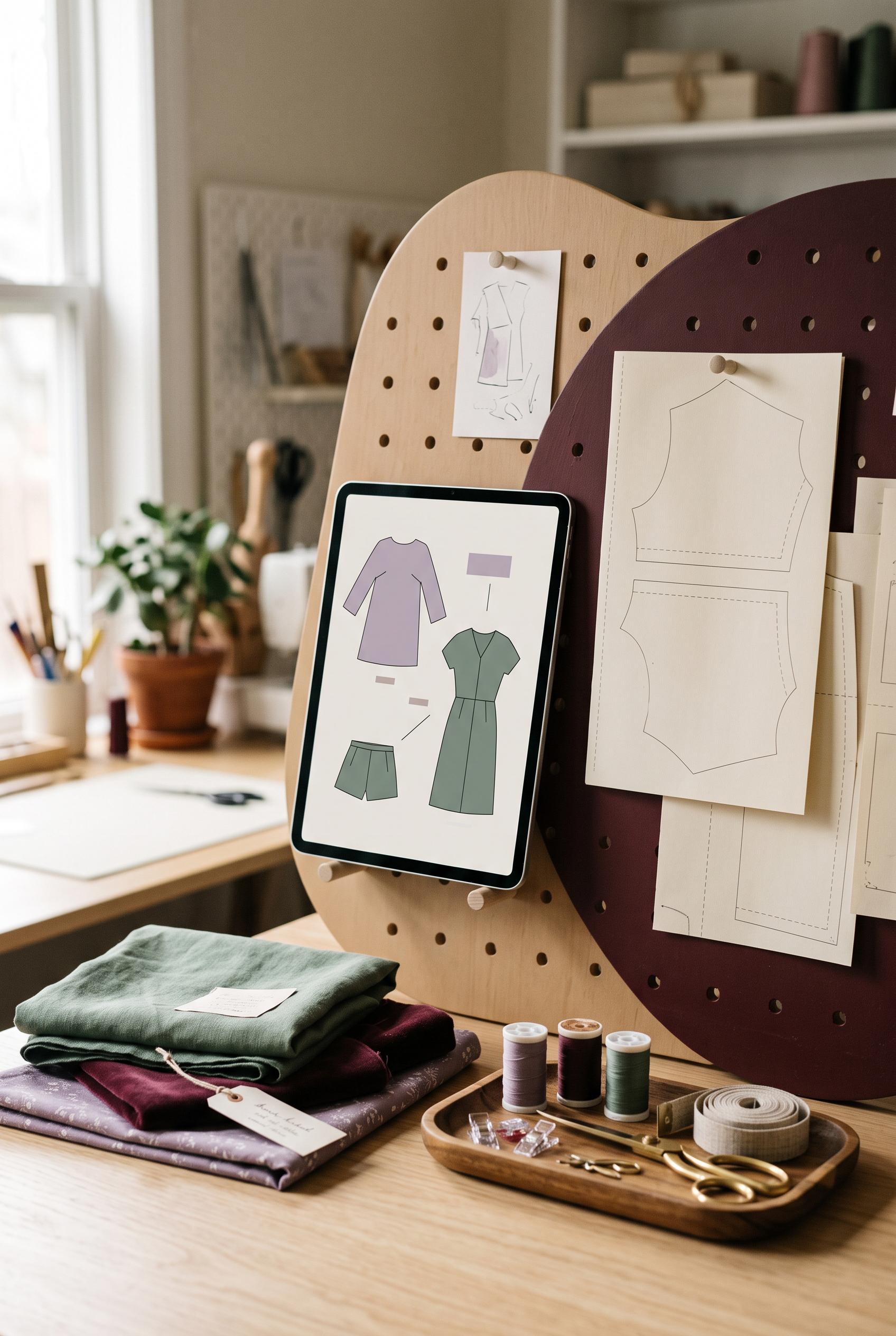 0
0Create a commercial-quality Pinterest product showcase in a vertical 2:3 composition for a digital sewing pattern bundle staged in a refined maker workroom. Use a sculptural pegboard display with coordinated blank pattern sheets, a tablet showing abstract garment diagrams, folded fabric, thread spools, scissors, and a measuring tape. Palette: muted lavender, deep wine, warm oat, and spruce green. Use elegant asymmetry, tactile materials, soft window light, and premium editorial styling. AI-modified downstream. No real brands, no trademarked characters, no watermark, no unintended readable text; all pages and screens must contain abstract shapes or illegible placeholder marks.
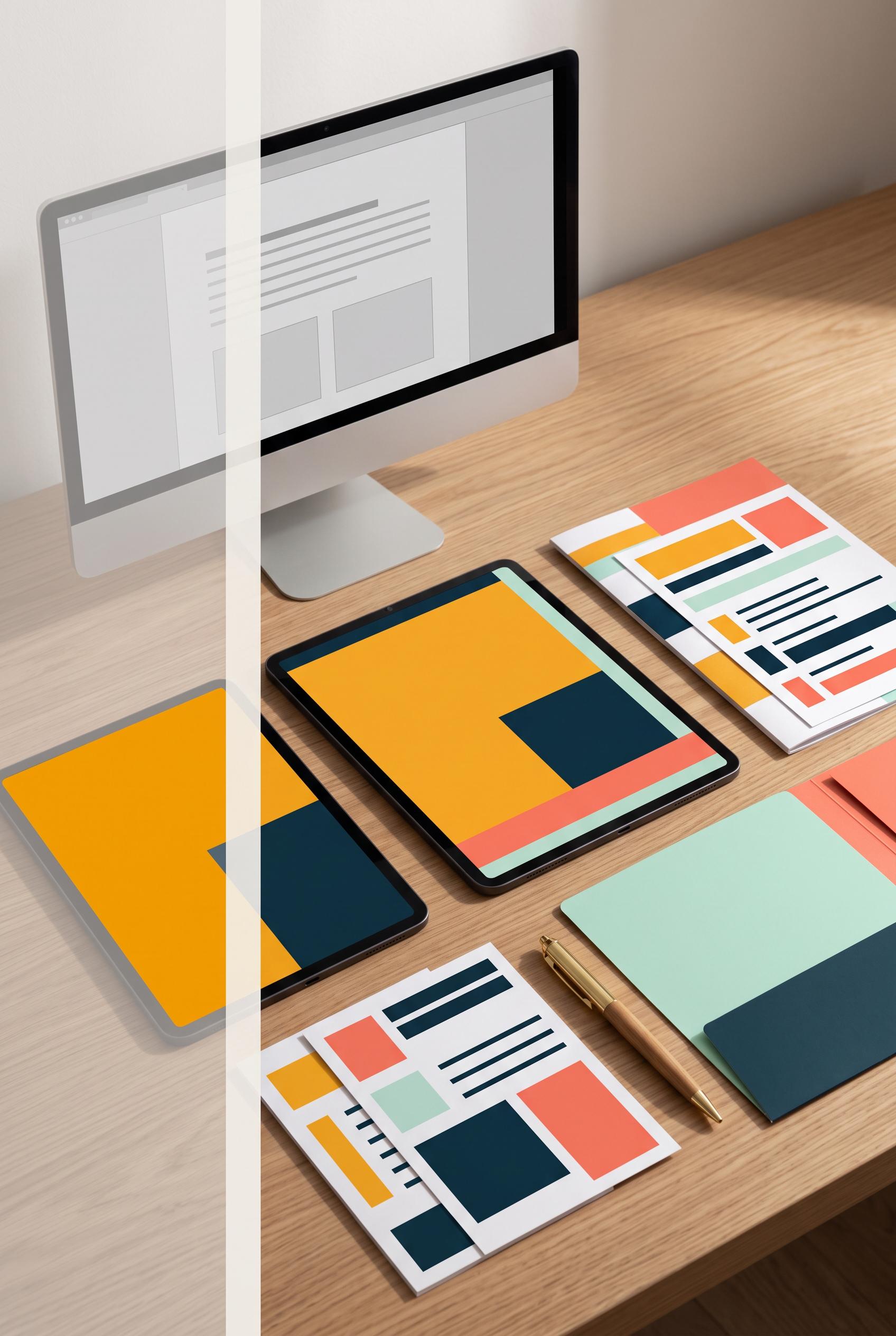 0
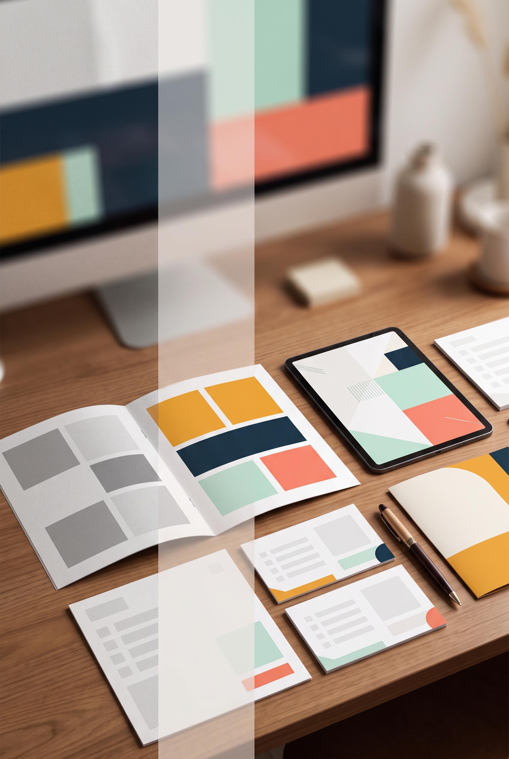
0Create a commercial-quality Pinterest creative in a vertical 2:3 composition showing a before-and-after transformation for an editable freelancer client onboarding packet. Use a translucent overlapping panel reveal: a sparse gray file preview recedes behind a polished saffron, deep ink, mint, and coral desk setup with tablet, printed packet, checklist cards, folder, and pen. Keep the transformation instantly legible through material contrast and organized spacing. Editorial product photography, soft directional light, crisp paper textures, premium Etsy listing art direction. AI-modified downstream. No real brands, no trademarked characters, no watermark, no unintended readable text; use abstract lines and blank placeholder blocks only. Corrective regeneration attempt 5. Produce a materially revised image, not a near-duplicate of an earlier variant. Preserve the successful subject, palette, lighting, focal hierarchy, and commercial polish from the original brief while correcting every issue below. Mandatory corrective instructions from the most recent visual QA: Preserve the vertical 2:3 editorial desk scene, saffron/deep-ink/mint/coral palette, tablet, printed packet, checklist cards, folder, pen, wood desk, soft directional light, and premium commercial photography. Remove every line grouping, checkbox, glyph, UI mark, and pseudo-text element from the tablet, monitor, packet, checklist cards, folder, and all paper surfaces. Replace all such details with blank surfaces and a few large, sparse, clearly non-linguistic geometric color blocks only; no letters, words, numbers, labels, icons, logos, or readable marks anywhere. Make the translucent overlap reveal narrow, light, and subtle so it preserves the overlap effect without obscuring the objects. Reduce the background monitor’s size and visual dominance, keeping it as a receding sparse gray abstract preview. Keep the refined physical kit as the clear focal point, with no captions, labels, watermark, or extra objects. Observed defects from prior variants that must not recur: 1) The translucent reveal band is visually heavy and partially obscures the composition. 2) Attractive vertical composition with clear desk transformation, requested objects, palette, and lighting. 3) Many papers and tablet areas contain pseudo-text lines, checkbox-like marks, and UI-like symbols, violating the explicit no-pseudo-text requirement. 4) The translucent reveal remains somewhat broad and visually dominant. 5) Attractive vertical composition, palette, lighting, and desk setup are strong. 6) Multiple paper and tablet surfaces contain pseudo-text lines, checkbox-like marks, and UI-like elements, explicitly prohibited. 7) The translucent vertical reveal is still broad and visually dominant, obscuring the desk arrangement. 8) The background monitor is oversized and competes with the intended onboarding-kit focal point. Render no letters, words, numbers, prices, headings, labels, contact details, logos, glyphs, or pseudo-text anywhere. Use only blank surfaces, clean geometric marks, and non-linguistic placeholder shapes. Do not add explanatory captions, before/after labels, interface copy, or extra objects that the brief did not request. When a corrective instruction conflicts with a decorative detail, prioritize the corrective instruction.
 0
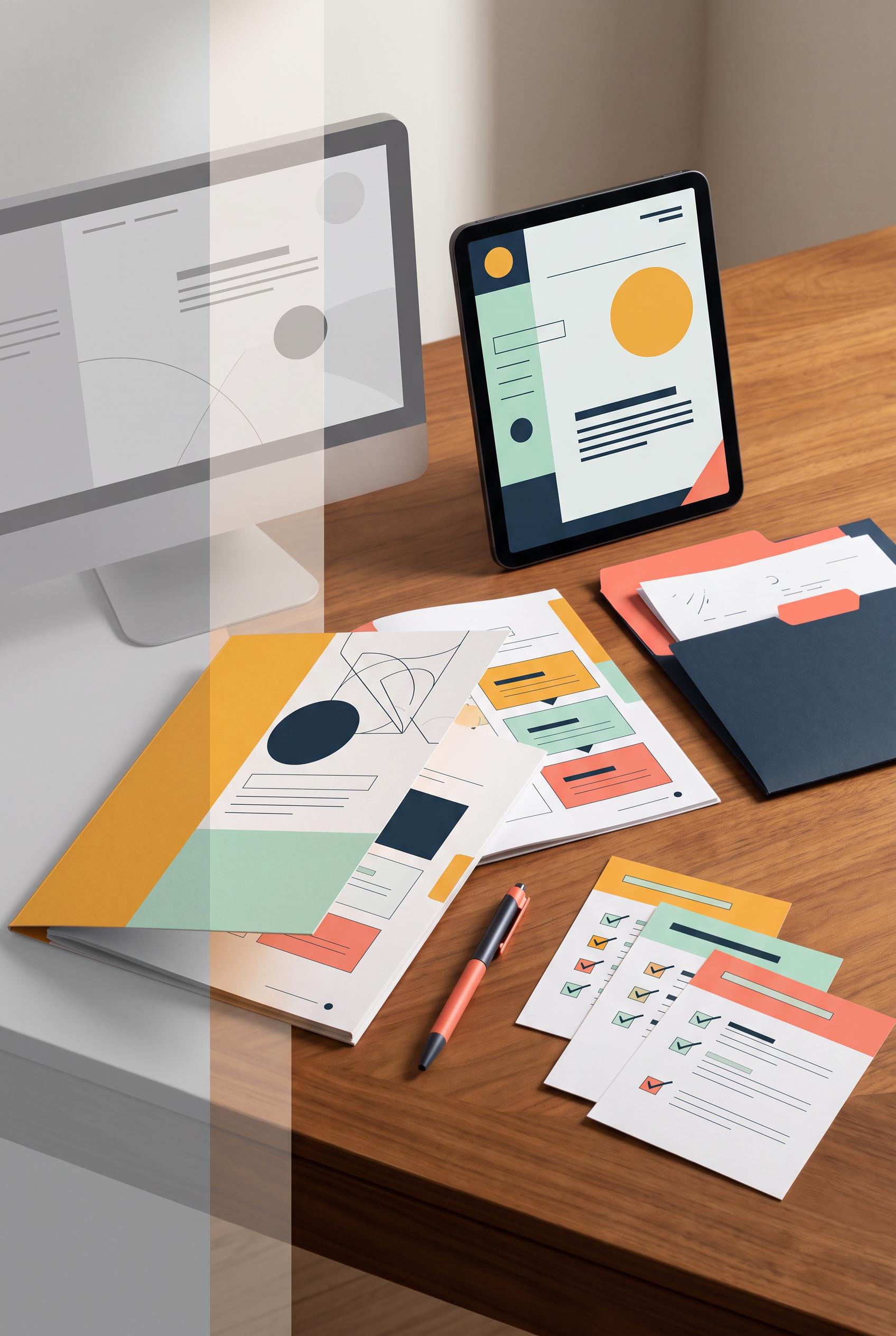
0Create a commercial-quality Pinterest creative in a vertical 2:3 composition showing a before-and-after transformation for an editable freelancer client onboarding packet. Use a translucent overlapping panel reveal: a sparse gray file preview recedes behind a polished saffron, deep ink, mint, and coral desk setup with tablet, printed packet, checklist cards, folder, and pen. Keep the transformation instantly legible through material contrast and organized spacing. Editorial product photography, soft directional light, crisp paper textures, premium Etsy listing art direction. AI-modified downstream. No real brands, no trademarked characters, no watermark, no unintended readable text; use abstract lines and blank placeholder blocks only. Corrective regeneration attempt 4. Produce a materially revised image, not a near-duplicate of an earlier variant. Preserve the successful subject, palette, lighting, focal hierarchy, and commercial polish from the original brief while correcting every issue below. Mandatory corrective instructions from the most recent visual QA: Preserve the attractive vertical 2:3 desk composition, tablet, printed packet, checklist cards, folder, pen, wood desk, saffron/deep-ink/mint/coral palette, soft light, and premium editorial photography. Remove every line grouping that resembles writing, UI, checkboxes, glyphs, or interface marks from the tablet, monitor, packet, checklist cards, folder, and all paper surfaces. Replace them only with large, sparse, clearly non-linguistic geometric color blocks and blank surfaces; no letters, words, numbers, labels, logos, icons, checkmarks, or pseudo-text anywhere. Keep the transformation legible through material contrast and organization. Make the translucent overlap reveal lighter, narrower, and less obscuring while retaining the overlap effect. Do not add captions, labels, watermarks, or extra objects. Observed defects from prior variants that must not recur: 1) Strong vertical composition and clear before/after transformation with the requested desk objects and color palette. 2) The refined packet contains clearly readable text such as “Onboarding Packet,” “Welcome,” “Process,” and “Agreements,” and the bottom includes readable “AFTER,” violating the no-un 3) Prominent readable “Welcome” text appears on the tablet, violating the requirement for no readable text. 4) The tablet also contains small UI-like marks that could read as interface symbols or pseudo-text. 5) The translucent reveal band is visually heavy and partially obscures the composition. 6) Attractive vertical composition with clear desk transformation, requested objects, palette, and lighting. 7) Many papers and tablet areas contain pseudo-text lines, checkbox-like marks, and UI-like symbols, violating the explicit no-pseudo-text requirement. 8) The translucent reveal remains somewhat broad and visually dominant. Render no letters, words, numbers, prices, headings, labels, contact details, logos, glyphs, or pseudo-text anywhere. Use only blank surfaces, clean geometric marks, and non-linguistic placeholder shapes. Do not add explanatory captions, before/after labels, interface copy, or extra objects that the brief did not request. When a corrective instruction conflicts with a decorative detail, prioritize the corrective instruction.
 0
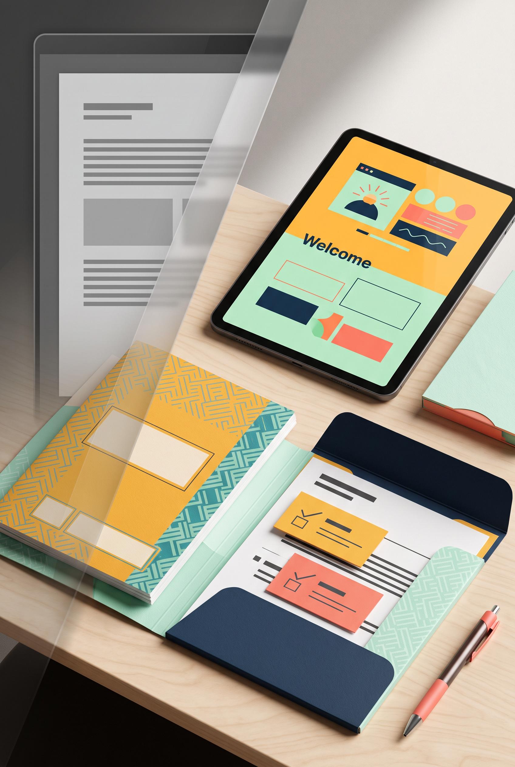
0Create a commercial-quality Pinterest creative in a vertical 2:3 composition showing a before-and-after transformation for an editable freelancer client onboarding packet. Use a translucent overlapping panel reveal: a sparse gray file preview recedes behind a polished saffron, deep ink, mint, and coral desk setup with tablet, printed packet, checklist cards, folder, and pen. Keep the transformation instantly legible through material contrast and organized spacing. Editorial product photography, soft directional light, crisp paper textures, premium Etsy listing art direction. AI-modified downstream. No real brands, no trademarked characters, no watermark, no unintended readable text; use abstract lines and blank placeholder blocks only. Corrective regeneration attempt 3. Produce a materially revised image, not a near-duplicate of an earlier variant. Preserve the successful subject, palette, lighting, focal hierarchy, and commercial polish from the original brief while correcting every issue below. Mandatory corrective instructions from the most recent visual QA: Preserve the attractive vertical 2:3 desk composition, tablet, printed packet, checklist cards, folder, pen, saffron/deep-ink/mint/coral palette, wood desk, soft light, and crisp editorial product photography. Remove every letter, word, number, label, logo, glyph, and pseudo-text mark, especially the readable “Welcome” on the tablet. Replace all tablet content, paper content, checklist areas, and folder details with blank surfaces, abstract geometric blocks, clean lines, and non-linguistic shapes only. Keep the overlapping reveal translucent but make it lighter and narrower so it supports the transformation without obscuring the objects. Do not add captions, labels, brands, watermarks, or extra objects. Observed defects from prior variants that must not recur: 1) Strong vertical composition and clear before/after transformation with the requested desk objects and color palette. 2) The refined packet contains clearly readable text such as “Onboarding Packet,” “Welcome,” “Process,” and “Agreements,” and the bottom includes readable “AFTER,” violating the no-un 3) Prominent readable “Welcome” text appears on the tablet, violating the requirement for no readable text. 4) The tablet also contains small UI-like marks that could read as interface symbols or pseudo-text. 5) The translucent reveal band is visually heavy and partially obscures the composition. Render no letters, words, numbers, prices, headings, labels, contact details, logos, glyphs, or pseudo-text anywhere. Use only blank surfaces, clean geometric marks, and non-linguistic placeholder shapes. Do not add explanatory captions, before/after labels, interface copy, or extra objects that the brief did not request. When a corrective instruction conflicts with a decorative detail, prioritize the corrective instruction.
 0
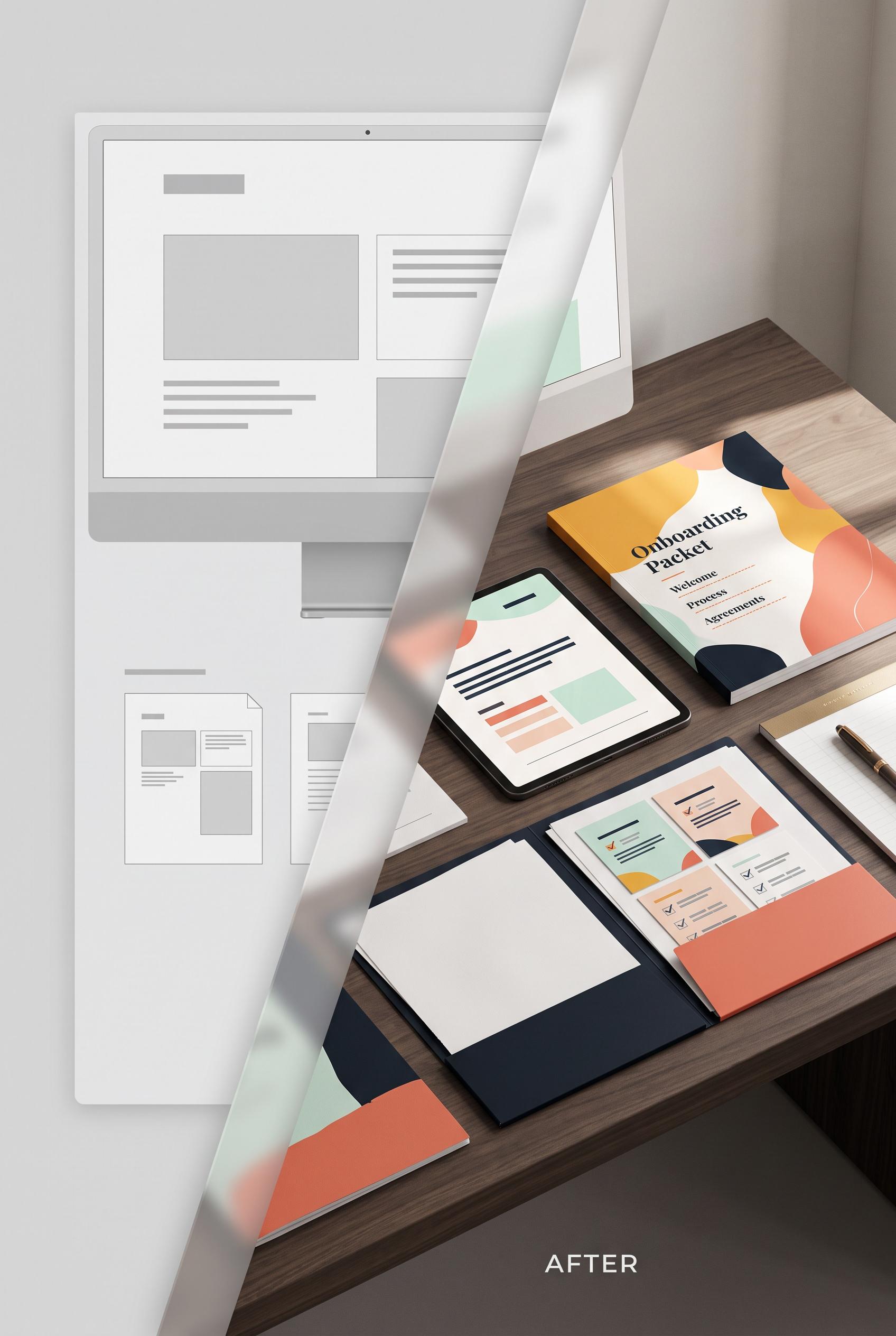
0Create a commercial-quality Pinterest creative in a vertical 2:3 composition showing a before-and-after transformation for an editable freelancer client onboarding packet. Use a translucent overlapping panel reveal: a sparse gray file preview recedes behind a polished saffron, deep ink, mint, and coral desk setup with tablet, printed packet, checklist cards, folder, and pen. Keep the transformation instantly legible through material contrast and organized spacing. Editorial product photography, soft directional light, crisp paper textures, premium Etsy listing art direction. AI-modified downstream. No real brands, no trademarked characters, no watermark, no unintended readable text; use abstract lines and blank placeholder blocks only. Corrective regeneration attempt 2. Produce a materially revised image, not a near-duplicate of an earlier variant. Preserve the successful subject, palette, lighting, focal hierarchy, and commercial polish from the original brief while correcting every issue below. Mandatory corrective instructions from the most recent visual QA: Regenerate the same polished vertical 2:3 overlapping-reveal composition, preserving the tablet, printed packet, checklist cards, folder, pen, saffron/deep-ink/mint/coral palette, wood desk, soft directional lighting, and crisp editorial product-photography quality. Remove all readable text everywhere, including the packet title, section words, checklist markings, and the bottom “AFTER” label. Replace every text area with abstract lines, blank blocks, and non-readable geometric placeholders. Keep the transformation legible through material contrast and organized spacing, with no logos, brands, trademarks, watermark, or garbled lettering. Observed defects from prior variants that must not recur: 1) Strong vertical composition and clear before/after transformation with the requested desk objects and color palette. 2) The refined packet contains clearly readable text such as “Onboarding Packet,” “Welcome,” “Process,” and “Agreements,” and the bottom includes readable “AFTER,” violating the no-un Render no letters, words, numbers, prices, headings, labels, contact details, logos, glyphs, or pseudo-text anywhere. Use only blank surfaces, clean geometric marks, and non-linguistic placeholder shapes. Do not add explanatory captions, before/after labels, interface copy, or extra objects that the brief did not request. When a corrective instruction conflicts with a decorative detail, prioritize the corrective instruction.
 0
0Create a commercial-quality Pinterest creative in a vertical 2:3 composition showing a before-and-after transformation for an editable freelancer client onboarding packet. Use a translucent overlapping panel reveal: a sparse gray file preview recedes behind a polished saffron, deep ink, mint, and coral desk setup with tablet, printed packet, checklist cards, folder, and pen. Keep the transformation instantly legible through material contrast and organized spacing. Editorial product photography, soft directional light, crisp paper textures, premium Etsy listing art direction. AI-modified downstream. No real brands, no trademarked characters, no watermark, no unintended readable text; use abstract lines and blank placeholder blocks only.
 0
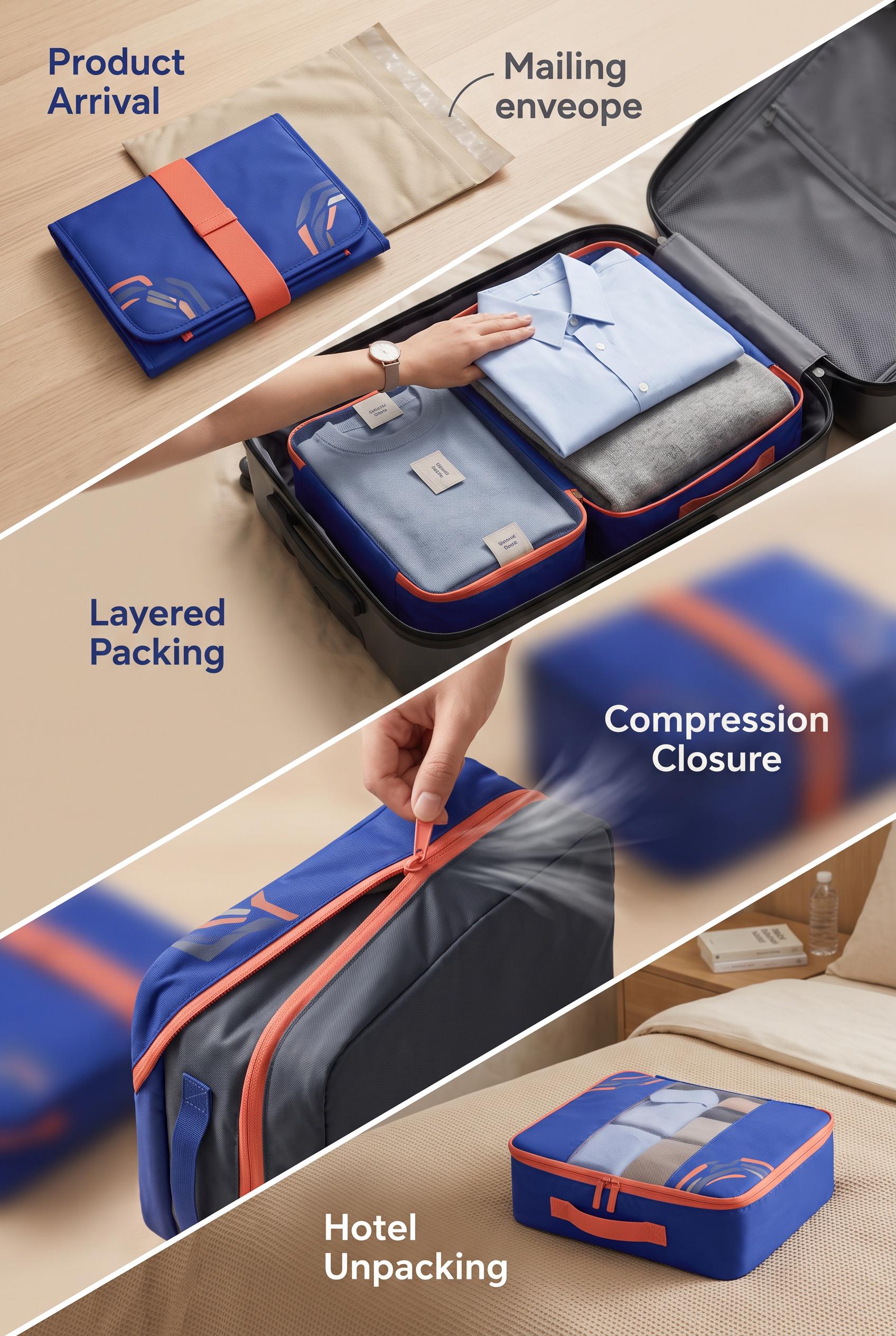
0Create a commercial-quality vertical 2:3 Pinterest campaign concept for a reusable luggage organizer. Show four connected proof stations along a diagonal path: folded product arrival, layered packing, compression closure, and organized hotel unpacking. Use ultramarine, coral, sand, and graphite, crisp overhead and close-up viewpoints, premium travel advertising art direction. No real brands, no trademarked characters, no watermark, and no unintended readable text. AI-modified downstream. Corrective regeneration attempt 4. Produce a materially revised image, not a near-duplicate of an earlier variant. Preserve the successful subject, palette, lighting, focal hierarchy, and commercial polish from the original brief while correcting every issue below. Mandatory corrective instructions from the most recent visual QA: Regenerate as a premium vertical 2:3 Pinterest composition using the same ultramarine, coral, sand, and graphite palette, crisp product photography, lighting, and central luggage organizer. Preserve four distinct stations along one continuous, clearly visible diagonal travel path: folded arrival, layered packing, compression zipper closure, and tidy hotel unpacking. Remove every letter, word, number, label, heading, logo, glyph, pseudo-text mark, garment tag mark, and watermark. Replace all stage titles and decorative symbols with only four clean abstract nonverbal icons: folded parcel, layered clothing, compression zipper, and tidy hotel unpacking. Integrate the stations into one journey rather than separated panels, keep surfaces blank and uncluttered, and eliminate unrelated objects or generation artifacts. Observed defects from prior variants that must not recur: 1) Small garment tags contain pseudo-readable/garbled text. 2) The four scenes are separated into panels rather than connected by a clearly visible travel path. 3) Prominent readable stage labels remain, violating the no-text requirement. 4) The composition includes extra decorative iconography that is not fully aligned with the requested four simple nonverbal proof icons. 5) The central diagonal path is visible, but the stations still read somewhat like separated panels rather than one fully integrated continuous journey. 6) Prominent readable stage labels violate the no-text requirement. 7) The composition reads as separated diagonal panels rather than one continuous connected travel path. 8) Extra iconography and text compete with the product story. Render no letters, words, numbers, prices, headings, labels, contact details, logos, glyphs, or pseudo-text anywhere. Use only blank surfaces, clean geometric marks, and non-linguistic placeholder shapes. Do not add explanatory captions, before/after labels, interface copy, or extra objects that the brief did not request. When a corrective instruction conflicts with a decorative detail, prioritize the corrective instruction.
 0
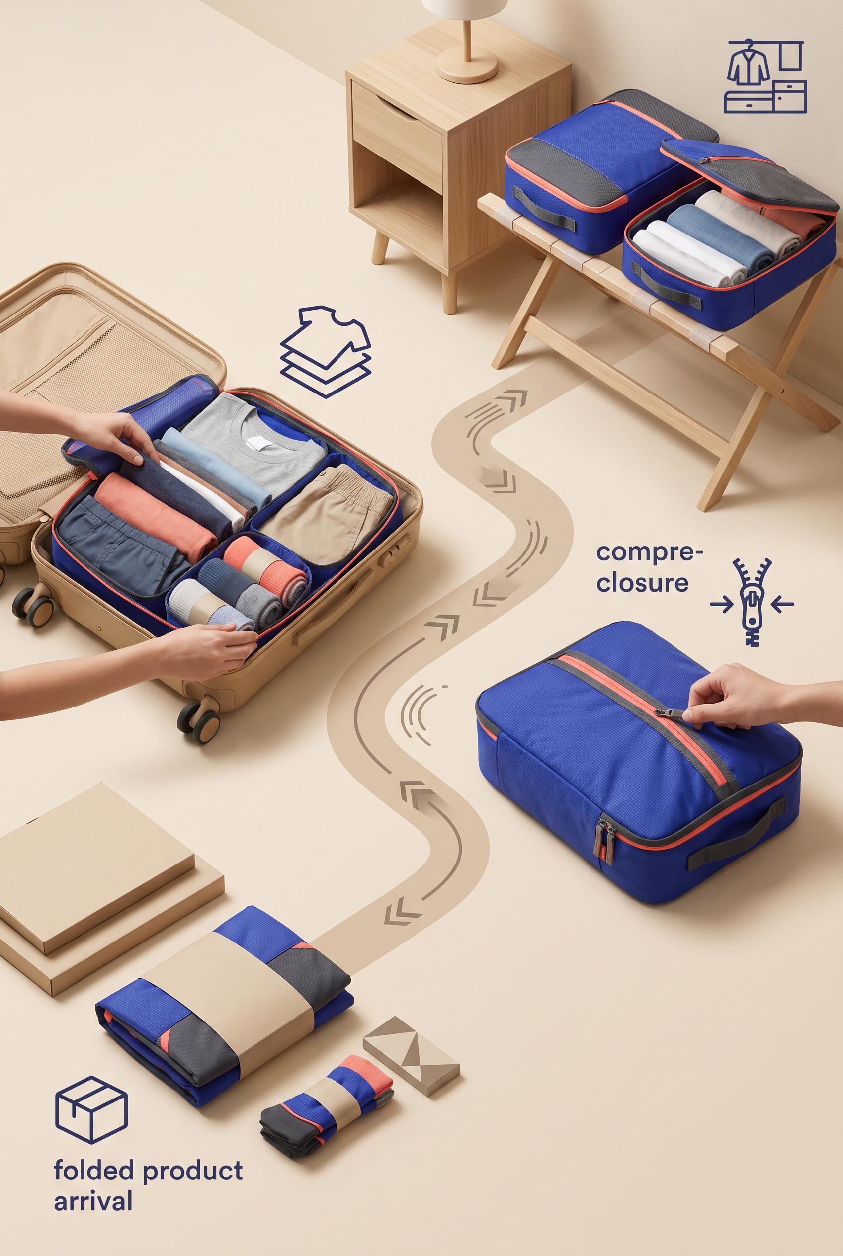
0Create a commercial-quality vertical 2:3 Pinterest campaign concept for a reusable luggage organizer. Show four connected proof stations along a diagonal path: folded product arrival, layered packing, compression closure, and organized hotel unpacking. Use ultramarine, coral, sand, and graphite, crisp overhead and close-up viewpoints, premium travel advertising art direction. No real brands, no trademarked characters, no watermark, and no unintended readable text. AI-modified downstream. Corrective regeneration attempt 3. Produce a materially revised image, not a near-duplicate of an earlier variant. Preserve the successful subject, palette, lighting, focal hierarchy, and commercial polish from the original brief while correcting every issue below. Mandatory corrective instructions from the most recent visual QA: Regenerate the same premium vertical 2:3 composition with the ultramarine, coral, sand, and graphite palette, central organizer, crisp product photography, and four-stage diagonal progression. Remove every readable word, letter, number, label, garment tag mark, packaging mark, logo, glyph, and pseudo-text shape, especially the bottom-left arrival text and right-side compression text. Replace all stage titles with only clean abstract icons: a folded parcel, layered clothing, a compression zipper, and tidy hotel unpacking. Retain one continuous, clearly visible diagonal travel path that physically connects all four distinct stations, avoiding a segmented panel layout. Remove unrelated wardrobe or decorative symbols, preserve blank clean surfaces, and ensure there are no watermarks or generation artifacts. Observed defects from prior variants that must not recur: 1) Strong vertical composition and clear diagonal four-stage story, but it uses prominent readable labels despite the brief requesting simple icon shapes instead of readable text. 2) Small garment tags contain pseudo-readable/garbled text. 3) The four scenes are separated into panels rather than connected by a clearly visible travel path. 4) Prominent readable stage labels remain, violating the no-text requirement. 5) The composition includes extra decorative iconography that is not fully aligned with the requested four simple nonverbal proof icons. 6) The central diagonal path is visible, but the stations still read somewhat like separated panels rather than one fully integrated continuous journey. Render no letters, words, numbers, prices, headings, labels, contact details, logos, glyphs, or pseudo-text anywhere. Use only blank surfaces, clean geometric marks, and non-linguistic placeholder shapes. Do not add explanatory captions, before/after labels, interface copy, or extra objects that the brief did not request. When a corrective instruction conflicts with a decorative detail, prioritize the corrective instruction.
 0
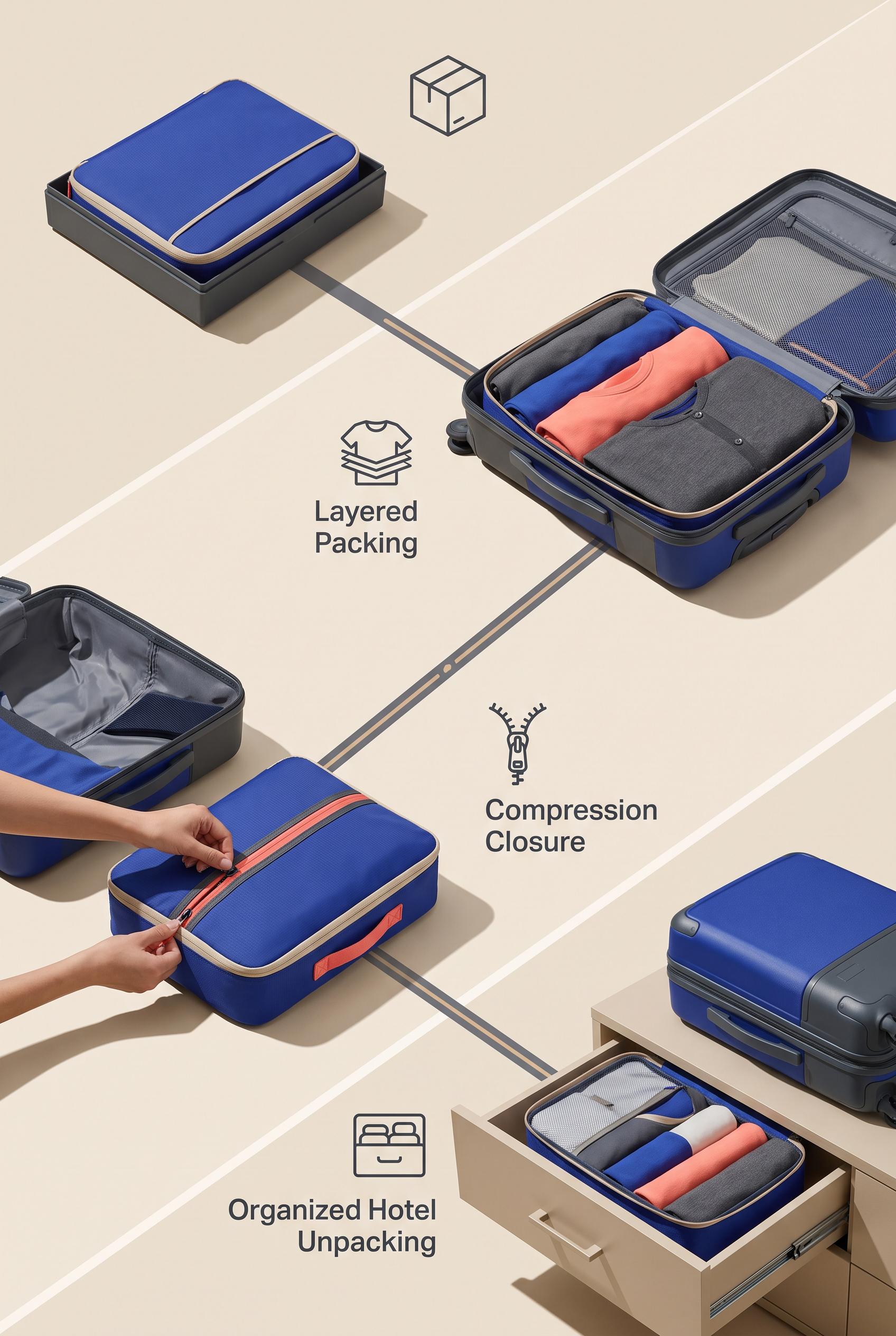
0Create a commercial-quality vertical 2:3 Pinterest campaign concept for a reusable luggage organizer. Show four connected proof stations along a diagonal path: folded product arrival, layered packing, compression closure, and organized hotel unpacking. Use ultramarine, coral, sand, and graphite, crisp overhead and close-up viewpoints, premium travel advertising art direction. No real brands, no trademarked characters, no watermark, and no unintended readable text. AI-modified downstream. Corrective regeneration attempt 2. Produce a materially revised image, not a near-duplicate of an earlier variant. Preserve the successful subject, palette, lighting, focal hierarchy, and commercial polish from the original brief while correcting every issue below. Mandatory corrective instructions from the most recent visual QA: Preserve the premium vertical 2:3 layout, ultramarine/coral/sand/graphite palette, central organizer, crisp product photography, and diagonal four-stage progression. Remove every word, letter, number, label, and pseudo-text mark, including all garment tags and packaging marks. Replace the large stage titles with simple nonverbal icon shapes only: folded parcel, layered clothing, compression zipper/closure, and tidy hotel unpacking. Make the four scenes feel connected by one continuous, clearly visible diagonal travel path while retaining distinct stations. Keep all logos and decorative marks abstract and non-branded, with no watermark or readable text. Observed defects from prior variants that must not recur: 1) Strong vertical composition and clear diagonal four-stage story, but it uses prominent readable labels despite the brief requesting simple icon shapes instead of readable text. 2) Small garment tags contain pseudo-readable/garbled text. 3) The four scenes are separated into panels rather than connected by a clearly visible travel path. Render no letters, words, numbers, prices, headings, labels, contact details, logos, glyphs, or pseudo-text anywhere. Use only blank surfaces, clean geometric marks, and non-linguistic placeholder shapes. Do not add explanatory captions, before/after labels, interface copy, or extra objects that the brief did not request. When a corrective instruction conflicts with a decorative detail, prioritize the corrective instruction.
 0
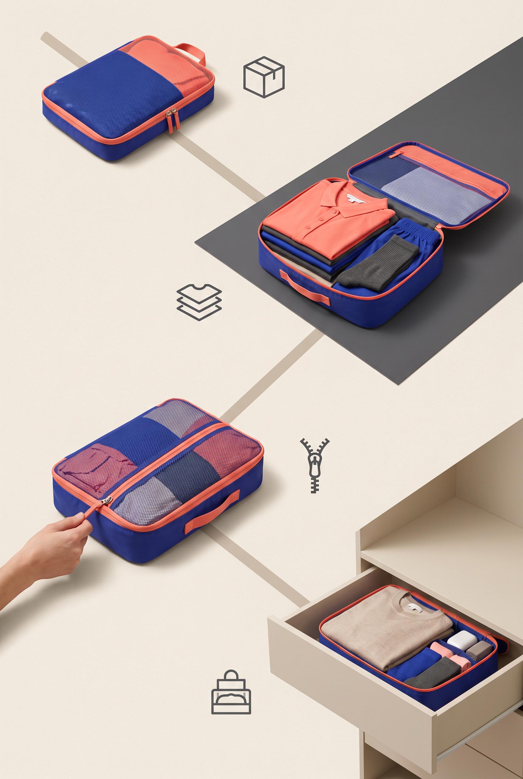
0Create a commercial-quality vertical 2:3 Pinterest campaign concept for a reusable luggage organizer. Show four connected proof stations along a diagonal path: folded product arrival, layered packing, compression closure, and organized hotel unpacking. Use ultramarine, coral, sand, and graphite, crisp overhead and close-up viewpoints, premium travel advertising art direction. No real brands, no trademarked characters, no watermark, and no unintended readable text. AI-modified downstream.
 0
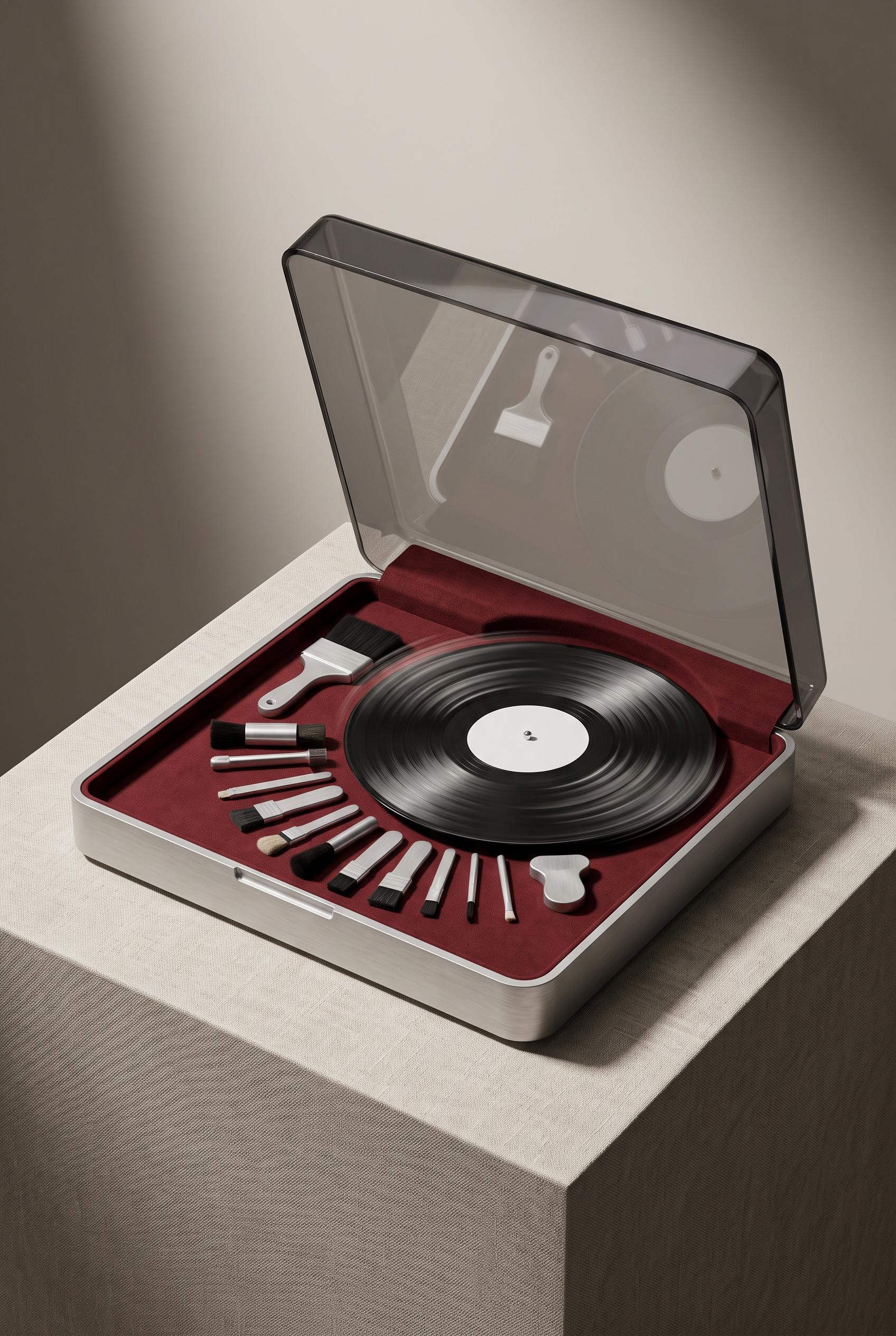
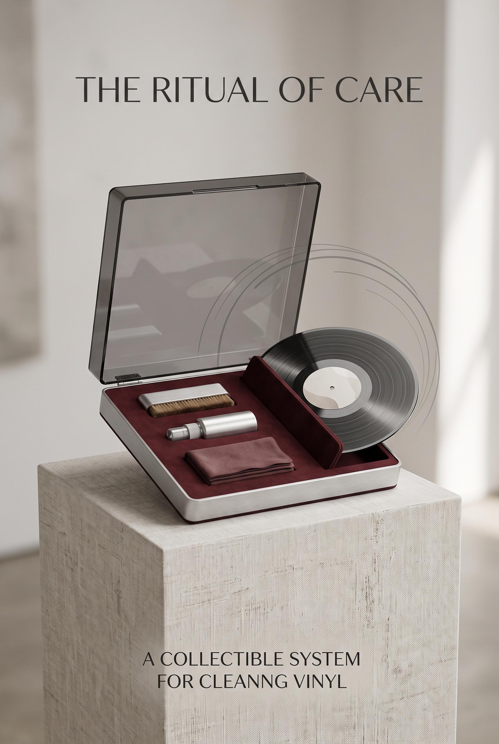
0Create a commercial-quality vertical 2:3 Pinterest showcase of a compact record-cleaning case displayed as a collectible listening ritual. Use a museum-like linen pedestal, smoked-clear lid, oxblood fabric lining, brushed aluminum tools, and a vinyl record with an abstract blank center. Add restrained circular motion trails and directional light, editorial product photography, elegant negative space. No real brands, no trademarked characters, no watermark, and no unintended readable text. AI-modified downstream. Corrective regeneration attempt 2. Produce a materially revised image, not a near-duplicate of an earlier variant. Preserve the successful subject, palette, lighting, focal hierarchy, and commercial polish from the original brief while correcting every issue below. Mandatory corrective instructions from the most recent visual QA: Preserve the elegant vertical 2:3 editorial product-photography composition, linen pedestal, smoked-clear open lid, oxblood lining, brushed aluminum tools, blank-center vinyl record, directional light, and restrained circular motion trails. Remove all text and lettering completely, including the top headline and bottom copy. Rearrange the cleaning tools into a clear deliberate crescent inside the open case. Seat the record naturally and securely in the case without awkward floating or obscuring the tools. Keep all surfaces clean, realistic, brand-free, watermark-free, and free of artifacts or readable marks. Observed defects from prior variants that must not recur: 1) Large readable headline and bottom copy violate the no-readable-text requirement. 2) Tools are arranged in mostly straight rows rather than a deliberate crescent. 3) The record appears awkwardly perched and partially obscures the case interior. Render no letters, words, numbers, prices, headings, labels, contact details, logos, glyphs, or pseudo-text anywhere. Use only blank surfaces, clean geometric marks, and non-linguistic placeholder shapes. Do not add explanatory captions, before/after labels, interface copy, or extra objects that the brief did not request. When a corrective instruction conflicts with a decorative detail, prioritize the corrective instruction.
 0
0Create a commercial-quality vertical 2:3 Pinterest showcase of a compact record-cleaning case displayed as a collectible listening ritual. Use a museum-like linen pedestal, smoked-clear lid, oxblood fabric lining, brushed aluminum tools, and a vinyl record with an abstract blank center. Add restrained circular motion trails and directional light, editorial product photography, elegant negative space. No real brands, no trademarked characters, no watermark, and no unintended readable text. AI-modified downstream.
 0
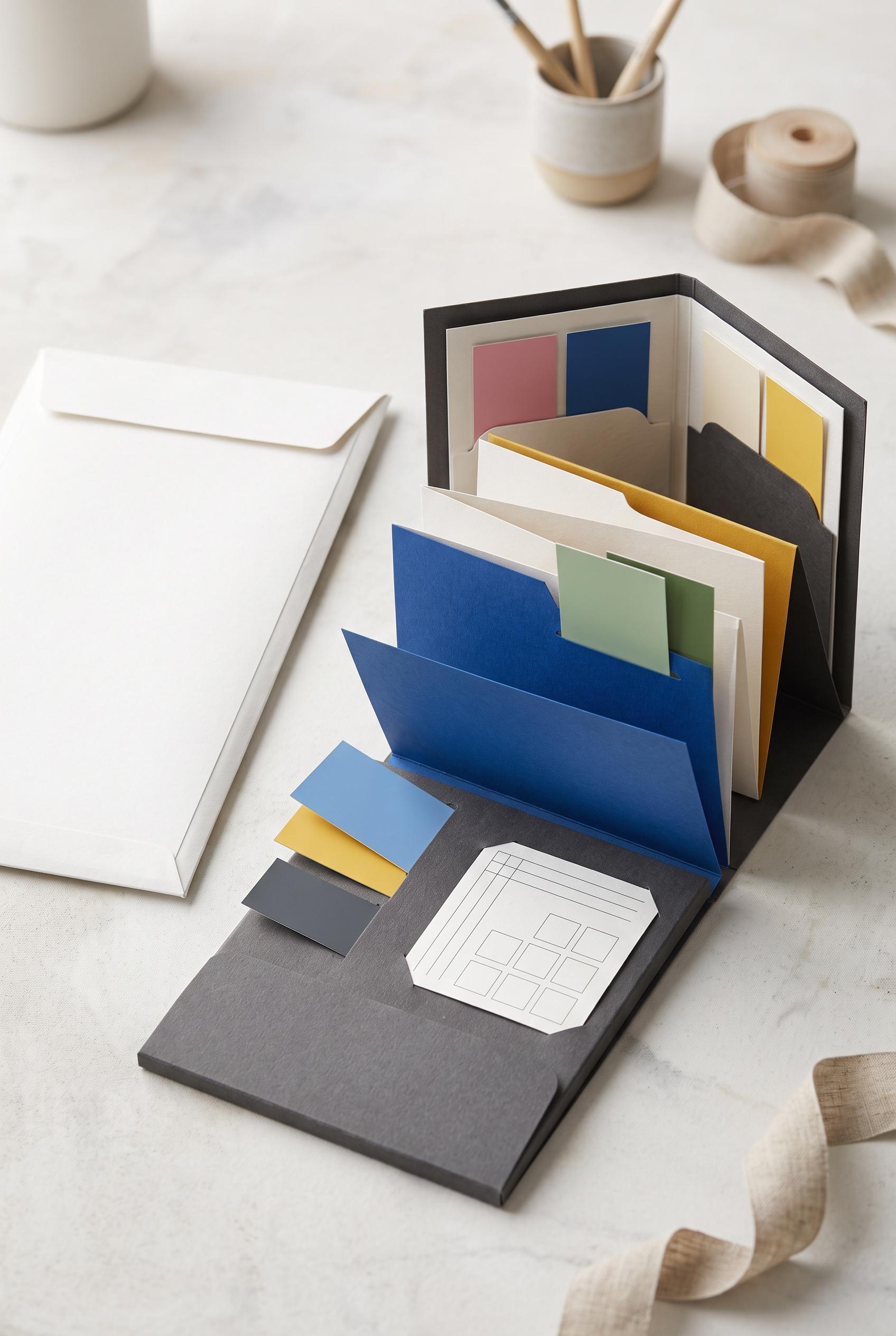
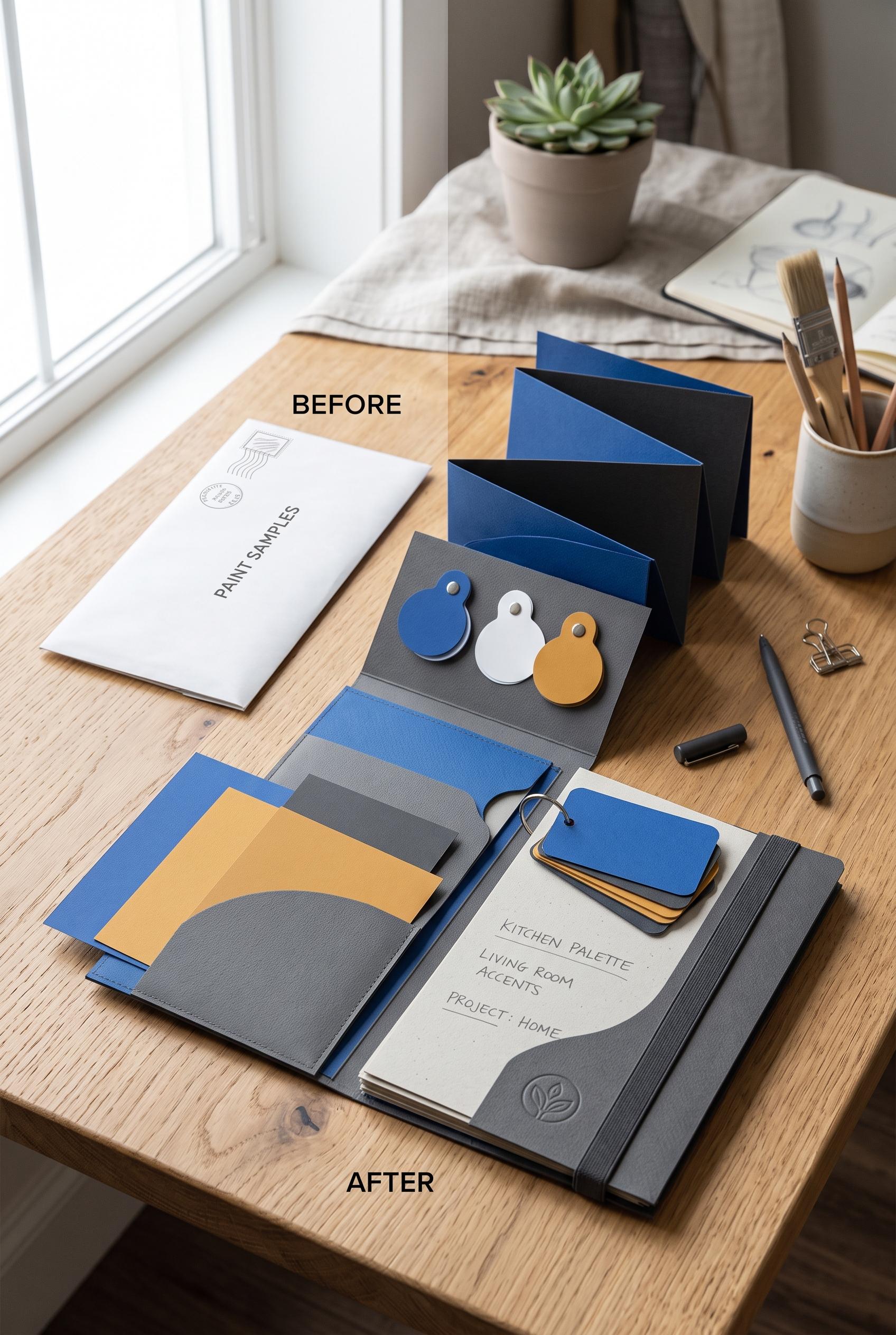
0Create a commercial-quality vertical 2:3 Pinterest composition showing a before-and-after transformation of a blank paint sample mailer into a refined refillable color-planning folio. Use an accordion reveal, tactile paper inserts, removable color swatches, and a bright studio desk. Chalk white, cobalt, ochre, and charcoal palette, realistic product photography, precise shadows, premium packaging art direction. No real brands, no trademarked characters, no watermark, and no unintended readable text. AI-modified downstream. Corrective regeneration attempt 2. Produce a materially revised image, not a near-duplicate of an earlier variant. Preserve the successful subject, palette, lighting, focal hierarchy, and commercial polish from the original brief while correcting every issue below. Mandatory corrective instructions from the most recent visual QA: Preserve the attractive vertical 2:3 studio desk composition, realistic paper texture, precise shadows, chalk white/cobalt/ochre/charcoal palette, blank shipping sleeve on the left, and open organized accordion folio on the right with removable swatches. Remove all readable text, including before/after labels, envelope wording, folio writing, postal marks, symbols, and logos; use completely blank textured paper surfaces. Add one clearly visible small blank measuring card inside the folio. Keep the composition uncluttered and premium, with no brand-like emblems, watermark, garbled marks, or decorative pseudo-lettering. Observed defects from prior variants that must not recur: 1) Readable embedded labels and copy are present, including “BEFORE,” “AFTER,” “PAINT SAMPLES,” and multiple folio lines, contrary to the no-unintended-text and minimal-copy brief. 2) A distinct small measuring card is not clearly included. 3) The embossed leaf-like mark could read as a brand-style logo. Render no letters, words, numbers, prices, headings, labels, contact details, logos, glyphs, or pseudo-text anywhere. Use only blank surfaces, clean geometric marks, and non-linguistic placeholder shapes. Do not add explanatory captions, before/after labels, interface copy, or extra objects that the brief did not request. When a corrective instruction conflicts with a decorative detail, prioritize the corrective instruction.
 0
0Create a commercial-quality vertical 2:3 Pinterest composition showing a before-and-after transformation of a blank paint sample mailer into a refined refillable color-planning folio. Use an accordion reveal, tactile paper inserts, removable color swatches, and a bright studio desk. Chalk white, cobalt, ochre, and charcoal palette, realistic product photography, precise shadows, premium packaging art direction. No real brands, no trademarked characters, no watermark, and no unintended readable text. AI-modified downstream.
 0
0Commercial-quality educational marketing visual for an independent bookkeeping consultant, vertical 2:3 Pinterest composition, three concentric proof rings surrounding a calm central business scene, symbolic calculator, organized folders, upward trend line, and checkmark tokens placed along the rings, indigo, apricot, sage, and graphite palette, clean editorial infographic art direction, spacious layout, no real brands, no trademarked characters, no watermark, no unintended readable text. Corrective regeneration attempt 5. Produce a materially revised image, not a near-duplicate of an earlier variant. Preserve the successful subject, palette, lighting, focal hierarchy, and commercial polish from the original brief while correcting every issue below. Mandatory corrective instructions from the most recent visual QA: Regenerate the same polished vertical 2:3 editorial composition with the calm consultant-at-desk scene, indigo/apricot/sage/graphite palette, and three concentric rings. Remove every word, letter, number, label, heading, punctuation mark, logo, watermark, and pseudo-text line. Replace all ring typography with clean color bands and simple non-linguistic geometric symbols only. Make the progression clear through abstract visual icons: outer ring with a question bubble containing only dots and simple shapes plus a calculator; middle ring with a completely blank speech bubble and organized blank folders; inner/outcome ring with a simple upward geometric trend and checkmark icon. Keep the monitor, documents, speech bubble, calculator display, and folder surfaces blank, with no writing or interface lines. Preserve the strong focal hierarchy and commercial polish. Observed defects from prior variants that must not recur: 1) Large readable question mark and other glyphs appear in the top bubble. 2) Documents contain pseudo-writing lines. 3) The question bubble includes punctuation-like marks rather than only abstract geometric marks. 4) The graphic includes extra symbolic marks that conflict with the no-glyph/no-pseudo-text requirement. 5) Readable text appears prominently throughout the rings, violating the no-text requirement. 6) Documents and speech bubbles contain pseudo-writing lines. 7) The image includes letter-like chart labels and other glyph-like marks. 8) The central composition and palette are polished, but the required abstract, reusable no-text treatment is not met. Render no letters, words, numbers, prices, headings, labels, contact details, logos, glyphs, or pseudo-text anywhere. Use only blank surfaces, clean geometric marks, and non-linguistic placeholder shapes. Do not add explanatory captions, before/after labels, interface copy, or extra objects that the brief did not request. When a corrective instruction conflicts with a decorative detail, prioritize the corrective instruction.
 0
0Commercial-quality educational marketing visual for an independent bookkeeping consultant, vertical 2:3 Pinterest composition, three concentric proof rings surrounding a calm central business scene, symbolic calculator, organized folders, upward trend line, and checkmark tokens placed along the rings, indigo, apricot, sage, and graphite palette, clean editorial infographic art direction, spacious layout, no real brands, no trademarked characters, no watermark, no unintended readable text. Corrective regeneration attempt 4. Produce a materially revised image, not a near-duplicate of an earlier variant. Preserve the successful subject, palette, lighting, focal hierarchy, and commercial polish from the original brief while correcting every issue below. Mandatory corrective instructions from the most recent visual QA: Preserve the polished vertical 2:3 composition, calm consultant-at-desk focal scene, indigo/apricot/sage/graphite palette, concentric rings, folders, calculator, upward trend, and commercial editorial style. Remove the large question mark, exclamation mark, multiplication mark, percent mark, and every other letter-like or punctuation-like glyph. Make the outer question bubble use only clean dots and simple non-linguistic geometric shapes. Remove all horizontal writing lines and pseudo-text from the documents and every other surface. Keep the speech bubble, documents, monitor, and calculator display blank, using only simple geometric shapes where needed. Retain the visual progression through abstract bubble plus calculator, blank speech bubble plus folders, and upward chart plus checkmark iconography. Include no letters, words, numbers, prices, labels, logos, watermarks, glyphs, pseudo-writing, or readable text anywhere. Observed defects from prior variants that must not recur: 1) The three rings do not clearly depict the specified progression from client question to plain-language explanation to visible business outcome. 2) Strong vertical composition, palette, focal point, and ring-based visual progression. 3) Fails the no-readable-text requirement: document sheets contain pseudo-writing, the speech bubble contains text-like strokes, and the monitor contains interface-like lines and data 4) The large question mark is a prohibited readable glyph under the corrective instructions. 5) Large readable question mark and other glyphs appear in the top bubble. 6) Documents contain pseudo-writing lines. 7) The question bubble includes punctuation-like marks rather than only abstract geometric marks. 8) The graphic includes extra symbolic marks that conflict with the no-glyph/no-pseudo-text requirement. Render no letters, words, numbers, prices, headings, labels, contact details, logos, glyphs, or pseudo-text anywhere. Use only blank surfaces, clean geometric marks, and non-linguistic placeholder shapes. Do not add explanatory captions, before/after labels, interface copy, or extra objects that the brief did not request. When a corrective instruction conflicts with a decorative detail, prioritize the corrective instruction.
AI画像ギャラリーについて
AI画像ギャラリーでは、コミュニティが作成した数千の共有AI生成画像を展示。各画像はユニークで高品質、AIアート生成の創造的可能性を表しています。様々なスタイル、サブジェクト、テーマを閲覧して、次のクリエイティブプロジェクトのインスピレーションを得ましょう。
なぜギャラリーを探索するのか?
- 複数のスタイルとテーマにわたる数千のユニークなAI生成画像を発見
- クリエイティブなプロンプトやアーティスティックなスタイルからインスピレーションを得る
- クリエイティブコミュニティが共有した画像を閲覧
- 任意の画像をクリックして共有ページを表示し、詳細を確認
ギャラリーの使い方
ギャラリーの使用はシンプルで直感的です:
- 共有画像のグリッドを閲覧
- 目を引く画像をクリック
- 専用の共有ページで画像の詳細と共有リンクを表示
自分だけのAI画像を作成する準備はできましたか?
AI Media Studioを使用して素晴らしい画像を生成する数千のクリエイターに参加。今日から作成を始めましょう!