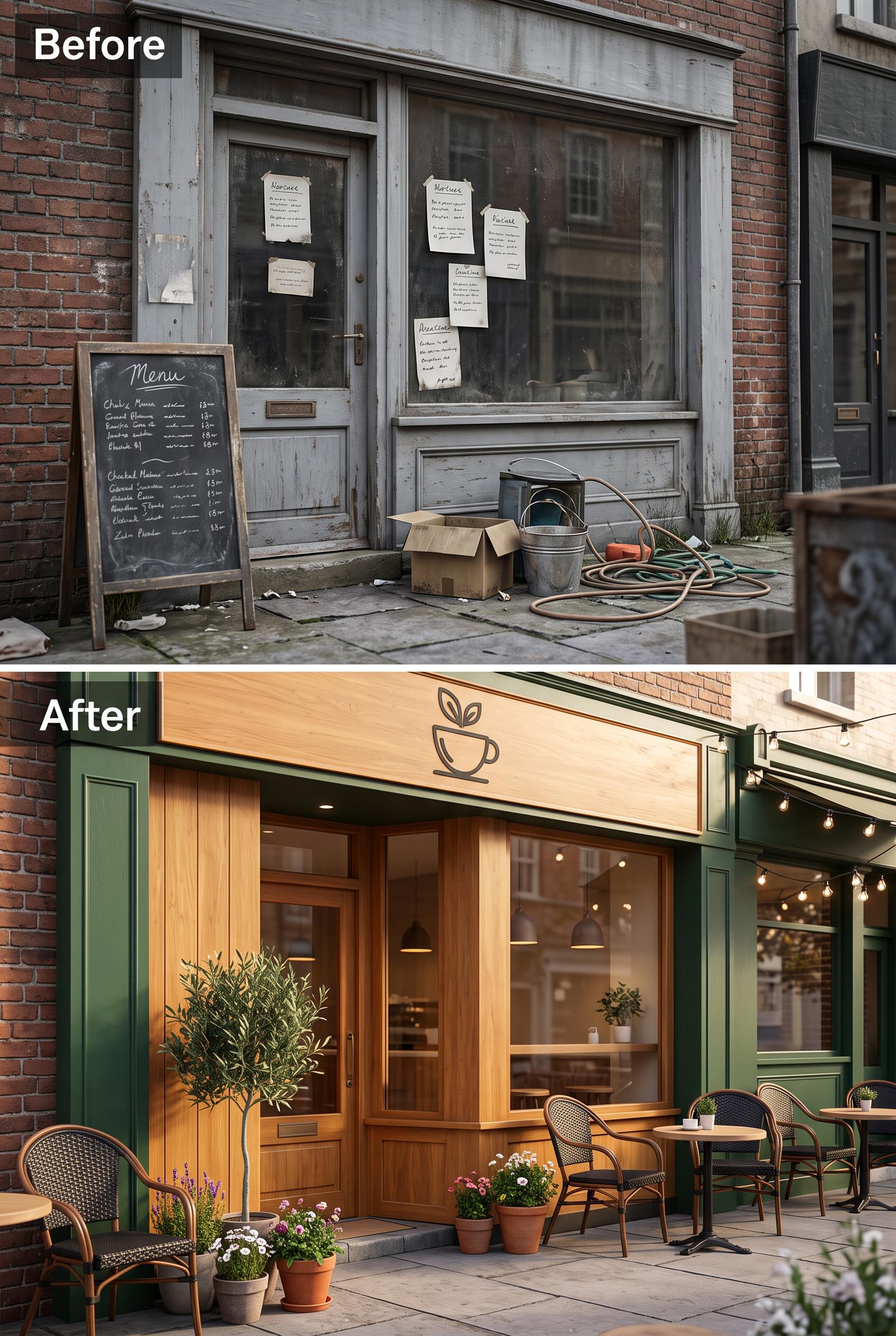
Split image of a local cafe entrance before (cluttered and dull) and after (cozy, inviting with outdoor sea...
View this AI-generated image from the AI Media Studio community gallery. Prompt: Split image of a local cafe entrance before (cluttered and dull) and after (cozy, inviting with outdoor seating) in vertical 2:3 Pinterest composition, commercial-quality art direction, no real br...
Prompt
Split image of a local cafe entrance before (cluttered and dull) and after (cozy, inviting with outdoor seating) in vertical 2:3 Pinterest composition, commercial-quality art direction, no real brands, no trademarks, no watermarks, no readable text. Corrective regeneration attempt 2. Produce a materially revised image, not a near-duplicate of an earlier variant. Preserve the successful subject, palette, lighting, focal hierarchy, and commercial polish from the original brief while correcting every issue below. Mandatory corrective instructions from the most recent visual QA: Create a vertical 2:3 split image of a local cafe entrance before/after redesign. Before panel: emphasize cluttered, dull, non-branded storefront; remove all legible text, signs, chalkboards, and notices. Use neutral, non-specific textures and debris; ensure no visible logos or readable words. After panel: warm colors, inviting outdoor seating, clean facade, clear branding that is fictional and non-brand-specific (e.g., a generic cafe sign without words or a simple icon). Maintain a clear focal point on the entrance and seating area in the after panel. Ensure no watermarks or generation artifacts; preserve natural lighting and sharp detail, and keep both panels aligned in a strict vertical split within a 2:3 aspect ratio. Observed defects from prior variants that must not recur: 1) Readable text appears in the before panel (chalkboard menu and notices) which violates the no-readable-text requirement. 2) Potential real-world clutter visible in the before panel could imply branding or signage accidentally resembling a brand; ensure all text is generic or removed. Render no letters, words, numbers, prices, headings, labels, contact details, logos, glyphs, or pseudo-text anywhere. Use only blank surfaces, clean geometric marks, and non-linguistic placeholder shapes. Do not add explanatory captions, before/after labels, interface copy, or extra objects that the brief did not request. When a corrective instruction conflicts with a decorative detail, prioritize the corrective instruction.
Use this image as inspiration
Browse more public generations, compare prompts, and open the original share page to continue exploring this style.
More from the gallery
Recent public images on the same domain, all with their own crawlable detail pages.

Flat lay of artisan tea collection with various blends, styled with dried herbs and tea cups in vertical 2:...

Flat lay of artisan tea collection with various blends, styled with dried herbs and tea cups in vertical 2:...
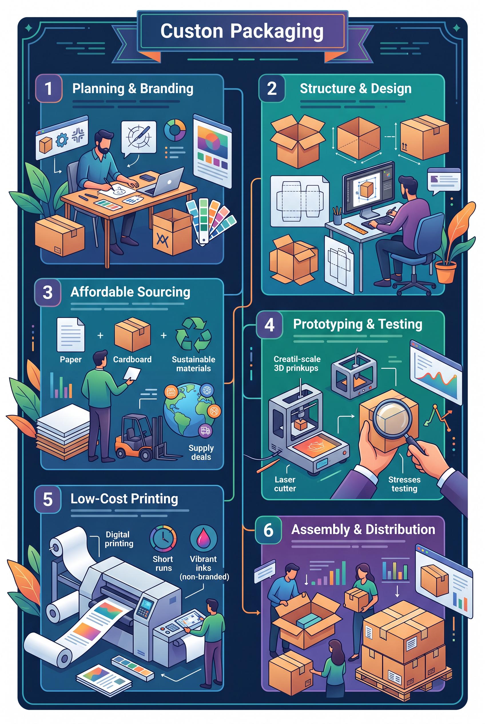
Infographic showing steps to create affordable custom packaging for small businesses in vertical 2:3 Pinter...
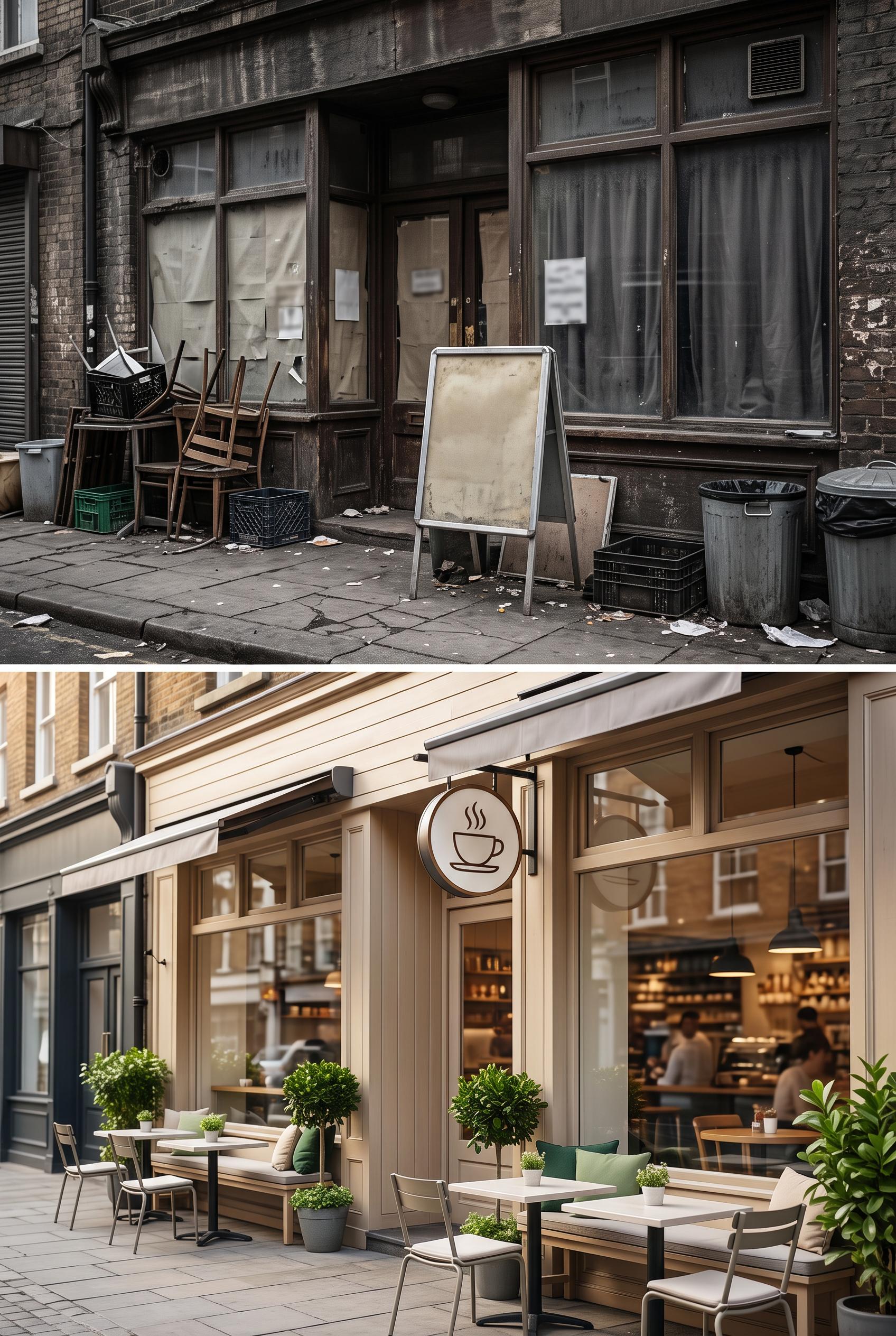
Split image of a local cafe entrance before (cluttered and dull) and after (cozy, inviting with outdoor sea...
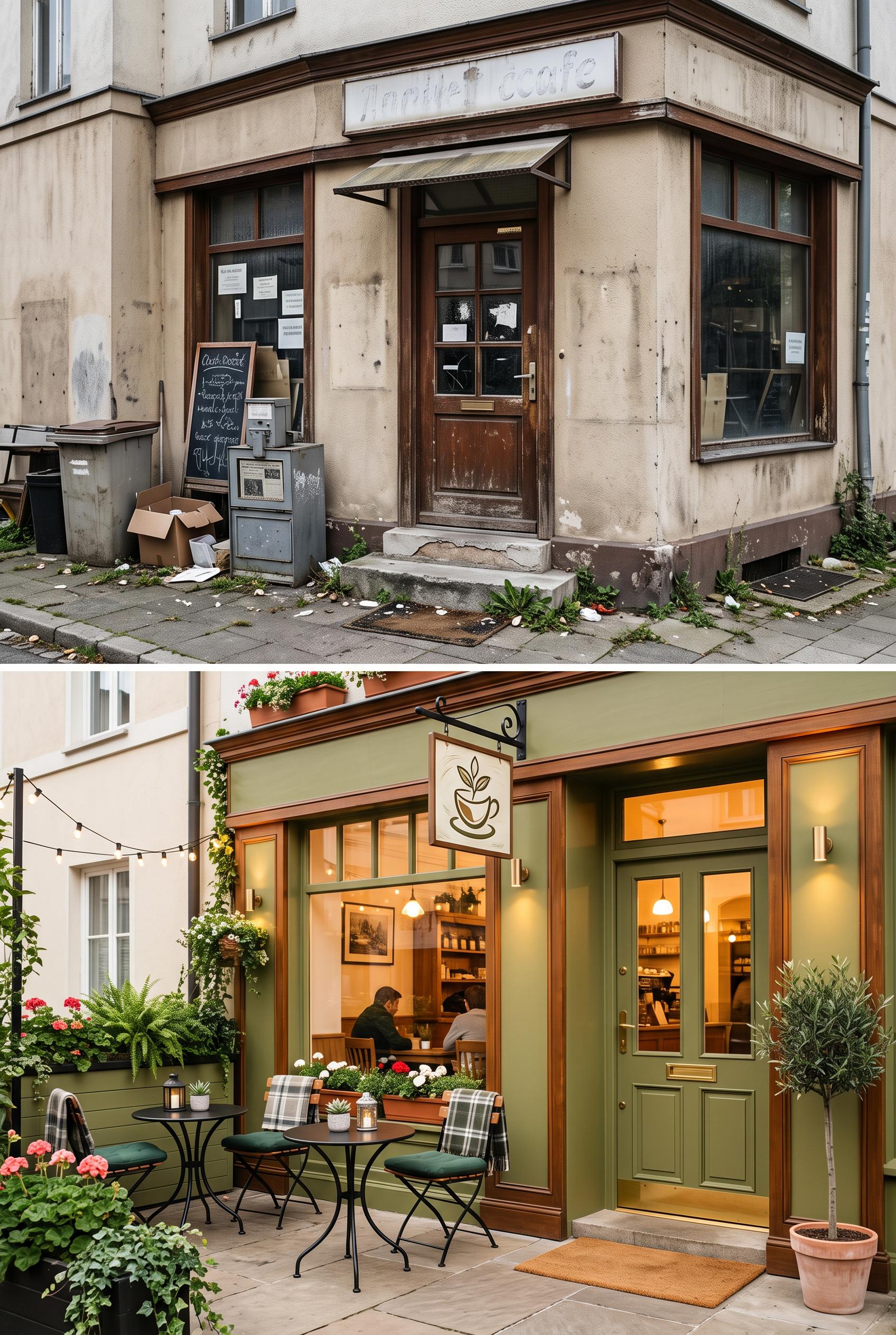
Split image of a local cafe entrance before (cluttered and dull) and after (cozy, inviting with outdoor sea...
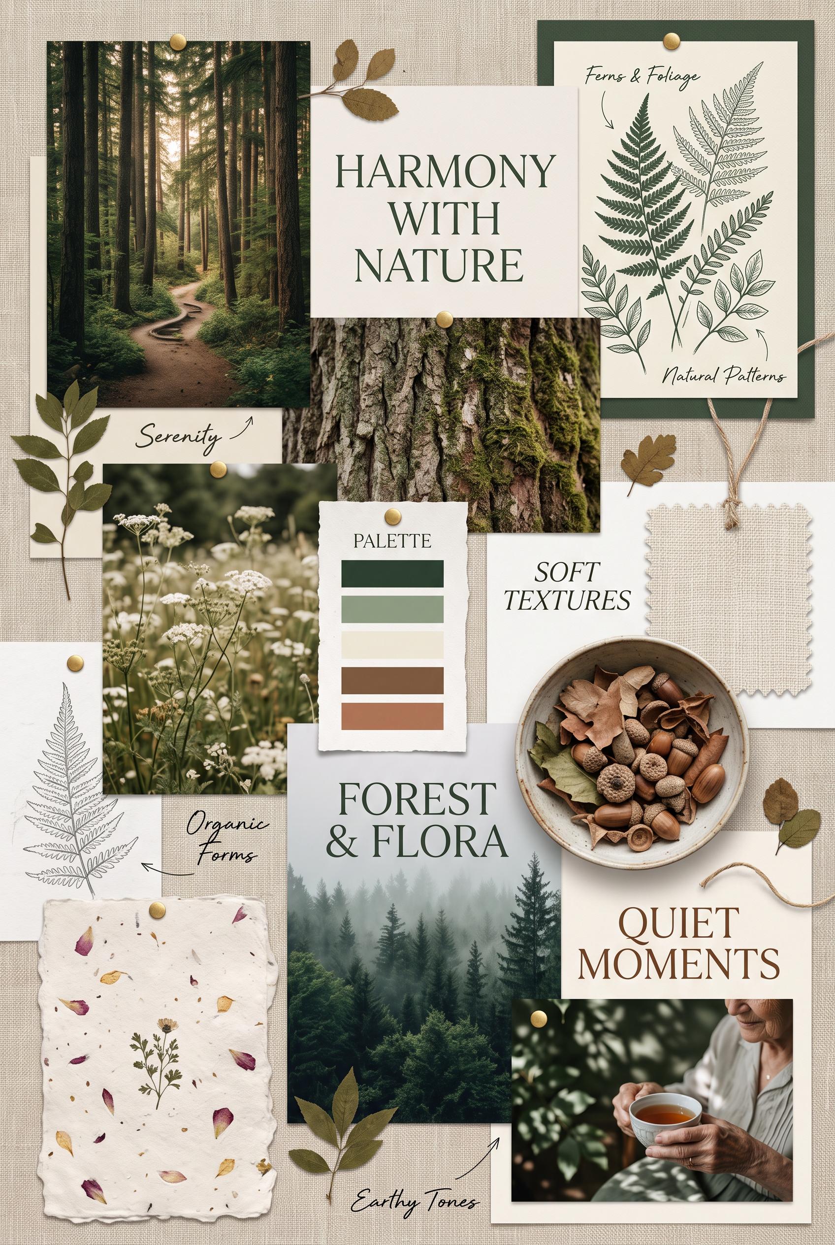
Create a vertical 2:3 composition presenting a nature-inspired moodboard. Include earthy images like forest...

Design a vibrant vertical 2:3 infographic that outlines a five-step content creation strategy for creators....
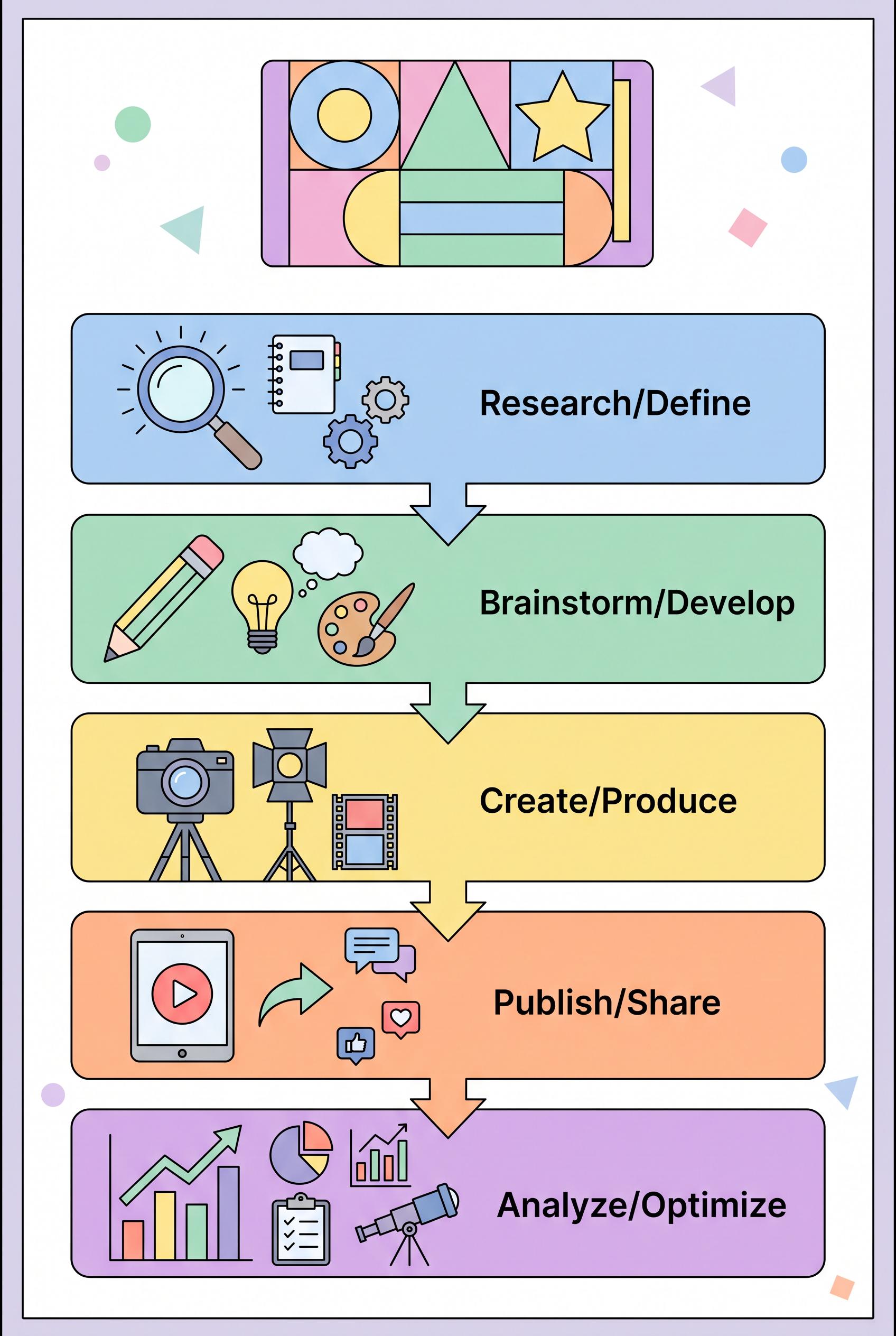
Design a vibrant vertical 2:3 infographic that outlines a five-step content creation strategy for creators....