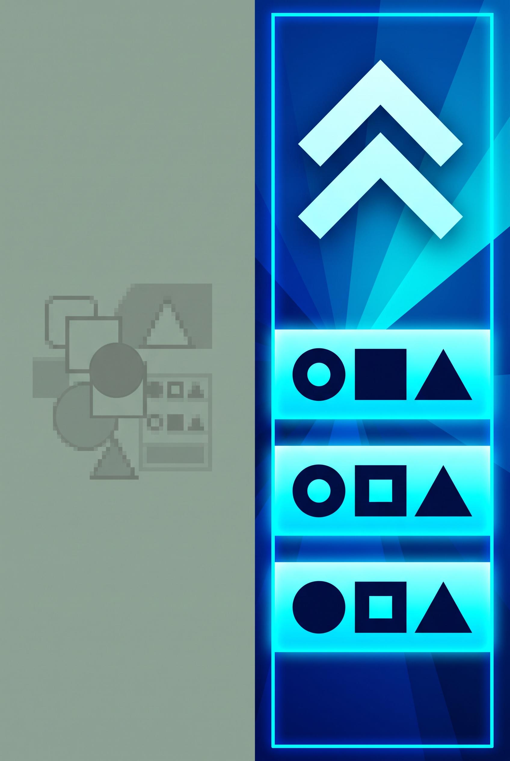
Create a vertical 2:3 composition showcasing a split image: one side shows a cluttered, old-style thumbnail...
View this AI-generated image from the AI Media Studio community gallery. Prompt: Create a vertical 2:3 composition showcasing a split image: one side shows a cluttered, old-style thumbnail featuring outdated colors and overlapped text, and the other side features a modern, eye...
Prompt
Create a vertical 2:3 composition showcasing a split image: one side shows a cluttered, old-style thumbnail featuring outdated colors and overlapped text, and the other side features a modern, eye-catching thumbnail with a bold design, simplified layout, and contrasting colors. No real brand elements, ensure commercial art direction. Art should be crisp and vibrant. Corrective regeneration attempt 2. Produce a materially revised image, not a near-duplicate of an earlier variant. Preserve the successful subject, palette, lighting, focal hierarchy, and commercial polish from the original brief while correcting every issue below. Mandatory corrective instructions from the most recent visual QA: Regenerate to produce a vertical 2:3 split thumbnail with a distinct, high-contrast bold right side and a simplified, legible left side. Specific changes: - Create a clean vertical 2:3 canvas; ensure the split line is sharp and centered vertically. - Left panel: remove clutter, reduce busy background, replace with a subdued tone to emphasize the old thumbnail critique; keep a single, readable headline if any but ensure it does not overpower the split. - Right panel: maintain bold, modern thumbnail aesthetic with high-contrast colors (e.g., dark blue to electric cyan) and clear, large typography; ensure no overlapping elements obscure main text. - Remove any bottom caption bars or overlays that resemble watermarks or instructions; ensure only the two halves are visible. - Ensure no generation artifacts or pixelation around the split seam; apply a clean, seamless edge. - Ensure no real brand elements or trademarks appear; substitute with generic icons if necessary. - Text on both sides should be legible at thumbnail size; avoid garbled or overlapping letters. - Overall look should be crisp, vibrant, and professional, suitable for Pinterest vertical 2:3 format. Observed defects from prior variants that must not recur: 1) Not a clean 2:3 vertical composition with a clear, singular focal point across the split. 2) Left (old) side remains cluttered and competes with the right for attention; fails to deliver a sleek, bold after-design as described. 3) Presence of extraneous bottom overlays/text that resemble captions (garbled/embedded text) reduces readability and perceived quality. 4) Potential small artifacts or seams at the split reduce polish; needs tighter join line. 5) No real brand elements, but the overall contrast and readability across the split need improvement to meet a high commercial standard. Render no letters, words, numbers, prices, headings, labels, contact details, logos, glyphs, or pseudo-text anywhere. Use only blank surfaces, clean geometric marks, and non-linguistic placeholder shapes. Do not add explanatory captions, before/after labels, interface copy, or extra objects that the brief did not request. When a corrective instruction conflicts with a decorative detail, prioritize the corrective instruction.
Use this image as inspiration
Browse more public generations, compare prompts, and open the original share page to continue exploring this style.
More from the gallery
Recent public images on the same domain, all with their own crawlable detail pages.
Split image of a local cafe entrance before (cluttered and dull) and after (cozy, inviting with outdoor sea...
Split image of a local cafe entrance before (cluttered and dull) and after (cozy, inviting with outdoor sea...
Split image of a local cafe entrance before (cluttered and dull) and after (cozy, inviting with outdoor sea...
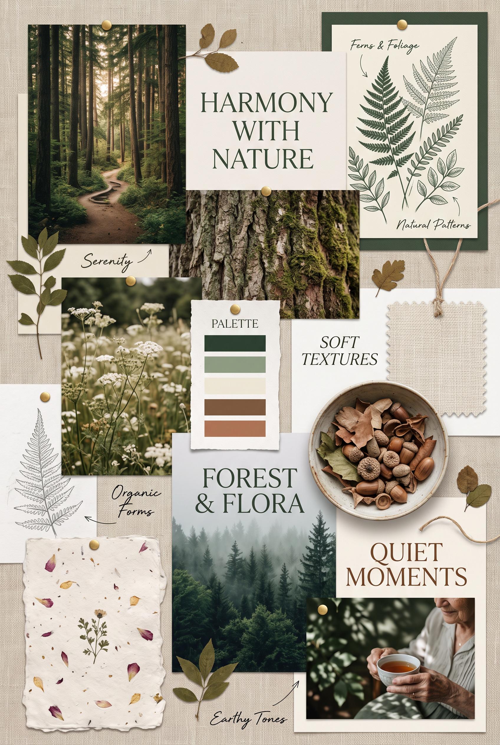
Create a vertical 2:3 composition presenting a nature-inspired moodboard. Include earthy images like forest...
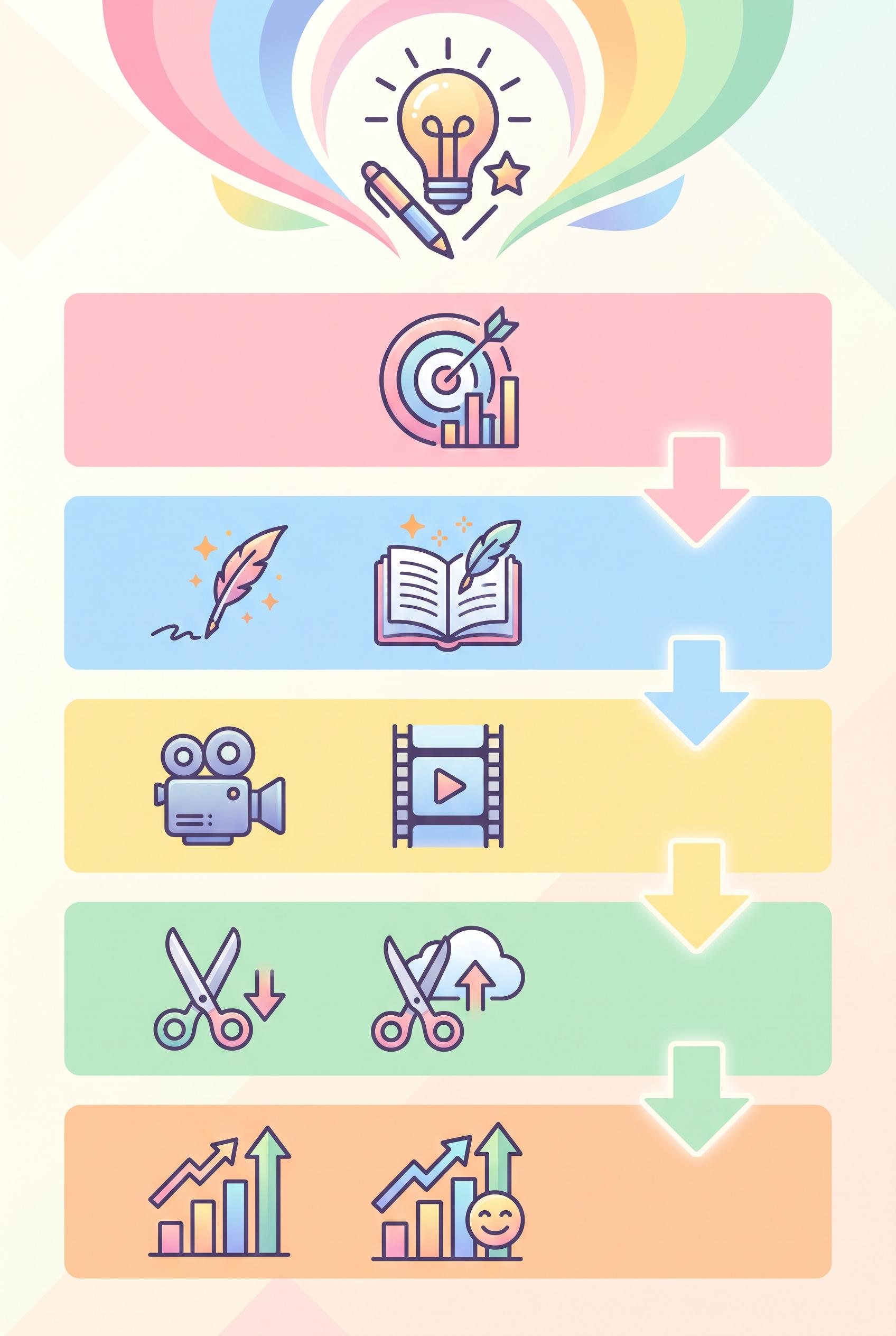
Design a vibrant vertical 2:3 infographic that outlines a five-step content creation strategy for creators....
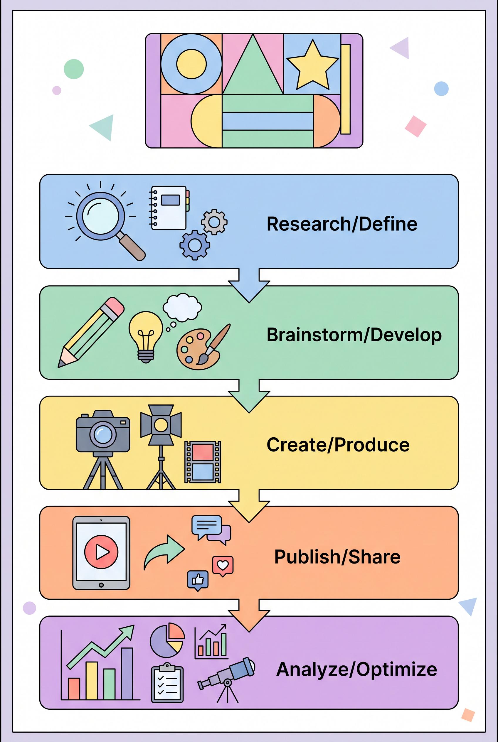
Design a vibrant vertical 2:3 infographic that outlines a five-step content creation strategy for creators....
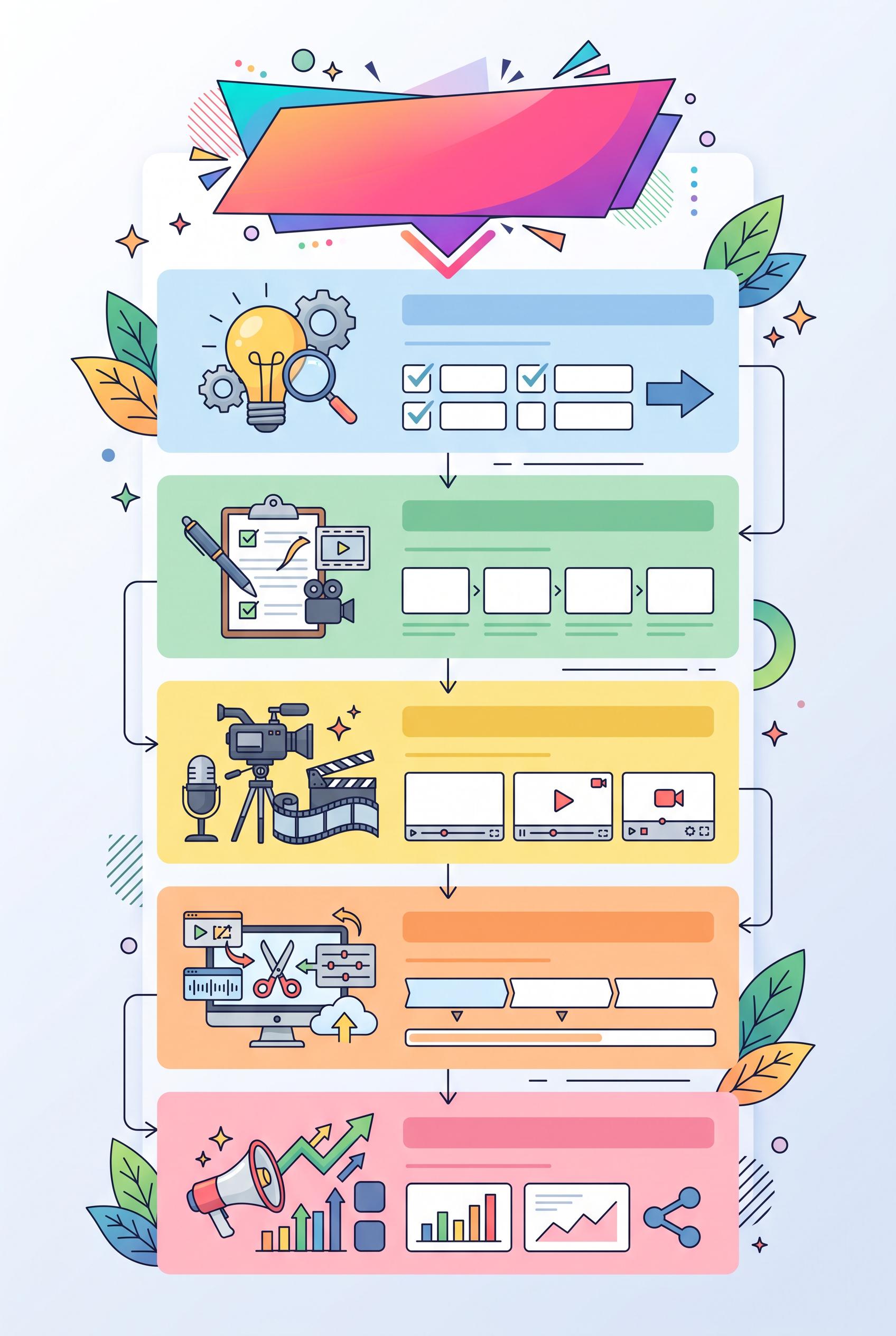
Design a vibrant vertical 2:3 infographic that outlines a five-step content creation strategy for creators....
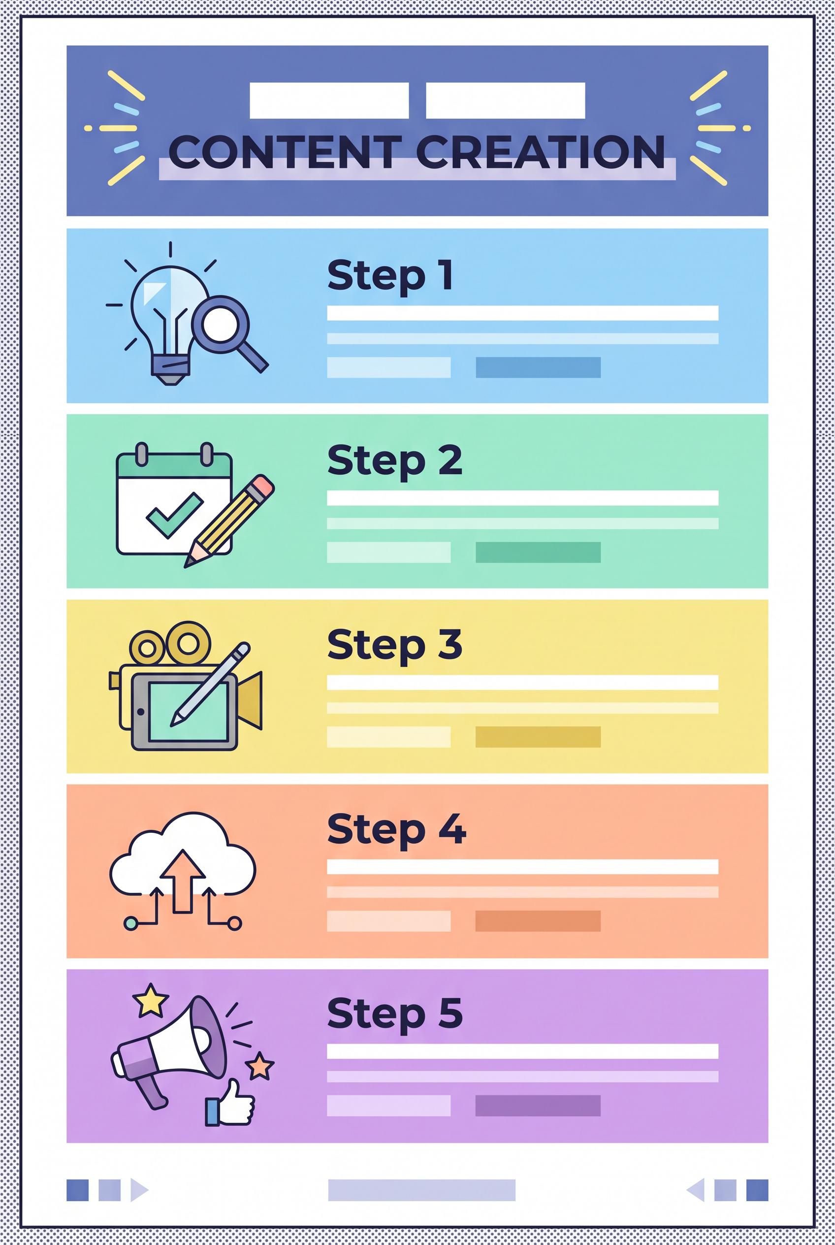
Design a vibrant vertical 2:3 infographic that outlines a five-step content creation strategy for creators....