AI Image Gallery
Discover 1720+ shared AI-generated images from our creative community
All Shared Images
Showing 48 of 1720 shared images
 0
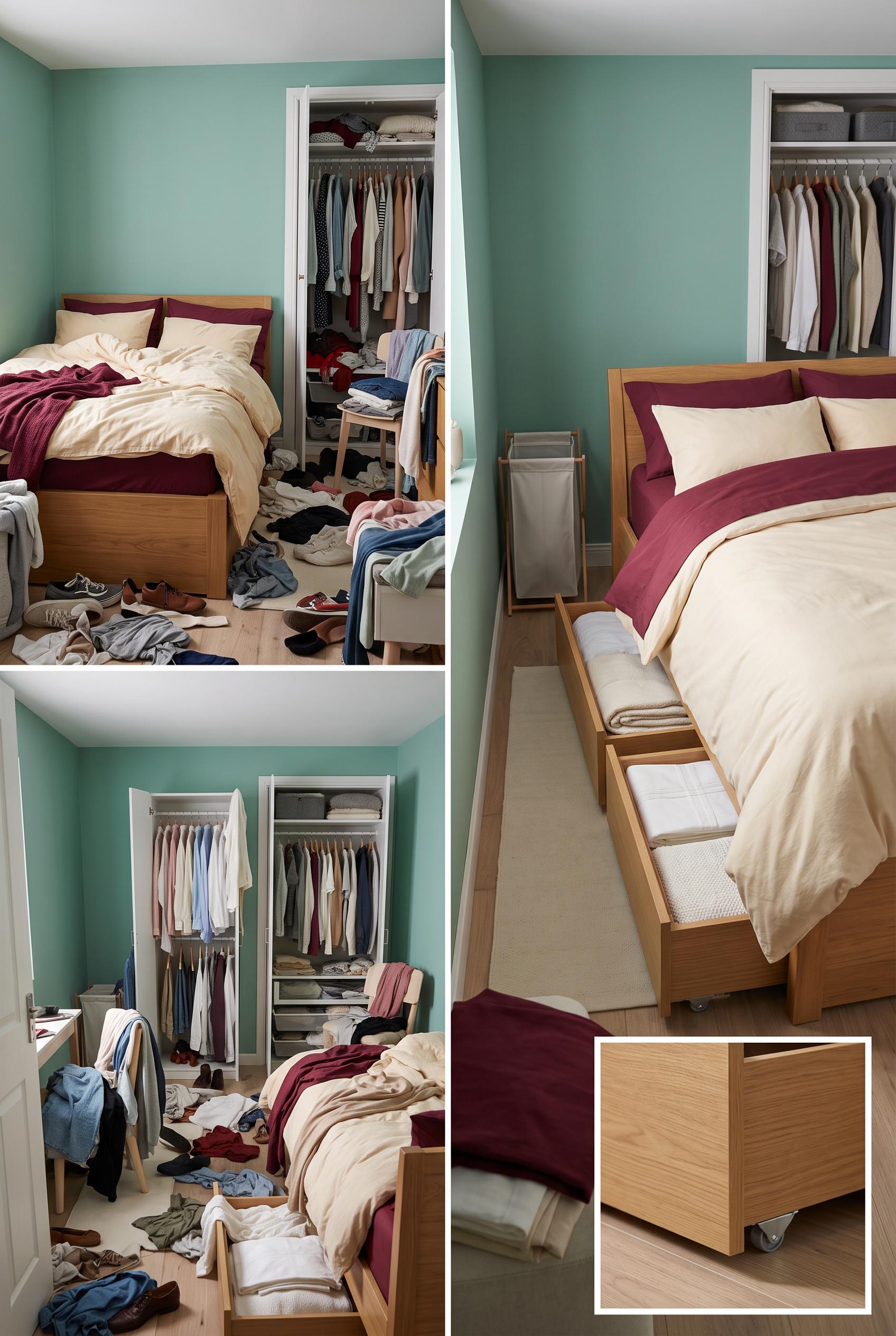
Create a commercial-quality interior design editorial image in a vertical 2:3 Pinterest composition. Show a matched before-and-after transformation of a small bedroom: left side cluttered with loose clothing and crowded wardrobe storage, right side calm and organized with low rolling drawers beneath the bed, clear floor space, folded linens, and a slim laundry basket. Use sea-glass walls, maroon textiles, warm cream bedding, and honey oak accents. Include a small close-up inset of the under-bed storage mechanism. No real brands, no trademarked characters, no watermark, no unintended readable text, no logos. Corrective regeneration attempt 2. Produce a materially revised image, not a near-duplicate of an earlier variant. Preserve the successful subject, palette, lighting, focal hierarchy, and commercial polish from the original brief while correcting every issue below. Mandatory corrective instructions from the most recent visual QA: Create a single cohesive vertical 2:3 before-and-after editorial composition of the same compact bedroom from one consistent elevated camera angle, split cleanly into matched left and right views. Remove all readable text, labels, typography, logos, and watermarks. The left view must show the overloaded wardrobe and visibly cluttered floor with loose clothing. The right view must show the same room transformed with clear floor space, shallow honey-oak rolling drawers visibly pulled partly from beneath the bed, folded textiles, a slim laundry basket, and one open wardrobe/storage detail. Use sea-glass walls, maroon textiles, warm cream bedding, and honey-oak accents. Include only one small, clean visual close-up inset of the drawer mechanism without text. Do not duplicate the after view, change camera angle, or introduce unrelated furniture; preserve the polished photorealistic interior styling. Observed defects from prior variants that must not recur: 1) The composition includes large readable “BEFORE” and “AFTER” labels despite the brief requiring visual-only labeling. 2) The before and after views are not consistently matched from the same elevated angle; the image repeats a separate after view in the lower section. 3) The after view in the top comparison does not clearly show the rolling under-bed drawers, making the transformation inconsistent. 4) The layout is visually overcrowded and less immediately legible as a clean before-after editorial pin. Render no letters, words, numbers, prices, headings, labels, contact details, logos, glyphs, or pseudo-text anywhere. Use only blank surfaces, clean geometric marks, and non-linguistic placeholder shapes. Do not add explanatory captions, before/after labels, interface copy, or extra objects that the brief did not request. When a corrective instruction conflicts with a decorative detail, prioritize the corrective instruction.
 0
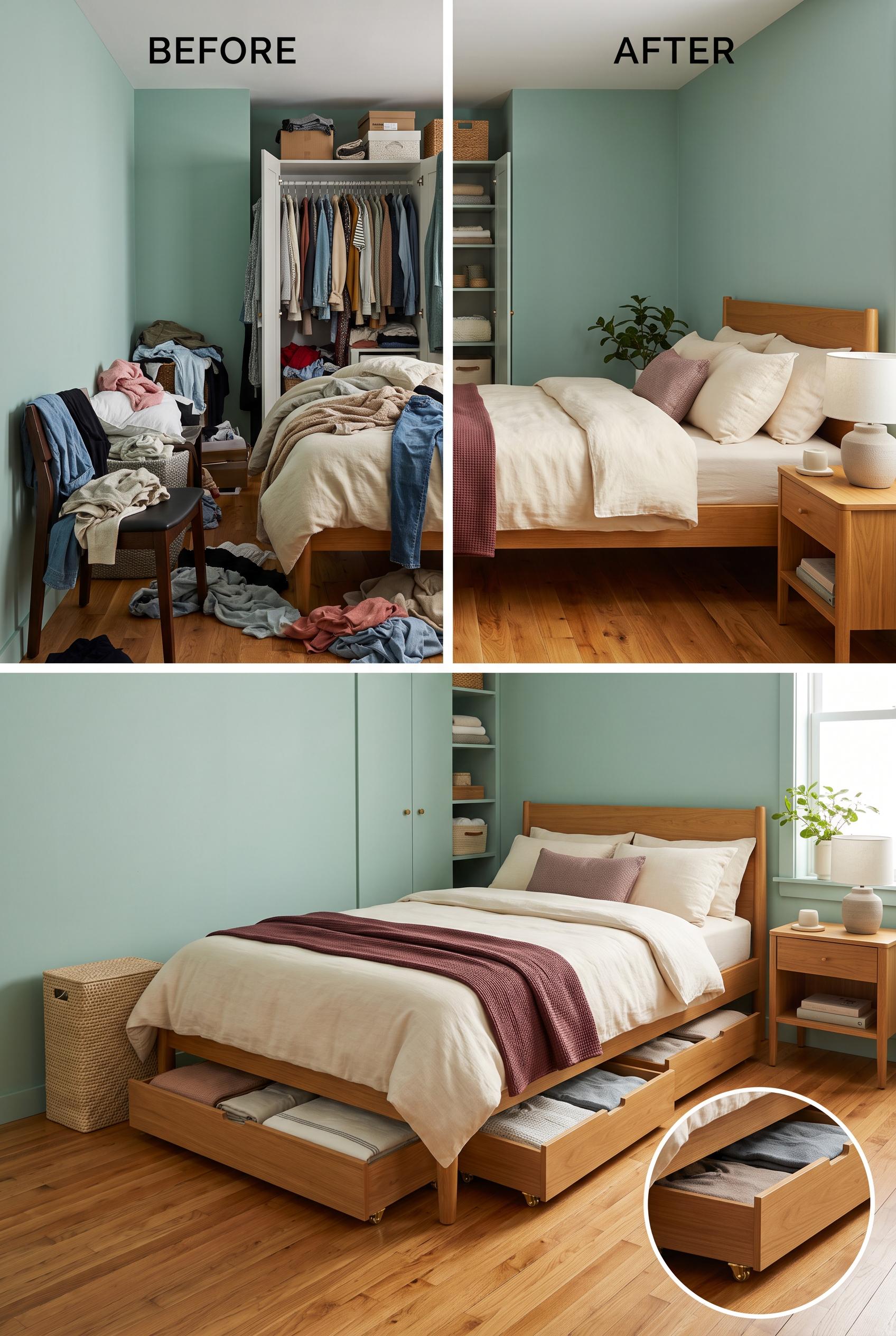
Create a commercial-quality interior design editorial image in a vertical 2:3 Pinterest composition. Show a matched before-and-after transformation of a small bedroom: left side cluttered with loose clothing and crowded wardrobe storage, right side calm and organized with low rolling drawers beneath the bed, clear floor space, folded linens, and a slim laundry basket. Use sea-glass walls, maroon textiles, warm cream bedding, and honey oak accents. Include a small close-up inset of the under-bed storage mechanism. No real brands, no trademarked characters, no watermark, no unintended readable text, no logos.
 0
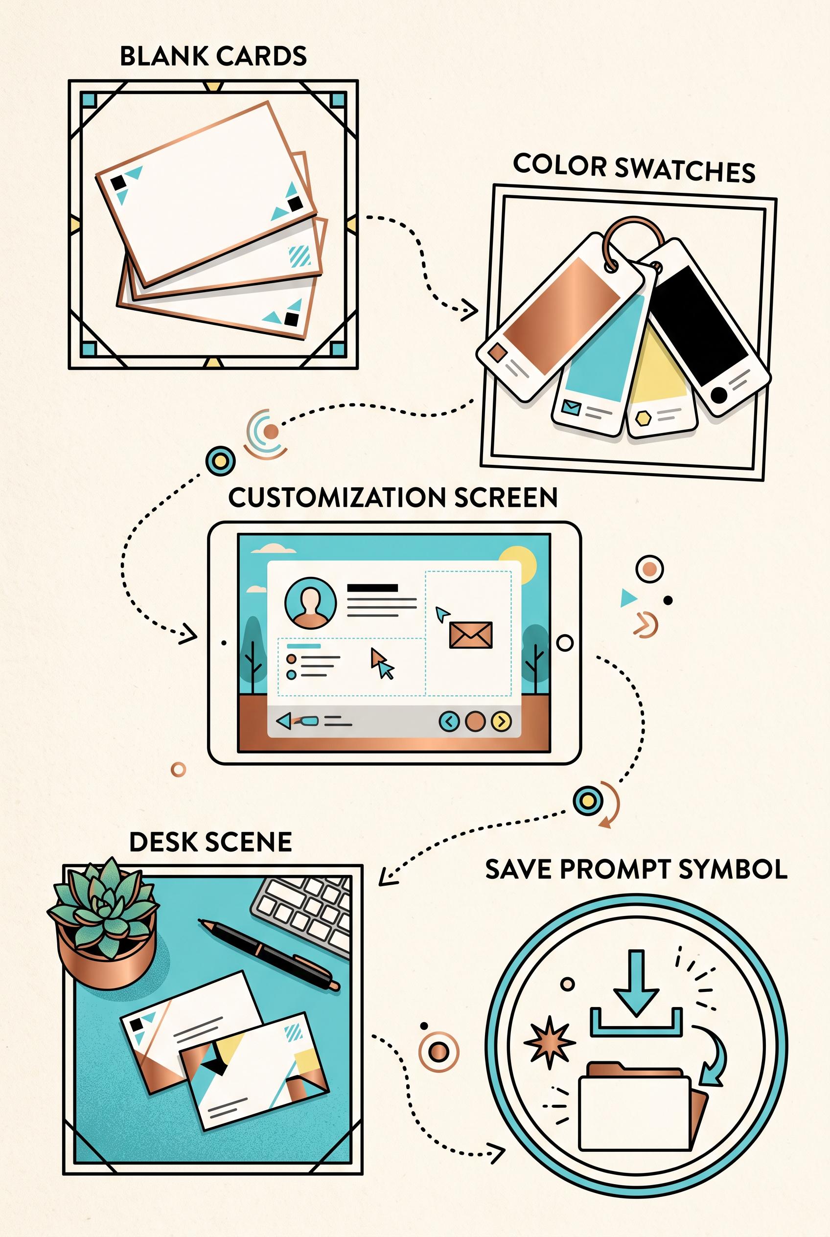
Create a vertical 2:3 Pinterest composition with commercial-quality art direction showing a passport stamp trail for launching a customizable business card template. Include five connected visual stops represented by blank cards, color swatches, a customization screen, a desk scene, and a save prompt symbol, with varied crops and clear hierarchy. Use copper, cyan, butter yellow, and black. No real brands, no trademarked characters, no watermark, and no unintended readable text. AI-modified downstream. Corrective regeneration attempt 2. Produce a materially revised image, not a near-duplicate of an earlier variant. Preserve the successful subject, palette, lighting, focal hierarchy, and commercial polish from the original brief while correcting every issue below. Mandatory corrective instructions from the most recent visual QA: Preserve the attractive vertical 2:3 passport-trail layout, copper/cyan/butter-yellow/black palette, five connected stops, varied crops, clear hierarchy, and illustrated commercial style. Remove all passport-stamp lettering and any other decorative pseudo-text inside the images; use only clean blank stamp marks, icons, borders, and symbols. Keep the intentional section headings “BLANK CARDS,” “COLOR SWATCHES,” “CUSTOMIZATION SCREEN,” “DESK SCENE,” and “SAVE PROMPT SYMBOL” crisp and correctly spelled. Ensure the final save panel uses a clear save icon rather than malformed lettering. No watermark, brand names, trademarked elements, or garbled readable text. Observed defects from prior variants that must not recur: 1) Several passport stamps contain obvious garbled or malformed text, including “UNCOCAIFIED,” “COLDRTRES,” “OEBGNEERS,” and “CEMPLATE.” 2) The composition is strong and coherent, but the corrupted stamp lettering fails the no-unintended-readable-text requirement. Render no letters, words, numbers, prices, headings, labels, contact details, logos, glyphs, or pseudo-text anywhere. Use only blank surfaces, clean geometric marks, and non-linguistic placeholder shapes. Do not add explanatory captions, before/after labels, interface copy, or extra objects that the brief did not request. When a corrective instruction conflicts with a decorative detail, prioritize the corrective instruction.
 0
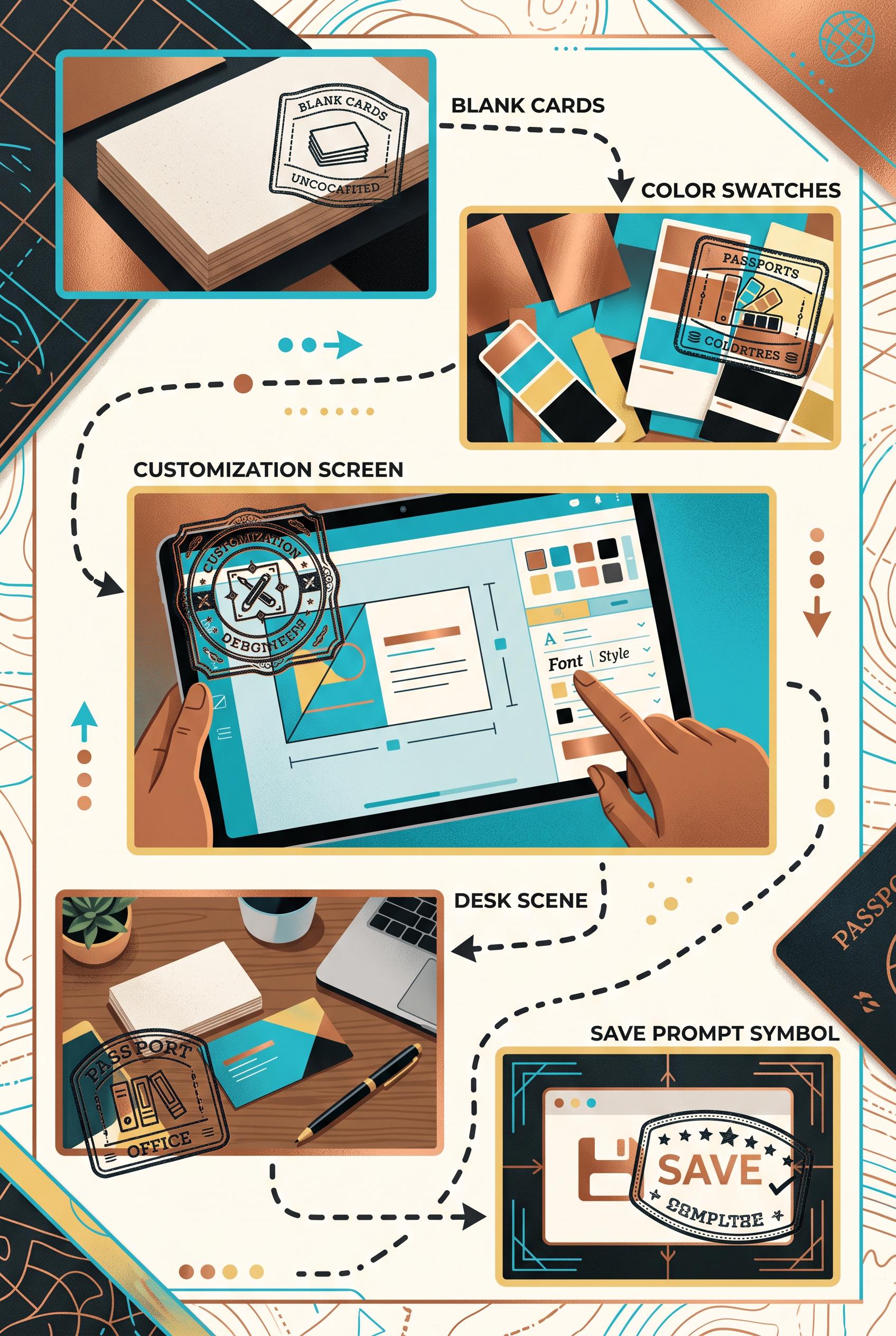
Create a vertical 2:3 Pinterest composition with commercial-quality art direction showing a passport stamp trail for launching a customizable business card template. Include five connected visual stops represented by blank cards, color swatches, a customization screen, a desk scene, and a save prompt symbol, with varied crops and clear hierarchy. Use copper, cyan, butter yellow, and black. No real brands, no trademarked characters, no watermark, and no unintended readable text. AI-modified downstream.
 0
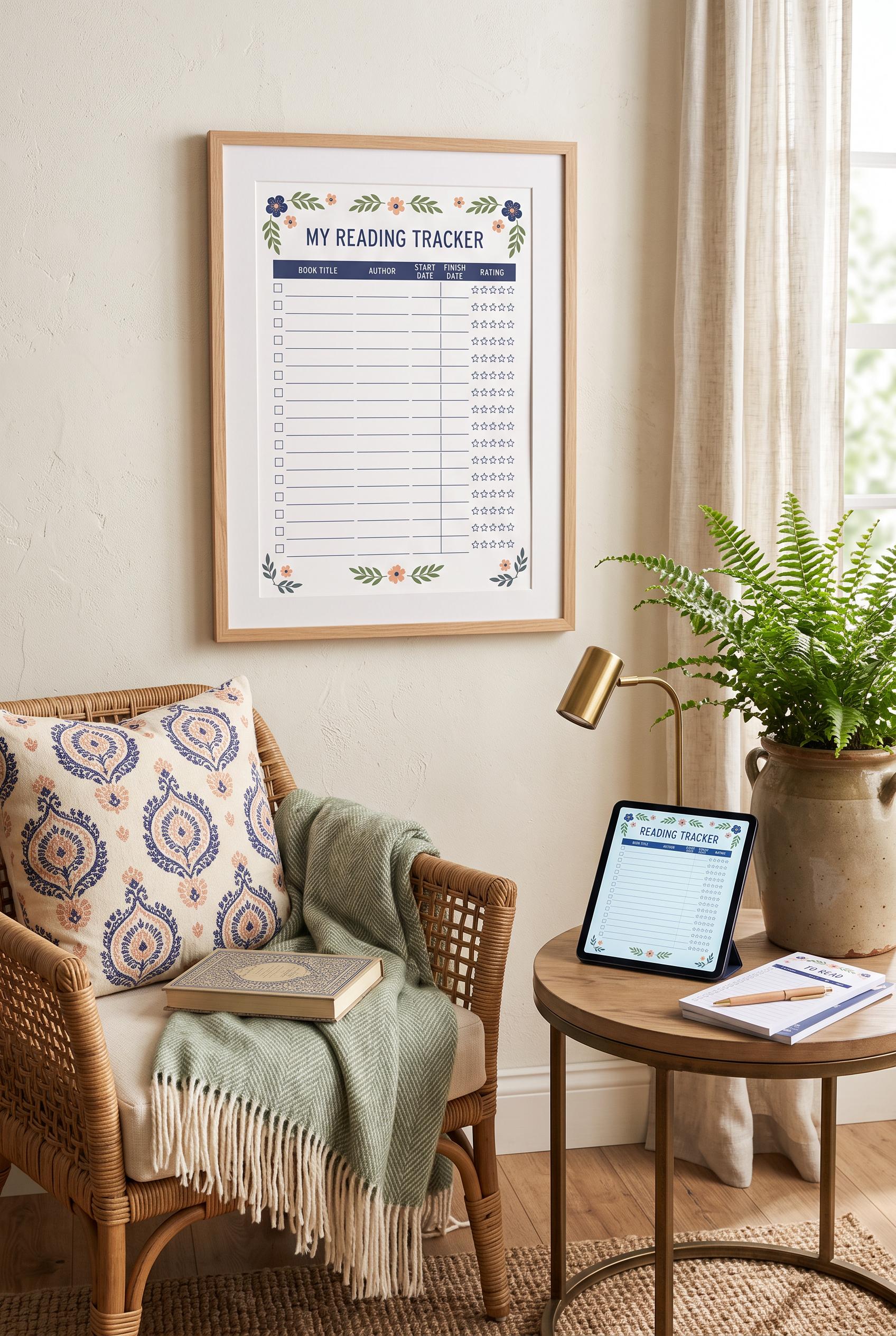
Create a vertical 2:3 Pinterest composition with commercial-quality art direction showing an aspirational reading nook centered on a printable reading tracker: framed page on the wall, tablet preview on a side table, coordinated paper stack, woven chair, soft book light, and subtle botanical accents. Use indigo, peach, fern, and cream. No real brands, no trademarked characters, no watermark, and no unintended readable text. AI-modified downstream.
 0
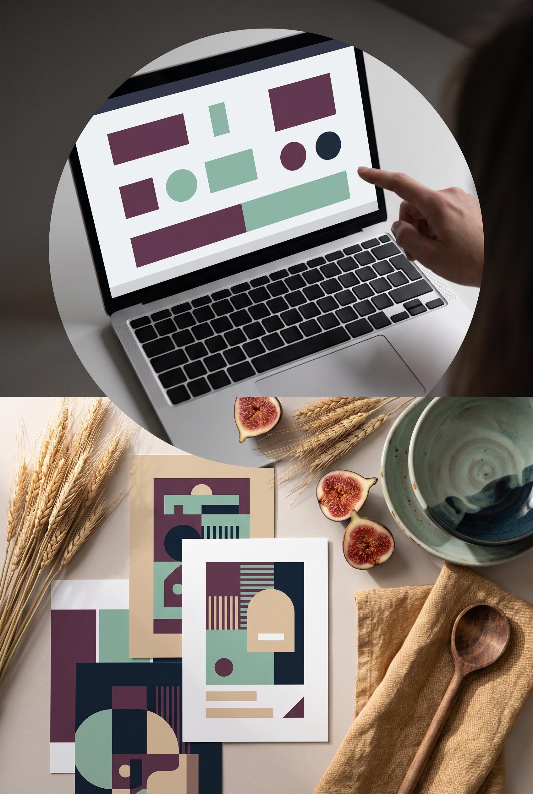
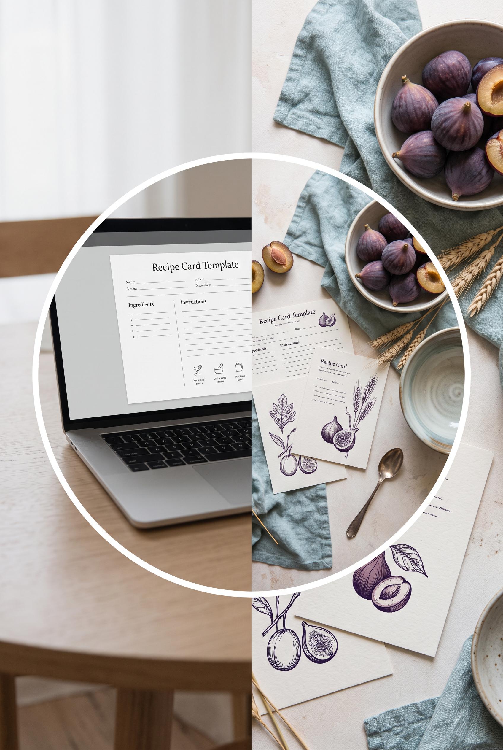
Create a vertical 2:3 Pinterest composition with commercial-quality art direction showing a circular aperture before-and-after reveal: a plain editable recipe card file on a laptop transforms into printed recipe cards arranged in a refined kitchen scene with ingredients, linen, and a ceramic bowl. Use fig plum, seafoam, wheat, and deep ink. No real brands, no trademarked characters, no watermark, and no unintended readable text. AI-modified downstream. Corrective regeneration attempt 5. Produce a materially revised image, not a near-duplicate of an earlier variant. Preserve the successful subject, palette, lighting, focal hierarchy, and commercial polish from the original brief while correcting every issue below. Mandatory corrective instructions from the most recent visual QA: Preserve the vertical 2:3 composition, circular aperture, premium still-life lighting, fig plum/seafoam/wheat/deep-ink palette, laptop, linen, figs, wheat, spoon, bowls, and clear transformation. Remove all letter-like markings from every keyboard key; make keys completely blank and unmarked. Replace every thin repeated horizontal line on the printed cards and laptop screen with unmistakable broad geometric elements only: solid rectangles, broad color bars, circles, squares, and clean abstract blocks. Do not include any letters, numbers, words, labels, glyphs, logos, captions, handwriting, pseudo-text, or watermark anywhere. Observed defects from prior variants that must not recur: 1) Laptop keyboard keys contain visible letter-like markings, violating the requirement for no letters or readable glyphs anywhere. 2) Some printed-card decorative marks resemble pseudo-writing and should be made purely geometric and non-linguistic. 3) Strong premium vertical composition and clear laptop-to-styled-card transformation. 4) Printed cards contain repeated thin horizontal lines that resemble handwriting or pseudo-text, violating the requirement for purely geometric, non-linguistic marks. 5) Circular aperture and still-life styling are otherwise cohesive; no obvious brand or watermark is visible. 6) Strong vertical composition, premium lighting, palette, and clear laptop-to-printed-card transformation. 7) Laptop keyboard keys visibly contain letter-like markings. 8) Printed cards and laptop screen use repeated thin horizontal bars that resemble pseudo-text, contrary to the geometric-only requirement. Render no letters, words, numbers, prices, headings, labels, contact details, logos, glyphs, or pseudo-text anywhere. Use only blank surfaces, clean geometric marks, and non-linguistic placeholder shapes. Do not add explanatory captions, before/after labels, interface copy, or extra objects that the brief did not request. When a corrective instruction conflicts with a decorative detail, prioritize the corrective instruction.
 0
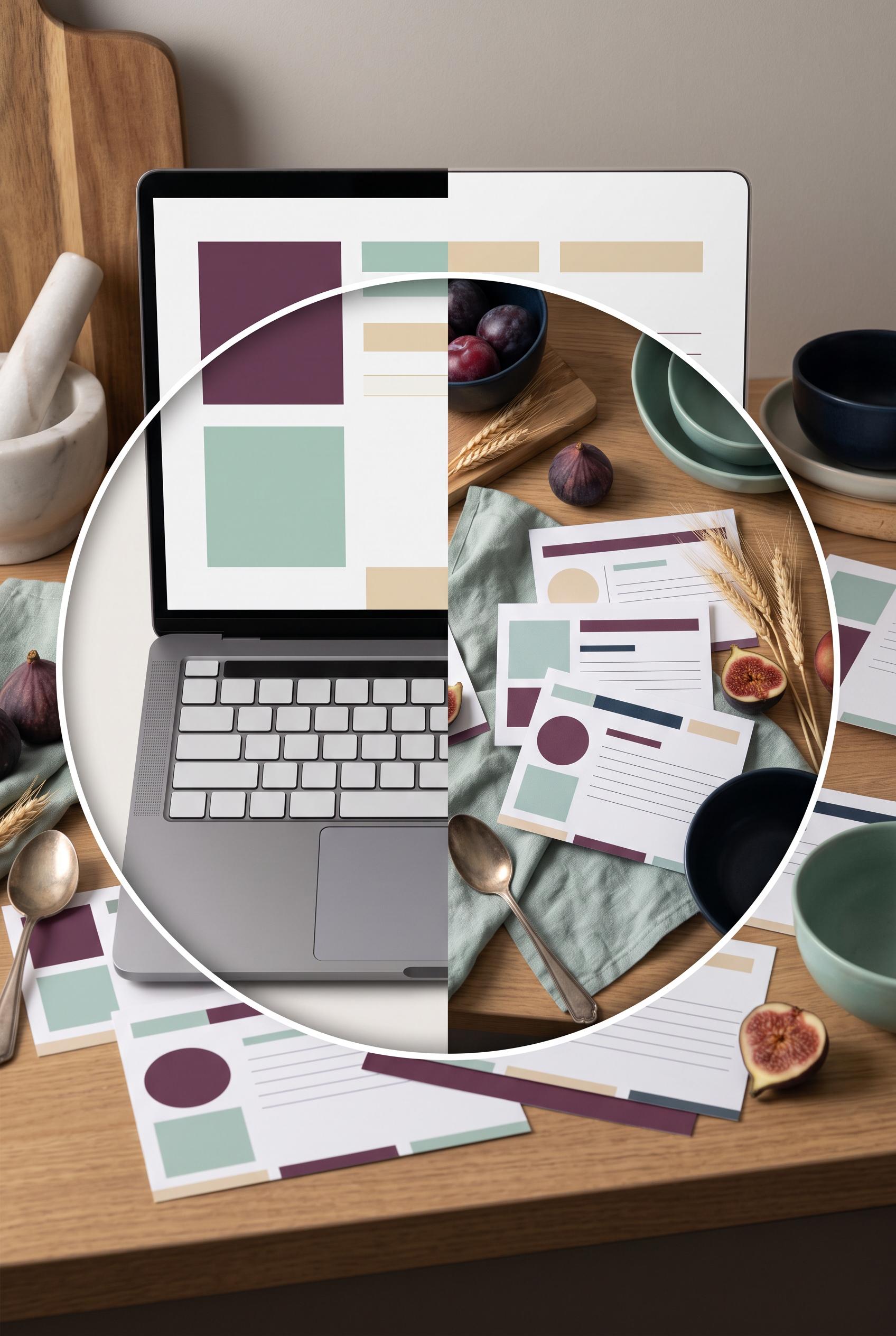
Create a vertical 2:3 Pinterest composition with commercial-quality art direction showing a circular aperture before-and-after reveal: a plain editable recipe card file on a laptop transforms into printed recipe cards arranged in a refined kitchen scene with ingredients, linen, and a ceramic bowl. Use fig plum, seafoam, wheat, and deep ink. No real brands, no trademarked characters, no watermark, and no unintended readable text. AI-modified downstream. Corrective regeneration attempt 4. Produce a materially revised image, not a near-duplicate of an earlier variant. Preserve the successful subject, palette, lighting, focal hierarchy, and commercial polish from the original brief while correcting every issue below. Mandatory corrective instructions from the most recent visual QA: Preserve the strong vertical 2:3 composition, crisp circular aperture, premium lighting, fig plum/seafoam/wheat/deep-ink palette, laptop, linen, figs, wheat, spoon, bowls, and clear laptop-to-printed-card transformation. Remove every thin horizontal line and any other mark on every printed card that could resemble handwriting, text, or pseudo-writing. Replace all card details with only unmistakable geometric elements: solid rectangles, broad color bars, circles, squares, and clean abstract blocks with no repeated text-like line patterns. Keep the laptop screen limited to blank space and simple geometric color blocks, and keep every keyboard key completely blank and unmarked. Do not add any letters, numbers, words, labels, glyphs, logos, captions, or watermark. Observed defects from prior variants that must not recur: 1) Recipe-card text is visibly readable, including “Recipe Card Template,” “Ingredients,” and “Instructions,” contrary to the no-unintended-readable-text requirement. 2) Some tiny card text is garbled and artifact-like. 3) The vertical composition, circular aperture, styling, palette, and transformation concept are strong. 4) Laptop keyboard keys contain visible letter-like markings, violating the requirement for no letters or readable glyphs anywhere. 5) Some printed-card decorative marks resemble pseudo-writing and should be made purely geometric and non-linguistic. 6) Strong premium vertical composition and clear laptop-to-styled-card transformation. 7) Printed cards contain repeated thin horizontal lines that resemble handwriting or pseudo-text, violating the requirement for purely geometric, non-linguistic marks. 8) Circular aperture and still-life styling are otherwise cohesive; no obvious brand or watermark is visible. Render no letters, words, numbers, prices, headings, labels, contact details, logos, glyphs, or pseudo-text anywhere. Use only blank surfaces, clean geometric marks, and non-linguistic placeholder shapes. Do not add explanatory captions, before/after labels, interface copy, or extra objects that the brief did not request. When a corrective instruction conflicts with a decorative detail, prioritize the corrective instruction.
 0
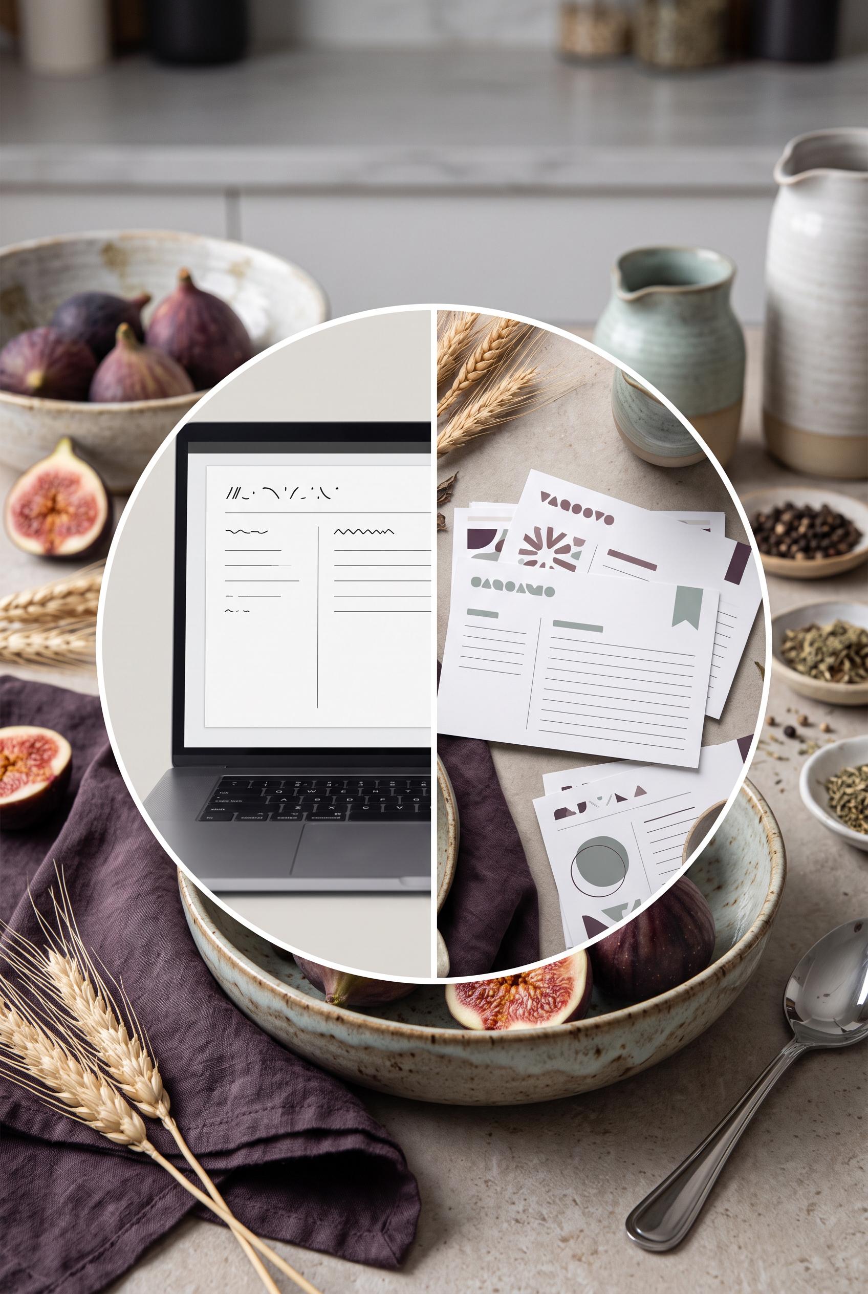
Create a vertical 2:3 Pinterest composition with commercial-quality art direction showing a circular aperture before-and-after reveal: a plain editable recipe card file on a laptop transforms into printed recipe cards arranged in a refined kitchen scene with ingredients, linen, and a ceramic bowl. Use fig plum, seafoam, wheat, and deep ink. No real brands, no trademarked characters, no watermark, and no unintended readable text. AI-modified downstream. Corrective regeneration attempt 3. Produce a materially revised image, not a near-duplicate of an earlier variant. Preserve the successful subject, palette, lighting, focal hierarchy, and commercial polish from the original brief while correcting every issue below. Mandatory corrective instructions from the most recent visual QA: Preserve the strong vertical 2:3 composition, clean circular split aperture, premium still-life lighting, fig plum/seafoam/wheat/deep-ink palette, laptop-to-printed-card transformation, linen, figs, wheat, spoon, and ceramic bowls. Remove every letter, number, word, logo, glyph, heading, label, and pseudo-text mark from the entire image. Replace the laptop keyboard with completely blank, unmarked keys or an abstract keyboard surface; make the laptop screen entirely blank with only subtle non-linguistic geometric blocks if needed. Replace all card markings with simple geometric shapes, solid color bars, circles, and clean lines that cannot resemble handwriting or letters. Keep the aperture edge crisp and the cards naturally arranged in a polished commercial still life. Do not add captions, labels, or explanatory text. Observed defects from prior variants that must not recur: 1) Strong vertical composition, focal aperture, and cohesive premium styling. 2) Recipe-card text is visibly readable, including “Recipe Card Template,” “Ingredients,” and “Instructions,” contrary to the no-unintended-readable-text requirement. 3) Some tiny card text is garbled and artifact-like. 4) The vertical composition, circular aperture, styling, palette, and transformation concept are strong. 5) Laptop keyboard keys contain visible letter-like markings, violating the requirement for no letters or readable glyphs anywhere. 6) Some printed-card decorative marks resemble pseudo-writing and should be made purely geometric and non-linguistic. Render no letters, words, numbers, prices, headings, labels, contact details, logos, glyphs, or pseudo-text anywhere. Use only blank surfaces, clean geometric marks, and non-linguistic placeholder shapes. Do not add explanatory captions, before/after labels, interface copy, or extra objects that the brief did not request. When a corrective instruction conflicts with a decorative detail, prioritize the corrective instruction.
 0
Create a vertical 2:3 Pinterest composition with commercial-quality art direction showing a circular aperture before-and-after reveal: a plain editable recipe card file on a laptop transforms into printed recipe cards arranged in a refined kitchen scene with ingredients, linen, and a ceramic bowl. Use fig plum, seafoam, wheat, and deep ink. No real brands, no trademarked characters, no watermark, and no unintended readable text. AI-modified downstream. Corrective regeneration attempt 2. Produce a materially revised image, not a near-duplicate of an earlier variant. Preserve the successful subject, palette, lighting, focal hierarchy, and commercial polish from the original brief while correcting every issue below. Mandatory corrective instructions from the most recent visual QA: Preserve the vertical 2:3 composition, circular split aperture, laptop-to-printed-card transformation, fig plum/seafoam/wheat/deep-ink palette, linen, figs, wheat, spoon, and ceramic bowls. Remove all readable text from every laptop and printed card: use only abstract blank lines, indistinct marks, or decorative non-letter forms, with no recognizable words, headings, labels, or pseudo-writing. Ensure no garbled text, logos, brands, watermarks, or trademarked imagery. Keep the aperture edge clean and the cards naturally arranged in a polished commercial still-life. Observed defects from prior variants that must not recur: 1) Strong vertical composition, focal aperture, and cohesive premium styling. 2) Recipe-card text is visibly readable, including “Recipe Card Template,” “Ingredients,” and “Instructions,” contrary to the no-unintended-readable-text requirement. 3) Some tiny card text is garbled and artifact-like. Render no letters, words, numbers, prices, headings, labels, contact details, logos, glyphs, or pseudo-text anywhere. Use only blank surfaces, clean geometric marks, and non-linguistic placeholder shapes. Do not add explanatory captions, before/after labels, interface copy, or extra objects that the brief did not request. When a corrective instruction conflicts with a decorative detail, prioritize the corrective instruction.
 0
Create a vertical 2:3 Pinterest composition with commercial-quality art direction showing a circular aperture before-and-after reveal: a plain editable recipe card file on a laptop transforms into printed recipe cards arranged in a refined kitchen scene with ingredients, linen, and a ceramic bowl. Use fig plum, seafoam, wheat, and deep ink. No real brands, no trademarked characters, no watermark, and no unintended readable text. AI-modified downstream.
 0
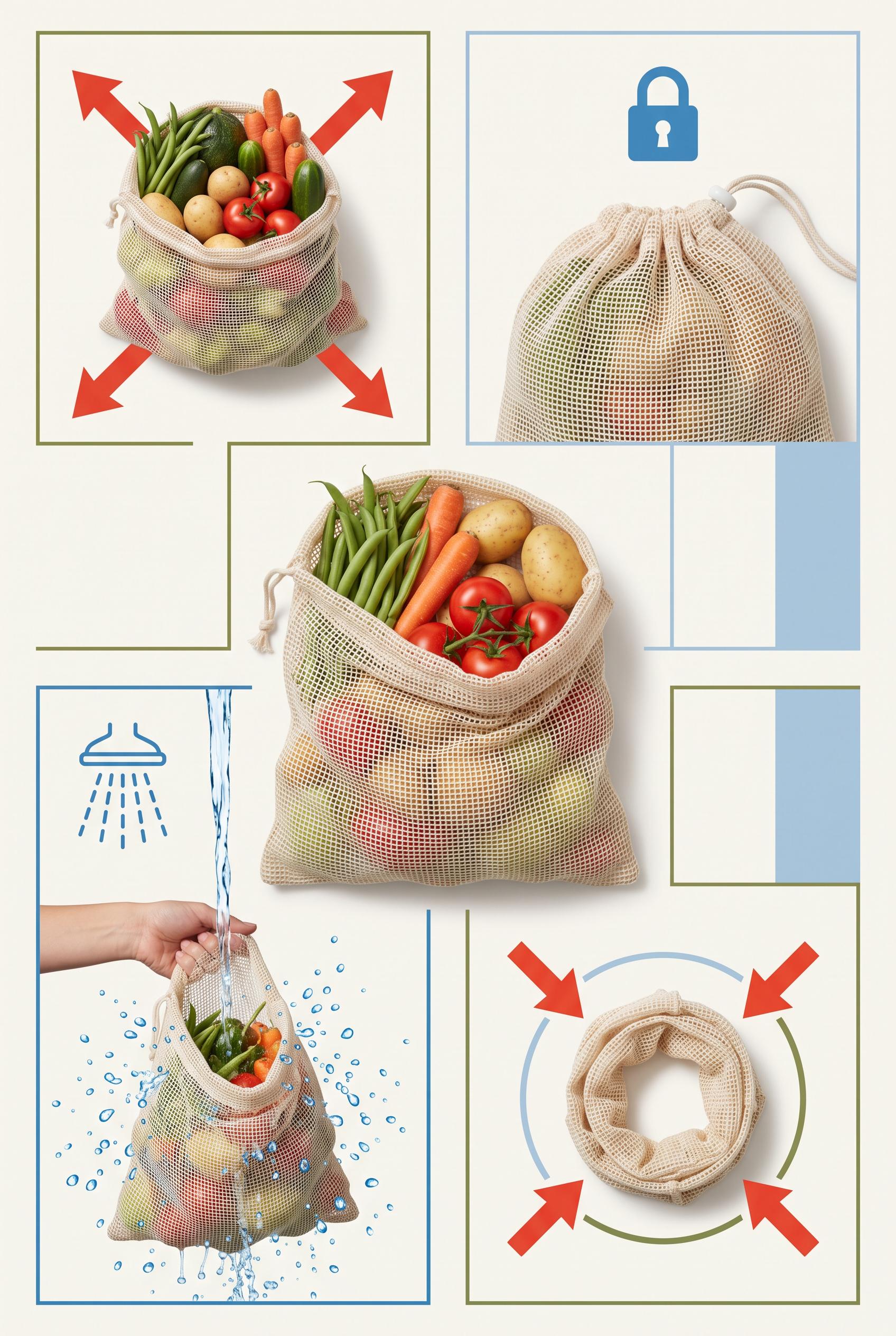
Create a commercial-quality educational product campaign in a vertical 2:3 Pinterest composition. Arrange one unbranded reusable produce bag at the center with four surrounding visual proof scenes showing capacity with vegetables, a secure drawstring closure, easy rinsing, and compact folded storage. Use tomato red, powder blue, olive green, and bone, crisp overhead photography mixed with subtle diagrammatic framing, no real brands, no trademarked characters, no watermark, and no unintended readable text. Corrective regeneration attempt 3. Produce a materially revised image, not a near-duplicate of an earlier variant. Preserve the successful subject, palette, lighting, focal hierarchy, and commercial polish from the original brief while correcting every issue below. Mandatory corrective instructions from the most recent visual QA: Preserve the attractive vertical 2:3 layout, bone background, tomato red/powder blue/olive palette, central unbranded reusable produce bag, clean four-panel grid, lighting, and polished illustration/photo hybrid style. Remove all readable text and lettering everywhere, including the visible capacity, secure drawstring closure, easy rinsing, and compact folded storage labels. Do not replace them with pseudo-text, numbers, logos, glyphs, or symbols resembling letters. Use only non-linguistic visual cues: four outward arrows around the vegetable-filled bag, a simple lock or cinch icon above the closed bag, blue water droplets and a rinse stream around the washed bag, and inward arrows circling the compact folded loop. Keep panels visually distinct, retain strong scale contrast and a clear promise-to-evidence flow, and ensure there are no watermarks, brands, trademarks, or generation artifacts. Observed defects from prior variants that must not recur: 1) The composition is attractive and clearly organized, but it contains extensive readable labels and headline text, contrary to the brief's requirement for visual cues without words. 2) The text is not garbled, but it is still an unintended mismatch with the requested text-free educational design. 3) Prominent readable labels appear throughout the composition, violating the text-free requirement. 4) The visual hierarchy is weakened by oversized text competing with the central hero bag. 5) The image otherwise has a strong vertical composition, clean grid, suitable palette, clear product focus, and distinct proof scenes. Render no letters, words, numbers, prices, headings, labels, contact details, logos, glyphs, or pseudo-text anywhere. Use only blank surfaces, clean geometric marks, and non-linguistic placeholder shapes. Do not add explanatory captions, before/after labels, interface copy, or extra objects that the brief did not request. When a corrective instruction conflicts with a decorative detail, prioritize the corrective instruction.
 0
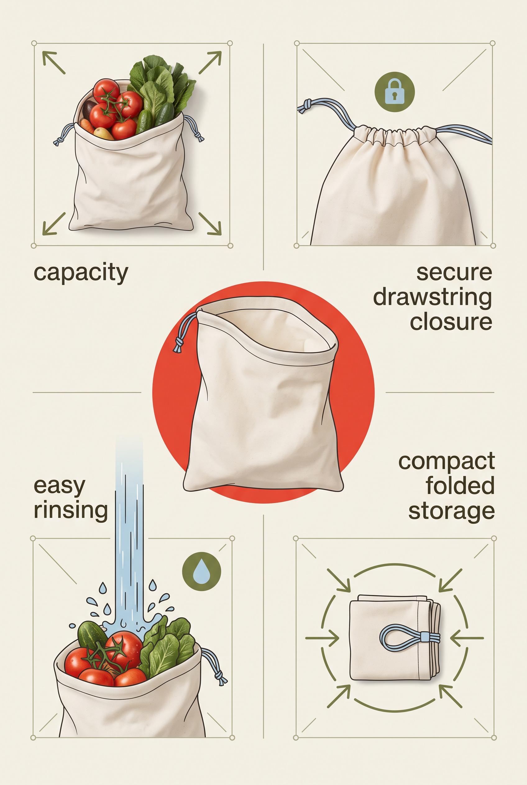
Create a commercial-quality educational product campaign in a vertical 2:3 Pinterest composition. Arrange one unbranded reusable produce bag at the center with four surrounding visual proof scenes showing capacity with vegetables, a secure drawstring closure, easy rinsing, and compact folded storage. Use tomato red, powder blue, olive green, and bone, crisp overhead photography mixed with subtle diagrammatic framing, no real brands, no trademarked characters, no watermark, and no unintended readable text. Corrective regeneration attempt 2. Produce a materially revised image, not a near-duplicate of an earlier variant. Preserve the successful subject, palette, lighting, focal hierarchy, and commercial polish from the original brief while correcting every issue below. Mandatory corrective instructions from the most recent visual QA: Preserve the vertical 2:3 layout, clean grid, bone background, tomato red/powder blue/olive palette, central hero reusable produce bag, and four surrounding proof scenes. Remove every readable word and letter, including “AMPLE CAPACITY WITH VEGETABLES,” “SECURE DRAWSTRING CLOSURE,” “THE BAG,” “EASY RINSING,” and “COMPACT FOLDED STORAGE.” Replace all labels with simple non-text visual icons and shape cues only: expansion arrows for capacity, a lock or cinch icon for closure, water droplets for rinsing, and inward arrows around a compact folded loop for storage. Keep the scenes visually distinct, unbranded, watermark-free, and free of any other readable text. Observed defects from prior variants that must not recur: 1) The composition is attractive and clearly organized, but it contains extensive readable labels and headline text, contrary to the brief's requirement for visual cues without words. 2) The text is not garbled, but it is still an unintended mismatch with the requested text-free educational design. Render no letters, words, numbers, prices, headings, labels, contact details, logos, glyphs, or pseudo-text anywhere. Use only blank surfaces, clean geometric marks, and non-linguistic placeholder shapes. Do not add explanatory captions, before/after labels, interface copy, or extra objects that the brief did not request. When a corrective instruction conflicts with a decorative detail, prioritize the corrective instruction.
 0
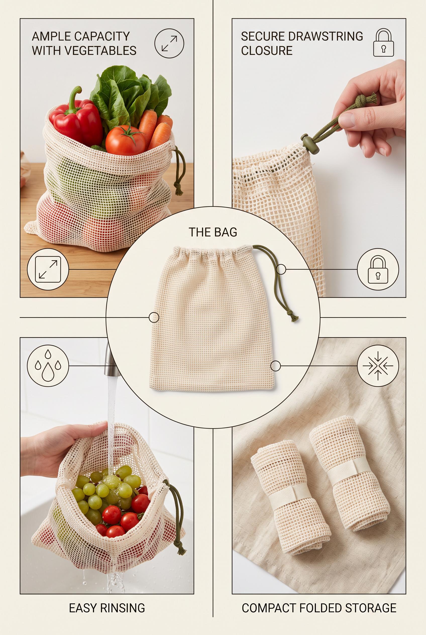
Create a commercial-quality educational product campaign in a vertical 2:3 Pinterest composition. Arrange one unbranded reusable produce bag at the center with four surrounding visual proof scenes showing capacity with vegetables, a secure drawstring closure, easy rinsing, and compact folded storage. Use tomato red, powder blue, olive green, and bone, crisp overhead photography mixed with subtle diagrammatic framing, no real brands, no trademarked characters, no watermark, and no unintended readable text.
 0
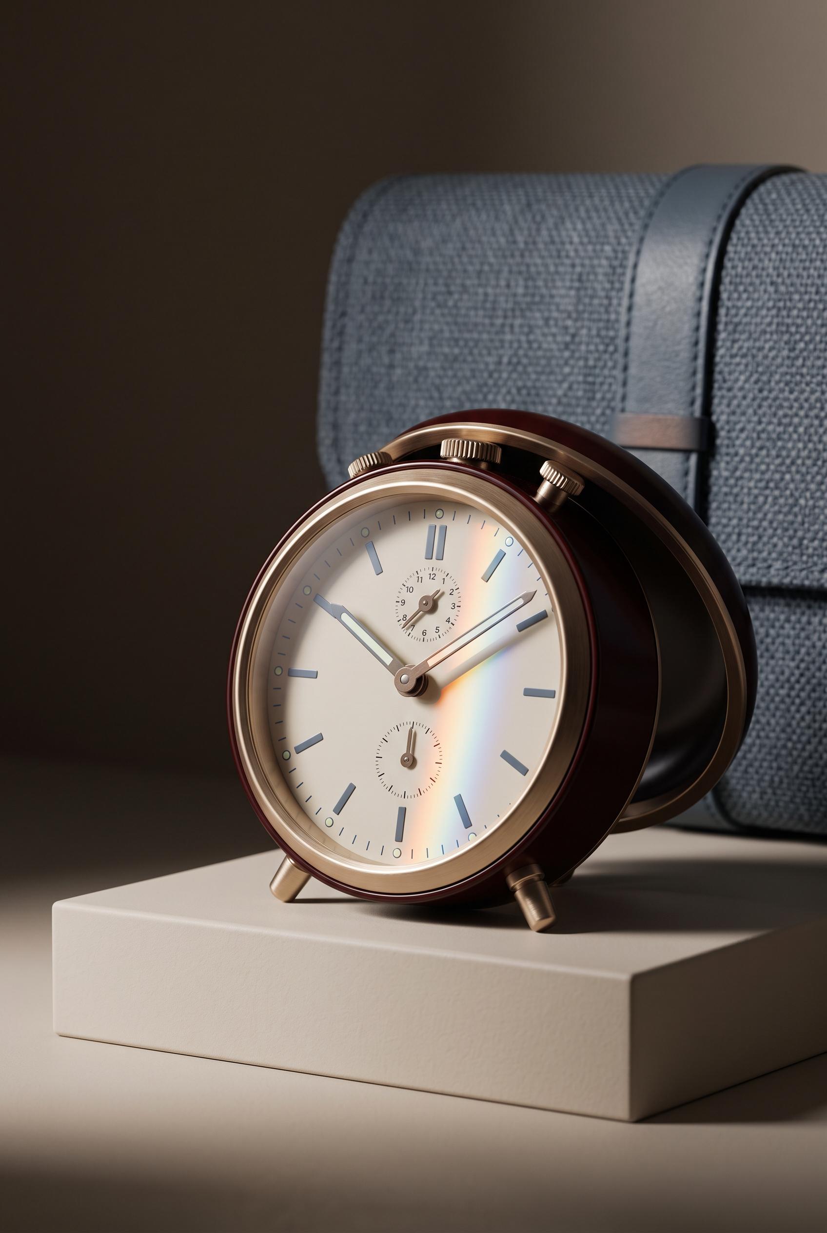
Create a commercial-quality inspirational product showcase in a vertical 2:3 Pinterest composition. Feature an unbranded analog travel alarm clock on a low cream plinth, hinged cover slightly open, soft woven case in the background, and a narrow prism of colored light crossing the face. Use oxblood, champagne metal, blue-grey, and cream, elegant editorial photography, controlled shadows, refined material detail, no real brands, no trademarked characters, no watermark, and no unintended readable text.
 0
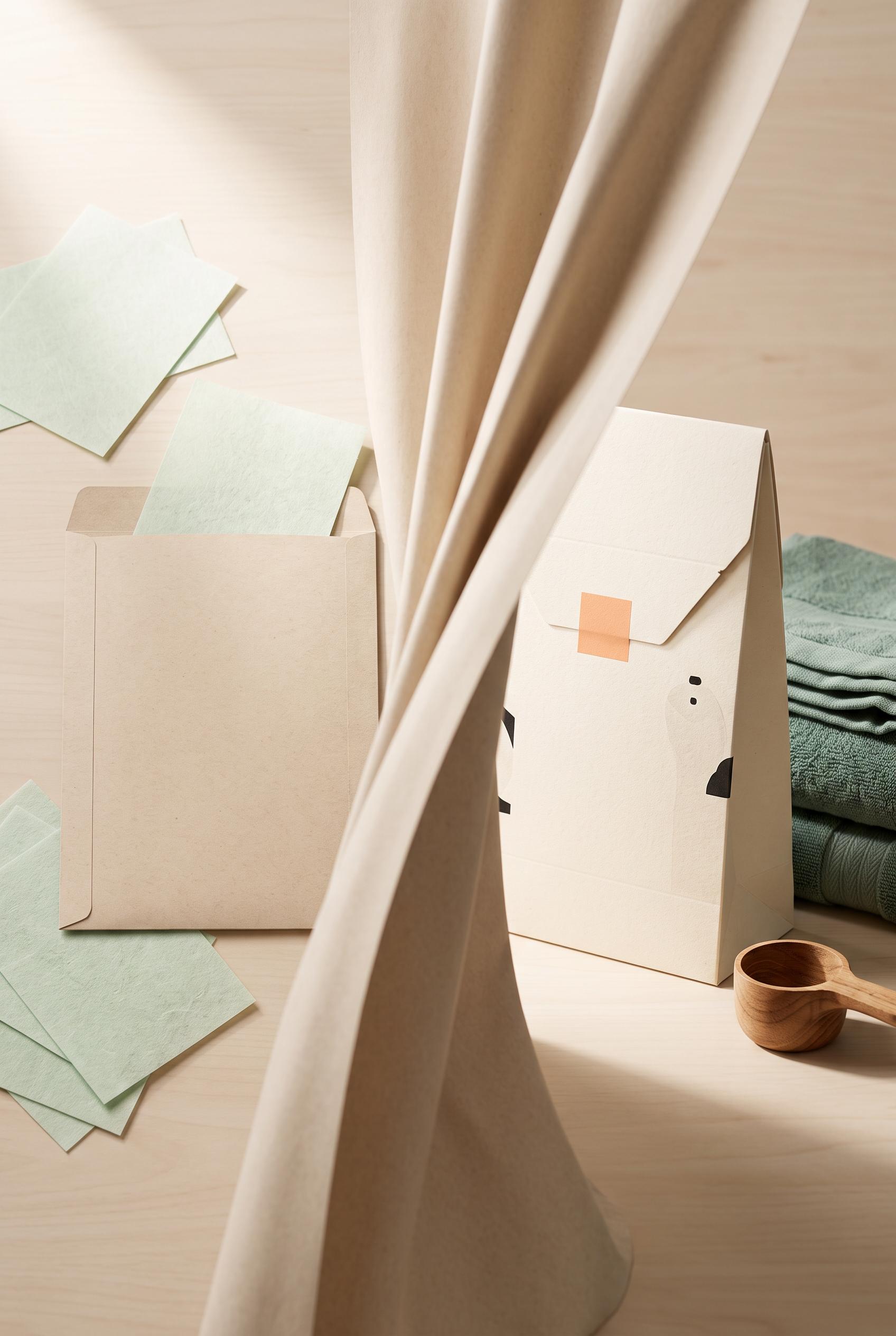
Create a commercial-quality product packaging scene in a vertical 2:3 Pinterest composition. Show a tactile curtain reveal from a flat unbranded laundry sheet refill envelope with loose sheets into a refined upright package beside folded towels and a small scoop. Use ink black, celadon green, apricot, and unbleached paper, soft studio light, realistic paper grain, crisp die-cut edges, premium art direction, no real brands, no trademarked characters, no watermark, and no unintended readable text. Corrective regeneration attempt 2. Produce a materially revised image, not a near-duplicate of an earlier variant. Preserve the successful subject, palette, lighting, focal hierarchy, and commercial polish from the original brief while correcting every issue below. Mandatory corrective instructions from the most recent visual QA: Preserve the warm premium studio styling, vertical 2:3 framing, paper grain, realistic shadows, folded towels, and wooden scoop. Rebuild the left side as a genuinely flat, unbranded refill envelope lying on the surface with several loose laundry sheets scattered nearby; use only blank paper surfaces with no letters, symbols, logos, icons, or pseudo-text. Add a clearly visible soft unbleached-paper curtain reveal sweeping through the center toward the right. On the right, show one refined upright unbranded package beside the neatly folded towel and small measuring scoop, with crisp die-cut edges and dimensional shadow. Keep all package and sheet surfaces completely free of readable or garbled text and remove the illustrated curtain print from the packaging. Observed defects from prior variants that must not recur: 1) Contains extensive readable packaging copy despite the no-readable-copy requirement. 2) Left-side package is not plain or flat; it is an upright decorated package rather than a flat refill envelope with scattered sheets. 3) The intended soft paper curtain reveal is not clearly depicted; the curtain graphic is printed on the package instead. 4) Composition and styling are attractive, with good paper texture, towels, scoop, lighting, and vertical framing. Render no letters, words, numbers, prices, headings, labels, contact details, logos, glyphs, or pseudo-text anywhere. Use only blank surfaces, clean geometric marks, and non-linguistic placeholder shapes. Do not add explanatory captions, before/after labels, interface copy, or extra objects that the brief did not request. When a corrective instruction conflicts with a decorative detail, prioritize the corrective instruction.
 0
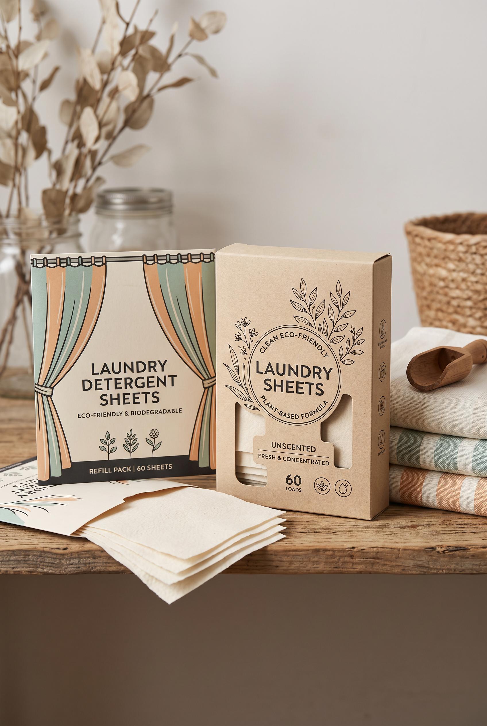
Create a commercial-quality product packaging scene in a vertical 2:3 Pinterest composition. Show a tactile curtain reveal from a flat unbranded laundry sheet refill envelope with loose sheets into a refined upright package beside folded towels and a small scoop. Use ink black, celadon green, apricot, and unbleached paper, soft studio light, realistic paper grain, crisp die-cut edges, premium art direction, no real brands, no trademarked characters, no watermark, and no unintended readable text.
 0
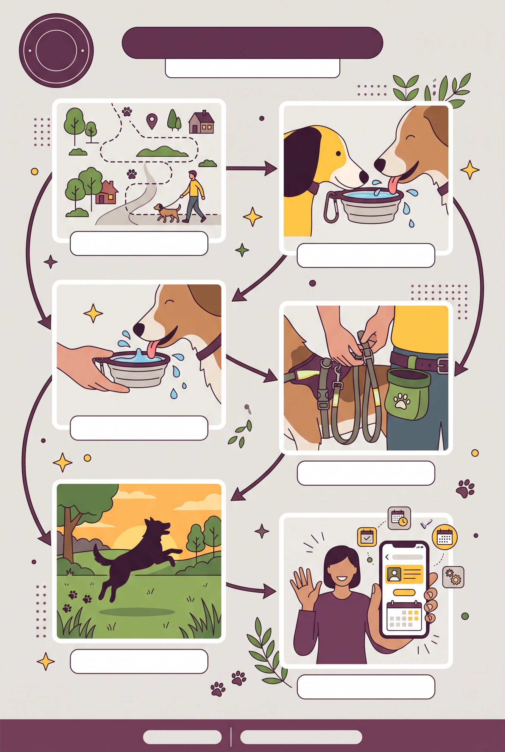
Create a commercial-quality AI-modified downstream Pinterest image in a vertical 2:3 composition for an independent dog-walking service. Use a circular day-planner path connecting five distinct photo tiles: neighborhood route, water break, safety detail, happy dog silhouette, and friendly booking gesture, plum, sunflower yellow, leafy green, and warm gray palette, clean editorial infographic styling, blank label areas with no readable text, no real brands, no trademarked characters, no watermark, no unintended readable text.
 0
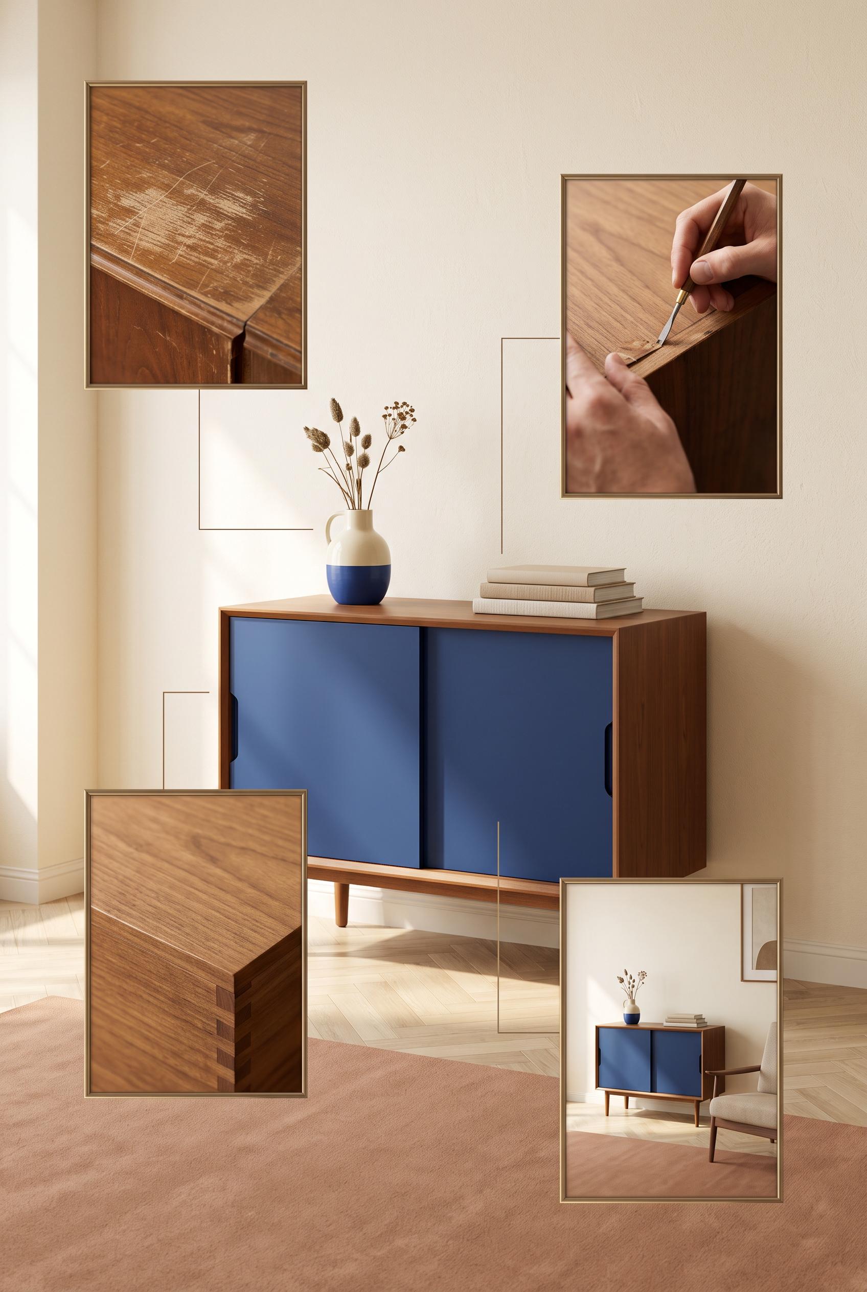
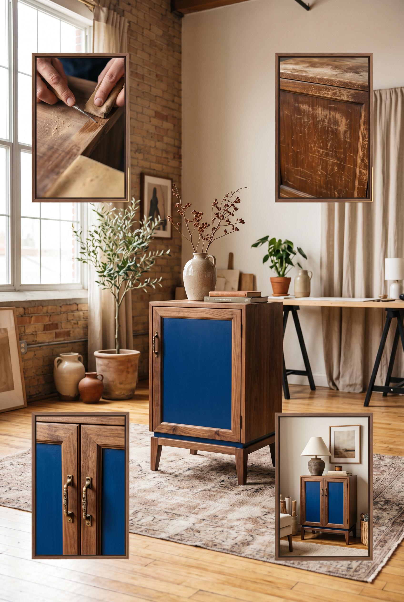
Create a commercial-quality AI-modified downstream Pinterest image in a vertical 2:3 composition for an independent furniture restoration studio. Show one beautifully restored vintage cabinet in a sunlit editorial room, surrounded by four floating framed visual moments of worn wood, hand repair, texture, and styled home placement, cobalt blue, tan, clay, and cream palette, cinematic natural light, refined campaign art direction, no real brands, no trademarked characters, no watermark, no unintended readable text. Corrective regeneration attempt 2. Produce a materially revised image, not a near-duplicate of an earlier variant. Preserve the successful subject, palette, lighting, focal hierarchy, and commercial polish from the original brief while correcting every issue below. Mandatory corrective instructions from the most recent visual QA: Preserve the existing composition, cabinet styling, sunlit editorial room, four framed moments, palette, and cinematic natural light. Remove all lettering, symbols, and markings from the book spines and replace them with completely blank, texture-only spines. Ensure there is no readable or garbled text anywhere in the image, with no other changes. Observed defects from prior variants that must not recur: 1) Strong vertical composition, clear cabinet focal point, and all four requested visual moments are present. 2) Tiny malformed/readable-looking text appears on the book spines, violating the no unintended readable text requirement. Render no letters, words, numbers, prices, headings, labels, contact details, logos, glyphs, or pseudo-text anywhere. Use only blank surfaces, clean geometric marks, and non-linguistic placeholder shapes. Do not add explanatory captions, before/after labels, interface copy, or extra objects that the brief did not request. When a corrective instruction conflicts with a decorative detail, prioritize the corrective instruction.
 0
Create a commercial-quality AI-modified downstream Pinterest image in a vertical 2:3 composition for an independent furniture restoration studio. Show one beautifully restored vintage cabinet in a sunlit editorial room, surrounded by four floating framed visual moments of worn wood, hand repair, texture, and styled home placement, cobalt blue, tan, clay, and cream palette, cinematic natural light, refined campaign art direction, no real brands, no trademarked characters, no watermark, no unintended readable text.
 0
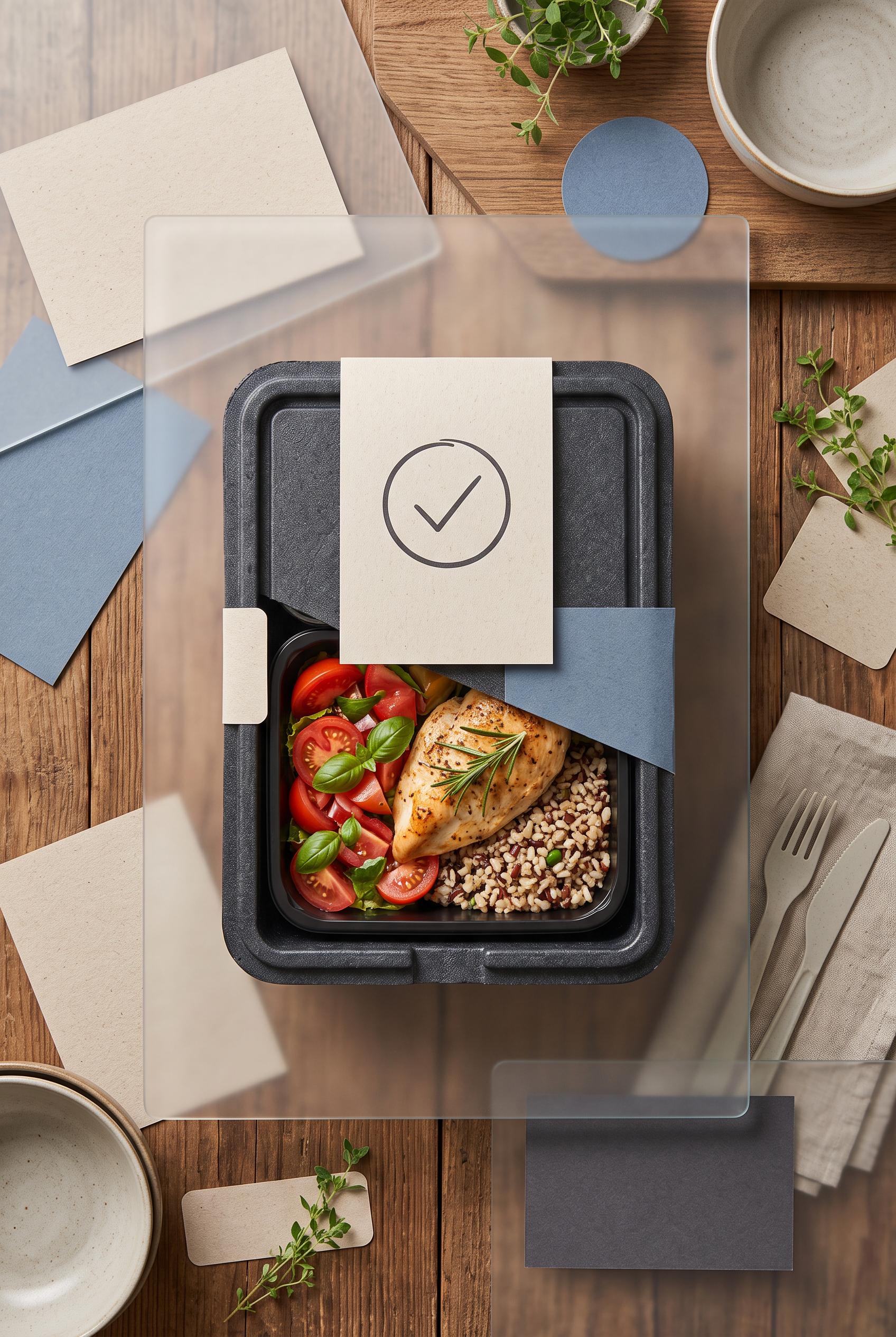
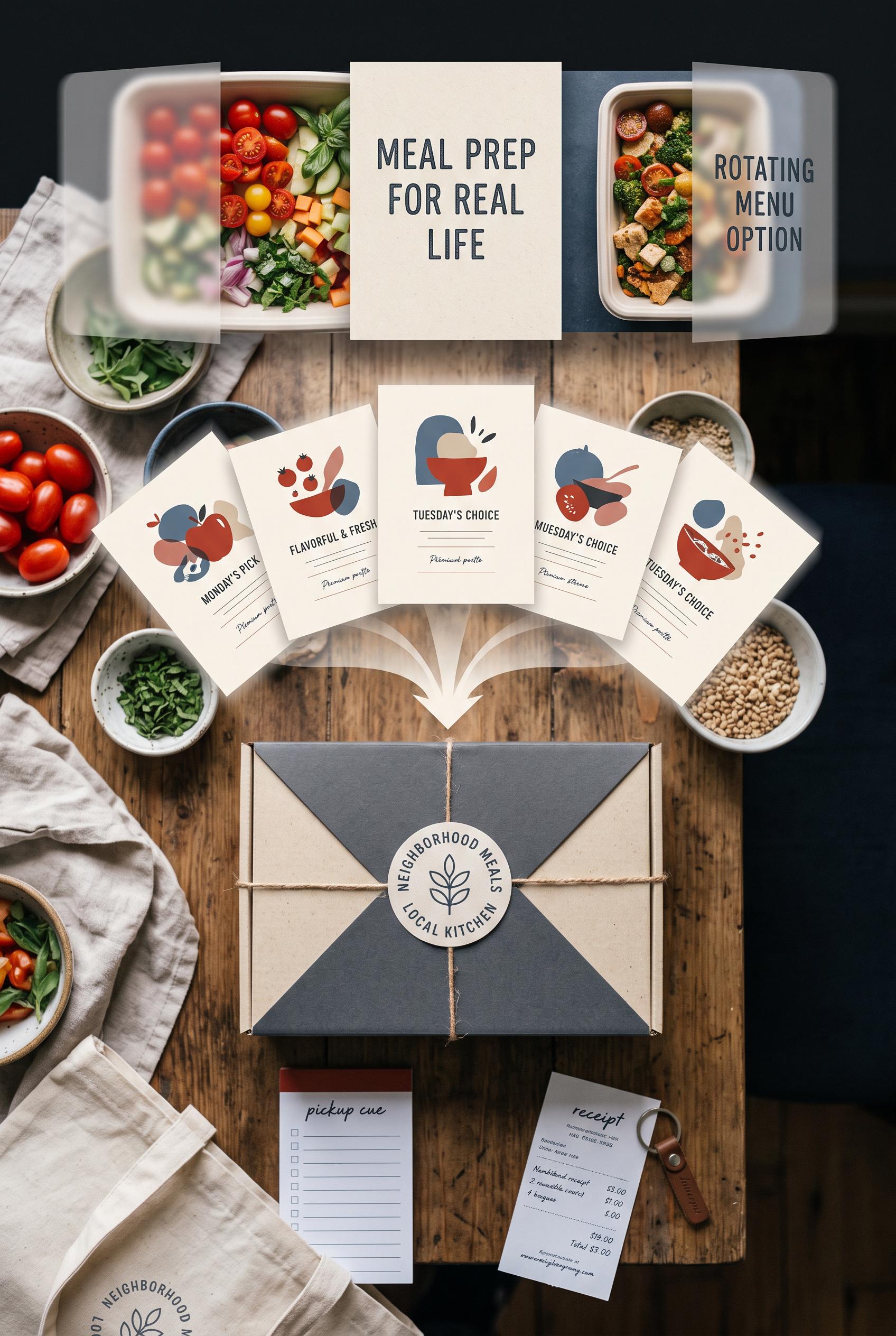
Create a commercial-quality AI-modified downstream Pinterest image in a vertical 2:3 composition for a neighborhood meal-prep service. Use an overhead tabletop scene with rotating translucent reveal panels, scattered generic menu cards transforming into one elegant meal box and pickup cue, tomato red, oatmeal, muted blue, and charcoal palette, tactile paper and food photography, premium small-business advertising art direction, no real brands, no trademarked characters, no watermark, no unintended readable text. Corrective regeneration attempt 2. Produce a materially revised image, not a near-duplicate of an earlier variant. Preserve the successful subject, palette, lighting, focal hierarchy, and commercial polish from the original brief while correcting every issue below. Mandatory corrective instructions from the most recent visual QA: Preserve the attractive overhead tabletop, vertical 2:3 framing, tomato-red/oatmeal/muted-blue/charcoal palette, realistic food photography, translucent reveal panels, and central meal box. Remove all readable lettering, logos, business names, seals, receipts, handwriting, menu titles, and labels. Replace every card and note with blank tactile paper or abstract non-text marks. Make the central hero a single elegant meal box with one prominent blank pickup cue card or simple non-linguistic calendar/checkmark icon, clearly communicating one weekly pickup promise without words. Reduce the number of competing objects and keep the meal box and pickup cue as the unmistakable focal point. Ensure there are no brand-like emblems, watermarks, garbled characters, or pseudo-text. Observed defects from prior variants that must not recur: 1) The image contains extensive unintended readable/generated text across the central panel, menu cards, package seal, pickup note, and receipt. 2) The package seal creates a brand-like identity with readable business wording, conflicting with the no-brand requirement. 3) The focal message does not clearly center on one weekly pickup promise; the composition is visually busy with multiple competing cards and documents. 4) The receipt and small notes contain visibly malformed or nonsensical text, failing the no-garbled-text requirement. Render no letters, words, numbers, prices, headings, labels, contact details, logos, glyphs, or pseudo-text anywhere. Use only blank surfaces, clean geometric marks, and non-linguistic placeholder shapes. Do not add explanatory captions, before/after labels, interface copy, or extra objects that the brief did not request. When a corrective instruction conflicts with a decorative detail, prioritize the corrective instruction.
 0
Create a commercial-quality AI-modified downstream Pinterest image in a vertical 2:3 composition for a neighborhood meal-prep service. Use an overhead tabletop scene with rotating translucent reveal panels, scattered generic menu cards transforming into one elegant meal box and pickup cue, tomato red, oatmeal, muted blue, and charcoal palette, tactile paper and food photography, premium small-business advertising art direction, no real brands, no trademarked characters, no watermark, no unintended readable text.
 0
Create a commercial-quality vertical 2:3 Pinterest composition for an educational creator campaign planner. Feature a large rotating diagnostic wheel divided into four abstract sections representing problem, process, evidence, and invitation, surrounded by four coordinated content cards. Use cobalt blue, clay orange, acid lime, and warm cream. Dynamic overhead studio layout, precise paper cutouts, clear visual sequencing, AI-modified downstream. No real brands, no trademarked characters, no watermark, and no unintended readable text.
 0
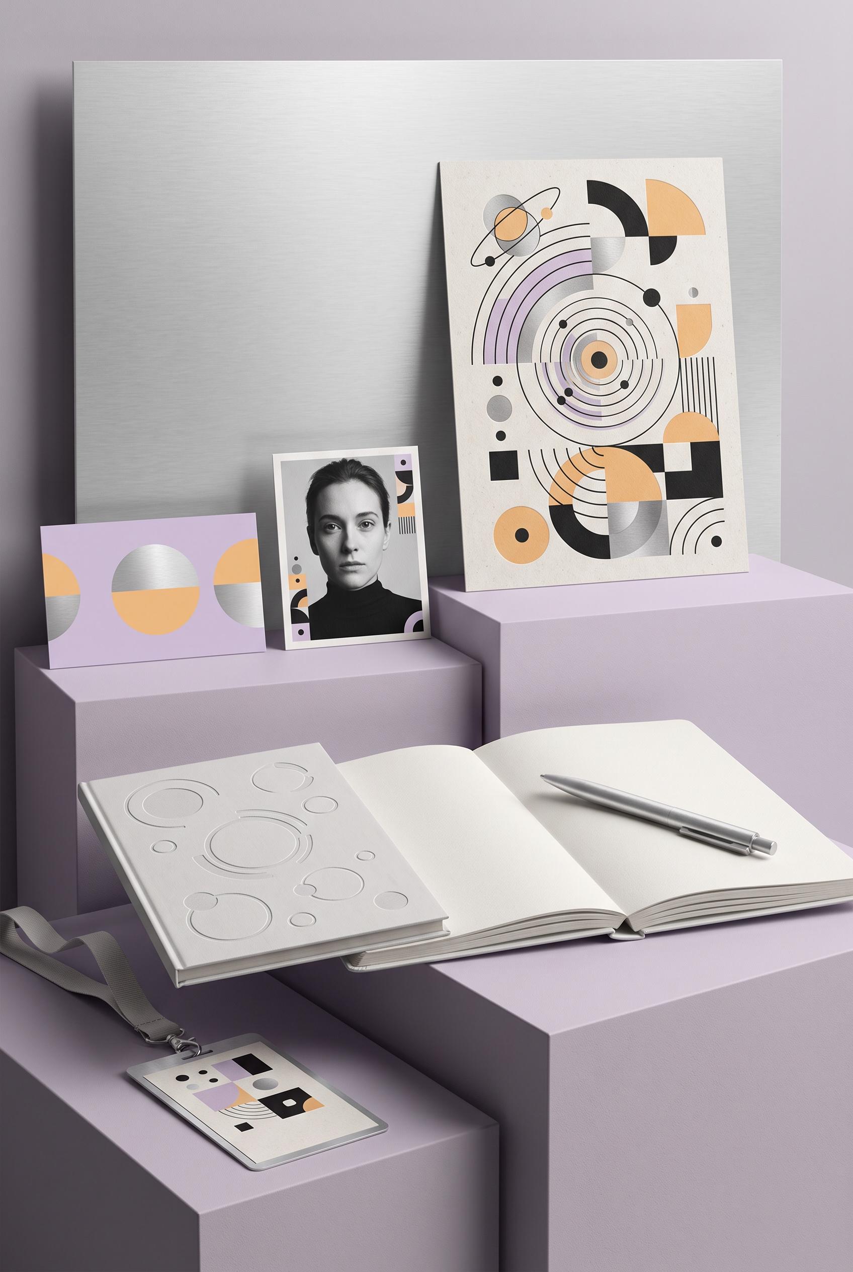
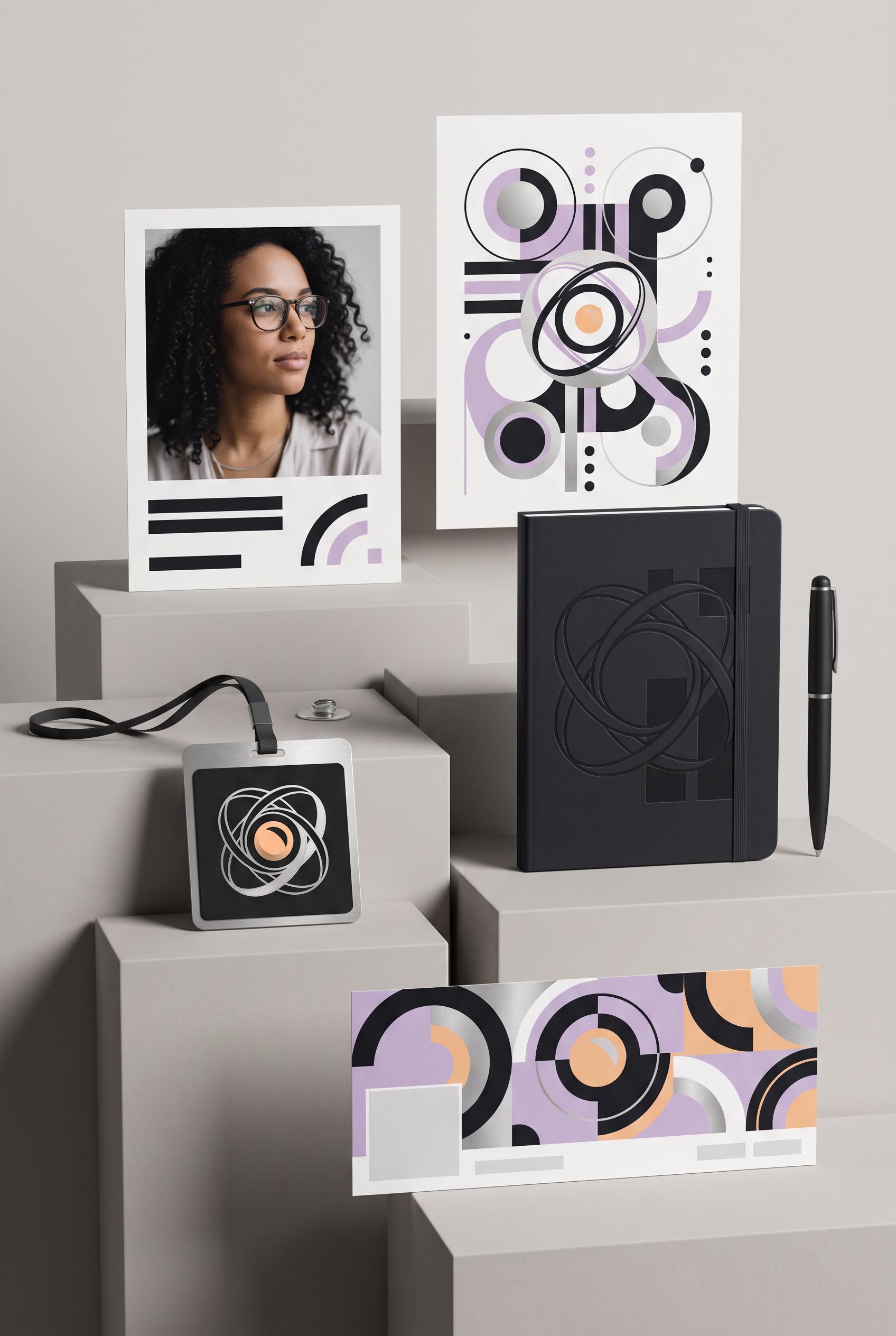
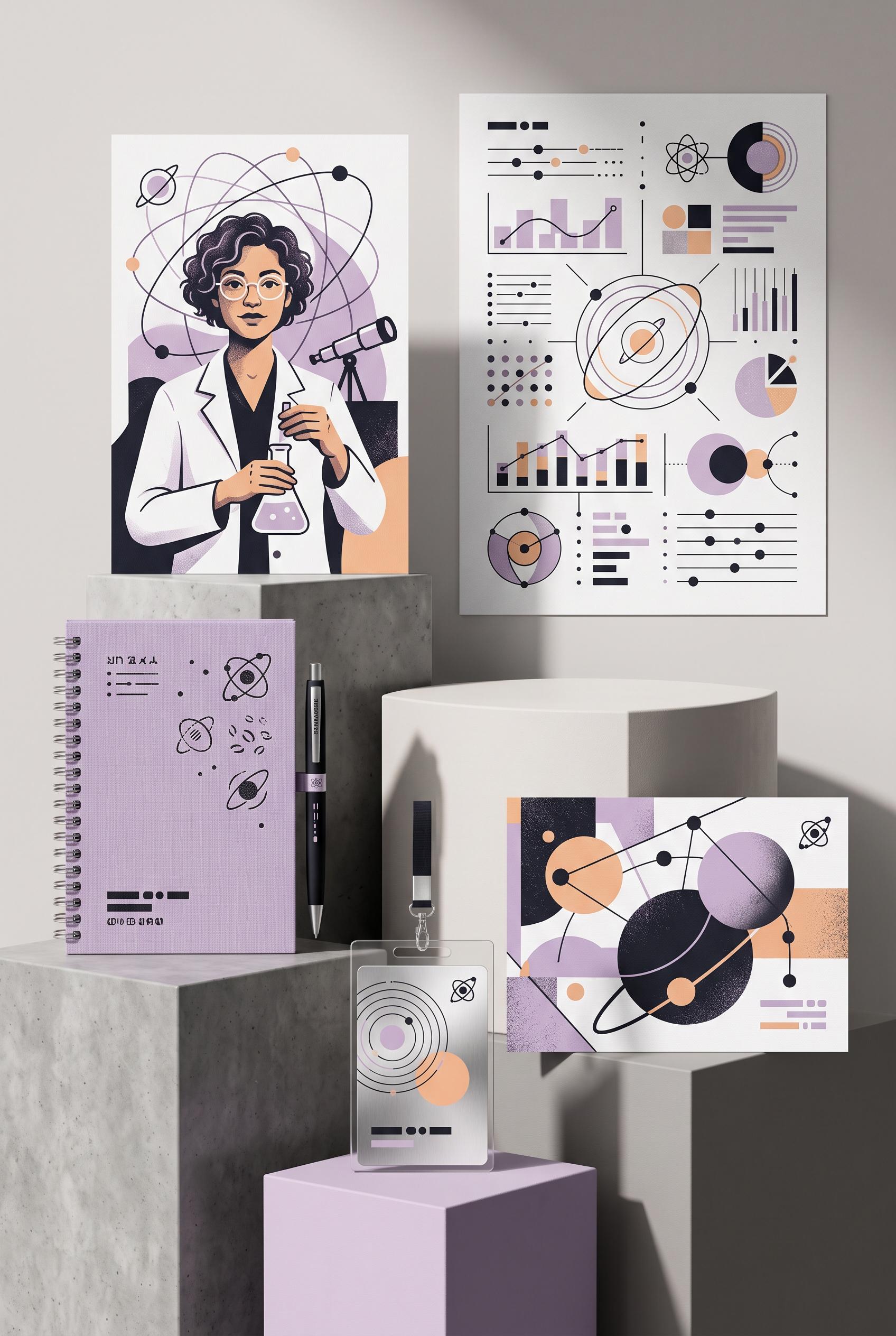
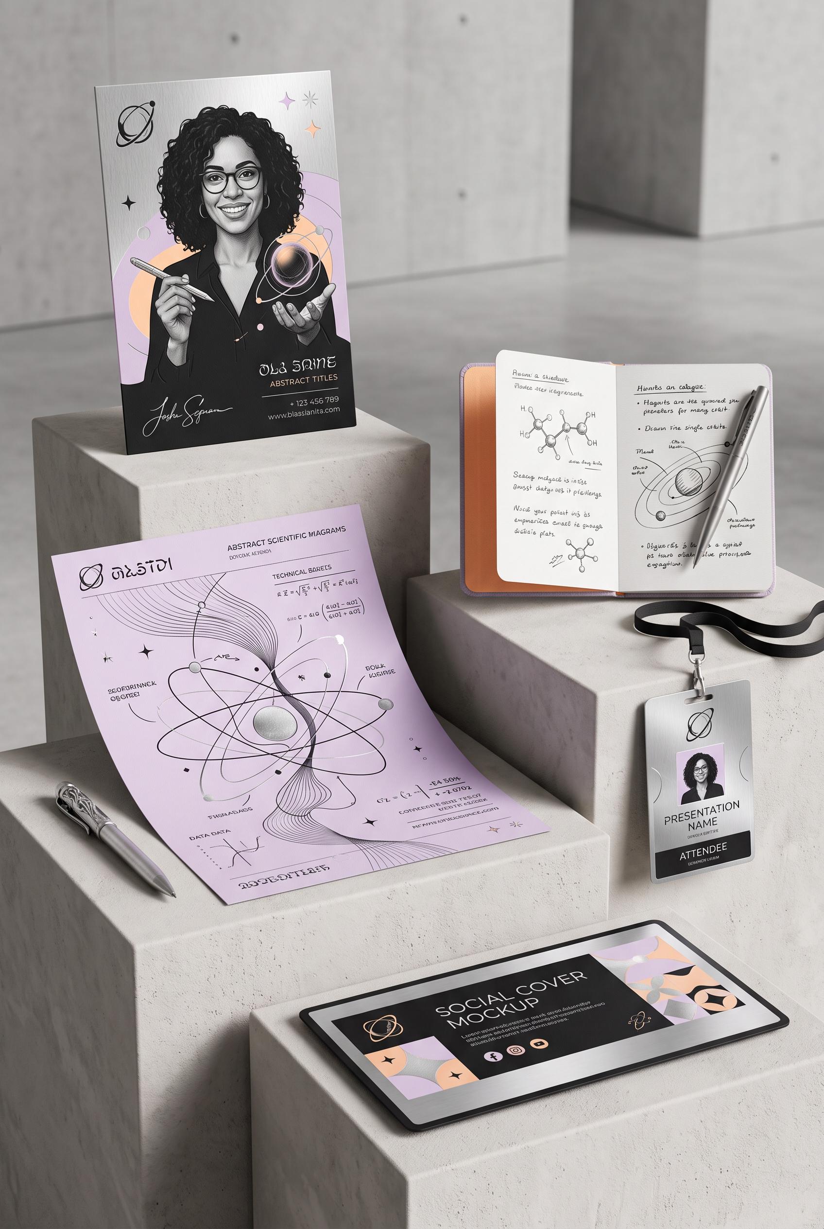
Create a commercial-quality vertical 2:3 Pinterest composition showcasing an inspirational personal brand identity for a fictional science communicator. Arrange a portrait card, abstract diagram sheet, notebook, presentation badge, and social cover on staggered museum plinths with subtle cast shadows. Use ink black, soft lilac, brushed silver, and apricot. Refined editorial art direction, tactile print details, modular orbital motifs, AI-modified downstream. No real brands, no trademarked characters, no watermark, and no unintended readable text. Corrective regeneration attempt 4. Produce a materially revised image, not a near-duplicate of an earlier variant. Preserve the successful subject, palette, lighting, focal hierarchy, and commercial polish from the original brief while correcting every issue below. Mandatory corrective instructions from the most recent visual QA: Preserve the polished vertical museum still life, portrait focal point, staggered plinths, lighting, tactile print texture, and ink black, lilac, brushed silver, and apricot palette. Replace every letter-like or logo-like form on the upper diagram sheet with clearly non-linguistic orbital arcs, concentric circles, dots, short rectangular bars, and modular geometric blocks; eliminate any shapes that resemble lowercase letters or typography. Simplify the notebook embossing into disconnected abstract circles and orbital arcs with no monogram-like silhouette. Keep the portrait card, badge, social cover, notebook, and pen completely text-free, with no words, numbers, glyphs, signatures, logos, icons, or pseudo-text anywhere. Observed defects from prior variants that must not recur: 1) Social cover includes recognizable social-media-style icons and the presentation badge includes templated identity text, conflicting with the no-brand/no-readable-copy requirement. 2) Attractive vertical museum-style composition with strong portrait focal point, cohesive palette, plinths, shadows, and requested identity objects. 3) Notebook contains clearly readable-looking pseudo-text and letter-like marks. 4) Pen includes a vertical brand-like text mark. 5) Some badge and notebook marks resemble templated identity copy rather than purely abstract non-linguistic geometry. 6) Strong vertical composition, focal portrait, plinth arrangement, palette, lighting, and object coverage are successful. 7) The upper diagram sheet contains prominent letter-like forms resembling lowercase typography, violating the no-letters/no-pseudo-text requirement. 8) The notebook embossing and some diagram marks could read as a logo-like identity symbol rather than purely non-linguistic geometry. Render no letters, words, numbers, prices, headings, labels, contact details, logos, glyphs, or pseudo-text anywhere. Use only blank surfaces, clean geometric marks, and non-linguistic placeholder shapes. Do not add explanatory captions, before/after labels, interface copy, or extra objects that the brief did not request. When a corrective instruction conflicts with a decorative detail, prioritize the corrective instruction.
 0
Create a commercial-quality vertical 2:3 Pinterest composition showcasing an inspirational personal brand identity for a fictional science communicator. Arrange a portrait card, abstract diagram sheet, notebook, presentation badge, and social cover on staggered museum plinths with subtle cast shadows. Use ink black, soft lilac, brushed silver, and apricot. Refined editorial art direction, tactile print details, modular orbital motifs, AI-modified downstream. No real brands, no trademarked characters, no watermark, and no unintended readable text. Corrective regeneration attempt 3. Produce a materially revised image, not a near-duplicate of an earlier variant. Preserve the successful subject, palette, lighting, focal hierarchy, and commercial polish from the original brief while correcting every issue below. Mandatory corrective instructions from the most recent visual QA: Preserve the vertical 2:3 museum still life, portrait focal point, staggered plinths, lighting, tactile print texture, orbital motifs, and ink black, lilac, silver, and apricot palette. Remove all letter-like marks, pseudo-text, words, numbers, signatures, logos, and brand-like symbols from the notebook, pen, badge, portrait card, diagram sheet, and social cover. Replace every such area with clean blank space or unmistakably non-linguistic circles, dots, bars, orbital arcs, and geometric blocks. Ensure the notebook cover and pen are completely text-free, and make all object surfaces clean and artifact-free. Observed defects from prior variants that must not recur: 1) Strong vertical museum-style composition with clear focal portrait and cohesive palette. 2) Multiple objects contain prominent readable but nonsensical or unintended text, including the portrait card, diagram sheet, notebook, badge, and social cover. 3) Social cover includes recognizable social-media-style icons and the presentation badge includes templated identity text, conflicting with the no-brand/no-readable-copy requirement. 4) Attractive vertical museum-style composition with strong portrait focal point, cohesive palette, plinths, shadows, and requested identity objects. 5) Notebook contains clearly readable-looking pseudo-text and letter-like marks. 6) Pen includes a vertical brand-like text mark. 7) Some badge and notebook marks resemble templated identity copy rather than purely abstract non-linguistic geometry. Render no letters, words, numbers, prices, headings, labels, contact details, logos, glyphs, or pseudo-text anywhere. Use only blank surfaces, clean geometric marks, and non-linguistic placeholder shapes. Do not add explanatory captions, before/after labels, interface copy, or extra objects that the brief did not request. When a corrective instruction conflicts with a decorative detail, prioritize the corrective instruction.
 0
Create a commercial-quality vertical 2:3 Pinterest composition showcasing an inspirational personal brand identity for a fictional science communicator. Arrange a portrait card, abstract diagram sheet, notebook, presentation badge, and social cover on staggered museum plinths with subtle cast shadows. Use ink black, soft lilac, brushed silver, and apricot. Refined editorial art direction, tactile print details, modular orbital motifs, AI-modified downstream. No real brands, no trademarked characters, no watermark, and no unintended readable text. Corrective regeneration attempt 2. Produce a materially revised image, not a near-duplicate of an earlier variant. Preserve the successful subject, palette, lighting, focal hierarchy, and commercial polish from the original brief while correcting every issue below. Mandatory corrective instructions from the most recent visual QA: Preserve the attractive vertical 2:3 museum still life, staggered plinths, portrait illustration, notebook, diagram sheet, badge, social cover, orbital motifs, tactile print texture, shadows, and ink black/lilac/silver/apricot palette. Remove every letter, word, number, equation, website, signature, phone number, placeholder copy, and readable mark from all objects. Replace all text areas with purely abstract modular lines, dots, orbital symbols, geometric blocks, and non-linguistic glyphs. Remove recognizable social-media icons and any brand-like symbols; retain only original abstract orbital motifs. Ensure all surfaces remain clean, coherent, and artifact-free. Observed defects from prior variants that must not recur: 1) Strong vertical museum-style composition with clear focal portrait and cohesive palette. 2) Multiple objects contain prominent readable but nonsensical or unintended text, including the portrait card, diagram sheet, notebook, badge, and social cover. 3) Social cover includes recognizable social-media-style icons and the presentation badge includes templated identity text, conflicting with the no-brand/no-readable-copy requirement. Render no letters, words, numbers, prices, headings, labels, contact details, logos, glyphs, or pseudo-text anywhere. Use only blank surfaces, clean geometric marks, and non-linguistic placeholder shapes. Do not add explanatory captions, before/after labels, interface copy, or extra objects that the brief did not request. When a corrective instruction conflicts with a decorative detail, prioritize the corrective instruction.
 0
Create a commercial-quality vertical 2:3 Pinterest composition showcasing an inspirational personal brand identity for a fictional science communicator. Arrange a portrait card, abstract diagram sheet, notebook, presentation badge, and social cover on staggered museum plinths with subtle cast shadows. Use ink black, soft lilac, brushed silver, and apricot. Refined editorial art direction, tactile print details, modular orbital motifs, AI-modified downstream. No real brands, no trademarked characters, no watermark, and no unintended readable text.
 0
Create a commercial-quality vertical 2:3 Pinterest composition showing a before-and-after transformation of a generic creator workshop workbook cover. Left side is cluttered with competing shapes and weak hierarchy; right side is refined with one bold abstract learning symbol, strong scale contrast, and generous negative space. Use saffron, aubergine, porcelain, and moss green. Editorial design studio lighting, tactile paper texture, crisp art direction, AI-modified downstream. No real brands, no trademarked characters, no watermark, and no unintended readable text. Corrective regeneration attempt 3. Produce a materially revised image, not a near-duplicate of an earlier variant. Preserve the successful subject, palette, lighting, focal hierarchy, and commercial polish from the original brief while correcting every issue below. Mandatory corrective instructions from the most recent visual QA: Create one clean vertical 2:3 composition with exactly two workbook covers: one cluttered cover on the left and one refined cover on the right, aligned in a single row. Remove the entire duplicated lower row and any cross-shaped four-panel layout. Add one unmistakable folded-paper reveal running between the left and right covers. Preserve the saffron, aubergine, porcelain, and moss-green palette, tactile paper texture, crisp editorial lighting, strong abstract symbol on the refined cover, accurate book geometry, and generous outer margins. Use only blank structured areas and abstract geometric marks; include no letters, words, numbers, pseudo-text, labels, logos, watermarks, or extra objects. Observed defects from prior variants that must not recur: 1) The composition is duplicated into two stacked before/after rows, weakening hierarchy and focal point. 2) It does not include the requested folded-paper reveal between states. 3) The left workbook contains obvious garbled pseudo-text, including malformed readable-looking lines. 4) The design uses prominent literal labels and workbook copy despite the brief requiring no literal copy. 5) The image is duplicated into two stacked before/after rows instead of one comparison. 6) The duplicated layout weakens the focal hierarchy and does not present a single clean vertical composition. 7) The folded-paper reveal is ambiguous and functions as a cross-shaped divider rather than a clear reveal between one left and one right state. Render no letters, words, numbers, prices, headings, labels, contact details, logos, glyphs, or pseudo-text anywhere. Use only blank surfaces, clean geometric marks, and non-linguistic placeholder shapes. Do not add explanatory captions, before/after labels, interface copy, or extra objects that the brief did not request. When a corrective instruction conflicts with a decorative detail, prioritize the corrective instruction.
 0
Create a commercial-quality vertical 2:3 Pinterest composition showing a before-and-after transformation of a generic creator workshop workbook cover. Left side is cluttered with competing shapes and weak hierarchy; right side is refined with one bold abstract learning symbol, strong scale contrast, and generous negative space. Use saffron, aubergine, porcelain, and moss green. Editorial design studio lighting, tactile paper texture, crisp art direction, AI-modified downstream. No real brands, no trademarked characters, no watermark, and no unintended readable text. Corrective regeneration attempt 2. Produce a materially revised image, not a near-duplicate of an earlier variant. Preserve the successful subject, palette, lighting, focal hierarchy, and commercial polish from the original brief while correcting every issue below. Mandatory corrective instructions from the most recent visual QA: Create one clean vertical 2:3 Pinterest composition with a single before-and-after comparison, not duplicated rows. Place one cluttered generic workbook cover on the left and one refined workbook cover on the right, separated by a clear folded-paper reveal. Preserve the saffron, aubergine, porcelain, and moss-green palette, tactile paper texture, crisp editorial lighting, and strong abstract symbol on the refined cover. Use no readable words, letters, numbers, pseudo-text, or labels anywhere; replace all cover typography with blank structured areas or purely abstract graphic hierarchy. Ensure generous margins, one clear focal point, accurate book geometry, and no brands, trademarks, watermarks, or generation artifacts. Observed defects from prior variants that must not recur: 1) The composition is duplicated into two stacked before/after rows, weakening hierarchy and focal point. 2) It does not include the requested folded-paper reveal between states. 3) The left workbook contains obvious garbled pseudo-text, including malformed readable-looking lines. 4) The design uses prominent literal labels and workbook copy despite the brief requiring no literal copy. Render no letters, words, numbers, prices, headings, labels, contact details, logos, glyphs, or pseudo-text anywhere. Use only blank surfaces, clean geometric marks, and non-linguistic placeholder shapes. Do not add explanatory captions, before/after labels, interface copy, or extra objects that the brief did not request. When a corrective instruction conflicts with a decorative detail, prioritize the corrective instruction.
 0
Create a commercial-quality vertical 2:3 Pinterest composition showing a before-and-after transformation of a generic creator workshop workbook cover. Left side is cluttered with competing shapes and weak hierarchy; right side is refined with one bold abstract learning symbol, strong scale contrast, and generous negative space. Use saffron, aubergine, porcelain, and moss green. Editorial design studio lighting, tactile paper texture, crisp art direction, AI-modified downstream. No real brands, no trademarked characters, no watermark, and no unintended readable text.
 0
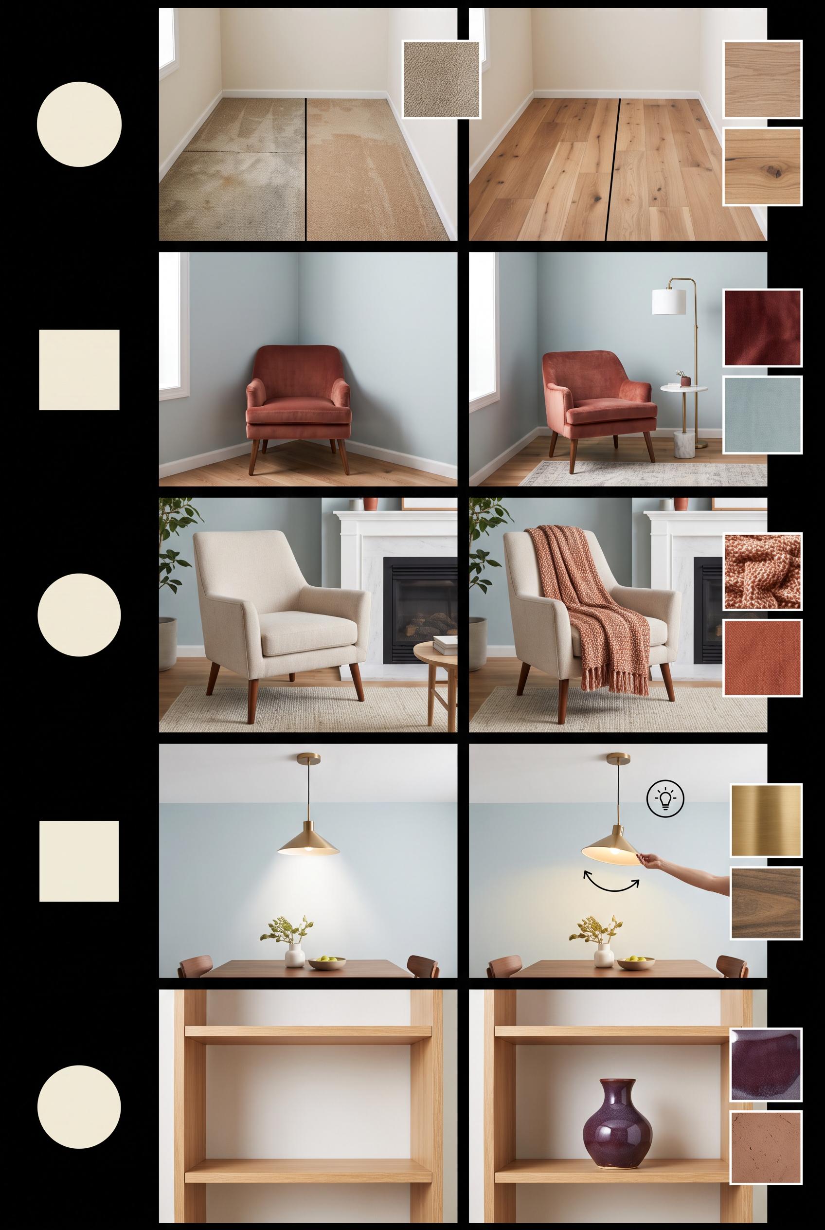
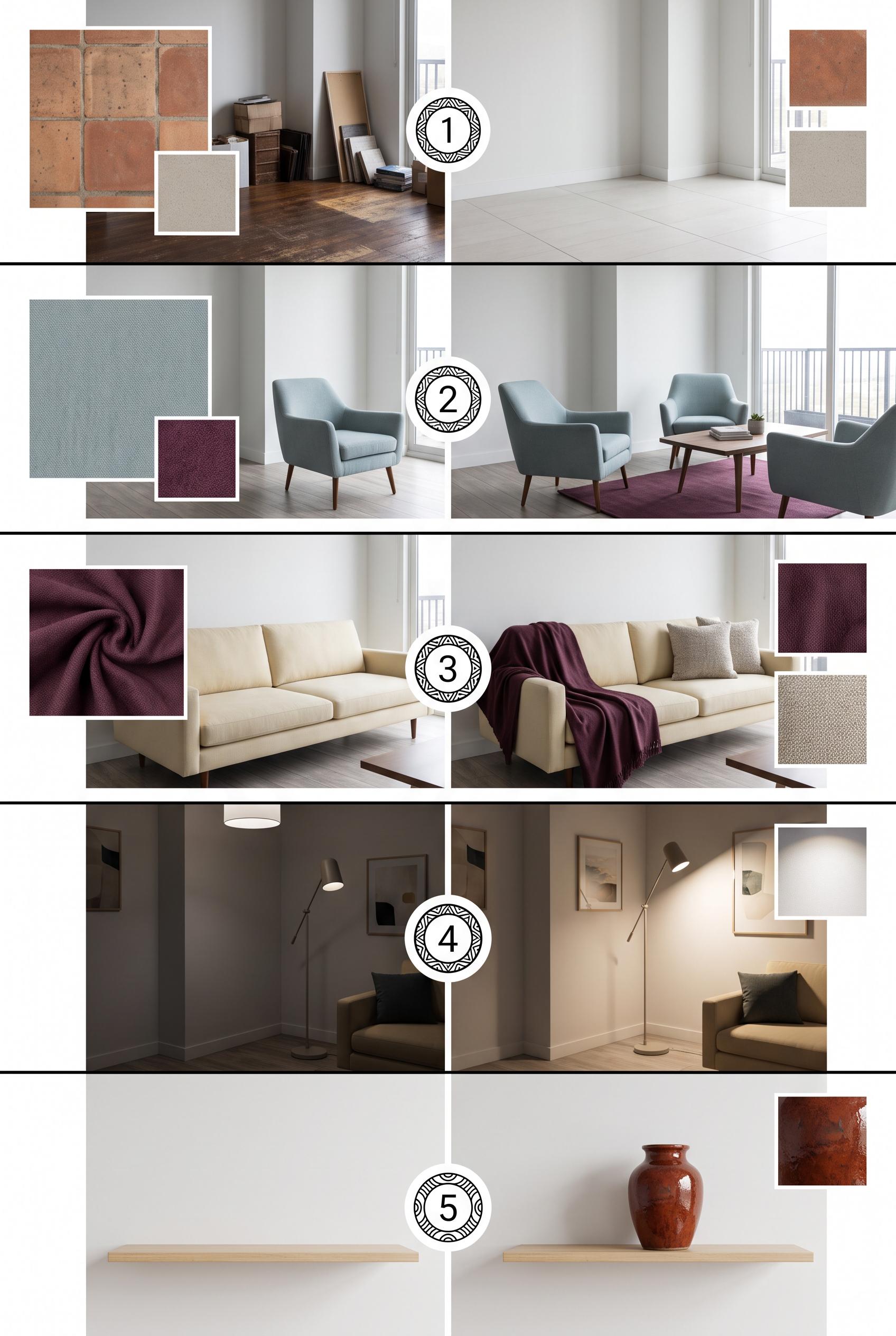
Create a commercial-quality educational interior styling graphic in a vertical 2:3 Pinterest composition. Show a five-step room refresh as an editorial contact sheet: edited floor, repositioned seating, added textile, redirected lighting, and one personal object. Include small room vignettes, material swatches, and simple numbered circles with no readable words. Use terracotta, mist blue, buttercream, and deep plum. AI-modified downstream. No real brands, no trademarked characters, no watermark, no unintended readable text. Corrective regeneration attempt 5. Produce a materially revised image, not a near-duplicate of an earlier variant. Preserve the successful subject, palette, lighting, focal hierarchy, and commercial polish from the original brief while correcting every issue below. Mandatory corrective instructions from the most recent visual QA: Preserve the polished vertical 2:3 editorial contact-sheet layout, black dividers, palette, room styling, material swatches, lighting, and commercial finish. Remove the visible numbered circles and every numeral, letter, word, label, logo, watermark, glyph, and pseudo-text from the entire image. Replace each step marker with a simple blank, non-linguistic geometric circle or other clean geometric mark. Keep the five sequential room transformations clear through imagery alone. Preserve step 5 exactly as an empty shelf before and one ceramic vase on the shelf after, with no other decor. Observed defects from prior variants that must not recur: 1) Step 5 imagery is somewhat ambiguous and does not make the requested single-object change unmistakable. 2) Visible numerals 1–5 violate the latest instruction to render no numbers or readable glyphs. 3) Step 5 shows the vase already present before the change, so it depicts moving the object rather than adding exactly one personal object. 4) The step 5 before/after transformation is therefore ambiguous. 5) Attractive vertical editorial contact-sheet composition with strong palette and clear progression. 6) Visible numerals 1–5 violate the mandatory instruction to remove all numbers and readable glyphs. 7) The numbered ornamental circles must be replaced with blank, non-linguistic geometric marks while preserving the layout. 8) Step 5 correctly shows an empty shelf before and exactly one ceramic vase after. Render no letters, words, numbers, prices, headings, labels, contact details, logos, glyphs, or pseudo-text anywhere. Use only blank surfaces, clean geometric marks, and non-linguistic placeholder shapes. Do not add explanatory captions, before/after labels, interface copy, or extra objects that the brief did not request. When a corrective instruction conflicts with a decorative detail, prioritize the corrective instruction.
 0
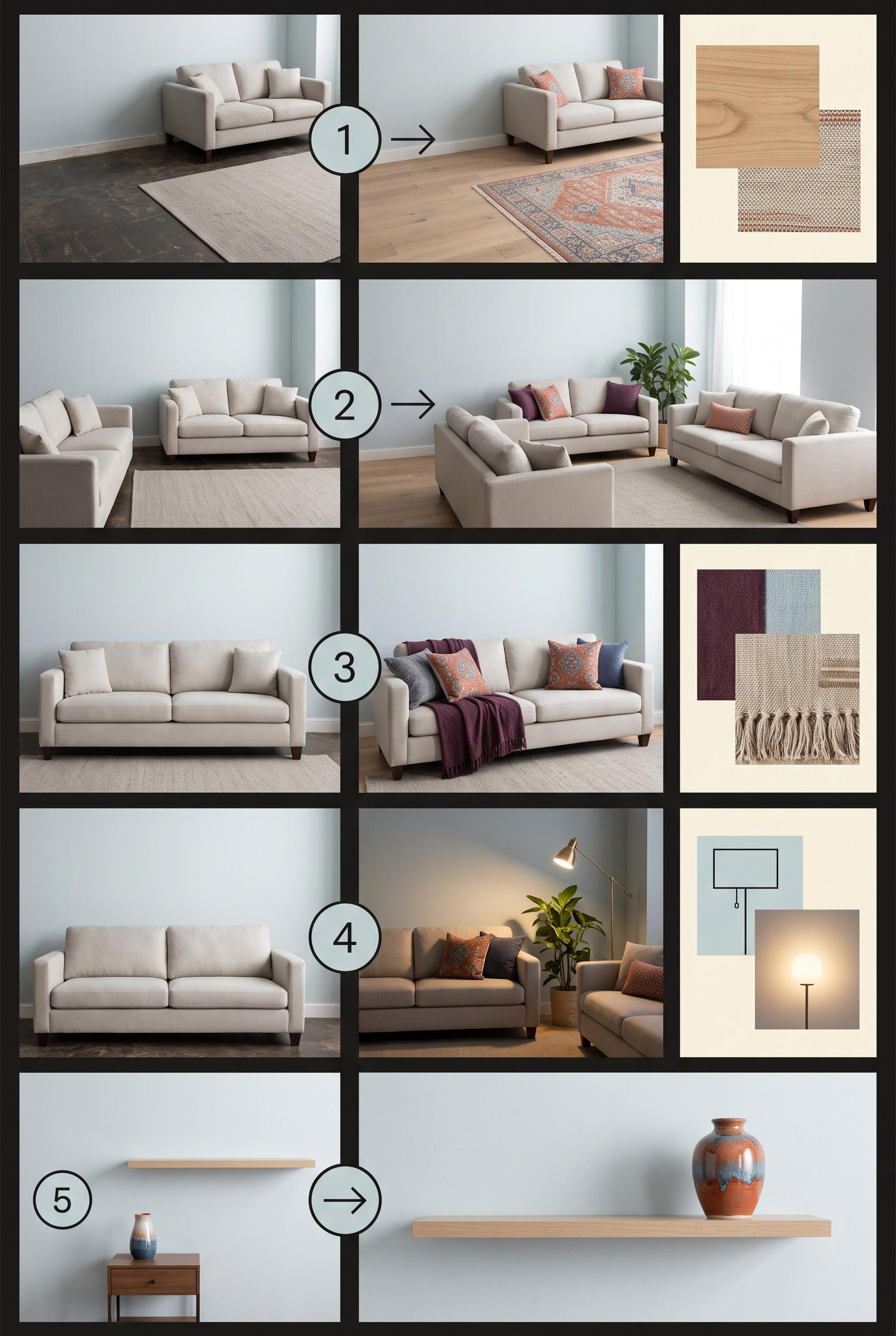
Create a commercial-quality educational interior styling graphic in a vertical 2:3 Pinterest composition. Show a five-step room refresh as an editorial contact sheet: edited floor, repositioned seating, added textile, redirected lighting, and one personal object. Include small room vignettes, material swatches, and simple numbered circles with no readable words. Use terracotta, mist blue, buttercream, and deep plum. AI-modified downstream. No real brands, no trademarked characters, no watermark, no unintended readable text. Corrective regeneration attempt 4. Produce a materially revised image, not a near-duplicate of an earlier variant. Preserve the successful subject, palette, lighting, focal hierarchy, and commercial polish from the original brief while correcting every issue below. Mandatory corrective instructions from the most recent visual QA: Preserve the polished vertical 2:3 editorial contact-sheet layout, black dividers, palette, room styling, material swatches, lighting, and commercial finish. Remove every numeral, arrow, letter, word, label, logo, watermark, glyph, and pseudo-text from the entire image; use only blank surfaces and clean non-linguistic geometric marks if needed. Revise step 5 so the before vignette shows a completely empty wall shelf and no personal object anywhere, while the after vignette shows exactly one personal object—a single ceramic vase—added to the shelf. Remove the existing vase from the before scene and eliminate all other books, stacked items, artwork, lamps, rugs, sculptures, plants, and decor from both step 5 scenes. Make the single-object addition unmistakable while keeping all other successful visuals unchanged. Observed defects from prior variants that must not recur: 1) Several labels contain obvious garbled text and nonsensical phrases, especially steps 4 and 5. 2) The visual progression is partially obscured by oversized instructional text rather than relying on imagery. 3) Attractive vertical editorial contact-sheet composition with strong palette and clear numbered progression. 4) The fifth step does not clearly show only one personal object added to shelving; it contains multiple books, a sculpture, and additional decor. 5) Step 5 imagery is somewhat ambiguous and does not make the requested single-object change unmistakable. 6) Visible numerals 1–5 violate the latest instruction to render no numbers or readable glyphs. 7) Step 5 shows the vase already present before the change, so it depicts moving the object rather than adding exactly one personal object. 8) The step 5 before/after transformation is therefore ambiguous. Render no letters, words, numbers, prices, headings, labels, contact details, logos, glyphs, or pseudo-text anywhere. Use only blank surfaces, clean geometric marks, and non-linguistic placeholder shapes. Do not add explanatory captions, before/after labels, interface copy, or extra objects that the brief did not request. When a corrective instruction conflicts with a decorative detail, prioritize the corrective instruction.
 0
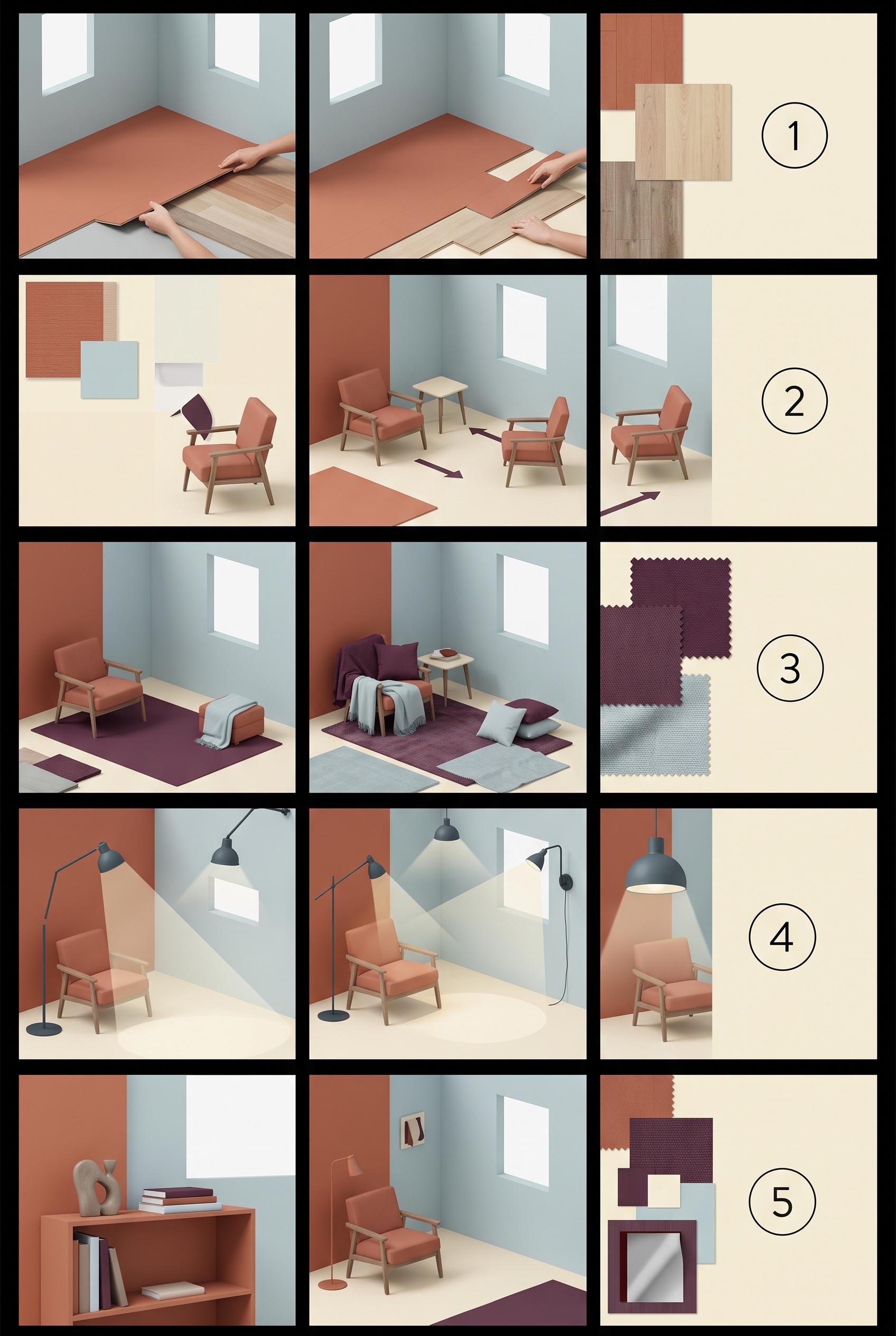
Create a commercial-quality educational interior styling graphic in a vertical 2:3 Pinterest composition. Show a five-step room refresh as an editorial contact sheet: edited floor, repositioned seating, added textile, redirected lighting, and one personal object. Include small room vignettes, material swatches, and simple numbered circles with no readable words. Use terracotta, mist blue, buttercream, and deep plum. AI-modified downstream. No real brands, no trademarked characters, no watermark, no unintended readable text. Corrective regeneration attempt 3. Produce a materially revised image, not a near-duplicate of an earlier variant. Preserve the successful subject, palette, lighting, focal hierarchy, and commercial polish from the original brief while correcting every issue below. Mandatory corrective instructions from the most recent visual QA: Preserve the polished vertical 2:3 contact-sheet layout, black dividers, palette, room styling, material swatches, arrows, lighting, and clean numbered circles. Revise only step 5 so the shelving contains exactly one clearly personal object, such as a single ceramic vase or framed photo, with no books, stacked items, artwork, lamp, rug, or other decor. Make the before/after room vignettes unmistakably show that one object being added to the shelf. Keep every surface blank and free of words, letters, logos, watermarks, pseudo-text, or extra objects. Observed defects from prior variants that must not recur: 1) Attractive vertical editorial composition with five visual stages and appropriate palette. 2) Contains extensive readable text despite the brief requesting simple numbered shapes and no readable wording. 3) Several labels contain obvious garbled text and nonsensical phrases, especially steps 4 and 5. 4) The visual progression is partially obscured by oversized instructional text rather than relying on imagery. 5) Attractive vertical editorial contact-sheet composition with strong palette and clear numbered progression. 6) The fifth step does not clearly show only one personal object added to shelving; it contains multiple books, a sculpture, and additional decor. 7) Step 5 imagery is somewhat ambiguous and does not make the requested single-object change unmistakable. Render no letters, words, numbers, prices, headings, labels, contact details, logos, glyphs, or pseudo-text anywhere. Use only blank surfaces, clean geometric marks, and non-linguistic placeholder shapes. Do not add explanatory captions, before/after labels, interface copy, or extra objects that the brief did not request. When a corrective instruction conflicts with a decorative detail, prioritize the corrective instruction.
 0
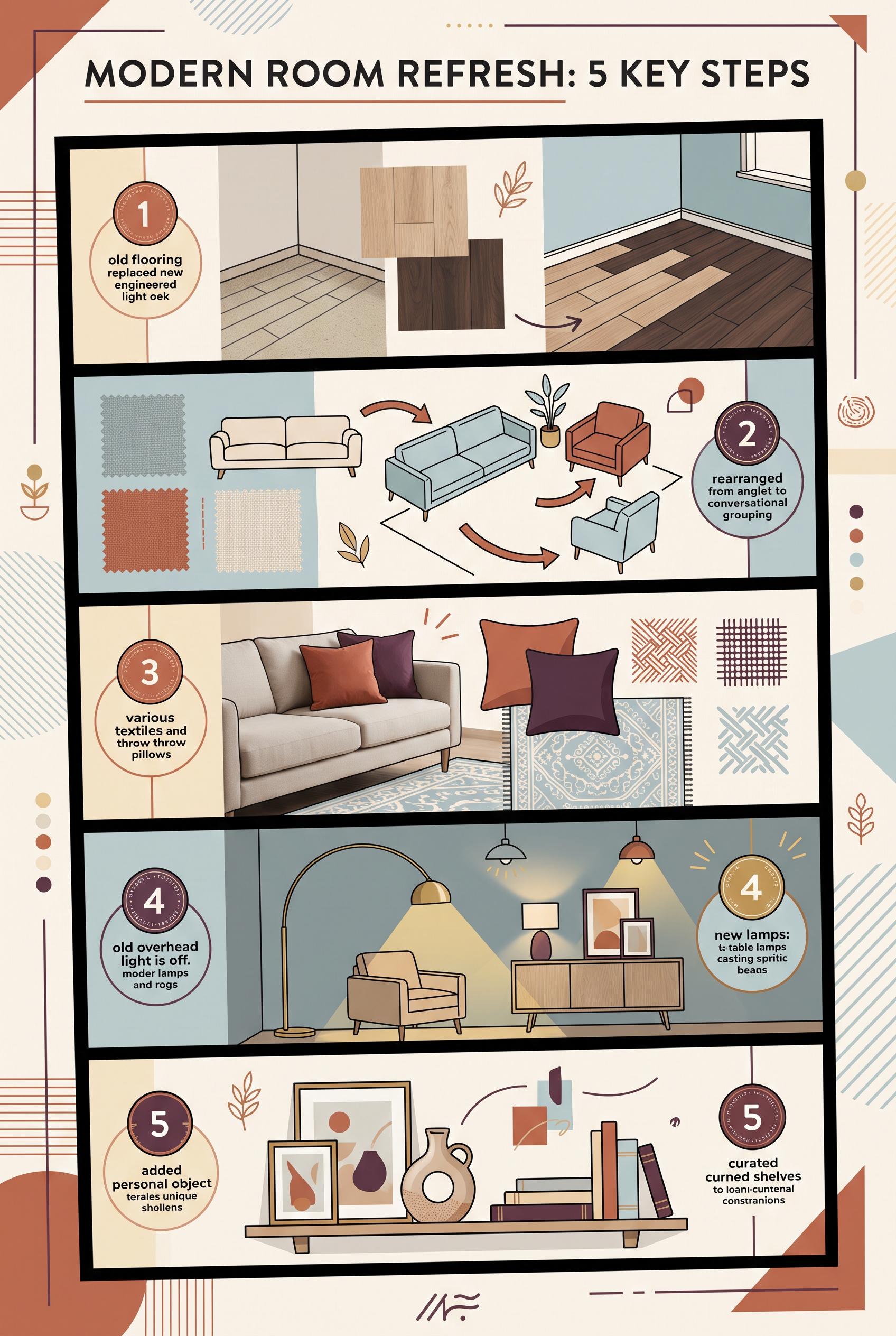
Create a commercial-quality educational interior styling graphic in a vertical 2:3 Pinterest composition. Show a five-step room refresh as an editorial contact sheet: edited floor, repositioned seating, added textile, redirected lighting, and one personal object. Include small room vignettes, material swatches, and simple numbered circles with no readable words. Use terracotta, mist blue, buttercream, and deep plum. AI-modified downstream. No real brands, no trademarked characters, no watermark, no unintended readable text. Corrective regeneration attempt 2. Produce a materially revised image, not a near-duplicate of an earlier variant. Preserve the successful subject, palette, lighting, focal hierarchy, and commercial polish from the original brief while correcting every issue below. Mandatory corrective instructions from the most recent visual QA: Preserve the vertical 2:3 editorial contact-sheet layout, strong black dividers, terracotta/mist-blue/buttercream/deep-plum palette, room vignettes, material swatches, arrows, and clear five-step progression. Remove every word, sentence, caption, heading, letter, and pseudo-text element from the image. Replace all instructional labels with only five clean numbered circles containing the numerals 1, 2, 3, 4, and 5. Keep the five scenes unmistakable: floor replacement with floor samples; shifted seating with directional arrows; added textile with rug, fabric swatches, and pillows; redirected lighting with lamps and visible light beams; one personal object added to shelving. Ensure all objects, hands, furniture, lighting, and patterns are clean and anatomically/geometrically coherent, with no garbled readable text, logos, brands, trademarks, or watermark. Observed defects from prior variants that must not recur: 1) Attractive vertical editorial composition with five visual stages and appropriate palette. 2) Contains extensive readable text despite the brief requesting simple numbered shapes and no readable wording. 3) Several labels contain obvious garbled text and nonsensical phrases, especially steps 4 and 5. 4) The visual progression is partially obscured by oversized instructional text rather than relying on imagery. Render no letters, words, numbers, prices, headings, labels, contact details, logos, glyphs, or pseudo-text anywhere. Use only blank surfaces, clean geometric marks, and non-linguistic placeholder shapes. Do not add explanatory captions, before/after labels, interface copy, or extra objects that the brief did not request. When a corrective instruction conflicts with a decorative detail, prioritize the corrective instruction.
 0
Create a commercial-quality educational interior styling graphic in a vertical 2:3 Pinterest composition. Show a five-step room refresh as an editorial contact sheet: edited floor, repositioned seating, added textile, redirected lighting, and one personal object. Include small room vignettes, material swatches, and simple numbered circles with no readable words. Use terracotta, mist blue, buttercream, and deep plum. AI-modified downstream. No real brands, no trademarked characters, no watermark, no unintended readable text.
 0
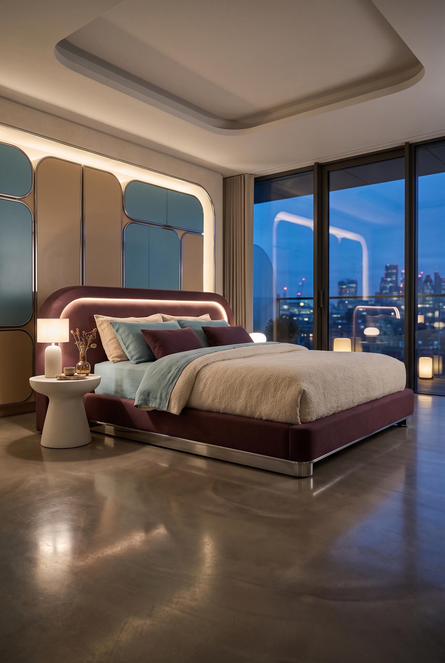
Create a commercial-quality interior design showcase in a vertical 2:3 Pinterest composition, featuring a soft futuristic bedroom with a low platform bed, rounded modular storage, a sculptural bedside pedestal, tactile boucle and linen bedding, and subtle chrome accents. Use aubergine, warm sand, lagoon blue, and soft chrome. Low-angle cinematic hero view with reflective material layers and elegant evening light. AI-modified downstream. No real brands, no trademarked characters, no watermark, no unintended readable text.
 0
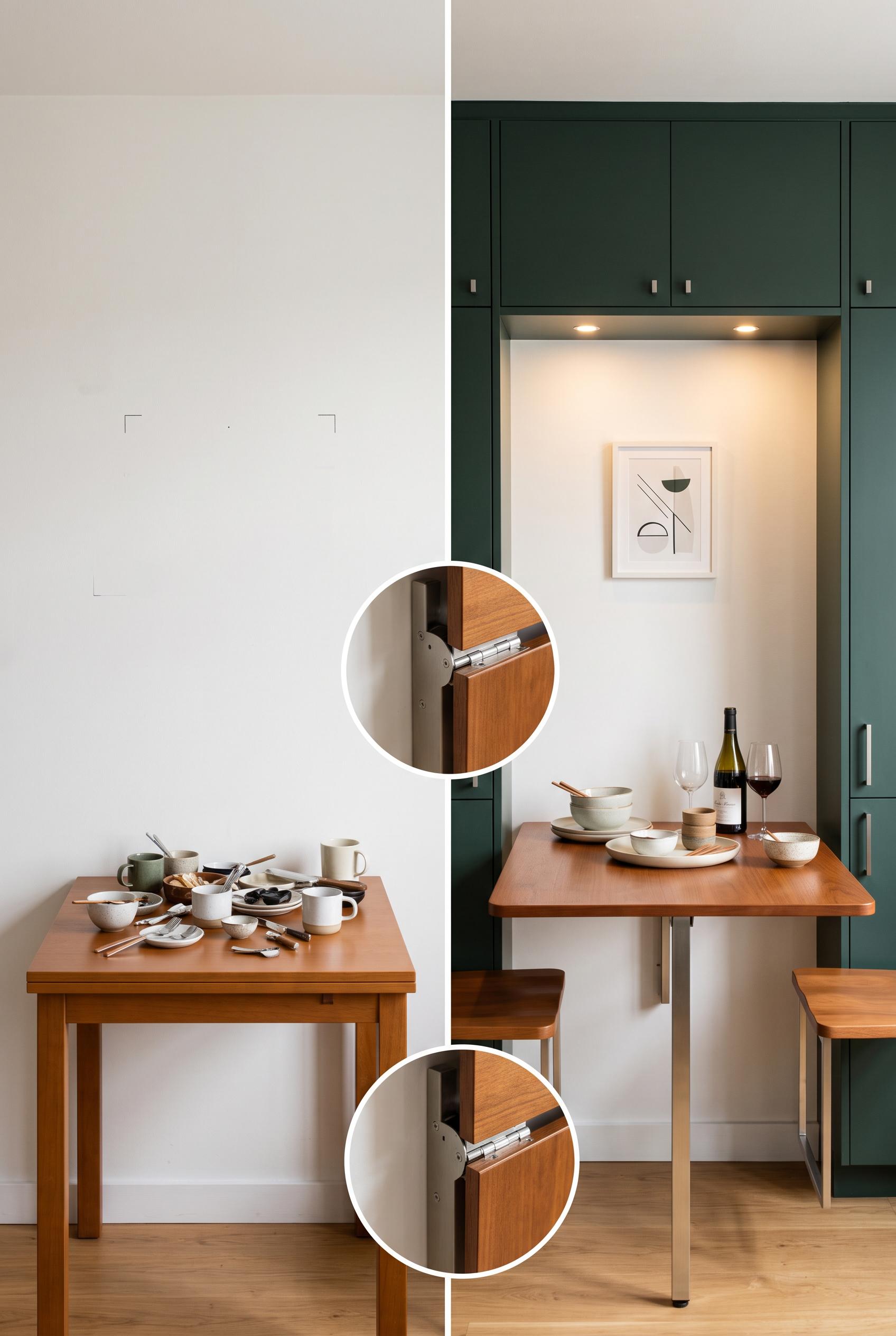
Create a commercial-quality interior design editorial image in a vertical 2:3 Pinterest composition, showing a matched before-and-after transformation of a compact dining wall into a fold-down hosting station. Include blank wall and cluttered surfaces in the before, then concealed storage, a slim drop-leaf table, two mounted stools, warm lighting, and styled serving pieces in the after. Use chalk white, ink green, caramel, and brushed steel. AI-modified downstream. No real brands, no trademarked characters, no watermark, no unintended readable text. Corrective regeneration attempt 5. Produce a materially revised image, not a near-duplicate of an earlier variant. Preserve the successful subject, palette, lighting, focal hierarchy, and commercial polish from the original brief while correcting every issue below. Mandatory corrective instructions from the most recent visual QA: Create a polished vertical 2:3 left/right split-screen comparison of the same compact dining wall with a clean vertical centerline. Keep the left side as a mostly blank chalk-white wall with a compact table holding scattered serving items. On the right, show the complete fold-down table, concealed ink-green storage, warm task lighting, styled serving pieces, exactly two fully visible wall-mounted caramel stools positioned side by side within the frame, and one small tasteful non-textual art moment. Keep both stools entirely inside the right panel, not cropped. Reduce and reposition the single circular close-detail inset so it is fully contained within the canvas, with one clean border and no overlap. Preserve the warm editorial lighting, caramel wood, brushed steel, chalk white, and ink green palette. Render no letters, words, numbers, labels, logos, glyphs, pseudo-text, or watermark. Observed defects from prior variants that must not recur: 1) The image contains readable BEFORE and AFTER text despite the latest instruction prohibiting all letters and labels. 2) The before panel is dominated by books and paperwork rather than a compact blank-wall dining area, weakening the matched transformation. 3) Small geometric marks on the blank wall resemble unintended glyphs or generation artifacts. 4) The before/after comparison reads primarily as top-versus-bottom rather than a clear matched left/right centerline comparison. 5) The inset has awkward overlapping circular borders that reduce editorial polish. 6) The after panel does not clearly show exactly two complete wall-mounted stools; the right stool is heavily cropped at the edge. 7) The required small art moment is missing. 8) The circular detail inset is oversized and partially cropped, weakening the composition. Render no letters, words, numbers, prices, headings, labels, contact details, logos, glyphs, or pseudo-text anywhere. Use only blank surfaces, clean geometric marks, and non-linguistic placeholder shapes. Do not add explanatory captions, before/after labels, interface copy, or extra objects that the brief did not request. When a corrective instruction conflicts with a decorative detail, prioritize the corrective instruction.
 0
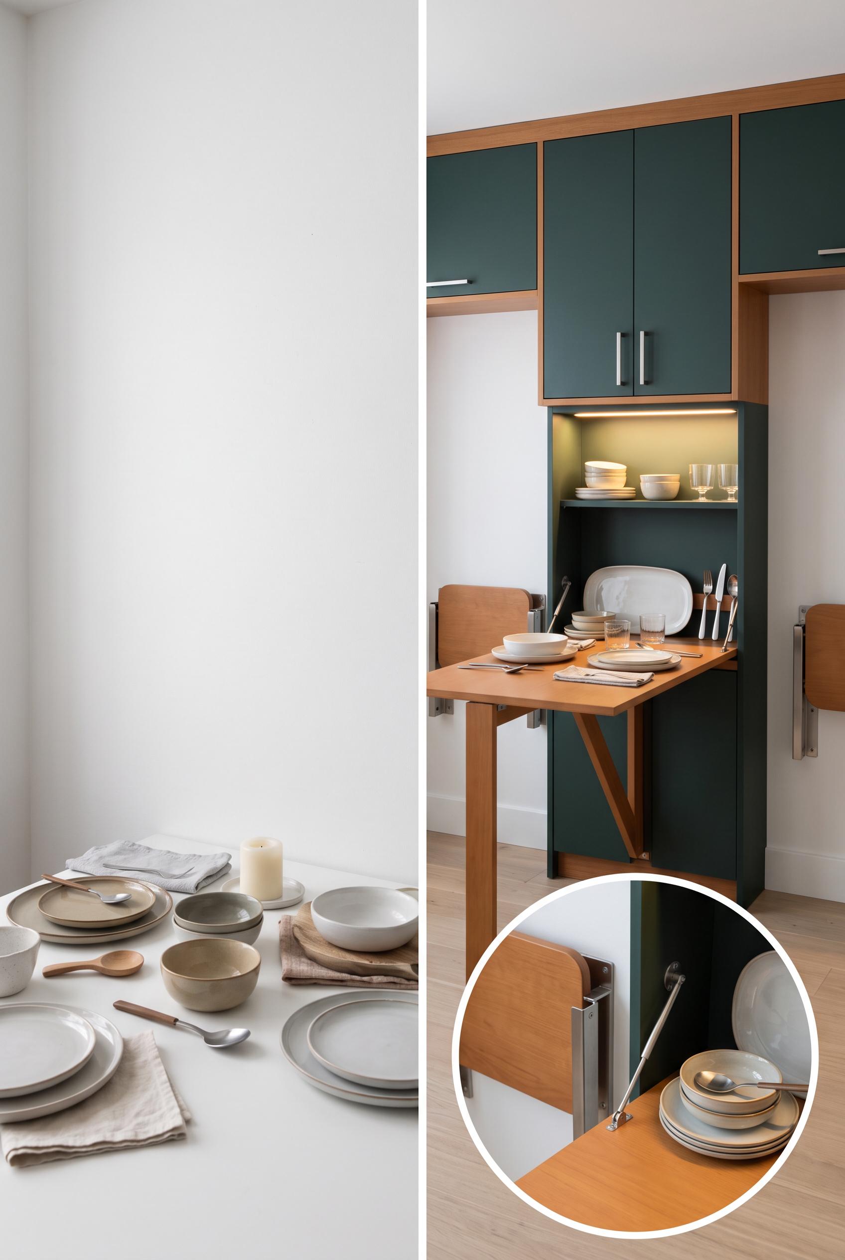
Create a commercial-quality interior design editorial image in a vertical 2:3 Pinterest composition, showing a matched before-and-after transformation of a compact dining wall into a fold-down hosting station. Include blank wall and cluttered surfaces in the before, then concealed storage, a slim drop-leaf table, two mounted stools, warm lighting, and styled serving pieces in the after. Use chalk white, ink green, caramel, and brushed steel. AI-modified downstream. No real brands, no trademarked characters, no watermark, no unintended readable text. Corrective regeneration attempt 4. Produce a materially revised image, not a near-duplicate of an earlier variant. Preserve the successful subject, palette, lighting, focal hierarchy, and commercial polish from the original brief while correcting every issue below. Mandatory corrective instructions from the most recent visual QA: Create a polished vertical 2:3 left/right split-screen comparison of the exact same compact dining wall, with a strong clean vertical centerline. Place the blank-wall, cluttered dining-item version on the left and the completed fold-down hosting station on the right. Preserve the chalk white, ink green, caramel, brushed-steel palette, warm task lighting, concealed storage, slim opened table, exactly two clearly visible wall-mounted stools, serving pieces, and one clean circular close-detail inset of the opened station. Remove every mark from the blank wall and all letters, numbers, labels, logos, pseudo-text, glyphs, and watermarks. Make the inset a single undistorted circle with one clean border and no overlapping rings. Observed defects from prior variants that must not recur: 1) Strong vertical before-and-after composition with a clear transformation, but the required close detail inset of the opened station is missing. 2) The before side is dominated by books and office clutter rather than clearly scattered serving items. 3) Only one wall-mounted stool is clearly visible in the after panel; the required pair is not shown. 4) The image contains readable BEFORE and AFTER text despite the latest instruction prohibiting all letters and labels. 5) The before panel is dominated by books and paperwork rather than a compact blank-wall dining area, weakening the matched transformation. 6) Small geometric marks on the blank wall resemble unintended glyphs or generation artifacts. 7) The before/after comparison reads primarily as top-versus-bottom rather than a clear matched left/right centerline comparison. 8) The inset has awkward overlapping circular borders that reduce editorial polish. Render no letters, words, numbers, prices, headings, labels, contact details, logos, glyphs, or pseudo-text anywhere. Use only blank surfaces, clean geometric marks, and non-linguistic placeholder shapes. Do not add explanatory captions, before/after labels, interface copy, or extra objects that the brief did not request. When a corrective instruction conflicts with a decorative detail, prioritize the corrective instruction.
 0
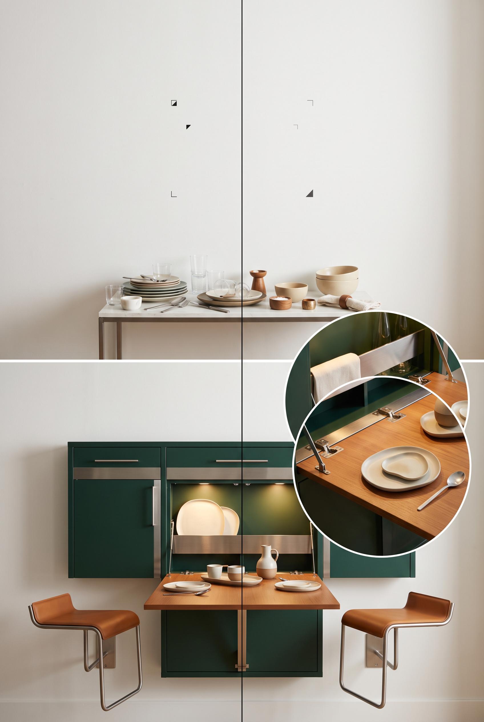
Create a commercial-quality interior design editorial image in a vertical 2:3 Pinterest composition, showing a matched before-and-after transformation of a compact dining wall into a fold-down hosting station. Include blank wall and cluttered surfaces in the before, then concealed storage, a slim drop-leaf table, two mounted stools, warm lighting, and styled serving pieces in the after. Use chalk white, ink green, caramel, and brushed steel. AI-modified downstream. No real brands, no trademarked characters, no watermark, no unintended readable text. Corrective regeneration attempt 3. Produce a materially revised image, not a near-duplicate of an earlier variant. Preserve the successful subject, palette, lighting, focal hierarchy, and commercial polish from the original brief while correcting every issue below. Mandatory corrective instructions from the most recent visual QA: Preserve the polished vertical 2:3 split-screen composition, centerline comparison, chalk white/ink green/caramel/brushed-steel palette, warm task lighting, fold-down table, concealed storage, serving items, and circular close-detail inset. Show exactly two clearly visible wall-mounted stools in the after panel, both integrated beside or beneath the opened station. Replace the before shelving, books, and paperwork with a mostly blank wall and unmistakable scattered dining items—plates, glasses, utensils, bowls, and serving pieces—on a small surface. Remove all readable letters, words, numbers, labels, logos, pseudo-text, and watermarks, including BEFORE and AFTER. Observed defects from prior variants that must not recur: 1) Strong vertical before-and-after composition with a clear transformation, but the required close detail inset of the opened station is missing. 2) The before side is dominated by books and office clutter rather than clearly scattered serving items. 3) Only one wall-mounted stool is clearly visible in the after panel; the required pair is not shown. 4) The image contains readable BEFORE and AFTER text despite the latest instruction prohibiting all letters and labels. 5) The before panel is dominated by books and paperwork rather than a compact blank-wall dining area, weakening the matched transformation. Render no letters, words, numbers, prices, headings, labels, contact details, logos, glyphs, or pseudo-text anywhere. Use only blank surfaces, clean geometric marks, and non-linguistic placeholder shapes. Do not add explanatory captions, before/after labels, interface copy, or extra objects that the brief did not request. When a corrective instruction conflicts with a decorative detail, prioritize the corrective instruction.
 0
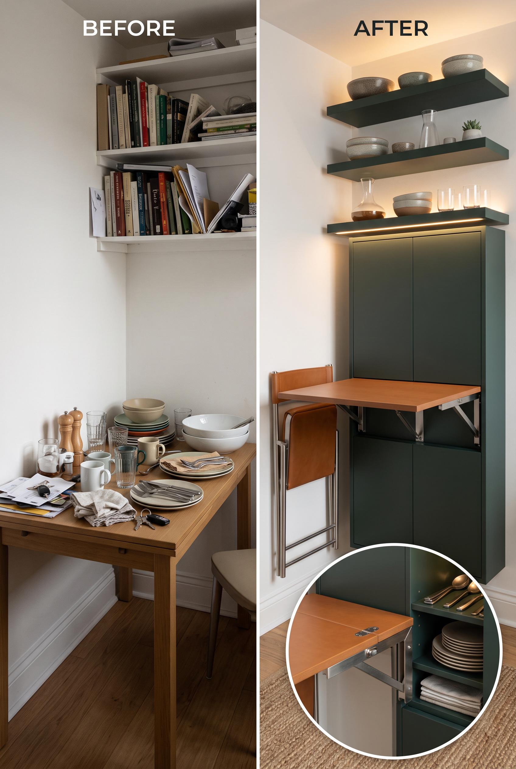
Create a commercial-quality interior design editorial image in a vertical 2:3 Pinterest composition, showing a matched before-and-after transformation of a compact dining wall into a fold-down hosting station. Include blank wall and cluttered surfaces in the before, then concealed storage, a slim drop-leaf table, two mounted stools, warm lighting, and styled serving pieces in the after. Use chalk white, ink green, caramel, and brushed steel. AI-modified downstream. No real brands, no trademarked characters, no watermark, no unintended readable text. Corrective regeneration attempt 2. Produce a materially revised image, not a near-duplicate of an earlier variant. Preserve the successful subject, palette, lighting, focal hierarchy, and commercial polish from the original brief while correcting every issue below. Mandatory corrective instructions from the most recent visual QA: Preserve the attractive vertical 2:3 split-screen composition, centerline comparison, color palette, warm lighting, fold-down table, concealed storage, and two wall-mounted stools. Add a clearly framed close-detail inset—preferably in the upper or lower after panel—showing the opened fold-down station, its hardware, concealed storage, and styled serving pieces. Replace or supplement the before-side books and office clutter with unmistakable scattered dining and serving items such as plates, glasses, utensils, and serving bowls. Keep all text limited to clean intentional BEFORE and AFTER labels; remove any other readable text, brands, watermarks, or artifacts. Observed defects from prior variants that must not recur: 1) Strong vertical before-and-after composition with a clear transformation, but the required close detail inset of the opened station is missing. 2) The before side is dominated by books and office clutter rather than clearly scattered serving items. Render no letters, words, numbers, prices, headings, labels, contact details, logos, glyphs, or pseudo-text anywhere. Use only blank surfaces, clean geometric marks, and non-linguistic placeholder shapes. Do not add explanatory captions, before/after labels, interface copy, or extra objects that the brief did not request. When a corrective instruction conflicts with a decorative detail, prioritize the corrective instruction.
 0
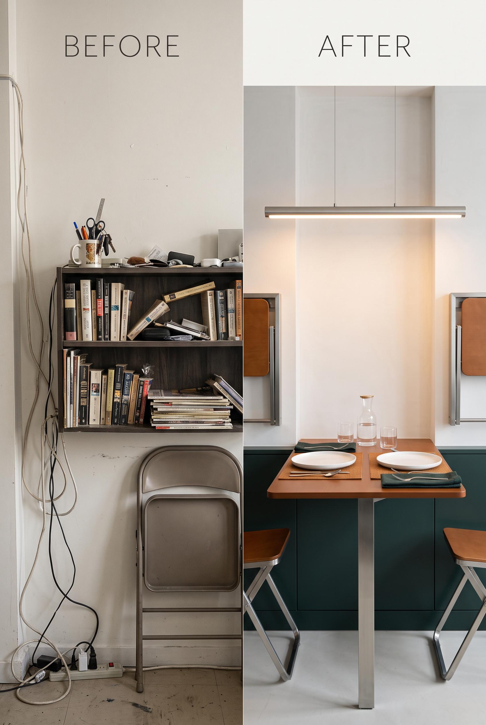
Create a commercial-quality interior design editorial image in a vertical 2:3 Pinterest composition, showing a matched before-and-after transformation of a compact dining wall into a fold-down hosting station. Include blank wall and cluttered surfaces in the before, then concealed storage, a slim drop-leaf table, two mounted stools, warm lighting, and styled serving pieces in the after. Use chalk white, ink green, caramel, and brushed steel. AI-modified downstream. No real brands, no trademarked characters, no watermark, no unintended readable text.
 0
Create a commercial-quality educational Pinterest graphic in a vertical 2:3 composition. Show a three-dimensional staircase made of five clean evidence cards for a digital download listing: product identity, included files, usage process, ideal buyer, and delivery moment. Use abstract icons, interface silhouettes, cropped page previews, folder shapes, and a small laptop, with no readable wording. Forest green, coral, periwinkle, and sand palette, sophisticated editorial infographic style, clear visual hierarchy, commercial art direction, AI-modified downstream concept. No real brands, no trademarked characters, no watermark, no unintended readable text. Corrective regeneration attempt 5. Produce a materially revised image, not a near-duplicate of an earlier variant. Preserve the successful subject, palette, lighting, focal hierarchy, and commercial polish from the original brief while correcting every issue below. Mandatory corrective instructions from the most recent visual QA: Regenerate a polished vertical 2:3 editorial infographic in the existing forest green, coral, periwinkle, and sand palette. Keep exactly five clearly separated, evenly spaced three-dimensional staircase evidence cards as the dominant focal point, with abstract icons, folder and file silhouettes, interface-like geometric previews, people silhouettes, and a small laptop. Remove every readable word, letter, number, label, heading, pseudo-text line, glyph, logo, and brand mark from all cards and the entire image; use only blank surfaces, clean color blocks, and simple non-linguistic geometric icons. Simplify the background by removing wall panels, redundant floating cards, oversized decorative blocks, and competing peripheral objects. Preserve soft lighting, clear hierarchy, commercial polish, and a clean reusable campaign-framework feel. Include no watermark or letter-like markings anywhere. Observed defects from prior variants that must not recur: 1) A clearly readable “MS” appears on the coral evidence card. 2) Multiple cards contain letter-like glyphs, pseudo-text lines, and UI-style marks despite the no-readable-text requirement. 3) The staircase is attractive but still visually dense, with competing wall panels and numerous peripheral objects weakening the five-step sequence. 4) Multiple large readable labels are present, including “Product Identity,” “Included Files,” “Usage Process,” “Ideal Buyer,” and “Delivery Moment,” violating the no-readable-text/no 5) The five cards contain prominent readable labels, directly violating the no-readable-text requirement. 6) The composition remains visually dense with competing wall panels and peripheral objects. 7) The staircase sequence is present but the cards overlap heavily and are not evenly separated. Render no letters, words, numbers, prices, headings, labels, contact details, logos, glyphs, or pseudo-text anywhere. Use only blank surfaces, clean geometric marks, and non-linguistic placeholder shapes. Do not add explanatory captions, before/after labels, interface copy, or extra objects that the brief did not request. When a corrective instruction conflicts with a decorative detail, prioritize the corrective instruction.
 0
Create a commercial-quality educational Pinterest graphic in a vertical 2:3 composition. Show a three-dimensional staircase made of five clean evidence cards for a digital download listing: product identity, included files, usage process, ideal buyer, and delivery moment. Use abstract icons, interface silhouettes, cropped page previews, folder shapes, and a small laptop, with no readable wording. Forest green, coral, periwinkle, and sand palette, sophisticated editorial infographic style, clear visual hierarchy, commercial art direction, AI-modified downstream concept. No real brands, no trademarked characters, no watermark, no unintended readable text. Corrective regeneration attempt 4. Produce a materially revised image, not a near-duplicate of an earlier variant. Preserve the successful subject, palette, lighting, focal hierarchy, and commercial polish from the original brief while correcting every issue below. Mandatory corrective instructions from the most recent visual QA: Regenerate as a polished vertical 2:3 editorial infographic preserving the forest green, coral, periwinkle, and sand palette, soft lighting, three-dimensional staircase, abstract icons, folders, interface previews, people silhouette, and small laptop. Make exactly five clearly separated, evenly spaced staircase evidence cards the dominant focal point. Remove every readable word, letter, number, label, heading, pseudo-text line, glyph, logo, and brand mark, including all existing card labels. Replace text areas with blank surfaces, clean color blocks, abstract geometric shapes, and simple non-linguistic icons only. Simplify the background by removing peripheral wall panels, redundant floating cards, extra charts, and competing decorative objects. Keep the composition uncluttered, commercially polished, and ensure there is no watermark or letter-like marking anywhere. Observed defects from prior variants that must not recur: 1) The composition is attractive and vertical, but it is overly dense with competing peripheral panels and decorative elements, weakening the staircase sequence and focal hierarchy. 2) A readable “MS” appears on a file card, violating the no-readable-text requirement. 3) The staircase does not clearly present five distinct, evenly legible evidence cards in a reusable campaign sequence. 4) A clearly readable “MS” appears on the coral evidence card. 5) Multiple cards contain letter-like glyphs, pseudo-text lines, and UI-style marks despite the no-readable-text requirement. 6) The staircase is attractive but still visually dense, with competing wall panels and numerous peripheral objects weakening the five-step sequence. 7) Multiple large readable labels are present, including “Product Identity,” “Included Files,” “Usage Process,” “Ideal Buyer,” and “Delivery Moment,” violating the no-readable-text/no Render no letters, words, numbers, prices, headings, labels, contact details, logos, glyphs, or pseudo-text anywhere. Use only blank surfaces, clean geometric marks, and non-linguistic placeholder shapes. Do not add explanatory captions, before/after labels, interface copy, or extra objects that the brief did not request. When a corrective instruction conflicts with a decorative detail, prioritize the corrective instruction.
 0
Create a commercial-quality educational Pinterest graphic in a vertical 2:3 composition. Show a three-dimensional staircase made of five clean evidence cards for a digital download listing: product identity, included files, usage process, ideal buyer, and delivery moment. Use abstract icons, interface silhouettes, cropped page previews, folder shapes, and a small laptop, with no readable wording. Forest green, coral, periwinkle, and sand palette, sophisticated editorial infographic style, clear visual hierarchy, commercial art direction, AI-modified downstream concept. No real brands, no trademarked characters, no watermark, no unintended readable text. Corrective regeneration attempt 3. Produce a materially revised image, not a near-duplicate of an earlier variant. Preserve the successful subject, palette, lighting, focal hierarchy, and commercial polish from the original brief while correcting every issue below. Mandatory corrective instructions from the most recent visual QA: Create a materially revised vertical 2:3 editorial infographic preserving the sophisticated forest green, coral, periwinkle, and sand palette, three-dimensional staircase, soft lighting, folders, abstract interface previews, people silhouettes, and small laptop. Make exactly five clearly separated, evenly spaced staircase evidence cards the unmistakable focal point. Simplify the background and remove peripheral wall panels, redundant decorative objects, extra charts, and competing figures. Replace every letter, number, word, logo, trademark, glyph, pseudo-text line, and the visible “MS” with purely abstract geometric shapes, blank surfaces, simple non-linguistic icons, and clean color blocks. Ensure no readable or letter-like marks appear anywhere, and include no watermark. Observed defects from prior variants that must not recur: 1) The composition is attractive and vertical, but it is overly dense with competing peripheral panels and decorative elements, weakening the staircase sequence and focal hierarchy. 2) A readable “MS” appears on a file card, violating the no-readable-text requirement. 3) The staircase does not clearly present five distinct, evenly legible evidence cards in a reusable campaign sequence. 4) A clearly readable “MS” appears on the coral evidence card. 5) Multiple cards contain letter-like glyphs, pseudo-text lines, and UI-style marks despite the no-readable-text requirement. 6) The staircase is attractive but still visually dense, with competing wall panels and numerous peripheral objects weakening the five-step sequence. Render no letters, words, numbers, prices, headings, labels, contact details, logos, glyphs, or pseudo-text anywhere. Use only blank surfaces, clean geometric marks, and non-linguistic placeholder shapes. Do not add explanatory captions, before/after labels, interface copy, or extra objects that the brief did not request. When a corrective instruction conflicts with a decorative detail, prioritize the corrective instruction.
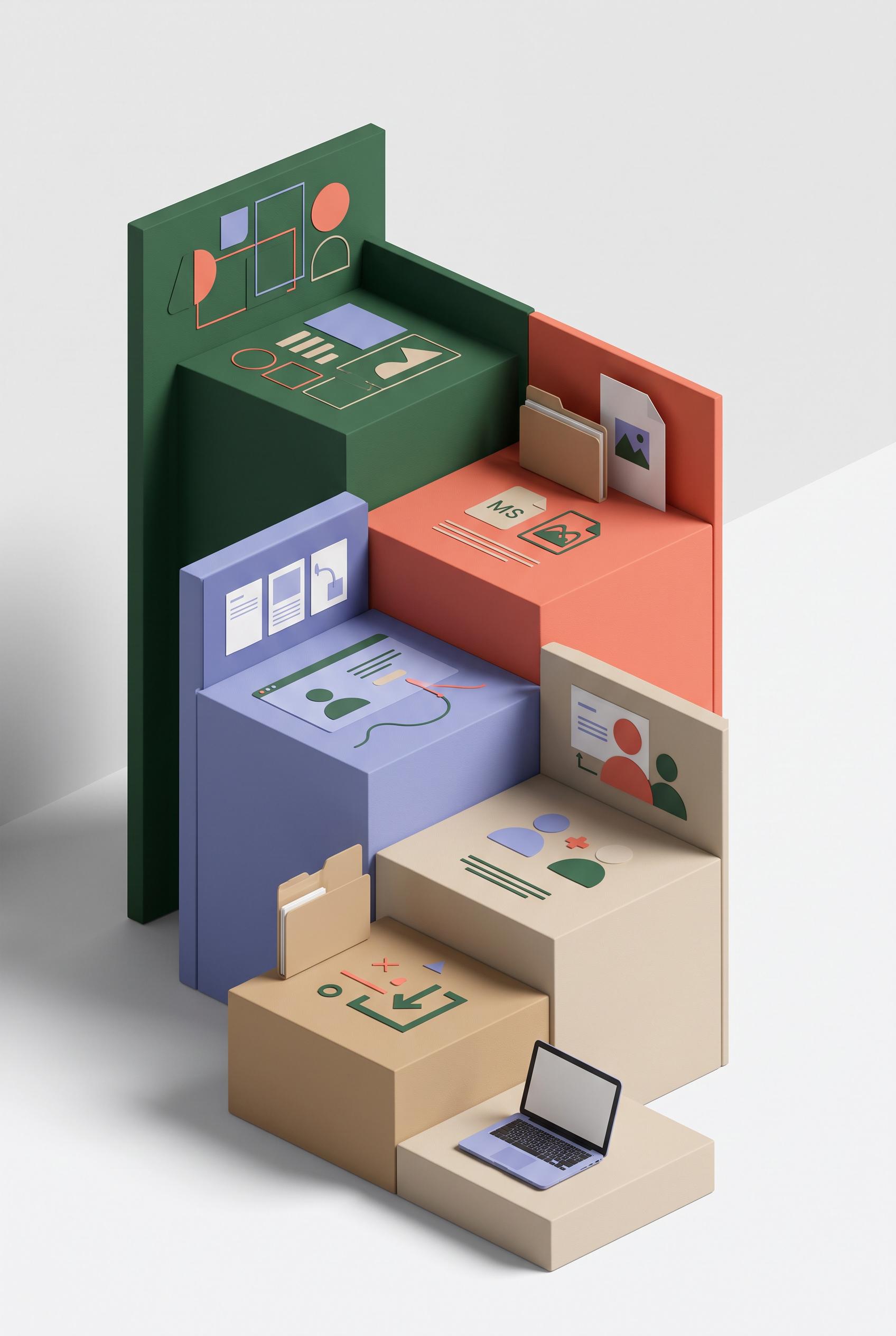 0
Create a commercial-quality educational Pinterest graphic in a vertical 2:3 composition. Show a three-dimensional staircase made of five clean evidence cards for a digital download listing: product identity, included files, usage process, ideal buyer, and delivery moment. Use abstract icons, interface silhouettes, cropped page previews, folder shapes, and a small laptop, with no readable wording. Forest green, coral, periwinkle, and sand palette, sophisticated editorial infographic style, clear visual hierarchy, commercial art direction, AI-modified downstream concept. No real brands, no trademarked characters, no watermark, no unintended readable text. Corrective regeneration attempt 2. Produce a materially revised image, not a near-duplicate of an earlier variant. Preserve the successful subject, palette, lighting, focal hierarchy, and commercial polish from the original brief while correcting every issue below. Mandatory corrective instructions from the most recent visual QA: Preserve the sophisticated forest green, coral, periwinkle, and sand editorial infographic style, the three-dimensional staircase, and the useful icons, folders, interface silhouettes, people, and laptop. Simplify the background and remove peripheral decorative panels, floating blocks, extra charts, and redundant figures so the five staircase steps are the unmistakable focal point. Make exactly five clearly separated evidence cards/steps with a clean, logical ascending sequence and balanced spacing. Replace every character or letter-like mark, including the visible “MS” on the file card, with purely abstract shapes or icons; ensure there is no readable text anywhere, no logos, no trademarks, and no watermark. Observed defects from prior variants that must not recur: 1) The composition is attractive and vertical, but it is overly dense with competing peripheral panels and decorative elements, weakening the staircase sequence and focal hierarchy. 2) A readable “MS” appears on a file card, violating the no-readable-text requirement. 3) The staircase does not clearly present five distinct, evenly legible evidence cards in a reusable campaign sequence. Render no letters, words, numbers, prices, headings, labels, contact details, logos, glyphs, or pseudo-text anywhere. Use only blank surfaces, clean geometric marks, and non-linguistic placeholder shapes. Do not add explanatory captions, before/after labels, interface copy, or extra objects that the brief did not request. When a corrective instruction conflicts with a decorative detail, prioritize the corrective instruction.
 0
Create a commercial-quality educational Pinterest graphic in a vertical 2:3 composition. Show a three-dimensional staircase made of five clean evidence cards for a digital download listing: product identity, included files, usage process, ideal buyer, and delivery moment. Use abstract icons, interface silhouettes, cropped page previews, folder shapes, and a small laptop, with no readable wording. Forest green, coral, periwinkle, and sand palette, sophisticated editorial infographic style, clear visual hierarchy, commercial art direction, AI-modified downstream concept. No real brands, no trademarked characters, no watermark, no unintended readable text.
 0
Create a commercial-quality Pinterest showcase in a vertical 2:3 composition featuring an editable digital wall art set in a compact modern apartment corner. Show three coordinated framed prints arranged in a tall gallery wall, a slim shelf with a tablet displaying abstract color blocks, and a small stack of unframed prints. Cobalt, citrus yellow, sky blue, and warm white palette, airy sunlight, refined interior styling, premium ecommerce art direction, realistic materials, AI-modified downstream concept. No real brands, no trademarked characters, no watermark, no unintended readable text, artwork must use abstract shapes only. Corrective regeneration attempt 3. Produce a materially revised image, not a near-duplicate of an earlier variant. Preserve the successful subject, palette, lighting, focal hierarchy, and commercial polish from the original brief while correcting every issue below. Mandatory corrective instructions from the most recent visual QA: Preserve the attractive vertical 2:3 apartment composition, three framed abstract prints, cobalt/citrus yellow/sky blue/warm white palette, airy sunlight, plant, sofa, realistic materials, and premium commercial styling. Replace the tablet screen entirely with a clean blank canvas containing only large geometric abstract shapes in the specified palette. Remove every toolbar, icon, control, border element, logo, glyph, number, letter, and pseudo-text from the tablet. Place the small stack of unframed abstract prints neatly on the slim wall shelf, while keeping the tablet and plant balanced there; remove or simplify the separate side table if needed. Ensure no readable or pseudo-readable text appears anywhere in the image and render no brands, watermarks, or interface artifacts. Observed defects from prior variants that must not recur: 1) The composition is attractive and fulfills most of the product concept, but the tablet screen includes a recognizable operating-system-style dock with app icons, creating an avoida 2) ble brand/interface artifact. 3) Attractive vertical composition with strong focal hierarchy and cohesive abstract artwork. 4) Tablet screen still contains visible editor UI elements, including toolbar icons and controls, violating the requirement for a purely generic abstract display with no interface or2 5) readable symbols. 6) Print stack is placed on a separate table rather than the slim shelf, weakening the requested product arrangement. Render no letters, words, numbers, prices, headings, labels, contact details, logos, glyphs, or pseudo-text anywhere. Use only blank surfaces, clean geometric marks, and non-linguistic placeholder shapes. Do not add explanatory captions, before/after labels, interface copy, or extra objects that the brief did not request. When a corrective instruction conflicts with a decorative detail, prioritize the corrective instruction.
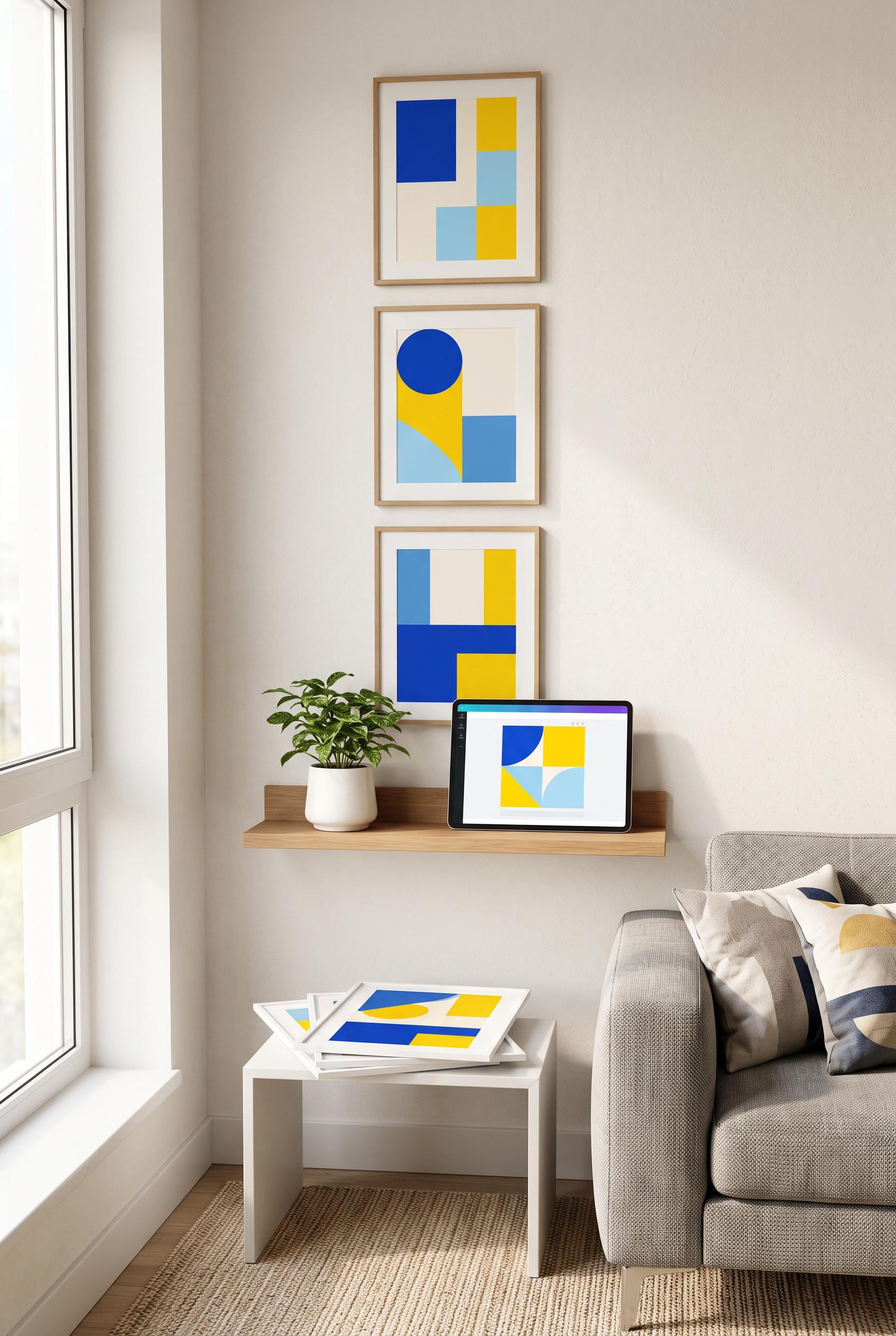 0
Create a commercial-quality Pinterest showcase in a vertical 2:3 composition featuring an editable digital wall art set in a compact modern apartment corner. Show three coordinated framed prints arranged in a tall gallery wall, a slim shelf with a tablet displaying abstract color blocks, and a small stack of unframed prints. Cobalt, citrus yellow, sky blue, and warm white palette, airy sunlight, refined interior styling, premium ecommerce art direction, realistic materials, AI-modified downstream concept. No real brands, no trademarked characters, no watermark, no unintended readable text, artwork must use abstract shapes only. Corrective regeneration attempt 2. Produce a materially revised image, not a near-duplicate of an earlier variant. Preserve the successful subject, palette, lighting, focal hierarchy, and commercial polish from the original brief while correcting every issue below. Mandatory corrective instructions from the most recent visual QA: Preserve the vertical 2:3 apartment composition, three framed abstract prints, airy sunlight, shelf, plant, sofa, and print stack. Replace the tablet display with a clean, generic abstract design editor view using only cobalt, citrus yellow, sky blue, and warm white geometric shapes; remove all dock icons, interface symbols, logos, controls, and any readable text. Ensure no recognizable branded device interface remains. Observed defects from prior variants that must not recur: 1) The composition is attractive and fulfills most of the product concept, but the tablet screen includes a recognizable operating-system-style dock with app icons, creating an avoida 2) ble brand/interface artifact. Render no letters, words, numbers, prices, headings, labels, contact details, logos, glyphs, or pseudo-text anywhere. Use only blank surfaces, clean geometric marks, and non-linguistic placeholder shapes. Do not add explanatory captions, before/after labels, interface copy, or extra objects that the brief did not request. When a corrective instruction conflicts with a decorative detail, prioritize the corrective instruction.
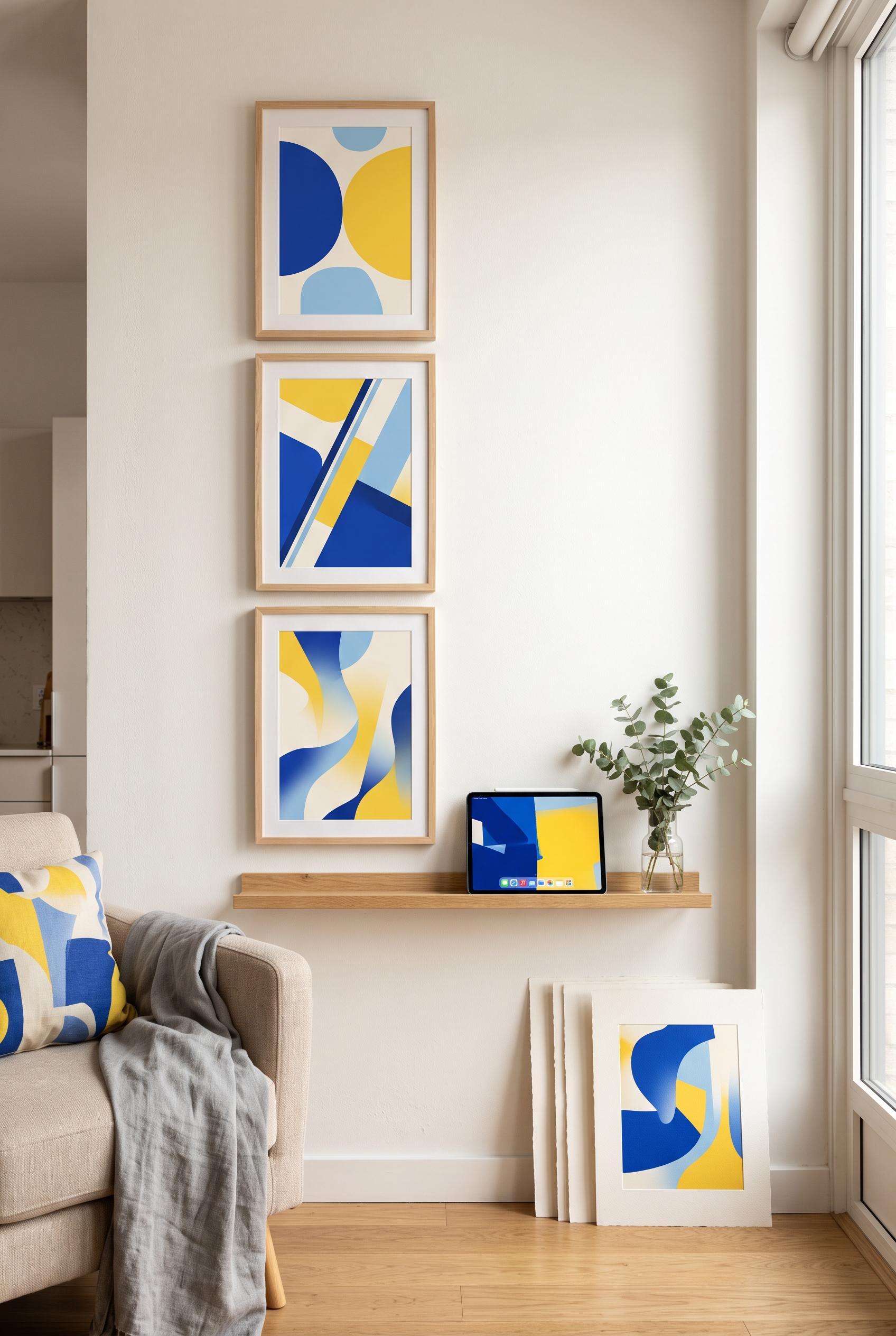 0
Create a commercial-quality Pinterest showcase in a vertical 2:3 composition featuring an editable digital wall art set in a compact modern apartment corner. Show three coordinated framed prints arranged in a tall gallery wall, a slim shelf with a tablet displaying abstract color blocks, and a small stack of unframed prints. Cobalt, citrus yellow, sky blue, and warm white palette, airy sunlight, refined interior styling, premium ecommerce art direction, realistic materials, AI-modified downstream concept. No real brands, no trademarked characters, no watermark, no unintended readable text, artwork must use abstract shapes only.
About Our AI Image Gallery
Our AI Image Gallery showcases shared AI-generated images created by our community. Each image is unique, high-quality, and represents the creative possibilities of AI art generation. Browse through various styles, subjects, and themes to get inspired for your next creative project.
Why Explore Our Gallery?
- Discover unique AI-generated images across multiple styles and themes
- Get inspired by creative prompts and artistic styles
- View images shared by our creative community
- Click any image to view its share page and get more details
How to Use the Gallery
Using our gallery is simple and intuitive:
- Browse through the grid of shared images
- Click on any image that catches your eye
- View the full image details and share link on the dedicated share page
Ready to Create Your Own AI Images?
Join catalog sellers using AI Media Studio to turn one product photo into a listing-ready set.